As mentioned in the research post, I was having a hard time with this project. Each time I felt like I was making progress, I would discover something that would set me a few steps back again. This, however, was mainly for the concept of the zine. The laying out of the content actually went pretty smoothly, considering how things were in the beginning.
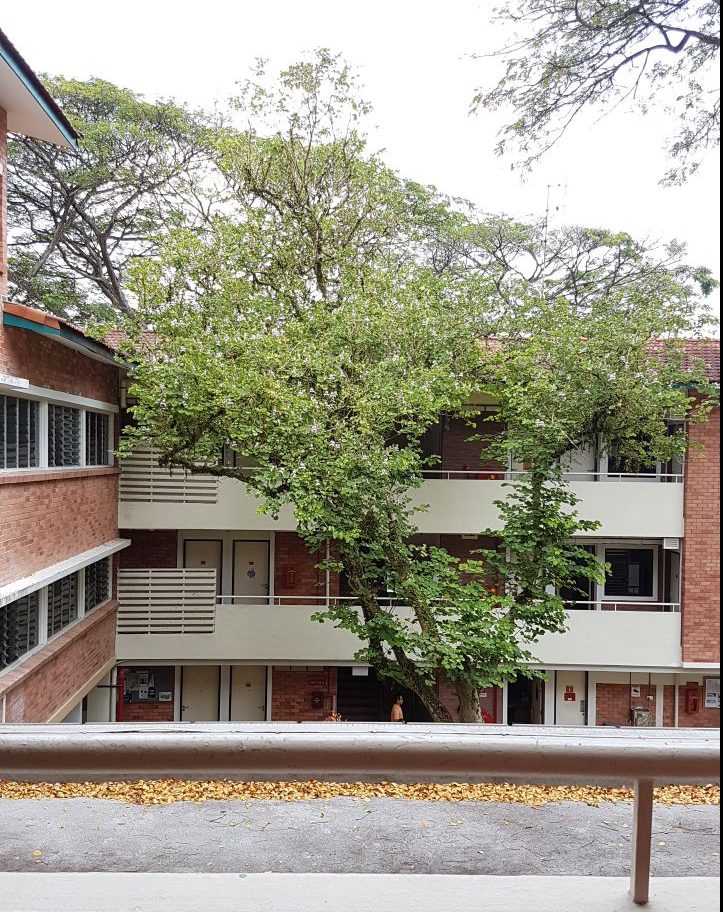
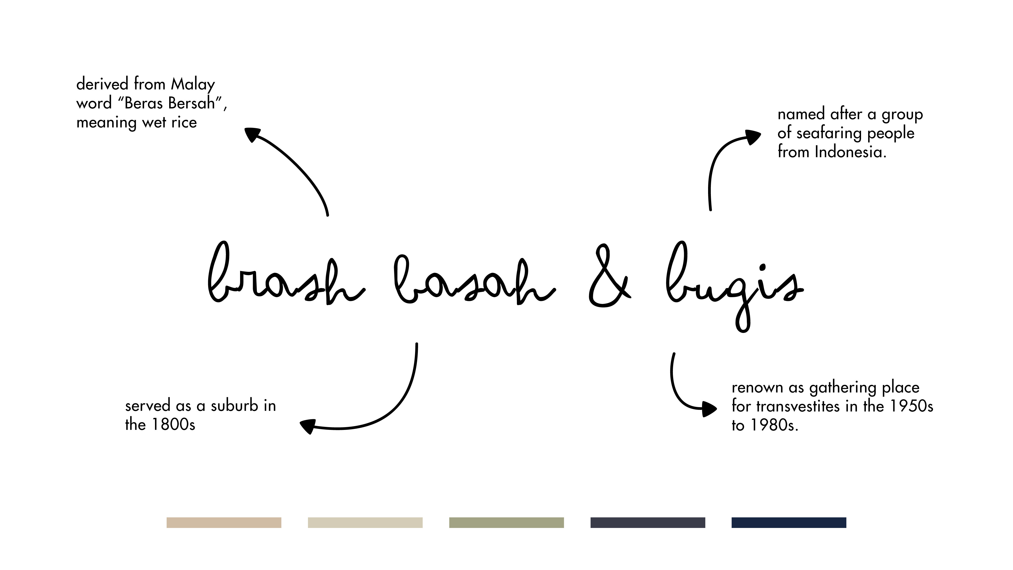
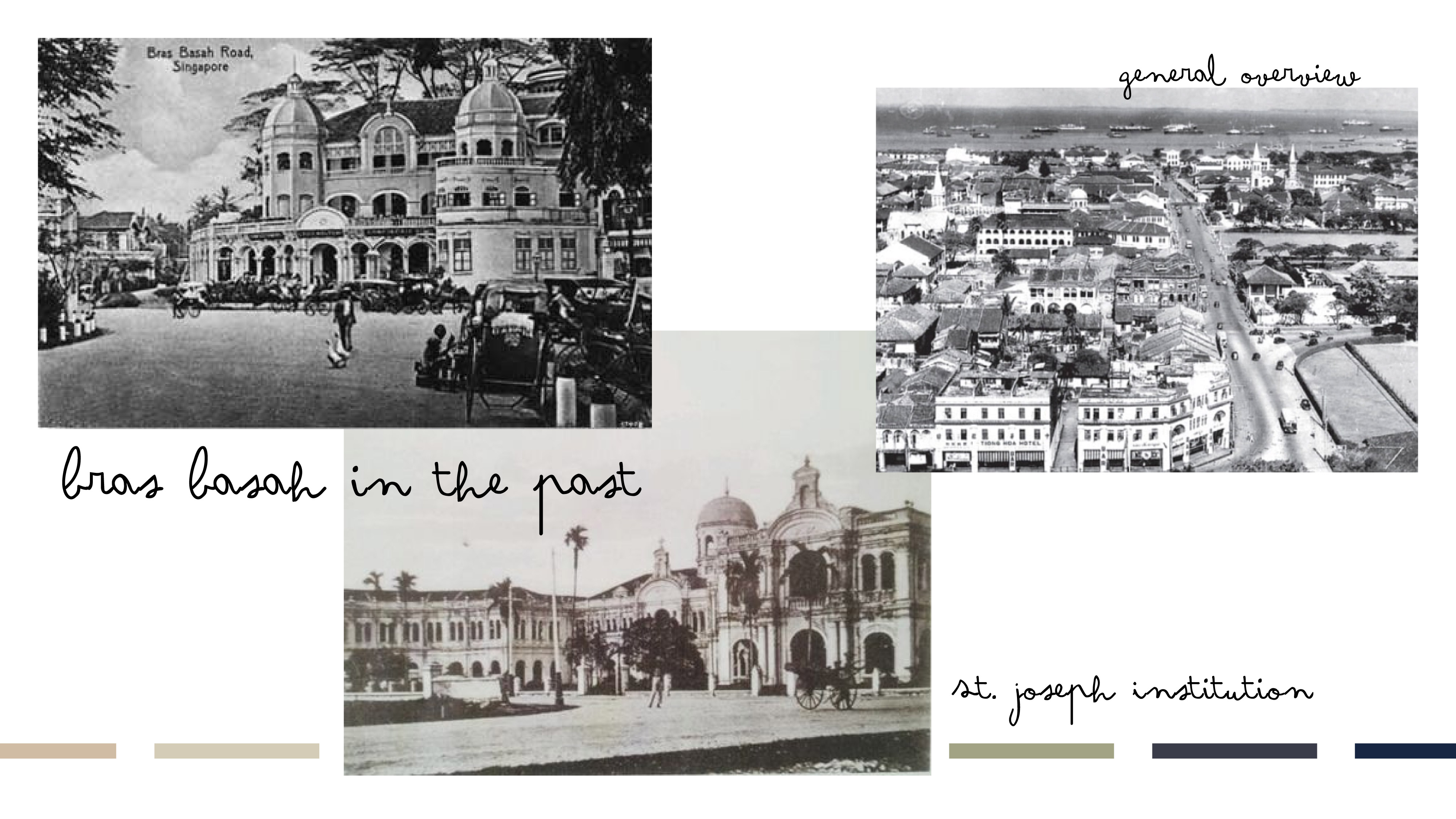
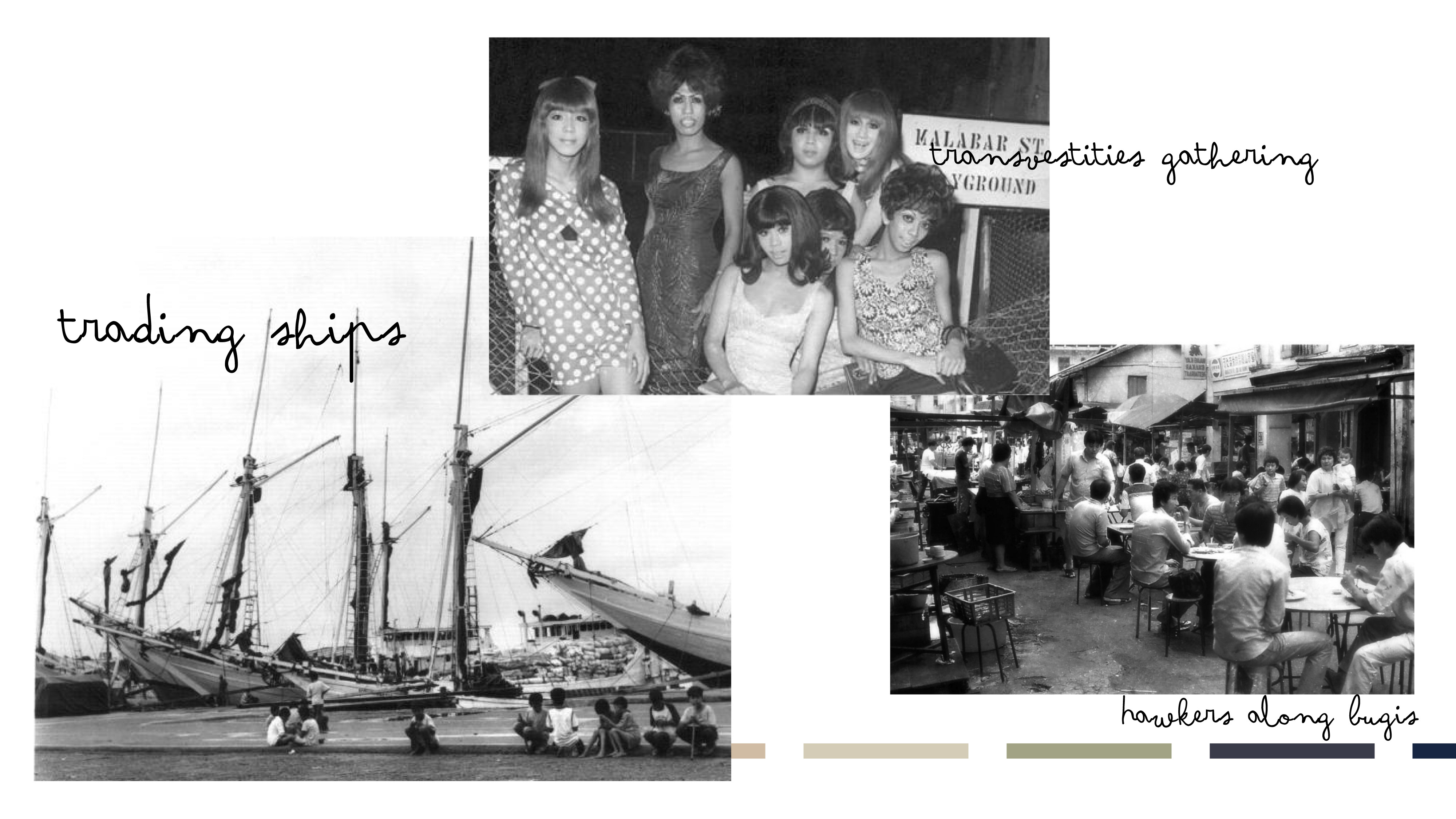
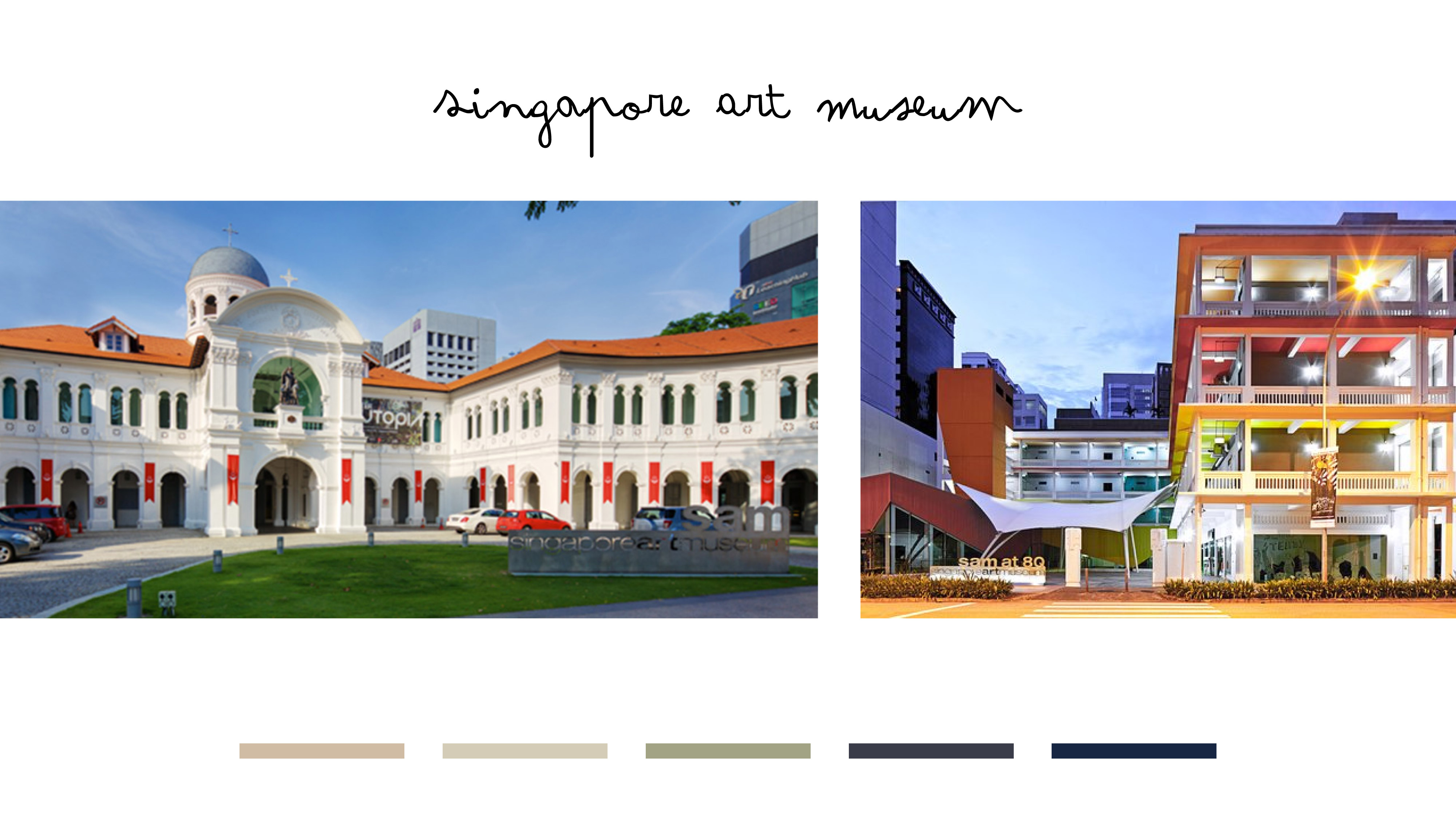
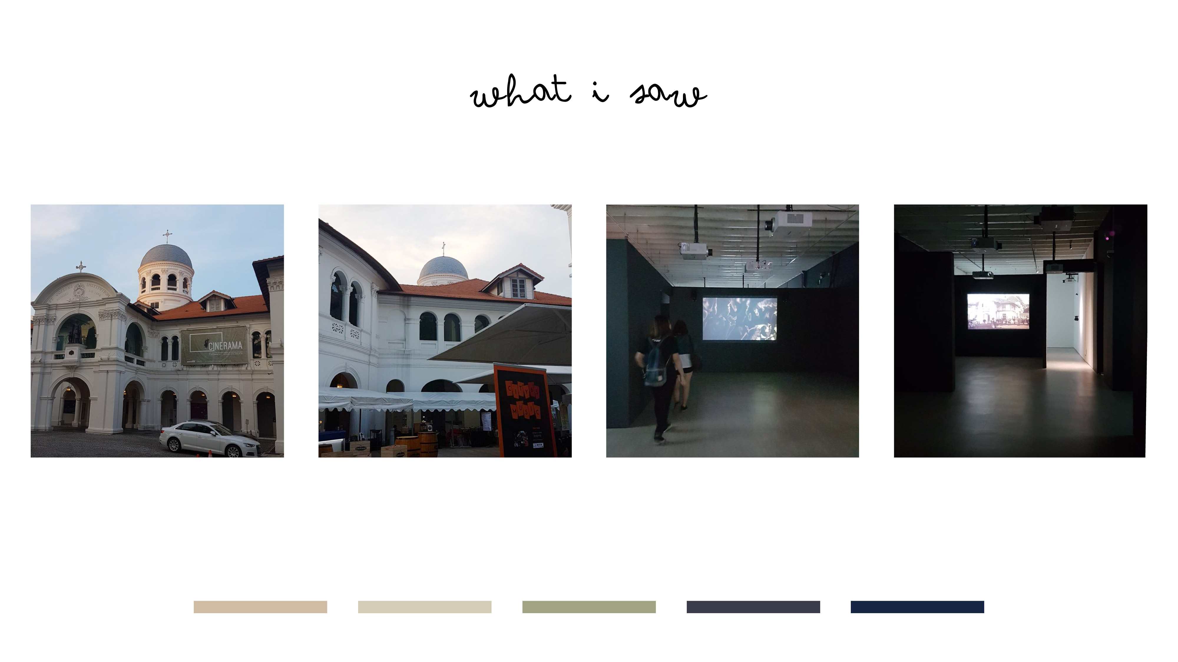
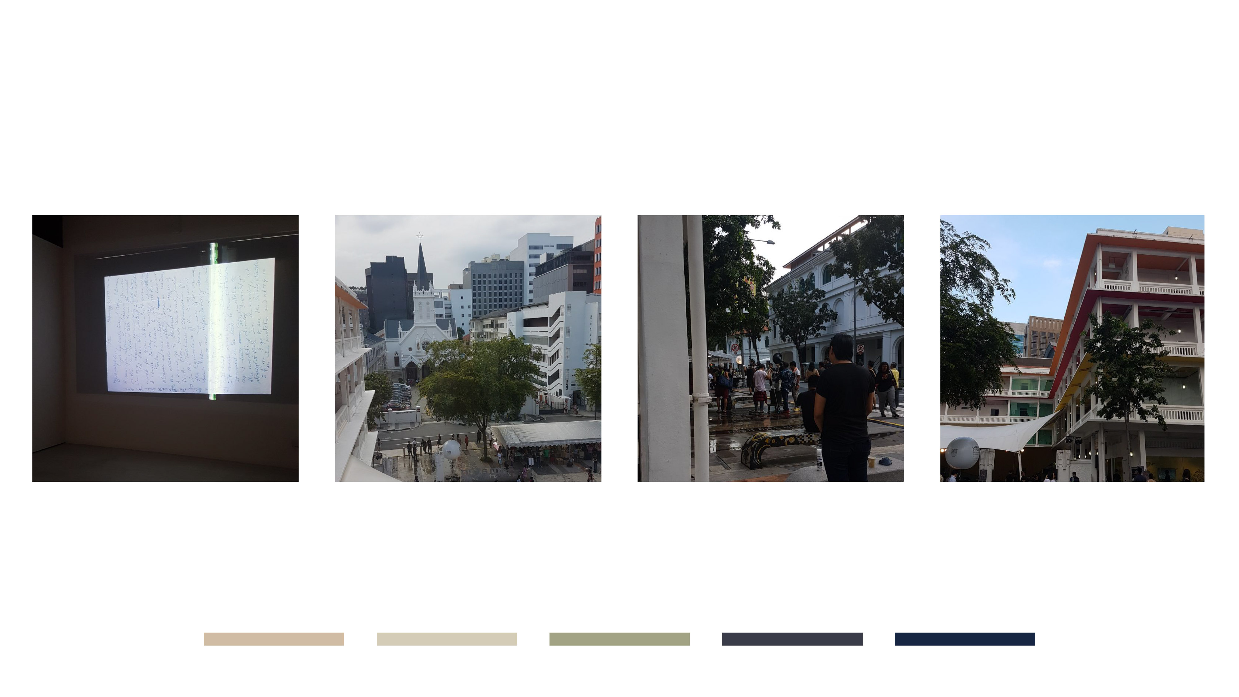
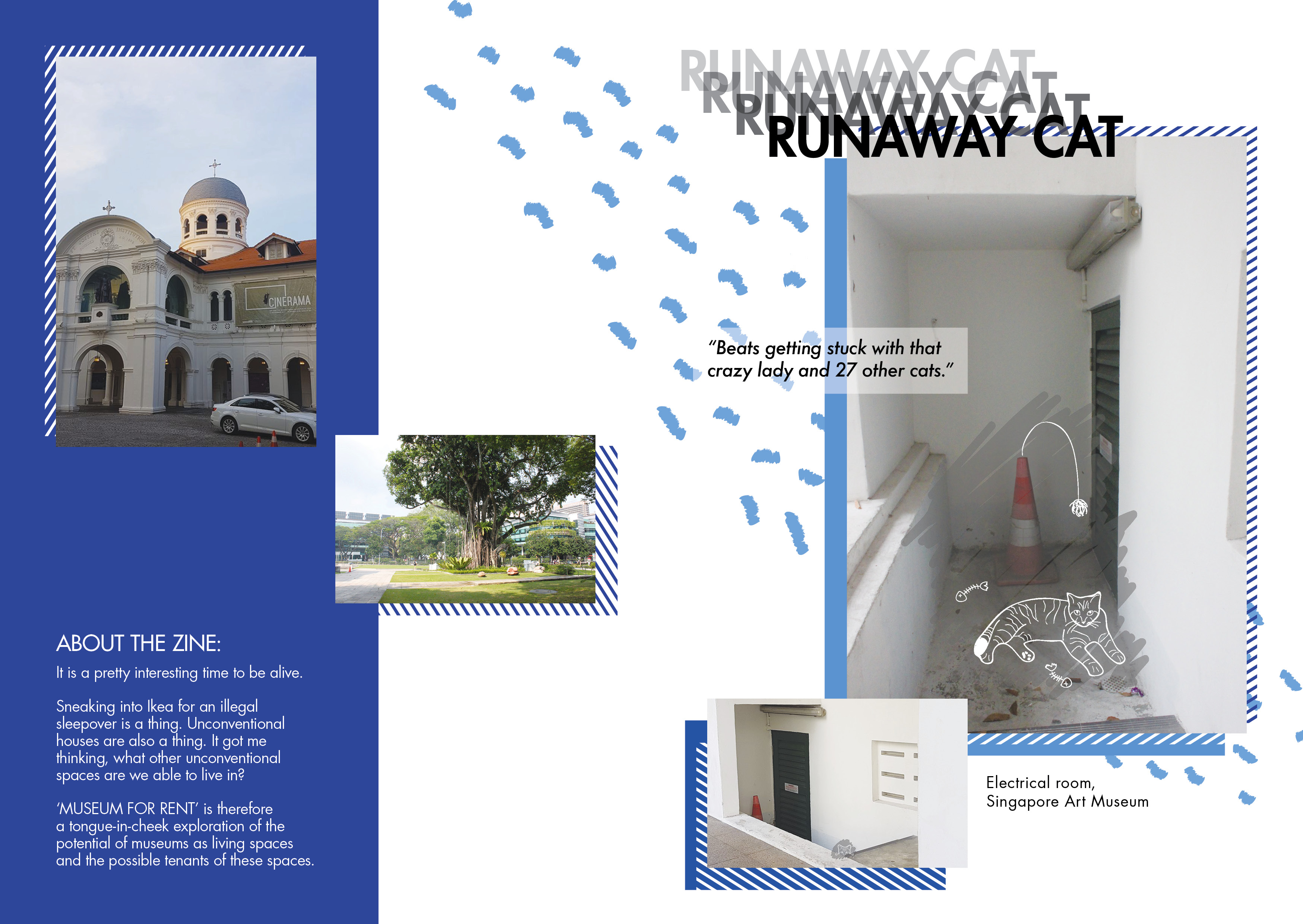
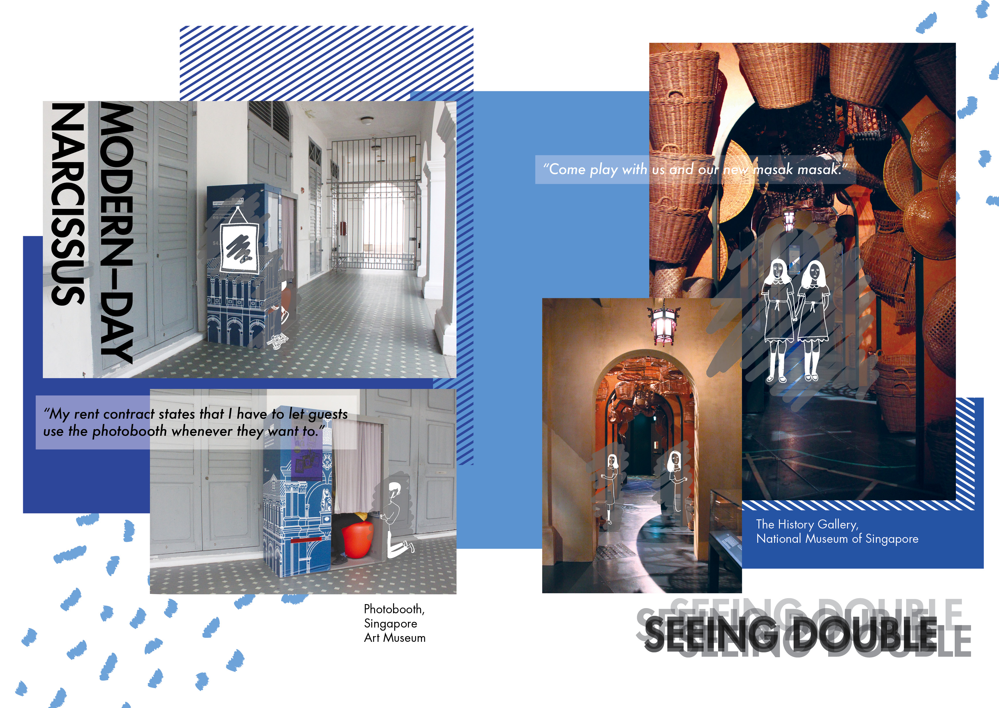
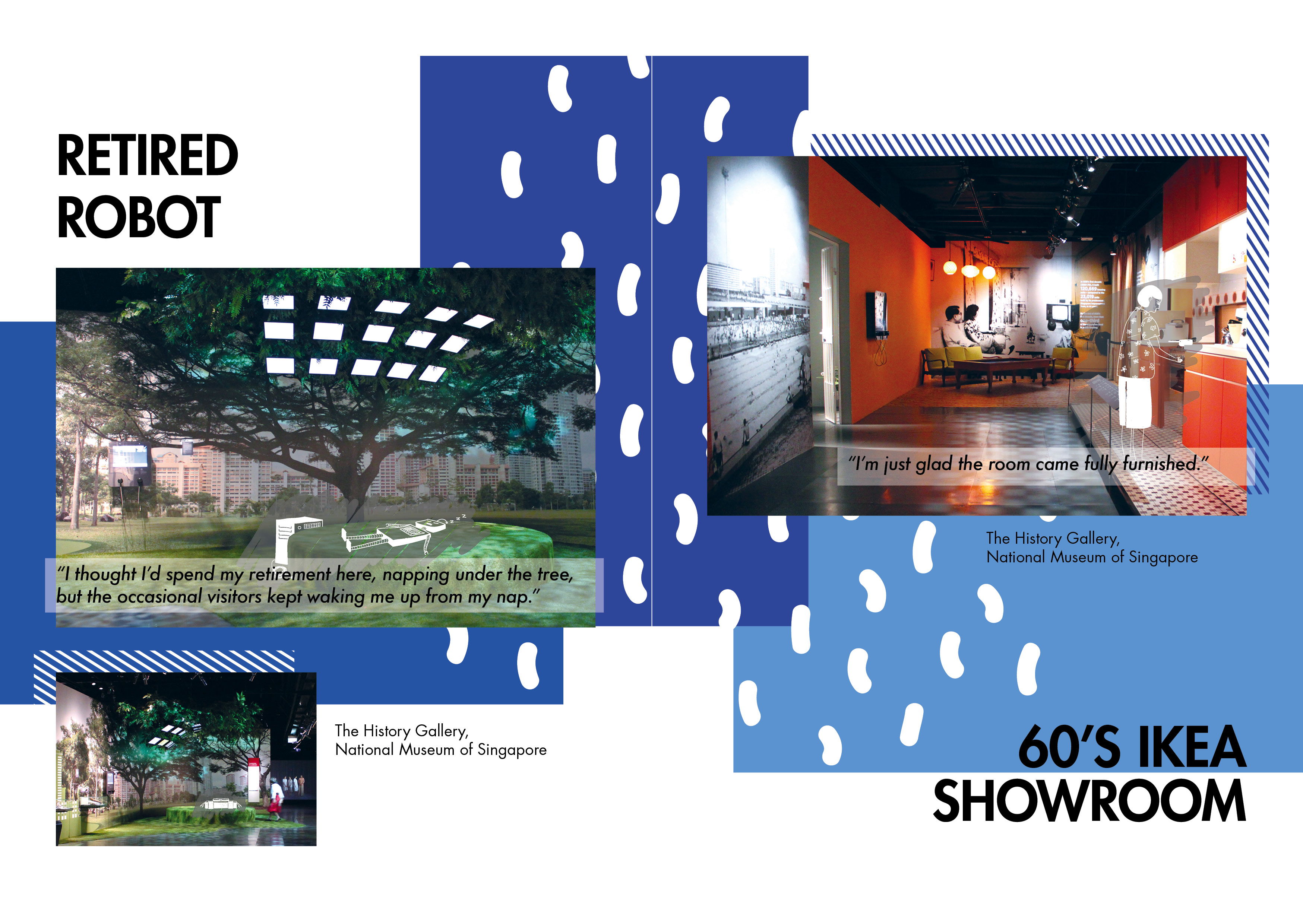
From my initial idea of a zine that would be a parody of property brochures, it became a zine about the potential tenants of museum spaces: who these characters were and how were they interacting with their living space or how their unique living situation affected their daily lives. Once this concept was settled, I had gone down to the museum with the intention of taking as many photos as I can so that I could go about bringing this concept to life. However, this was the weekend that I discovered that the Singapore Art Museum’s 8Q side was closed as well for the setting up of a new exhibition. This forced me to just wander around the outside of the two buildings, taking photos of random nooks and crannies. It started to feel weird after a while as I was taking photos of areas that no tourist (or any regular joe) would take. That session was a sad one (it also rained after a while so I was stuck at there with nothing to do and nowhere to go :’)) and the lack of photographs meant that there was not much content for me. This made me consider adding the National Museum of Singapore into the list, which led to another trip down to that area. The trip to the National Museum was not too bad but it was a lot more crowded than I thought it would be on a Wednesday afternoon. This also meant that I had to spend quite a bit of time waiting for people to move out of the exhibition space before I took the photos.
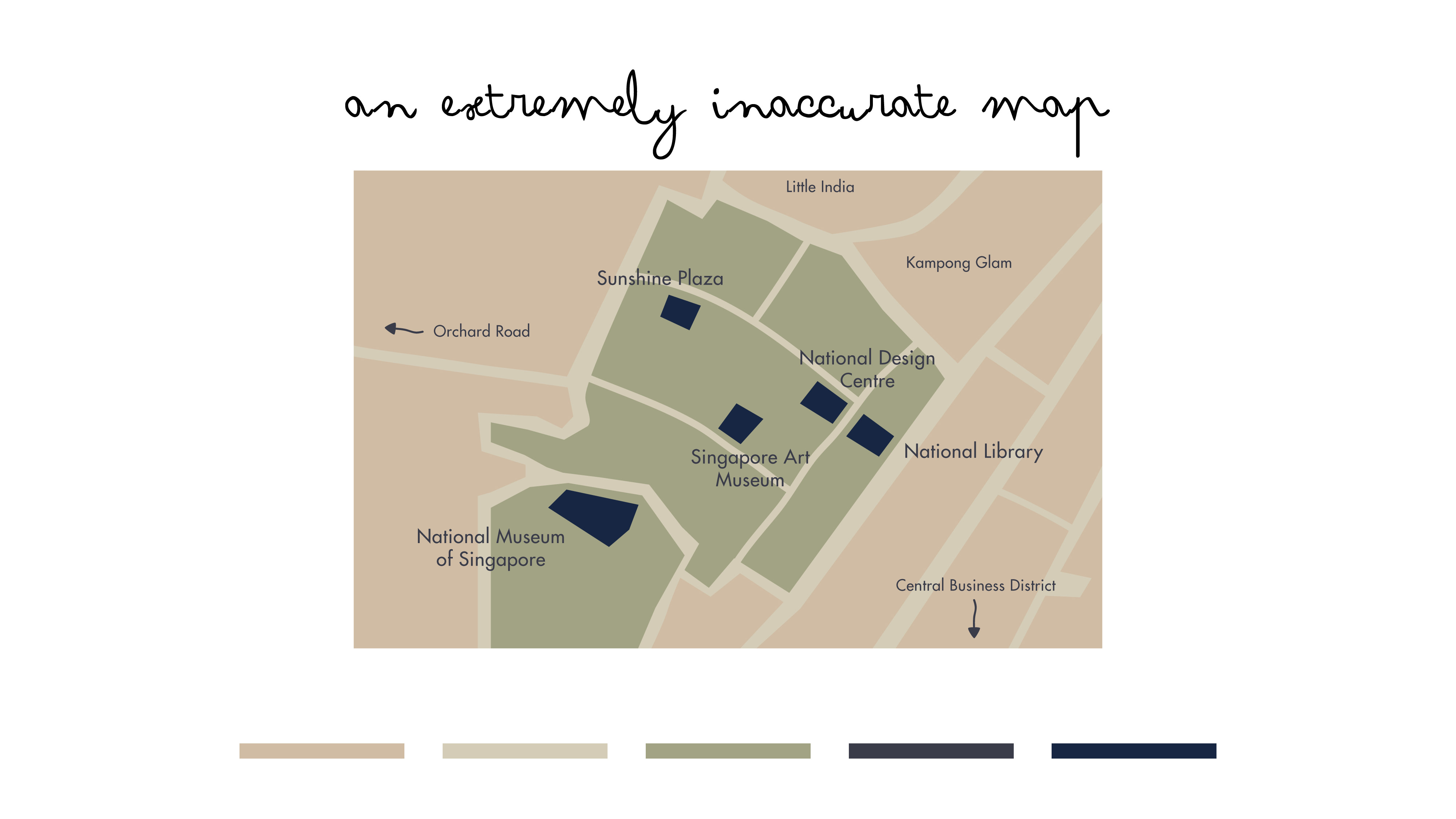
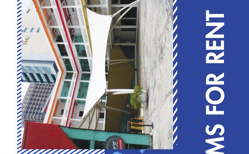
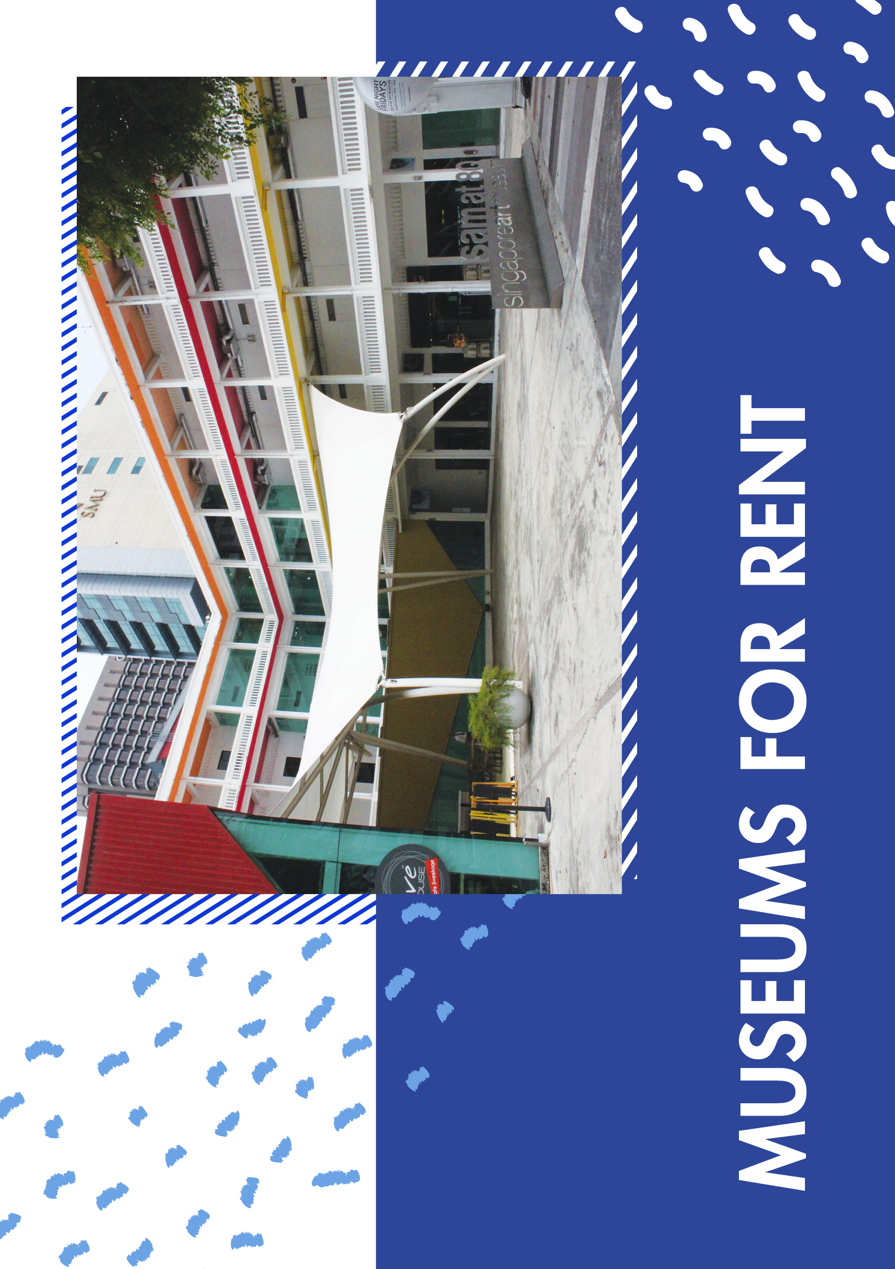
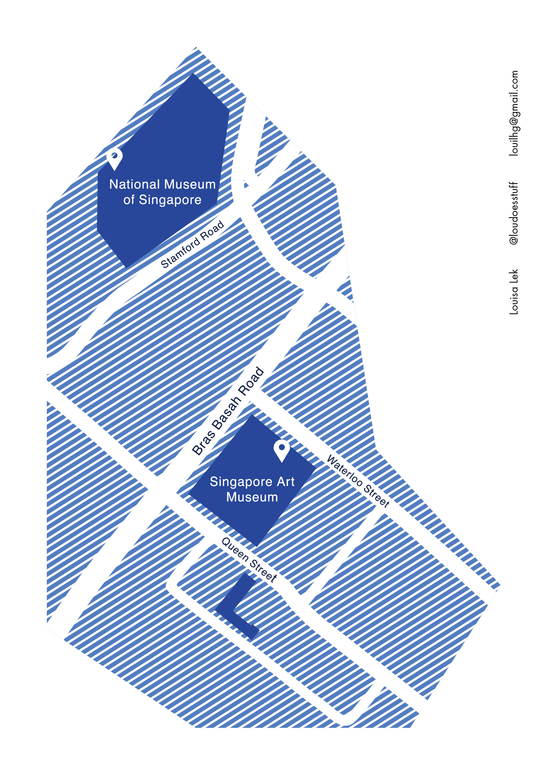
Once I had the photos, it was merely the about selecting the ones that I could generate content on. Strangely, a lot of the photos that I selected, in the end, came from the National Museum. The first page of the zine that I completed was the back cover. I knew I did not want to have a lot of text or details on the map itself so I went onto Pinterest and did a little researching where I managed to find the reference below. 
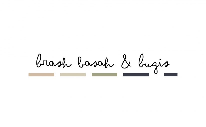
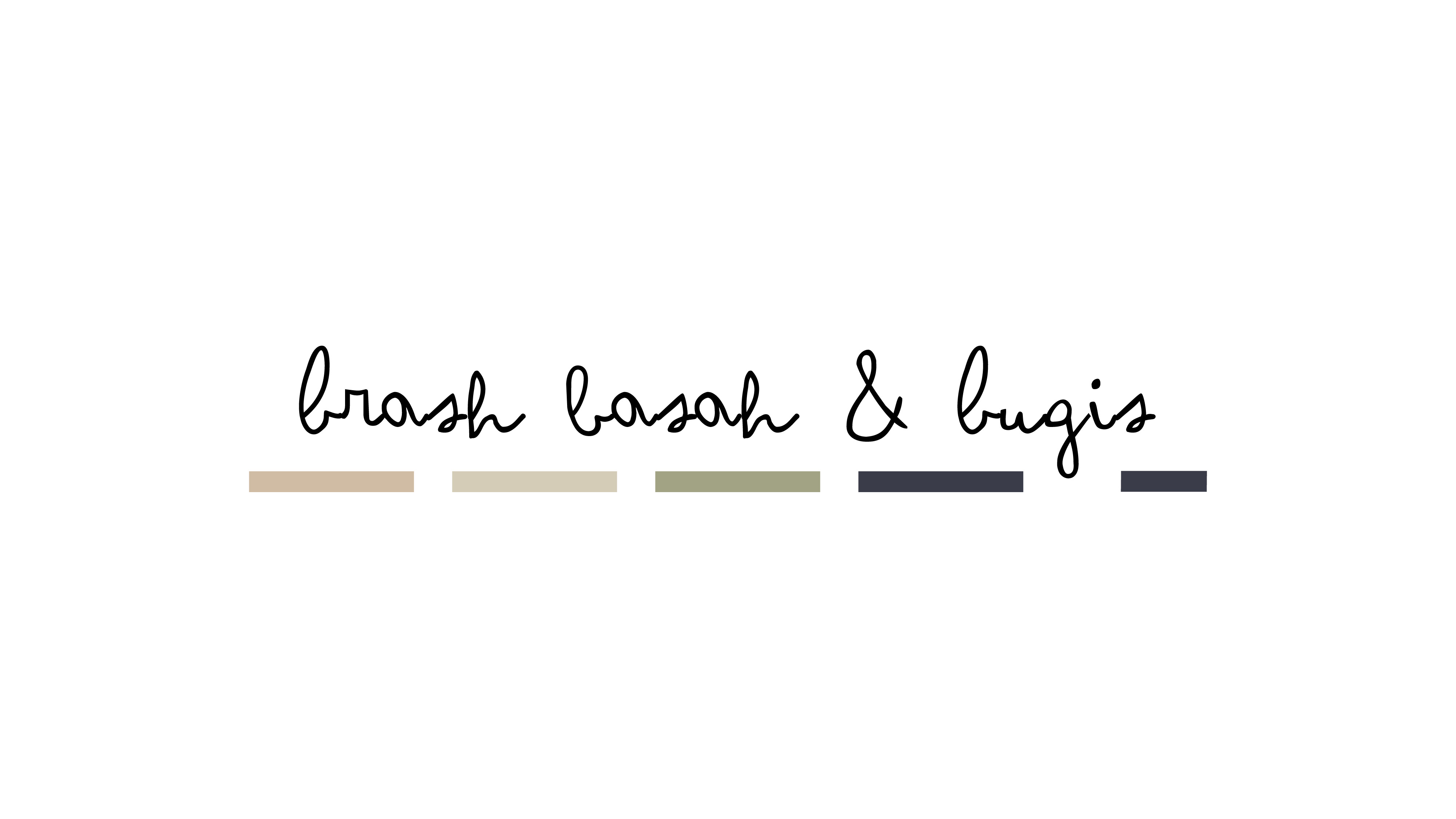
I liked how clean the whole map was yet the diagonal stripes added this element of fun to it. These diagonal stripes later became the design element that would be repeated throughout the entire zine.
![]() Shades of blue and white were adopted for the colour scheme as well as I wanted the general feel of the zine to be neutral, clean yet dynamic and fun. Honestly, the colour scheme does not add to the concept as it was based on the original concept of the zine being a parody of a property brochure and the colours went sort of inspired by the corporate colours of a property rental site called 99.co. However, after the concept was tweaked, I decided to still go with the same colour scheme as the colours coupled with the layout still worked for what I had in mind for the art direction of the zine.
Shades of blue and white were adopted for the colour scheme as well as I wanted the general feel of the zine to be neutral, clean yet dynamic and fun. Honestly, the colour scheme does not add to the concept as it was based on the original concept of the zine being a parody of a property brochure and the colours went sort of inspired by the corporate colours of a property rental site called 99.co. However, after the concept was tweaked, I decided to still go with the same colour scheme as the colours coupled with the layout still worked for what I had in mind for the art direction of the zine.
Initially, only the diagonal stripes were used as a sort of design element, duplicated across the spreads. However, after I reviewed the spreads once more, it felt too stiff and boring to just have straight lines and boxes. That was when I decided to adopt the usage of these little coloured blobs which can often be seen in Memphis Design style, as seen below. The blobs helped to make the design less rigid with its curves and random twists. The spreading of the coloured blobs diagonally also helped to further soften the effect of the straight lines and helped to make the design seem less rigid and more fun. 
Another aspect of the zine that gave me a bit of problem was the coming together of the photos and illustrations. For the photos, it was kind of hard to edit the photos to all have a similar feel as the photos are taken in different environments under different lighting conditions. While I was able to make the photos taken in the outdoors look somewhat more uniform, the photos that were taken indoors were a lot harder to edit, especially since the coloured lighting in each of the exhibitions were all different.
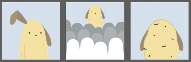
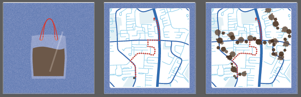
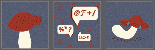
As for the illustrations, my initial plan was to do vector illustrations but that did not seem to fit in well with the photos. I tried to use the photo montage method as well (and actually used that method to help give Shirley an idea of what I was planning to add on to the photos…) but that turned out even worse. Meanwhile, I was reluctant to have to hand draw the illustrations as I knew drawing was my weakness and the most that I could manage was very simplified line drawings. Thankfully, things worked in my favour as this was the sort of style that fits in with what I had in mind for the general feel of the zine. Furthermore, the hand-drawn illustrations, with its incomplete irregular lines, help provide a contrast to the neatly arrange photos and and boxes and this made the design a little bit more interesting to look at.

The next challenge I faced after that was trying to make the illustrations visible in each of the photos. I decided to draw the illustrations in white as it was already part of the current colour scheme. Also, since most of the photos taken in the museum were quite dark, especially those that were taken indoors, I thought white would be a good choice of colour as it would be able to stand out from the dark background. This worked but only for some photos, as there were some photos that had areas of huge contrasts placed near each other and it made it hard for the illustration to fully stand out from the already very messy photos (well, some of them were quite messy). To “solve” that issue, I created these grey brushes strokes behind the illustrations to help the illustrations stand out from the photo background. The one last problem that I had was trying to fit the illustrations into the photos, in scale, while at the same time, trying to ensure that the illustrations were visible. Quite a few of the illustrations turned out to be too small. To counter this, I tried to resize the photos and zoom in. While it does allow for the illustration to be bigger and more noticeable, it takes away some of the details that I thought were important to keep, in the photos. I guess in future projects, one way to try to counter this would be to plan what I wanted to illustrate first before heading down to the place to plan the shots, then finally take the photos (as opposed to going down to the place, taking all my random photos then going back to panic and spending a lot more time working on the illustrations then I should have).
Lastly, I would like to talk about my choice of type. The typeface that was used in the zine is Futura Standard, a rather clean-cut sans-serif font. It was the favourite of my mentor, back at the creative agency that I had worked at during my gap year. In some ways, I guess she influenced me a lot (or maybe it was just drilled into me through my everyday interaction with her for a good 6 months) because, after the internship, I realised that her favourite fonts to use became mine as well. The default typeface I usually fall back on now is Avenir, Futura, Gotham or even Univers (if I really have to). While there is probably nothing wrong with using Futura for this particular project, I feel like I could have been slightly more adventurous in terms of the typefaces I could have used for the headlines. Another thing I have noted is that I need to take into consideration how big the words would look when printed out. In Microsoft Words, the standard setting would be font size 12. However, when printed out, it seemed almost a little too big and could perhaps, been a little bit smaller.
General Reflection:
While I was initially looking forward to this particular project, the many hiccups along the way made me dread working on it and at the end of the day, while I am happy about certain aspects of the zine, I would say that this is actually a very poorly done work and there is room for a lot of improvement. The concept is weak and the layout and usage of colour did not add nor link back to the concept at all. While I was glad I had forced myself to illustrate despite my poor drawing skills, the conceptual part of the project leaves much to be desired while the execution portion could have been a lot more adventurous. All in all, this is probably not a project that I would be proud of but I am glad I had gone through so much trying to accomplish this project. While my grades might drop this semester due to my (overall) dismal performance, I am just glad that I have survived 1 full year in university. Once again, thank you Shirley for your guidance this semester. It’s been fun learning under you again and I hope to see you around in school. Cheers!