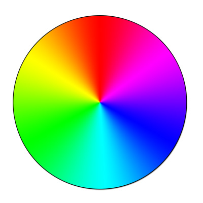
Colour is British, Color is American, but their meaning is universal.
Colour is important because it adds meaning to a design.
Colour carries emotional resonance with it- in that, when we see a colour, we have an emotional response towards that colour. Blue can be sad, calm, and confident while yellow is happy, light, and cautionary. We naturally associate colours with emotions because it is hard to put words to what we are feeling.
Colours connect to our feelings in a unique and memorable way, which make them a powerful marketing tool. Colour is helpful in communicating your message because it draws attention, sets the tone of the message, and guides the eye where it needs to go. It presents a sense of direction and recognition that people can identify and relate to.
Colour is a form of non verbal communication. It is not a static energy and its meaning can change from one day to the next with any individual – it all depends on what energy they are expressing at that point in time.

PRIMARY COLOURS
RED
Positive keywords include: action, energy and speed, attention-getting, assertive and confident, energizing, stimulating, exciting, powerful, passionate, stimulating and driven, courageous and strong, spontaneous and determined.
Negative keywords include: aggressive and domineering, over-bearing, tiring, angry and quick-tempered, ruthless, fearful and intolerant, rebellious and obstinate, resentful, violent and brutal.
Effects of Red:
Stimulating: to the physical senses- the sexual and physical appetite. It stimulates the deeper passions within us, such as sex, love, courage, hatred or revenge. If you have a flagging sex life and would like to introduce more passion into it, introduce some red into the bedroom – the more red, the more passion, but don’t overdo it or it will have the opposite effect.
Exciting and Motivating: it excites our emotions and inspires us to take action.
Attention-getting: it demands you to take notice, alerting you to danger. This is why we have red traffic lights and stop signs – it is the universal colour for danger.
Assertive and Aggressive: drivers of red cars should take note! A small survey I did a few years ago showed that drivers of red cars, including females, said they felt quite aggressive behind the wheel of their red car.
GREEN
Positive keywords include: growth and vitality, renewal and restoration, self-reliance, reliability and dependability, being tactful, emotionally balanced and calm, nature lover and family oriented, practical and down to earth, sympathetic, compassionate and nurturing, generous, kind and loyal with a high moral sense, adaptable, encourages ‘social joining’ of clubs and other groups, a need to belong.
Negative keywords include: being possessive and materialistic, indifferent and over-cautious, envious, selfish, greedy and miserly, devious with money, inconsiderate, inexperienced, a hypochondriac and a do-gooder.
Effects of Green:
Rejuvenating: The colour green revitalizes us when we are physically, mentally or emotionally exhausted.
Nurturing: Because of its link with the heart, green urges us to nurture others. Green is also nurturing to us – another reason why it is the most predominant colour on earth.
Dependable, agreeable and diplomatic: The colour green helps us to see situations clearly from all sides.
Possessiveness: Green is a colour that encourages us to want to own things and people, to collect and possess. Green encourages materialism.
Envy: Green with envy’ is a common phrase and a negative reaction to the colour green.
BLUE
Positive keywords include: loyalty, trust and integrity, tactful, reliability and responsibility, conservatism and perseverance, caring and concern, idealistic and orderly, authority, devotion and contemplation, peaceful and calm.
Negative keywords include: being rigid, deceitful and spiteful, depressed and sad, too passive, self-righteous, superstitious and emotionally unstable, too conservative and old-fashioned, predictable and weak, unforgiving, aloof and frigid. It can also indicate manipulation, unfaithfulness and being untrustworthy.
Effects of Blue
Conservative: The colour blue is a safe colour – the most universally liked colour of all.
Predictable: Blue is not impulsive or spontaneous and it doesn’t like to be rushed – blue needs to analyse and think things through, and to work to a plan.
Orderly: Blue needs to have direction & order- untidiness and unpredictability overwhelms it.
Rigid: Blue likes familiarity. It doesn’t like change and will stubbornly do things its own way, even if there is a better way.
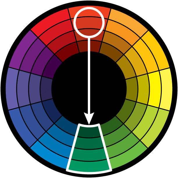
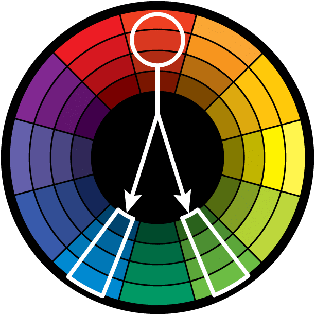
SECONDARY COLOURS
YELLOW
Positive keywords include: optimism, cheerfulness, enthusiasm, fun, good-humored, confidence, originality, creativity, challenging, academic and analytical, wisdom and logic.
Negative keywords include: being critical and judgmental, being overly analytical, being impatient and impulsive, being egotistical, pessimistic, an inferiority complex, spiteful, cowardly, deceitful, non-emotional and lacking compassion.
Effects of Yellow:
Creative: The color of new ideas, yellow helps us find new ways of doing things.
Quick decisions: Yellow helps with clear thinking and quick decision-making but it can also be impulsive.
Anxiety producing: Yellow is fast moving so too much time in its presence can agitate and lead to nervousness and emotional instability.
Critical: Yellow makes people more mentally analytical and self critical of both themselves and others.
Non-emotional: Yellow relates to the head not the heart.
MAGENTA
Positive keywords include: universal harmony and love, emotional balance, helps our spirit soar, spiritual yet practical, encourages common sense, loving, compassionate, supportive and kind, imaginative, innovative, creative and artistic, non-conformist, negotiator.
Negative keywords include: impulsive, domineering, impatient, intolerant, avoids challenges, too relaxing, feeling disconnected to others, can be bossy and demanding.
Effects of Magenta:
Emotional Balance: spiritual yet practical, it helps to create emotional, physical and spiritual balance.
Compassion: gentle and caring in its approach, it generates acceptance, tolerance, support and patience.
Inspiration: inspires cheerfulness and optimism, creativity and innovation, dream activity, positive change and negotiating skills.
CYAN
Positive keywords include communication, clarity of thought, balance and harmony, idealism, calmness, creativity, compassion, healing and self-sufficiency.
Negative keywords include boastfulness, secrecy, unreliability and reticence, fence-sitting, aloofness, deception and off-handedness.
Effects of Cyan:
Clarity of Thought: It enhances the ability to focus and concentrate, assisting with clear thinking and decision-making, and the development of good organizational skills.
Calming: It is calming yet invigorating, restoring depleted energies.
Non-emotional: A negative effect of turquoise is that it can cause people to be too aloof and to hide their emotional reactions.
TERTIARY COLOURS AND BEYOND
ORANGE
Positive keywords include: sociable, optimistic, enthusiastic, cheerful, self-confident, independent, flamboyant, extroverted and uninhibited, adventurous, the risk-taker, creative flair, warm-hearted, agreeable and informal.
Negative keywords include: superficial and insincere, dependent, over-bearing, self-indulgent, the exhibitionist, pessimistic, inexpensive, unsociable, and overly proud.
Effects of Orange
Enthusiasm: Orange is optimistic and extroverted – the color of the uninhibited.
Rejuvenation: Orange helps to restore balance to our physical energies.
Stimulation: Orange is not as passionate or as excitable as red, but it is stimulating, particularly to the appetite – the worst color to have in the kitchen if you want to lose weight.
Courage: Orange helps us to take account of our lives, to face the consequences, to take action and make appropriate changes, and then to move onward and upward.
Vitality: Orange has a more balanced energy than red, not as passionate and aggressive, but full of vitality.
PURPLE
Positive keywords include: unusual and individual, creative and inventive, psychic and intuitive, humanitarian, selfless and unlimited, mystery, fantasy and the future.
Negative keywords include:immaturity, being impractical, cynical and aloof, pompous and arrogant, fraudulent and corrupt, delusions of grandeur and the social climber.
Effects of Purple/Violet:
Empathy: Compassion, kindness and a love of humanity are positive qualities of Violet.
Controlled emotion: Violet is passionate, like red, but inclined to display it in private only.
Respectable & distinguished: The darker shades of violet particularly are linked to the origins of purple where it was only available to royalty and the wealthy.
Impractical: Violet can be impractical, with its head in the clouds rather than having its feet on the ground. It tends to see life as it imagines it, rather than how it is.
Immature: Violet can be immature, encouraging fantasy and an idealism that is often difficult to achieve in real life.
Dignity: Violet exudes a quiet modest form of dignity which is often appealing to others.
Cynical: This is a negative side of violet.
INDIGO
Positive keywords include integrity and sincerity, structure and regulations, highly responsible, idealism, obedience, highly intuitive, practical visionary, faithful, devotion to the truth and selflessness.
Negative keywords include being fanatical, judgmental, impractical, intolerant and inconsiderate, depressed, fearful, self-righteous, a conformist, addictive, bigoted and avoiding conflict.
Effects of The Color Indigo:
Introspection: promotes deep concentration during times of introspection and meditation – can lead to feelings of being spaced out.
Idealistic: an ability to plan for the future.
Addiction: can support an addictive personality into maintaining their addictions – don’t use it if you are trying to overcome an addiction – it is associated with the religious fanatic – the colour of the workaholic who thinks they are indispensable – can also be related to those who are addicted to getting qualifications.
The Dramatist: relates to the acting profession – can cause people to ‘make a mountain out of a molehill’.
Conformity: a love of ritual – conformity to the things that have worked in the past, not just for the sake of conforming.
PINK
Positive keywords include: unconditional and romantic love, compassion and understanding, nurturing, romance, warmth, hope, calming, sweetness, naiveté, feminine and intuitive energy.
Negative keywords include: being physically weak, over-emotional and over-cautious, having emotional neediness or unrealistic expectations, being naive, immature and girlish, lack of will power and lack of self worth.
Effects of the Color Pink:
Calming: Pink calms our emotional energies.
Non-threatening: Pink lacks any aggression or anger, although the deeper pinks can be more assertive and confident.
Affectionate: Pink offers warmth and tenderness to friends and family.
Caring: Sensitivity and tender loving care relate to pink’s feminine and intuitive energies.
Immature: Pink is the color of the sweet young girl, before life’s experiences take over.
BROWN
Positive keywords include: down-to-earth, wholesome, practical, approachable, friendly, stable, structured, supportive, comforting, reliable, protective, strength, quietly confident, sensual, sensitive, warm, reassured, honest, sincere, quality.
Negative keywords include: dull, boring, frugal, materialistic, lack of humour, lack of sophistication, predictable, cheap and stingy.
Effects of Brown:
Comforting: Sensual and warm, friendly and approachable, brown engulfs one in a feeling of calm and safety
Protective: creates a safe haven of support for family and friends
Materialistic: it encourages material security and the accumulation of possessions
GREY
Positive keywords include: reliable, conservative, dignified, neutral, impartial, professional, mature, intelligent, classic, solid, stable, calming, subdued, reserved, elegant, formal and dependable.
Negative keywords include:indecisive, non-emotional, indifferent, boring, sad, depressed, lifeless, lonely, isolated
Effects of Grey:
Indecision: Grey prefers to sit in the middle, not making a decision either way, sitting on the fence.
Detached: being non-emotional, grey can appear indifferent, uncaring, cold and aloof.
Depression: grey can stifle and depress energy but it is also the stable base from which the new and positive can come.
Unemotional: grey can appear neutral, disinterested, objective or impartial.
SILVER
Positive keywords include: illumination, reflection, feminine power, balancing, calming, soothing, dignity, glamour, self control, responsibility, organization, insight, wisdom, modern, sleek, hi-tech and scientific.
Negative keywords include:dull, melancholy, lonely, lifeless and colorless, rigid, negative, neutral, indecisive, insincere, deceptive.
Effects of Silver:
Calming and soothing: its gentle and comforting qualities relate to the sensitivity of the moon’s cycle of ebb and flow.
Lifeless: the colourless energy of silver can lead to negative feelings of coldness, indecision and being non-committal.
Dignified and responsible: silver is respectable and courteous, mature and determined, wise and organised.
GOLD
Positive keywords include: Success, abundance, wealth, understanding, self-worth, wisdom, compassion, love, passion, charisma, winning, optimistic, positive, and masculine.
Negative keywords: Fear of success, fear of wealth, self-centred, demanding, mean spirited, lack of trust, falseness.
Effects of Gold:
Enlightenment: gold, at its highest level, inspires knowledge, spirituality and a deep understanding of the self and the soul.
Compassion: caring, loving, generous and giving, gold is the benefactor or patron.
Generosity: gold loves to share its wisdom, knowledge and wealth with others.
WHITE (hahaha)
Positive keywords include: innocence, purity, cleanliness, equality, complete and whole, simplicity, immaculate and neat, self-sufficient, pristine and open, new beginnings.
Negative keywords include: sterile, stark, fastidious, empty, isolated, cautious, plain, distant, unimaginative, critical and boring.
Effects of White:
Impartial: White suggests fairness and neutrality because of the balance and equality of all the colors contained within it.
Rescuer: White rescues us from the dark. It is the white knight, rescuing the damsel in distress.
Futuristic: Symbolizing a clean slate, we can envisage anything with white.
Efficient: White is clean and clinical, giving an impression of efficiency and organization.
BLACK
Positive keywords include protection and comfort, strong, contained, formal, sophisticated, seductive, mysterious, endings & beginnings.
Negative keywords include aloof, depressing and pessimistic, secretive and withholding, conservative and serious, power & control, sadness and negativity.
Effects of Black:
Formal, dignified and sophisticated: As in the little black dress and the formal dinner suit.
Aloof: Black sets itself aside from others with its heavy and intense energy. It keeps others at arm’s length.
Depressing: Black can close us to the positive aspects of life, forcing us to look at our disappointments and the black or negative aspects of our life. It can create a fear of the future.
Pessimistic: Too much black encourages us to look at the negative side of life.
Colour is a complex subject with many strands and it has the power to subliminally convey values and stories.
By stopping to consider what each colour represents and is linked to in the ‘real world’ we can make informed design decisions that ensure we appeal to our target audience.


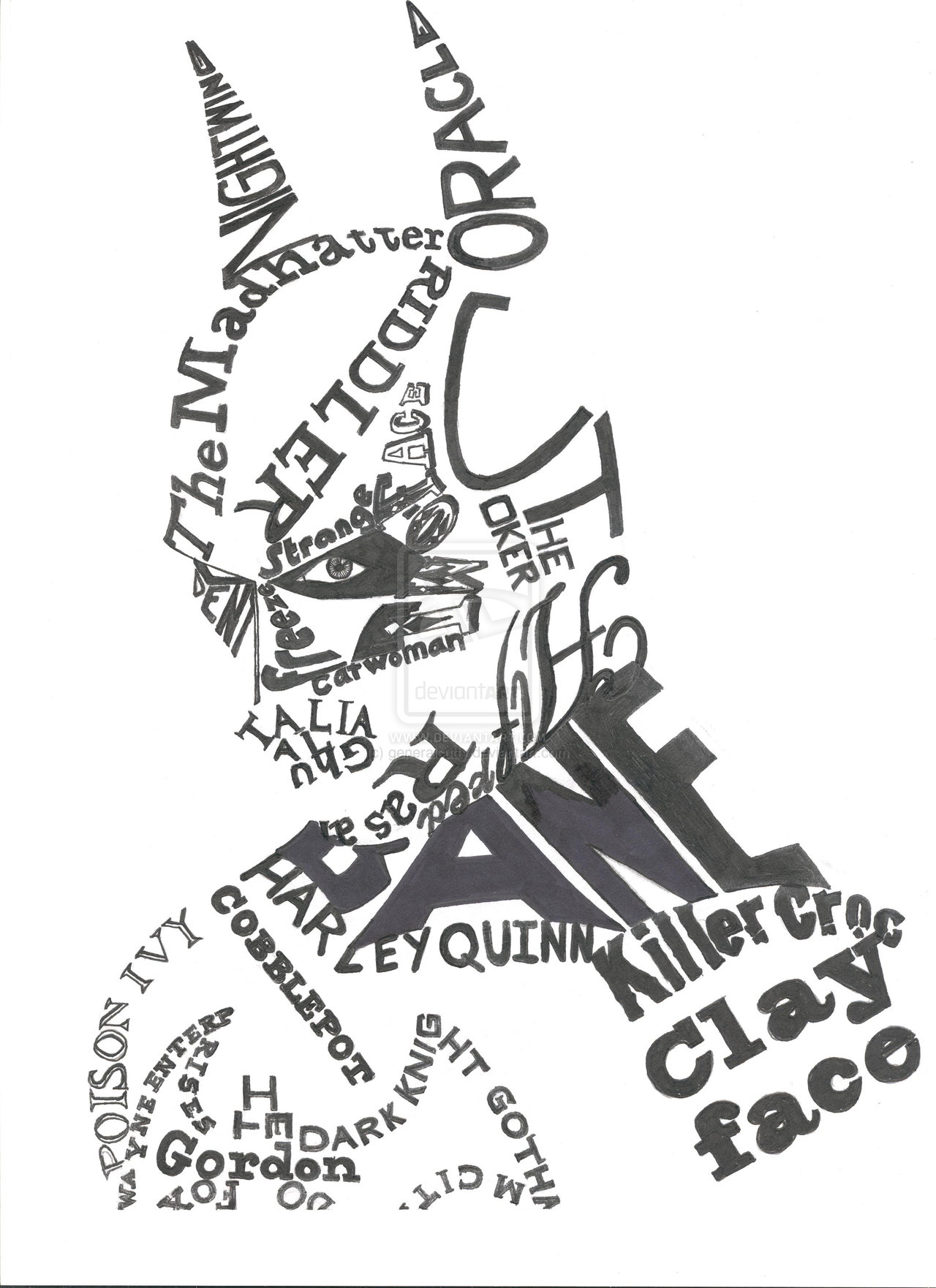


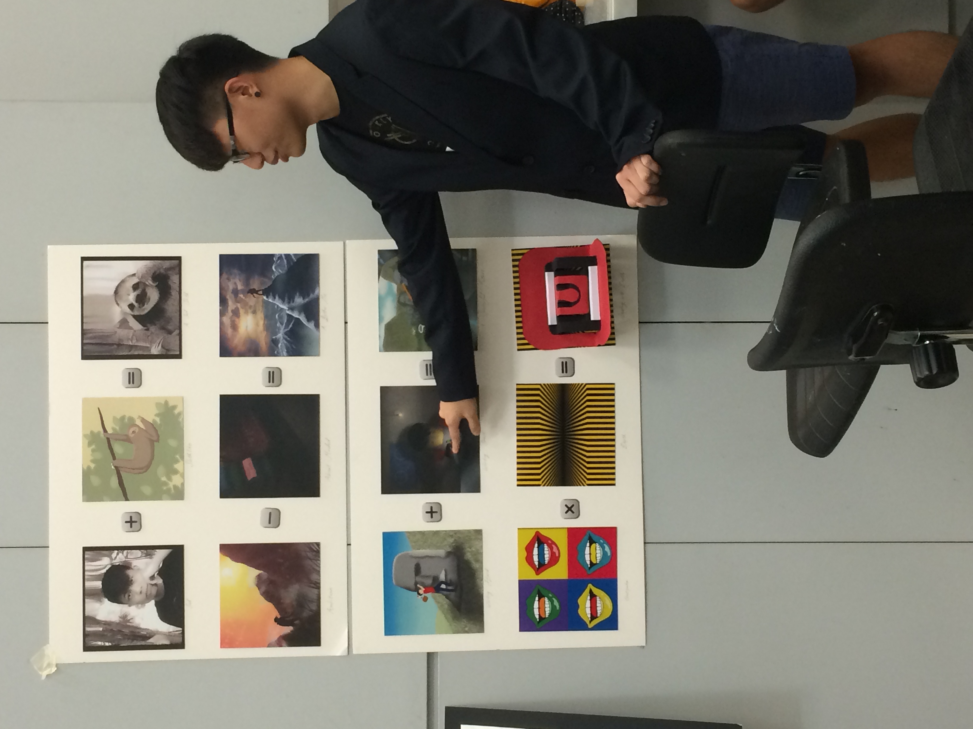
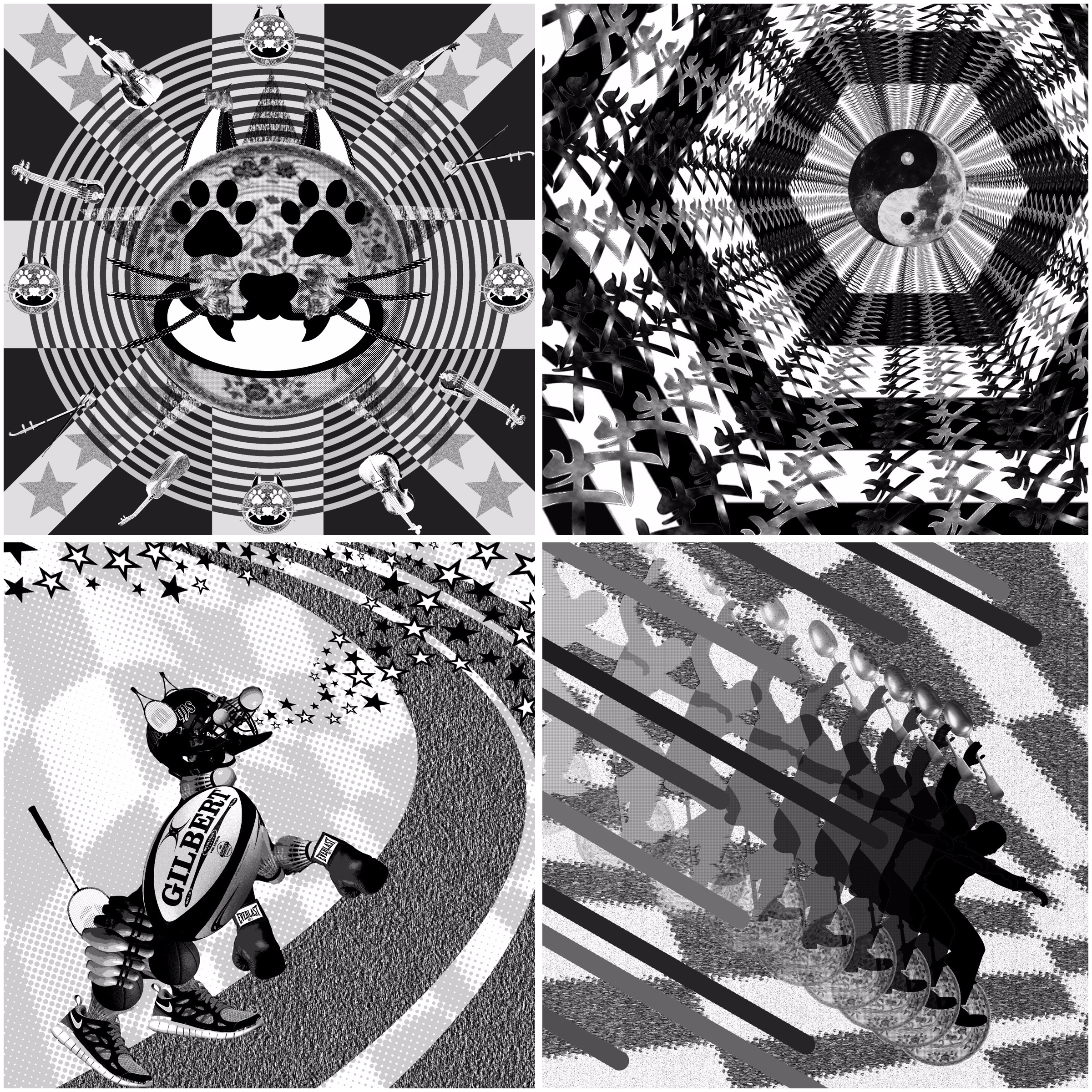
 Another pen drawn scan.
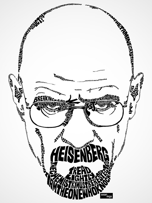