Project 1 (Que Sera, Sera) – Research, Process & Final (3 in 1)
So to start this assignment off, I did as much mind mapping and brainstorming as possible. At first I thought this assignment might not be as difficult as the one’s before, but nooooooooo, wrong.
But before that, below are the final outcomes,
CLICK TO ENLARGE:


Research/Brainstorming:

My initial ideas for jobs that I wanted were those I had thought of when i was a child (the highlighted ones are the ones I initially selected):
1. Pilot or Fighter pilot (the army kind)
2. Gymnast (did it when i was younger)
3. Army personnel (cos cool mah)
4. Circus (always dreamed of those stories where people run to the circus)
5. Detective (cos of the Hardy Boys detective books i read when younger)
6. Batman (cos he’s just batman)
7. Tour guide (cos they get to travel)

So initially, the above 4 were my chosen jobs, but I later changed the Gymnast and Tour Guide because I wasn’t really happy with the concept hehehe.
I’ll explain further beloww.

So I wanted to be a tour guide, but no matter how much I tried to brainstorm or draw/sketch out, I just couldn’t really come up with something that I felt would work. I had ideas where the alphabets would be luggages or with the tour guide flag, but they all seemed kind of mehh, without a spark, so I decided to move on.
Furthermore, being a tourguide, there aren’t really that many things that represents them. So on to easier jobs with easier representations.

I spent a lot of time on pinterest and google and youtube, trying to get inspiration. It really is never easy to get inspiration just like that.
1. Batman process & Final
jengJengJENGGGGGG BATMAN!!
Always wanted to be Batman as a kid, because even though he has absolutely no power, and can seem quite useless compared to Superman, he’s still the coolest and dark super hero ever! And also because there was so many cartoons on batman to watch while growing up. heheh.

So the above was my initial thumbnail sketch for Batman, which of course was a big no, because it wasn’t answering the question of dressing up the name. And also, this thumbnail didn’t really give any perspective.

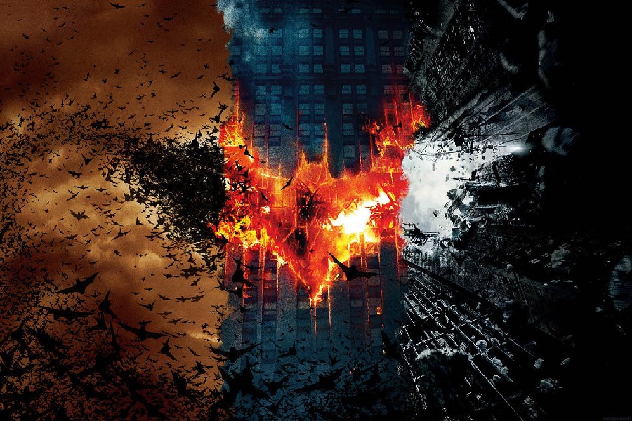
I did as much research as possible, to see if anyone’s done anything about typography and dressing them up, and I found the above image, which I thought was DAMN NICE LUH!! BUTTTTT now i cant use the same idea, because it’ll be too similar. So I scrapped that concept, also cause i saw something else that I really wanted to adapt and try.
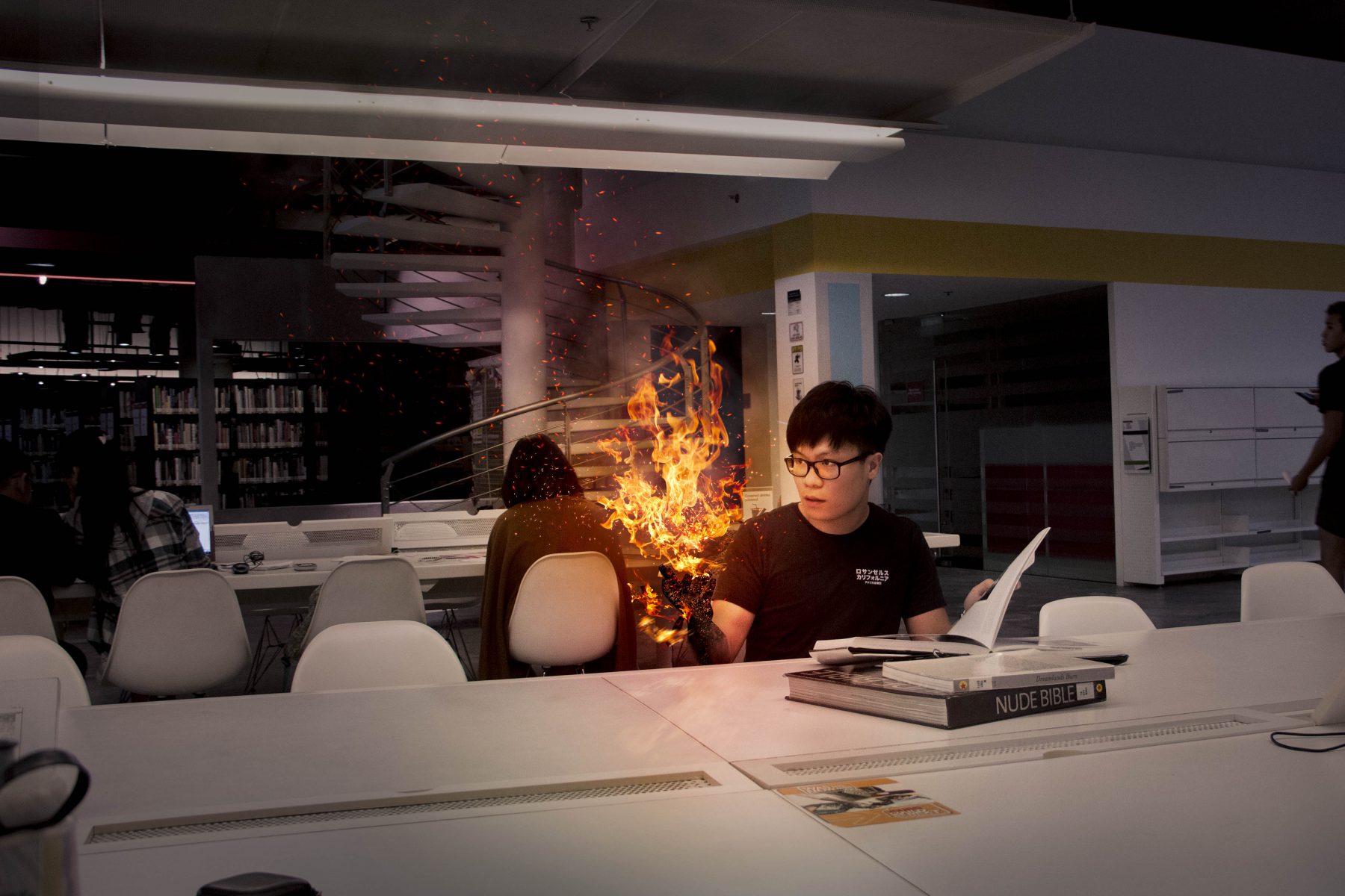
Sooooo I really wanted to try to use bats to dress my letters up. There’s always this scene where batman kind of materialises from a bunch of bats like POOF! I wanted to create that same kind of effect but this time with my name. And so off I went..

I found lots of tutorials on youtube that helped me a bunch to come up with what I had envisioned. For example, the background above was something I learned from Youtube using photoshop. I wanted to re-create like a burning cloudy/rainy kind of sky. I also wanted to try and make my initials be in a shape like a bat, hence the M has “ears” and all. Trying uh.
I just keep learning so many things about photoshop man! PHOTOSHOP IS AMAZING!!

My concept seemed to work above!! YAYY!! Just needed to make some edits.
 FINAL BATMAN concept:
- So this design may be a rather direct approach cause the bats literally make up my initials (but that answers the question i guess!! heheh). The only thing I’m worried and tried to re-work on earlier is that there might be too much stuff going on here, such that the initials don’t seem to be too obvious, or that the initials are a bit too warped. Although after editing a bit, I’m quite satisfied that it is adequately visible hehehe.
- Playing around with the bat shaped figures was fun also. Trying to shape that with the brush tool was cool too!
- Learned to play around with the zoom effect on photoshop for this job. OH OH AND THE CLOUDS EFFECT!! Super cool! This assignment really did force me to learn new things. But so much more to learn!!
2. Mechanical Engineer process and Final
Putting things together and fixing things is something I always looked up to my dad in terms of being the dandy man of the house. So its something I wanted to become. To be as proficient and efficient in things like fixing things in the house.

In my research I found many similar ideas to mine, BUTT the difference was that thesse were all pretty much in 2D, and what i wanted to try this time round was 3D!!
So i went about thinking what elements or icons would a mechanical engineer do or use:
1. Bolts and nuts
2. Screws
3. Gears
4. Springs
5. Pumps
6. Wires
So I incorporated the above elements in to the letters (JER) to symbolise and dress up my name to look like a mechanical engineer.
So during consultation with my classmates, there were a few things that I took note and applied to this particular job:
- Perspective
- Kill the baseline and create depth
- Less is more (don’t obstruct the message of the design)
- The design may not necessarily be accurate (just don’t overdo it)
FINAL Mechanical Engineer concept: 
- I’ve tried to incorporate all the elements to make it look like its being worked on and to make it look mechanical. Dressing the letters up with things that a Mechanical Engineer would work on in his lab or in his workshop. It also kind of looks to me like this is an unfinished piece by the mechanical engineer. Its like he’s still touching up on it.
- The background I gave it a reflective surface feel, but a dull grey colour, to give it a professional workshop feel. I also tried adding yellow and slight tints of blue at the corners to give the entire design a more workshop feels with yellow light and all that. I’ve always imagined those kind of colours in such a workshop.
- So this is pretty much the first 3D typography thing i’ve ever done, and I’m glad I had a go at it, because as mentioned earlier, PHOTOSHOP IS AWESOME! Learned yet again so much from this job and assignment.
- THAT BEING SAID, PHOTOSHOP IS NOT A 3D SOFTWARE… haisss.. Now i really want to go learn how to use a proper 3d software. This is too cool.
3. Fighter Pilot process and Final

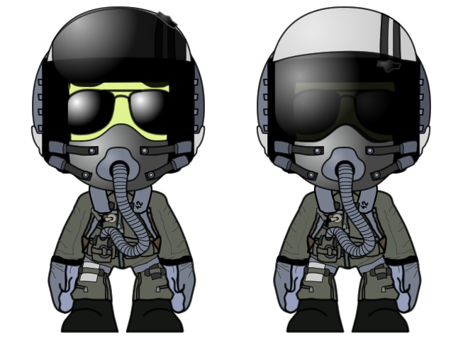
So my initial idea for being a pilot was to dress my letters up in the airforce gear and helmets etc (like the above), but that was a bit mehh to me, not so interesting.

The next idea i had was of combining many planes or the elements of being a fighter pilot / pilot into my alphabets, somewhat like the above.
That would’ve been cool actually.


BUT I was also inspired by NDP’s jets, making patterns and performing the stunts in the air.
So all that being said, after doing a lot of research, i decided to go with the woosh woosh idea of the clouds (below).
So I created a very dreamy kind of fighter jet that just reminded me of how I’d always thought flying as a fighter pilot, or even as a pilot would be like:

DRAFT 1 consult: Too much cloud, the focus is a bit lost because of it and the plane wasn’t in the correct direction hehehe.

FINAL Fighter Pilot concept: 
- Instead of this idea having a very direct approach by dressing up my letters as parts of the jet plane or as a pilot himself, its more of the after effects of being a fighter pilot, what he leaves behind. That to me is more of the essence of this particular job!
- The above was a concern of mine that I asked during consultation, and it was OKAYYY HENG AHHHH (thanks ‘cher!!) hahahahha This is because I was really happy with the outcome of this job as it gave me the “dreamy feels” of what it felt like when looking up at the pilots when I was younger. A bit of nostalgia as well. And I always kinda wanted to go to the airforce during army, but alas, I ended up going somewhere else.
- Colour was very interesting to play around with. Like the sky itself was very nice and vibrant, changing it a bit, making it slightly warmer gave it a very nice dreamy feel.
- The letters however, at first they were completely white, but they didnt seem to blend in with the background. So if you notice, from the left, the background’s clouds are a little redish, then it changes to white on the right. So that’s what i did for my initials. This somewhat melded the thing together, so that the initials were not awkward with the background.
- Also adding a lens flare behind the fighter plane, adds on to the wowww feeling.
4. F1 Racer process & Final


 Inspiration 1 (above):
The chequered pattern is very symbolic for F1 Races so I wanted to incorporate that into my design as well.

The way its been lighted up the motion lines of the car and it’s shininess are what my letters need to look like if they are to represent that of a race car.

The woosh woosh feels, the lighting and the dark night background really gives it the feels. Soooooo, I kinda chose this colour scheme for my final design.
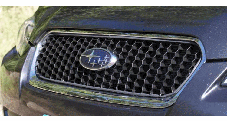
So for the background I wanted to do something related to cars, so while doing research, I saw cars had these vents at the bonets (inspirational image 4), and I thought it’d make a cool background for this job.

So i learnt how to manipulate the chequered texture of the letters so that they look like they are flowing. This is referenced from one of the flags that they always use to start the race. Flowy flowyyy.
FINAL F1 Racer concept: 
- So this one’s also a bit more direct. I shaped the racing cars into my alphabets. Initially, I didn’t want to have the actual alphabet there, but have instead the cars. BUT! it didnt seem to work, or more like it looked a little empty without it, so i decided to leave it as it is.
- But this way, it looks like the cars are racing or going by the flag stand near the start/finish line because of the chequered design. Either that or they look like they just crossed the finish line.
- Singapore’s F1 are always in the night, so hence the spotlight and dark feel to the design. I wanted to add the shiny surface because well, all the cars are all so shiny, especially when the whole area is so lit up (like boomz!)
- The background itself is inspired by the vents that a cars bonnet will have, makes it a rather fitting kind of background (to me. heheh..)
- And if you look carefully, it’s a bit smokey in the background. heheehe Adds on to the whole atmosphere.
Reflections
- It was difficult to come up with the concepts for the jobs.
- MENTAL BLOCK is NO JOKE sia. But another issue i faced was that when i came up with ideas that I liked, I didn’t know how to carry on from there. My level of photoshop and illustrator skills are not good enough to just come up with something one the spot. Thats why I am so grateful for youtube tutorials. Really learnt so much through them.
- I wanted to try something different in my designs this time round. Explore different aspects of design that I’m not used to. For example previously, my designs were a bit more abstract-flat-2d-mashed-up feels.
- This time round the 2 styles I wanted to try was the slightly more realistic look of photo manipulation and 3D! Both were difficult to learn, but worth it! At some point, I was kind of panicking because some of the designs (especially the 3d one) didnt seem to work, but I guess it turned out well enough. Could be better though, i feel.
- ALSO!! Wa play with colours very important. They are what make the mood. Like if my sky for the Pilot design was not so vibrant or of a different blue, it’ll look very different.
Takeaways
- There were a lot of learning opportunities that I am grateful for. If not for this assignment, I probably would not be trying to push the boundaries. I learned so much about Photoshop that I’m amazed at it. Sometimes I feel like my photoshop knowledge isn’t all that bad, and then I learn something about it and what it can do and I’m just humbled lololl and want to learn so much more.
- Learnt a few concept guidelines or things to look out for in a design. As mentioned above, PERSPECTIVE is very important. Always (ok, maybe not always) challenge what other ways to look at a design. Try to give a design something different such that it has a different look. Break the baseline to create depth!
- After learning the above midway through the assignment, I tried applying that to the rest of my designs, and they turned out very differently. Gave it a different aspect and perspective that i was very happy with.
- Mind-mapping and sketching out little thumbnails really do help with the process. They show what might or might not be possible. During consultation, I saw how our teacher just drew and drew with such ease, and immediately the picture was a lot clearer. Could see what she meant when she said one thing. Granted of course she had a lot more experience uh! hahhaha looks like i need to draw somemore.
- I learned I shouldnt be shy to look around and ask around my classmates. For example, if I hadn’t talked to some of my classmates, my ideas would not have flowed nicely. Like Charmaine always has a lot of brilliant ideas, and she’s good to bounce off ideas from. hahahha so thanks Charmaine! And also if I hadn’t gone to talk to Viena, I wouldn’t have been inspired with the whole 3D concept. heheh Thank youu! So bottom line is, don’t shy, there’s so much to learn from everyone!
So that’s the end of assignment! Its been an interesting one! Waiting for the next one to learn even more things. heheheh Its always a never ending learning journey.