LINK FINAL POWERPOINT HERE 🙂


LINK FINAL POWERPOINT HERE 🙂

Playing with resin:
basically using a mould
add resin base and two percent of resin hardener,
pour in the mould! and add the items you wanna add into the mould.
leave overnight to cure and dry 🙂
I decided to use an ice cube tray for the mould, following the food theme of my projects. for the items i wanted to add into the mould, I dug through my pantry for the things
I wanted colours in my ‘ice cubes’, mainly red, beige, cream and a pop of a darker colour. as a result, i used chilli flakes (leftover from pizza), chilli powder (leftover from ramen), rolled oats, chia seeds, crushed pumpkin seed, and some old pills i no longer needed.

adding chilli powder!
Since i was using a hard ice cube tray, i was concerned that i couldnt pop the resin out afterwards, so i used some vaseline to lube up the insides of the ice cube tray. it gave the resin some texture, but i wasnt too concerned about that!

adding swirls into the resin using toothpick.
i wanted the chilli flakes to look like they are floating inside- only one of them was more successful.

the more successful ice cube! with chilli flakes floating 🙂


all of the ice cubes 🙂

before taking them out
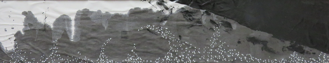
and yes, heating plastics is back!
It has been a while since I last tried this technique (*back in Year 1 melting plastics meant holding acrylic pieces over a candle and manipulating it into the shape before it burns)
Plastic Fusion || Technique
1| Collect plastics of various textures and colours
2| Lay them together
3| Sandwich the plastic layers between baking paper
4| Take a hot iron over it, allowing yourself to check periodically to see the amount of fusion.
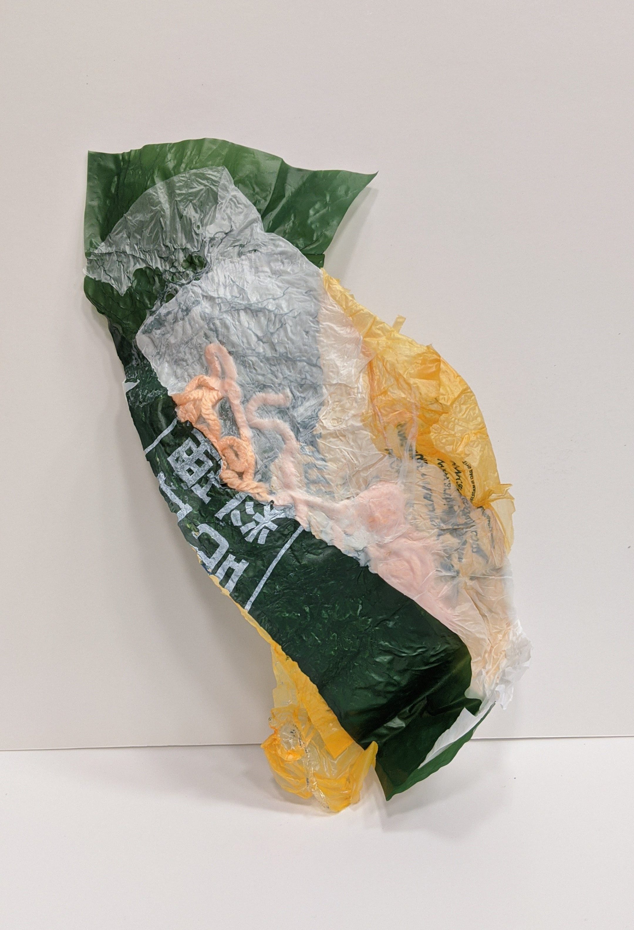
Hello! This marks the beginning of the journey in Surface Design.
At the start of the lesson, as Galina was talking about using a theme to guide your creative direction in this class, I quickly decided on using ~SUSHI~ as my theme, or rather, salmon sushi as my direction. I liked the different textures that come in salmon sushi, the different layers of flavours that assault your taste buds when you bite into it.
The combination of colours I used was close to the colours of salmon sushi: yellow, orange, green, black, white. I want this set of colours to be continuous through my range of works in this project/module.
Dry/Wet Heat Transfer || Technique
1| for the dry technique, using Fabric Crayola, draw on white paper. Or for the wet technique, use the heat transferrable paints on white paper
2| cut out the preferred shape
3| iron on the paper, sandwiching the cloth and the paper with fresh baking paper.
4| allow the iron to sit on the cloth for a longer period of time, to let the colour seep into the cloth properly.
The trial and error nature of this medium allowed me to test out the difference between the dry and wet techniques, and the difference between using the iron versus the heat press.
The iron allowed for us to control the heat more easily by shifting the dial on the iron, and we could test out the heat tolerance of the colours. The heat press is easier to use, faster and more effective, and leave less to chance.
Courts:

This Coway Air Purifier caught my attention. It is one of the air purifiers on sale in Courts, but the rest all looked quite bulky/bulbous. This one caught my eye because it has very clean and sleek lines and can easily blend into the living space, which is what you want a air purifier to be.

the other thing that caught ( or court. get it? ahha) is this SodaStream. This again is another sleek appliance that is completely unnecessary in the house. The use of the white and silver allows the appliance to look clean and futuristic in some sense.
Ikea:

She is based in Sweden (duh.) Her designs are not the conventional flatpack furniture you would usually associate with Ikea but she has added a handmade touch to its products.

one of which is this limited edition collection of vases in 2017. This is a modern approach to the old technique of glass blowing, and by having the coloured glass and its streaks, there is a strong dynamic feel to it.

this is another one of her prototypes (not sure whether it made to production), and I like how she played with the use of modular forms to allow stacking of the objects to allow users to have multiples uses for one product.
modular form:
disgusting vs not so gross Creative response:
In Class Assignment 1:
i thought this would work very well as a decorative piece in a Singaporean Chinese family. This reminds me of the blue porcelain bowls that many homes have.
In Class Assignment 2:
 This is Xiang Rei.
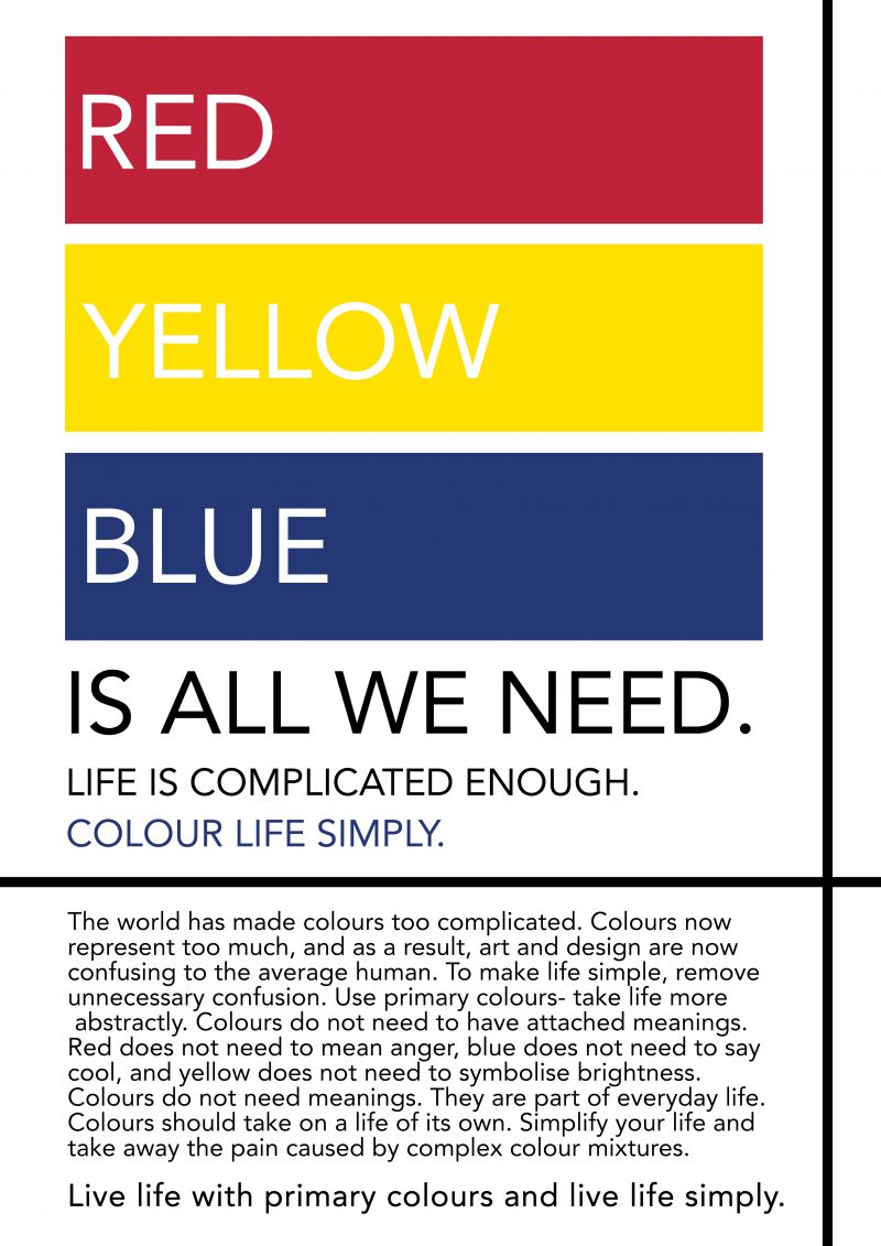
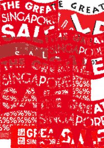
this is my A3 poster! inspired by dada, the cheapo culture (singlish slang for being cheapskate) is very prevalent in singapore.

Jenny Holzer is a neo conceptual artist who lives in New York. Many of her works are installation based, but uses a large variety of media to broadcast her works. While she is based in New York, her work has had global influence through her text based works that have political and feminist influences.
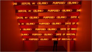
Red Yellow Looming, Jenny Holzer
“Red Yellow Looming” was displayed in Whitney Museum of American Art, and is now at the Met Bruer, a museum dedicated to modern and contemporary art in New York, in an exhibition named “Everything is Connected”. The work consists of a series of 13 horizontal LED tickers running across a narrow space between 2 walls.
The work bathes the small restrictive space in a red glow on one side of the tickers, and on the other side of the tickers, yellow. As the viewers walk up to it, they are overwhelmed by this as it is the only light source in the space, and they are drawn in. The thirteen tickers are placed in ascending order, almost like a set of stairs that leads to nowhere.
While the work doesn’t actually interact with the viewer like many other works shared by the class, I believe Jenny Holzer’s works gives a very strong physical immersion experience for the viewers. Instead of giving the viewers an option to alter the words on the tickers (like for Truisms, where viewers choose a truism and change a word or phrase and post it in a list), she completely immerses the viewers in the red/yellow LED lights. While it is not like Virtual Reality (VR), the person is in a constricted space flooded with the strong lights and is confronted with the moving words on the tickers. The viewers might even struggle with concentrating on just one set of tickers because of the constant movement. It leaves the viewers feeling like they are not the ones in control as they have no idea what the tickers will show next. It almost instills a sense of expectancy and confusion in the viewers as they wait for the next line to appear on the ticker.
The content displayed on the tickers are actually excerpts from the United States government’s documents on Iraq. The red and yellow background only helps to emphasise on the urgency of the matter that Jenny Holzer wants us to focus on. In addition, the high speed at which the words travel across the ticker also makes the viewers focus solely on the content and not just on the bright surroundings.
The use of the thirteen digital tickers also have a significance. Tickers are usually associated with the stock tickers and stock market. By using the digital tickers, Holzer is trying to associate the importance of the Iraq War that has claimed many lives between 2003 and 2011, of which the United States was heavily involved in, to the stock market in United States. There is evidence in the direct correlation between the Stock Market dips and the country’s involvement in wars globally.
Despite Jenny Holzer’s lack of use of ‘high’ tech gear so to speak, she manages to pull off a very successful work where she brings her viewers to a holt to focus on the problem she has identified. Even without the physical interaction which creates a physical output immediately like a Dynabook, it brings you on a journey through her creative process.

