
This is a combined post by Francesca Nio Hui Shan | Guan Hui Boon | Jocelyn Sim Chun Wei | Yeoh Zhen Qi
Our personal reflections will be at the bottom of our posts!
Introduction
This installation explores the impact of sleep deprivation on students. In a competitive and demanding school environment, it is common for students to sacrifice sleep in order to complete their assignments and maintain their grades.Through an installation, viewers will experience the state of sleep deprivation that our character, Sienna, is going through.
Our target audience will be ADM students. This will be relevant to ADM students, serving as a wake-up call for students currently living in this lifestyle by warning them of the severe consequences of sleep deprivation.
Concept
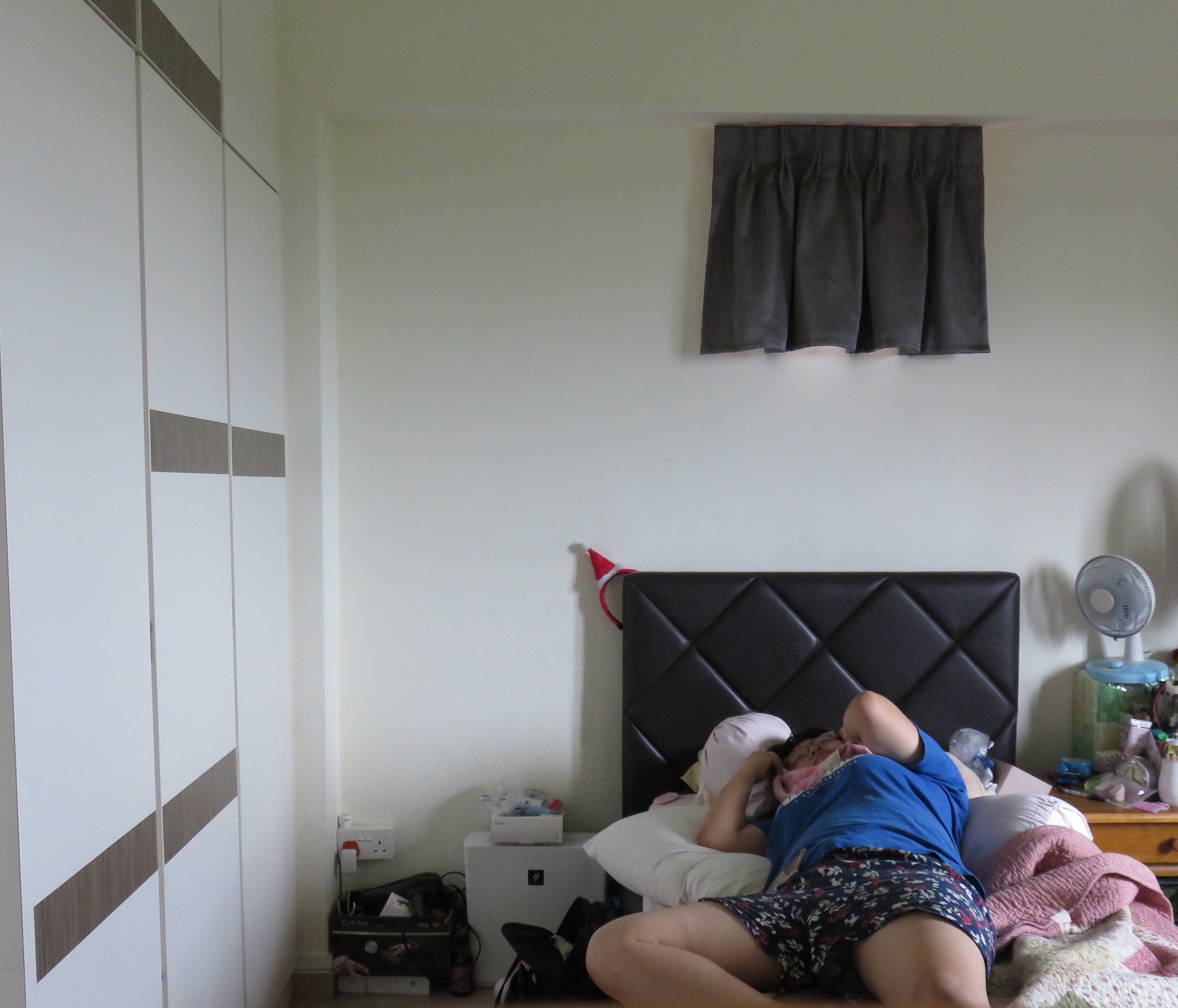
Through an installation piece, audiences get to uncover the story of Sienna Lam, a Media, Art and Design (MAD) student, and what drove her to this devastating sleep-deprived state that she is in now.
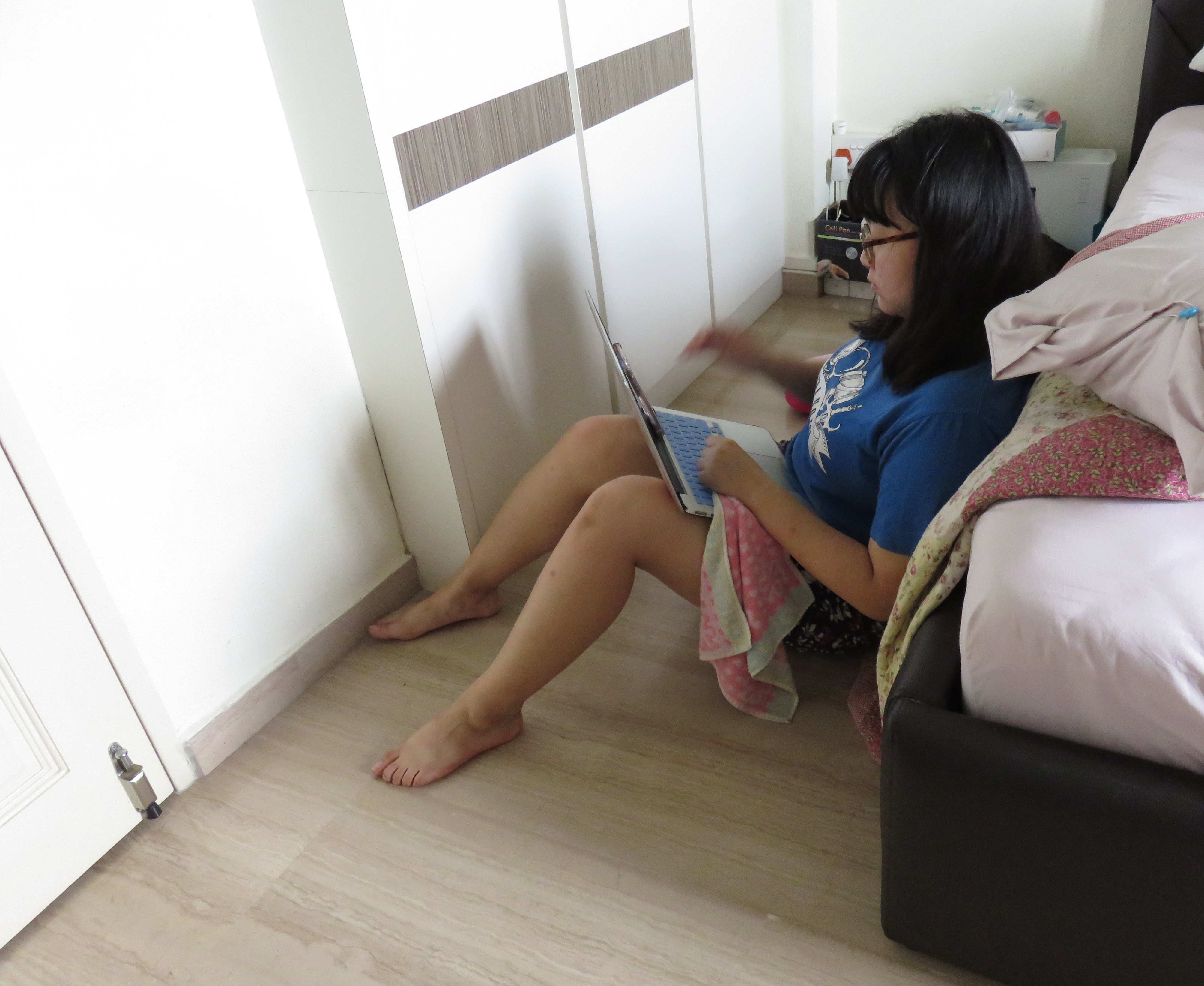
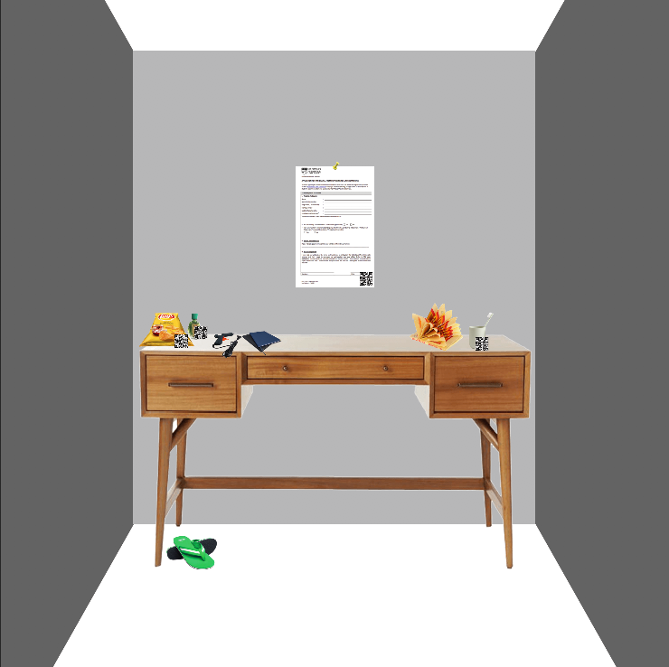
The installation piece aims to replicates Sienna’s messy work cubicle, mirroring her mental and physical state. Viewers are then allowed to manoeuvre through her belongings to figure out what has happened to Sienna and how has her life been impacted by Sleep Deprivation.
At the end of the installation, one question which viewer might raised would be : Where is Sienna now? In response to that, the final takeaway of this installation is to allow viewers to relate to Sienna and at the end of the day decide for Sienna as well as themselves where would they want to be as an Art student.
Sienna Lam, a MAD student, suffers from sleep deprivation due to the struggle to maintain a work-life balance. Her grandmother raised her because of the premature death of her parents. Besides having to juggle her demanding school work, Sienna is also working part-time as a barista in order to help to lighten the financial burdens on her grandmother. Sienna is able to afford to come to university because of a scholarship offered to her. Due to her scholarship, Sienna feels even more pressure to maintain her grades. Despite her passion for product design, Sienna is struggling to keep up with her interest and quality in her works due to the lack of sleep and time.
This story presents the fact that sleep deprivation is not as simple as not having enough sleep. Many factors contribute to it as well. The progression of sleep deprivation is a gradual process, and Sienna does not realise that she was sleep-deprived until it was too late whereby the effect of sleep deprivation has taken over her life.
Execution + Processes
This installation takes on a sublime approach that exaggerates the consequences of sleep deprivation in order to shock the audience. In contrast to beauty or prettiness, the sublime describes beauty mixed with terror, danger, threat – usually on a grand or elevated scale.
AIDA Framework:
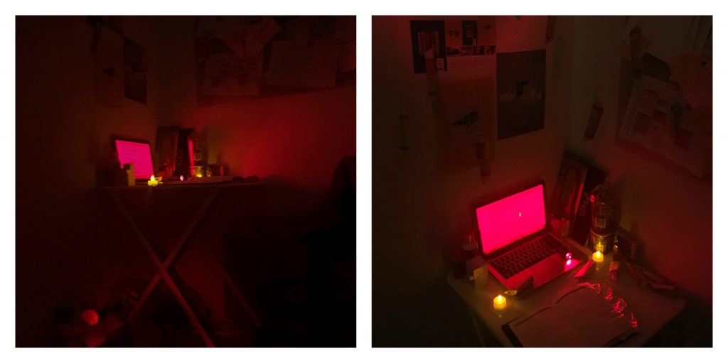
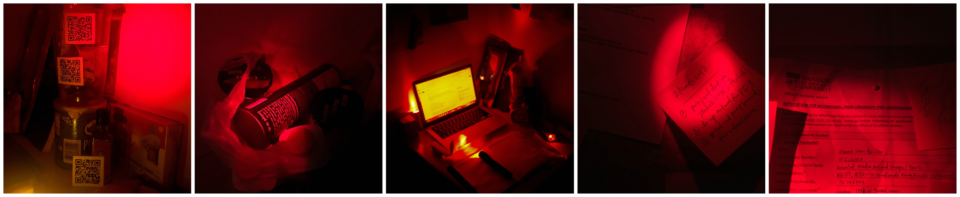
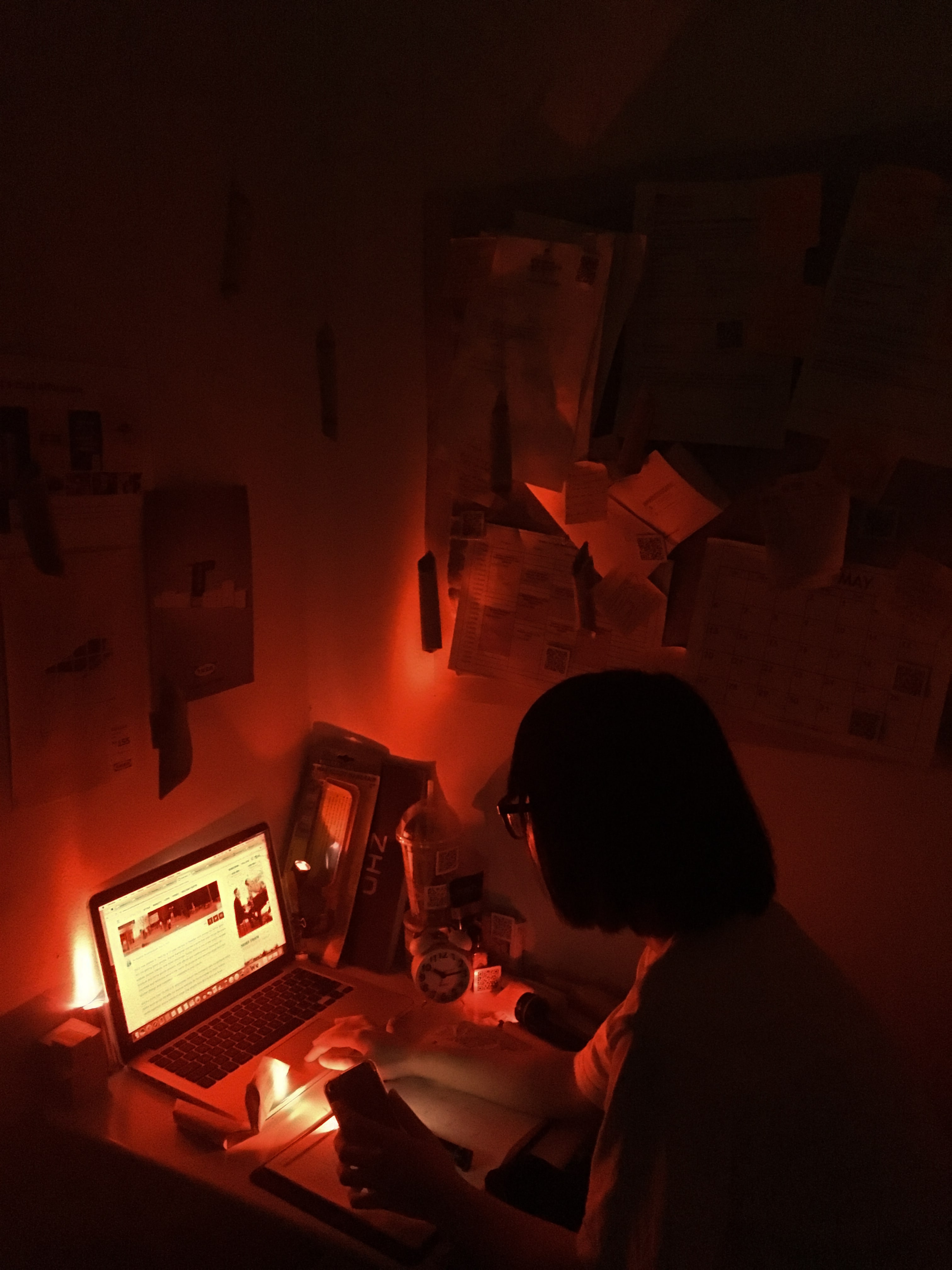
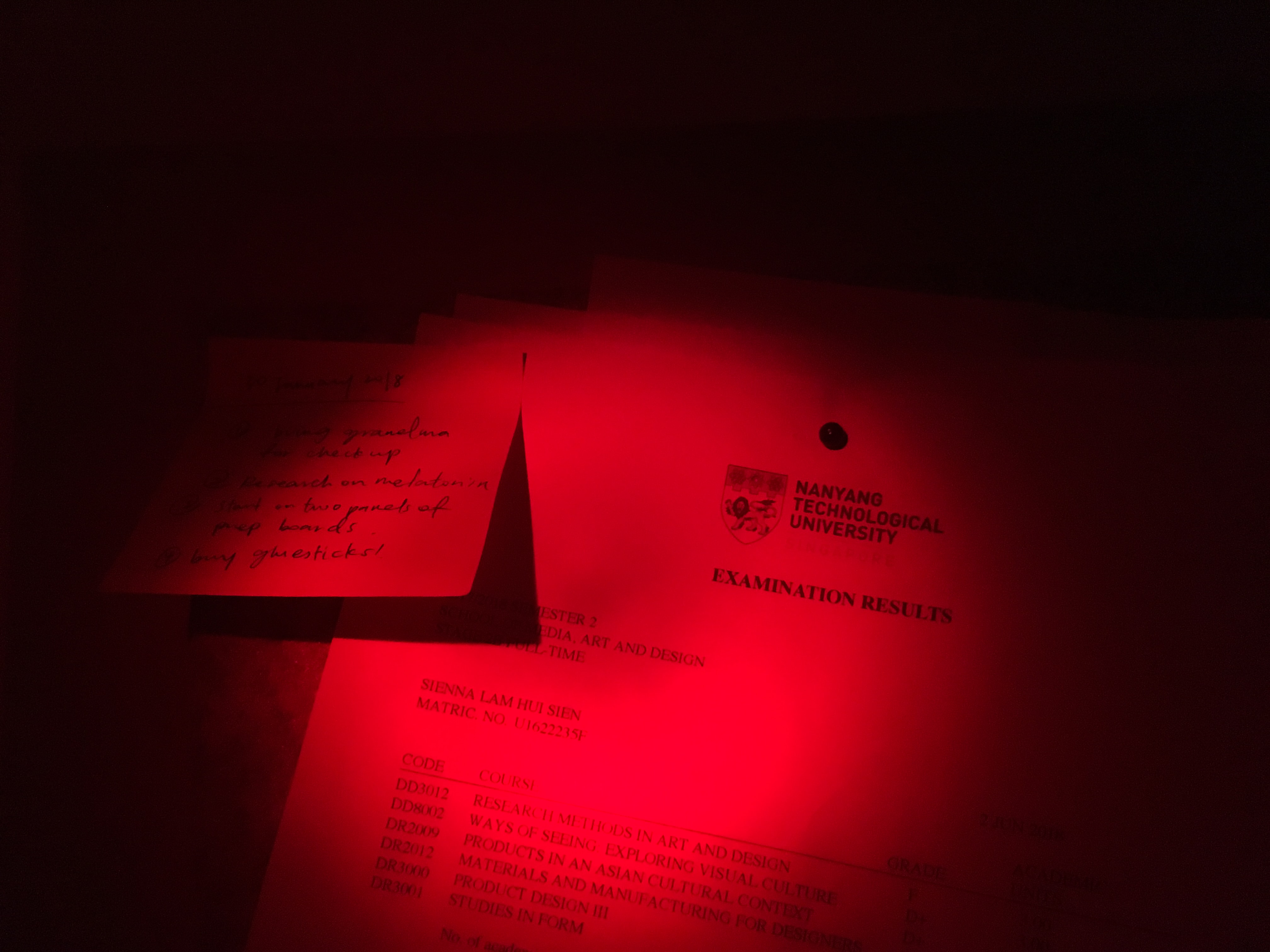
• Awareness – Installation is set up in a dim location, lit by only small torches with red tints. Viewers will navigate through it with the help of their phone’s torch light.
• Interest – Viewers will be curious as to where is Sienna now as well as the mood given off by the cubicle as such prompting the viewer to look through Sienna’s cubicle for clues leading to the discovering of her plight and story.
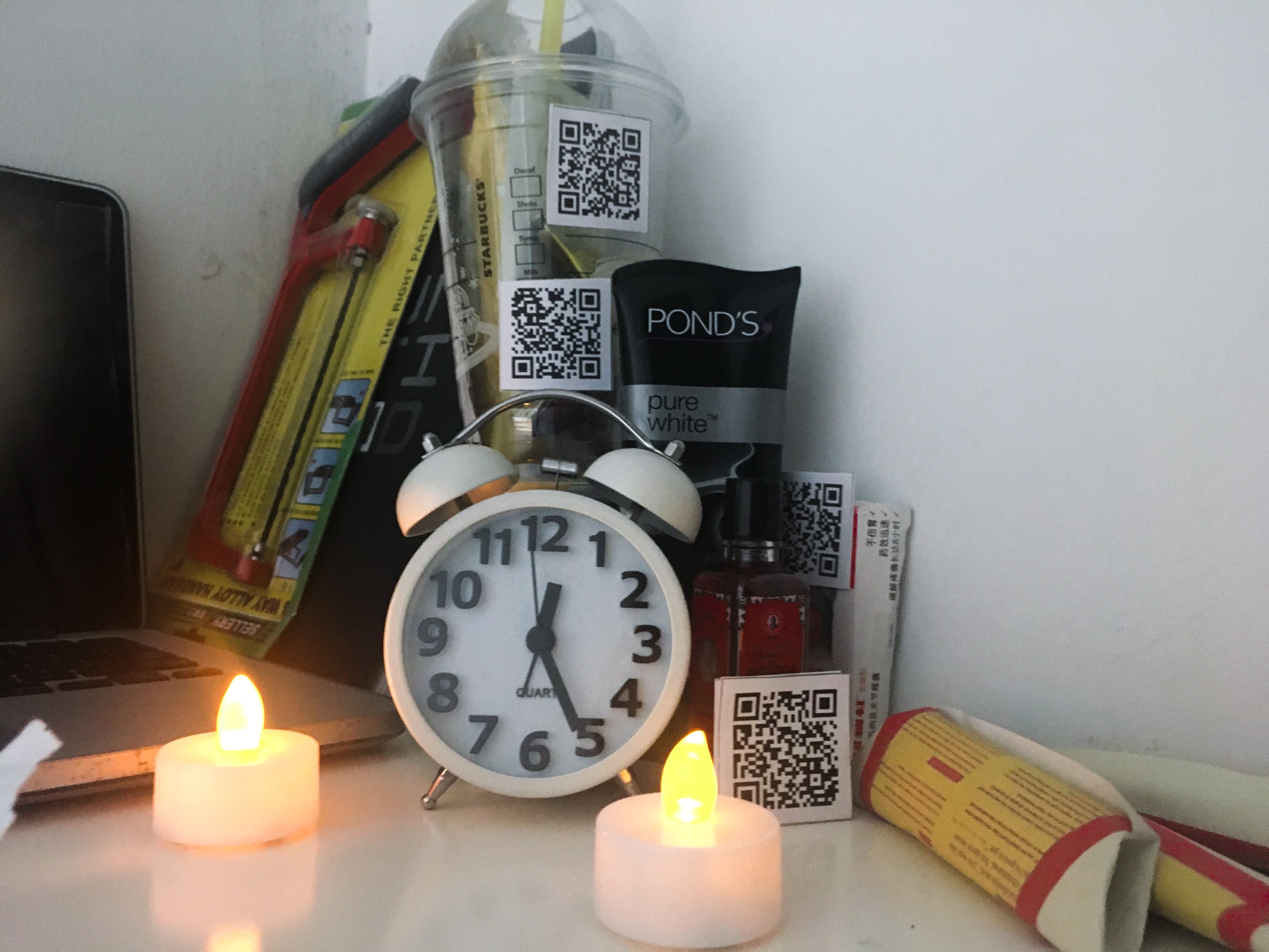
• Desire – Upon inspection, viewers will notice that the incense papers hung up and scattered around are actually not what they seemed to be. The incense papers are actually project briefs which are avalanching into Sienna’s life. Clues about Sienna’s situation will be littered around the study tables for viewers to explore.
• Advocate – After learning more about Sienna’s situation, viewers will reevaluate their own situations and strive to make a change in their sleeping habits. On the other hands, while viewers evaluate the question of where has Sienna gone to, viewers would also be able to make that decision for themselves while making connection to the character.
Final Installation and Considerations
Space Considerations:
As we are replicating a workspace, we looked to our own personal workspace as references to ensure that our installation looks like a realistic and messy workspace, but it is highly curated at the same time.
Proposed space cubicle
Actual space cubicle
As compared to our initial space consideration, we eventually settled down with a small and constricted space for Sienna’s cubicle in order to fully draw out the feeling of being confined and trapped within a small space. The rationale behind the small constricted space is to allow viewer to feel and draw the idea of Sienna being trapped within this vicious cycle of sleep deprivation and its effect is daunting her.
Logistics:
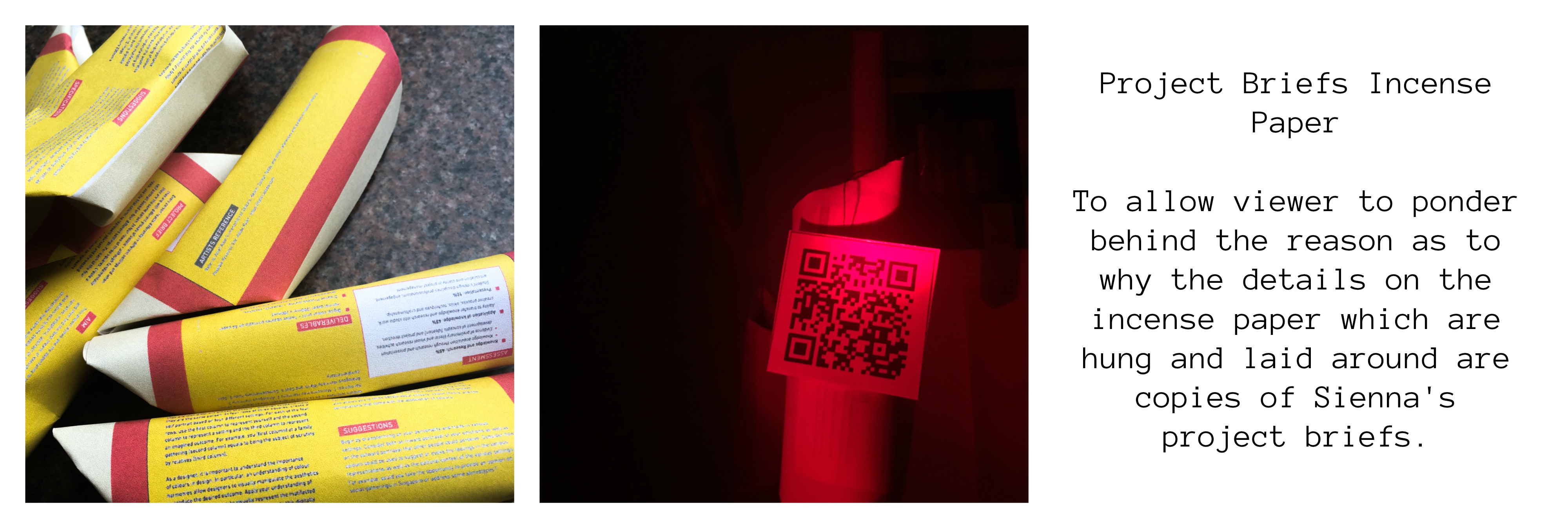

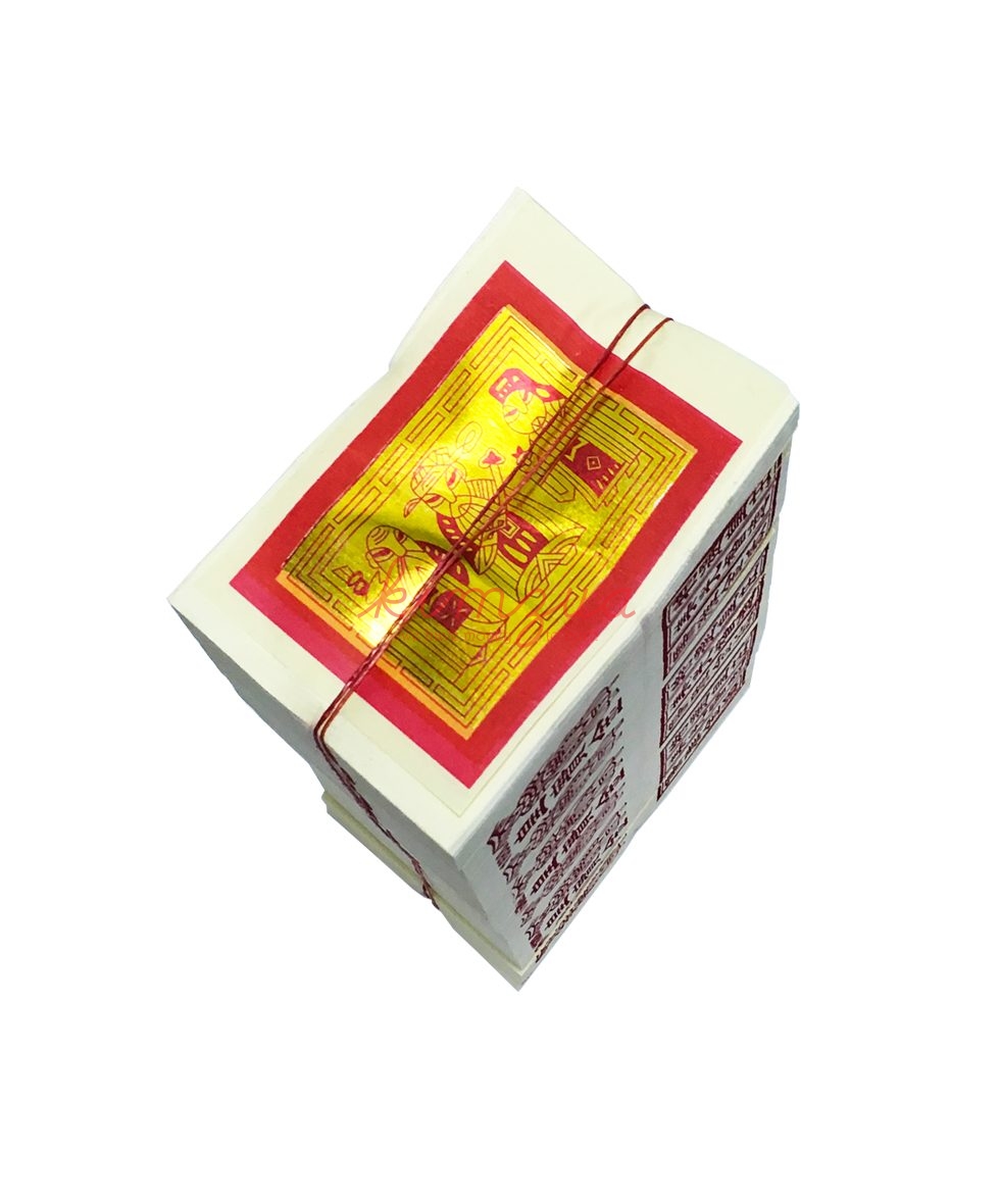
For the incense paper project briefs, we made use of our very own project briefs and photoshopping them to mimic the visual of actual incense paper before folding them into the common shape in which incense paper are folded into for prayer purposes.
In other to exaggerate and bring across the impact in which a staggering amount of work has been on Sienna leading to her sleep deprivation, we decided to go for this approach. We felt that it would be a sublime approach since the essence of the briefs would only be discovered if viewers really do pay attention to these incense paper.
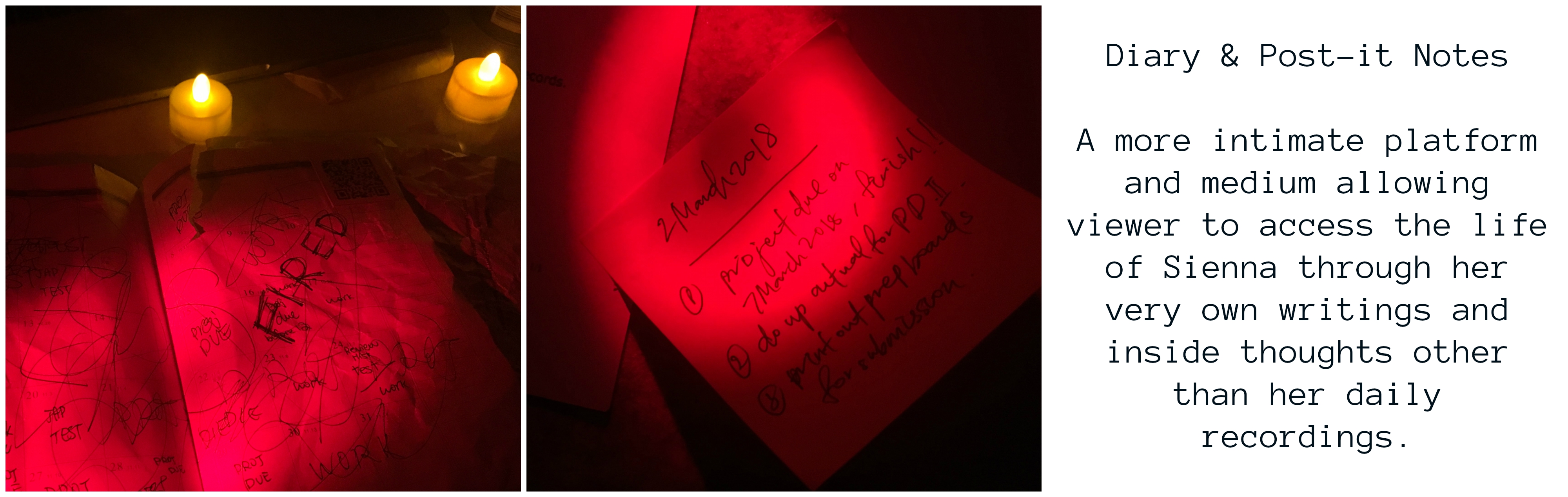
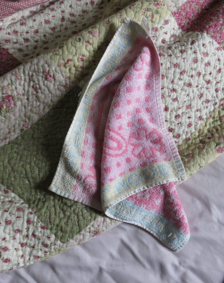
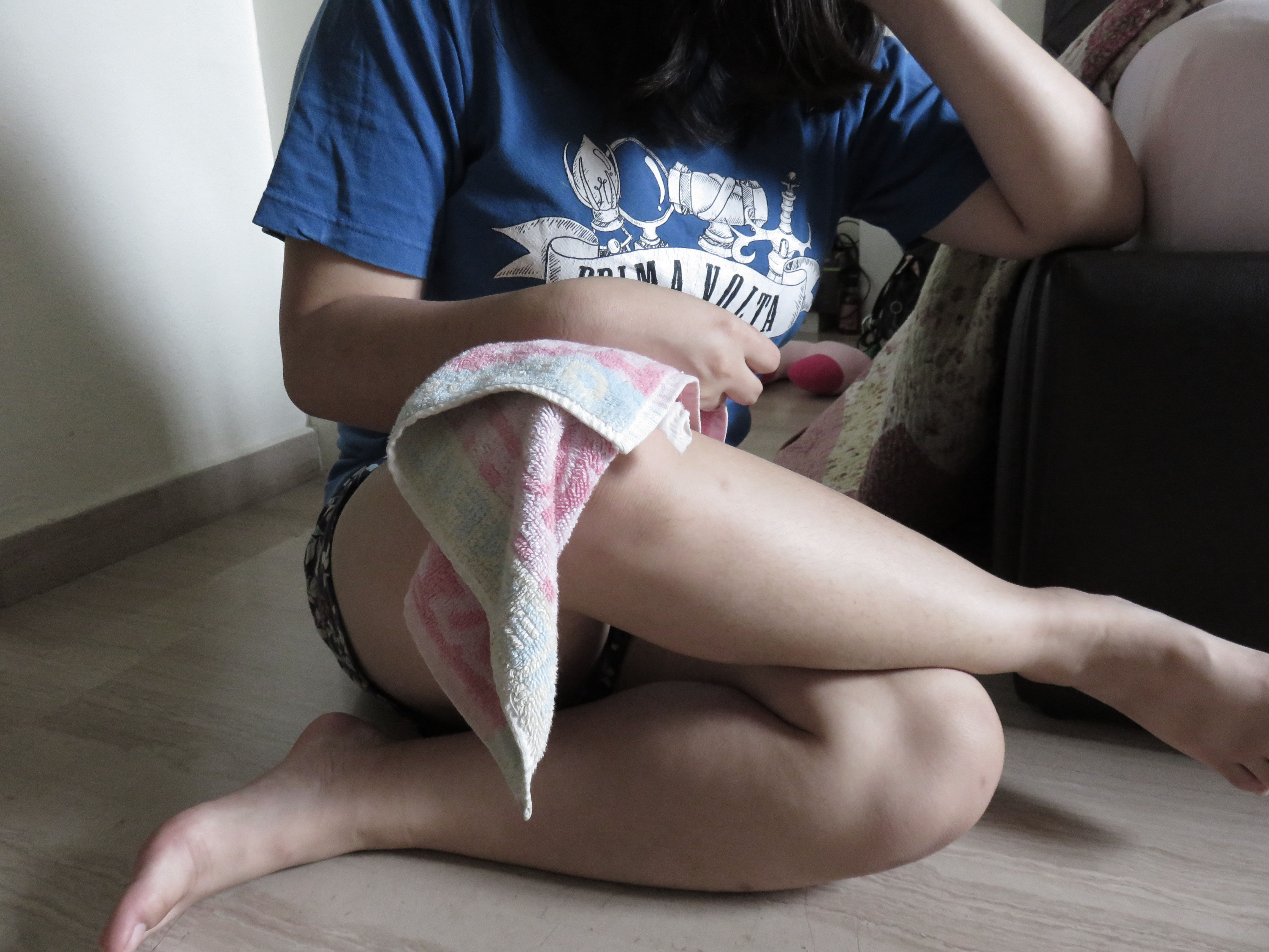
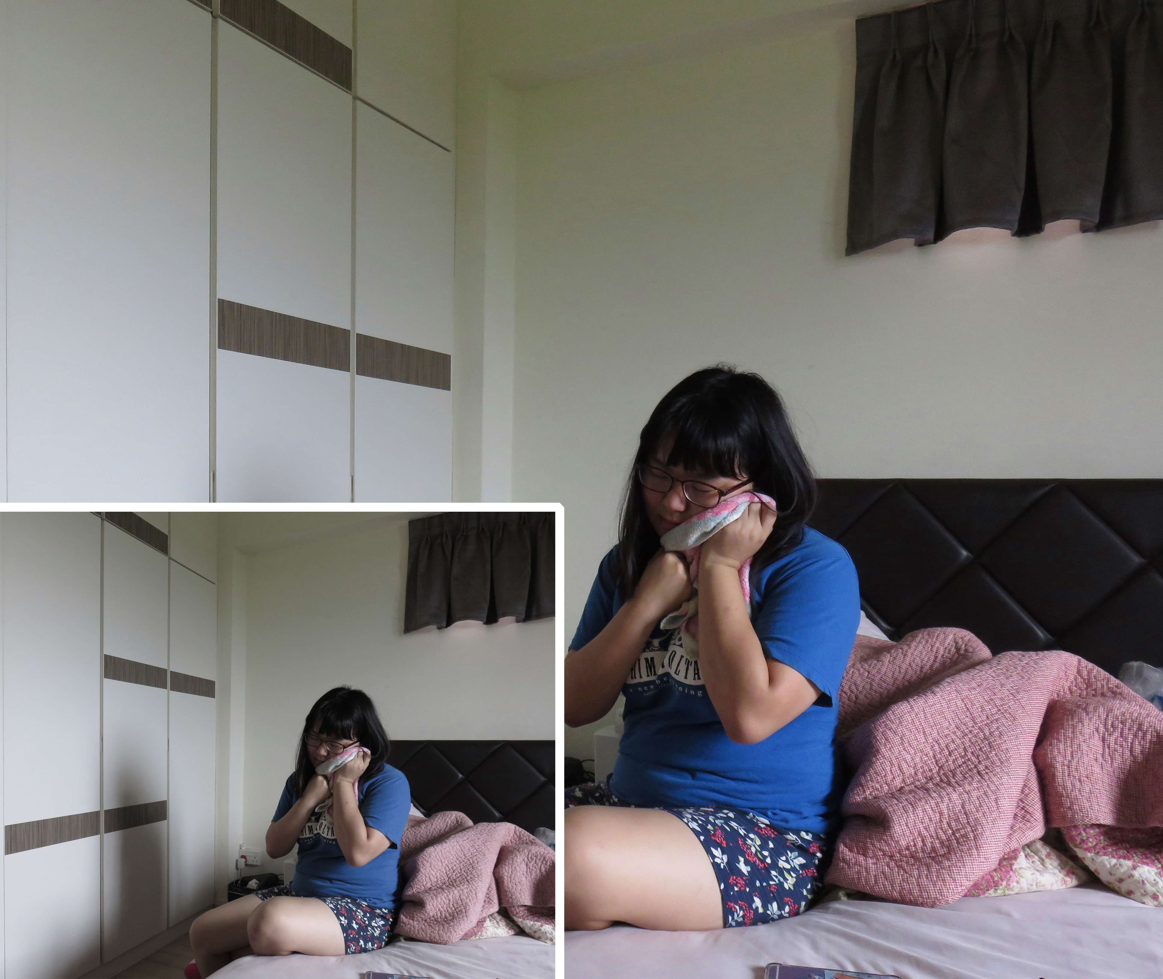
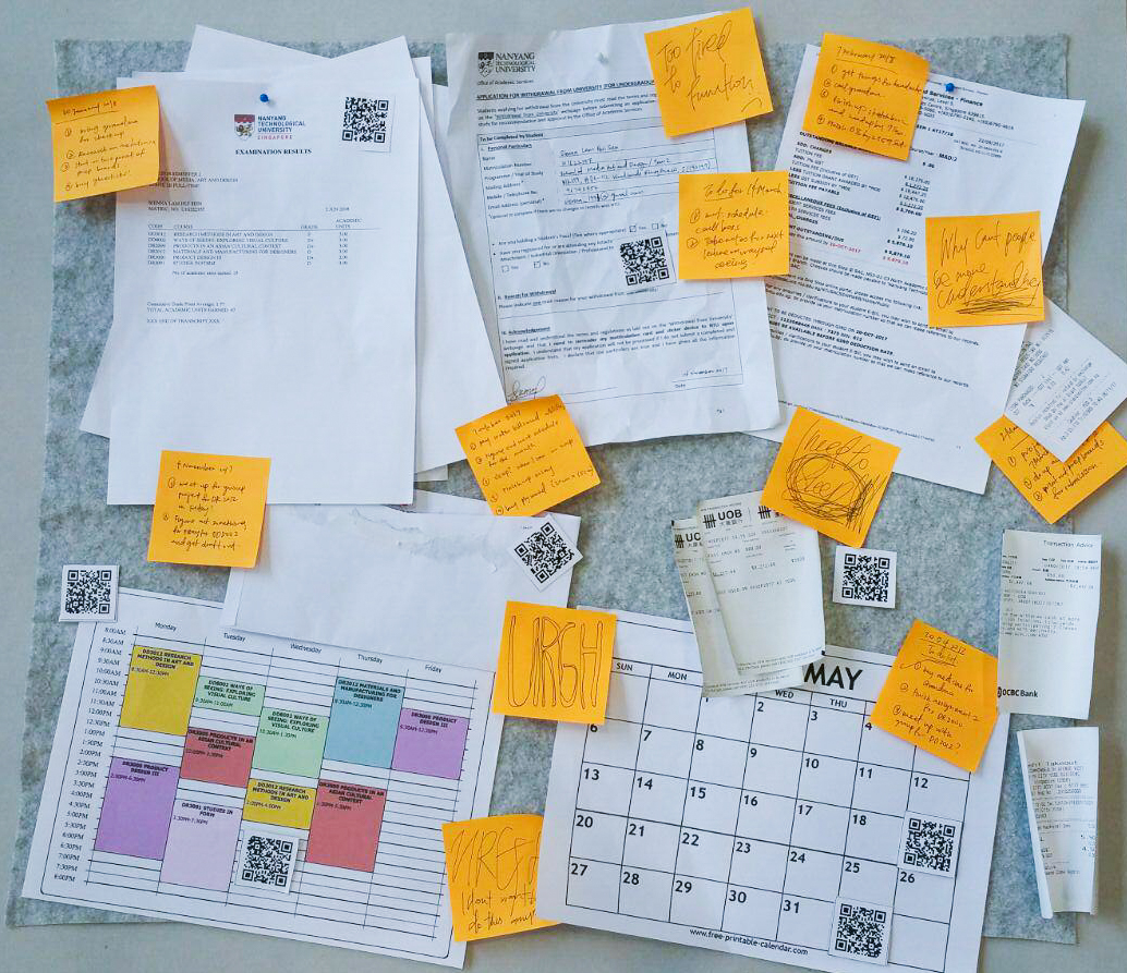
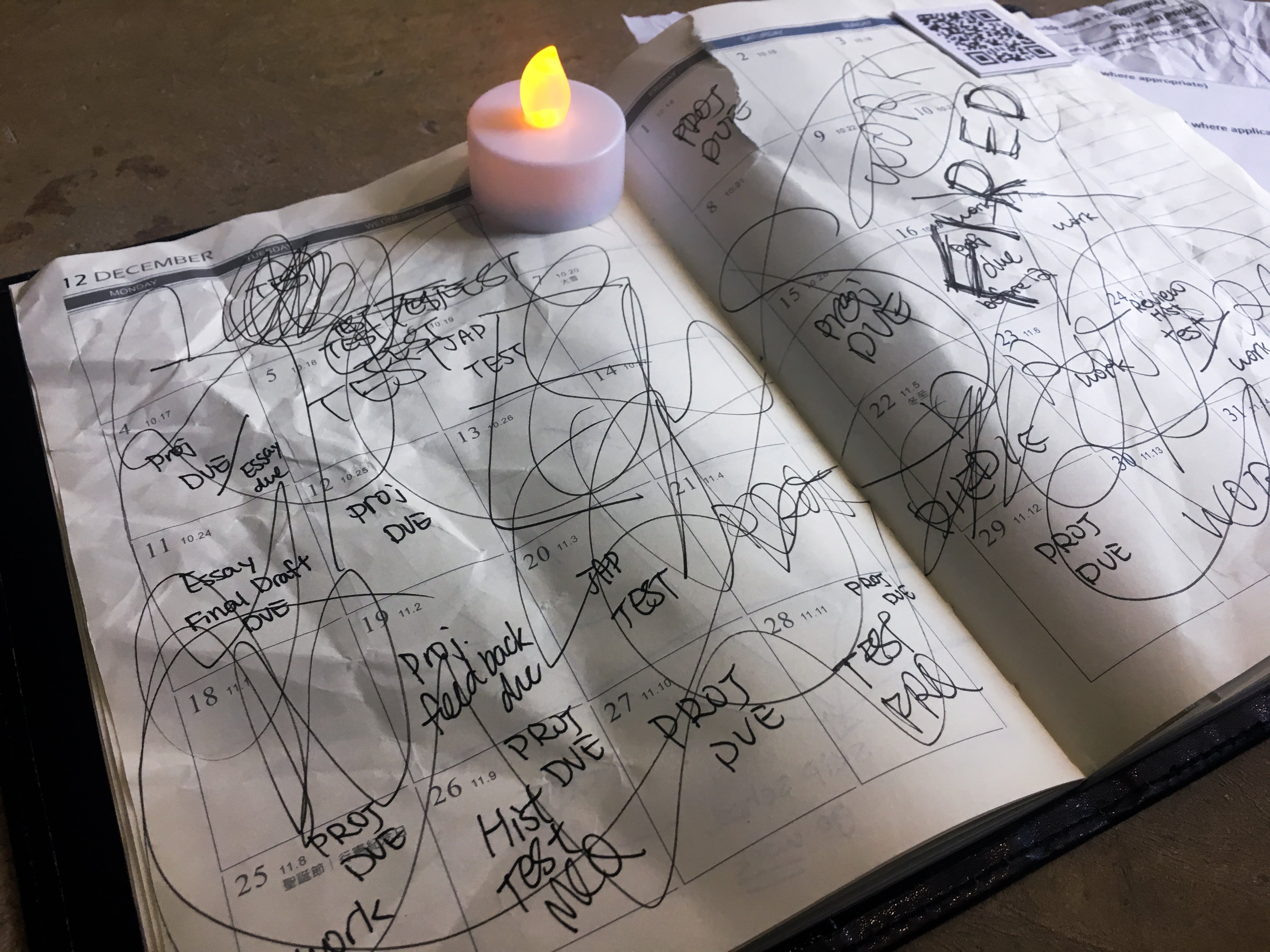
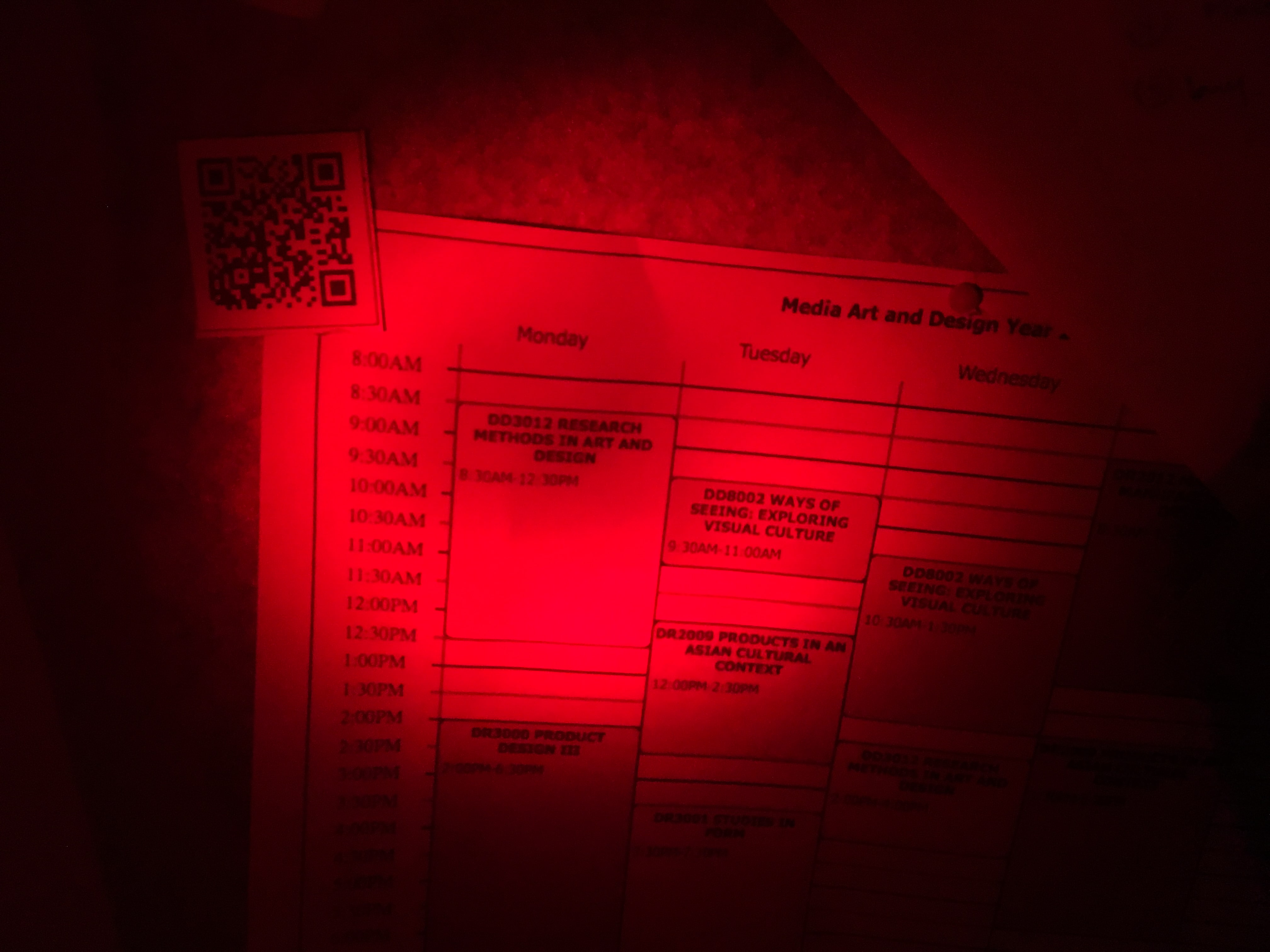
Sienna’s diary as well as post-it notes which are pasted on her wall also serve as another platform in which viewers can attain greater access into Sienna’s personal life and discover her daily struggles since these mediums are dated and are easily traceable to the things that Sienna are doing each and every day.
On the other hand, the hand written diary also offers a micro look into Sienna’s struggle as the hand writings eventually degrades, showing her lack of interest in planning out her schedule.
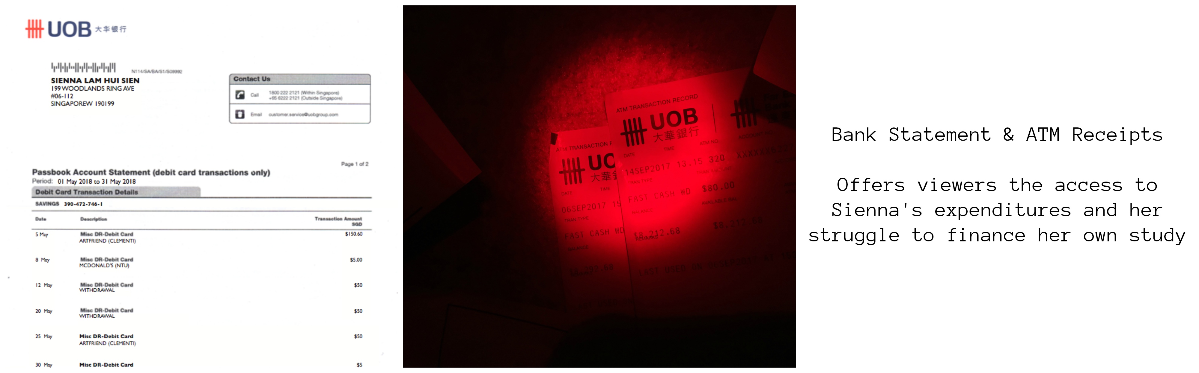
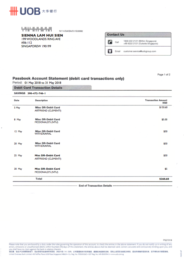
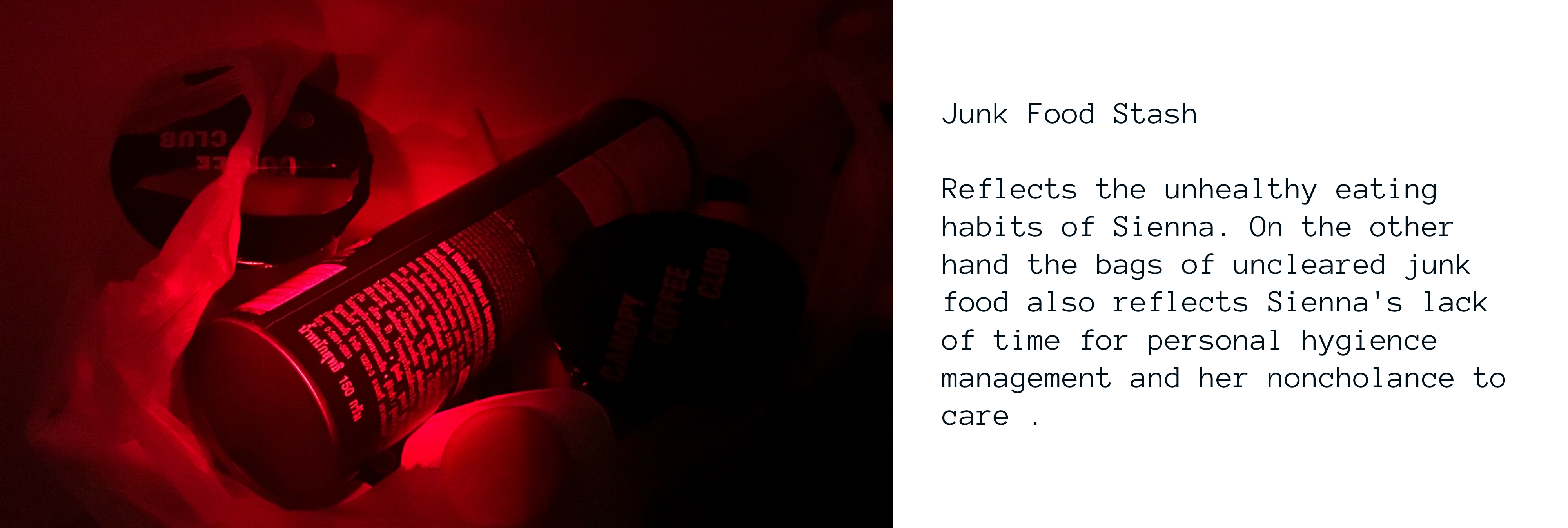
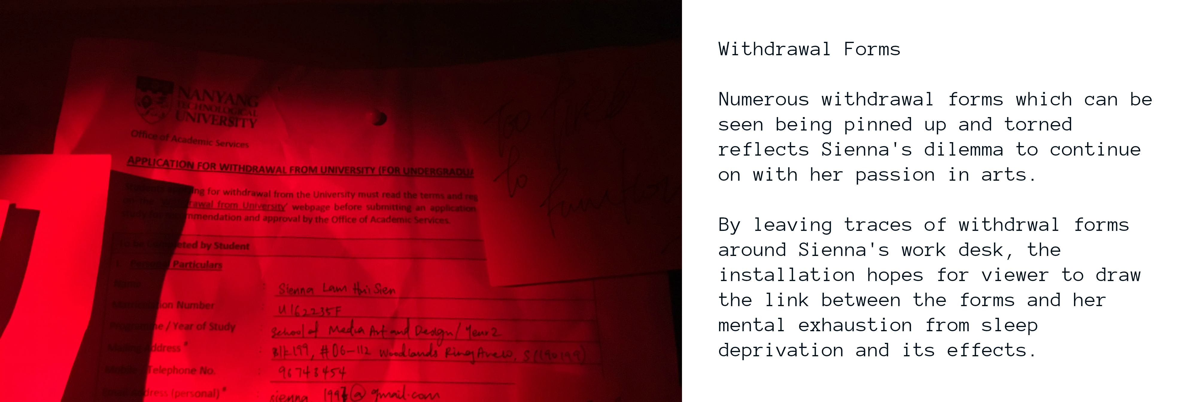
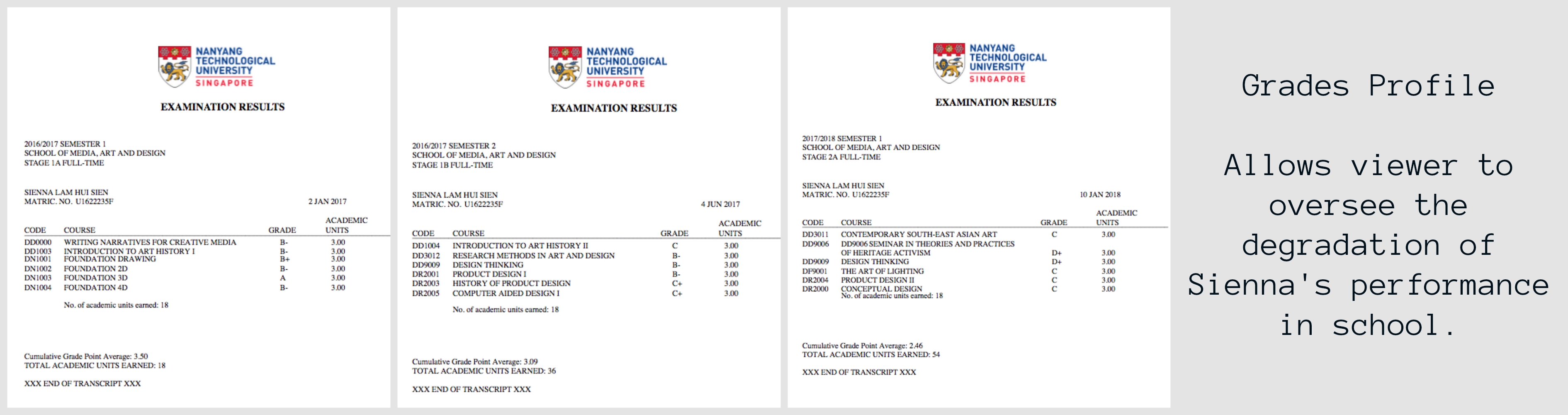
Bank statements and ATM receipts of Sienna are also pinned up on her notice board as well as being left around her work desk. As viewer chance upon her expenditures on art materials etc, viewers would then be able to infer from her expenditure on how she is struggling financially despite her working part time. This factor adds on to the severity of her sleep deprivation due to the stress it incurs on Sienna.
Sensory Integration Model
Sight:
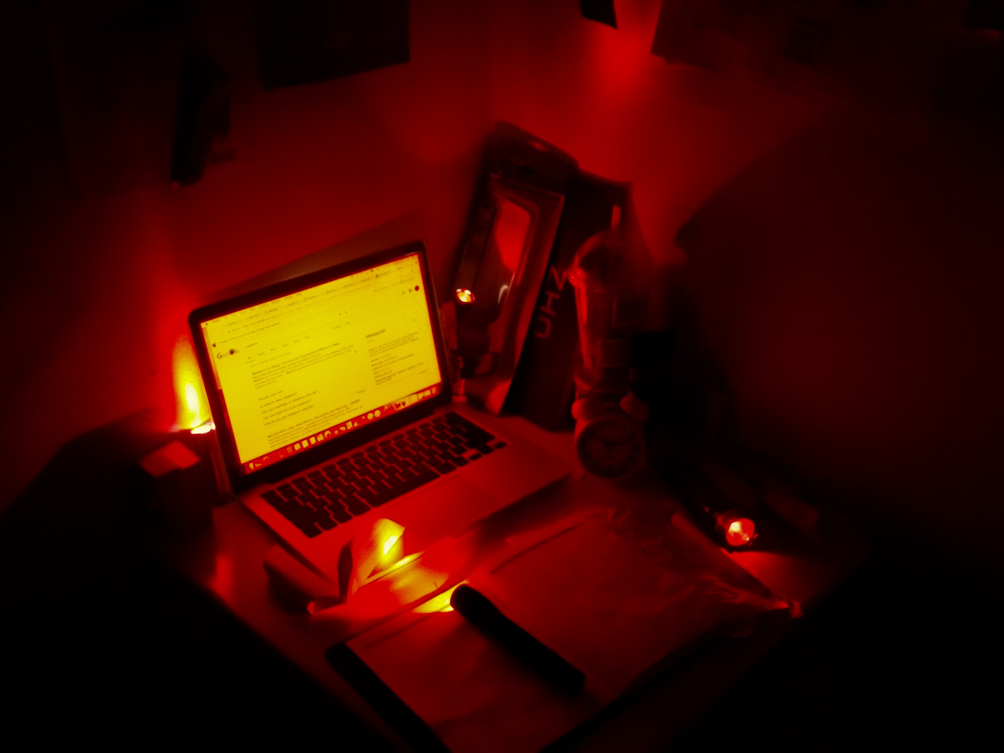
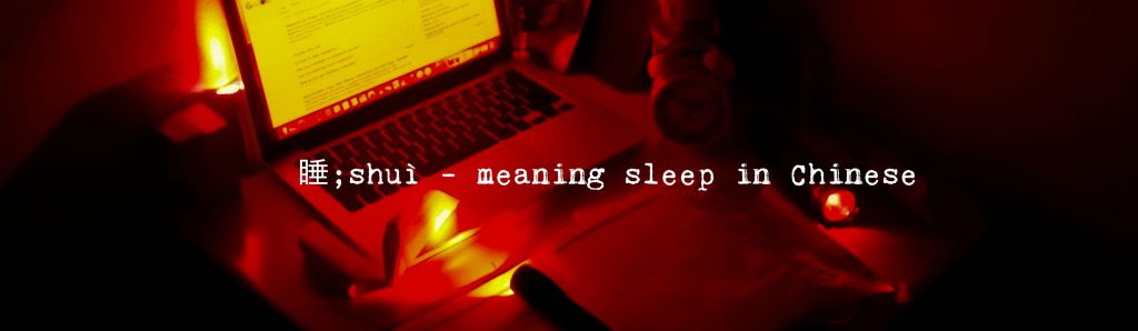
The overall mood of the cubicle space is also controlled by the usage of red lights. The light sources were only limited to 4 torches as well as the laptop screen of Sienna as we wanted the cubicle space to only be slightly lit such that things can clearly be identified yet there are areas that requires further discovery. On top of that the visibility of the cubicle is controlled so as to give off the feeling of confusion and controlled vision to mimic that of the effect of sleep deprivation where those experiencing it experiences hallucinations and reduced visibility.
Touch:
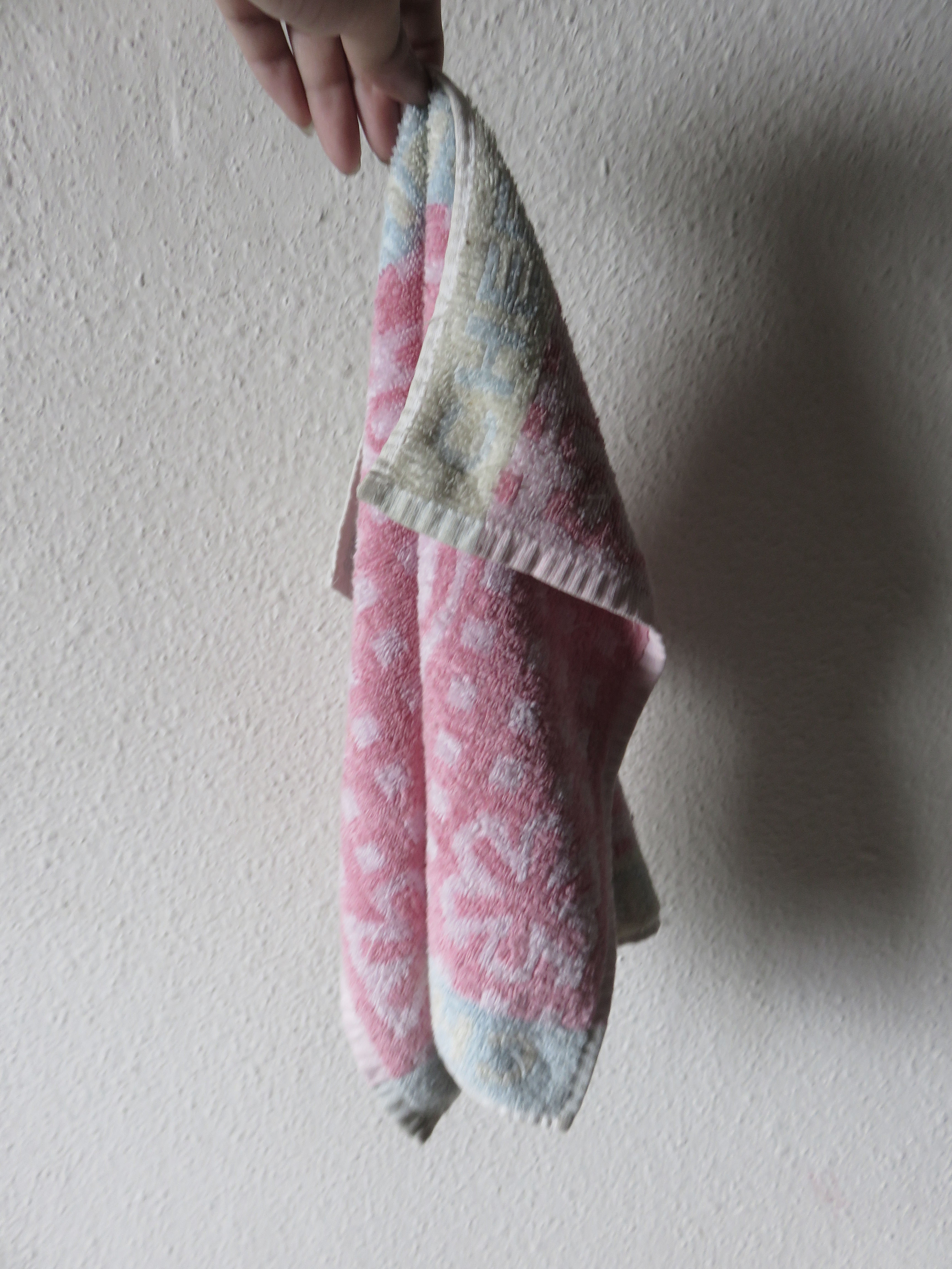
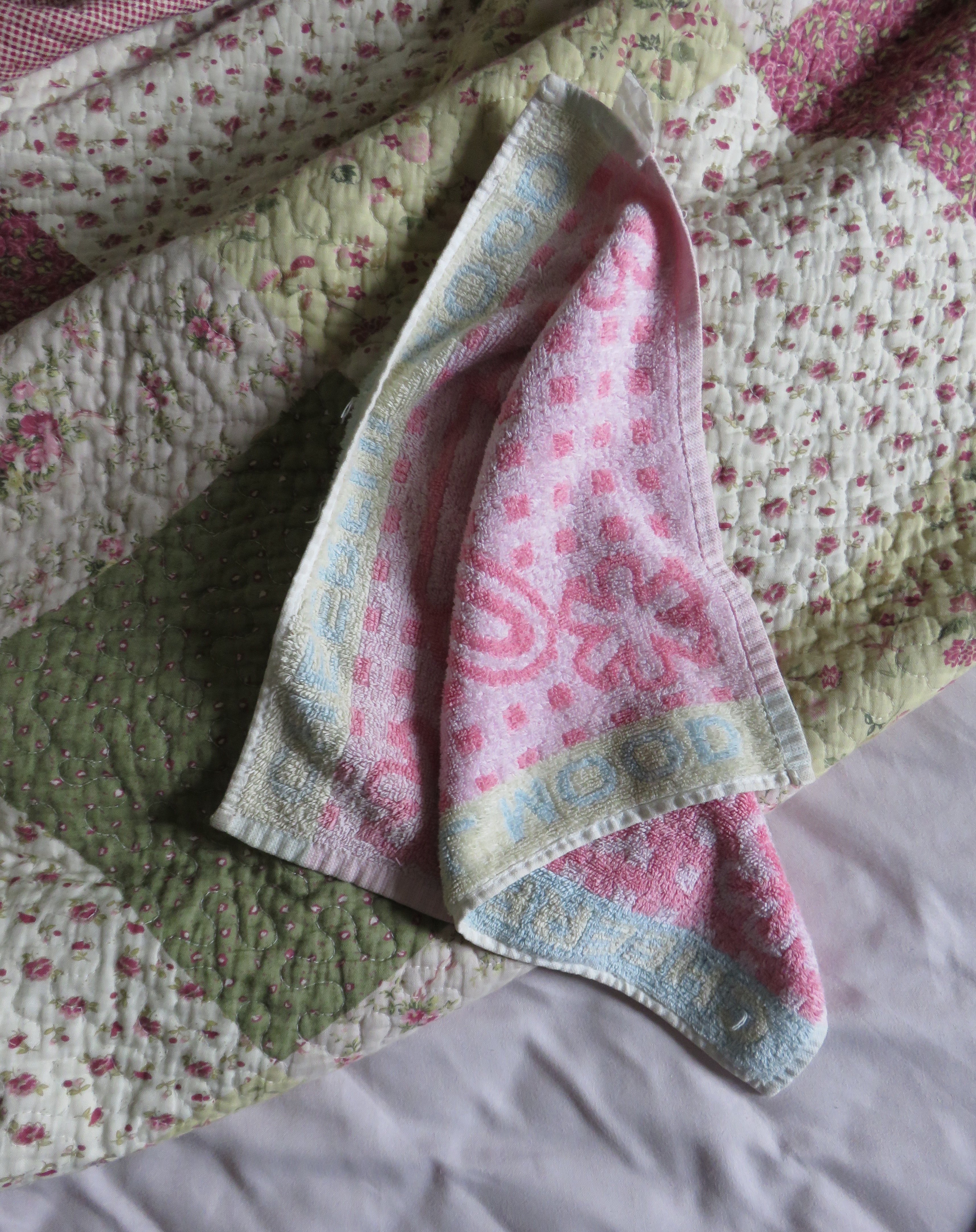
Personal belongings of Sienna were left around on the table allowing viewers to interact with the items and get to know about the life of Sienna.
Audio:
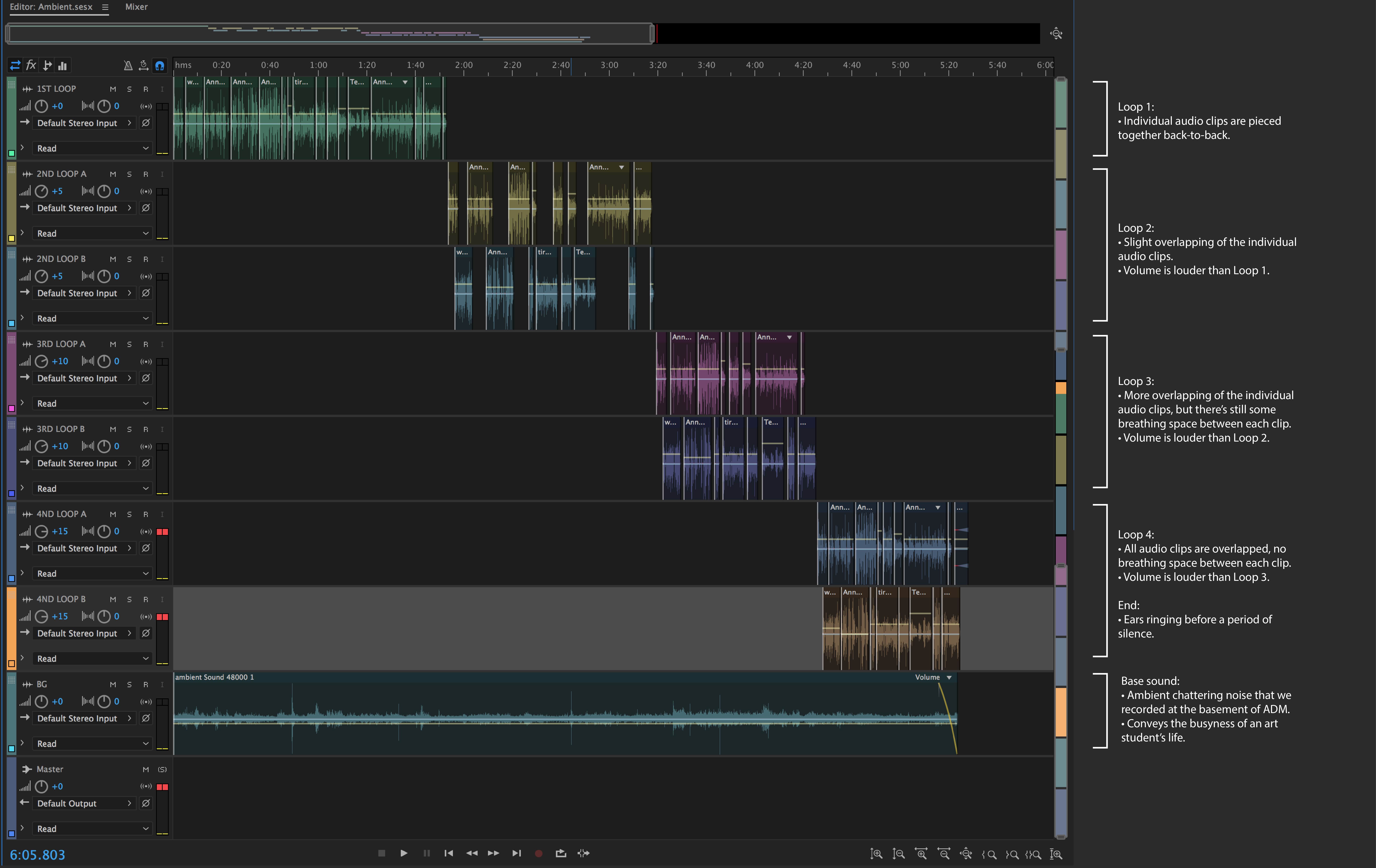
Ambient sound
As the QR codes lead to audio clips that are from Sienna’s POV, we decided that the ambient noise would be audio clips that are from other people’s POV. These people include Sienna’s classmates, boss, co-worker, teacher and best friend. Hostile remarks were thrown in Sienna’s way and this gives us an insight into the amount of stress that she’s dealing with.
Over time, the audio clips start to overlap more and the volume gets louder as well. Eventually, Sienna is unable to take it anymore and shuts down, hence the ears ringing sound and then silence. As we were listening to the final audio clip, we ourselves felt stressed out too!
Sienna’s grandmother’s voice is purposely left out because her grandmother is the most important person to her, hence we wanted the audience to imagine what her conversation with her grandma would be like.
All the individual audio clips are pieced together, then looped 4 times to form the final ambient audio clip.
Here’s a breakdown of the final audio clip:
Sienna’s daily voice recordings
[ accessed through QR code]
By laying around daily voice recordings of Sienna through the medium of QR code, the installation aims to prompt viewer to manoeuvre through the various QR Codes laid around Sienna’s work space to find out about the back story of Sienna. Unbounded by the sequence in which the voice recordings are being heard, the recordings also aim to draw a connection back to the ambient sound that are being played in the surrounding. As the recordings are only from Sienna’s perspective, combining the ambient sounds which consist of perspective from people around Sienna would allow viewer to piece things together.
As for presenting Sienna’s POV, it was a toss between an audio diary or video blogs (vlogs). We decided to go with an audio diary eventually because we felt that it would be more realistic for Sienna to choose this over vlogs. As she was already so overwhelmed, she wouldn’t have time to video herself ranting. Hence an audio diary would be more convenient and hassle-free.
From a storytelling perspective, rather than literally showing Sienna’s physical and mental state through videos, we also wanted the viewers to imagine the state that she was in instead. We felt that this would be more impactful as our viewers would sub-consciously put themselves in her shoes and imagine how it would be like if they themselves were going through this ordeal.
Audio files bank
Sienna’s Daily Recordings|
– Day 1 of school: https://vocaroo.com/i/s0oCPZdLtze0
– Being done with life: https://vocaroo.com/i/s0Ef1a0mFw1L
– Week 2: https://vocaroo.com/i/s0G3PlNvDlTN
– Week 3: https://vocaroo.com/i/s1XMwGw5P9IK
– Week 4: https://vocaroo.com/i/s1R6KpQODvMg
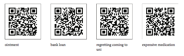
– Ointment: https://vocaroo.com/i/s0Ventavdv8G
– Bank loan: https://vocaroo.com/i/s08LFP2RMjpk
– Expensive medication: https://vocaroo.com/i/s0EjtykijJBp
– Regretting coming to university: https://vocaroo.com/i/s0D5FwSXocUn
Grandma related |
– Frustrated with grandma: https://vocaroo.com/i/s1dIqRobh0gY
– Medicine: https://vocaroo.com/i/s1eFcKPlYPnp
– Unable to go home: https://vocaroo.com/i/s1K7H5pm2uMo
– Whining: https://vocaroo.com/i/s1VeFTeXpqkW
School related |
– School office: https://vocaroo.com/i/s1AkNMAyqWZB
– Unable to go for project: https://vocaroo.com/i/s1LS1BatnhNp
– Attendance: https://vocaroo.com/i/s1YUb7nmYKB1
Friends |
– Less interaction pt 1: https://vocaroo.com/i/s1HQQpBgAJ2z
– Less interaction pt 2: https://vocaroo.com/i/s1Nep55XdKOh
Workplace |
– Unable to go to work pt 1: https://vocaroo.com/i/s1NbL9UmCj3F
– Cover shift for co-worker: https://vocaroo.com/i/s145F1Qer4mu
QR codes |

Video Footages
More Pictures!

Personal Reflection time
Think for me it was challenging for me to think ahead to the final whole outcome when we were discussing about the project in the first few weeks, but towards the end we could really see everything coming together! For me I struggled with thinking too much about the minute details at the beginning when we did not have a proper idea solidified yet, so I had to consciously stop myself from babbling on about the details that we could not confirm yet. i think my group also did a good job of putting ourselves in check because we would constantly stop each other from babbling too much about irrelevant details ahahahahahha
I personally really loved working on this project because it was much more in my comfort zone even though i havent done an installation before. (sidenote: my teachers have always told us to take the chance while we are in school to do installations, it’s unlikely that we will ever do it again after entering the workforce unless we become full fledged artists) We really go through the minute details to form a whole character (gestalt!!!) so that there is a whole narrative for the viewers to experience. Definitely think that we could have done more for the installation if given more time and space, if we could explore a more literal death? who knows! I still really love the final result because it was the sweat and tears of our group :’)
think the entire thing was such a great experience for us to create a physical space for a narrative, a chance that we may not have in the future depending on what major we go into! i’m really thankful for the group of people that I worked with (hopefully didnt cause them too much grief) because i think we honestly pulled the installation off quite nicely despite the various obstacles we faced! LOVE YALLLLLLL <3 and thank you laoshi for not killing me this sem, even though my last project was a complete flop!!!!!