Project 2b – LOCALE Creative Process Journal

When we were told to explore around own neighbourhood and make a zine about it, my first instinct was to find somewhere aesthetic and take a bunch of nice looking photos. That is why the first location I decided to explore was a playground at the end of my street. 


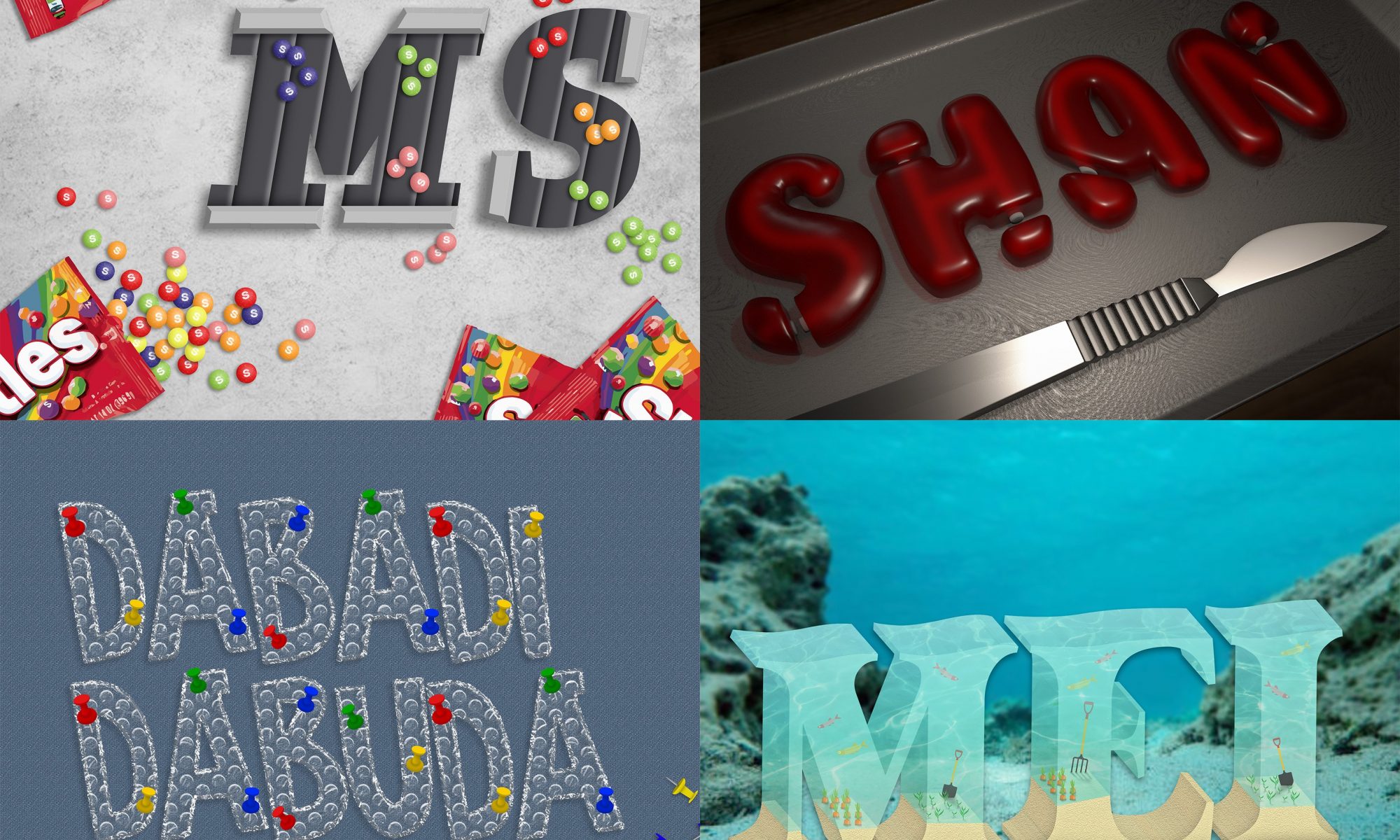
I took a bunch of pictures but when I went home and looked through them, I didn’t see a common theme that I could tie them together with. Then I thought what about Chinese Garden. It has been agesss since I last went there. I used to go there often as a kid, especially during the Mid Autumn Festival for the lantern displays. It was kinda a family tradition we had until we grew up and eventually stopped going. 

I was literally still a baby when we visited Chinese Garden as a family.

Anyway I went there in the morning hoping it wouldn’t be too hot and crowded but it was already filled with elderlies doing morning exercise. So, I walked around Chinese Garden and spent around an hour taking photos. At first I wasn’t sure what I was going to be focusing on my zine and took a bunch of photos that had shapes, lines and textures. But halfway through the hour, I realised that there were actually a surprising number of reoccurring shapes in photos. So I tried to categorise the shapes and came up with the idea to match and align the shapes side by side. And I was able to find quite a few matching ones. 

Then I had to put these together into a zine and figure out the layout. I started by looking at references and inspirations on pinterest. I tried looking at more geometric layouts? Hoping it will have some relation to my focus on shapes. 


But after consultation with Shirley, I realised I haven’t been looking at enough zine inserts layout, but mostly cover pages.

This was the rough mock up I had after consultation with Shirley. 


This are the drafts I had for the various pages. Honestly I was very lost and quite unsure of the overall look I was going for.

Then I got most of layout somewhat finalised on the second last week.

Consulted with Shirley one last time and made some final amendments.
Final Design:

PRINTING
Despite being the final part of the project, I faced many issues during the printing process. First being the paper alignment. The test print of the spread would turn up perfect but when printing using a thicker paper, the alignment becomes waaay off. And because of the wrong alignment, folding along the centre line is impossible. I had to compromise the front and back pages so as to make the middle inserts match.

Luckily, one of the print outs had a vertical misalignment and not a horizontal misalignment so I could make it work with the bleeding. Though the colour was a little darker than I would have preferred.
FINAL BINDING
REFLECTION
From this project, I finally got to learn how to use InDesign. Something that seemed really intimidating to me at first. At the start, I was still trying to use Photoshop to plan out my layouts cause I wasn’t confident in my InDesign skills. But eventually I began to start using InDesign and actually got used to using it halfway through the project. Honestly, I’m not so much of a VisCom student and coming up with the layout kinda stressed me out. I was stuck even with artist references. BUT I’m glad I managed to pull this through and had a quite decent outcome? 

Graphic Form Project 1: IMAGE MAKING THROUGH TYPE

When we were first briefed about our first assignment and how it was coming out with nonsensical jobs, I was honestly quite excited and came out with a list of jobs that I thought was interesting. 

  • Skittles Sorter
  • Wrinkle Ironer
  • Bubblewrap Popper
  • Gummy Bear Amputator
  • Grape Deflator
  • Star Harvester
  • Mushroom Grower
  • Underwater Farmer

From here I tried to do up some sketches of how the entire design of the typography would look. Honestly, I got quite(very) confused about the entire concept of not bending the elements to fit the letters themselves. But some of the designs that I thought was bending were actually acceptable. Took me awhile to get it. Or did I really? Anyway, these are the final outcome and process of my 4 nonsensical future jobs expressed using type. 


First job: Skittles Sorter

The first thing that comes to mind when I think about sorter would definitely be conveyor belts and mechanical hands that we usually see in factories.

As seen from my initial sketch, I didn’t quite catch the idea therefore actually went to arrange the various elements into the font.  but luckily I was corrected before I moved on to continue it digitally. After the consultation, I kinda got a rough idea of what I did wrong. The font should be prioritised first and it should look like a font. 

References

The font I chose is a font called “Slab Serif”. Unfortunately, it’s a paid font so I had to trace over the font sample that they provided on the website. Thank goodness this design only had 2 letters. 

So on my first attempt I tried to create a skittle that didn’t look too flat? Although the style I was going for on the conveyor belt is a vector style but I think it would look weird with just circles with a letter s on it. I tried 2 different styles for the letter S and decided the latter looked better. After getting some feedback from Shirley and friends, I decided to add some shadows on the conveyor belt and to make the skittles smaller, at the same time arrange them so that they look like they are sorted within the text itself. 


And another half done attempt at the design and I gave up halfway. 

Then I ended with something like this. Tried to overlap the skittles so it doesn’t look as static. Even by adding the sprinkle of skittles on the left bottom corner, it still felt very empty. That’s when I thought maybe I could try adding some packets of skittles. I was hoping the skittles at the bottom left would have the effect of leading the eye to the initials.

Final Outcome: 


Second Job: Bubblewrap Popper

The elements in this job is kinda straight forward I think, bubblewrap and something to pop it, be it a needle or something sharp.

Initially I was actually thinking towards a comic style somehow. And by using the background, I could show the popping element. (which I after found out was not a wise thing to do since we needed to express the elements in the font itself)


For the first try, I used an online tutorial to create the bubble wrap texture using the blending modes on Photoshop. The results were okay and I went on to think about the popper element. I had troubles trying to incorporate needles into the font itself and I wondered if I could add a finger instead. Since we usually pop bubble wraps by squeezing them with our fingers. I tried a few placements of the finger on the letters I decided that I should risk having any elements sticking out of the font itself. I also decided to split it into 2 lanes so that the letters could be overall bigger. 

After getting some feedback, we decided that a pushpin would better express the idea of popping rather than a finger.

Final Outcome:


Third job: Gummy Amputator

Initial idea was a Gummy Bear Amputator but because of the additional parts I wanted to add onto the letters to make it a bear, we decided to just swap careers and be a Gummy Amputator instead. 

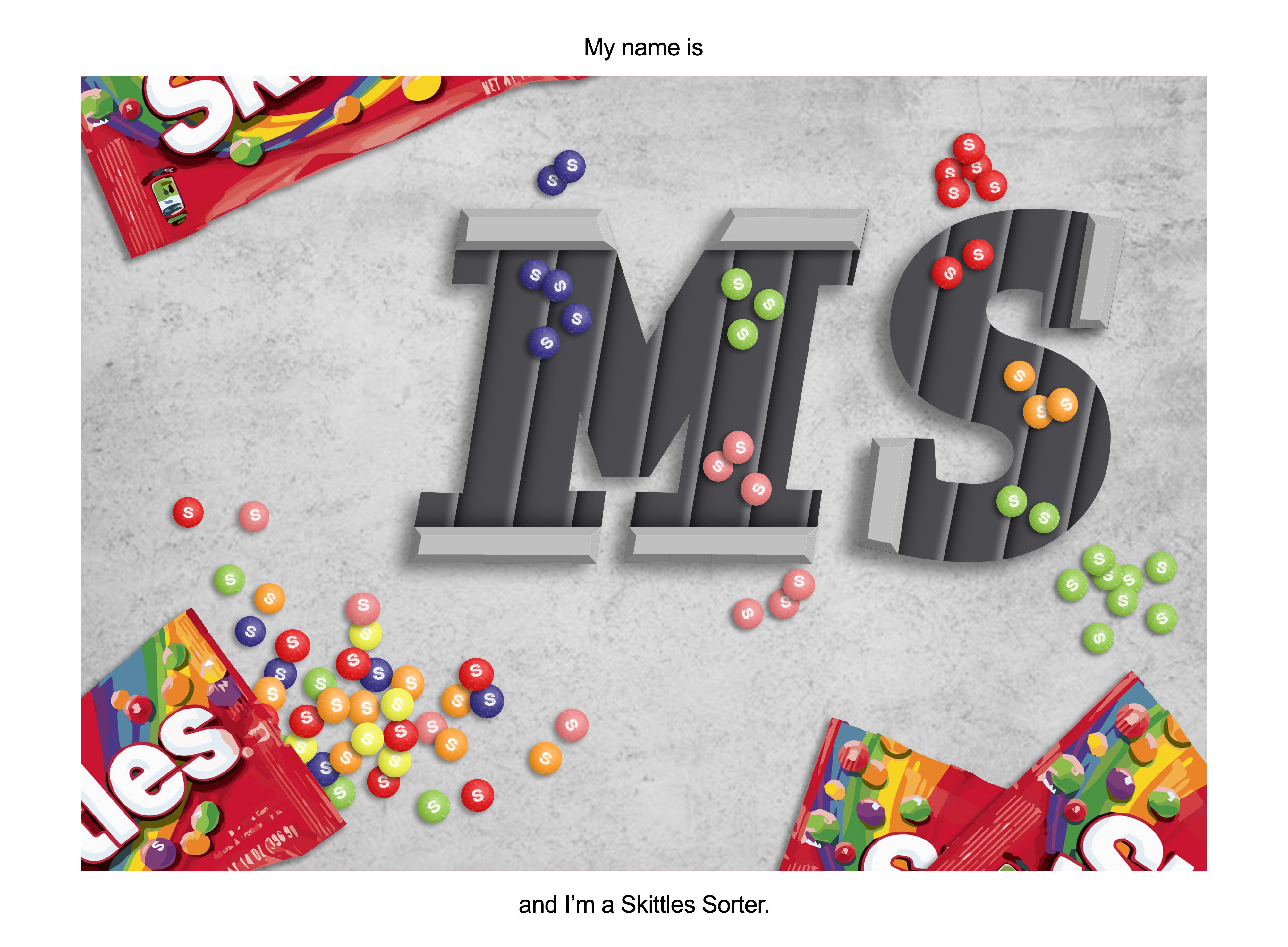
To create the gummy texture, I quickly realised it’s impossible for me to paint it digitally so I went to a software that I knew I could recreate it with a lesser time. Autodesk Maya

References:

First tryout with the material preset

Feedback: The material feels more like jelly rather than gummy. The feeling of amputator isn’t exactly there. Might help to add some bones inside maybe?

After all the modelling and material for the gummy and the bones are done, I figured it would help by adding a scalpel into the scene to give the feeling of being amputated. Then I moved on to lighting the scene to make it look like one of the scenes from Shrek, whereby gingerbread man was held captive at the table at Lord Farquaad’s castle. 

Final Composition of passes

Final Outcome:


Fourth job: Underwater Farmer

This was definitely the one that I faced the most problem with with countless times of redoing and re-testing and finding new ways to achieve the results I have in my head. 

References:

So I started out being a little confident and excited about this since I thought I had something after my first try.

UNTIL I realised I had to trace out every single face of the letter, even the ones behind since water was transparent. That’s when I started a whole lot of testing in Photoshop, Illustrator and Maya. (tho I didn’t want to use Maya for this composition)

Some of the failed attempts: (there were probably like 4 times the number of tryouts here)

Transparency on Photoshop 3D extrusion didn’t work well and the 3D function in Illustrator didn’t have the transparency option and I didn’t want to model all the elements in 3D in Maya. T-T

I even gave up at a point in time and decided maybe I should just do a flat version of it. But I really really didn’t like how it looked so I went back to all sorts of testing.

THEN finally I figured a way of working around the both the softwares. I first created the letters in illustrator without transparency, then I brought it over to photoshop to overlay the textures and adjusted the opacity is make it look like water.

Final Outcome:


Overall, I found this assignment really interesting and fun. The fact that we had to choose nonsensical jobs meant that we really had to communicate solely through the elements in the font itself. Although I was very confused during the first 2 weeks, I think I got a hang of the aim of the project. I stayed true to the font and stopped myself from adding any addition stuff outside of the letter itself. I also managed to learn abit of Illustrator which I found to be quite useful.