
History of Design (Lecture 4) – Reflection & Feedback
The past 4 weeks of History of Design for Graphic Design had been very interesting and informative. Since I’m a PD IM kid, I thought that History of Graphic Design class would be a tiny little boring for me but surprisingly, I found it pretty interesting. I originally thought that History of Graphic Design would just be focusing on topics such as the well-known Bauhaus, Cubism etc but I loved the fact that we went all the way back to the Egyptians and ancient methods of writing. I really enjoyed the first lecture. From cuneiforms to contemporary fonts, I thought that the content was informative and was able to pique my interest. Having the sheet of keywords for every lesson was effective since there was no additional information on it, I guess it kinda forced us to pay attention and take down notes during class. The reflection assignment every week required us to do additional research which was very helpful with helping to retain information and getting a deeper understanding on the topic we chose that interested us the most during the lesson.
From these 4 weeks of History of Graphic Design classes, I really learnt a lot about how graphic design evolved over the years and how we have came this far with the help of technology. Overall, History of Graphic Design had been a lot more bearable and interesting than I had anticipated. Thank you for the last 4 weeks Desmond!
History of Design (Lecture 3) – Zang Tumb Tumb

What caught my eye during this week’s lecture was Futurist books, or rather the Zang Tumb Tumb. Mainly because it reminded me of this series of books that I used to read when I was a kid, Geronimo Stilton. Especially since the creator of Zang Tumb Tumb, Filippo Tommaso Marinetti, identified his book as a sound poem book which was weirdly similar to the Geronimo Stilton books.

https://origin2images-rainbowresource.netdna-ssl.com/products/067136i02.jpg
Back to Marinetti. In his book, Marinetti abstained from using any verbs or adjectives instead he used only nouns which he strategically placed and scaled to express the words in the way they sounded. I thought that this was really innovative of Marinetti especially when back in the days, the only way that people knew how to write was the conventional way of writing. His revolutionary way of writing freed typography from the restrictive layouts into a means of dynamic expression.
 https://en.wikipedia.org/wiki/Zang_Tumb_Tumb#/media/File:Marinetti-Motagne.jpg
I think Marinetti’s idea of “words in freedom” played a big part in the history of art. His innovation was what fuelled and influenced the development Calligrammes later in the years, which contributed to more visual poetry books during the futurism period.
During my research, I found an interesting video of animated visuals from Marinetti’s book paired with recordings of him reading excerpts from his sound poems.
History of Design (Lecture 2) – Ukiyo-e

The term Ukiyo-e direct translates to “pictures of the floating world”. When identified as an art genre, it generally refers to the woodblock prints/painting produced during the 17th-19th century that features the hedonistic lifestyle that the people had during that period. During my research, I came across this print that seemed familiar cause it reminded me of the skeleton monster that was featured in the movie “Kubo and the two strings”.
 https://en.wikipedia.org/wiki/Ukiyo-e#/media/File:Takiyasha_the_Witch_and_the_Skeleton_Spectre.jpg
Princess Takiyasha Summons a Skeleton Spectre to Frighten Mitsukuni, Utagawa Kuniyoshi, c. 1844
 http://cdn.collider.com/wp-content/uploads/2016/06/kubo-and-the-two-strings-set-54.jpg
Set Design of the movie “Kubo and the two strings” , LAIKA, 2016
After some googling, this art piece, Princess Takiyasha Summons a Skeleton Spectre to Frighten Mitsukuni, was by an artist named Utagawa Kuniyoshi. Kuniyoshi’s artistic capabilities were realised at the age of 12 and had been actively producing art ever since. His art features a wide range of themes from warriors to myths to landscapes to samurai cats. In the lecture, we learnt that Ukiyo-e was the main influence for the art movement, Art nouveau. Interestingly, many elements of Kuniyoshi’s works were inspired by Western Art. Kuniyoshi was known for his interesting use of different composition and bold colours in his works.
 https://data.ukiyo-e.org/mfa/images/sc154715.jpg
Sanuki no in kenzoku o shite Tametomo o sukuu zu, Utagawa Kuniyoshi, c. 1848-1852
 https://www.artelino.com/show/japanese_single_print.asp?mbk=48660
Archer Sinks Enemy Ship, Utagawa Kuniyoshi, c. 1843-1846.
 https://www.britishmuseum.org/research/collection_online/collection_object_details.aspx?objectId=3277661&partId=1
Oboshi Rikiya Yoshikane, Utagawa Kuniyoshi, c. 1847
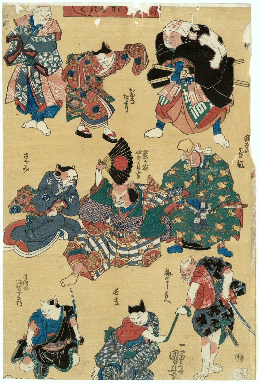 https://data.ukiyo-e.org/mfa/images/sc138217.jpg
Cats, Utagawa Kuniyoshi, c. 1839-42
Looking at the intricate details on some of his works makes it almost hard to believe that they were done using woodblock printing; the swirls on each of the fish’s scales for instance. Also the application of colour on each print, to think that one separate woodblock is needed for each colour for each print is pretty insane, considering the range of colours they have on the fully coloured prints, also known as Nishiki-e. I cannot imagine the amount of time and effort these artists put into a single piece of art work back in those days. It makes us appreciate the convenience we have now to mass produce prints.
History of Design (Lecture 1) – Boustrophedon


“Turning like oxen in plowing” was the thing that stood out the most to me during the lecture. At first it was cause I found it cute how the word was just a direct translation of the meaning but then at the same time, I could relate as to why it was adopted as a method of writing and reading.
I think we all had moments when we realised we read the same line of text or skipped a line of text from misjudging where the next line starts after finishing the line on the other side of the page. (or maybe that’s just me) That was why I found this a rather smart and effective way of writing in comparison to our modern way of writing.
I was genuinely curious why this method of writing and reading was scrapped.
However after researching and reading more into Boustrophedon, I realised it wasn’t how I imagined it to be. Apparently, along with the sentence, even the letters in the words were flipped/mirrored. What I had in mind was something
would I but all at way this in reading mind wouldn’t I ,honestly and this like
imagine writing to be a nightmare. Anyhow, it was interesting to learn that this was once used as a method of writing in the ancient times as it didn’t occur to me that a different way of writing from left to right/top to bottom actually existed.
I came across this during my research which I thought was quite cool. This is a stele from the 6th century BC that features inscriptions written in the boustrophedon style. The flipped/mirrored letters are quite obvious in some lines if you were to look carefully at the inscriptions.

Photo credit: https://www.britishmuseum.org/research/collection_online/collection_object_details.aspx?objectId=459473&partId=1