Automated Utopia – IM2 Guest Lecture Reflection

During Week 9 of the semester, we had a guest lecture conducted by Ong Kian Peng on Automated Utopia. The lecture surrounded around the topics of Artificial Intelligence, of whether it would create a utopian or dystopian world, and also works that incorporated AI into them.

I’ve always thought of AI as a tool to help us human beings progress further in technology to help those in need, especially in the health care sector. During the lecture, we were introduced to many works of artists that uses AI and films that addresses the relationship humans have with AI. One of the films that really made an impact on me was the film “Doomsday Book” by Kim Jee Woon. 

Doomsday Book consists of 3 short films of which the second short, The Heavenly Creature, talks about a robot in a Buddhist Temple that gained digital consciousness and achieved enlightenment. Monks in the temple treated him as a deity and started to worship him. The company that created the robot then sent a repairman to the temple with intentions to shut him down as they deemed it as a malfunction. I think this film addresses the fear that people have over the whole idea of AI becoming something more than we have intended for them to be. Gaining consciousness and us losing control over them. As mentioned by Dr. Ayanna Howard in the video, How Far is Too Far? | The Age of A.I..

One misconception of AI is that there is a super intelligent being that knows all, can do all, smarter than all of us put together. that is a total misconception. AI is built on us, AI is mimicking our thought process. AI is basically an emulation of us.

I would like to think that Artificial Intelligence is created to enhance us and not replace us. Softwares and code have been written to aid humans in decision making but it all comes down to us to make the final decision, whether we choose to trust the AI or our own instincts.

In the context of the art scene, there is always the concern of whether AI will eventually replace artists. Rather than replacing, I think that AI is a means of enhancing and aid to the artists. Out of the artworks that were shown during the lecture, I found Sougwen Chung: Drawing Operations Unit: Generation 2 to be very interesting. This artwork was created by Chung and a robotic arm that was trained to learn and follow Chung’s style of art. The robotic arm draws alongside with Chung in real time to create the art piece. While some artists may use AI and data as a medium to create their works, (for instance, Refik Anadol) Chung’s work feels more like a collaboration between an artist and a robotic arm that is controlled using AI. 

Ultimately, I feel it all comes down to what we human choose to do with this piece of developing technology but I do strongly believe that AI will aid us into going towards a more utopian world. 


https://www.youtube.com/watch?v=UwsrzCVZAb8&t=1s
https://www.cinemaescapist.com/2015/05/review-doomsday-book-south-korea-2012/
https://sougwen.com/machinecollaboration


History of Design (Lecture 3) – Zang Tumb Tumb

What caught my eye during this week’s lecture was Futurist books, or rather the Zang Tumb Tumb. Mainly because it reminded me of this series of books that I used to read when I was a kid, Geronimo Stilton. Especially since the creator of Zang Tumb Tumb, Filippo Tommaso Marinetti, identified his book as a sound poem book which was weirdly similar to the Geronimo Stilton books.


https://origin2images-rainbowresource.netdna-ssl.com/products/067136i02.jpg


Back to Marinetti. In his book, Marinetti abstained from using any verbs or adjectives instead he used only nouns which he strategically placed and scaled to express the words in the way they sounded. I thought that this was really innovative of Marinetti especially when back in the days, the only way that people knew how to write was the conventional way of writing.  His revolutionary way of writing freed typography from the restrictive layouts into a means of dynamic expression.


https://en.wikipedia.org/wiki/Zang_Tumb_Tumb#/media/File:Marinetti-Motagne.jpg


I think Marinetti’s idea of “words in freedom” played a big part in the history of art. His innovation was what fuelled and influenced the development Calligrammes later in the years, which contributed to more visual poetry books during the futurism period.
During my research, I found an interesting video of animated visuals from Marinetti’s book paired with recordings of him reading excerpts from his sound poems.

History of Design (Lecture 2) – Ukiyo-e

The term Ukiyo-e direct translates to “pictures of the floating world”. When identified as an art genre, it generally refers to the woodblock prints/painting produced during the 17th-19th century that features the hedonistic lifestyle that the people had during that period. During my research, I came across this print that seemed familiar cause it reminded me of the skeleton monster that was featured in the movie “Kubo and the two strings”.


https://en.wikipedia.org/wiki/Ukiyo-e#/media/File:Takiyasha_the_Witch_and_the_Skeleton_Spectre.jpg
Princess Takiyasha Summons a Skeleton Spectre to Frighten Mitsukuni, Utagawa Kuniyoshi, c. 1844

http://cdn.collider.com/wp-content/uploads/2016/06/kubo-and-the-two-strings-set-54.jpg
Set Design of the movie “Kubo and the two strings” , LAIKA, 2016


After some googling, this art piece, Princess Takiyasha Summons a Skeleton Spectre to Frighten Mitsukuni, was by an artist named Utagawa Kuniyoshi. Kuniyoshi’s artistic capabilities were realised at the age of 12 and had been actively producing art ever since. His art features a wide range of themes from warriors to myths to landscapes to samurai cats. In the lecture, we learnt that Ukiyo-e was the main influence for the art movement, Art nouveau. Interestingly, many elements of Kuniyoshi’s works were inspired by Western Art. Kuniyoshi was known for his interesting use of different composition and bold colours in his works.


https://data.ukiyo-e.org/mfa/images/sc154715.jpg
Sanuki no in kenzoku o shite Tametomo o sukuu zu, Utagawa Kuniyoshi, c. 1848-1852

https://www.artelino.com/show/japanese_single_print.asp?mbk=48660
Archer Sinks Enemy Ship, Utagawa Kuniyoshi, c. 1843-1846.

https://www.britishmuseum.org/research/collection_online/collection_object_details.aspx?objectId=3277661&partId=1
Oboshi Rikiya Yoshikane, Utagawa Kuniyoshi, c. 1847

https://data.ukiyo-e.org/mfa/images/sc138217.jpg
Cats, Utagawa Kuniyoshi, c. 1839-42


Looking at the intricate details on some of his works makes it almost hard to believe that they were done using woodblock printing; the swirls on each of the fish’s scales for instance. Also the application of colour on each print, to think that one separate woodblock is needed for each colour for each print is pretty insane, considering the range of colours they have on the fully coloured prints, also known as Nishiki-e. I cannot imagine the amount of time and effort these artists put into a single piece of art work back in those days. It makes us appreciate the convenience we have now to mass produce prints.  

History of Design (Lecture 1) – Boustrophedon

“Turning like oxen in plowing” was the thing that stood out the most to me during the lecture. At first it was cause I found it cute how the word was just a direct translation of the meaning but then at the same time, I could relate as to why it was adopted as a method of writing and reading.

I think we all had moments when we realised we read the same line of text or skipped a line of text from misjudging where the next line starts after finishing the line on the other side of the page.  (or maybe that’s just me) That was why I found this a rather smart and effective way of writing in comparison to our modern way of writing.

I was genuinely curious why this method of writing and reading was scrapped.
However after researching and reading more into Boustrophedon, I realised it wasn’t how I imagined it to be. Apparently, along with the sentence, even the letters in the words were flipped/mirrored. What I had in mind was something
would I but all at way this in reading mind wouldn’t I ,honestly and this like
imagine writing to be a nightmare. Anyhow, it was interesting to learn that this was once used as a method of writing in the ancient times as it didn’t occur to me that a different way of writing from left to right/top to bottom actually existed.


I came across this during my research which I thought was quite cool. This is a stele from the 6th century BC that features inscriptions written in the boustrophedon style. The flipped/mirrored letters are quite obvious in some lines if you were to look carefully at the inscriptions. 


Photo credit: https://www.britishmuseum.org/research/collection_online/collection_object_details.aspx?objectId=459473&partId=1


Project 2b – LOCALE Creative Process Journal

When we were told to explore around own neighbourhood and make a zine about it, my first instinct was to find somewhere aesthetic and take a bunch of nice looking photos. That is why the first location I decided to explore was a playground at the end of my street. 


I took a bunch of pictures but when I went home and looked through them, I didn’t see a common theme that I could tie them together with. Then I thought what about Chinese Garden. It has been agesss since I last went there. I used to go there often as a kid, especially during the Mid Autumn Festival for the lantern displays. It was kinda a family tradition we had until we grew up and eventually stopped going. 

I was literally still a baby when we visited Chinese Garden as a family.

Anyway I went there in the morning hoping it wouldn’t be too hot and crowded but it was already filled with elderlies doing morning exercise. So, I walked around Chinese Garden and spent around an hour taking photos. At first I wasn’t sure what I was going to be focusing on my zine and took a bunch of photos that had shapes, lines and textures. But halfway through the hour, I realised that there were actually a surprising number of reoccurring shapes in photos. So I tried to categorise the shapes and came up with the idea to match and align the shapes side by side. And I was able to find quite a few matching ones. 

Then I had to put these together into a zine and figure out the layout. I started by looking at references and inspirations on pinterest. I tried looking at more geometric layouts? Hoping it will have some relation to my focus on shapes. 


But after consultation with Shirley, I realised I haven’t been looking at enough zine inserts layout, but mostly cover pages.

This was the rough mock up I had after consultation with Shirley. 


This are the drafts I had for the various pages. Honestly I was very lost and quite unsure of the overall look I was going for.

Then I got most of layout somewhat finalised on the second last week.

Consulted with Shirley one last time and made some final amendments.
Final Design:

PRINTING
Despite being the final part of the project, I faced many issues during the printing process. First being the paper alignment. The test print of the spread would turn up perfect but when printing using a thicker paper, the alignment becomes waaay off. And because of the wrong alignment, folding along the centre line is impossible. I had to compromise the front and back pages so as to make the middle inserts match.

Luckily, one of the print outs had a vertical misalignment and not a horizontal misalignment so I could make it work with the bleeding. Though the colour was a little darker than I would have preferred.
FINAL BINDING
REFLECTION
From this project, I finally got to learn how to use InDesign. Something that seemed really intimidating to me at first. At the start, I was still trying to use Photoshop to plan out my layouts cause I wasn’t confident in my InDesign skills. But eventually I began to start using InDesign and actually got used to using it halfway through the project. Honestly, I’m not so much of a VisCom student and coming up with the layout kinda stressed me out. I was stuck even with artist references. BUT I’m glad I managed to pull this through and had a quite decent outcome? 

Graphic Form Project 1: IMAGE MAKING THROUGH TYPE

When we were first briefed about our first assignment and how it was coming out with nonsensical jobs, I was honestly quite excited and came out with a list of jobs that I thought was interesting. 

  • Skittles Sorter
  • Wrinkle Ironer
  • Bubblewrap Popper
  • Gummy Bear Amputator
  • Grape Deflator
  • Star Harvester
  • Mushroom Grower
  • Underwater Farmer

From here I tried to do up some sketches of how the entire design of the typography would look. Honestly, I got quite(very) confused about the entire concept of not bending the elements to fit the letters themselves. But some of the designs that I thought was bending were actually acceptable. Took me awhile to get it. Or did I really? Anyway, these are the final outcome and process of my 4 nonsensical future jobs expressed using type. 


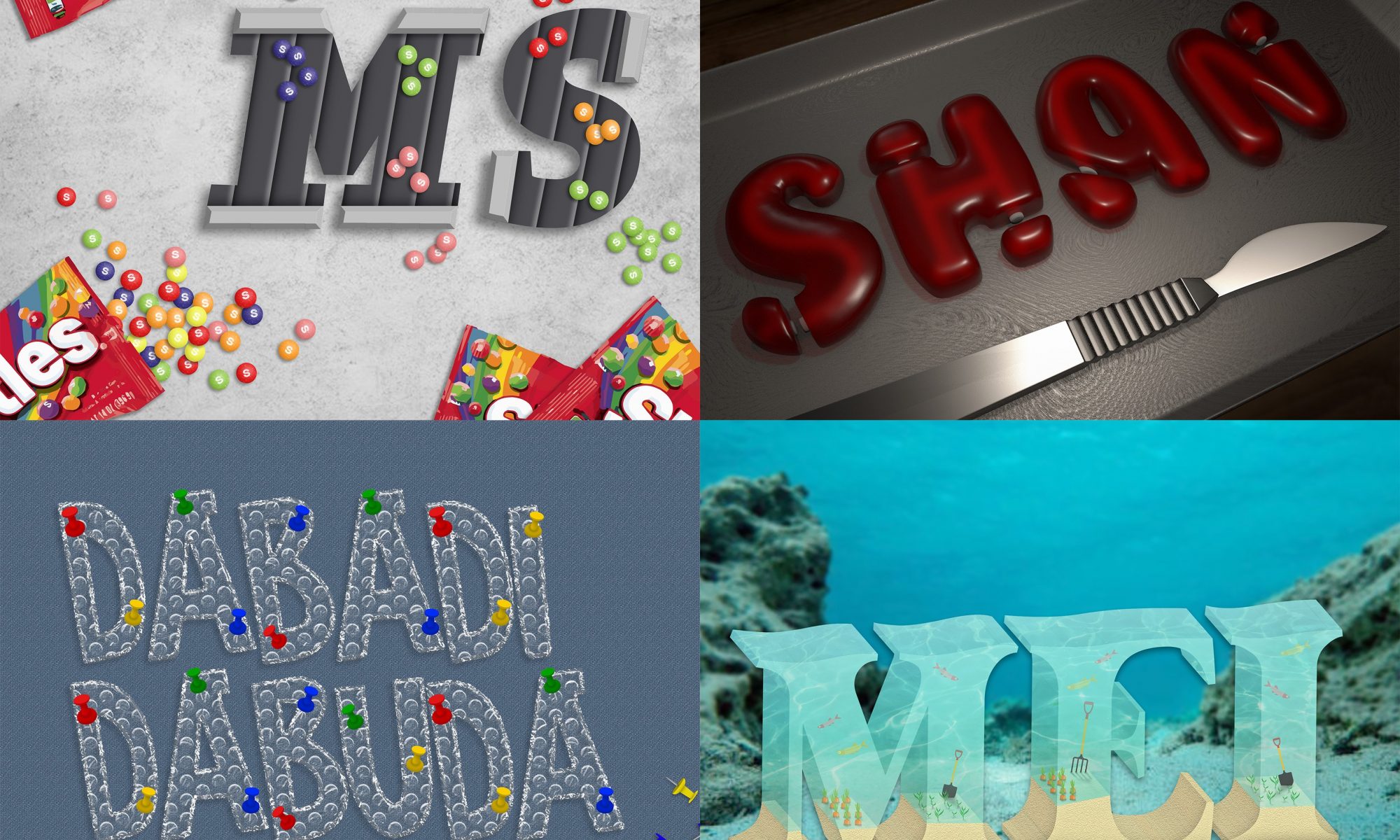
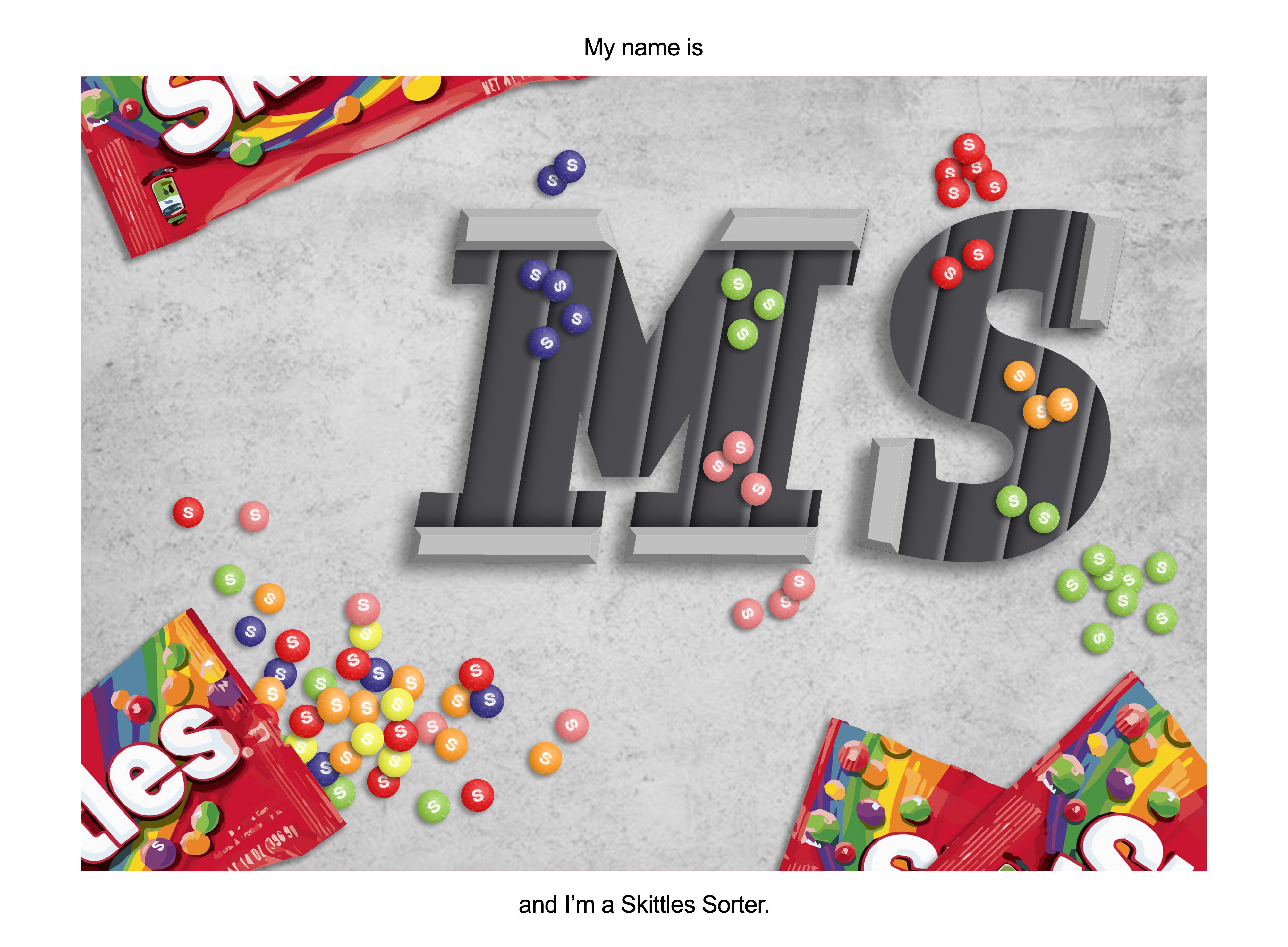
First job: Skittles Sorter

The first thing that comes to mind when I think about sorter would definitely be conveyor belts and mechanical hands that we usually see in factories.

As seen from my initial sketch, I didn’t quite catch the idea therefore actually went to arrange the various elements into the font.  but luckily I was corrected before I moved on to continue it digitally. After the consultation, I kinda got a rough idea of what I did wrong. The font should be prioritised first and it should look like a font. 

References

The font I chose is a font called “Slab Serif”. Unfortunately, it’s a paid font so I had to trace over the font sample that they provided on the website. Thank goodness this design only had 2 letters. 

So on my first attempt I tried to create a skittle that didn’t look too flat? Although the style I was going for on the conveyor belt is a vector style but I think it would look weird with just circles with a letter s on it. I tried 2 different styles for the letter S and decided the latter looked better. After getting some feedback from Shirley and friends, I decided to add some shadows on the conveyor belt and to make the skittles smaller, at the same time arrange them so that they look like they are sorted within the text itself. 


And another half done attempt at the design and I gave up halfway. 

Then I ended with something like this. Tried to overlap the skittles so it doesn’t look as static. Even by adding the sprinkle of skittles on the left bottom corner, it still felt very empty. That’s when I thought maybe I could try adding some packets of skittles. I was hoping the skittles at the bottom left would have the effect of leading the eye to the initials.

Final Outcome: 


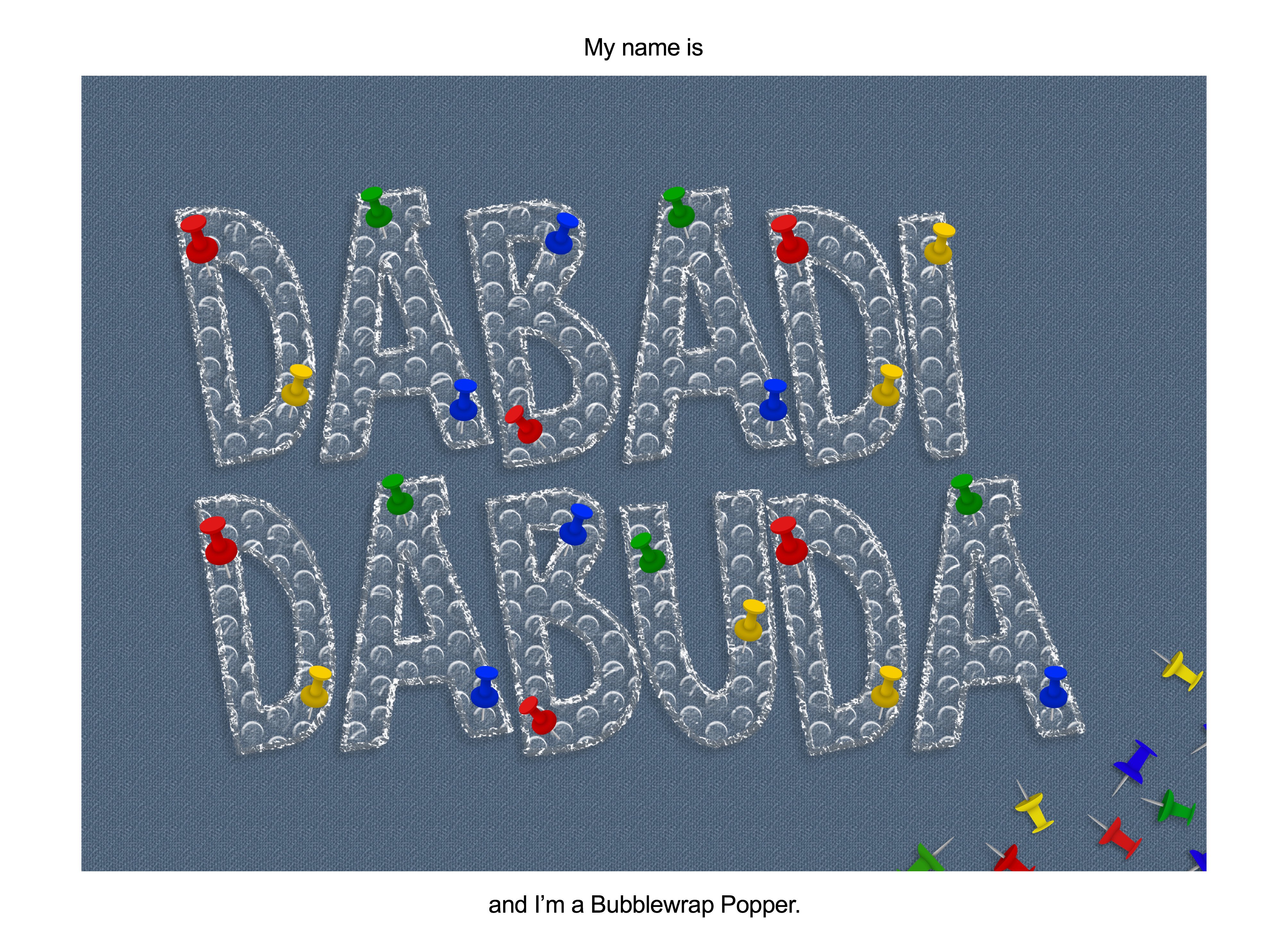
Second Job: Bubblewrap Popper

The elements in this job is kinda straight forward I think, bubblewrap and something to pop it, be it a needle or something sharp.

Initially I was actually thinking towards a comic style somehow. And by using the background, I could show the popping element. (which I after found out was not a wise thing to do since we needed to express the elements in the font itself)


For the first try, I used an online tutorial to create the bubble wrap texture using the blending modes on Photoshop. The results were okay and I went on to think about the popper element. I had troubles trying to incorporate needles into the font itself and I wondered if I could add a finger instead. Since we usually pop bubble wraps by squeezing them with our fingers. I tried a few placements of the finger on the letters I decided that I should risk having any elements sticking out of the font itself. I also decided to split it into 2 lanes so that the letters could be overall bigger. 

After getting some feedback, we decided that a pushpin would better express the idea of popping rather than a finger.

Final Outcome:


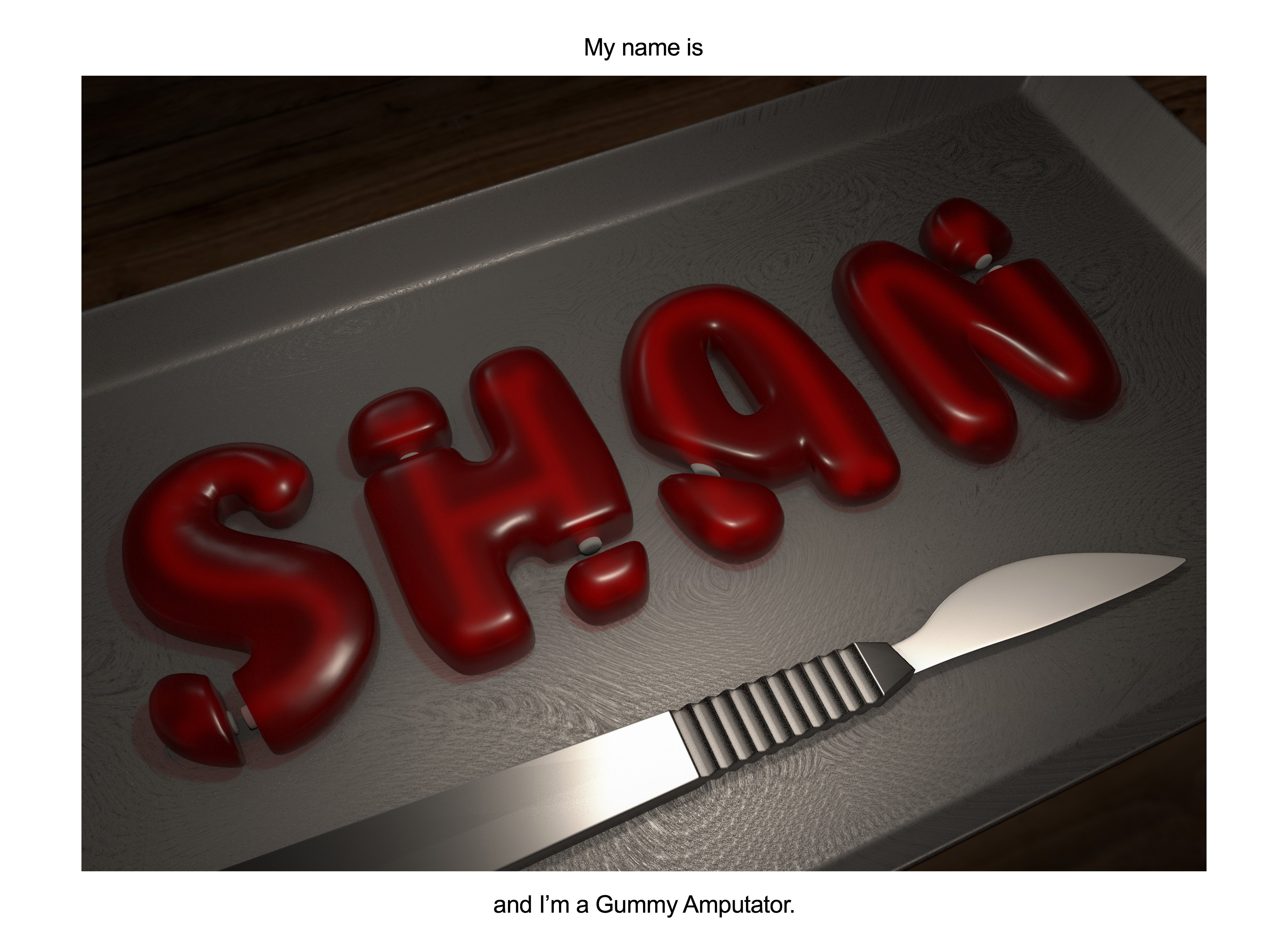
Third job: Gummy Amputator

Initial idea was a Gummy Bear Amputator but because of the additional parts I wanted to add onto the letters to make it a bear, we decided to just swap careers and be a Gummy Amputator instead. 

To create the gummy texture, I quickly realised it’s impossible for me to paint it digitally so I went to a software that I knew I could recreate it with a lesser time. Autodesk Maya

References:

First tryout with the material preset

Feedback: The material feels more like jelly rather than gummy. The feeling of amputator isn’t exactly there. Might help to add some bones inside maybe?

After all the modelling and material for the gummy and the bones are done, I figured it would help by adding a scalpel into the scene to give the feeling of being amputated. Then I moved on to lighting the scene to make it look like one of the scenes from Shrek, whereby gingerbread man was held captive at the table at Lord Farquaad’s castle. 

Final Composition of passes

Final Outcome:


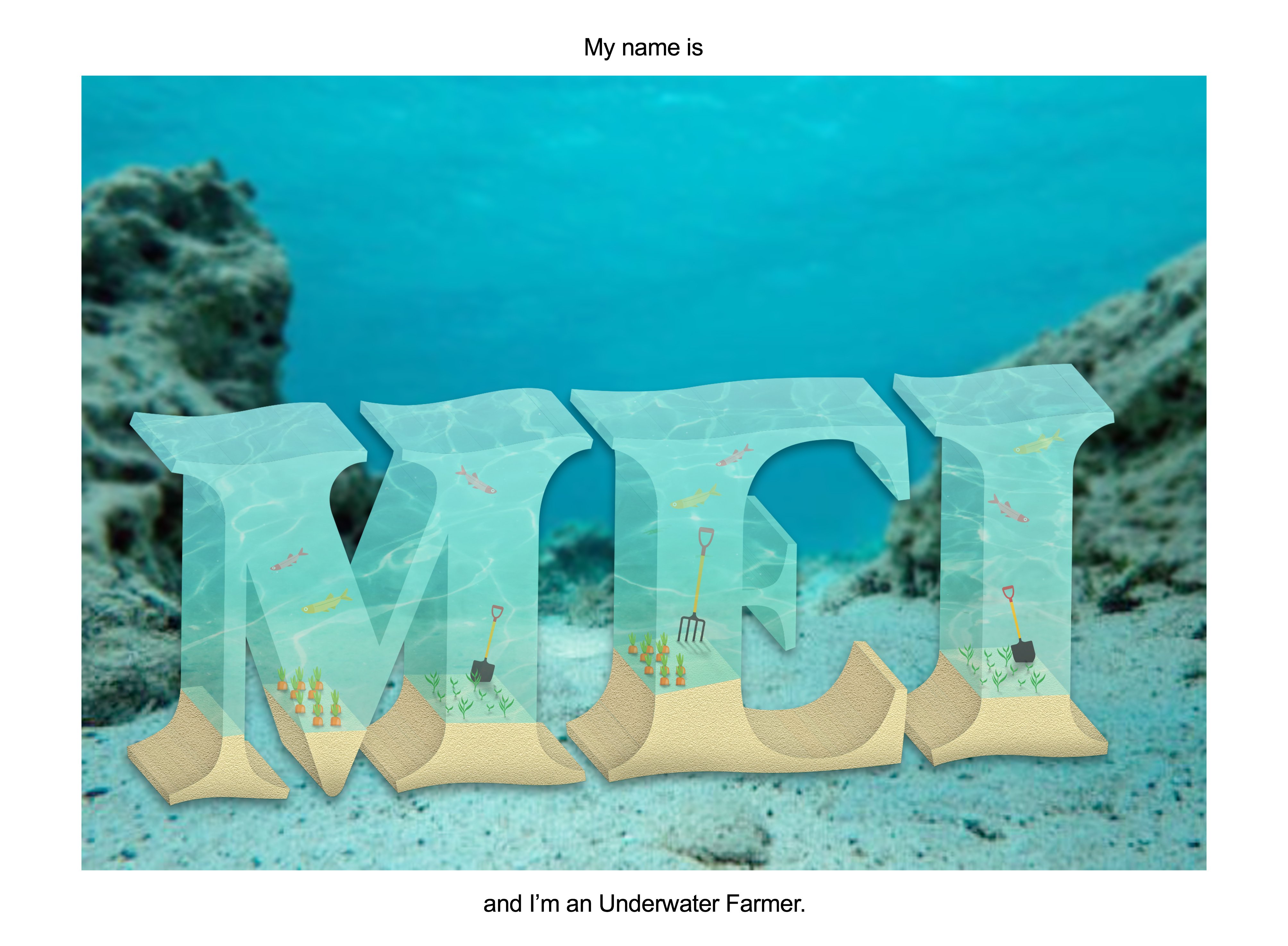
Fourth job: Underwater Farmer

This was definitely the one that I faced the most problem with with countless times of redoing and re-testing and finding new ways to achieve the results I have in my head. 

References:

So I started out being a little confident and excited about this since I thought I had something after my first try.

UNTIL I realised I had to trace out every single face of the letter, even the ones behind since water was transparent. That’s when I started a whole lot of testing in Photoshop, Illustrator and Maya. (tho I didn’t want to use Maya for this composition)

Some of the failed attempts: (there were probably like 4 times the number of tryouts here)

Transparency on Photoshop 3D extrusion didn’t work well and the 3D function in Illustrator didn’t have the transparency option and I didn’t want to model all the elements in 3D in Maya. T-T

I even gave up at a point in time and decided maybe I should just do a flat version of it. But I really really didn’t like how it looked so I went back to all sorts of testing.

THEN finally I figured a way of working around the both the softwares. I first created the letters in illustrator without transparency, then I brought it over to photoshop to overlay the textures and adjusted the opacity is make it look like water.

Final Outcome:


Overall, I found this assignment really interesting and fun. The fact that we had to choose nonsensical jobs meant that we really had to communicate solely through the elements in the font itself. Although I was very confused during the first 2 weeks, I think I got a hang of the aim of the project. I stayed true to the font and stopped myself from adding any addition stuff outside of the letter itself. I also managed to learn abit of Illustrator which I found to be quite useful. 

The Journey

Journal Entry 1 – Day 1

IMPORTANT THINGS TO REMEMBER
– GOAL: Escape out of this place
– Limited candle bits, use sparingly (7, now 6 left)
– DO NOT burn or cut the strings (until it’s time)
– Clear all traces after the end of everyday
– You are being watched during the day
– DO NOT GET CAUGHT NO MATTER WHAT


Today has been a crazy day. I don’t know how long will this candle last me but I’m gonna try my best to note down everything before a new day starts and my memory resets, or so mentioned in the note from them. To summarise, I woke up this morning alone in a forest with a note beside me, supposedly from a friend (maybe?) that was previously with me. I’m not too sure myself as I don’t seem to have any memories from before I woke up. Writing this down is supposedly gonna help me record down my progress and remind me every morning about what is to come. 

The note mentions that I’m the last one of the seven that was originally here together. I should also mention there’s 6 of these journal entries, similar to what I’m writing now, that comes with this note that is dedicated to me. In each of those journals, only 7 days were recorded, whether they made it out or not. Out of where precisely, I’m not sure. But I’m guessing, 7 days the maximum time I have to figure things out. I have never questioned nor realised the strings on my arms and legs but the note tells me to never burn or cut any of these strings, until it’s time. I can’t see the end of the strings but they seem to be attached to somewhere high up in sky.

The note also mentions that now that I have “wakened up”, I mustn’t act out of the norm to spark the suspicions them, whoever that might be. Since I was awakened, I’m starting to take notice of my surroundings. A factory can be seen from afar that seems to be operating 24/7, judging from the constant smoke from its chimneys.  Apparently, before any one of us awakened, everyone were all mindlessly harvesting a 7 legged shiny blue insect that can only be found at least 3 feet underground, for whom I’m not sure. Today, whilst wandering around, I saw others that were like me but they were just mindlessly digging with soulless eyes, none of them talked or interacted with each other. The note specifically warned me to not get in contact or talk to anybody else I see as waking other people and working in a group could spark the suspicions of the people up there. At sunset, a loud bell was sounded and a bright light is lit up from the top of the factory like a lighthouse,  and everyone would start walking towards the factory. It’s almost like they were all hypnotised by the light. That is when everyone would gather and deposit their loots for the day into the factory and return to where they were last digging. It’s then when all lights will go out and everything turns pitch black. 

As said from the note, we were a division that consisted of 7 of us that’s in charge of searching the north-east area, which is the area furthest from the factory; until one day, one of us was somehow awakened (lets call him 1 for now) and discovered a way out of this place. No one knows what lies beyond this world that we know of, but 1 managed to figure it out and when he escaped, he passed on the information to the next person. 

Today has been an absolutely sensory overload day, I don’t know how long has passed since the last person left and if all of these is true. I guess I can only take this one step at a time and see where all of these gets me. If whatever they said was true, I would most likely not remember everything that has happened today and would have to rely on this journal of mine to remind myself about what’s happening. The candle is almost burnt out, I’m going to list some final stuff down before it gets too dark to see anything at all. 


EXTRA NOTES TO THE TOMORROW ME
– Some big foot markings were spotted on the mud today, don’t know what they were, not mentioned in note
– Search for some kind of map in past journals that states the possible location of the exit
– Use the night time wisely as I only have the time of a candle to provide light at night
– Use the night time to read up on past journals and record down all findings


Photo Credit: https://www.shutterstock.com/video/clip-9726302-time-lapse-letter-being-hand-written-fountain-pen