ADM UX
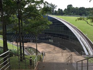
The ADM building is so beautiful but the way finding is actually quite unclear for someone who is unfamiliar with the space. The design of this building and surrounding area is very serene, there are palm trees and water features and it’s a really nice! People sitting outside socialising and look very relaxed.
Location – ADM is in the center of the campus so it is relatively easy to get to. It is near to two bus stops, canteens, halls and not too far from North Spine.
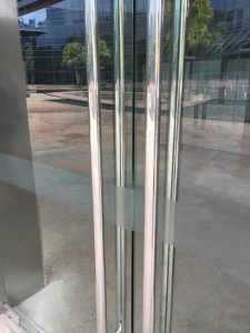
Entrance – there is no signage to say that this is the ADM building! Nothing to introduce visitors or to label it. Also the gates around the pathway don’t allow you cross by the round about, instead adding extra walking which is frustrating but it does guide you straight to the stairway down to the building.
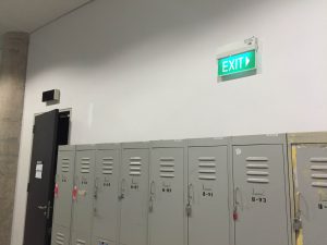
Signage – none on the exterior of the building and very little inside. The only visible signage is names on the classroom doors, by the elevators and the exit signs in the hallways.
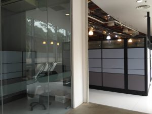
Spatial Arrangement – entering on the right side of the building there seems to be lots of offices in this narrow and dark corridor –feels a bit like you’re in the wrong place! While the classrooms are labeled the arrangement is confusing- once you get to the end of one side the numbers start up again but on the opposite side of the building. Also some classes have a and b after the number and others don’t?


Good Map Design – Singapore MRT
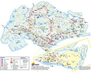
The layout of the map is easy to follow because of the different colours used to differentiate each line. It particularly works well to show the stops that have changes to other lines and the key is very understandable as the colours correlate clearly to the map. The layout is effective in providing enough space for all the station names to be easily read, and allowing each line to be separated enough to be differentiated. It looks spacious rather than cluttered which makes reading the map very easy.

Poor Map Design – Sentosa Island
This map was difficult to understand. Firstly the light yellow colour of the island is very similar to the white roads, which makes it hard to distinguish the two. The map is very busy and cluttered with symbols and text so it is tricky to focus on a certain area or even to find a particular location. The brightly coloured symbols stand out more than the text (despite their unimportance) and the abundance of text also covers up the roads so you can’t see where to walk. This was a problem I faced as some pathways are dead ends but that isn’t visibly communicated on the map.

Getting Lost – HarbourFront
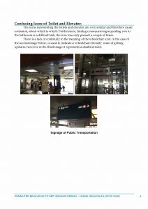
From getting off the MRT at HarbourFront to finding the Sentosa Boardwalk I got very confused! After swiping off at the station I saw a sign for the Boardwalk that point up, so went up the escalator at which point all signage ceased and there was no directions for where to go next. I actually went back downstairs to see if I had misinterpreted the sign, found out from another sign it was on level B2 which meant going up two escalators. Once doing this there was a sign directing my pathway but from there it took a while to find another. The signage here was very inconsistent and unspecific.
Reading Response – The Design of Everyday Things
It was really fascinating to read about the relationship of psychology and design/technology. It’s so easy to take objects and technology for granted because we use them so often their operation is almost second-nature, our understanding is so comprehensive. However that is only actually relating to an understanding of these objects doing what we want them to, or what we specifically use them for. Like the author described, it’s so easy to just focus on what you know, or the bit you can control of an object and just disregard the functions you don’t understand. When something doesn’t work its so common to just let it go because we don’t understand, therefore we start to not take full advantage of the object in use, simply using it for some of its potential.
The reading made me more attune to the concept of good design and how difficult it actually is to achieve- to add value without confusion or complexity. Also that the designer has to many people to satisfy when creating a product; the manufacturer, customer, purchaser and repairer. Even then the customer may not necessarily be part of the target audience so how can the designer make it understandable for those the marketing attracts too?
It’s interesting to think about the role of psychology of human thought and cognition. The fact that good design is considered to take advantage of the things people are expected to know/have previously learnt, shows how effectively design objects were in the past. The familiarity of knowing how something works, or having the recognition of a certain feature is crucial in aiding understanding. Therefore when new and improved models continue to use these features they are more successful as consumers have the prior knowledge of knowing how to control that function. So in creating a new product, is it worth combining recognizable features/controls to provide a basis for understanding from the user? Even despite no connection between the old and new products, but for the sake or familiarity? Without this it limits the possibility of inventing totally new things, as people don’t like something new that they don’t understand easily- it would be worth looking into the psychology behind this too. How could we make more people open to trying and learning how to use a product that is completely new? By explicitly demonstrating a new product, or having clear instructions perhaps?
Object analysis 1- Fob
Before arriving at NTU I hadn’t had the experience of using a fob. This object is a small round disc used to unlock doors/entrances. To operate it you simply hold it up to a sensor for a short amount of time, when the sensor makes a noise or lights up this is feedback that the lock is unlocked and you can open the door.
On a door it is pretty intuitive because there is no key lock so you realise there is another method to unlocking the door. However on the staircase doors it is common to just reach for the handle before realizing it requires unlocking first.
The light function can be frustrating as its not super bright during the day time, and it only flashes once so if you look away and miss it you aren’t aware if it has worked or not. Also I find the time taken to unlock the door varies and sometimes takes quite a while for the fob to register- perhaps because the sensor pad is quite small.
Alternate design
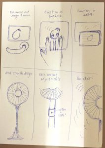
I would propose a design of the sensor pad that is more aesthetically appealing and not so big and clunky. Placing it just above the door handle would be more easily accessible and having a flat pad means you can hold the fob onto it, removes the accuracy needed. Also the register function could instead be a vibration so that you feel the feedback that the door is unlocked, which allows you to not have to focus your sight on the sensor so much, eg. you could multitask. Thirdly, I would add the ability for the fob to be sensed through other materials such as when it’s in your wallet, to improve accessibility and convenience.
Object analysis 2- Standing Fan
A fan is an electrical object that uses a rotation of blades to create a force of cool air. It is often available at different speeds which result is different intensities of the force of the air. There are other options you can adjust such as the height and direction of the fan, both left/right and pointed up/down, as well as making it oscillate. The fan affords lots of possibilities to suit the user. It is an intuitive experience as the user gets immediate feedback- when you press a button it clicks/locks in place and also the fan will begin to spin immediately after. These buttons are also often labeled 0-1-2-3 so the signs are very clear. Often you buy these and have to assemble the fan yourself, which is
Alternate Design
I think the overall aesthetic design could be improved to make it look more sleek and stylish, so it’s not such an eye-sore in the middle of the room! They could also have more variety so it becomes more of a feature in the room, so in different colours or patterns. Another idea would to make it more flexible, so that making adjustments wasn’t such a difficult task and the parts moved together with more ease. Finally I would make the functioning of the fan quieter, it is called a ‘whisper’ fan after all! Overall the function is excellent and probably could not be improved.
