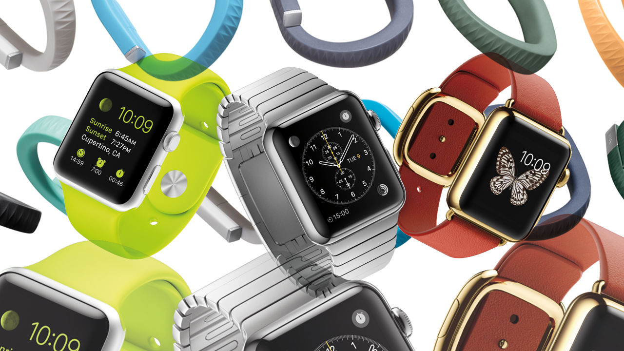
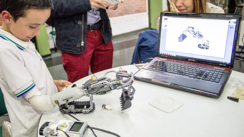
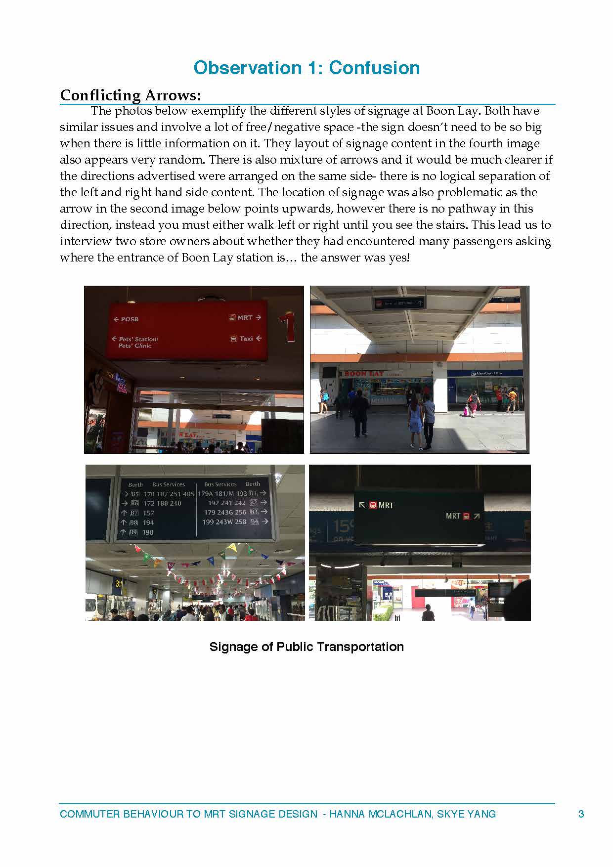
Assignment 7+8 – Project Proposals

Creating new screen-based UX design.

Can be based on past field trips:

  • Futureworld – interactions with art
  • Hawkers/Canteens – experience buying food
  • MRT – experience with transportation
  • Interactive design
  • Food UX
  • Transportation UX

Screen-based experience
Can be speculative… hypothetical, abstract, suppositive

Create an experience, interaction, response using…

  • Technology
  • App
  • Website
  • Wearable technology
  • Interface

Wearables

  • Limit interaction with smartphones
  • Useful in an everyday context
  • Wearables have become recognised as the future of technology
  • Smartwatches and activity trackers are so popular but they don’t do anything that a smartphone can’t
  • They aren’t essential

“There will be plenty of people who will benefit from smartwatches, but there won’t be many people who will be worse off for not having one.”

3036326-poster-p-1-its-time-to-look-beyond-the-smartwatch

With that in mind.. my research has come across some products that have influenced my ideas for a project.

Digital Tattoo – Project Underskin

screen-shot-2016-10-03-at-11-54-56-am

  • Technology and fashion reaching beyond the wrist
  • Smart digital tattoo implanted in your hand and interacts with things you touch

“It can unlock your front door, trade data with a handshake, or even tell you if you have low blood sugar.”

  • Cultural precincts may oppose this but its not a huge step forward from tattoos, piercings, birth control
  • It runs off of your body’s electro-chemical energy and can send out NFC signals
  • Can recognise location and body movements

—-> Digital Tattoo for MRT users

  • Instead of a smartwatch/smartphone/wristband, having a digital implant to pay for rides
  • Can track your location so reduces need to queue for the card-sensor stations
  • Accessible and useful for everyone as the MRT is used by all


Moment by Somatic Labs

3063400-inline-16-a-screenless-smartwatch-that-teases-an-alternative-future-of

  • A smartwatch with no screen –questions screen as a means of interface interaction
  • Communicates by sending vibrations in each corner of the watch, that the user is able to recognise
  • Connects with smartphones, creates vibration patterns to communicate who is calling/directions/music

—-> SMRT Wristband

  • Use to pay for rides
  • Can vibrate on arrival (to wake sleeping passengers)
  • Vibrate to communicate directions and aid people walking around the stations (signage is confusing)
  • Alternatively, create an app that can do all this
  • Minimises the things you have to carry
  • Makes process quicker
  • Everyone is using their phone anyway
  • Issues –availability of smartphone to everyone? Functionality with a dead battery?


Smart Contact Lens by Google and Novartis

3033085-poster-smartcontactlens

A contact lens to help diabetics monitor their insulin levels from tears. Uses a small glucose sensor and a wireless chip to transmit information from the eye.

  • health tracker
  • removes the need to diabetics to pin prick themselves
  • simple to use
  • design makes it subtle to wear -also not different to normal contacts
  • Google is even working on LED lights that will notify a wearer of low blood sugar right in their field of view -immediate feedback to user
  • can be used for non-diabetics to simply monitor healthy eating/dieting

I’d love to find a way to use this innovation…


More ideas I want to explore

  • Addressing the ‘issue’ of queueing and waiting times -providing an experience during these times and activating the dead space/public space
  • EG bringing a taste of the FutureWorld exhibition to the MRT – interactive walls to entertain the people in the space, enhance the boring and tired experience and also to advertise the exhibition to encourage people to go
  • Interactive advertising to provide a taste-test of the experience

Week 7+8 Assignment – Thoughtful UX Design

Uber

Uber is very well-known and popular due to its great use of UX and UI design.

uberpool-iphone-5s-640x743

  • clear and clean design -minimal colours used
  • easy to navigate and use app
  • use of tracking and gps makes it easy to define your location
  • quick response (often)
  • complaints are entertained -easy refund for any issues
  • visibility and recognition of important information -cars around your location/time til pick-up/cost of ride/car options
  • icons are recognisable
  • promos to encourage new users
  • cheaper than taxis (often)
  • easy and simple review system (of driver) -also recognises safety of the service
  • UberPool – I really like this feature as it makes the fares cheaper and also is beneficial for the environment because strangers share the ride instead of taking separate ones. It also shows how the company is constantly looking to improve and develop.


Smart Highways, Glowing Lines (glow-in-the-dark roads in the Netherlands)

This is definitely an innovative and forward-thinking use of UX design introduced to enhance road safety particularly in dimly-light streets.

  •  the project was conceived in 2012 by Heijmans and Studio Roosegaarde to create the “interactive and sustainable roads of tomorrow.”
  • uses luminescent paint that is charged by solar energy during the day and then glows for up to 10 hours when it gets dark
  • increases visibility
  • improves safety
  • sleek and simple design, aesthetically pleasing
  • easy to use/understand/see
  • environmentally friendly- solar powered


IKO Creative Prosthetic System

This innovation combines robotics, programming, and prototyping into a prosthetic arm that’s half prosthesis, half Lego set. It allows kids who are navigating the world with a disability to be able to create any kind of arm they want for themselves.

The prototype has a three main sections: a base that fits around an arm stump and senses for its movements, a “muscle” that translates those signals into motorized movements, and then the attachments, which can either be a conventional “hand” or many of the toy systems the Danish company has to offer.

3063953-inline-1a-the-2016-innovation-by-design-award-winners-user-experience

  • an interactive, innovative and creative experience for users/kids
  • playful and fun approach to UXD -appropriate for the target audience
  • empowers children with disabilities
  • encourages the navigation of the relationship between their bodies and the technology that will enhance their abilities
  • its personalisable -can function according to the needs of the user
  • double function -an arm and a lego set


One more because this is really cool…

Smart Contact Lens created by Google and Novartis

A contact lens to help diabetics monitor their insulin levels from tears. Uses a small glucose sensor and a wireless chip to transmit information from the eye.

3033085-poster-smartcontactlens

  • health tracker
  • removes the need to diabetics to pin prick themselves
  • simple to use
  • design makes it subtle to wear -also not different to normal contacts
  • Google is even working on LED lights that will notify a wearer of low blood sugar right in their field of view -immediate feedback to user
  • can be used for non-diabetics to simply monitor healthy eating/dieting


I discovered some more awesome UX examples on here https://www.fastcodesign.com/3063953/18-of-the-smartest-ux-designs-of-the-year

Week 7+8 Assignment – Reading response

Designing for the Digital Age: How to Create Human-Centered Products and Services by Kim Goodwin.

It’s so accurate the describe the world as shaped by humans and to suit themselves. We seem to be constantly inventing tools to make our lives easier and more enjoyable. Efficiency and convenience are a big part of innovations these days.

The statement about our different modes of communication is also something which technology has boosted. Thanks to technology, particularly smartphones, we are able to ‘talk to someone’ in a variety of different ways. And not always audibly but through the use of images, other visuals, sounds, gestures and other movements. Popular trends of social media like snapchat make it so easy to send photos to people to communicate something -where you are/what you’re doing/how you’re doing/for no reason at all, even without the use of words or intention for conversation.

“Design is the craft of visualising concrete solutions that serve human needs and goals within certain constraints.”

I like this quote because it summarises what it is to design. It also alludes to the idea that design is a mix of science and art, which I agree with! Design is creative problem solving that aims to serve human needs/goals. I think that with the influence and growth of technology design is moving towards being for functional, everything has a purpose and a goal. Design therefore appears to be improving and developing alongside that of technology.

The digital age has offered new challenges and capabilities to design. Airline customer touch points has really impacted from this – as I was leaving home to fly to Singapore I was amazed at how much technology had taken over the whole process, even for long haul flights, and the general lack of people involved in the process. I checked-in using a machine, printed my ticket and baggage sticker, but my bag into a weighing machine which deemed it okay, which then put it on the conveyor belt to get it to the plane. At no point during the check in process was I faced with anyone who worked for the company!

Product and service design, instead of experience design, is an interesting idea because obviously the designer wants to create a particular experience but a valid point is raised here about the chances of everyone having that same proposed experience perhaps being unlikely. Should the designer therefore create an opportunity for a particular experience, or should they just create an environment for any experience to take place, subject to the individual? Is product and service design successful simply by providing an experience to the user, or must it be the particular and intended experience?

Interaction design/Graphic design/Information design/Industrial design – it is interesting to consider how they all link and contribute to Experience design. HCI and IA design is also comparable. Will one trump all other one day, or will they somehow all merge? It seems confusing and an exaggeration to have so many different ‘types’ of design when they are similar and cross over in so many ways. I imagine that designers would have skills in a few of these areas because of this overlap.

I like the label of Goal-Directed design, however isn’t all design goal-directed? With regard to the design process, surely a designer cannot progress without a goal and a plan or achieving it? Despite not all design perhaps having a functional aim (maybe its just about aesthetic value) it must have an end goal or else what drives the process?

Incredibly, personas and other methods that have been developed and are still successful tools used today in the design process. It seems wise to mix new and successful methods to be most effective in creative problem-solving. Personas is a method I have used for a past project and I found it a good way to make sure that the product did everything it needed to, and that it would cater to all audiences it was intended for.

Principals – guidelines, can’t all be applied in all contexts, not all created equally -help user accomplish goal/help user minimise work?

Patterns -solutions used for similar problems, inform designers vocal

Processes -planning (objectives, idea, schedule)/research (define, decide, interviews, ethnographic research)/modelling (analysis, trends, personas)/requirement definition (implied factors, highlights needs)/framework definition (objectives, solutions)/detailed design (plan, refine, collaboration, determine product specifications, user testing)/implementation support (construction support, ongoing)

Practices -team structure, communication, collaboration, small team, team environment

These elements are a good reminder of how the design process works -it is not a straightforward journey, but consists of many influential factors that need to be considered.

Week 7+8 Assignment – FutureWorld review

Future World: Where Art meets Science exhibition at the ArtScience Museum @MBS.

This was such a cool exhibition! One that was definitely on my list of things to do whilst in Singapore. It was incredible to experience a place with so many interactive exhibits, as a view it really helped me to connect to the space.

We were very fortunate to have someone to show us around as it wasn’t always clear exactly what the artworks could do -but I imagine thats part of the fun exploring.

I think that exhibition showed that experience design has a large focus on the users experience when faced with a product or service. It should induce a response from the user and provide an experience. Future World also highlighted that there are so many kinds of responsive environments. There were exhibits that responded to touch, motion and proximity and they produced different effects.

I believe this has the power to really influence the world around us. We can see how technology is taking over to rapidly and becoming part of everyday life. Things are becoming more responsive and automated which enables us to almost think less and do more. Although Future World is perhaps more aimed at being a children’s playground, it is just as exciting for older people because of this integration of interactive technologies. It is a new technology to everyone and therefore we find it so interesting!

The Future Playground is an example of this as it has integrated technology into children’s toys. Not only do you play with wooden blocks, but moving them around the table then results in a change of animation/projection so it appears the environment is responding to your actions.

Communication appears to be becoming more than just verbal form. The artwork of illuminated colour blocks shows another form of communication -when the blocks match up correctly together then they both light up the same colour, and will change back when moved apart. This form of communication is received visually and immediately.

artscience-late-lp

Nature, the moving illustrations of flowers and butterflies respond to your movement and swarm around areas of shadow/standing, and the butterflies disintegrate if you hit the wall as they fluttered past.

img_9972 img_9973 img_9974


100 Years Sea Animation, showing the effects of global warming.

img_9975


Future Playground, Connecting! Train Block, the animation reacts to the blocks moving location on the table. This action creates new pathways and alters the thriving cityscape for the various trains, planes, boats and cars. img_9977


A Table Where Little People Live, characters and projected onto the table that will try to jump over your hands when you place them on the table too.
img_9979


Sketch Town, depicting Singapore city, you are able to colour-in vehicles and buildings and scan them through onto the projection transforming the 2D drawing into a 3D animations.

img_9980 img_9982


Media Block Chair, stacking blocks together makes them change to the same colour. You can construct furniture, towers and other structures. The boxes communicate as they connect and discontent by changing colours. img_9981


Light Ball Orchestra, touching the balls changes the colour and sound produced from the ones around it.
img_9983 img_9984 img_9985

Create! Hopscotch for Geniuses, your drawings customise the hopscotch with different arrangements of shapes. When you complete the course, the colours stepped on trigger another projection of colour and pattern on the other wall.img_9986

Story of the Time When Gods Were Everywhere, touching hieroglyphic characters makes them transform into natural elements like fire and trees, narrating the story of creation. img_9987 img_9988

Crystal Universe, more than 170,000 LEDS to create the effect of stars moving in space as well as planets, galaxies and gravitational waves.

img_9992 img_9994 img_9996 img_9997


It’s so cool reading about the different projects Teamlab has been involved in. They have aimed to portray the natural world in many of their artworks. They have even recreated the way that the landscape never looks the same by having a continuous rendering of the programme used- instead of an animation or loop. The fact that many of their pieces are interactive shows their understanding that human behaviour (and other environmental factors) all have an impact on the natural world.

4430

Nature is also a theme in this piece as it emulates the phenomenon of fire through use of bright coloured LEDs and various sounds. It even expresses the continuously changing and transformative quality of fire by not using pre-recorded imagery but constantly programming the spectacle (like the above artwork).

2955


I like how the Crystal Fireworks artwork has incorporated the use of smartphones as the means to activate a response from the LED light exhibit. This grants everyone the ability to interact with the exhibit as phones are a very current and popular form of technology.

It would be so interesting seeing this piece displayed outdoors! The external environmental influencing factors would be very apparent -the best visibility would be at night time and I wonder how it would be affected by wind/rain? At the exhibition however I think most of the amazement came with being surrounded and immersed in the exhibit, we were able to walk through it and experience it visually and audibly.

672

I think that involving the use of smartphone technology will encourage people to get involved in interacting with the exhibit.

955

Week 5 Assignment

Reading Response – Chipchase, Hidden in Plain Sight, You are what you carry CH4.

Again Chipchase has encouraged me to think about the ordinary and mundane tasks I perform in everyday life, in a way that I haven’t before.

I was able to relate to many of the points he discussed -I too have the ‘keys, money, phone’ point of reflection before leaving my room everyday to ensure I have remembered everything, but it was the analysis of these objects that interested me. Thinking about these objects in terms of offering us our primary needs is so accurate, and the secondary needs come from the other things we carry around -sunglasses, paper, pens, water, panadol etc are all ‘non-essential’ things that I take with me to alleviate my sense of perceived redundancies, they are the contingencies/items I may need.

This reading made me realise that I have a very small range of distribution, I like my belongings where I can see them. I think this is due to a high perceived risk, perhaps because I am in an unfamiliar country and still getting used to things in Singapore and also from past experiences like my house at home being robbed a few times. Therefore my sense of security has heightened both inside and outside of my home. Other contextual factors include being a foreigner and a traveller which has also boosted this sense of awareness and the safety of my surroundings. As I go to foreign countries my parents always remind me to be careful with my belongings particularly as getting replacements for any important documents/objects could potentially be very difficult being so far from home.

My organised personality has meant that I use centres of gravity to help me remember where I leave things. I try to put my things back in the same place (such as my keys/purse) and I definitely think that this mental convenience holds equal importance to the physical convenience.

The idea of physically carrying everything on your phone with you each day, instead of having it digitally stored, made me realise and appreciate the amount of information we have such easy accessibility to. Despite maybe not using all of my apps often, I still need them all as they will get used at some point. Chipchase touched on the idea of backing up data which made me recall how recently my mum’s hard-drive broke so we went to investigate getting it fixed and basically were told its not possible, they are made only to last a couple years and then you must purchase a new one. This seemed so strange to me because then you would have to back up one hard drive to another and surely you would run out of space very quickly? However this seems to be how technology is controlling us and taking advantage of our consumer practices, like how your iPhone will eventually slow down and loose function after a few years to encourage customers to buy a new one and constantly upgrade. Is this a result of technology advances occurring so rapidly or is it a marketing ploy to get us to continue to spend? It shows how we are “at the mercy of the network” and almost controlled by technology companies and the products that they produce.

I am intrigued by the idea of limiting our ownership while also increasing the number of things we use. This could increase the network of renting things, which already is a popular form of ownership. There seem to be so many platform sand opportunities to rent things temporarily rather than buying it as the use of that object doesn’t warrant or require a complete ownership. I wonder how far this concept could expand? There are already platforms for people to rent out their clothes, for example dresses for special occasions, so are there other objects that we use everyday which could be rented to us instead of purchased?

Finally I will address the notion of convenience, our need and appreciation of things to be smarter and faster. While the world is constantly changing and therefore technology is giving things the ability to be smarter and faster, should we really demand much more? The talk of putting sensors and tracking devices on us to analyse our habits seems too far! If we have companies guessing our next moves and being one step ahead where does that leave us? It takes away our control and our decision making, leaving these companies to influence our behaviours to the degree that they almost control them. I understand and appreciate technology and the ease and aid it allows us in different situations, however I would still like the ability to control my behaviours and be conscious of the decisions I am making without getting lazy and having it done for me. While “the easiest way to never forget anything is to never have anything to forget” (and that would be great) it shouldn’t be the end of the world if you accidentally forget something.


Ubiquitous Technology 

Ubiquitous Technology is made to feel accessible and available anytime, everywhere, in any device and in any format.

The trend of smart phones and apps make ubiquitous technology services accessible at any time and location, given you have cellular service. Google Maps for example uses ubiquitous technology as its GPS services mean that you can locate yourself on a map and therefore find your way to another location/find the nearby methods of transportation etc.

A futuristic* example is iris scanning being projected for use on PCs, ATMs and Smartphones. Iris detection capabilities are already used in various prisons and airports. The speed of recognition can be a few seconds which is faster than fingerprints, despite using more data points for the biometric identification. Iris scanning is a passive process unlike fingerprint scans where you have to touch the surface, which can be viewed positively and negatively. It removes the conscious action of opening/unlocking the phone/computer and would speed up the process by occurring immediately. However it could also activate the action without intention if the person wasn’t aware or wanting it. Every iris is different so it would offer excellent privacy and would be reliable as your eyes are always ready, unlike fingerprint scans which don’t work from a certain angle/wet fingers/has to be right finger.

* although the article was published in 2011 it still appears to be an idea for future investigation as it has not been commonly implemented

http://www.popsci.com/technology/article/2011-02/coming-soon-iris-scans-pcs-atms-and-cell-phones-if-puerto-rican-firm-gets-its-way

Week 3 Assignment

Reading Response – CH 1 Annette Kim, Sidewalk City: Remapping Public Space in Ho Chi Minh City (2015)

This reading was really interesting as I have never really considered how to “conceptualise the purpose of a sidewalk.” As it is something we simply use everyday without conscious thought it is usually looked over- perhaps this is a cultural thing also.

I’ve noticed here in Singapore the commonness of street vendors/stalls/locals selling food etc and so pedestrians then share the sidewalk with these activities. As I am pretty much a tourist I would just walk around them if they were in my way, or be engaged in conversation and not really notice if they were situated inconveniently. Therefore I find it fascinating that there seems to be so much discussion around this topic and the dynamics and design of such space. More specifically, how the rules and regulations with property rights get involved as street vendors are simply making their living who can say its not allowed? Particularly as it is so involved within the culture of HCMC. Even when ethics is involved it almost seems like silly rules when you have to enforce regulations regarding to personhood and the kinds of behaviours that are allowed in this space.

The debate around ethnographic research is one covered too in the previous reading and the same issues apply here of the researcher being as objective as they can be. I liked that they noted the benefits of taking photos because it limits the perspective of the viewer, you can only see what is in the frame which removes some of the context or opinions added to the experience.

I think that the level of social empathy is really nice to read about. How even the police use their discretion when dealing with street vendors and enforcing rules. It just shows how much this practise has become a part of the culture in HCMC. Therefore I wonder what it would take to really shut these places down? Despite the argument that the sidewalk is for pedestrians, the locals obviously support the cause therefore I support the idea of a ‘mixed-use’ area. It would be fantastic if the sidewalk could serve several purposes and continue the tradition and livelihoods of street vendors.

When the reading discusses mapping you begin to really understand what a challenge it is to gather data from a culture and country you aren’t local to, and then present it in a manner targeted towards other cultures. It made think when would the data collection end? When would researchers be satisfied they had the correct and most accurate information? I imagine that they start the project with ideas on what to research but must come across other areas or ideas that need to be included. I agree with the idea that mapping is a process or performance because it is not the end product, you don’t use a map once you have arrived at the destination its purpose is instead to guide you -something I hadn’t thought of as a performance before.

Experimental and Non-traditional Mapping Techniques

As the reading explored the true and local aspects of HCMC it would be great to have a map that expressed these parts of cities- the bits that make them unique and that travellers should experience. This could also work to advertise the parts of Singapore that are overlooked. Similar to guide books but with more input from the locals. I suppose my attitude of wanting to learn about different cultures and contexts makes me even more interested in how the essence of a city can be communicated through a map- particularly as all maps often look very similar! Perhaps also creating different categories of maps that target specific audiences based on age/interests etc.

Using various senses would be an interesting way to provide a sense of place- a audio representation for instance? Providing audible directions/interesting facts of the area/typical sounds of the space to guide you or to add ambience. Or using design to communicate different sounds of the area. Mapping emotions would be tricky as everyone experiences them differently but also at different times. Using colours could potentially work to represent the different emotions, or even giving different recommendations of places to go based on your emotions.

Week 2 Assignment

160815 MRT Signage Field Study_Page_1

160815 MRT Signage Field Study-revised!_Page_2 160815 MRT Signage Field Study-revised!_Page_3 160815 MRT Signage Field Study-revised!_Page_4 160815 MRT Signage Field Study-revised!_Page_5 160815 MRT Signage Field Study-revised!_Page_6

Reading ResponseChipchaseHidden In Plain Sight: How To Create Extraordinary Products For Tomorrow’s Customers. 2013.

This reading really resonated with me as an exchange student living away from home. Like the author I have noticed many differences between cultures as I face the challenge of settling into a new country. Having some travel experiences I am able to relate and really understand the accuracy in this writing. It is interesting how the author wrote about several different categories and could then describe several different variations of how people behave or processes occur.

I believe that the notion of rapid cultural calibration can be very successful and a beneficial way of experiencing a place or context. Attending the various events at NTU targeted to exchange students provided us with a similar opportunity, to be guided around by locals and to have the chance to participate in and see and try foods or activities we wouldn’t otherwise have or have known about.

The reading described that the morning would be the ideal time to begin an observation of a place. First I thought that this would be a really mundane and boring time but the reading made me realise that this is when people are beginning their daily routines, moving between places, interacting with each other or certain technologies. Therefore this is a great period of time in which to see the realities of daily life.

Although this is an excellent form of data collection and it seems very accurate, I do wonder whether the observers are able to be fully objective when conducting this research? It is very clear that cultures behave differently and value different things so I imagine it’s difficult for the researcher to not allow their own culture to influence how they interpret another.

Another question I have is what can be done with this data now? As I have come into a new culture very different to my own I feel that it would be so beneficial to be able to access information like this in order to gain extra knowledge and perhaps also gain prior knowledge before travelling in order to have better preparation and limit culture shock. Travel, navigation and signage was described and similarly to the conversation in our last class, it can be very confusing for foreigners to understand these new systems. Learning information on common and appropriate behaviors I imagine would help the settling in process for those unfamiliar which their surroundings, such as myself.

Week 1 Assignment

ADM UX

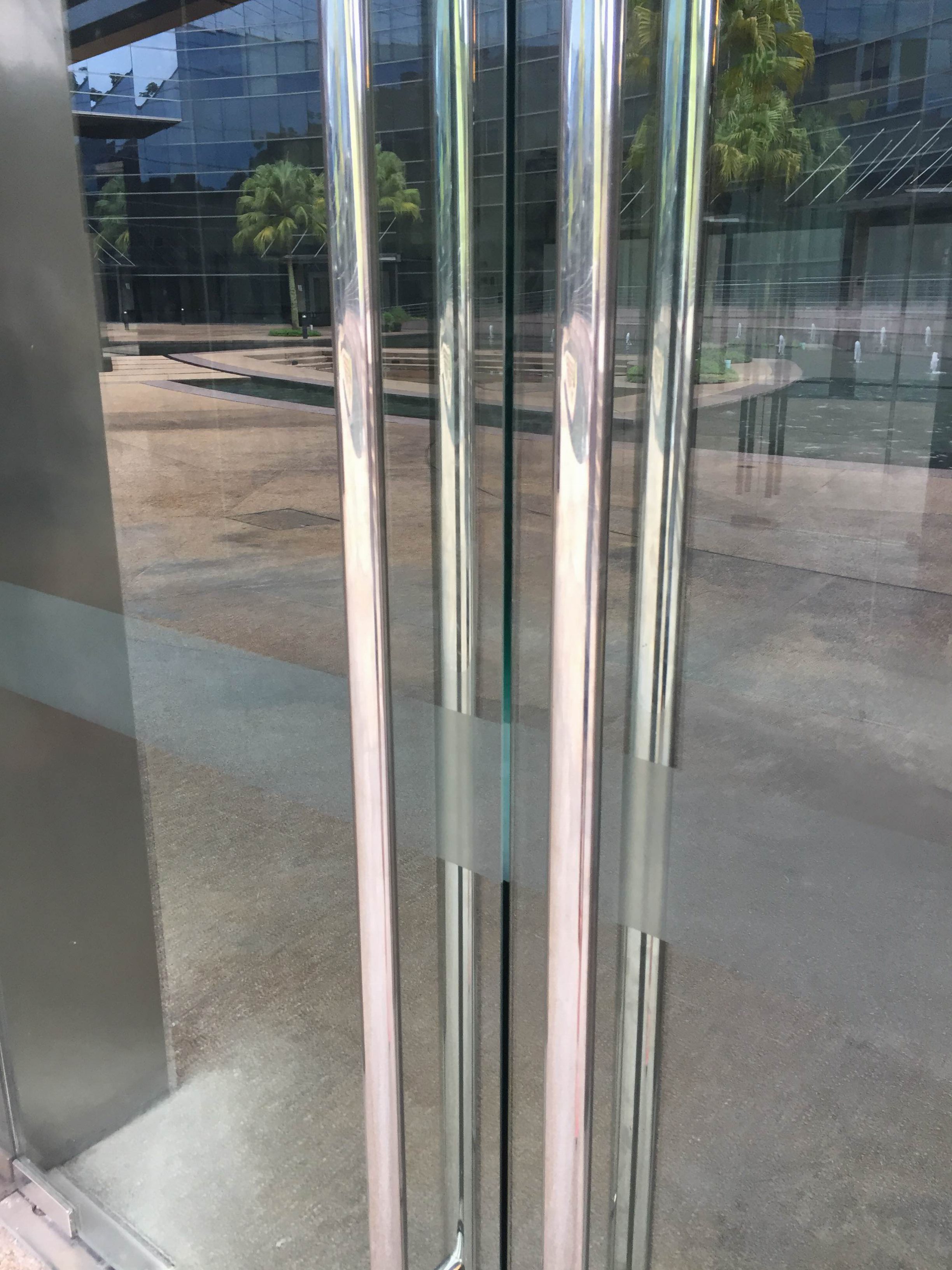
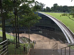
The ADM building is so beautiful but the way finding is actually quite unclear for someone who is unfamiliar with the space. The design of this building and surrounding area is very serene, there are palm trees and water features and it’s a really nice! People sitting outside socialising and look very relaxed.

Location – ADM is in the center of the campus so it is relatively easy to get to. It is near to two bus stops, canteens, halls and not too far from North Spine.

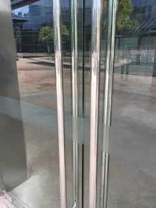
Entrance – there is no signage to say that this is the ADM building! Nothing to introduce visitors or to label it. Also the gates around the pathway don’t allow you cross by the round about, instead adding extra walking which is frustrating but it does guide you straight to the stairway down to the building.

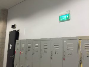
Signage – none on the exterior of the building and very little inside. The only visible signage is names on the classroom doors, by the elevators and the exit signs in the hallways.

Spatial Arrangement – entering on the right side of the building there seems to be lots of offices in this narrow and dark corridor –feels a bit like you’re in the wrong place! While the classrooms are labeled the arrangement is confusing- once you get to the end of one side the numbers start up again but on the opposite side of the building. Also some classes have a and b after the number and others don’t?

IMG_9268 IMG_9266 IMG_9264 IMG_9267


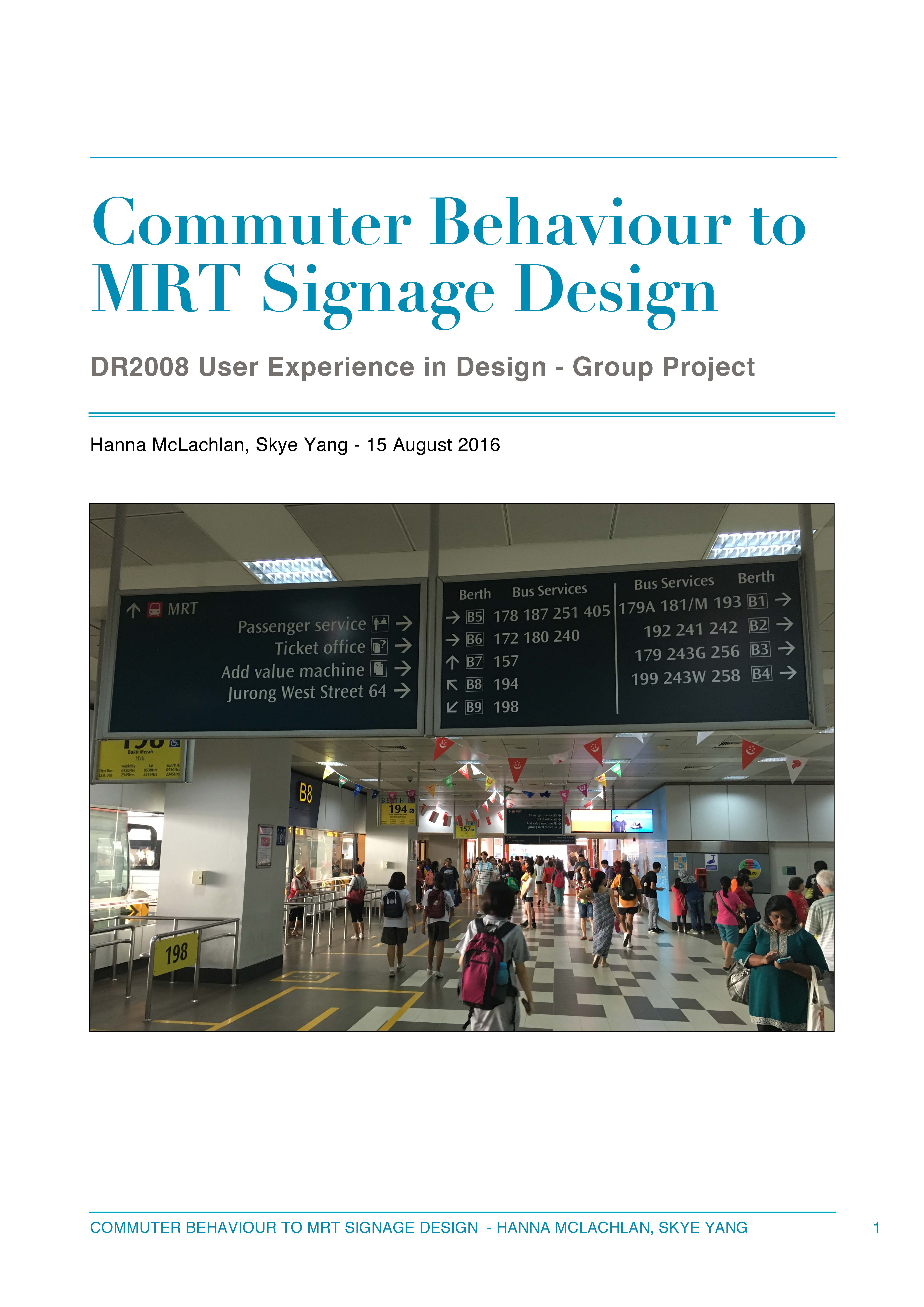
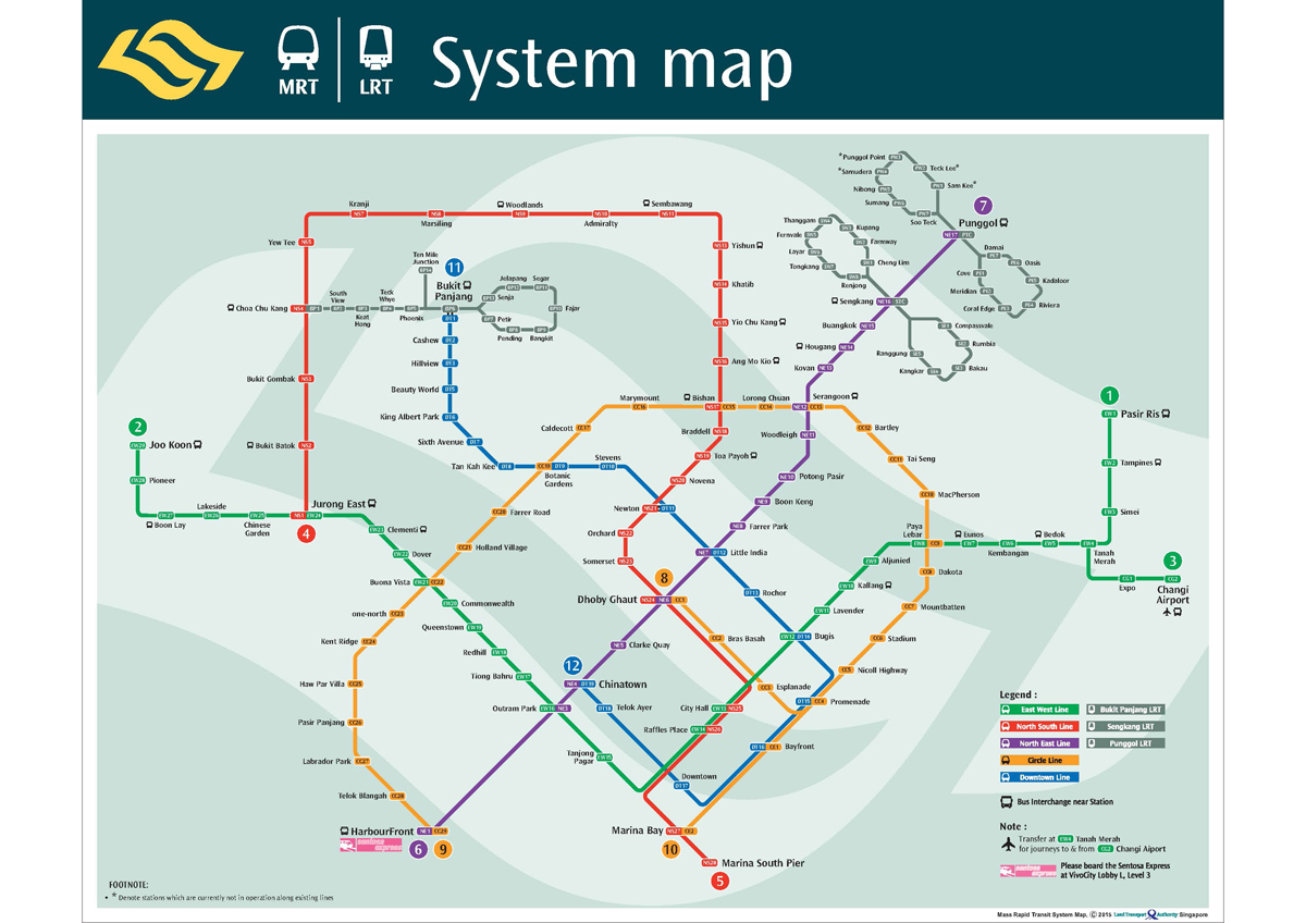
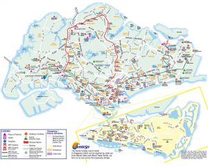
Good Map Design – Singapore MRT

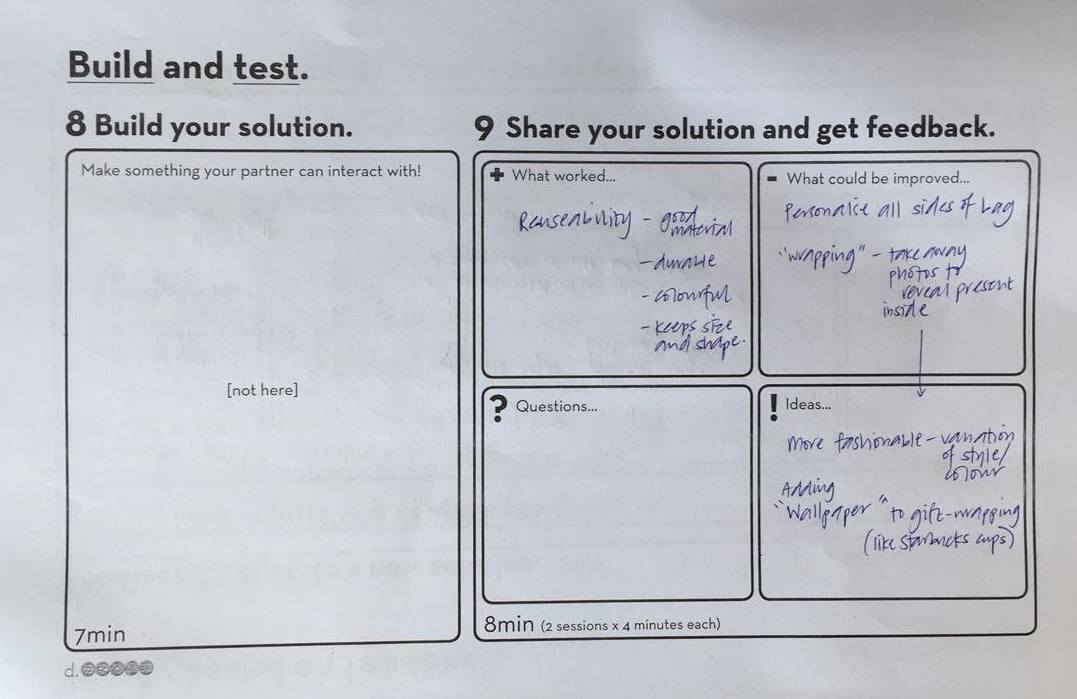
The layout of the map is easy to follow because of the different colours used to differentiate each line. It particularly works well to show the stops that have changes to other lines and the key is very understandable as the colours correlate clearly to the map. The layout is effective in providing enough space for all the station names to be easily read, and allowing each line to be separated enough to be differentiated. It looks spacious rather than cluttered which makes reading the map very easy.

mrt_sys_map_3

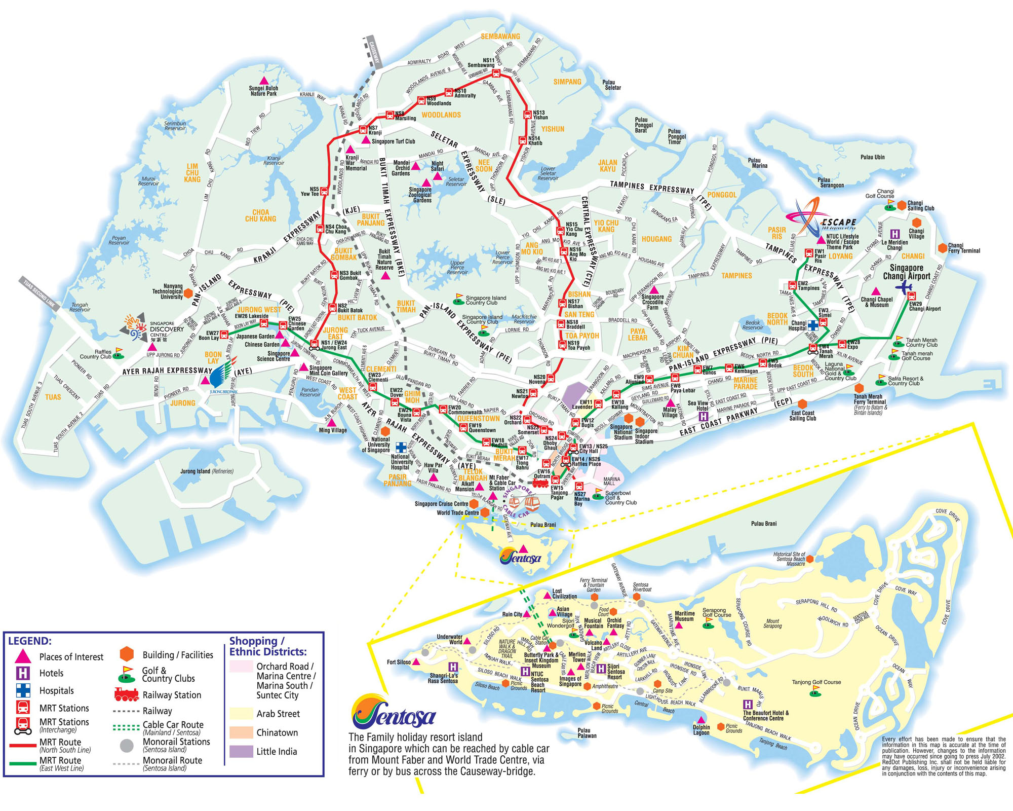
Poor Map Design – Sentosa Island

This map was difficult to understand. Firstly the light yellow colour of the island is very similar to the white roads, which makes it hard to distinguish the two. The map is very busy and cluttered with symbols and text so it is tricky to focus on a certain area or even to find a particular location. The brightly coloured symbols stand out more than the text (despite their unimportance) and the abundance of text also covers up the roads so you can’t see where to walk. This was a problem I faced as some pathways are dead ends but that isn’t visibly communicated on the map.

Singapore-Tourist-Map

Getting Lost – HarbourFront

From getting off the MRT at HarbourFront to finding the Sentosa Boardwalk I got very confused! After swiping off at the station I saw a sign for the Boardwalk that point up, so went up the escalator at which point all signage ceased and there was no directions for where to go next. I actually went back downstairs to see if I had misinterpreted the sign, found out from another sign it was on level B2 which meant going up two escalators. Once doing this there was a sign directing my pathway but from there it took a while to find another. The signage here was very inconsistent and unspecific.


Reading Response – The Design of Everyday Things

It was really fascinating to read about the relationship of psychology and design/technology. It’s so easy to take objects and technology for granted because we use them so often their operation is almost second-nature, our understanding is so comprehensive. However that is only actually relating to an understanding of these objects doing what we want them to, or what we specifically use them for. Like the author described, it’s so easy to just focus on what you know, or the bit you can control of an object and just disregard the functions you don’t understand. When something doesn’t work its so common to just let it go because we don’t understand, therefore we start to not take full advantage of the object in use, simply using it for some of its potential.

The reading made me more attune to the concept of good design and how difficult it actually is to achieve- to add value without confusion or complexity. Also that the designer has to many people to satisfy when creating a product; the manufacturer, customer, purchaser and repairer. Even then the customer may not necessarily be part of the target audience so how can the designer make it understandable for those the marketing attracts too?

It’s interesting to think about the role of psychology of human thought and cognition. The fact that good design is considered to take advantage of the things people are expected to know/have previously learnt, shows how effectively design objects were in the past. The familiarity of knowing how something works, or having the recognition of a certain feature is crucial in aiding understanding. Therefore when new and improved models continue to use these features they are more successful as consumers have the prior knowledge of knowing how to control that function. So in creating a new product, is it worth combining recognizable features/controls to provide a basis for understanding from the user? Even despite no connection between the old and new products, but for the sake or familiarity? Without this it limits the possibility of inventing totally new things, as people don’t like something new that they don’t understand easily- it would be worth looking into the psychology behind this too. How could we make more people open to trying and learning how to use a product that is completely new? By explicitly demonstrating a new product, or having clear instructions perhaps?

Object analysis 1- Fob

Before arriving at NTU I hadn’t had the experience of using a fob. This object is a small round disc used to unlock doors/entrances. To operate it you simply hold it up to a sensor for a short amount of time, when the sensor makes a noise or lights up this is feedback that the lock is unlocked and you can open the door.

On a door it is pretty intuitive because there is no key lock so you realise there is another method to unlocking the door. However on the staircase doors it is common to just reach for the handle before realizing it requires unlocking first.

The light function can be frustrating as its not super bright during the day time, and it only flashes once so if you look away and miss it you aren’t aware if it has worked or not. Also I find the time taken to unlock the door varies and sometimes takes quite a while for the fob to register- perhaps because the sensor pad is quite small.
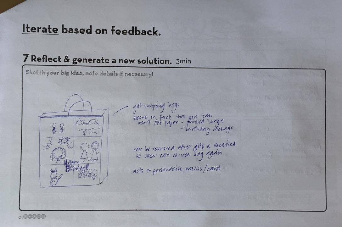
Alternate design

I would propose a design of the sensor pad that is more aesthetically appealing and not so big and clunky. Placing it just above the door handle would be more easily accessible and having a flat pad means you can hold the fob onto it, removes the accuracy needed. Also the register function could instead be a vibration so that you feel the feedback that the door is unlocked, which allows you to not have to focus your sight on the sensor so much, eg. you could multitask. Thirdly, I would add the ability for the fob to be sensed through other materials such as when it’s in your wallet, to improve accessibility and convenience.

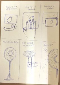
Object analysis 2- Standing Fan

A fan is an electrical object that uses a rotation of blades to create a force of cool air. It is often available at different speeds which result is different intensities of the force of the air. There are other options you can adjust such as the height and direction of the fan, both left/right and pointed up/down, as well as making it oscillate. The fan affords lots of possibilities to suit the user. It is an intuitive experience as the user gets immediate feedback- when you press a button it clicks/locks in place and also the fan will begin to spin immediately after. These buttons are also often labeled 0-1-2-3 so the signs are very clear. Often you buy these and have to assemble the fan yourself, which is

Alternate Design

I think the overall aesthetic design could be improved to make it look more sleek and stylish, so it’s not such an eye-sore in the middle of the room! They could also have more variety so it becomes more of a feature in the room, so in different colours or patterns. Another idea would to make it more flexible, so that making adjustments wasn’t such a difficult task and the parts moved together with more ease. Finally I would make the functioning of the fan quieter, it is called a ‘whisper’ fan after all! Overall the function is excellent and probably could not be improved.

IMG_9292