Prototype #2
In order to come up with a better prototype, we dug deeper into our target audience’s psyche. We asked ourselves a few questions:
Q1. How should we make a connection between the current user and the next/previous user?
We had to first understand who our users were. Basically, there are two types of people: Those who clean up after themselves and those who do not clean up after themselves. For people who don’t, they leave a place as how it was when they came or dirtier than before. We came up with the following possible reasons as to why they choose not to:
- They don’t feel responsible and have the impression that the aunties will clean up for them.
- No one appreciates their effort even if they cleaned up, and no one would catch them if they left the space dirty. There is a sense of indifference about cleaning up.
Thus our mission is to change the second type of person to the first.We also created personas to categorize the main audiences for our campaign.
Personas
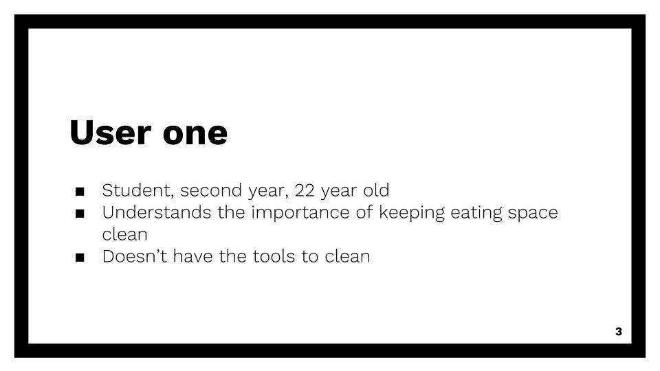
- User One
- 22 year old, second year student in NTU
- Understands the importance of cleaning up
- But doesn’t have the supplies to clean
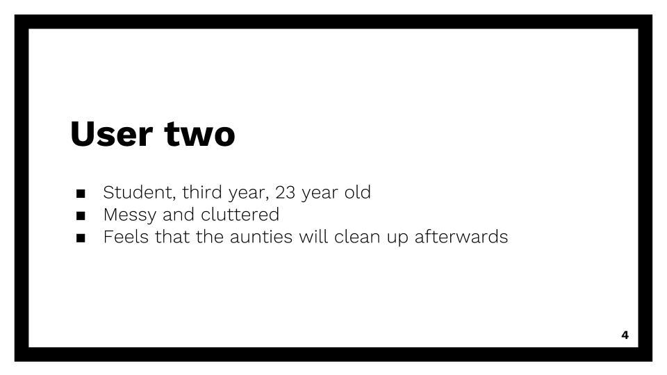
- User Two
- 23 year old, third year student in NTU
- Messy and cluttered
- Feels that aunty will clean up after him
- Out of sight out of mind?
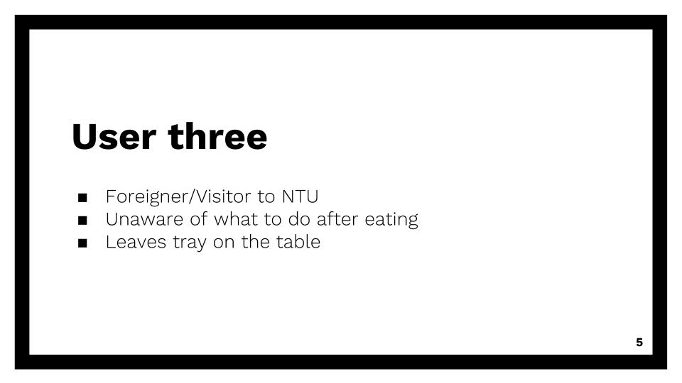
- User Three
- Foreigner or visitor in NTU
- Unaware of what to do after eating
- Leaves tray on the table
Q2. Assuming that our target audience is greedy and only does things ultimately for their own benefit. How can we make the connection between doing this action of cleaning and self benefit? How can we make our campaign appeal to our audiences such that they will participate?
We brainstormed three underlying driving human truths:
- People want to be perceived as good people
- People will do good if they hold the belief that they will receive good in return
- People desire recognition for doing good
We translated these truths into action points for our prototype 2.
- For point 1, since people wanted to be perceived as good people, we decided to choose positive framing over shame or guilt to drive the message.
- For point 2, we used the pay it forward system, such that they are already receiving the benefit before they do the good deed, and might pay it forward to the next person.
- For point 3, since people needed recognition for doing good, we incorporated their names to be written down on our signs.
Q3. What is the key message of our campaign and what is it grounded in?
Key message of our campaign: Just one small gesture, can make your mood better
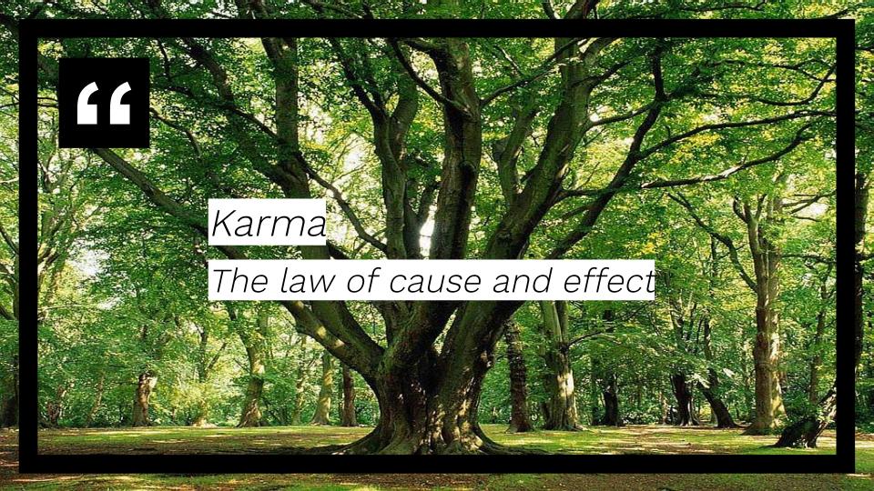
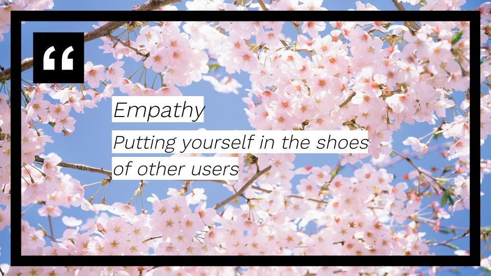
Three concepts we wanted our campaign to be grounded in:
- Karma – the law of cause and effect
- Empathy – putting yourself in the shoes of others
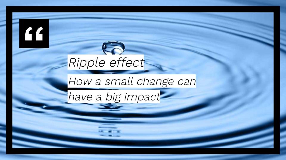
- Ripple effect – how a small change can have a big impact

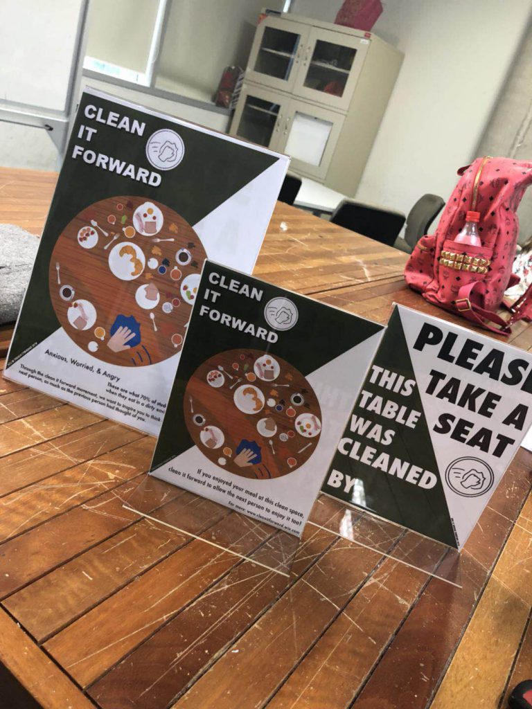
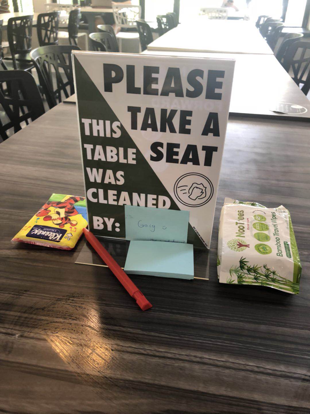
Design & Copy of Sign
As compared to prototype 1, we cut down most of the words to make it as easy and appealing for patrons to read and understand.
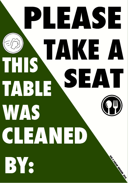
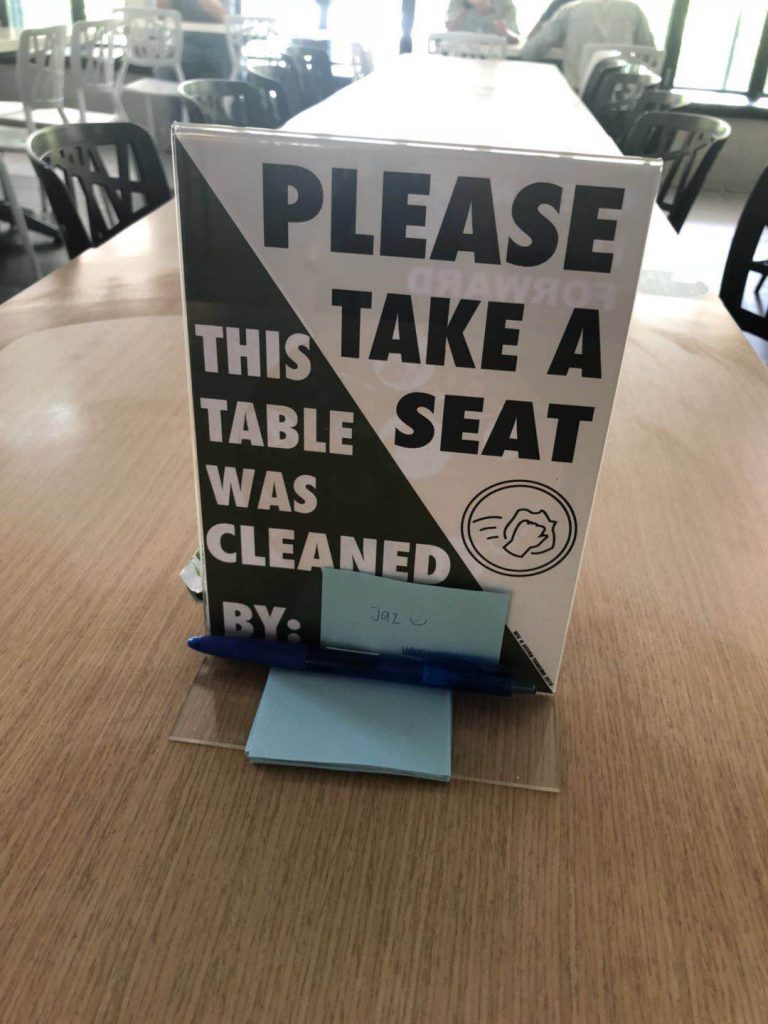
On the front side, the top half of the sign is used to inform patrons to “please take a seat”. This is to prevent people from misunderstanding that the tables are reserved or “chope-d”. The second half states “this table was cleaned by:” followed by a little space, meant for patrons to stack their post its with their name on it. This idea of of stacking on a pile of post its with the patrons names is to enhance the visibility of this campaign. It touches on two of the underlying human truths mentioned earlier: that people want to be perceived as good people and that people desire recognition for doing good. This achieves both goals. Furthermore, establishes the connection between the current user seated at the table and the previous user. The current user that reads and understands that someone before him/her had cleaned the table will feel appreciative and will be more inclined to do the same for the next user.
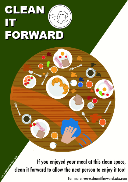
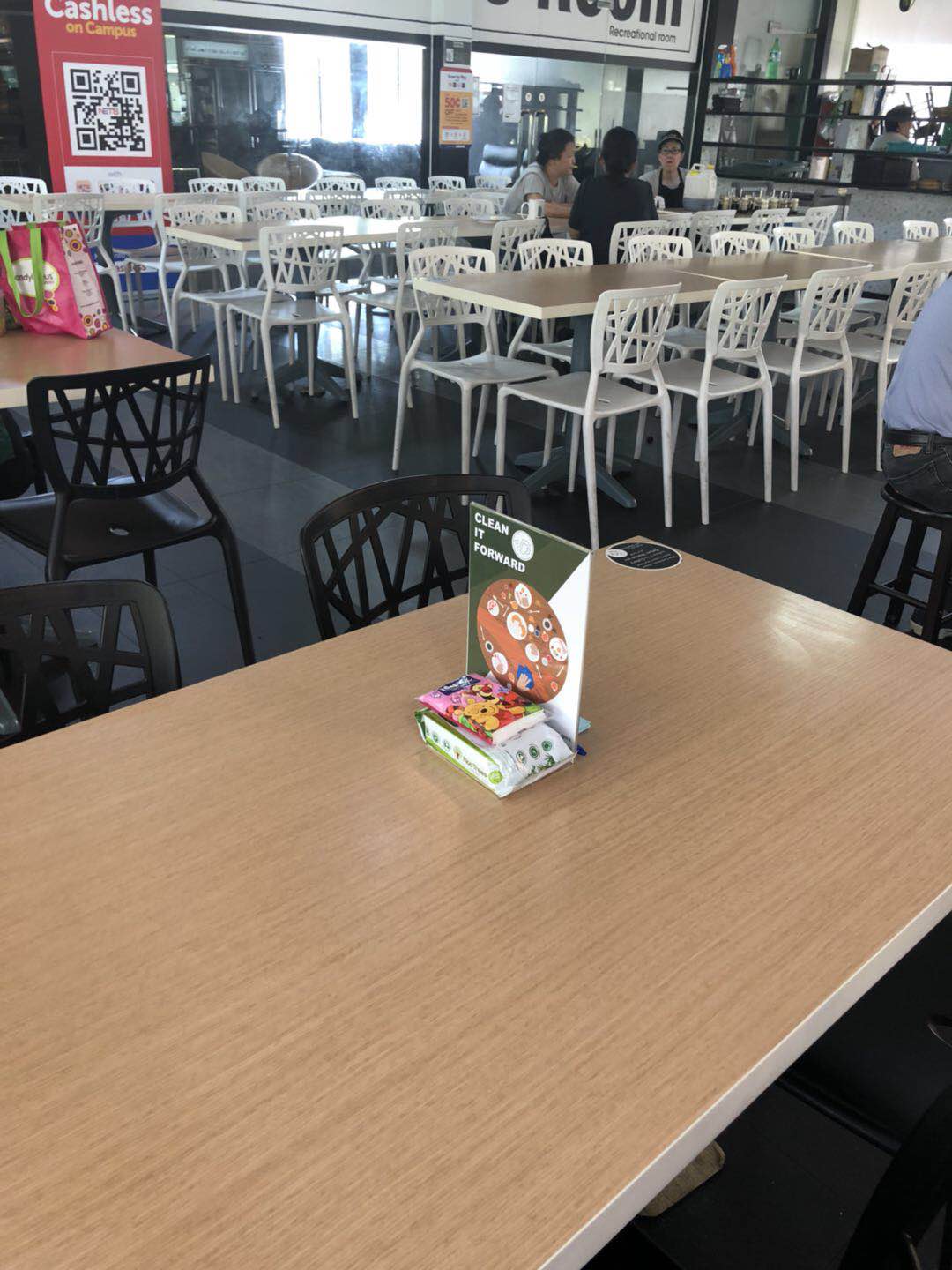
On the back side, instead of having a huge text explaining our campaign, like what we did previously, we summarised it into one graphic and a single sentence. The graphic captures the essence of what we would like canteen users to do – to clean the tables after their meal.
The signs make use of a diagonal colour split design to make it more eye-catching. Green and white are chosen as those colours have a greater association to the concept of ‘clean’. We also created the logo, a simple black and white image of a hand wiping with a cloth.
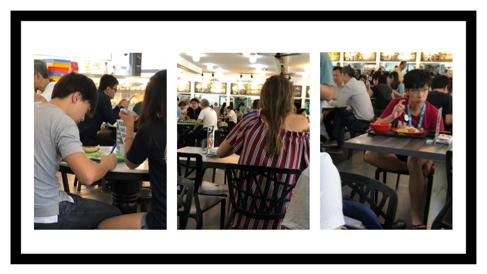
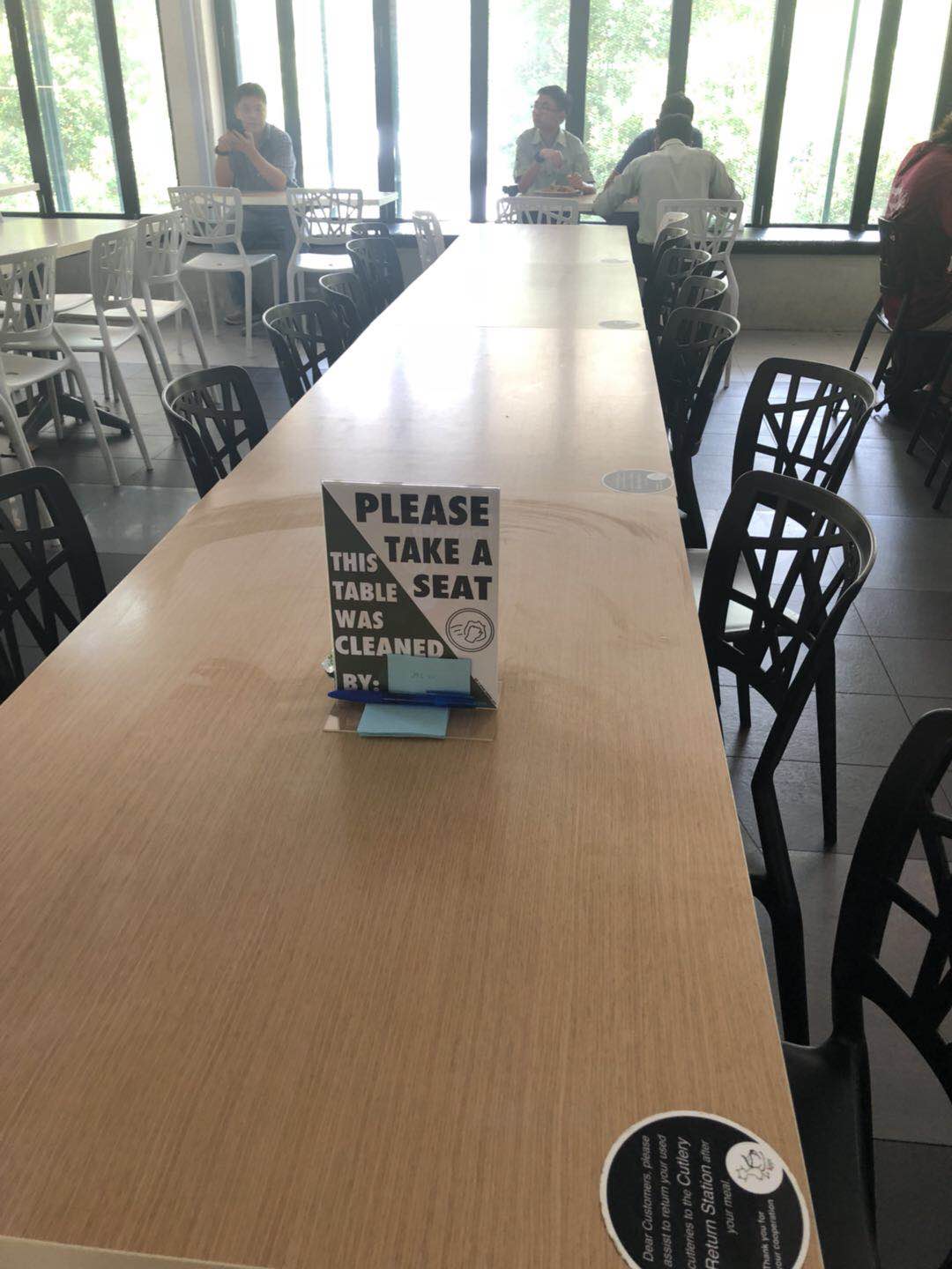
Finally it was time to put our prototype to the test! Our location for testing was Canteen 2, during the busy lunch hour. We put out three sets of signs and wipes and observed patrons reacting and interacting with our prototypes.
interview video record
NO.1
https://drive.google.com/file/d/1NNK1EwuCAJJVxDyS-1F7tpzDYpcptCMg/view?usp=sharing
NO.2
https://drive.google.com/file/d/1JgnLIHGKDYrme2_K14hW3KbSeBTTEU2R/view?usp=sharing
NO.3
https://drive.google.com/file/d/1vg4Blf8LjAH6JYgs7nGrKoRd6nGEg3kh/view?usp=sharing
Results
All participants, except one local male student, took interest in reading the signage and also made use of the supplies to clean up their tables after the meal.
Feedback from participants
Additionally, we surveyed those who had interacted with our signs after their meal to gather insights on the effectiveness of the campaign and areas to improve in.
- Did you clean up after your meal? Why?
- What do you understand from the message we are trying to convey through this campaign?
- Are you more inclined to keep the eating environment clean now?
- How do you feel about eating here knowing a fellow patron cleaned up for you?
- How did you feel when you cleaned for the person after you?
- What would make you more inclined to clean after your meal?
In general, all the participants understood the messaging and the purpose of this campaign. A common initial misconception among the locals is that the signs and tissues seemed to signal that the table is reserved. But they quickly realise that it is not the case as they see that a few other tables have the same sign.
Participants mentioned that they thought this was a great initiative, and that it “feels good” knowing that someone before had cleaned up for them, and that they cleaned up after themselves for the next person – “it’s like taking care of people”.
The only participant who did not clean up seemed nonchalant and indifferent about the campaign. He did not seem to understand the messaging thinking that “it was some CIP instead of encouraging us to keep it clean”.
Things that could be improved include making the wording and design of the signage more “fun”. The wording could also be more clear cut – the group of middle aged NTU staff did not fully understand the purpose of the post its.
Feedback from the class
- To create more comprehensive campaign
- Photoshop photos of tissues into graphic, add colours to branding
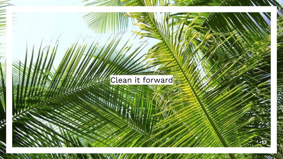
- Put hand and cloth at diagonal and make “clean it forward” to be bigger
- Add diagonal in the logo – action of cleaning and dirty is in logo
- Clean up the table, no need to have a tiny details of croissants
- Minimise text
- Perhaps have signatures on the table instead of post its
Recent Comments