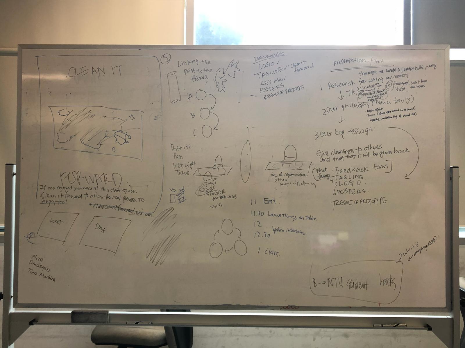
This was the last stage of prototyping and we wanted our design to be as close to a final product as possible by incorporating suggestion and addressing issues we discovered during testing. The key changes we wanted to implement are listed here.
Key changes:
- Text:
- More obvious it’s not a ‘reserved’ sign
- More concise wording
- Graphical design:
- More fun
- More comprehensive
- Add diagonal in the logo
- Consistent color scheme
- Put hand and cloth at diagonal and make “clean it forward” bigger
- Clean up the table
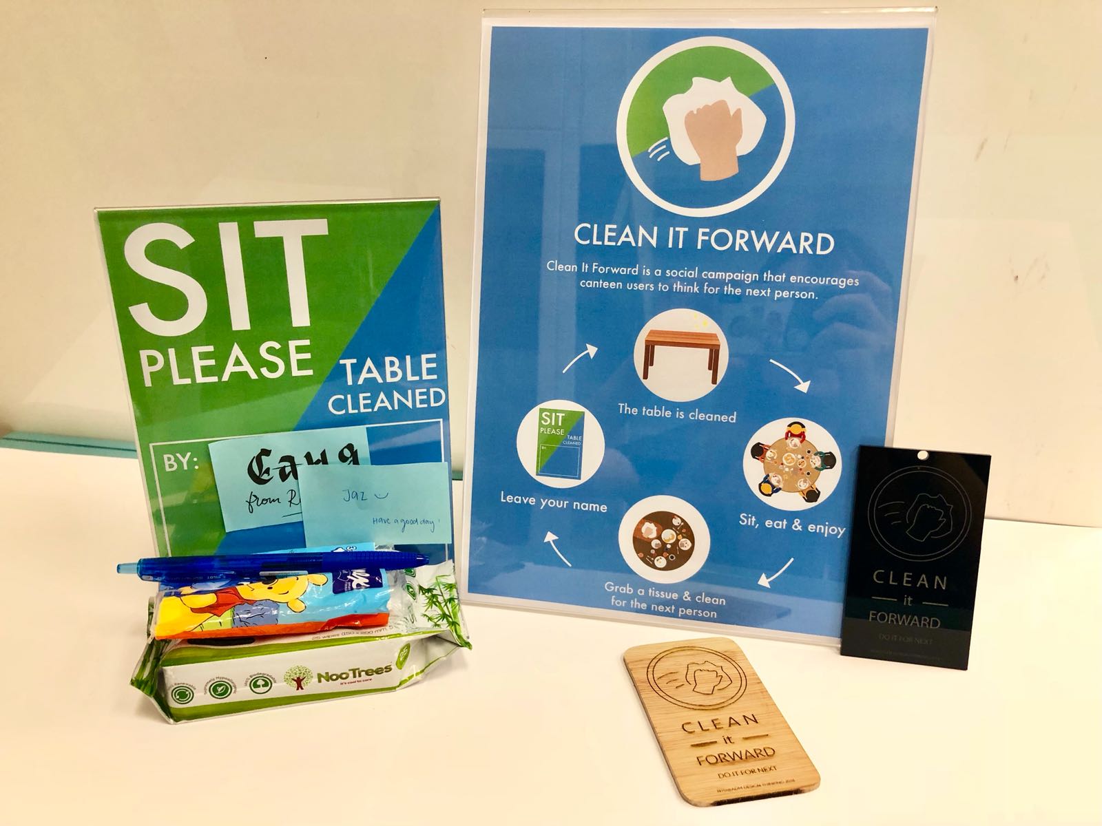
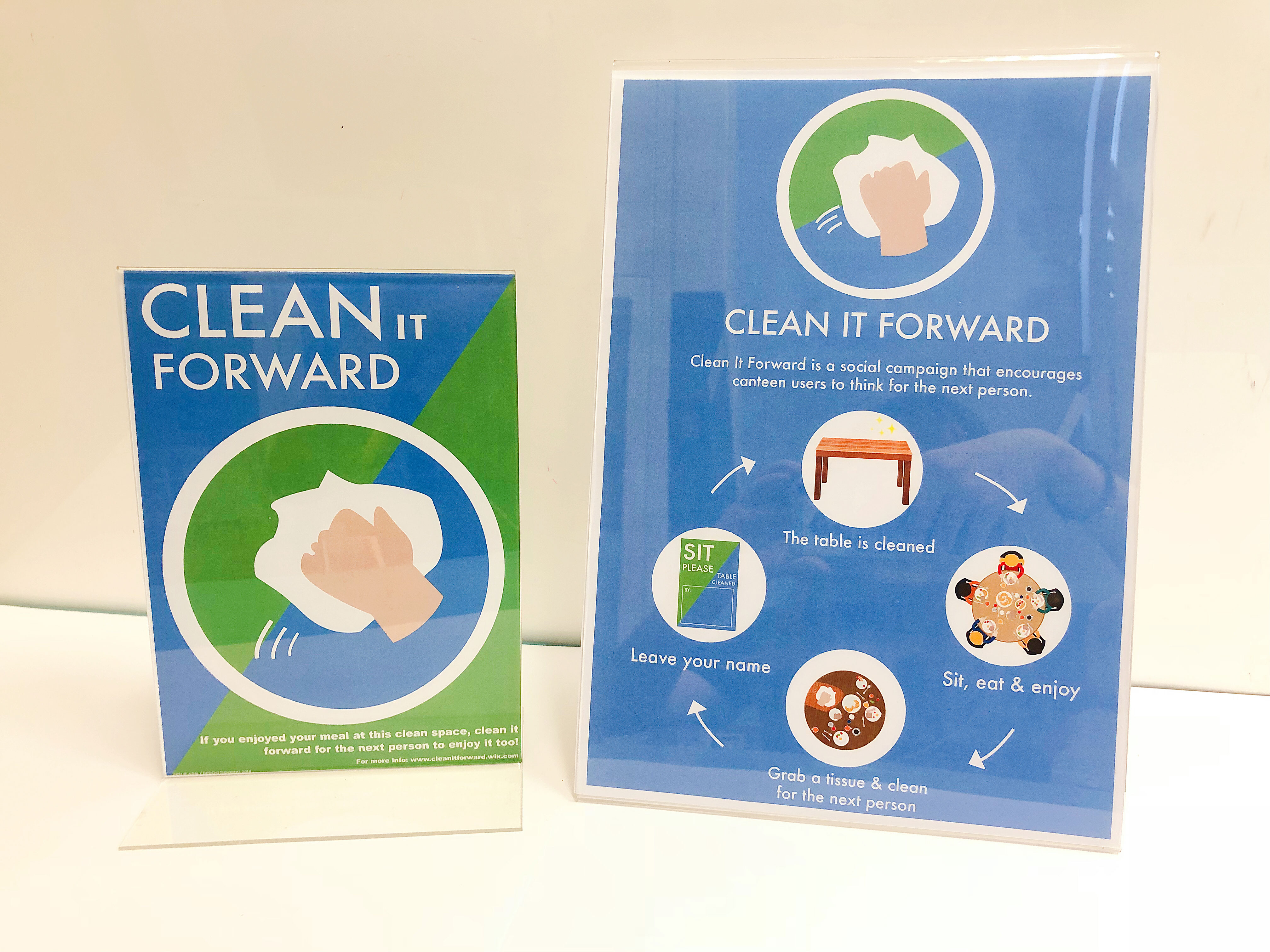
One of the largest problems our prototype sign faced was being confused for a “Reserved” or “Chope” sign. To address this, we chose to change the wording. Previously the signs said “Please take a seat”, spanning 3 lines. We hypothesized that because reading the complete phrase (3 lines) was required to understand the message, patrons were unable to tell what the signs meant at a glance. To correct this, we tried to use fewer words and place the most important words at the start of the phrase. Our new phrase is “Sit please” and spans only two lines. This way, hopefully, patrons will know it is okay to sit, with only a glance at the sign.
Secondly, to make the signs, and campaign as a whole, more fun, we decided on a more bright and vibrant color scheme. The idea behind this is to instill positive emotion and to make the signs more inviting. Additionally, the color scheme needed to appear ‘clean’, so as to compliment the theme of the campaign. We experimented with different tones of blue, orange, and green, eventually deciding on a blue/green/white combination.
It was suggested that we make the campaign more comprehensive. We addressed this by coordinating the color scheme across campaign items and attempting to create the similarity between signage and the campaign logo. The diagonal color split design of the signs from our second prototype was well received, so we chose to keep this design element and tried to incorporate it into the logo as well. We did this by using the same diagonal color split as the background of our existing logo. Additionally, we replaced the table imagery in our signs with an enlarged logo. This has the appearance that the logo itself is a table being wiped clean. The diagonal in the logo and the sign backgrounds meshed well together to create a very coherent look.
The system where sticky notes were left behind as a message for future patrons was kept because we believed it shows that many people have cleaned the table, which should inspire patrons to clean it again after themselves. We made the instructional wording more concise, changing it to “Table cleaned by”, followed by a box indicating where to paste sticky notes.
Main campaign poster
Other than improving on the A5 signs to be placed on canteen tables, we also created an A4 campaign poster to be put up on pillars and walls in the canteen and the areas leading up to it. This A4 poster aims to communicate the purpose of the Clean It Forward campaign, and how users can be a part of it.
As we brainstormed about what key message we would like to highlight in this campaign poster, we came to the conclusion that the idea of the pay it forward system was the most appropriate as it encompassed the entirety of our campaign – users receiving the benefit of someone before them, and then them passing on the same benefit to the next user.
In order to explain this pay it forward system, we displayed it in a cycle diagram. At the top of the cycle, it is stated that “the table is cleaned”. Next, users are able to “sit, eat & enjoy”. After finishing their meal, users can “grab a tissue & clean for the next person”. The user can then choose the leave their name on the A5 table sign. Finally, the cycle is complete as the table is once again cleaned.
From all the feedback received from previous prototypes, we tried as much as possible to streamline the design and copy to ensure that it will be easy for users to understand immediately. As such, the copy for the purpose of the campaign is condensed into a single sentence, and the description of the instructions is reduced to short phrases.
Design-wise, we used the three brand colors – blue, green and white on the poster. Also, as the campaign logo is placed at the top one-third of the poster, we decided to do away with the diagonal color split. This is because there would have been a clash in the design if there were too many diagonals. Instead, we went with blue for the entire background. The icons are placed within white circles to be consistent with the use of circles in the logo.
Recent Comments