According to Wikipedia, psychogeography is the exploration of urban environments that emphasises playfulness and “drifting” or “dériving”. Deriving meant that the participant would have to go through an unplanned journey through a landscape that is usually urban, in which they would have to drop their everyday relations and “let themselves be drawn by the attractions of the terrain and the encounters they find there”.
The location that I got from drawing the lot was Citylink. Citylink is a mall and “link” that links the visitors to other shopping malls, the Esplanade, War Memorial as well as other offices in the Central Business District area. The mall is accessible by City Hall MRT or Esplanade MRT. I began my journey from City Hall MRT and ended it at Esplanade MRT. This place was almost foreign to me as the closest I would be to Citylink Mall is when I have to head to the Esplanade or Marina Square mall.
My aim for the dérive would be to get used to the layout and spot as many exits or “links” I could find and see where it leads me to as well as spotting any nice architecture or designs the interior had. Keeping in mind the people that visited and the time as well.
I started my dérive at 9pm from the entrance of City Link mall right outside the City Hall MRT station. Instantly, I realised that there were many office workers rushing into the station. As I walked into the mall further, I spotted lesser and lesser people. The first stretch of shops were mainly food and beverages shops followed by two short escalators up to the “second section” of the mall. This followed by a long corridor of neon lights and a huge store selling overpriced apparels. There was an atrium in which had a really beautiful glass ceiling.
The whole stretch of the second section were filled with apparel and lifestyle stores as compared to the first section where they had more food and beverage shops and kiosks. Before going up the long escalator to the last section, there is an escalator on the right going down to Esplanade as well as other offices and the War Memorial. The last section of the mall had more expensive restaurants and beauty shops as well as the exit to Marina Square, main road as well as the Esplanade MRT.
Pre- Submission
The pre-submission that I did was that I categorized the mall into the three sections as I have mentioned in the above paragraph. I have included icons such as MRTs, escalators, information counters and also toilets so as to convey my familiarity with the mall after dérive. I then added speech bubbles which depicted my thoughts when I walked around the place. I have also included dots on the map to indicate the speed that I was walking, more dots being the more time I spend whereas lessers dots meant I spent lesser time there.
Final Work
Title: NO ONE
Artist Statement:
Sad Lazy Frustrated Annoyed Pleasing Beautiful Long Shiny Short Exit Finally Bright Blinding Long Annoying Tiring Empty Excited Reminiscent Bright Sad Lonely Bright Dope Empty Deserted Stuffy Annoying Finally Cool Excited Dissapointed Satisfied Sad
This is my journey through a mall after its opening hours and how many other places it links to are at night.
Explanation
I decided to scrap the map I have created previously completely and rely solely on my images to “map” out the mall. I also paid closer attention to the amount of people that I see in the particular area and photos which are bigger in size meant that it had more visitors as compared to the smaller images.
I have used arrows as an indicator to show the direction that I walked. I have also explore the exits further and showed it in my map the links that the mall have and what lies after exiting the exits. I have also indicated my feelings at each place – red being angry or annoyed, blue being lonely, sad or disappointed and green being satisfied and happy.
As we moved on from the simplicity and straightforwardness of the rectilinear volumes, curvilinear volumes strays away from perpendicular lines and are much more dynamic and interesting to make and look at. Although the process of cutting and sanding is pretty intricate, it is definitely worth the effort to create beautiful and interesting compositions with the models.
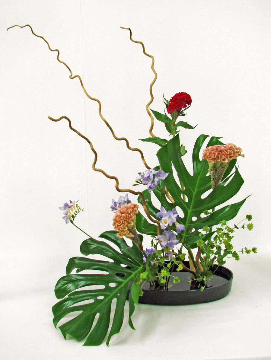
What is Ikebana?
Ikebana is the ancient Japanese art of flower arranging. The name comes from the Japanese ike, meaning ‘alive’ or ‘arrange’ and bana meaning ‘flower.’ Ikebana consists of arranging, blossoms, branches, leaves, and stems to allow a finding of new life as materials for art making. In contrast to the western habits of casually placing flowers in a vase, ikebana aims to bring out the inner qualities of flowers and other live materials and express emotion.
Principles of Ikebana?
Ikebana has become an art form that is associated with a meditative quality. Creating an arrangement is supposed to be done in silence to allow the designer to observe and meditate on the beauty of nature and gain inner peace. This ties into other principles of Ikebana including minimalism, shapeand line, form, humanity, aesthetics, and balance.
How is a basic Ikebana arrangement made?
To prepare a basic Moribana arrangement, the ikabana artist will need to add water to a shallow container, then places a kenzan—a small, pin-covered object that keeps flowers in place—within it. Then, the artist selects two branches, one for shin and one for soe, and a flower, for hikae. Next, each stem is measured and cut to precise lengths (which are specified in the Moribana beginner’s manual) and fixed, one at a time, on the kenzan, at different angles. To complete the arrangement, supplementary jushi stems are added to hide the kenzan and fill out the arrangement.
Brief History of Ikebana
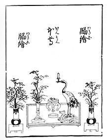
The long history of ikebana can be traced back as early as the sixth century with the introduction of Buddhism to Japan from China and Korea. Buddhist floral offerings, called kuge, were placed on the altar of temples. The offering consisted of three main stems gathered closely at the base and rose from the water as one. The three stems were used to represent the harmonious relationship between heaven, man, and earth.
For hundreds of years, priests continued to make floral offerings to Buddha, but there were no set rules used to make the arrangements. Ikenobo Senkei, a Buddhist priest, created the earliest form of ikebana, called tatehana, or “standing flowers.” The arrangements were meant to be displayed in the tokonoma, a recessed area in a traditional Japanese home used to display art objects. The tokonoma was a central feature of the new Shoin architectural style. It was after ikebana began to be displayed in the homes of the aristocracy that its purpose changed from that of a religious offering to that of a decoration of the home.
Currently, there are over 3,000 different schools of ikebana. Ikenobo, Sogetsu, and Ohara are the three most popular. Ikenobo is the oldest of the three and still retains the classical concepts of ikebana. Sogetsu is the most modern and emphasizes self-expression. Ohara relies on tradition, but also pays special attention to each season and flower to bring out its natural beauty, creating a modern interpretation of the classical forms.
A tradition over 600 years old, ikebana is still alive and well. The different forms and styles of ikebana strive to harmonize with the contemporary spaces where people live, work and play. Arrangements make use of natural materials, bringing the beauty of nature indoors. The tradition has evolved into a modern art from that can be enjoyed by everyone.
SEASON AND FOOD RESEARCH
The season that I drew was spring and the first thing that came to my mind when I hear the word spring is colourful and blooming. Although Singapore and many other countries in Southeast Asia doesn’t really have a spring season, I decided to look at the occasions that fall during the spring season which is March 20, 2018 to June 21, 2018.
The festivities that are happening in Singapore during the spring season would be Good Friday, Easter, Vesak Day and Hari Raya Aidilfitri (Lebaran).
As I am very familiar with Indonesian/Malay food, I decided to take Lebaran as my main food concept when making my model. Lebaran is translated to “a celebration” and it is a day where Muslims celebrate the end of one month-worth of fasting and doing deeds. In my family, we have a family recipe of Nasi Tumpeng, a yellow glutinous rice dish served to share in a big tray with many other gravies and dishes such as rendang, spicy liver, serunding, sambal goreng, etc and is decorated with banana leaves, salad leaves and many other decorative leaves.
The colours of the Nasi Tumpeng are very vibrant and it is to compliment each other. My family usually prepare this dish for Lebaran, wedding occasions and even birthdays as this is considered to be one of the most intricate and tedious dish to create. To relate this back to my model, I would be adopting elements of Nasi Tumpeng such as the big yellow cone glutinous rice, rendang and fish cracker as well as similar garnishing decorations.
PROCESS
Churning out a sketch model based on my second sketch model, I further improved the concept and created this:
FRONT VIEW
SIDE VIEW
TOP VIEW
To translate this into the actual food model, I required alot of preparation in order to create the glutinous rice and its elements perfectly.
STEAMING
SCULPTING
The yellow glutinous rice, which is the Dominant element in my model is made by soaking the uncooked grains of rice with tumeric so as to gain the bright yellow colour. After soaking it overnight, I then steamed it in the steamer for an hour before sculpting it into a cone and letting it rest in a cup. It was pretty hard to sculpt the rice as once it sets, it gets pretty hard and it will be difficult to fix it.
FISH BALL AND RENDANG BALL
Next, I started to fry the fish ball and rendang ball so as to solidify them. I fried both the fish and rendang ball so that I could pick the more suitable one to place in the final model. This ball would be my Sub-Ordinate and spherical piece, which is the smallest curvilinear item I have in my model.
CRACKERS
The fish cracker would be my Sub-Dominant piece in the model and initially, I tried frying it myself but could never get the shape that I want and it is quite flimsy so I had a back-up pre-made one ready to fry. The diameter of this cylindrical cracker is smaller than the cone, making it a good match to be the Sub-Dominant.
BASE
GARNISH
I have also made my base which is the other Sub-Dominant element in my model out of glutinous rice as well and it is to also support the rest of my elements as I would be assembling my curvilinear volumes with toothpicks and satay sticks. The red chilli flowers would be my other Sub-Ordinate as I would be placing them on the base as well on the branch.
Tumpeng Spring Final Model
45 DEGREE VIEW
CLOSE UP FRONT VIEW
FRONT
SIDE
TOP
Sketch Analysis
Reflection
One thing that I took away from this project would be the importance of identifying the Dominant, Sub-Dominant and Sub-Ordinate really clearly. This is because, as these are curvilinear volumes, sometimes it is possible to forget that some of the radius of the surfaces might be similar to the height of another element. As such, sketch models are very important in recognising if any part of the elements needed to be enlarged or decreased.
I also realised how the branches in Ikebana as well as my model gives the whole model a “magic touch” meaning it is much more dynamic than before and it gives the model “life”. To end it off, I will definitely keep in mind the idea of Ikebana and movement and use it in the next coming project!
What I could improve on would be to have the Sub-Dominant be smaller as the height of the Sub-Dominant currently is almost similar to the Dominant, making it slightly unclear.
Sketch Model 2
FRONT VIEW
SIDE VIEW
TOP VIEW
Similarly, what I could improve on would be to have the Sub-Dominant be shorter as the height of the Sub-Dominant currently is almost similar to the Dominant. However, I quite love the idea of how the Dominant is “suspended” in air and having the tiny Sub-Ordinate sort of balancing the whole model out. Perhaps my final model might have this element of suspension.
My takeaway from this project would be that it is absolutely essential in identifying the Dominant, Sub-Dominant and Sub-Ordinate pieces of each model. Only then would it be an interesting piece. I have also learnt new terms such as principle axis which is absolutely essential to mark in the 2D sketch analysis. In addition, I also learnt how to overcome the challenges that I have faced such as visualising my word, “discordance” into my 2D sketch models, doing the wedging and piercing on different materials such as hard cardboard and metallic paper and how I need different techniques and application to get what I want.
I look forward to the curvilinear exercises and submissions and can’t wait to produce really awesome and dynamic pieces of models!
The Substation visit was very insightful and showcased how a place can mean so much to different types of people in the country. It also has many different impact to to not only the human beings around but also to the environment, animals as well as other beings that are inhabiting in it.
According to Wikipedia, Psychogeography is an exploration of urban environments that emphasises playfulness and “drifting”. Another meaning of it would be”a whole toy box full of playful, inventive strategies for exploring cities… just about anything that takes pedestrians off their predictable paths and jolts them into a new awareness of the urban landscape.”
Some Government Funded Art Spaces in Singapore:
Aliwal Arts Centre
Formerly the Chong Cheng and Chong Pun Schools, Aliwal Arts Centre is a multi-disciplinary arts centre with a strong focus on performing arts.
Located within Kampong Glam Conservation District and is very nearby the Malay Heritage Centre.
Hosts the annual Aliwal Urban Arts Festival featuring street art, performing arts groups and even skateboarding.
2. Arts House
Formerly known as Singapore’s first Parliament House, the venue has been focusing on the development and promotion of literary arts since 2011.
Venues include a Black Box Theatre, Galleries, Screening Room all suitable for book signings, product launches, exhibitions, conferences and even theatre productions.
3. Goodman Arts Centre
Located at the former LaSalle College of the Arts, Goodman Arts Centre opened its doors in early 2011.
It was established with the vision of becoming a youthful and energetic Arts Centre, providing a wide range of exciting arts and cultural offerings for the community to experience and engage with in an intimate manner.
Some Independent Art Spaces in Singapore:
The Projector
An independent cinema that screens a great mix of arthouse, horror, cult classics, and indie films.
It boasts a range of films and documentaries from the documentary Brave Miss World to Oscar-winning films such as Spotlightand Amy.
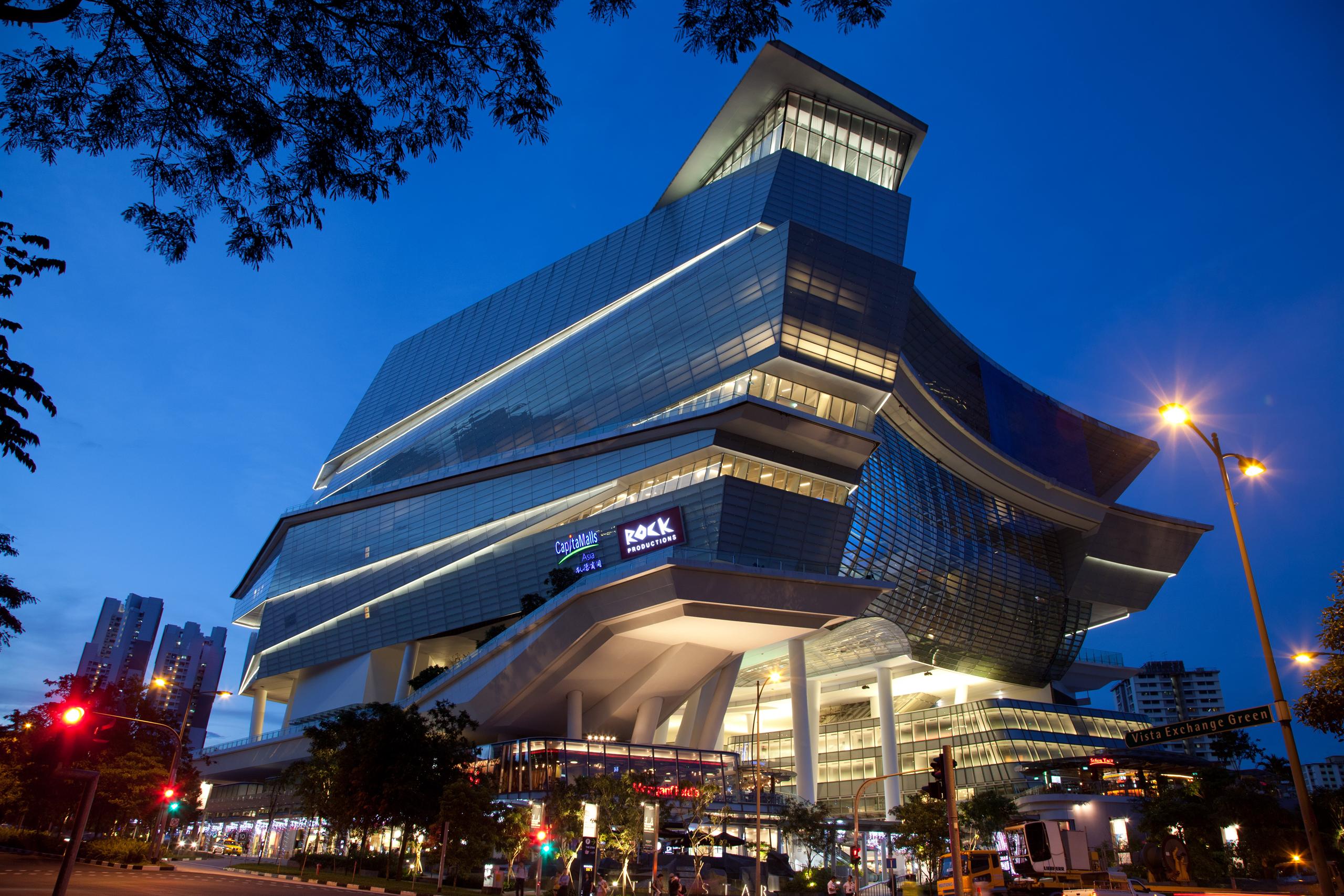
2. The Star Performing Arts Centre
The Star is an integrated hub that comprises of a Civic & Cultural Zone named The Star Performing Arts Centre, and a retail mall named The Star Vista.
3. Objectifs Centre for Photography & Filmmaking
The contemporary filmmaking and photography centre champions the works of visual artists through a host of platforms, including workshops, talks, a residency programme and courses for beginners—even photography mentorships.
4. Gillman Barracks
The former military encampment for the British Army today forms the heart of Singapore’s art enclave, with 13 galleries spread across five buildings.
Conservation & Heritage in Singapore
The Historic Districts of Boat Quay, Chinatown, Kampong Glam and Little India are the four more “known” heritage districts in Singapore with great architecture as well as art. These districts enrich our built environment with their diverse facades, rich ornamentation and unique architectural styles.
To maintain the ambience and physical character of these historic districts, strict conservation guidelines have been put in place.
For example, the entire building envelope, including the rear service blocks and rear courts are to be retained and restored, to maintain the overall low-rise scale and fine grain of the urban texture.
The Residential Historic Districts of Emerald Hill, Cairnhill and Blair Plain were first developed as residences for the well-to-do. They have traditionally been in continuous use as residences for individual families. One example is Blair Plain, which lies at the South-Western edge of Chinatown.
What is “Right to the City”?
According to Wikipedia, “Right to the City” is an idea and a slogan that was first proposed by Henri Lefebvre in his 1968 book Le Droit à la ville and that has been reclaimed in the last decades by social movements, thinkers and several progressive local authorities alike as a call to action to reclaim the city as a co-created space—a place for life detached from the growing effects that commodification and capitalism has had over social interaction and the rise of spatial inequalities in worldwide cities throughout the last two centuries.
In his first inception of the concept, Lefevbre paid specific emphasis on the effects that capitalism had over “the city”, whereas urban life was downgraded into a commodity, social interaction became increasingly uprooted and urban space and governance were turned into exclusive goods.
Bukit Brown Things:
The Bukit Brown Municipal Cemetery was established to serve the burial needs of the Chinese community.It officially opened on 1 January 1922 and operated for more than half a century before its closure in 1973. The cemetery was previously a section of a 211-acre plot of land, belonging to the Hokkien Ong clan, that the municipal government had acquired between 1918 and 1919.
Cemetery for the wider Chinese community
Bukit Brown was initially unpopular with the Chinese because of its small plot sizes. However, it then slowly gained acceptance after improvements were made to the layout. It was reported that by 1929, 40 percent of all officially registered Chinese burials within the municipality took place there.
The commissioners also sought to improve the conditions of the cemetery. Two rest houses were then allocated for funeral visitors. A regular water supply was provided through the construction of water pipes and wells, and gardeners were hired to maintain the site.
Problems arise at the cemetery
Aside from murders, robberies and faction fights were also known occurrences. One of the earliest murders at the cemetery took place in 1927. A fight between two groups led to the fatal stabbing of two Chinese men
Future developments
In 2011, the Land Transport Authority (LTA) announced that a new dual four-lane road linking MacRitchie Viaduct and Adam Flyover would be built over parts of Bukit Brown Cemetery. The road would cater to increased traffic demand and help to ease the peak-hour congestion along Lornie Road and the PIE. It is expected to be completed by the end of 2017. Details of the graves affected by the construction were published in March 2012, and exhumation of the first batch of graves began in December 2013.
The remaining parts of the cemetery and its surrounding land, totally 200 ha, are slated for redevelopment into a new housing estate in the future.
In October 2013, Bukit Brown Cemetery was placed on the 2014 World Monuments Watch, which records global heritage sites which are at risk of being destroyed.
After playing around with the three different sketch models, I came to this final one which I think could be really interesting. For my previous refined sketch models, I’ve had two of them with the sub-ordinate being in discordance whereas only one model had the sub-dominant being in discordance. Out of the three models, I realised that the model with the sub-dominant being in discordance turn out to be the most interesting model out of all the three. As such, I with my final model, I decided to make my sub-dominant the discordant one.
45° Front View
View into the Sub-Ordinate
Top View
Some things to address:
Why I did not wedge the Sub-Ordinate to the right side – The reason was that I wanted the Sub-Dominant to feel a little more balanced since it is suspended 2/3 and only 1/3 of the piece is wedged onto the Dominant piece. The second would be that there are light in the Dominant piece that can only be seen if the Sub-Ordinate piece is pierced right at the spot I chose to pierce it at. If I had wedged the Sub-Ordinate on the side of the Dominant piece, I would then not be able to achieve the “kaleidoscope” effect.
Why I didn’t pierce the Sub-Ordinate through the back of the Dominant piece– The reason would be that I would then again, not been able to showcase the green and purple light as I have wanted as I would only be able to see what’s on the other side of the dominant piece. In addition, the lights were not small enough to fit directly into the Sub-Ordinate piece thus, it has to be mounted on the inside of the Dominant piece.
Materials Used:
White Cardboard Box
Metallic Red Card
Matte Black Card
Transparent Tape
Purple and Green Glow Stick
In this final model, I have used the wedging piercing techniques. I have cut the Dominant 1cm deep such that I can fit the Sub-Dominant into it. The challenge that I faced with this would be that the cardboard box is really difficult to cut through as it is tougher and harder to cut as compared to foam. The wedging is also strategically placed such that it is 1/3 wedged onto the Dominant while the 2/3 is left hanging. To create a cantilever effect, the Sub-Ordinate has been placed on the 1/3 portion of the Sub-Dominant.
The Sub-Ordinate has been placed by piercing through the Sub-Dominant. As mentioned, the Sub-Ordinate is strategically placed in the middle of the 1/3 potion of the Sub-Dominant. When looking through the Sub-Ordinate, viewers are able to see a purple and green light, to contribute further to the idea of a Pandora Box as well as discordance as these colours are complimentary to each other.
I have further worked to improve and make this sketch model such that the wedging of the Sub-Dominant is that it is more prominent now. The Sub-Dominant is placed right halfway through the Dominant piece and is elevated from the ground by an inch. The Sub-Ordinate is wedged onto the Sub-Dominant exactly parallel to the Dominant piece.
Sketch Model 2
FRONT
SIDE
TOP
In this model, the Dominant and Sub-Dominant piece are wedged parallel to each other. As for the Sun-Ordinate, it is pierced diagonally through the Sub-Dominant piece exactly from the 1/4 of the and right out the 1/2 mark. I have chosen a toothpick as the Sub-Ordinate as it is rather fine yet visible to the eye.
Sketch Model 3
TOP
SIDE
TOP
In this model, the Dominant piece and the Sub-Dominant piece are perpendicularly wedged to each other. The Sub-Dominant piece is wedged 1cm or 1/2 into the Dominant piece and from the front view, it is wedged 2/3 onto the Dominant piece while 1/3 of the piece is hanging out. I have used a Satay stick as the Sub-Ordinate piece and also the piece that is discordant.
Out of the five images that I have shortlisted to be considered for the final submission, I have further eliminated two images to create this:
Title: Obsessed
Artist Statement:
I have always felt the need of having to hide parts of myself to the rest of the world. To show only bits and pieces of what and who I truly am. Have I been honest to myself? Yes. Have I been honest to people? Maybe not. I am constantly in doubt and am always ever so cautious with my surroundings that faking has become a relatively huge part of my personality. To be specific, faking my confidence. It led me to an obsession with high end make-up products, branded goods and shiny jewellery as these material possessions slowly integrated into becoming a part of myself. Over time, I am consumed with with vanity and looking “perfect” and rigid and continued to stray away from being honest with who I truly am.
My Literal Message:
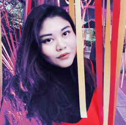
The constant use of the red colour is to immediately catch the eye of the viewers as it is a bold colour and it looks absolutely flattering on myself. The red head piece is used to compliment the outfit and balance out the whole red aesthetic of the photograph.
The shiny necklace, earrings and rings that I cladded myself with is to further compliment the outfit that I am wearing as the shiny pieces really brings forth the vibrancy in the red colour.
My Symbolic Message:
The use of red that I have constantly placed an emphasis throughout the series would be to showcase confidence and how I feel beautiful and empowered. Red is also a colour used by women to appear attractive and somewhat alluring, drawing a sense of sex appeal.
The shiny necklace, earrings and rings is to symbolise how I need all these material possessions to appear confident and to somewhat brag that I am of class and have a high spending power. This relates to how women on social media perceive each other’s worth based on the amount of expensive goods they own.
Image 1
This image focuses on the excessive amount of jewellery and also the neckline. I chose this image so as to portray how I am vulnerable to these material possessions and it has become part of me, part of the things that make up the idea of perfection. The image is particularly cropped from the lips to the collarbone area as I personally feel that this is one of the sexier region of the female body and the gesture of my fingers grazing my face as such is to show how I am really obsessed with vanity.
Image 2
This image is to slowly introduce my personality through my eyes, yet not having to show my whole face just yet. I chose this shot as it exudes the “mysterious” feel that would somehow make viewers curious and would want to click on my profile to see more of my face.
Image 3
I selected this image as to me, this is the ideal of how I would portray myself to my followers on social media. This was how I wanted them to perceive me as. In this image, I have over-exaggerated some elements such as the lipstick and excessive rings worn. The over-lining of the lipstick has been in trend with so many social media beauty influencers as it now an “ideal” to have really plump and luscious lips. The expression that I made was a typical “I’m confident” pose with my chin tilted lightly up and my head tilted to the left slightly, sort of subtly looking down to the viewers.
In conclusion, I really do believe that expensive material goods and portraying oneself in a proper and most idealistic way through make-up or dressing up is a form of self-expression on how they want to be be accepted and well-liked by the society or the “online-society” they are in. As I grew up and with a social circle of friends who are constantly obsessed about posted the most picture-perfect posts at the right timing with the right caption, I somehow too have developed that trait unwillingly became obsessed with that lifestyle.
Here are some of my own examples to show how when posting at different timings or when I post something that is not conventionally what my followers like, which are picture-perfect posts of myself, I tend to receive different amount of likes and comments.
Posted at 8pm on a Wednesday, where most of my followers are having dinner or at home. I consider this to be the “prime time” on Instagram where posts posted at this timing will get the most exposure. Image is a selection from 30 images that were shot, filtered and colour corrected to make the colours “pop”.
Posted at 6pm on a Sunday, I consider this to be the “prime time” for weekends where most of my followers will be at home resting and getting ready for a Monday work day / school day. Again, this image was a selection from over 20 images, filtered and colour corrected to make the aesthetic fitting of that a “Sunday Brunch”.
Posted on a Friday evening at 5pm, this was honestly one of my favourite shots on my Instagram page yet it has the least likes because my face is clearly not seen and it is apparent that my followers don’t care for my silhouette or the beautiful neon sign behind me. This was also filtered and colour corrected.
Crit Sesh Comments
There is a constant colour tone so it helps that it is printed into one board.
Gives off a collage feel very old school or look book feel.
Like how the bottom photo zooms in to the detail.
There is a sense of self-love in the images.
Kardashian-Jenner feel.
All three images makes one image and it resembles magazines that we are familiar with.
Piece comes in context with the artist statement and how I frame myself in the social media perfection.
Like the fact how I use something aesthetically pleasing to show outside with the inside to convey something deeper.
From the three different artist references that I have gathered, I started an elimination process and started to think on what was possible to execute with the time, budget and resources that I have.
I decided to not go further with the first and second artist reference as firstly, the first reference needed a bath tub and that required me to book a hotel room which was way over my budget for a shoot. Furthermore, the rooms that I wanted weren’t available during the dates when I wanted to conduct the shoot on. As for the second idea, it is achievable but due to time constraints and unfortunate weather forecast, I decided to not risk the time being wasted and proceeded with a concept that I am able to have full control over.
In my series, I would like to portray how I am obsessed with looking pretty and perfect especially when posting on social media platforms. Using Kitty Ca$h as my main inspiration, I proceeded to create a moodboard that would help me with visualising the aesthetic of the series.
I proceeded to choose my location, which was in my previous school. Republic Polytechnic was my choice of location as it has big glass windows which allowed for natural sunlight to enter, allowing me to have minimal lighting set-up.
I then began to start on my make-up which was to highlight the point that I am trying to relay. The make up look that I went for was to have warm tones of orange, red and gold on my eyelids as well as making my face as contoured as it can naturally get. To create the desired look, I smoked the corner of my eyes and made the center of the eyelids as shiny as possible. As for the lips, I used a bright red colour to further compliment my outfit.
I also had on many accessories suck as a brick red flower head piece, a shiny necklace, a whole set of rings and also long dangly ear pieces. The purpose of these accessories were to make the photo as shiny as possible as well as exude a “classy” front.
I also had to use a brown paper backdrop using 2-metre long art paper as the backdrop as I felt that a white background would feel too flat.
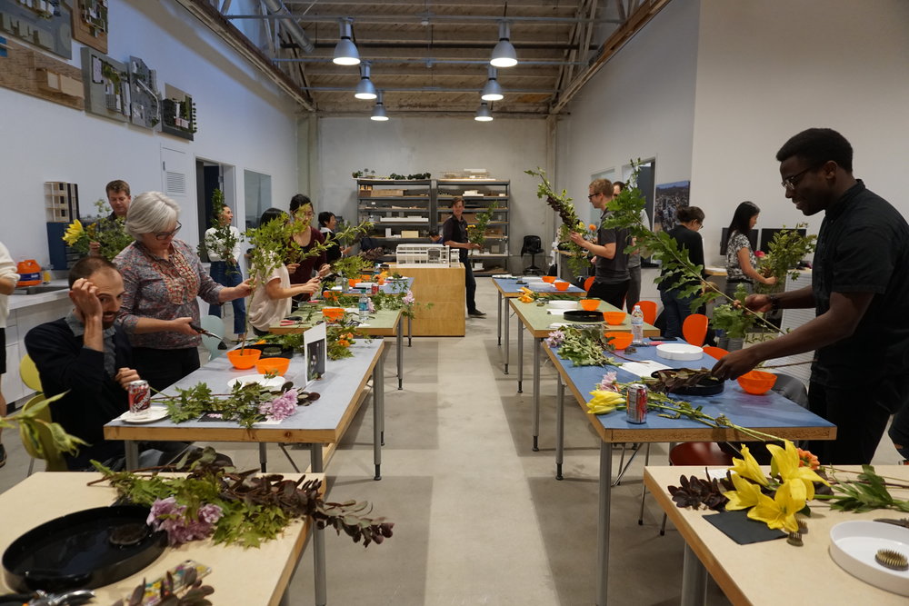
After dressing myself up, I then started to do some test shots and setting adjustments by having my friend stand in to where I will be standing at and start to frame up. As he will be the one shooting me, I just wanted him to get the shots that I wanted and be familiar with the vibe I’m going for. Throughout the shoot, I constantly referenced back to the Kitty Ca$h series so as to have a rough guide on the variety of shots I should get.
At the end of the shoot, out of the million shots we took, I narrowed them down to these ones before choosing my final three shots for submissions.