Week 3 Write-Up: Designing for the Digital Age

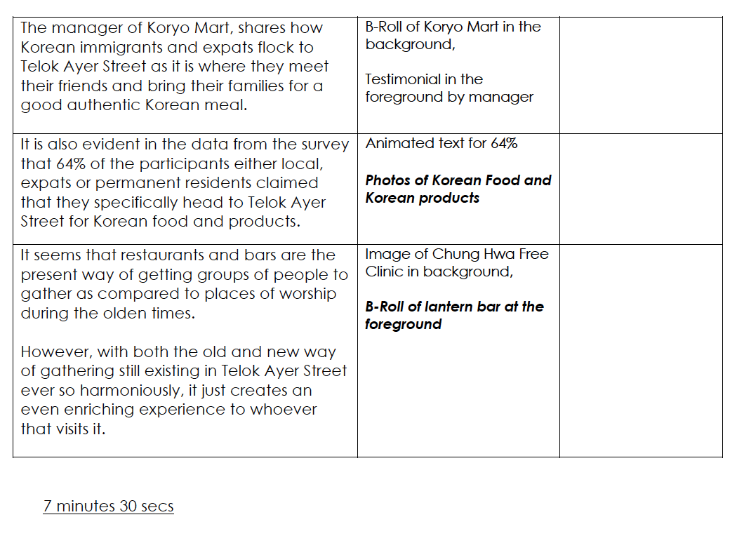
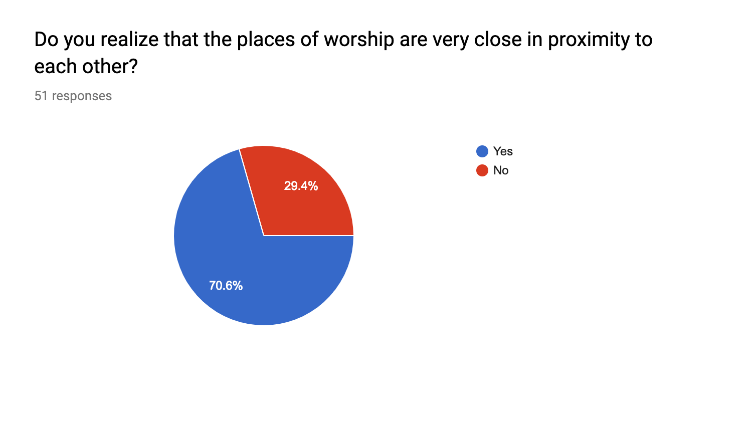
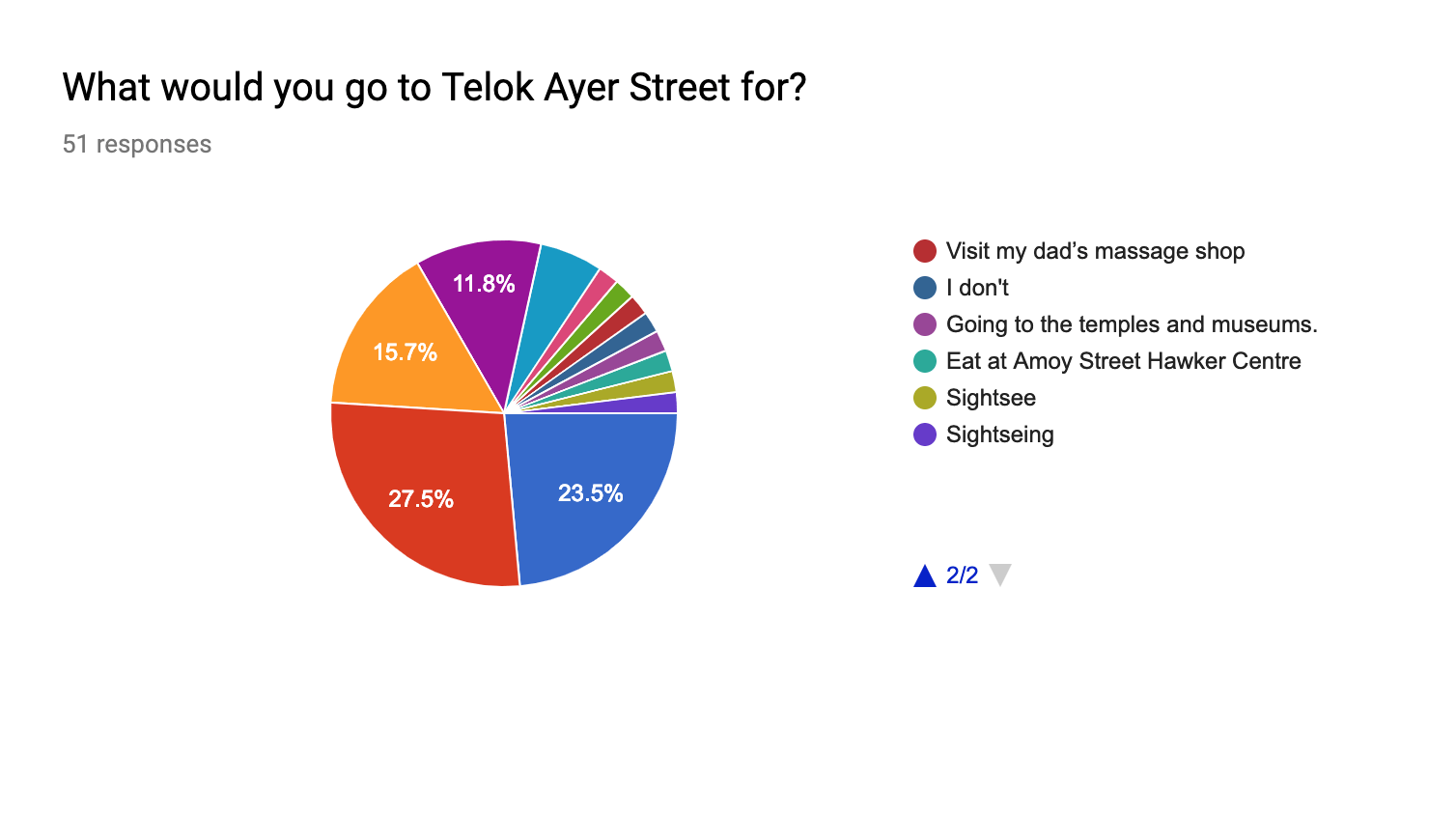
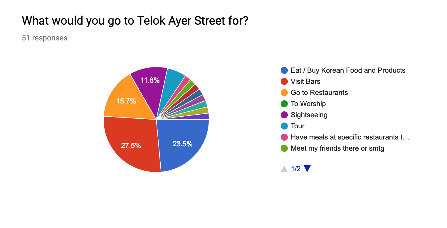
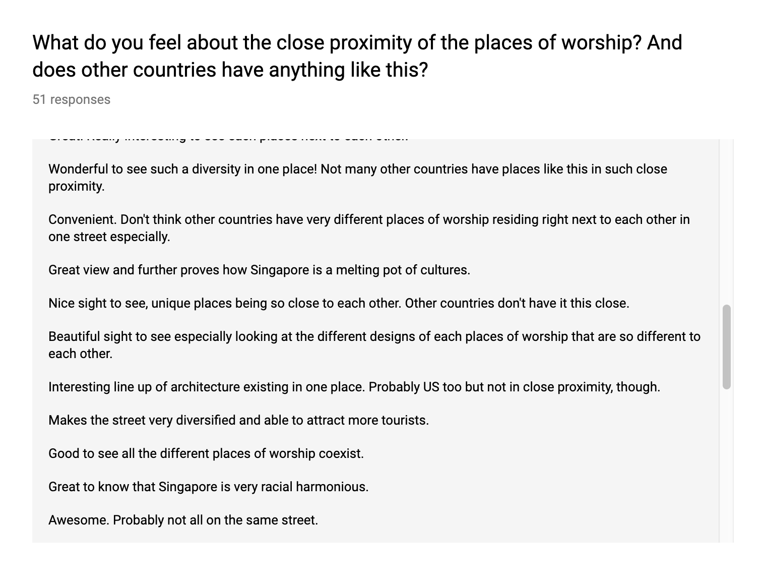
When I was first introduced to the world of design 5 years ago, I often associated it with graphic and web design purely for the sake of advertising as that was what I was mainly exposed to at that point of time. However, design bears an array of definition and one of it is to make everyone’s day-to-day life easier and to also act as a medium for communication. This correlates to what Kim Goodwin had mentioned at the beginning of the chapter where she wrote, “This intentional shaping of the world for mass consumption is often referred to as design.”

Design Solution

The term “design solution” is a buzz-phrase that I have been hearing people throw around but what does it exactly entail? The explanation here suggested that some of these solutions could be tangible products or they could also exist as a service providing specific experience. This statement made me derive to the thought that designers are “human-centered” problem solvers that are responsible in visualising the end-product and communicating with every parties involved in the process as well. It is interesting if we put to perspective how doctors solve medical issues, engineers solve technical issues and designers somehow solve human-centered issues. I feel this is why designers have to keep up with a lot of knowledge from social issues, science, technology, etc so as to create the perfect solution for the issue.

science or art?

I love how Kim chose to categorize design as craft. Design does not equate to science as it works past only understanding how things in the universe work. Although it is true that to start designing to solve the issue at hand, one must be familiar with the scientific facts pertaining to the human senses, cognition and ergonomics – all of which are used to get better understanding of the demographic. I feel that the scientific aspect of things are often overlooked as many designers tend to forego these facts that help to aid the design into being more functional and plausible as they often focus on the aesthetic of the work and are too fixated on the design being beautiful.

This is why design and art are defined together as designers tend to express their own preferences and vision onto the design which takes them away from serving to solve the human needs and goals. As such, finding the right middle ground between art and science is a craft as it truly showcases the best of a design being able to cater to the human needs yet possess great artistic value at the same time.

re-defining experience design

“We can design every aspect of the environment to encourage an optimal experience, but since each person brings her own attitudes, behaviors, and perceptions to any situation, no designer can determine exactly what experience someone has.”

This statement is a good argument as to why human-centered product and service design is not exactly experience design. Designing every component of a service and product to the perceived optimal does not necessarily mean that it would be the best experience for everyone as it is purely subjective and based on different user’s behaviours. What I garnered from this is that experience design is a one-way communication from the designer to the user but interaction design allows for a two-way communication where the designer responds to the user.

But isn’t interaction design interface design?

Non-designers and designers alike often misunderstand what interaction design is and will interchange it with interface design. I like to think of interface design as addressing touchpoints such as screens and buttons on a website, the “look” and visuals of the service and also to ensure the user stays on the website. Interaction design however, as Kim had coined, is “focused on what people want to do as well as how they can best accomplish it”.

I feel that interaction design is the big picture in any design discipline and is not fixated on interface design. Interaction design focuses on what the product or service is about and then providing the best way to experience it while taking into consideration how the users behave towards it and what they actually want from it. This span across product design, architecture, interior design, graphic design among many others and what makes a design successful does not lie on how good it looks but in the functionality and how sensitive it is to making the user’s experience seamless.

Goal-Directed Design – best design technique

“Its fundamental premise is that the best way to design a successful product is to focus on achieving goals. Although the rhetorical emphasis is on user goals, the method also incorporates the goals of the customers (people who purchase but don’t use a system) and of the business creating the product or service.”

As I read how Cooper hires skilled and experienced designers and sending them through classes and apprenticeship to master the techniques of goal-directed design, I realise how education or learning in general plays an important role in implementing goal-directed design. In a way, I feel that tertiary art/design schools are actually trying to cultivate the practices and processes of goal-directed design techniques in every project and assignments.

Final Thoughts

Looking at the overview of the Goal-directed process, I feel that it is extremely relevant to how we will be tackling our FYP thesis in this module and moving forward as we actually start implementing and creating it. I find the steps that come before “detailed design” extremely important as these are the essential foundational blocks needed before actually producing the detailed design. With goal-directed design techniques and experience design technique explained, the future projects that I will embark on would have to have great considerations of these concepts in order to create a meaningful product that would resonate with my demographic.

Week 1 Write-Up

1. Biography

As a versatile creative designer and art director, my passion lies in advertising for social change and branding design. The work experiences that I have garnered the past 5 years span across providing art direction, graphic design for digital and print, photography, video editing and executing creative pitches among many others.

Having gained valuable skills from various industries such as public relations, entertainment, food and beverages, IT and education, it has expanded my vocabulary when providing and implementing creative solutions. With these experiences, my motto is to create works that are inspiring, reflective and especially works that make a difference in the society.

2. Link to personal presentation
3. link to RESUME
4. Link to inspiring Artist Presentation

I have chosen Pentagram as an agency that inspires me as they are not only an established design giant that have produced many iconic works since the 1970s, but they are also still creating impactful works that are applicable and still relatable till today.

I have chosen two works from Pentagram and have further gone into details on how these works have inspired me in the speaker notes section of the Google Slides Presentation.

DESIGN OUTCOME 1: THE SPECTRUM GAME

Moving forward from the infographic poster, I decided to keep the colours, illustrations and basically the whole look and feel to incorporate it in both of my final deliverables.

DESIGN OUTCOME 1

Pro-Choice Game: Are You Pro-Choice or Pro-life?

Starting this deliverable out, I spent some time thinking and collating information from both the survey responses as well as videos, websites, forums and articles online that could aid me in the content of my game. My aim of this game would be to spark conversations among young women, encouraging them to speak up and/or ask questions that they are shy to ask with all things revolving around abortions, adoptions and unwanted pregnancies.

Initially, I just wanted to come out with prompt cards that will be drawn by each players and getting them to talk about what they feel but after consultations and revisiting the cards and its concept, I felt that the prompt cards doesn’t fully engage the players as much as I wanted it to be.

As such, I went to think of stronger game objectives that allow players to come to a conclusion once they are done with the game thus, the gameplay of the board game allows players to find out if they are pro-choice supporters or if they are pro-life supporters all while allowing conversations to flow throughout the different prompt cards.

Early Sketches:

Gameplay:

Packaging:

I decided to go with the sliding box as the final packaging as I thought it would be simple yet a little different from the usual open up boxes. The different faces of the box are in pink, blue and yellow respectively so as to really make it interesting and vibrant and look very attractive as a game cover.

Board (+icons):

I have created the board such that it allows for players to place their icons within a spectrum as I felt that it would allow them to better visualise where they stand among the other players and allows for a better conversation starter after each prompt.

Prompt Cards:

I have divided the prompt cards into pro-choice and pro-life cards where 5 cards from each category would have a follow-up of having the players collect either pro-choice or pro-life cards if they were to land on any agree spectrum. After 20 rounds of drawing, players would then be able to determine if they are pro-choice supporters or pro-life supporters.

Token Cards:

Players are to collect these cards and accumulate them at the end of the game.

Application:

I really hope that this game could be a great conversation starter for young women especially those who have been raised by parents who are not open with discussing topics revolving around unwanted pregnancies. This game could be part of a workshop done by organisations that aid women in unwanted pregnancies or even local Youtube channels that highlight social issues in Singapore where they gather young women of different walks of life to come together to have a genuine conversation and also gaining insight from each other.

Dialogue in the Dark Visit

Briefly share your experience going through Dialogue in the Dark. What were some of the feelings, challenges, and insights gained while role playing a blind person?

Dialogue in the Dark is an experience that is really eye-opening to me as I really love participating in role-playing activities to further understand a situation better. Going into the exhibition, I knew that I wouldn’t be able to see anything and be in complete darkness. I felt calm because I wasn’t alone going through this experience so I wasn’t as worried as if I were to go in alone.

Some of the challenges faced inside the exhibition would be my ability to decipher alphabets through touch. I realized how extremely reliant I am on my sense of sight. It took me quite a long time to figure out the words at the Raffles monument and I was only able to figure out the name of the monument after someone else figured the other part of the name. The cursive sign was worse as I originally am not really able to figure cursive in real life that well so when my sense of sight is unavailable, my sense of touch simply were lost.

The insights that I’ve gained whole role-playing as a blind person would be that everyone of them faced a really confusing and exhausting phase in the beginning of their blindness as they try to adapt to their new condition. Things that we have in our everyday lives are taken rather for granted when we are able to see such as doing really basic daily routines such as walking in the park, crossing a bridge, crossing a pedestrian crossing, press the doorbell of our house or simply walking on the pavement without bumping onto any obstruction. These are the simple things that blind people would have to face and adapt to thus making them walk a little slower than we do as they have to pay way more attention to their surroundings.

Drawing on your experience, can you think and list some of the benefits inherent in the design research technique of role playing?

Role-playing is a great design technique as it really creates an immersive experience for the participants. Through Dialogue in the Dark, we were able to fully immerse ourselves in the environment and point of view of a blind person. This technique is also very effective in relaying the message and cause which was to raise awareness of the visually impaired in Singapore.

Can you think of some contexts where role-playing can be useful to help discover and definition of design challenges or contribute to the development of design solutions?

Role-playing is a form of creative problem solving for the participants as they are placed in a “problem” situation which requires them to solve within their own groups. Just like in Dialogue in the Dark, we were highly dependant on each other and the guide to help up through the experience. Role-playing is also allows participants to actually work in a physical space or experience and through that, they are also able to see issues that might not have shown up on mere 2D or 3D designs.

PROJECT 2: ZINE LOCALE PART 2

From the video, I decided to look up some neat layouts of editorial pieces to gain inspiration on how I could present the elements in my zine.

Layout Ideas

My purpose of having the layout be clean is that I am intending to put in a lot of other elements that are much more “messier” such as a handful of images as well as illustrated stamps.

Moving on to the stamps, I wanted to include an “olden” feel to the contemporary zine by including a modernised version of the stamps and I was also hoping to include other elements such as a luggage tag or even stickers to further accompany the zine.

Stamp / Stickers Ideas

Seeing that I have captured a lot of photos of Telok Ayer Street, I decided to put together a mini gallery of a few of the images that really captures the places of worship as well as the life in the bars and restaurant.

Brief Gallery
Explaining each spread

Cover Page:

The front cover page is a depiction of the places where people gather in the olden times which were at places of worships such as the church, mosque and temples. As seen on the right side of the image, I have combined the three places of worship to show how these places mesh together.

The back cover page is a depiction of how the architecture of Telok Ayer Street has drastically changed as it is not about the places of worship anymore but rather about the shophouses which houses the restaurants and bars and especially the high skyscrapers right behind the shophouses.

I based the zine on a guidebook for immigrants of the past time-travelling forward in time sort of like to guide them through the new and old establishments. It is to highlight how the old buildings and places still exist yet it might have a new life or purpose to it.

First Spread:

The first spread highlights how and where the people of the olden times gathered when they first came and are at Telok Ayer street. In the san serif font, I have put in facts of the places that I took from the site’s information whereas for the handwritten font, I included my own guide to serve as a tip for the immigrant reading the guide.

Middle Spread:

In this spread, I decided to do an interactive spread whereby the readers are able to paste stickers onto the page and build on the street for themselves. The rationale behind the spread would be to depict how the shophouses and places of worship are a constant or permanent establishment that have existed for a very long time but the skyscrapers at the back are not permanent as they are constantly changing and being build on.

I have cut up the chunks of the skyscrapers to show further exaggeration and contrast of the tall buildings to the humble temple. I have also included elements to portray construction as seen on the signboards and the yellow construction tape. When the stickers are taken out, this would be the look of the spread.

Final Spread:

In this spread, I wanted to add in “human”elements by putting in images that shows a lot of people in it as compared to solely architectural images in the previous spreads. I wanted to portray how people in the present day gather in Telok Ayer now for the bars and pubs, art festivals, street movie screenings and Korean restaurants.

similarly to the first spread, I have included facts of the sites as well as given my own tips to enjoy the place to its fullest.

Photographed Zine
Feedbacks + Comments from the class

Reflections

I find this project very creatively liberating as I absolutely love editorial design. It has provided me with such a different perspective as to how I approach a location and translate into unique ways that people might not have known about.

In addition, I also feel like it is a great practice for learning about printing, colour and layout as printing is such a vital portion in a zine production thus it has provided me with a great learning point which is to package my work well as well as knowing how the colours would actually translate onto the print as well as selecting the appropriate paper quality.

PROJECT 2: ZINE LOCALE PART 1

For this project, I really wanted to pick a location that is very rich in texture. I categorize texture as sound, sight, smell, taste and touch. All these layers of texture are what I hope to have in the location that pick. As best as possible, I would also want this place to have a history and perhaps have a place of worship or a cultural establishment in the vicinity.

As such, I shortlisted these locations based on the following merits.

#1) Bras Basah

Bras Basah as an area is very well known for its Bras Basah complex and how that place is definitely not a stranger to many of the students in ADM. However, apart from the bookstores, printer shops, antique shops, restaurants, and residential apartments above, I felt that Bras Basah lacked the texture and cultural note I wanted.

#2) Geylang

I wanted to approach Geylang in a contradicting way whereby I wanted to feature the presence of the Malay Muslim community with the market, shopping malls, heritage centre and mosque yet also uncover how the red light district is very much thriving just a stone’s throw away from the community.

However, although there is a texture and cultural to the location, I felt that I might face certain security constraints and might not achieve the outcome that I wanted.

#3) Ann Siang Hill

I considered Ann Siang Hill as one of my location as it is a depiction of my love for pubs and bars. As I often patronise the area, I fell in love with the beautiful nightlife as well as the shophouses that really brings out the nostalgic feel to a contemporary bar.

However, I realised how doing a zine based on just nightlife, bars and pubs seem to be very shallow and doesn’t really bring out the best in a locality. As such, I decided to go a little further down the street to Telok Ayer Street where I uncovered so much texture in just one whole street.

#4) Telok Ayer Street

I decided to go with Telok Ayer Street as I felt that it has the most texture out of all the other locations that I have shortlisted. I discovered that Telok Ayer Street has three different places of worship of three different religions and these places really co-exist really well with each other.

Apart from that, I also noticed how there is also nice combination of bars, local restaurants as well as a handful of Korean restaurants along the same street. What is more interesting to me is that the area is sandwiched between two business district areas.

From this, I developed the script to start filming the video of Telok Ayer Street. The three pages below are my first draft of the script to present to Joy for consultation.

From the consultation, I gathered from Joy that I needed to include more numbers, interviews and statistics. From that, I decided to add in more facts and also lengthen the duration in order to make my presentation close to 8 minutes.

I have also included a couple of survey questions to the public such as people from ADM, tourists, CBD workers as well as other patrons of Telok Ayer Street. Here are some of the results.

From this list of questions, I then put together a final video for this locality.

Feedbacks + Comments from the class

Reflections

Moving forward, I will be adopting the visuals and aesthetic feel of the video into my zine. I felt that the mustard yellow is a great accent colour for the rustic cream feel of the shophouses and paper that I am going for.

PROJECT 1: IMAGE MAKING THROUGH TYPE

Concept

I had two different concepts in the beginning of the ideation process.

Concept 1 was about about jobs that were male-centric and had a minority or even no women at all. I had jobs such as military personal, politician, surgeon and athlete.

Concept 2 was about fictional jobs that I idealise about which included some of my favourite mobile apps or mobile apps I frequently use in a day such as Tinder, Deliveroo, Netflix and Google Assistant.

After having consultations with Joy, I came to the conclusion of fusing these two concepts of which  I will incorporate visuals of the idealised jobs but the context of the male-centric jobs.

As for the tone of the work, I decided to go for a comical and sarcastic approach as I exaggerate the different features of the work.

Inspirations

I was inspired by this design mainly because of the arm coming in interact with objects that were much smaller in scale. I intend to adopt this idea of arms coming in most of my compositions so as to show the “God”-like quality that I have in the jobs.

As for these two examples, I was very fascinated by the use of isometric view to really showcase not just the letterforms but also the little elements in the work like the people. I planned to include this in one or two of my works which would support the idea of the larger-scaled arms coming into the picture.


Jane Fonda ABC by Jessica Das

I also thought about using the body to create the letterforms as I was really interested at exploring how the body language are able to distort themselves to translate into letterforms. I plan to adopt this in the composition where I use an exaggeration in the body movement of my characters to really capture the essence of the letterforms.

Occupation #1: Tinder Bio Specialist

The ideation for this was that I really wanted to show how people are very superficial online and they only seek to put out the best versions of themselves online both in their images and in their bio.

I decided to use Tinder as a prime example as I felt that it was the most relatable social media application and also because I’ve had experiences with it too.

The idea also derived from me scrolling through Instagram and seeing how curated the posts of these influencers are as they only post the best shots and best angles of themselves.

To put into perspective, the job of a Tinder Bio Specialist would mimic that of a plastic surgeon that is fixing the physical attributes of the users and only curating on the best parts to go onto the body in order to create the best bio on Tinder. Here are some of the sketches to get me going.

From the sketches, I derived to my final composition.

The letterforms are seen as such:

N – The two chopped up arms

A – The cut out bra

D – Inverted left butt cheek

D – Inverted right butt cheek

Y – Torn skin on the thigh


Occupation #2: Deliveroo Employees Trainer

For this occupation, I really wanted to show the exaggeration of how Deliveroo riders are very much similar to military personnels such as the soldiers as they too are tasked to serve the people – the hangry customers.

I planned to depict the people in my compositions as Deliveroo employees cladded in army gears and are doing very battle-like actions such as going through the battlefield.

I also got more ideas after looking at soldiers in various different situations and really understand their body language so it will be easier for me to visualise how I can manipulate their body language into making out the letterforms.

To put into perspective, the hands in this composition would come in as a trainer that is trying to test the employees by putting them into challenges but at the same time try to help them out as well. Here are some sketches.

From the sketches, I derived to my final composition.

The letterforms are seen as such:

N – The telephone wire

A – Deliveroo employee being thrown from the top

D – 2nd Level Ground

D – 1st Level Ground

Y – Telephone wire dangling around and down the employee


Occupation #3: Professional Netflix Watcher

This occupation was the most difficult for me to crack and really put together a good combination of the two jobs that make up this occupation. I decided to go with the politician as the professional Netflix watcher as it derived from the idea of how Singaporean politicians are simply known for their “eye-power”.

I wanted to approach this in a very sarcastic manner whereby I used the Parliament House to set the setting for this work. The stands at the front of the Parliament House was something that I wanted to change and incorporate a conveyor belt of food and projection screening of Netflix.

To put into perspective, the politicians in the work would be illustrated in pajamas to further emphasise that they are just in leisure mode while in the Parliament House. The will also be taking an oath to promise to watch Netflix and eat as many junk food as they like. Here are some sketches.

From the sketches, I derived to my final composition.

For this work, I decided to use my initials. The letterforms are seen as such:

N – The sofas and people taking the oath

M – The conveyor belt of food and large LCD screen


Occupation #4: Google Assistant’s Assistant

For this occupation, I thought of really humanising the inanimate Google Home device which is the most popular embodiment of the Google Assistant. What I wanted to do with this was really to show how there is actually a human inside the Google Assistant and that she really actually needs alot of help and maintenance as the default voice of the Assistant is in fact a woman, which is where me or my hands come in to help.

These are some of the chunked up body parts such as the arms, legs and ears that I have come across that I planned to incorporate into the Google Home device.

Here are some of the sketches to help me better understand the letter forms to incorporate.

From the sketches, I derived to my final composition.

The letterforms are seen as such:

N – The arms coming out and reaching for a book

A – The legs coming out to receive a pedicure

D – Inverted ear

D – Ear listening to music

Y – Wire with veins

Feedbacks + Comments from the class

Reflections

I find this project to be challenging yet it allows for me to really learn about the creation of letter forms and how easily it can be manipulated into anything that we want it to be. The challenge that I faced in this project would definitely be the forcing of the letter forms onto the elements of my work as I did think that it could have been done less forcefully

I felt that I definitely took away a lot of learning points from this as creating letter forms through image is a great tool to have when doing other works as well as it is a really great visual tool to incorporate considering how flexible it is to manipulate and how it is a much more visually simulating and interesting.

RESEARCH CRITIQUE 4: UNCOMFORTABLE INTERACTIONS

The term “Uncomfortable Interactions” came about by Steve Benford and his team of creatives and innovators. Steve Benford is a professor of Collaborative Computing in the Mixed Reality Laboratory at Nottingham where he explores future cultural and entertainment technologies. Uncomfortable Interactions stems from experimenting and pushing the limits and possible outcomes of HCI which stands for human-computer interaction[1]. HCI researches the design and use of computer technology, focused on the “user-friendly” expect of an interface. HCI’s engagement with cultural experiences such as art installations, performances, guides and games has inspired some unconventional approaches that usually comes only in traditional interactional designs[2].


Professor Steve Benford giving a lecture on Uncomfortable Interactions at the University of Salford, Manchester.

Uncomfortable interactions are said to benefit cultural experiences in three methods which are entertainment, enlightenment and sociality. Entertainment can be one of the ways of uncomfortable interactions through firstly, physical discomfort. This can take the form of riding roller-coasters or doing extreme sports such as bungee jumping as it evokes a feeling of thrill by a combination of fearful anticipation, followed by an extreme physical sensation, and then the euphoria of relief at having survived[3].

Enlightenment through interpretation can also be one of the ways of uncomfortable interactions as it tends to provoke interpretation rather than directly giving information to the audiences. This is achieved by including a certain ‘ambiguity of relationship’[4] in which the participant’s relationship to the experience becomes subject to interpretation.

Lastly, sociality is also one of the ways of uncomfortable interactions as it allows for confronting and sharing discomfort as a form of social bonding. This same principle can be applied to team building activities whereby groups would have to endure and go through challenging tasks together[5]. Social bonding around discomfort extends to audiences as they witness the public discomfort of others.

These ideas are exemplified through the game, Uncle Roy All Around You where the uncomfortable interactions could come in the forms of Discomfort through Control and Discomfort through Intimacy. For the online players, they are giving up their control to a bot called “Uncle Roy” in which it would be giving the online players directions in order to guide the street players to Uncle Roy’s office. This continues as a chain where street players surrender their control over to the online players in which giving the online players full control of telling them where to head to in order to find Uncle Roy’s office.

Discomfort through Intimacy can also be seen in the game as it allows the online players a chance to see their street players through surveillance camera as soon as they reach Uncle Roy’s office. This is also the moment whereby they will be deciding if they would want to commit to the commitment of staying with each other for the next 12 months.

Uncle Roy All Around You’s possible benefits would be Entertainment and Enlightenment. I believe that this game benefits entertainment wise for the Street Players in particular is because throughout the 60 minutes they are given, they are constantly being put on edge and the suspense of waiting for the next directions, getting into Uncle Roy’s office and also meeting Uncle Roy himself.

The game benefits enlightenment wise as there is a great sense of ambiguity that occurs between the participants’ relationship to the experience.This is because the players are being placed in a position whereby the online players are able to control the directions given to the street players meaning they can easily led them to the wrong way. However, subconsciously or not, the players still do realize how it is indeed after all a game or a piece of artwork that is being carefully orchestrated by the game’s orchestration team comprising of 10 people.

References:

[1] Rouse, Margaret. “HCI (human-computer interaction).” SearchSoftwareQuality. https://searchsoftwarequality.techtarget.com/definition/HCI-human-computer-interaction (retrieved 25 February 2019)

[2] Benford, Steve. “Uncomfortable Interactions.” Session: Culture, Playfulness, & Creativity. (2012) Pg. 2005

[3] Benford, Steve. “Uncomfortable Interactions.” Session: Culture, Playfulness, & Creativity. (2012) Pg. 2006

[4] Benford, Steve. “Uncomfortable Interactions.” Session: Culture, Playfulness, & Creativity. (2012) Pg. 2006

[5] Benford, Steve. “Uncomfortable Interactions.” Session: Culture, Playfulness, & Creativity. (2012) Pg. 2006

Link to Presentation Slide Here

MICRO-PROJECT 3: TOGETHER SPLIT

This work was created using the Instagram private group chat feature in which we incorporated the use of the human body, hands and fingers as subjects of the work. The objective of our work would be to experiment with proximity, scale and connectedness of each frame as the subjects go through the frames one by one.

In Scene 1, we have the subject walking in full human body form, walking towards the right in the first quadrant and when he enters the second quadrant, he turns into fingers. When he drops to the third quadrant, he then transforms back to the full human body form and as he walks towards the last quadrant on the left, he then transform back into fingers.

In Scene 2, we have the subject being flicked by a giant finger in quadrant 1 and is flung across quadrant 2 where he then falls into quadrant 3 and gets pulled by another hand in quadrant 4.

In Scene 3, the team wanted to end the work with a light-hearted game of rock, paper, scissors in which after every round, those eliminated would exit the call and the last one would be the master screen thus ending the group chat.

THE OUTCOME

The outcome of each scene didn’t stray too far off of what we had initially planned for although there we several lags in each quadrant, the objectives were still met and we were still able to showcase scale and connectedness with each scene.

We took a very long time setting up the screens before we could even try out our scenes due to connection problems and just where our locations were at as well. When one person has unstable connection, it tremendously affected the rest as weren’t able to communicate.

As it was our first time using the group chat feature on Instagram, it was rather difficult navigating the screens thus, it made us take a longer time to understand where each screen is at, on the master screen – which is the person who started the call. This is also the difficult part as on our own personal screens, our quadrants are all placed differently so navigating our directions were rather difficult as well.

In addition, as we use the same subject for one of the scenes, it is immensely challenging to time the perfect sequence from each quadrant and our subject would have to run to the next location almost immediately in order to make it to the following quadrant where they would have to reappear.

Although it was challenging, it allows us to be adaptive digital users as we were only given 60 minutes to plan and shoot everything. As social media platforms and other digital platforms continue to advance, coming out with more intricate features, as users, it is definitely a must-have trait for us to be ever-ready in learning and exploring the new features in order to make the best out of that platform.

Out of all the 3 Micro-Projects,

Which project did you feel you had the most creative control? Why?

I felt that the project with the most creative control would be Micro-Project 1: Creating The Third Space. This is because firstly, the project allows the creator to have full control of the artistic outcome in which the artist is able to conceptualize and create the work to his or her liking and there is no input from anyone else before he or she posts it onto Instagram with the hashtag.

The only thing that was binding everyone in this project would only be the hashtag, in this case to identify the posts of the people who had created the works. Apart from that, what I chose to shoot, edit and post were all in my control thus, making me feel that Project 1 gave me the most control.

Which project had the most unpredictable outcome? Why?

Project 2: Crowd-Sourced Art had the most unpredictable outcome as it allowed the audience of the work to have a huge amount of control in the decisions that we, the artist had to follow. The process of the work allowed for people to choose either one of the two options presented to them. As the creators, we were never too sure which option would end up the majority so each time we allowed the audience to choose, the results were unpredictable.

Which project best illustrates the concepts of DIWO & OpenSource? Why?

In my opinion, Project 1: Creating The Third Space, best illustrates the concepts of DIWO and Open-Source. This is because the idea of the hashtag itself allows for creators to collaborate on the same platform and interact with each other as they view each others’ work. The hashtag on Instagram also allows for the public to openly contribute to the community and comment on the posts. This means that people who don’t follow each other would be able to view and comment on each other’s work thus creating new connections and enabling more collaborations to happen.

As compared to Project 2: Crowd-Sourced Art, it only allows for people who follow the artists on their platform to be able to interact and participate in the making of the work. Thus, it doesn’t really make it open-source as there are more control as to who is allowed to see and contribute to the artists’ work as compared to Project 1 in which, it is completely open to whoever that have an Instagram account.

INTER- : HUMAN CANVAS

concept

I am curious to find out how people would react when presented with a human face as a canvas and having beauty tools and make-up as their art materials instead of the usual paint and paint brushes.

In addition, I would also like to see how the audience interact with the canvas and tools: will they erase anything on my face or continue on from the previous person’s work.

inspirations

Yayoi Kusama // Obliteration Room (2017)

Allowing audience interaction, Kusama’s work allowed for the audience to stick colourful stickers all over the furniture and walls of the white room. The white room acts as a canvas in which the audience are able to experience being an “artist” by placing their own “mark” onto the canvas.

As such, the free interaction from the audience was what I took from and implemented in my own work.

Marina Abramović // Rhythm 0 (1974)

Also allowing audience interaction, Abramović stands still while the audience was invited to do to her whatever they wished. They had the option of using one of 72 objects she had placed on a table. These included a rose, feather, perfume, honey, bread, grapes, wine, scissors, a scalpel, nails, a metal bar, and a gun loaded with one bullet.

Similar to Abramović, I will be laying out an abundance of materials for the audience to pick and play with on a table and will not allow myself to talk and let them experience the canvas freely.

pre-submission testing

In this experiment before the actual submission, I have allowed for multiple people to come at me and do my make-up as they please. I realised that with more people working on my face, they tend to ask each other if they are doing the right thing, which is something I didn’t want them to care about. However, I did get some interesting response on the canvas as people are more willing to be creative when there are many people doing at a go.

actual submission – the human canvas

Instructions:

Having the audience coming and working on the human canvas one at a time, it felt much more personal than previously where everyone ambushed at the same time. It also allowed me to interact and react to the audience more intimately in which they can take their time to scout the different tools before testing it out on me. In addition, it was also interesting to see how many of the audience chose to add on and not erase the previous person’s work as if they are afraid to ruin it.