LECTURE 4 REFLECTION

I have always been interested about corporate identities of brands and I get a sense of satisfaction whenever I see a really well designed logo and identity especially when it gets recognition and becomes a really iconic visual.

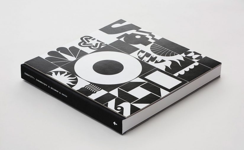
When it comes to branding design firm, there is a design giant in New York City that had created the identities of many renowned brands. Chermayeff & Geismar & Haviv is a branding and graphic design firm founded in 1957 and is currently led by partners Tom Geismar and Sagi Haviv.

Although they had been around for over 60 years, I really feel that their designs are very intuitive and reflects modernity at best. Most of their designs are very tactical, well thought out and uses geometric shapes that gives it a great proportion.

Factset Research Systems, 1996

Univision, 1989

Some of the many brands they have designed for are National Geographic, Harvard University Press, NBC, New York University and Mobil. Although these brands are known to have a traditional practices, their identities are all given a fresh look to it with trendy and eye-catching colours in addition to the beautiful geometric shapes.

Despite being a branding firm, Chermayeff & Geismar & Haviv is also known for putting up exhibits and environmental art installations. Some of their projects included the Ellis Island Immigration Museum, the Statue of Liberty Museum, two World’s Fair pavilions (the U.S. pavilions of 1967 and 1970), and the red number 9 at 9 West 57th Street in New York City. This really shows how branding is not just about the logo but can also involve event activations on site and that requires the firm to always update and accept new technologies and skills.

Class Feedback:

The past four weeks has been a blur honestly but it has been enjoyable so far being able to really learn about something that relates to what I’m doing which is graphic design. The quizzes gave me slight anxiety but all is gud because it really makes me genuinely take time to understand the terms and who did what. Something I wish the mod could work is perhaps a consistent timeline? Because I am low-key lost with the jumping of different times from the first week up till week 10.


LECTURE 3 REFLECTION

Calligrams are texts arranged in a way that forms a related image to the meaning of the text. It comes in the form of a poem, phrase, a portion of scripture, or a single word. The arrangements of the texts relies on specific usage of typefaces, calligraphies or even handwritten. They are aligned freely and doesn’t really conform to one particular layout. The visuals created by the words depict the text by showing what it means such as the poem about rain by Guillaume Apollinaire, a famous calligram writer.

Although calligrams started way back in 1918, its influence is still prevalent in a lot of works today such as on logos, signages and even a design element. Here are some examples done by Stockholm-based graphic designer Daniel Carlmatz that shows clever use of calligrams in the modern context.


Task 2: Infographic Poster

Coming from the interview outcomes and more target researching, I came out with the palette as well as the look and feel of my infographic poster. I then came up with these drafts before refining them further with edits made to my copy as well.

After consultation, I decided to work on the first draft further because I really feel drawn to the circle and main illustration and feel that that could be the main storyteller of the whole infographic poster.

WIP

This was what I presented as a WIP on week 7 before the recess week and I gathered some feedbacks to take and improve on.

  • Main illustration seemed a little uncertain as the middle lady is looking at one side and the look of uncertainty is not apparent.
  • The placement of the main illustration is sort of fighting for attention with the other smaller illustrations at the bottom so there is a need to redefine the hierarchy and perhaps shifting of the placement.
  • The sub-headers were are in an S-shape and not really have a particular sense of consistency and orientation.
  • On print, the pink looks darker so might need to adjust.
  • Title to be bigger as it’s not as attention-grabbing right now.
Refinements

Right off the bat, I changed almost everything about the main illustration where the characters look more womanly with more comfortable and natural curves. I fixed the layout a little to show better sectioning and the ability to comprehend the information consistently but I just know that it still doesn’t look as completed as I want it to be so further refinements.

Final Poster

I adjusted some elements of the illustration such as the squarish platform into a medical plate because I felt that it was more organic looking and also much more relatable since it is a medical tool used in abortions. I also added some little background elements to not make the poster look too flat. In addition, I managed to find a really good space to add in my call-to-action at the bottom part of the poster. Lastly, I changed the black outline of the illustrations into a darker shade of the fill colour as I felt that overall, it would just brighten the poster and make the lines less harsh.

Task 1B: Exploratory Research – Interviews

The reason why I proposed this question as the first one as I felt that it was a good opener to really gauge and kind of understand who my target audience should be. Females are the predominant survey repliers so I concluded that they are generally more interested in this topic and could relate better to than males.

The second question was to also gauge the specific age group to target so I can create a design that speak to or even attract people of that particular age group. In this case would be young adults from 18 to 29 years old and I felt that something vibrant, illustrative and playful would draw them in.

The third question was to ease them into the topic of unwanted pregnancies before I throw them any jargons without any context so this was kind of like a context provider to the next questions. The results shows that more than half of Singaporean youths barely speak of any topics related to unwanted pregnancies which proves my point further that there is barely any conversations among families and friends in Singapore.

Surprisingly, majority of the respondents are aware of the jargon “pro-choice” considering they do not speak about unwanted pregnancies and topics surrounding it.

I had an open-ended short answer question to roughly gauge what the respondents define the term “pro-choice” as and they are all rather similar to one another.

Similarly with the jargon, pro-life, I also wanted to know if more respondents knew about it and turns out more people do.

Also wanting to know what their definitions are for pro-life, similarly, majority of them responded with similar replies.

I posed this question gather feedback from the respondents on where in the pro-life and pro-choice spectrum does the Singaporean society in general lands on.

The answers neither and pro-life were very close to each other so I concluded that from this question and the open ended ones that older Singaporeans are very much pro-lifers but the younger ones are pro-choice so there is still a large influence on the youth’s actions from the older generation which is why conversations and dialogues about pro-choice and pro-life are not brought up.

LECTURE 2 REFLECTION

I have always loved modern/didone typefaces such as Didot and Bodoni but after the second lecture, I became extremely drawn towards the fat face type. Absolutely attention-grabbing with its thick strokes and contrasting thin serifs was honestly just Bodoni and Didot on steroids.

Based on the lecture, the first fat face type was introduced by a prominent English type founder, Robert Thorne in 1803. As this was a time in Europe where printing technology and innovation flourished, many trades and enterprises or commerce are blooming therefore, there is a great demand for print advertising such as posters, flyers and pamphlets. Although Robert Thorne didn’t publish another book of type specimens after 1803, he continued to come out with other new bold fonts at his Fann Street Foundry up till his death in 1820.

1832 reward poster for lost horse, from the John Soulby collection, University of Reading.

Moving into the 20th century, type foundries came out with dozens of new sans serif fonts such as Gill Sans, Futura, Agency Gothic , etc. However, fat faces came out with even more new releases such as Modern Ratio from the German foundry Stempel in 1923 and Ultra Bodoni in 1928 from the American Type Founders, to name a few. This time round, fat faces weren’t just used for display types but it is also used for body copies but also very largely as a design element as well. Fat faces can scream out a design but it also preserves a certain elegance to it which made it quite a popular choice in design.

Herbert Bayer cover design using Ultra Bodoni for the 1939 issue of PM Magazine, a journal showcasing the finest examples of quality graphic art reproduction and modern design.
Paul Rand’s 1962 simple cover design exploiting size and contrast with almost nothing but Ultra Bodoni.

Personally, I feel that in modern use, fat faces are often seen predominantly in fashion, editorial and creative industries. I think it’s because of its versatility in communicating stylishness both for males and females as seen in the many logos, headers and titles in fashion magazines and luxury brands. However, despite understanding its eminent beauty and presence, fat faces are quite difficult to read when it is in a long chunk or paragraph of body copy so it is important to balance it out with a sans serif font or a much more legible serif font.


References:

https://www.linotype.com/2738/fat-faces.html

https://www.fontsmith.com/blog/2017/01/16/fonts-and-luxury-brands-chapter-three-fashion