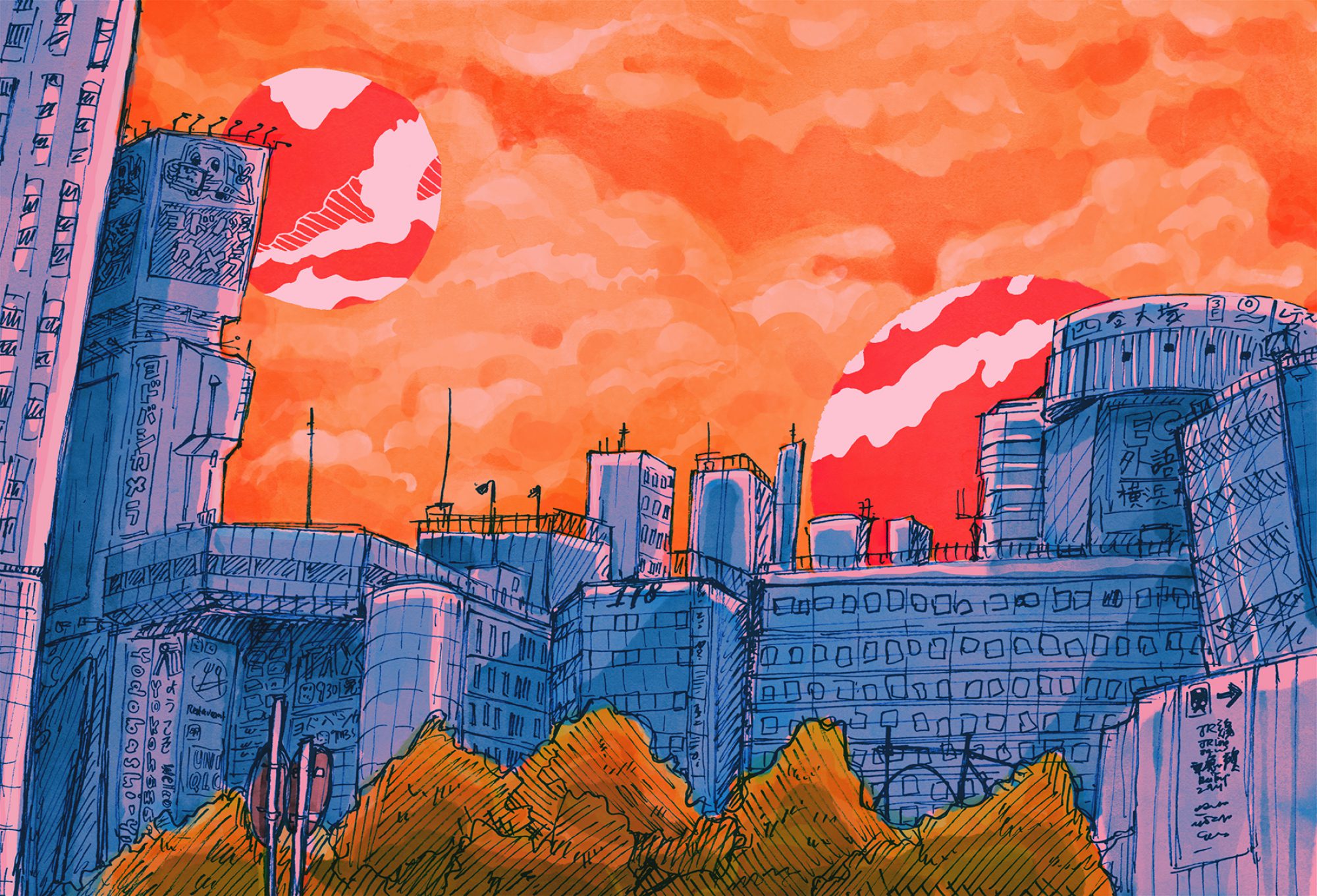
idea generation
I wanted to do a topic that I could personally relate with?? Like wacky job sounded cute but I wanted to do something more serious like a social commentary. So I picked the theme of stereotypical Asian occupations that were supposedly stable and safe and high-paying, which is something that is quite close to my heart considering that I’ve been subjected to a lot of these expectations throughout my life. :’) So I thought that I could put my personal experiences in the portraits, as a sort of like series of “Futures that could have been, but now will never be.”

Also, I didn’t want to rely on a literal portrayal of a person doing the job to convey my ideas. I wanted to represent the ideas through the themes of documents associated with the jobs, like newspapers, blueprints, drafts etc.
JUMPING STRAIGHT INTO THE PROCESS BC NO TIME TO DILLY DALLY AND RAMBLE!!
engineer
Steady income!! Everyone needs engineers…right……I mean. I couldn’t imagine doing math all day every day but props to those who do?
But some traits of the job I thought of were:
- Laborious
- Tedious
- Systematic
- Rigid and precise
reference works
When I thought of an engineer I immediately thought of a blueprint? I’m not even sure engineers use blueprints but I’m sure the fact that it was a image that popped up in my head is telling of some sort of stereotype or perception of engineers.

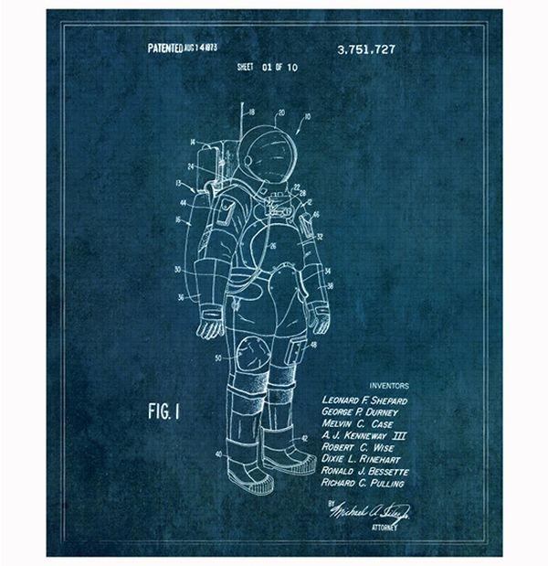
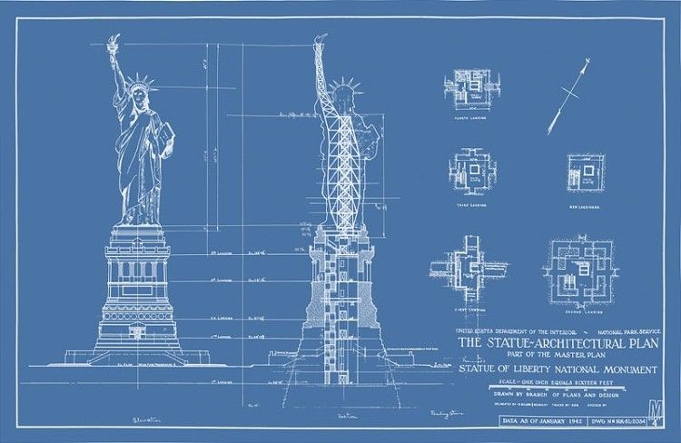

Important features I had to adopt were the clean cut lines, grids, labelling and that faded shade of blue. Also I thought the text in the corners really added to the realism of the blueprint.
brainstorming
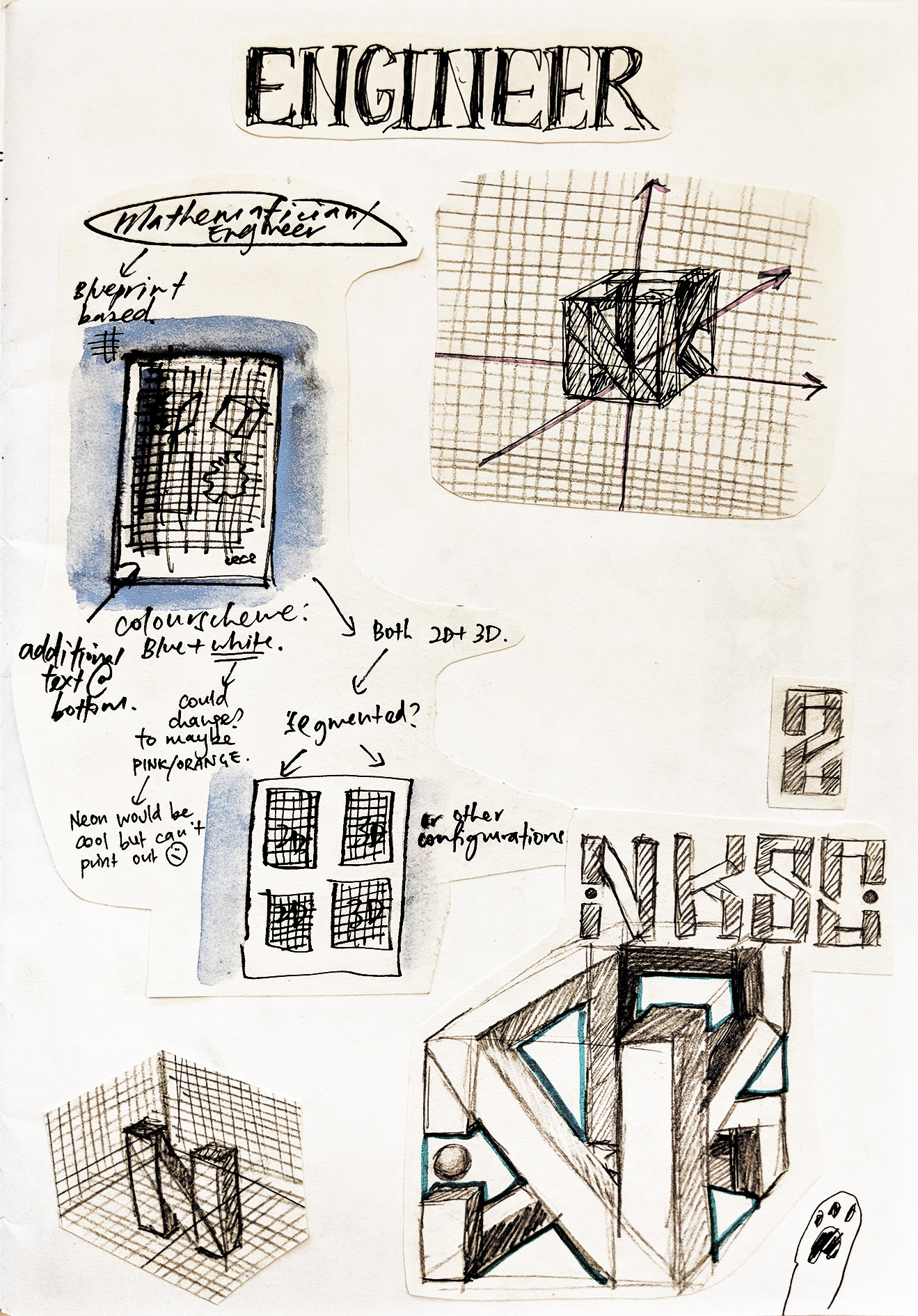
What was in the blueprint was an idea I arrived at pretty quickly. The initials I chose, NKSC (Niki Koh Suat Chee) were pretty blocky (apart from S and C but that could be fixed), and came in 4 so I was like…..cube……
So I made my letters into a cube. Planning out the connecting areas was a bit of a chore though.
I was also deciding whether I wanted to have only one configuration of the letters in the middle, but realised that ohno!!! The other two letters (S and C) couldn’t be seen clearly in the 3D cube. So I decided to create other orthogonal drawings of the cube, in a smaller size at the sides of the paper.
creation process

Created a grid in Photoshop and added various textures and stains to make it look more worn. The white lines were made with a pencil brush to make it look more authentic. :)))
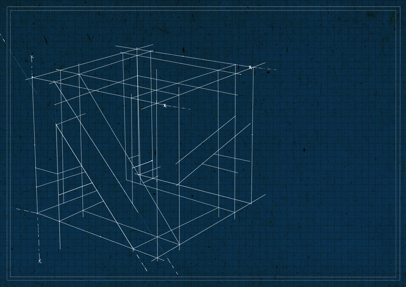
The 3D cube was done purely in Photoshop with a pencil brush and the click + Shift + click method. At that point it was the most tedious drawing done in the history of my Photoshop experience (little did she know she would soon have to face a worse fate). I think I cried a bit when I finished it. JK?? (Or not??)

So when it came to the smaller drawings I was like…..not gonna go through the pain again man. No!! So I did them on paper and scanned them in and life was much easier. 🙂
Joy’s feedback throughout the process was to incorporate the idea of ‘tediousness and laborious’ more through textures of the engineer ‘rubbing out’ lines, and making mistakes here and there. She suggested adding a bit of extra over the drawing as a way to ‘cover up’ the mistake as well. I thought it would be fun to add snide comments by a sort of ‘supervisor’ as well by the side, and used the ‘titles’ at the top to add to the effect as well (like the number of attempts).

Here’s the final product!! Tweaked the blue to make it look fresher and more modern since I realised the setting was the future. I really tried my best to bring out the idea of ‘trying and trying again but it’s never enough’ that kind of thing?? And always being put down and being frustrated with yourself.
Essentially, the pursuit of a perfection that is impossible to fulfil D:
I think that’s quite relatable? It’s a volatile mindset that shifts between “This is toxic because I’m spending too much futile energy,” and “This is important for me to improve my skillset.” And you might never know whether the problem is actually you or society’s standards. Moderation I guess?? :O
doctor
Dat feeling when you’ve been in the art and humanities stream all along but your parents still ask you to study medicine aghghhhgGHGHGHGJH I can’t…..the logic….it’s not even that I don’t think doctors are cool but like I’m not even at the point of being able to even attempt being a doctor…..I dropped biology like a hot potato immediately after Sec 1 so like…why would you ask this of me ugh….
What do I think of when I hear the word doctor?? Here I didn’t so much focus on the occupation rather than the feelings and thoughts I associated with my parents asking me to be a doctor.
- Doing a job I have no business doing –> Repressing actual passions –> Emotional instability :'(
reference works
Not sure why but I was really riding a vintage wave at this point and I thought of those vintage hand drawn anatomical posters on faded brown paper!!


brainstorming

So I chose the heart because emotion! Although now that I think of it why is the heart even an expression of emotion all it does is pump blood aa ANYWAY
Name I picked for this one was: Niki. Yes my plain jane name yes. I wanted the name to be found within the veins criss crossing across the heart, and thought the splitting that could be found within the ‘K’ was quite fitting. Dots aren’t found in veins naturally so I stuck with uppercase letters for the letterforms.
Initially the idea of restriction and repression would be through the veins constricting the heart, and other strange organs would be present in the heart also to show other emotion. When I proposed the idea, Joy also suggested for me to have like a paintbrush sticking out somewhere, and the blue/red veins for deoxygenated vs oxygenated blood idea too!! Which I totally forgot about wow biology 101
creation process
So when I was studying the posters I was like oh, these are hand drawn with pencil or pen….hmm….that sounds tedious…..
But tbh digital illustration on a scale as detailed as this would probably be even more tedious. So I just drew :’)
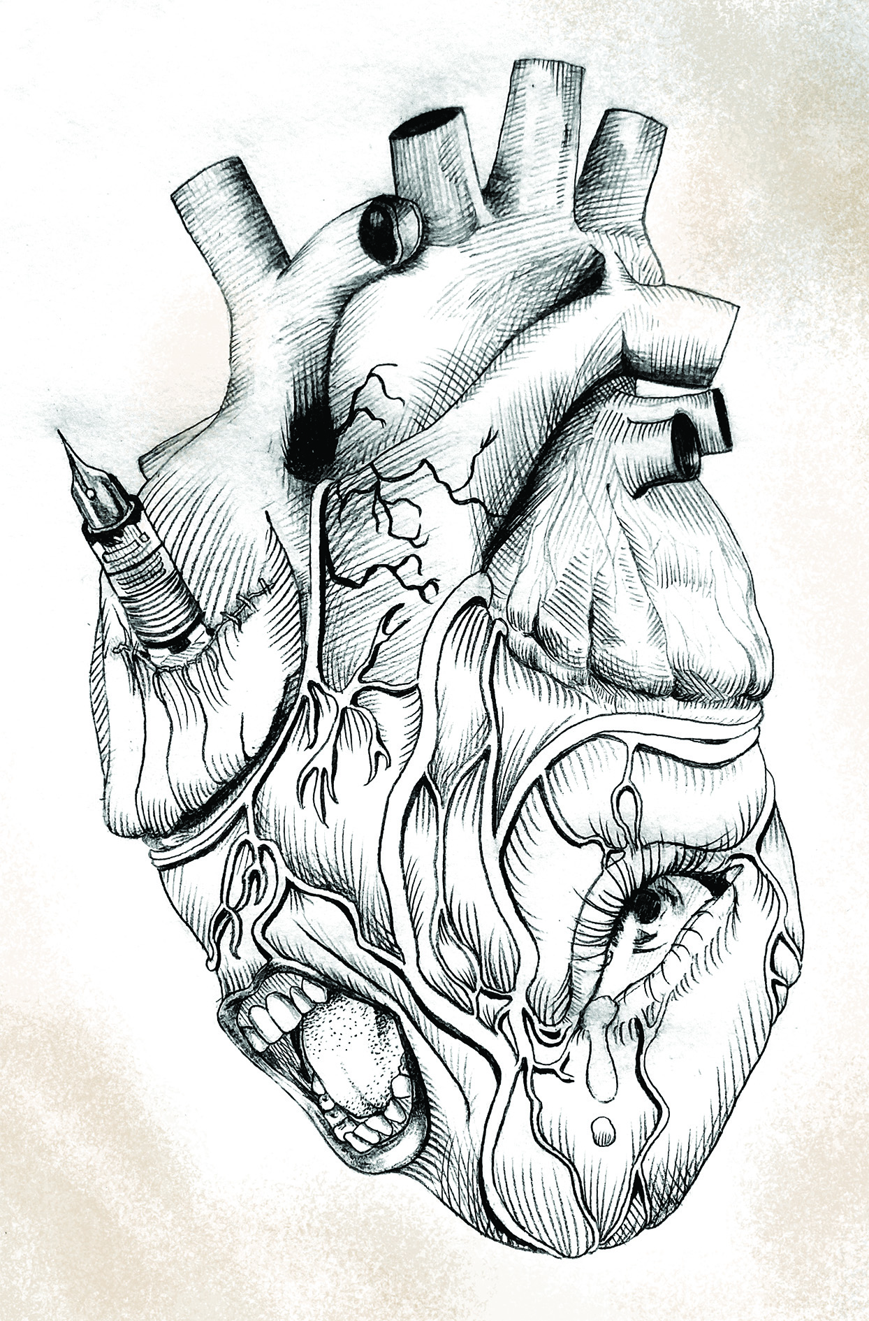
This is the original drawing, but probably cleaned up here and there digitally because photo scanning can only do so much. I used a bunch of hatching, lines and pointillism techniques to give it a more?? Authentic feel?
So the eye was to show sadness and the mouth is screaming in some sort of distress. I wanted a a more visceral and gruesome tone in the heart, like something more surrealistic. I also adopted Joy’s paintbrush idea but I changed it to a fountain pen because I can’t paint so so so :’)
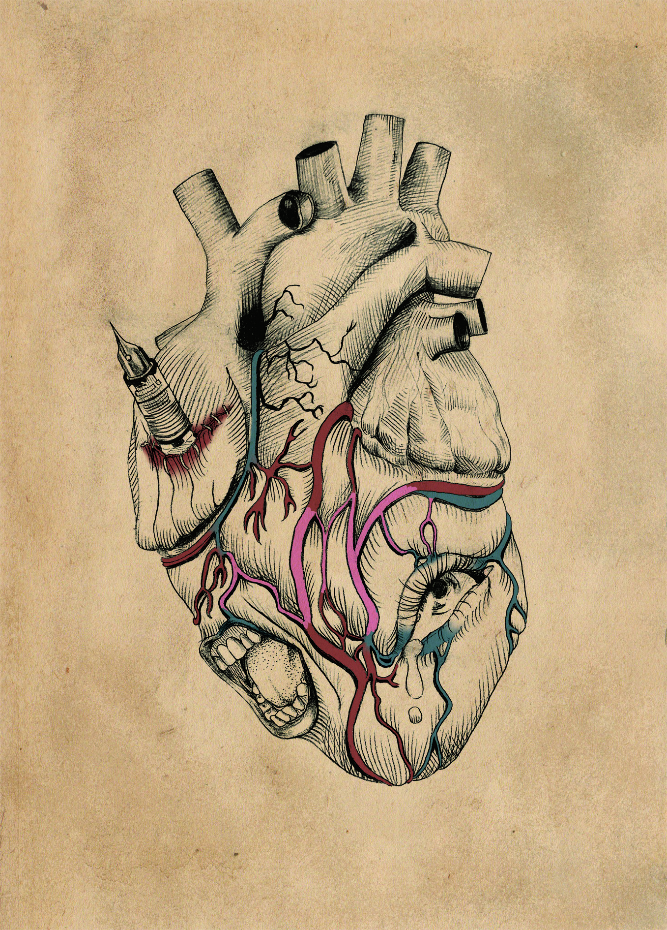
I coloured in the lines for the blue and red veins, making sure that the blue veins were coming from the “infected” body parts. I fiddled with the idea of making my name pink in the veins to make it stand out more, but it was kind of jarring. In the end I decided to make it a more subtle thing in the composition.
Joy’s further suggestions:
- Add more veins to show more constricting of the valves, and make sure the blue-red power play is more evident, especially around the body parts
- The constricting veins could be used to spell out more of my name
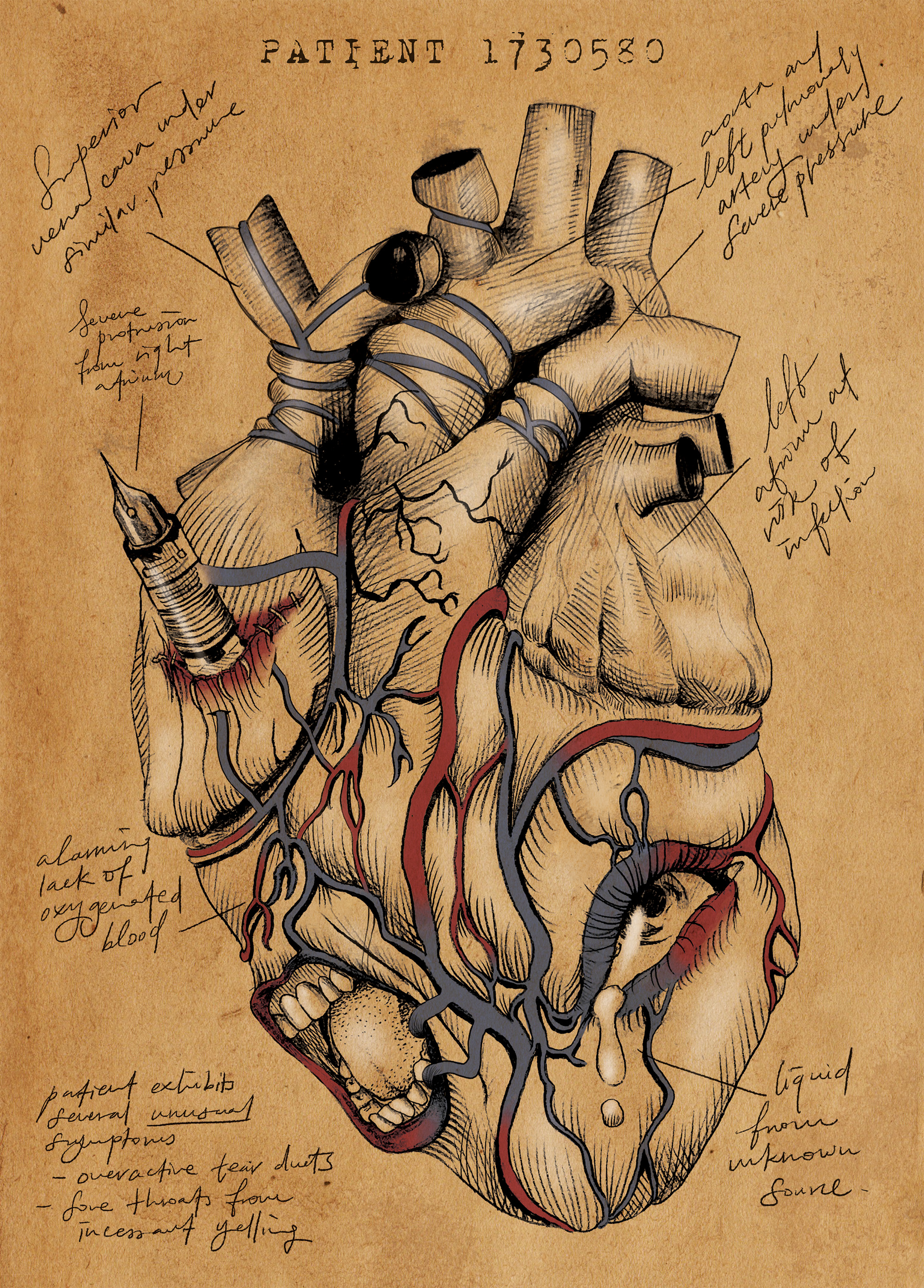
Here’s the final! Redrew the valves and veins digitally and it was a very messy layer process in Photoshop aa. Also decided to add supporting text in like a legible ‘doctor’s handwriting’ thing haha. For example “Patient exhibits several unusual symptons: Overactive tear ducts / Sore throats from incessant yelling” to support the idea of emotional trauma.
Specific comments from Joy were:
- Very detailed, but could have created more of a focal point but angling the fountain pen towards the valves or body parts.
journalist
Journalism is perhaps closer to my heart since I was actually convinced that I was going to be study Communications (and was actually offered WKWSCI first) before I had the balls to apply for ADM. But ultimately I realised writing and communicating with people was not something I enjoyed? Like I feel like if you can’t bring yourself to do it in your free time then what’s the point of dedicating your life to it?? aha
So because of my feelings and association with communications, the traits I focused on were:
- Dissatisfaction
- Grudge
- Weariness
reference works
Journalism, so newspapers. JK magazines count as well. Basically my initial idea was to work with text and spreads, but I didn’t have much references because I felt like newspapers were already a foolproof format? :”) How wrong I was :’)
brainstorming
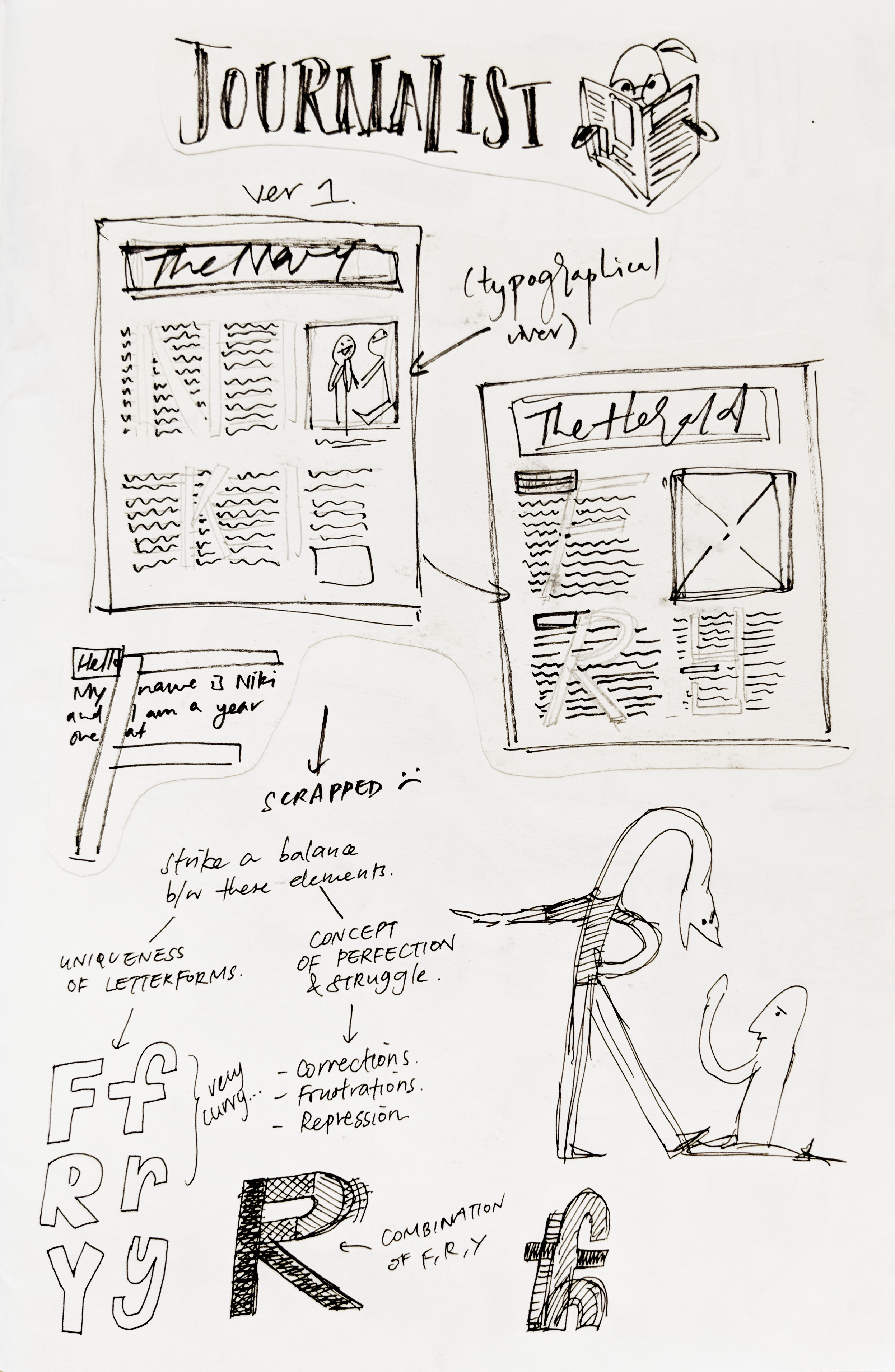
So as I said my initial idea was to work with newspaper formats, with blocks of text and typographical rivers, which are the blank spaces between words that line up nicely in a paragraph to make a blank ‘river’.
However, Joy’s feedback was that these rivers and text were not really representative of the ideas of weariness I was trying to bring across, so maybe things like folded paper and cancellations would help.
The name choice for this one was still in flux, which was kind of a mistake tbh as you will see later. :’) But generally the choice was ‘Fry‘, which comes from a nickname of mine called Kikifry. :’3
CREATION PROCESS


Ok so like. I struggled really hard with the Journalist portrait. As hard as I tried, the ideas just weren’t visually sound or pleasing. I emailed Joy with these drafts over the weekend and her feedback was that the markings on the paper were distracting from the main letterforms. She suggested maybe the interior of an office, or a newspaper printing line.
My mistake was not thinking about the letters enough. Basically to me at that point the letters were an afterthought, but what I should’ve done was focus on the unique shapes of the letters. So BACK TO THE DRAWING BOARD I WENT.
brainstorming 2.0

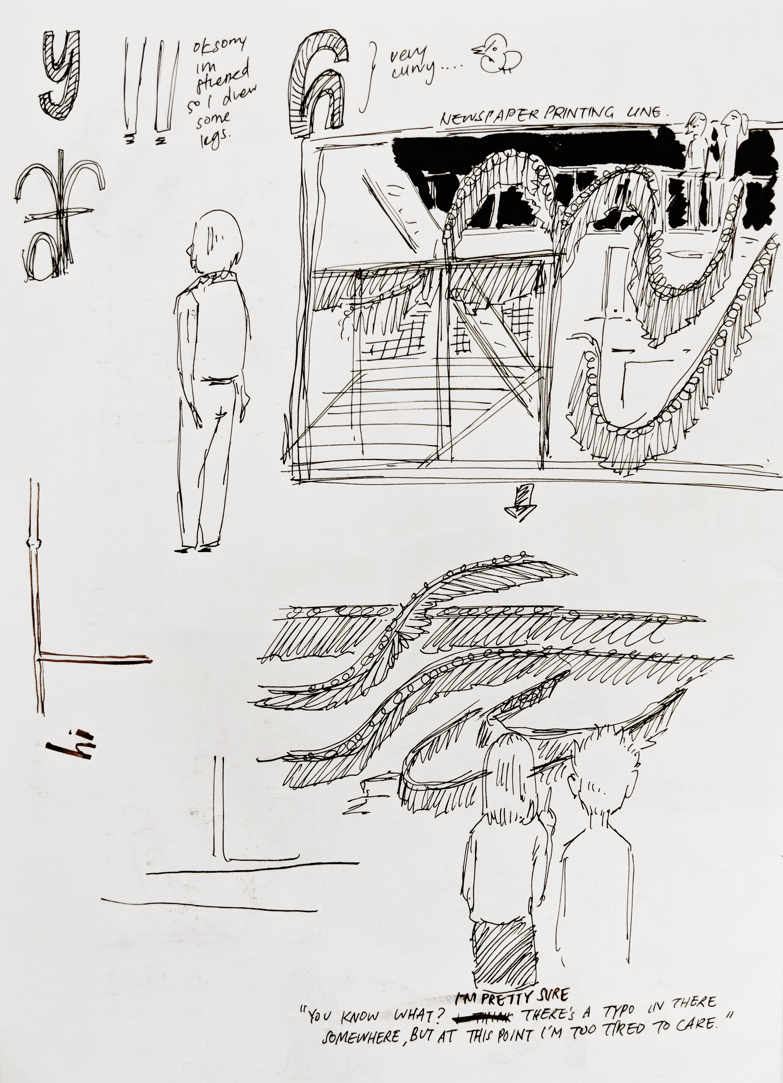
So the rest of my brainstorming focused on examining the letters “F”, “R” and “Y”. The lowercase in particular was interesting as it contained a lot of curves, so I adapted it into the idea of a newspaper printing line. Which looked very complicated but at that point I was desperate enough to just go for it.
But I didn’t want to do just any old illustration!!! Like I still wanted that newspaper context. So I made it into a newspaper comic!!! Which is quite nostalgic haha they were my childhood.
creation process 2.0
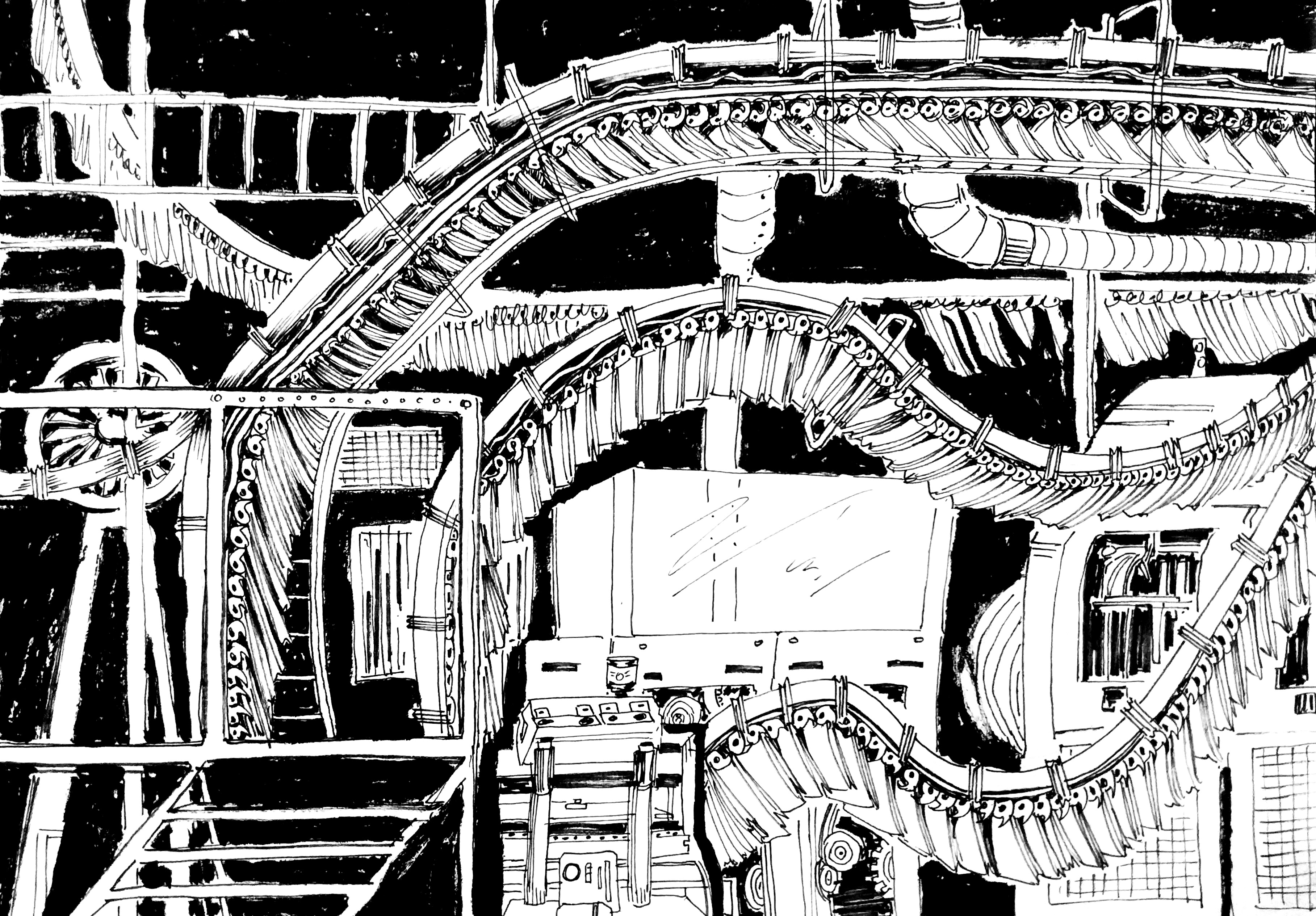
So this was the original drawing and I panicked a lot because it looked super messy and the letterform wasn’t obvious at all so
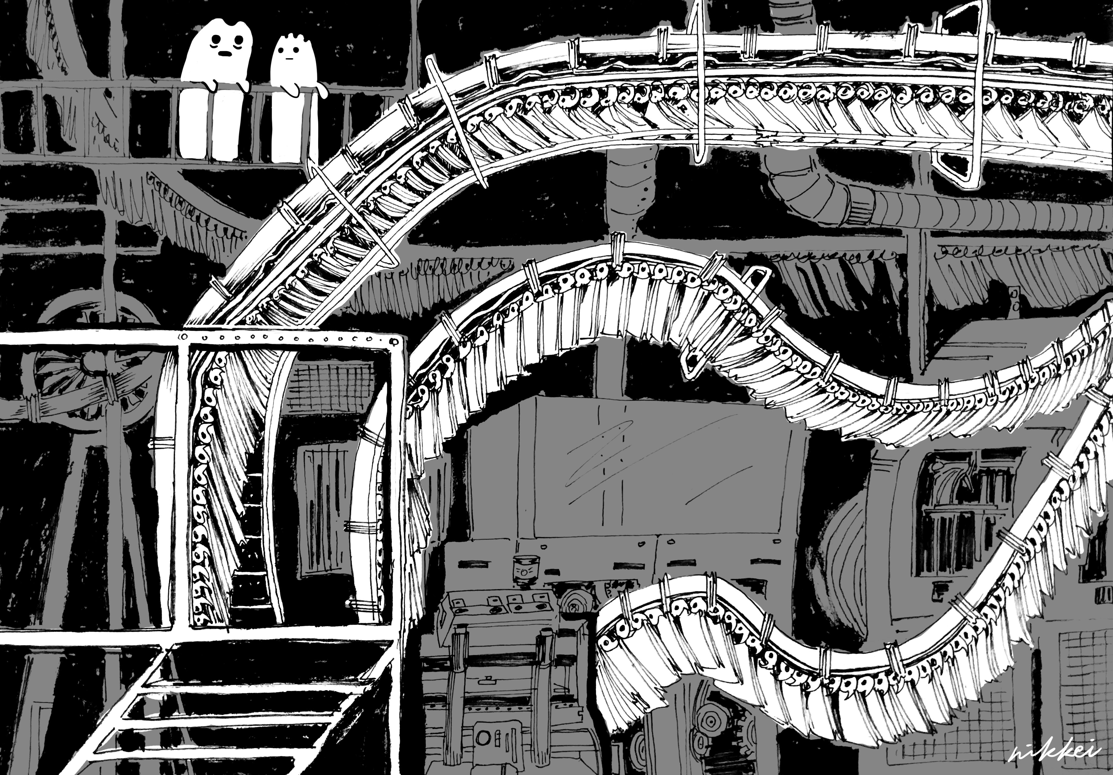
I edited it digitally!!! By greying out most of the parts that didn’t contribute to the letterform. Like this it also gave the impression of a foreground and a background as well.
I added two little things on top that were supposed to be people. But I didn’t want complicate the composition further so I reduced them to ghostly blobs.
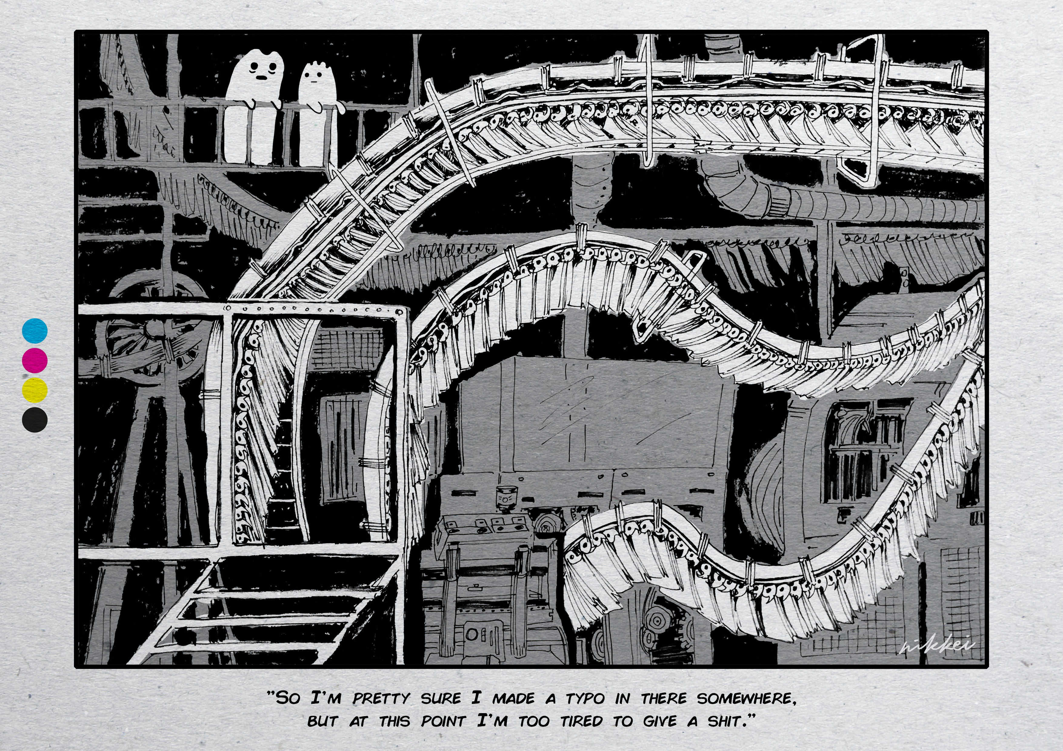
After that I concentrated on adding newspaper textures and details like the CMYK dots at the side. I added a bit of shadow for a more immersive look?? Like you were the one poring over the newspaper in the morning and you came across this comic. I tried to add folds but my Photoshop skills weren’t great enough. :’)
Joy’s feedback: Could dial up the complexity of the spread more by incorporating more printing lines in the background.
lawyer
Not gonna lie man when I started really thinking about lawyer it was like….3 days before the submission….all along I had been stressing and focusing on the other three that the last one hit me like freight train like ohnO how?
But I did think about what I associated lawyers with which is the main fact about:
- The glut of lawyers in Singapore because of the popular demand of the occupation but the limited slots in the sector.
- Affects future prospects very much so 🙁
(no reference works to see here)
brainstorming
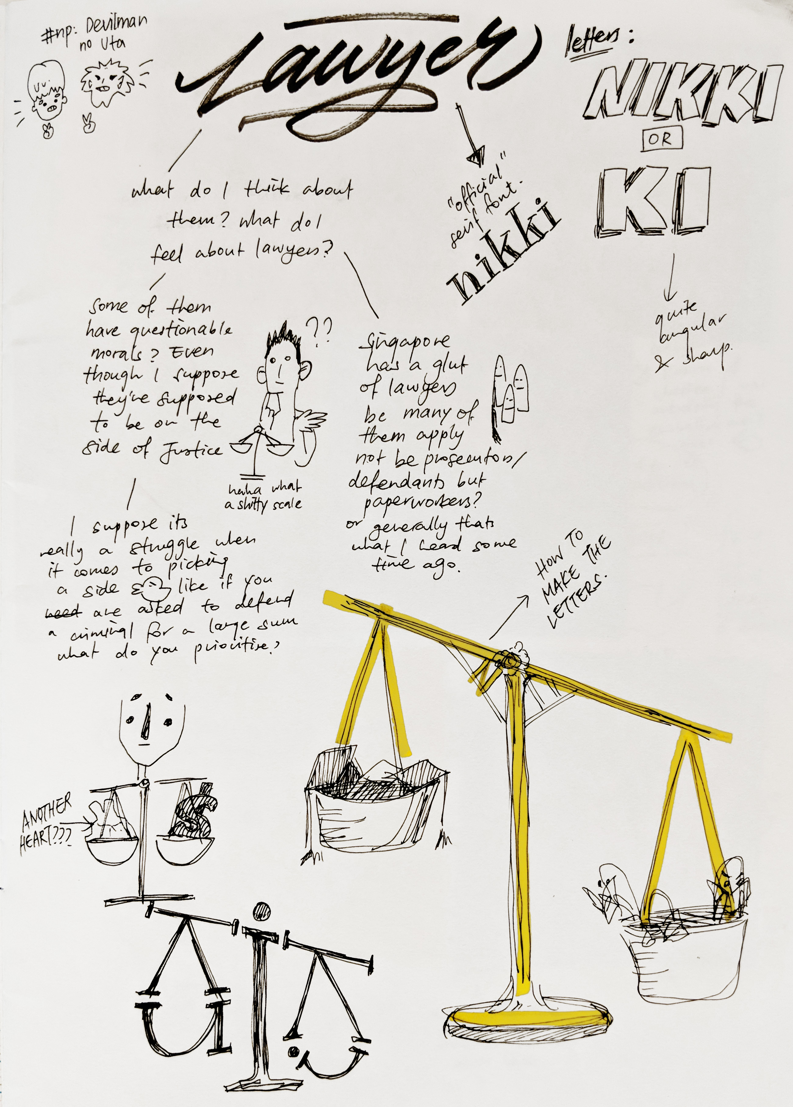
So my train of thought went from lawyer….law…..justice….scale…..
And so the scale was my visual metaphor. But letterforms how?? From examining the scale I found that actually you could very easily involve a letter ‘K’ from the parts that branch out!! I was super excited. But also it meant that I had to have two Ks.
So my name in here was ‘Nikki‘. Which is the PREFERRED spelling around the world and the fact that I’ve had to deal with people spelling it wrong my entire life is just aaaaagh check out my compilation of people spelling my name wrong on my insta @kiki.fry 🙂
And from there I envisioned created the scale with purely the letterforms!!! Serifs had to be used to create the ‘joints’ of the scale.
Creation process

Here was the draft I drew up on Photoshop!! I used slab serif as it seemed like a really ‘official’ font and also was easier to draw compared to serifs. From there I created the idea of putting the lawyer glut on one side and the idea of limited slots on the other side.
jesus im so hungry ive been sitting here for more than 5h and i havent eaten for more than 7h help

Agh for this one the main trouble was the colours…..I had so many variations over the background colour, texture, drop shadow, saturation……. I even nitpicked over the colour of the hanger for the coat on the left. And these don’t show it but the kids were initially in many different colours. Which I liked but also thought it looked very distracting so I changed to warm analogous colours to signal frustration.
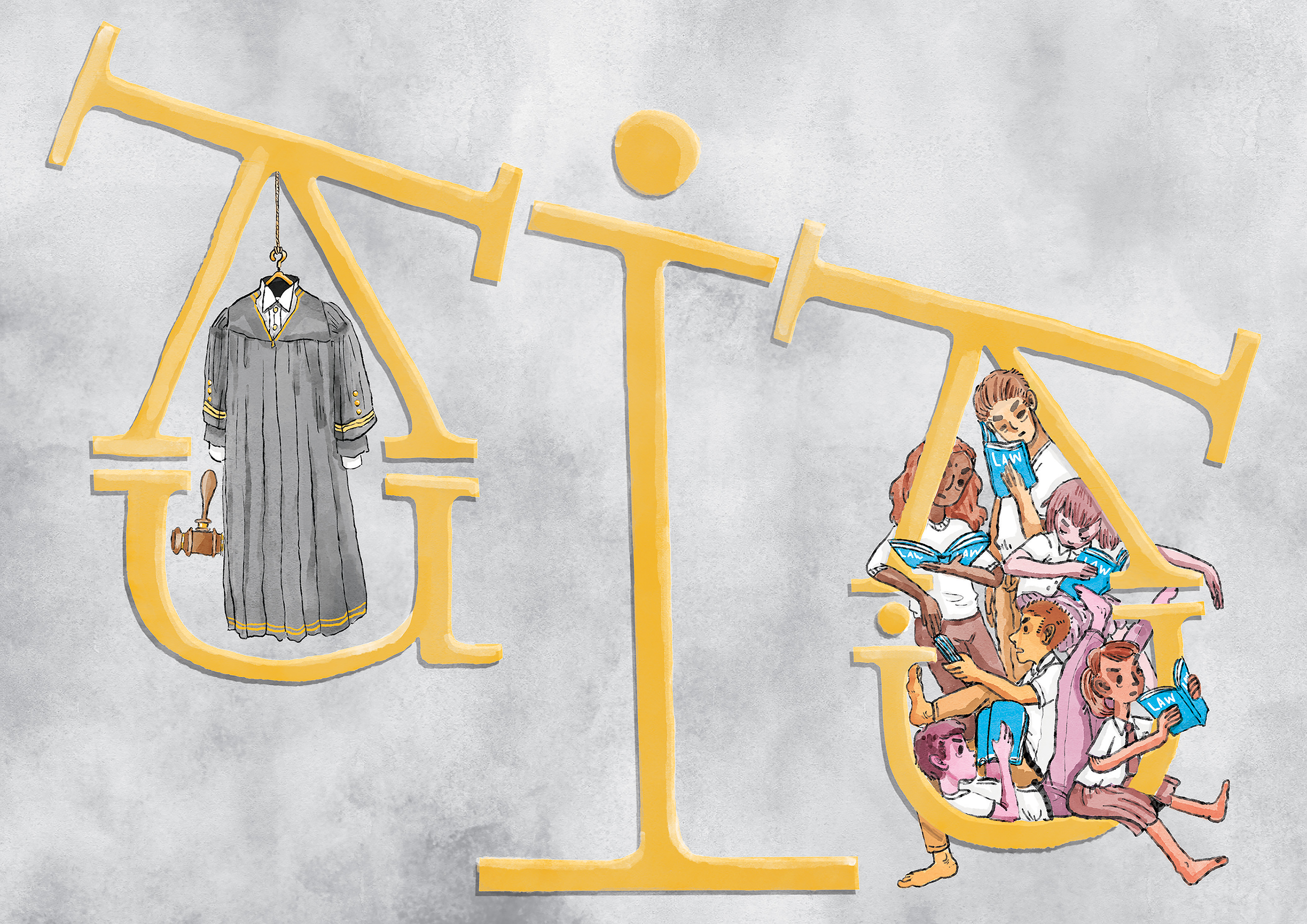
But anyway here was the final that I picked!! I thought the gold and white felt regal and very much ‘lawyer-ly’ and classy hoho.
wrapping up
overall feedback
- JOY
- Successful in using letterforms and bringing out their unique qualities
- Ideas of frustration and sadness brought out quite well
- CLASSMATES
- Detailed illustrations and complex compositions :))
- Strong concept
- Little details help to drive narrative
- 2 people said the Doctor piece looked “Da Vinci” what an honour??
- Journalist piece’s letters could have been clearer
- 4 compositions could have been connected better
final thoughts
I was actually quite pleased with myself for this project?? Rare!! To be honest throughout a lot of the process I was preoccupied with thinking “Should this be vector art?” or “Would Joy like this?” but towards the end the desperation really made me dig down into my personality to find a ground that was comfortable for me. (I’m not saying I want to make things you dislike Joy I’m sorry HAHAHA) And this project really let me push my illustrative boundaries further to get closer to finding a personal style so I was also happy with that!! Although I do agree that some of the compositions could be less cluttered……..it’s in my nature to itch to fill up empty spaces 🙁
Here’s the link to the final gallery of compiled works for this project:
Okay no more babbling I have other OSSes to do :’0 BYE!!!
- Nooki