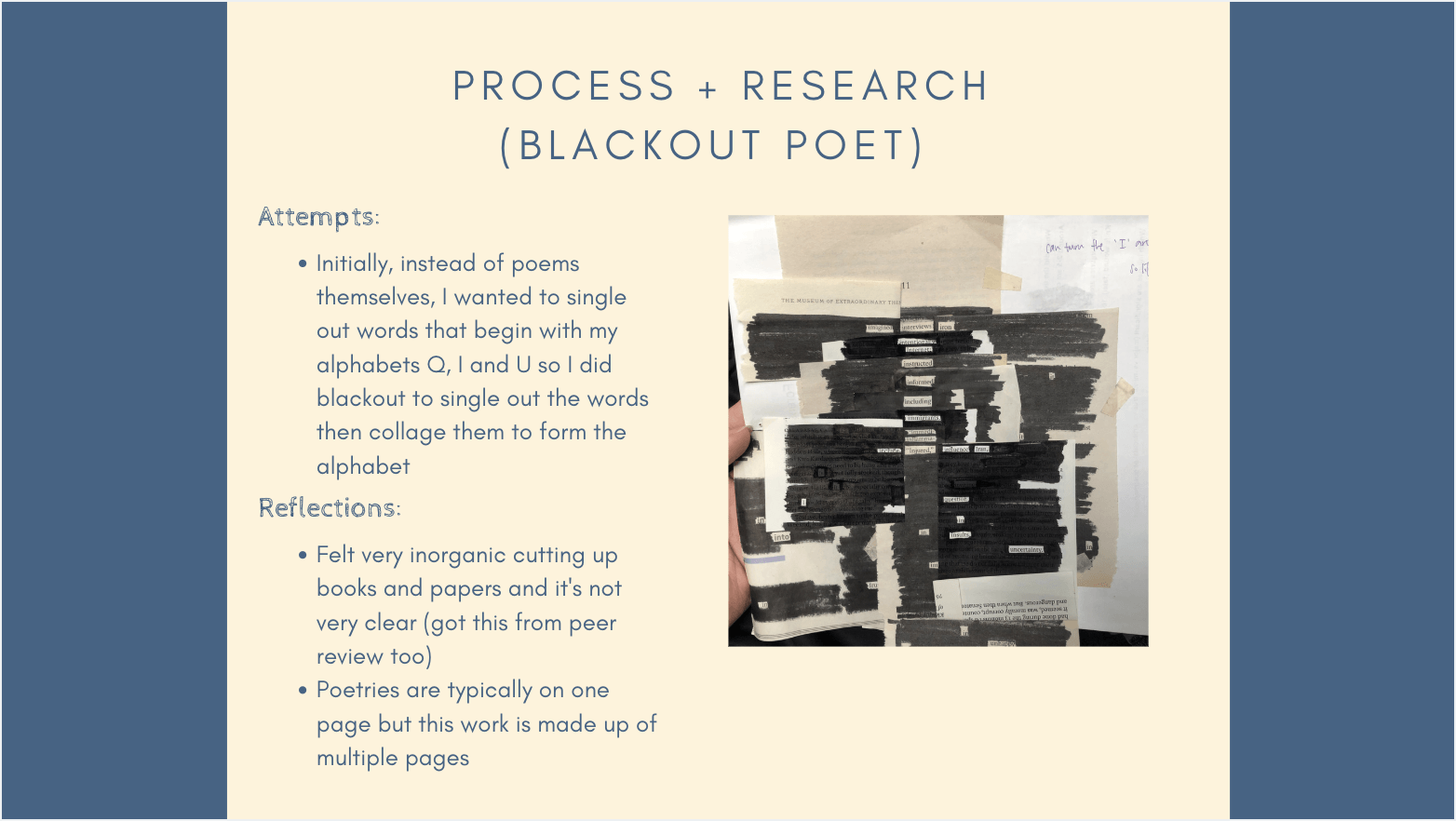
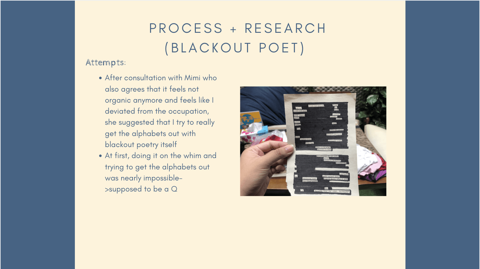
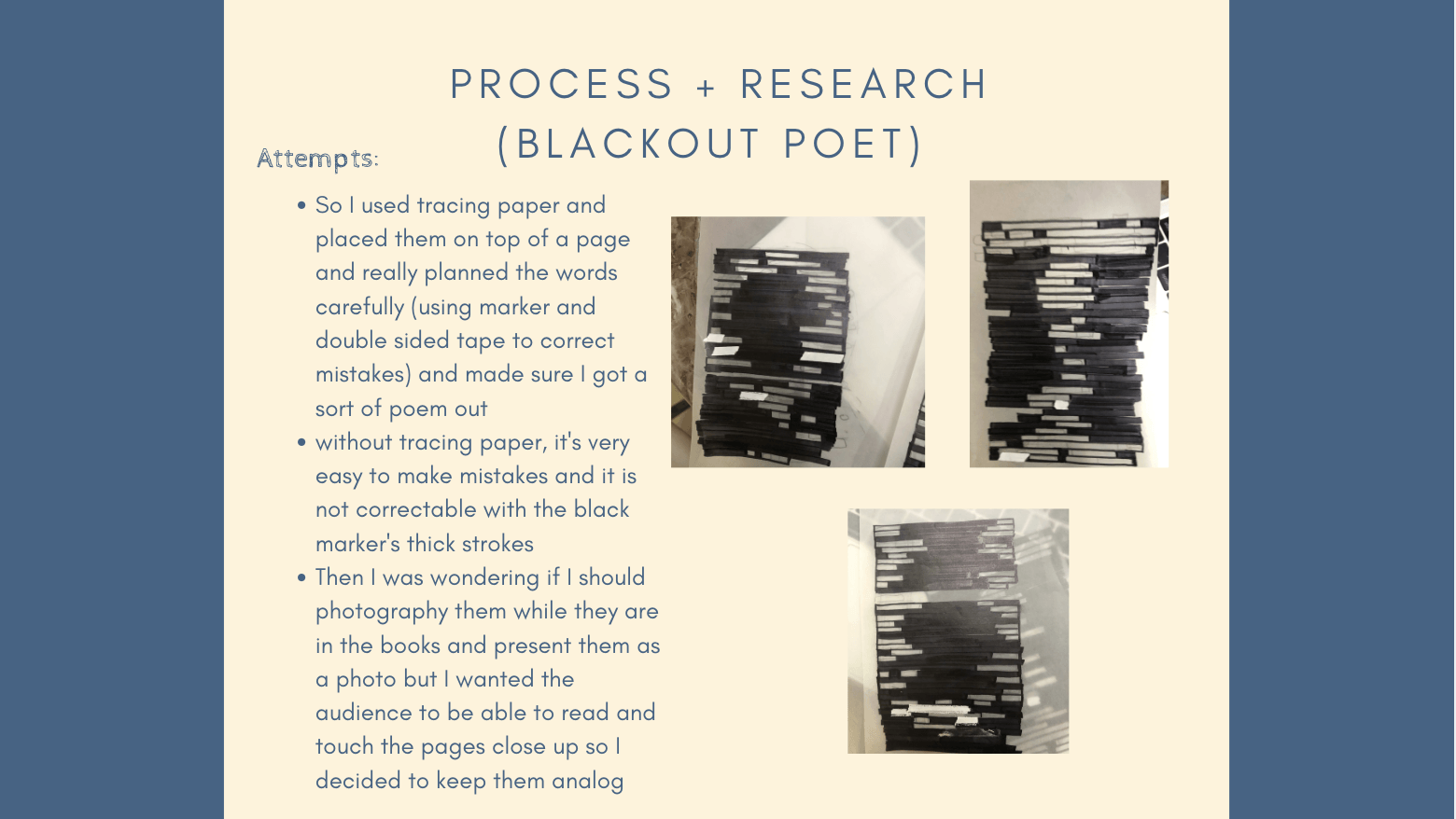
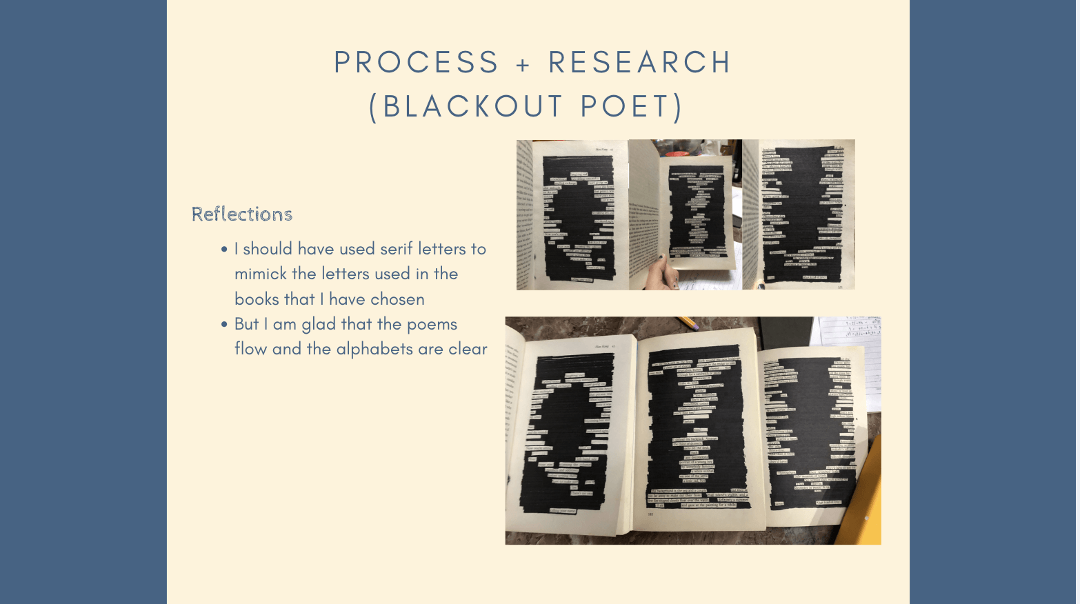
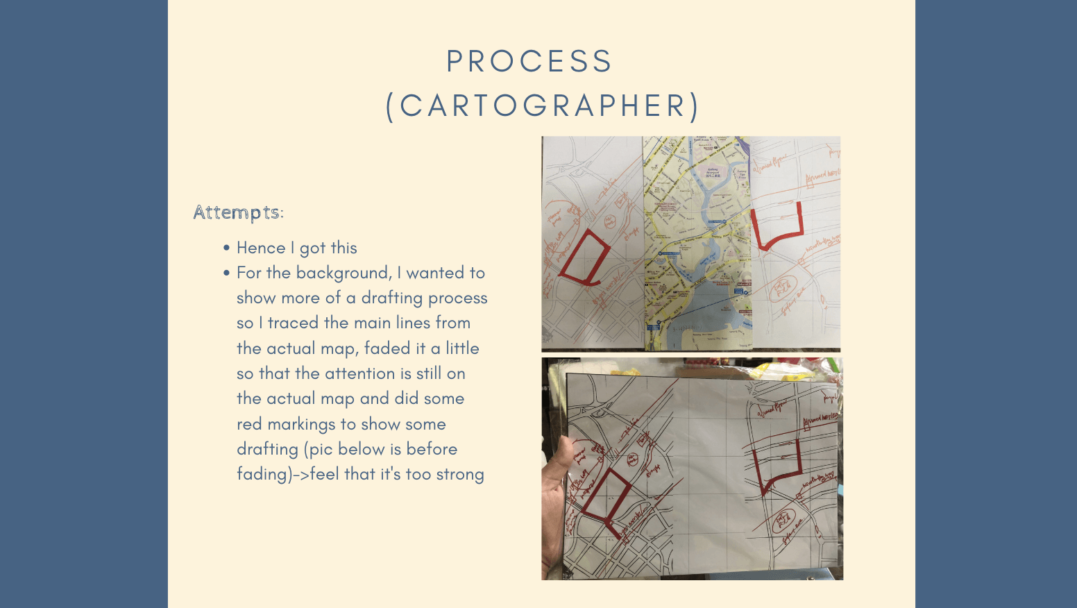
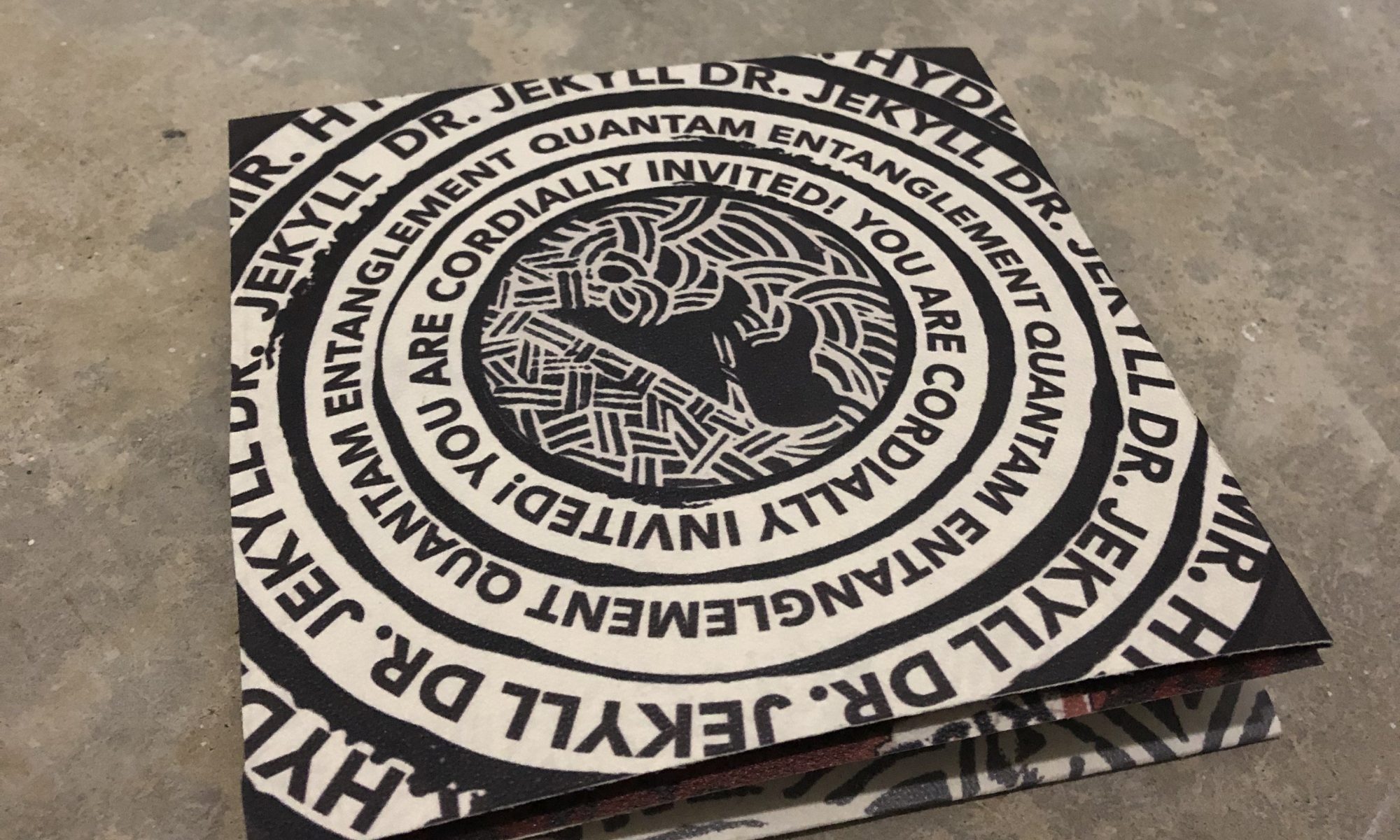
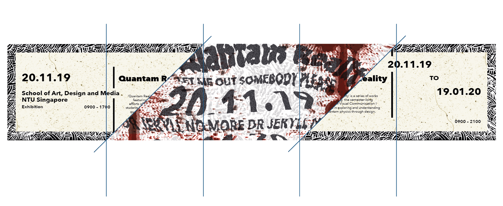
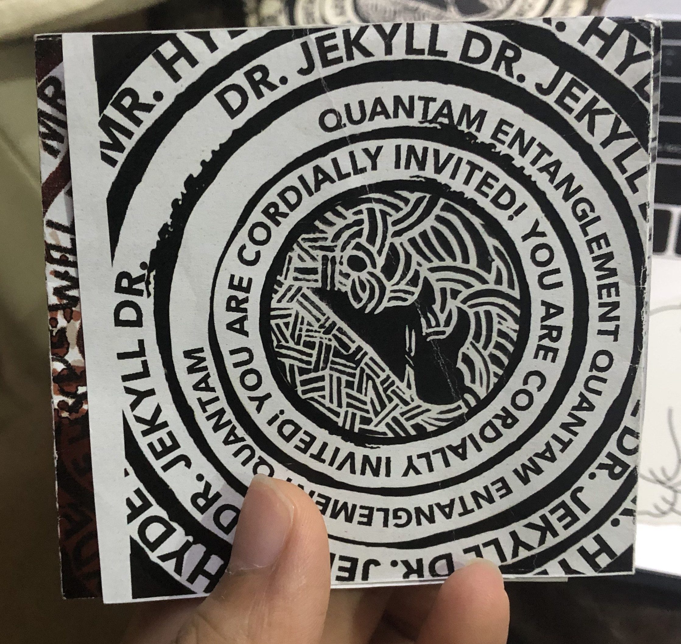
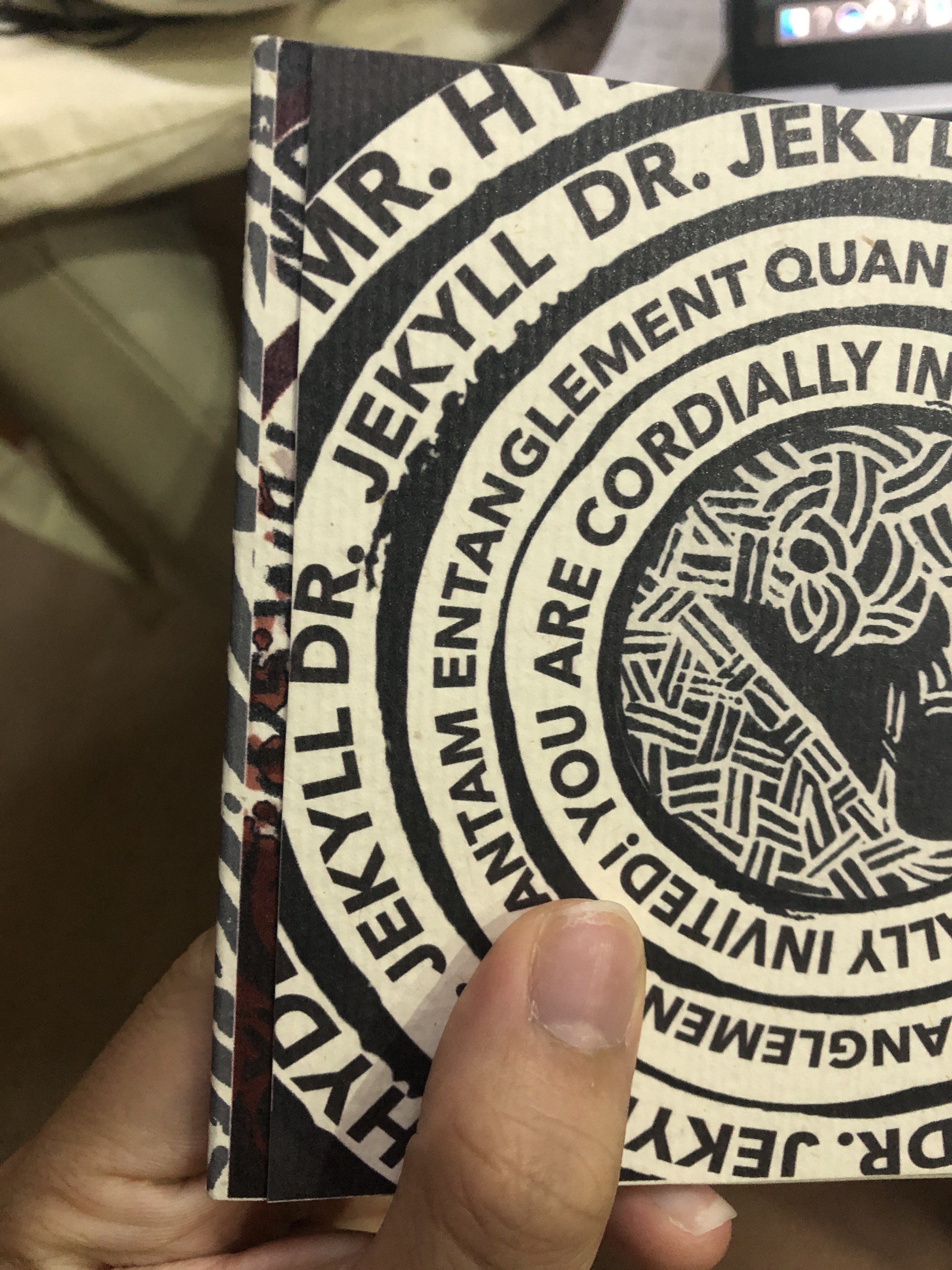
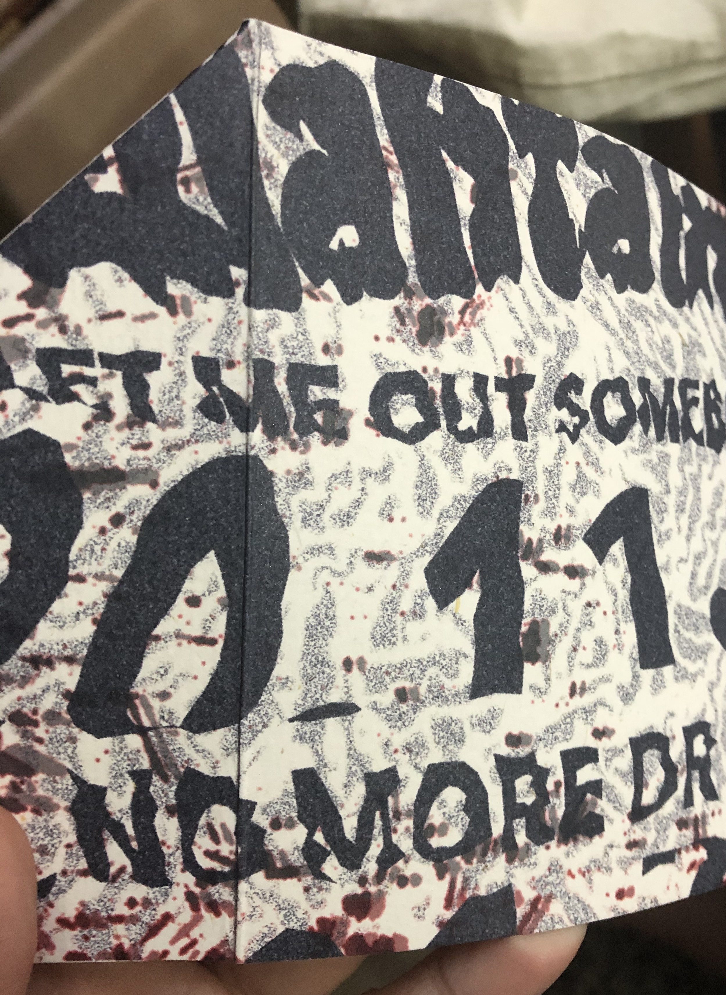
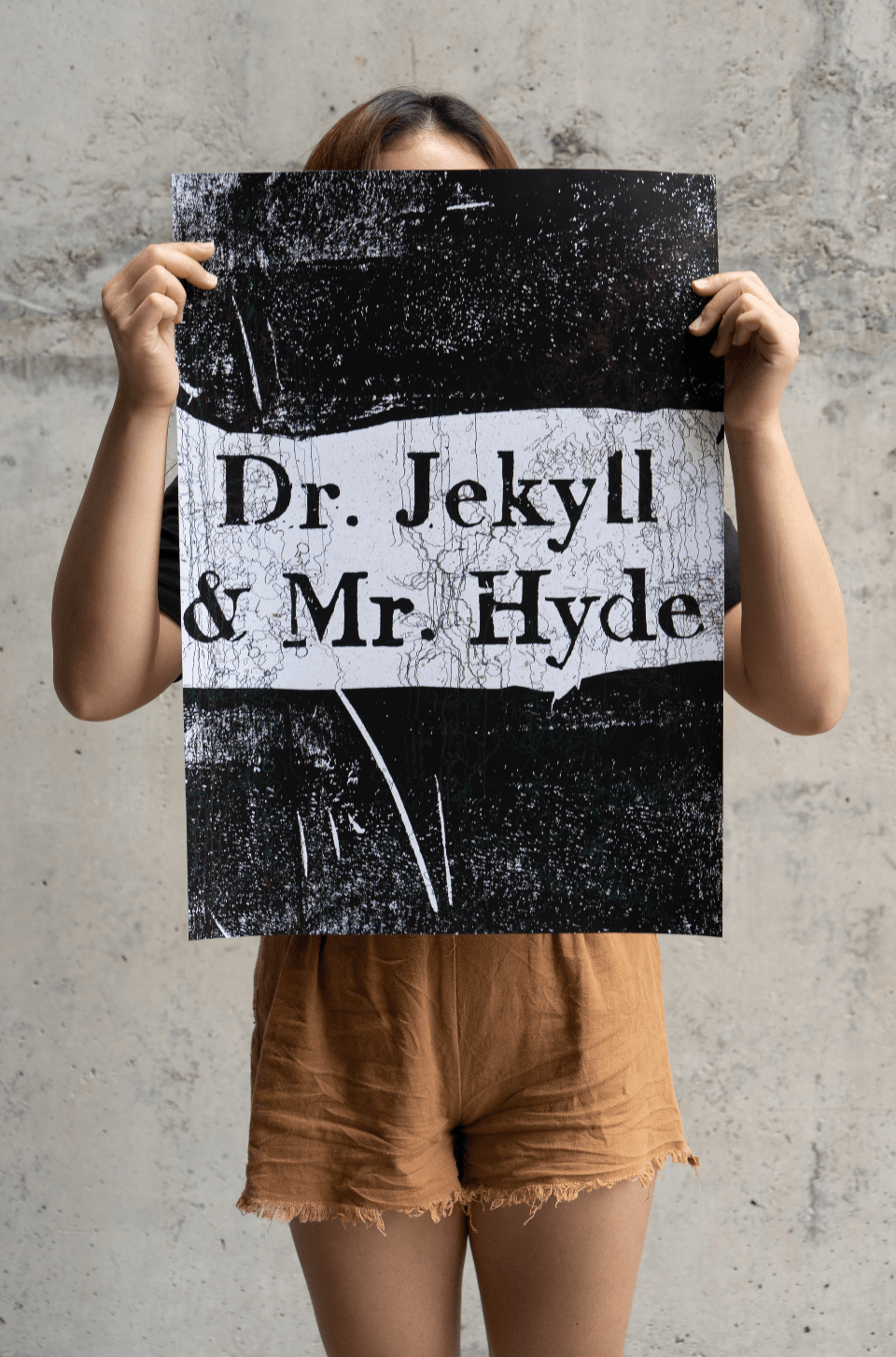
Short Description: Extrapolating the theory of quantam entanglement to the literary story of Dr. Jekyll and Mr. Hyde, I explore in this invite the struggles of two entangled beings grasping for monarch over a single body. In quantam entanglement, the state of one particle cannot be described independently of the state of another particle across distances and I would like to express that with the duality of Jekyll and Hyde; that their good and evilness comes hand in hand. Hence, with every formal and clean invitation layout (font page, the inner information), there is a hidden warped version of that layout and it has to be discovered (either through flipping the invite or opening up the invite further especially the second warped layout, there is a twist and turn action to access that layout and that is to imply that accessing Hyde and Jekyll’s inner psyche is not an easy feat; it requires some deliberation). Hidden in these warped layouts are some of Hyde’s thoughts like: “Jekyll no more” and “Let me out” in contrast with Jekyll’s cordial invitation. Hence, this invite aims to not only demonstrate the duality that comes with entanglement but the inexplicable trouble that comes with it.
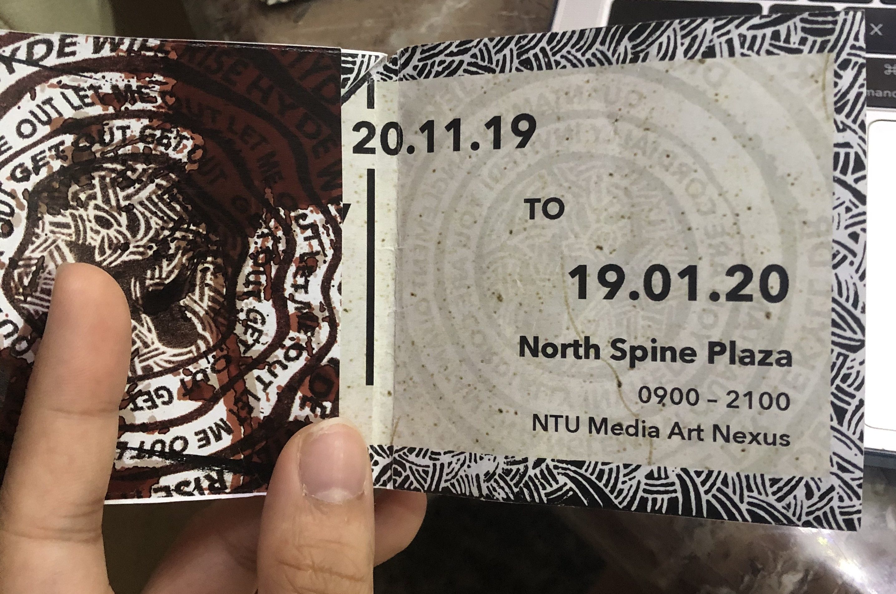
Front: (Blue lines are where the invite is folded)
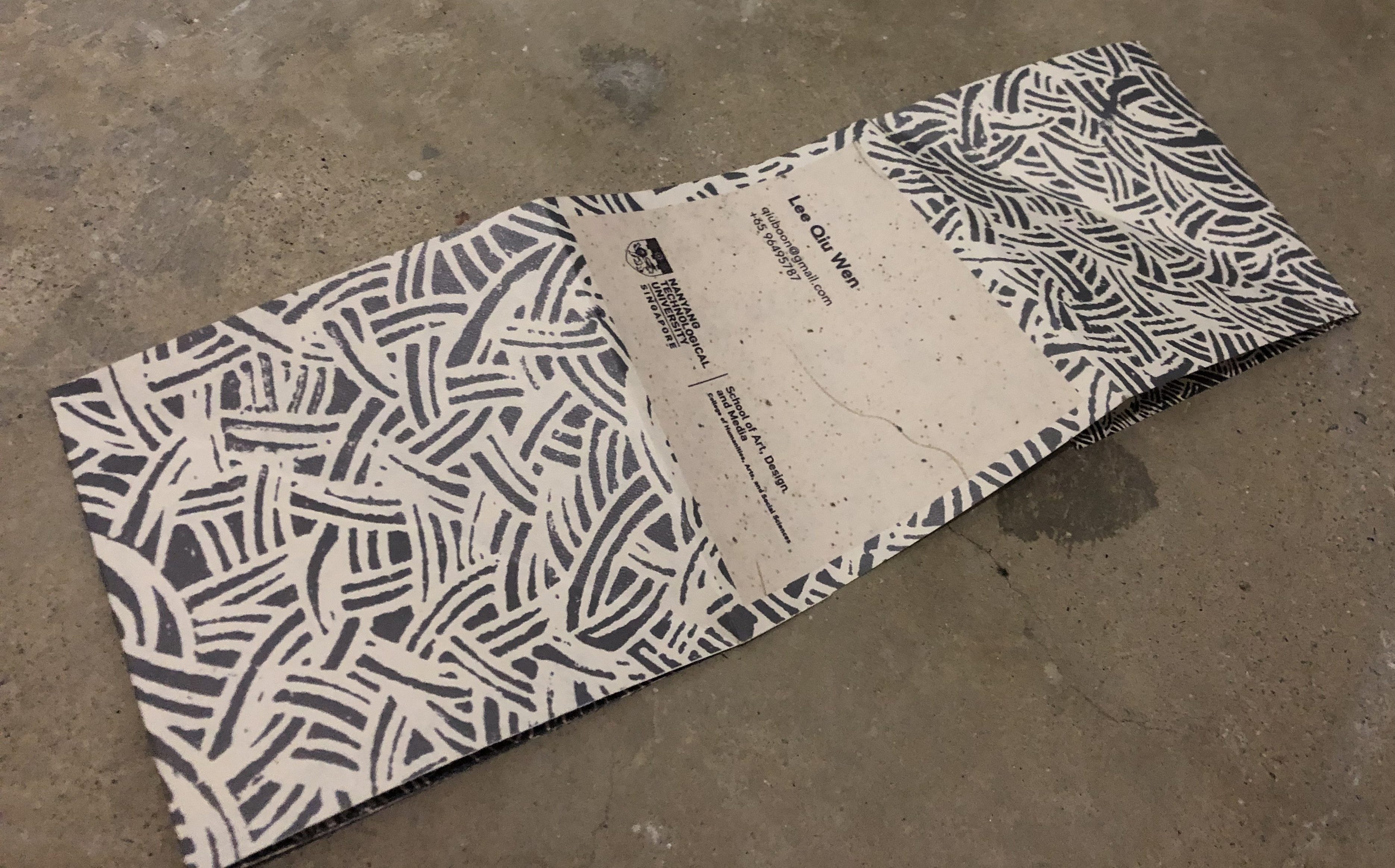
Back: (Blue lines are where the invite is folded)
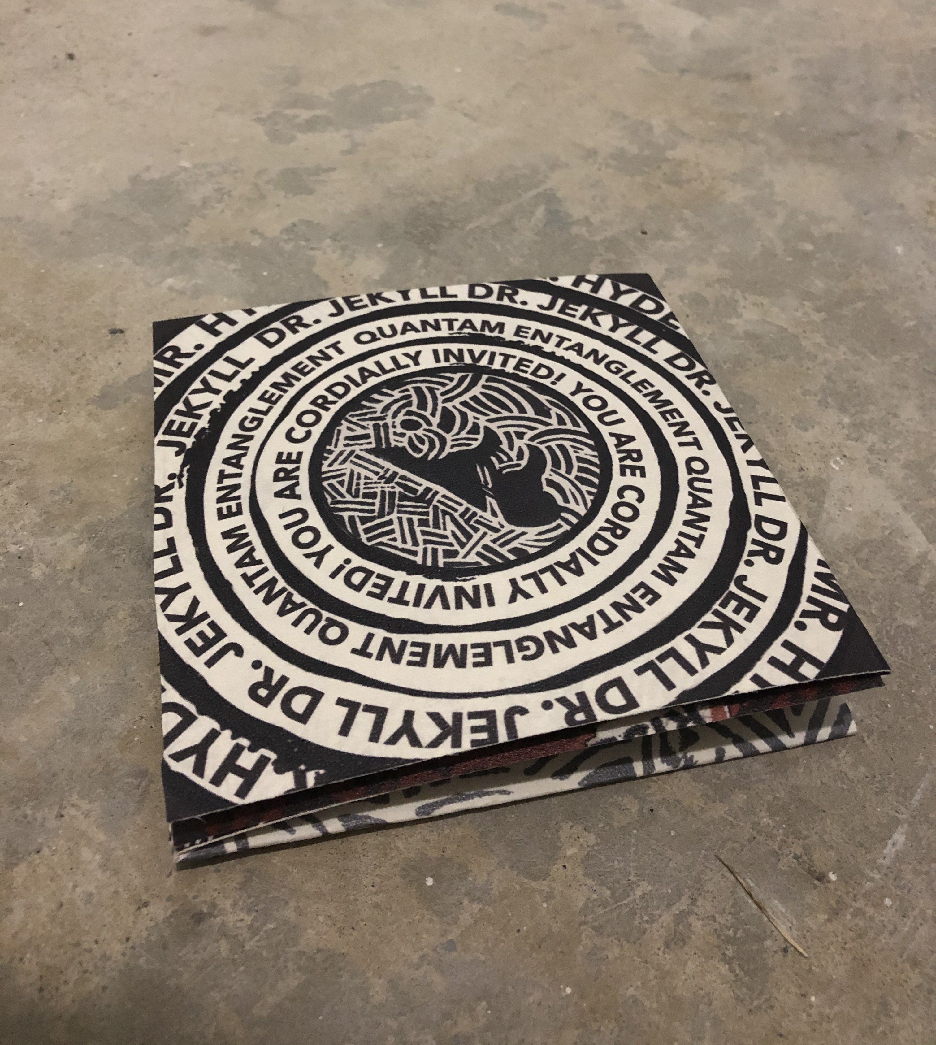
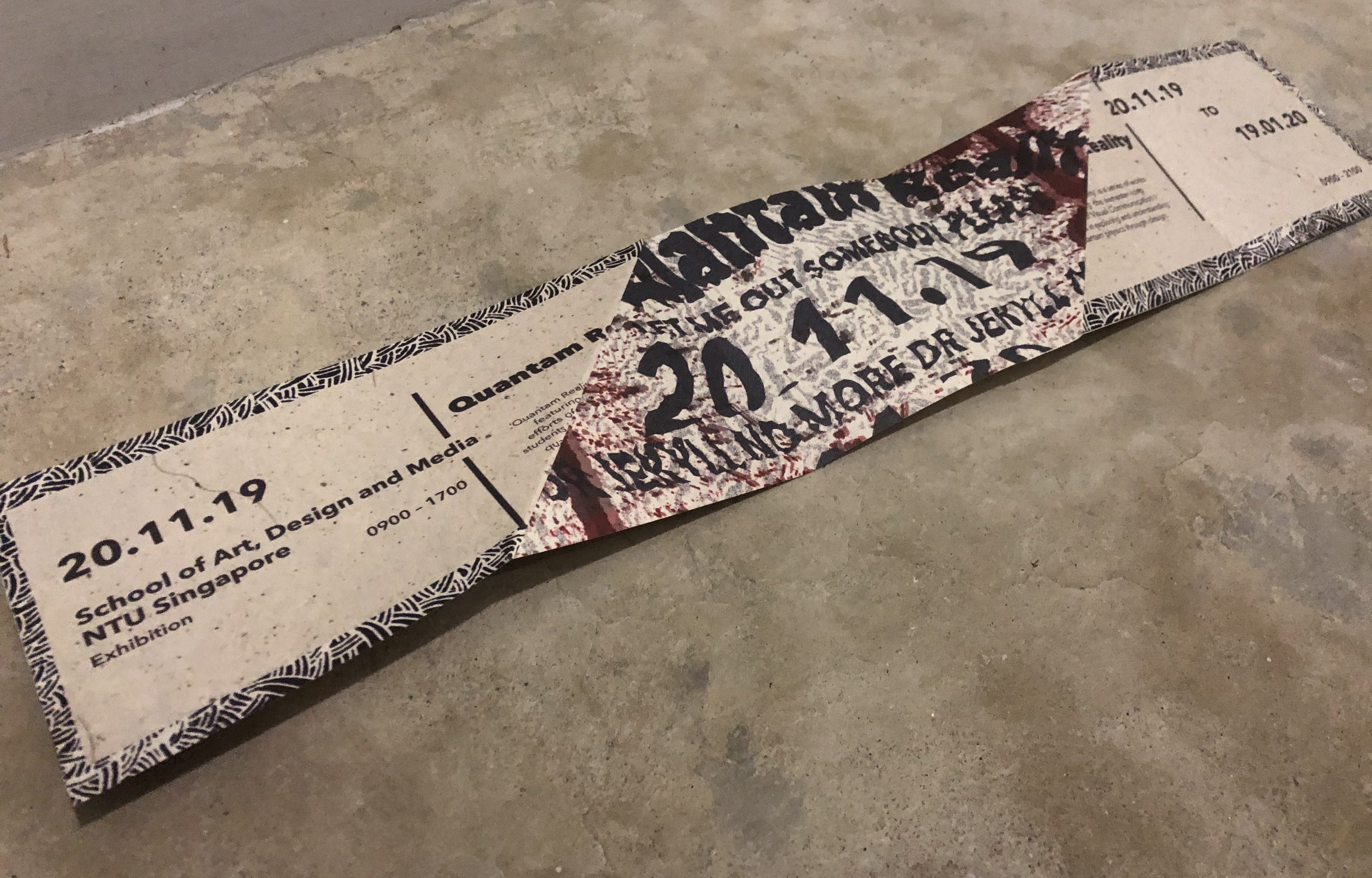
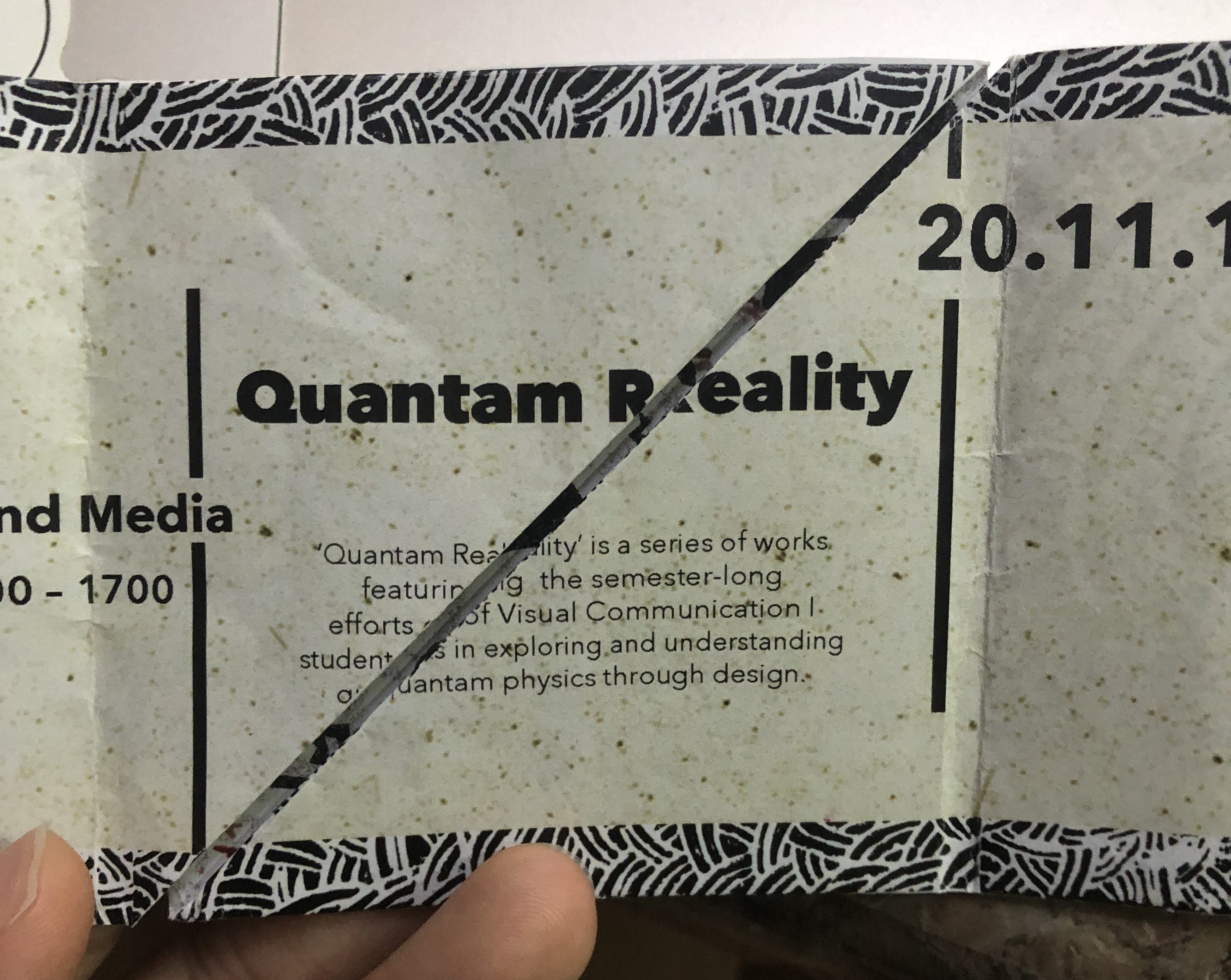
Picture of invite:
Front:
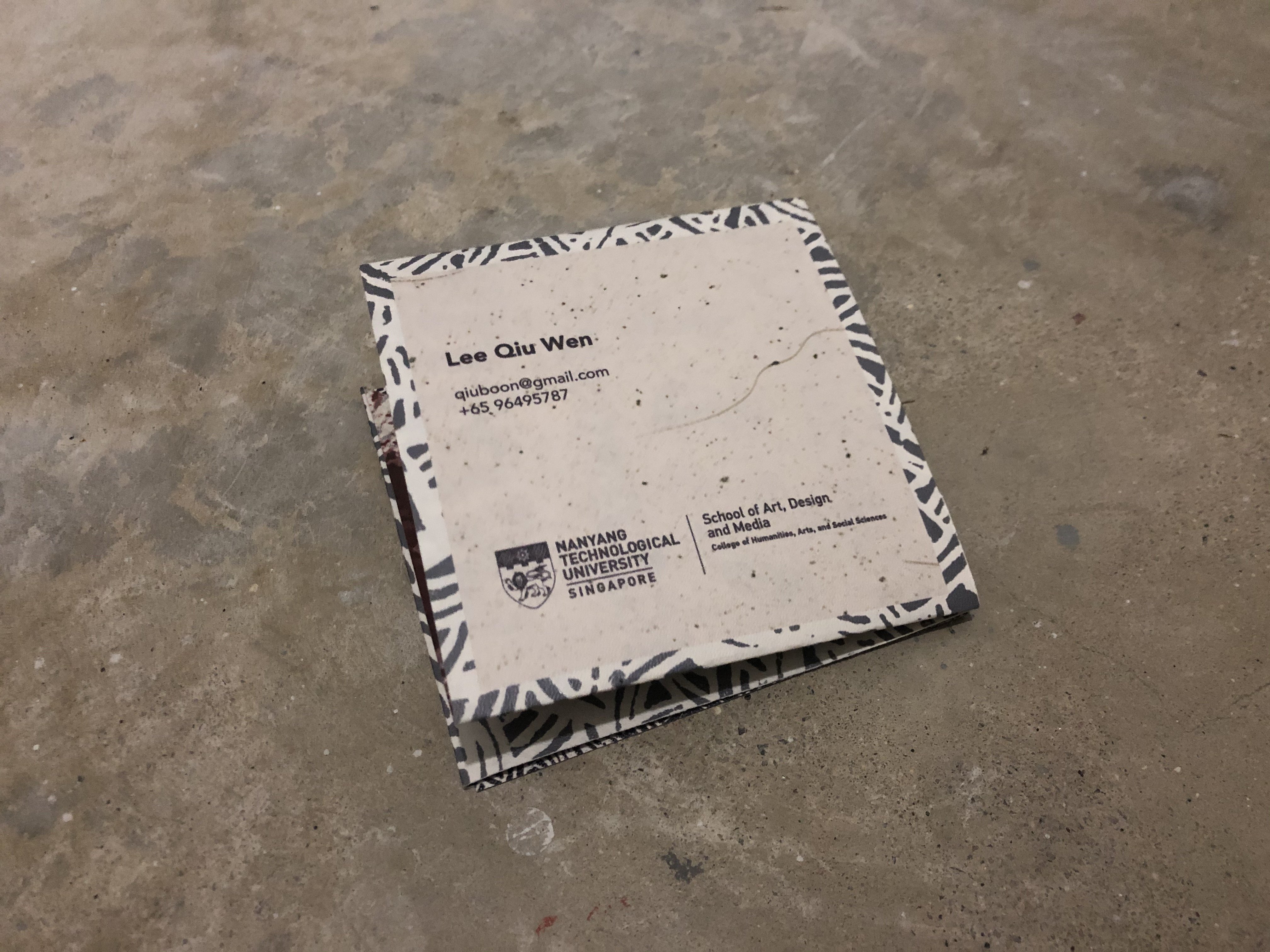
Back:
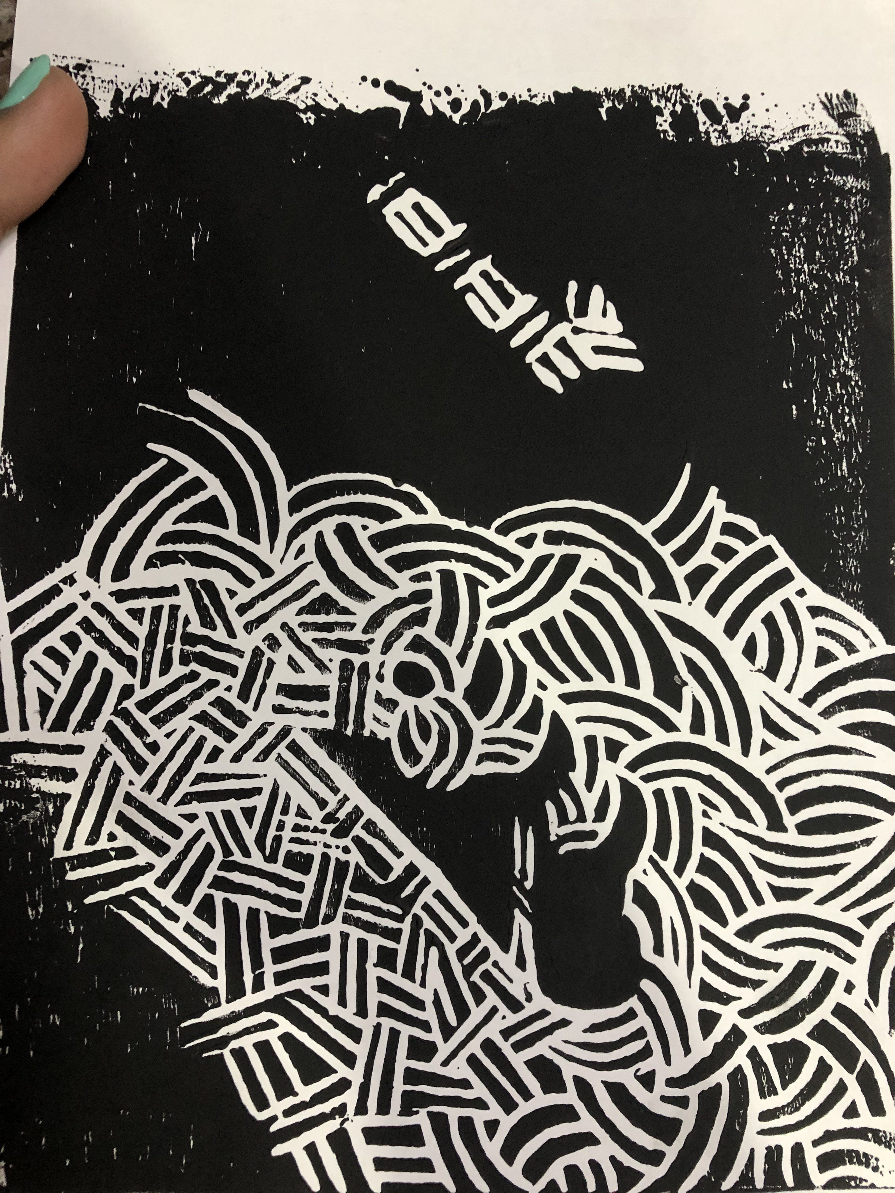
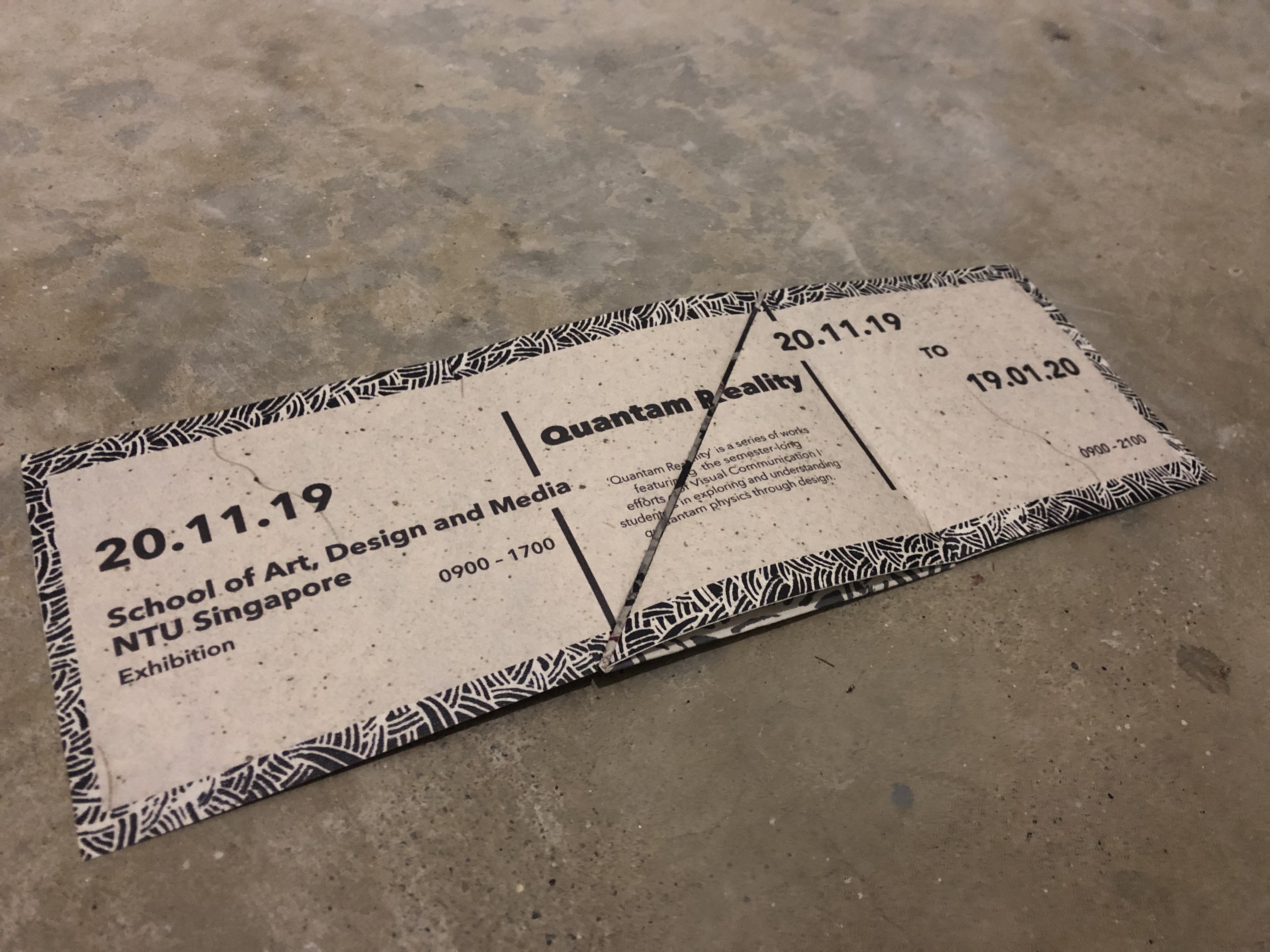
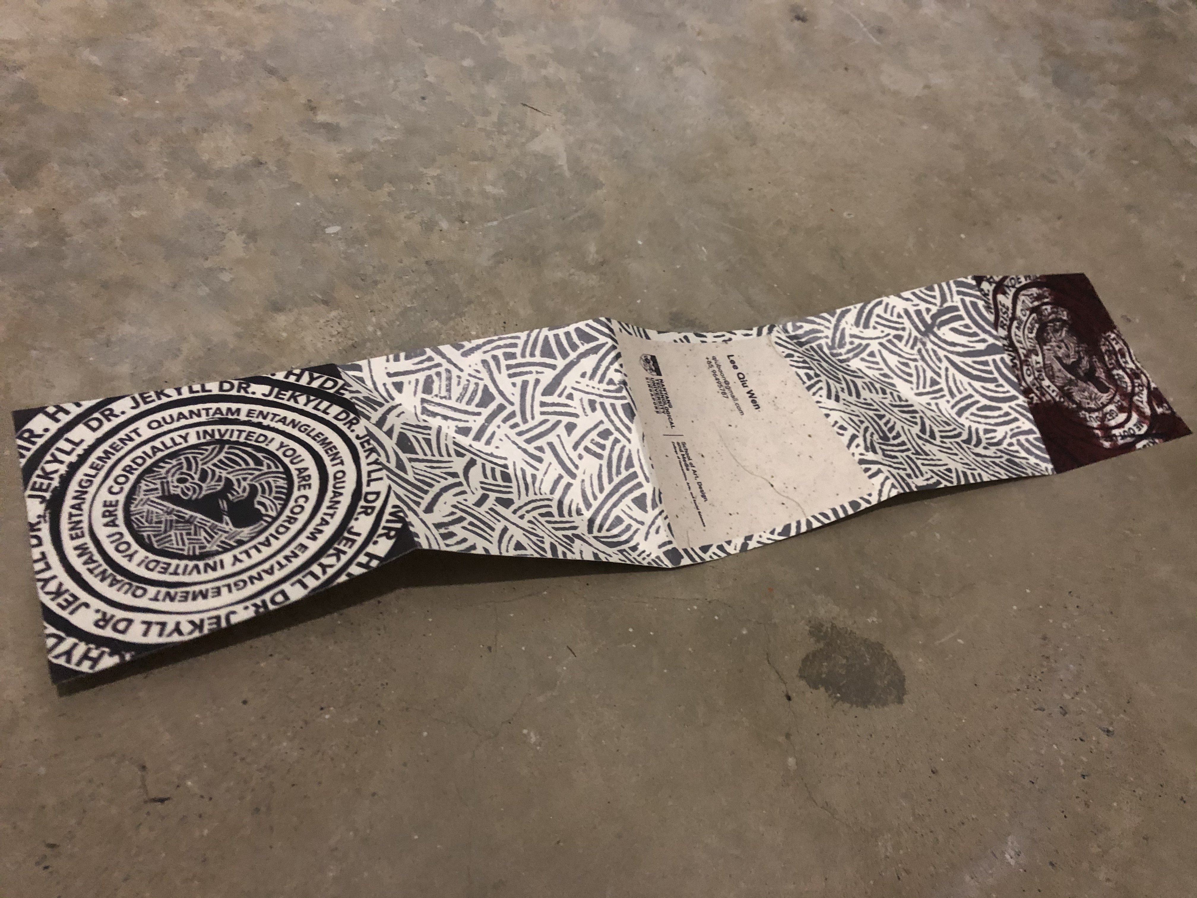
Front unfolded (Inside):
Back Unfolded:
Paper Details:
Name: Sagitta White
GSM: 110 GSM
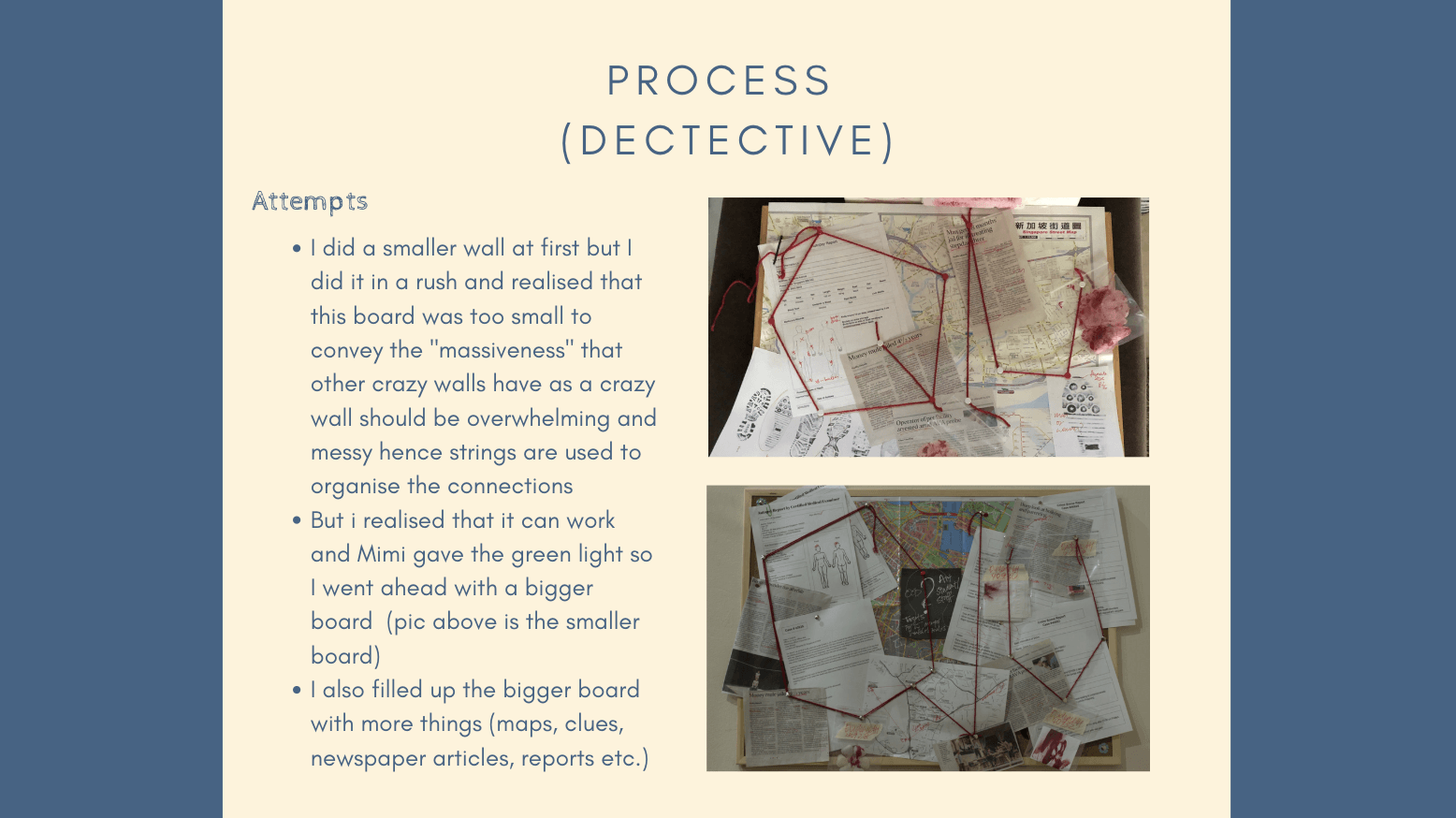
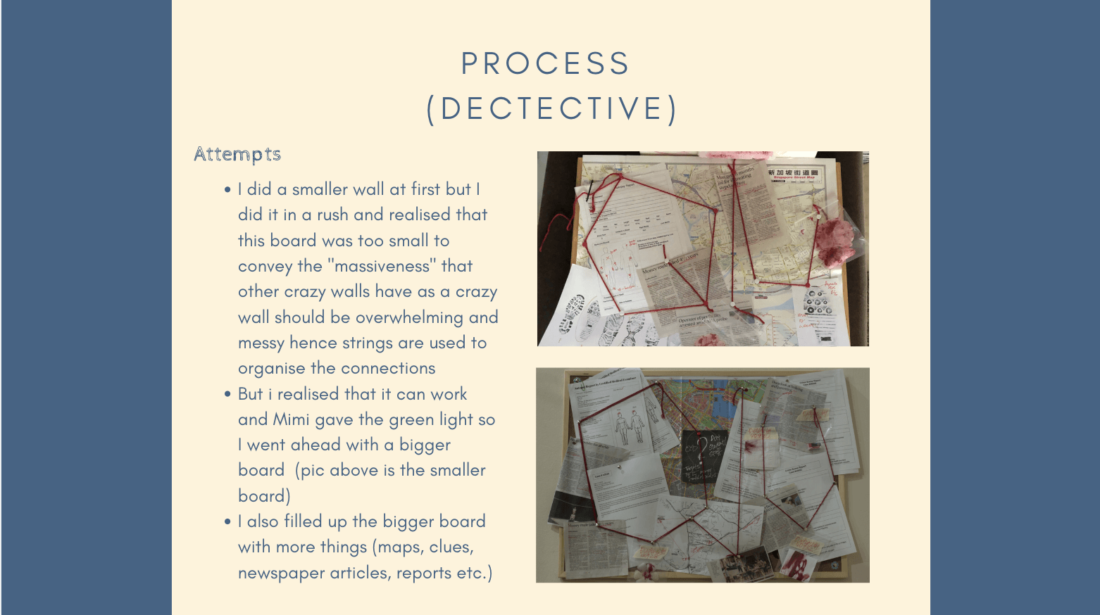
Recurring Problems:
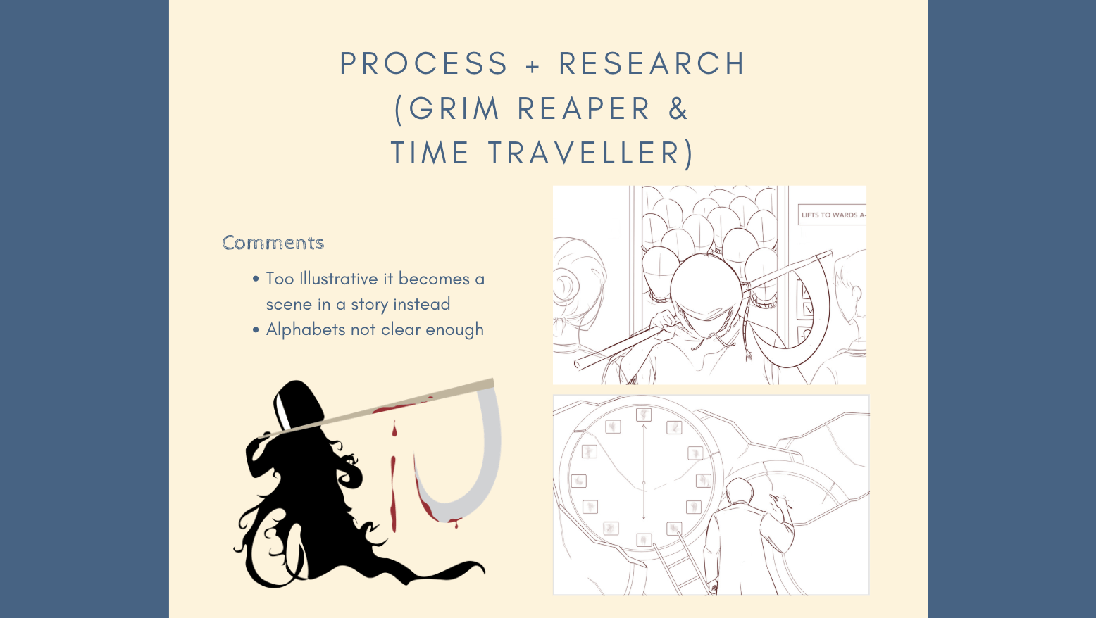
The problem I had was mainly aligning the two sides as my folds have to be accurate so that the information in the middle section matches up and is readable. It was hard to align the folds especially since the middle of my invite is split into two folds and they have to come together perfectly. My test prints all had these problems that comes with alignment:
The centre has a gap that splits the information even if the information is aligned and matches up like the picture below:
The front of the invite does not line up to form a perfect square:
The first test print was horribly misaligned:
The printing done at sunshine was better but still misaligned:
The paper used here was 250 gsm which was too thick and left very obvious folding marks:
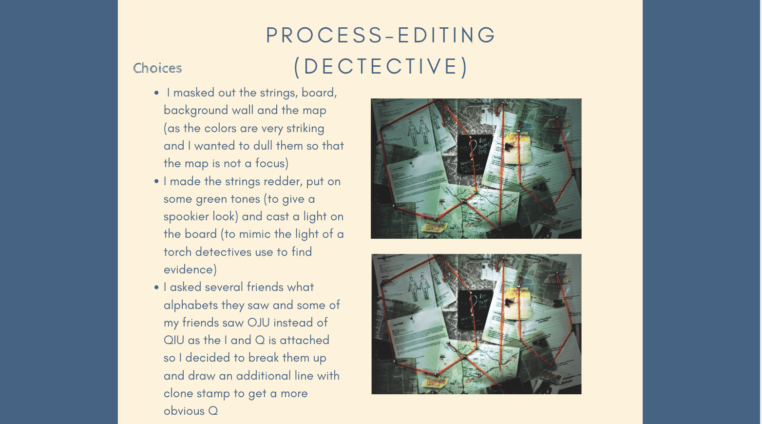
Hence, for the final one I chose a paper that has way lesser gsm: 110 and I told the printer to align it for me as best as he can. He used two pieces of paper (which is all that I bought) and failed to align it so I went to get more paper for him and he managed to somewhat align it in the end. The alignment is still not that perfect but it’s probably the best that I can get and I guess I’m satisfied with it :’)
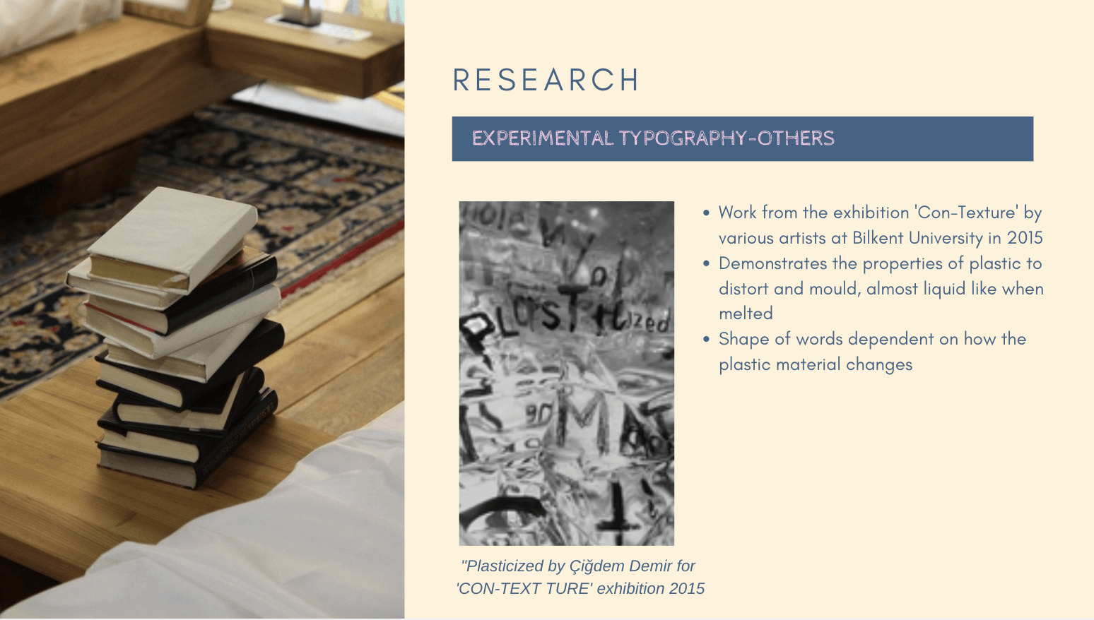
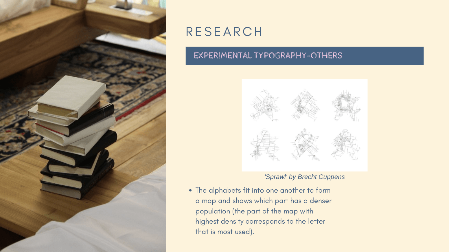
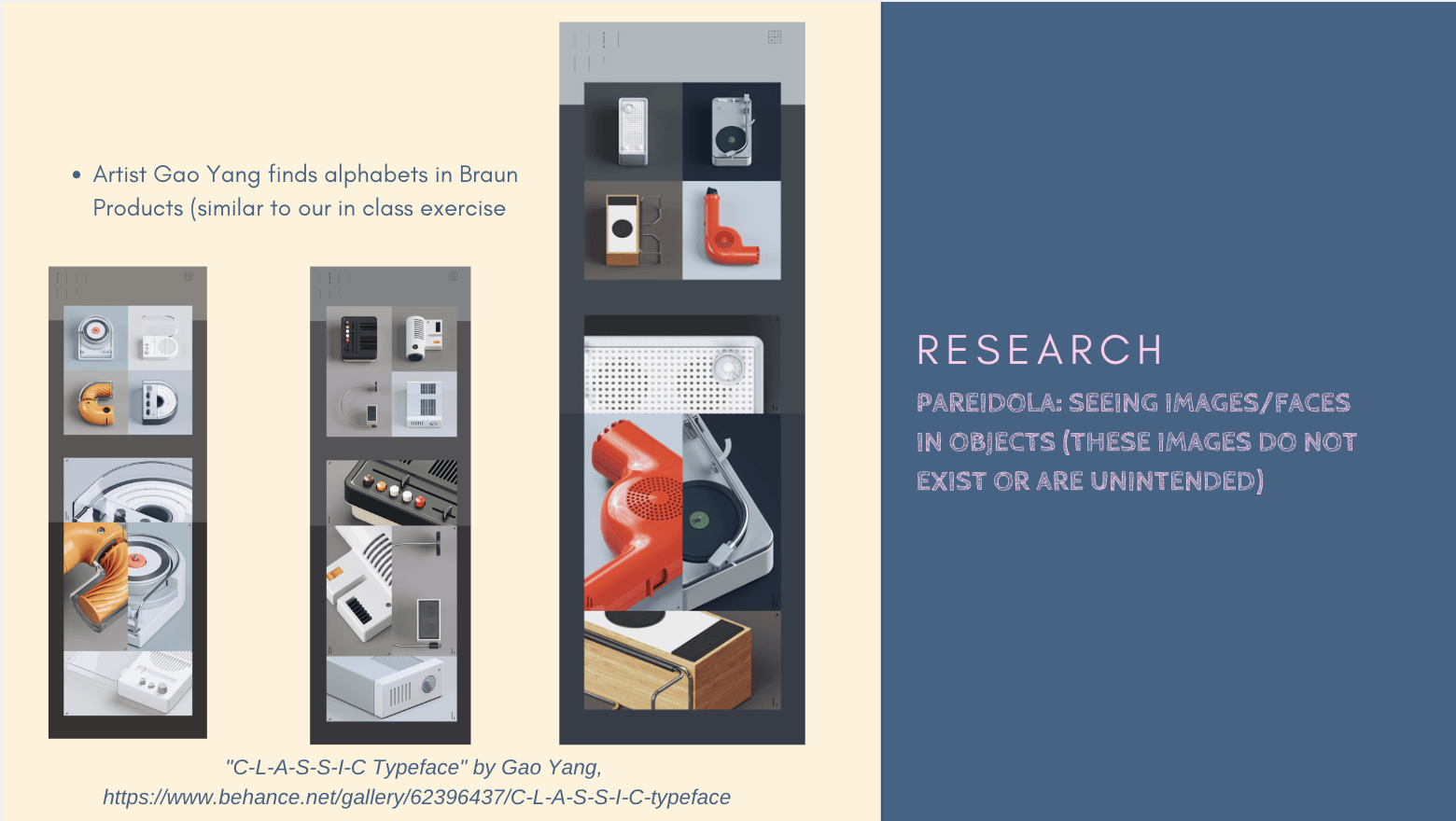
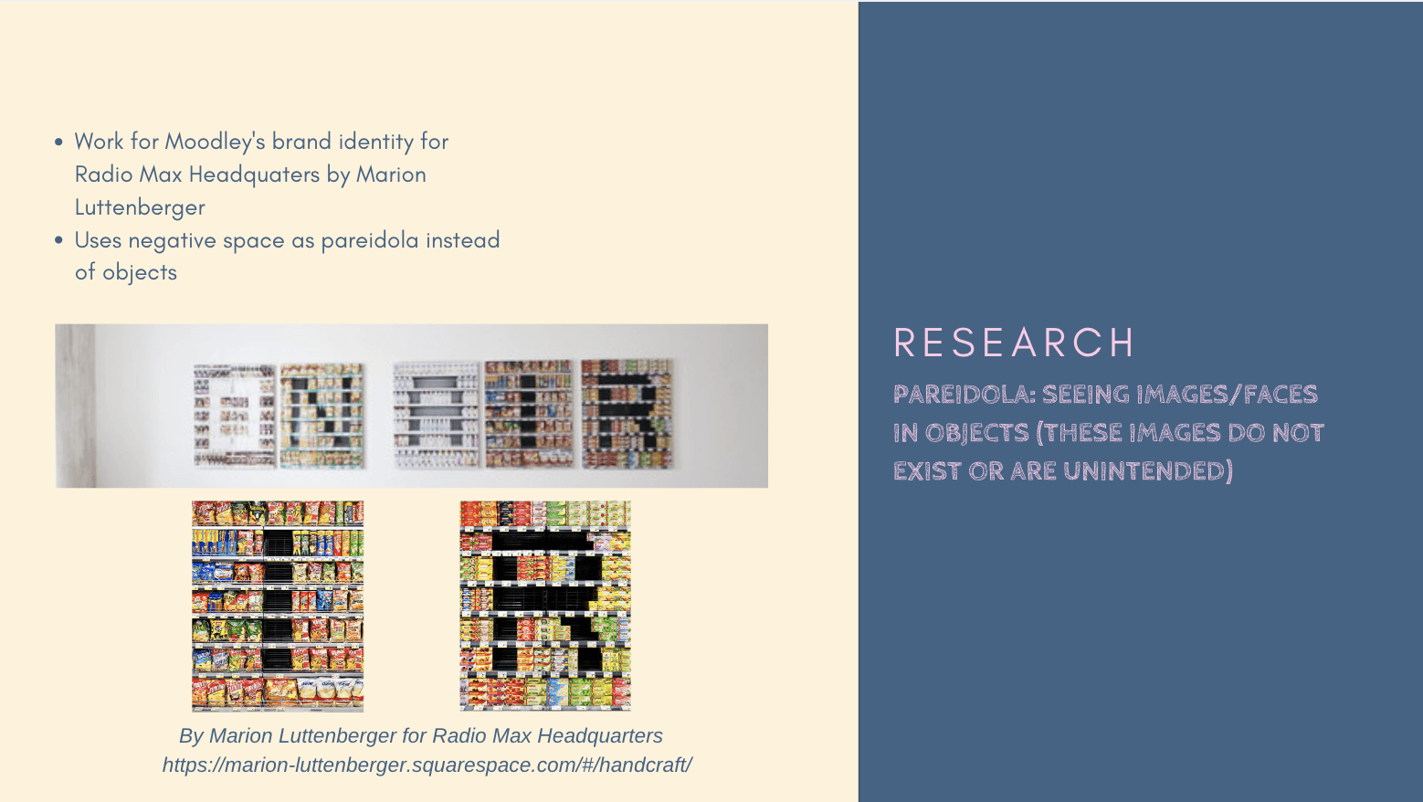
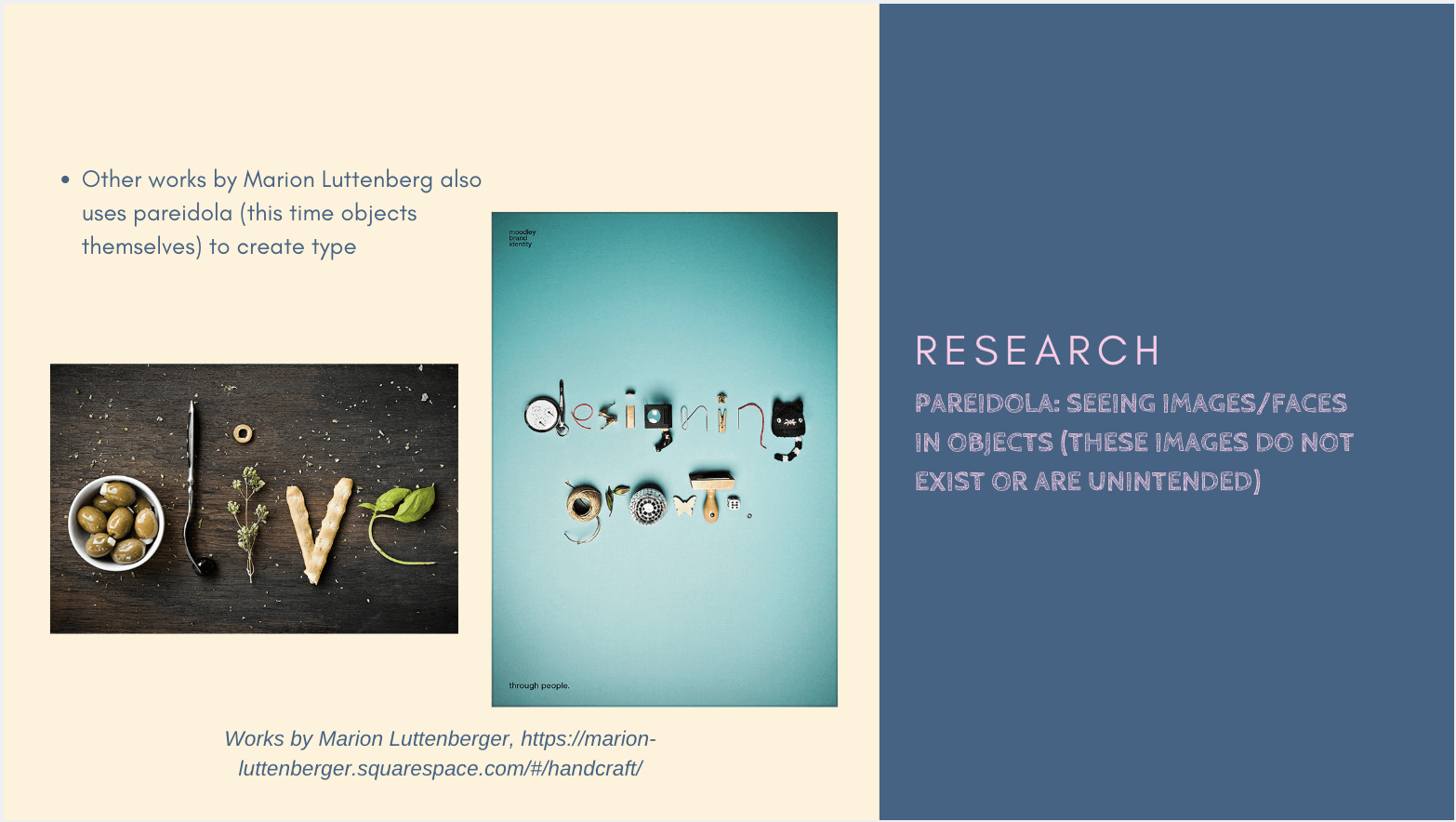
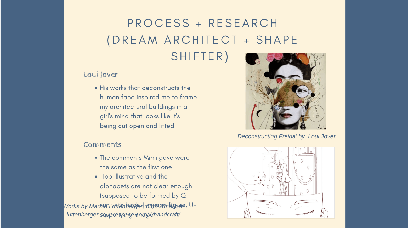
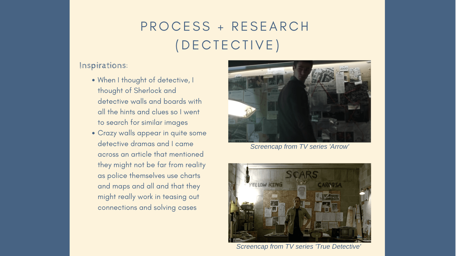
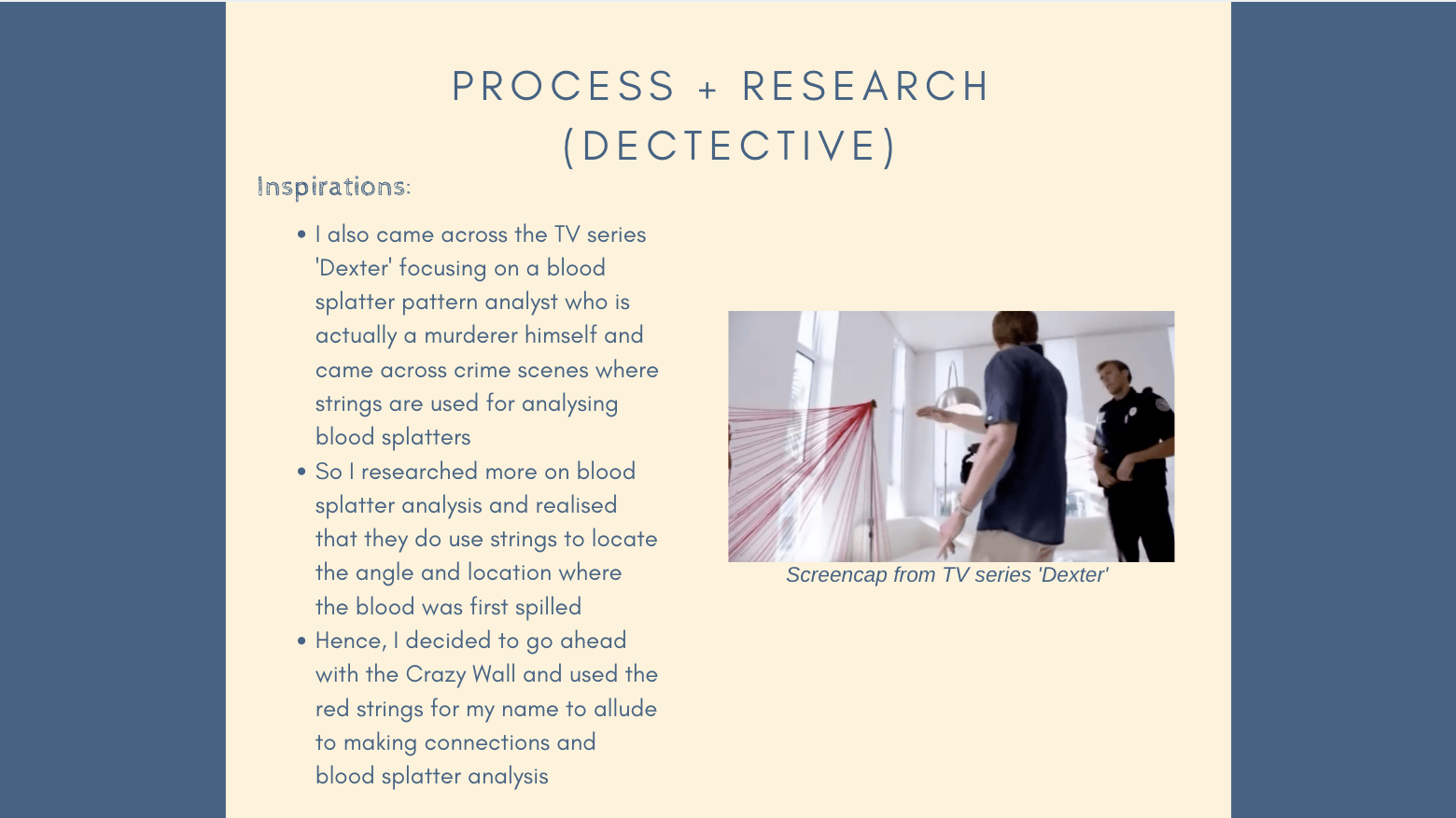
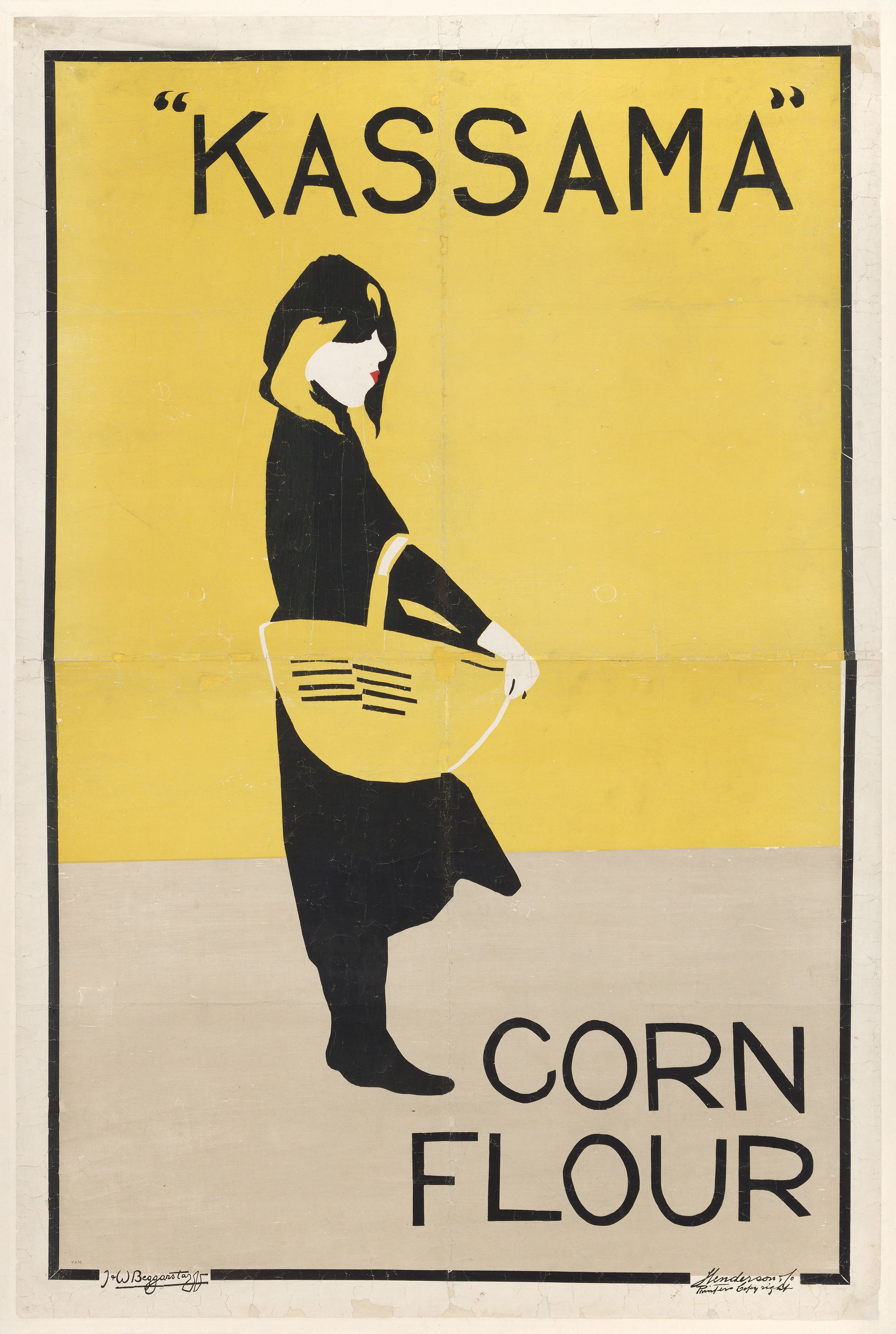
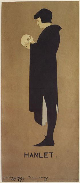
This lecture was filled with a lot of interesting examples exemplifying the various art movements but the work that I found most interesting was the Beggarstaffs’ ‘Kassama’!
‘Kassama’ by the Beggarstaff Bros., 1894 https://www.cam.ac.uk/beggarstaffs
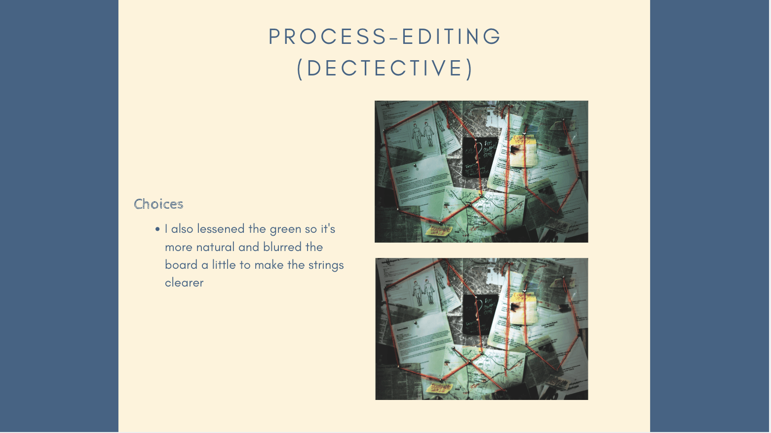
It reminds me of the posters that we have now like:
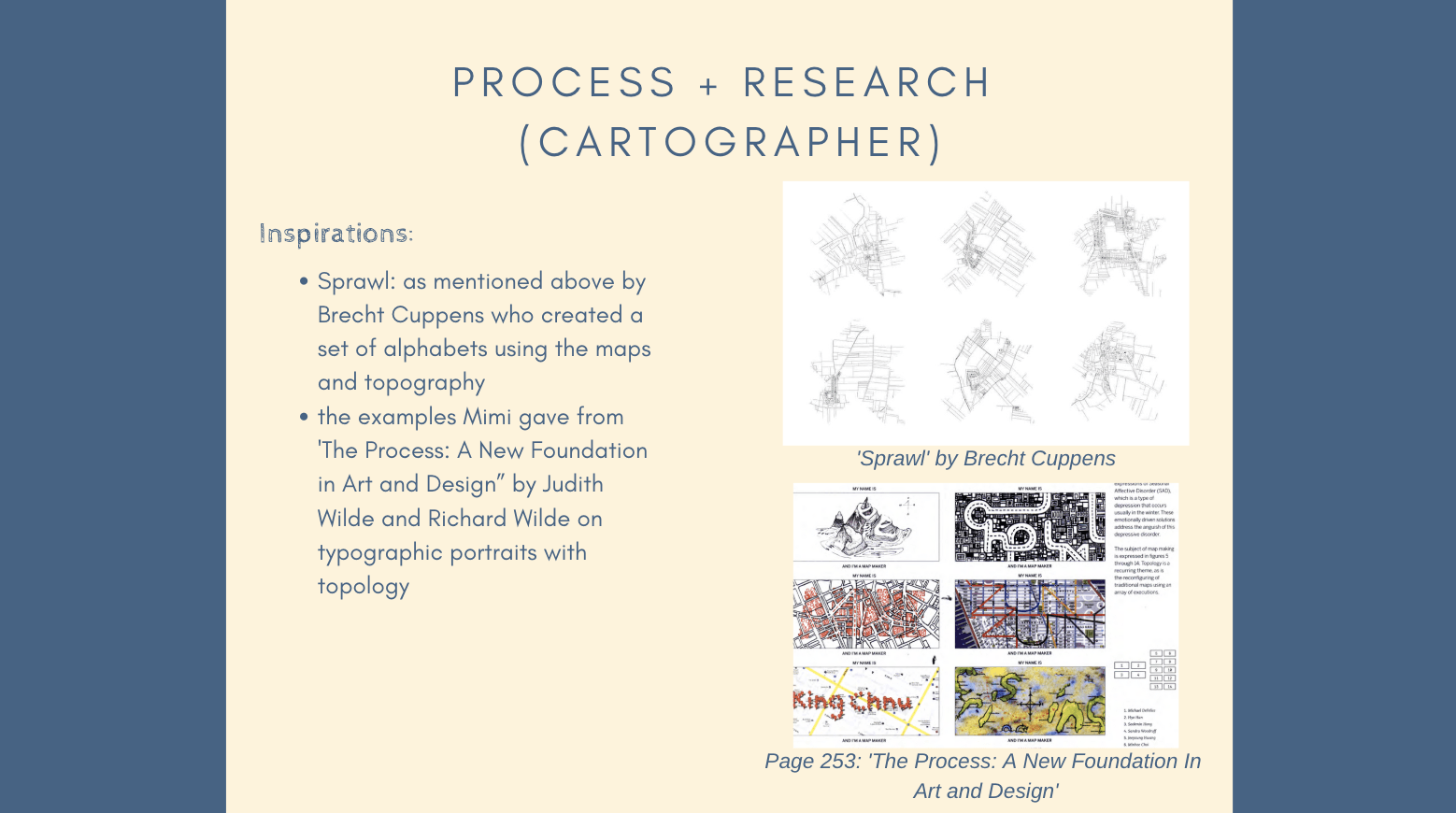
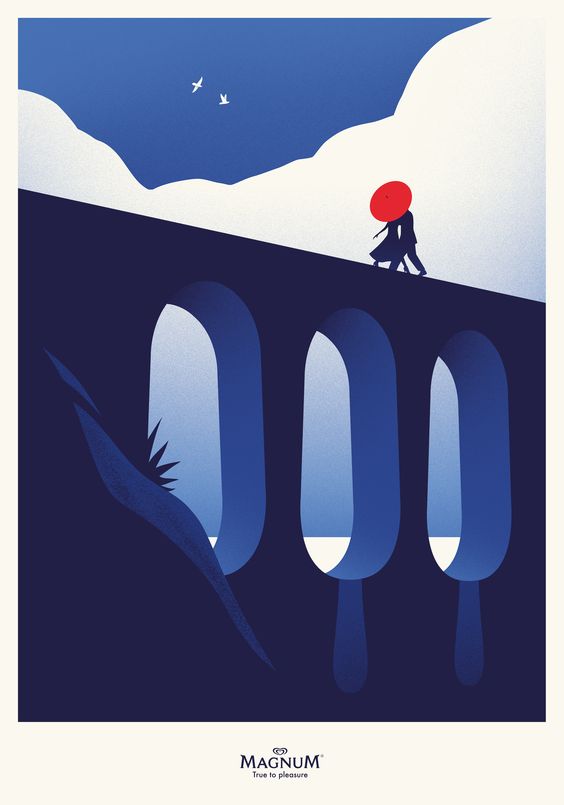
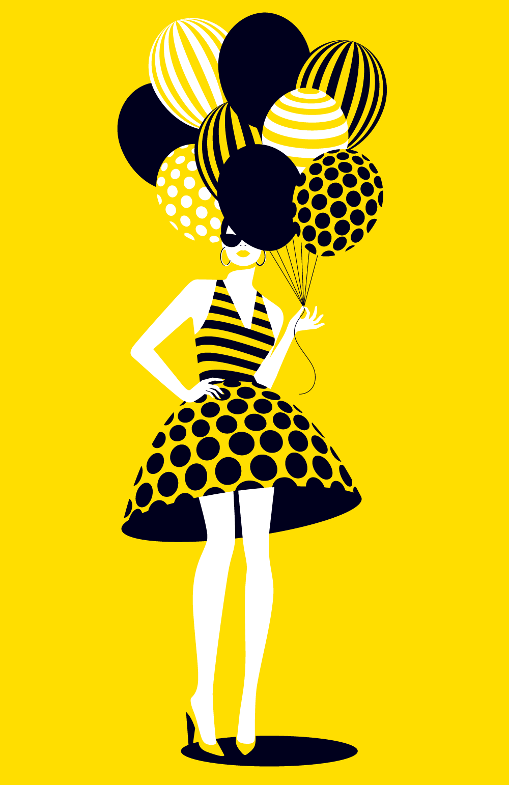
Magnum advertisement by Thomas Danthony, 2018 https://www.danstapub.com/magnum-pleasure-icon-art/‘Balloons’ by Malika Favre for Papyrus https://www.malikafavre.com/balloons
But of course, these are digitised while the Beggarstaffs worked with collages and paper cut outs.
The ‘Beggarstaffs’ made up of two artists: William Nicholson and James Pryde. Nicholson was English while Pryde was Scottish and they are brother-in-laws as Nicholson married Pryde’s sister. In 1894, they formed the ‘Beggarstaffs Bros.’ after seeing the word on a fodder sack and teamed up to create posters that were known for their bold simplicity. This was during the Art Noveau period where the use of curvilinear and floral shapes was abundant in posters.
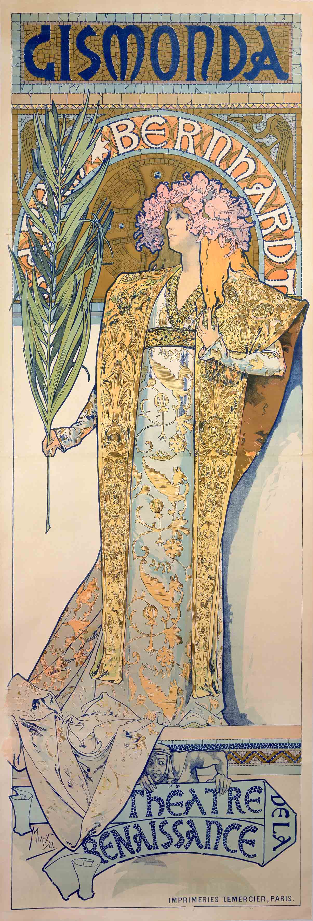
Below are the posters ‘Gismonda’ by Alphonse Mucha and ‘Hamlet’ by the Beggarstaff Brothers. Both are produced in 1894, life sized and for theatrical productions but both are in very different styles. Mucha’s ‘Gismonda’ was in the Art Noveau style with the curvilinear and whiplash strokes and shapes while ‘Hamlet’ was done with stencil and painting over brown paper. ‘Hamlet’ compared to ‘Gismonda’ is very simplified and not ornamented at all, be it the illustration or the typography. It exemplifies how the Beggarstaffs went against the style of their time and created posters that are radically different.
‘Gismonda’ by Alphonse Mucha, 1894 https://www.myddoa.com/gismonda-alphonse-mucha/
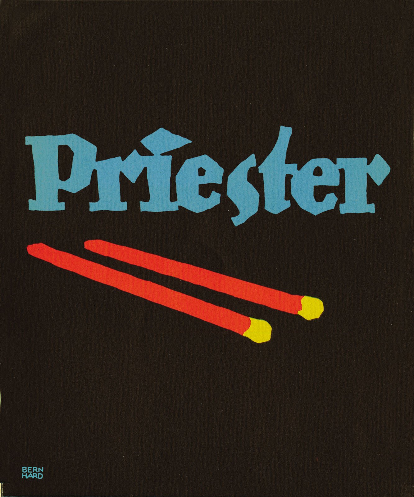
They were not the only ones who went against Art Noveau as Lucien Bernhard and Ludwig Hohlwein’s Plakatstil and Sachplakat (‘Poster Style’) also similarly advocated for simplification, flat colours and a focus on the central object being advertised (after the Beggarstaffs beginning around 1905 hence we can see their influence).
‘Priester’ by Lucien Bernhard, 1905 https://www.britannica.com/topic/Plakatstil
The Beggarstaff Brothers went their separate ways after five years as they were a commercial failure due to the boldness of their works but they were regarded highly for their influence and originality.
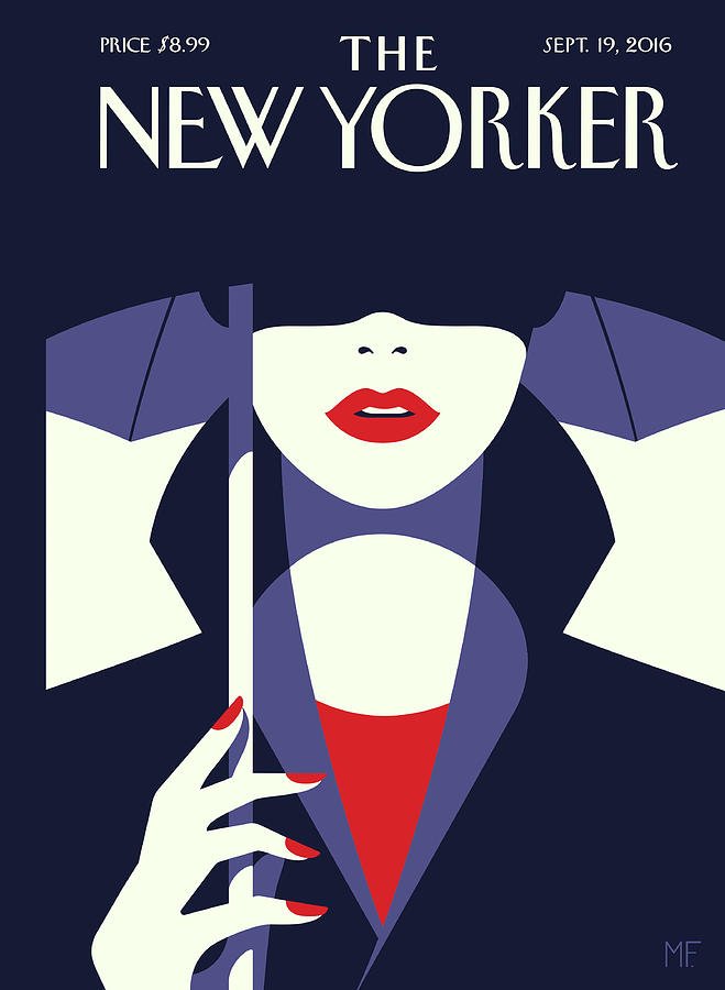
I think that the style of the Beggarstaff Brothers can be seen in today’s graphic design and posters. Instead of stencils and paper cutouts, we have vectorised designs that favours simplification and limited colour palette. The Beggarstaff Brothers’ influence can be seen in the art of modern artists like Malika Favre.
‘In The Shade’ by Malika Favre for the ‘New Yorker’, 2016 https://www.malikafavre.com/intheshade
Personally, I feel like poster design today has become restricted by digitisation. More can explore a mixture of analogue and digital methods to fully utilise and combine the raw craftsmanship quality of art and the tools of digital illustration to create designs that are timeless.
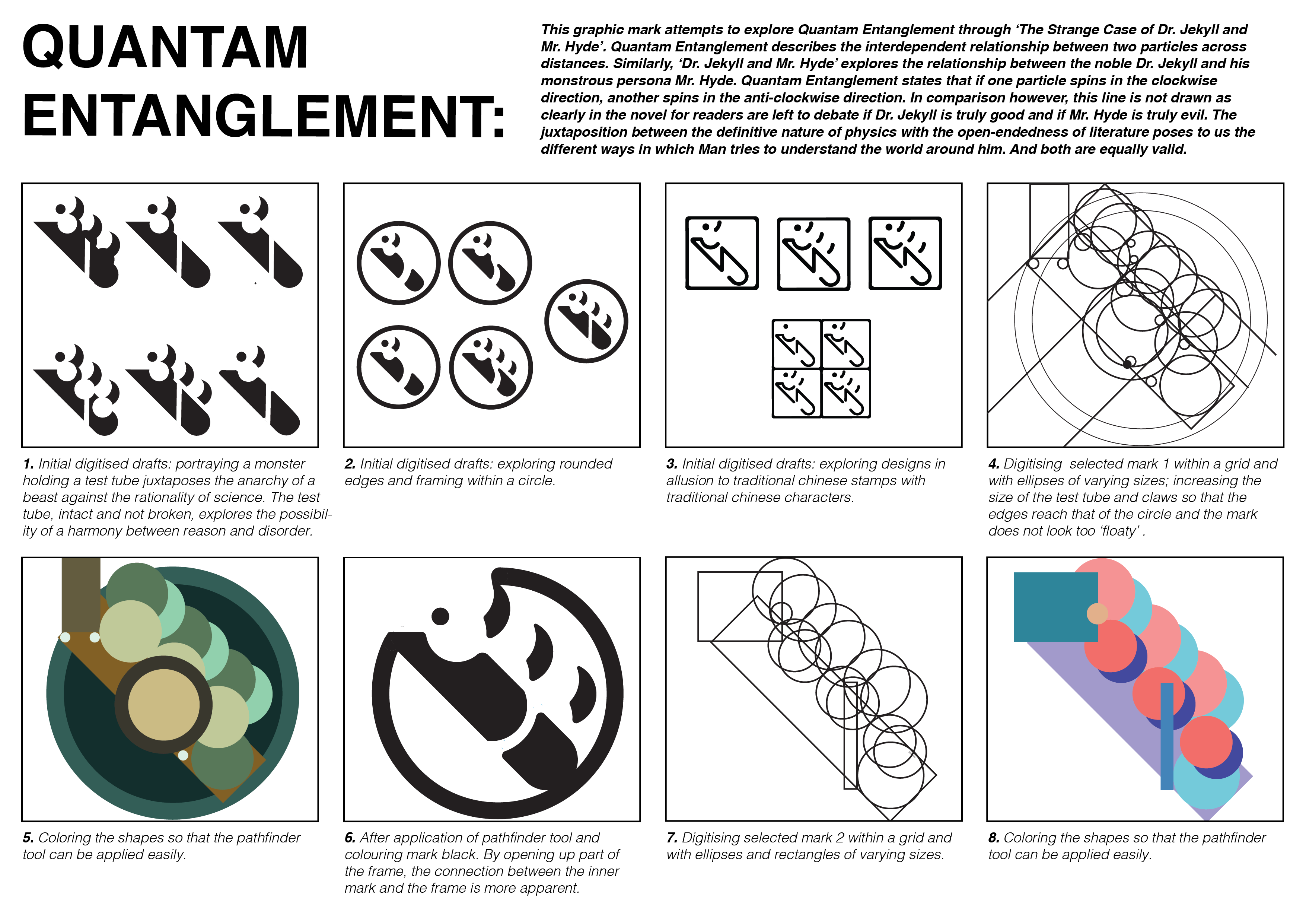
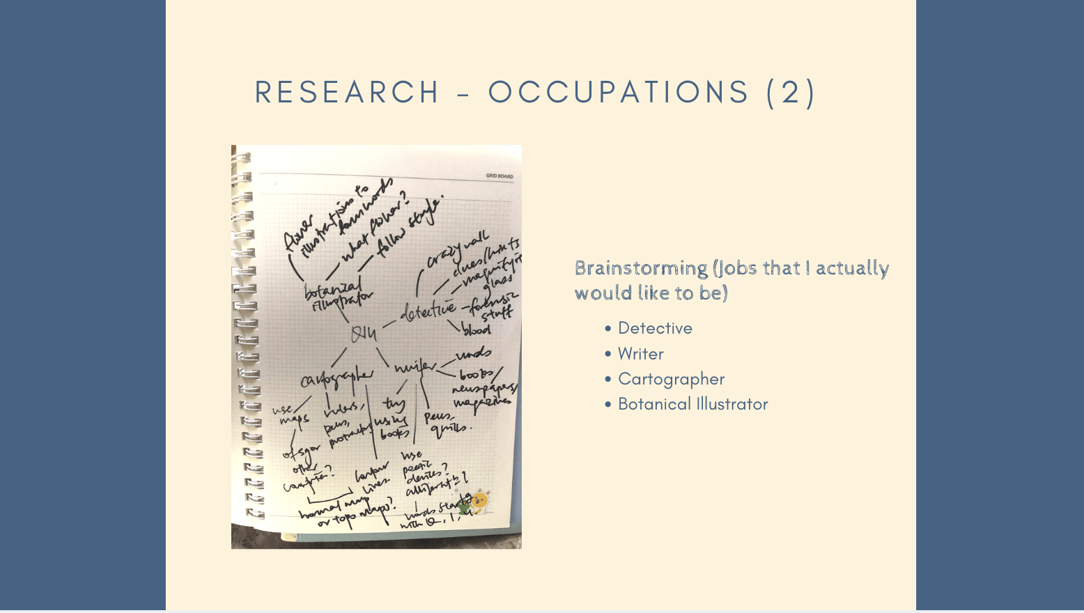
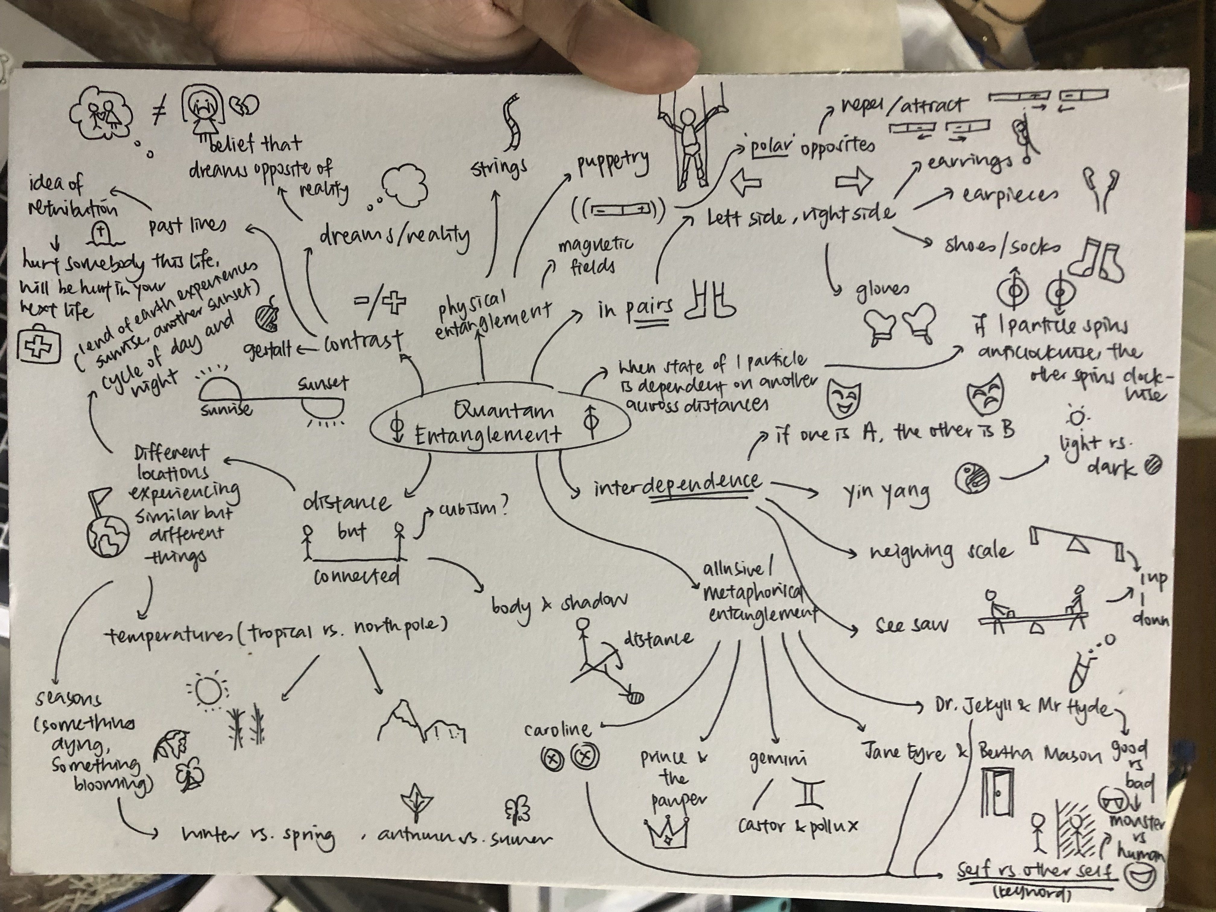
When I first received the brief and did some research, the first thing that popped out to me was Quantam Entanglement as I found it interesting how two matters can affect each other across distance even if they are not in contact with each other.
I then branched out to the more physical ideas like Pairs of things or the Night and Day cycle, things that have opposing ends etc. before going into metaphors and literature like Jane Eyre vs. Bertha Mason, Prince and the Pauper and The Strange Case of Dr. Jekyll and Mr. Hyde.
The last one struck me because I think that it’s very representative of Quantam Entanglement where when you have a good side of that person, you’re bound to have a bad side of that person and if Jekyll is good then naturally Hyde is bad and if Hyde is good then Jekyll is bad.
Hence, I decided to explore Quantam Entanglement via Jekyll and Hyde.
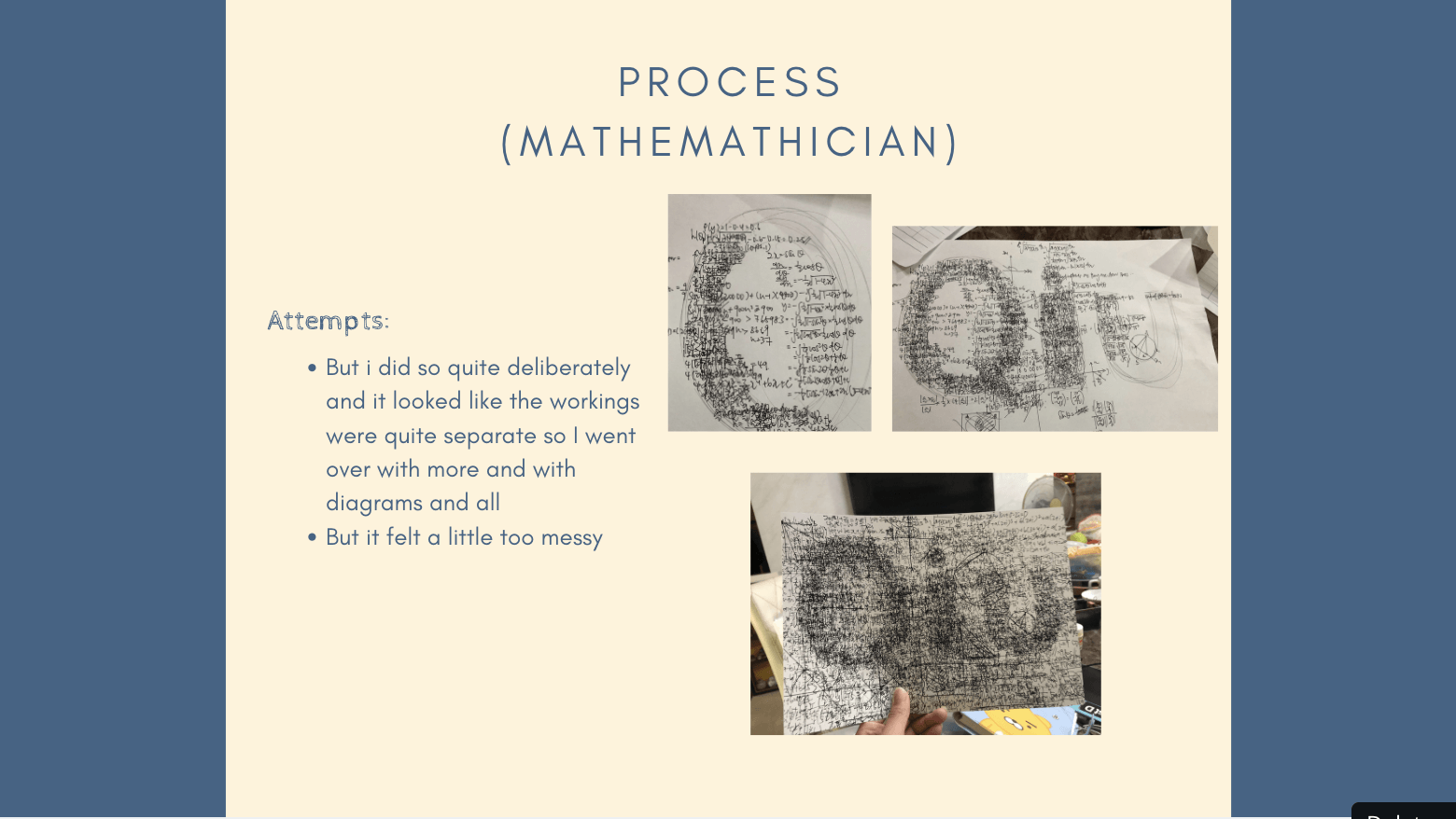
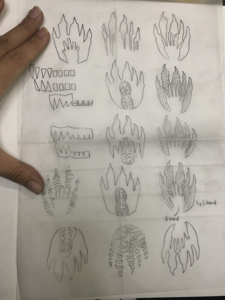
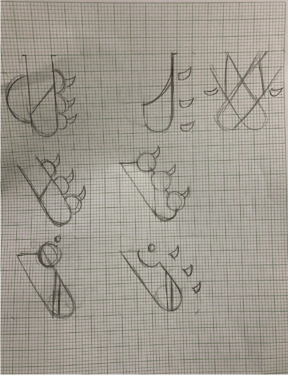
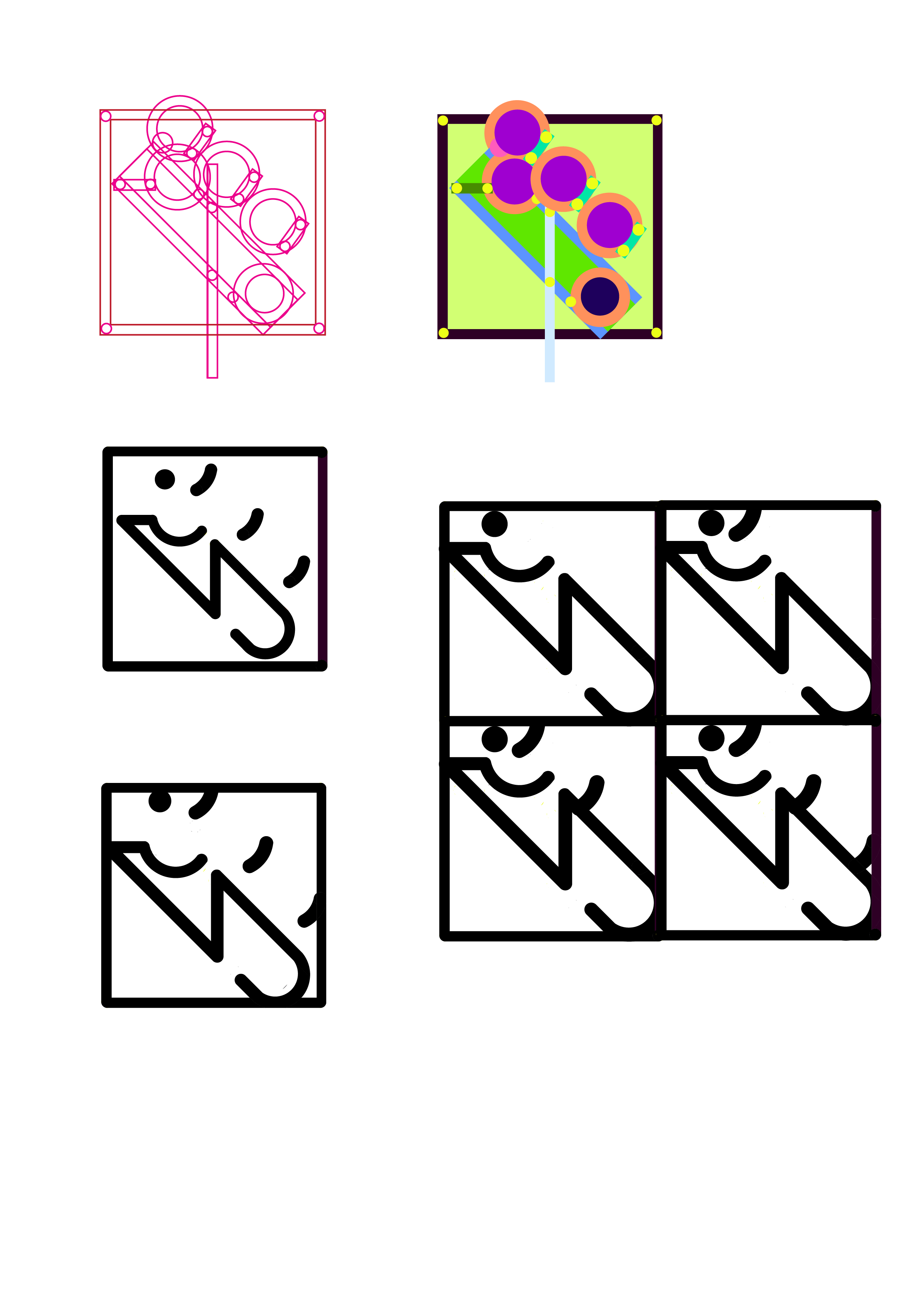
At first, I decided on the keywords: Self vs. The Other Self and Chaos vs. Order and decided on the images of claws, human teeth and footprints.
I wanted to show the contrast between the monster self and the human self hence the differing sizes and shapes of the monster paw vs. the human hand or the human teeth vs. the monster fangs.
After consulting with Ina, she recommend that I used a grid and when I was trying to do so, I realised that these shapes are very hard to fit into a grid and that this was too obvious and not abstract enough.
I also wanted to try linocutting to make the mark as I think that there is something raw about linocutting that is representative of the rawness of human nature that the story of Jekyll & Hyde was trying to explore.
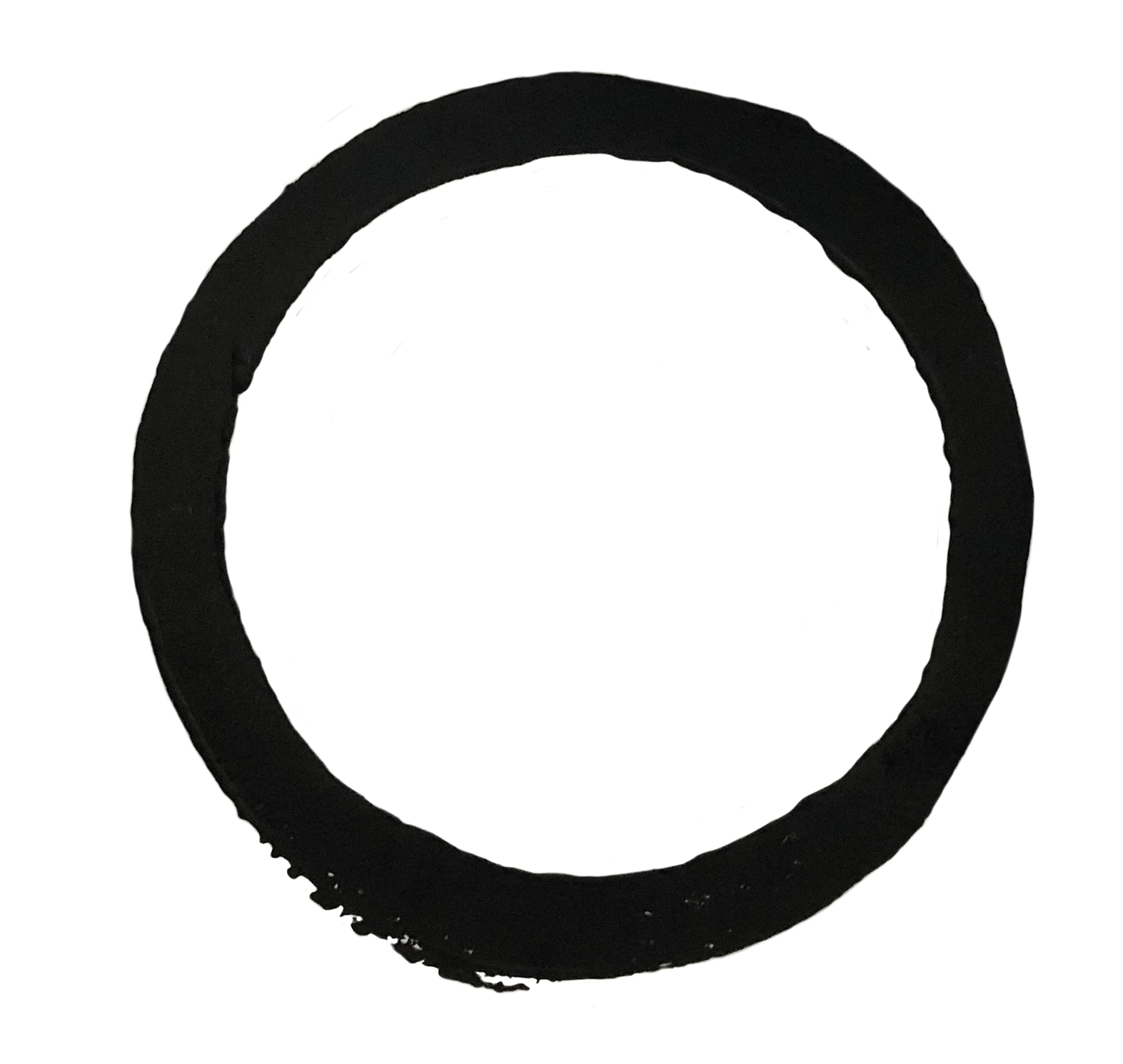
So instead of the sketches that I have I decided to come up with new ones and explored the idea of a ‘monster holding a test tube’ to show both the harmony and the contrast between the rationality of science and the lack of rationality of a monster that is balanced out perfectly in this figure of Hyde/Jekyll.
I then digitised them and came up with more variations.
But the grids are still kind of rough as I wasn’t really sure of how to deal with overlapping shapes until the class where our classmates kindly taught us how to (thank you so so much!!!)
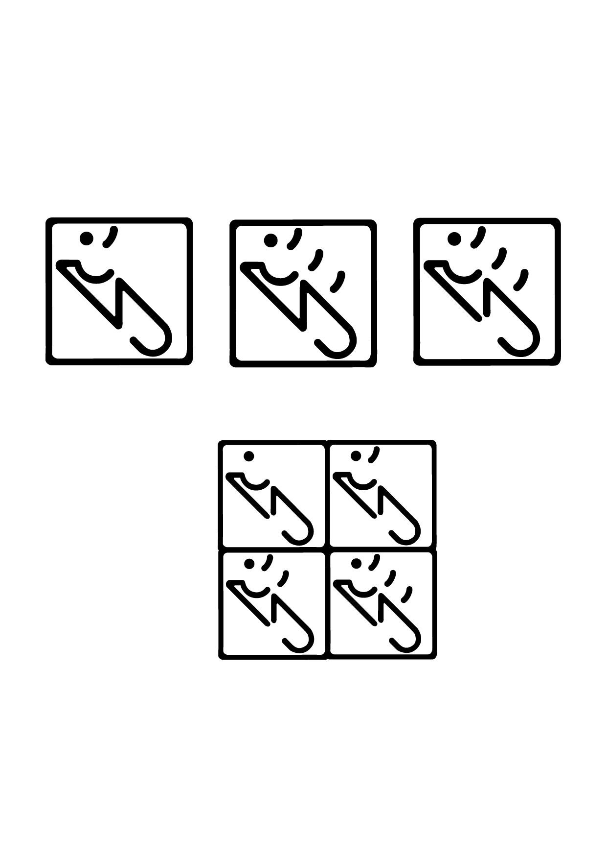
Ina mentioned that from the previous drafts, the mark looked too separated from the circle so I tried to merge them more in the first pic and I found that they look a little too boring so I omitted a part of it also to show the emptiness or lack of rationality that Jeykll embodies.
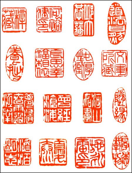
The last mark with the four square is supposed to imitate traditional chinese stamps with traditional words like these:
and Ina also mentioned that the first draft looks too ‘floaty’ so I merged them more into the borders and they show the sequential turning of Jekyll into Hyde with the number of claws increasing.
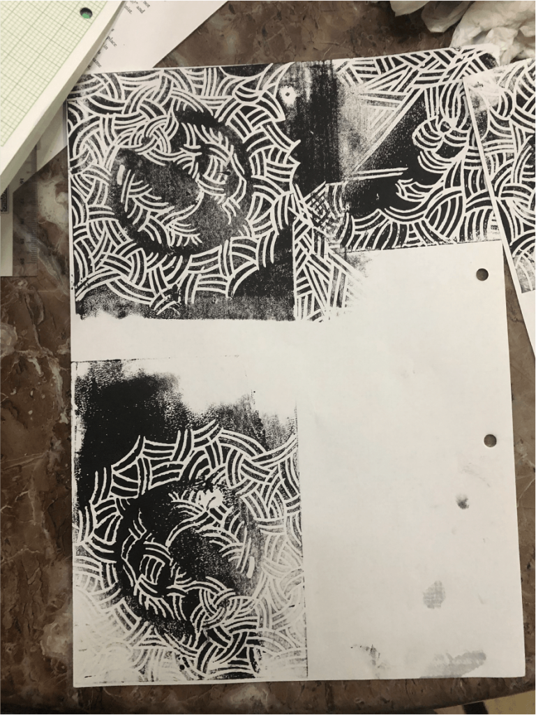
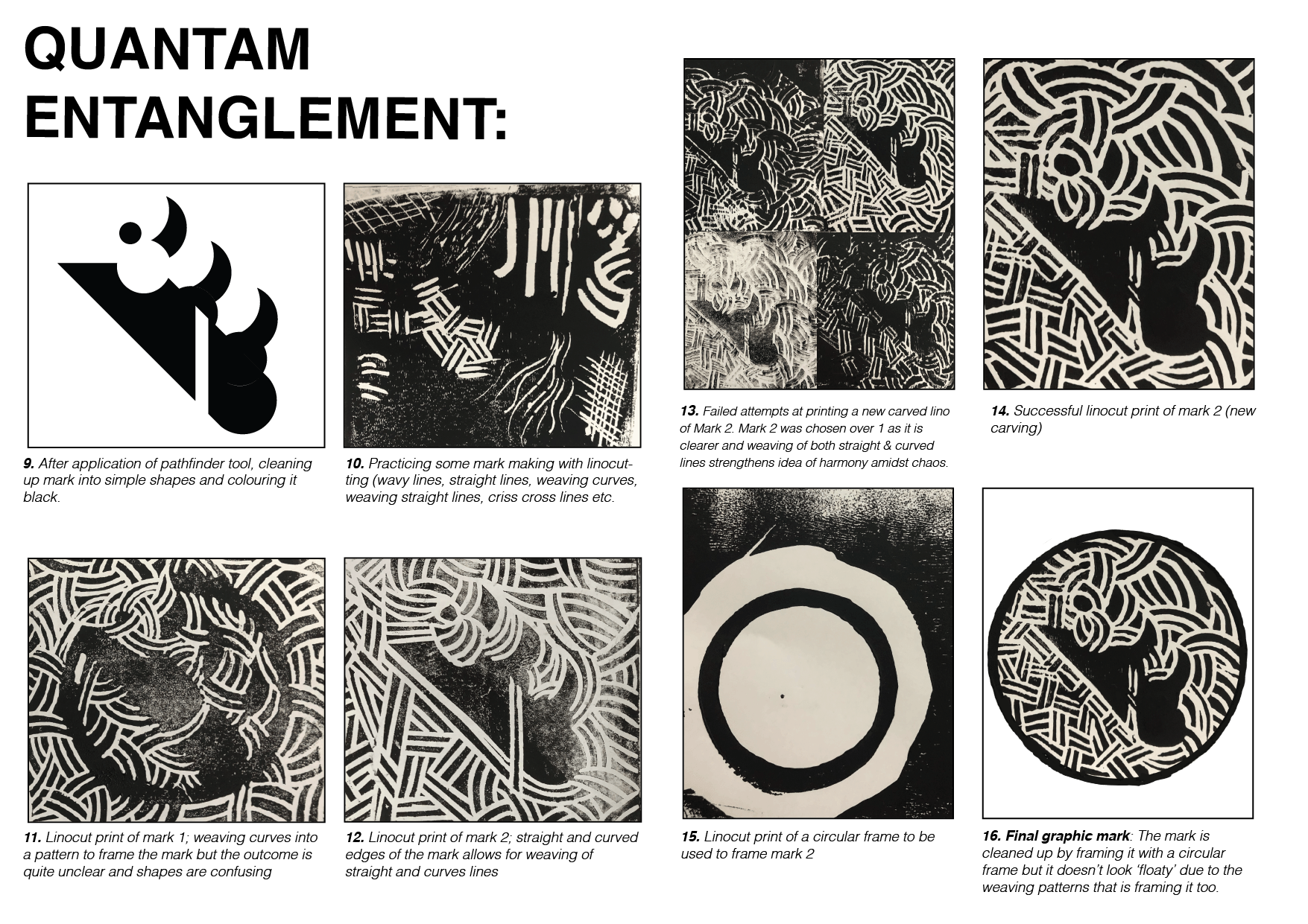
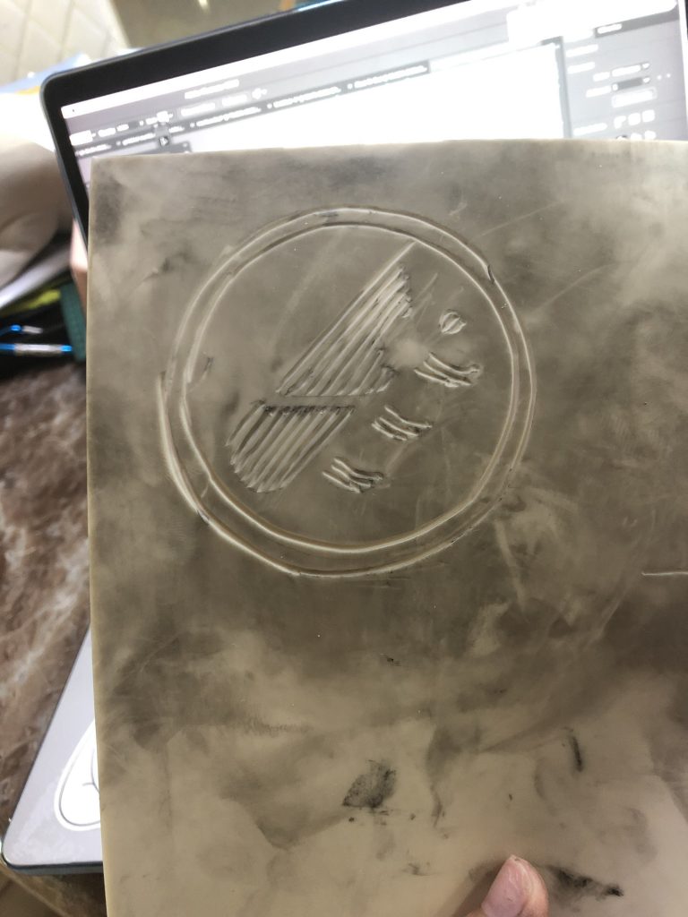
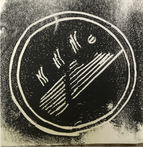
With linocutting, the first attempt was not too successful as I tried to use the marks to bring out the shapes and forgot that since I am printing it by flipping it and pressing it onto a piece of paper, I should cut it on the reverse side but I did not so I got this
.
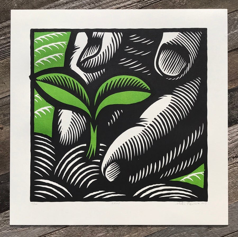
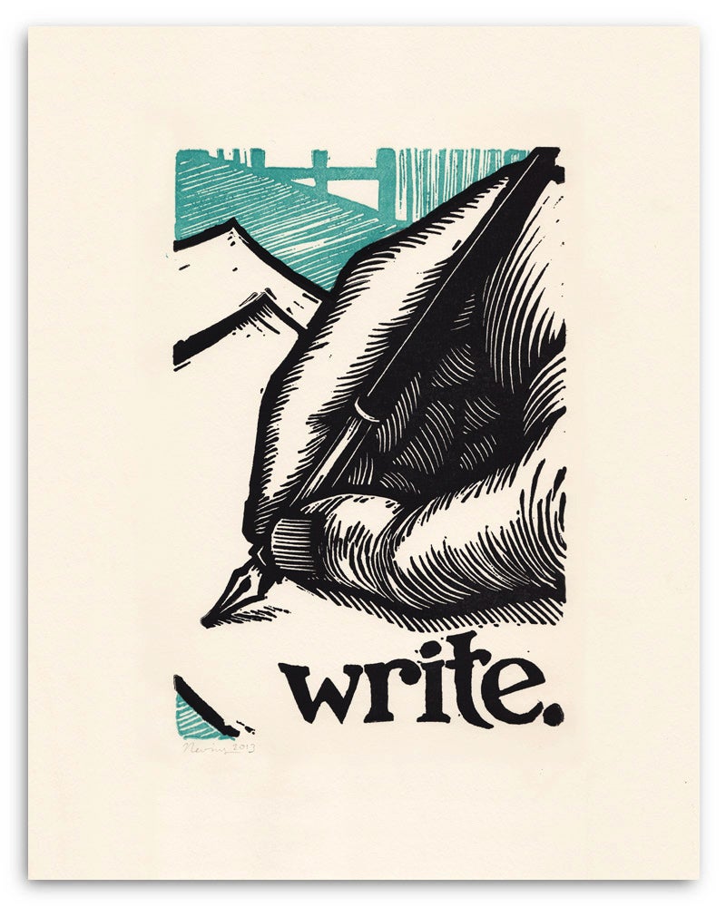
And I realised that instead of marking the shapes I should mark the outside to bring out the shapes so I tried it again (and this time reversing it). I also referenced a linocut artist Peter Nevins whose use of curves to frame and shape figures is very masterful and I feel like would help me frame my shapes well too
One artist I referenced was Peter Nevins: https://www.peternevins.com/products
‘Grow’ by Peter Nevins
‘Write’ by Peter Nevins
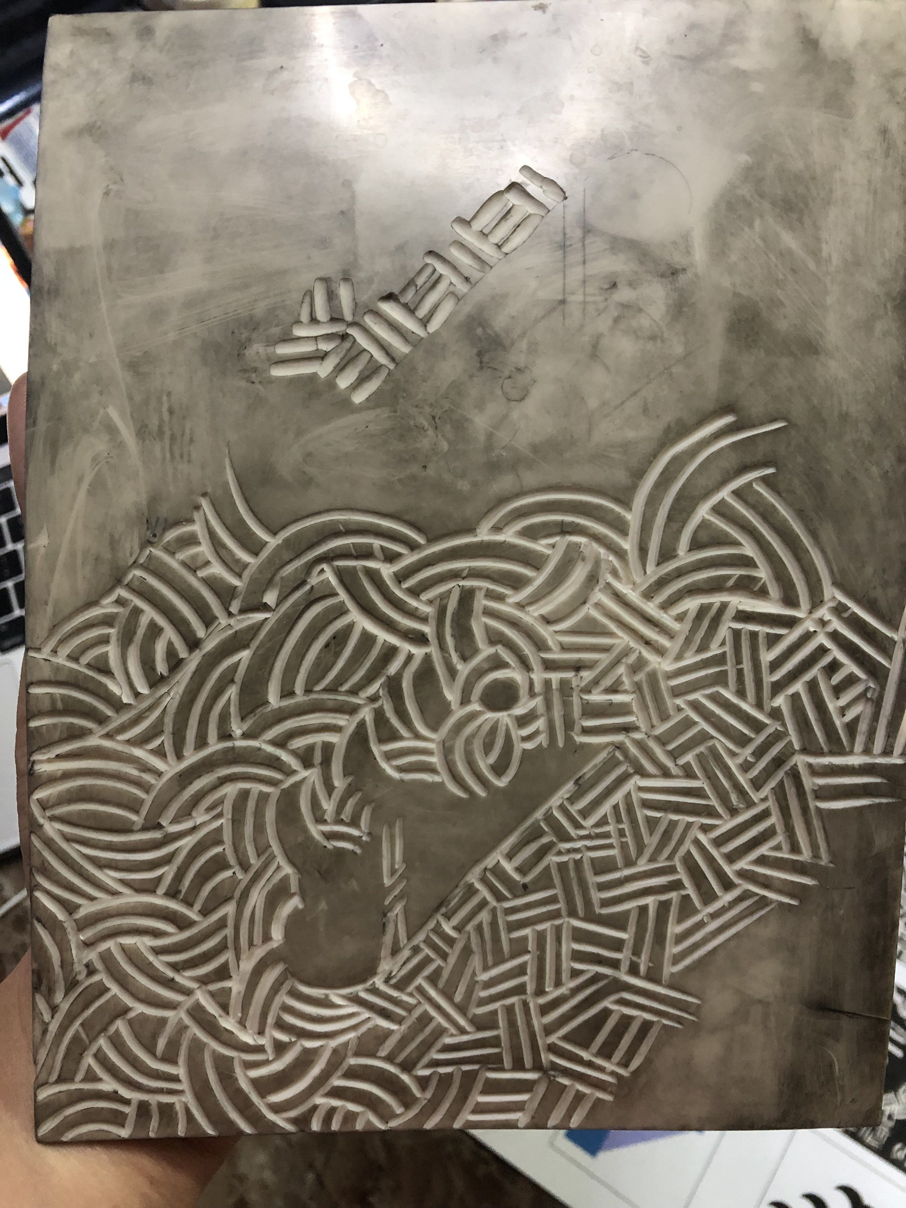
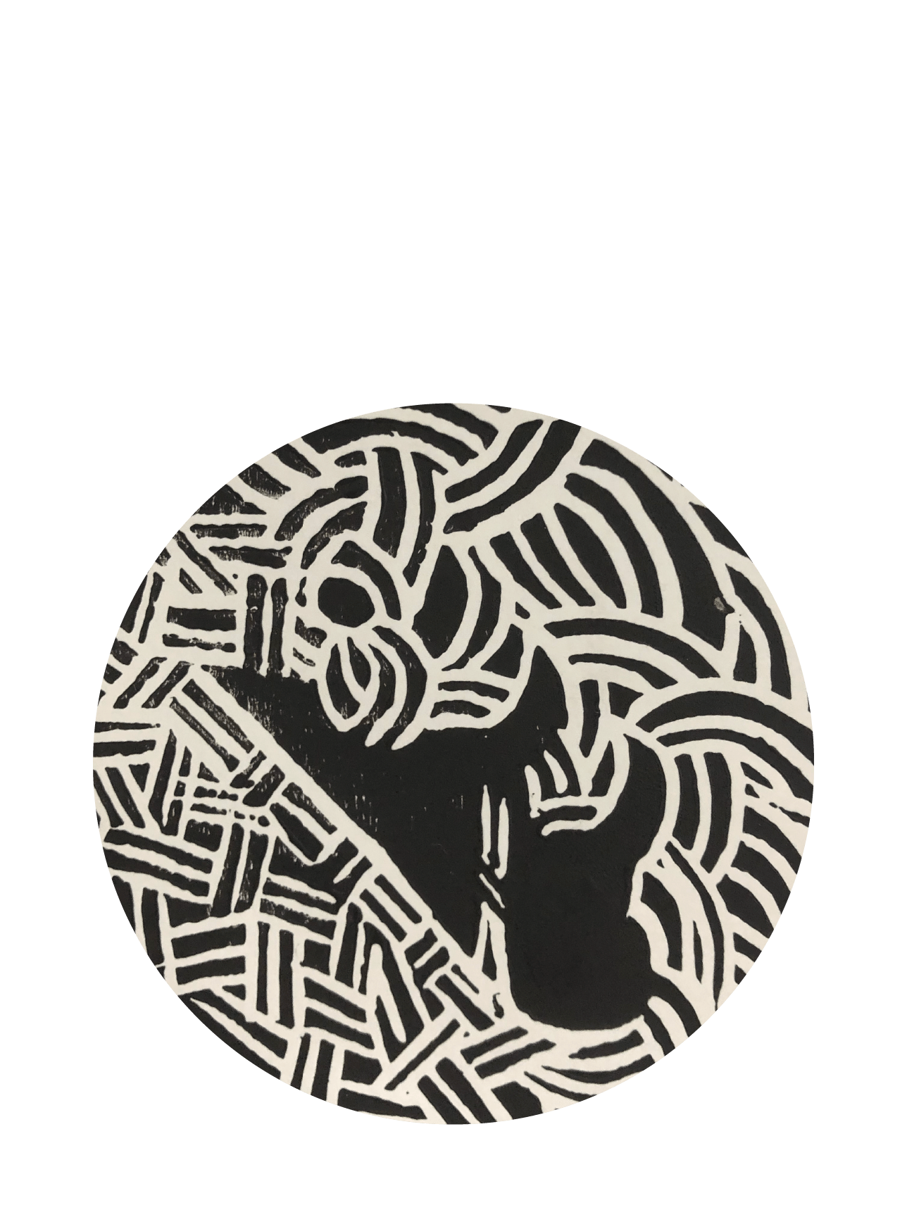
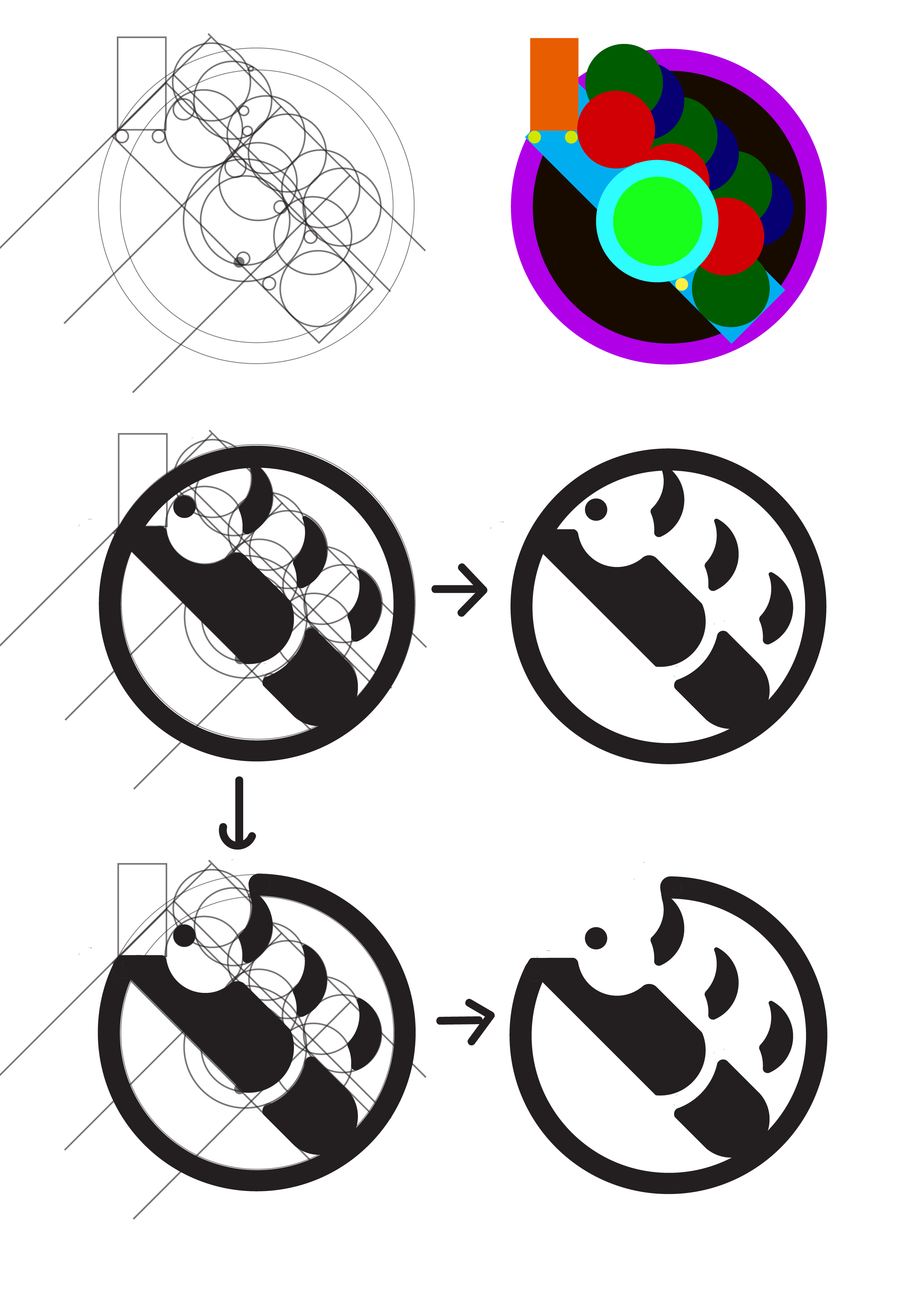
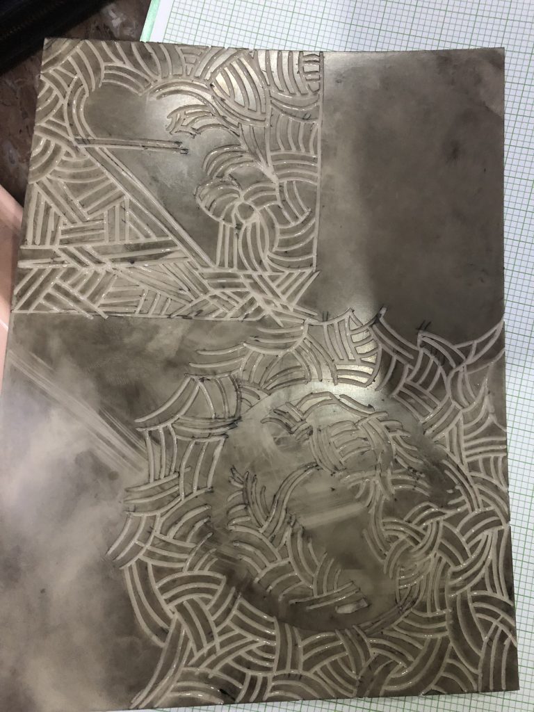
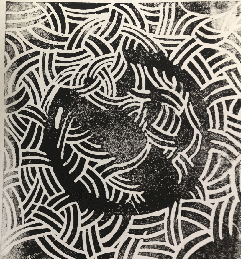
For the more squarish and geometric one, I use curved lines to frame the curvatures and straight lines to frame the straight areas and formed a sort of weaving pattern to bring out the shapes.
For the circular mark, I used curves to frame the the shapes and I find the weaving pattern very interesting as it kind of exemplifies the chaos yet order (which was one of the keywords I wanted to play with) of the science that Jekyll was experimenting with and that was aligned with Quantam Entanglement.
These are the printing process:
.
I’ll experiment more with linocutting in the week to come!
After consultation, Ina mentioned that I should use reference color scheme for the colors that I used to differentiate the various shapes to use the pathfinder tool on.
These are the pictures that I referenced:
And I applied the referenced colors to the shapes here.
And for this too.
After using the pathfinder tool, I got these:
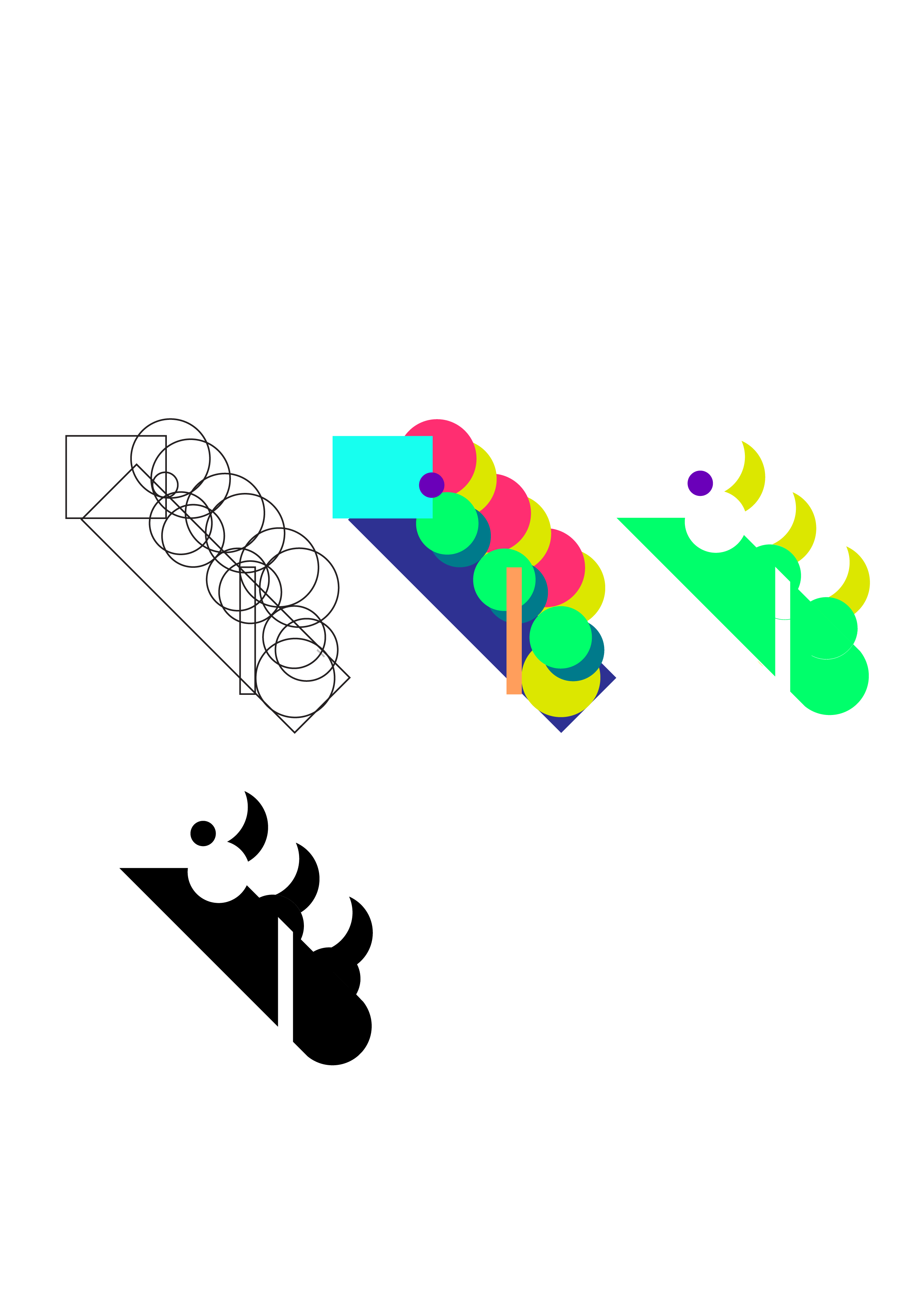
And started to do more linocutting. I decided to practice some basics first so to do some mark making first:
then I carved out the mark that I wanted which from the previous consultations, Ina mentioned that I should work on mark 2. I also felt that mark 2’s curves + straight edges gave me more to play with and I can explore the co-existence and harmony of both weaved curves and weaved straight lines that plays to the idea of two opposing things coming together (reinforces Quantam Entanglement/ Jekyll and Hyde).
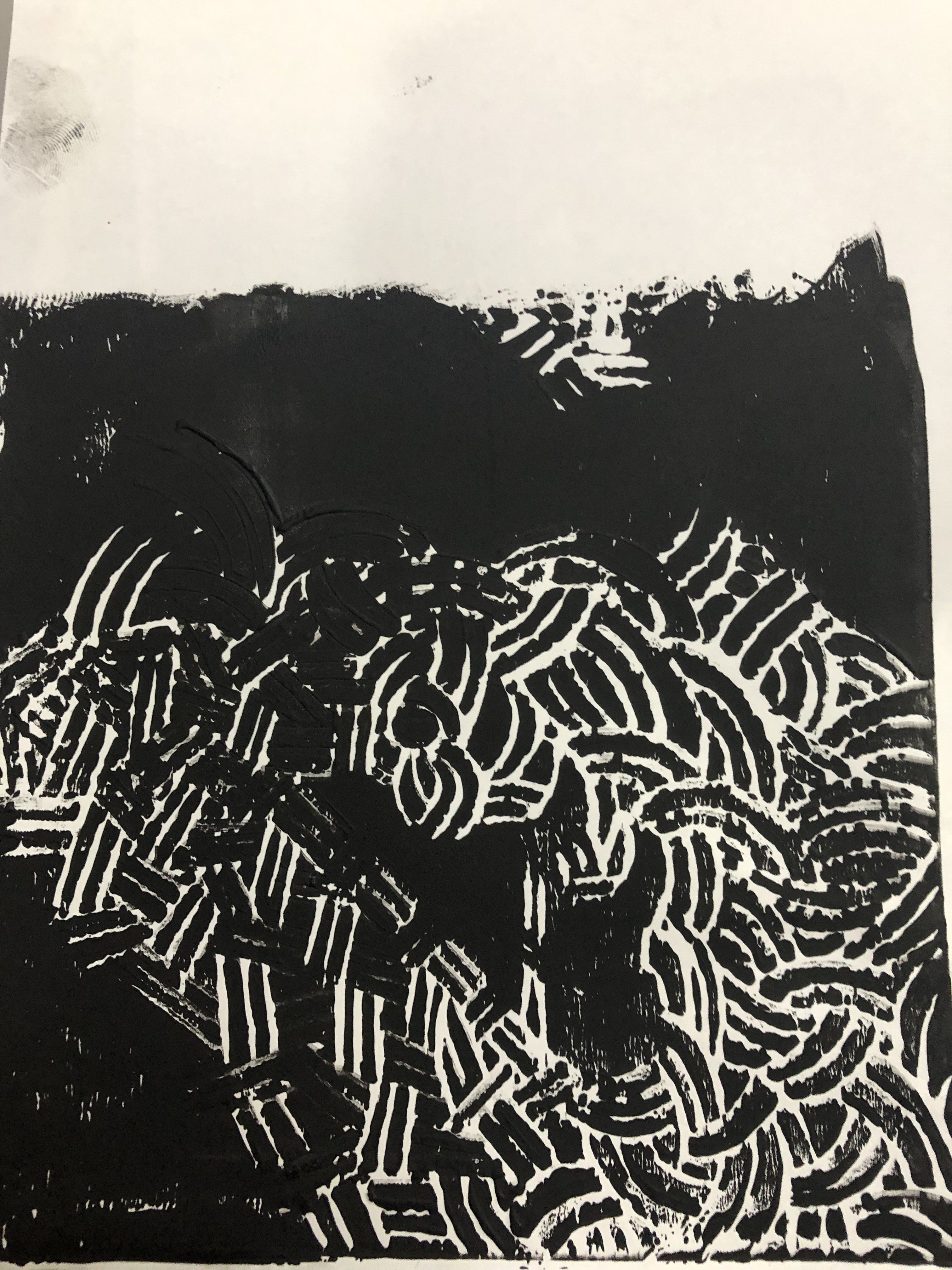
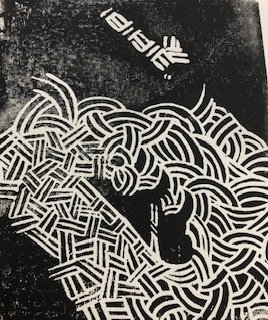
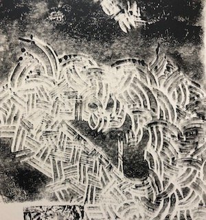
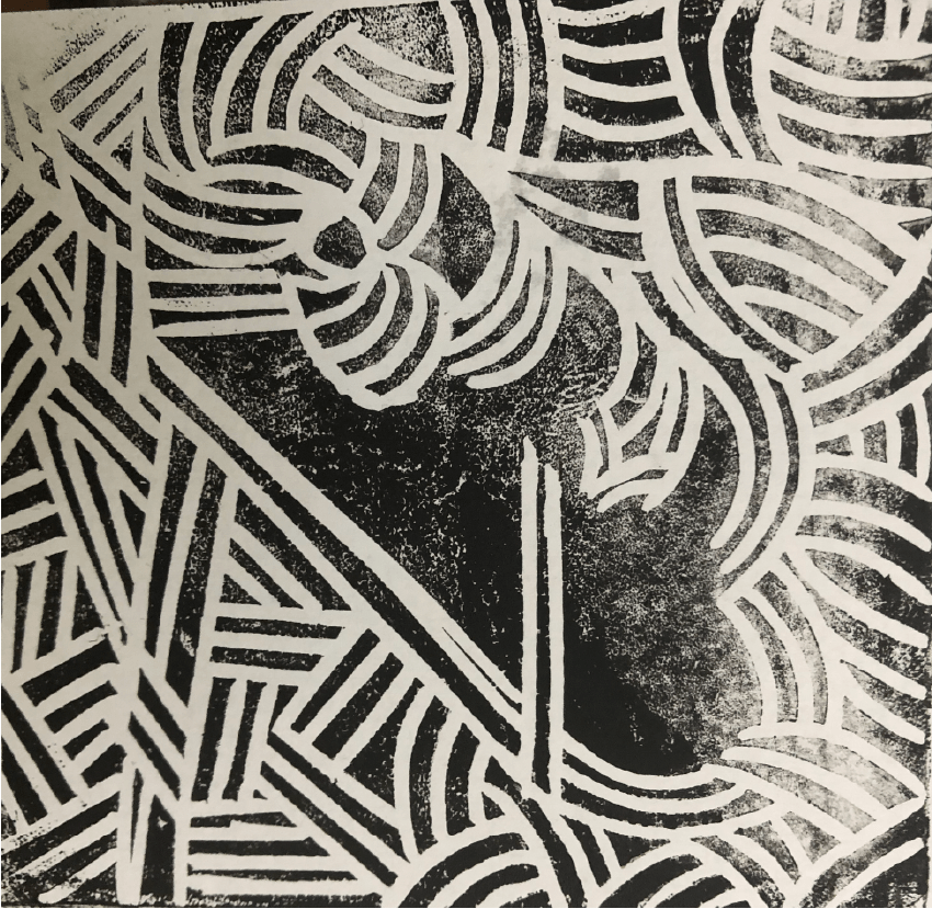
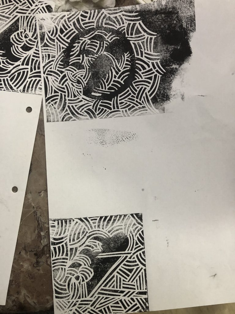
And after some printing errors (where the ink is either too clumpy or too faded):
This was the final one that worked well :))
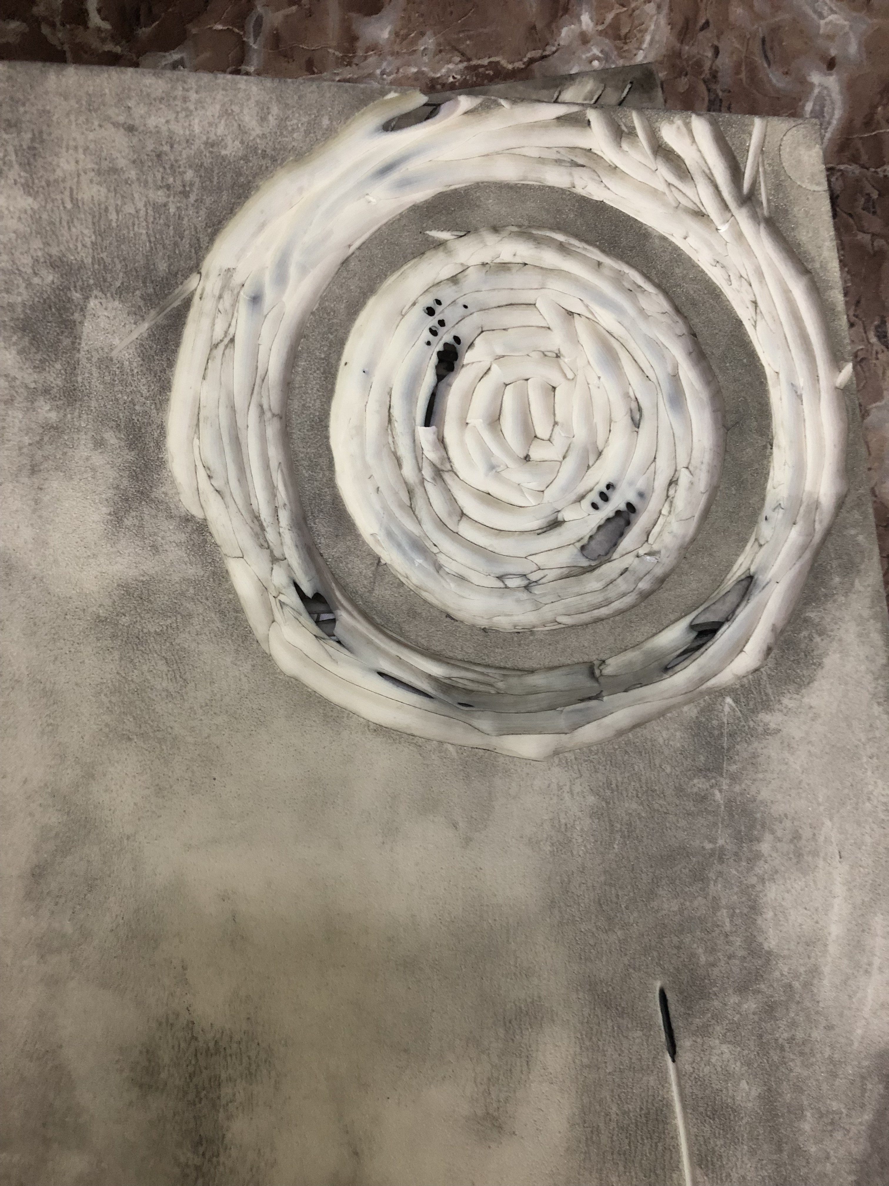
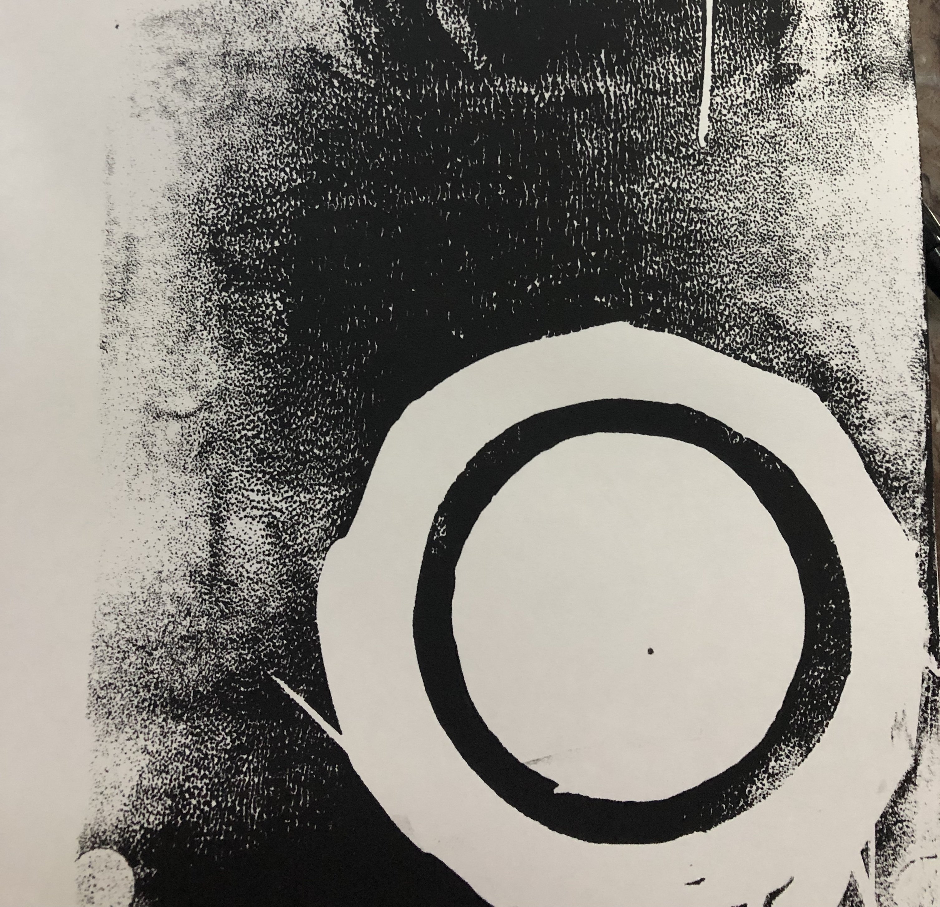
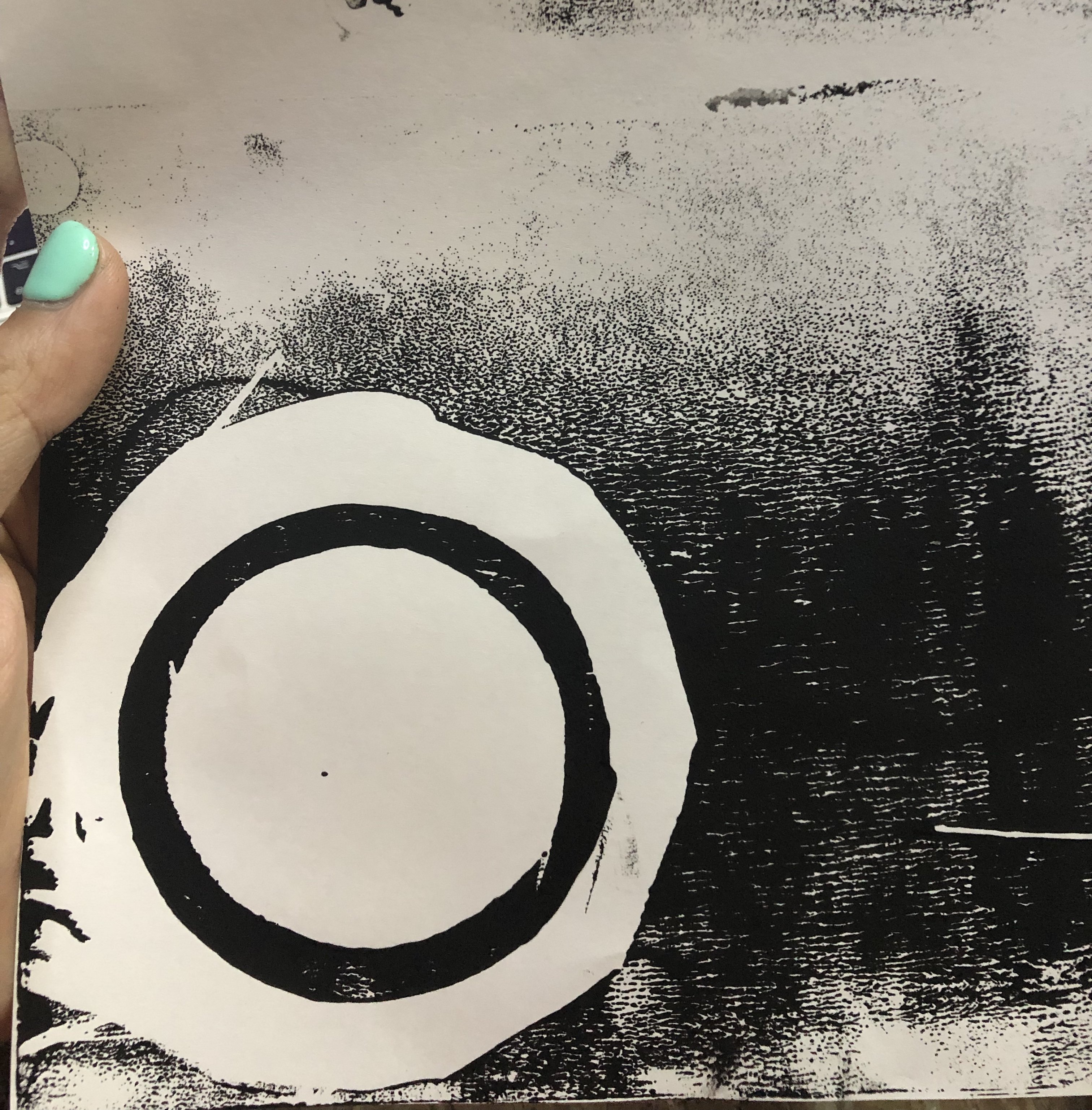
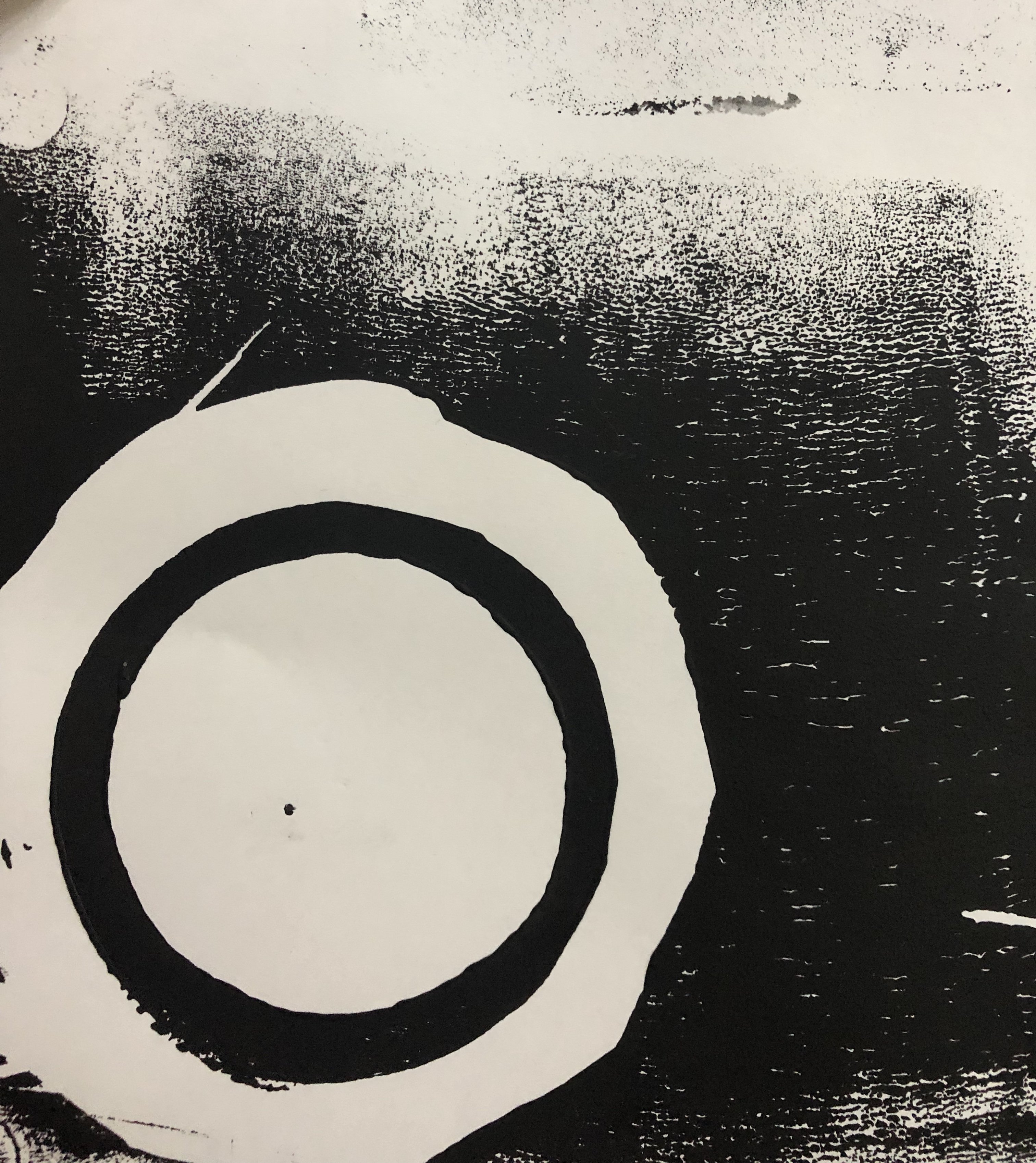
After consultation, Ina also mentioned for me to frame the design within a circle. Initially, she suggested doing so through digitisation but I decided that I wanted to keep it raw so I decided to linocut a circular frame first then digitise the two marks together.
Here’s the circular frame carving!
Here are the marks it produced and I chose the last one as it is the darkest and most complete circle!
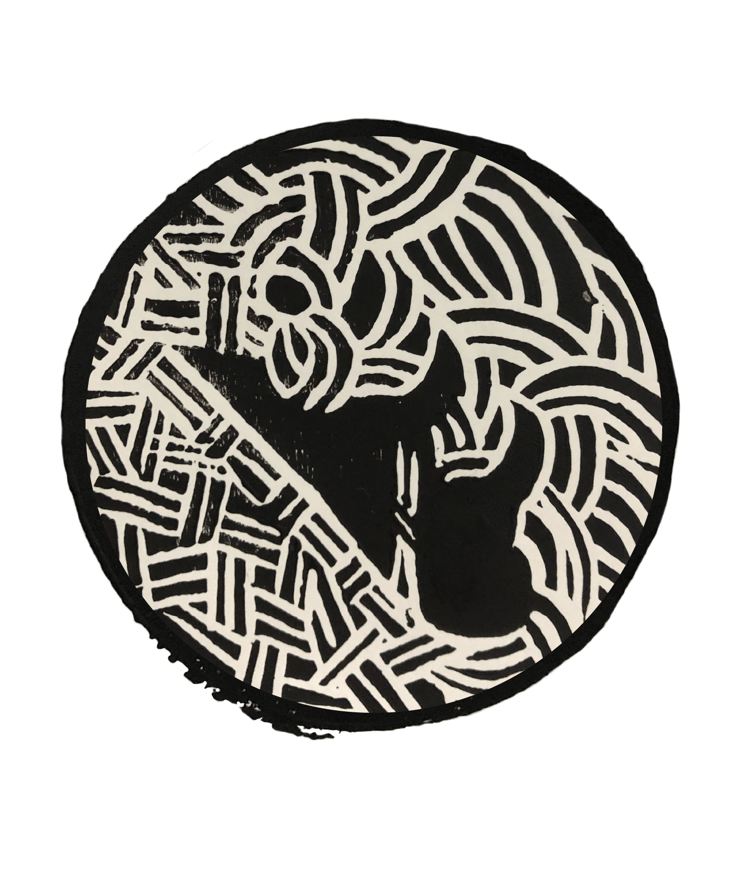
I first put a clipping mask on the mark with the test tube to frame it with a circle.
Then mask out the circular mark from the image of it.
Then combine the both and used clone tool to clean it up so that the edges don’t look too abrupt or clean (to keep the rawness of the linocut)
And I also cleaned up the blotches as the bottom left to get the final mark!
From this project, I realised that by drawing parallels between science with literature, I also found the differences between the both. While in quantam entanglement, when one particle spins in a clockwise direction, the other is sure to spin in an anti-clockwise direction, it is not so clear in the example of Jekyll and Hyde. Yes, Hyde is evil and Jekyll is good and hence the parallel but the novel also raises questions as to whether Hyde is completely bad and if Jekyll is completely good and so this poses a difference between science and literature. While the quantam entanglement theory has been widely debated, it is mostly proven true and the theory itself, though doubted, has very little room for differing perceptions and versions of it. Meanwhile in literature, it is up to the reader’s perception of the story to come to a conclusion if Hyde or Jekyll is completely good or bad (in other words, the direction in which these two particles spin and the conclusion can be entirely ambiguous in which Jekyll and Hyde both spin in both directions).
Hence, this exploration makes me conclude that as much as science is definitive and literature is open-ended (the opposite), they are both ways in which Man explores the world and neither is above the other. Also, perhaps the juxtaposition of science vs. literature also runs in parallel with quantam entanglement in which these two very differing subjects are interdependent on one another. The world cannot be entirely explored in definitive lenses, all would be too rigid and much beauty would be lost. It can also not be explored in entirely flexible viewpoints as we need some facts to ground us. The rigidity of science is enhanced by the open endedness of literature and vice versa hence this exploration, when thought further is really an extrapolation of Quantam Entanglement to the broader subjects of science and literature.
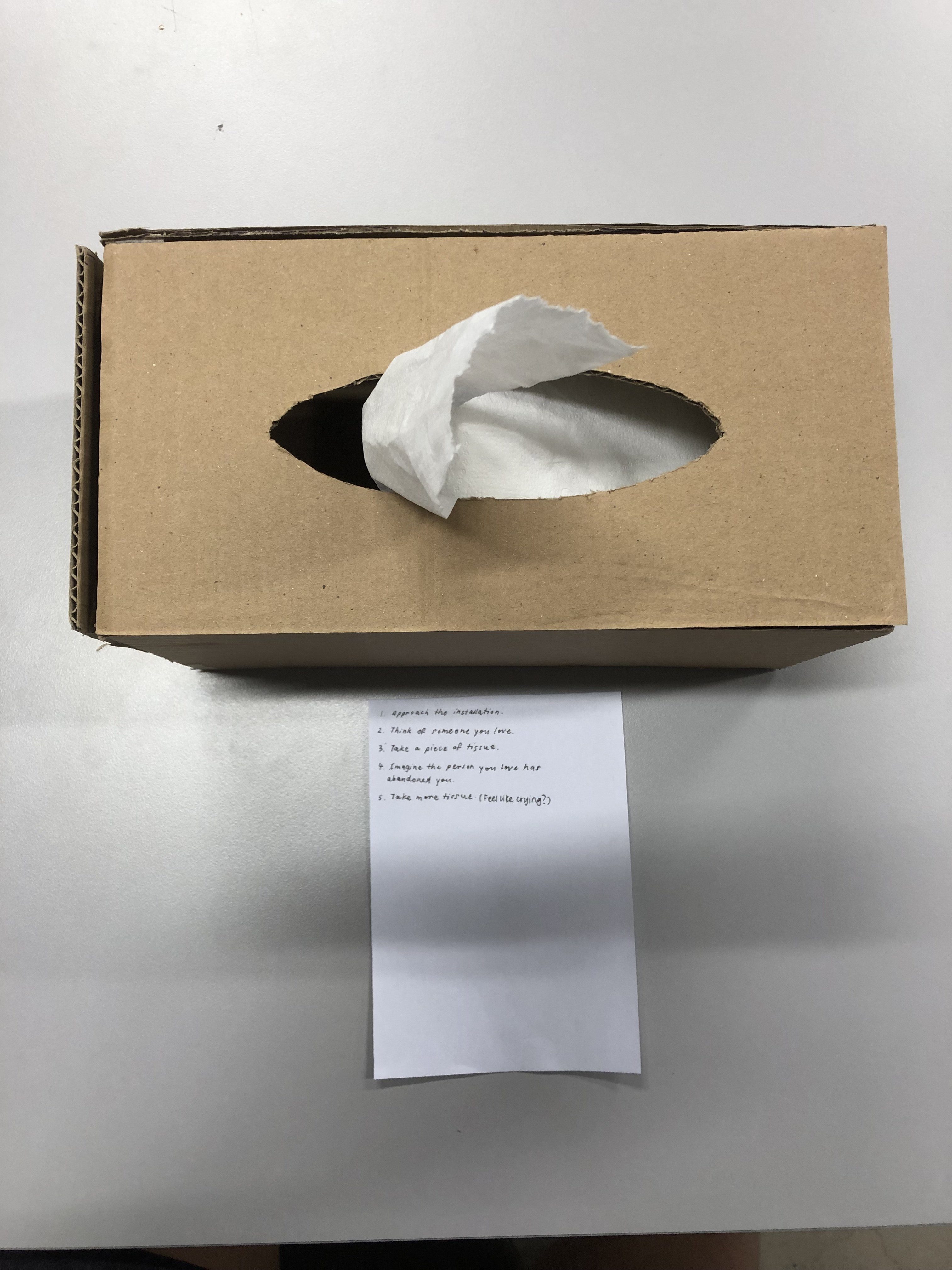
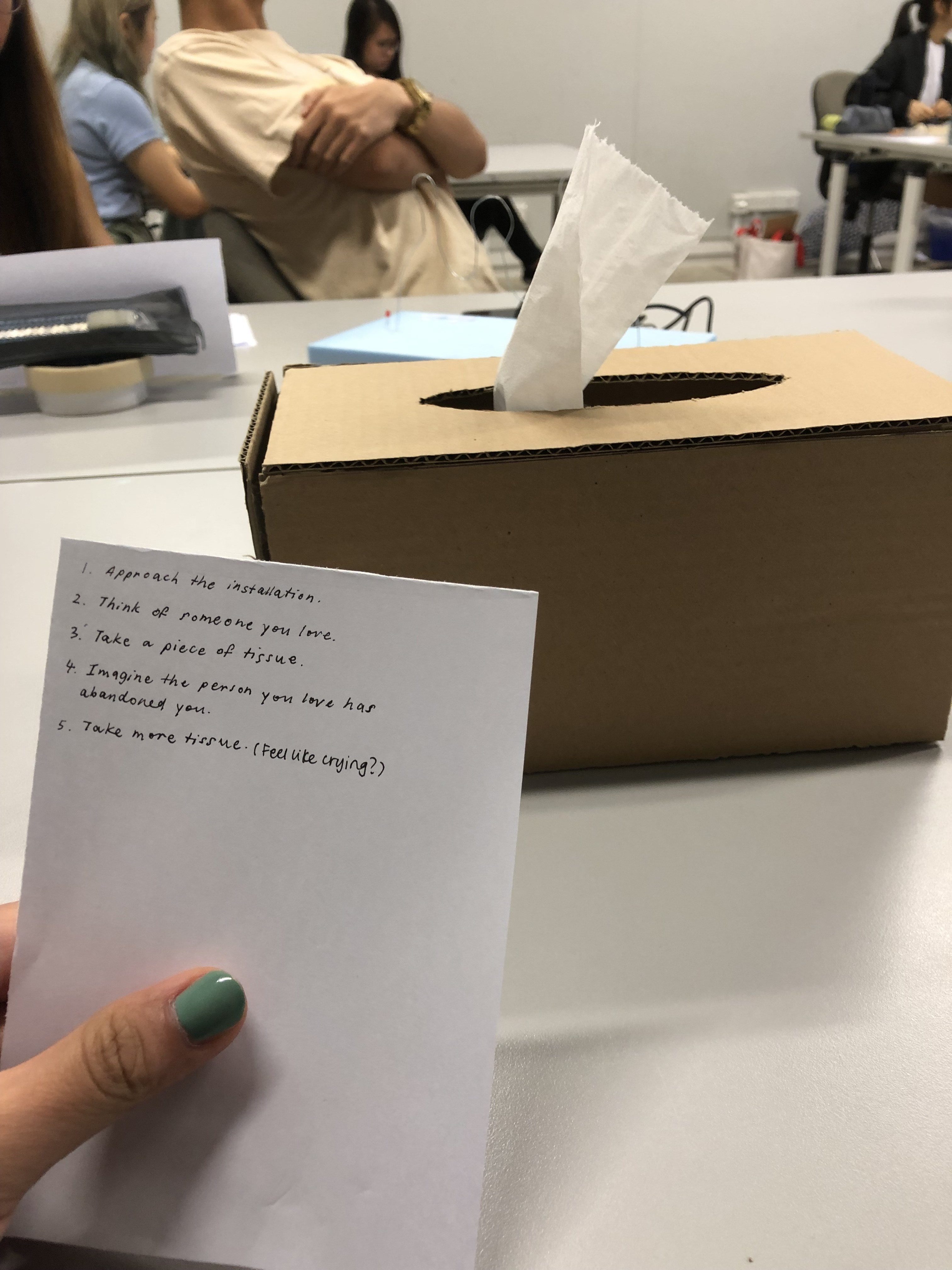
QW: We learnt that setting the context up for our object is very important. If we do not have an isolated set-up/scenario that leads our audience into a gloomy mood, they may take the object as a laughing matter and pull out the tissues just to see how the mechanical voice sounds and what it will say. Hence, we need to give the audience more time and space to get into the right frame of mind so that they can treat our object seriously.
ZK: Before Body Storming, I thought that our object was pretty straightforward in terms of concept and interactivity, but afterwards, I realised that we needed to provide context / curate the environment around our object in order for people to truly understand and empathise with it. On the other hand, some people may not be able to empathise with our work because they have not lost someone.
What surprised you while going through the process?
QW: Even though our tester pulled out more tissues subsequently to see what the box will say, we were surprised that there was the desire to hear more and if we set up a right context, we believe that we can get the audience to pull out the tissues not because they just wanted to tease the box but because they really desired comfort.
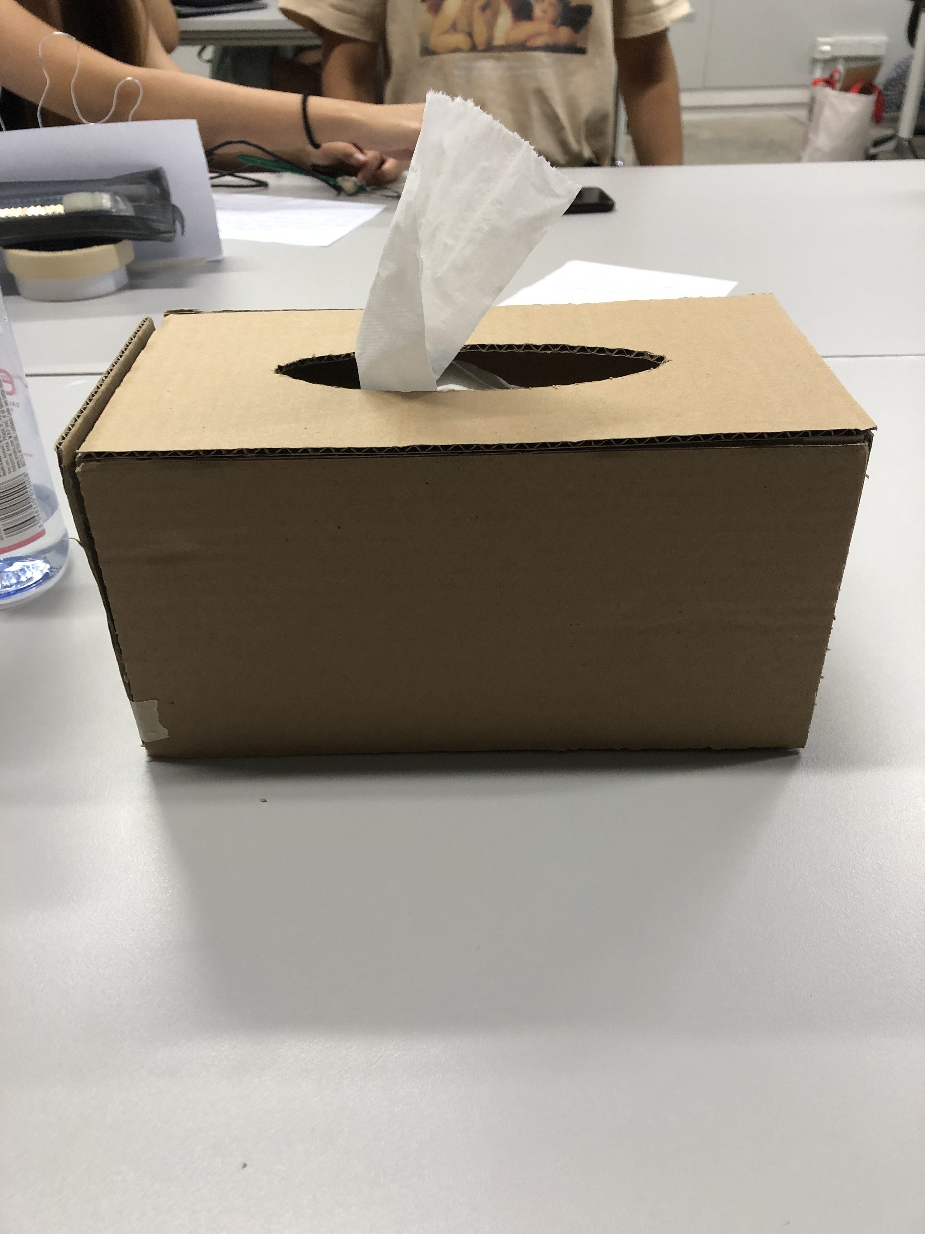
We also realised that since a tissue will replace another tissue when one is being pulled out, we cannot use an IR sensor (which we were planning to) since a tissue will always interrupt the laser and cause it to constantly trigger the sound.
Because we didn’t have actual tissues for the session, we used toilet paper and that made the object easier to be taken as a comical one so we now know to be more careful about the materials used.
ZK: I was mostly surprised that the type of tissue used would affect how our tester perceived our work (Man Wei felt that toilet paper wasn’t sad at all and instead reminded her of the toilet).
How can your apply what you have discovered to the designing of your installation?
QW: We plan to set up a context and isolate the audience using a tent and with a more cosy setting (blanket, pillow etc.) so as to give them time to explore their own emotions and interact with our object in a right frame of mind.
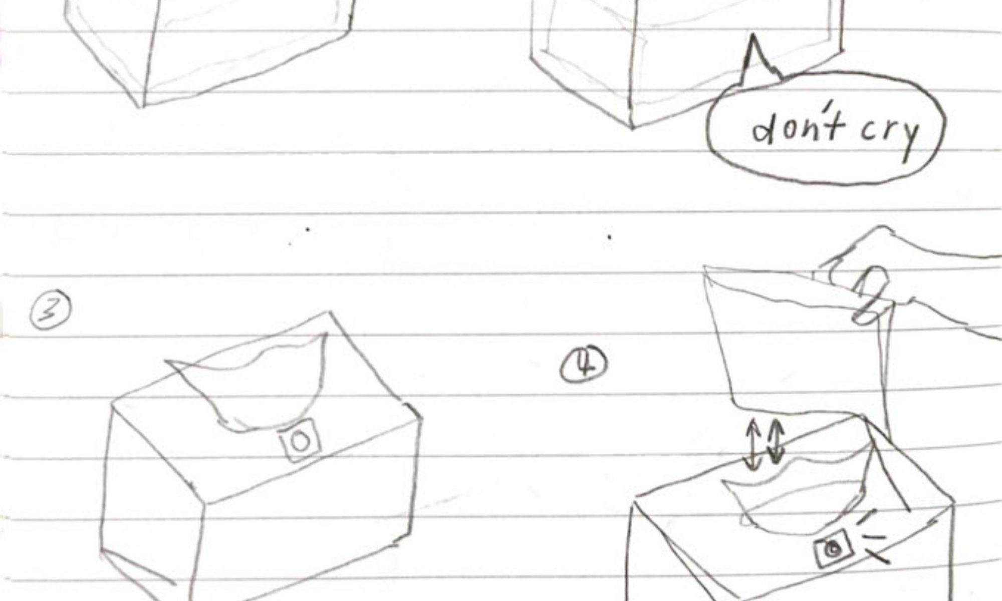
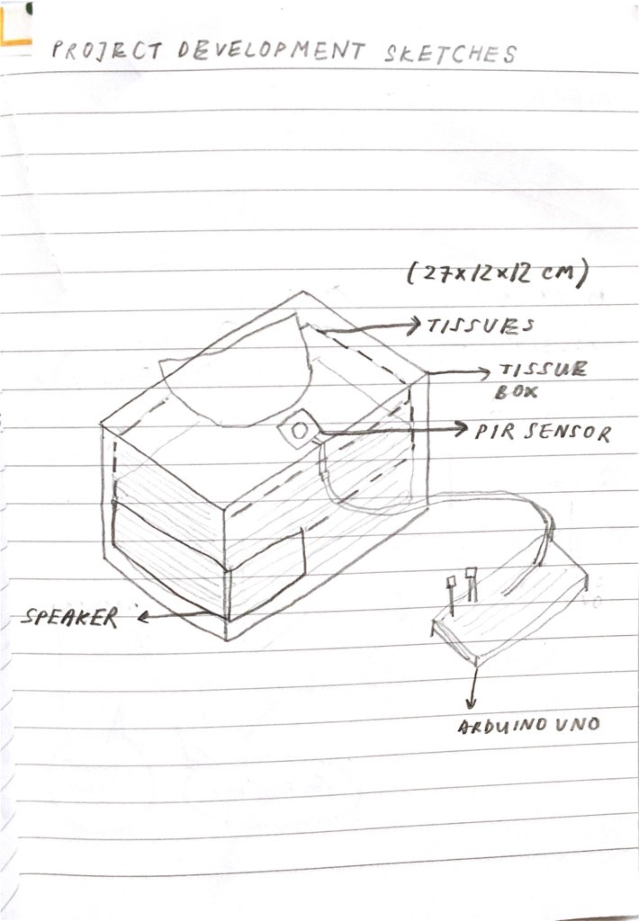
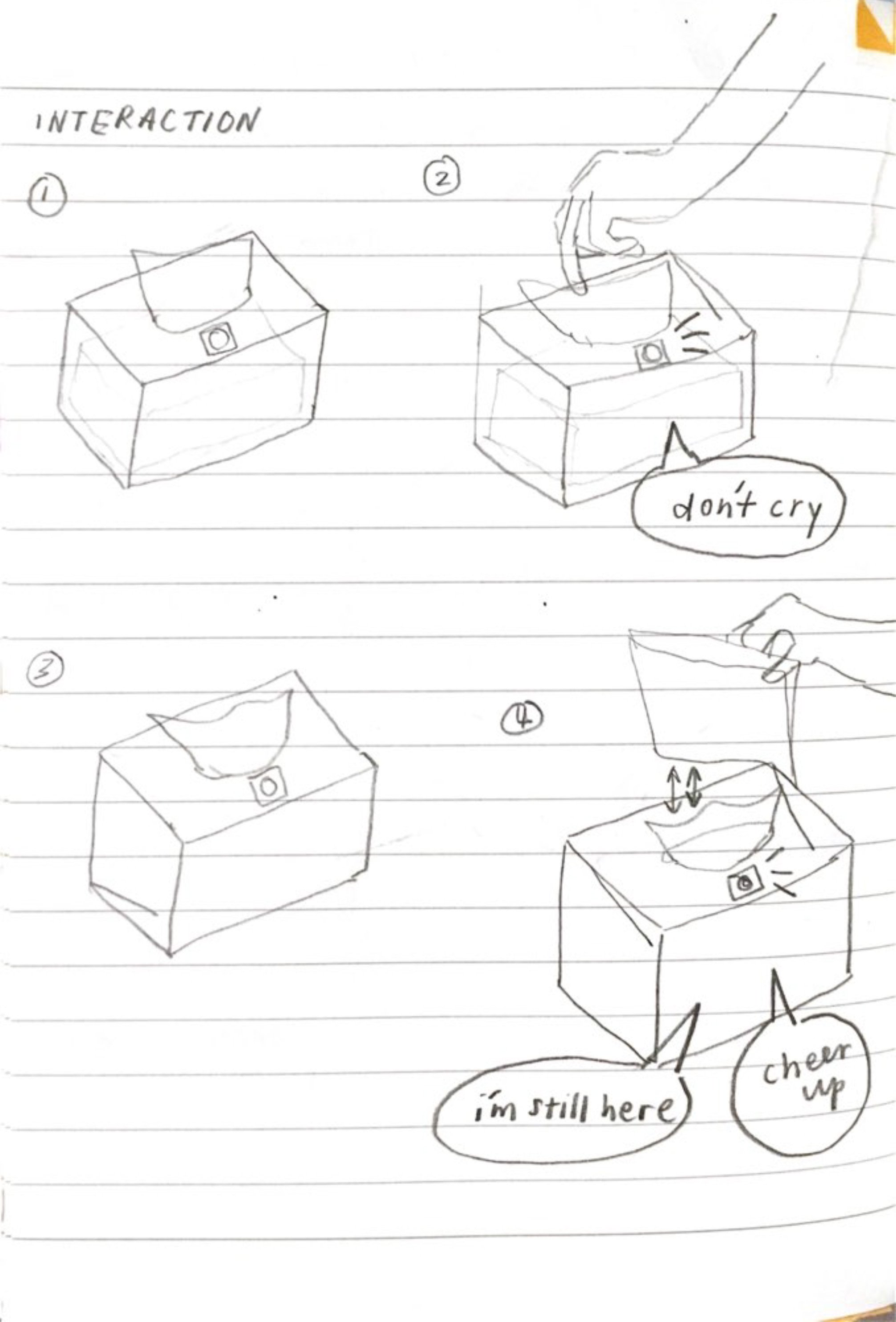
We plan to use a photocell that pops out from the opening instead to trigger the sound so that every time a person reaches for the tissue, the recording plays.
ZK: If possible, the tent would mimic a bedroom, or at least an incredibly intimate space, as that is where most people cry / use tissues! We could also play soft, low frequency music that’s kinda like those you hear in art galleries / installations. Personally, I feel that that kind of sound helps to immerse me if the installation is supposed to be a reflective / meditative experience.
We will also dress up the tissue box, and maybe use fancy tissue paper (heavier gsm, patterned) to add to the whole experience.
Let’s take the audience as the person who has been abandoned. With every tissue that the audience pulls out from the tissue box (our object), a different sound recording plays. The sound recordings are not words of loath or despise but of comfort instead.
Is it for a single person to engage with your project or for multiple participants concurrently?
It is for a single person to engage with at a time.
What is the interaction or situation you are creating for your audience?
Our audience has just been abandoned by a loved one and requires/desires comfort to ease their sadness. Our object does so but in a mechanical voice reminding them of the loved one’s absence instead, hence facilitating feelings of emptiness and loneliness.
What is the intention of this interaction?
After being abandoned, one may possibly shut oneself out and the words of comfort from friends and family may fall on deaf ears. A tissue box represents the audience’s desire for comfort/need to be comforted as crying is a sign of struggle and crying aloud can be taken as a call for help. The mechanical voice—meant to substitute that of the loved one—and the recordings remind the audience that the comfort they desire from the loved cannot be attained for he/her has left. The lack of tone and human presence in the voice emphasises this, hence forcing them to face harsh reality of the loved one’s absence. We hope this also encourages/reminds them to seek/accept comfort from the friends and family around them instead and to cherish the presence of present companions instead of lingering over a lost love.
Uncomfortable Interactions are interactions that cause physical or mental distress to those involved. Pain is often associated with agony and according to Freud, humans tend to make decisions with “avoidance of ‘pain’ or production of pleasure”[1] This suggests that suffering is unfavourable and so uncomfortable interactions are to be frowned upon. However, uncomfortable interactions, when “usefully designed into cultural experiences”[2]can be greatly beneficial.
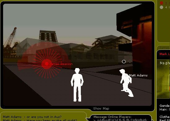
‘Uncle Roy All Around You’ is a gaming experience involving both online and street players. Street players are equipped with handheld communication devices and online players guide street players via audio or text to find Uncle Roy. At the end of the game, they are asked if they are willing to agree to help a stranger in any personal trouble during whenever for the next one year.
In ‘Uncle Roy All Around You,’ two ways of engineering discomfort are as Benford, Greenhalgh, Giannachi, Walker, Marshall, and Rodden suggested: ‘establish(ing) intimacy with strangers’[4] and ‘surrender(ing) control to other people’[5].
A survey reports the likelihood of a person choosing to not talk to a stranger being much higher than one choosing to avoid talking to a friend[6]. This suggests that interactions involving engagements with strangers will result in discomfort. This discomfort, as concluded by Schroeder and Epley, stems from misguided assumptions of strangers not wanting to connect back and solitude providing a better experience when experimental results prove otherwise[7]. This game then encourages one to reconsider our natural avoidance of engaging with strangers (Is it justifiable?) and to confront with misconceptions on communication with stramgers. This uncomfortable interaction then is ‘a way of promoting certain other benefits, values or worth’[8].
Another way that the game introduces discomfort is depriving the player of control. The game has been termed ‘theatrical’[9] and theatre causes discomfort when it involves ‘surrendering control to the performers’[10]. In the game, players are under the control of a primary performer, Uncle Roy who decides their next move. Online players have control over the street players they guide. This evokes a sense of vulnerability for street players and uneasiness for online players who take charge of the street players’ fate[11]. This discomfort in being controlled, especially through online tracking easily links to the idea of surveillance. Furthermore, ‘All Around You’ suggests an omnipotence paralleling ‘Big Brother’[12]. The game being transmedia and the presence of computers also sets up a parallel for surveillance today where technology provides authorities access to personal information[13]. Hence, this encourages the reflection of a theme pertinent to modern society and is beneficial to deciding the direction that our society moves towards (e.g. Will more or less surveillance benefit?).
In relation to ‘Uncle Roy All Around You’, uncomfortable interactions can create bonds between people (dispel mistrust between strangers) and open up conversations about topics that may otherwise not be so fervently discussed. Hence, when thoughtfully designed and using a medium most suitable and can best attain the intended goals of the designers, uncomfortable interactions can be powerfully beneficial.
[1] Sigmung Freud and C.J.M. Hubback, Beyond the Pleasure Principle (London: International Psycho-analytical Press, 1922), 1.
[2] Steve Benford et al., “Uncomfortable Interactions,” Proceedings of the 2012 ACM Annual Conference on Human Factors in Computing Systems – CHI 12, 2012, 1, doi:10.1145/2207676.2208347
[4] Steve Benford et al., “Uncomfortable Interactions,” Proceedings of the 2012 ACM Annual Conference on Human Factors in Computing Systems – CHI 12, 2012, 1, doi:10.1145/2207676.2208347
[5] Steve Benford et al., “Uncomfortable Interactions,” Proceedings of the 2012 ACM Annual Conference on Human Factors in Computing Systems – CHI 12, 2012, 1, doi:10.1145/2207676.2208347
[6] Nicolas Epley and Juliana Schroeder, “Mistakenly Seeking Solitude.” PsycEXTRA Dataset, 2014, 2, 14-16, doi: 10.1037/e578192014-009
[7] Nicolas Epley and Juliana Schroeder, “Mistakenly Seeking Solitude.” PsycEXTRA Dataset, 2014, 2, 14-16, doi: 10.1037/e578192014-009
[8] Steve Benford et al., “Uncomfortable Interactions,” Proceedings of the 2012 ACM Annual Conference on Human Factors in Computing Systems – CHI 12, 2012, 1, doi:10.1145/2207676.2208347
[9] Helen Freshwater and Lois Weaver, Theatre & Audience (Basingstoke: Palgrave Macmillan, 2009).
[10] Steve Benford et al., “Uncomfortable Interactions,” Proceedings of the 2012 ACM Annual Conference on Human Factors in Computing Systems – CHI 12, 2012, 1, doi:10.1145/2207676.2208347
[11] Steve Benford et al., “Uncomfortable Interactions,” Proceedings of the 2012 ACM Annual Conference on Human Factors in Computing Systems – CHI 12, 2012, 1, doi:10.1145/2207676.2208347
[12] George Orwell, Nineteen eighty-four (London: Secker and Warburg, 1949).
[13] Joseph Cannataci et al, Privacy, Free Expression and Transparency: Redefining Their New Boundaries in the Digital Age (France: United Nations Educational, Scientific and Cultural Organization, 2016), 19
Bilblography:
Benford, Steve, Chris Greenhalgh, Gabriella Giannachi, Brendan Walker, Joe Marshall, and Tom Rodden. “Uncomfortable Interactions.” Proceedings of the 2012 ACM Annual Conference on Human Factors in Computing Systems – CHI 12, 2012. doi:10.1145/2207676.2208347.
Blast Theory. “Uncle Roy All Around You”. Vimeo. Video File. October 21, 2009. https://vimeo.com/7182676
Cannataci, Joseph, Bo Zhao, Gemma Vives, Shara Monteleone, Bonnici Mifsud, Pia Jeanne and Evgeni Moyakine, Privacy, Free Expression and Transparency: Redefining Their New Boundaries in the Digital Age (France: United Nations Educational, Scientific and Cultural Organization, 2016).Epley, Nicholas, and Juliana Schroeder. “Mistakenly Seeking Solitude.” PsycEXTRA Dataset, 2014. doi:10.1037/e578192014-009.
Freud, Sigmund, and C. J. M. Hubback. Beyond the Pleasure Principle. London: International Psycho-analytical Press, 1922.
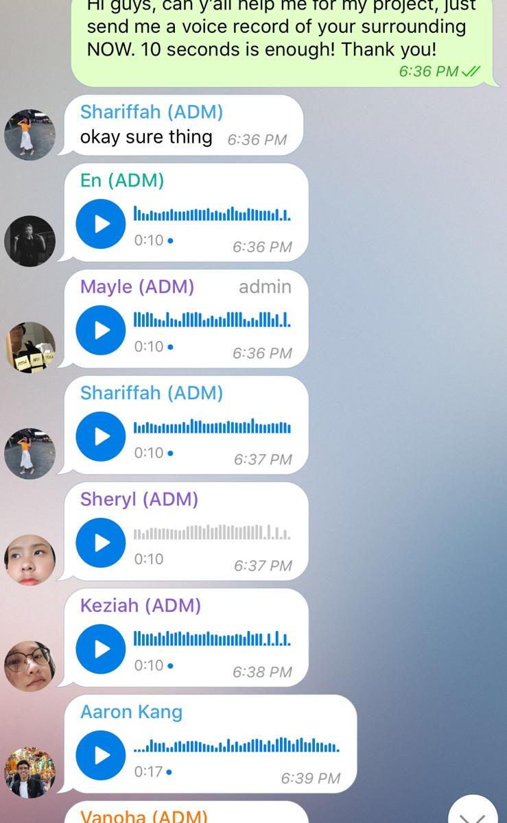
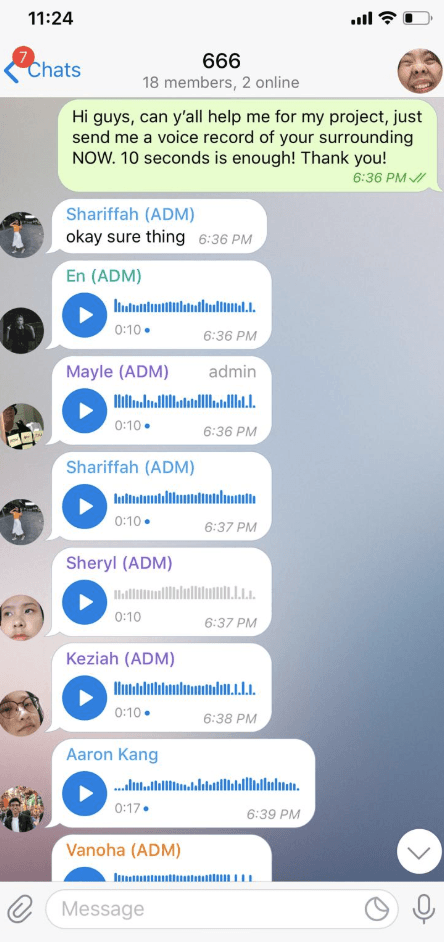
What is the content of the work and who is creating it?
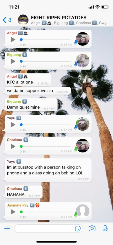
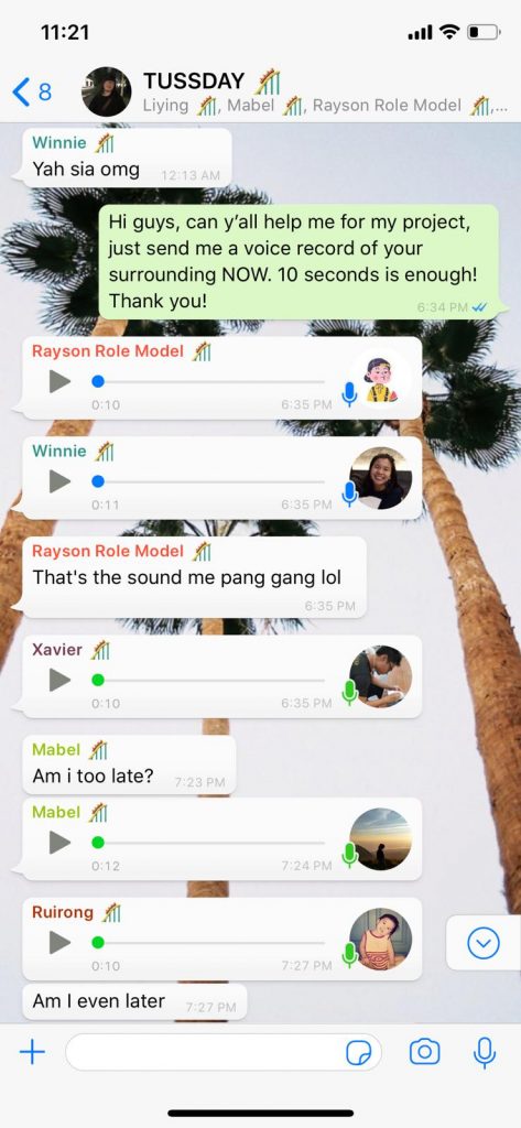
This piece is a soundscape (combined sounds) of the surroundings of Alvin’s friends wherever they are. We/He asked them for a 10 second recording of their surroundings no matter where they are and combined the sounds into a single audio piece.
Where does this work take place?
We asked for the sounds through the social media messaging app Whatsapp and as Alvin’s friends were scattered all over Singapore, we can say that the work took place across the island.
How does this work involve social interaction?
As Alvin had to ask for the sounds from his friends, he actually managed to reconnect with some of his friends whom he hasn’t spoken to in a long time and through the sounds, he’s able to be updated on their lives and know roughly what they are doing and how they are now.
As audiences who are strangers with these friends, we may not actively interact with them but through the sound piece, we can roughly deduce perhaps where they are and what they are doing and how are they as people, who they surround themselves with physically (e.g. that singing diva friend). It’s a glimpse into another’s life and in hearing sounds that we are familiar with, we bring in our own experiences to identify where they are, what kind of a person they are etc. (the sound of MRT doors closing=that person is waiting for or boarding a train) and this is a kind of interaction that may not be active or evident but which is as meaningful. I think that with social media, a lot of focus has been on the visuals, the photos and videos and not too much on sound which is just as important a medium for reconnection and connection.
How is your crowd-sourced project different from one that is created by a single artist/creator?
The aim of this project was to create a connection/reconnection between people (between Alvin and his friends or the audience and his friends). As a person can only be at a place at one time, this combined audio piece strings the experiences of people at different places doing different things together and allows the audience to experience a small piece of a stranger’s life.
Lei mentioned in class that the sound piece sounded like a single person’s story/life in a single person as there are MRT sounds and sounds of people singing and seems to tell the experience of one. I think that this is powerful in showing that a harmonious and cohesive work can be created by multiple artists. As MRT sounds, the sounds of friends singing etc. are sounds that we ourselves are familiar with, there’s a possibility of the audience reflecting on their own experiences upon hearing them. Hence, a sense of unity and connection would surface. A singular person can only be at a place at one time and at limited areas in a period of time. A singular person can only offer this many experiences and with the time limit given, perhaps only a few similar ones, but with multiple artists, we have diversity and as a an artwork on its own and with the audience coming in to experience, we can then achieve a sort of harmony because of and despite this diversity.
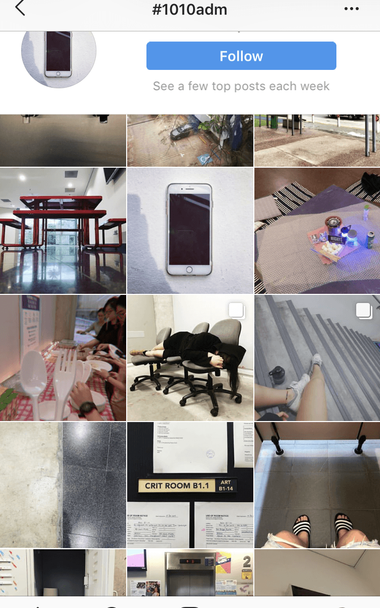
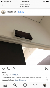
Why did you choose this space or object to photograph?
The picture above shows the entrance of the drawing room. I chose to photograph the drawing room as it reminded me of once when I snuck into it (oops I’m sorry) to film something, broke a glass bulb and reported it. When we went there, I found that the sign being not lit (indicating that a class is not going on) but the room being lit and the door being open (indicating the presence of somebody) reflected my experience with the drawing room. Hence, I chose this photo.
What are some of the characteristics of this alternative virtual space you had created collectively?
This alternative virtual space offers a glimpse at the minds/personality of others that we may not otherwise be able to see from one’s appearance or mere conversations. As we are all taking photos of a same place at a particular time, there is a sense of bonding and belonging when we see posts of things that are relatable or familiar. The comments and conversations that take place in this virtual space is then built upon our idea or experience of this physical space (e.g making a makeshift bed to sleep between lessons).
As not all experiences are narrated and the captions are more or less short or just a hashtag, there is space for interpretation (not just of the photos but a person’s traits can be inferred from the account name, tone of the comments, the likes etc. all reflects a certain personality). This leads also to space for misunderstanding and assumptions and reflects the distance between two persons in this virtual space. While in this space we can feel a certain sense of familiarity tying everybody together, there is also a sense of distance exemplified by the attempts to understand each other’s photos and experiences and the comments in an effort to reach out to another.
This virtual space is also sustained in real time as everybody posts and adds onto it in a same timeframe. The interactions happen across distances (e.g. one at the ADM BBQ, one in class etc.) yet is confined to the screens of our phones.
Under what circumstance will this alternative virtual space change?
I think that this virtual space itself is ever changing, ever transforming with every like and comment and photos posted.
However, if somebody completely unrelated to the class or ADM contributes to this virtual space, the sense of belonging tied to ADM that we’ve built up through the photos might be disrupted. If more joins in, this virtual space may shift and broaden from being a place of congregation for ADM Experimetal Interaction students to a virtual space for people in general.
How does this project relate to what we discussed in the lecture regarding co-creation, the concept of Do-It-Yourself (DIY), Do-It-With-Others (DIWO)?
This virtual space is built upon the memories of each student in the class who has had experienced life in ADM. The sense of belonging that is evoked would not be possible if it was an individual effort. While we view the artworks (every photo), we are also the artist (creators of photos), hence embodying the idea of doing it ourselves and doing it with others.
Instagram as a social media platform provides opportunities for people to share their lives and stories. It makes me wonder: when everybody does DIY, does it then become DIWO? When does something expand from DIY to DIWO? Sharing our lives in general would not have created this virtual space as this virtual space was created specifically by our memories and experiences regarding ADM and the spaces in it. I think that Do-It-With-Others requires some degree of similar experiences or interests between the artists/creators to bring them together to produce something cohesive and has a degree of completion.
This project is about liking/being obsessed with something unhealthy and this already sounds like it is heading towards a toxic love r/s narrative but hear me out first.
Artist statement:
I seldom touch on this topic as I am afraid that people may not be comfortable but I decided to go for it as I wanted to offer something personal. I used to hyperventilate a lot about three-five times a week and I still do but not as frequently. I get anxious very easily and I panic at the slightest trigger. I often say that I hate hyperventilation but sometimes I wonder if in a perverse way, I actually am grateful for it because there is a long moment after hyperventilation when you’re feeling so much that you are not feeling anymore and that is when I actually calm as I’ve never felt before. It’s numbness and sometimes I find myself searching for it and even craving it. Hence, I decided to explore the idea that something that is chaotic, crazy and hurtful, is actually dangerous not because it hurts you but because you may end up liking something that gives you so much pain.
I took videos of the strings myself, just overlapping them again and again to push the idea of being trapped, being buried, constrained, silenced etc. a sense of helplessness and repetition that I feel whenever I hyperventilate. I used red strings again as I often hyperventilate due to social/communication issues or when you put me in a place full of people and the red strings, as I’ve mentioned before, represents relationships in eastern mythologies hence I decided to reuse red. Also, I tried to convey pain by finding videos of blood and suffocation. However, I didn’t want a very gory piece of art. Instead, as I wanted to convey the idea of loving one’s chaos, I tried to find more aesthetic videos of blood and realised that a lot of TV series’ sequences have that (is this a thing). I used sequences from Dexter, Daredevil and Hannibal. I realise that they tend to use blood to form a face and I really find that image appropriate as it is like something that hurts you and makes you bleed has become a part of your identity, has taken over your features, has become your mask (in a way that is a panic attack to me as that moment of serenity defends and protects me from the noises of the world).
In every video that I took, there is something linked to suffering-breaking, suffocating, bleeding etc. I put in Harley Quinn as I felt that she perfectly embodied the idea of loving and cutting oneself on chaos which is the Joker to her. I feel that she is a person constantly in conflict as to protecting herself and indulging in her passions and I think she represents what I wanted to show hence I put in her with an expression change.
Technical Decisions:
There are a few ways I went about cutting the videos.
Firstly, I didn’t string all the videos together and left gaps in between as visually, it makes the video as a whole look more erratic and random and that gives a sense of chaos and disorder. It also gives a jump and shock as one views it. It is as though the video chokes in intervals and this is in tandem with the gasps for air (sound effect) at the back which I find gives a good sense of what a panic attack may feel like.
Secondly, I overlaid the videos of the strings with other sourced videos as visually, it is messy and it gives you more things to concentrate on and you probably cannot concentrate on only one of them and that is anxiety. When a panic attack is triggered, it is basically a million thoughts thrown at you.
I also wanted to portray the difference between physical pain and emotional pain. Blood can represent pain but it is mostly linked to physical pain and physical pain is no measure of one’s emotional pain. In the overlaid sequence, I overlay the videos with lesser strings below the video of blood seeping through a piece of bandage while I overlay the videos with more strings below the video of two drops of blood. There is a disparity here and it shows that one’s mental state should never be judged based on one’s physical condition. A part of my hyperventilation stems from playing softball and when I was at my fittest, my mental state was at my weakest. Hence, I decided to portray this by overlaying the videos.
Thirdly, I link the videos together with most obviously the color red as red can mean love or danger which suits my idea that you can love chaos and be hurt by it at the same time. And also, through common things like faces (1st and second clip), subject matter aka blood or strings (for the 30s vid around 20-23s) and directions/actions (e.g. for the 30s vid when the test tubes smashes and the hand from the next clip moves and for the 1 min vid when the blender with red juice cuts to the barrel overflowing with blood).
Fourthly, instead of starting with the layering of strings from the first to the last, I started in sort of before the middle (before it gets crazy). It shows like you’re being plunged into something, without choice, which is panic attack. But at the end, I showed the first string and not just the first string but the fact that it is being pulled across, that it started everything to imply that subconsciously, or no matter how hard I try to hide it, I can’t deny that there isn’t agency, that there isn’t control, that a part of me chose to go into an attack because perhaps, I craved it. I feel that this subverts the idea of hyperventilation/panic attacks as I often find myself also defending myself and saying ‘I can’t help it’ then reflecting and thinking ‘maybe I can’. In the one min vid, I also put the clip of the laying down of strings backwards to portray a “what should have been/what I would like to/I should want to get rid of my anxiety and hyperventilation” but it ends with the clip of the first string being laid across to subvert that assumption/portrayal.
For sound,
In addition to the voiceover, I recorded myself pretending to hyperventilate and I think that that makes for a good backing track in way as there are times when I gasp heavier and times when I’m about to relax and slow down my breathing and times when my breathing goes completely crazy which makes for a track that can give a climax that I put at the end.
If you listen close enough there is a steady short breath that is repeated throughout the entire vid and that kind of makes for the background ‘music’.
In a way, using my hyperventilate-ish breathing as a form of music implies that there is beauty in it and that it is not always noise (how perverse).
Color Editing:
The first thing I ensured was that the blood is of the same color as I took them from different sources that color graded their blood differently.
Blood from Daredevil has a more ‘matte’ look to it. That of Dexter is brighter and fresher and that of EXID’s MV Every Night is a little pinkish and bright too. The strings I had taken were very bright and not a dark intense red.
I decided that I want a more intense and darker red hence I color corrected them with color balance, brightness and contrast and a little bit of tint.
BeforeAfterBeforeAfterBeforeAfterBefore
After
I decided that I want a more intense and darker red hence I color corrected them with color balance, brightness and contrast and a little bit of tint.
I at first thought of using a very red scheme but I remembered my first project where the reds clashes and decided to go with green and red. Green typically is used in horror movies to convey fear but it can convey health too and red for danger but also red for love/passion. I think the duality and conflict in what they represent suits the idea. Also, red is typically used in traffic lights for ‘stop’, as a warning while green is for ‘go’ and that coincides with my views towards my condition (wanting it to never happen again and wanting it to happen again).
BeforeAfterBeforeAfter
I went for a paler green as I wanted to contrast between an intense red and a less intense green to make the red pop and also because one constantly dominating color gives off a sense of helplessness towards the other color.
I also wanted red to appear in every clip for consistency and to show repetition/relentlessness hence I coloured the mist red and the hand somehow pinkish. I didn’t want to hand to be full on red or have a bright red look as this part is where there is realisation that one can love chaos and I wanted to tone down on the “danger danger” tone of red which is usually bright and intense but instead went for a softer shade of red that conveys affection and love. For the one min vid, I put in more contrast by putting the hand clip after a reversal clip of the first daredevil clip which is a face in darkness. Because that is the point when the voiceover claims that chaos can be loved so there should be a beat and a change of sorts.
I also wanted red to appear in every clip for consistency and to show repetition/relentlessness hence I coloured the mist red and the hand somehow pinkish.
BeforeAfterBeforeAfter
I didn’t want to hand to be full on red or have a bright red look as this part is where there is realisation that one can love chaos and I wanted to tone down on the “danger danger” tone of red which is usually bright and intense but instead went for a softer shade of red that conveys affection and love. For the one min vid, I put in more contrast by putting the hand clip after a reversal clip of the first daredevil clip which is a face in darkness. Because that is the point when the voiceover claims that chaos can be loved so there should be a beat and a change of sorts.
After that beat, there is more green than red as it is a point of realisation and mimics the initial reaction of denying and rejecting the idea that I may enjoy hyperventilating hence lesser red and the fear that it gives to have my mind so twisted and stuff.
Artists’ References:
When I thought about strings and researched on them, I came across a Japanese artist Chiharu Shiota who goes crazy with strings and comes up with installations of strings that overlaps one another and forms webs and webs of strings that look beautiful. Hence I decided to overlap strings together over and over again as she did because I find that there is some beauty in that just as I admired her works.
The next reference I came across while researching on editing is the opening sequence of ‘Seven’, a movie about a psychopaths killing people according to the seven deadly sins. The cutting of the sequence puts a lot of jumps in between the clips because of the credits but it gives a certain sense of shock, mysteriousness and darkness. It gives the sequence a very fast pace and rhythm. I tried to do that in mine and when I tried it for the overlaid clips of the strings, it makes the clip more intense and I feel that that was very appropriate as to convey hyperventilation in the beginning, I wanted something fast paced and quick to mimic short breaths. Also because the strings are filling up, putting in the black breaks gives it a certain sense of doom and anticipation as the background becomes more filled up.
I did overlaying after rewatching sherlock (yay) and seeing the title sequence that has a lot a lot of overlays. It gives a sense of confusion, of leads going somewhere and yet going nowhere at all. It’s a mess, it’s all jumbled up and I thought that that was perfect in conveying a hyperventilation. However, I didn’t want to cross dissolve or overlaying everything together as I favoured hyperventilation because of that calmness after it and so I wanted some order to my video. Hence, I used the strings and used to strings filling up the background to add tension and increasing mess.
When anxiety gets out of hand, panic attacks occur. During these attacks, you’ll find it hard to breathe. Your hands will become numb and your head will go dizzy. Every single bad thought haunts you and screams at you. You scream at yourself. You scream at people who tries to help you. You bite yourself, you hit yourself to distract yourself with pain.
And it ends.
You’ve hurt so much it no longer hurts. You’re numb. You can’t feel anything.
That is perhaps the most relaxing feeling ever.
A state of serenity you cannot possibly get from doing anything else.
And sick as it may sound, perhaps you crave it. You’ve come to terms with it, you’re used to it. You may even enjoy it. Instead of slaying your demons, you choose to dance with them.
Transcript:
Do I hate it?
Monsters in my head, short breaths, cold sweat and warm tears.
It hurts.
But I’ve reached a point when the demons have become my friends and the voices all sound the same.
Perhaps chaos is dangerous, not because it hurts you, but because you may fall for something that hurts you.

 Back: (Blue lines are where the invite is folded)
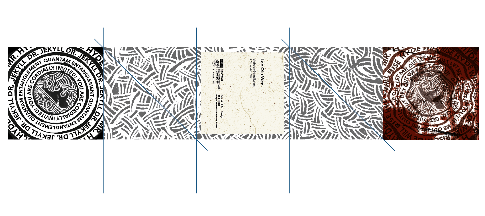


 .
. 
 .
.