0
original
remake

Just another Open Source Studio site
0
original
remake
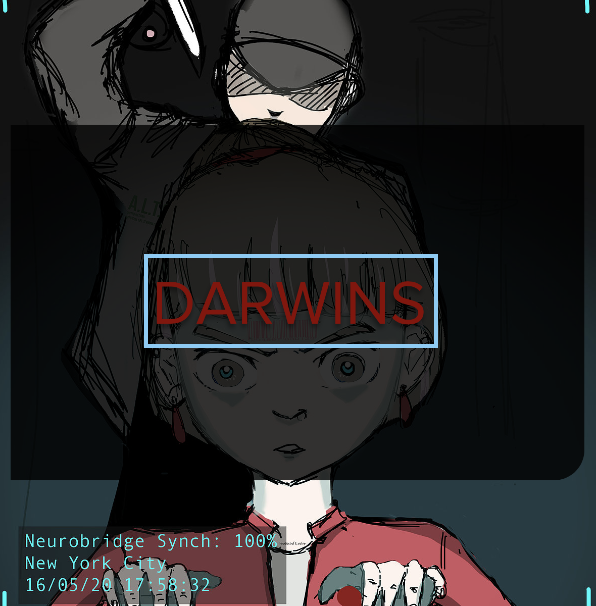
Visual Storytelling Project 2: Darwins
https://qiuwen-98.wixsite.com/mysite
In this project, I wanted to explore and make the player a character in the game and following prof’s suggestion, I made the player/character able to navigate everywhere in a split second by making him a part of every electronics. The plot’s at first just a cat and mouse game between robots who have converted and robots who have not. However, I decided to give it a more meaningful conflict and explore the tension between humans and robots-what makes the two different and if one race is actually superior than the other.
With discrimination and prejudice that has happened in history and is still occurring till now and into the future, I decided to pit robots against humans. Instead of standing in the POV of a human, I decided to do so in the POV of the “alien” race and discover that they may have more “humanity” than humans do because rebellions are messy and people are mostly ironic in rebellions, often not noticing that they have embodied the ideals they fight against.
I think it would be interesting to stand in the point of view of a robot who detests humans because they act upon their biases almost too quickly and adamantly and wants to wipe out the robot race because of one incident. In order to protect his race as humans have attacked simultaneously, he decided to reduce himself into codes and become a part of every electronic device so that he may be clairvoyant and able to send warnings to his kind. Although by doing so, he is reducing himself to his most basic component–codes, rendering himself into nothing but a piece of science/technology, he justifies that his intention of doing so to protect his kind has reaffirmed that he is more humane than the prejudiced humans who are after him.
What baffles me is if I needed a reason for the player to not know that he/she is the character but I realised that as many other games are, the player is often “plunged” into a character/the character is “possessed” by the player and there still requires some distinction between player and character as the player is also exploring the character as the player plays. Hence, there need not be a reason for it is often inferred/implicit but does not take away the enjoyment of the game and it makes it more fun too for the player to know that he/she is exploring a character that he/she is playing.

Videos:
30s ^
1 min ^
Pls bear with me, I’m super long winded :<
This project is about liking/being obsessed with something unhealthy and this already sounds like it is heading towards a toxic love r/s narrative but hear me out first.
Artist statement:
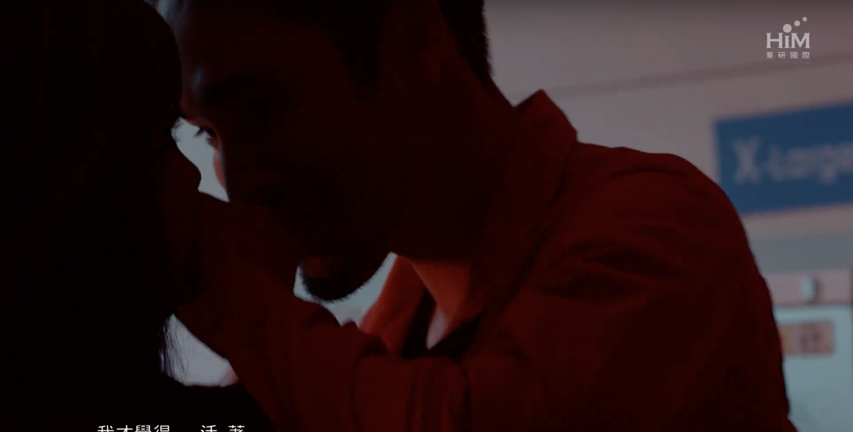
I seldom touch on this topic as I am afraid that people may not be comfortable but I decided to go for it as I wanted to offer something personal. I used to hyperventilate a lot about three-five times a week and I still do but not as frequently. I get anxious very easily and I panic at the slightest trigger. I often say that I hate hyperventilation but sometimes I wonder if in a perverse way, I actually am grateful for it because there is a long moment after hyperventilation when you’re feeling so much that you are not feeling anymore and that is when I actually calm as I’ve never felt before. It’s numbness and sometimes I find myself searching for it and even craving it. Hence, I decided to explore the idea that something that is chaotic, crazy and hurtful, is actually dangerous not because it hurts you but because you may end up liking something that gives you so much pain.
I took videos of the strings myself, just overlapping them again and again to push the idea of being trapped, being buried, constrained, silenced etc. a sense of helplessness and repetition that I feel whenever I hyperventilate. I used red strings again as I often hyperventilate due to social/communication issues or when you put me in a place full of people and the red strings, as I’ve mentioned before, represents relationships in eastern mythologies hence I decided to reuse red. Also, I tried to convey pain by finding videos of blood and suffocation. However, I didn’t want a very gory piece of art. Instead, as I wanted to convey the idea of loving one’s chaos, I tried to find more aesthetic videos of blood and realised that a lot of TV series’ sequences have that (is this a thing). I used sequences from Dexter, Daredevil and Hannibal. I realise that they tend to use blood to form a face and I really find that image appropriate as it is like something that hurts you and makes you bleed has become a part of your identity, has taken over your features, has become your mask (in a way that is a panic attack to me as that moment of serenity defends and protects me from the noises of the world).
In every video that I took, there is something linked to suffering-breaking, suffocating, bleeding etc. I put in Harley Quinn as I felt that she perfectly embodied the idea of loving and cutting oneself on chaos which is the Joker to her. I feel that she is a person constantly in conflict as to protecting herself and indulging in her passions and I think she represents what I wanted to show hence I put in her with an expression change.
Technical Decisions:
There are a few ways I went about cutting the videos.
Firstly, I didn’t string all the videos together and left gaps in between as visually, it makes the video as a whole look more erratic and random and that gives a sense of chaos and disorder. It also gives a jump and shock as one views it. It is as though the video chokes in intervals and this is in tandem with the gasps for air (sound effect) at the back which I find gives a good sense of what a panic attack may feel like.
Secondly, I overlaid the videos of the strings with other sourced videos as visually, it is messy and it gives you more things to concentrate on and you probably cannot concentrate on only one of them and that is anxiety. When a panic attack is triggered, it is basically a million thoughts thrown at you.
I also wanted to portray the difference between physical pain and emotional pain. Blood can represent pain but it is mostly linked to physical pain and physical pain is no measure of one’s emotional pain. In the overlaid sequence, I overlay the videos with lesser strings below the video of blood seeping through a piece of bandage while I overlay the videos with more strings below the video of two drops of blood. There is a disparity here and it shows that one’s mental state should never be judged based on one’s physical condition. A part of my hyperventilation stems from playing softball and when I was at my fittest, my mental state was at my weakest. Hence, I decided to portray this by overlaying the videos.
Thirdly, I link the videos together with most obviously the color red as red can mean love or danger which suits my idea that you can love chaos and be hurt by it at the same time. And also, through common things like faces (1st and second clip), subject matter aka blood or strings (for the 30s vid around 20-23s) and directions/actions (e.g. for the 30s vid when the test tubes smashes and the hand from the next clip moves and for the 1 min vid when the blender with red juice cuts to the barrel overflowing with blood).
Fourthly, instead of starting with the layering of strings from the first to the last, I started in sort of before the middle (before it gets crazy). It shows like you’re being plunged into something, without choice, which is panic attack. But at the end, I showed the first string and not just the first string but the fact that it is being pulled across, that it started everything to imply that subconsciously, or no matter how hard I try to hide it, I can’t deny that there isn’t agency, that there isn’t control, that a part of me chose to go into an attack because perhaps, I craved it. I feel that this subverts the idea of hyperventilation/panic attacks as I often find myself also defending myself and saying ‘I can’t help it’ then reflecting and thinking ‘maybe I can’. In the one min vid, I also put the clip of the laying down of strings backwards to portray a “what should have been/what I would like to/I should want to get rid of my anxiety and hyperventilation” but it ends with the clip of the first string being laid across to subvert that assumption/portrayal.
For sound,
In addition to the voiceover, I recorded myself pretending to hyperventilate and I think that that makes for a good backing track in way as there are times when I gasp heavier and times when I’m about to relax and slow down my breathing and times when my breathing goes completely crazy which makes for a track that can give a climax that I put at the end.
If you listen close enough there is a steady short breath that is repeated throughout the entire vid and that kind of makes for the background ‘music’.
In a way, using my hyperventilate-ish breathing as a form of music implies that there is beauty in it and that it is not always noise (how perverse).
Color Editing:
The first thing I ensured was that the blood is of the same color as I took them from different sources that color graded their blood differently.


Blood from Daredevil has a more ‘matte’ look to it. That of Dexter is brighter and fresher and that of EXID’s MV Every Night is a little pinkish and bright too. The strings I had taken were very bright and not a dark intense red.
I decided that I want a more intense and darker red hence I color corrected them with color balance, brightness and contrast and a little bit of tint.


I decided that I want a more intense and darker red hence I color corrected them with color balance, brightness and contrast and a little bit of tint.
I at first thought of using a very red scheme but I remembered my first project where the reds clashes and decided to go with green and red. Green typically is used in horror movies to convey fear but it can convey health too and red for danger but also red for love/passion. I think the duality and conflict in what they represent suits the idea. Also, red is typically used in traffic lights for ‘stop’, as a warning while green is for ‘go’ and that coincides with my views towards my condition (wanting it to never happen again and wanting it to happen again).


I went for a paler green as I wanted to contrast between an intense red and a less intense green to make the red pop and also because one constantly dominating color gives off a sense of helplessness towards the other color.
I also wanted red to appear in every clip for consistency and to show repetition/relentlessness hence I coloured the mist red and the hand somehow pinkish. I didn’t want to hand to be full on red or have a bright red look as this part is where there is realisation that one can love chaos and I wanted to tone down on the “danger danger” tone of red which is usually bright and intense but instead went for a softer shade of red that conveys affection and love. For the one min vid, I put in more contrast by putting the hand clip after a reversal clip of the first daredevil clip which is a face in darkness. Because that is the point when the voiceover claims that chaos can be loved so there should be a beat and a change of sorts.
I also wanted red to appear in every clip for consistency and to show repetition/relentlessness hence I coloured the mist red and the hand somehow pinkish.


I didn’t want to hand to be full on red or have a bright red look as this part is where there is realisation that one can love chaos and I wanted to tone down on the “danger danger” tone of red which is usually bright and intense but instead went for a softer shade of red that conveys affection and love. For the one min vid, I put in more contrast by putting the hand clip after a reversal clip of the first daredevil clip which is a face in darkness. Because that is the point when the voiceover claims that chaos can be loved so there should be a beat and a change of sorts.
After that beat, there is more green than red as it is a point of realisation and mimics the initial reaction of denying and rejecting the idea that I may enjoy hyperventilating hence lesser red and the fear that it gives to have my mind so twisted and stuff.
Artists’ References:
When I thought about strings and researched on them, I came across a Japanese artist Chiharu Shiota who goes crazy with strings and comes up with installations of strings that overlaps one another and forms webs and webs of strings that look beautiful. Hence I decided to overlap strings together over and over again as she did because I find that there is some beauty in that just as I admired her works.

The next reference I came across while researching on editing is the opening sequence of ‘Seven’, a movie about a psychopaths killing people according to the seven deadly sins. The cutting of the sequence puts a lot of jumps in between the clips because of the credits but it gives a certain sense of shock, mysteriousness and darkness. It gives the sequence a very fast pace and rhythm. I tried to do that in mine and when I tried it for the overlaid clips of the strings, it makes the clip more intense and I feel that that was very appropriate as to convey hyperventilation in the beginning, I wanted something fast paced and quick to mimic short breaths. Also because the strings are filling up, putting in the black breaks gives it a certain sense of doom and anticipation as the background becomes more filled up.

https://www.youtube.com/watch?v=-k2gsEI34CE&t=27s
I did overlaying after rewatching sherlock (yay) and seeing the title sequence that has a lot a lot of overlays. It gives a sense of confusion, of leads going somewhere and yet going nowhere at all. It’s a mess, it’s all jumbled up and I thought that that was perfect in conveying a hyperventilation. However, I didn’t want to cross dissolve or overlaying everything together as I favoured hyperventilation because of that calmness after it and so I wanted some order to my video. Hence, I used the strings and used to strings filling up the background to add tension and increasing mess.


https://www.youtube.com/watch?v=IB8nPu5iH9c
Descriptive Text:
When anxiety gets out of hand, panic attacks occur. During these attacks, you’ll find it hard to breathe. Your hands will become numb and your head will go dizzy. Every single bad thought haunts you and screams at you. You scream at yourself. You scream at people who tries to help you. You bite yourself, you hit yourself to distract yourself with pain.
And it ends.
You’ve hurt so much it no longer hurts. You’re numb. You can’t feel anything.
That is perhaps the most relaxing feeling ever.
A state of serenity you cannot possibly get from doing anything else.
And sick as it may sound, perhaps you crave it. You’ve come to terms with it, you’re used to it. You may even enjoy it. Instead of slaying your demons, you choose to dance with them.
Transcript:
Do I hate it?
Monsters in my head, short breaths, cold sweat and warm tears.
It hurts.
But I’ve reached a point when the demons have become my friends and the voices all sound the same.
Perhaps chaos is dangerous, not because it hurts you, but because you may fall for something that hurts you.
Credits List:
‘Dexter’ Opening Sequence:
‘Daredevil’ Opening Sequence:
EXID ‘Every Night’ Music Video:
https://www.youtube.com/watch?v=SVgkNW2cENQ
Suicide Squad Extended Cut:
https://www.youtube.com/watch?v=5OORTGT36Pw
‘James Bond: Skyfall’ Opening sequence:
https://www.youtube.com/watch?v=uto3lp-ewkU
BTS ‘Blood, Sweat and Tears’ Japanese Version MV:
https://www.youtube.com/watch?v=7OX7dIRReSA
BTS ‘Live Episode III: The Wings Tour’ Trailer:
https://www.youtube.com/watch?v=RuntXwPvvaE&t=20s
Original

Edited:

Artist Statement:
For this hyperreal self portrait, I wanted to present the idea that the best way in which I can show a person who I am is through my artwork.
Before coming to adm, I made a promise to myself to put a piece of myself into every artwork that I do here and my classmate once told me that she can hear my “voice” through my art. I had ironically laughed to myself because I never thought that I had much of a “voice” in social settings, always silenced by my awkwardness, inability to mingle, tendency to blurb out one or two anti-climatic sentences etc. Hence, I decided to present a part of my identity that deals with communication.
I juxtaposed my verbal communication with a communication of my ideas through art, one represented by the opening of a door while the other, a stitched mouth. The opening of the door being positioned at the forehead is because it is the closest to our mind, where my ideas stem from. I chose Natalie Portman to represent myself because she I wanted a famous actress as I feel that it pushes the idea of communication as a portrayal of oneself, an image of oneself that may deviate from one’s true self. Also, she won an academy award for the film, “the Black Swan” which I deeply connected with as I sometimes wonder “how far would I go to pursue perfection in my art?” I also put the door at the forehead as it is positioned like a “third eye” of a cyclops which usually represents clairvoyance and I think that I experienced many more things through the eyes of my characters hence the positioning added another layer of meaning.
For the girl from the door, I chose Alice from Alice in Wonderland, not Natalie Portman, to push further the idea of the represented self and the true self as two separate beings. I chose Alice because she discovered Wonderland and my mind is filled with wonky fantasy ideas that sometimes feels like wonderland compared to our mundane world. I also chose Alice instead of another actress and narrowed down to a character because my mind is full of characters and people like Alice who have found a place and belonged to a place unlike our world. I leave Alice coloured and the rest of my face (excluding the strings) black and white to draw the focus to these two as juxtaposition tools, also because my social world that I kind of wrecked because of my inability to communicate well verbally has become a dread and sometimes seems dead (colourless) whereas the communications that my characters have with one another and the drive that they give me makes me feel alive.
I used strings to stitch up the mouth, because continuing from the previous artworks, red strings represents my wish to connect my audience with more people but in reality, my red strings are a mess because of my communication skills. Hence, I stitched my mouth up in untidy strings and cuts across each other.
I created the vignette and put on some green to create a spooky and evil effect as the red strings and the person popping out would already give off but I wanted to push it further. I wanted to put more blood and gore at first but it looked weird and I felt that I wanted to drive at a more sickly and perverse kind of horror instead of a full on gory and disgusting one. I went for the horror look because I find that it personally scary navigating through social circumstances and I find that it is scary how much I like to present myself through art as it leads to think how far would I then shrink from the social world and keep looking inwards in a place of suffering and pain (which is where most of my art comes from) to find comfort and purpose.
Techniques:
I cleaned up Natalie Portman’s face, removing the obvious blemishes but not cleaning up her face as clearly as possible because the photo is very hd and I can see her pores but I like the imperfection? (It adds the meaning that an image is not perfect, I hope I don’t come off as being lazy, I would actually clean it down to a tee if I think that I should:() I took a door and B and W it because it was too white and I blended in the sides using the clone stamp and healing brush tools so that it doesn’t look out of place. I added Alice in and had to play with dodge and burn and the shadowing and stuff because the lighting of postman’s face is straight on while for Alice it was from the side. The same goes with the strings (photos that I took). I sized the strings down and put it at postman’s mouth and added redness and wound marks to them. I made the ones at the most far corner of her mouth darker to suit the lighting and clone stamped/healing brushed over the places where the strings end off (would look more natural).
References:


I am inspired by this artist called Diana Dihaze, whose photography are disturbing and scary to say the least but I like that they have a silently creepy and eerie effect. The horror is not in the exaggerated blood or facial distortions but in less loud ways and I like the misty effect that she uses which I tried to use here too as it gives off an otherworldly and scary look.


I also took some ideas from Erik Johansson whose works I noticed often includes sizing things up or sizing things down and using objects that are of the same color or texture to pass off as one another (blanket and snow). I wanted to do a door with a person walking out at first. But after seeing his works, I realised that I can play with size a little more to make it look more surreal hence the door and Alice being much smaller and fitting the forehead instead. Also, I realised that a white door can be blended into a forehead (black and white) and passed off as a natural part of the forehead.
Description:
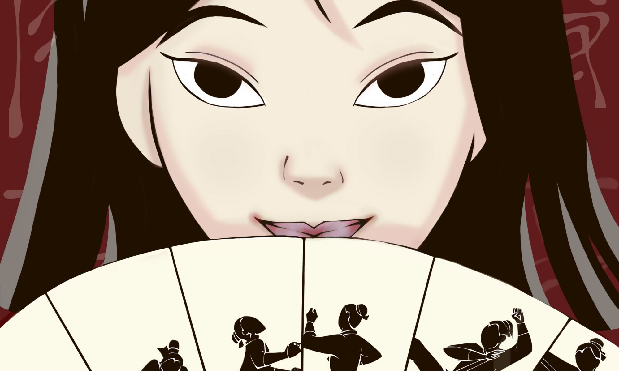
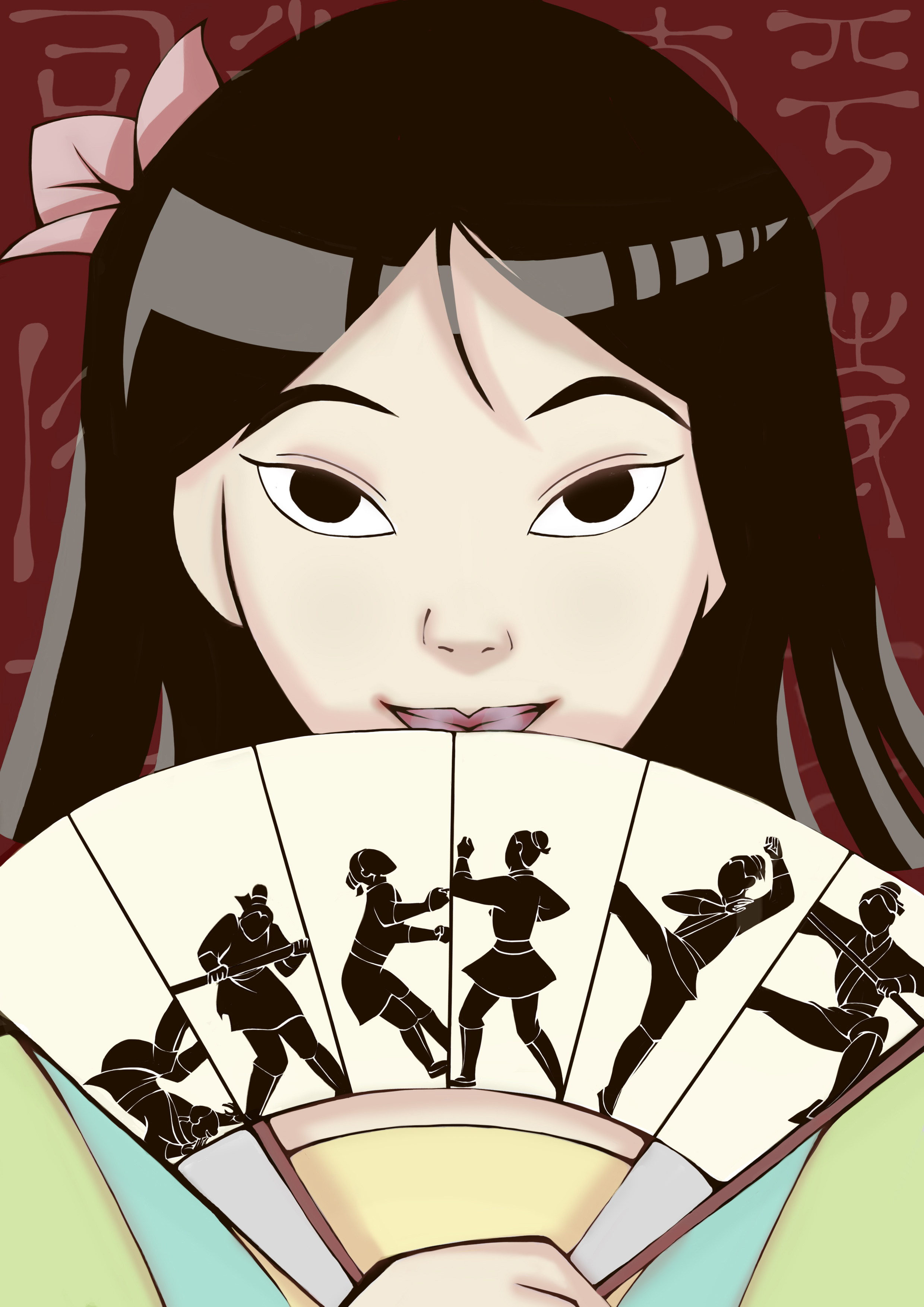
In this image, I strive to reflect Mulan’s identity as a woman. In the Disney movie, Mulan struggles to come to terms with the “femininity” that was expected of Chinese women in her time. The movie can be seen as a “coming of age” film that chronicles her realisation that a woman is not only of cosmetics and beauty but also of strength and wits. Hence, I tried to depict that with a Mulan that has undergone the Huns invasion (hence short hair and in female clothing) for it is this Mulan who has come to terms with herself as a Chinese woman and portrayed her warrior side with the fan that chronicles her training process (from being weak to strong, in accordance with the positions).
Visual Analysis:
I decided to place both her “warrior” side and her feminine side in one picture and decided to portray her in the aftermath of the Huns invasion in which she now has short hair and is discharged from the military. She is in female clothing and has a flower blossoming on her hair to signify her womanhood (the bloom of flowers in both the movie and Chinese culture, signifies the growth of a women). The colors that I used are also softer and brighter to show a more optimistic outlook and the enlightenment she experiences after going through the military.
The background is red to signify the boldness and strength of a warrior and I used a lighter shade of red as her shadows to signify that the strength she has as a warrior is a part of her strength as a woman and a person too.
The fan chronicles her journey as a warrior and her growth too-from falling down and tumbling to flying in midst air with a kick and I used her position to signify her growth too (from a low position to a flying position) and I placed that in the fan because a fan was used in the earlier part of a movie to be an essential of a woman and is used to hide a woman’s face from her to be husband. Instead of using the fan to hide her identity (that suggests the inferiority of women who must “hide”), I subverted it and used it to show her identity and strength as a warrior instead, suggesting that a woman does not have to hide her strengths, much less herself.
Behind, in the background, I used the “Chinese words” (traditional) that are used in the movie as in the critique, it was suggested and I found the background plain. Plus, fading out the words suggests that Mulan is no longer trapped by the “Chinese culture (rules regarding femininity)” that she felt victimised by.

Before:

After:

Concept:
When I first thought about what I wanted to present as my self-portrait, I thought about what was important to me I found two answers: softball and writing. I love both of them but both journeys have been tough and testing of my willpower. I wanted to represent the frustration, the endurance and the pain that I felt after experiencing constant setbacks and more often than not feeling inferior etc. because this pain has shaped me into who I am today-persevering on, jaded, struggling still.
I wanted to convey the idea of a certain death-the death of my ideals of how one should chase after dreams or goals or how things would always work out in the end. I went for a more zombified look because I wanted to convey the feelings of being weighed down by death yet constantly struggling to reach the light and also because the undead cannot really die and there’s some victory in that.
I also wanted to show the messiness of my inner world and my mind which was why I tore up the papers (also to show frustration) and wrote the words over and over again (also to show repetitions, editing) across my hand. This is why I also used a variety of writings, all that’s been done by me and not just writings-there are drawings, sketches, scripts, mind maps, everything that came out while I brainstorm.
I put up the red strings because it reminded me of the ‘Crazy Wall’ that detectives are often portrayed to make when they are trying to find connections in cases and this reminded me of my mind when I try to come up with plots and link characters together. Secondly, in eastern mythology, red strings are used to connect people and I wanted to represent my desire to connect my characters to a wider audience (why the strings are attached to the paper and extends out from it) yet the strings also creates a very suffocating look, especially when red reminds one of danger and blood and I think that perfectly conveyed the idea that something that I want to do so badly is hurting me instead and making me feel trapped.
I used masking tape because during my softball days, when we had blisters, we used masking tape to go over our hands because we didn’t have time or the money to afford bandages and it hurts when we do that because the tape sticks to your wounds and that pain has stuck with me till now.
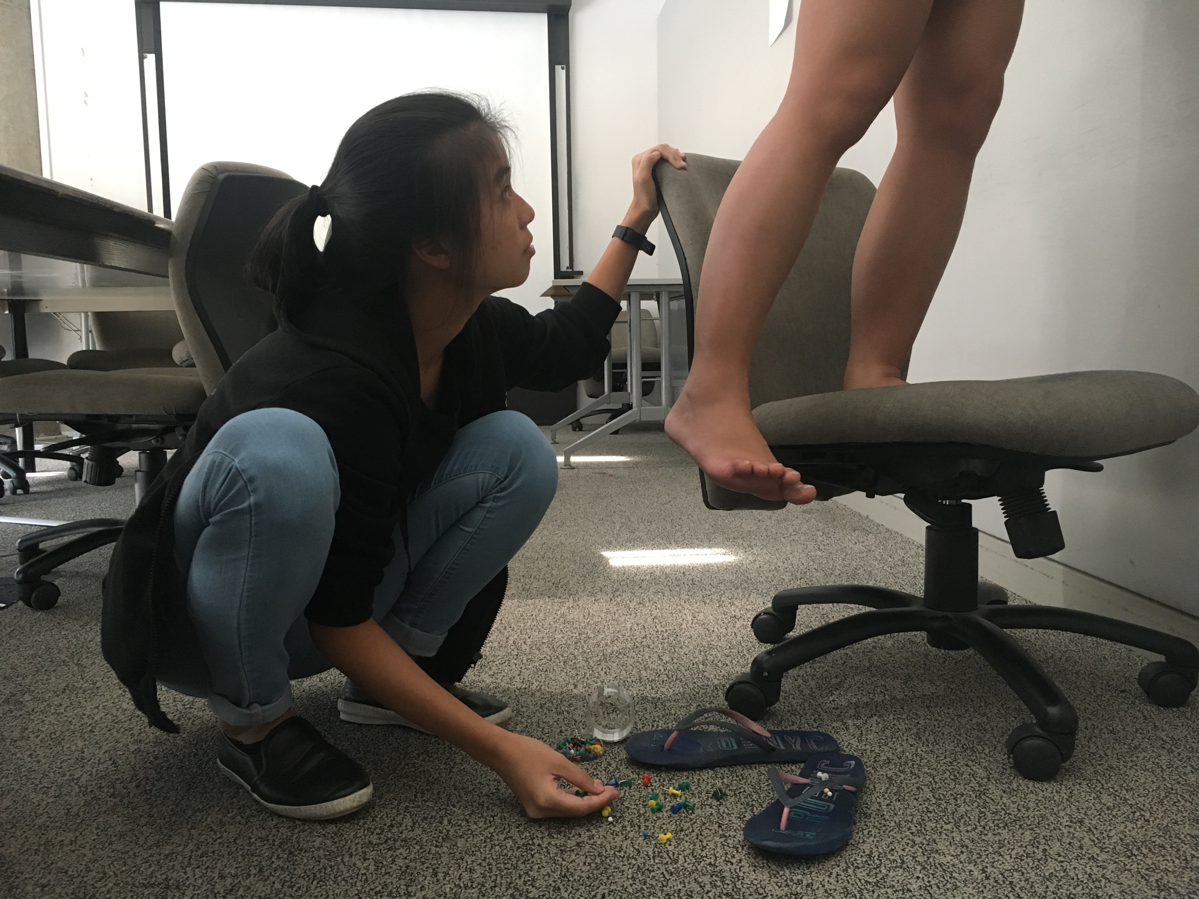
Technical Decisions:
I used a zoom lens to take the photo because I wanted a rather close up shot of my hand. I cut the hand off at my forearm so it does not look too weird (previously had cut it at my wrist and Bryan mentioned that it looks weird and chopped off). I took the photo in portrait instead of landscape to really get the whole of my forearm and to push the effect and idea of reaching out for something.
In photoshop, I added a ring of light above to show the reaching out for the light. I used the gradient tool with the diffused circle of light as it felt a little like a diffused and blurred spotlight that gave the hand a little more of a dramatic effect. At first I had made the picture quite saturated and tinted with red but during critique, it was pointed out that the redness clashes with the strings. To push the idea of sadness and dismay, there were suggestions to use blue. So I did and I liked the look better because it feels sadder and heavier and a little more ghostlike. It also allows the strings to pop out and I can then mask them and make them bolder.
I masked the string in front and the strings at the back differently because the string in front was brighter and when I tried to toggle the brightness of all the strings as a single mask, it popped out too much.
Using smudge and brush, I added some redness and blackness to stimulate rawness/dirt (?) and it gave the hand a more rugged look. I tried to mask out some blisters and add them onto the hand but my incompetencies made it looked like some monstrous experimentation was going on and kind of destroyed the work (I SHALL BE ABLE TO DO THIS ONE DAY).
Artist References:
When I was looking through pictures for references, I remembered a photographer (Tyler Shields) whose art I quite liked and I came across this picture.

This kind of sparked me to do something about sufferings and passion. Because I have not yet succeeded, I don’t think that it is right to portray a ‘success’ part like the feet on the left on pointe. Instead I wanted to portray a more reaching out for the light idea, hence the zombified look. However, I wanted to portray the wounds and the injuries like the feet on the right hence the masking tape and black red marks in my piece.


I wanted a zombified look and I liked that the idea of the ‘Undead’ fit into my concept so I searched for the hand gestures that zombies often have before they die as they try to reach out for something.
The Crazy Wall came to my mind next when I thought of strings and I went to search up some references.


I immediately thought of Sherlock and Stiles from teen wolf (as I’ve seen the intro a lot of times before) and I really liked the look of the strings. In the second picture, I found the strings a little too flat and I prefer the layering/depth effect that the first picture has hence I try to achieve some depth by attaching the end of one string to the camera and letting my hand go through another string (layering of strings to not look flat).
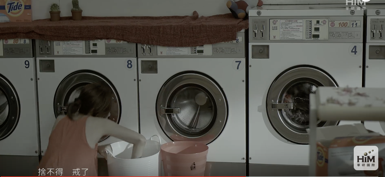
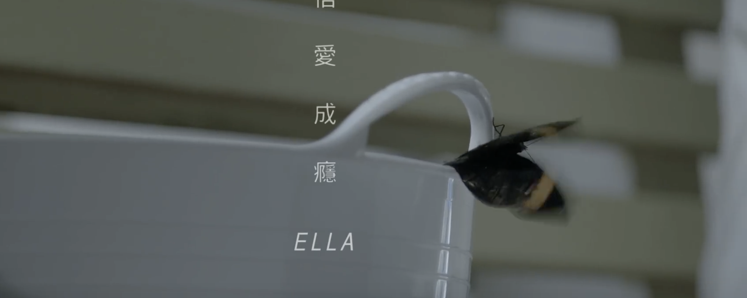
The video that I’ve chosen is a music video of a Chinese song called 信愛成癮 (Love Addiction) by Ella.
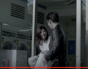
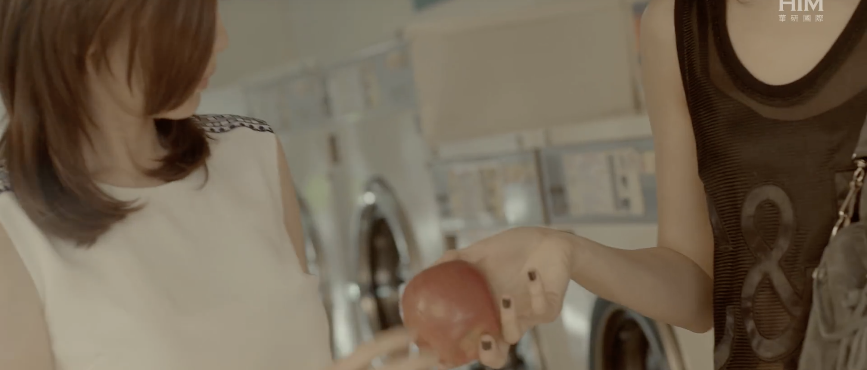
The subject matter is the 2 women and their relationship between them and the man they are in love with and the theme is an addiction to a love that hurts. The video started with a raining scene and the colours very dull. This gives off a sombre and gloomy mood and this suggests that the meeting between the two protagonists does not bode well for the both of them. The colours in this video are all rather dull and faded. This allows some colours, particularly red, to deliberately pop out and it creates an overall sad tone. In the beginning, one of them was wearing grey and the other lent her a white shirt so both of them ended up wearing white. White represents innocence and purity, coinciding with the fact that none knows about the affair.
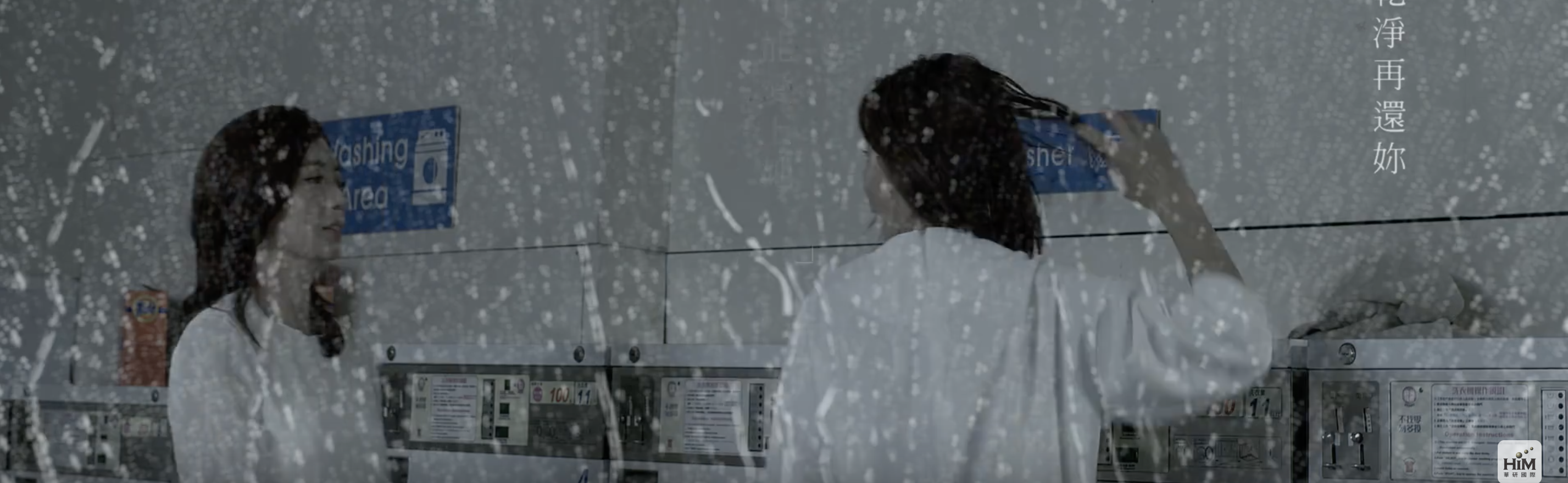
The hints of red in the laundromat foreshadows the dangers of their love for the same man and also implies the passion that they have for him.
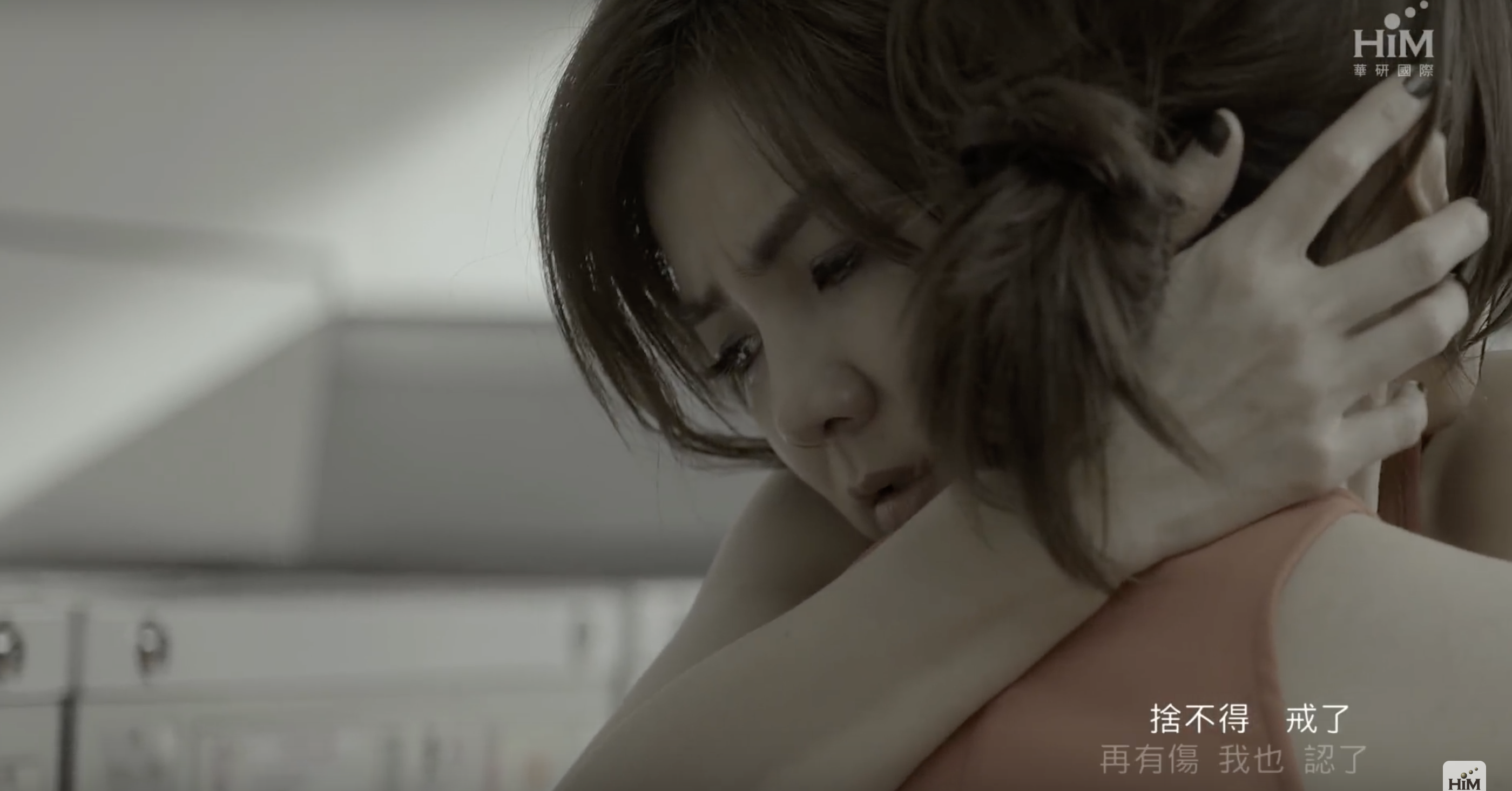
During the scene when one of them realises about the affair, both of them are wearing the same red dress and the background has more hints of red, perhaps to show also the intensity of the anger they both of them feel at that moment.
Their wearing of the same red dress suggests a sort of common identity that is shared between the both of them—victims, lovers who loved the same person. 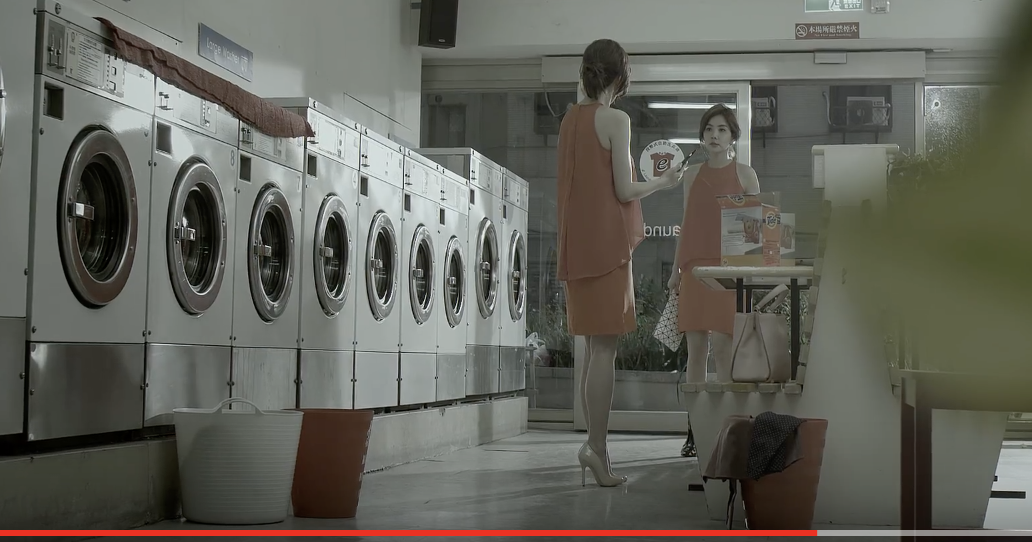
The scene of them hugging each other after their cat fight also suggests that they seek comfort in each other, knowing how hurt the other must be.
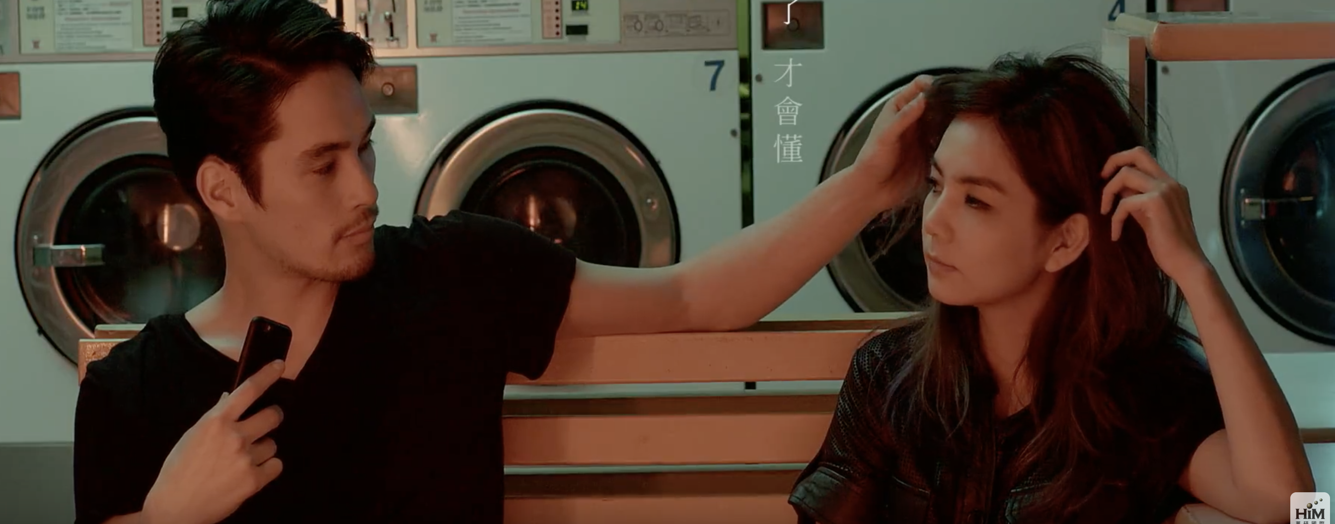
 The girl in white at the beginning spots many references of being innocent-snow white, white shirt etc, is always seen in white and at times of the day (never at night) whereas, the other lady is seen in black and in the night when she makes love to the guy. It may be too fast to assume that the girl in black is the mistress. Another interpretation may be that they both represent two different kinds of love—one that is sweet and innocent and another that is playful and sexual.
.
The lighting for the sex scene is dim and redden while both the lady and the man are wearing black and the man wears a dark red jacket. The red imitates the passion between the both of them and along with the dim lighting, shows the forbiddennature of an affair.
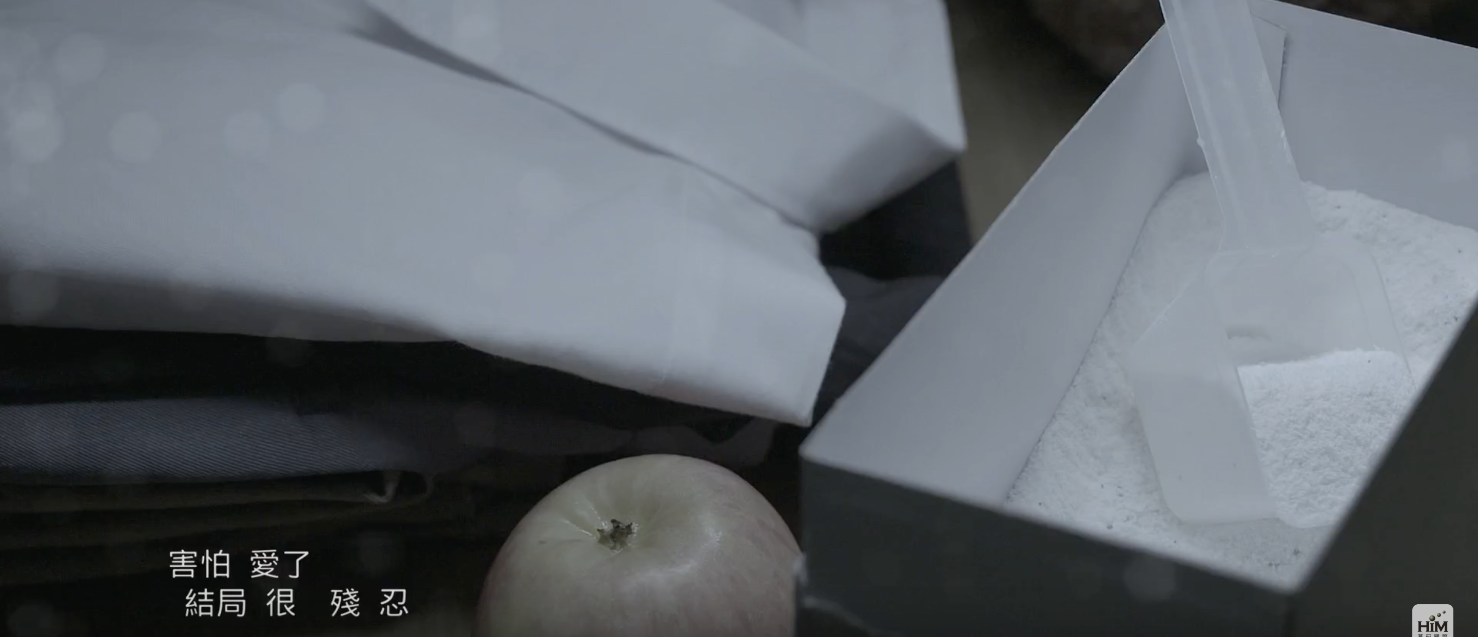
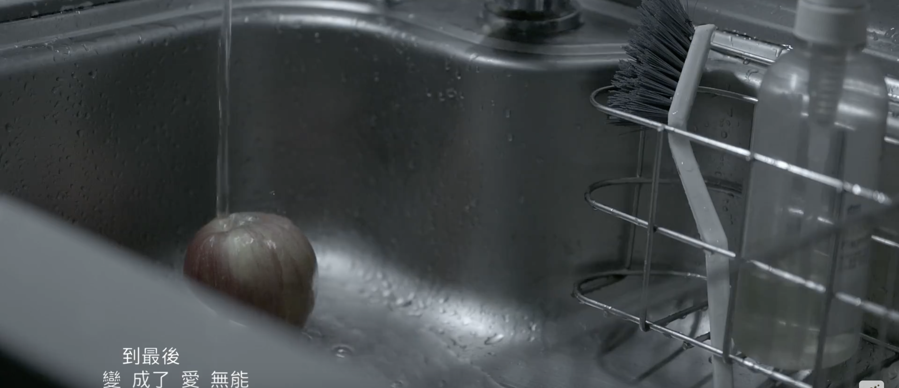
In contrast, the lighting in the scenes that shows the sink and home (of the woman in white) is dim too but the scenes spot many greys and whites along with the apple and the dullness gives off a sense of loneliness as the guy is with the other woman instead of her.
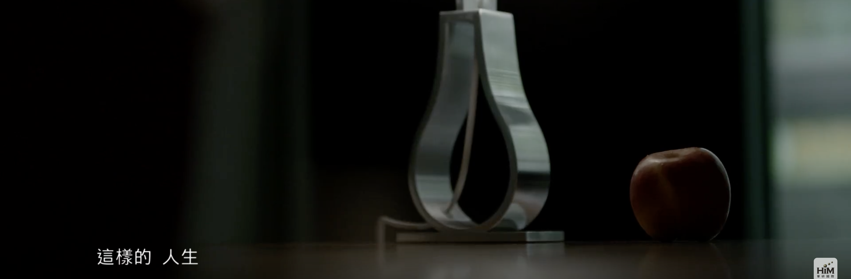
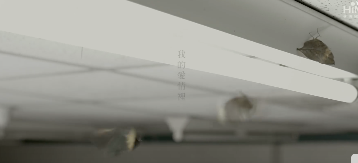
Moths and apples are recurrent symbols in the video. Moths are symbols of death. When they first met, moths are seen on the ceiling and subsequently after, one disturbs the woman in white, implying impending doom upon her relationship, or the death of her boyfriend’s loyalty towards her. During the sex scene, the moths appear again. ‘A moth attracted to a flame’ is a rather common saying that is repeated in the song too and the moths resting on the ceiling during that scene can imply that the woman in black knows that she is doing something that would hurt herself and is wrong but goes ahead anyways because she is attracted to the danger. At the end of the video, more moths appear and as both women choose to go ahead with their relationship with the guy, knowing that there is another girl, it shows that they are both attracted to the flame, to cutting themselves on love.
The apple, most commonly known as a poison apple and the forbidden fruit, is a symbol of temptation and death and the woman in black handing the one in white an apple foreshadows that she will be the cause of her suffering. The woman in black saying that she is not the “evil queen” implies that she is also a victim of love and the scene of both of them in red singing the song shows that ultimately, whether their love for the man is innocent, pure love or love demonstrated by sex and raw passion, both are equally hurt by this complicated relationship. The location of the video is a mostly a laundromat and the constant washing that is done in the video can imply an attempt to purify and a washing off of sins.
team: Yap Qian Yin, Chanel Chan, Lee Qiu Wen
Bully intimidating someone stronger than him
Person betraying team
For our final 4D project, it’s a group work!
i grouped with Gladys and Jamie.
Upon receiving the project brief, we were told to work on an object/location within the compounds of ADM, and we began brainstorming.
Unanimously, we all came up with the same thing!
We decided to work on Vending Machine – the best place to go for our hungry souls. We wanted to make the vending machine interactive, fun and to promote healthy living!
Our idea was planned with the mindset of having a collaboration with Health Promotion Board (HPB)
We will have a vending machine that vends out healthy food, instead of the usual unhealthy snacks and drinks.
For example, instead of having potato chips, we have veggie chips! Or if we have salted peanuts, we can change to almonds instead!
However, the buyer will not know about the change in product, until they selected their choice.
To explain better, we built a small vending machine prototype, with iPad as our machine screen.
Watch the video to see how the vending machine works!
The whole process starts when a passer-by walks past the vending machine. It will light up and greet the passer-by, attracting their attention and asking if they want anything. Next up, it will show the panel of food, letting the customer select the choice he/she wants.
Upon pressing, a surprise animation comes out, and we can see the changing animation of the original product changing into a healthier alternative!
It will then vend out the healthier alternative for the customer, ending with a quote to promote healthy living.
During the process of vending, we will have a unique jingle for each product – to keep the customer occupied while waiting.
We intend to have the interface appear more futuristic, while keeping the elements of it quirky and fun.
After presenting to the class about our project, it seemed pretty well-received!
Although it was voiced out that some customers might get angry for not receiving the item they wanted, the issue was resolved, as we intend to place a line of text on the vending machine stating “What you see might not be what you get“. Furthermore, our plan of collaborating with HPB will come into handy, as if used for a HPB roadshow, the audience will know this vending machine is promoting health!
All in all, I am satisfied with how the vending machine worked out! Although we kept changing our ideas, I am glad that we stuck to this final idea!
Initially, we wanted to host a competition between all the food in the vending machine, like a pageant contest. But we realised that the contest has no purpose, and if someone is there to buy food, they might get irritated by the long contest process.
But our final idea, has a clear purpose on promoting health and is a shorter process than our original!
And thankfully, we had a 3D vending machine prototype to aid us with the presentation of our project, if not, it will be difficult trying to explain our idea!
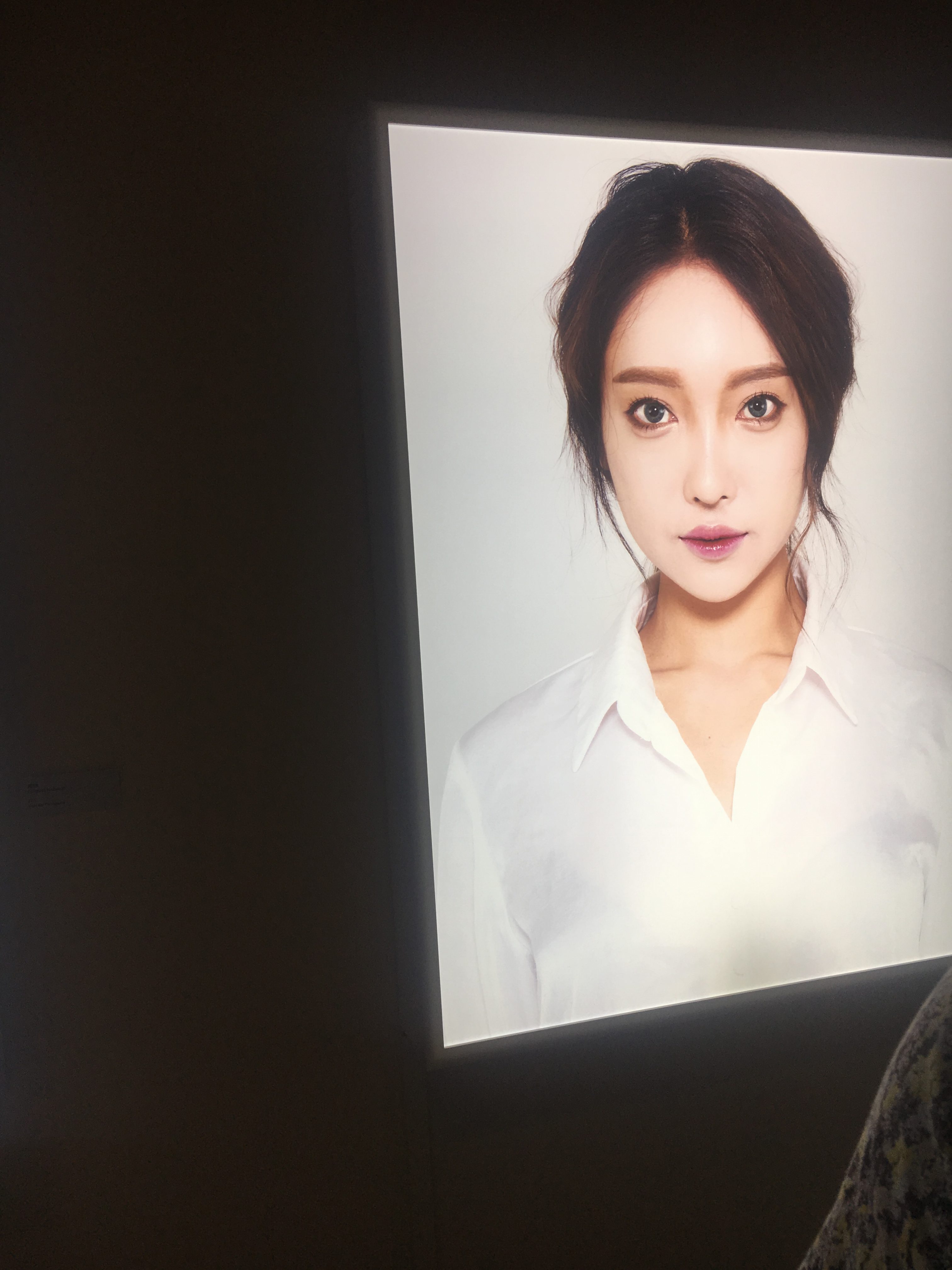

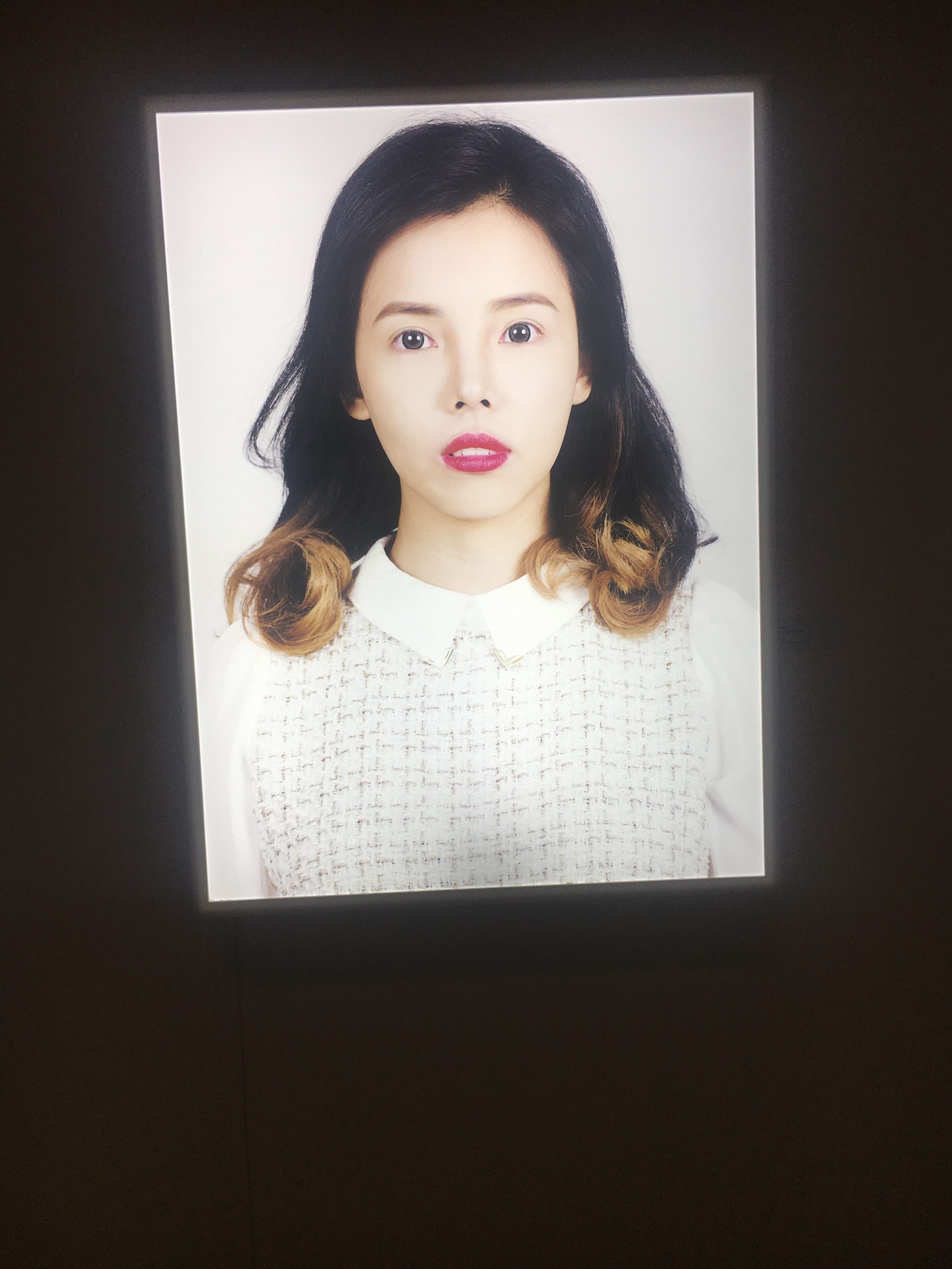 One work that caught my eye was ‘Fake I Real Me’ by Corinne Mariaud. It consists of 3 pictures of South Korean women who cares about their outer appearances alot and has had plastic surgery done before to look ‘prettier’.
When I first saw them, I found them to be creepy looking as their eyes looked too huge (almost to the extent where they look like dolls) and devoid of emotions. It makes me a little crept out. They look beautiful but to me, they looked beautiful in a ghost like way. When I first saw it, I thought it has something to do with beauty standards and plastic surgery. I think it touches on how looks have become more and more important such that some would go lengths to physically alter themselves. I think it is a critique on pressing beauty standards and increasing superficiality in our society. I think the simplicity of the work made it possible to gather such information-it is just three women and the most striking thing about them is their flawless beauty. I think the fact that it is very simple portraits of them that adds another layer to the artwork because portraits like this typically show people in their most natural state (poker faced, expressionless) but there is nothing natural about their features since they have gone under the knife before and emphasises on the fact that these are alterations to what was natural.
After reading text, I confirmed what I had inferred but I think that it might be because I am interested in korean culture and know what is the korean beauty standards. If a viewer does not have prior knowledge, it may be hard to understand the work. I think that if the artist added perhaps marks (the ones they draw on you before they cut you up for plastic surgery) that are not so visible from afar to the face and obvious as one approaches the artwork, it would be perhaps more effective but it may be too obvious and take away the subtlety and simplicity (which I find to be the stunning point) of this artwork.

The next artwork is ‘The Optimisation of Parenting part 2’ by Addie Wagenknecht and it consists of a mechanical arm rocking a baby cot. My first impression was that it felt lonely? I felt quite sad because I would expect seeing a mother beside a cot but inside it is a mechanical arm and there is a lack of parental warmth which I find a pity. I thought that it would be about the lack of time resulting in parents turning to machines to take care of their children and a critique on the reliance on machinery. The juxtaposition of the cozy baby’s cot and the rigid mechanical arm (between life and a mimicry of life) directs me towards the direction of machinery replacing us in carrying out tasks even the most intimate and the consequences of it.
After reading the text, I realised that I was partly wrong. The artist is much more optimistic and even supportive as she stands in the shoe of a busy parent and question if small tasks like rocking a cot can be handed to robots. The artist also questions if this will affect the child’s growth.
I think that if she wants to emphasise on the parent being relieved of her duty, she can add a pair of female hands alongside the robot’s doing her work and the lighting can be less harsh. The harsh lighting makes it look sad and devastating.