HISTORY OF DESIGN: GRAPHIC DESIGN SO FAR (REFLECTION)

Herb Lubalin is a progressive American typographer and designer in the 20th century, known for high-quality typographic logos and era-defining typefaces. Mostly associated with the typeface, ‘Avant Garde‘. Despite Lubalin being color-blind which can be seen as detrimental in the graphic design field, it could be argued that this shortcoming contributed his razor-sharp black and white imagery.

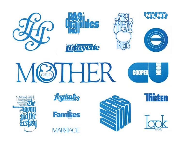
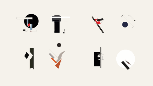
His typogram caught my utmost attention as it tells a story despite being simple and straight to the point. Typogram is making changes to the characters of the letters into a visual image. Lubalin had a playful approach to design as each letter are designed individually according to the weight and strokes to create a shape.

In the example above, my favorite graphic illustration is ‘Families’. Despite using a simple san-serif typeface, the idea of a family is illustrated in the ‘ili’ characters of the letters to show a family unit which is really symbolic. 

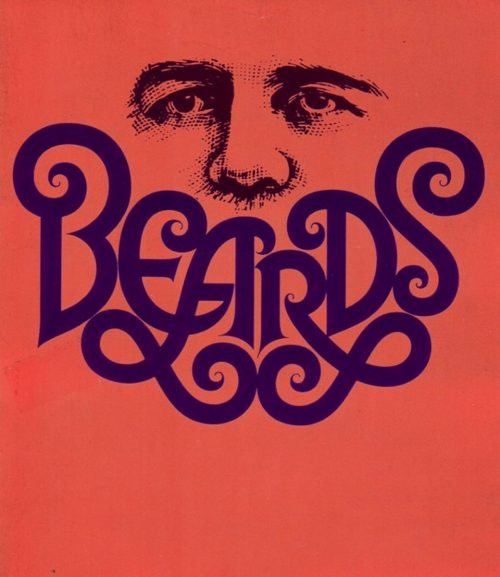
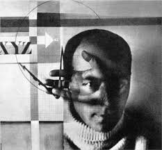
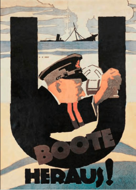
Another example that I personally love is his ‘Beards’ illustration in 1946 which is a mixture hybrid of modern and late-modern style. The manipulation of letters to form imagery of a beard just by using a typeface is experimental. In addition, he is known for creating new conceptual typography called ‘ Graphic Expressionism’. Thus, he was a key figure in the ‘creative revolution’ that transformed American advertising in the 1960s with his artworks. 

According to Lubalin in an essay, he wrote for Print magazine, “Graphic Expressionism is my euphemism for the use of typography, or letterforms, not just as a mechanical means for setting words on a page, but rather as another creative way of expressing an idea, telling a story, amplifying the meaning of a word or a phrase, to elicit an emotional response from the viewer.” 

All in all, I’m amazed by his playful composition of letters’ shapes can change the weight and meaning of words, and how it evokes certain emotions from the viewer with its imagery and symbolic meaning which is really useful for advertising and communication. To me, Lubalin is one of the prominent experimental typographers that changed the industry with his conceptual typography. 


References

https://www.uniteditions.com/blogs/news/ten-things-you-should-know-about-herb-lubalin

Herb Lubalin

http://www.designishistory.com/1960/herb-lubalin/

Herb Lubalin Was Controversial at Times, But Always Great

My Favorite Lubalin


Class Feedback

For the past four weeks, I’ve learned a lot of graphic design styles and movement that was created which was impacted by various aspects such as political, social, technological and economic issues. Despite being bombarded by all these useful terms during the lessons, my knowledge about everything is very surfaced-level and I have to research on my own to understand more about a particular term. 

In terms of the weekly reflection essay, I feel like it would be so much better if there’s a brief or a certain direction we should follow because I don’t really know what I should include in it besides the interesting facts I’ve found online. In addition, I wish the lesson would include more Asian movements and influences or maybe some Singaporean context other than the Western graphic movements. Thanks, Desmond for the past 4 weeks!

HISTORY OF DESIGN: TO BAUHAUS & BEYOND (REFLECTION)

El Lissitzky

El Lissitzky is an influential and prominent Russian artist in the constructivism (the idea of solving problems with solutions; practicality) and suprematism (eliciting feeling of intensity) movement. Together with his mentor, Kazimir Malevich, known for his suprematist artwork – “Black Square”, they developed suprematism by designing propaganda posters and exhibitions for the Soviet Union.

His artworks are greatly influenced by his training as an architect in Germany. It incorporates the usage of simple shapes as symbolism for the rationale behind his works which are mostly about the socio-cultural context of the emergent Soviet Union after World War 1.

El Lissitzky is known for his photography, photomontage and coming up with the term ‘proun’. He produced a large number of artworks that he termed as “project for the affirmation of the new” in Russian which is heavily influenced by the political issues at that point in time. ‘Proun’ is a style that creates an illusion of depth from a 2D canvas.

El Lissitzky’s propaganda poster styles are abstract and interpretative as compared to Britain and America’s propaganda poster which are more visual with bold eye-catching letters with flat colors which is similar to the plakatstil style. 

One of his iconic works is “Beat the Whites with the Red Wedge” – 1919. The composition of simple geometric shapes strategically placed to create a narrative and meaning about his visualization of the fundamental transformations in society within the space and material used. The play of contrasting striking colors – Red and White to show the opposing team during the civil war in Russia.

Despite being an abstract artwork using political symbolism, people involved or knew the context of what is going on will be able to interpret and understand the message behind this piece. The image of the red wedge shattering the white form communicated a powerful message that left no doubt in the viewer’s mind of its intention. The shapes he used are similar to the military maps to elicit suprematism.

There are so many design styles to send out an impactful message to the audience. To me, the idea of using symbolism and play of colors stands out among the rest despite the minimal visual graphics. It can be used in so many contexts such as a secret or hidden message to people who belong to a certain group or association, who know of the meaning of the symbol and logo. It gives designers and artists, their own freedom to create their own meaning and have a personal take on what the shape or symbols mean to them, similar to the idea of expressionism movement.


References:

https://www.moma.org/collection/works/79040 

https://post.at.moma.org/content_items/1240-the-many-lives-of-el-lissitzky-s-proun-19d-1920-or-1921

HISTORY OF DESIGN: INDUSTRIAL REVOLUTION & GRAPHIC REACTIONS(REFLECTION)

Chromolithography is known as a colored picture printed by lithography, especially in the late 19th and early 20th centuries. It is a unique method to create multi-colored prints.

Process of Chromolithography

It is a chemical process based on the rejection of grease by water.

  • Image is applied to limestone and zine surfaces (commonly used materials in the production of chromolithography)  with a grease-based crayon or ink.
  • The image is gummed-up with a gum arabic solution and weak nitric acid to desensitize the surface.
  • Before printing – the Image is proved before finally inking up the image with an oil-based transfer or printing ink. 
  • Inked image under pressure is transposed onto a sheet of paper using a flat-bed press – a direct form of printing.
  • Colors may be overprinted by using additional stones or plates to achieve a closer reproduction of the original. 

Louis Prang & Company

First Christmas card by Sir Henry Cole

For this reflection, what caught my attention was Louis Prang & Company who is known as the “Father of the American Christmas Cards” in 1873 for the British market. Louis Prang is a famous Boston lithographer who popularised commercially printed holiday greeting cards using chromolithography after being exposed to the first Christmas greeting card created by Sir Henry Cole which caused a sensation in the Victorian era.

He incorporates chromolithography into this design process as an artist has more freedom for expression. They are able to create whatever shape or letterform they want for their design and they are not restricted to the structured and restrictive process of using a standardized typeface using metal or woodblock printing.

Louis Prang & Company became the first printers to commercially print holiday greeting cards that are readily available to the public in the American market after producing the collectible albums cards for the British market in 1873.

The venture to the American market was successful as his company was printing up to 5 million Christmas cards per year. His products ranged from simple to lavishly decorated greeting cards embellished with fringe, tassels, and sprinkles printed on high-quality paper.

Other Contributions

In addition, he’s a man ahead of time during that period as he is one of the active supporters of women artists. During that period of time, women’s occupations were limited to low-paying domestic services. He created an art contest and advertised it through the women’s rights journal Revolution in collaboration with the Ladies’ Art Association. The winner of the contest gets to state a prize for their artwork and Louis Prang will buy it. The fact that he did this when the society that period of time was male-dominated is forward-looking and revolutionary. In 1881, Louis Prang & Company employed more than 100 women as designers, artists, finishers, and embellishers to find new designs and keeping up with the trend.

Another contribution of Louis Prang is the Prang Educational Company and the Prang Normal Art School. He was one of the driving forces behind providing public-school students with an art education with the knowledge and resources he has by creating art instructions in schools and publishing books.


References

http://www.newenglandhistoricalsociety.com/louis-prang-invents-american-christmas-card-boston/

https://blog.bookstellyouwhy.com/vlog-four-videos-on-the-art-of-chromolithography

https://aknextphase.com/louis-prang-street-christmas-cards/


HISTORY OF DESIGN: WRITING TO TYPOGRAPHY (REFLECTION)

After the first lecture of ‘Writing to Typography’, we were exposed to the history of the evolution and development of how type was formed with the earliest form of writing on petroglyphs to the fonts we often use nowadays.

Personally, I was intrigued and visually attracted to the font, “Baskerville” – an English type, as it reminds me of the Netflix show “Peaky Blinders” which is about an English mafia family based in Birmingham, English in the late 18th century which often uses this typeface font in the film.

Coincidentally, after learning about this font during the lecture, John Baskerville – the creator of the Baskerville types, practiced his artistry as a printer in Birmingham, England. The Baskerville typeface became a common font to be used in England for books, newspapers, and prints. Hence, it was amazing to know that the production team in “Peaky Blinders” took consideration of the typeface and details used during that period of time to accentuate the style and vibe of an old English town in that film and I really appreciate it.

The Baskerville font was developed in 1752 by John Baskerville. His typefaces are all about creating hierarchy and contrast using purely type. The Baskerville’s types are classified as a Transitional typeface – stylistically a mixture of Old Style and Modern typefaces. The axis of symmetry is vertical.

His typeface used to be criticized for being too thin and narrow due to the high contrast from thick to thin strokes as it was hurtful to the eyes. To some, it was known as the thinner version of the Caslon font which is another English transitional typeface. However, it was notably admired by Benjamin Franklin and it regained popularity in 1917.

The Baskerville font has a delicate, sophisticated feel to it and high readability factor. Due to the attributes of long, elegant wedge-shaped serifs and subtle transfer of stroke weight from thick to thin with perpendicular stresses. This typeface is an excellent choice for body text and it became a standard typeface for long text in the late 18th century for books and display purposes, and still widely used till today.


REFERENCES

https://bossygregrules.files.wordpress.com/2014/01/baskerville_typeface_poster_gh.jpg 

https://www.linotype.com/702/john-baskerville.html

https://www.huffpost.com/entry/baskerville-font-history_n_58e7fe09e4b058f0a02f4e30