Philip B. Meggs, Meggs’ History of Graphic Design, Wiley; 6 edition, 2016. ISBN 1118772059 ; Chapter 24 : The Digital Revolution and Beyond, page 571-619
REFLECTIONS
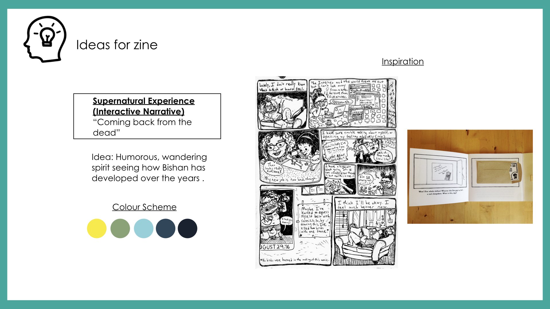
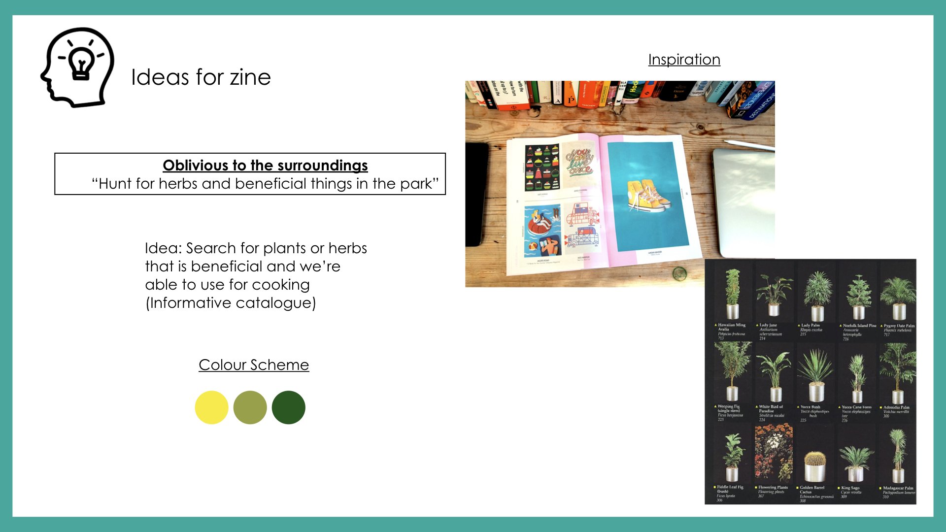
Suggestion from Mimi: Focus on the thesis of “How everyone can be a graphic designer due to the accessibility of the resources thanks to digital revolution”
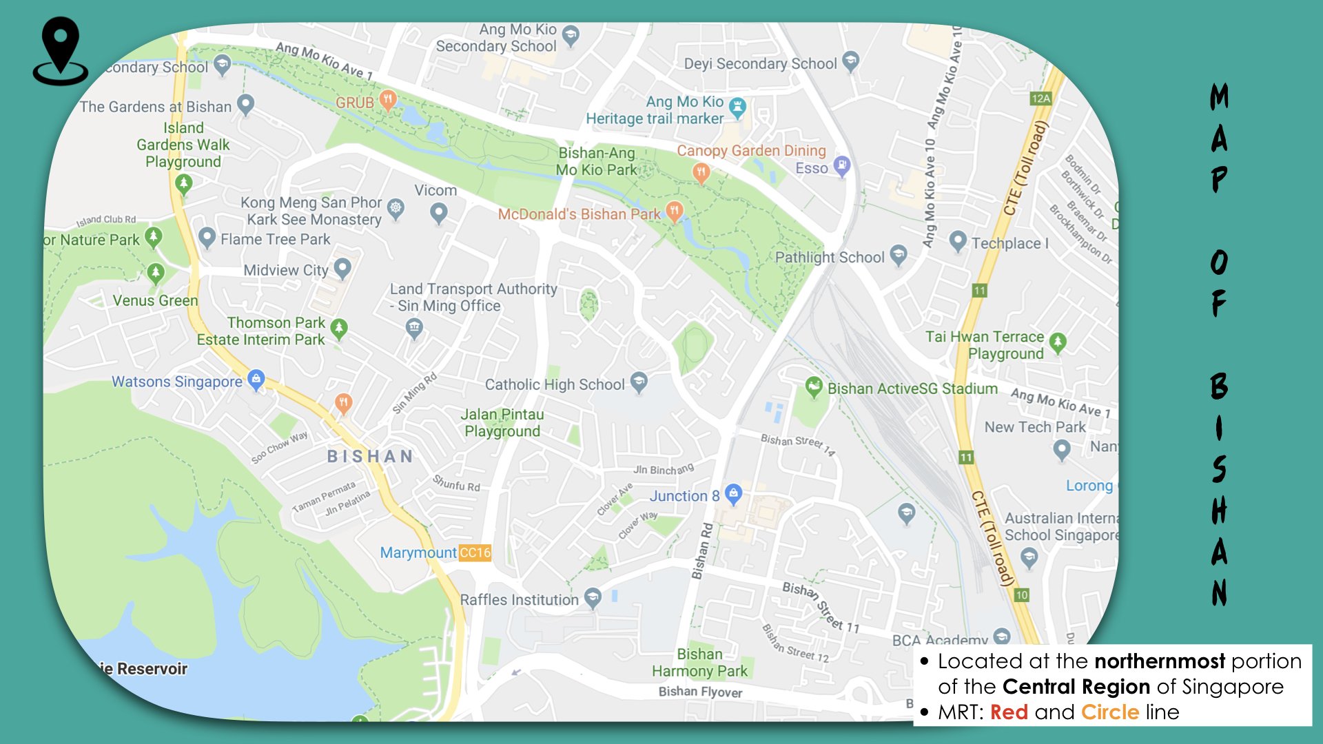
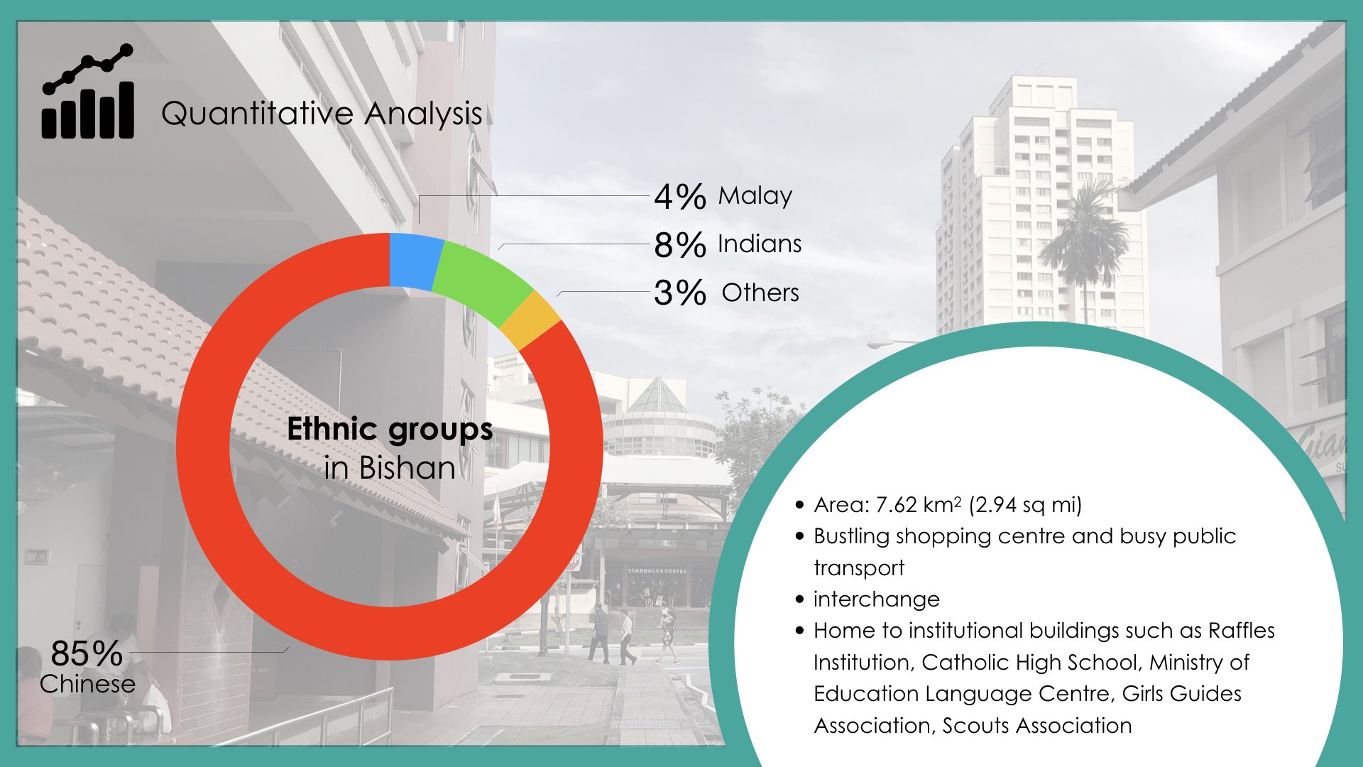
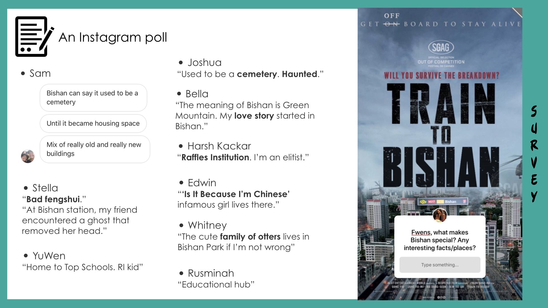
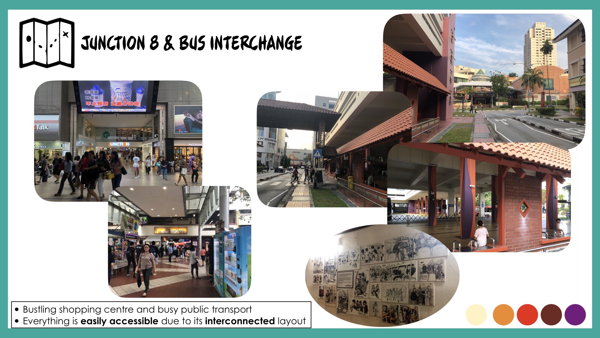
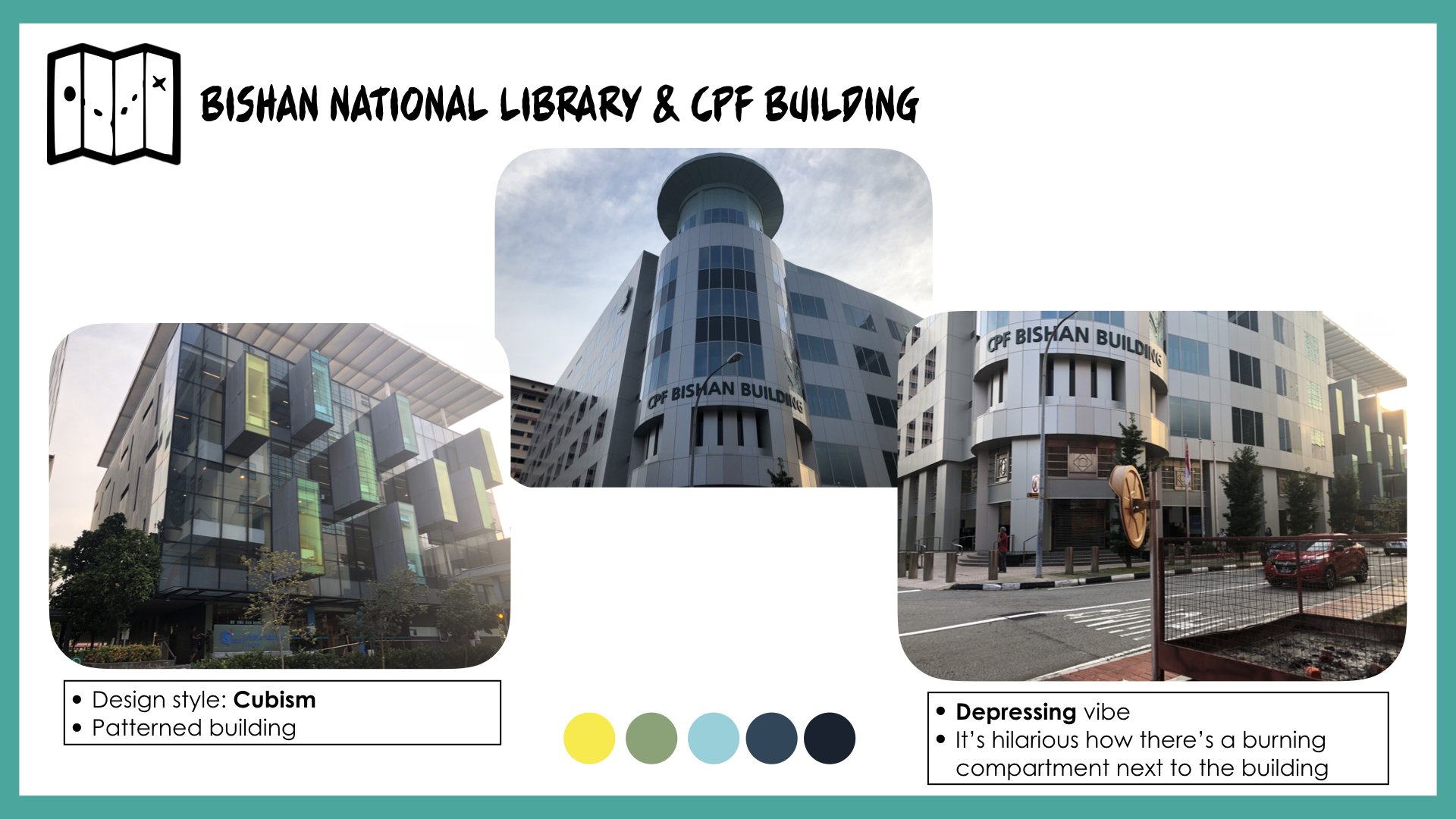
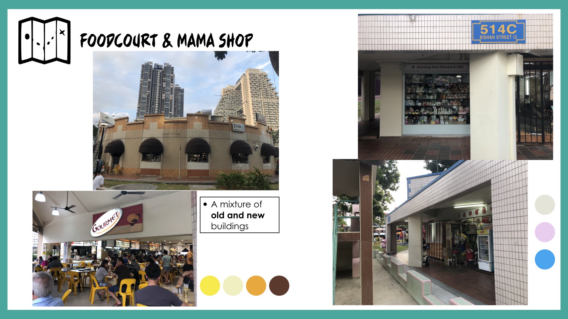
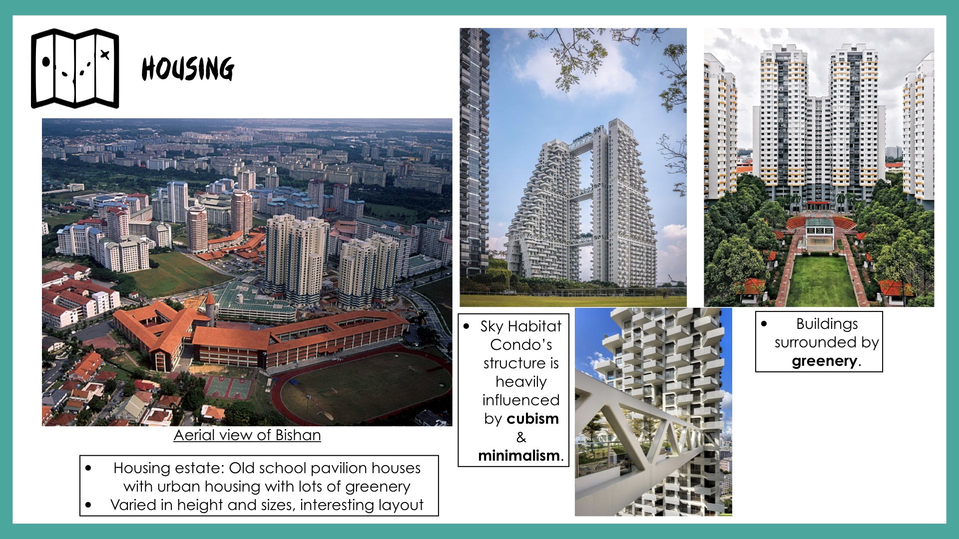
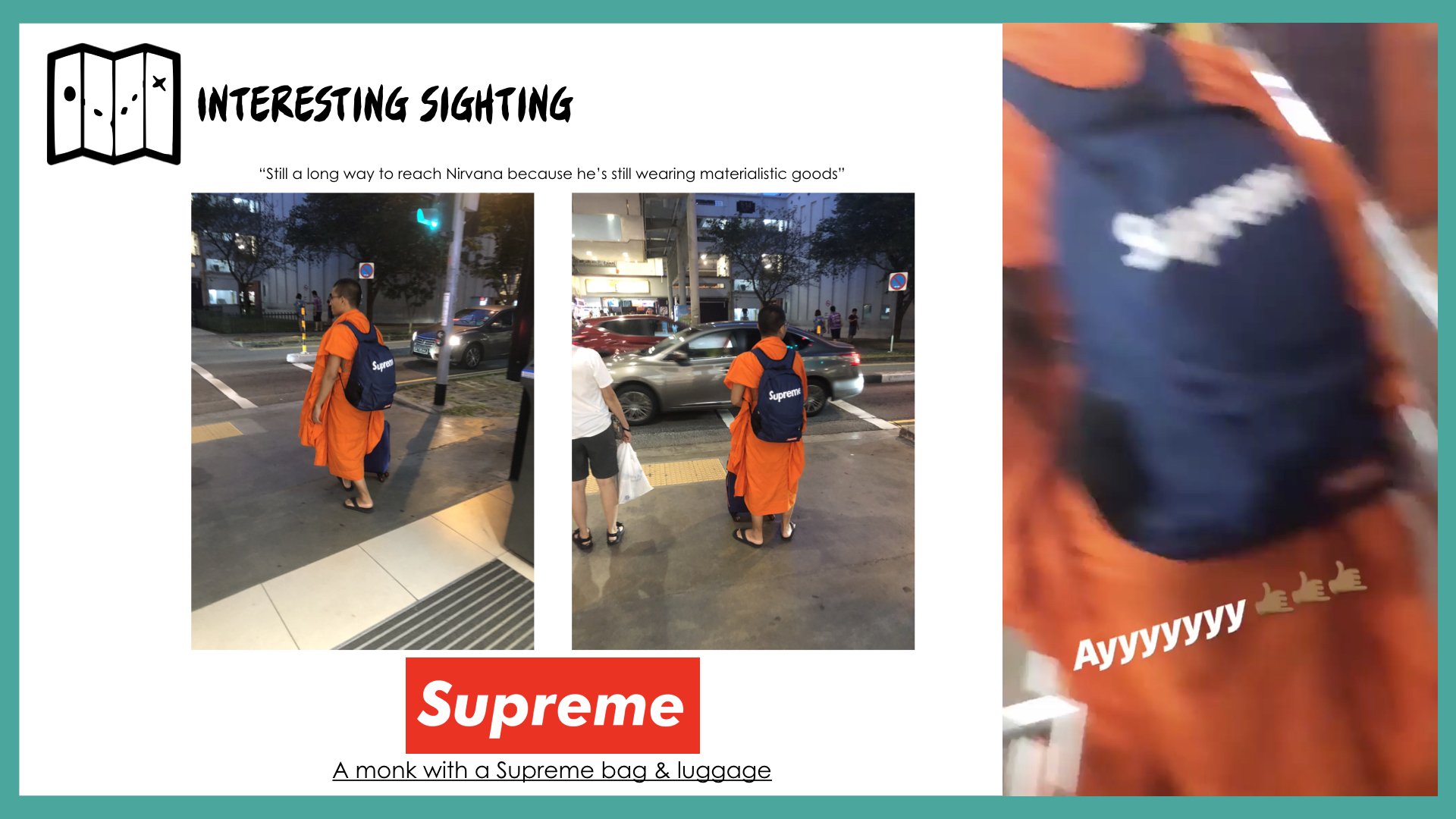
After listening to my peers’ presentation and receiving feedback from Mimi, I’ll be visiting Bishan again to explore the site. Hopefully, I’ll receive more insights about the relationship between history, people and certain areas of Bishan that makes the location unique or special. My objective is to have better research and insights that are more reflective and analytical that will assist in my narrative of creating the flow for my zine magazine.
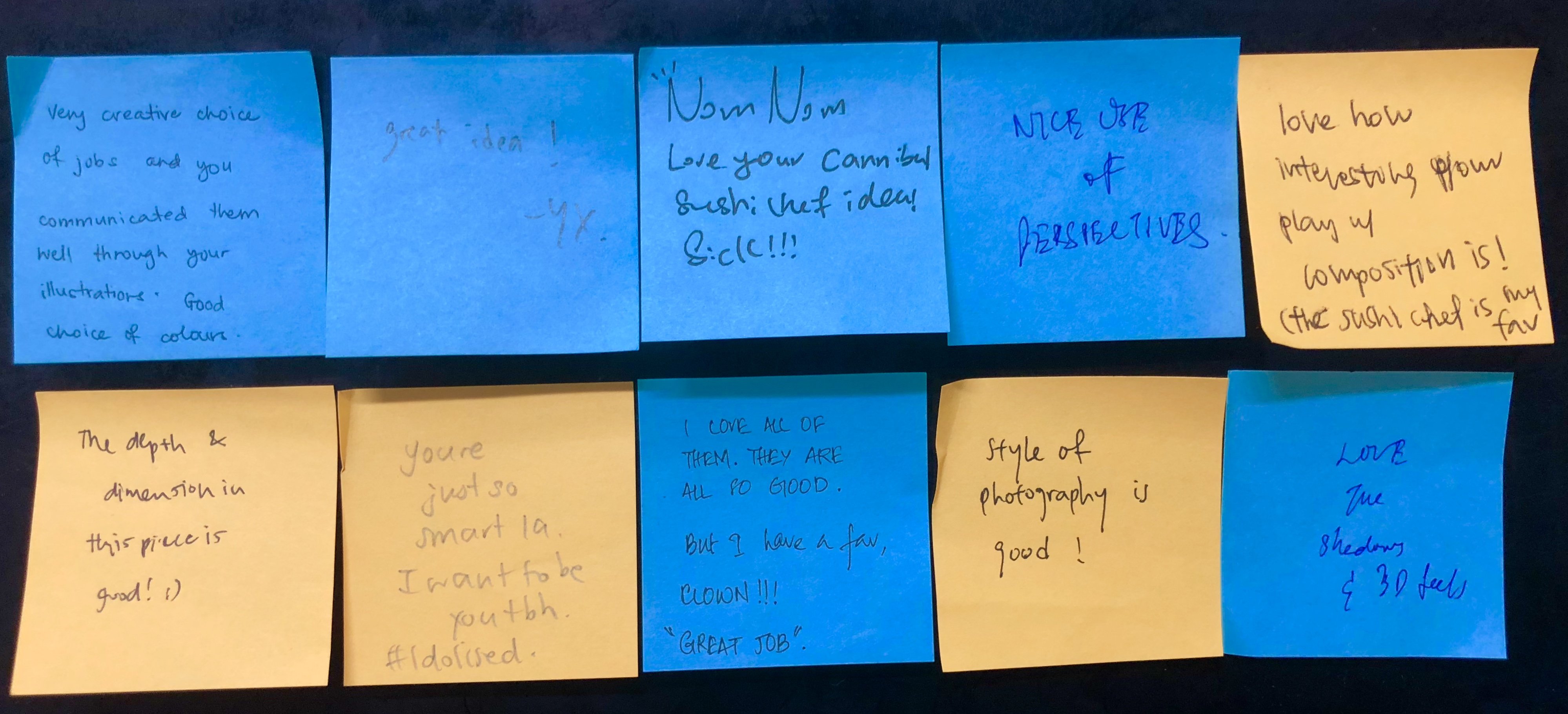
Legibility of the letter ‘K’. It looks like an ‘X’.
Add highlights to the typeface so it looks bouncy.
Incorporate the texture and thin lines onto the typeface instead of the background.
Outline the rounded and bouncy typeface on the clown’s face.
CRITIQUE SESSION:
The letter ‘R’ looks like a P. (Legibility)
CRITIQUE SESSION:
Legibility of the letter ‘K’. I should have reduced the length of the decorative tail of the K.
I should have brought the physical soft textured typeface during the presentation to showcase to my peers.
CRITIQUE SESSION:
Legibility of the first ‘I’. Suggestion: Repeat the second ‘I’ typeface so it’s more readable.
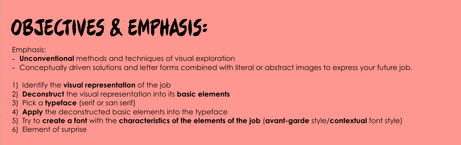
TAKEAWAYS AND LEARNING CURVE DURING THIS PROJECT:
I had challenges trying to picking out the minimal and essential elements from each of my jobs to portray it visually and efficiently. However, this project made me focused on the various aspects of the design process for image-making through type such as the usage of suitable elements, choice of fonts, color scheme, overall composition, technique or method that I’m going to apply.
My knowledge of the principles of design and elements of design assisted the overall composition of typographic portraits and my peers complimented the perspective, depth, and dimensions of my typeface.
Personally, I really enjoyed the dynamic design process of trying out analog and digital methods.
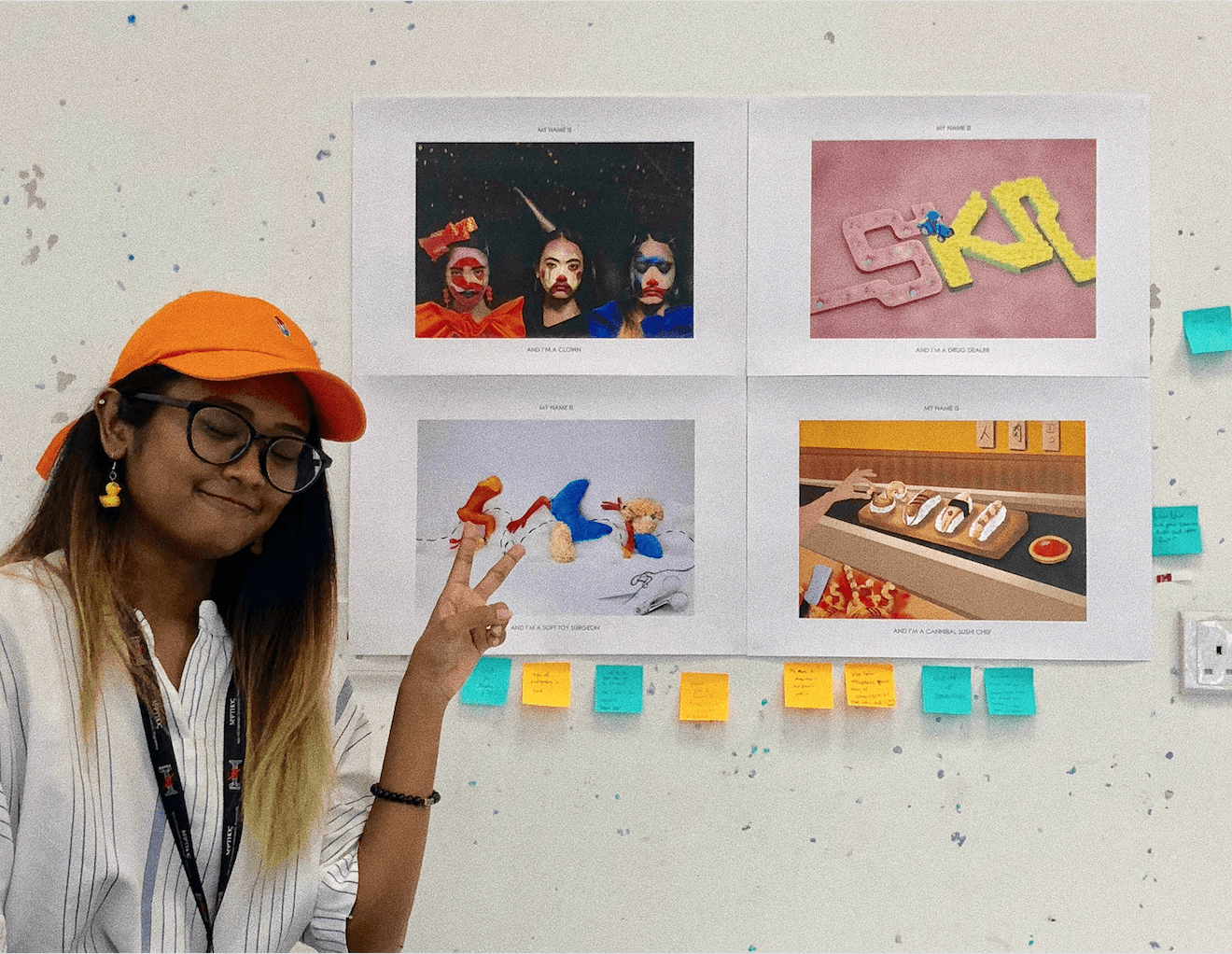
All in all, I’m really satisfied with the 4 outcomes of my typographic portraits. My favorite designs are the ‘Depressed Clown’ and ‘Drug Dealer’ and most of my peers really enjoyed ‘Cannibal Sushi Chef’. In terms of my illustrating skills, I felt like I’ve grown and improved in being able to harmonize all the elements and create a narrative.
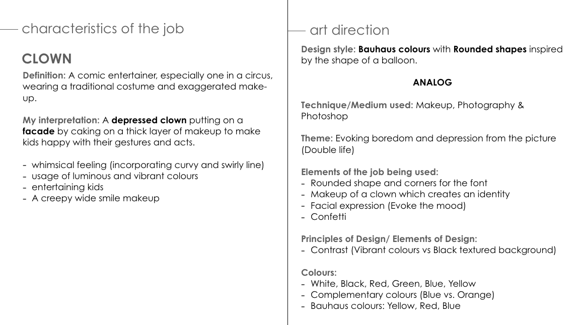
An initial idea of the typeface I’ve in mind: San Serif which incorporates the rounded feature of a balloon, rubbery and dirty textured to show the dual reality of a creepy clown with whimsical and vibrant colors.
FIRST CONSULTATION WITH MIMI:
Try to maintain the bouncy and rounded aspect of the font
SECOND DEVELOPMENT:
Outline
First draft
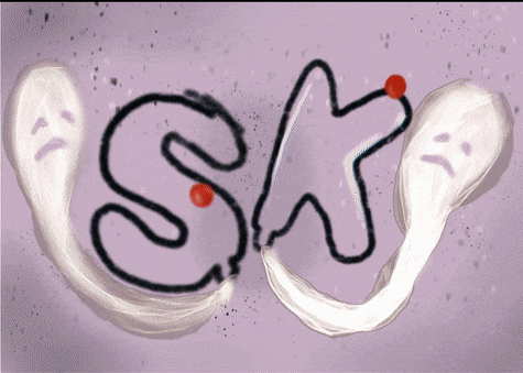
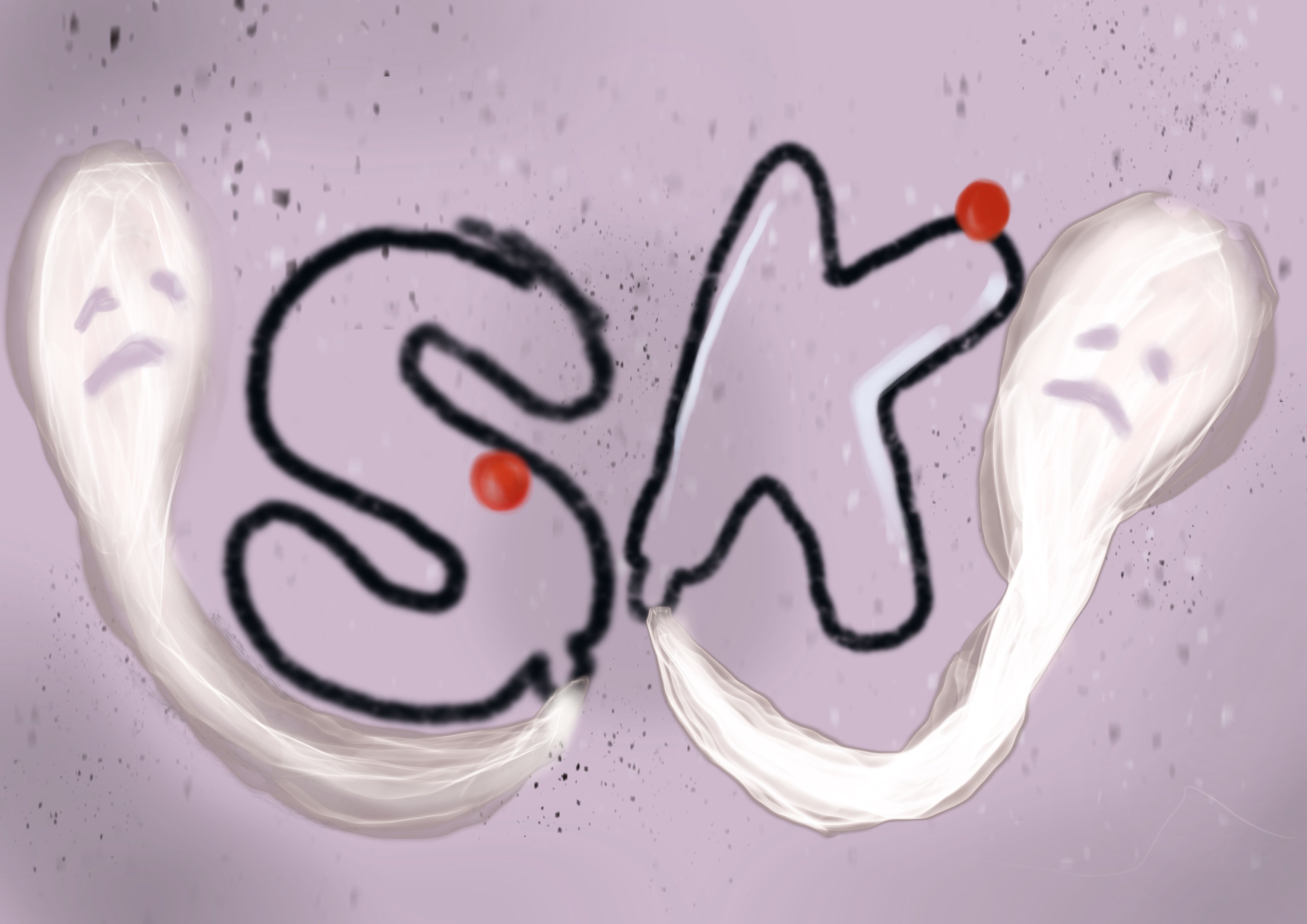
For this draft, my concept was a creepy clown typeface being deflated and the air leaving is the souls of crying kids. The elements used for this typeface is the rubbery and smooth texture of a balloon with deconstructed elements of a clown such as its iconic red nose and confetti in the background.
SECOND CONSULTATION WITH MIMI & PEERS:
Couldn’t tell it’s related to clowns
The spirit of the children looks like a sperm.
Try to focus on the elements of being a clown
THIRD DEVELOPMENT:
Rough sketch of a depressed clown
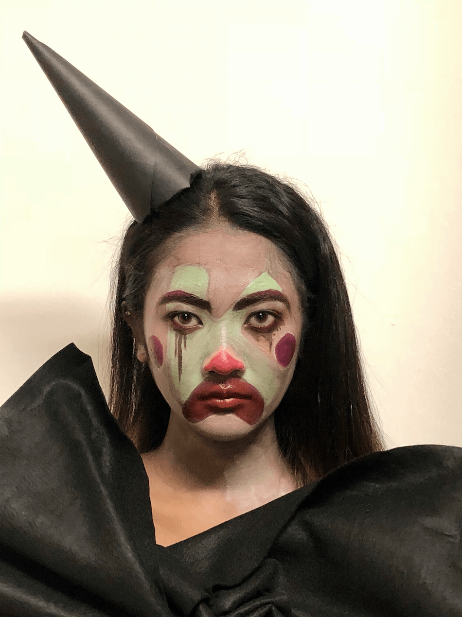
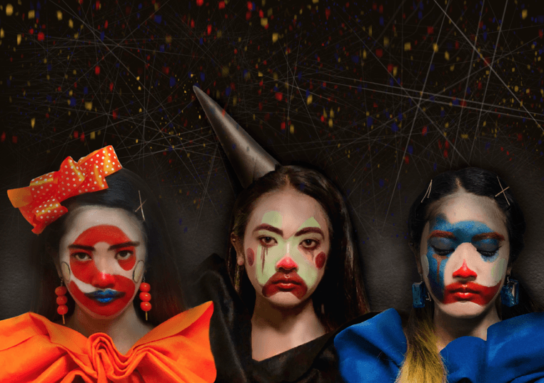
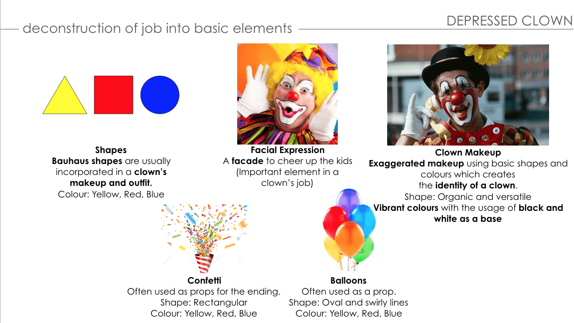
I’ve decided to change from a creepy clown to a depressed clown to emphasize the dual reality of being a clown whereby despite wearing vibrant and joyful colors, the clown is feeling otherwise emotionally (contrast). After consulting Mimi and my peers, I was having a mind block and decided to research and breakdown the elements of being a clown.
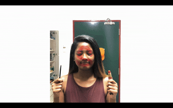
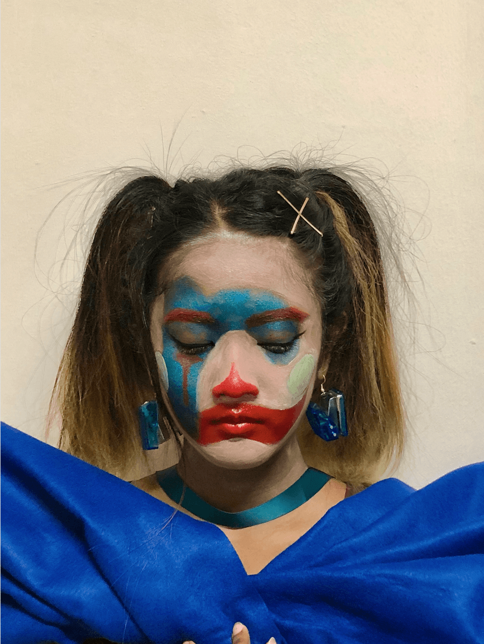
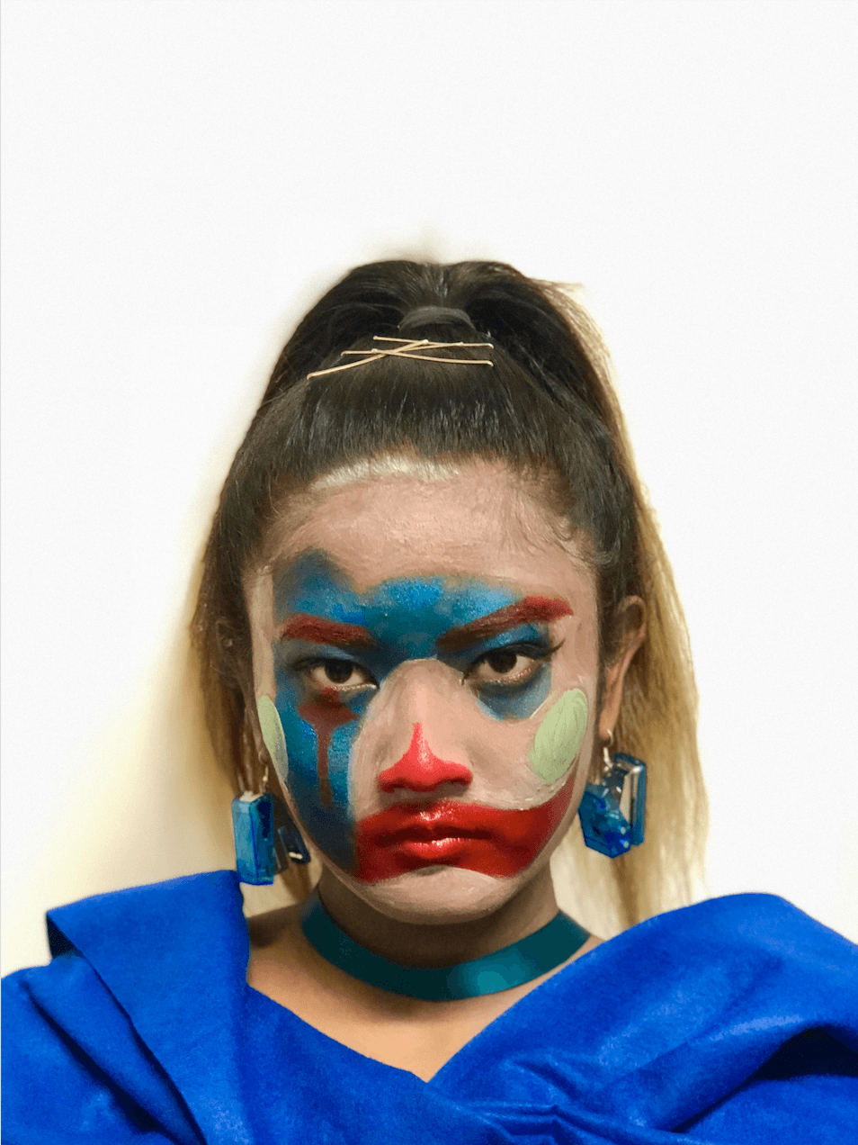
I realized what makes a clown are their makeup which consists of Bauhaus’ geometric shapes and colors, their facial expression and their custome which creates their identity. To regain my motivation, I’ve decided to do this typeface by putting on makeup which I enjoy and recreating the desired rounded and bouncy font with the elements of being a clown on my face as a canvas and editing the overall composition on Photoshop afterward.
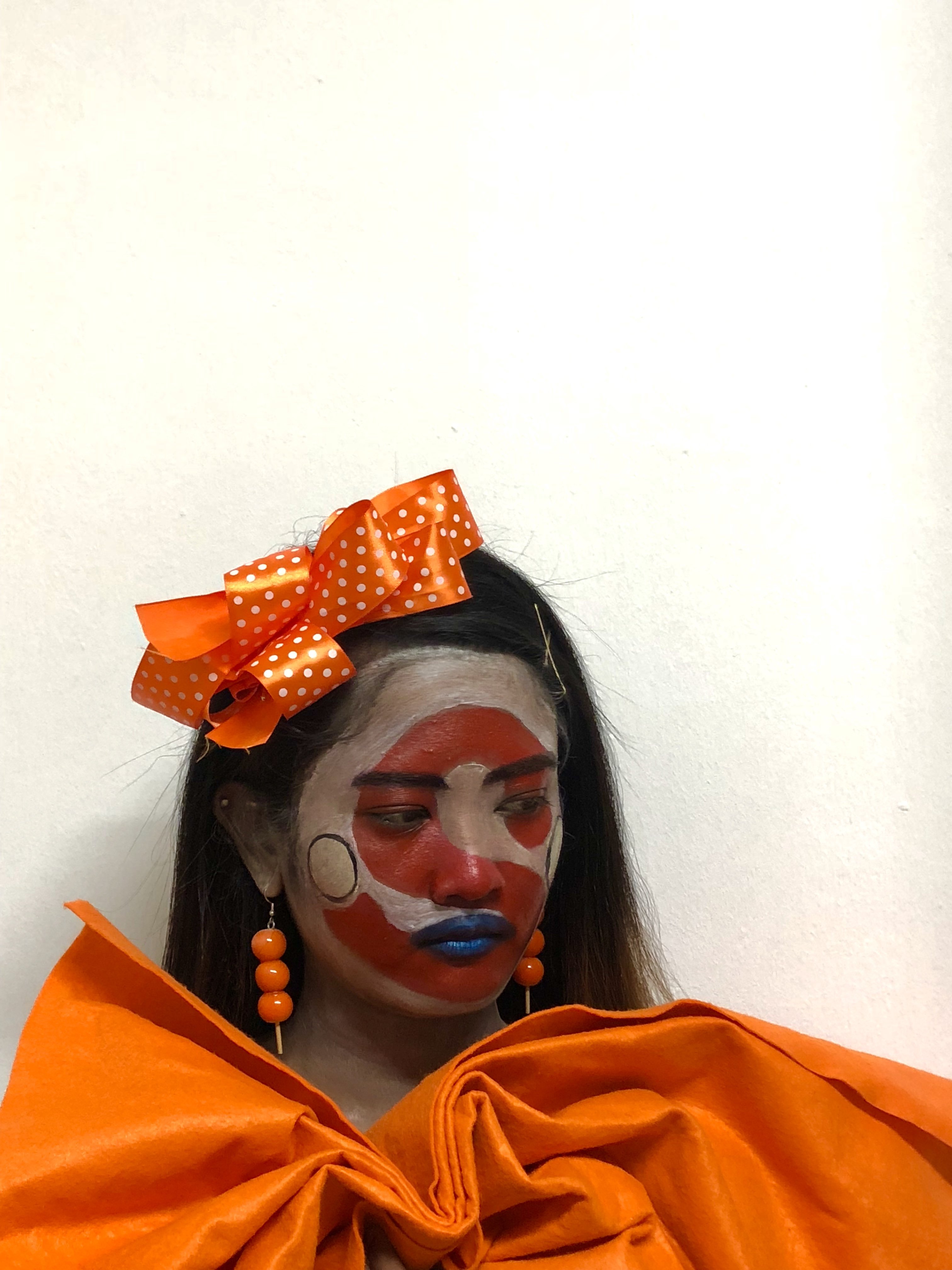
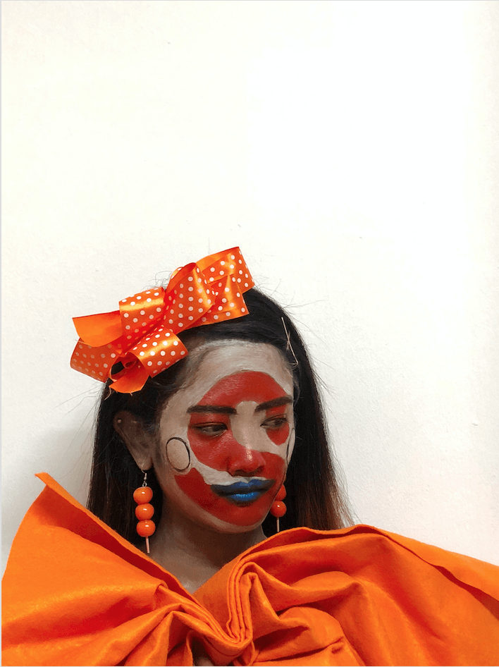
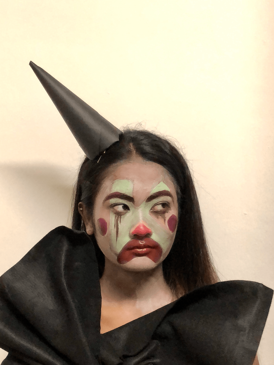
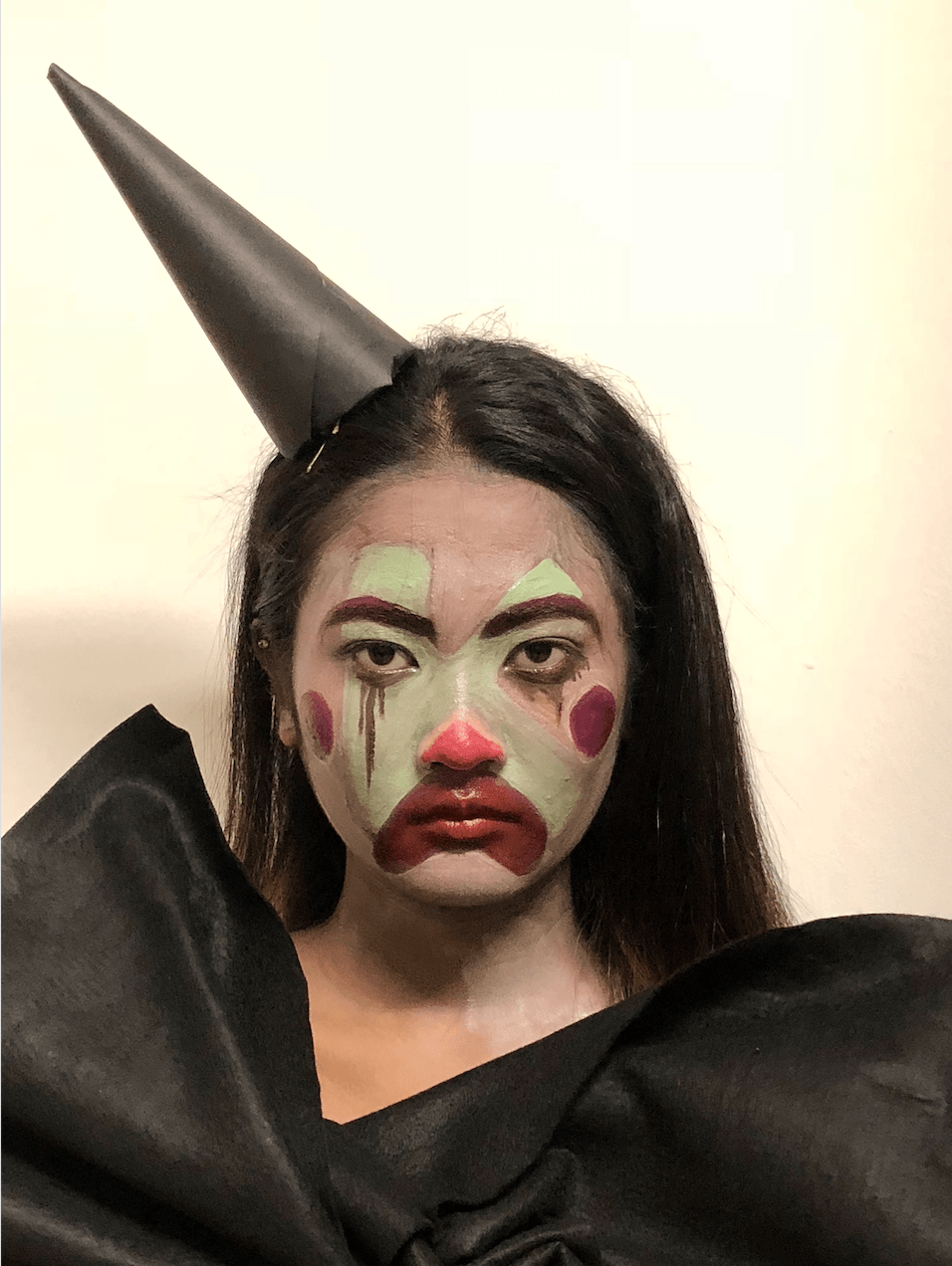
APPLICATION OF MAKEUP:
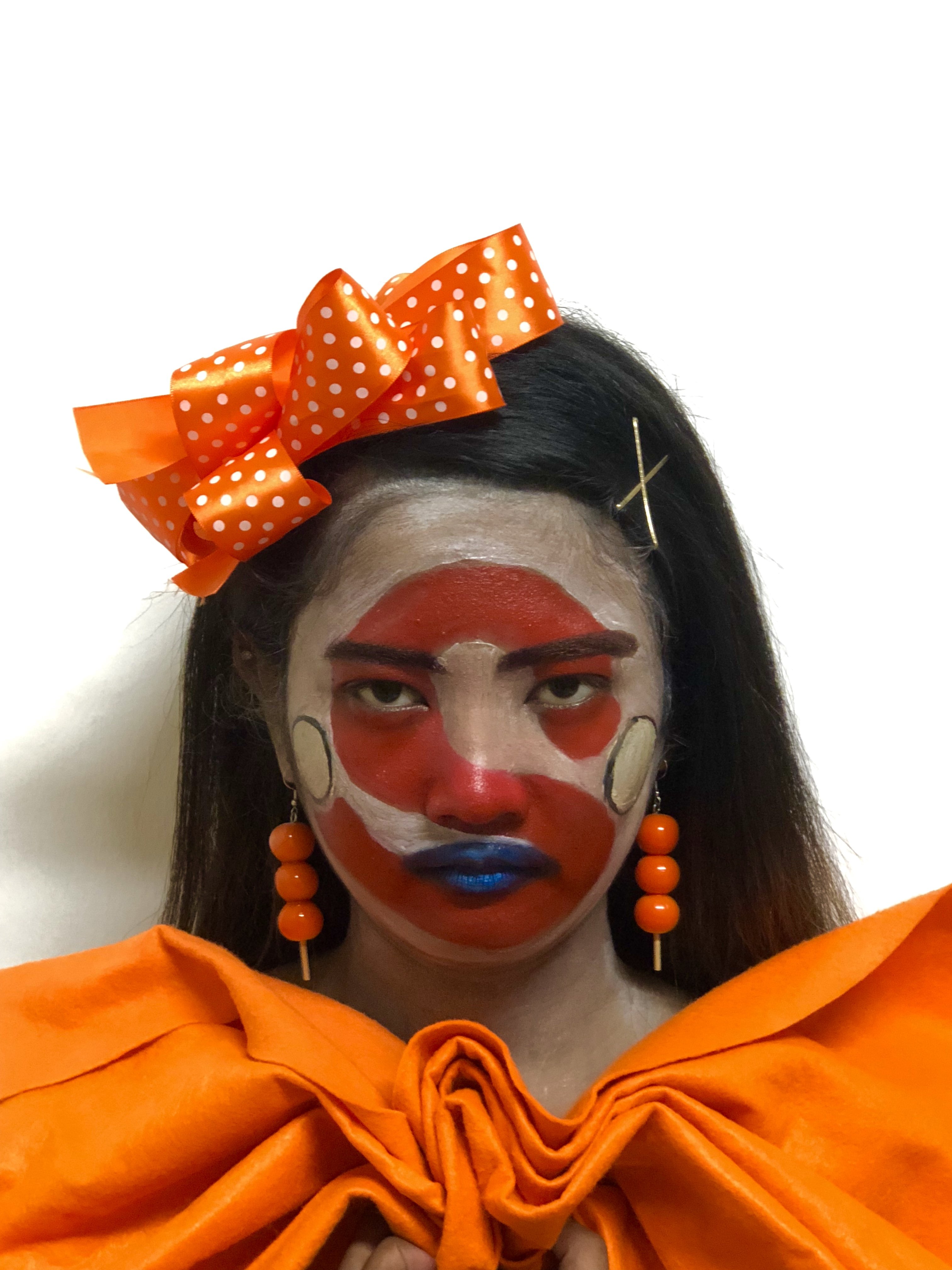
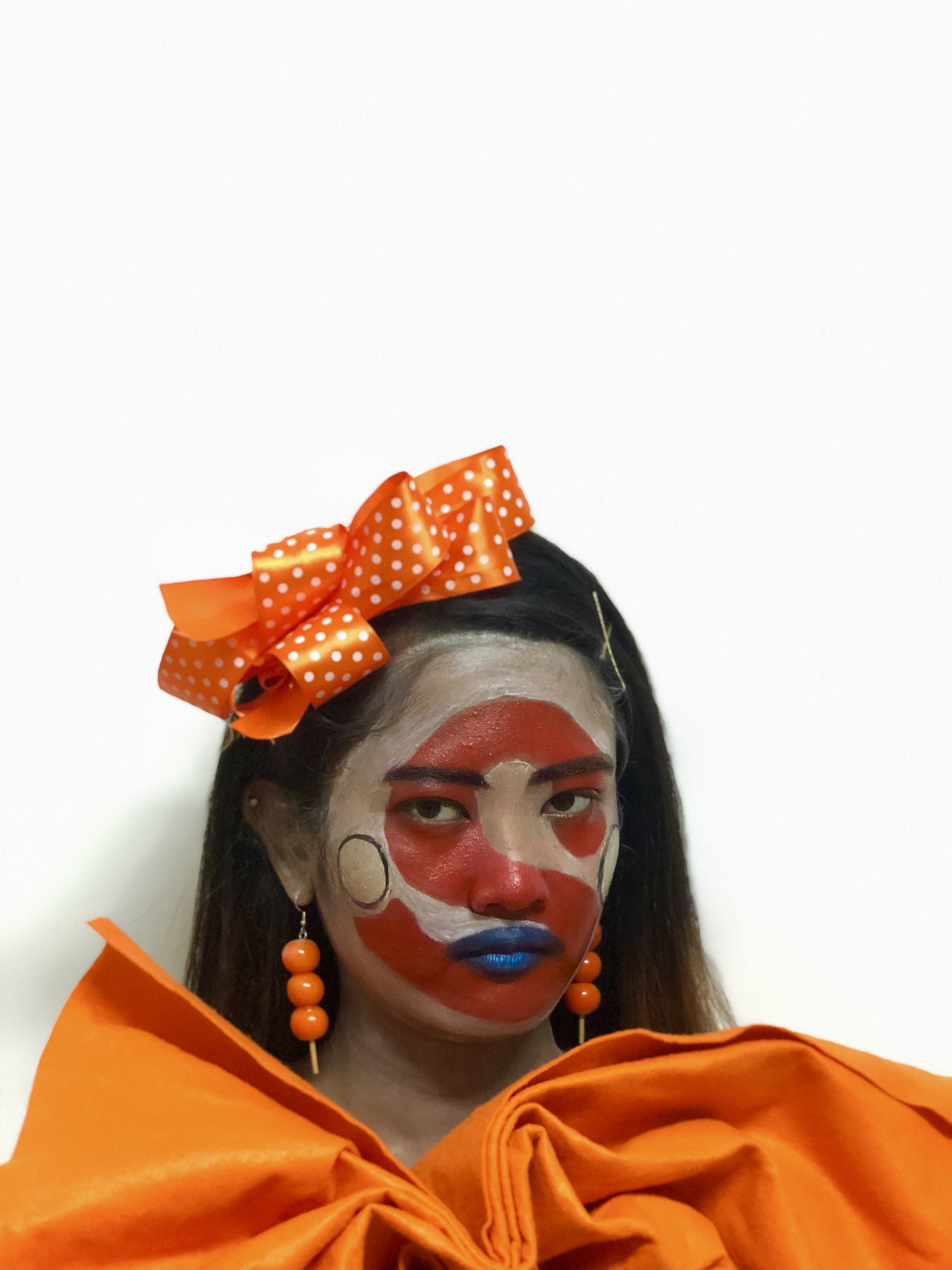
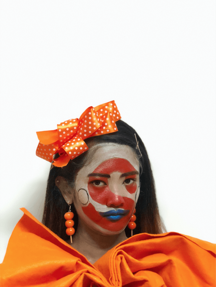
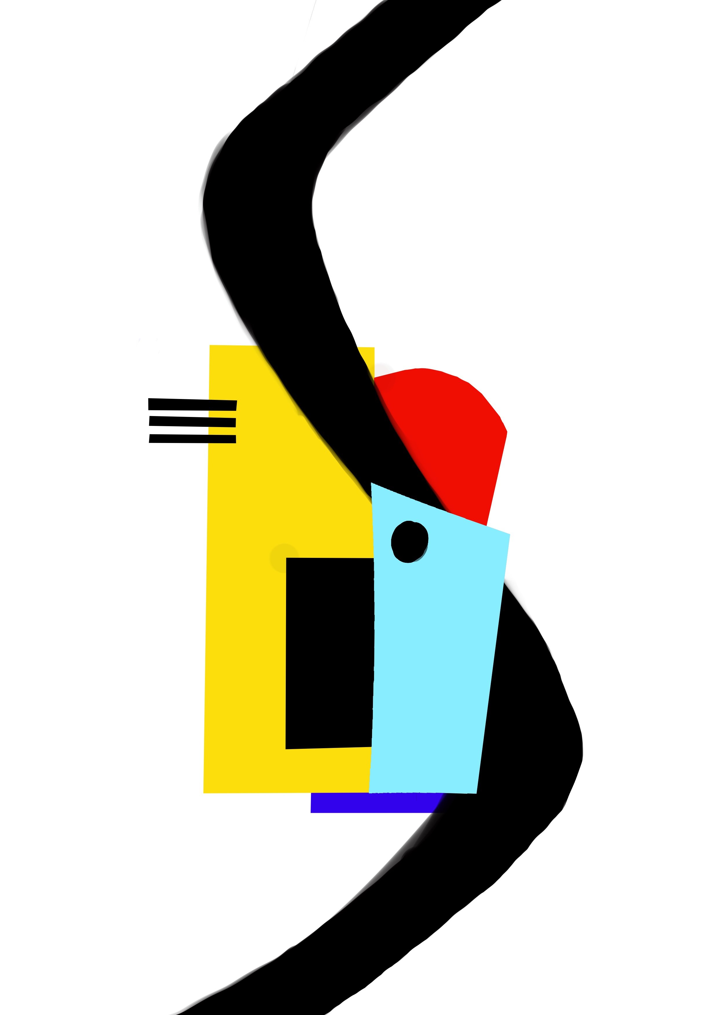
For the letter ‘S’ –
The typeface with the letter ‘S’ is rounded and red in color. Addition elements such as a blue lip and yellow circles are included because a clown’s makeup incorporates the Bauhaus’ geometric shapes and colors.
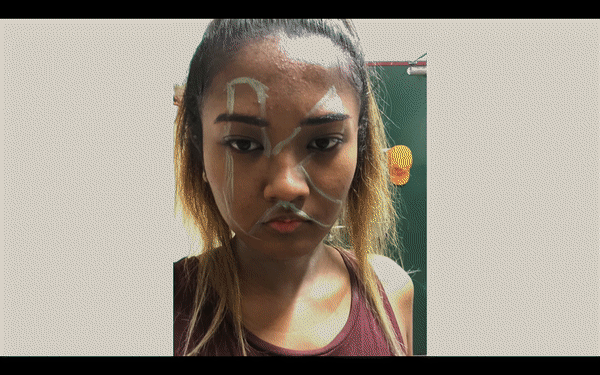
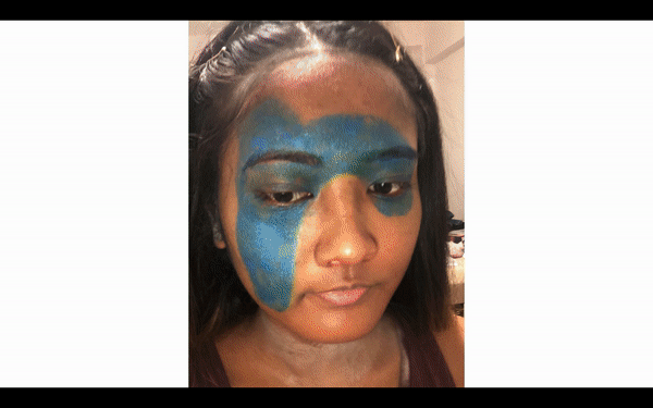
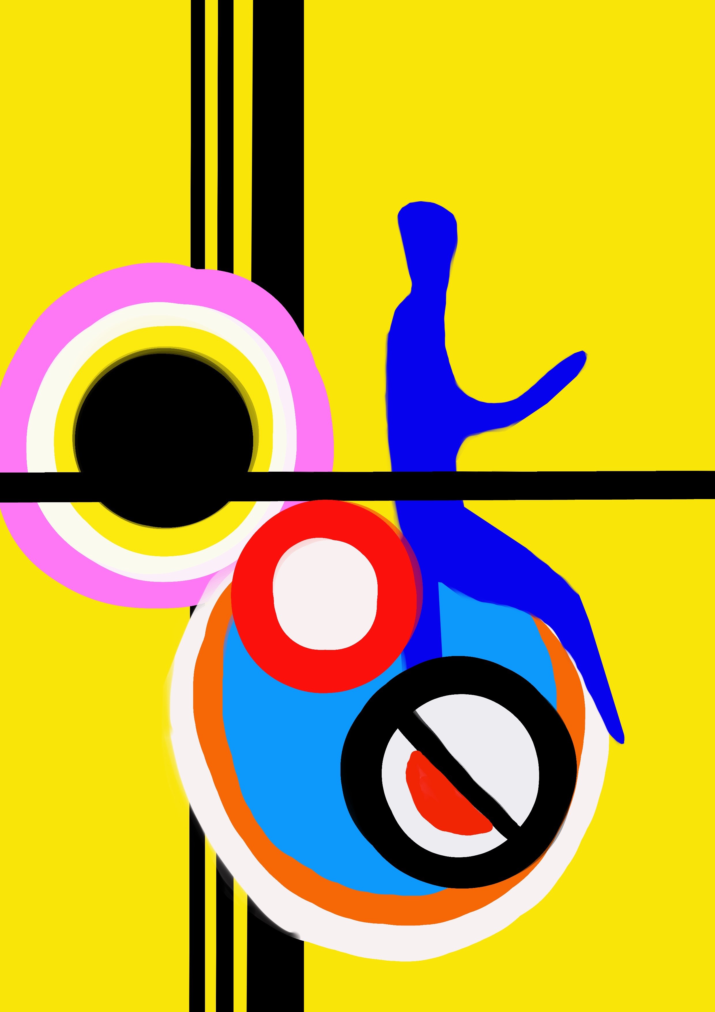
For the letter ‘K’ –
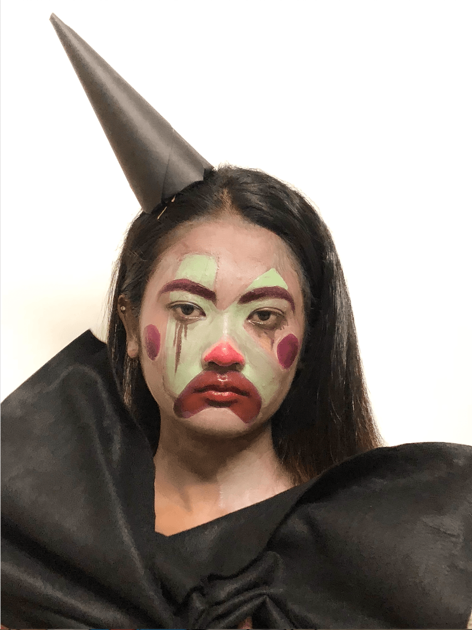
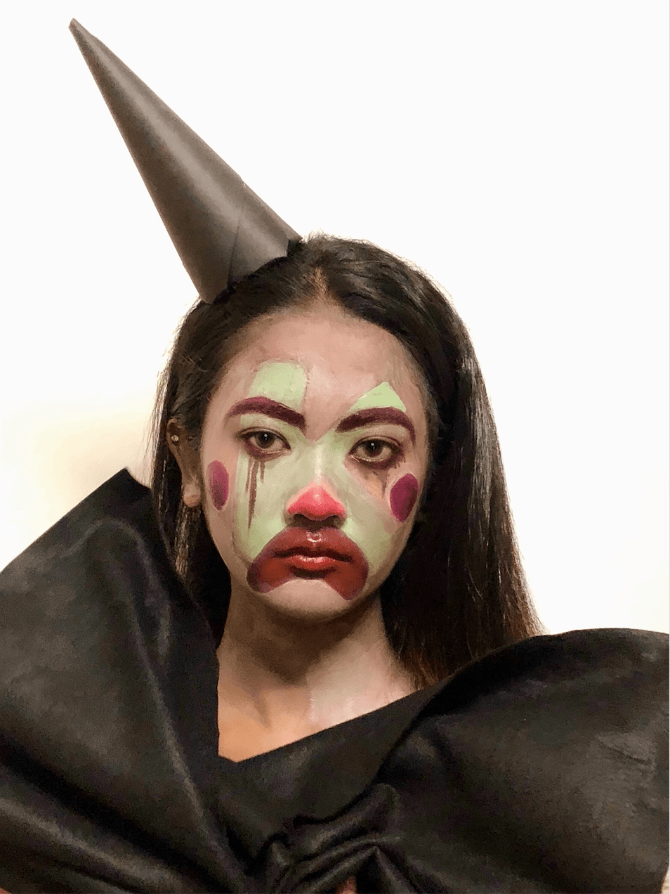
For the letter, ‘K’ has the same rounded typeface and it’s green in color. The red triangular shape and the magenta lips help emphasize the form of the letter. For the cheeks, there are two magenta circles and brown tears to evoke the feeling of depression and sadness.
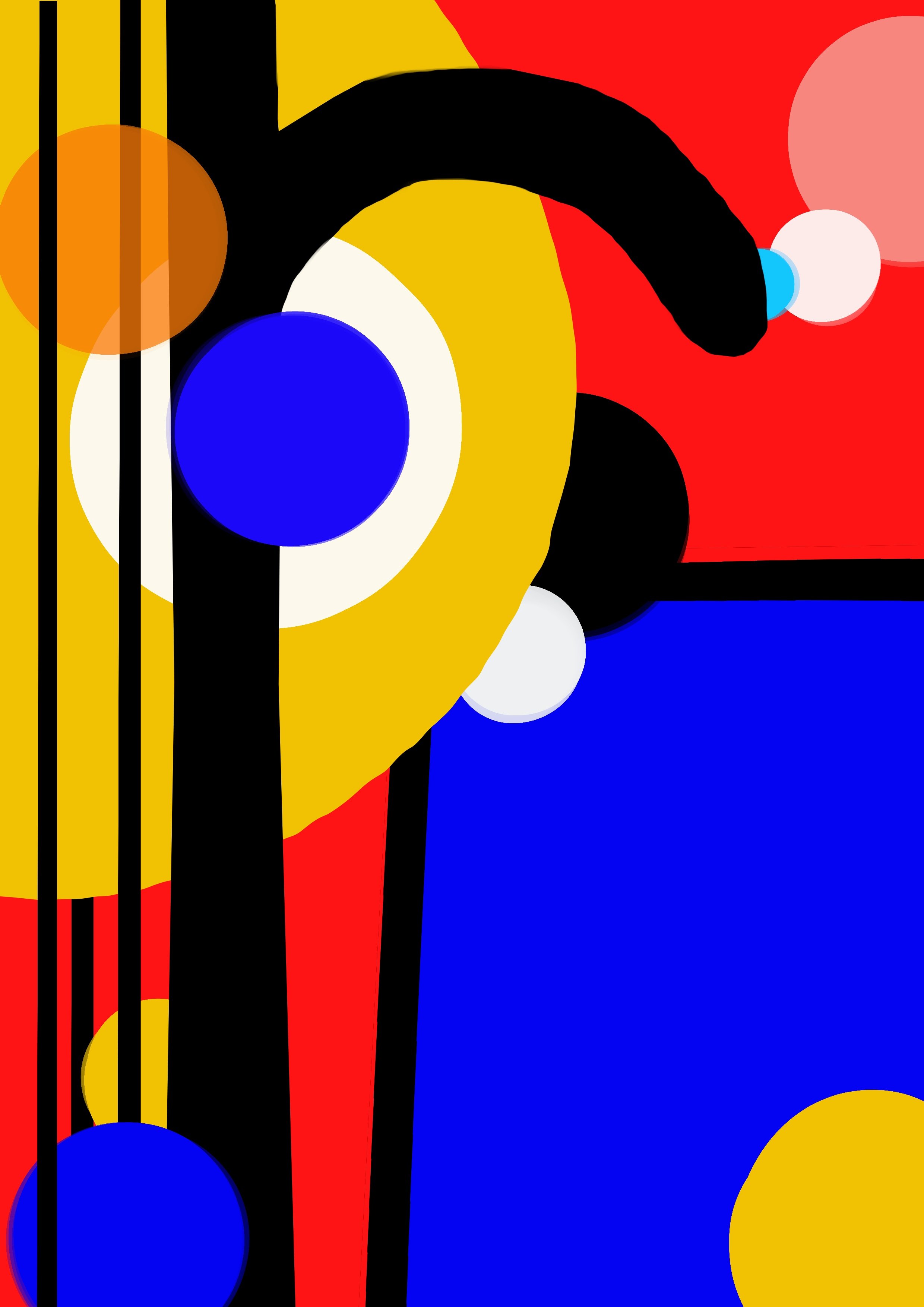
For the letter ‘R’ –
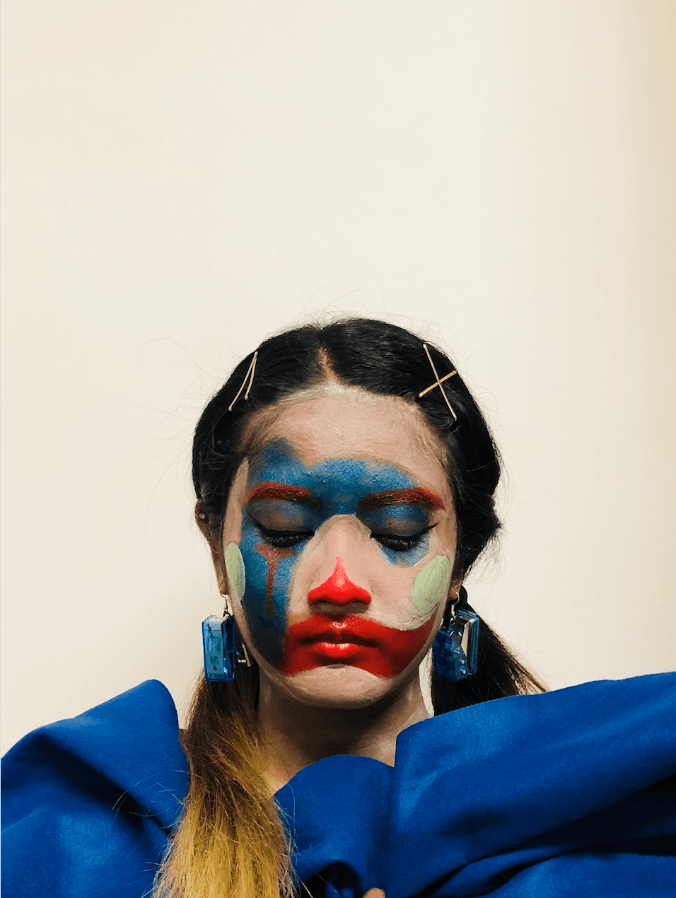
For the letter, ‘R’, the rounded typeface is blue in color. Colors such as blue, red(eyebrows, tears, and lips), and green (circles on the cheek) are used.
RAW IMAGES & EDITING OF PHOTOS:
Edited using Meitu and Photoshop to touch up (increase saturation and contrast).
Letter ‘S’ :
BEFORE
AFTER
BEFORE
AFTER
BEFORE
AFTER
Letter ‘K’ :
BEFORE
AFTER
BEFORE
AFTER
BEFORE
AFTER
Letter ‘R’ :
BEFORE
AFTER
BEFORE
AFTER
BEFORE
AFTER
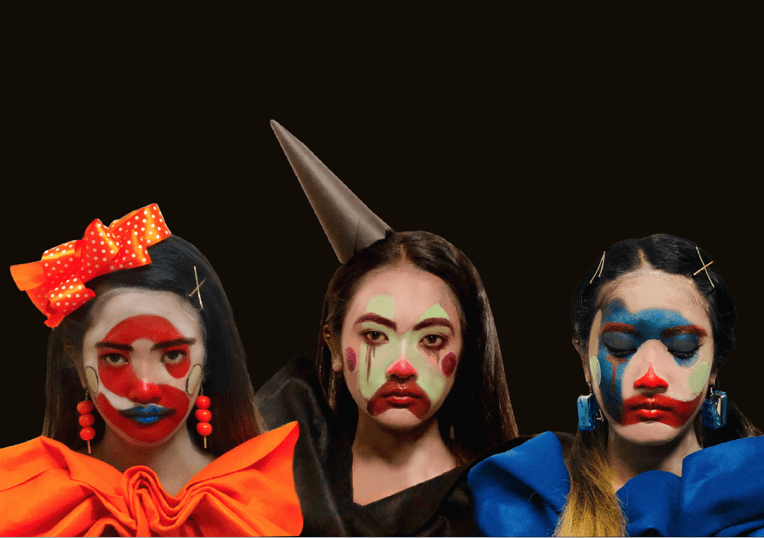
FOURTH DEVELOPMENT:
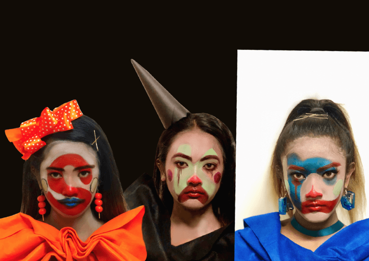
An arrangement of the clowns and typeface:
Selecting the right clown with expressing the right emotions
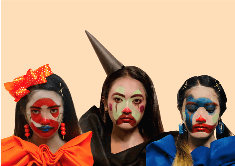
Against a beige background
Against a black background -CHOSEN
For this process, I was experimenting with different typeface clowns which is suitable to evoke the concept of the dual reality of a depressed clown. I’ve decided to choose a black background in contrast with the vibrant and lively typeface clowns with depressing facial expression.
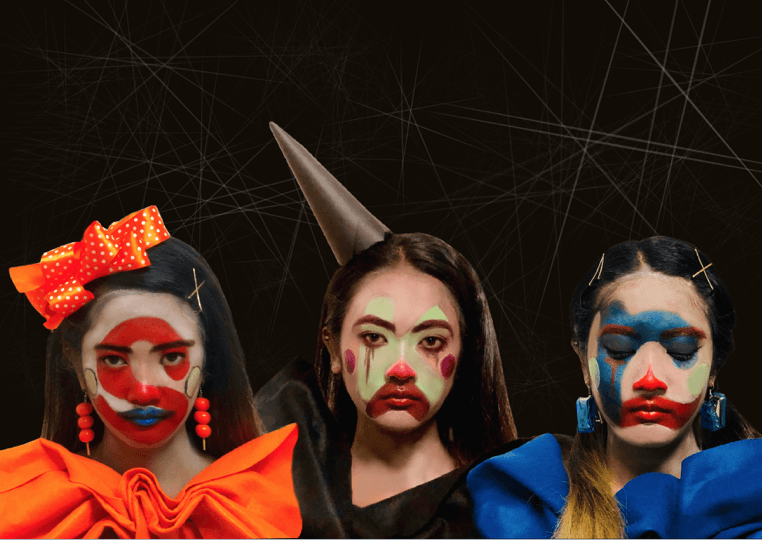
Addition of texture and lines for the background:
Thin lines in various sizes
Textured white pattern behind the clowns
For the background, I added a variety of thin lines because it suggests pain, agony, and frailty as it appears to break easily. In addition, a white textured pattern behind the typeface clowns so it wouldn’t blend into the background.
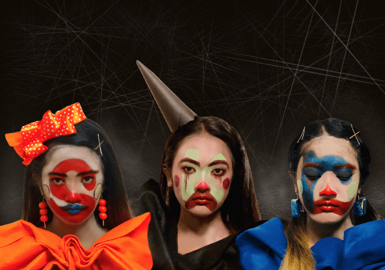
Addition of shadows around the clown to focus on the typeface:
Shadows around the typeface clowns
To focus on the letters of the typeface, I’ve added a drop shadow around it to create a similar effect of lighting on an art piece in a museum.
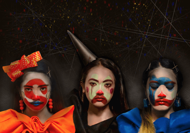
Addition of confetti:
1
2 – CHOSEN
The last development stage in this design process, I’ve added red, yellow and blue confetti which is one of the props to end off a clown’s performance. Hence, I’m using this to harmonize the typeface clown (foreground) together with the black textured background.
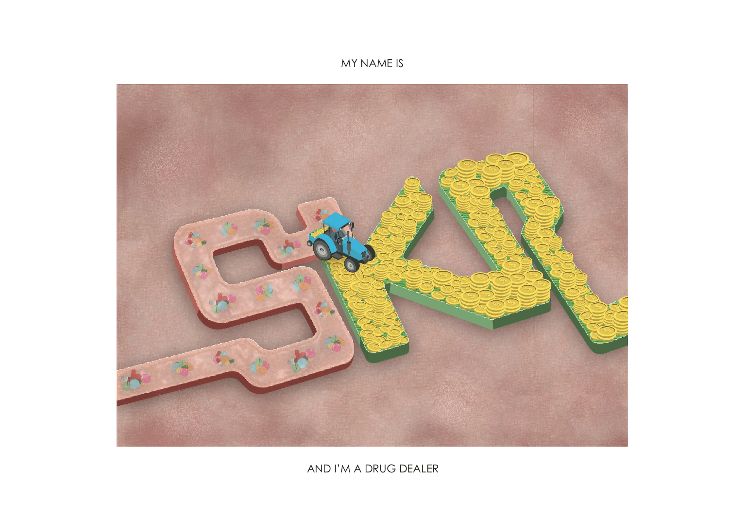
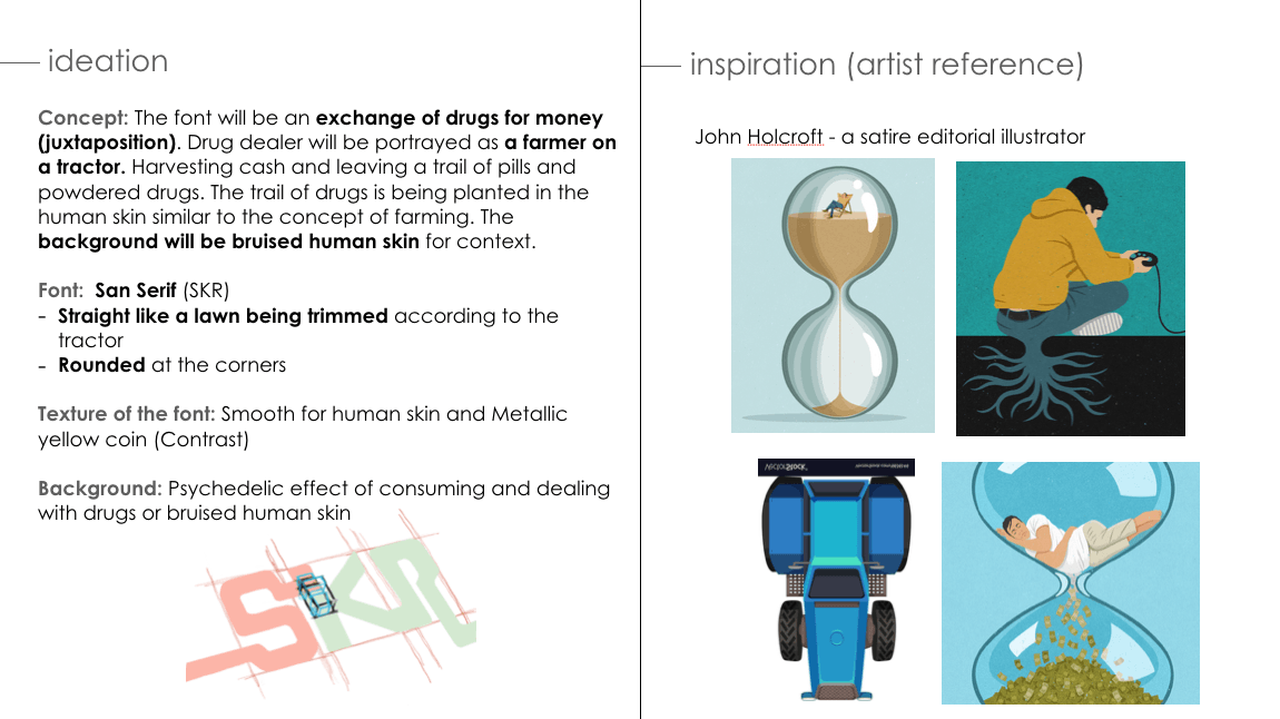
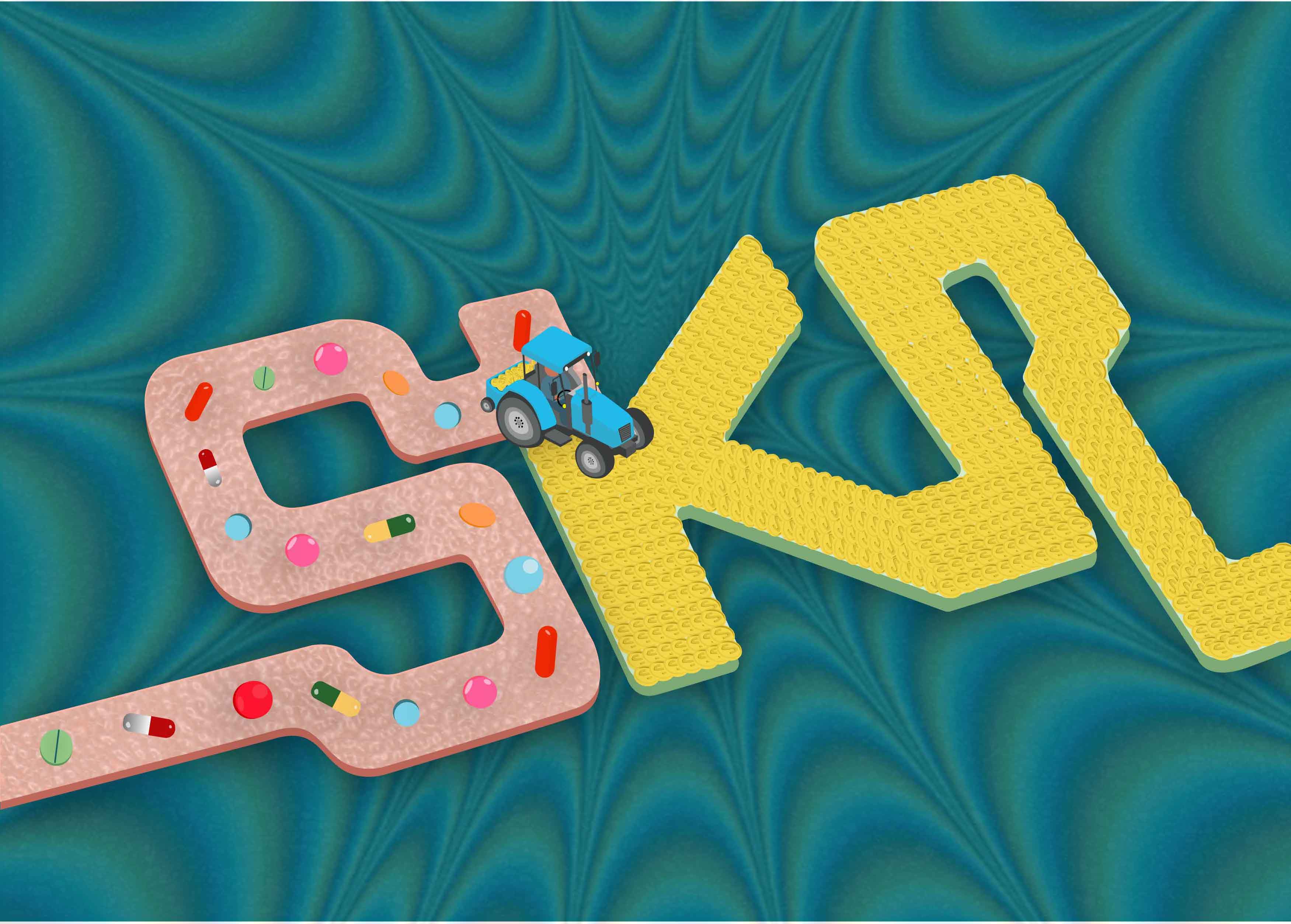
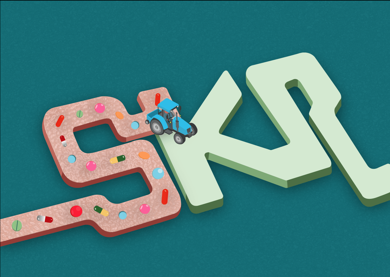
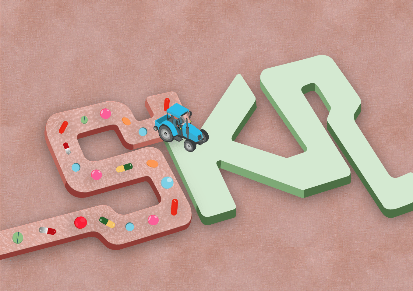
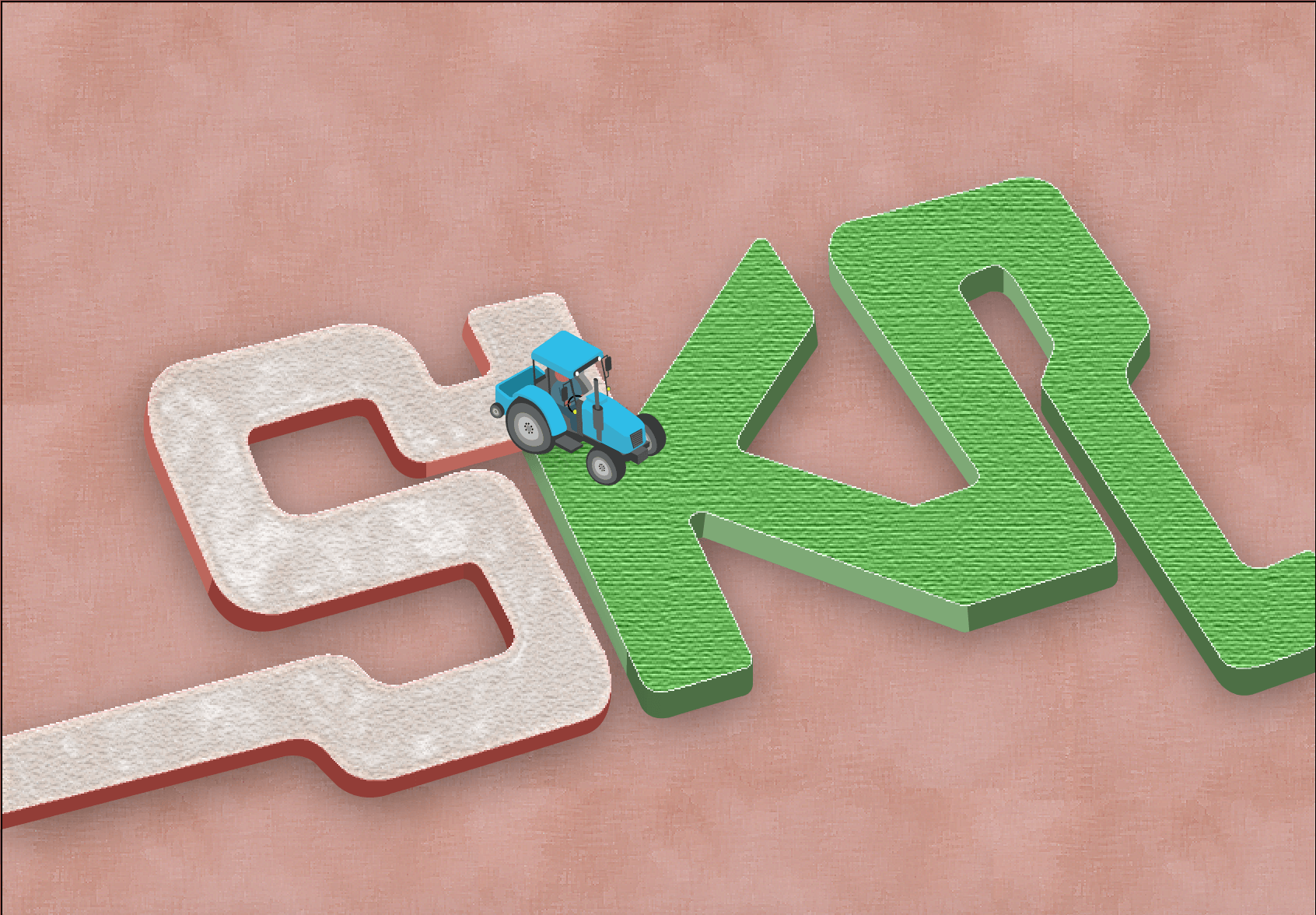
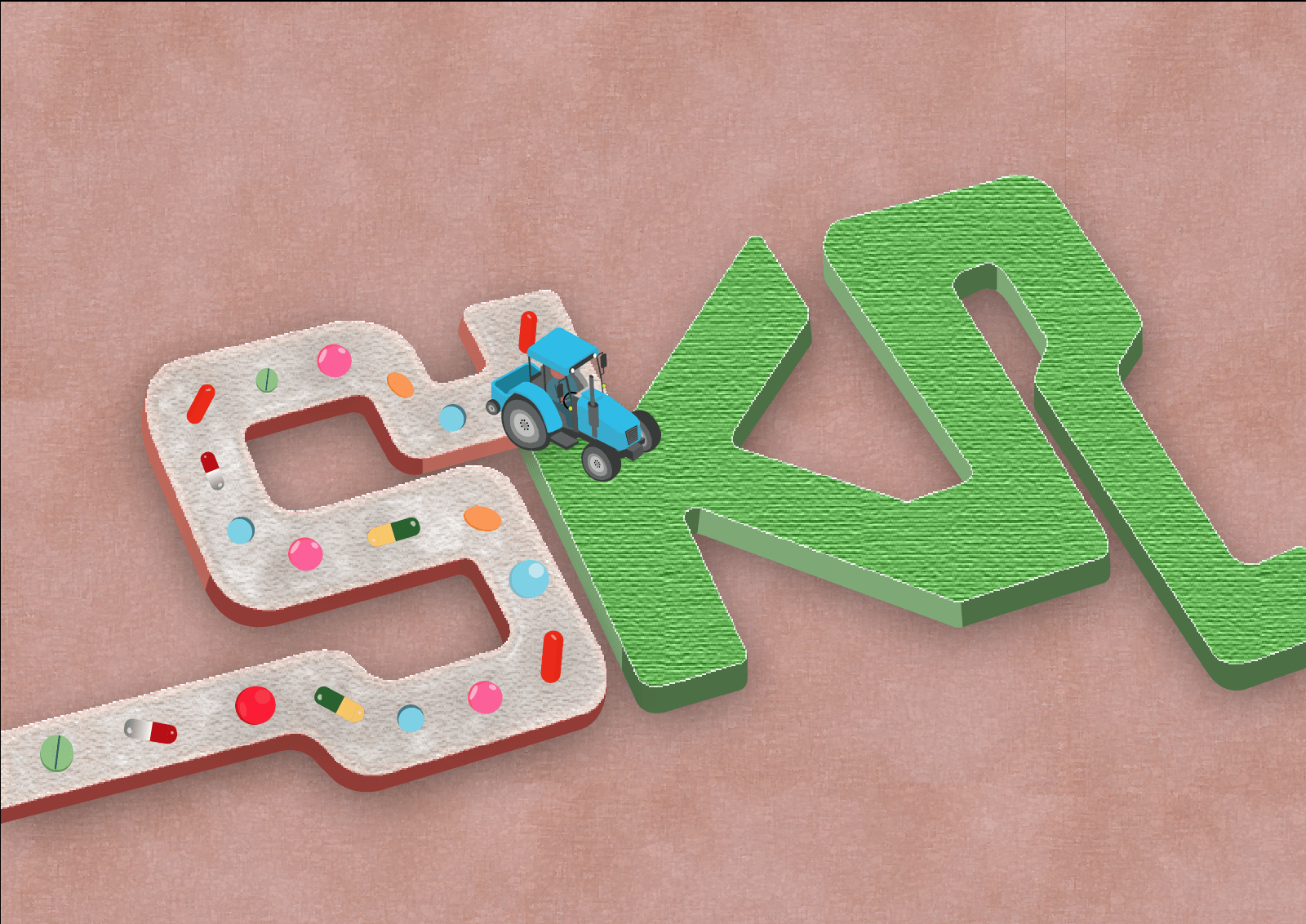
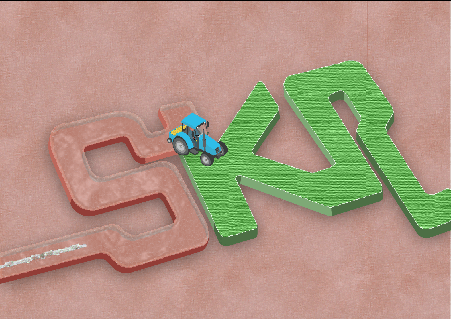
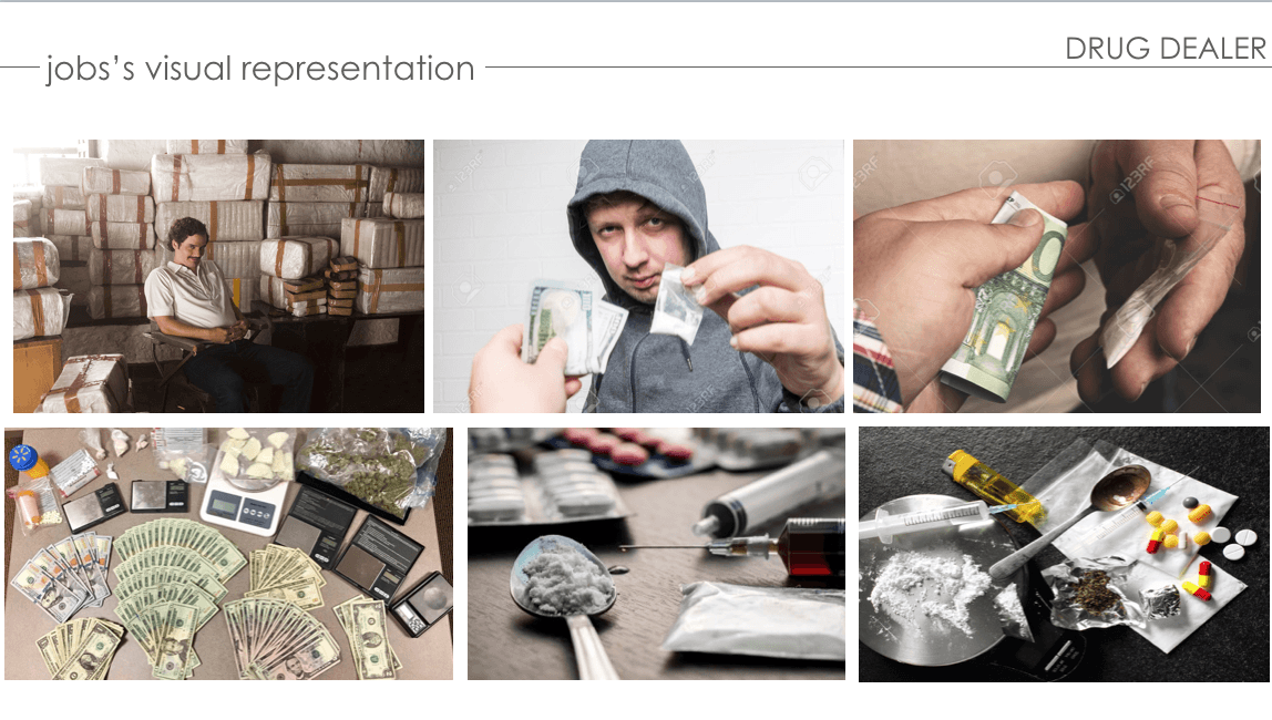
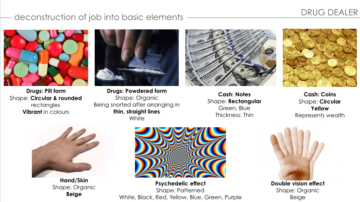
PROCESS – DRUG DEALER
ANIMATED PROGRESS:
FIRST DEVELOPMENT:
Double Vision Effect
Psychedelic Effect
A rough initial idea of the typeface I’ve in mind: San Serif (Rounded & Blocky style like pills) with a powdered textured font. The background will be the effect of consuming drugs which will be a double vision or psychedelic effect.
FIRST CONSULTATION WITH MIMI:
focus on dealing with drugs
stacks of cash or coins
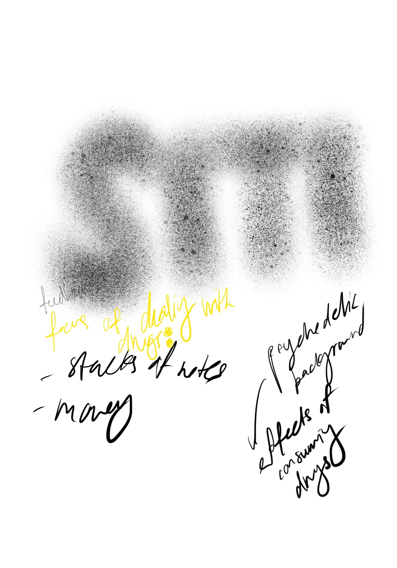
SECOND DEVELOPMENT:
First Draft (With Psychedelic Background)
Second Draft (With textured background)
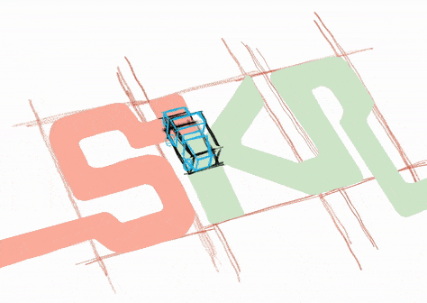
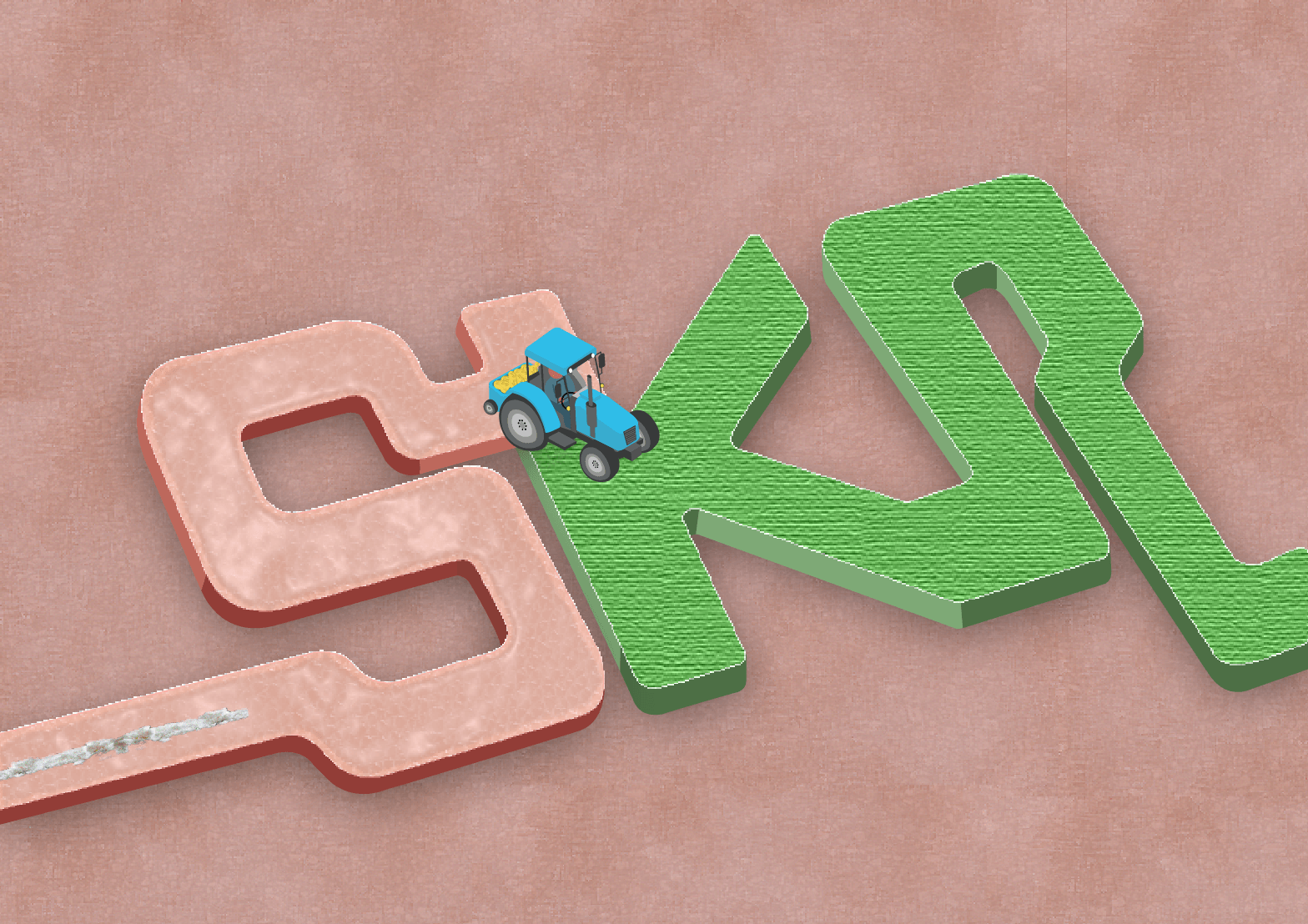
For my first draft, I wanted my font to be made up of a juxtaposition of the exchange of drugs and money. The theme is farming; planting of drugs onto the human skin in exchange for money as a drug lord. Overall vibe will be the contrast of job, and colours (Base colour of font; Skin – Beige vs Money – Light green) and Objects (Tractor – Blue vs. Coin – Yellow). In addition, I applied the ‘Rhythm’ and ‘Movement’ to emphasize the flow on my typeface.
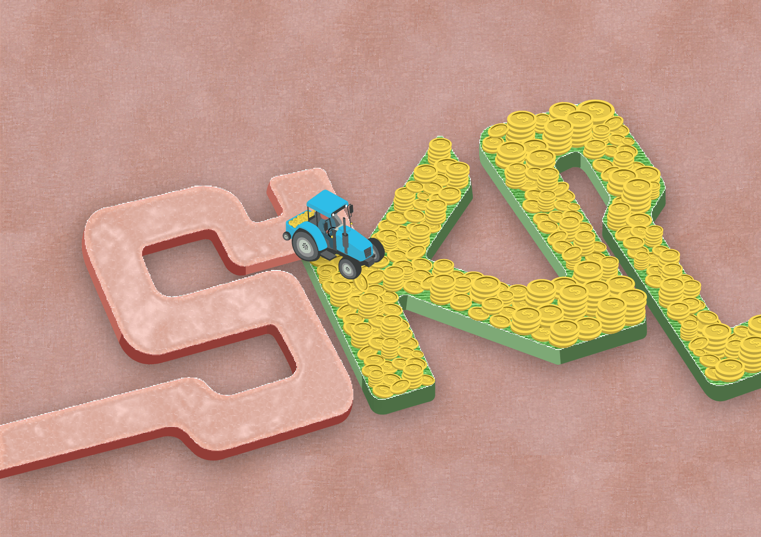
SECOND CONSULTATION WITH MIMI & PEERS:
Increase the size of the coins to make it more obvious
Increase the thickness of the form of the font to make it stand out
Change the background to focus on the exchange of drugs and money between humans
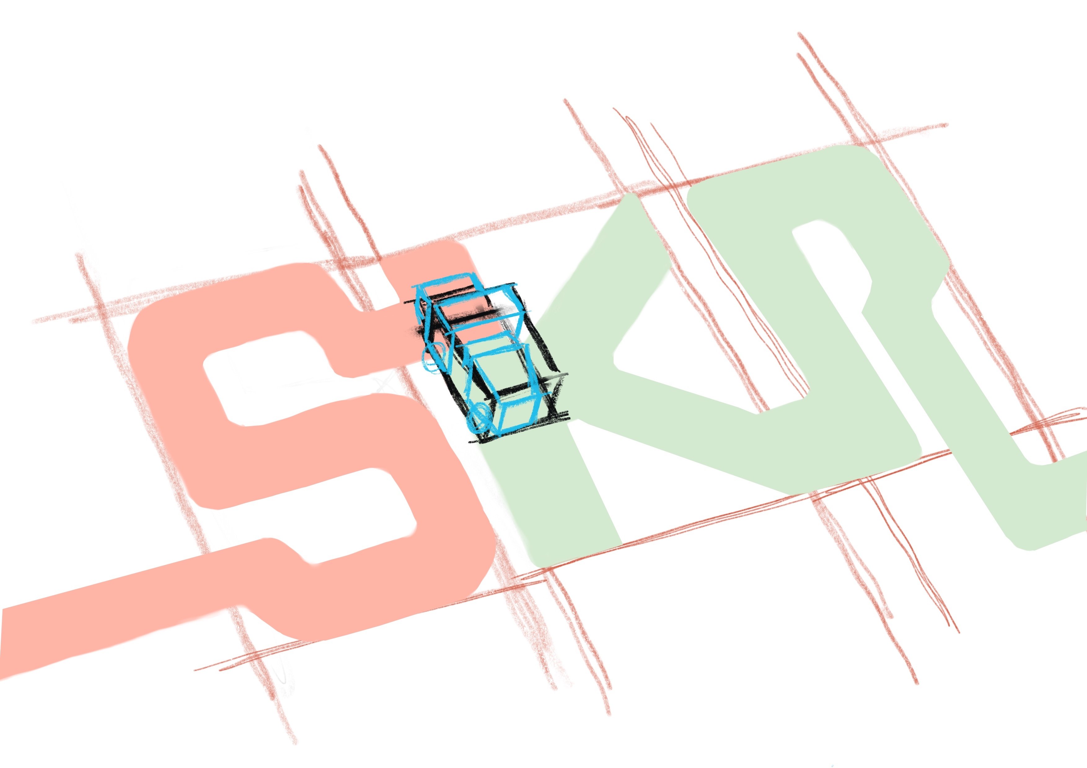
THIRD DEVELOPMENT:
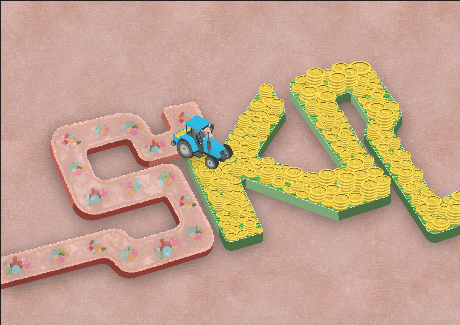
Increased the thickness
Changed the background to human skin
Human Skin
Textured road
For the development of this draft, I increased the thickness of the form of the changed the background to human skin. To manipulate and add texture to the background of the typeface, I musk the images of the human skin and textured road above onto a beige solid background. Using plastic wrap and paint daubs effect on Illustrator.
1
2
3
4
Experimenting with the textures of the letter ‘S’ – Human and ‘K’ and ‘R’ – Cash with the transparency and colors to see which is suitable for my concept. In addition, I was figuring how to arrange the drugs in a pill or powdered form.
Increased the size of the coins and arranged it in a messy way instead of a neat and clean style as a semiotic that this drug dealer job is not a ‘clean’ and respectable job.
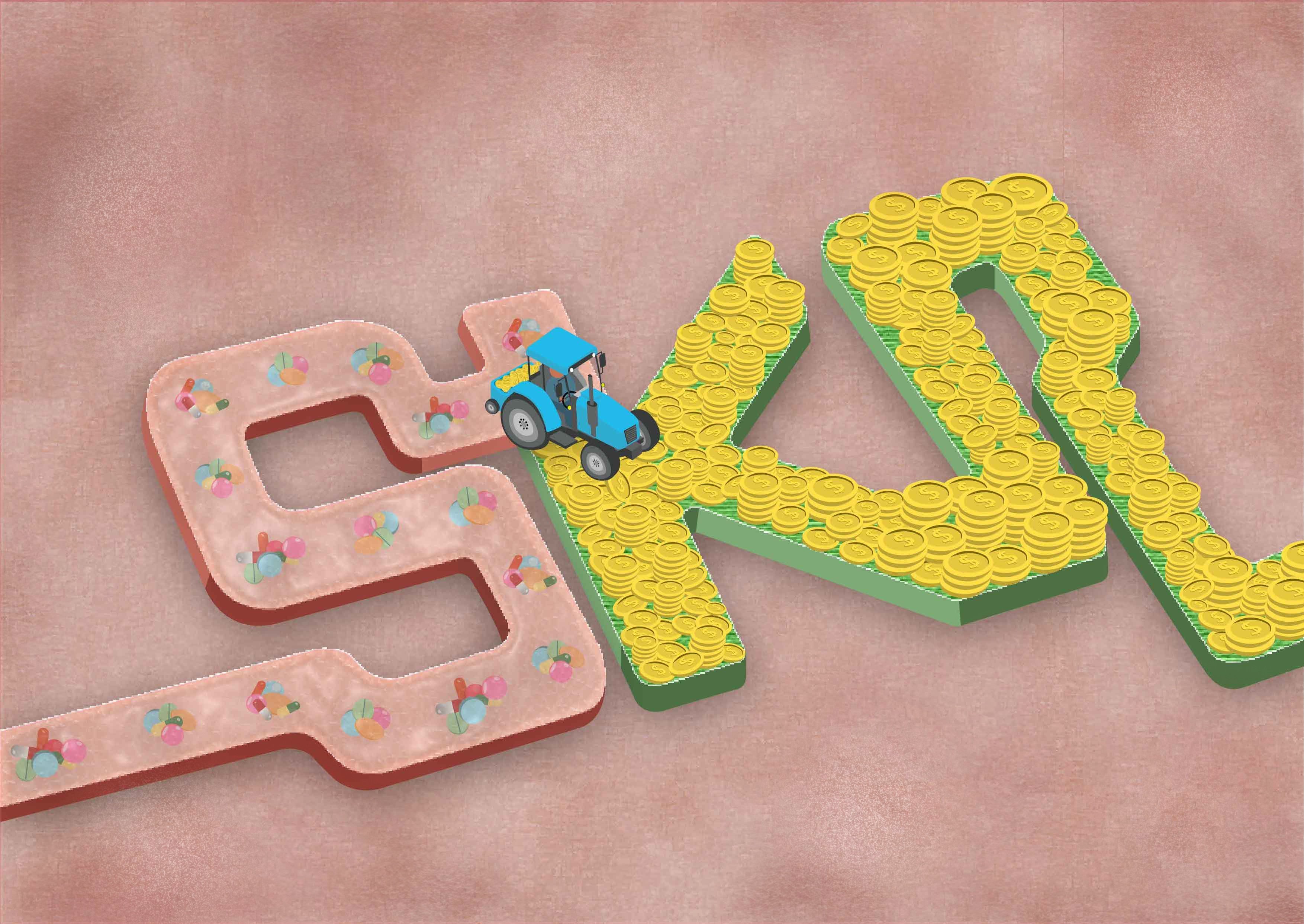
Drug pills on the skin
Drug pills implanted in the skin
For this development, I’ve decided to use a variety of drugs pilled up together and being left in a trail after the tractor lawned on the human skin. I had a dilemma whether to place the drugs on the skin or implanted in the skin. My final decision is implanting the pills in the human skin and you can see the layer of skin above which emphasizes on consuming the drugs.
Lastly, for the background, I’ve added the bruising of injecting the drugs into our body to create depth for the overall look of the typographic portrait. Personally, I love the concept of the font replicating the grass being lawned as the movement of the font and the juxtaposition of the colors and idea for the exchange of drugs and money as a drug dealer.
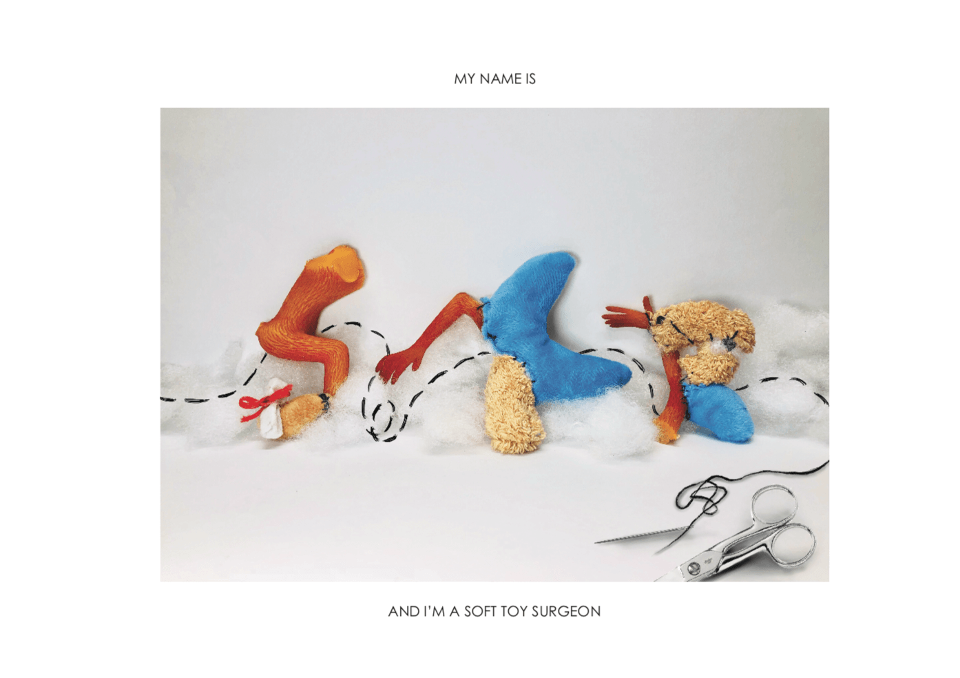
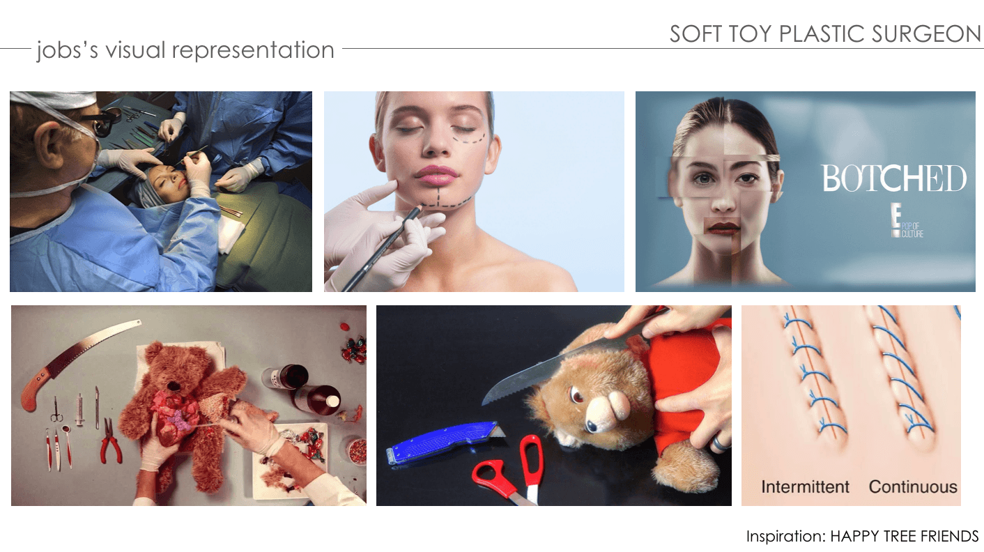
PROCESS – SOFT TOY SURGEON
ANIMATED PROGRESS:
FIRST DEVELOPMENT:
Before changing job to soft toy surgeon
First draft – Mutilating soft toys
Second draft – Hanging reconstructed work on a noose
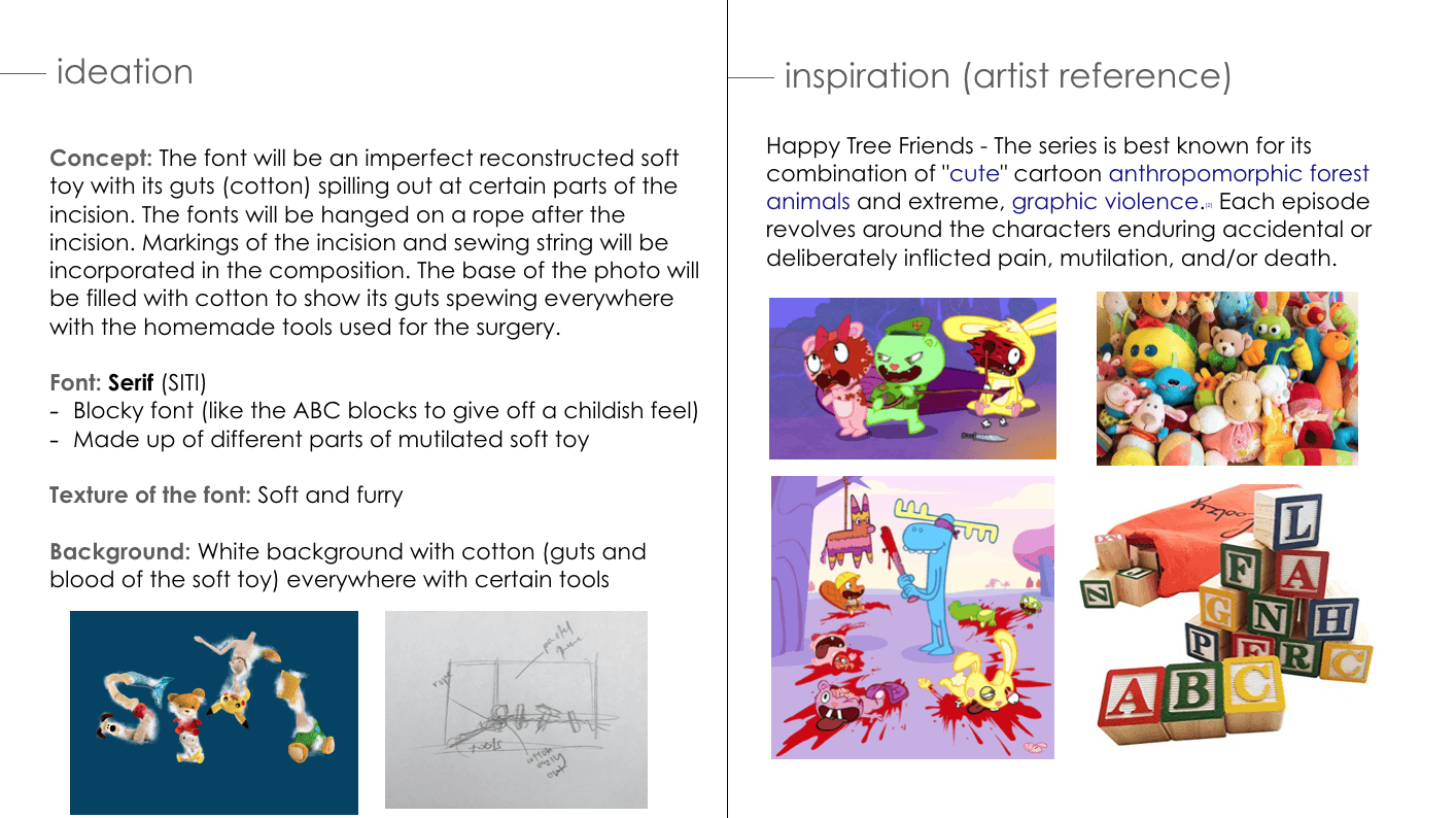
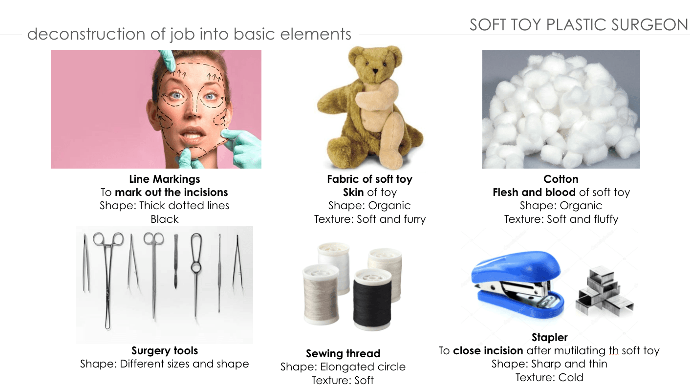
Initially, my job was a serial killer and I’ve decided to change to a soft toy serial killer. I wanted my typeface to give off a childish and innocent vibe with the psychotic characteristics of being a serial killer.
The concept behind this typeface is using a variety of soft toy fabric as the skin and its guts (cotton) are in the base of the composition. The font of my typeface is serif, similar to the children’s alphabet block toys. I have intentions of using certain parts of the fabric as the decorative part of the font. In addition, I wanted each letter to be hanging on a noose as if it’s the victim of the serial killer. Tools and equipment used are attached to the typeface for context.
FIRST CONSULTATION WITH MIMI & PEERS:
Try using the analog method instead of digital
Change job name from Soft Toy Serial Killer to Soft Toy Surgeon.
SECOND DEVELOPMENT:
NEW COMPOSITION
TYPEFACE FONT
I’ve decided to change the layout of the concept I have in mind. Removing the noose and focusing on being a soft toy surgeon. The composition will be a reconstructed soft toy typeface surrounded by cotton (its guts) against a white backdrop to show cleanliness and professionalism of a surgeon’s workplace with tools used in the foreground. The technique and method I’ll be using to create this typeface will be sewing and digital enhancement.
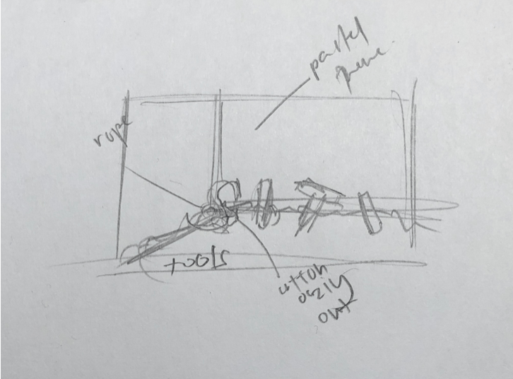
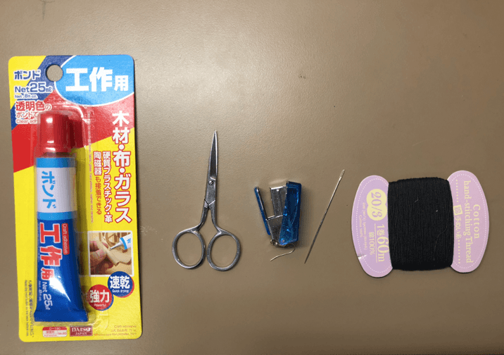
EQUIPMENT/TOOLS USED FOR SEWING:
Glue, scissors, stapler, needle & sewing thread
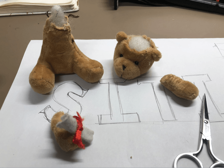
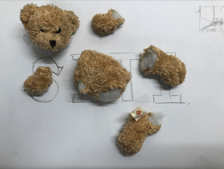
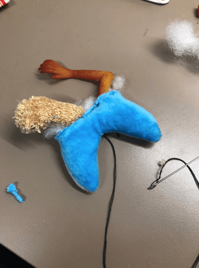
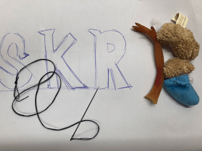
MUTILATING THE SOFT TOY INTO DIFFERENT PARTS:
CASUALTY 1: BEAR
CASUALTY 2: BEAR
CASUALTY 3: ORANGE MONKEY
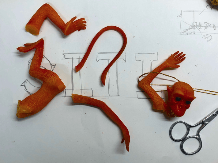
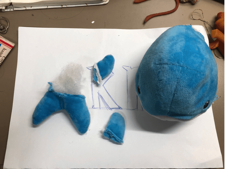
CASUALTY 4: BLUE WHALE
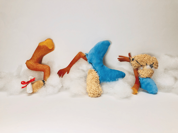
Personally, deconstructing and mutilating the soft toy physically was therapeutic and I was excited to construct it into the serif typeface font that I have in mind. Orange, Brown & Blue soft toys are used because they’re complementary colors that are vibrant and it will stand out against the white backdrop. I’ve kept the cotton filling of the soft toys to represent the guts for the later process of the composition. In addition, I want the texture of the font to be soft and furry.
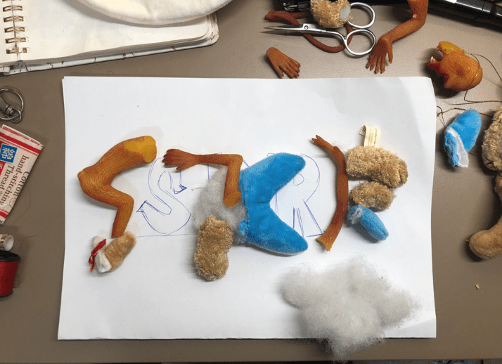
PLANNING OF RECONSTRUCTION WITH DIFFERENT PARTS OF SOFT TOY:
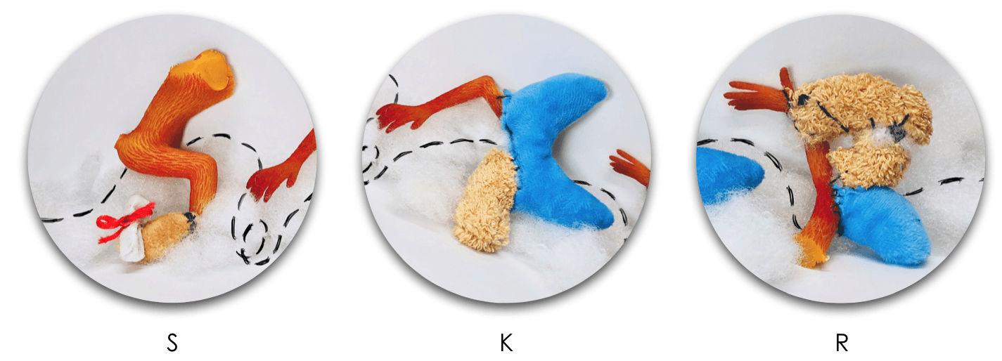
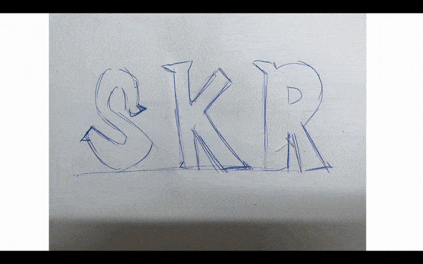
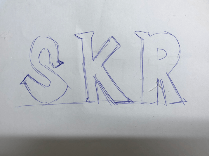
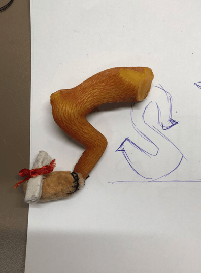
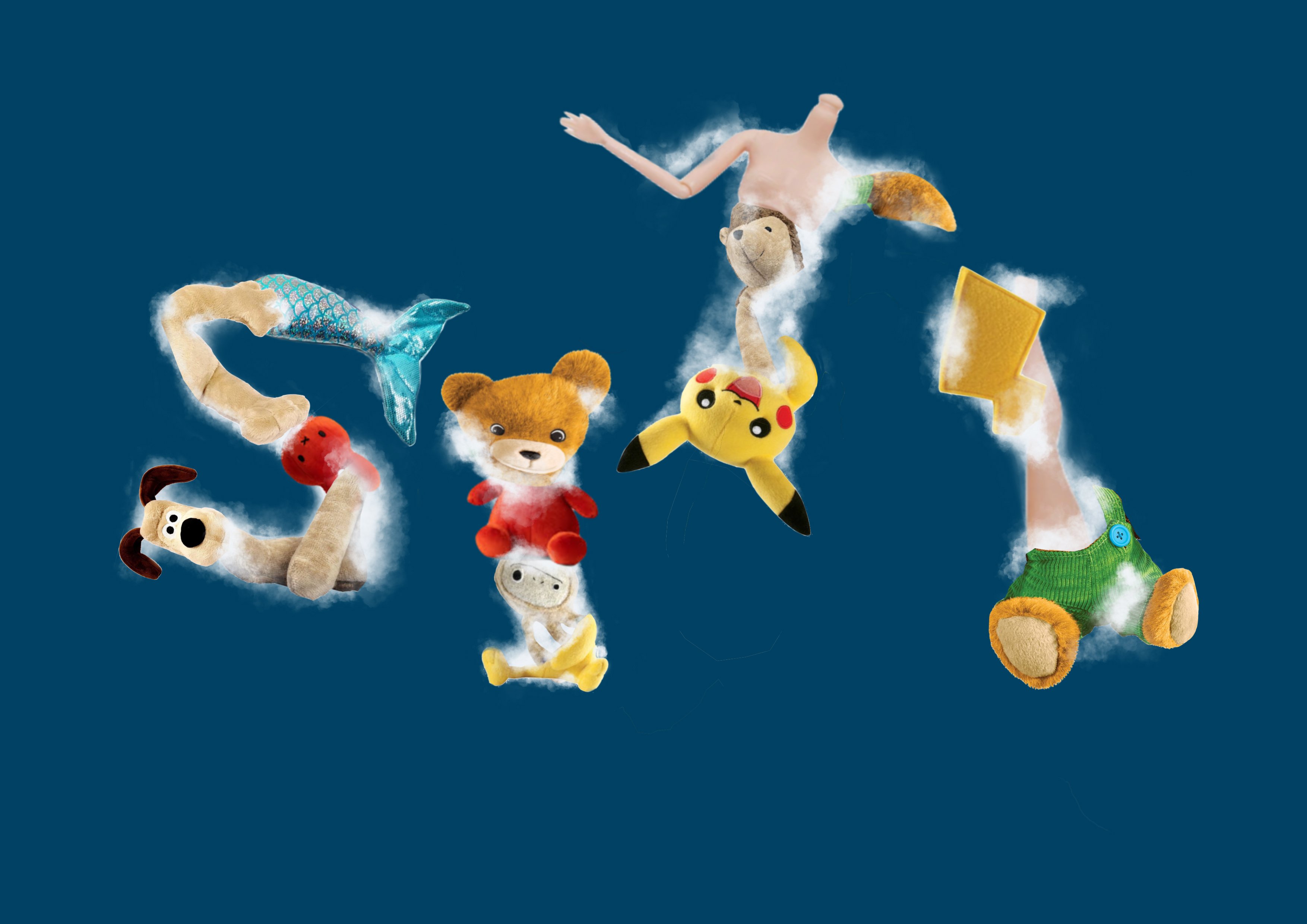
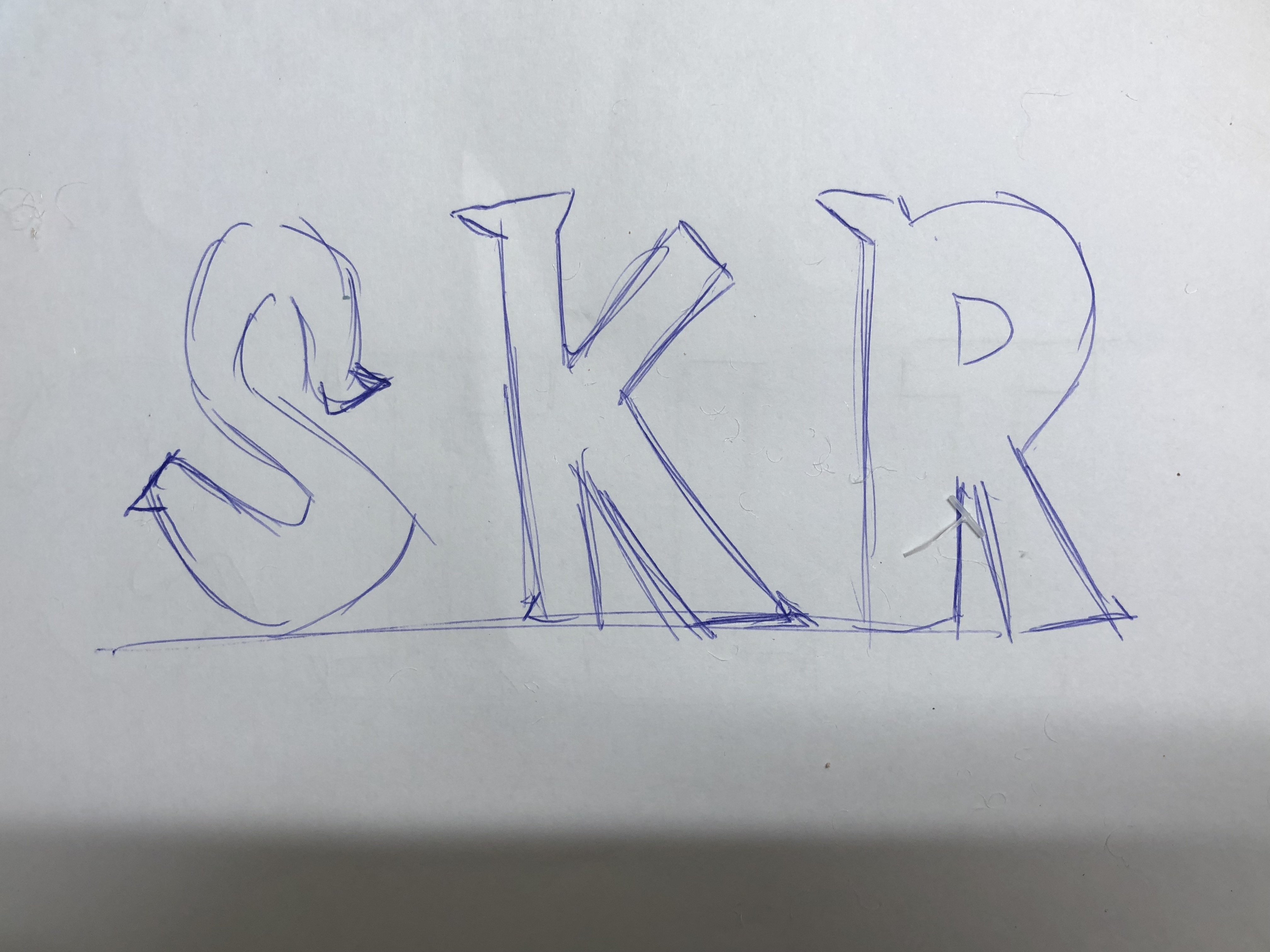
RECONSTRUCTING EACH LETTER INTO THE DESIRED TYPEFACE:
S
K
R
S
K
R
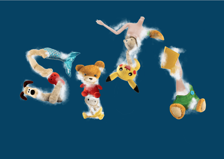
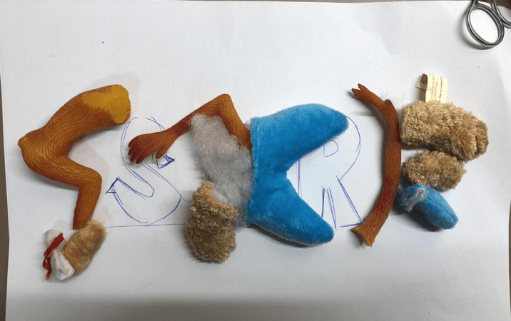
FINAL OUTCOME OF TYPEFACE AFTER SEWING
After sewing and reconstructed the mutilated soft toy as a surgeon, I’m satisfied with the outcome but I’ll be editing and using Photoshop to make the typeface more legible. In addition, I tried to incorporate different parts of the soft toy to add the decorative tail of the serif font.
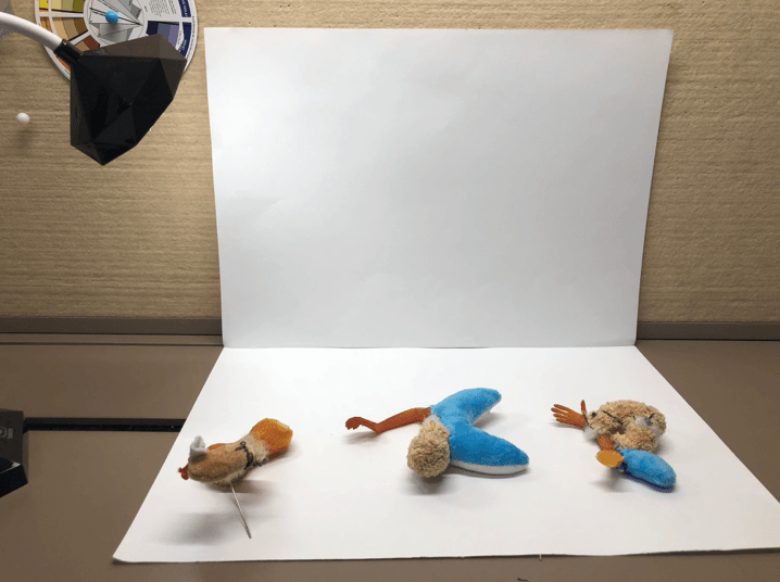
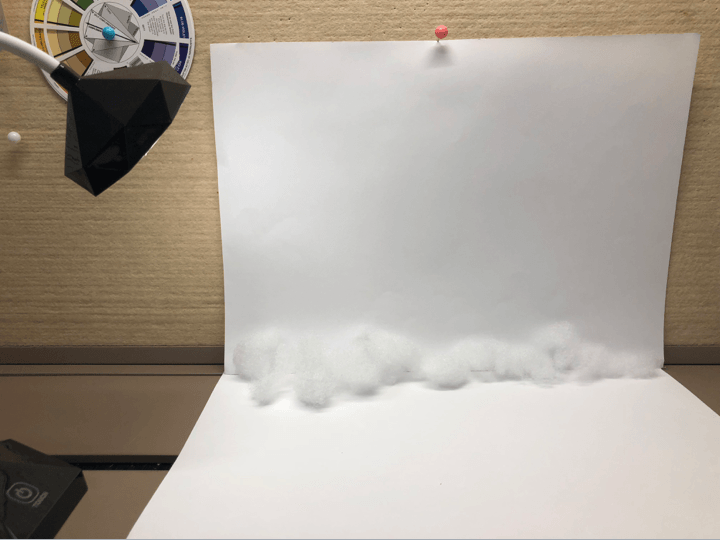
CREATING BACKDROP AND LIGHTING FOR THIS TYPEFACE COMPOSITION:
White backdrop
Addition of cotton (its guts) as the base
To ensure that I’ll get the highest quality and ability to capture the texture of the typeface I’ve created by hand, I used a lamp and a white backdrop. My aim after this photoshoot was to emphasize the texture of the typeface in a white clean-cut workplace of a soft toy surgeon.
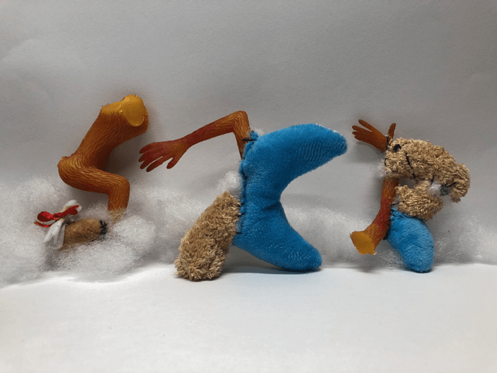
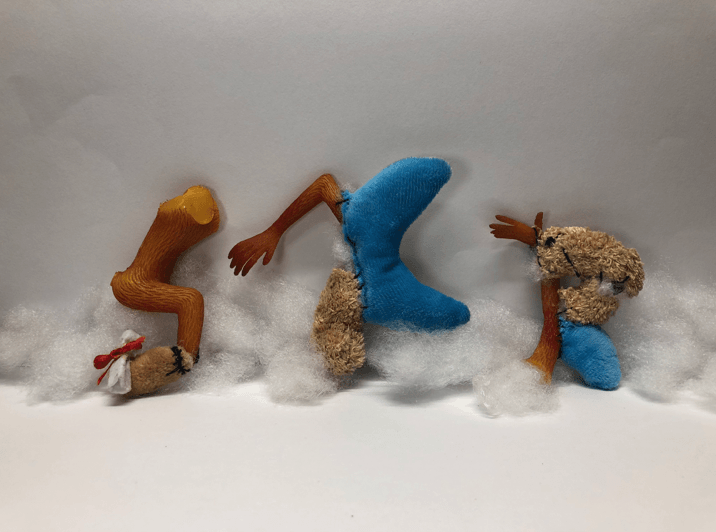
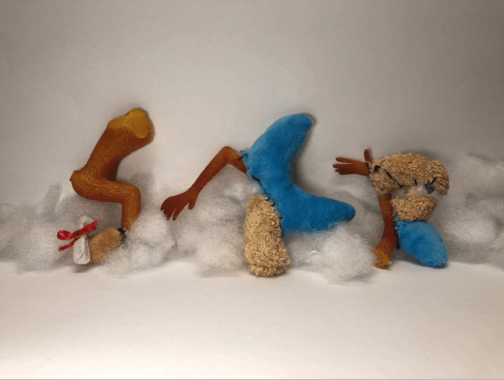
RAW IMAGES FROM THE PHOTO SHOOT:
1
2
3
4 – CHOSEN IMAGE
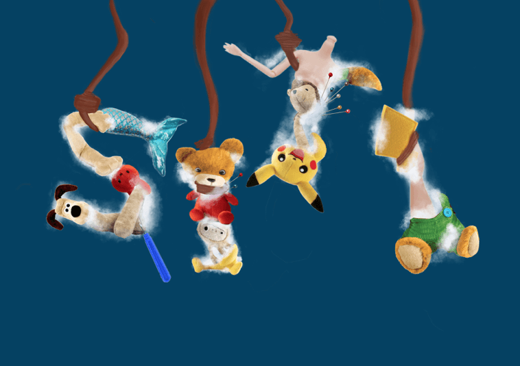
During the photo shoot, I’ve decided to add the sewing thread which is one of the tools to create a visual path of how the fonts are supposed to be read but I’ve decided to remove and do it digitally. The soft and furry textured typeface is supported by its cotton fillings (its guts). I experimented with the positioning and arrangement of the letters and decided to choose the fourth image.
THIRD DEVELOPMENT – DIGITALLY USING PHOTOSHOP:
Reduced the cast and shadows of the image
Decreased the saturation
Increased the contrast + Addition of tools and incision marks
During the digital editing, I reduce the saturation of the backdrop to make it as white with blue hues so the emphasis will be on the textured typeface. I increased the contrast of the typeface so its texture will stand out against the backdrop and our eyes will automatically look at the font. To create context about my job scope, I’ve added incision marks which are used during the process of reconstructing, to create the visual path. In addition, a sewing needle, thread, and scissors are added in the foreground amidst the white and clean workplace. All in all, I was satisfied with the outcome of the typographic portrait and I did a few adjustments to the typeface to ensure each letter are legible.
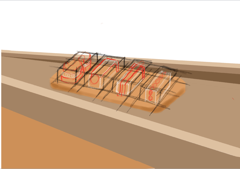
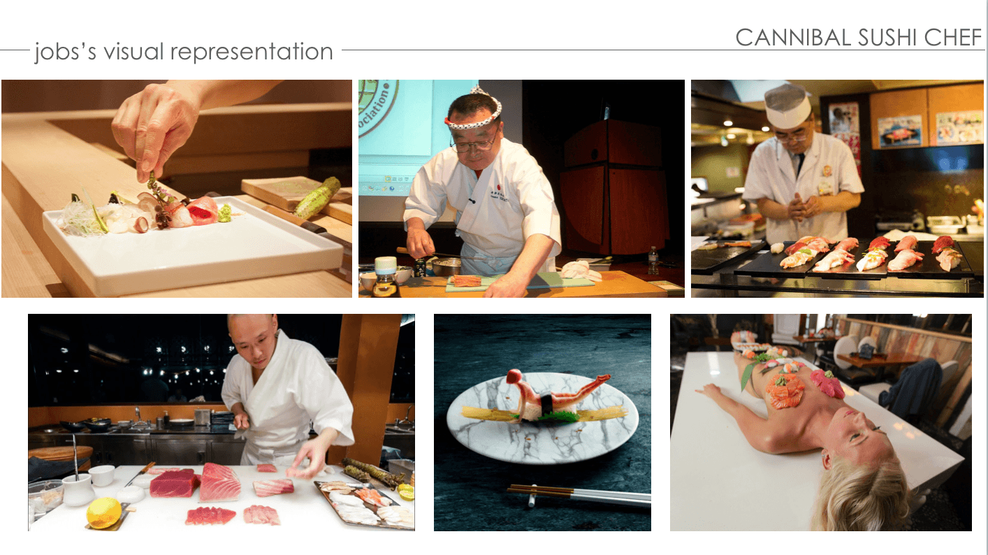
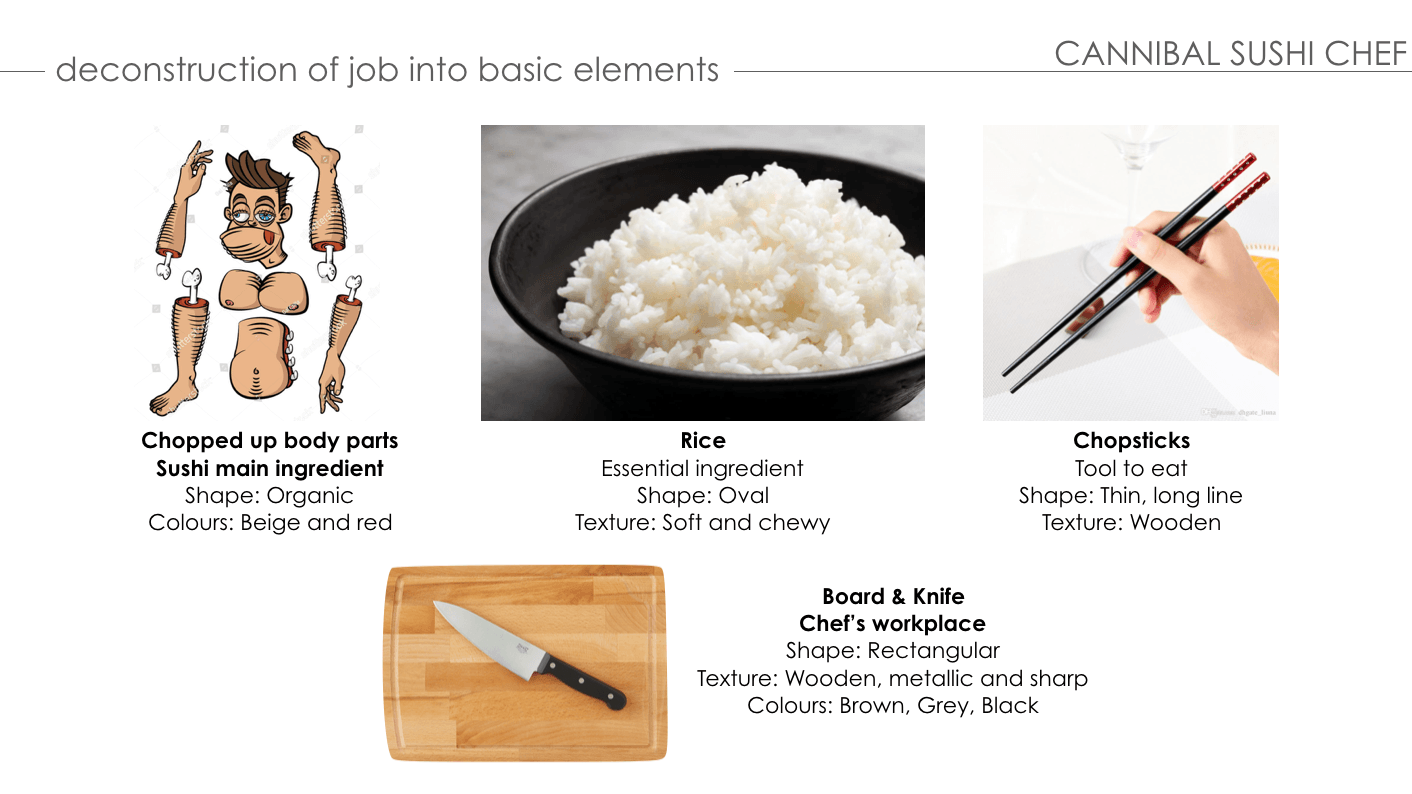
PROCESS – CANNIBAL SUSHI CHEF
ANIMATED PROGRESS:
FIRST DEVELOPMENT:
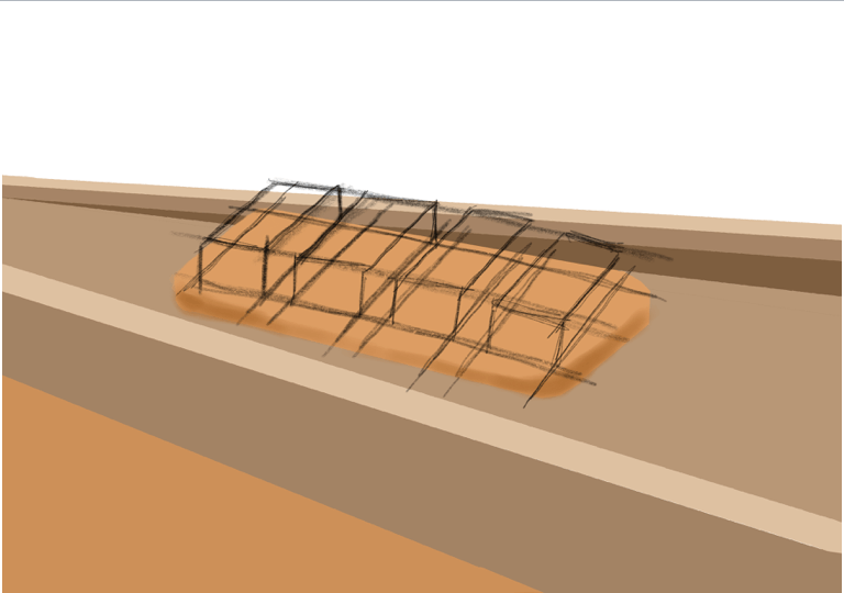
Perspective of human sushi
Rough outline of human sushi
For the composition of this typeface, I wanted to the form of the typeface of human sushi to be an isometric view so viewers are able to see the details of the deconstructed elements. This typographic view is created on Procreate as a digital painting.
1
2
3 – Addition of blood onto the sushi rice
4 – Addition of shadows
5 – Adding depth for the details
6
Visual assistance using figure mannequin
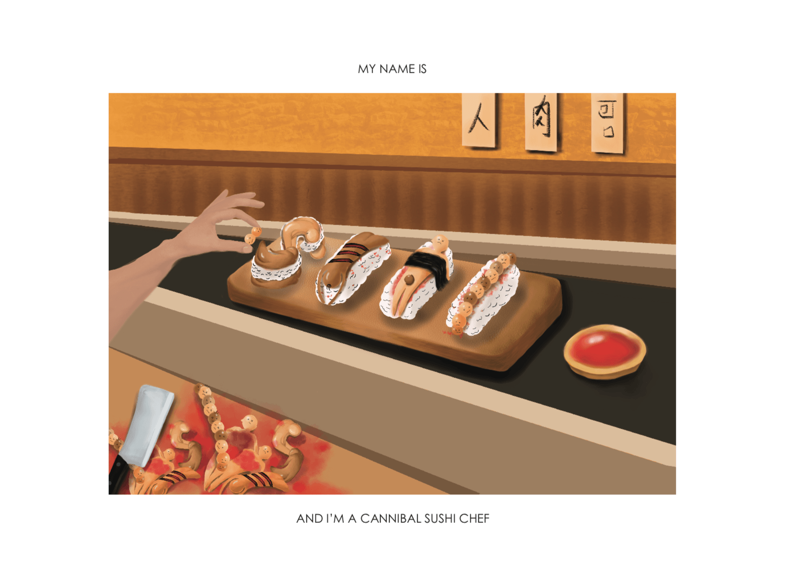
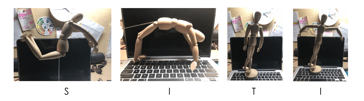
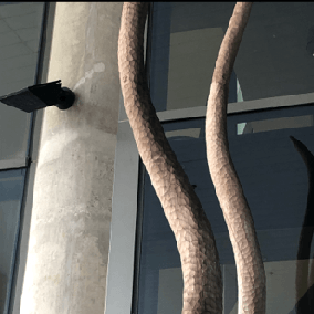
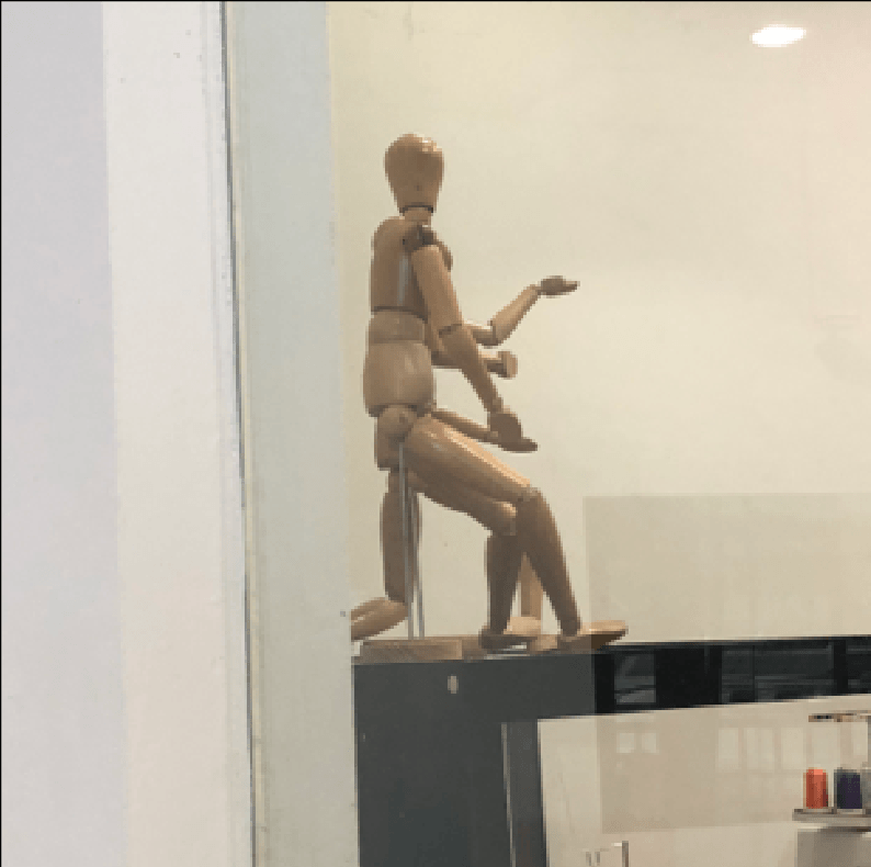
Inspired by our in-class assignment (pareidolia) and the curves of the human body, I’ve decided to create the typeface for this job to be about the human body parts and its curves (san-serif). To help with the positioning and forming the font of my typeface, I used a figure mannequin for visual assistance. The colors used for this typeface are analogous such as red, beige and brown to give off a humanistic vibe.
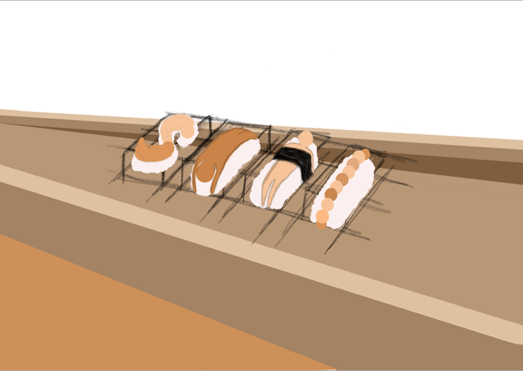
SECOND DEVELOPMENT:
7 – Removed outline
8 – Duplicate ‘S’ element
9 – Added shadows and drop shadow
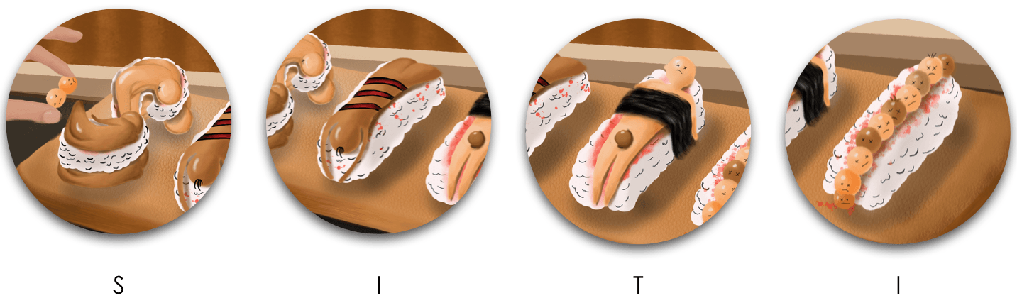
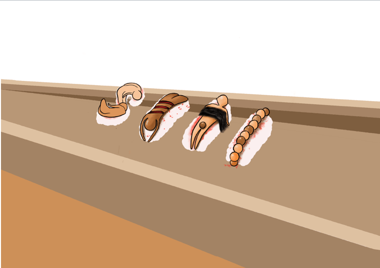
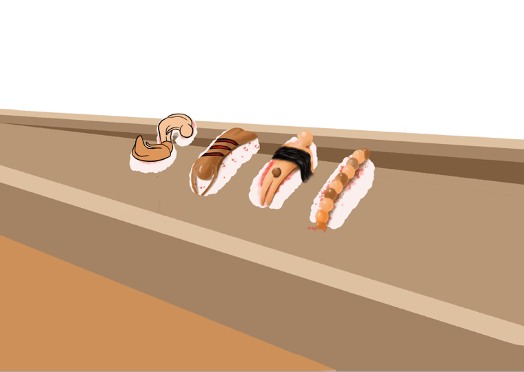
After consulting with my peers, they suggested that I should remove the outline of each typeface so it’s more realistic. ‘S’; it is made up of two human bodies being contorted to form the letter. First ‘I’; the body being slashed by a cannibal with a bloody indentation to create a similar look of salmon sashimi. ‘T’; it is made of a human body being strapped down by a layer of hair and the private part is covered by a human head as a joke. For the second ‘I’; I created a row of human heads with a circular shape. Also, I added shadows and drop shadows onto the human sushi typeface. The typeface is mainly made up of deconstructed elements of the human body parts such as the body, head, blood, and hair.
THIRD DEVELOPMENT:
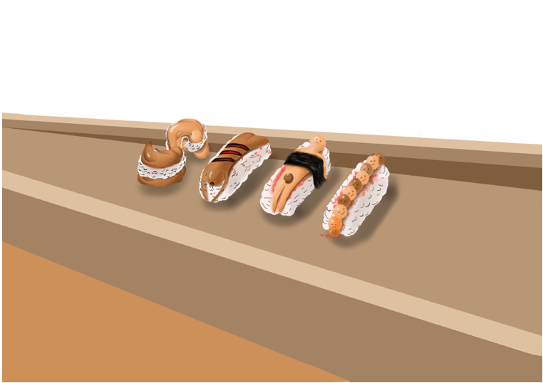
CREATING THE TEXTURE OF THE CHOPPING BOARD
To emulate the Japanese restaurant ‘zen’ feel, I’ve decided to make the whole composition using earthy colors, wood and incorporating minimalism. I used the wooden brush texture on Procreate to create the texture of the plate to display our typeface.
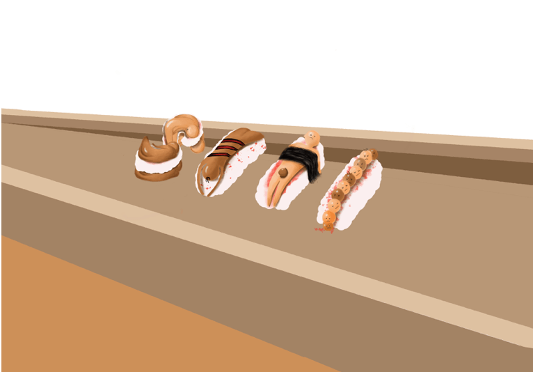
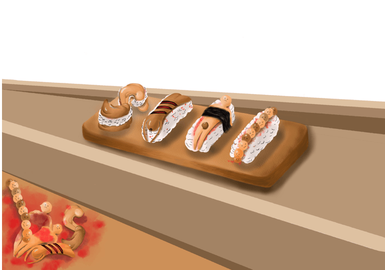
1 – Addition of excess human body being chopped up at the side for context
2 – Addition of cannibal sushi chef plating
3 – CSC adding details onto typeface
4 – Arranging excess body
5 – Addition of knife and human blood sauce
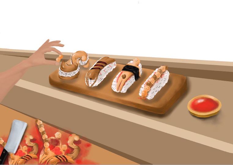
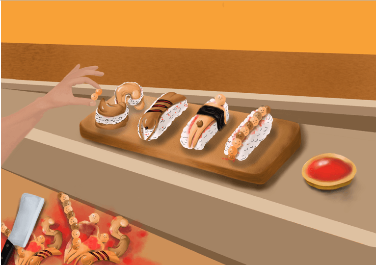
The foreground of the composition consists of excess human body parts being slashed up with a knife for context. Besides the plate, there’s a blood sauce as a condiment. In addition, to communicate visually to the audience about my job, I’ve added a hand adding decorations on the typeface human sushi for context. All the different variety of human elements and objects creates harmony to tell the narrative of my job scope.
FOURTH DEVELOPMENT:
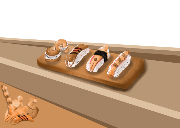
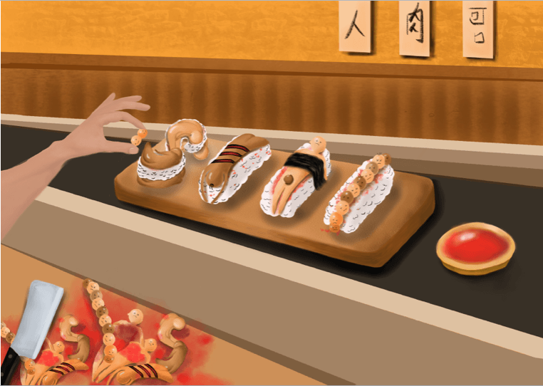
6 – Earthy wallpaper for the background
For the background, to strongly emulate the ‘zen’ and minimalistic restaurant vibe, I used the earthy colors and wooden planks which are usually seen in a Japanese place. In a Japanese restaurant, the owners tend to place white menu signs on the walls to inform their customers about their ingredients. Inspired by this fact, I’ve added characters on the signs saying ‘Human meat is delicious’ as the menu sign for my restaurant as a cannibal chef (:
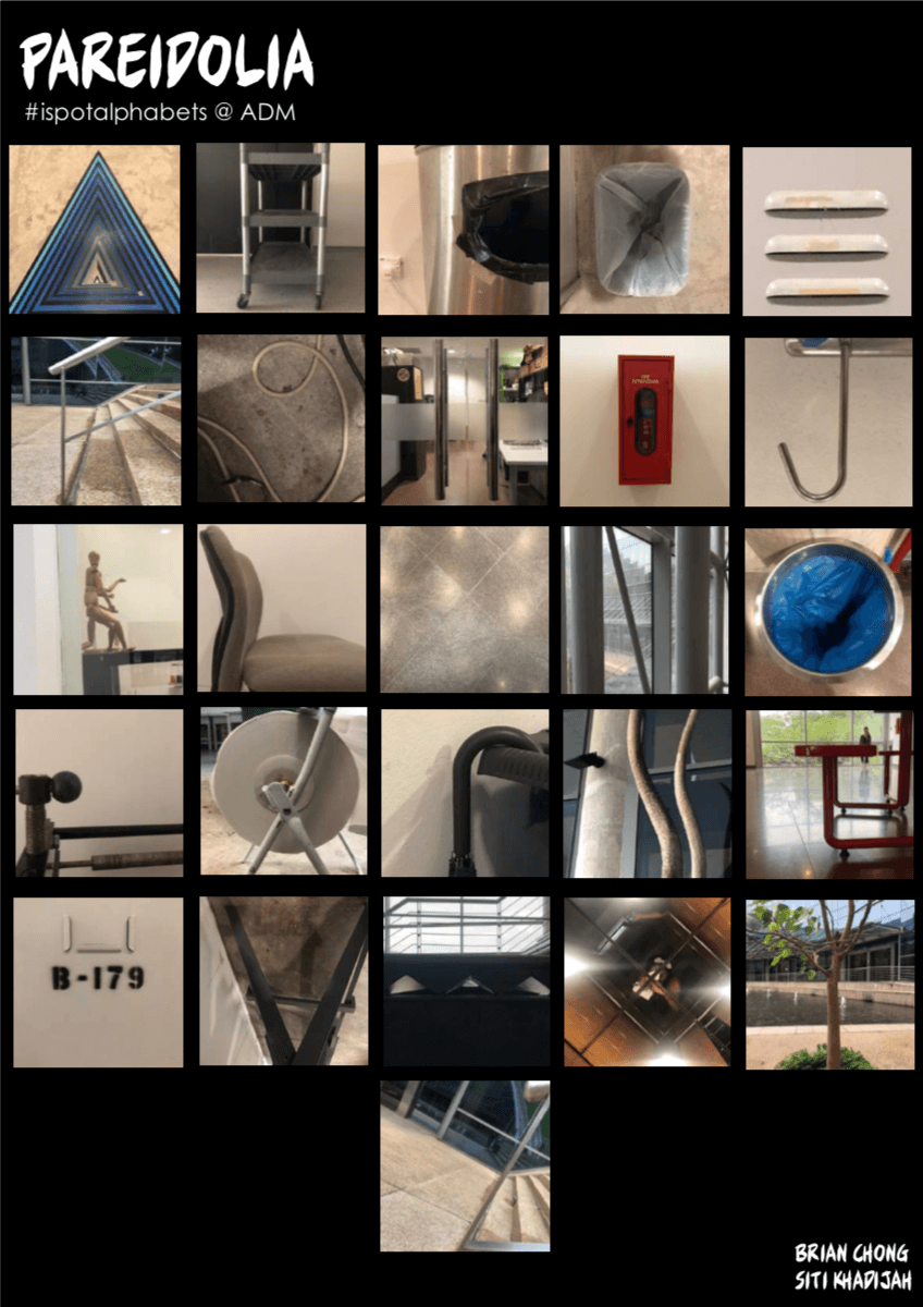
IN-CLASS ASSIGNMENT
WEEK 1 – PAREIDOLIA
Objective: Create a series of photographs of objects or scenery that looks like the 26 letters in the alphabets around ADM.
Pareidolia – A psychological phenomenon that causes people to see patterns in a random stimulus. This often leads to people assigning human characteristics to objects.
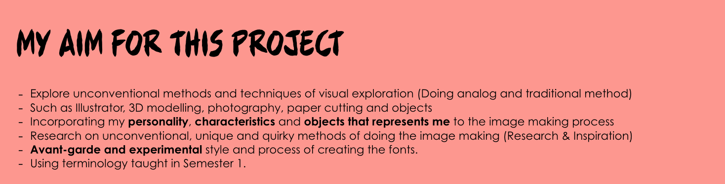
From the start of this project, I knew I wanted to challenge myself to create typographic portraits for my future jobs in analog and digital methods. Considering aspects such as the choice of typeface, color scheme, layout and how I’m going to harmonize all the deconstructed elements of my job into my artwork during the design process is going to be a tedious yet, fruitful journey. My end goal for this project is to create each artwork with engaging typography and a narrative to communicate my job to people visually.
For my job scope for this assignment, I’ve decided to choose unconventional jobs that spark curiosity and unrealistic to be one in my current life as of now. I’ll be researching the characteristics of the jobs above, creating my own interpretation of it and adding my style into the artwork to make the process meaningful and engaging.