According to Anthony Duane and Fiona Raby, design can be divided into two categories; affirmative design and critical design.
Affirmative design conforms to cultural, social, technical and economic expectation whereas, critical design rejects and challenge what is available in the industry as the only possibility, with alternative ideas that embody values in design as the foundation to raise awareness on social, cultural, technological, ethical issues that make us think. It can be used to provoke new ideas for systems, products, and services.
In authors’ words, the design profession will lose all intellectual credibility and “be viewed simply as agent of capitalism”, if they insist on focusing on marketability. Popular design has to sell in large number thus, focusing on capitalism instead of the impact it might make. It lacks practicality as it promotes desires for new products, ensures obsolescence and encourages dissatisfaction with what we have. Unfortunately, most critical design objects are deemed as conceptual design because it is unlikely to be funded by the industry due to challenging its agendas.
Developing critical perspective in design is essential because having an intellectual stance creates a more responsible and pro-active role within the society. It emphasizes on neither commercial purpose or physical utility. Creating design that challenges the system will encourage discussion among everyone about why certain values are embodied in the design, and question about the design proposals about the progress of technology, consumerism and cultural value being implemented in our lives.
Affirmative design focus on the production rate, product, and its feasibility. Whereas, critical design focus on the consumption, aesthetic of use and, the user experience and awareness it can offer. Hence, critical design is a powerful form of social critique by implementing values as a raw material into the object.
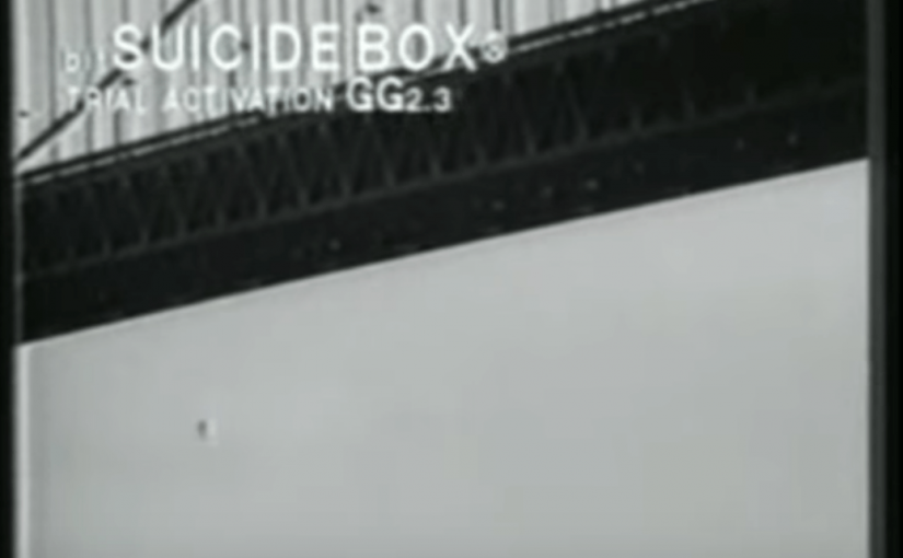
For example, Suicide Box by Natalie Jeremijenko, created this box to reveal the political nature of data abstraction as she felt that advanced technology is being taken for granted. The object is a motion-triggered camera developed by the Bureau of Inverse Technology placed on the Golden Gate Bridge for 100 days. The purpose of the suicide box is to count the number of people jumping off the bridge. When vertical motion is detected, it will trigger the camera to record to disk, supplying public, frame-accurate data of a social phenomenon not previously quantified.
An average of 0.68 suicides per day during the duration of the project. This statistics and data create an opportunity to characterize the value of suicide. Previously, the value of suicide has been extremely hard to quantify and represent but with its imaging of suicide, it recovers statistical representation and quantifies suicide in the logic of information thus, shedding some light into the issue of mental health and how the data collected and can be used to improve the situation. With the advancement of technology, having a critical perspective in design is essential to create a commentary of reflection and criticism regarding a certain issue with our object or artwork with the public to progress as a society.
References:
Design Noir: The Secret Life of Electronic Objects by Anthony Duane and Fiona Raby
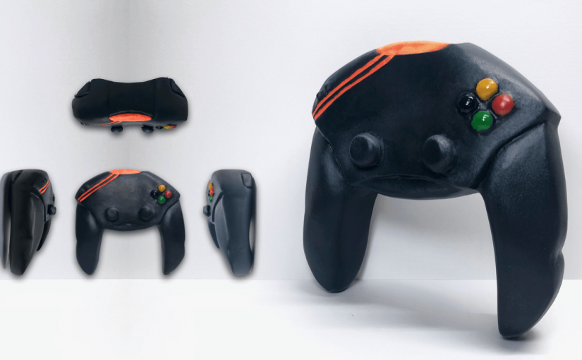
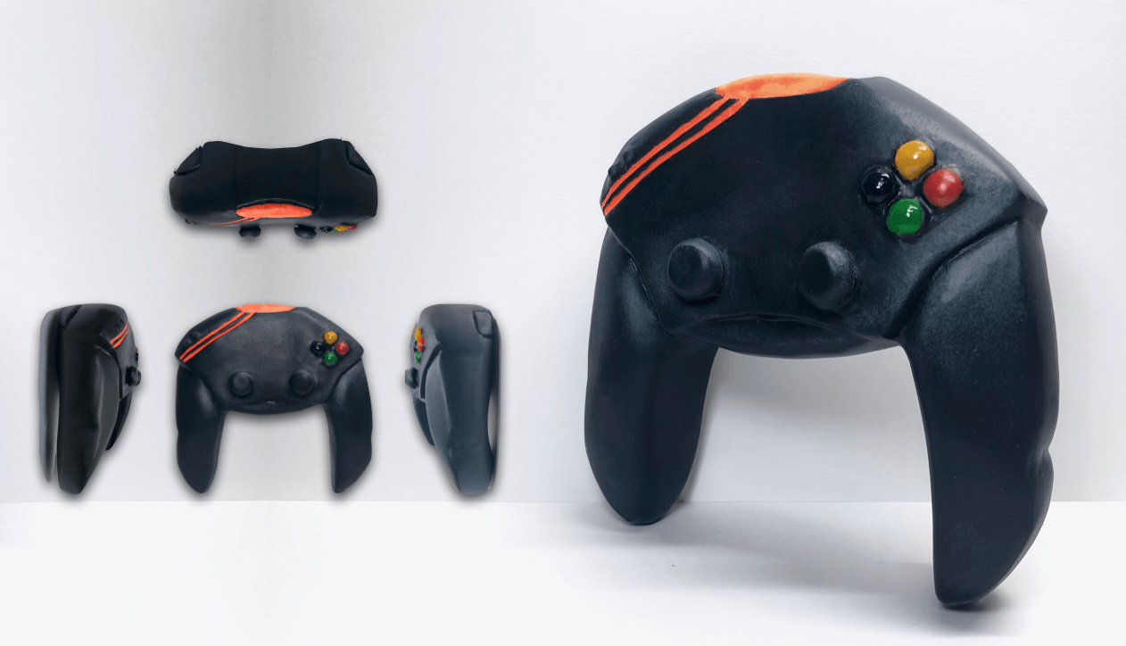
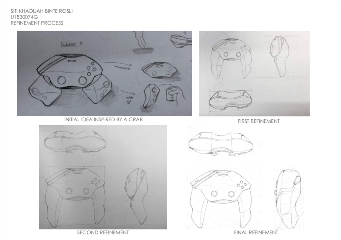
Continuing from our previous assignment, we had to build a scale model of the chosen object design using blue foam. I’ve decided to choose the design inspired by the form of a crab as it’s visually and aesthetically appealing to me. Also, it brings an emotive aspect to the form as the navigation and movement features are strategically placed according to the placement of the eyes on the crab. In addition, I focused on the ergonomics of the gaming controller and refined the design to ensure it is comfortable for the usage.
REFINEMENT PROCESS
The refinement process was on-going while I was creating the foam model to ensure the aesthetic and ergonomics is the best quality, given the time limitation. I had a few changes before I reached the final refinement form of the gaming controller (as seen below) and I was satisfied with the process. I’ve adjusted a few features and overall size of the form considering being able to create a better user experience for gamers.
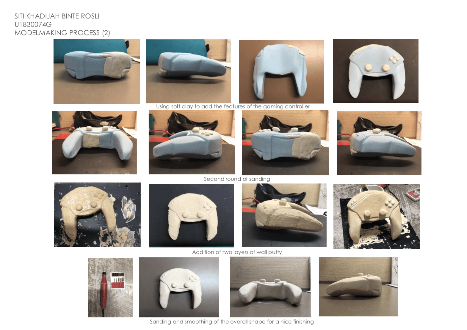
MODELMAKING PROCESS
The overall shape of my prototype is made out of blue foam and the features are made out of soft clay that hardens over time.
After using the wire cutter to get the overall shape of my form, I did my first round of sanding however, I sanded the left side of the controller too much. To resolve the issue of asymmetry, I used epoxy to patch up the areas that have been sanded off too much.
To add the features of the gaming controller such as the navigation buttons and gamepad, I used soft clay to shape out the form of these features and let it harden over time. I did many rounds of sanding to achieve a smooth finishing but due to the color difference of the foam, epoxy and soft clay, I’ve decided to add two layers of wood putty and sand it once again. To add the grooves of the gaming controller, I used the automatic filer which has different sizes to create a small, thin indentation.
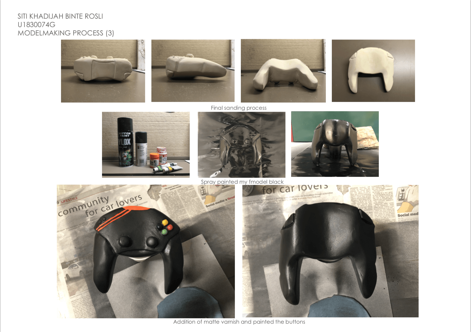
After the final round of sanding of the wall putty, I spray painted my prototype a glossy black and painted the features of the gaming controller. The last step was adding a matte varnish to give that cold and smooth finishing for my prototype. However, I felt like the varnish ruined the overall smooth finishing of my prototype and I should have stopped at spraypainting it black ): Lesson learned.
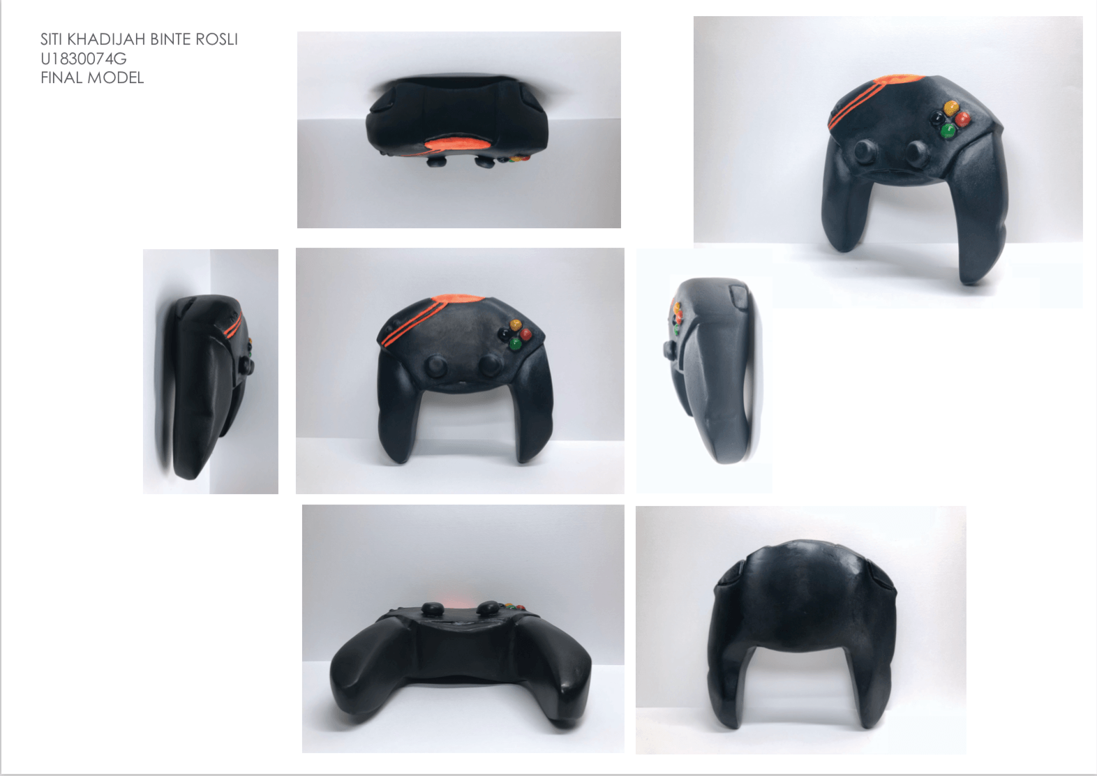
FINAL MODEL – ‘CRABBY’ GAMING CONTROLLER
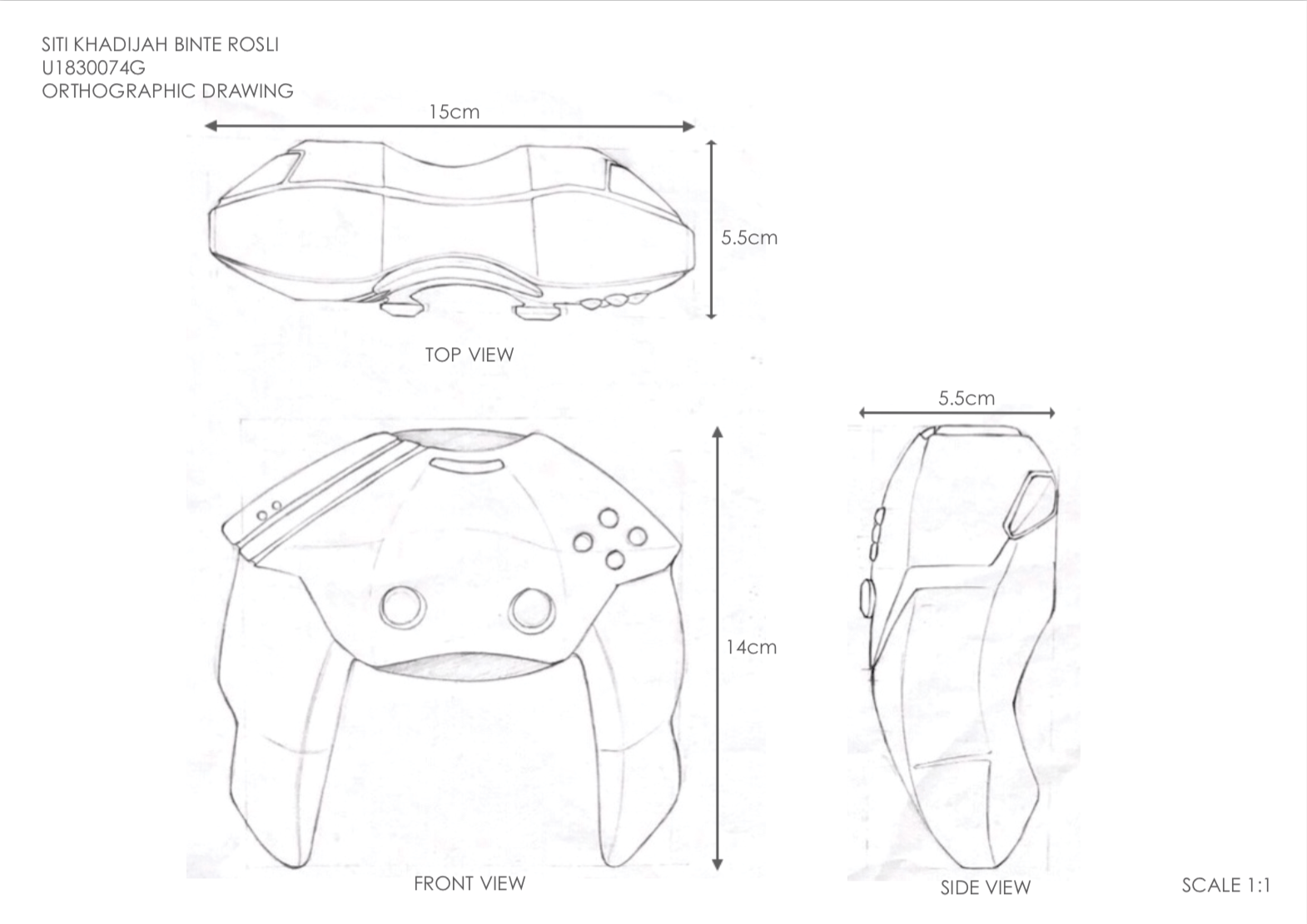
ORTHOGRAPHIC DRAWING – ‘CRABBY’ GAMING CONTROLLER
REFLECTION
One of the challenges was being able to achieve a smooth finishing for an organic form like my prototype. Trying to sand the curves and the navigation buttons to achieve a rounded curve was tedious but I tried my best. In addition, I had to add epoxy due to over-sanding and I’ve learned to refer to the original sketch to ensure the dimensions is accurate to prevent such incident from happening again.
In addition, I wished I didn’t add the matte varnish as the finishing touch because it ruined the overall smooth and sleek finishing of my prototype.
It was a good experience trying to improve my model making skills and I’ve learned a lot of different techniques from the critique session with my peers.
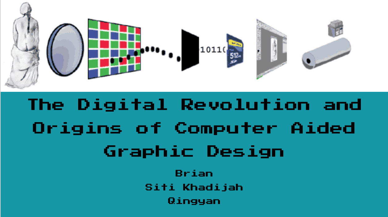
Philip B. Meggs, Meggs’ History of Graphic Design, Wiley; 6 edition, 2016. ISBN 1118772059 ; Chapter 24 : The Digital Revolution and Beyond, page 571-619
REFLECTIONS
Suggestion from Mimi: Focus on the thesis of “How everyone can be a graphic designer due to the accessibility of the resources thanks to digital revolution”
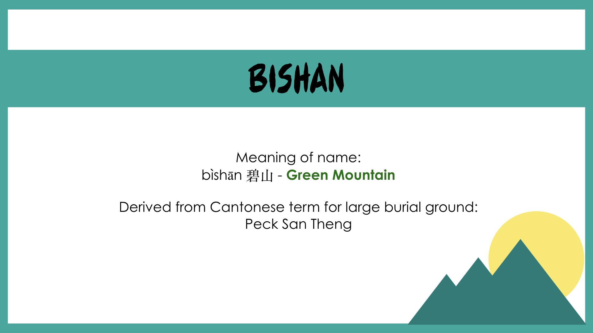
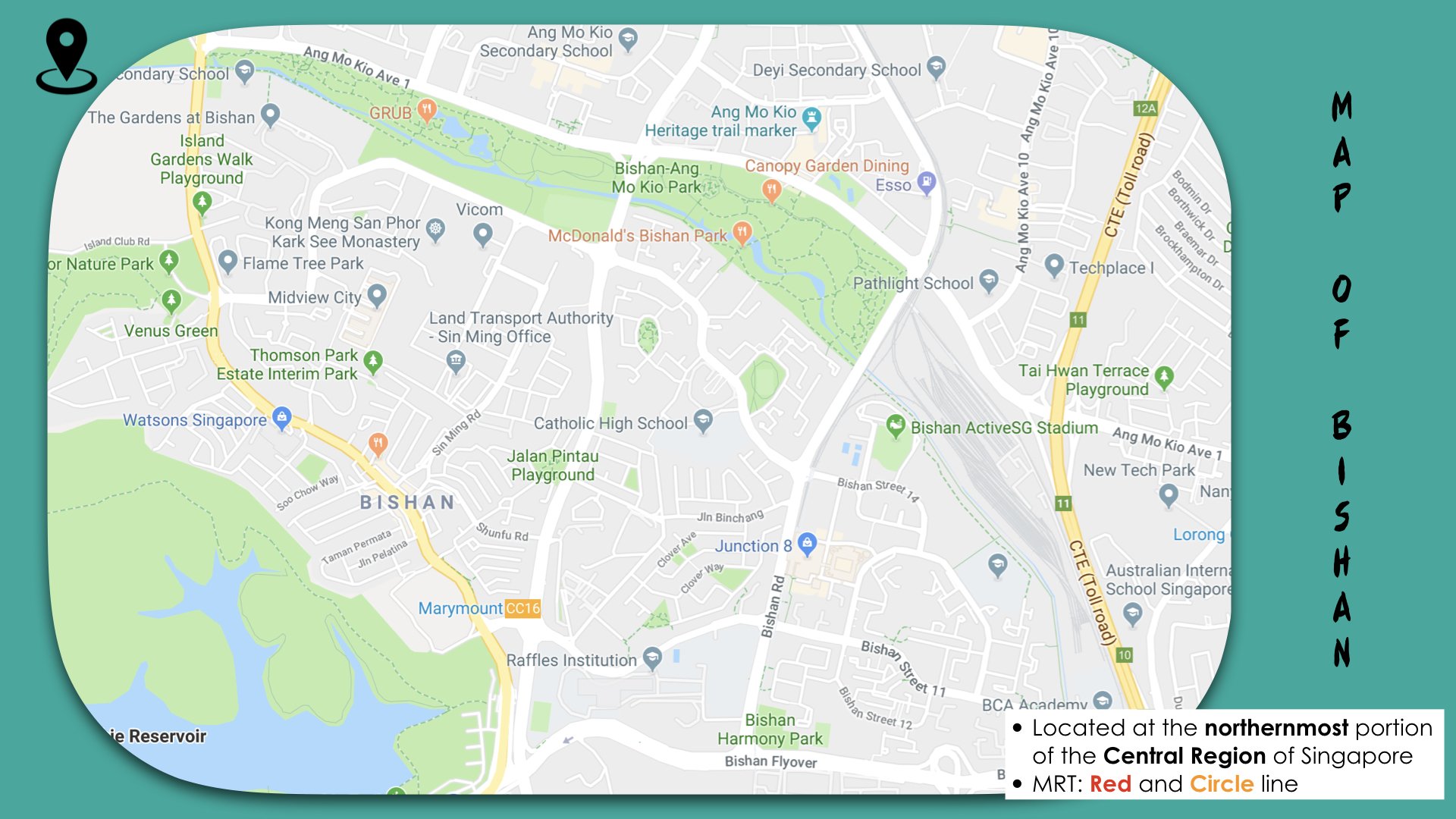
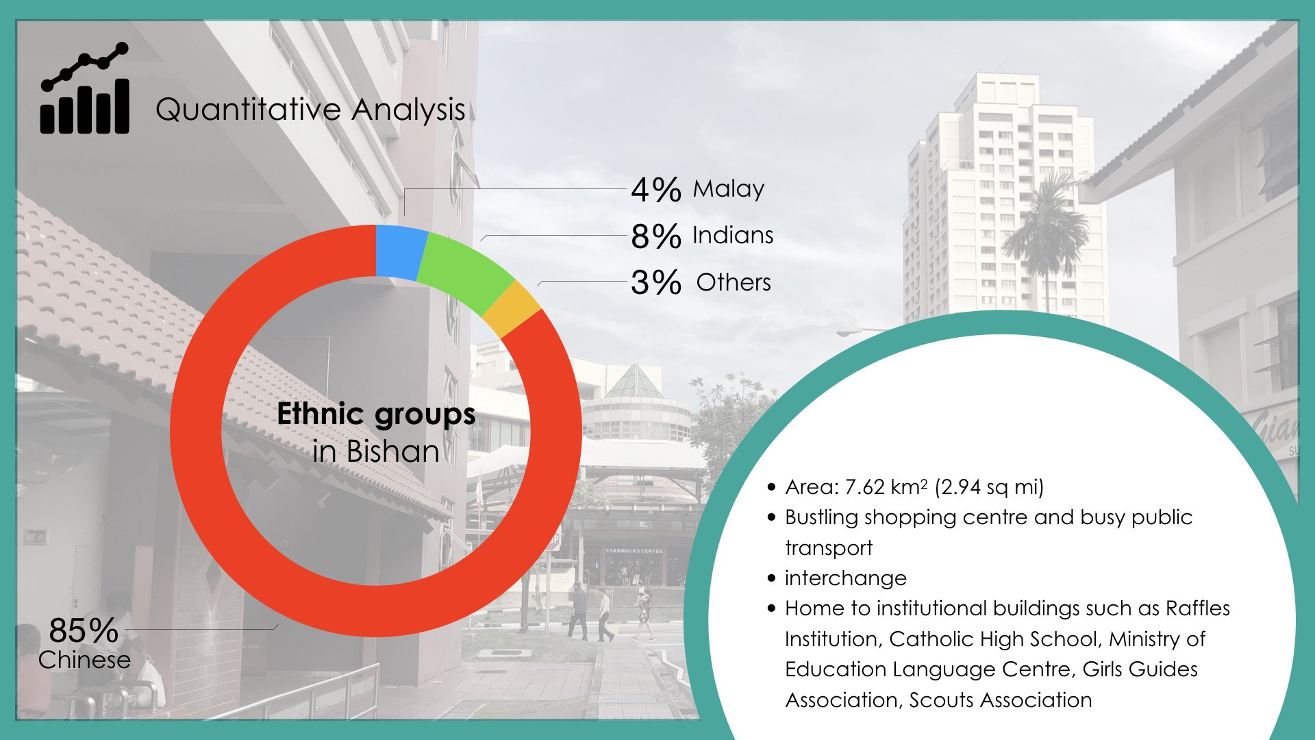
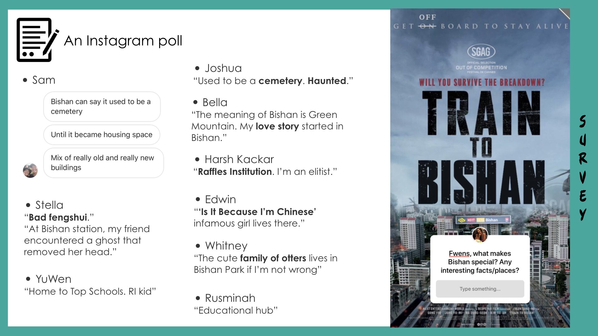
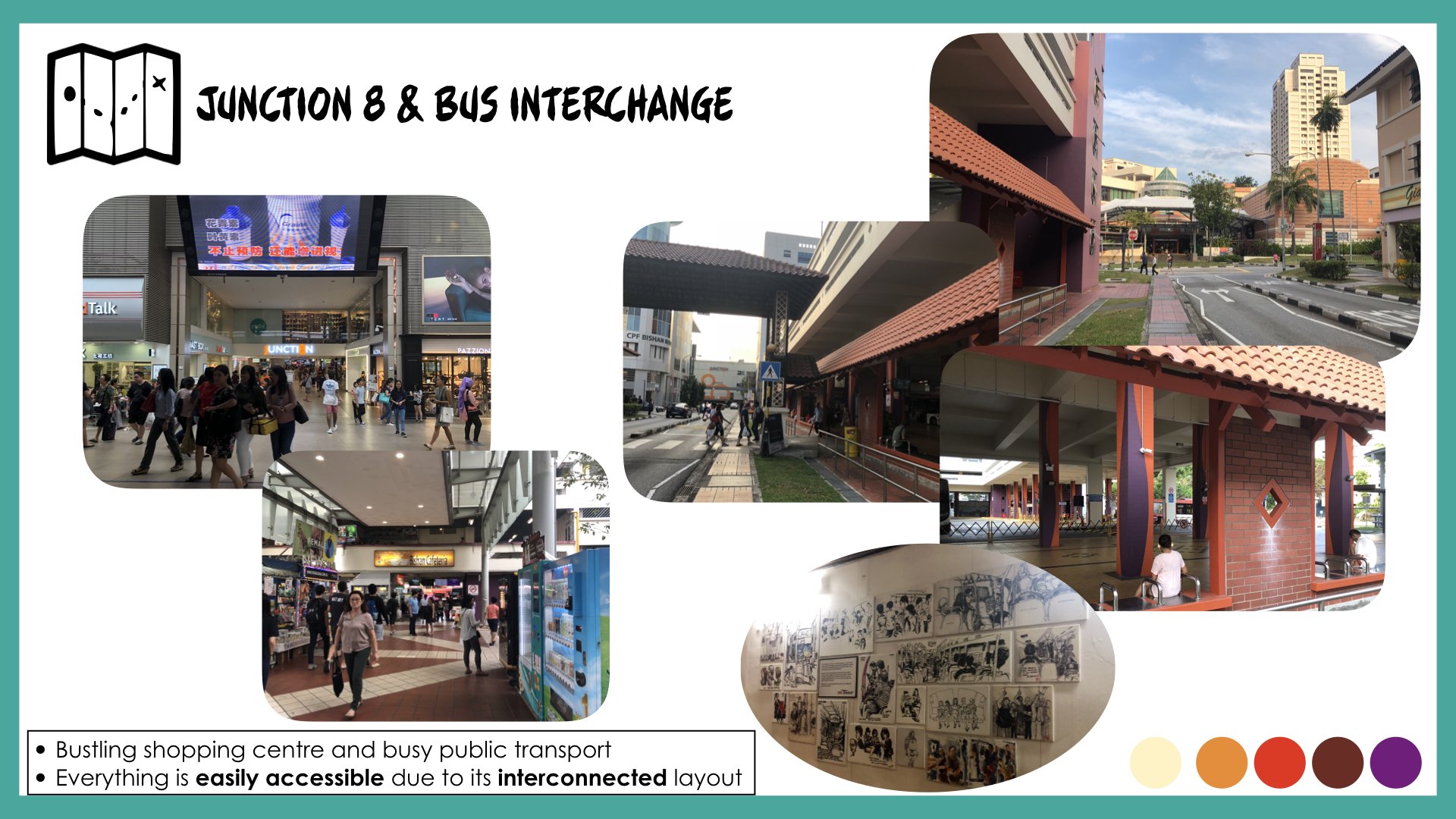
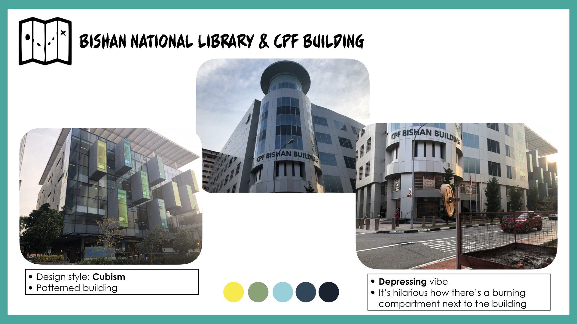
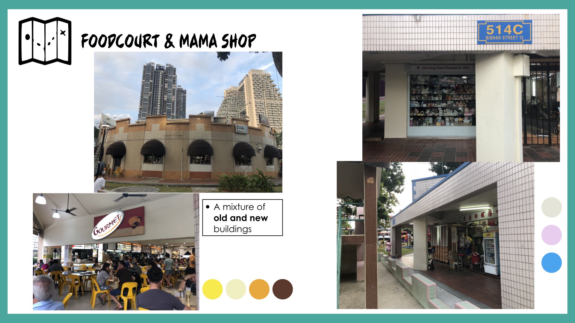
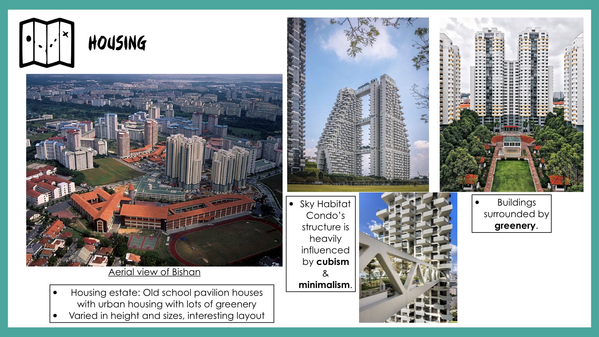
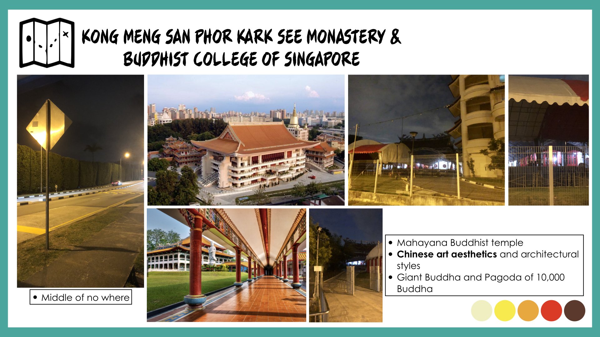
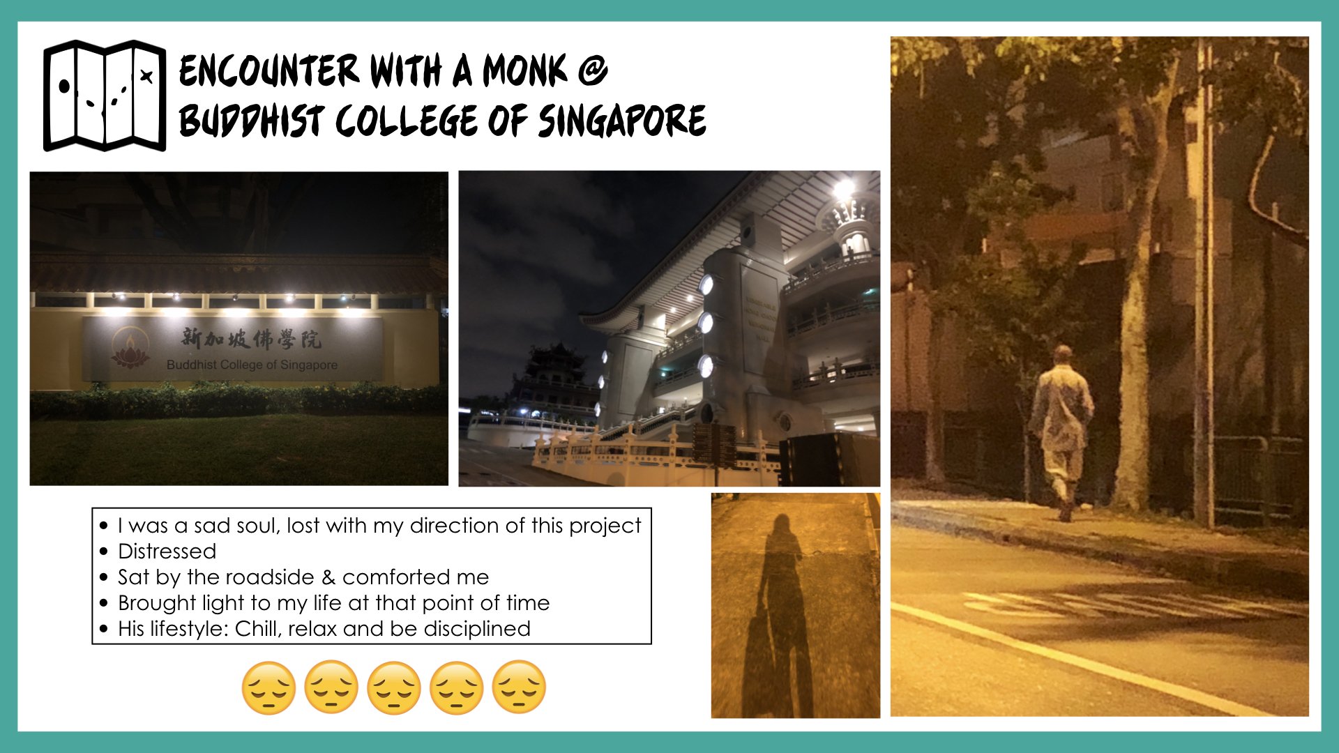
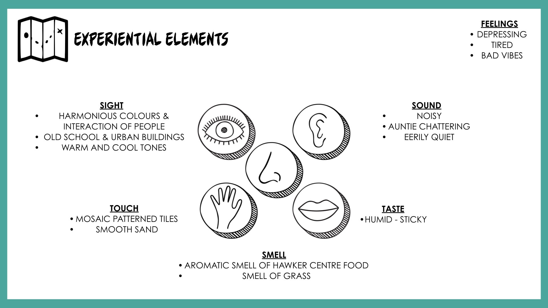
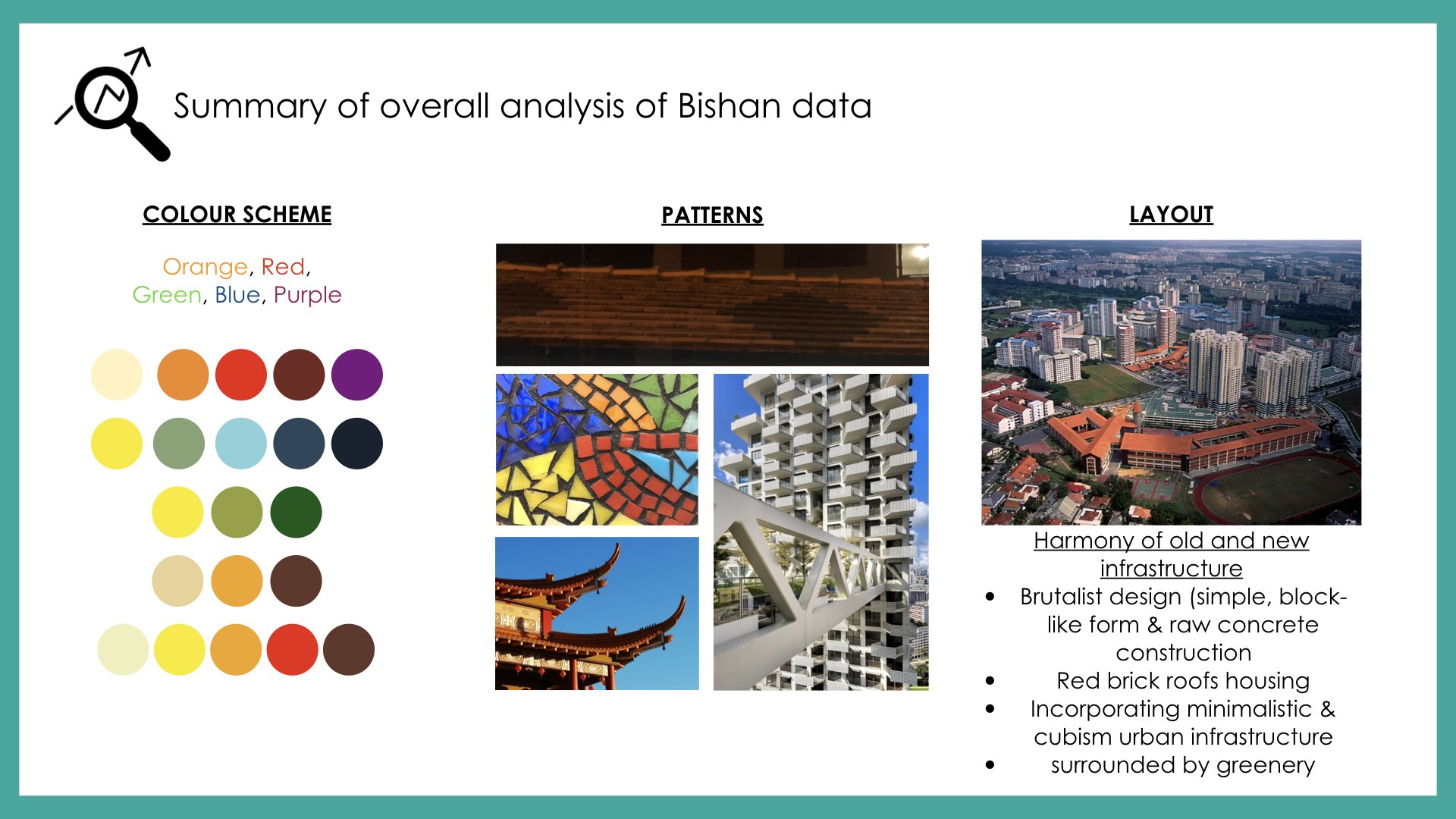
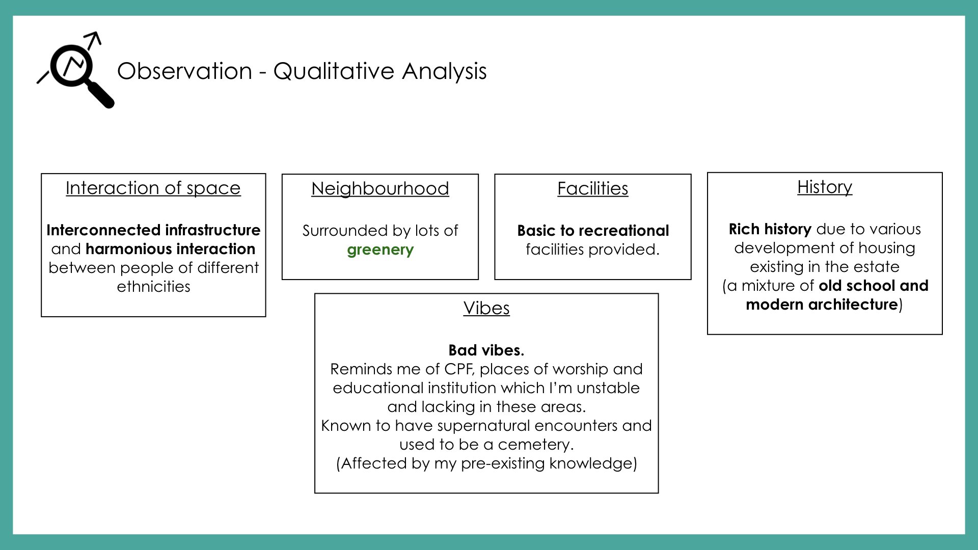
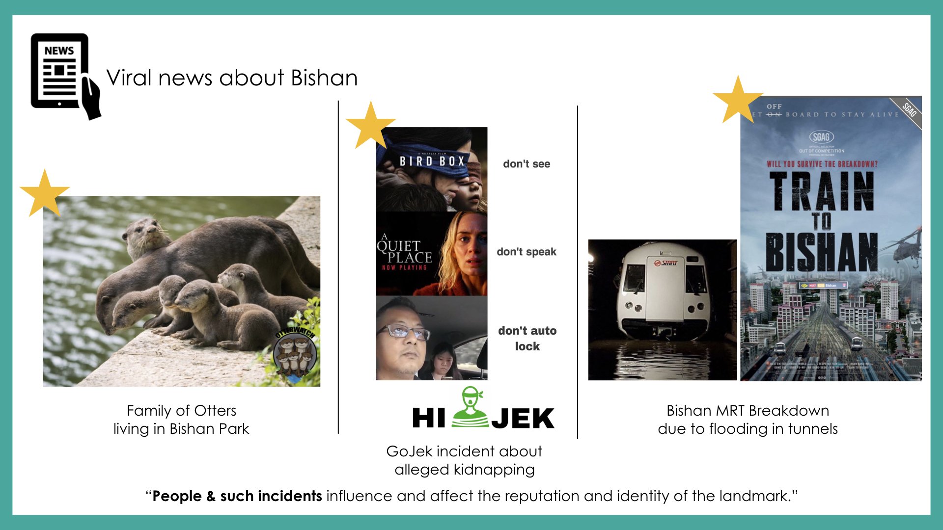
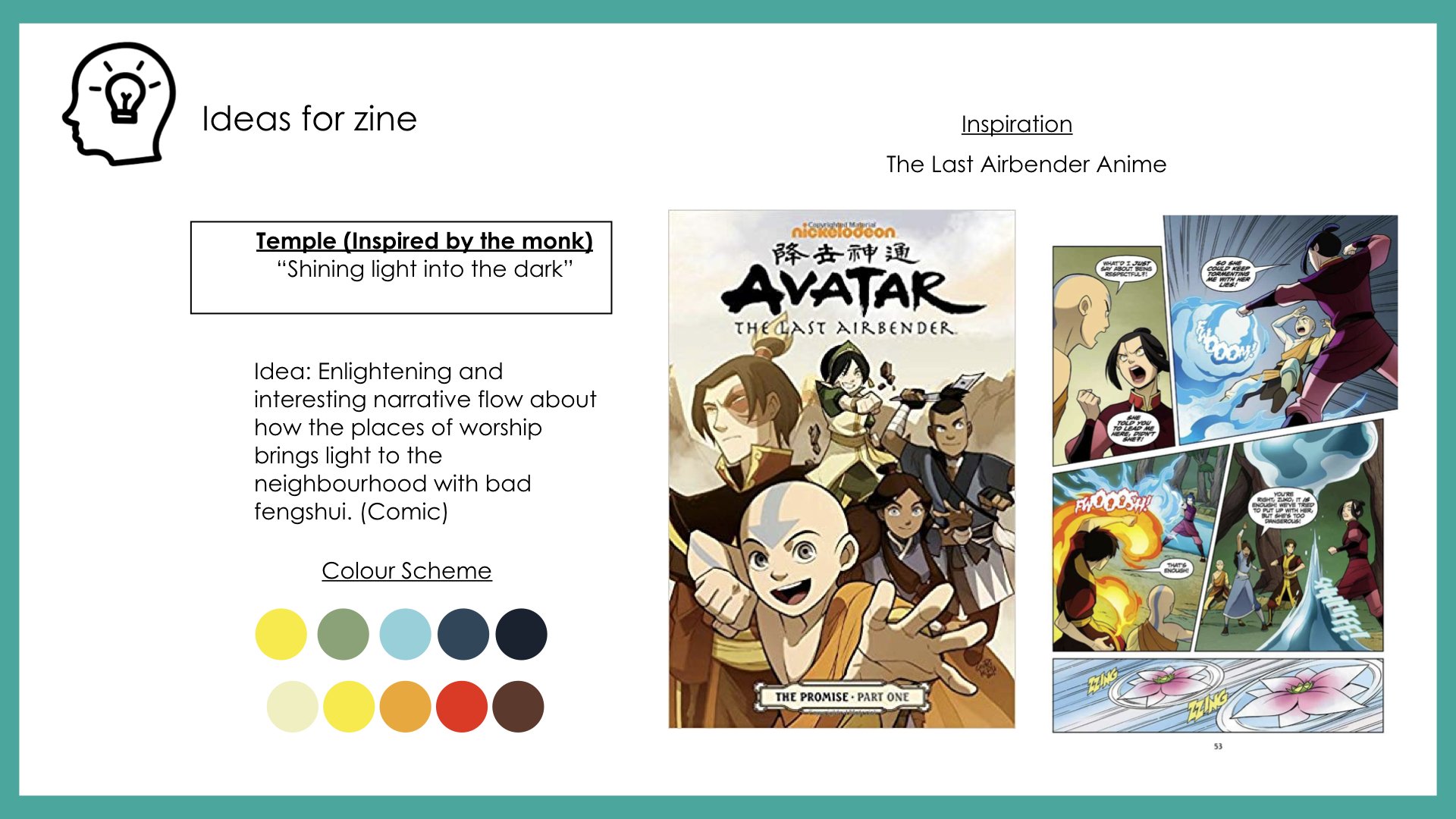
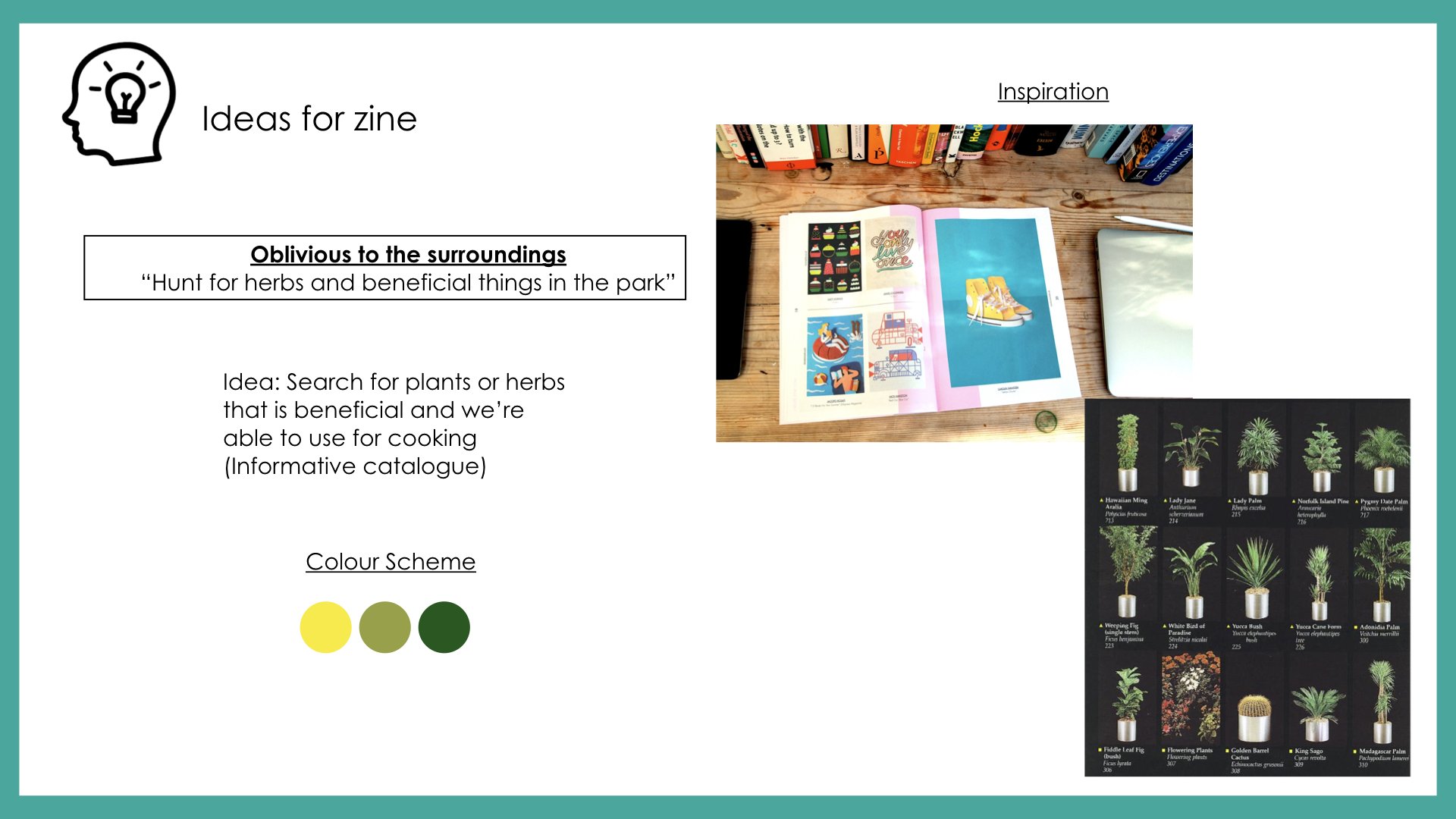
After listening to my peers’ presentation and receiving feedback from Mimi, I’ll be visiting Bishan again to explore the site. Hopefully, I’ll receive more insights about the relationship between history, people and certain areas of Bishan that makes the location unique or special. My objective is to have better research and insights that are more reflective and analytical that will assist in my narrative of creating the flow for my zine magazine.
After being introduced to ‘Critical Making’; a combination of Critical Thinking and Hands-On Making, we were tasked to create a disobedient object by hacking an everyday household object. The objective of this micro-project is to incorporate Arduino, sensors, and actuators with our chosen object so that it behaves in the least expected way.
Group Members: Siti Khadijah& Tong Tong
IDEATION
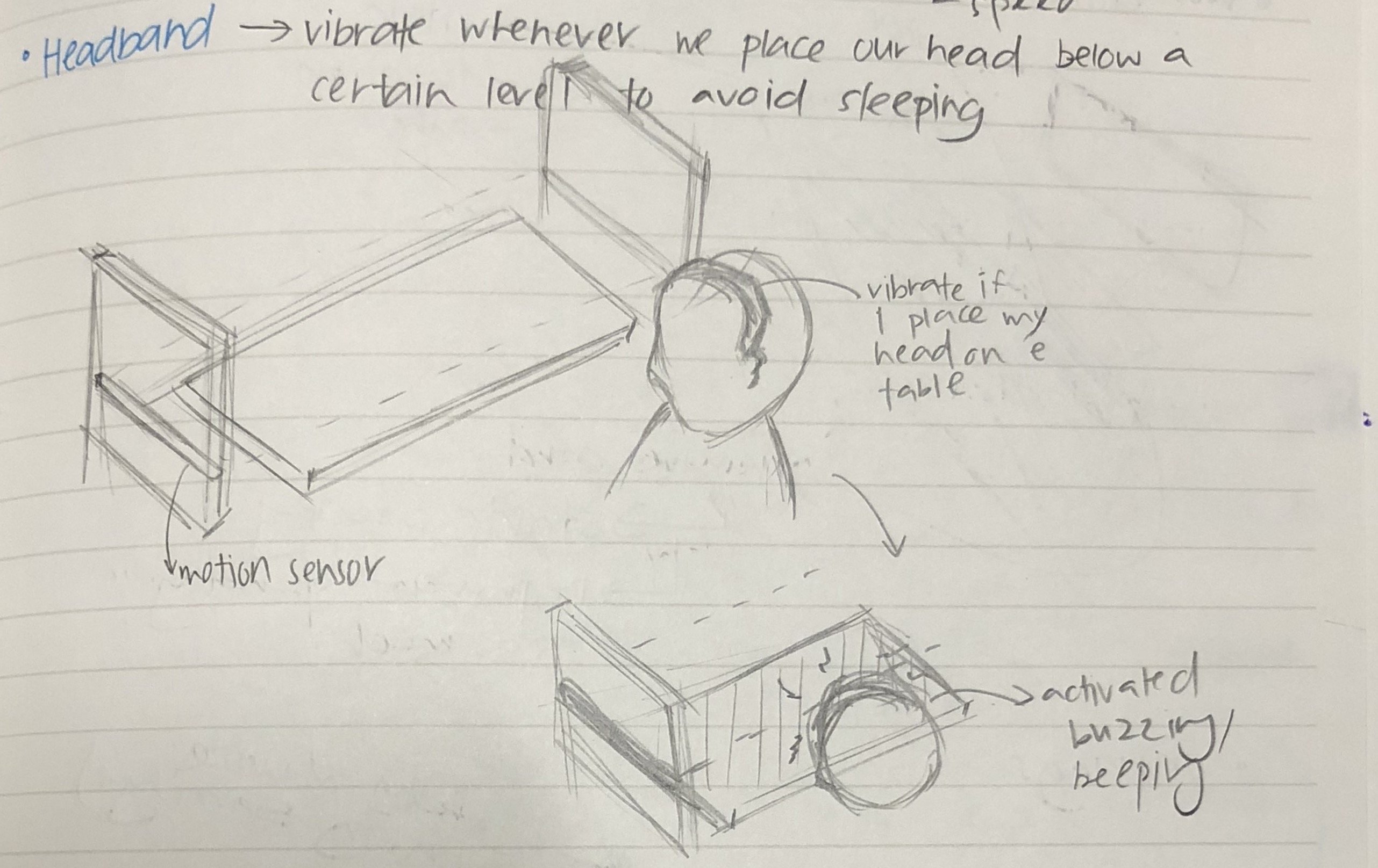
1. Screaming Headband
Hacking a headband so when we place our head below a certain level, it will start to beep, the objective of the hacked object is to increase productivity, avoid sleeping while when we are doing work.
2. Screaming Shoes
Hacking a pair of shoes so when the user enters a room with the shoes on, it will start to beep, the objective of the hacked object is to prevent the worn shoes into the room.
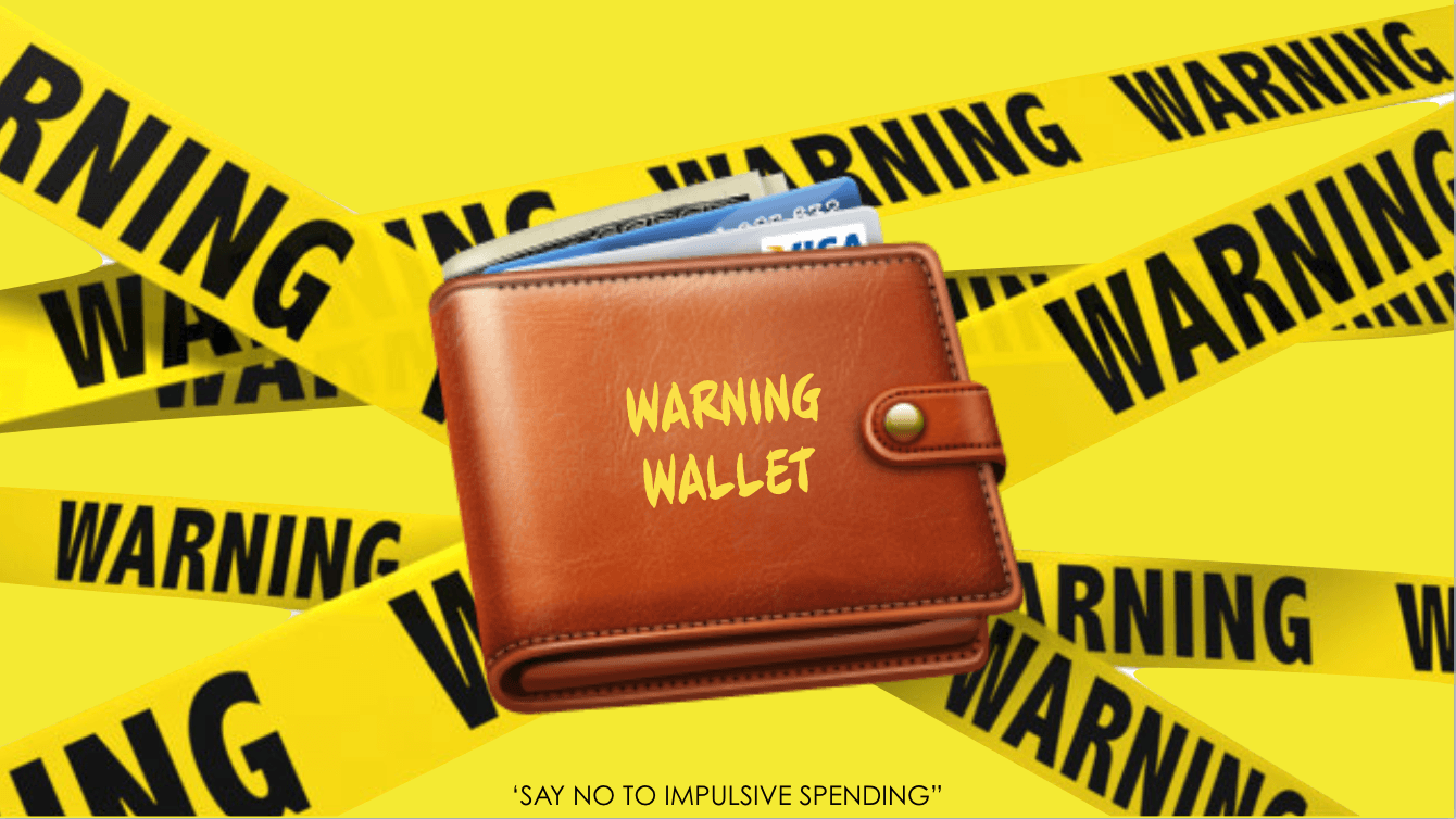
3. Warning Wallet
Hacking a wallet so when the user opens the wallet and take out a card from the cardholder, the wallet will produce an alarming noise to alert the user to control spending, give a second thought before spending.
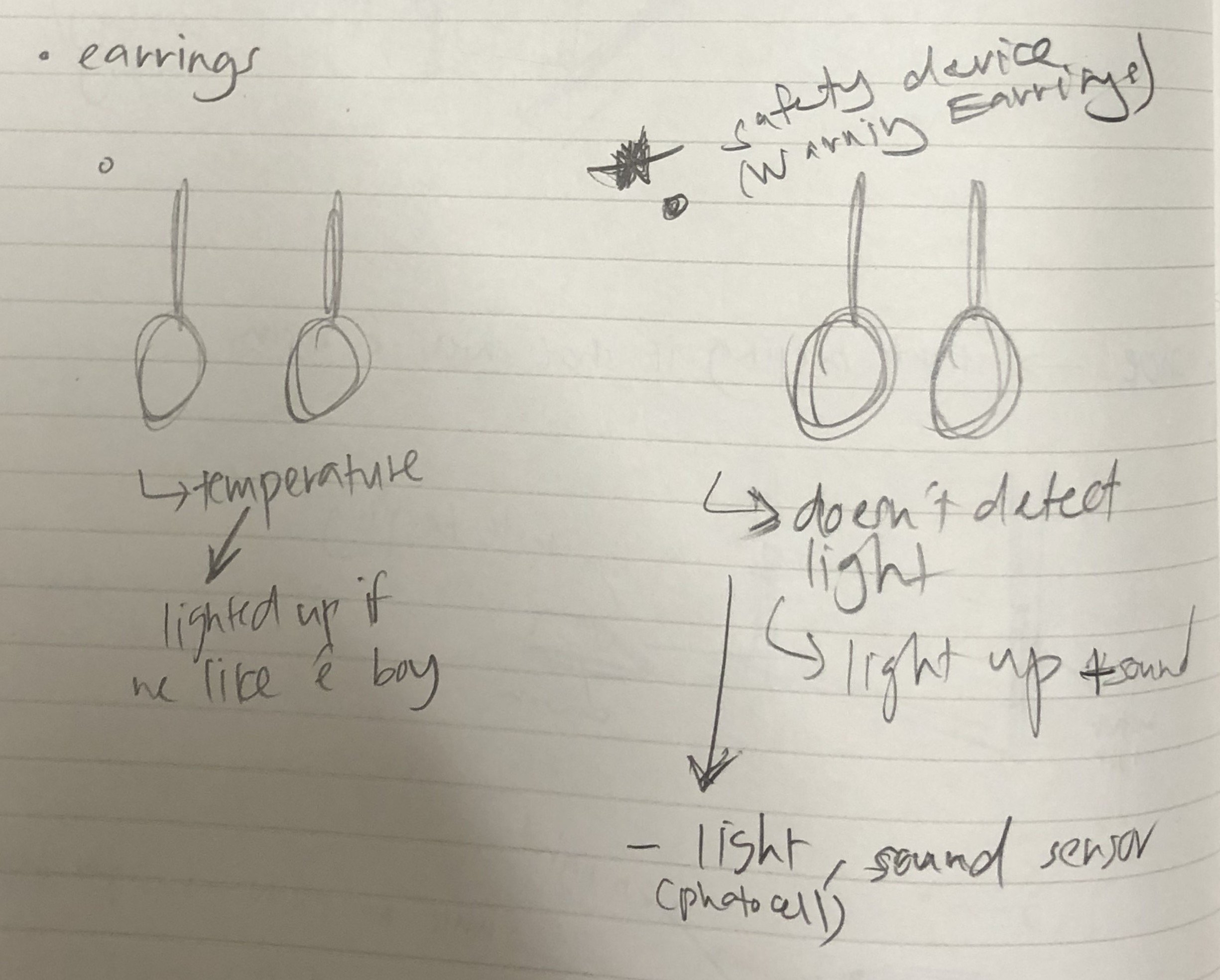
4. “True love” Earrings
Hacking an earring so when the user’s body temperature goes up, the earring will light up, the earning is helping the user to detect the love of his/her life.
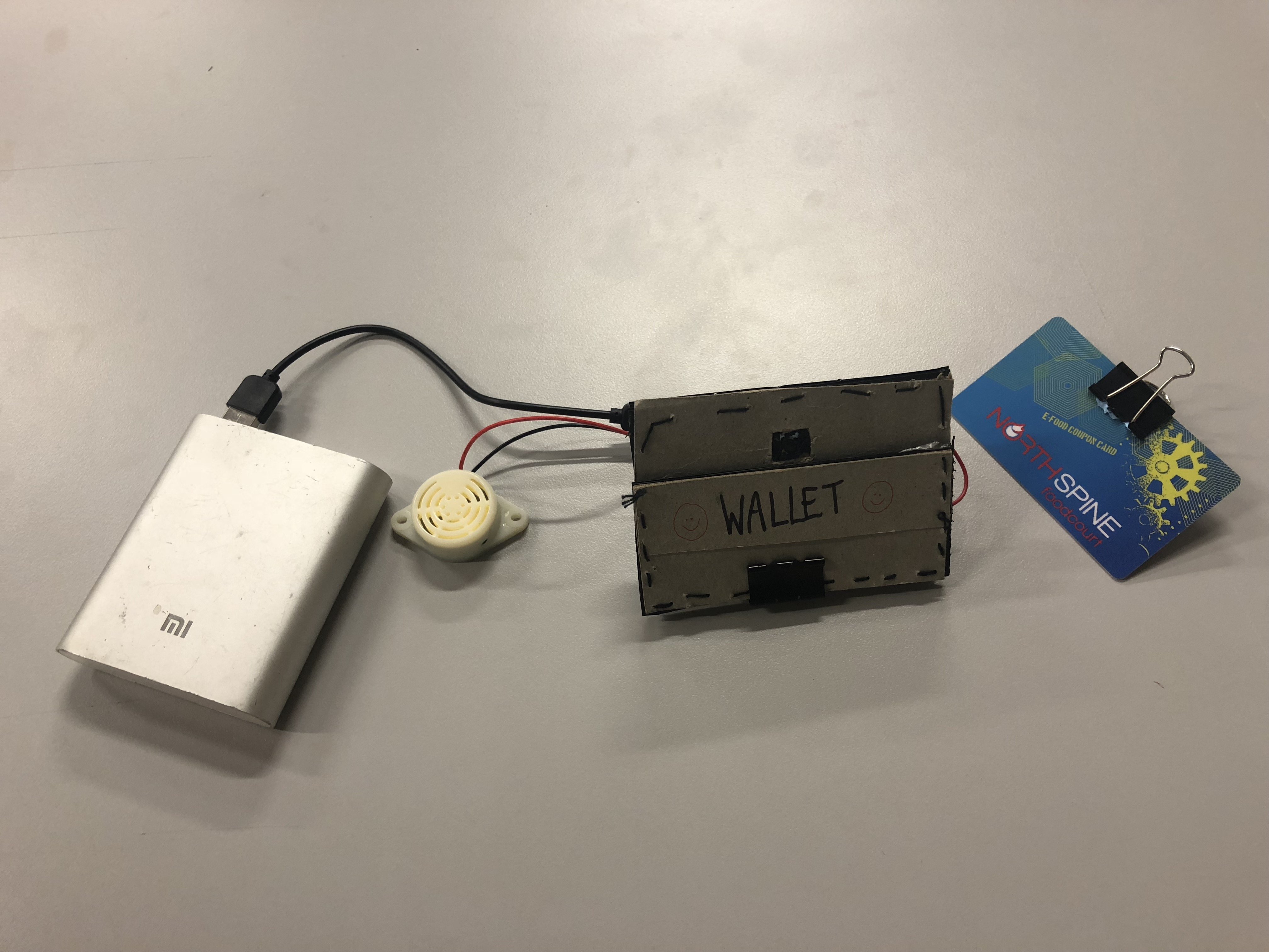
CHOSEN IDEA: WARNING WALLET
After the presentation of ideas and discussing with one another, we decided to go with the third idea, we felt that the Warning Wallet is conceptually stronger and it’s a legit problem that we face everyday-impulsive spending. So we did a research on “How to avoid impulsive spending?” The first step to making a change in behavior is to recognize the problem. Once you acknowledge that uncontrolled spending is an issue, your awareness of the problem will help you follow through with a plan to stop. The alarming noise produced by “Warning Wallet” helps the user to acknowledge that uncontrolled spending issue thus, it helps reduce impulsive spending. In addition, creating an uncomfortable situation will embed discomfort and awkwardness into their experience hence, they won’t repeat the same action and it will serve as a reminder before they spend their money.
PROCESS – ‘WARNING WALLET‘
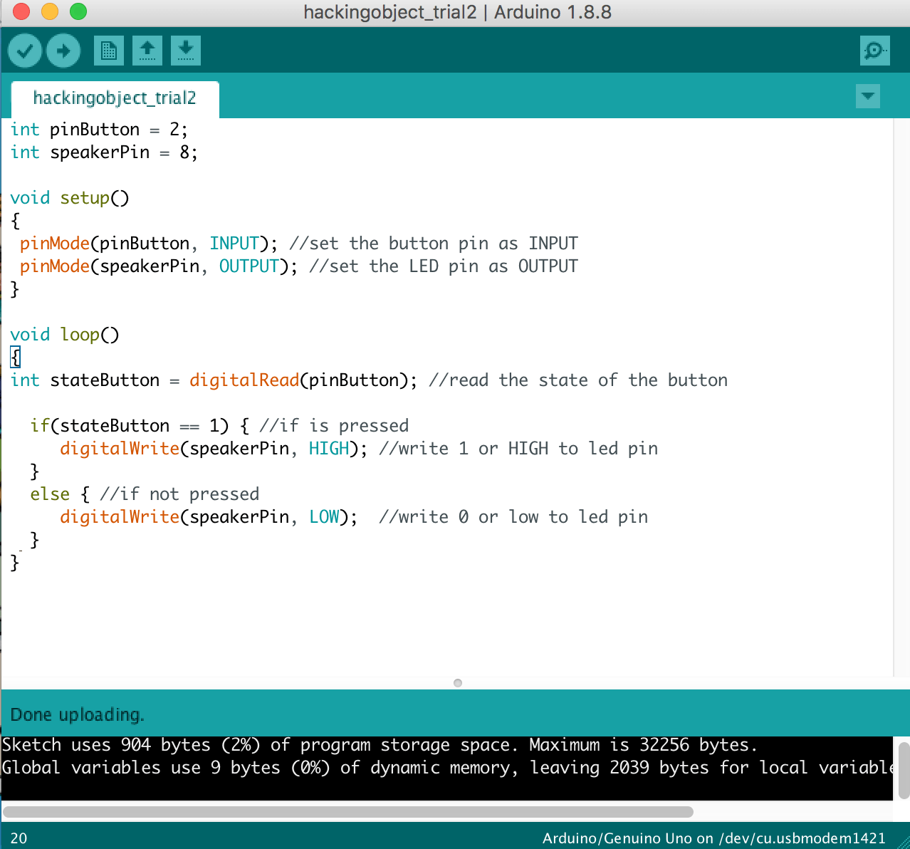
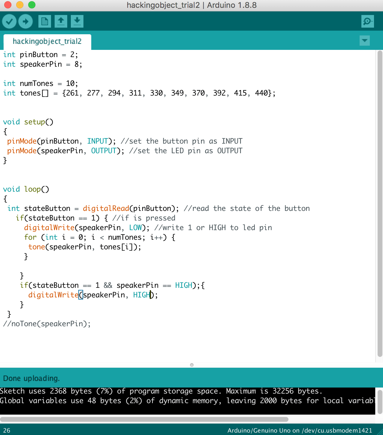
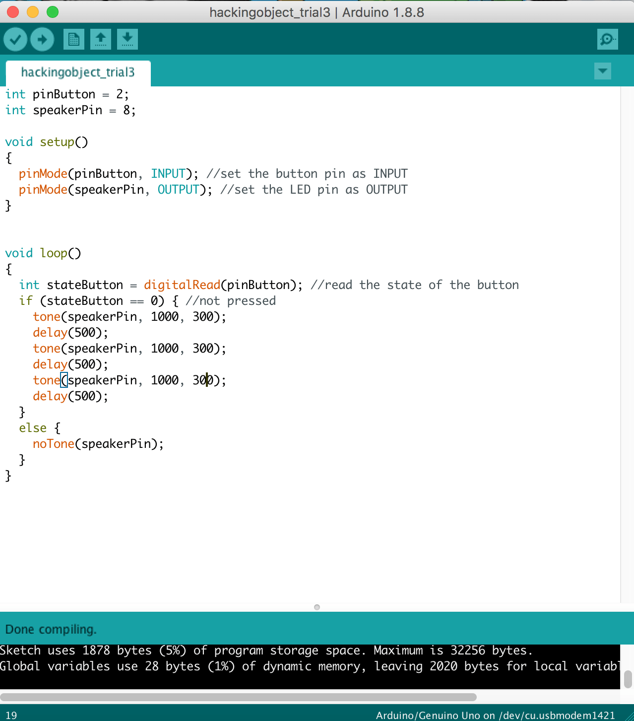
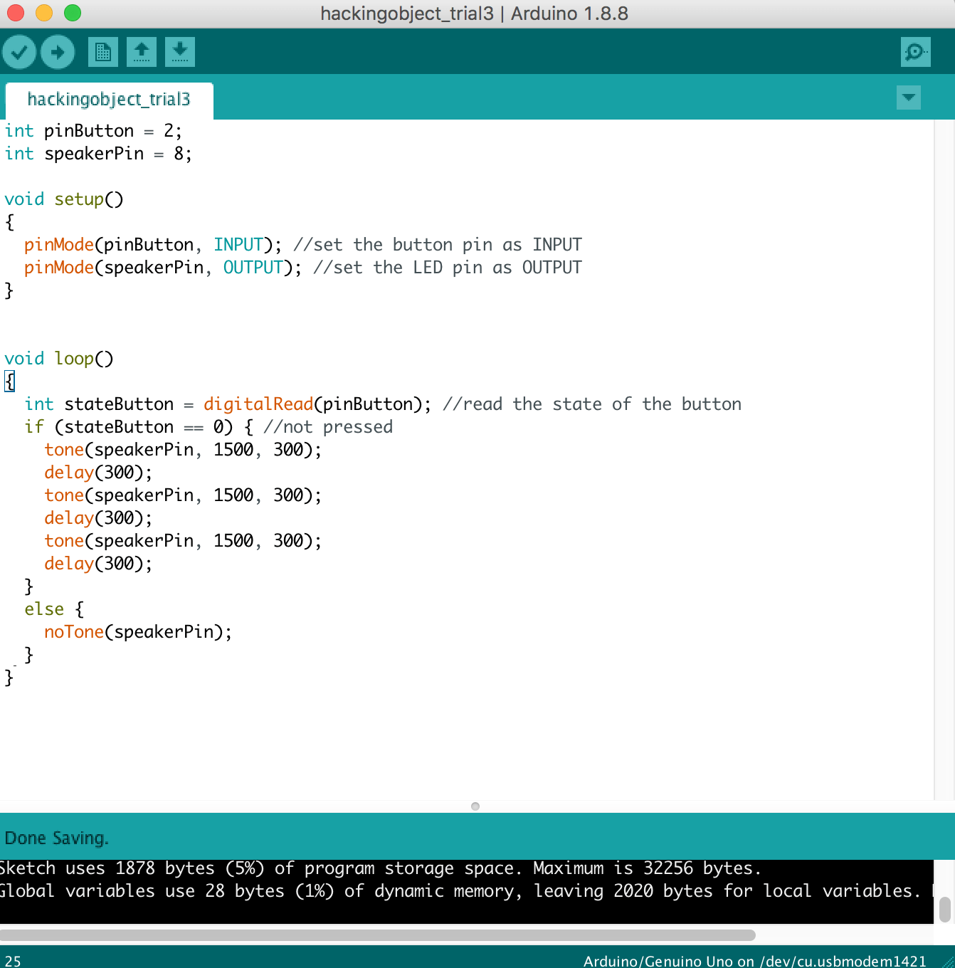
Figuring out the code
1 – Making it Beep
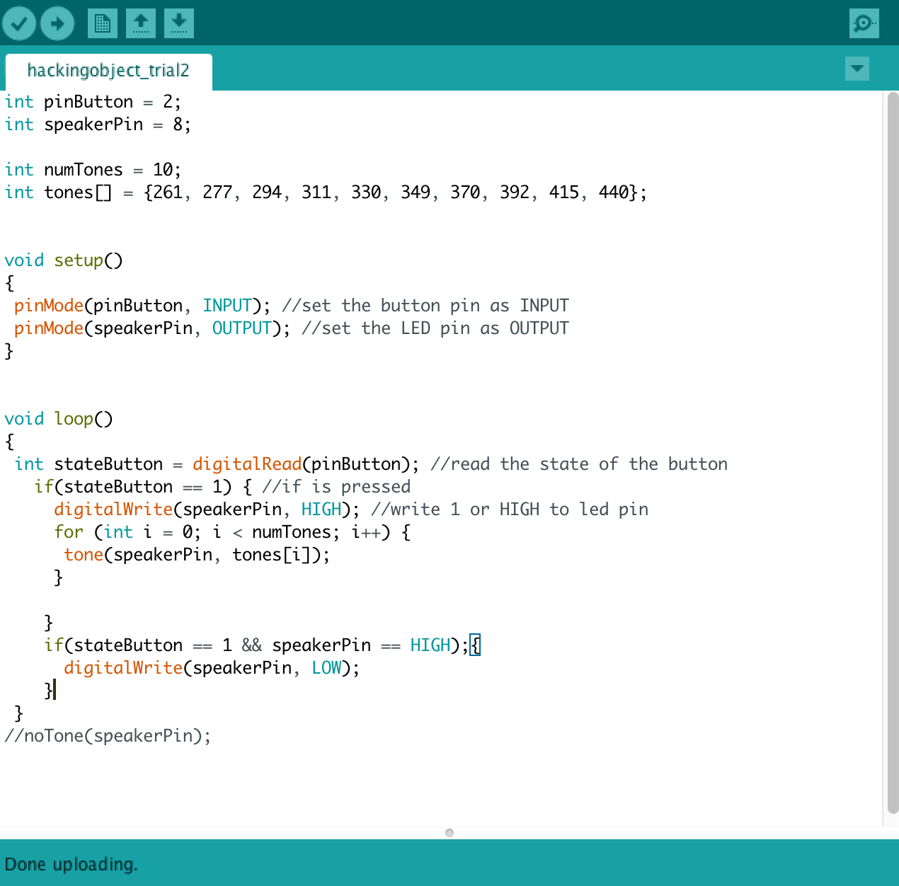
2 – Create the looping sound
3 – Switch Button as the sensor
4 – Final Outcome
5 – Changing of pitch
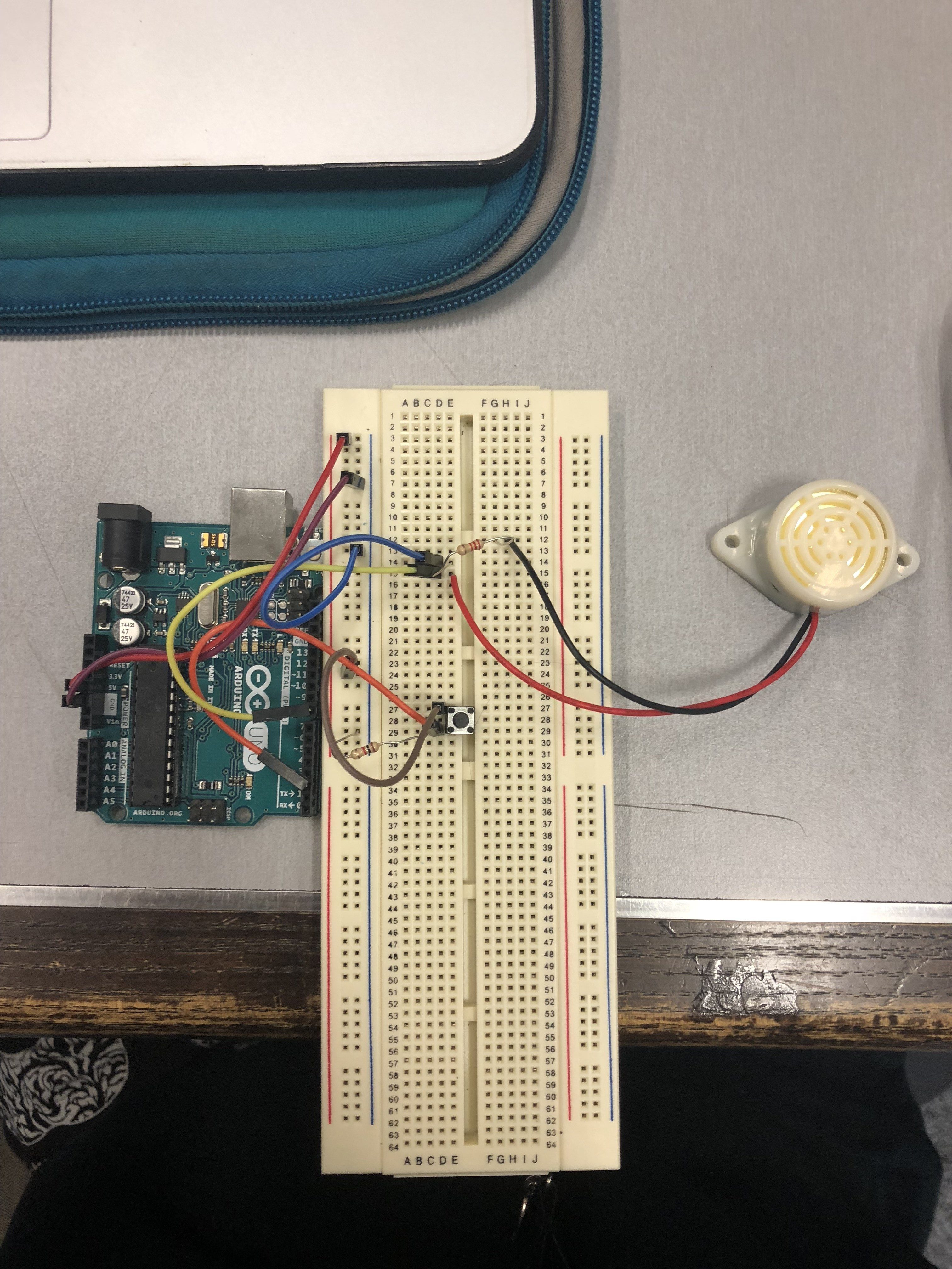
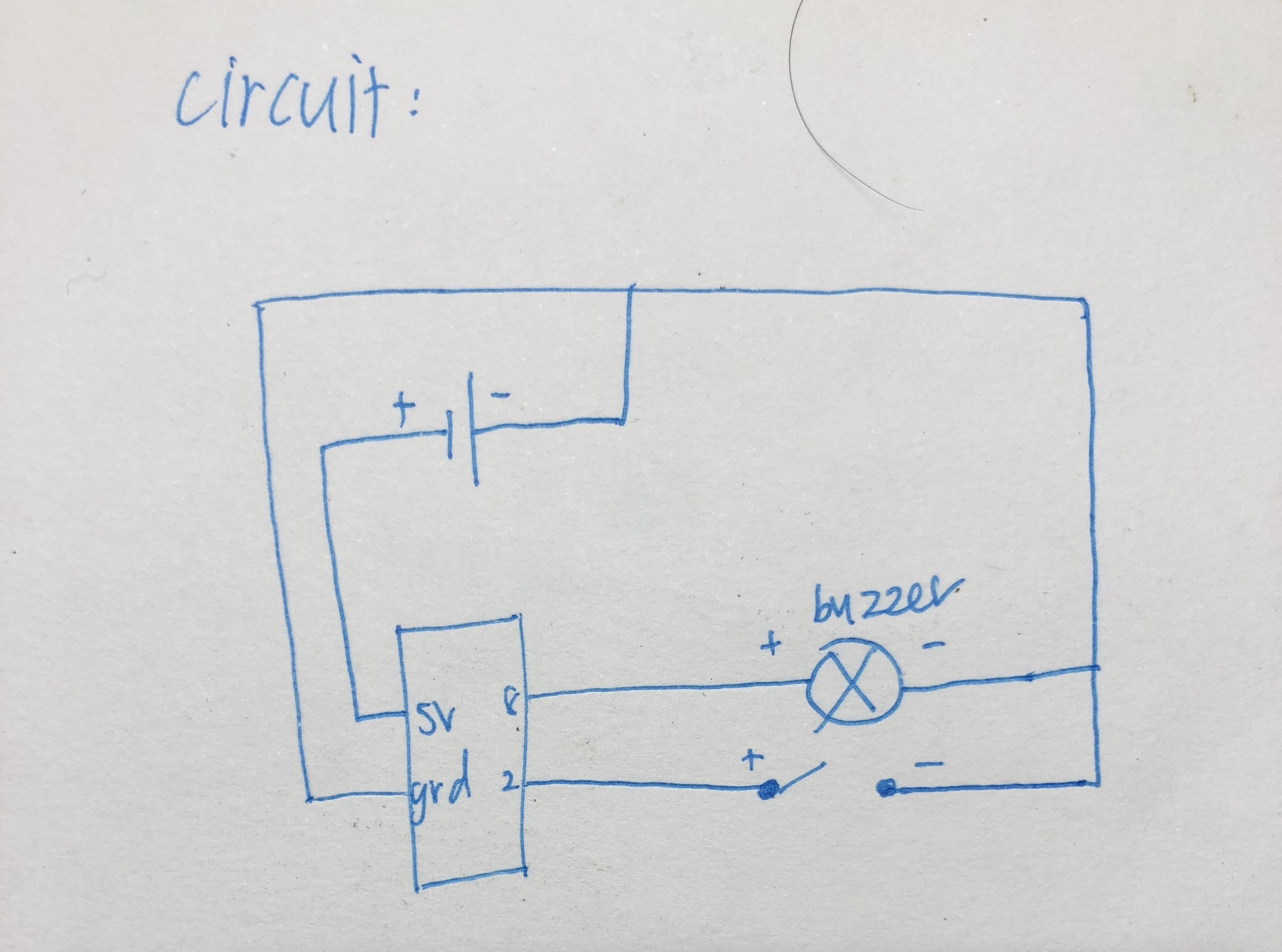
The essential components in our circuit are the switch button which acts a sensor to trigger the beeping sound when the card is removed from the wallet and the sound motor which beeps when it is triggered.
Using reference (below) from Open Source websites and forums, we were able to solve the issues we had which is being able to loop the beeping sound and the switchState to trigger the beeping sound.
We were able to simplify our code and learned the easier way to do the switchState and adjusting the pitch of our beeping sound to make it more annoying.
Circuit Board
Final circuit for Warning Wallet
Placed in an actual wallet
VIDEO: HOW OUR ‘WARNING CIRCUIT’ WORKS?
On a breadboard:
We realized that the breadboard was too big to be fitted in the wallet and we wanted our participants to have good user experience with our hacked object. Hence, we consulted some of our friends with an engineering background to solve this issue.
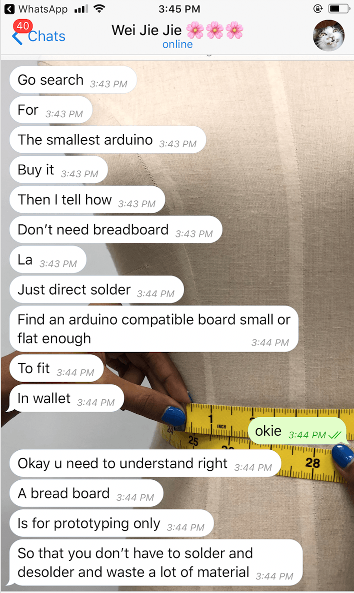
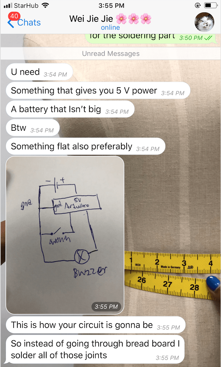
SUGGESTIONS FROM WEIJIE (ENGINEERING FRIEND):
1 – Getting an Arduino Nano
2 – Soldering
3 – Use a copper board for cheaper alternative
After discussing with each other, our group members decided to:
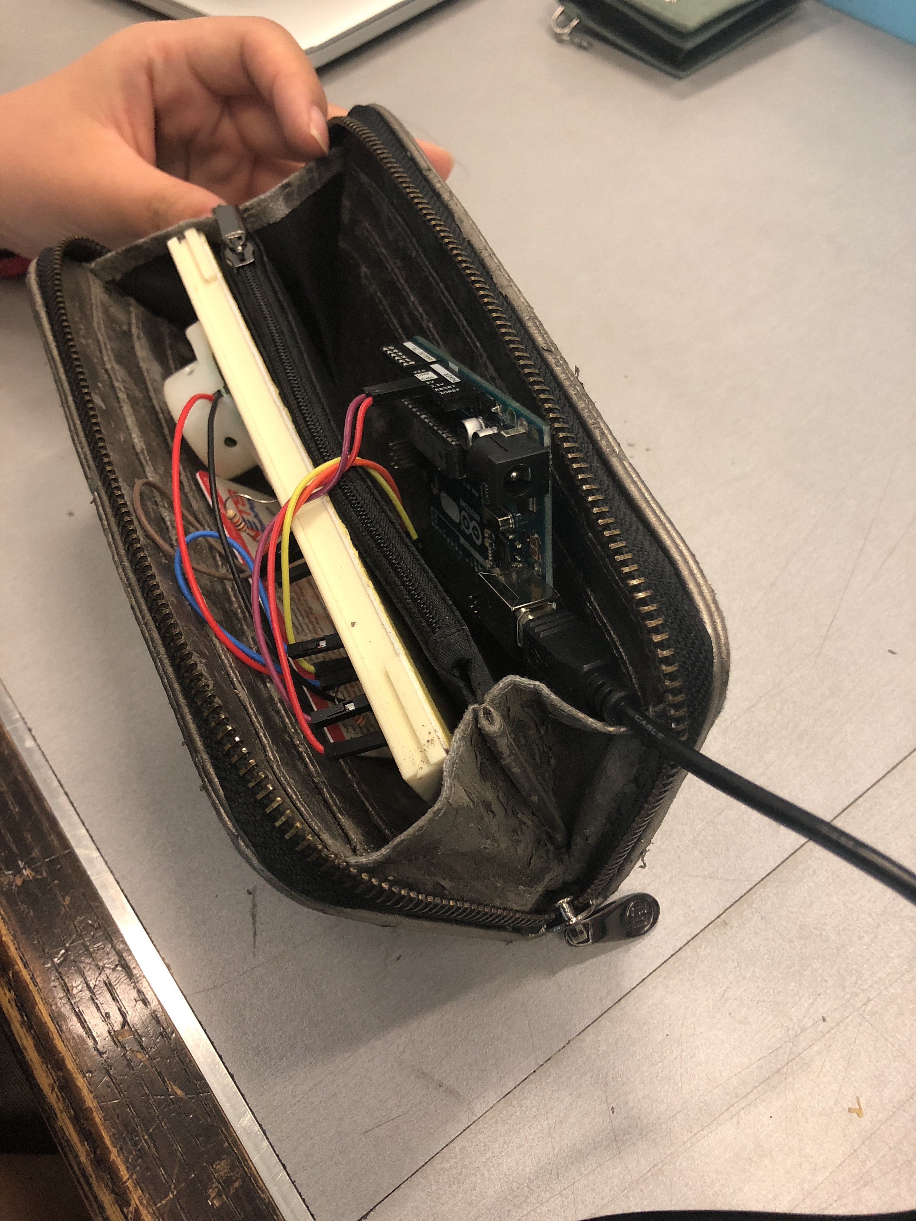
Buy an Arduino Nano to make it compact and portable for our ‘Warning Wallet’
Upload code onto Arduino Nano
Solder the wires directly onto the Arduino with reference to our circuit on the breadboard
Create a casing prototype for our circuit
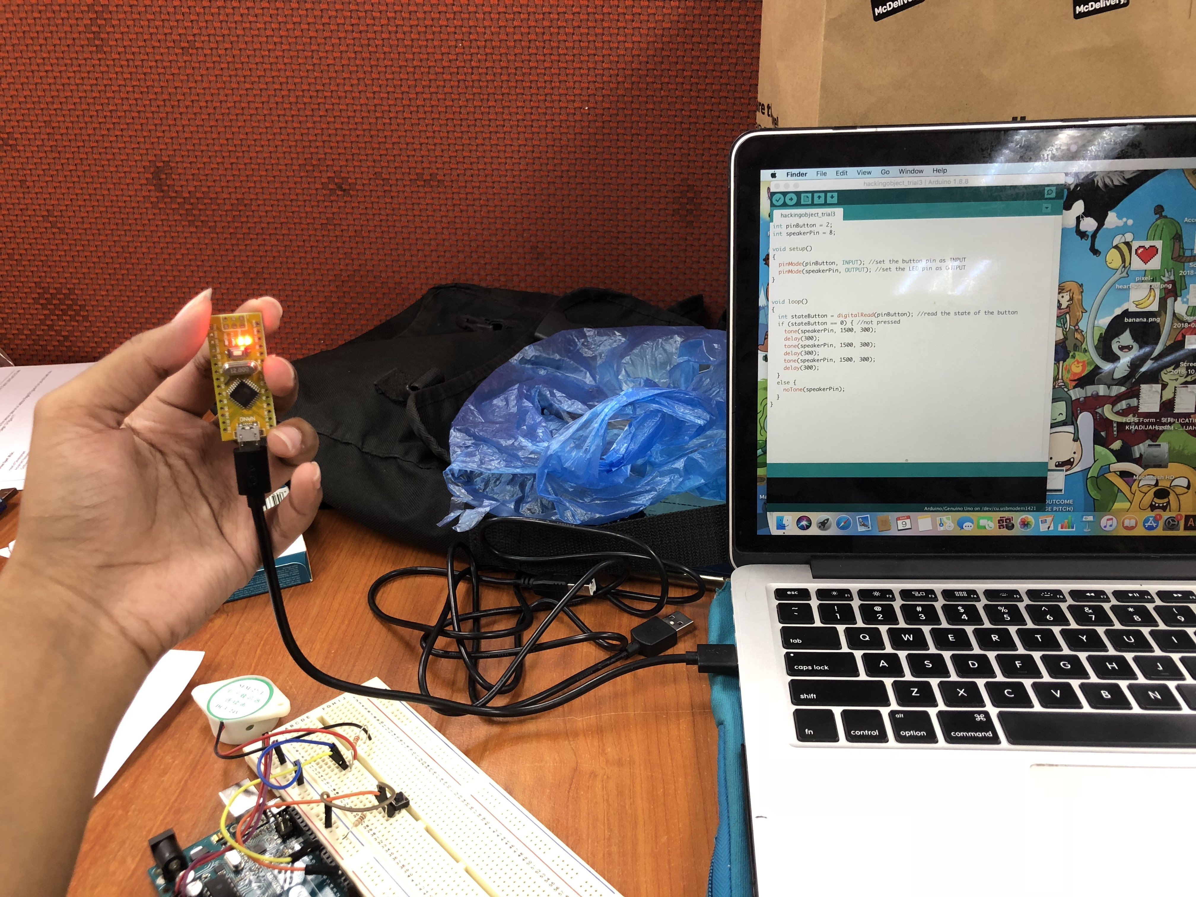
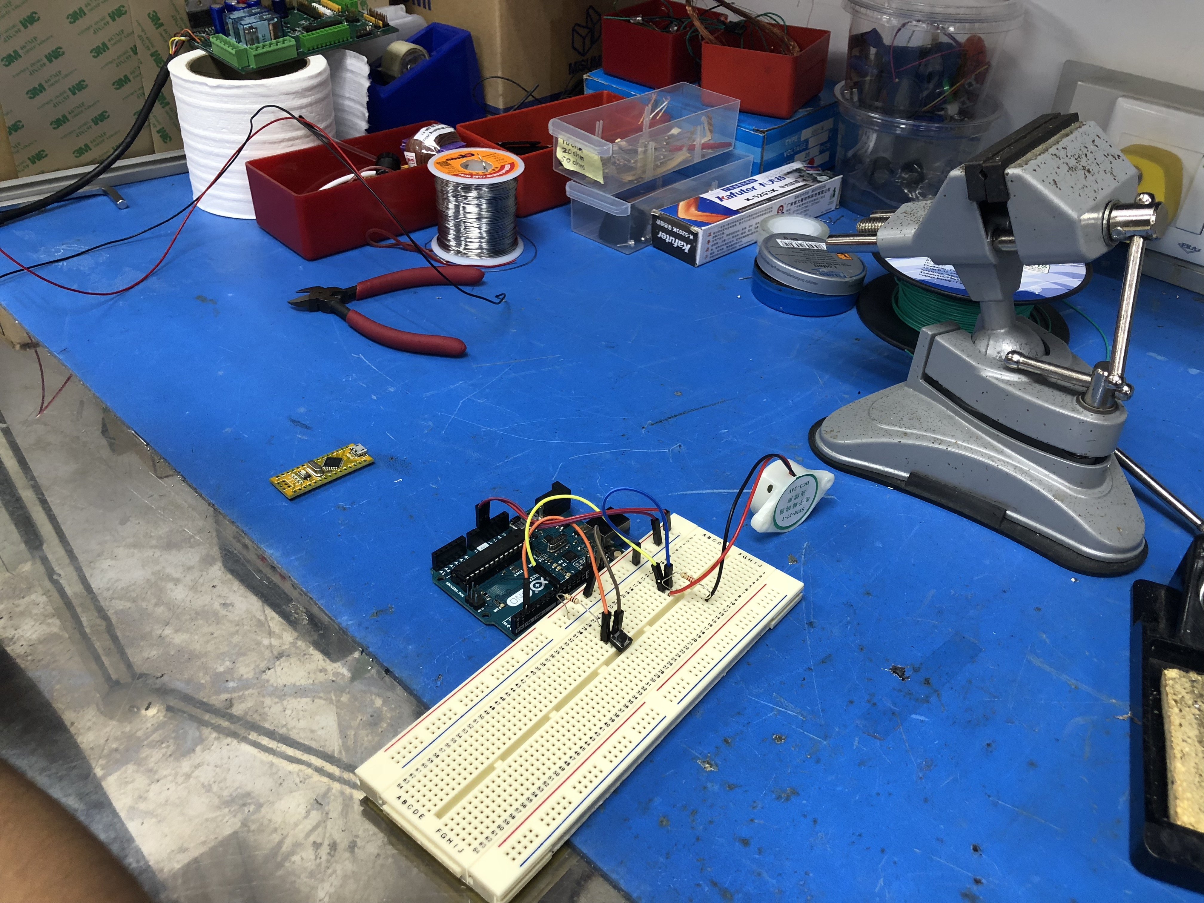
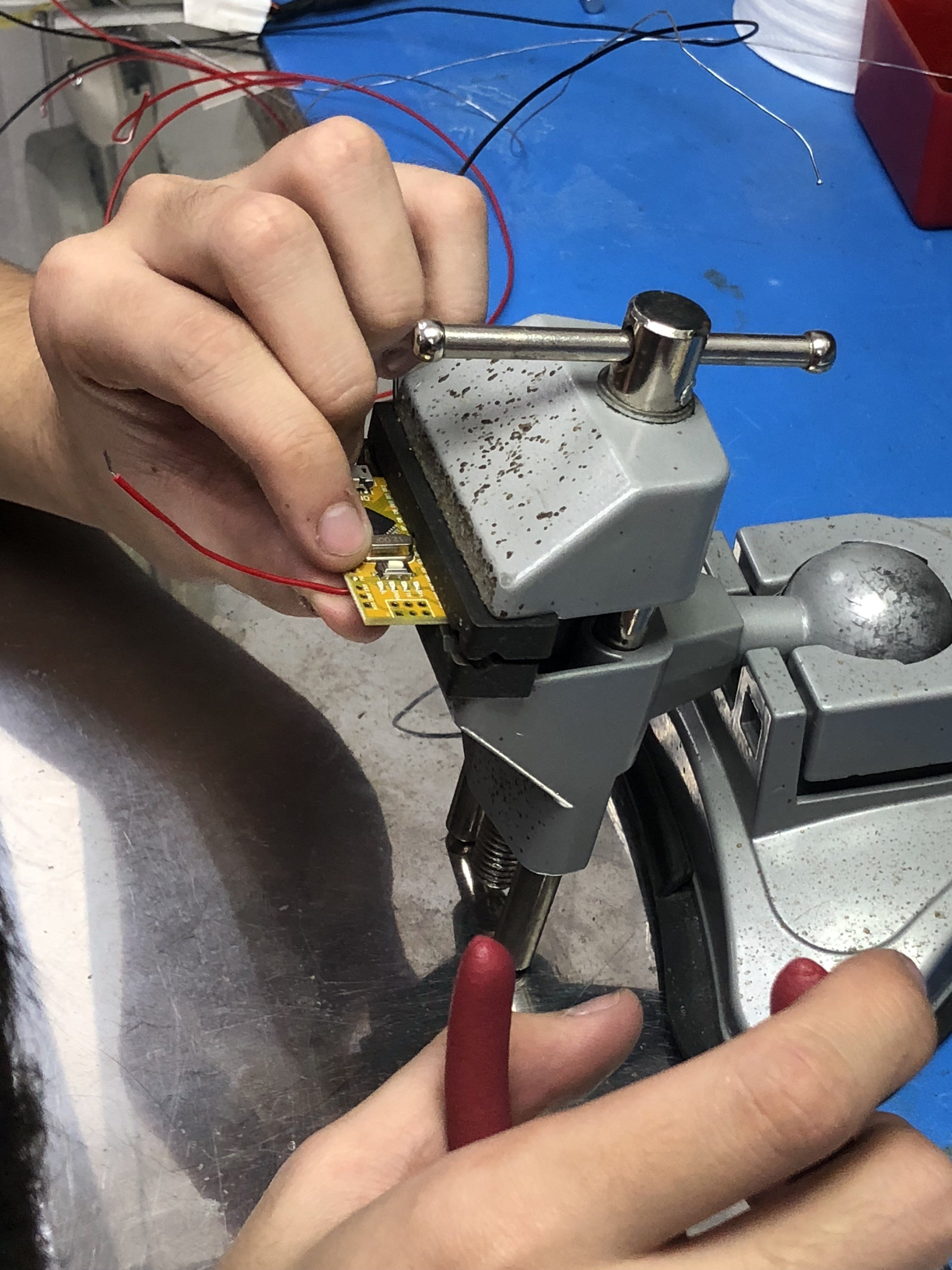
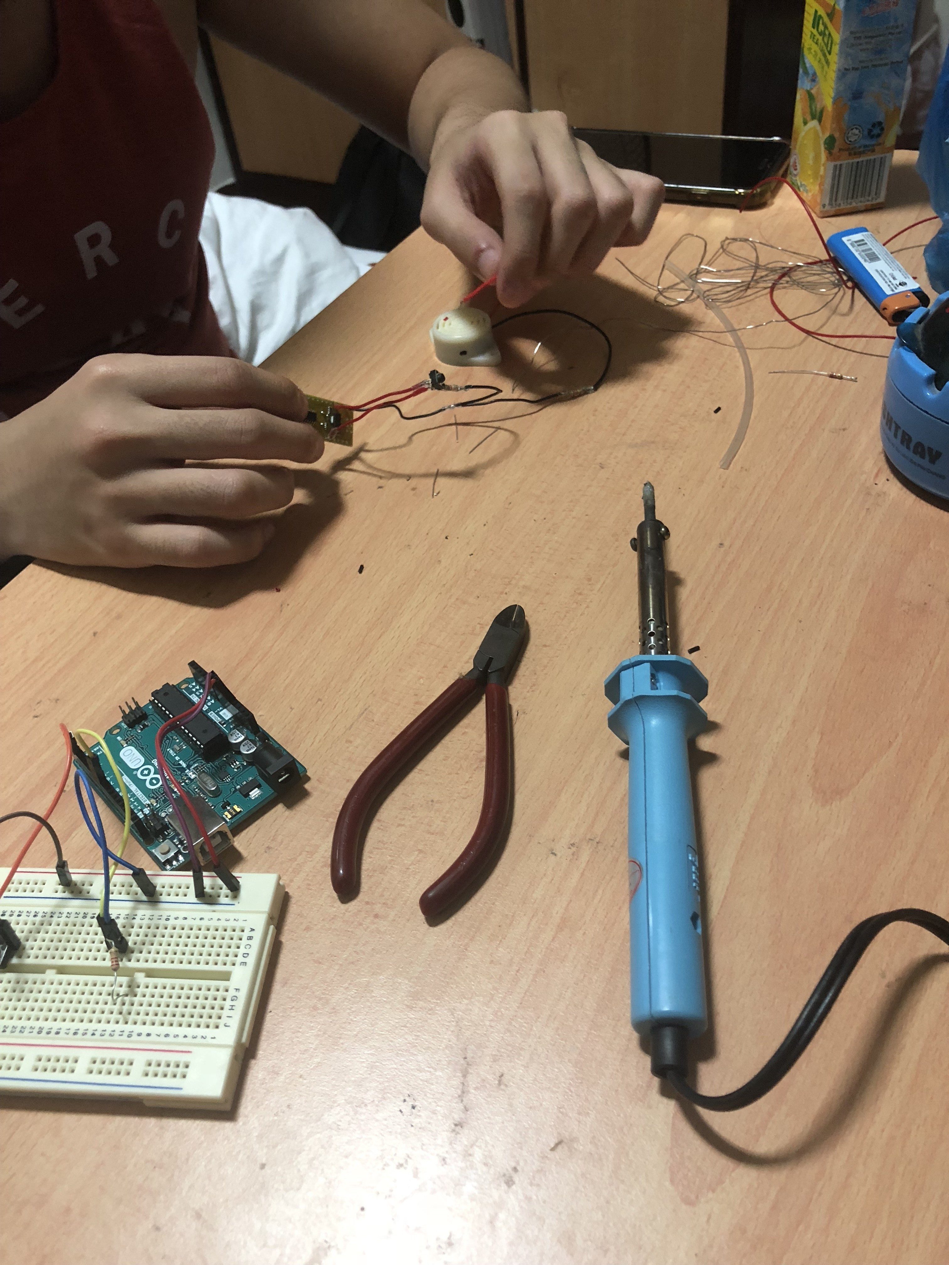
Process of soldering directly onto Arduino
1 -Original circuit vs. Compact circuit
2 – Uploading of code
3 – Workspace
4 – Clamping our Arduino Nano to solder
5 – Soldering
6 – Transferring components onto Arduino Nano
Since we’re are not experienced with soldering, we decided to ask assistance from our engineering friend and learn how to solder all the components together. Through this experience, we were able to learn the ‘hands-on’ making of the project and improve our ability to create a robust and working circuit.
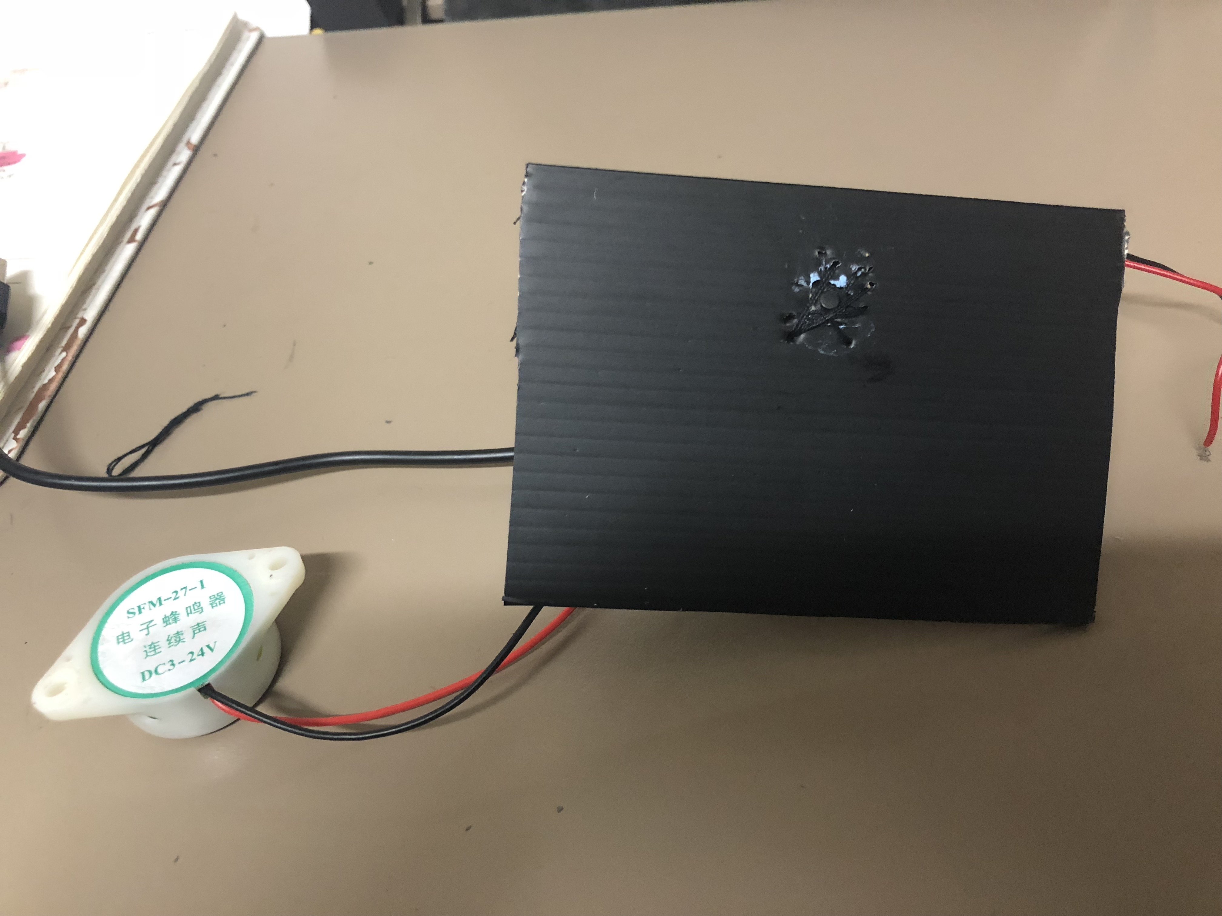
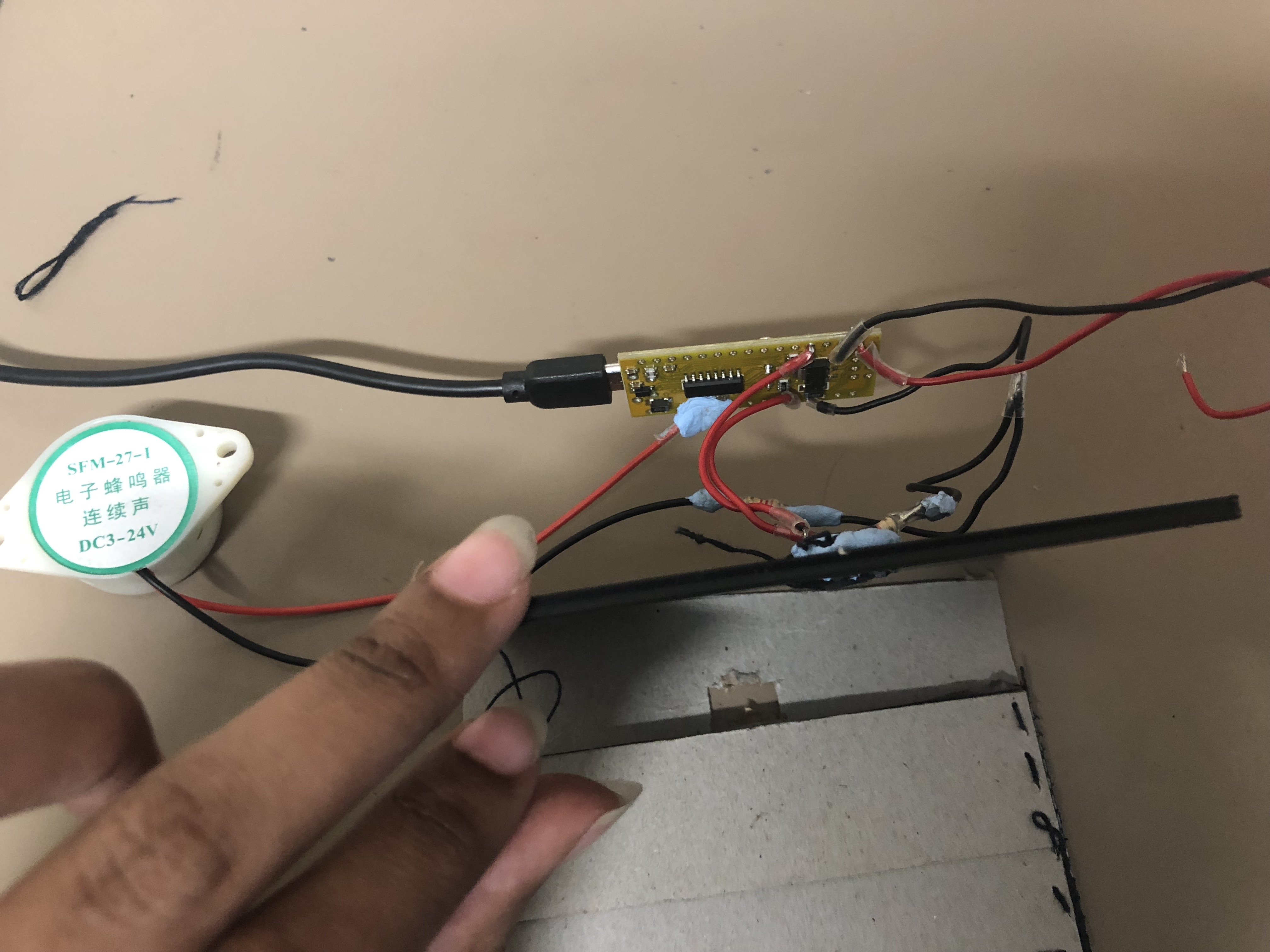
FINAL OUTCOME OF SOLDERING ONTO ARDUINO NANO:
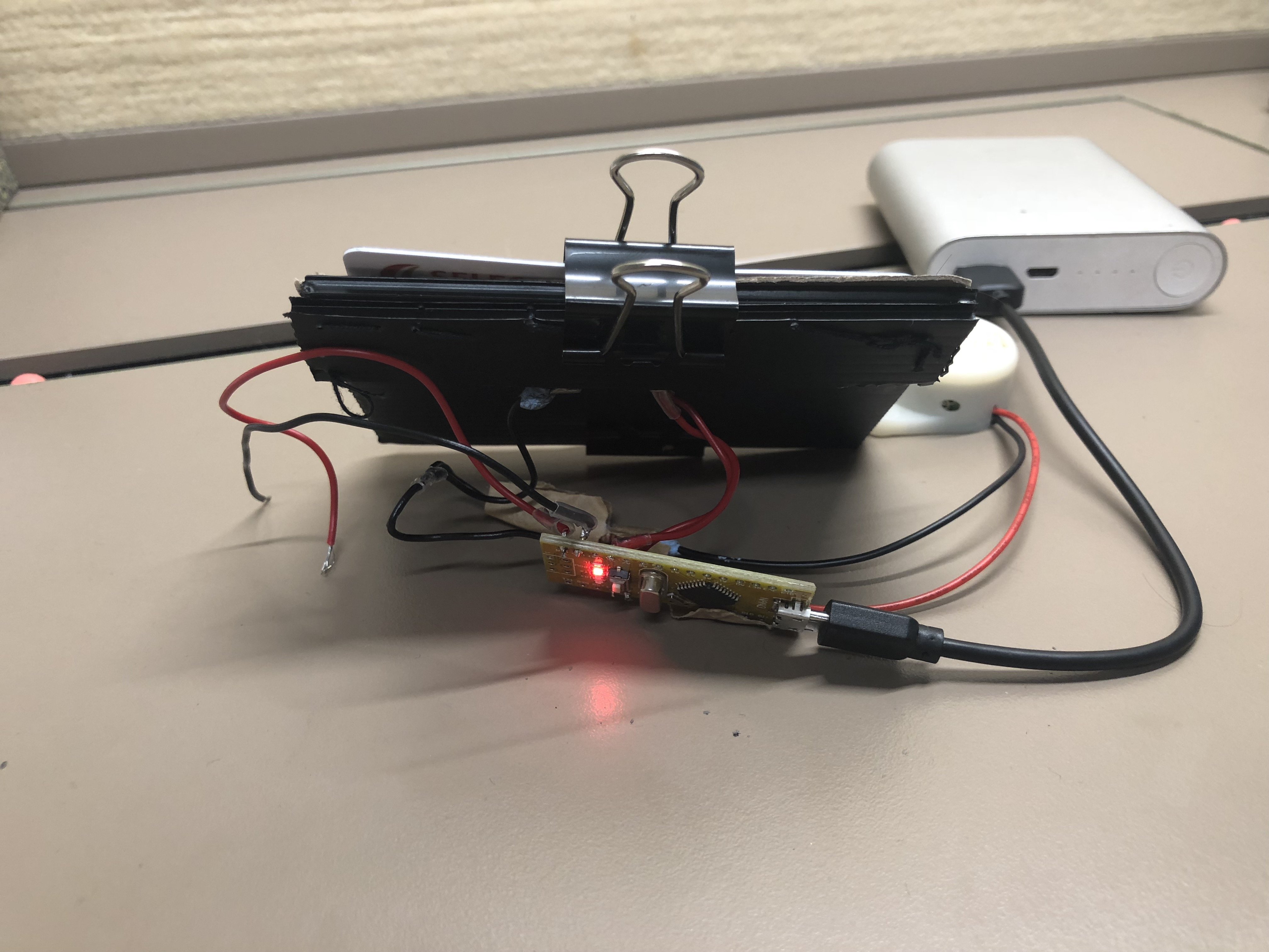
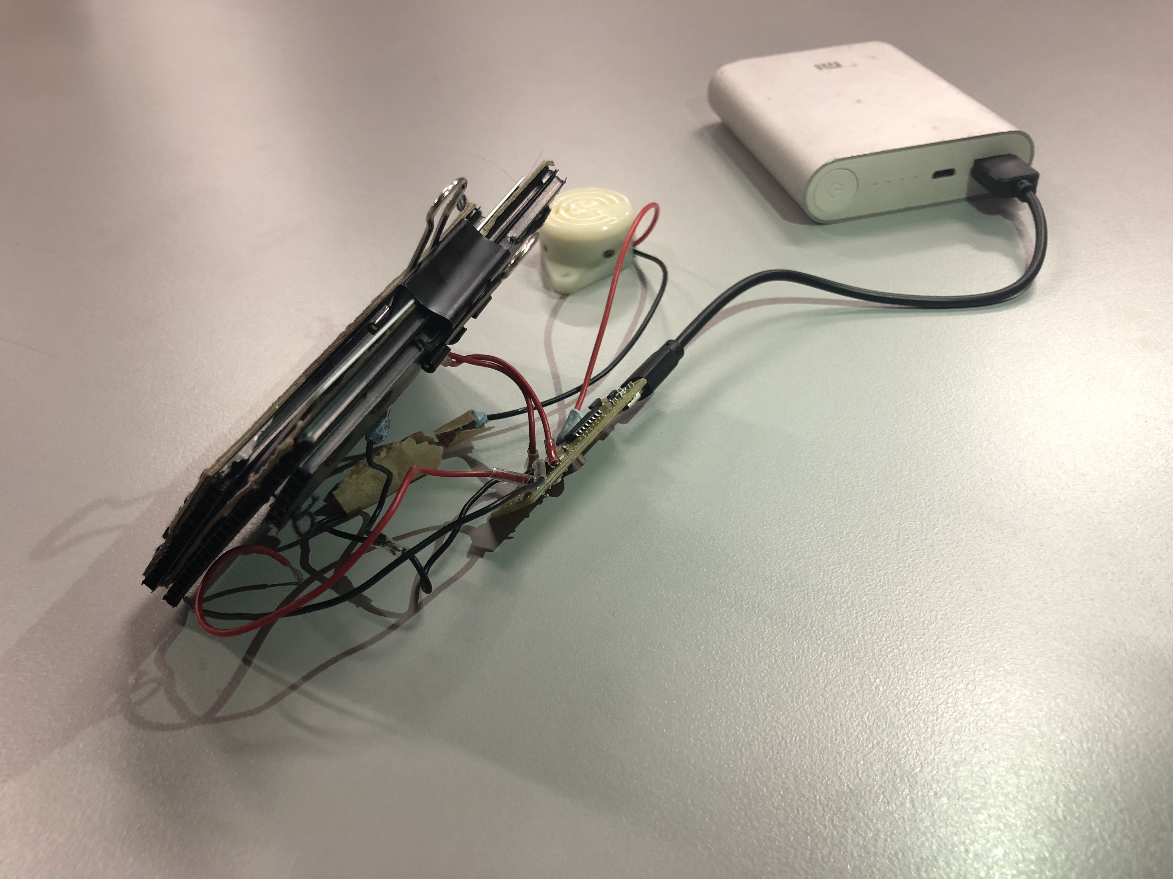
1 – Final outcome of circuit
2 – Additional wires for battery
Wejie told us that he decided to solder extra wires connecting the power and the ground to a battery in case, our power bank isn’t working so there’s another alternative to power the hacked object.
VIDEOS: TWO WAYS TO POWER THE ‘WARNING WALLET’
Powered by Xiaomi power bank – For compatibility and convenience
Powered by 9V battery – Another alternative
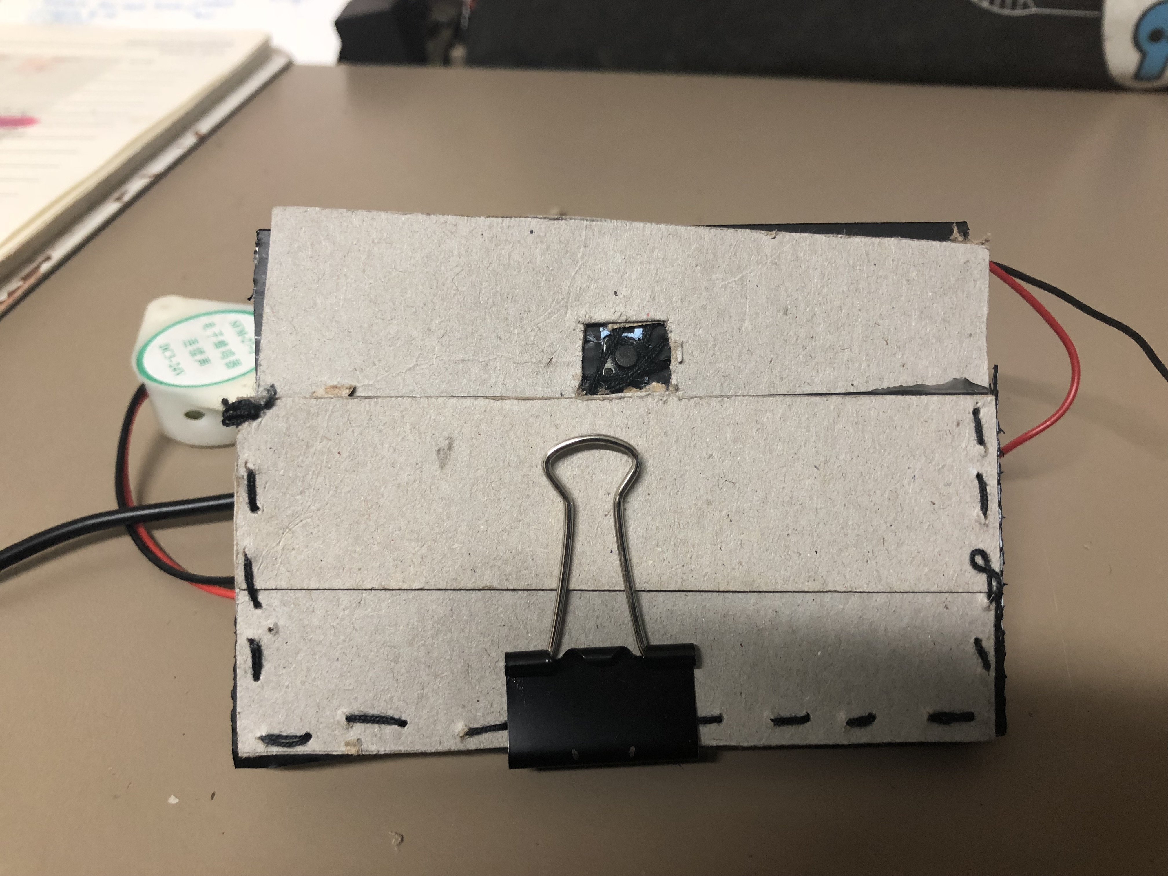
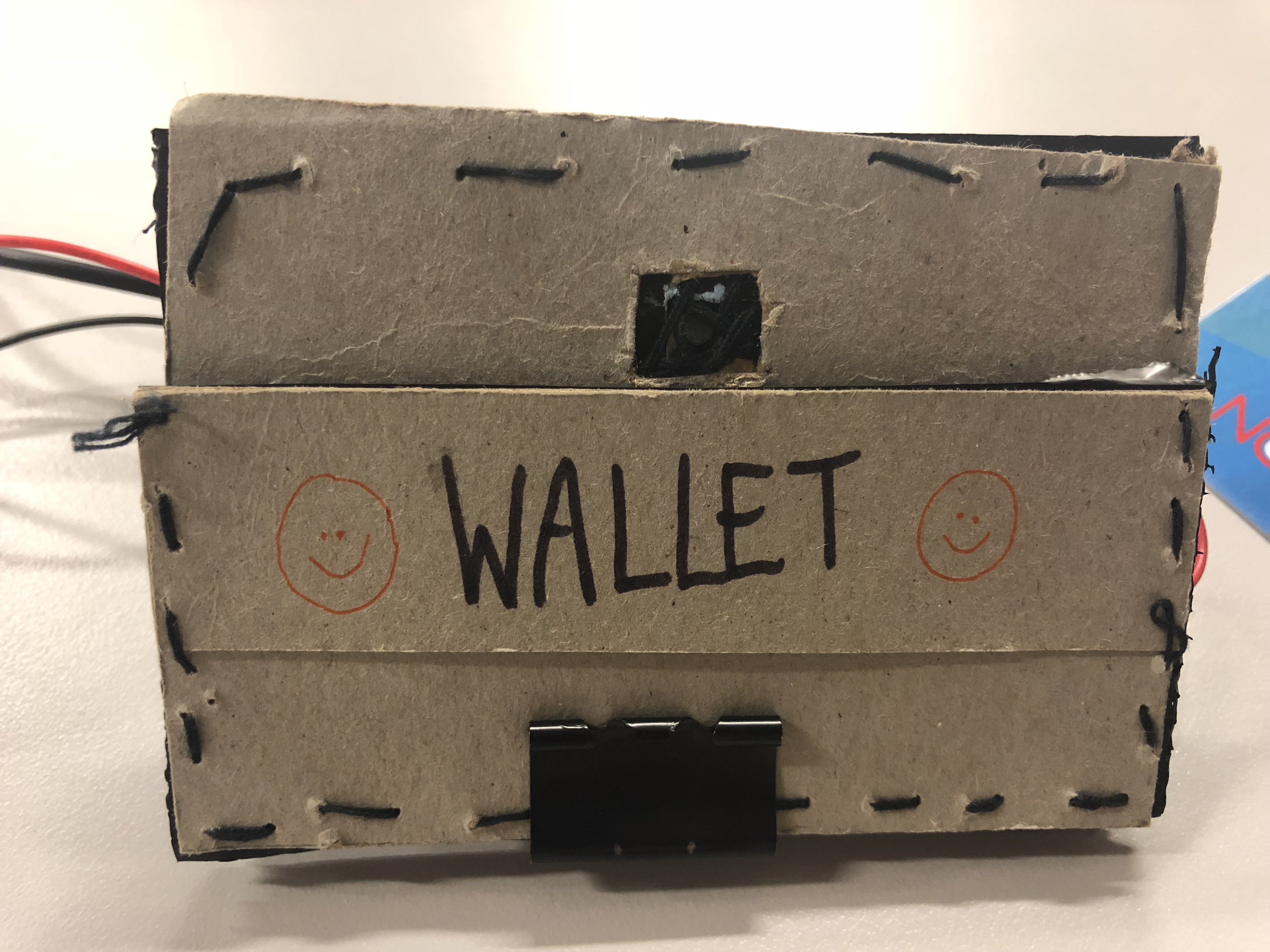
Prototype casing for ‘Warning Wallet’
Sewn and glued together, a wallet prototype for the circuit. The main objective of this prototype is to create a section in the cardholder for the switch button which will trigger the beeping sound when the card is removed from it.
ISSUES WITH OUR PROTOTYPE CASING – WALLET:
The card slots in the wallet weren’t tight enough to prevent the switch button from beeping. Hence, I added a clip to add more pressure to press against the switch button as an immediate solution.
*FINAL OUTCOME – ‘WARNING WALLET‘
VIDEOS
HARDWARE
1 – FRONT VIEW
2 – SIDE VIEW
3 – CARD IS REMOVED
4 – WALLET PROTOTYPE
CIRCUIT
Code
‘WARNING WALLET‘ IN USE IN A REAL LIFE CONTEXT
OUR EXPERIENCE:
As the users, honestly, we were quite embarrassed because of the loud beeping sound activated in the public and we wanted the purchasing process of buying bread to be over as soon as possible.
The auntie was wondering where the sound was coming from and kept looking around so, it was amusing to us. Afterward, she realized it was coming from our wallet and informed us about it.
We felt like we were able to deliver the objective of our hacked object and we’re pleased with the results.
PRESENTATION IN CLASS
ISSUES DURING PRESENTATION:
During our test trials and runs before the presentation, it was working fine. However, we were unlucky and the wire for the sound motor soldered to the Arduino Nano came off when we’re presenting ):
Despite this mishap, we had documentation videos of our working prototype and how it works in a real-life situation to present to our peers.
REFLECTIONS
“How does your hacked object behave in a way you least expect it to?”
SITI: A function of a wallet is supposed to store and safeguard valuables such as cash, cards, and identification details. Due to the consumerist culture of purchasing items that we do not need but want, we decided to hack a wallet and create an uncomfortable interaction. When a card is being removed from the wallet, the switch button will be released and trigger a loud beeping sound. Hence, creating an uncomfortable and awkward situation during the process of payment. The participant using the hacked object will be shocked and try to figure out how to stop the looping beeping sound which is by placing the card back into its slot. It serves as a reminder not to overspend and makes the user think whether it’s necessary to purchase an item.
TONG TONG: Our hacked object was designed to respond to the user’s movement, which is to take out the card from the card slot. We made a cardboard wallet and use a clip to exert a force onto the switch to imitate the actual wallet. In all our testing, we were assuming that the user will know how to use the wallet until the wallet is being used by the others, we then release the problem.
“What are some reactions you observed from your participants when they interacted with the object?”
SITI:
TongTong as the participant
During our test run in a real-life context, our prototype was working fine. When we were making our payment to the pastry store auntie, the beeping sound was activated and she was trying to figure out where the sound was coming from. You can see the confusion and frustration on her face. Personally, we as the participants wanted the whole process to be done as soon as possible but it was hilarious to see her reaction. After the payment is done, we were relieved that the annoying beeping sound has been stopped.
Brian as the participant
During our presentation, he wasn’t sure how to approach our ‘Warning Wallet’ but he took out the card but our circuit wasn’t working. The soldered wire of the sound motor was not connected properly and it might have been loose during the process of transportation. I should have been more careful in terms of safeguarding the circuit or should have created a protective casing for the wires to prevent such things from happening.
TONG TONG: Our first participant Brian, he was initially confused with how he should approach the object, when he took out the card from the wallet with the wallet being not very responsive, just happened that not to work during the presentation, even though we tried many times before the presentation, he is even more confused.
“What are the challenges involved and how did you overcome them? What problems still exist? How might you overcome them eventually?”
SITI:
We faced a lot of challenges during the process of creating our ‘Warning Wallet’.
As we’re not proficient in coding, we relied on opensource forums and the knowledge we’ve learned in class to figure out the codes suitable to apply for our circuit.
We realized that to make our prototype more realistic during user experience, we had to focus on the compatibility and portability of our ‘Warning Wallet’. With the assistance of our friends with an engineering background, we were given suggestions to change to an Arduino Nano and solder our components directly so it will be compact. In addition, we learned how to solder directly, simplify the circuit and completed the circuit together (DIWO). Personally, it was a meaningful and fun experience collaborating with my friends and I appreciate their skills.
During the process of creating the prototype casing of the ‘Warning Wallet’, the card slots in our spare wallet weren’t tight enough and I had to resort to making a wallet out of cardboard because I didn’t want to destroy our current wallet that works perfectly with the circuit. However, despite creating a prototype casing out of cardboard, the card slot and card were still not tight enough to press against the switch button sensor. I resorted to adding a clip onto the card to exert more force onto the switch button sensor to prevent it from beeping (immediate solution because we didn’t have much time left). Hence, affecting the user experience of our participants for the presentation ):
When we were faced with this issue of making the sensors work, we realized we should have change the sensor from the switch button to a photocell sensor (detects light) which is much better as it doesn’t require force and it will stop beeping when the card is covering the photocell. The user experience of the participants will be much better if we tried multiple sensors for our circuit before finalizing which sensor is the best option for our hacked object! (Lesson learned!)
TONG TONG: There were several challenges that we faced throughout the process, involved hiding the components of the setup. We decided to buy a smaller Arduino board and soldering it so we were able to hide everything inside the wallet. We could have improved on our object by doing user testing, then we will realize the problem of the product. It would have been better if we use an actual wallet instead of the cardboard. Moreover, there was the issue of the choice of sensor, photosensor (detects the presence of visible light) might be a better choice than using the switch (detects the pressure).
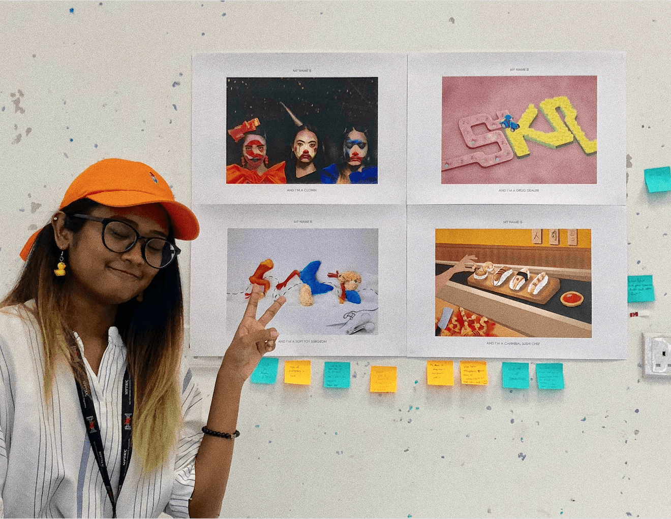
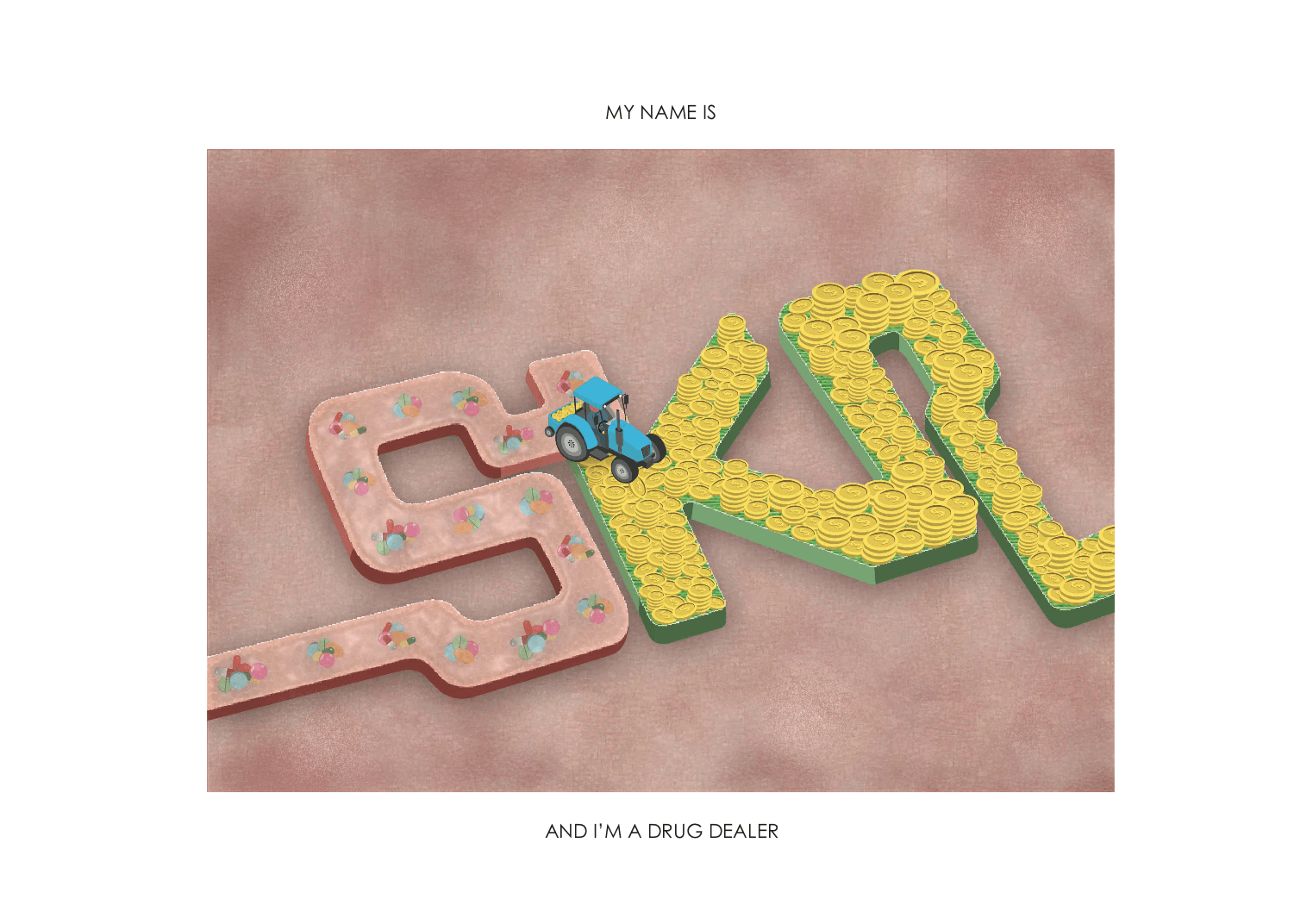
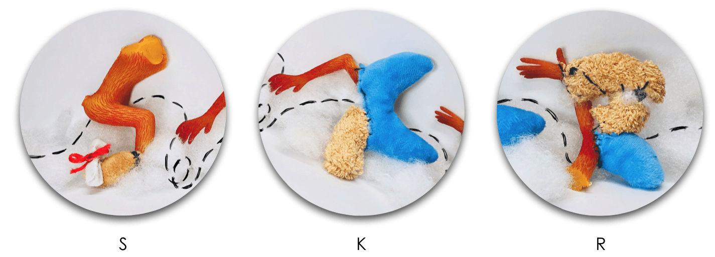
Legibility of the letter ‘K’. It looks like an ‘X’.
Add highlights to the typeface so it looks bouncy.
Incorporate the texture and thin lines onto the typeface instead of the background.
Outline the rounded and bouncy typeface on the clown’s face.
CRITIQUE SESSION:
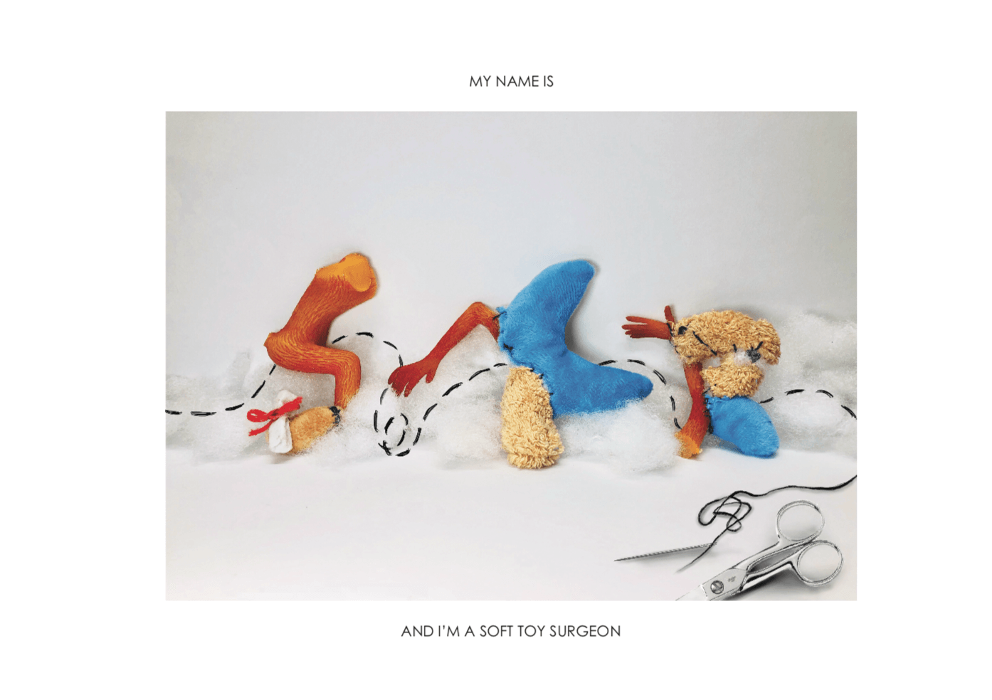
The letter ‘R’ looks like a P. (Legibility)
CRITIQUE SESSION:
Legibility of the letter ‘K’. I should have reduced the length of the decorative tail of the K.
I should have brought the physical soft textured typeface during the presentation to showcase to my peers.
CRITIQUE SESSION:
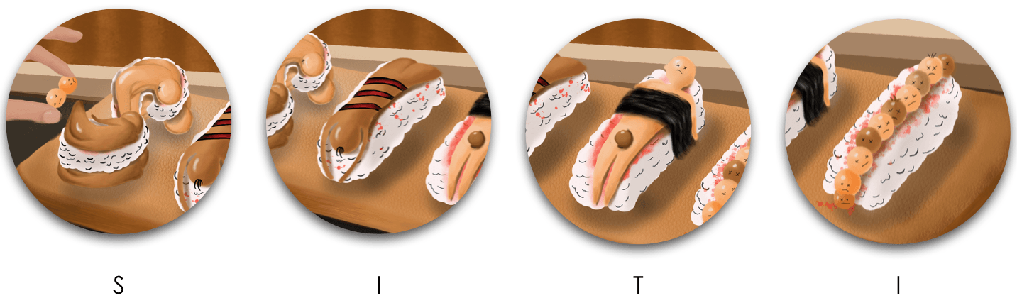
Legibility of the first ‘I’. Suggestion: Repeat the second ‘I’ typeface so it’s more readable.
TAKEAWAYS AND LEARNING CURVE DURING THIS PROJECT:
I had challenges trying to picking out the minimal and essential elements from each of my jobs to portray it visually and efficiently. However, this project made me focused on the various aspects of the design process for image-making through type such as the usage of suitable elements, choice of fonts, color scheme, overall composition, technique or method that I’m going to apply.
My knowledge of the principles of design and elements of design assisted the overall composition of typographic portraits and my peers complimented the perspective, depth, and dimensions of my typeface.
Personally, I really enjoyed the dynamic design process of trying out analog and digital methods.
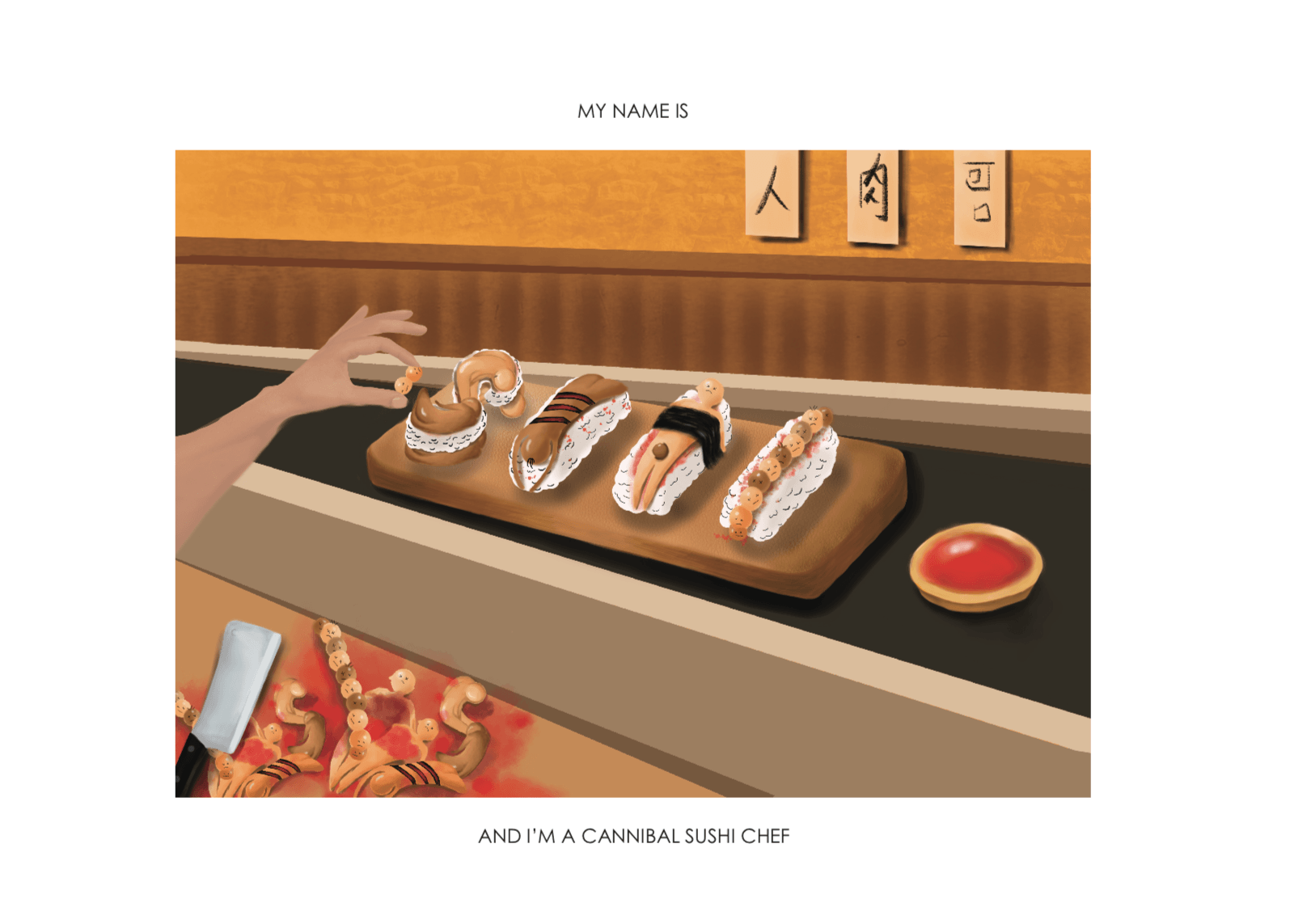
All in all, I’m really satisfied with the 4 outcomes of my typographic portraits. My favorite designs are the ‘Depressed Clown’ and ‘Drug Dealer’ and most of my peers really enjoyed ‘Cannibal Sushi Chef’. In terms of my illustrating skills, I felt like I’ve grown and improved in being able to harmonize all the elements and create a narrative.