Final Project – The Pill Bag

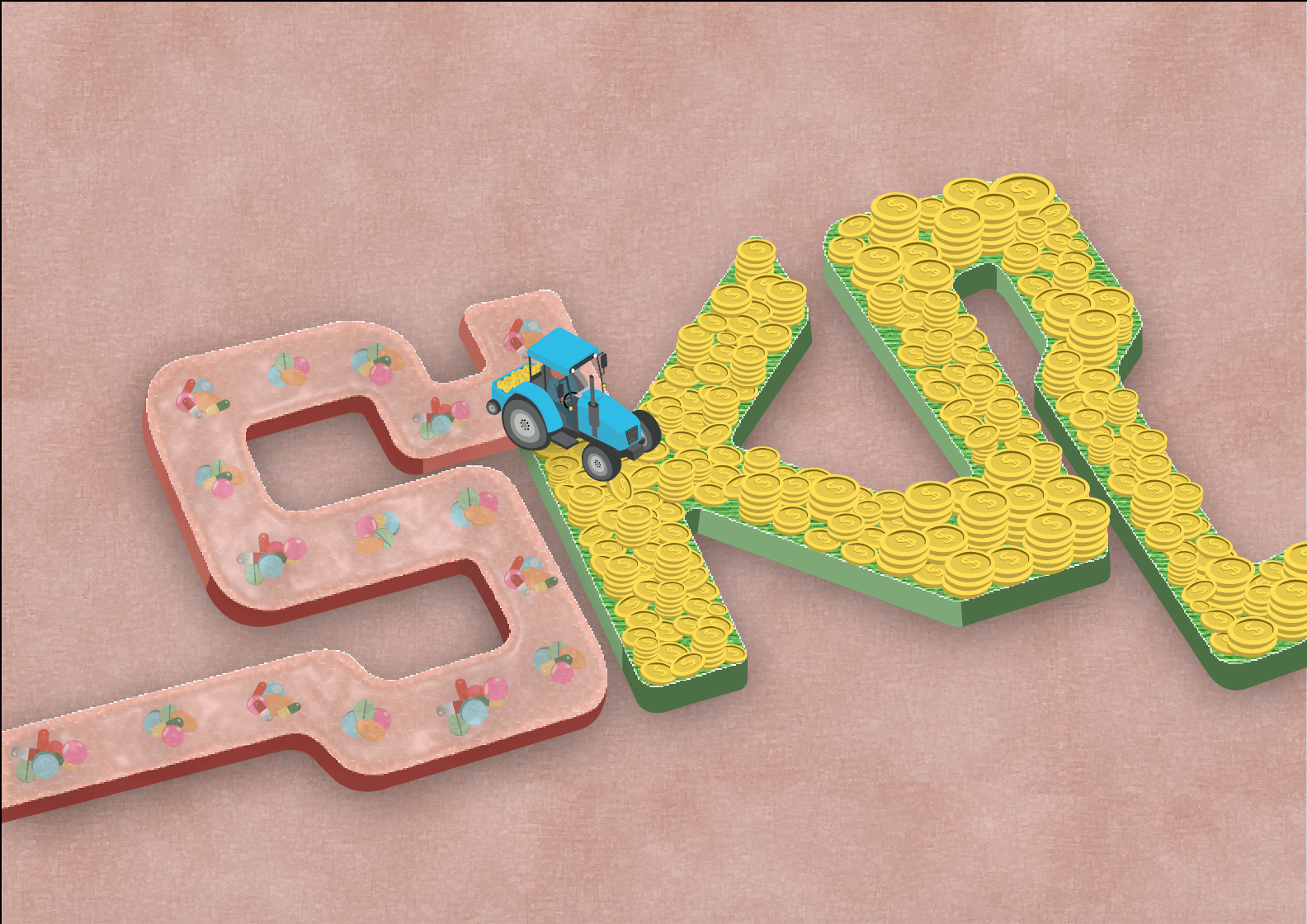
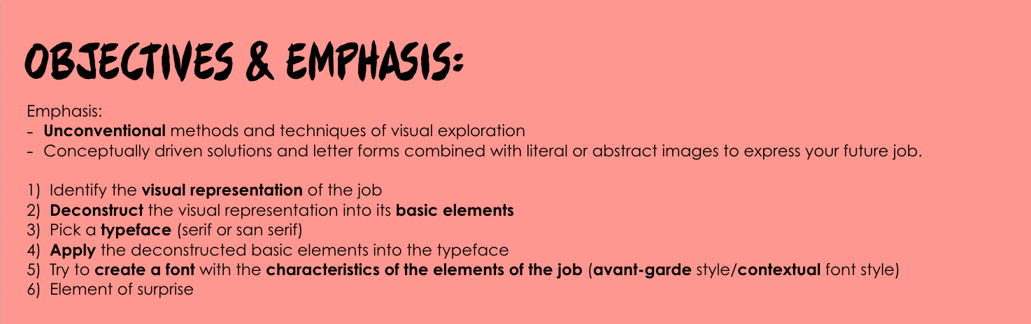
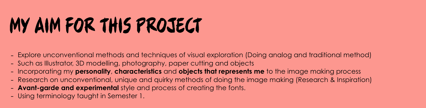
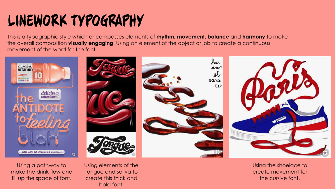
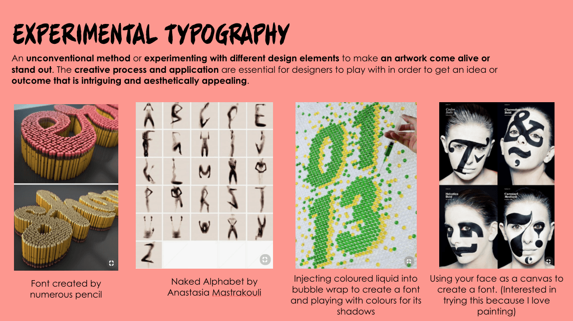
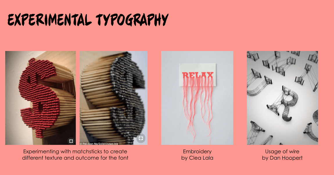
OBJECTIVES & RATIONALE BEHIND THE ISSUE WE’RE HIGHLIGHTING

For our final project for Experimental Interaction, we decide to create a provocative object to address ethical issues in contraceptive justice. For this project, we will be focusing on the issue of birth control for women. Our project is trying to break the stereotype of being secretive about consuming birth control pills and girls should be empowered by using our pill bag by making this issue transparent and boys have to get used to it. Our objective is to make the bag as a fashion statement which stands out as a protest to change the perspective of how such issues should not be kept under the rugs or not be spoken in front of the opposite gender – normalize it


The invention of the birth control pill was a significant milestone in the women’s rights movement. Since then, other long-acting, reversible contraceptives have been developed for women, and women now have a total of 11 methods. In contrast, men only have 2 options, thus the public ceding major responsibility for contraception to women. Moreover, Women currently bear most of the financial and health-related burdens of contraception, dedicating time and energy to contraception care, feeling stress and anxiety about taking the pills, the possibility of unintended pregnancy.

Women bear the majority of contraception responsibility and the burdens it entails while men have limited reproductive autonomy. We decided to design a pill bag resembling the birth control pills calls the attention to reconceptualize the issue of responsibility and transparency for contraception between men and women.
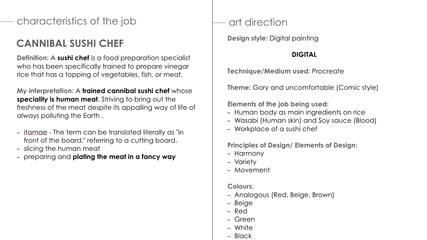


THE PILL BAG

WHAT IS IT ABOUT?

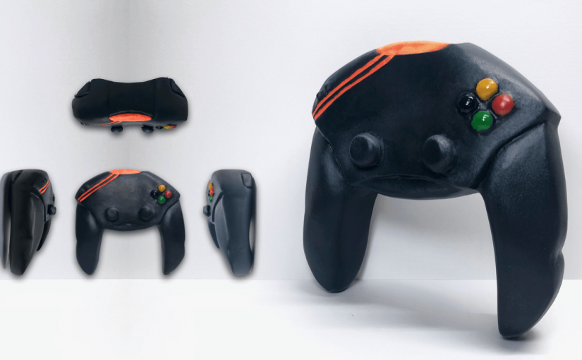
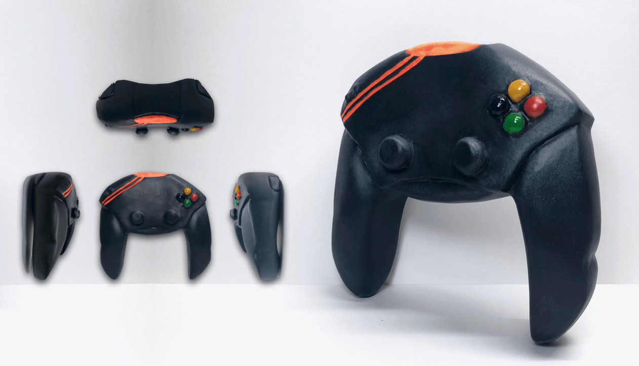
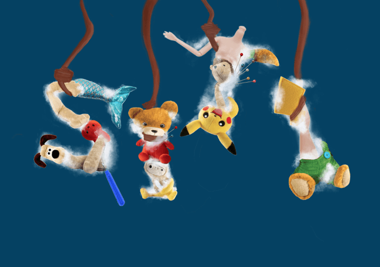
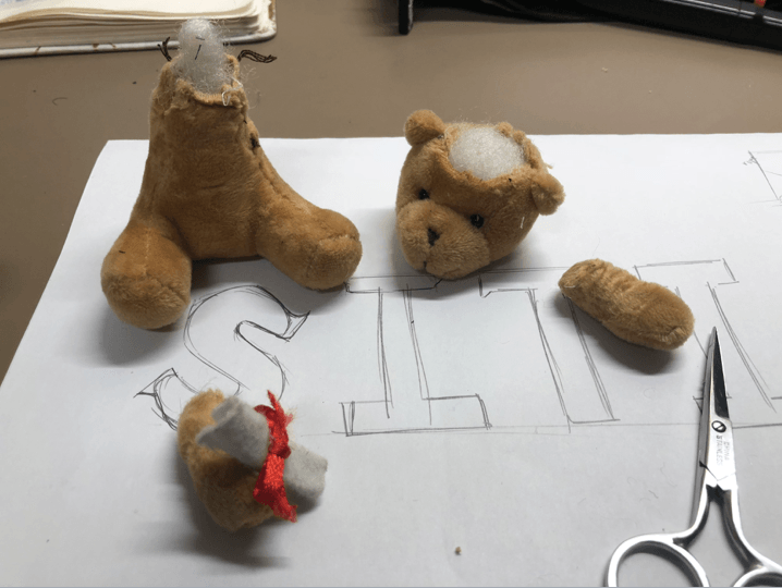
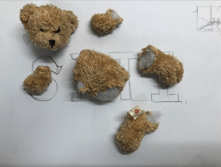
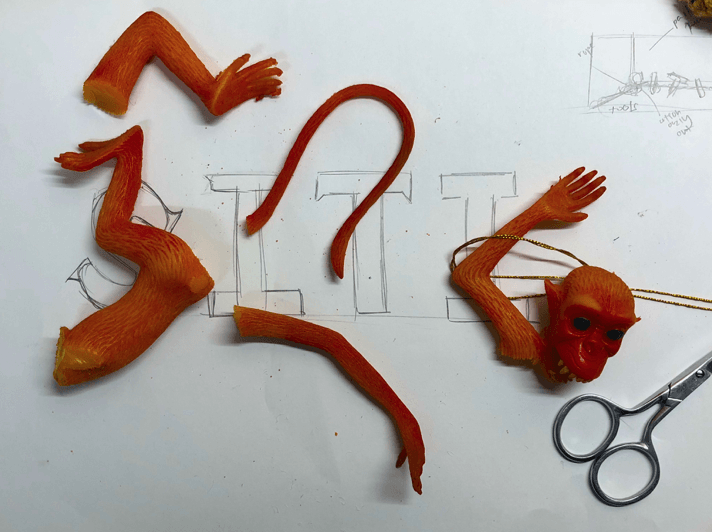
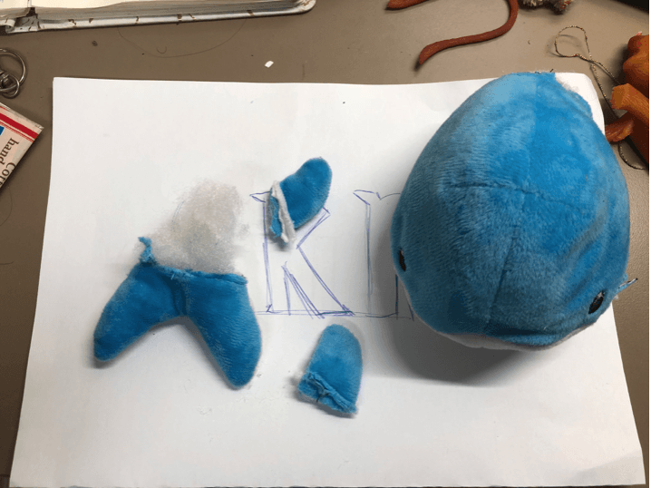
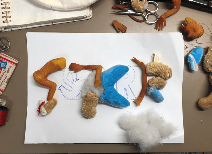
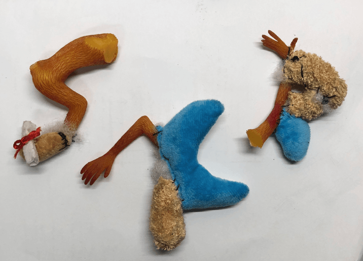
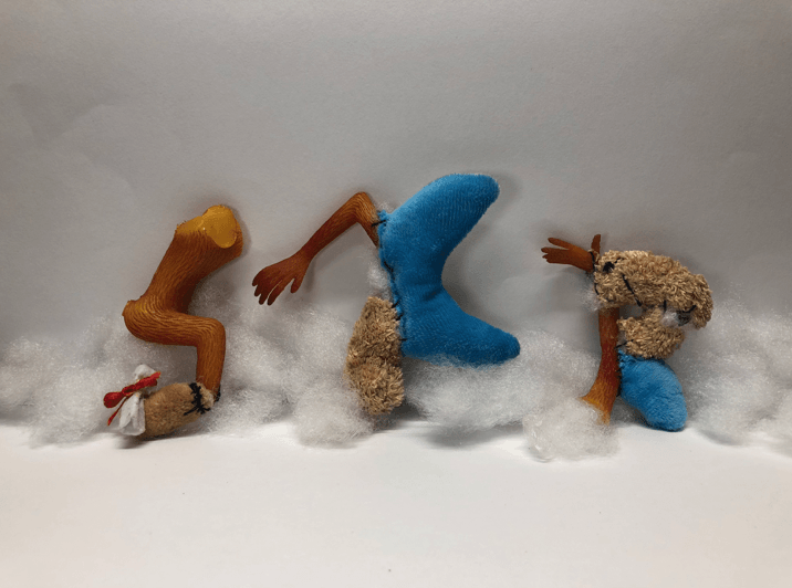
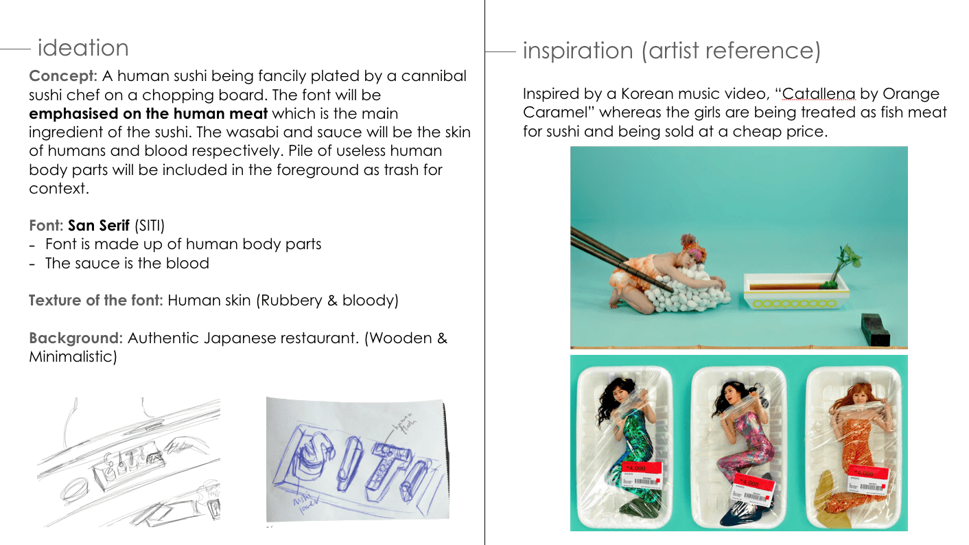
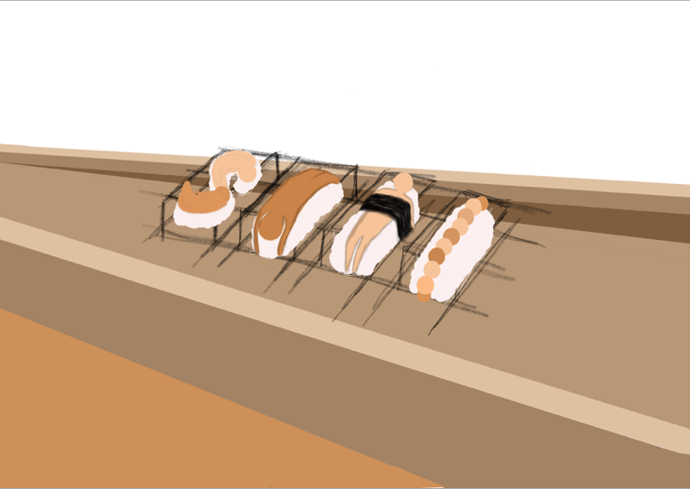
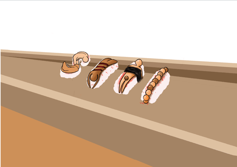
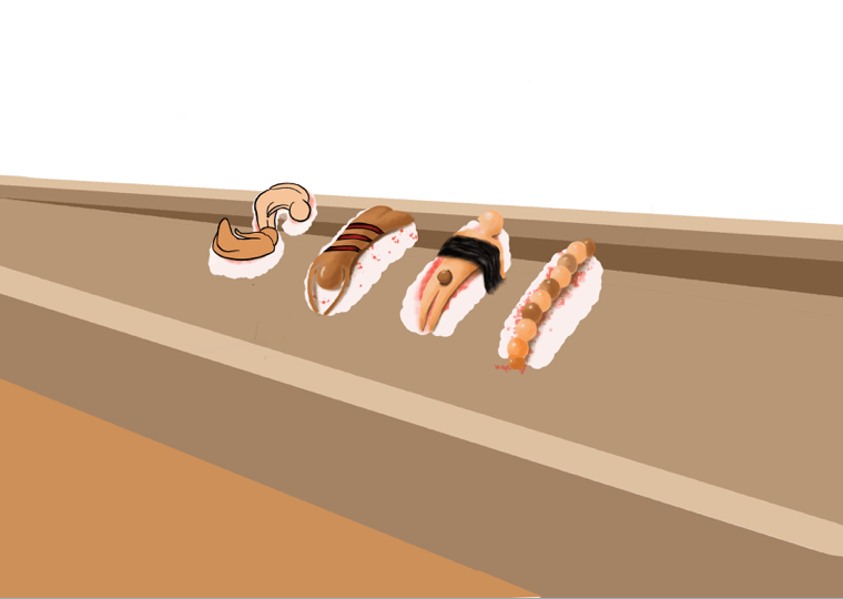
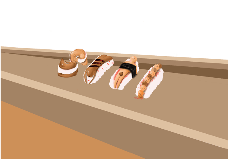
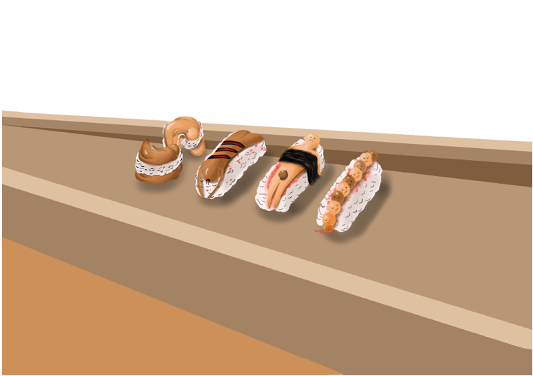
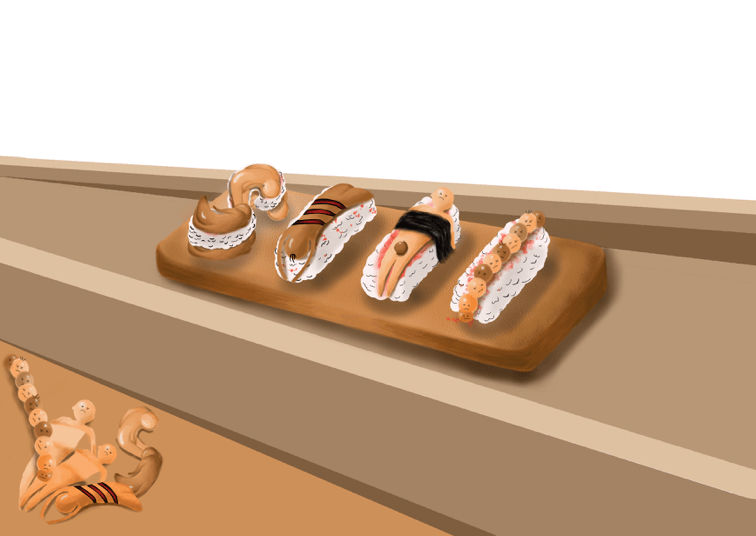
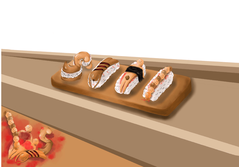
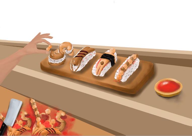
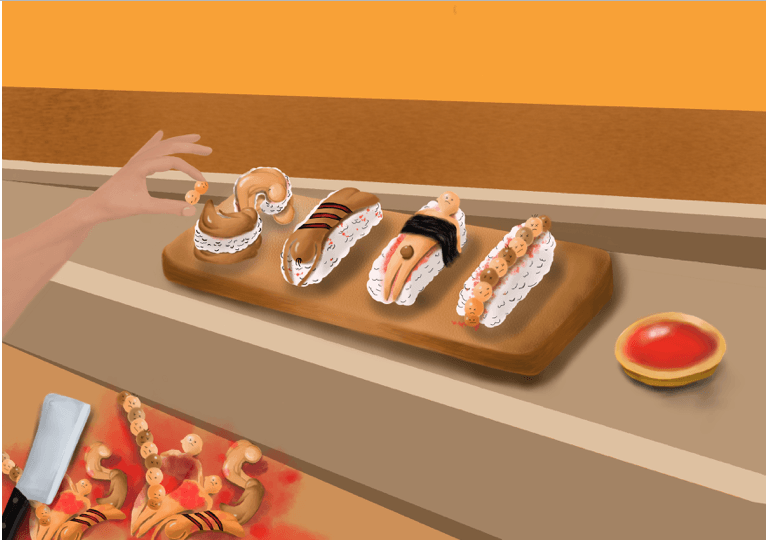
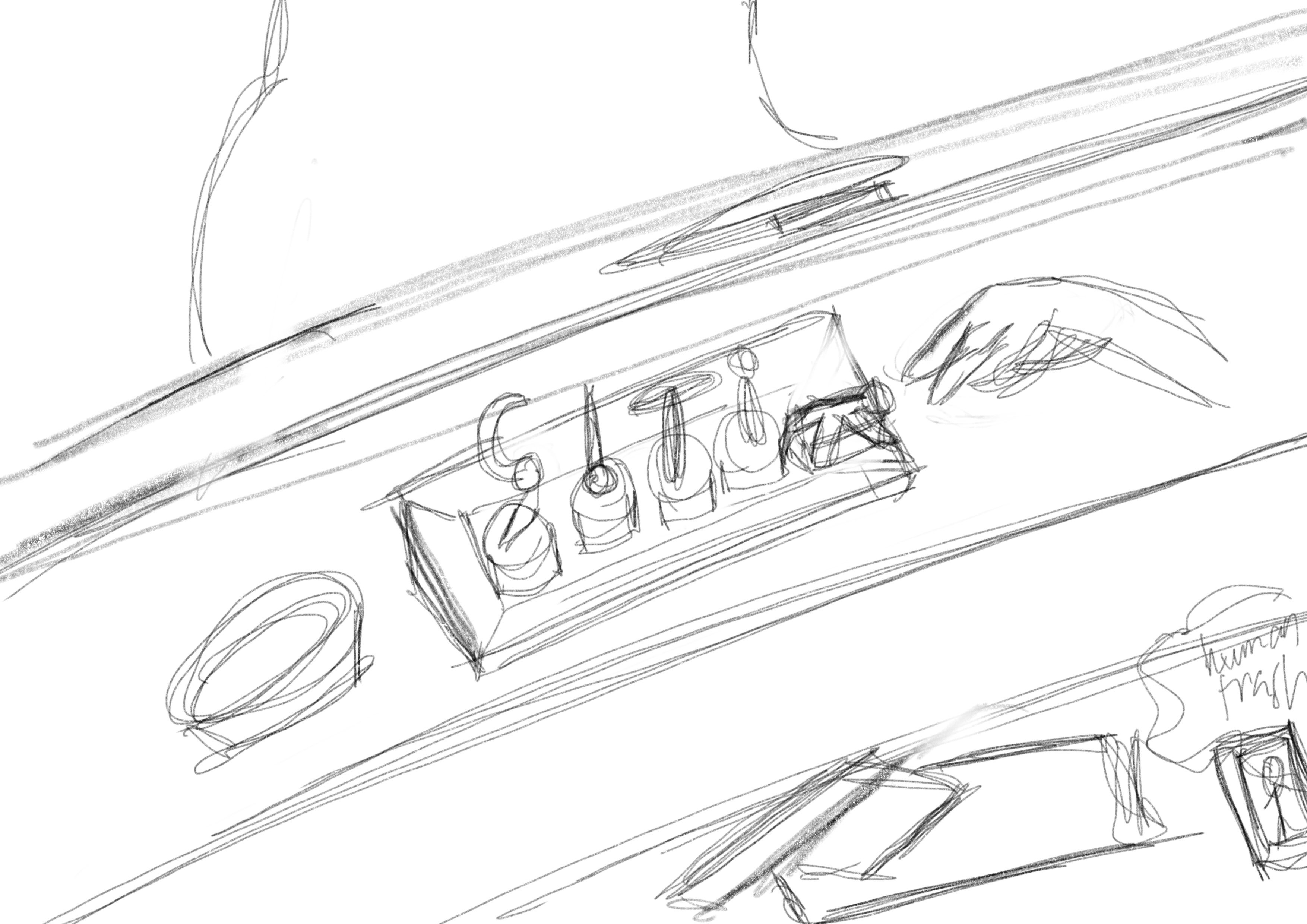
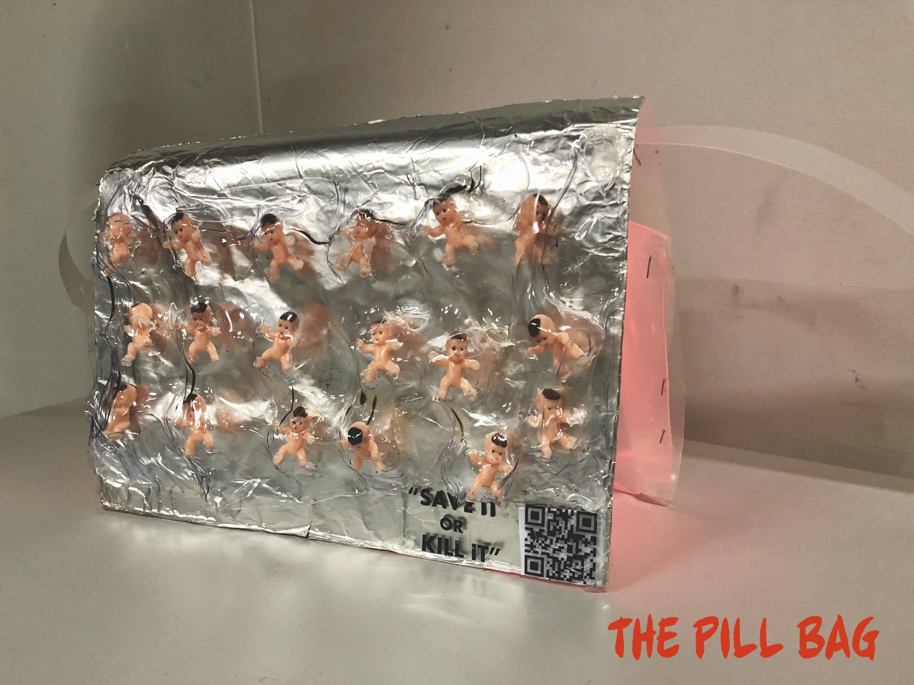
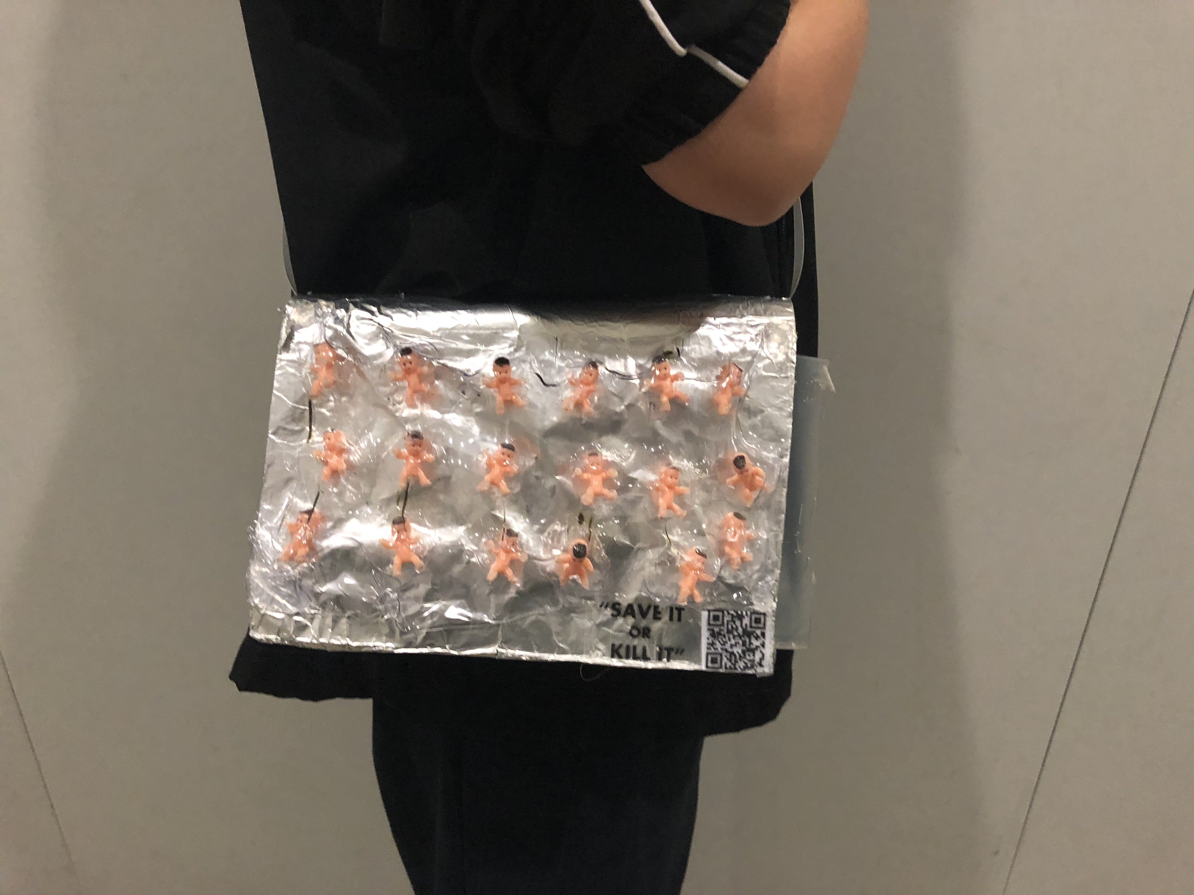
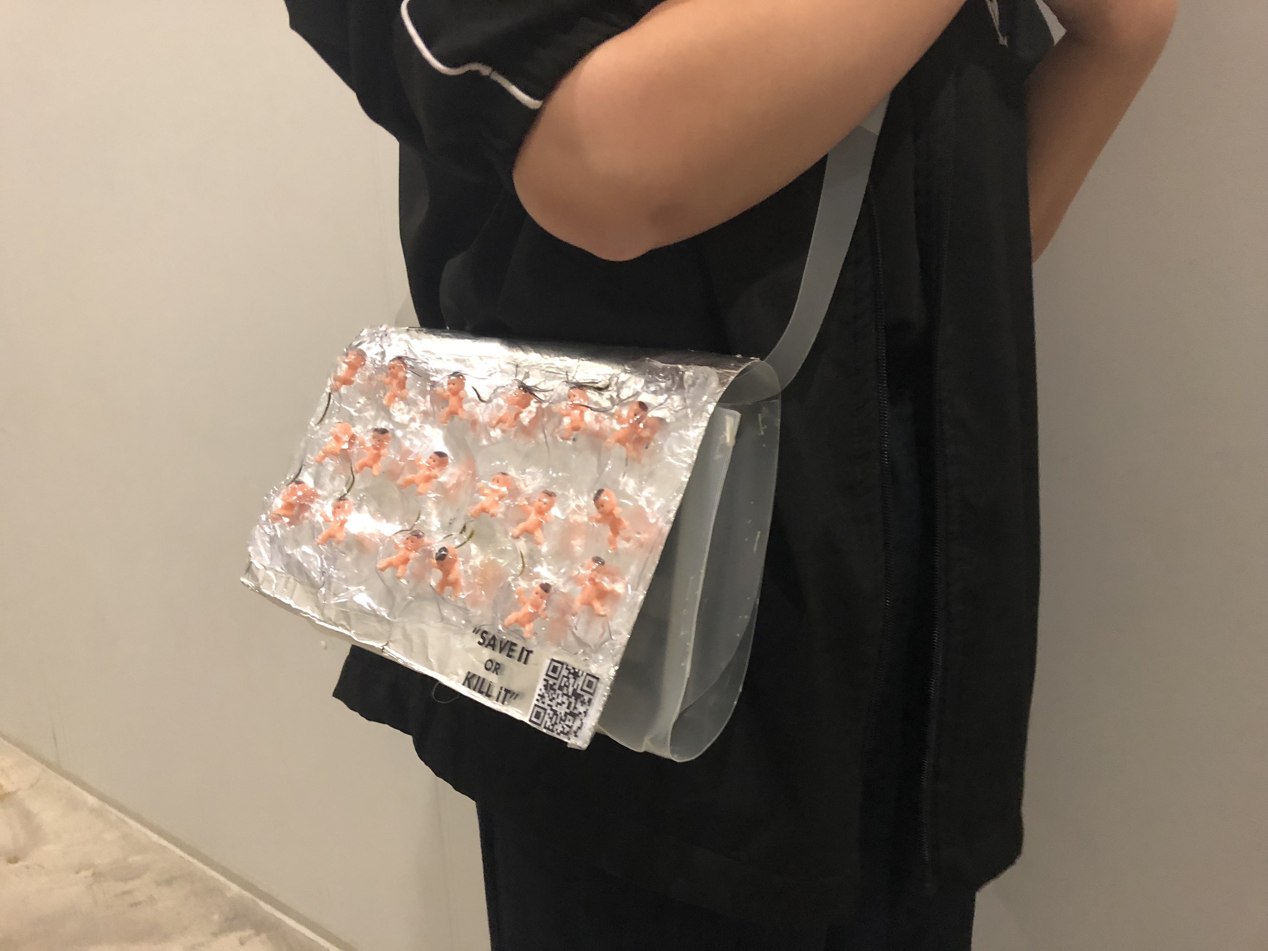
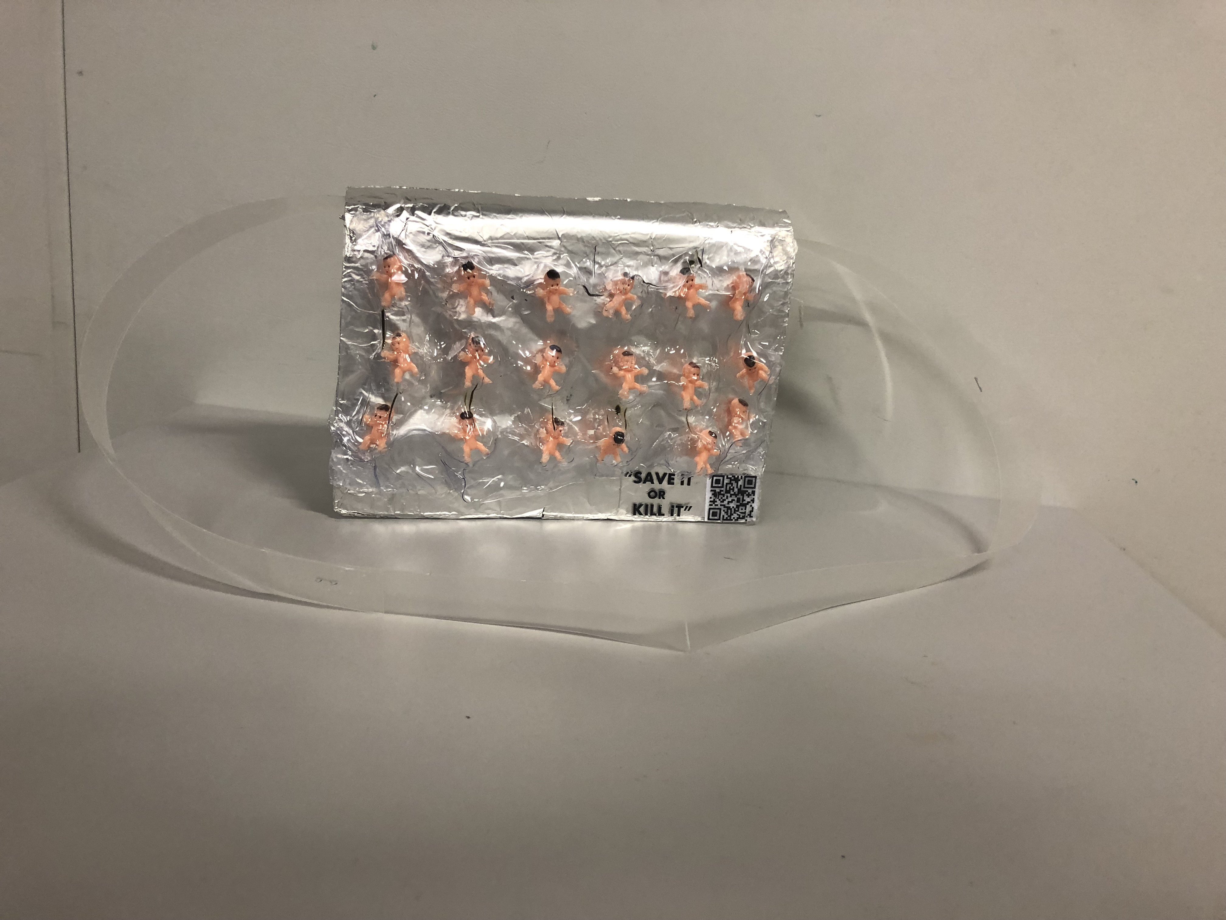
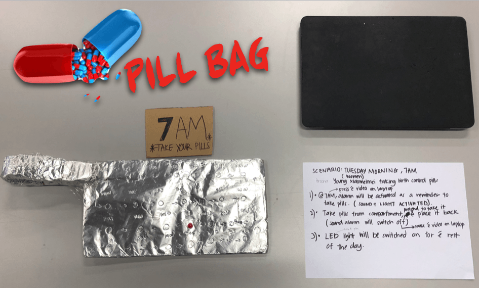
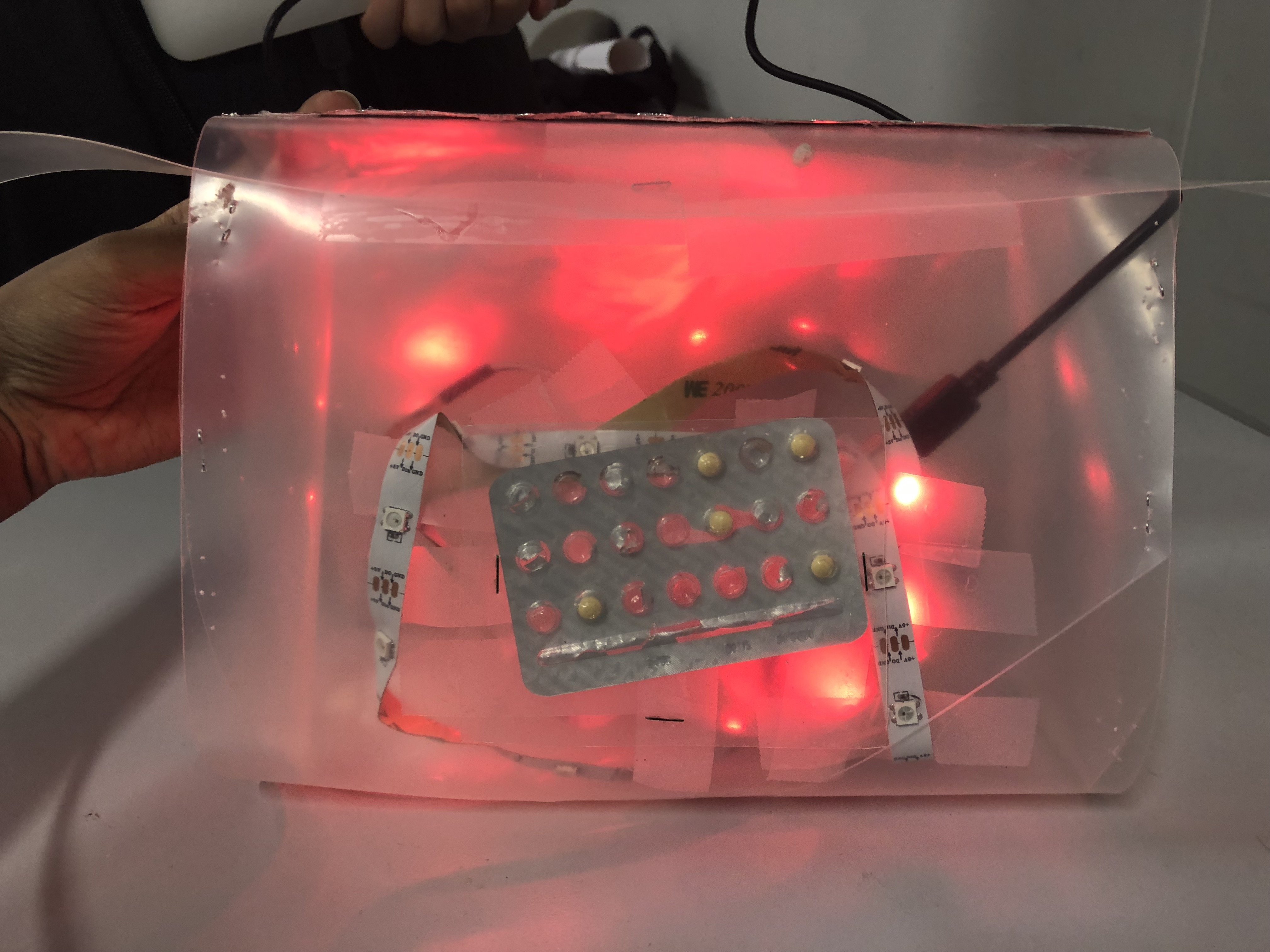
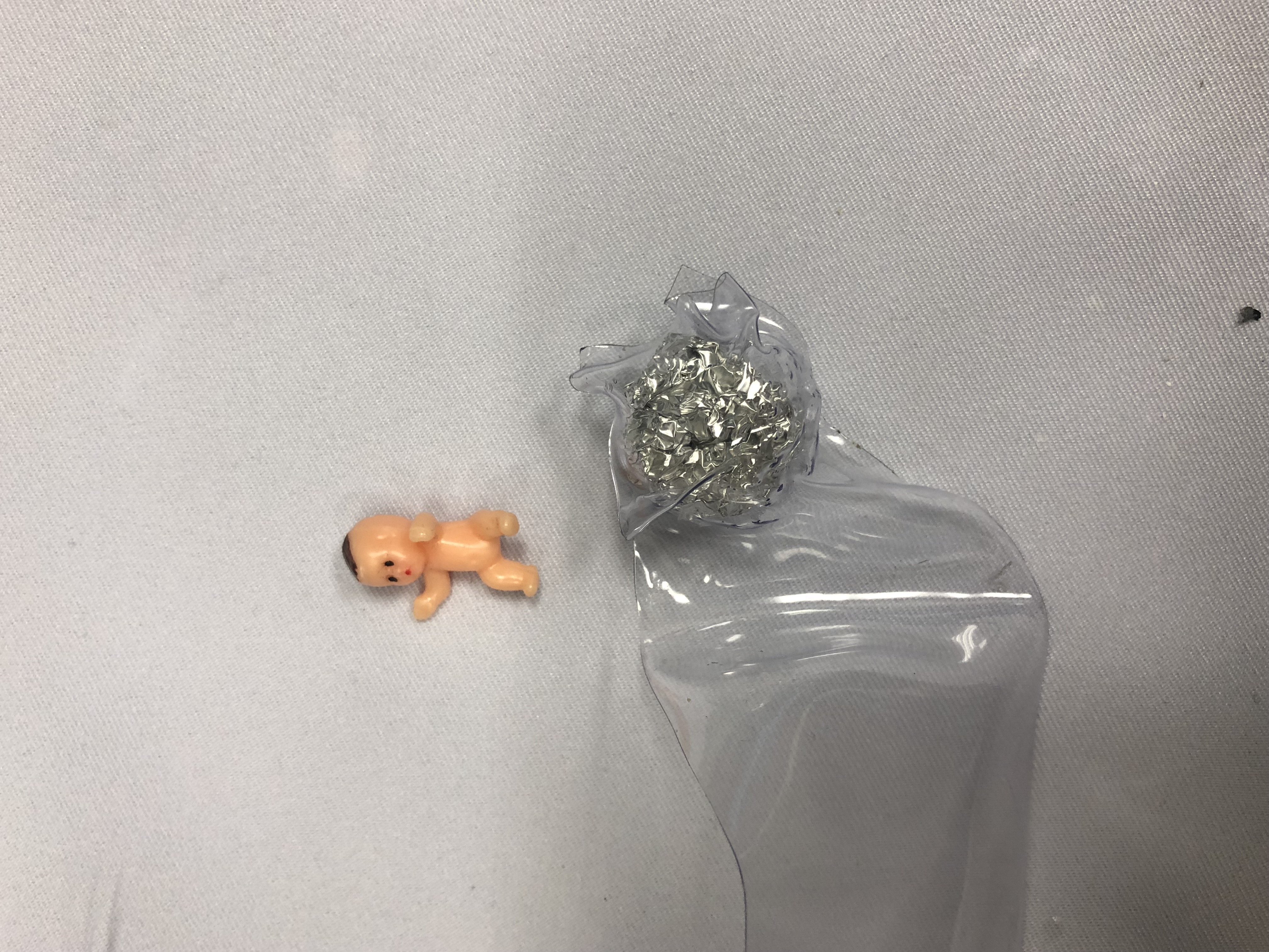
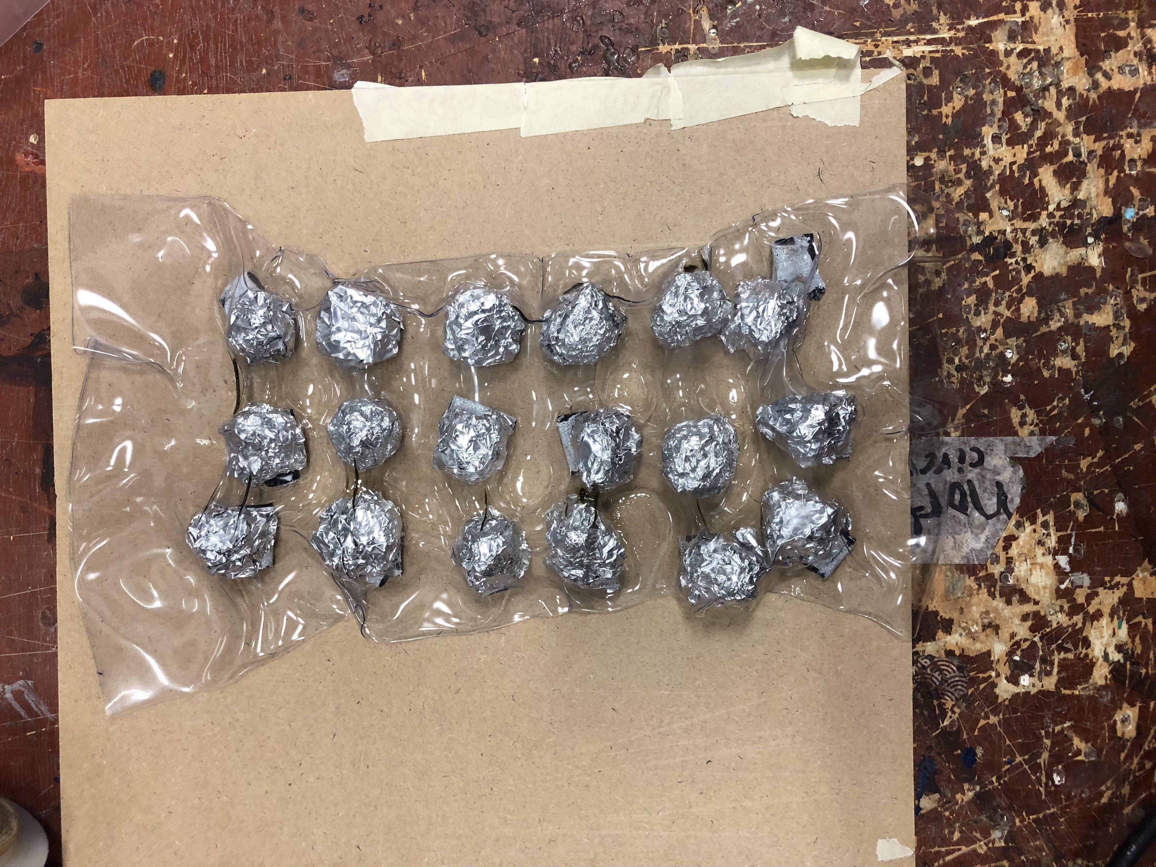
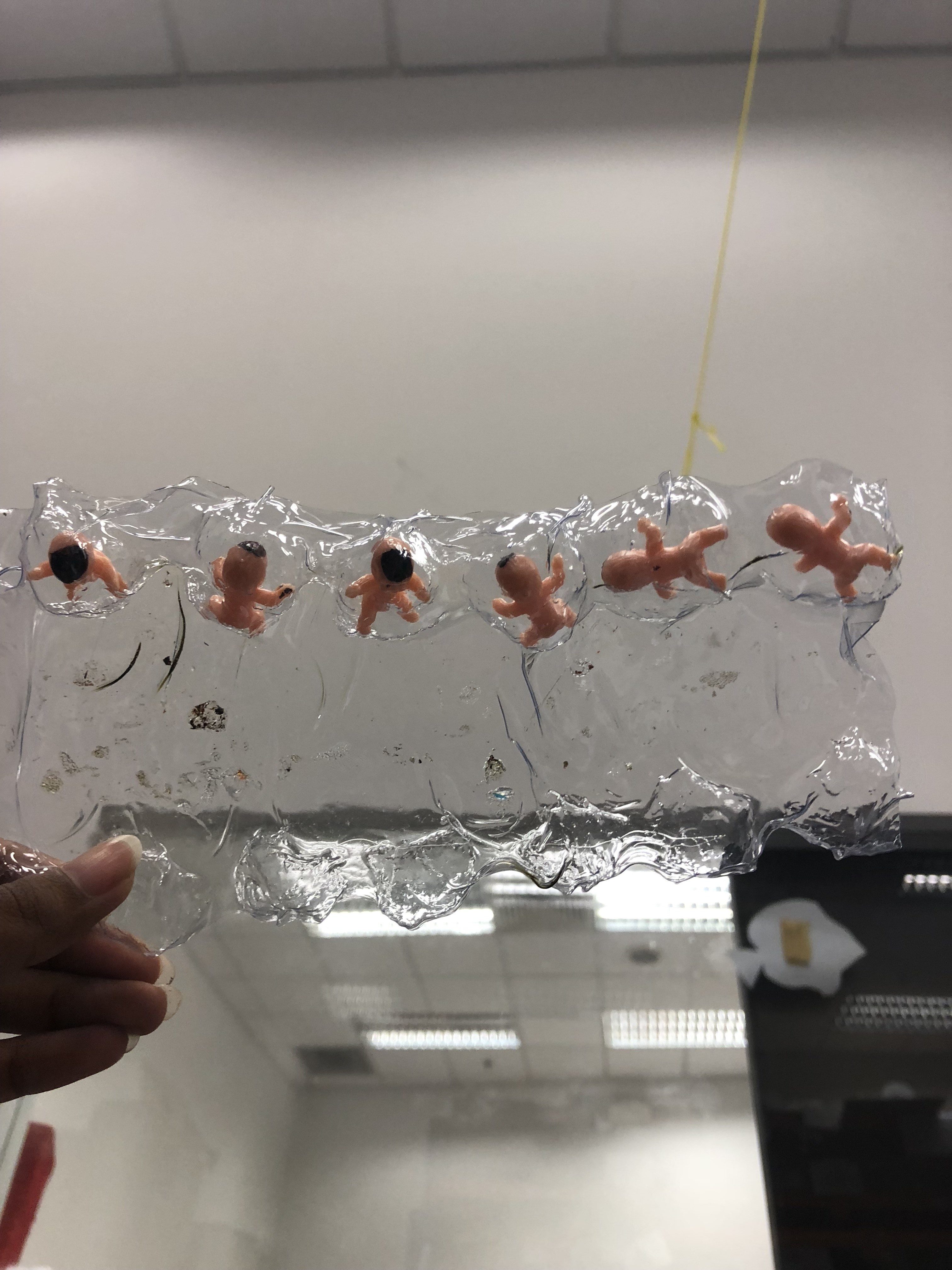
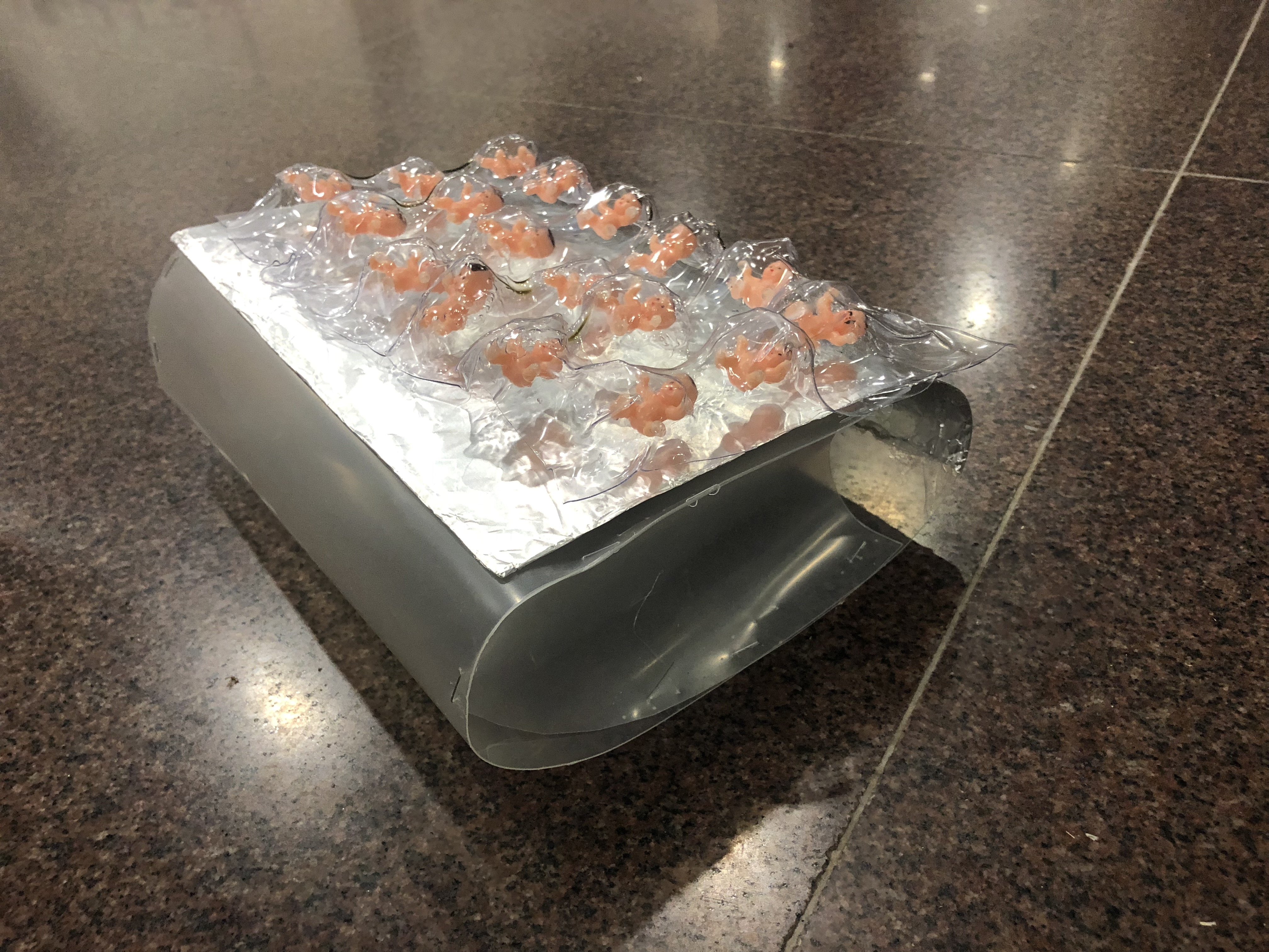
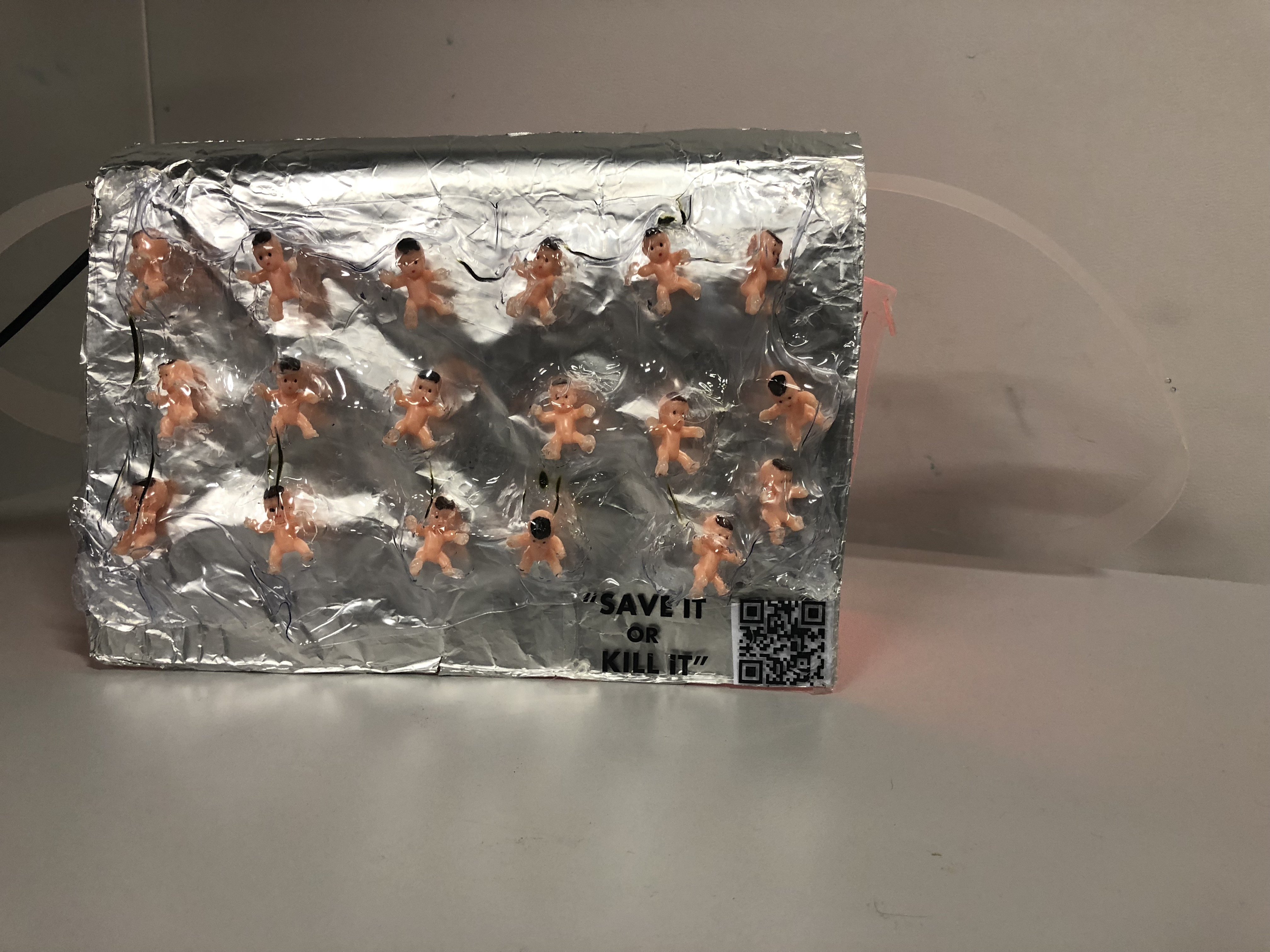
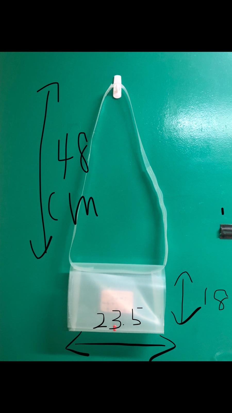
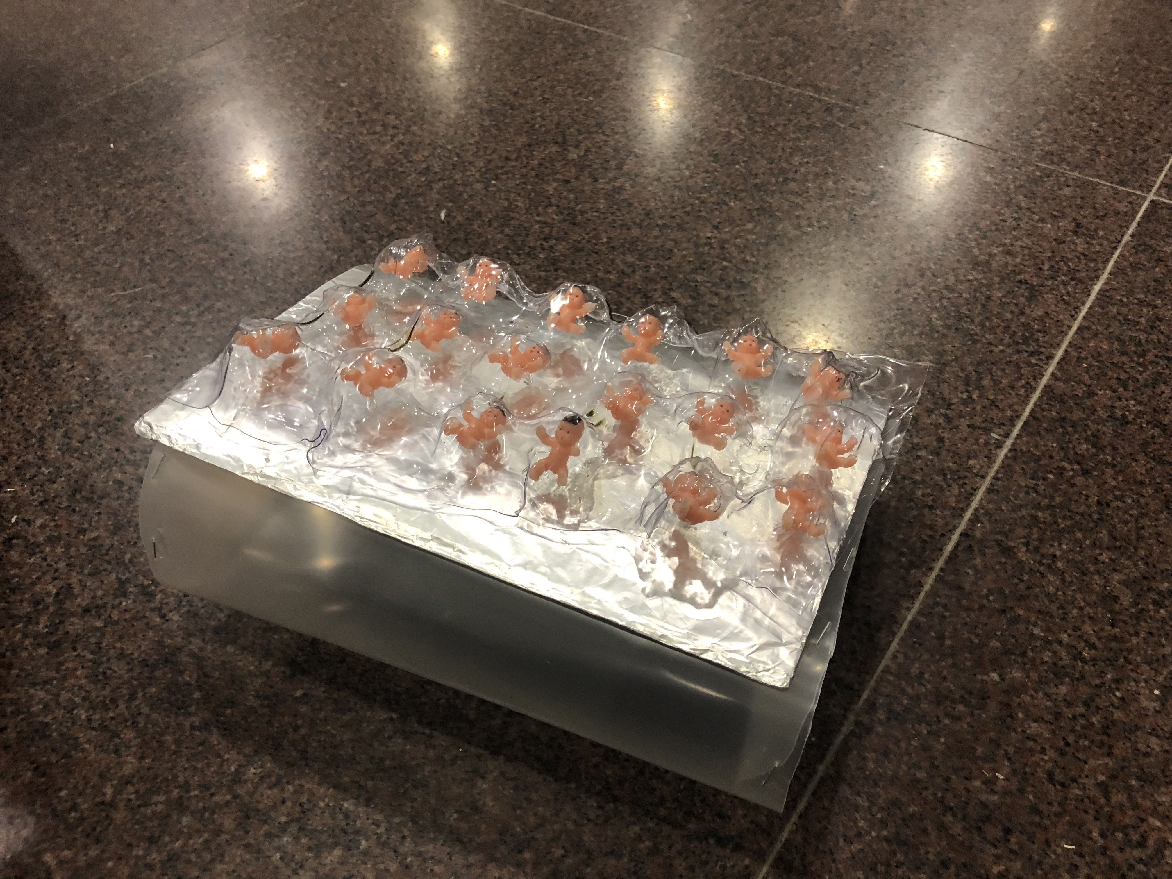
A provocative object that can be used in our everyday life to create a commentary about the transparency of consuming birth control as a female which usually being frowned upon when we’re talking to our parents or male counterparts. The embellishment of the bag imitates the form of our birth control package. Instead of pills, we chose to insert babies to show the severity of the pills not taken on time. Babies will be formed which is horrendous if you hate children or are not planning to have one anytime soon.

In addition, the material of the bag is made of up a transparent material because we are focusing on the issue of transparency of consuming birth control. We were inspired by the case study of “Transparent Grenade” during the researcher’s critique and decided to incorporate this element into our object. 

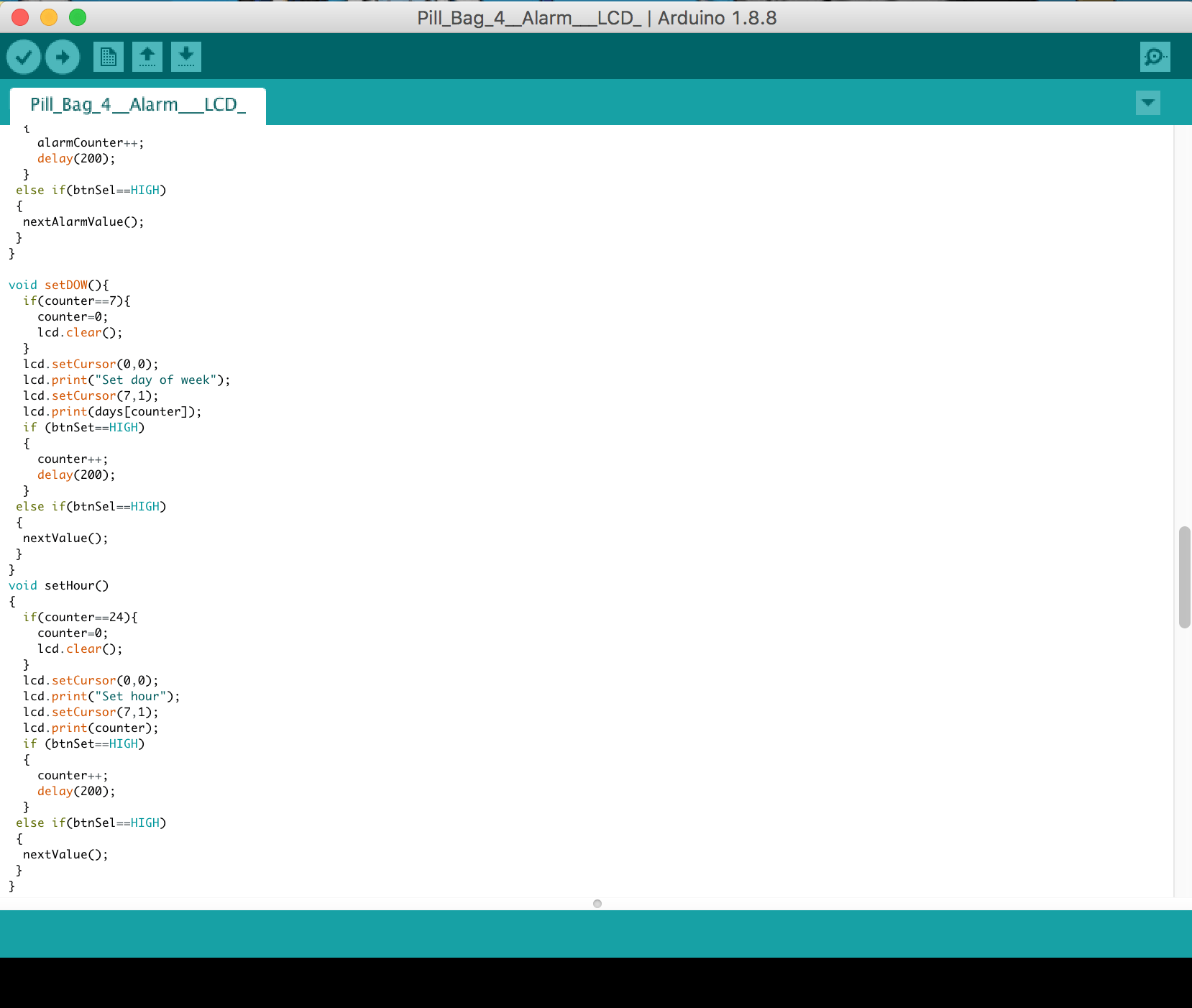
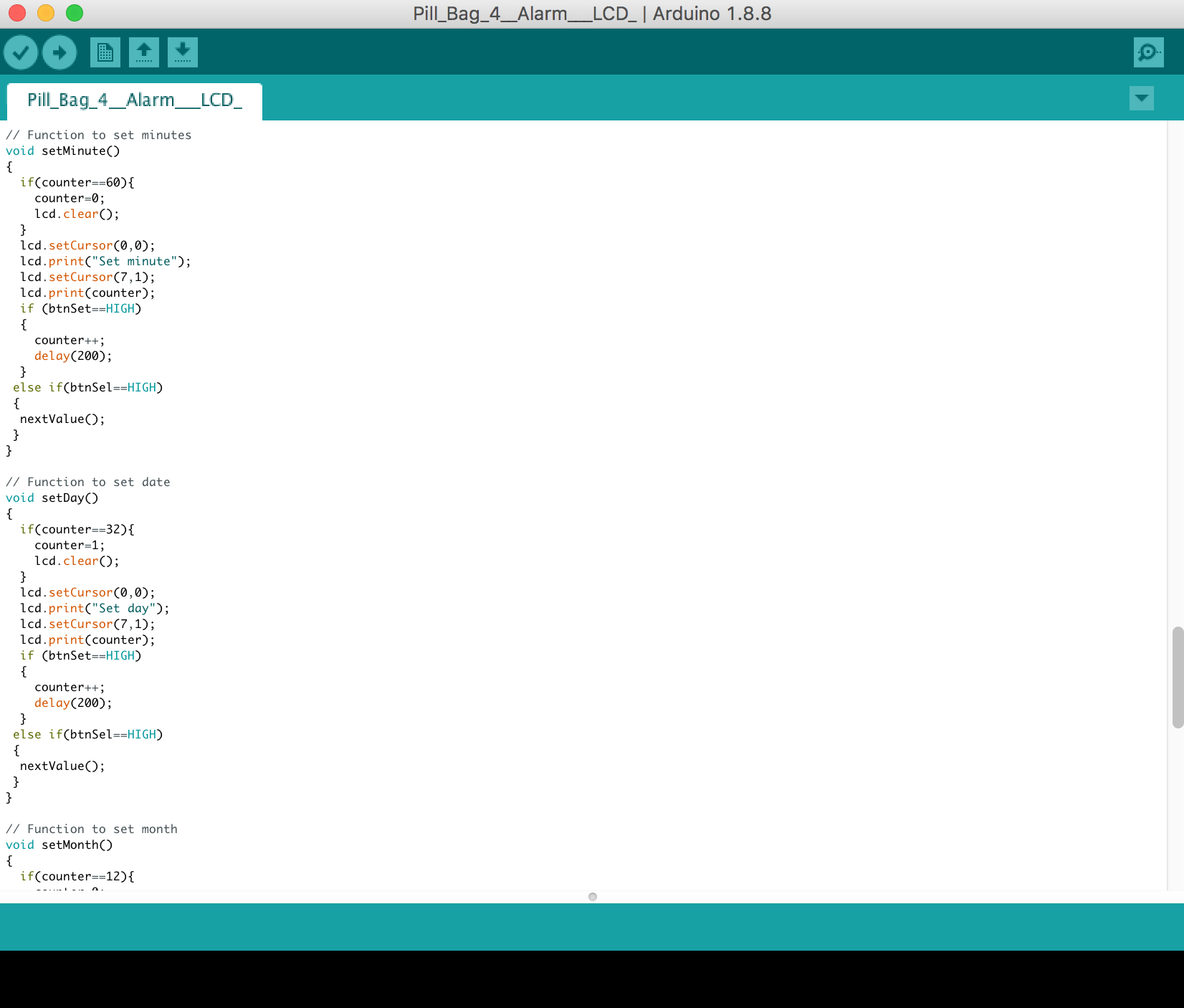
For the user, the function of the bag is to remind them to take the birth control pill in time because it is essential to be punctual in order for it to work by including an alarm. 

As for the observers when the alarms set off, the second layer of interaction will occur as the bag will attract attention with the sound and striking form and embellishment of the pill bag, causing a complicated pleasure. A QR code with “Save it or Kill it” can be scanned and it will lead the public to a survey about birth control and lead them to a page about information related to birth control. 

In addition, not only this is beneficial for the users but it raises awareness by making the public uncomfortable with our object and learning the importance of transparency and responsibility that a woman has to bear to control her body. With the QR code and survey, we are able to track down how many people we have reached out to with the pill bag.


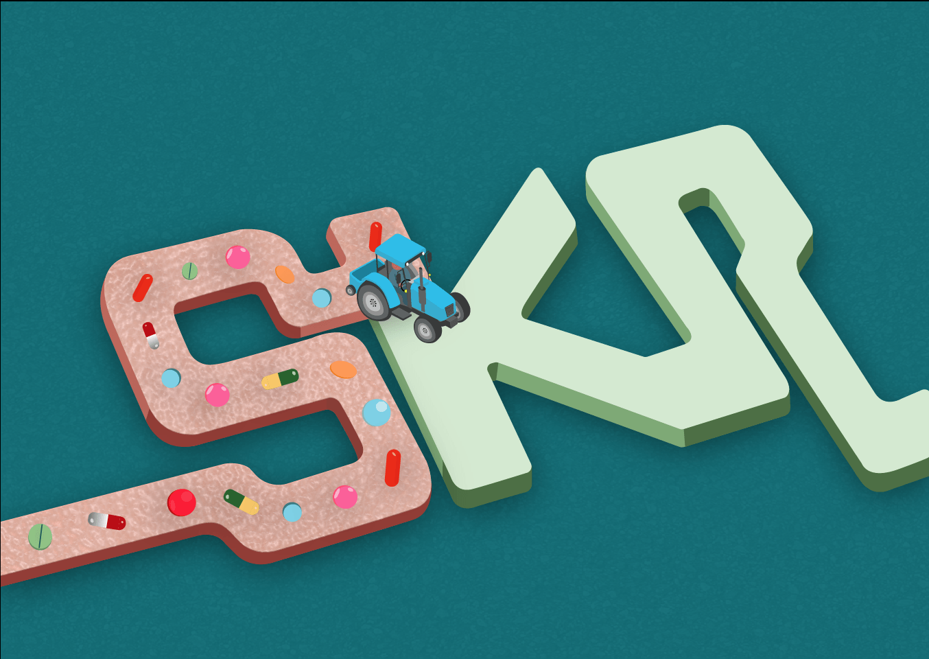
TIMELINE FOR OUR PROGRESS – THE PILL BAG


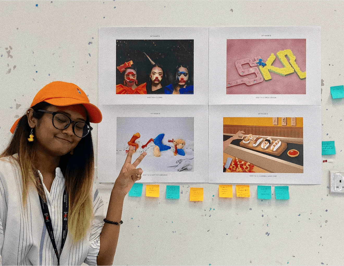
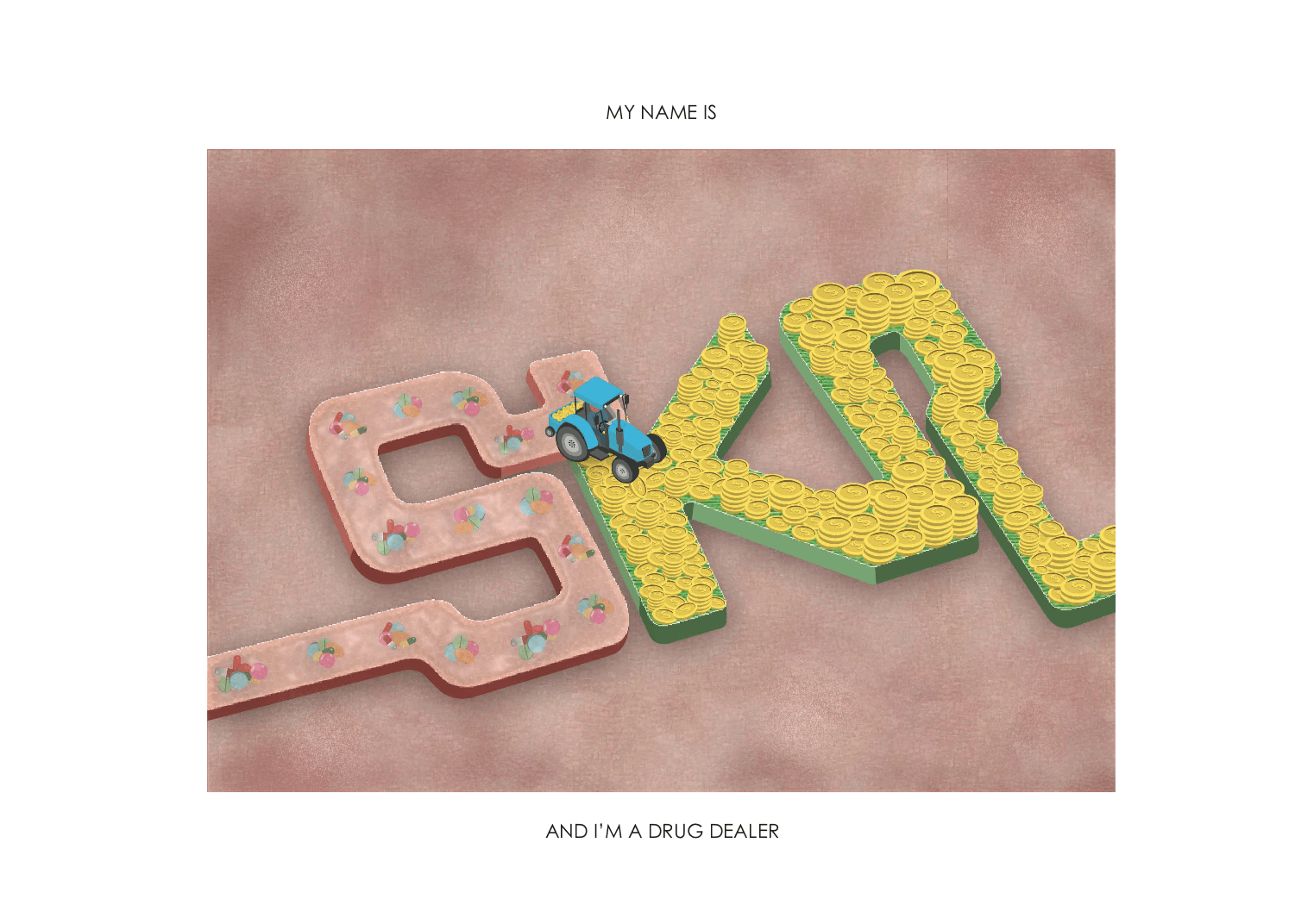
OBSERVATIONAL DOCUMENTATION FOR USER TESTS
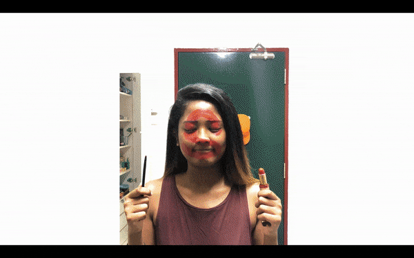
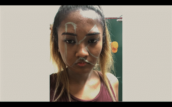
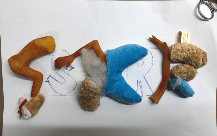
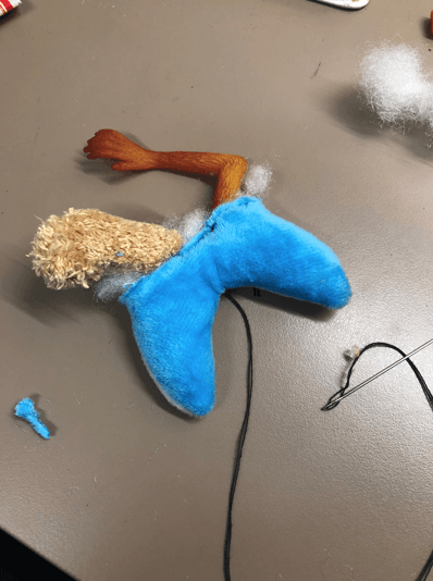
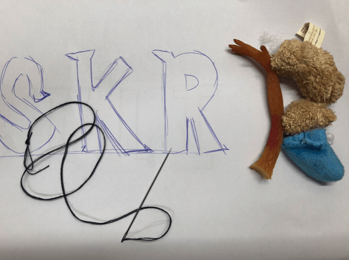
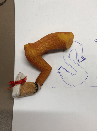
FIRST BODY STORMING

Click on this link to view our first body storming process, video and feedback.


INTERACTIVE WORKING PROTOTYPE

First attempt:

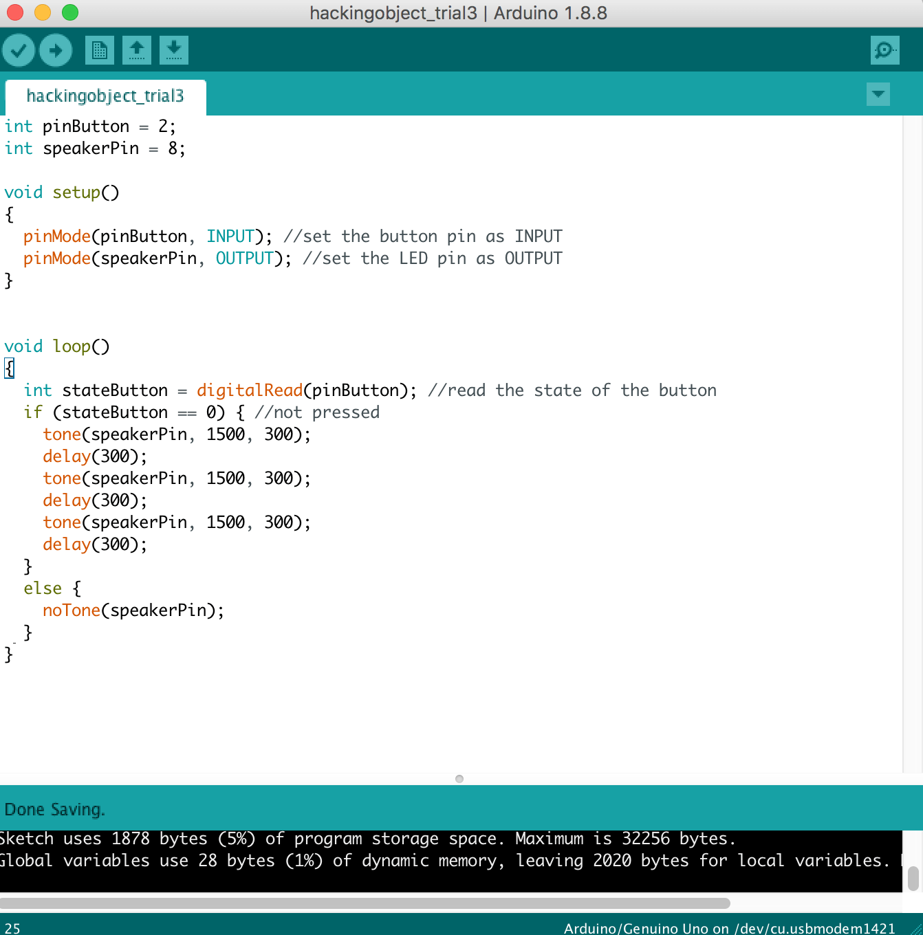
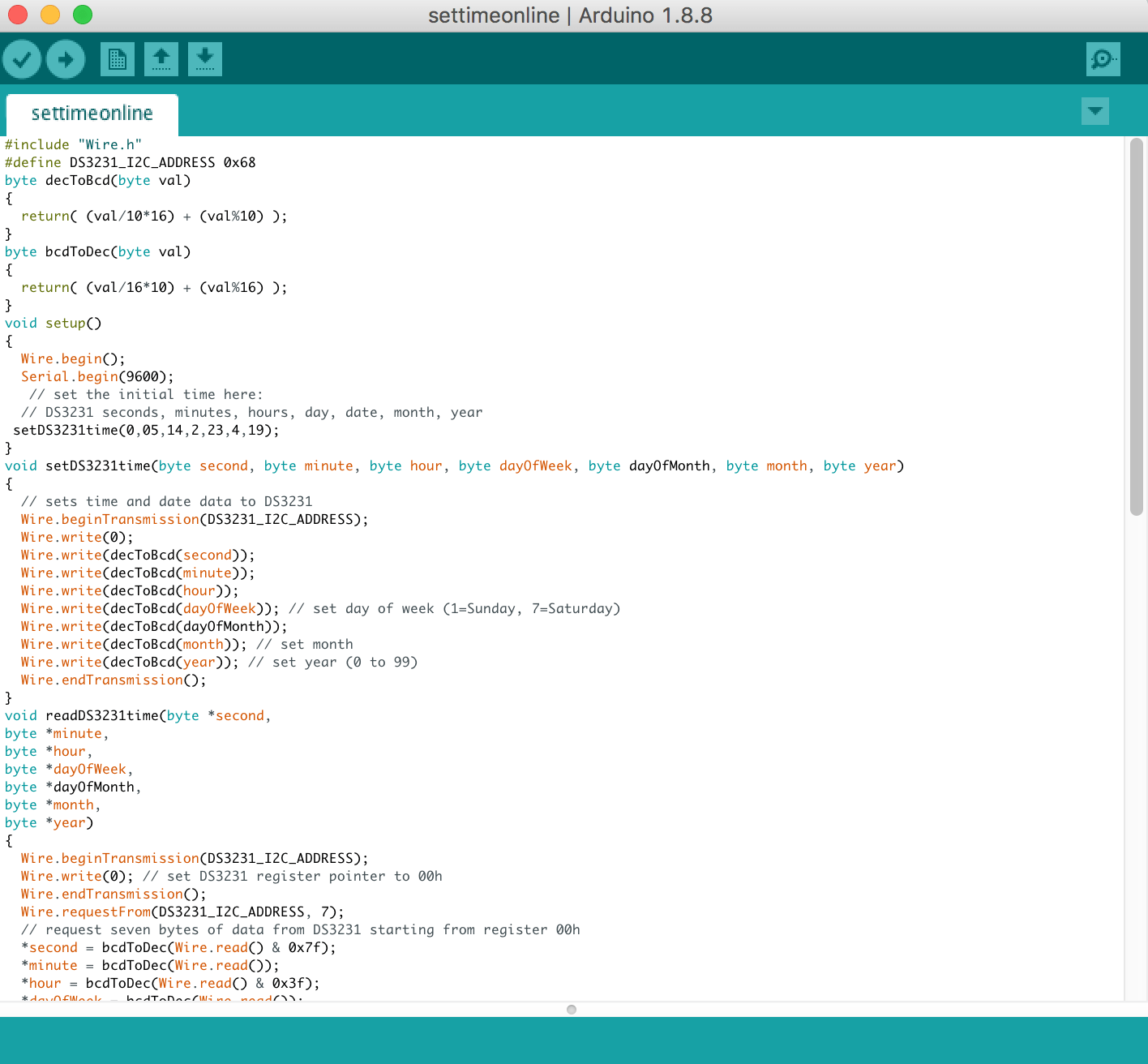
Our alarm code is based from this youtube video:

https://www.youtube.com/watch?v=TnQWR0BW8zQ

The code is from this website:

https://github.com/masseullahadel/LCDClock/blob/master/LCDClock.ino


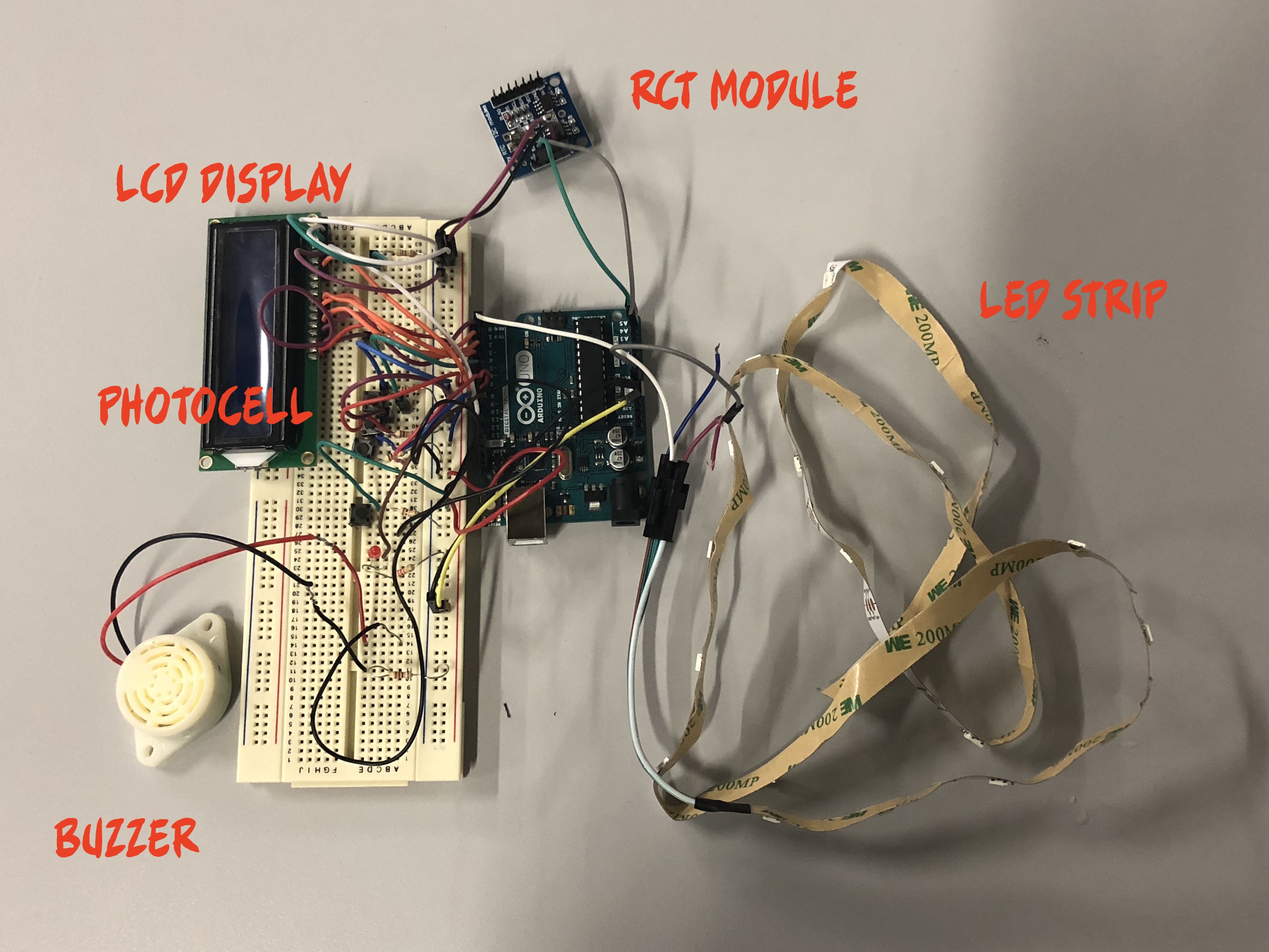
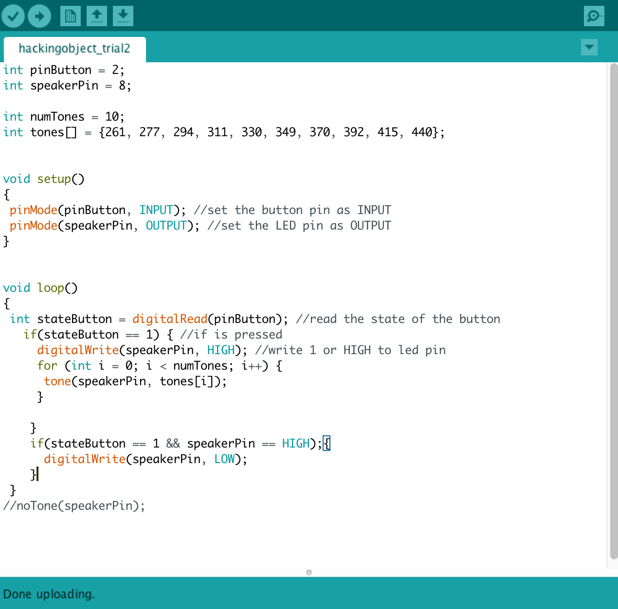
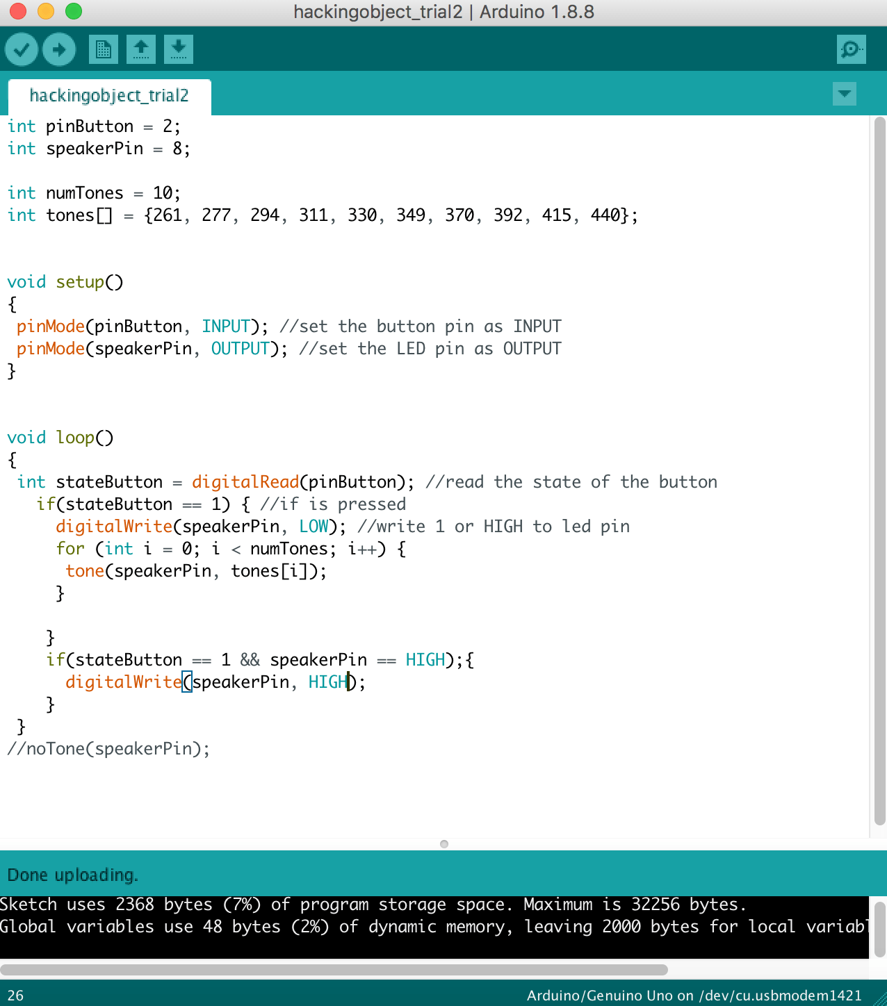
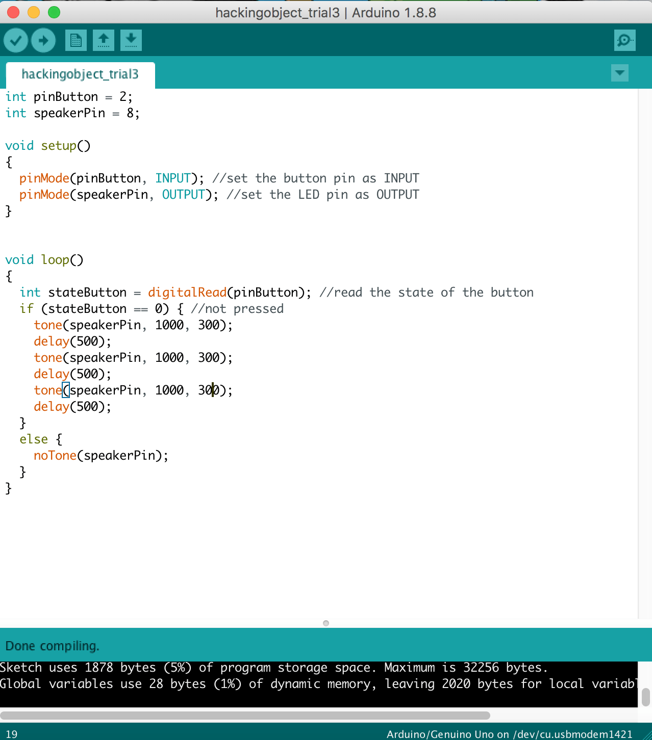
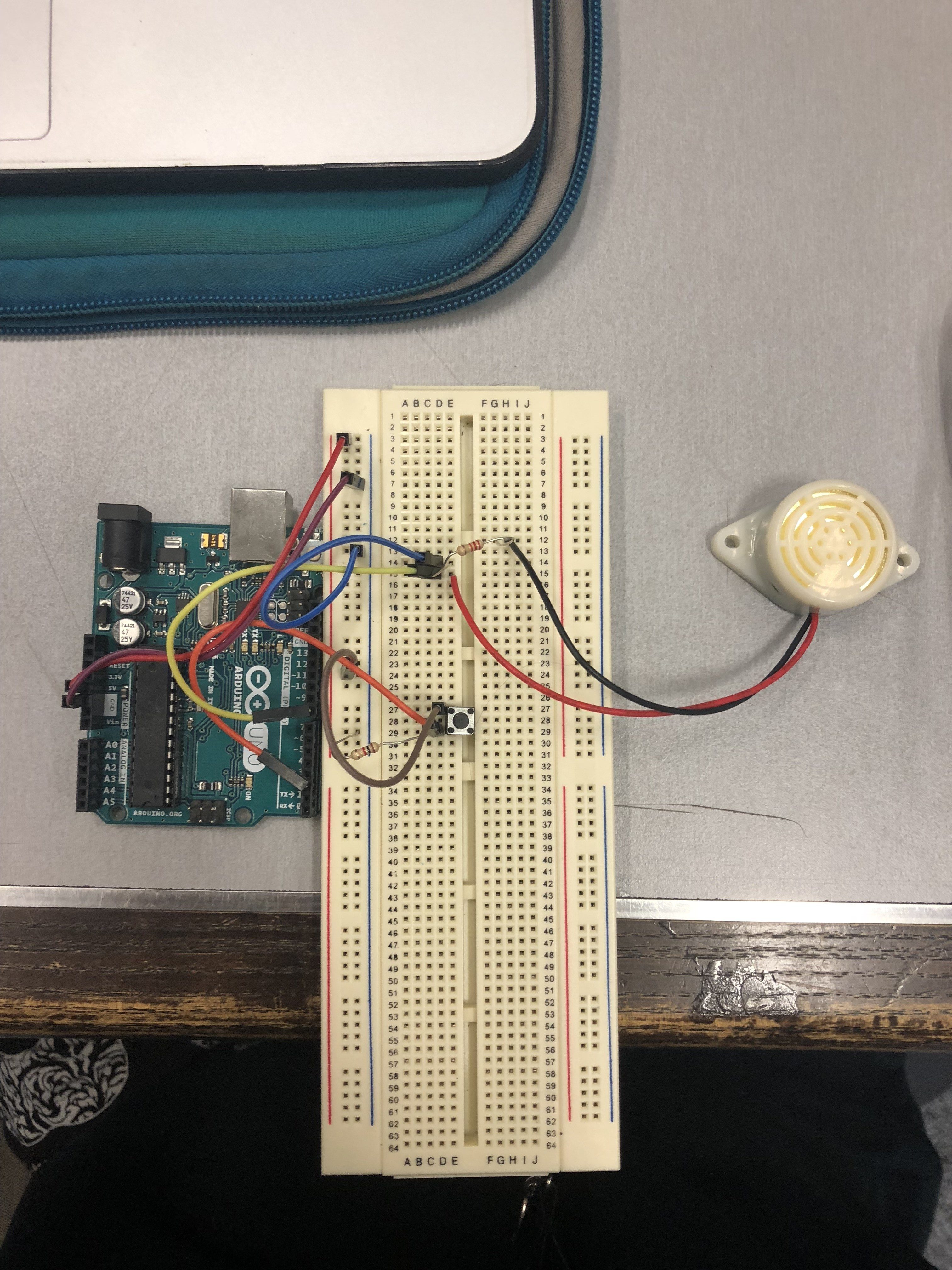
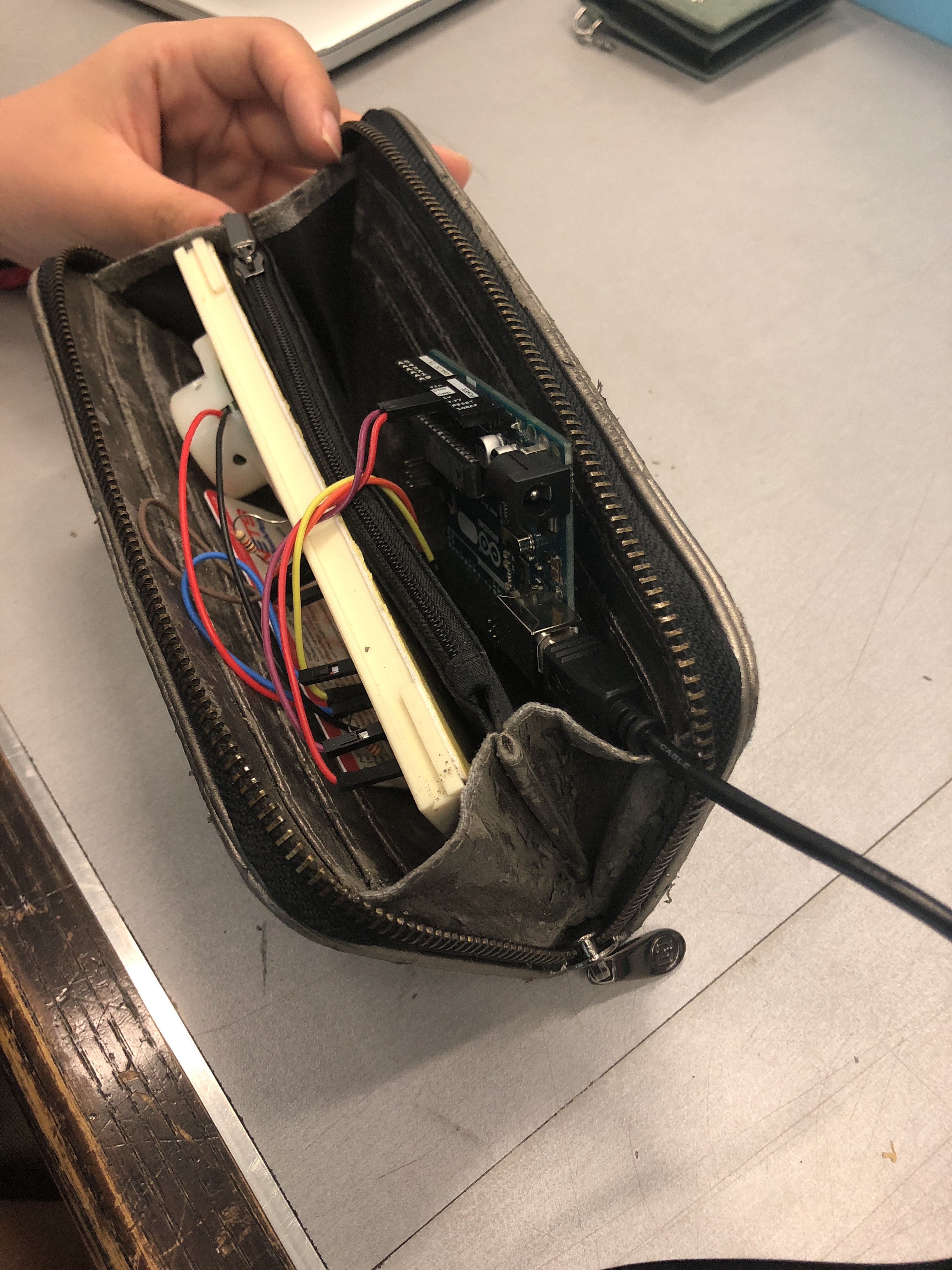
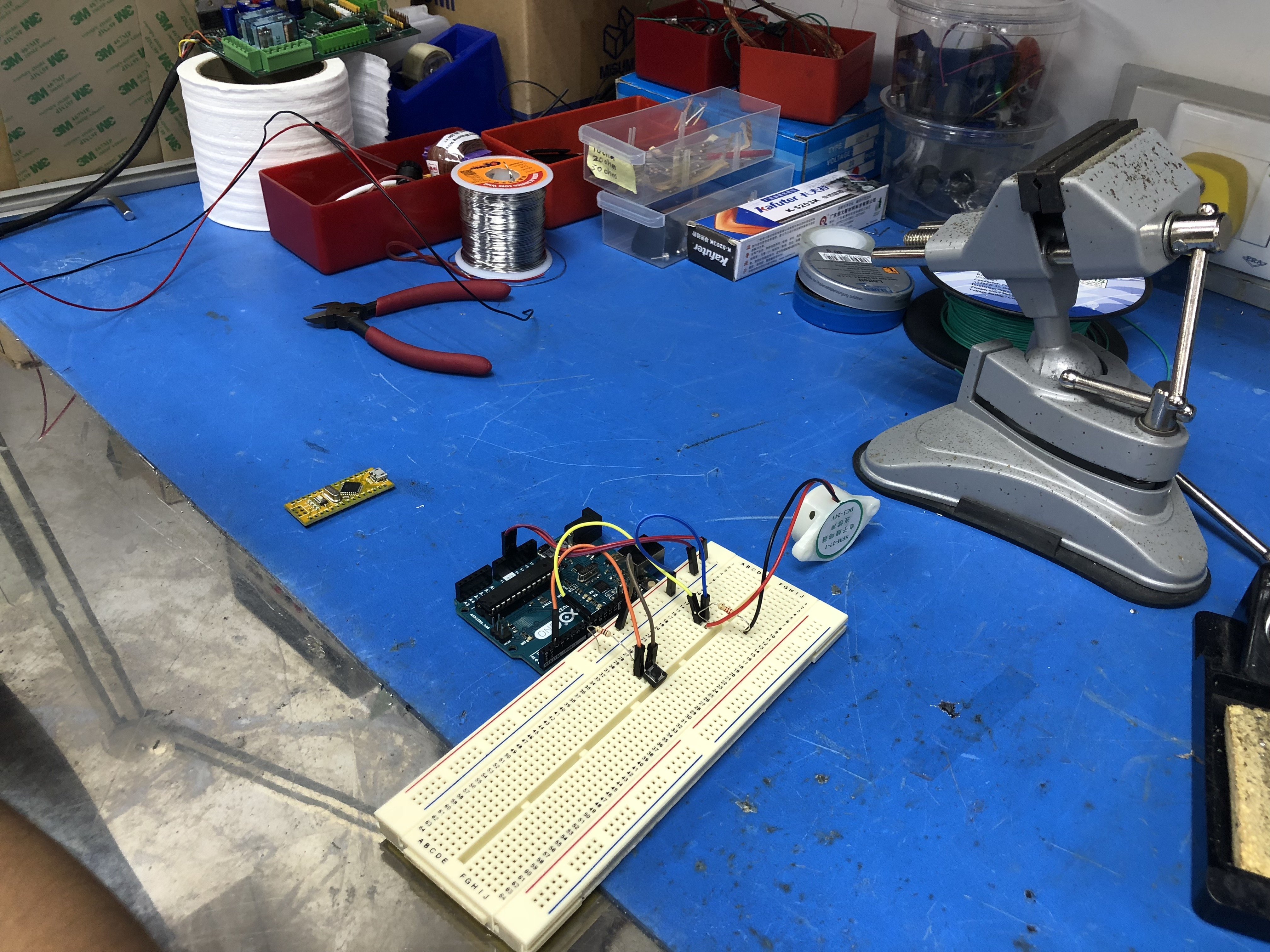
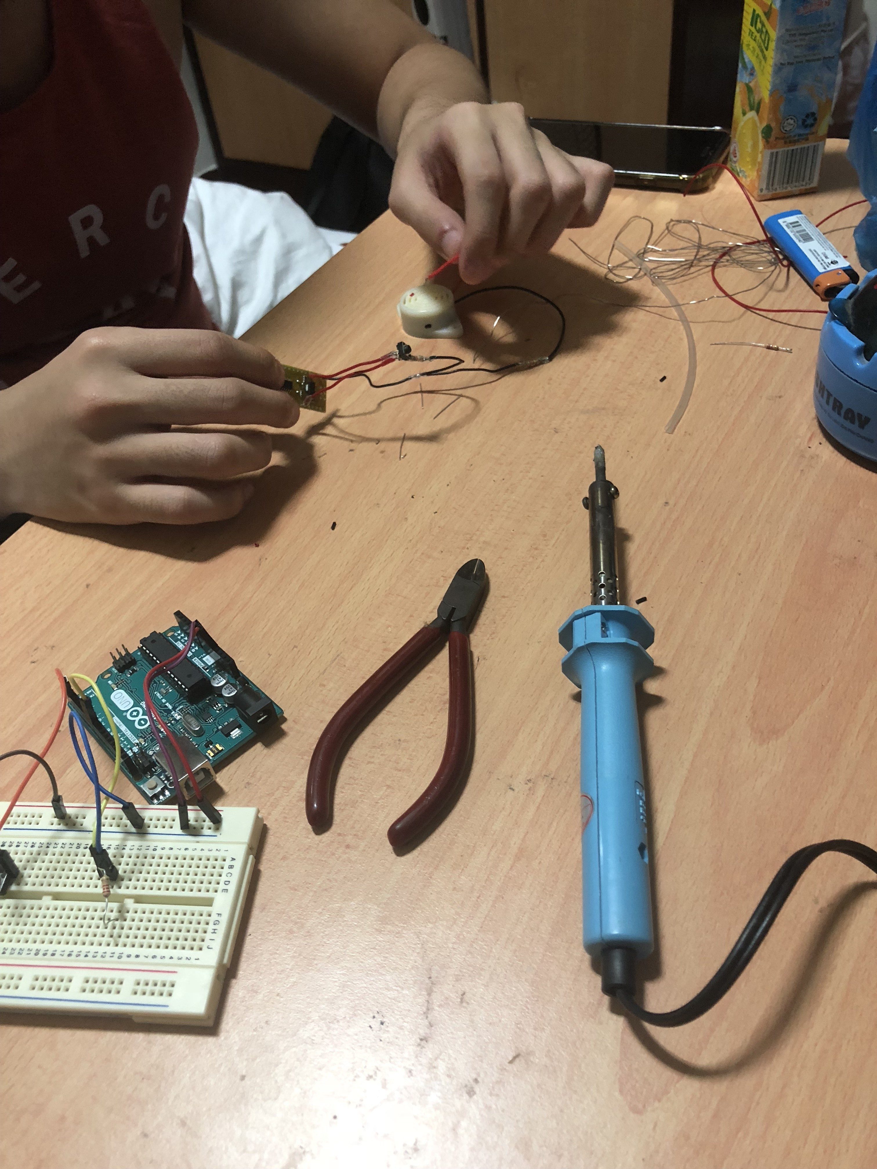
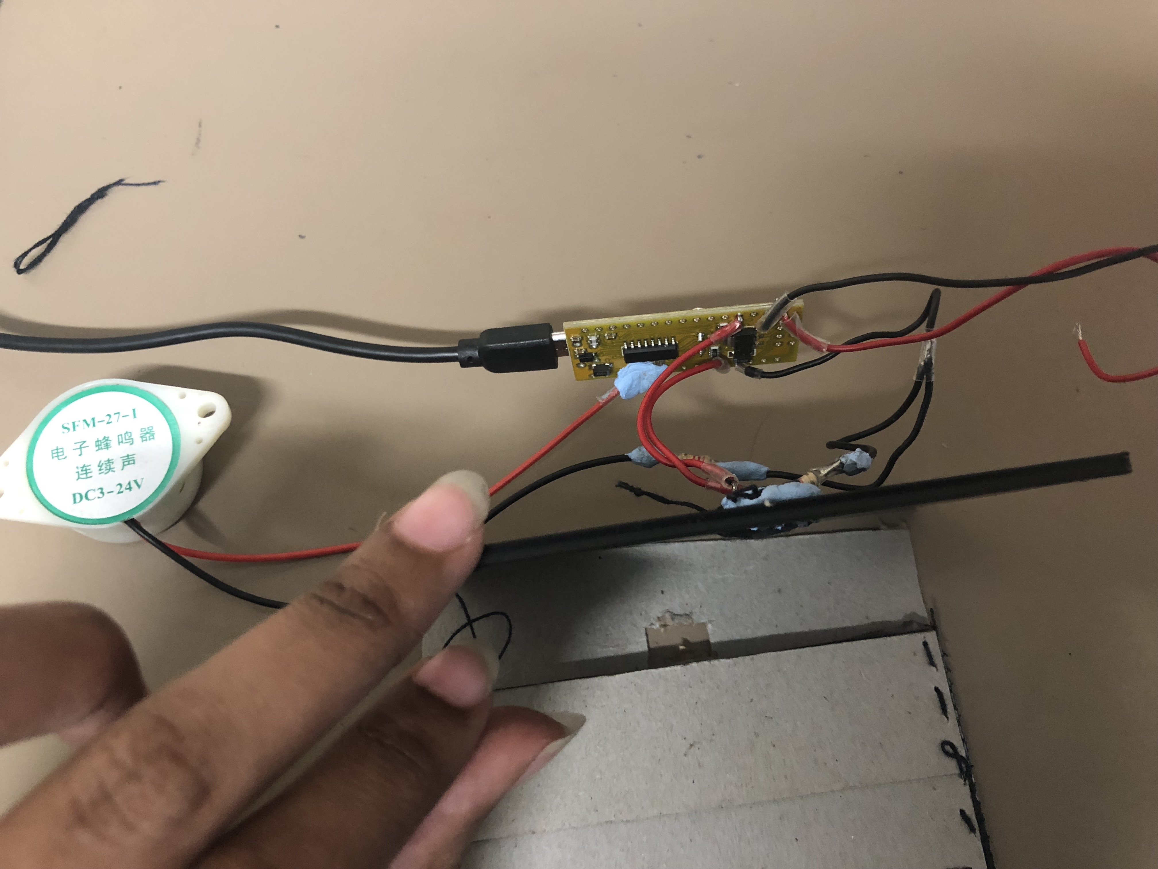
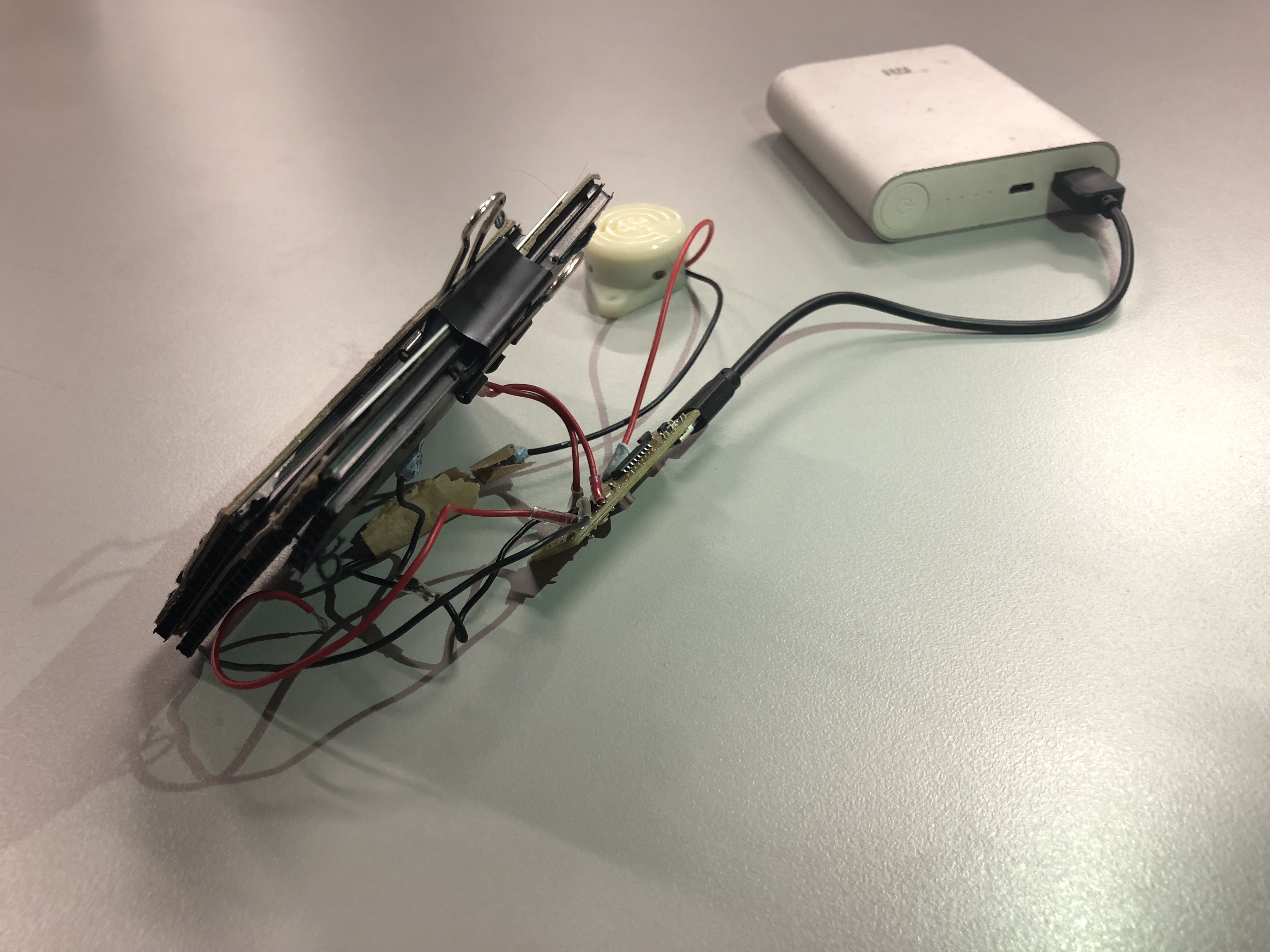
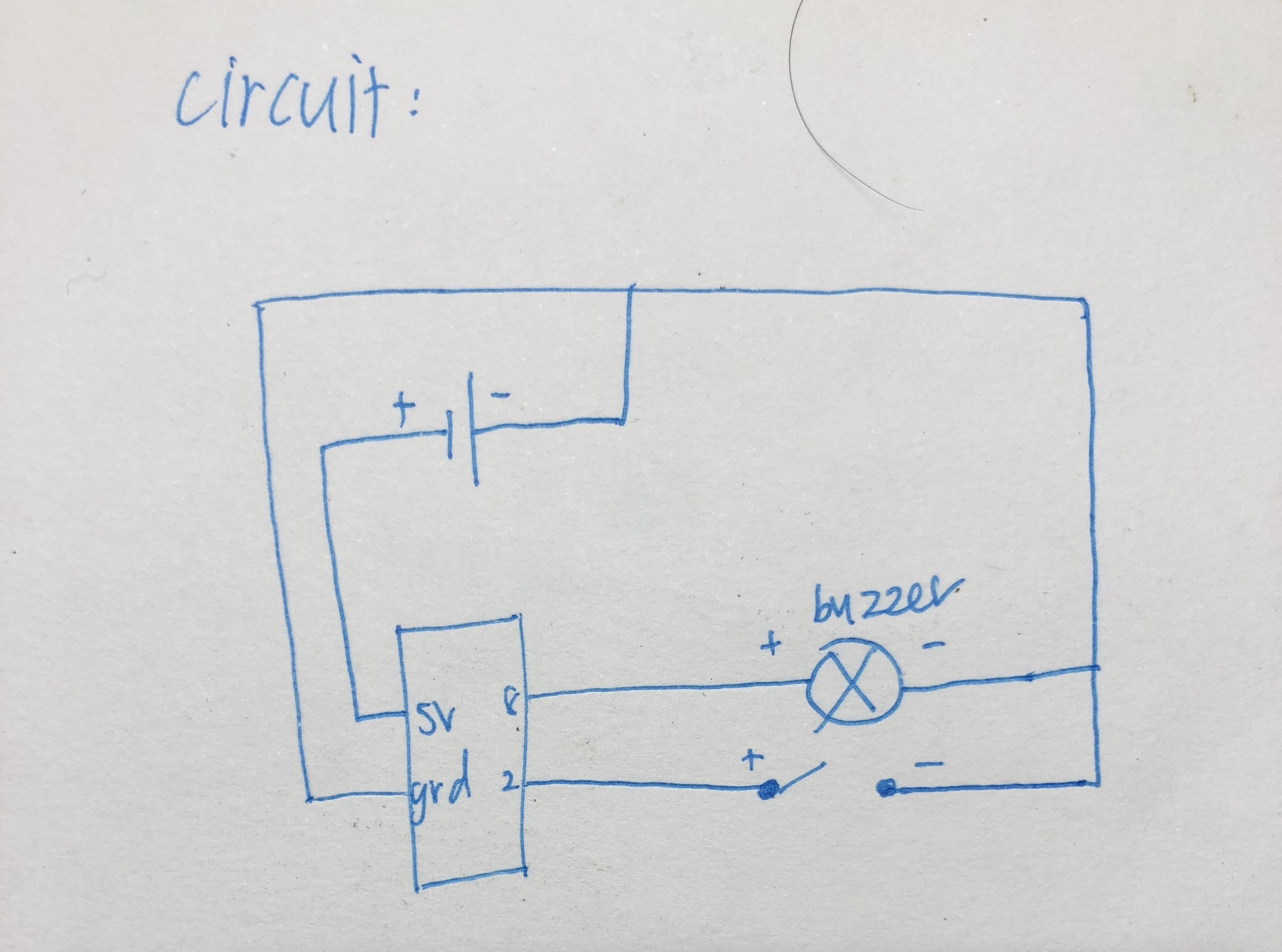
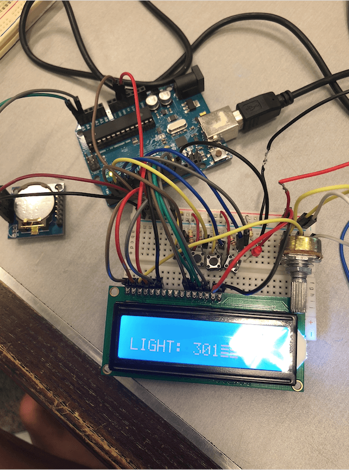
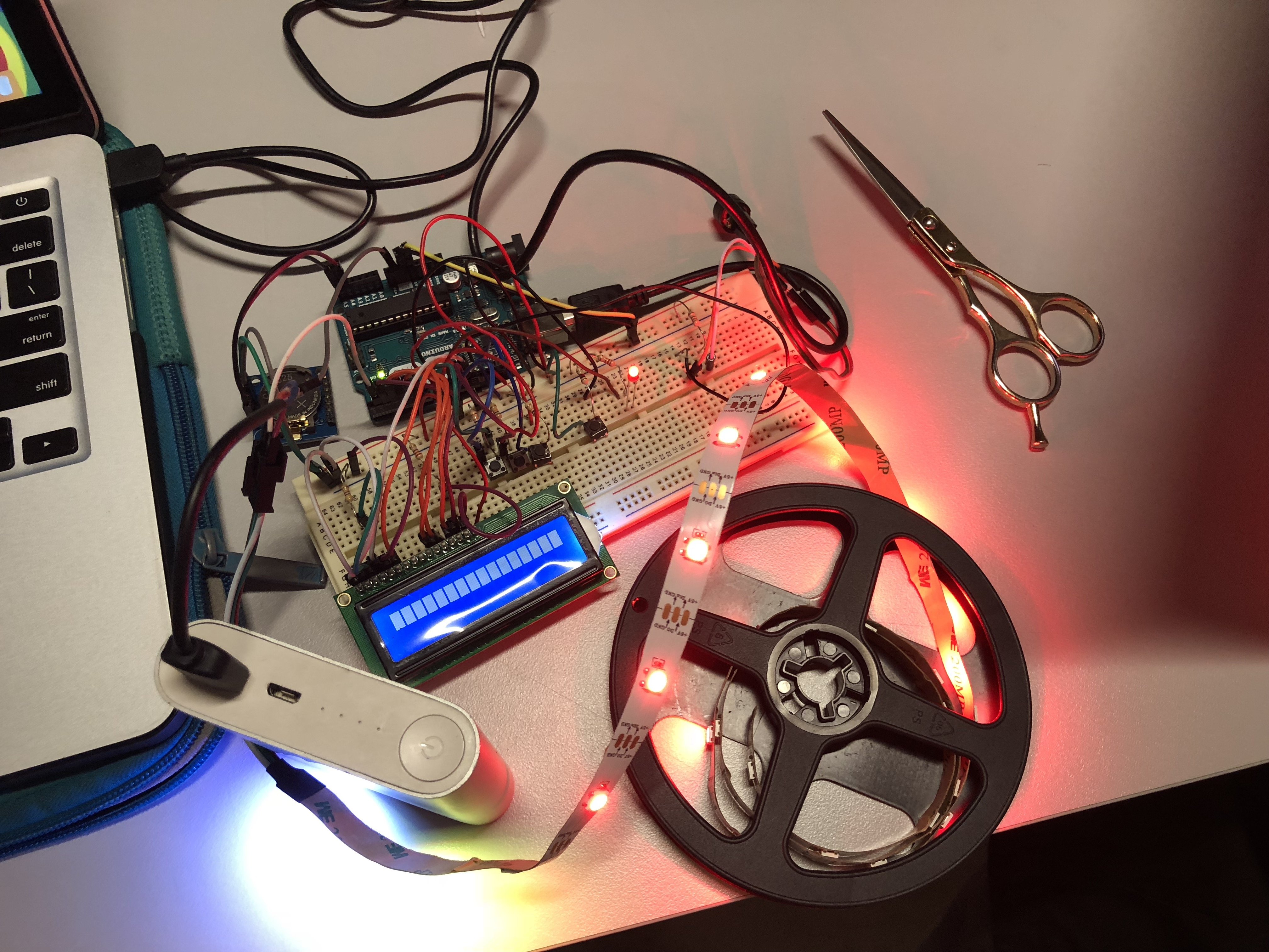
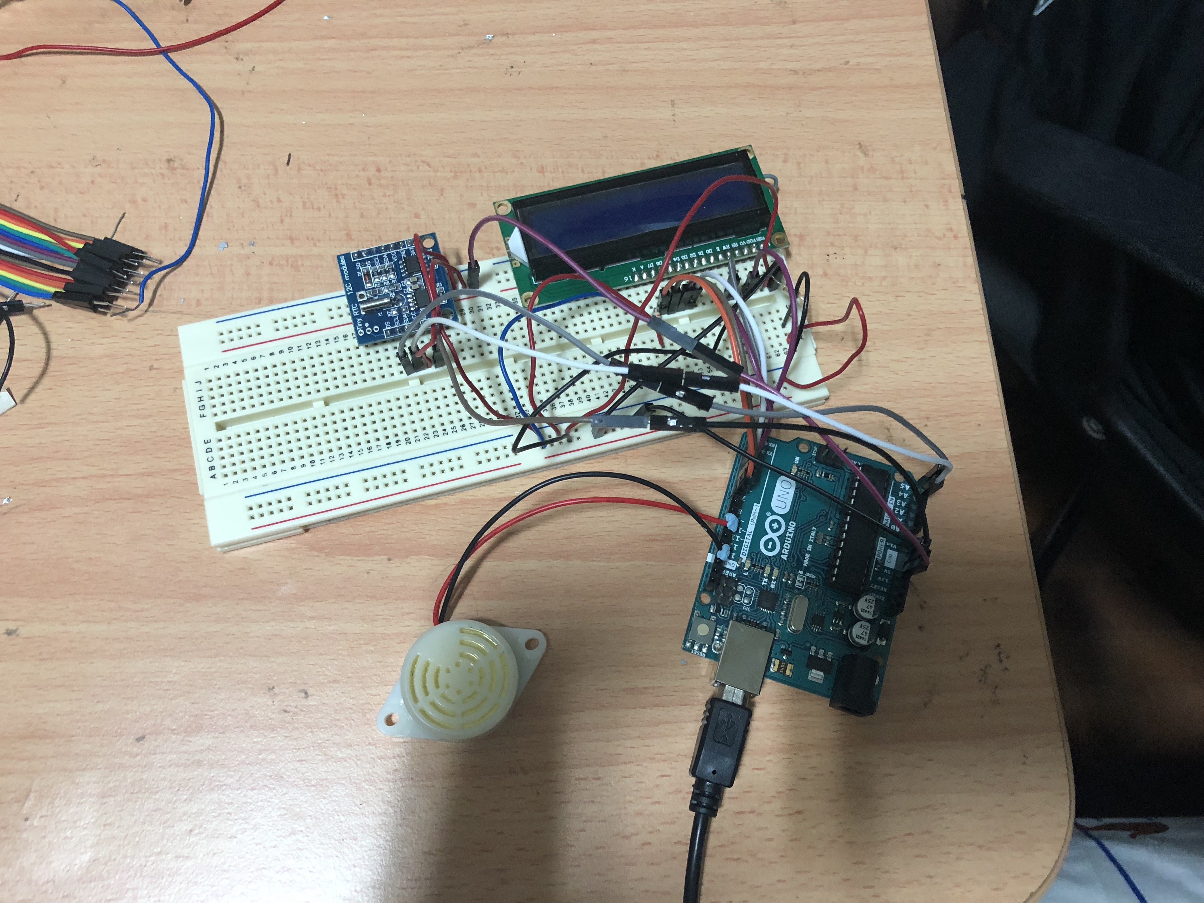
COMPONENTS FOR OUR CIRCUIT

RTC Module – to set off an alarm at a specific timing

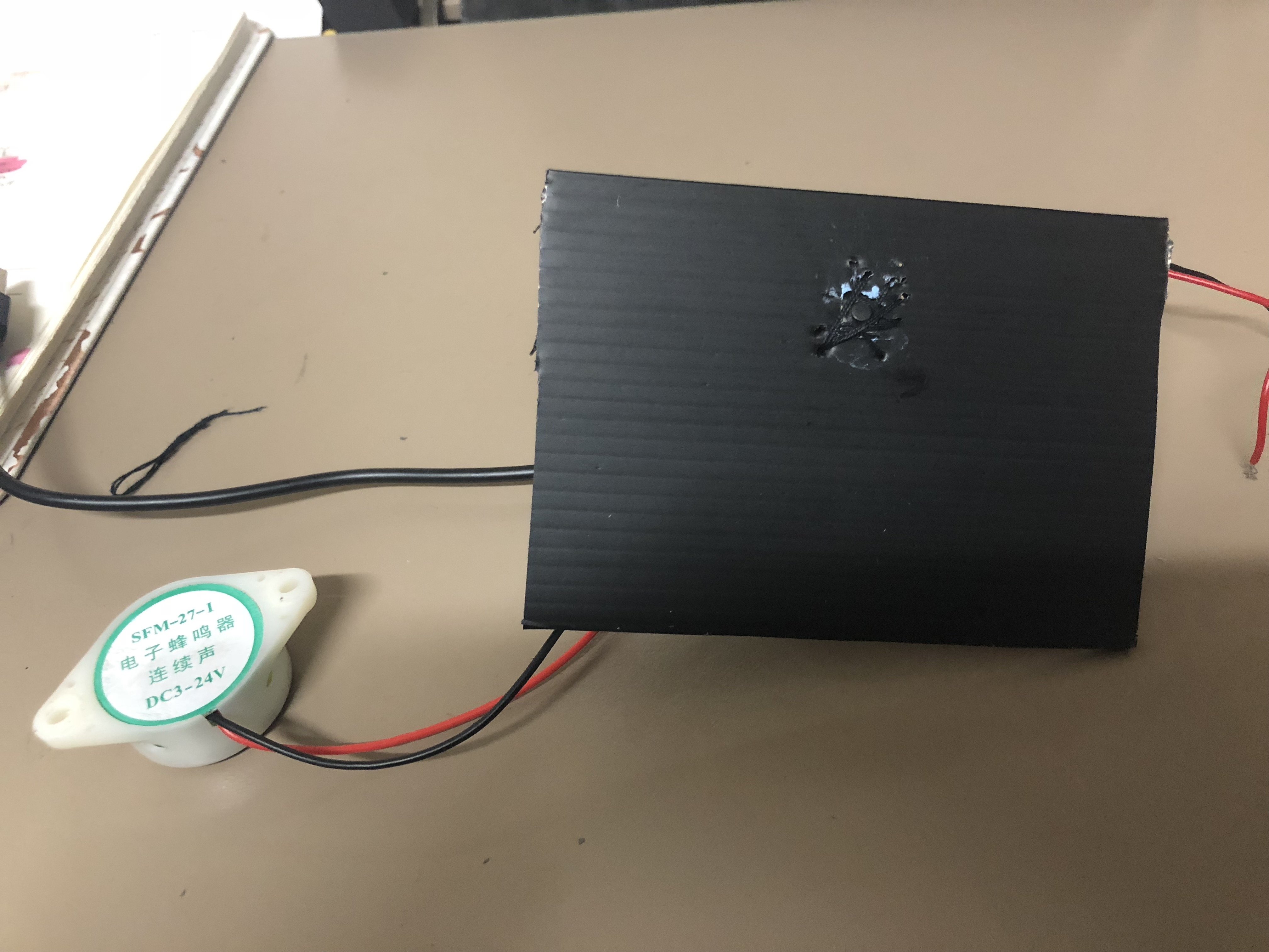
24V Buzzer (for the sound of the alarm)

Photocell – to stop the alarm and buzzer once the pill has been removed from the compartment (works together with the code of the alarm by replacing the alarm snooze switch button to a photocell which detects light)

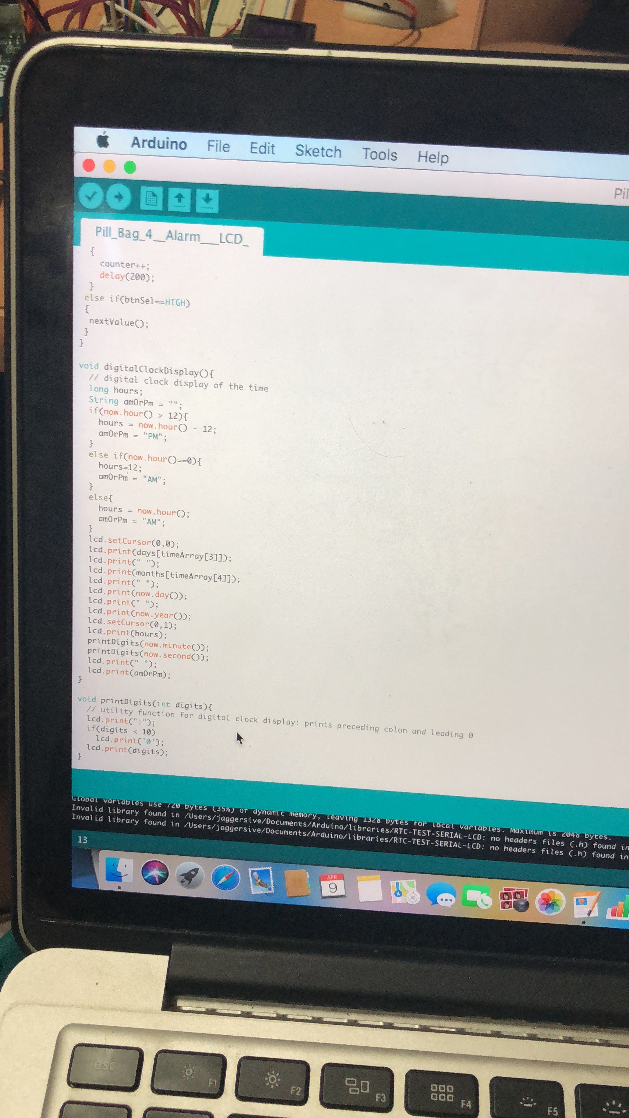
LCD Display – for user interface to set the alarm

LED Strips – to light up the pill compartment when alarm it being set off
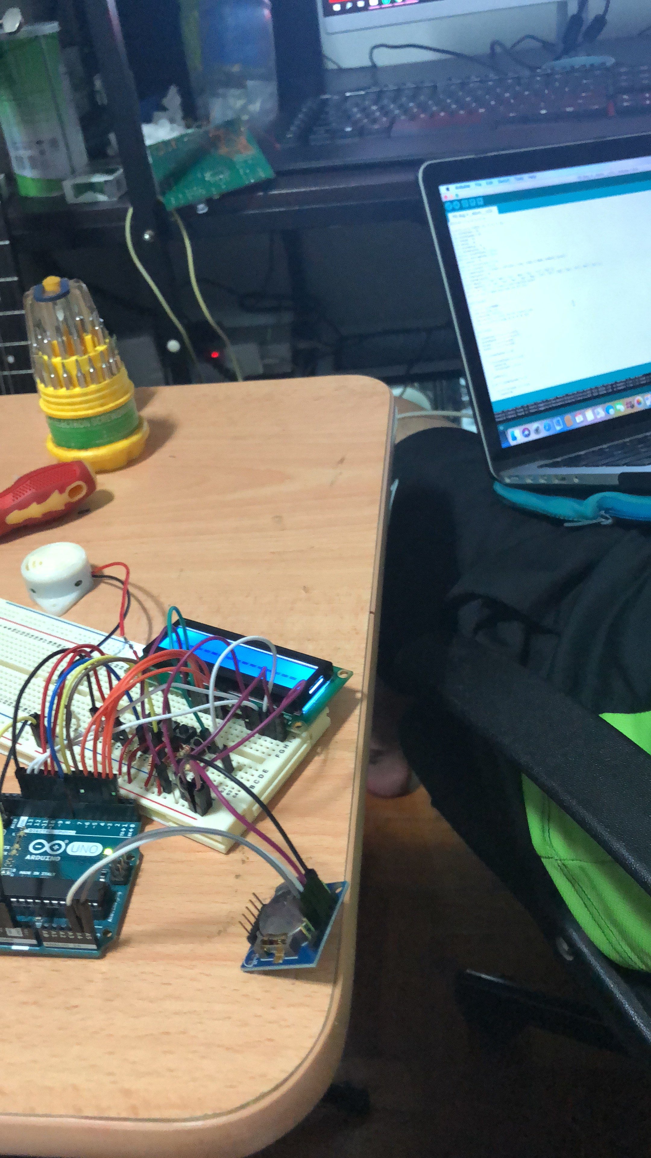
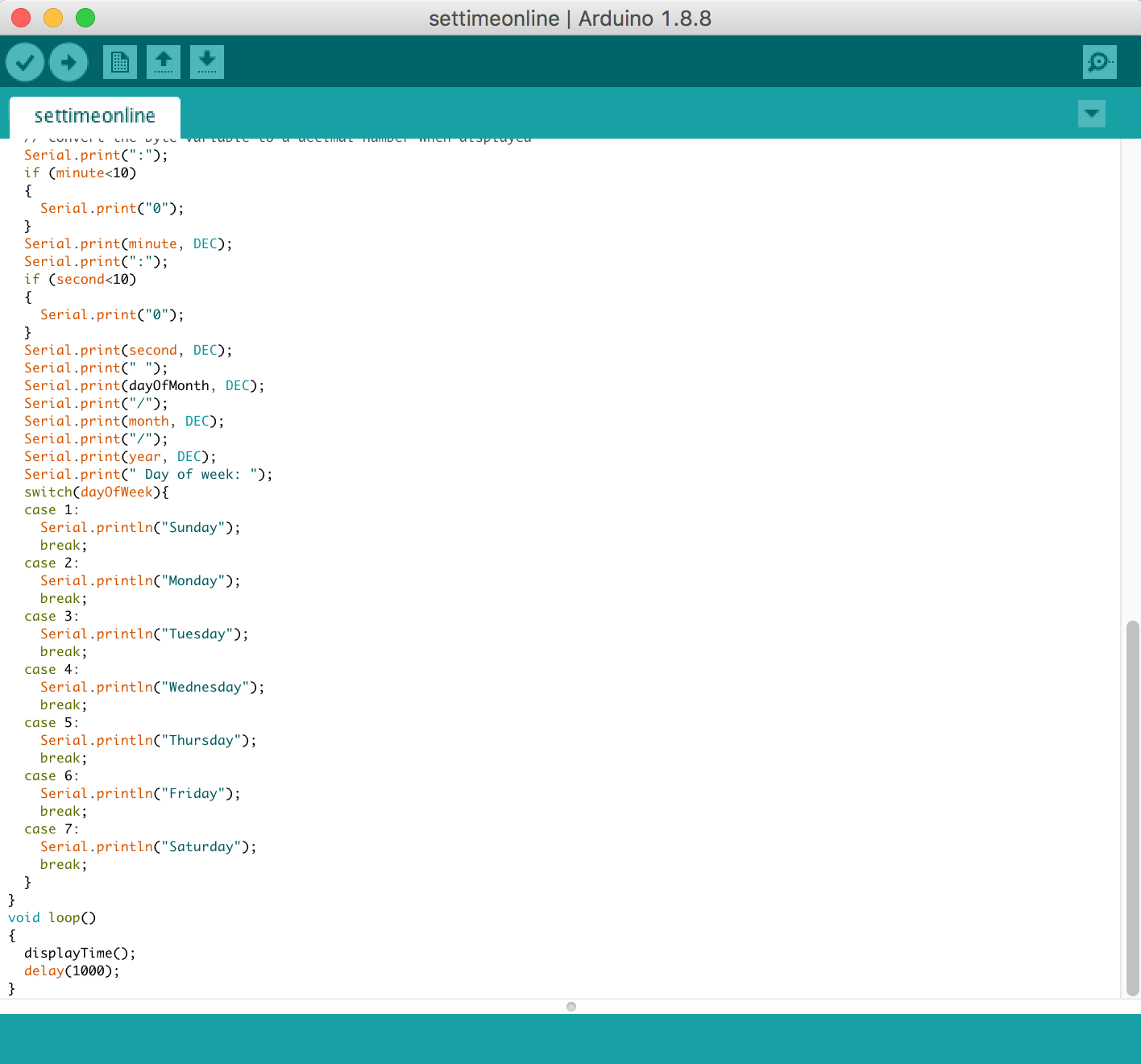
LCD Display:

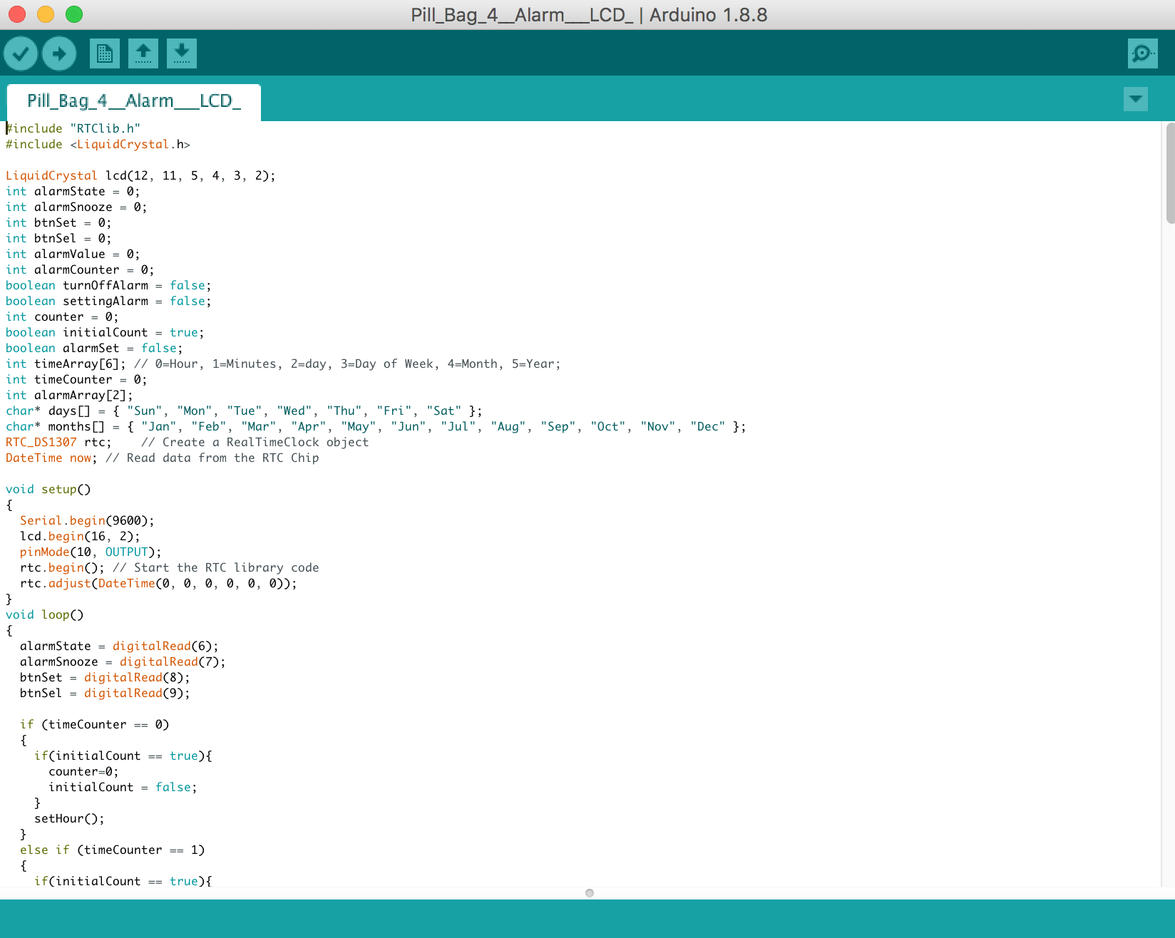
Code for LCD Display:

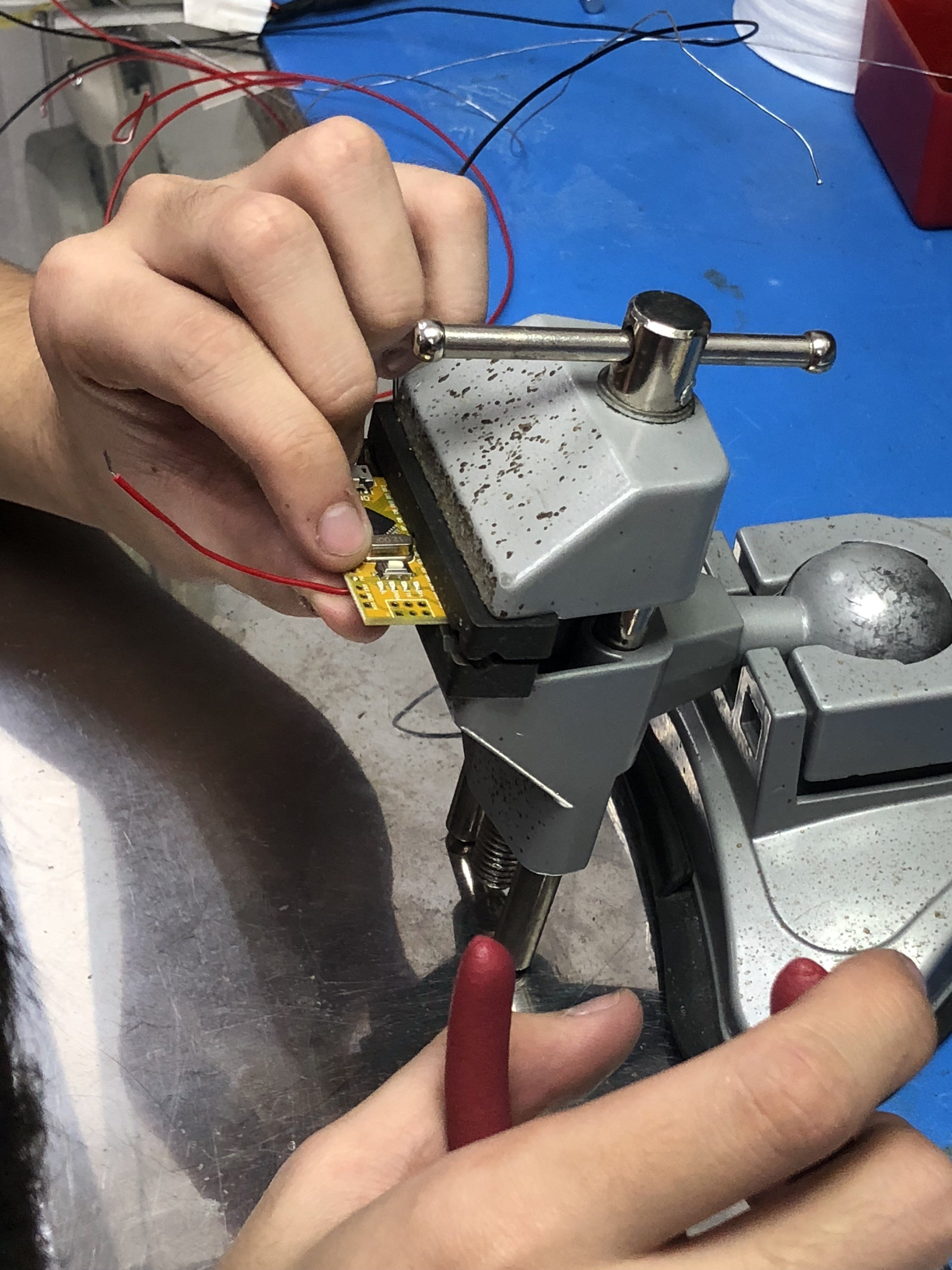
Initially, the circuit wasn’t working with the code we used from the Youtube Video despite having all the components and code correctly placed. After our technical consultation with Lei and Serena, we found out the LCD display wasn’t working and changed it. An important lesson is to check each component is working by itself before assembling everything together!

LED Strips:

Code for LED Strip:

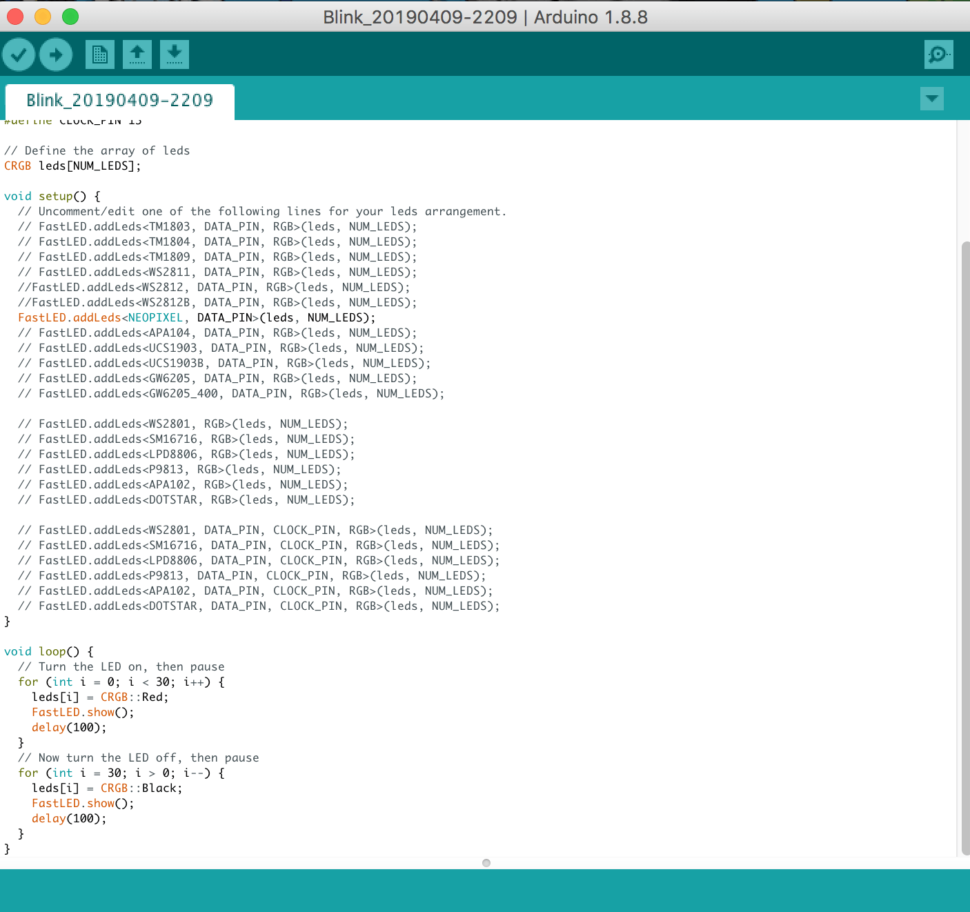
With the help of Serena soldering our mini USB cable to the LED strip and Lei’s technical consult to make the LED lights blink one by one, we were really satisfied with the LED component which will highlight the compartment of our pills at the back of our bag!

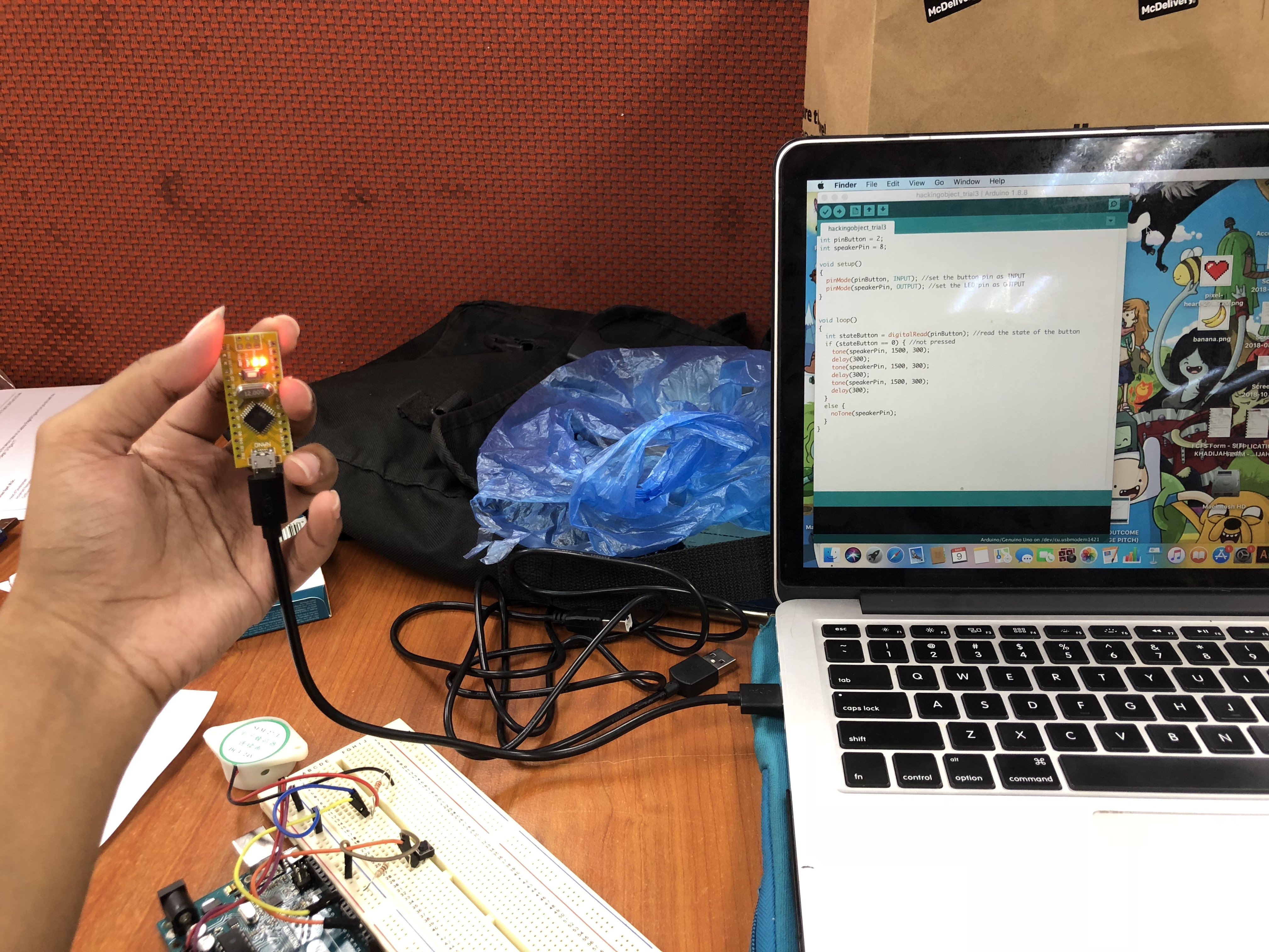
RTC Module – The component that is a pain in the ass ):

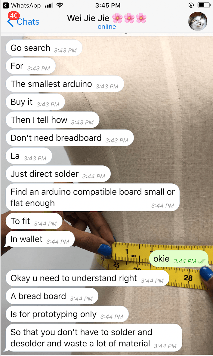
During our first interactive working prototype exercise, in order for all our other components to work, we have to make the RTC module work in order to set the alarm. Since I’m not really good with coding, I decided to DIWO and asked Weijie (my fwen with an engineering background) and we stayed up from 7pm to 7am to figure out the problem!!! We troubleshoot every single component to figure out the component and we realized that it was the hardware, not the software!!!

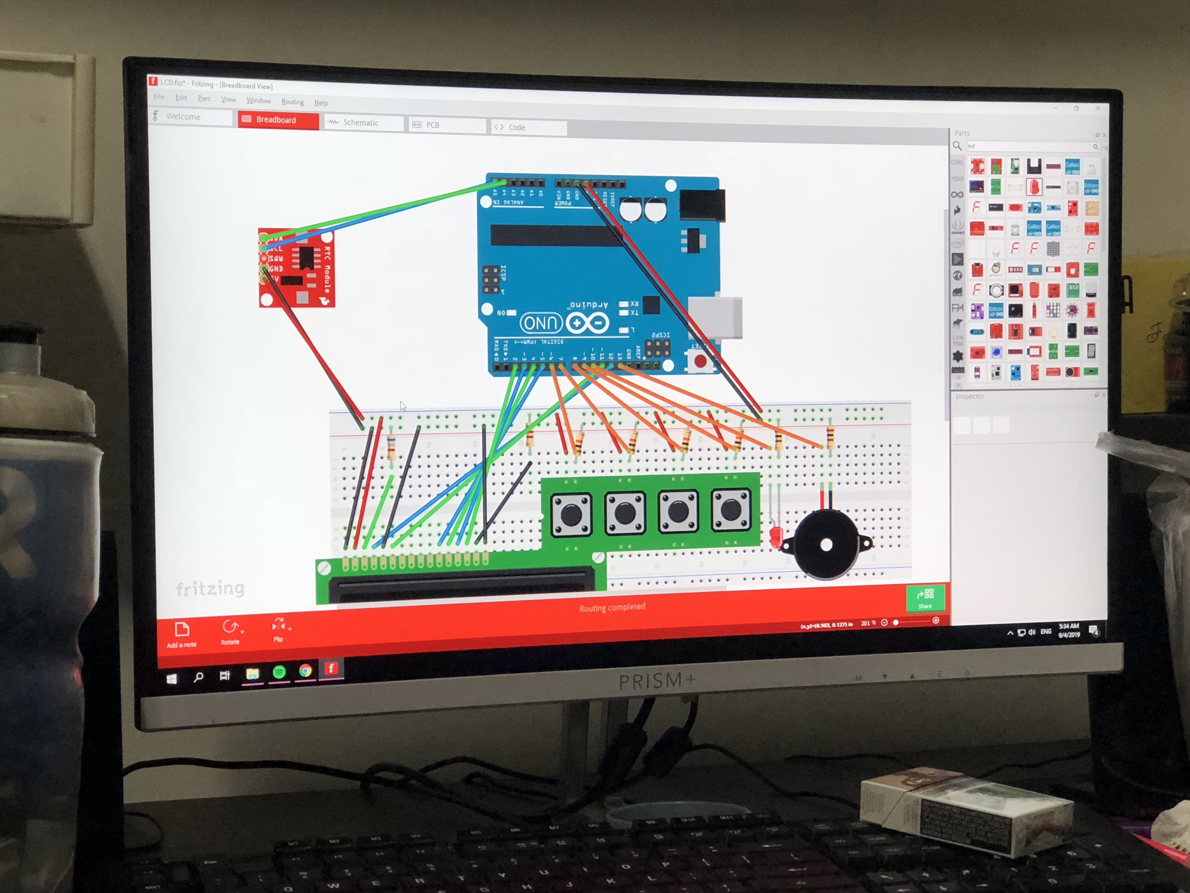
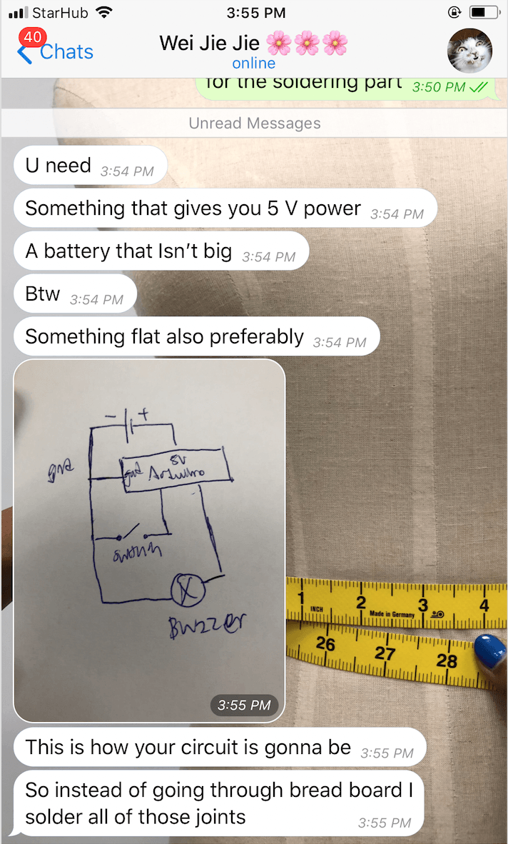
We even used Fritzing to arrange all the components and figure out what’s the main issue with this circuit. Firstly, it was the display and now the RTC ): At least, we’ve learnt a new software which is Fritzing to troubleshoot my components in the circuit without having to buy any additional components beforehand to try it out! Thanks Weijie!

So after consulting with Lei, we decided to buy a new RTC module! I decided to try the code outside of the Sunlight store so I can exchange immediately if they sold us another faulty component! I literally sat outside of the story for an hour just to make the RTC component work in our circuit. Thankfully, it finally worked without giving me gibberish numbers and I felt a sense of satisfaction!

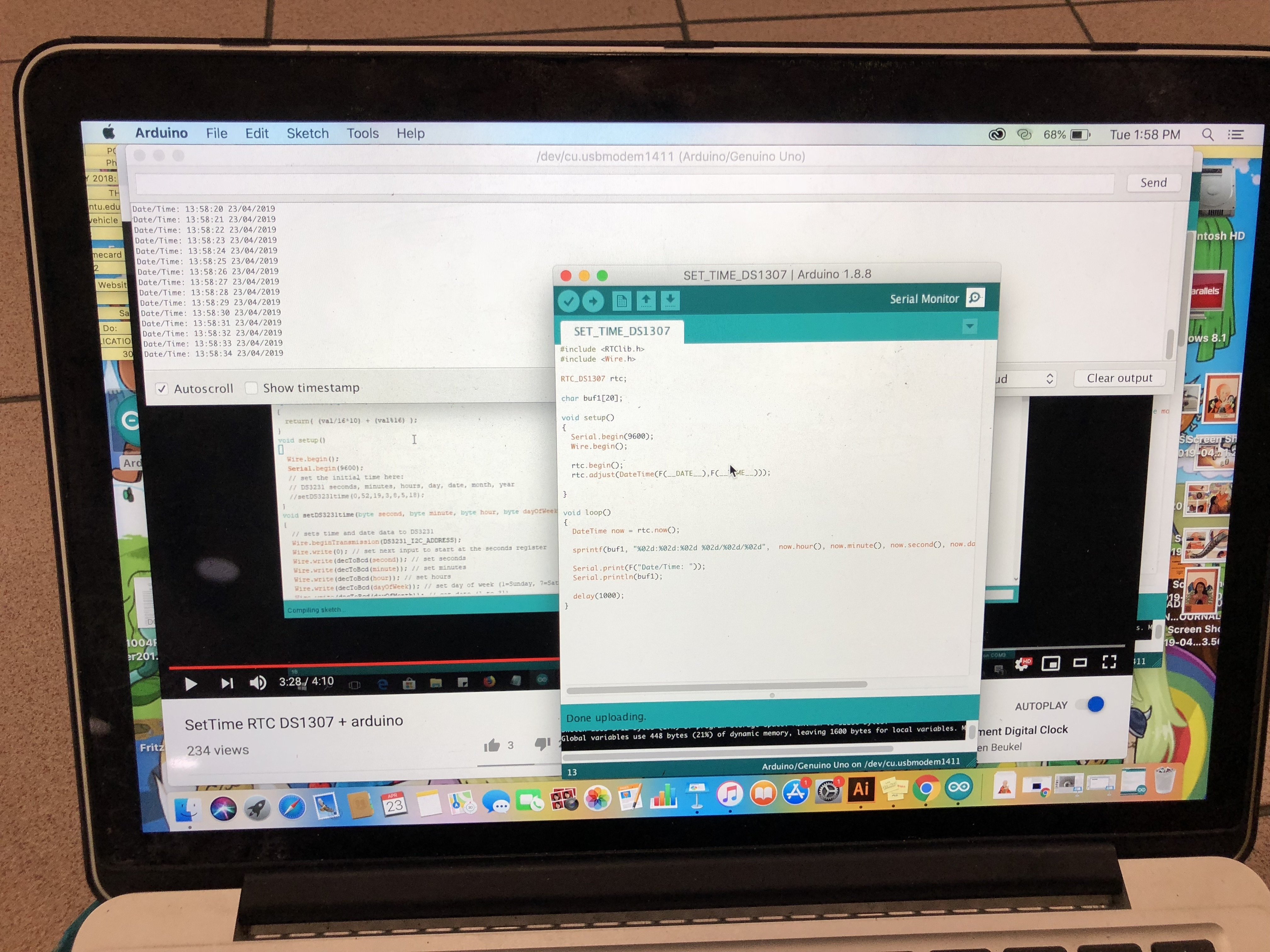
To set the timing on the RTC, I used this code:

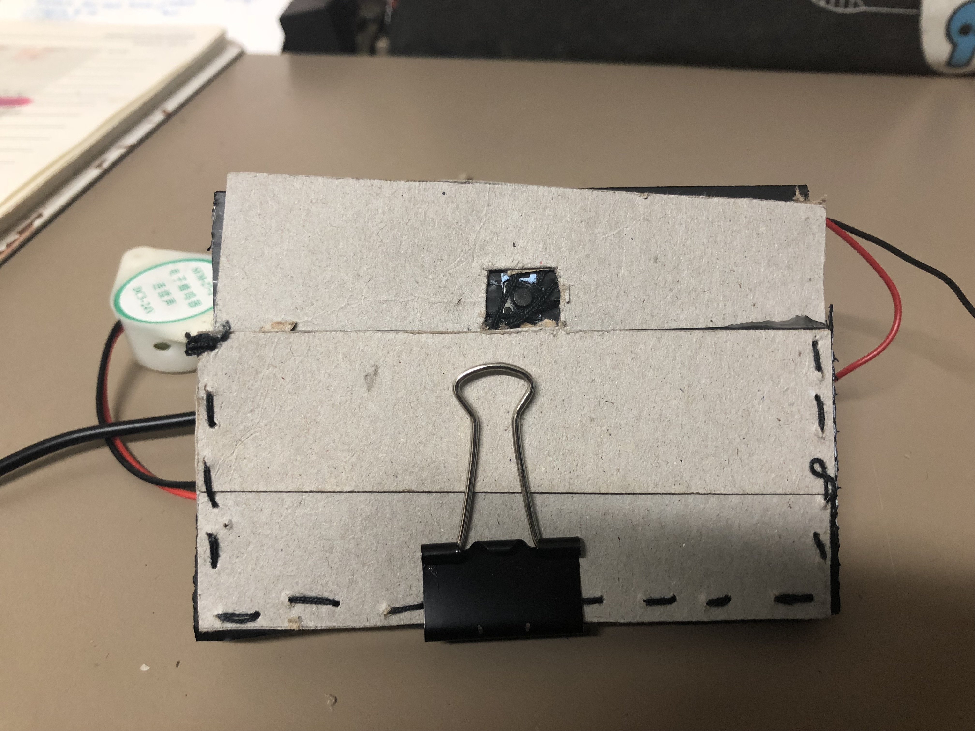
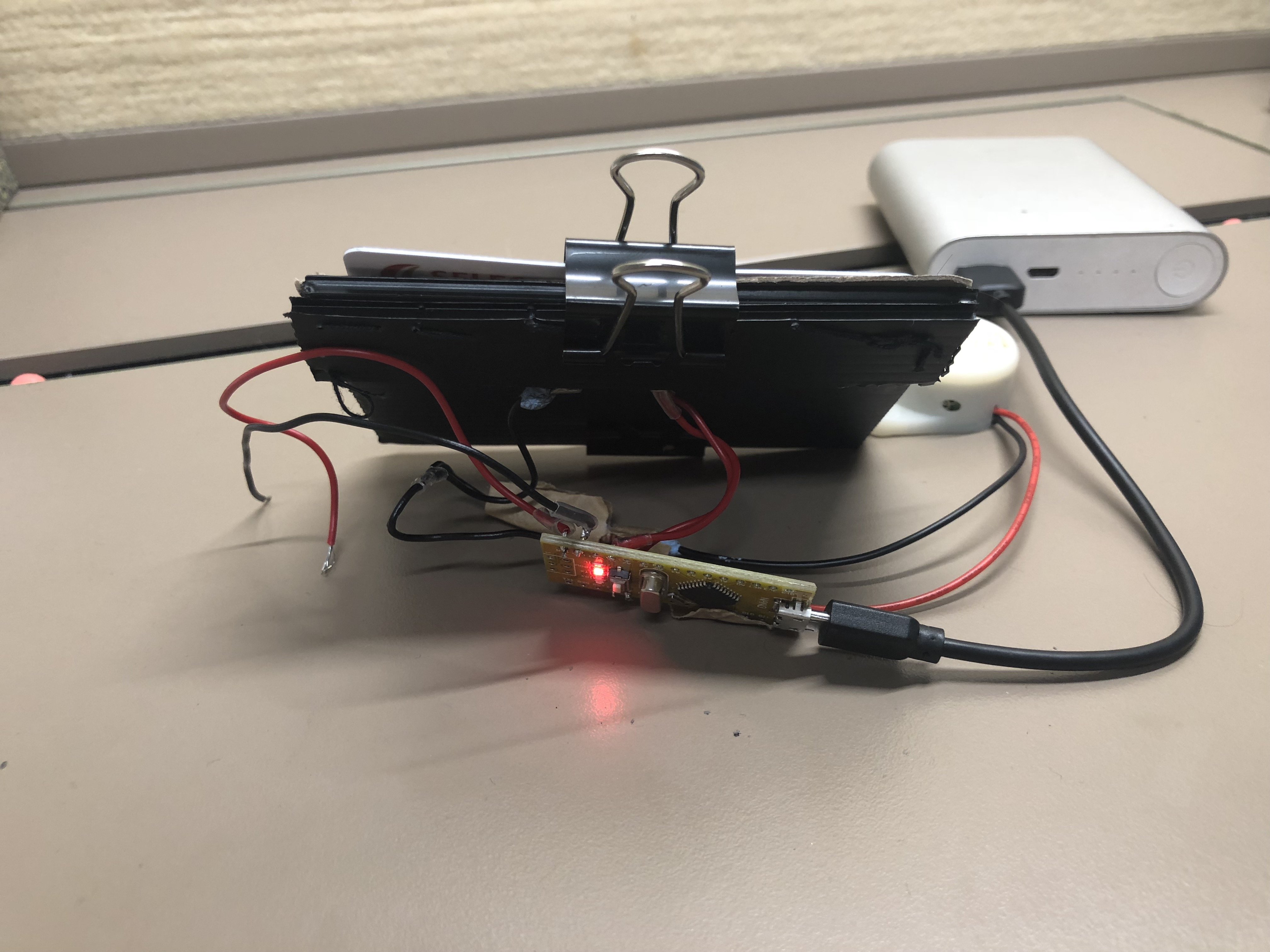
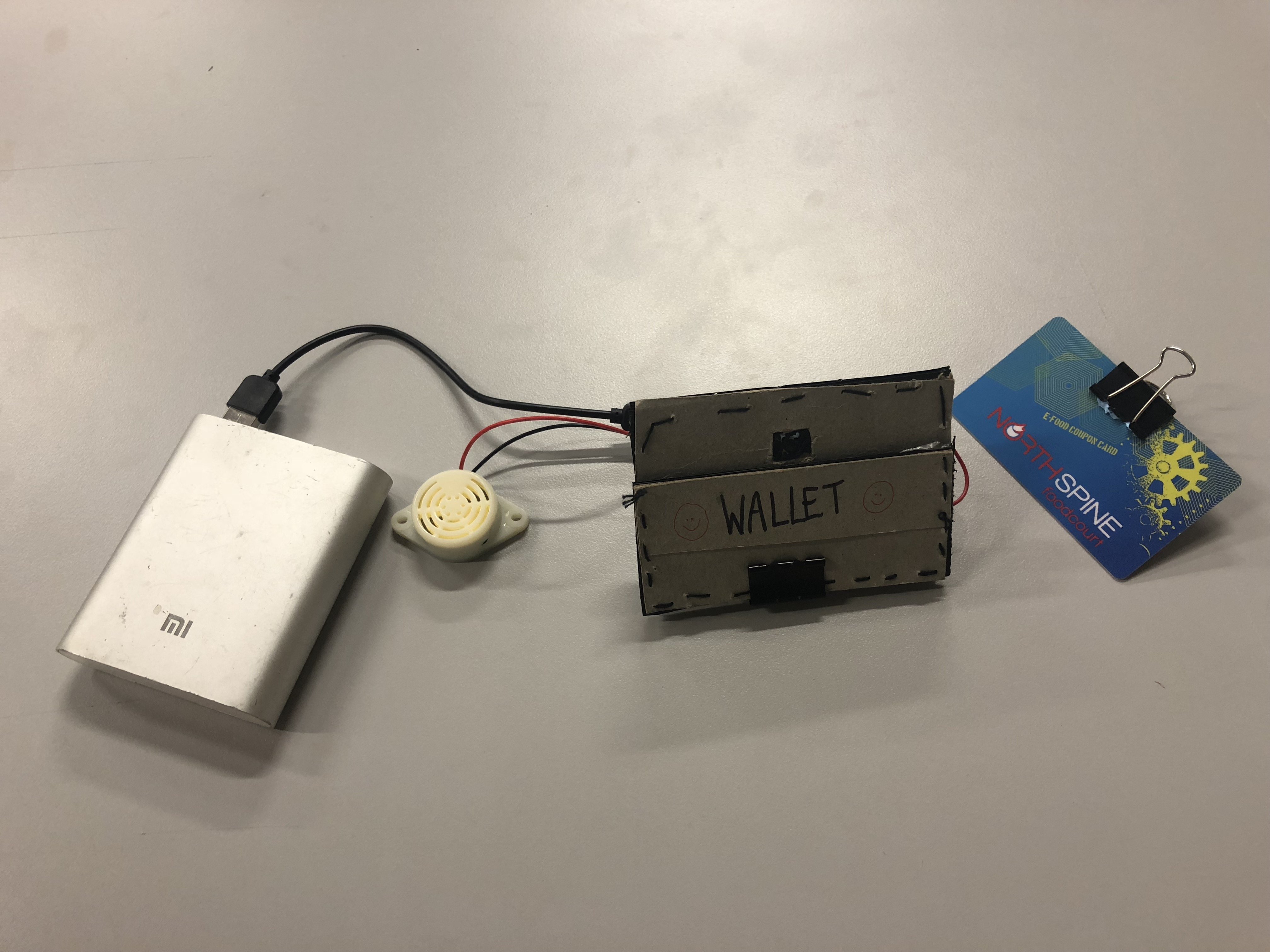
COMPLETED CIRCUIT VIDEO

DEVELOPMENT PROGRESS FOR OUR CIRCUIT IN PDF FILE:  Pill Bag – Development of Circuit


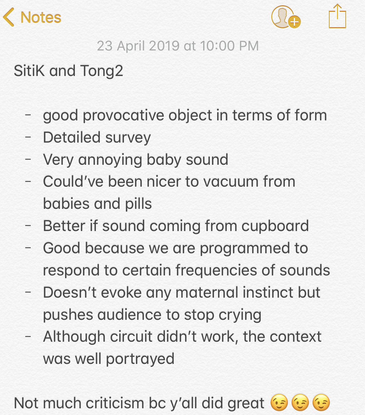
REFLECTION ABOUT USER TESTING:

I’ve realized the importance of user testing. As designers and creators, we tend to assume that the users will automatically know how it works or how to approach it. Sometimes, we’re too ambitious with trying to create something complicated to impress people but simplicity is the better option to send out a message to the public. I’ve learned to think in the perspective of the user and how I should have added visual cues for them to approach our object. To be honest, it was a good experience because every failure is a learning process but not a loss. I was not disheartened by every failure because I knew that our circuit and user approach could be improved with the help of our peers and the community online. 


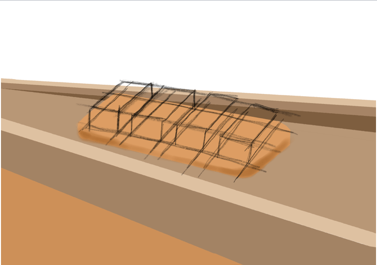
DESIGN PROCESS – CHANGES IN DESIGN

The design process documentation and changes for the pill bag after the first body storming exercise and first interactive working prototype can be seen here: Link

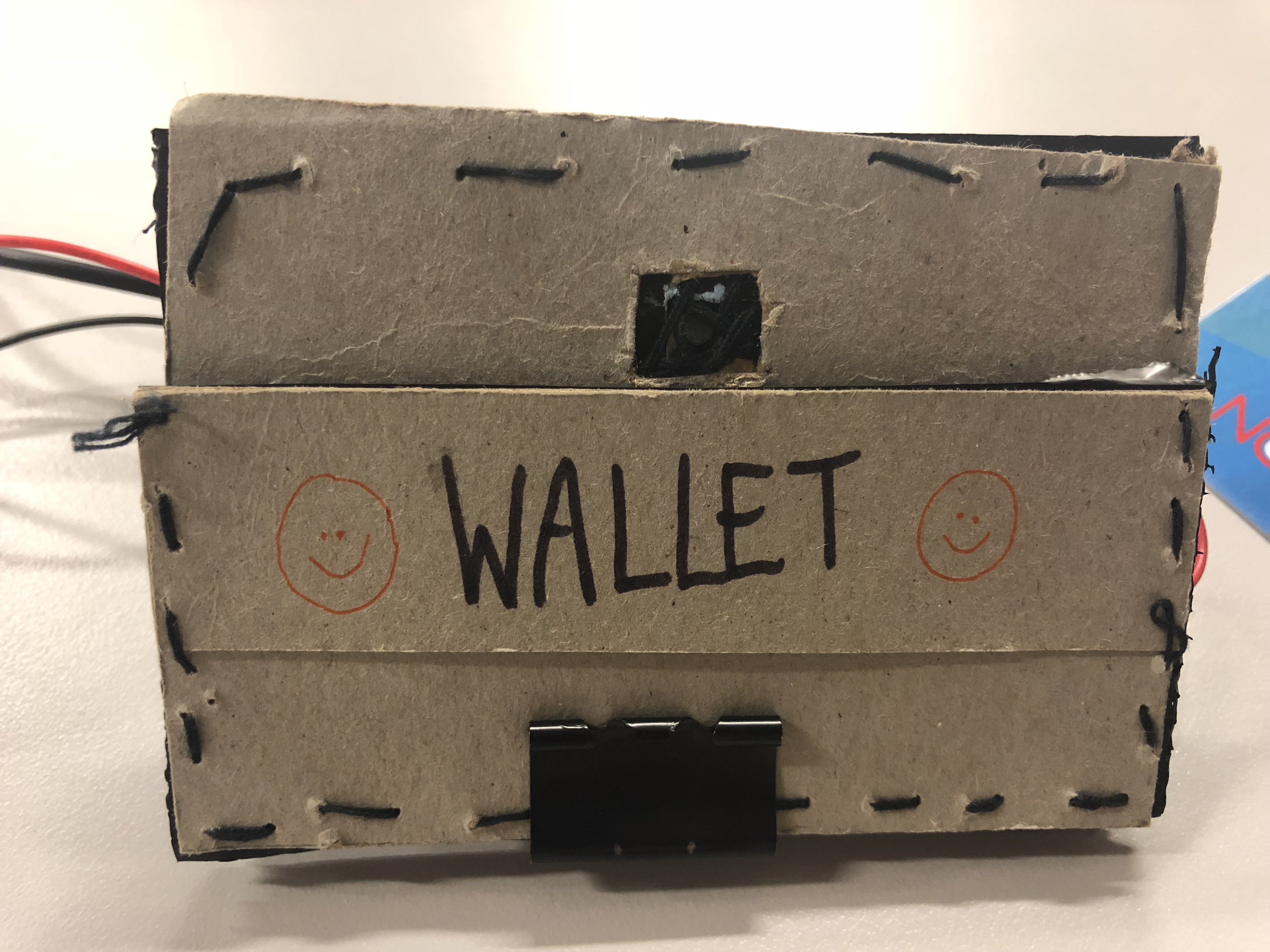
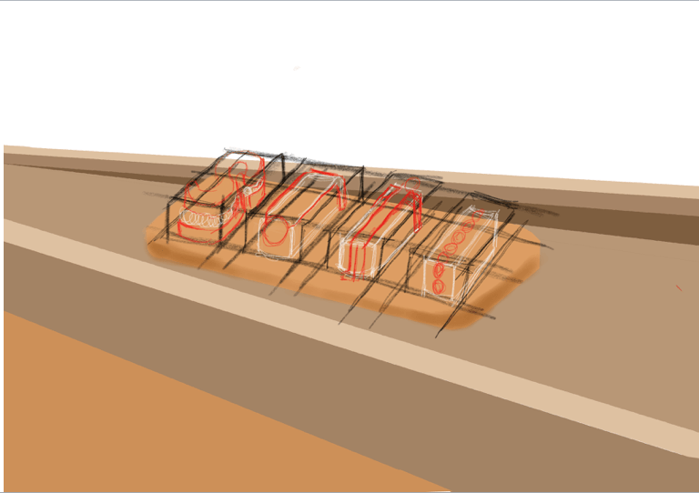
Our final change with the features of the design:

  • The front of the bag will be embellished will pill containing babies.
  • The pill compartment will be placed at the back of the bag with LED lights surrounding it.
  • At a certain timing, the compartment containing the pill will light up and sound off a beeping alarm with a baby crying sound. (Easier for the user to approach)
  • Once, the pill is placed back in the compartment, sound and light sensors will be off.
  • There will be a barcode at the front with a tagline which prompts the public to scan it. “Kill It or Save It” (Why barcode? → Price of contraceptive is a problem too)
  • The second layer of interaction; QR Code: Leads them to a page about our movement (information, questionnaire, maybe donation for people who don’t have access to conceptive)
  • Data collected can be used to raise awareness and inform the public about how many people we managed to reach out using our object.


PROTOTYPE PROCESS


 ENVIRONMENT/SET UP OF CONTEXT IN A LIVING ROOM

Location: Level 2 of ADM, nearby 2D Foundation room

BACKGROUND SOUND TO SET THE ENVIRONMENT AND CONTEXT OF OUR PILL BAG

During our test runs before our presenting, we realized we need to create an environment so the tester will know how to approach the object we wanted.

When the alarm sets off, it will create a beeping sound and a baby crying. Why? Whenever we hear an alarm, our first instinct is to shut it off because it’s annoying and it will increase our sense of urgency.

In addition, to guide our tester to our pill bag which is hidden in a wardrobe, a voice recording of “Take the pill to stop it! Take it!”. Another reasoning behind this phrase is when you take your birth control pills, it will reduce the chances of you getting pregnant. Thus, when you removed the pills from the compartment of the bag, it will immediately stop the alarm and the LED using a photocell.

TEST RUN WITH CAROL BEFORE PRESENTATION

We decided to have Carol to test run before our presentation to make final changes to our set up and see if we need any additional changes to make the user experience more enriching.

VIDEO OF THE PILL BAG IN AN ACTUAL SETTING – PRESENTATION DAY

For our main tester, we decided to choose Brian who has no pre-existing knowledge or experience about birth control. After experiencing our setup with the pill bag, he told us that he didn’t know taking your birth control on time is essential to prevent pregnancies and he understands the responsibility and burden a woman has to carry. Hence, raising awareness and empathy for the girls consuming birth control.

FEEDBACK FROM OUR PARTICIPANTS AND OBSERVERS:

NOTE TAKER: FENELLA <3

HOW IT WORKS WHEN IN USE IN A PUBLIC PLACE

Imagine being a female carrying out our pill bag in a public place, when it’s time to consume your birth control pills, the alarm will set off with a beeping and annoying baby crying sound. It will attract the attention of people from the surrounding because of the sound and baby embellishment of the pill bag causing complicated pleasure. With a tagline of “Kill it or Save it” and a QR code next to it, it will spark curiosity amongst them to scan it which will lead to a questionnaire about birth control. Even if they do not wanna do the questionnaire, we are able to keep track of how many people that we reached out to with our provocative object – The Pill Bag. This is to empower woman to be proud and transparent about consuming birth control and we are controlling our body because it’s our choice. Nothing to be ashamed about. 


REFLECTIONS

Experimental Interaction module was a love-hate relationship for me. It really makes me understand the concept of DIWO and I wouldn’t be able to complete this project with the help and guidance of Serena, Lei, Weijie, Tongtong and my peers for giving their opinions about our provocative object. Coding was particularly hard for me and trying to make sure all the software and hardware components work together is really tedious but I’m glad to be able to have this experience! All the mental breakdowns and crying to my peers was worth it because I’m able to make most of the circuit work for our provocative object! The learning process of figuring out the codes and trying to use Arduino in different ways is really enjoyable!

I’ve learned new aspects of interaction design of how we should focus on the impact it can make instead of focusing on marketability and getting rich through profits. To be honest, I used to think that being an interactive designer is not really sustainable and I find it weird but now, I have a new found respect for such people. How admirable are they to be doing such installations and to highlight certain issues in our society so our future generation can benefit from it. I feel that enriching the public with such values as the message of the object/design/project is essential in our society and more projects like these should be funded.

Whatever grade I received for the module, I feel like it’s not really important compared to what I’ve received and learned from Serena and Lei throughout the module about all the case studies about interaction design and discussion. I feel like the knowledge and experience I’ve received from this module will definitely improve my skills as a designer by being able to observe and empathize with the mindset of each individual in the project.


INSTRUCTABLES – THE PILL BAG

PROTOTYPE – THE PILL BAG
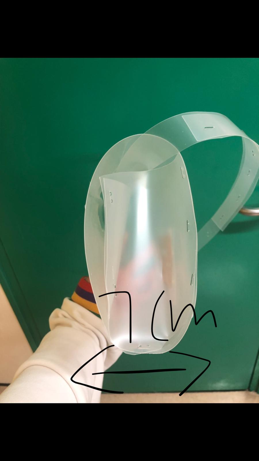
MATERIALS:

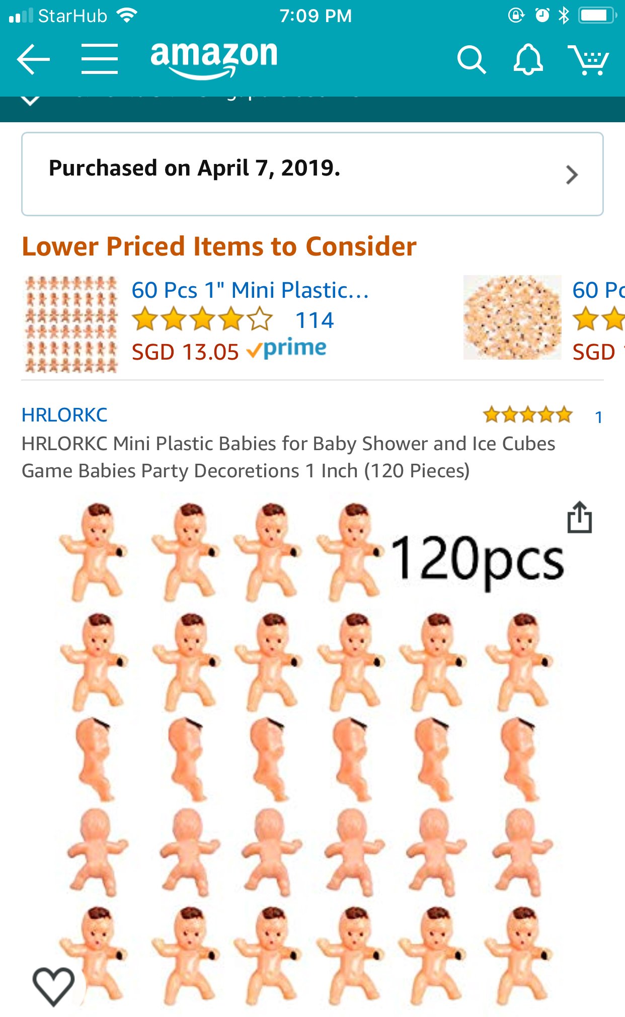
  • Babies you can buy from Amazon
  • Any thick transparent plastic sheets (Or just buy a ready-made transparent bag)
  • Heat Gun
  • Glue Gun/Sewing Machine
  • The pdf file for the tagline and QR code

CODING  – THE PILL BAG

Assignment 2: Form Making – Gaming Controller


To download pdf version of this file: ASSIGNMENT 2 – FORM MAKING – SITI KHADIJAH FINAL


Continuing from our previous assignment, we had to build a scale model of the chosen object design using blue foam. I’ve decided to choose the design inspired by the form of a crab as it’s visually and aesthetically appealing to me. Also, it brings an emotive aspect to the form as the navigation and movement features are strategically placed according to the placement of the eyes on the crab. In addition, I focused on the ergonomics of the gaming controller and refined the design to ensure it is comfortable for the usage.

REFINEMENT PROCESS

The refinement process was on-going while I was creating the foam model to ensure the aesthetic and ergonomics is the best quality, given the time limitation. I had a few changes before I reached the final refinement form of the gaming controller (as seen below) and I was satisfied with the process. I’ve adjusted a few features and overall size of the form considering being able to create a better user experience for gamers.


MODELMAKING PROCESS

The overall shape of my prototype is made out of blue foam and the features are made out of soft clay that hardens over time. 

After using the wire cutter to get the overall shape of my form, I did my first round of sanding however, I sanded the left side of the controller too much. To resolve the issue of asymmetry, I used epoxy to patch up the areas that have been sanded off too much.

To add the features of the gaming controller such as the navigation buttons and gamepad, I used soft clay to shape out the form of these features and let it harden over time. I did many rounds of sanding to achieve a smooth finishing but due to the color difference of the foam, epoxy and soft clay, I’ve decided to add two layers of wood putty and sand it once again. To add the grooves of the gaming controller, I used the automatic filer which has different sizes to create a small, thin indentation.

After the final round of sanding of the wall putty, I spray painted my prototype a glossy black and painted the features of the gaming controller. The last step was adding a matte varnish to give that cold and smooth finishing for my prototype. However, I felt like the varnish ruined the overall smooth finishing of my prototype and I should have stopped at spraypainting it black ): Lesson learned.


FINAL MODEL –  ‘CRABBY’ GAMING CONTROLLER

ORTHOGRAPHIC DRAWING – ‘CRABBY’ GAMING CONTROLLER


REFLECTION

  • One of the challenges was being able to achieve a smooth finishing for an organic form like my prototype. Trying to sand the curves and the navigation buttons to achieve a rounded curve was tedious but I tried my best. In addition, I had to add epoxy due to over-sanding and I’ve learned to refer to the original sketch to ensure the dimensions is accurate to prevent such incident from happening again.
  • In addition, I wished I didn’t add the matte varnish as the finishing touch because it ruined the overall smooth and sleek finishing of my prototype.
  • It was a good experience trying to improve my model making skills and I’ve learned a lot of different techniques from the critique session with my peers.

THANK YOU!

Micro-Project 4: Disobedient Objects – Warning Wallet

After being introduced to ‘Critical Making’; a combination of Critical Thinking and Hands-On Making, we were tasked to create a disobedient object by hacking an everyday household object. The objective of this micro-project is to incorporate Arduino, sensors, and actuators with our chosen object so that it behaves in the least expected way.

Group Members: Siti Khadijah & Tong Tong


IDEATION

1. Screaming Headband

Hacking a headband so when we place our head below a certain level, it will start to beep, the objective of the hacked object is to increase productivity, avoid sleeping while when we are doing work.

2. Screaming Shoes

Hacking a pair of shoes so when the user enters a room with the shoes on, it will start to beep, the objective of the hacked object is to prevent the worn shoes into the room.

3. Warning Wallet

Hacking a wallet so when the user opens the wallet and take out a card from the cardholder, the wallet will produce an alarming noise to alert the user to control spending, give a second thought before spending.

4. “True love” Earrings

Hacking an earring so when the user’s body temperature goes up, the earring will light up, the earning is helping the user to detect the love of his/her life.


CHOSEN IDEA: WARNING WALLET

After the presentation of ideas and discussing with one another, we decided to go with the third idea, we felt that the Warning Wallet is conceptually stronger and it’s a legit problem that we face everyday-impulsive spending. So we did a research on “How to avoid impulsive spending?” The first step to making a change in behavior is to recognize the problem. Once you acknowledge that uncontrolled spending is an issue, your awareness of the problem will help you follow through with a plan to stop. The alarming noise produced by “Warning Wallet” helps the user to acknowledge that uncontrolled spending issue thus, it helps reduce impulsive spending. In addition, creating an uncomfortable situation will embed discomfort and awkwardness into their experience hence, they won’t repeat the same action and it will serve as a reminder before they spend their money. 


PROCESS – ‘WARNING WALLET

  • Figuring out the code

The essential components in our circuit are the switch button which acts a sensor to trigger the beeping sound when the card is removed from the wallet and the sound motor which beeps when it is triggered. 

Using reference (below) from Open Source websites and forums, we were able to solve the issues we had which is being able to loop the beeping sound and the switchState to trigger the beeping sound.

  • https://forum.arduino.cc/index.php?topic=350943.0
  • https://www.electroschematics.com/8964/turn-on-led-button-arduino/

CONSULTATION WITH LEI

We were able to simplify our code and learned the easier way to do the switchState and adjusting the pitch of our beeping sound to make it more annoying.

  • Circuit Board

VIDEO: HOW OUR ‘WARNING CIRCUIT’ WORKS?

On a breadboard:

We realized that the breadboard was too big to be fitted in the wallet and we wanted our participants to have good user experience with our hacked object. Hence, we consulted some of our friends with an engineering background to solve this issue. 

SUGGESTIONS FROM WEIJIE (ENGINEERING FRIEND):

After discussing with each other, our group members decided to:

  1. Buy an Arduino Nano to make it compact and portable for our ‘Warning Wallet’
  2. Upload code onto Arduino Nano
  3. Solder the wires directly onto the Arduino with reference to our circuit on the breadboard
  4. Create a casing prototype for our circuit 
  • Process of soldering directly onto Arduino 

Since we’re are not experienced with soldering, we decided to ask assistance from our engineering friend and learn how to solder all the components together. Through this experience, we were able to learn the ‘hands-on’ making of the project and improve our ability to create a robust and working circuit.

FINAL OUTCOME OF SOLDERING ONTO ARDUINO NANO:

Wejie told us that he decided to solder extra wires connecting the power and the ground to a battery in case, our power bank isn’t working so there’s another alternative to power the hacked object.


VIDEOS: TWO WAYS TO POWER THE ‘WARNING WALLET’

  • Powered by Xiaomi power bank – For compatibility and convenience 

  • Powered by 9V battery – Another alternative


  • Prototype casing for ‘Warning Wallet’

Sewn and glued together, a wallet prototype for the circuit. The main objective of this prototype is to create a section in the cardholder for the switch button which will trigger the beeping sound when the card is removed from it. 

ISSUES WITH OUR PROTOTYPE CASING – WALLET:

  • The card slots in the wallet weren’t tight enough to prevent the switch button from beeping. Hence, I added a clip to add more pressure to press against the switch button as an immediate solution. 


*FINAL OUTCOME – ‘WARNING WALLET

  • VIDEOS


  • HARDWARE
  • CIRCUIT


  • Code


WARNING WALLET‘ IN USE IN A REAL LIFE CONTEXT

OUR EXPERIENCE:

  • As the users, honestly, we were quite embarrassed because of the loud beeping sound activated in the public and we wanted the purchasing process of buying bread to be over as soon as possible.
  • The auntie was wondering where the sound was coming from and kept looking around so, it was amusing to us. Afterward, she realized it was coming from our wallet and informed us about it. 
  • We felt like we were able to deliver the objective of our hacked object and we’re pleased with the results.


PRESENTATION IN CLASS

ISSUES DURING PRESENTATION:

  • During our test trials and runs before the presentation, it was working fine. However, we were unlucky and the wire for the sound motor soldered to the Arduino Nano came off when we’re presenting ): 
  • Despite this mishap, we had documentation videos of our working prototype and how it works in a real-life situation to present to our peers.


REFLECTIONS

“How does your hacked object behave in a way you least expect it to?”

SITI: A function of a wallet is supposed to store and safeguard valuables such as cash, cards, and identification details. Due to the consumerist culture of purchasing items that we do not need but want, we decided to hack a wallet and create an uncomfortable interaction. When a card is being removed from the wallet, the switch button will be released and trigger a loud beeping sound. Hence, creating an uncomfortable and awkward situation during the process of payment. The participant using the hacked object will be shocked and try to figure out how to stop the looping beeping sound which is by placing the card back into its slot. It serves as a reminder not to overspend and makes the user think whether it’s necessary to purchase an item.

TONG TONG: Our hacked object was designed to respond to the user’s movement, which is to take out the card from the card slot. We made a cardboard wallet and use a clip to exert a force onto the switch to imitate the actual wallet. In all our testing, we were assuming that the user will know how to use the wallet until the wallet is being used by the others, we then release the problem.


“What are some reactions you observed from your participants when they interacted with the object?”

SITI:

  • TongTong as the participant

During our test run in a real-life context, our prototype was working fine. When we were making our payment to the pastry store auntie, the beeping sound was activated and she was trying to figure out where the sound was coming from. You can see the confusion and frustration on her face. Personally, we as the participants wanted the whole process to be done as soon as possible but it was hilarious to see her reaction. After the payment is done, we were relieved that the annoying beeping sound has been stopped.

  • Brian as the participant

During our presentation, he wasn’t sure how to approach our ‘Warning Wallet’ but he took out the card but our circuit wasn’t working. The soldered wire of the sound motor was not connected properly and it might have been loose during the process of transportation. I should have been more careful in terms of safeguarding the circuit or should have created a protective casing for the wires to prevent such things from happening.

TONG TONGOur first participant Brian, he was initially confused with how he should approach the object, when he took out the card from the wallet with the wallet being not very responsive, just happened that not to work during the presentation, even though we tried many times before the presentation, he is even more confused.


“What are the challenges involved and how did you overcome them? What problems still exist? How might you overcome them eventually?”

SITI:

We faced a lot of challenges during the process of creating our ‘Warning Wallet’.

As we’re not proficient in coding, we relied on opensource forums and the knowledge we’ve learned in class to figure out the codes suitable to apply for our circuit.

We realized that to make our prototype more realistic during user experience, we had to focus on the compatibility and portability of our ‘Warning Wallet’. With the assistance of our friends with an engineering background, we were given suggestions to change to an Arduino Nano and solder our components directly so it will be compact. In addition, we learned how to solder directly, simplify the circuit and completed the circuit together (DIWO). Personally, it was a meaningful and fun experience collaborating with my friends and I appreciate their skills.

During the process of creating the prototype casing of the ‘Warning Wallet’, the card slots in our spare wallet weren’t tight enough and I had to resort to making a wallet out of cardboard because I didn’t want to destroy our current wallet that works perfectly with the circuit. However, despite creating a prototype casing out of cardboard, the card slot and card were still not tight enough to press against the switch button sensor. I resorted to adding a clip onto the card to exert more force onto the switch button sensor to prevent it from beeping (immediate solution because we didn’t have much time left). Hence, affecting the user experience of our participants for the presentation ):

When we were faced with this issue of making the sensors work, we realized we should have change the sensor from the switch button to a photocell sensor (detects light) which is much better as it doesn’t require force and it will stop beeping when the card is covering the photocell. The user experience of the participants will be much better if we tried multiple sensors for our circuit before finalizing which sensor is the best option for our hacked object! (Lesson learned!)

TONG TONG: There were several challenges that we faced throughout the process, involved hiding the components of the setup. We decided to buy a smaller Arduino board and soldering it so we were able to hide everything inside the wallet. We could have improved on our object by doing user testing, then we will realize the problem of the product. It would have been better if we use an actual wallet instead of the cardboard. Moreover, there was the issue of the choice of sensor, photosensor (detects the presence of visible light) might be a better choice than using the switch (detects the pressure).


THANK YOU!

IMAGE MAKING THROUGH TYPE – FINAL OUTCOME

FINAL OUTCOME

FEEDBACKS FROM PEERS


CRITIQUE SESSION:

  • Legibility of the letter ‘K’. It looks like an ‘X’.
  • Add highlights to the typeface so it looks bouncy.
  • Incorporate the texture and thin lines onto the typeface instead of the background.
  • Outline the rounded and bouncy typeface on the clown’s face.

CRITIQUE SESSION:

  • The letter ‘R’ looks like a P. (Legibility)


CRITIQUE SESSION:

  • Legibility of the letter ‘K’. I should have reduced the length of the decorative tail of the K.
  • I should have brought the physical soft textured typeface during the presentation to showcase to my peers.


CRITIQUE SESSION:

  • Legibility of the first ‘I’. Suggestion: Repeat the second ‘I’ typeface so it’s more readable. 


TAKEAWAYS AND LEARNING CURVE DURING THIS PROJECT:

  • I had challenges trying to picking out the minimal and essential elements from each of my jobs to portray it visually and efficiently. However, this project made me focused on the various aspects of the design process for image-making through type such as the usage of suitable elements, choice of fonts, color scheme, overall composition, technique or method that I’m going to apply. 
  • My knowledge of the principles of design and elements of design assisted the overall composition of typographic portraits and my peers complimented the perspective, depth, and dimensions of my typeface. 
  • Personally, I really enjoyed the dynamic design process of trying out analog and digital methods.
  • All in all, I’m really satisfied with the 4 outcomes of my typographic portraits. My favorite designs are the ‘Depressed Clown’ and ‘Drug Dealer’ and most of my peers really enjoyed ‘Cannibal Sushi Chef’. In terms of my illustrating skills, I felt like I’ve grown and improved in being able to harmonize all the elements and create a narrative. 

IMAGE MAKING THROUGH TYPE – PROCESS

PROCESS

PROCESS – CLOWN

ANIMATED PROGRESS:


FIRST DEVELOPMENT:

An initial idea of the typeface I’ve in mind: San Serif which incorporates the rounded feature of a balloon, rubbery and dirty textured to show the dual reality of a creepy clown with whimsical and vibrant colors.

FIRST CONSULTATION WITH MIMI:

  • Try to maintain the bouncy and rounded aspect of the font

SECOND DEVELOPMENT:

For this draft, my concept was a creepy clown typeface being deflated and the air leaving is the souls of crying kids. The elements used for this typeface is the rubbery and smooth texture of a balloon with deconstructed elements of a clown such as its iconic red nose and confetti in the background. 

SECOND CONSULTATION WITH MIMI & PEERS:

  • Couldn’t tell it’s related to clowns
  • The spirit of the children looks like a sperm.
  • Try to focus on the elements of being a clown

THIRD DEVELOPMENT:

Rough sketch of a depressed clown


I’ve decided to change from a creepy clown to a depressed clown to emphasize the dual reality of being a clown whereby despite wearing vibrant and joyful colors, the clown is feeling otherwise emotionally (contrast). After consulting Mimi and my peers, I was having a mind block and decided to research and breakdown the elements of being a clown. 

I realized what makes a clown are their makeup which consists of Bauhaus’ geometric shapes and colors, their facial expression and their custome which creates their identity. To regain my motivation, I’ve decided to do this typeface by putting on makeup which I enjoy and recreating the desired rounded and bouncy font with the elements of being a clown on my face as a canvas and editing the overall composition on Photoshop afterward. 

APPLICATION OF MAKEUP:

For the letter ‘S’ –

The typeface with the letter ‘S’ is rounded and red in color. Addition elements such as a blue lip and yellow circles are included because a clown’s makeup incorporates the Bauhaus’ geometric shapes and colors.

For the letter ‘K’ –

For the letter, ‘K’ has the same rounded typeface and it’s green in color. The red triangular shape and the magenta lips help emphasize the form of the letter. For the cheeks, there are two magenta circles and brown tears to evoke the feeling of depression and sadness.

For the letter ‘R’ –

For the letter, ‘R’, the rounded typeface is blue in color. Colors such as blue, red(eyebrows, tears, and lips), and green (circles on the cheek) are used.


RAW IMAGES & EDITING OF PHOTOS:

Edited using Meitu and Photoshop to touch up (increase saturation and contrast).

Letter ‘S’ :

Letter ‘K’ :

Letter ‘R’ :


FOURTH DEVELOPMENT:

An arrangement of the clowns and typeface:

For this process, I was experimenting with different typeface clowns which is suitable to evoke the concept of the dual reality of a depressed clown. I’ve decided to choose a black background in contrast with the vibrant and lively typeface clowns with depressing facial expression.


Addition of texture and lines for the background:

For the background, I added a variety of thin lines because it suggests pain, agony, and frailty as it appears to break easily. In addition, a white textured pattern behind the typeface clowns so it wouldn’t blend into the background.


Addition of shadows around the clown to focus on the typeface:

Shadows around the typeface clowns

To focus on the letters of the typeface, I’ve added a drop shadow around it to create a similar effect of lighting on an art piece in a museum.


Addition of confetti:

The last development stage in this design process, I’ve added red, yellow and blue confetti which is one of the props to end off a clown’s performance. Hence, I’m using this to harmonize the typeface clown (foreground) together with the black textured background.


PROCESS – DRUG DEALER


ANIMATED PROGRESS:


FIRST DEVELOPMENT:

A rough initial idea of the typeface I’ve in mind: San Serif (Rounded & Blocky style like pills) with a powdered textured font. The background will be the effect of consuming drugs which will be a double vision or psychedelic effect. 

FIRST CONSULTATION WITH MIMI:

  • focus on dealing with drugs
  • stacks of cash or coins

SECOND DEVELOPMENT:

For my first draft, I wanted my font to be made up of a juxtaposition of the exchange of drugs and money. The theme is farming; planting of drugs onto the human skin in exchange for money as a drug lord. Overall vibe will be the contrast of job, and colours (Base colour of font; Skin – Beige vs Money – Light green) and Objects (Tractor – Blue vs. Coin – Yellow). In addition, I applied the ‘Rhythm’ and ‘Movement’ to emphasize the flow on my typeface. 

SECOND CONSULTATION WITH MIMI & PEERS:

  • Increase the size of the coins to make it more obvious
  • Increase the thickness of the form of the font to make it stand out
  • Change the background to focus on the exchange of drugs and money between humans

THIRD DEVELOPMENT:

For the development of this draft, I increased the thickness of the form of the changed the background to human skin. To manipulate and add texture to the background of the typeface, I musk the images of the human skin and textured road above onto a beige solid background. Using plastic wrap and paint daubs effect on Illustrator.


Experimenting with the textures of the letter ‘S’ – Human and ‘K’ and ‘R’ – Cash with the transparency and colors to see which is suitable for my concept. In addition, I was figuring how to arrange the drugs in a pill or powdered form.


Increased the size of the coins and arranged it in a messy way instead of a neat and clean style as a semiotic that this drug dealer job is not a ‘clean’ and respectable job. 


For this development, I’ve decided to use a variety of drugs pilled up together and being left in a trail after the tractor lawned on the human skin. I had a dilemma whether to place the drugs on the skin or implanted in the skin. My final decision is implanting the pills in the human skin and you can see the layer of skin above which emphasizes on consuming the drugs. 


Lastly, for the background, I’ve added the bruising of injecting the drugs into our body to create depth for the overall look of the typographic portrait. Personally, I love the concept of the font replicating the grass being lawned as the movement of the font and the juxtaposition of the colors and idea for the exchange of drugs and money as a drug dealer. 


PROCESS – SOFT TOY SURGEON

ANIMATED PROGRESS:

FIRST DEVELOPMENT:

Initially, my job was a serial killer and I’ve decided to change to a soft toy serial killer. I wanted my typeface to give off a childish and innocent vibe with the psychotic characteristics of being a serial killer.

The concept behind this typeface is using a variety of soft toy fabric as the skin and its guts (cotton) are in the base of the composition. The font of my typeface is serif, similar to the children’s alphabet block toys. I have intentions of using certain parts of the fabric as the decorative part of the font. In addition, I wanted each letter to be hanging on a noose as if it’s the victim of the serial killer. Tools and equipment used are attached to the typeface for context.

FIRST CONSULTATION WITH MIMI & PEERS:

  • Try using the analog method instead of digital
  • Change job name from Soft Toy Serial Killer to Soft Toy Surgeon.

SECOND DEVELOPMENT:

I’ve decided to change the layout of the concept I have in mind. Removing the noose and focusing on being a soft toy surgeon. The composition will be a reconstructed soft toy typeface surrounded by cotton (its guts) against a white backdrop to show cleanliness and professionalism of a surgeon’s workplace with tools used in the foreground. The technique and method I’ll be using to create this typeface will be sewing and digital enhancement.

EQUIPMENT/TOOLS USED FOR SEWING:

Glue, scissors, stapler, needle & sewing thread


MUTILATING THE SOFT TOY INTO DIFFERENT PARTS:

Personally, deconstructing and mutilating the soft toy physically was therapeutic and I was excited to construct it into the serif typeface font that I have in mind. Orange, Brown & Blue soft toys are used because they’re complementary colors that are vibrant and it will stand out against the white backdrop. I’ve kept the cotton filling of the soft toys to represent the guts for the later process of the composition. In addition, I want the texture of the font to be soft and furry.

PLANNING OF RECONSTRUCTION WITH DIFFERENT PARTS OF SOFT TOY:


RECONSTRUCTING EACH LETTER INTO THE DESIRED TYPEFACE:


FINAL OUTCOME OF TYPEFACE AFTER SEWING


After sewing and reconstructed the mutilated soft toy as a surgeon, I’m satisfied with the outcome but I’ll be editing and using Photoshop to make the typeface more legible. In addition, I tried to incorporate different parts of the soft toy to add the decorative tail of the serif font


CREATING BACKDROP AND LIGHTING FOR THIS TYPEFACE COMPOSITION:

To ensure that I’ll get the highest quality and ability to capture the texture of the typeface I’ve created by hand, I used a lamp and a white backdrop. My aim after this photoshoot was to emphasize the texture of the typeface in a white clean-cut workplace of a soft toy surgeon. 


RAW IMAGES FROM THE PHOTO SHOOT:

During the photo shoot, I’ve decided to add the sewing thread which is one of the tools to create a visual path of how the fonts are supposed to be read but I’ve decided to remove and do it digitally. The soft and furry textured typeface is supported by its cotton fillings (its guts). I experimented with the positioning and arrangement of the letters and decided to choose the fourth image.

THIRD DEVELOPMENT – DIGITALLY USING PHOTOSHOP:

During the digital editing, I reduce the saturation of the backdrop to make it as white with blue hues so the emphasis will be on the textured typeface. I increased the contrast of the typeface so its texture will stand out against the backdrop and our eyes will automatically look at the font. To create context about my job scope, I’ve added incision marks which are used during the process of reconstructing, to create the visual path. In addition, a sewing needle, thread, and scissors are added in the foreground amidst the white and clean workplace. All in all, I was satisfied with the outcome of the typographic portrait and I did a few adjustments to the typeface to ensure each letter are legible. 


PROCESS – CANNIBAL SUSHI CHEF

ANIMATED PROGRESS:

FIRST DEVELOPMENT:

For the composition of this typeface, I wanted to the form of the typeface of human sushi to be an isometric view so viewers are able to see the details of the deconstructed elements. This typographic view is created on Procreate as a digital painting. 


Visual assistance using figure mannequin


Inspired by our in-class assignment (pareidolia) and the curves of the human body, I’ve decided to create the typeface for this job to be about the human body parts and its curves (san-serif). To help with the positioning and forming the font of my typeface, I used a figure mannequin for visual assistance. The colors used for this typeface are analogous such as red, beige and brown to give off a humanistic vibe


SECOND DEVELOPMENT:

After consulting with my peers, they suggested that I should remove the outline of each typeface so it’s more realistic. ‘S’; it is made up of two human bodies being contorted to form the letter. First ‘I’; the body being slashed by a cannibal with a bloody indentation to create a similar look of salmon sashimi. ‘T’; it is made of a human body being strapped down by a layer of hair and the private part is covered by a human head as a joke. For the second ‘I’; I created a row of human heads with a circular shape. Also, I added shadows and drop shadows onto the human sushi typeface. The typeface is mainly made up of deconstructed elements of the human body parts such as the body, head, blood, and hair. 


THIRD DEVELOPMENT:

CREATING THE TEXTURE OF THE CHOPPING BOARD

To emulate the Japanese restaurant ‘zen’ feel, I’ve decided to make the whole composition using earthy colors, wood and incorporating minimalism. I used the wooden brush texture on Procreate to create the texture of the plate to display our typeface.


The foreground of the composition consists of excess human body parts being slashed up with a knife for context. Besides the plate, there’s a blood sauce as a condiment. In addition, to communicate visually to the audience about my job, I’ve added a hand adding decorations on the typeface human sushi for context. All the different variety of human elements and objects creates harmony to tell the narrative of my job scope.  

FOURTH DEVELOPMENT:

For the background, to strongly emulate the ‘zen’ and minimalistic restaurant vibe, I used the earthy colors and wooden planks which are usually seen in a Japanese place. In a Japanese restaurant, the owners tend to place white menu signs on the walls to inform their customers about their ingredients. Inspired by this fact, I’ve added characters on the signs saying ‘Human meat is delicious’ as the menu sign for my restaurant as a cannibal chef (:


IN-CLASS ASSIGNMENT

WEEK 1 – PAREIDOLIA

Objective: Create a series of photographs of objects or scenery that looks like the 26 letters in the alphabets around ADM. 

Pareidolia – A psychological phenomenon that causes people to see patterns in a random stimulus. This often leads to people assigning human characteristics to objects.

To view the picture above in better quality: PAREIDOLIA by Brian & Siti G06-compressed 


WEEK 3 – TRACE 3 LETTERS INTO A NEW COMPOSITION (INSPIRED BY CUBISM)

SELECTED LETTERS (S,K,R):

CUBISM – S
CUBISM – K
CUBISM – R


Link to proceed to the Final Outcome – Image Making Through Type.


IMAGE MAKING THROUGH TYPE – RESEARCH

UNDERSTANDING THE PROJECT

From the start of this project, I knew I wanted to challenge myself to create typographic portraits for my future jobs in analog and digital methods. Considering aspects such as the choice of typeface, color scheme, layout and how I’m going to harmonize all the deconstructed elements of my job into my artwork during the design process is going to be a tedious yet, fruitful journey. My end goal for this project is to create each artwork with engaging typography and a narrative to communicate my job to people visually.


 For my job scope for this assignment, I’ve decided to choose unconventional jobs that spark curiosity and unrealistic to be one in my current life as of now. I’ll be researching the characteristics of the jobs above, creating my own interpretation of it and adding my style into the artwork to make the process meaningful and engaging.


RESEARCH – TYPOGRAPHY

Source of screenshot image: https://www.pinterest.com/search/pins/?q=typography&rs=typed&term_meta[]=typography%7Ctyped 

Typography – the art and technique of arranging type to make written language legible, readable, and appealing when displayed. 

TYPES OF TYPOGRAPHY


RESEARCH – FUTURE JOBS

ROUGH SKETCHES:

Click on Image Gallery above to view rough sketches.


ROUGH SKETCH:


ROUGH SKETCHES:

Click on Image Gallery above to view rough sketches.


 Inspiration: Artist reference – Catallena by Orange Caramel (Music Video)

 ROUGH SKETCHES:

Click on Image Gallery above to view rough sketches.


Link to proceed to the Process – Image Making Through Type.

Project 4: Poetics of Time – “Into Another Dimension” (Final)

“Into Another Dimension”

Special Thanks to Whitney & Gwen for helping me out during the whole process.

The project is an interactive instructional installation that experiments with experienced time (relativity of time) and implied causality. This concept involves time, space and sound. As this is the final project for Foundation 4D, I wanted to create an escapism by making an installation that will bring the audience into another dimension, hence, forgetting about the present time for a moment.

Principles of Time used in installation:

  • Experienced time
  • Relativity of time
  • Implied causality


PROPOSAL OF INSTALLATION

Click link to download pdf version of proposal.


OBJECTIVE

I want them to be able to feel that they’re entering another dimension by the shift of location and setting of the mood by relaxing as they observe the interior of the room and forget about the present moment of being stressed due to submissions. (outside – brightly lit vs. inside – dimly lit with disco led lights).

After the experience, I want them to be able to understand and experience the point I’m putting across which is playing with relativity of time by bringing them out of the present time or putting a pause on their normal everyday school life.

In terms, of experienced time according to the soft tempo/fast tempo soundscape, I want to open a discussion and discuss with everyone on how the time they’ve experienced during the installation is different and what influenced it to be that way. It will be interesting to listen to their views because it varies from each individual and time is subjective as everyone has their own definition of time.


CHALLENGES

  • Being able to be engaging and capture the audience’s attention. (I need to be prepared, practise my role and have a lot of confidence.)
  • Setting the mood so I can bring them into another dimension.
  • The outcome and reaction of the audience is unpredictable so I have to practise on different people and make sure I can manipulate certain aspects in order for them to have a certain reaction that I’ve have in mind and put the point across to them about relativity of time and making them anticipate something.


PREPARATION ON THE ACTUAL DAY

Preparation before the installation:

Before my installation, asked the class to download the soundscape. Split them into two groups for different experience; Slow & Fast Tempo with the same duration.

Soundscape 1: Slow tempo (Music: Nature Background Music)

Soundscape 2: Fast tempo (Music: Bangarang by Skrillex)


Location: 4D Foundation Room

Layout of setting up the paper & plastic for audience to interact –

Me and Whitney as the actors –

Roles

Me: Host that will be engaging the audience.

Whitney: Assistant that will scan and beep at the audience at the entrance & film.


FINAL VIDEO OF INSTALLATION DAY

Outcome of course mates’ artwork listening to the soundscape

Discussion Video

Feedback

  • Serena (Slow tempo soundscape) – The duration of the music is too short & I’ve should make it longer because she was only able to get into the mood in 30 seconds.
  • They were able to feel that they’re entering into another dimensions because of the act in the beginning, Whitney beeping them as they entered the room and the disco LED light created the mood and setting of another realm.
  • Experienced time felt by each individual varies because of the preference in music so even if it’s a fast tempo and EDM genre, many might think time will pass fast but it might be slow for them due to the dislike in their taste of music.
  • There should be more assistants to increase the audience’s expectations and bringing them into another dimension.
  • Some of the participants felt it was unfair because they were only given the slow tempo soundscape and wanted to experience both.
  • Participants with the fast tempo soundscape tend to draw their lines in a jagged and fast strokes while the participants with the slow tempo soundscape tend to draw their lines in a smooth, curvy/swirly strokes which is interesting. Some participants were just unique AHAHAHA.


Personal reflection

After the execution of the installation, personally, I felt that I managed to incorporate the aspect of time, space and sound during the process. Despite the time constraint, I was satisfied with the outcome and open discussion that I’ve had with my course mates.

In terms of improvement, I should’ve combined the two audio together and see how they felt about the experienced time when they’re listening to both of the soundscape and see how it influenced their drawing and time felt. (Increasing the duration of the soundscape)

In terms of the setting and mood of the location, I felt that I managed to pull through with my concept and participants were curious about the setting and mood when I brought them into the room. I managed to create a sense of anticipation in them and it’s all thanks to the principles I’ve learnt during the lecture such as the different dimensions of time and rhythm, movement, causality and duration.

Conclusion

I’m really thankful to be able to experience Foundation 4D and stepping out of my comfort zone by trying out new concepts that I’ve in mind whilst incorporating the principles I’ve learnt. To me, I think the conceptualization and development process of the project really impacted me because work reviews with Serena taught me that there’s different way to make a concept come to life. Sometimes, being too ambitious and making things intricate doesn’t create a good outcome. Minimalistic and simple concepts can have a greater impact on the audience too and I learnt how to balance what is required as an artist and what I want the audience to experience. Thanks Serena for everything!

Project 3: The Impossibilities Of Being (Final)

COMPONENT 3: FINAL VIDEO – SAFE HAVEN

DESCRIPTION OF VIDEO

The protagonist is a mental patient with depression and suicidal thoughts who thinks that the mental hospital she’s in is a safe haven. Everything is white and simple and that’s what she has been wanting which is simple joy without any worries. It showcase the difference in acceptance of reality between the protagonist and her family member. To the protagonist, it is a safe haven whereas to her family member, it is a hell zone being cooped up in a mental institution. It makes you wonder what’s reality and heaven is just a place in your head that you have created because till today, nobody knows what heaven or hell looks like and it’s up to your own interpretation.


COMPONENT 1: VISUAL SEQUENCE

CHOSEN LOCATION: ***MENTAL HOSPITAL***

First encounter approach to this location: A safe haven to the protagonist


Approach for VISUAL AESTHETICS of the video:

DREAMY –> REALISTIC 

(to show the different world/perspective between the protagonist and her family member)


THEME FOR CONCEPT:

  • ALL WHITE, TIMELESS AND FADED to CLEAR
  • DREAM-LIKE STATE OF CONSCIOUSNESS
  • SHOWING TWO PERSPECTIVE OF A SAFE HAVEN AND A HELL ZONE


INITIAL HI-FI STORYBOARD


REFINED HI-FI STORYBOARD


COMPONENT 2: SOUNDSCAPE

Layering of small elements such as breathing and bed compressing (diegetic sounds) together with non-diegetic sound such as the happy music and beeping sound to heighten and elevate the intended atmosphere.

SOUNDSCAPE OF ‘SAFE HAVEN’ – 1 MINUTE


EMOTIONAL GRAPH OF SOUNDSCAPE OF ‘SAFE HAVEN’ 

SERENE + HEAVENLY (mind state of protagonist) —> THRILL & SUSPENSE (finding out the location of the protagonist whereabouts –> PSYCHOTIC FEELING (when you find out she’s a mental patient)

  • How do you want your audience to NAVIGATE THIS SPACE? Associate the mindset of the mental patient with the white space (heavenly). The different acceptance of reality.
  • Attributes of the location are you highlighting? – The simplicity and whites of the location that depicts innocence and happiness.
  • Does it evoke an emotional response in your audience? – Showcase the different acceptance of reality. What is reality or real?


Reference for Soundscape

OUTLAST:

PEWDIEPIE (Youtuber that plays psychotic games):


After my consultation with Prof Serena, she suggested to use an unpleasant non-diegetic sound that flows for the background of my video. I’ve decided to use reference from thrill, horror and suspense game such as Outlast and see the gamer’s reaction to the sound and visual to assist me in my video making and soundscape editing.


CRITIQUE FROM PEERS:

  • Slow down on the scene where it shows the patient’s emotions on drawings.
  • Prof Serena suggested that the protagonist should play all the characters and roles in the film so it will be more psychotic.
  • Find the balance between showing the two perspective of the safe haven to the protagonist and hell zone to family member by making a distinct difference between the opacity of the visuals. (More dream-like and faded for protagonist) and (Clearer for family members).
  • Maybe just try to do in the protagonist’s perspective of a safe haven so it will be clearer.
  • The soundscape at the beginning of the video is not clear.


PERSONAL REFLECTIONS:

  • Personally, I really enjoyed doing this project as I get to delve into filming as well as creating my own soundscape to reinforce and manipulate the visuals of my concept – safe haven.
  • I used diegetic sounds to reinforce and manipulate certain visuals such as using the rustling of leaves for the psychotic blinking for a more dramatic effect.
  • Referencing and learning how to incorporate non-diegetic sounds to heighten the atmospheric value of the film and sound even though it is unpleasant, it flows with the visual to give it a thrill and suspense effects.
  • In addition, layering of sounds such as foreground, mid-ground and background of the small elements really brings the scene alive and it reminds me the importance of soundscape as it enhances the viewer’s experience.
  • As I delved into a new sector which is filming, it’s an interesting experience as I get to direct my sister to act and get the framing and shots I’ve envisioned in my head while considering how I’m going to edit it.
  • Editing wise, it will a little bit tedious using Premiere Pro as I have to ensure the movement of my protagonist aligns with the soundscape but all in all, I really want to do more film projects and create more interesting concepts using the techniques I’ve learnt.
  • After the critique, I really loved this project’s objectives as I get to see the different styles of my coursemates’ work. You can see different emotions attached to the chosen location of theirs and widen my perspective on how certain concepts can be interpreted into different style  such as animation, film, stock film and many more.

In-Class Exercise: A Clap & A Bang (Group Exercise)

GROUP PERFORMANCE

For our group performance, Gwendolyn, JiaXi, Zoey and I had to create a response and decided to do a short performance regarding the question that was given to us;

  • Silence is ???
  • Noise is ???
  • Sound is ???
  • Listening is ???

Gwendolyn started off with a rhythmic clapping (sound – pleasant to the ears).

JiaXi and Zoey followed Gwendolyn by clapping with a regular beat. (sound)

I disrupted the flow of the beat by doing a non-rhythmic clapping by doing a fast and irregular clapping. (noise – unpleasant to the ears)

Everyone started creating chaotic sounds by clapping in a non-rhythmic way.  (noise)

Zoey stopped the chaotic sound with a loud bang by slamming her palms on the table. (sound)

After the end of the performance, there was a brief moment of silence (an abrupt change of sound – loud to silent).

The whole process of our audience paying attention to the performance is listening.


OWN INTERPRETATION:

  • SILENCE is death, deafening. To me, you will only achieve true silence when you’re dead. In addition, silence can also be an abrupt change of sound from loud to silent (transitional).
  • NOISE is an unpleasant sound to the ears. It is a subset of sound but has a negative connotation to it as it tends to be annoying and disruptive.
  •  SOUND is pleasant to the ears. Something that we do not mute out and notice in an environment full of sound.
  • LISTENING is getting the audience to act on what they hear. The conscious act of processing sound and the brain is engaged and makes meaning from the sound they heard.


RESPONSE TO ANOTHER GROUP’S PRESENTATION

My favourite response is from Stella, Li Xin, Li Ying & Whitney’s group about the vending machine which uses their voice to mimic the mechanical sounds (diegetic sound) and asking the buyer whether they’re okay in a humanistic way (non-diegetic sound) which is an interesting approach to this dialogue.

It makes me ponder about the Fourth Industrial Revolution where soon everything will be filled with Artificial Intelligence and robots. It strips away our sense of emotions and incorporating our human voice as a greeting to the buyer retains a sense of humanism in the future. I really love their response <3