7 Stories from 700 Years –
As part of the Light to Night festival’s Bicentennial edition, 7 Stories from 700 Years is a series of projection mapping works displayed around the Civic District area on 4 iconic buildings – National Gallery, The Arts House, Victoria Theatre & Victoria Concert Hall, as well as the Asian Civilisations Museum. The site-specific content of the works showcase the significance of these places in the course of Singapore’s history, which has now been converted into places for arts and culture.

01 THROUGH HER EYES @ National Gallery Singapore, Supreme Court Wing (By Didier Mathieu, Gema Putra, Brandon Tay)

Location: Although it was located at a prime spot, it was difficult to see the overall projection in its entirety due to the limited amount of space for spectators. The only viewing point directly in front of the projection was a pathway by the roadside. There was no space to stand at a further distance as the Singapore Cricket’s Club building and facilities were located just across the road. There were also bright lights from the cricket pitch across the road shining directly at the building, making it even harder to decipher what was projected at the start of the piece. However, I did appreciate that there was an interesting juxtaposition to show how the use of the building has transformed and evolved over time, displayed on the very facade that witnessed it.
Content: I personally felt that the architectural details of the building could have been better used instead of seeing the facade as a flat surface. It would have added some dimension to the work, and made it even more unique and relevant to the site. However, due to the significance of the work which was already tied in quite strongly with the history relating to the location, perhaps the artists felt that it was not necessary for these details to be incorporated. The splash of colours used with the graphic elements were difficult to see and hence harder to make out what the storyline was. Overall, I felt that the use of the canvas was not utilised to its full potential, and it seemed more visual-focused than one that was aiming to communicate the intended storyline.
Spectatorship: This was a silent piece, probably due the music coming from the other two pieces that were around it. Hence, the attention was only brought to it when there were sudden splashes of colours on it. When I was there on Tuesday night, there were no audiences directly in front of the building, but I did catch a few people watching from other spots from various points across the road. From the angle at which they were looking at the work, it seemed impossible for them to be able to see and appreciate the piece in its entirety.
02 SECRETS OF THE SANDS, WRITTEN IN THE STARS, SNAPSHOTS IN TIME @ National Gallery Singapore, City Hall Wing (By Machineast, Don Richmond, Brandon Tay, TMRRW)

Location: I felt that this piece had one of the better viewing locations, with a vast field in front of it so that audiences are able to move further back to get a better view of the entire work.
Content: The architecture was just not ideal for projecting and showcasing the details that came with the found photos that they were using. The overall image became more complex and harder to digest due to the number of windows and pillars that were splitting the image. There was a light installation placed directly in front of the steps to the National Gallery. It seemed to be an additional part to the projection mapping piece as the lights appeared to move along with what was projected at the start of the piece. Personally, I felt that it was quite distracting and seemed to be fighting for attention with the projection.

Spectatorship: The lights and sound coming from the piece were enough to draw attention to it. There were groups of people sitting down on the field, as well as passersby who stopped to watch the projection. However, due to the width of the building, it was difficult for the spectator to capture the entire work visually. I also noticed that there were some patrons at the outdoor seating space of a restaurant in the National Gallery looking at the light projecting on the wall from where they were seated, but they did not seem to have much reaction to it otherwise.

03 THE RESIDENT @ National Gallery Singapore, Supreme Court Wing facing The Arts House (By Louis Quek, SOAK, Speak Cryptic)

Location: This piece had quite a good viewing location, as the work itself wasn’t too tall or wide to be viewed. The environment was also rather conducive There was also quite a huge amount of space for spectators to watch and admire the work from.
Content: Similar to the first piece, I felt that this work could have played more with the architectural details of the facade and given it more dimension. The work didn’t seem to be site specific, as it was simply projected onto the facade, and could have worked just as well in any other location. One aspect of the work that I really liked was the kaleidoscopic and hypnotic motion of the order of nature, which gave me the impression of literally being absorbed into the work.
Spectatorship: The sounds and attractive visuals of this work did draw quite a significant amount of attention to it. I thought it would have been interesting if this piece was placed at the spectator’s eye level, giving them the feeling of being drawn into another dimension.

04 SAYANG DI SAYANG @ National Gallery Singapore, Padang Atrium (By Gema Putra, Brandon Tay, Julian Wong)
I couldn’t find this piece 🙁
05 STRONGHEARTS @ The Arts House (By Lab Six Five, Safuan Johari, TMRRW)

Location: In my opinion, this work was one of the most site-specific in terms of the context of the work in relation to the location, as well as utilising the architectural features as a supporting element of the artwork.
Context: Compared to the previous work that also made use of found images, this piece definitely did a much better job. The focus was not really on whether the found images were clear and visible. Rather, the use of the images set the stage for the illustrated elements and tied everything together.
Spectatorship: There were quite a few passersby who stopped to watch the work. But because of the speed at which the display changes, not many of them stayed throughout.
06 PORTRAITS OF PERFORMERS FROM THE PAST @ Victoria Theatre & Victoria Concert Hall (By Eric Foenander, Machineast)

Location: This projection had the best viewing conditions among all the works, as there was a large grass patch in front of it where people could sit/stand. As this work played with more verticality as compared to the other works, viewers could admire the show from a comfortable distance.
Context: This work made good use of space on the architecture of the building, specifically the clock tower. The content was also extremely relevant to the history of the building and provided a clear timeline into the history of events that once took place here.
Spectatorship: The height and verticality, as well as the motion of the accompanying elements (starting from the bottom and leading the viewer’s eyes to the top), brought out the importance of the figures that were represented. I personally really liked the aesthetic of the piece as there was some kind of “uncanny valley” effect to the figures portrayed and how they interacted with audiences (E.g. Looking directly at them, etc.)
07 INTERSECTIONS @ Asian Civilisations Museum (By Reza Hasni, Kiat, Muhammad Izdi)

Location: This work was located at a prime area where people passing by along and across the river, as well as tourists on the junk boats, could look and admire the work. The installations around the area also helped in drawing attention and eventually leading to the projection work.
Context: It made good use of the overall architecture of the building as part of its content. The work was definitely relevant to the location of ACM (especially since it sits along the Singapore River) and was the connecting point for a lot of cultures in past, particularly in terms of trade.
Spectatorship: There was an artwork directly in front of the projection, which may have been quite distracting or even wrongly associated with the projection work, as with the first exhibit at National Gallery. Despite this, many spectators were still attracted to the projection and stood there to watch. The drawing factor could have been the bright light and colour, as well as the audio aspect that was attached to the work.


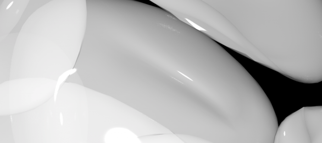
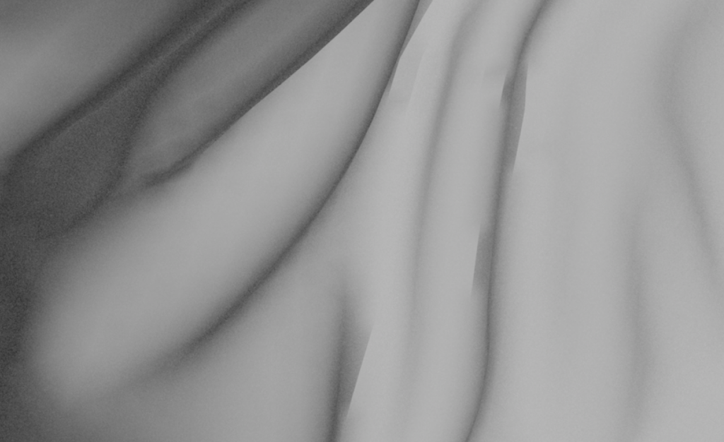
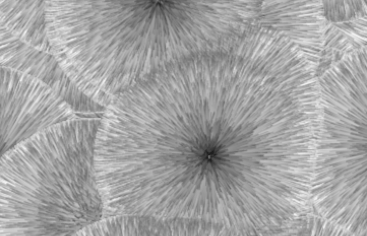
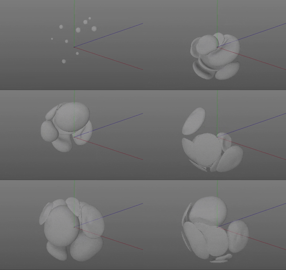
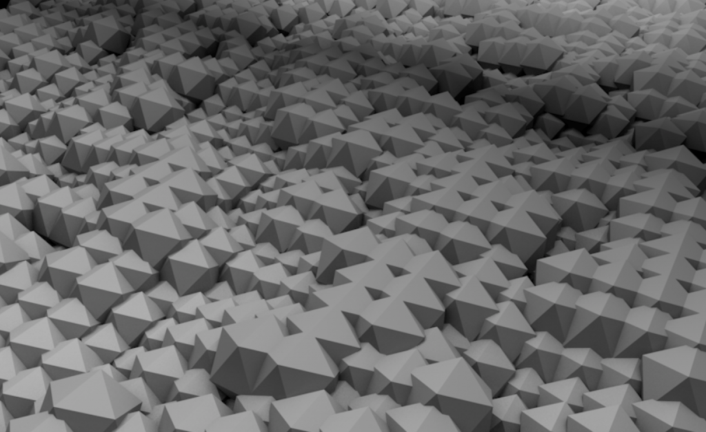 The abstract textures were created with Cinema 4D, a 3D modelling and motion graphic software. As I initially wanted to create textures that appeared as though they were emerging from the wall and towards the viewer, I need to use a powerful 3D modelling software and not After Effects. I have never had any prior experience dealing with C4D before, but I thought it would be a good opportunity to throw myself into the deep end and see how things go (with a lot of reliance on online tutorials of course).
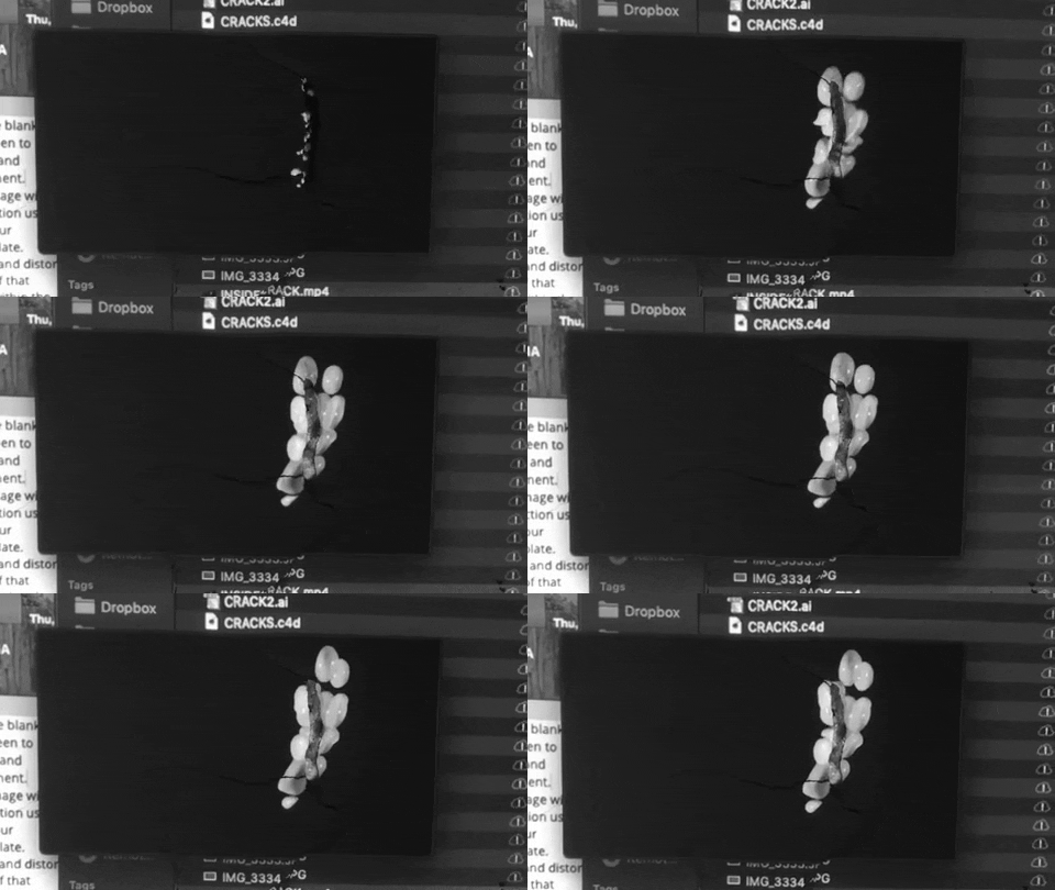
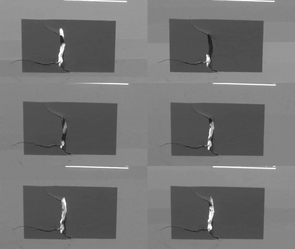
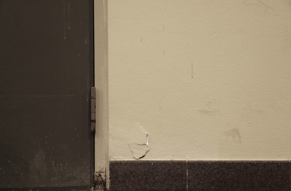
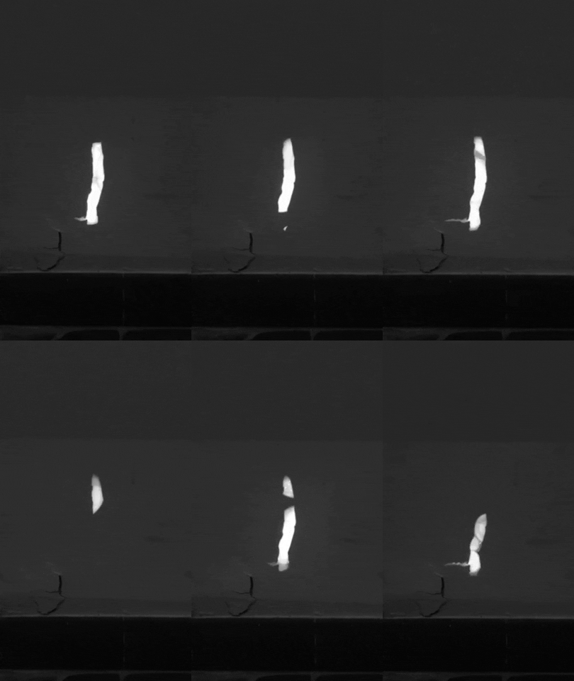 Out of curiosity, I tried playing a video of the animations hidden behind the wall. It looked as though another huge crack had appeared on the wall, and looked like a gateway to another realm! I also realised that it was quite difficult to achieve the “3D” popping out effect due to irregularities of the surface and the crack, which made it really obvious that it was a projection.
 I drew associations to the one of Wodiczko’s Polish Shoppers (maybe because they were both lone figures on a monumental structure + wearing striped shirts). There are some similarities in both Wodiczko, as well as Varda’s & JR’s work, where they bring these everyday characters to prominence through the scale of their works while revitalising “unused” spaces and surfaces. Their works communicate these stories from the people of the community that we live in, reminding us not to forget that these faces are what makes the place one that we connect and belong to.

 I thought it would be interesting to represent the turbulent history related to the building & Nantah in abstract textural forms. I created a mood board that shows the visual that I am aiming for: energetic, chaotic and volatile.
 Personally, I feel that the concept would work best if it was projected on site as the content relates directly to the context. However, due to practical reasons, I might not be able to project my work directly at the CHC. For proof of concept, I have decided to project on cracks that can be found in ADM. These are some cracks that I observed at the basement level (really wish I could tamper with the crack on the left so that I have more surface to project on), the parts highlighted in red are the areas that I could project onto.
 As I will be creating animated content that relies heavily on the movement, texture and material, I have decided to create my content with Cinema 4D. So far I have only tried 3 different types of motion with the help of tutorials, but I have yet to experiment much with creating different kinds of materials.
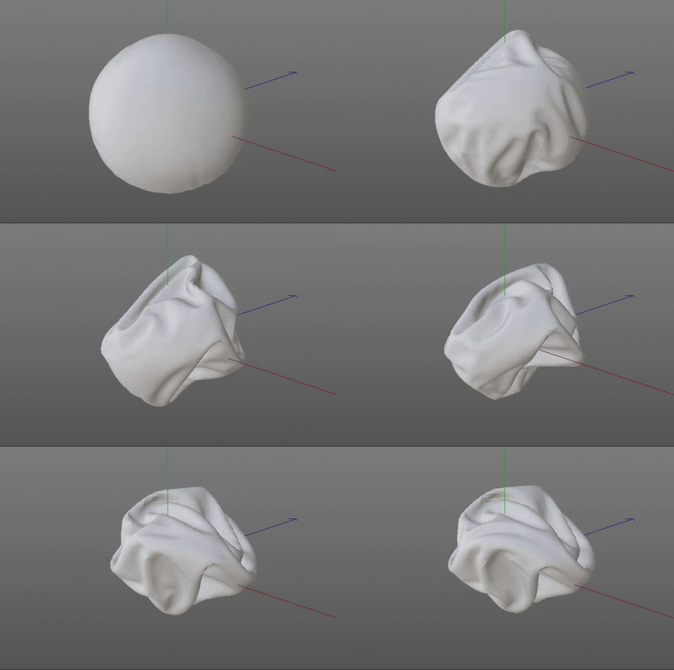
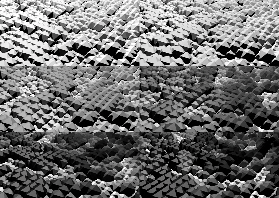
 My ideal set up will consist of 1 tiny projector, 2 speakers and a laptop. It would be best if I could somehow hide the equipment so that it doesn’t draw too much attention to the crack that easily, encouraging people to go closer and observe it.


 I wanted to bring to life the wear & tear – especially cracks – that can be found in architecture, because they usually only appear in buildings that have been around for some time. To me, a crack tells a story about the history of the building and what is has been through.
 For example, cracks in shophouses. Most of the shophouses that we see today have been around for a significant part of Singapore’s history. They have been used and abandoned and gentrified for other purposes over the years. Although its function has been changing, the structure has mostly remained the same.
 Along the lines (pun intended) of cracks and stories, I also realise that our skin, too, tells a story about us. The signs of aging that become visible on our skin over time, also reflects the wisdom that we have through our years of being alive.
 There are also the lines on the palm of our hands, which is often used in fortune-telling practices to predict the future of our fortune, marriage, kids and health.
 I like how this projection mapping work assimilates so well into the environment that it is difficult to distinguish between the physical and the digital.
 I was extremely impressed by how these usually hidden and unseen spaces in the forest are brought to life by mimicking bioluminescent qualities. They give these “artefacts” a unique character, and makes the viewer see them in a different light (ha, another pun intended).
 This last work is one of my favourite digital artworks! I love how something as intangible as memories are given a tangible form and visualised in a constantly evolving and ever-changing substance on a surface. It is something that I can look into if I am planning to translate the history of the chosen space into something visual.

