Issues in IM – Week 01

Examples of projects that addresses the notion of place, mobility or interactive environments in an innovative or thought-provoking way.

(Question: What defines space and place?
Place – specific position? Space – empty & vast?)

Image result for anish kapoor cloud gate

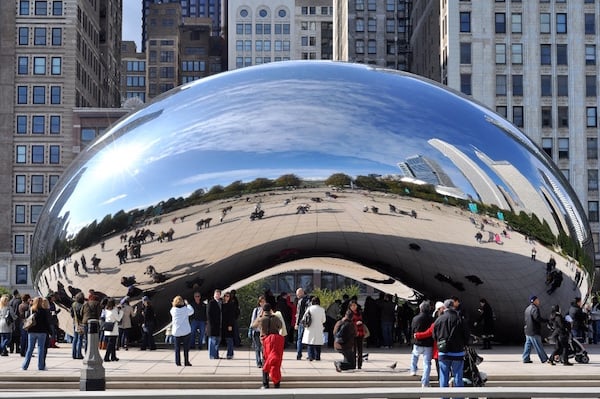
Cloud Gate by Anish Kapoor
Kapoor’s work is a site-specific, giant, reflective, bean-shaped sculpture that seeks to alter our perception of the world around us. Its reflective surface provides a wider view of the environment that surrounds the sculpture, allowing us to see it through the skewed and distorted image presented to us. The work attempts to nurture an appreciation of our surroundings, and through its very existence and significance, contributes to the idea and definition of “place” by filling the void of where it now stands.

Overdeepening by Olafur Eliasson
Eliasson’s work consists of two half-rings that appear completed when seen through their reflections – one seen from a mirror and the other from a water surface. The illusions create an impression that the ‘space’ created from the reflections is an extension of the physical space that the viewer is in. The layering of reflections – from the mirror, back to the water surface and back to the mirror again, etc. – creates an infinite chain of rings that challenges one’s idea of continuity and limitations of space.


We Live in an Ocean of Air
by Marshmallow Laser Feast
The work is a multi-sensory immersive installation highlighting the connections between us and nature through virtual reality. The work is ironic in many aspects, particularly in its attempt to portray a realistic presentation of nature through virtual means. The use of virtual reality also contradicts the idea of mobility, by only allowing us to freely navigate a space virtually (based on what we see) but restricting our physical movements in reality.
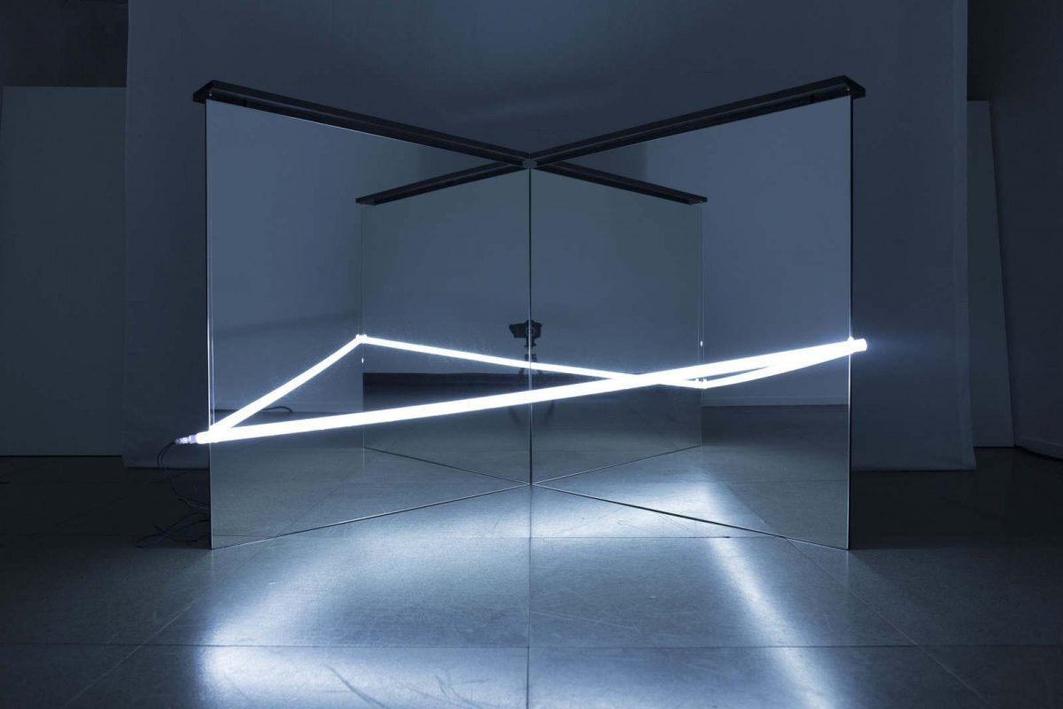
Hoshi by Nonotak
Nonotak’s work uses the simple and effective combination of mirrors and lights, multiplying them to create an infinite space. It plays with the viewer’s perception of depth and motion by utilising the illusion of reflections and movement of light.

MCM x Christopher Raeburn by Universal Everything
This work merges the physical and digital almost seamlessly. “The multi-sensory installation was created through the unique combination of radial architecture, large-scale CGI video, atmospheric lighting design and the inventive screen format hologauze – a super-fine projection material that creates a holographic illusion.”

Life / Time 03

My initial idea was to film this refraction of water and light in a time lapse, that ends with the refraction disappearing. I wanted to show how we tend to not notice the things around us and only realise it when it is too late. However, I realised that it was impossible to control the timing of which the refraction appears and disappears, because it is entirely dependent on sunlight.

On the bus ride to NTU, I noticed that there were two different things going on through the window – the scenery on the exterior and the activities happening in the bus through the reflection. I realised that I could only focus on one thing at a time, missing out on one when I looked at the other. It gave me the idea of using dual projections for my project.

I chanced upon this video while attempting to research on projection overlay. I love how the out of focus effect masks our ability to recognise anything in the video, leaving it very open-ended and ambiguous.

I may strongly consider changing my concept to something related to duality and overlay, but I definitely have to further develop it. *excites*

Life / Time 01

Upon realising that the common theme for my first two projects deal with photo outcomes that have some form of effects that include distortion/manipulation/ambiguity, I was reminded of a music video concept that really blew me away. I was amazed by the use of distortion from first person perspective and how the effect imitates the fluidity of water.

This distortion is used throughout the entire video as a form of transition that flows with the storyline. It gets more heavily distorted as the video progresses, leaving the viewer in a state of curiosity at the end.

The concept behind the video is pretty interesting as well:

blurs the boundaries between reality, sensation and perception. In the video we watch the visual manifestation that evokes what director Clemens Habicht calls, ‘the delicious euphoric pleasure that motivates the sort of mistakes that precede remorse.'” (http://www.wizz.fr/news/clemens-habicht-directs-flumes-never-be-like-you)

“After a breakup, the memories of your former lover can often feel otherworldly. They’re distorted and distant, like you’re not sure they actually happened. That disjointed reality is exactly what director Clemens Habicht tries to capture in Flume’s new video for his Kai-featuring single “Never Be Like You”. In the clip, Australian actors Sophie Lowe and Sam Reid swirl in the wavy memories of a romance freshly ended. Though the moments are romantic and tender, looking back on them from the point of being wounded isn’t the prettiest vantage point.” (http://consequenceofsound.net/2016/02/memories-are-wavy-in-flumes-video-for-never-be-like-you-watch/)

Distortion is used here as a representation of time and emotion in the situation. After sharing my concept with the class, Robert suggested that instead of distorting the video digitally, I could try using a medium that could distort the video (aka water). How can I use distortion as an expression of a situation? #thoughts

What I Remember 03

Some examples of scanography found in zines:

tumblr_nia0eoqiel1svgodmo4_1280Using objects to create patterns

tumblr_nia1kbmdxt1svgodmo1_1280Using layers of paper

tumblr_nia36e0oot1svgodmo3_1280 tumblr_nia36e0oot1svgodmo4_1280Using motion & abstraction


I feel that motion & abstraction can be interesting as it does not distract the viewer from the subject matter (image), but brings more attention to certain areas of the photo that the creator might want to emphasise on. In the example shown above, it is also very emotive & expressive although there is a lack of colour. Hope all goes well!

What I Remember 02

I’ve been thinking a lot about how I could express my emotions through editing my photos with a particular medium. I remembered a process that I came across once, when I attended a Local People SG x M2 Academy market. A particular booth caught my eye – while everyone else was selling products, this booth was selling an experience – a hand at making zines, using scanography.

Scanography is the process of capturing digitized images of objects. It uses atypical objects, often three-dimensional, as well as from photography, due to the nature of the scanner’s operation.

The booth offered a wide range of items for us to play around with, from old textbooks & examination papers to a good morning towel. Using these items, as well as the movement of the creator while the scanner was in the process, created an effect that is impossible to replicate.

Examples of the pages in the zine from that flea market:

IMG_3698 (2)
IMG_3699
I love the distortion of the images and how the effect expresses the creator’s movements and probably their thoughts and emotions when creating the zine. I also like how it makes use of existing objects to make art, giving the old object a new lease of life. I would like to try using this method to manipulate my photos to express how I feel about my childhood photos and the stories behind them.

Emo inspo

I was casually scrolling through Instagram when I chanced upon these works done by Fabienne Jousse (@fabienne_jousse_dessins) using ink & paper, which I thought was quite relevant to our current 2D project. I like the way his lines flow, and how they appear more like fabric or thread than lines on paper. I also like how he makes use of the “stop” at the end of the lines as a contributing element to his art. What I really love is that his lines are consistent in every piece of work, and each composition has very minimal dynamism, but is at the same time so expressive.

IMG_3470
IMG_3471
IMG_3472

What I Remember 01

I’ve been having problems thinking of how to execute my existing topic regarding human behaviour/reaction and expressing that through photos. I think the idea of using a set-up experiment as a form of research is interesting, but the topic I’ve chosen is really really broad and I had a hard time finding a place to start. (#self-kill)

After contemplating about my topic for the past 2 weeks, I have decided to focus on something that is more personal and close to the heart. The title of my project will be “What I Remember”, and it the central theme will be about memories (or lack thereof). I’ve always had this situation whereby I have barely any recollection of my childhood. I thought of expressing what I actually remember about my past through existing images of my childhood, with the use of old photos and pops of colour, to express my thoughts and emotions about that particular photographed memory.

Before I started experimenting, I decided to do some research on the medium of using colours on photos to see if I could get any inspiration.

1._Flower_Power_(series),_2001,_acrylic_paint_on_photography,_130x200cm

I love how the bright red colour is in stark contrast to the black & white background, immediately bringing attention to their faces (or lack thereof). It also draws my attention to the action of the subjects and their dressing.

f31231e0019da5d299657611bf71a5af
I like how the tone of the blue matches that of the filter of the photo. Giving the photo a very “soft” feeling. I also like how the brush strokes provide some form of depth and direction of an imaginary face although there isn’t one in the photo.

tumblr_mixvagRpgo1qlaxyoo1_400

The textures of the paint caught my attention because it gave a very three dimensional effect to a 2D photo. The mix of blues and whites also divides itself from the mundane black and white of the rest of the photo. The sharp angles direct the eye, further emphasising and framing certain parts of the photo.

I will start trying out by adding colour onto the photos and see if I can achieve the desired effect to bring out the emotions I would want to express.

Van Cleef & Arpels

I took some time off this weekend and headed down to the Van Cleef & Arpels exhibition at the Art Science Museum.

Van Cleef & Arpels are known for their tradition of transformability in most of their pieces. Many of their pieces have the ability to be taken apart and combined again to be used as other forms of jewellery. Here are some examples:

IMG_2843
FLYING BIRD
This gem can metamorphose into a pair of winged earrings and a brooch, while the yellow diamond can be detached from the clip and worn alone as a pendant.

IMG_2851 (1)
THE ZIP NECKLACE
This is one of Van Cleef & Arpels’ most famous creations. It is a piece of jewellery inspired by the zip fastener, which was first used in pilot & sailor uniforms in the 1930s. The Zip can be worn as an open necklace, but can also be transformed into a bracelet by sliding the tassel fringe upwards.

During the exhibition, I also identified some rocks on display that demonstrated D, SD & SO qualities.

IMG_2911
IMG_2970
Prior to attending this exhibition, I had this impression that this exhibition was for the rich tai tais who were interested in the expensive jewels & jewellery, but I was proven wrong after seeing the pieces for myself.

The display of the exhibition was really interesting, and for most of the time I felt like I stepped into a time machine, because most of the items they designed then are rarely or never used nowadays. But what really amazes me about the work of Van Cleef & Arpels is the process & technique behind their pieces. For them to be able to come up with such incredible & advanced technology at a time when the world was without, was really inspiring. Overall, I felt the exhibition gave me more insights into the world of artisanal making. It is also a good example of how things can be applied to a different context to give it an interesting form or functionality.