
W A T E R
I tried filming my shots over the weekend and experimented with different angles and combinations:
01 Surface angle –

02 Bright & dark parts placed at 1/2 point –

A for effort

My initial idea was to film this refraction of water and light in a time lapse, that ends with the refraction disappearing. I wanted to show how we tend to not notice the things around us and only realise it when it is too late. However, I realised that it was impossible to control the timing of which the refraction appears and disappears, because it is entirely dependent on sunlight.
On the bus ride to NTU, I noticed that there were two different things going on through the window – the scenery on the exterior and the activities happening in the bus through the reflection. I realised that I could only focus on one thing at a time, missing out on one when I looked at the other. It gave me the idea of using dual projections for my project.
I chanced upon this video while attempting to research on projection overlay. I love how the out of focus effect masks our ability to recognise anything in the video, leaving it very open-ended and ambiguous.
I may strongly consider changing my concept to something related to duality and overlay, but I definitely have to further develop it. *excites*
I started off by thinking of nicknames that are commonly associated to me by friends – tissue (a play on my name), sotong (because I’m really unaware and “blur“), wrecking ball (because I’m really careless and tend to ruin things A LOT). I came up with a few situations and tried to think of how the different nicknames could be fit into it. I thought that representing myself as a piece of tissue was pretty interesting, since it is a daily object that can be found in many scenarios and has quite an impact in the lives of Singaporeans (chope!). I tried to think of different scenarios where a piece of tissue could be used / found, and I gave the tissue some emotions and actions.
Mindmap of character, possible situations & outcomes:

Rough sketches of tissue in various situations:

I have yet to decide on 4 scenarios which could be interesting for a piece of tissue, will try working on it!
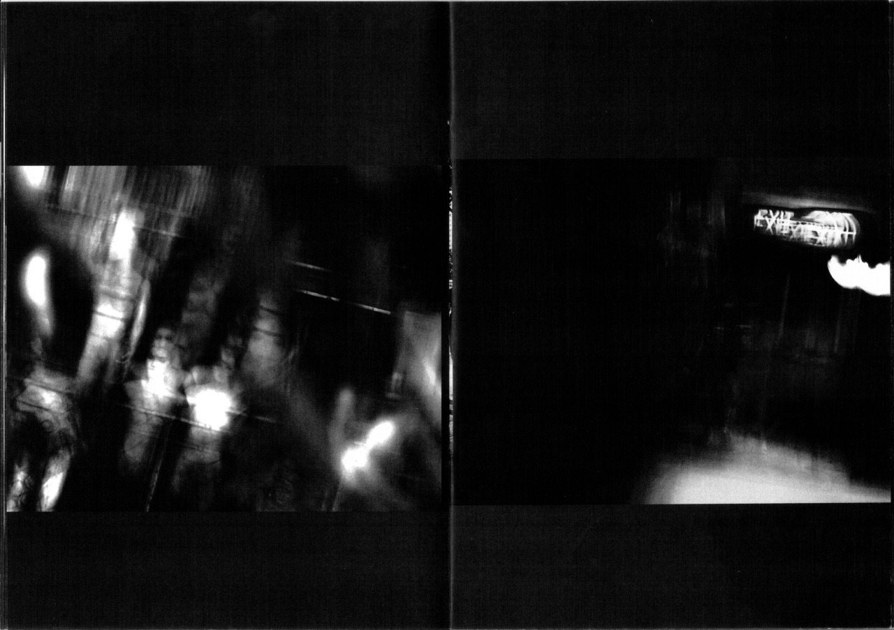
Upon realising that the common theme for my first two projects deal with photo outcomes that have some form of effects that include distortion/manipulation/ambiguity, I was reminded of a music video concept that really blew me away. I was amazed by the use of distortion from first person perspective and how the effect imitates the fluidity of water.


This distortion is used throughout the entire video as a form of transition that flows with the storyline. It gets more heavily distorted as the video progresses, leaving the viewer in a state of curiosity at the end.
The concept behind the video is pretty interesting as well:
“blurs the boundaries between reality, sensation and perception. In the video we watch the visual manifestation that evokes what director Clemens Habicht calls, ‘the delicious euphoric pleasure that motivates the sort of mistakes that precede remorse.'” (http://www.wizz.fr/news/clemens-habicht-directs-flumes-never-be-like-you)
“After a breakup, the memories of your former lover can often feel otherworldly. They’re distorted and distant, like you’re not sure they actually happened. That disjointed reality is exactly what director Clemens Habicht tries to capture in Flume’s new video for his Kai-featuring single “Never Be Like You”. In the clip, Australian actors Sophie Lowe and Sam Reid swirl in the wavy memories of a romance freshly ended. Though the moments are romantic and tender, looking back on them from the point of being wounded isn’t the prettiest vantage point.” (http://consequenceofsound.net/2016/02/memories-are-wavy-in-flumes-video-for-never-be-like-you-watch/)
Distortion is used here as a representation of time and emotion in the situation. After sharing my concept with the class, Robert suggested that instead of distorting the video digitally, I could try using a medium that could distort the video (aka water). How can I use distortion as an expression of a situation? #thoughts

I came across this book at a Basheer book sale at North Spine, and the title just really spoke to me. (I have this weird connection with failure that’s hard to explain, my friends always associate me with it.) It’s a book that is “dedicated to the art of making mistakes” by Erik Kessels. (I have no idea who he was until Robert coincidentally spoke about him during class the very next day.) The book shows the works of various artists and photographers that revolves around the theme of failure.
The book served as an inspiration for my project, revolving around the idea of failed photography and the beauty behind them. Most people tend to overlook these photos as “bad images” and never look back at it again or may have even deleted them from their albums. I would like to bring attention to the unnoticed, and remind them to be more aware. I am determined to find the photos instead of taking them on my own, because I feel that such photos have to be very natural, and not done deliberately.
Some examples of failed photography that might be interesting to explore:
 Unintentional artistic bokeh effect
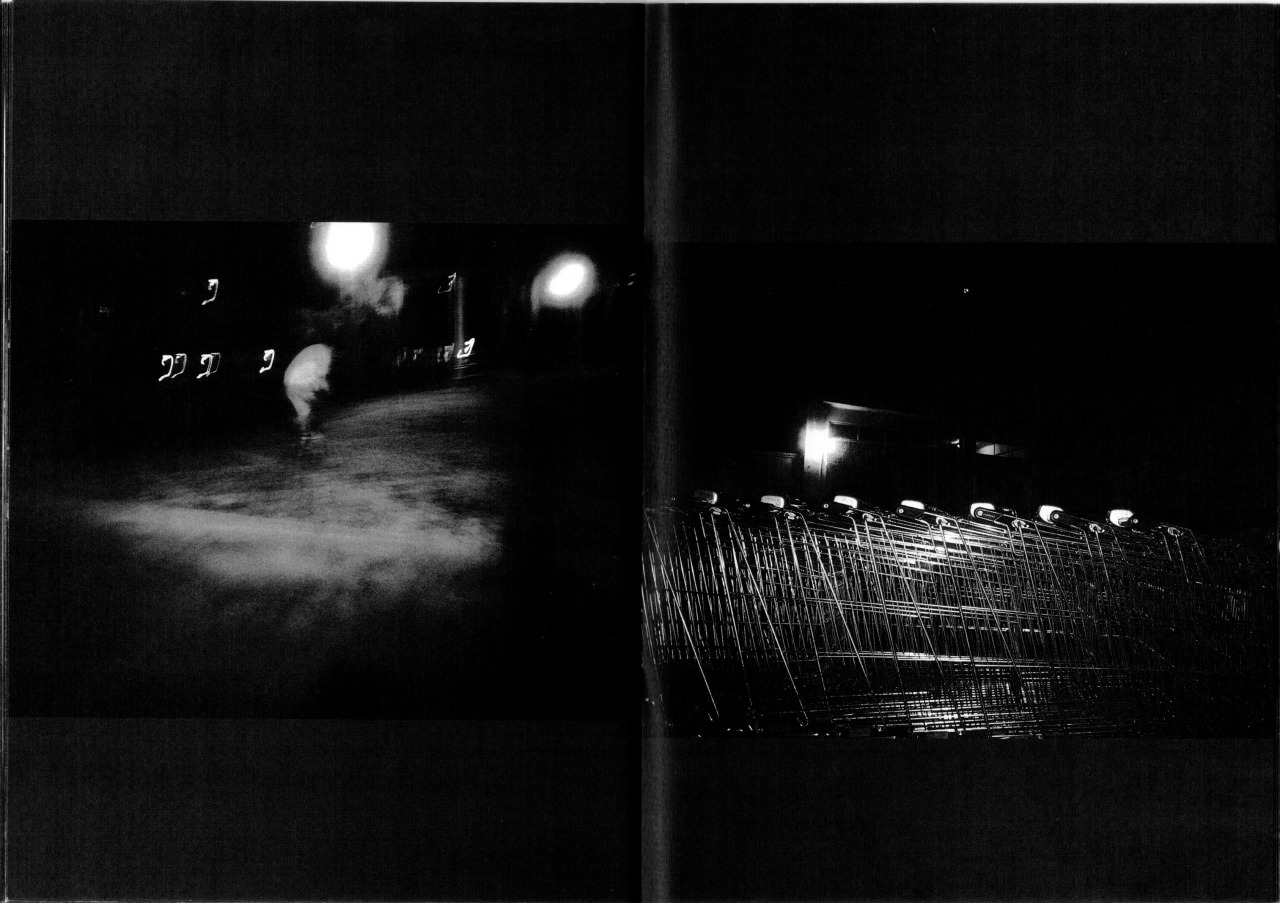
 Overexposure
 Vertical linear motion
 Rotary motion
 Horizontal linear motion
 Obscured by external sources
 Obscured within photo (Classic finger blocking)
I tried printing out the photos on different mediums for final submission. I felt like the paper base could make a huge difference in enhancing the experience of the photography project.
Printed on paper with home inkjet printer, white space cut out to test the contrast of the paper against the wall as a background.
 Printed on transparency with home inkjet printer to test out the effect.
Printed on matte photo paper with home inkjet printer.
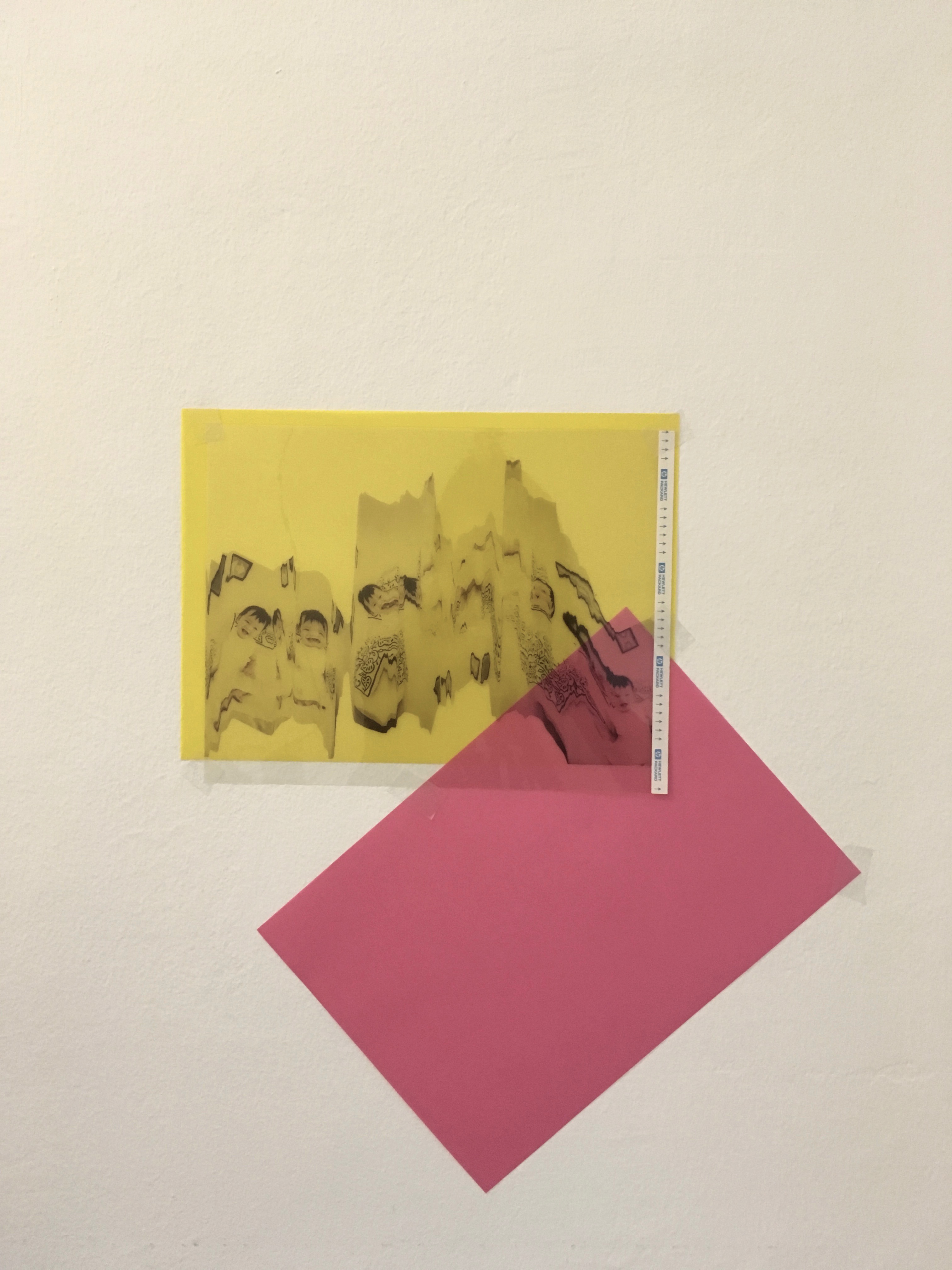 Printed on transparency and layered over a mix of coloured translucent paper to test effects of colour on the print.
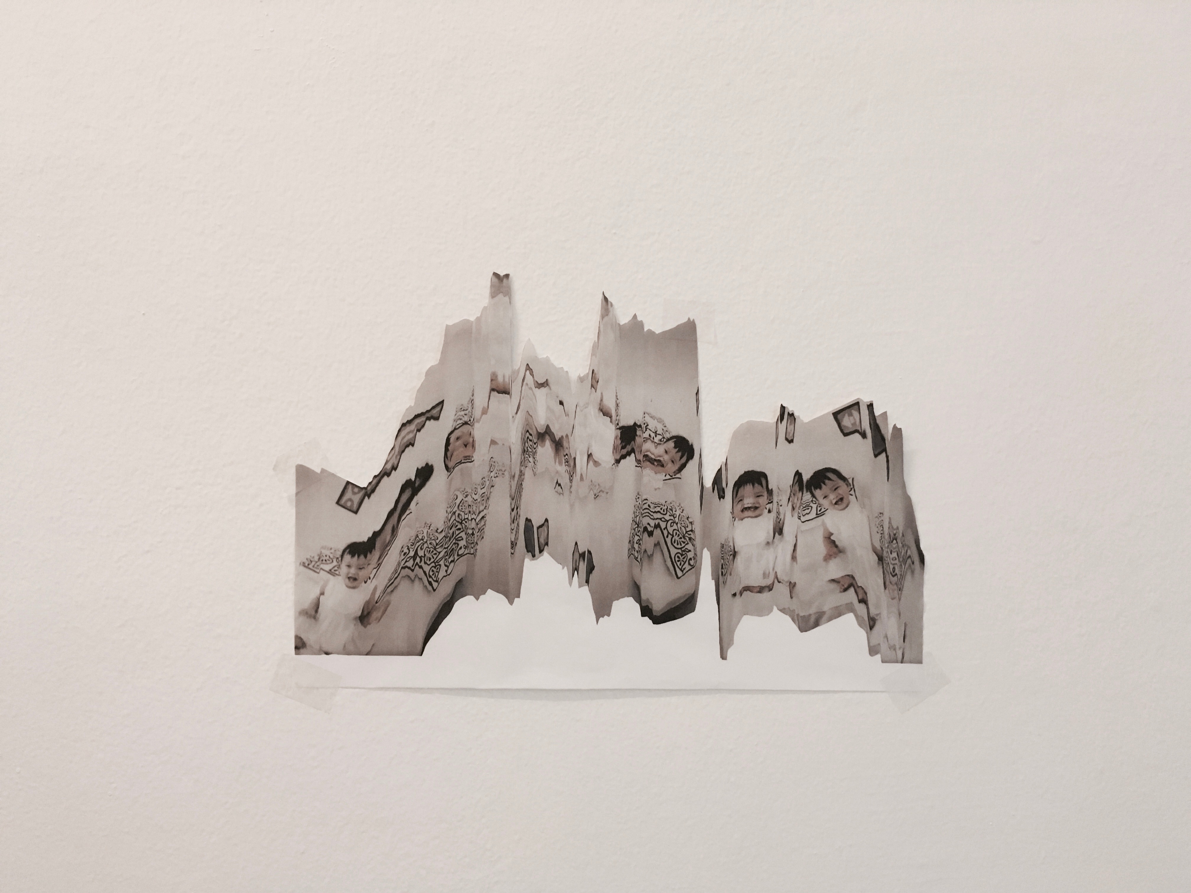
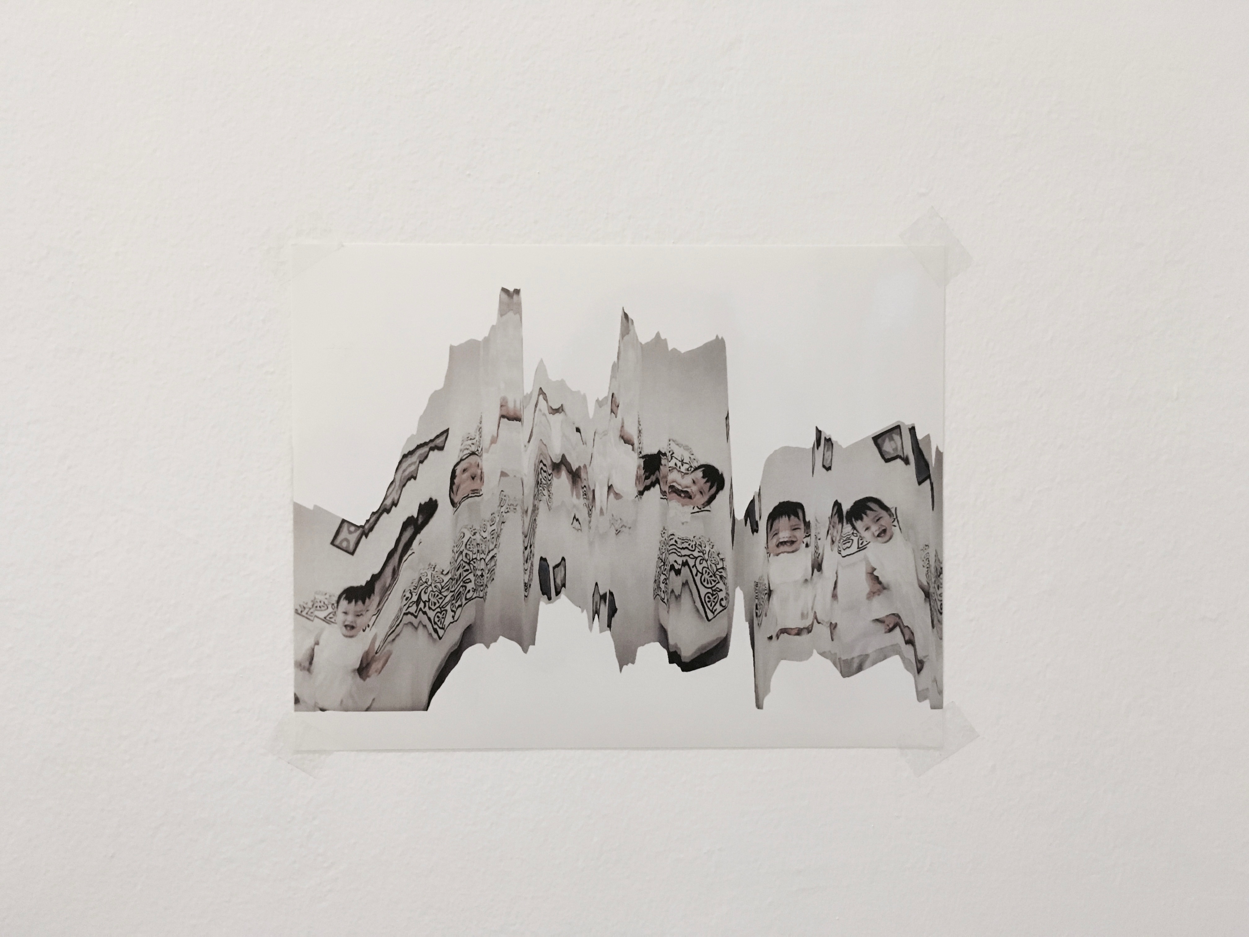
After trying to print on the few mediums that I had at home, I decided to finalise with printing on transparency. I feel like the use of transparency could open the door for a wide range of effects because of the opacity of translucent printed on transparent. I also felt like the transparency could represent the act of “vulnerability” in showing my past to the world, in the sense of me being transparent about my life events.
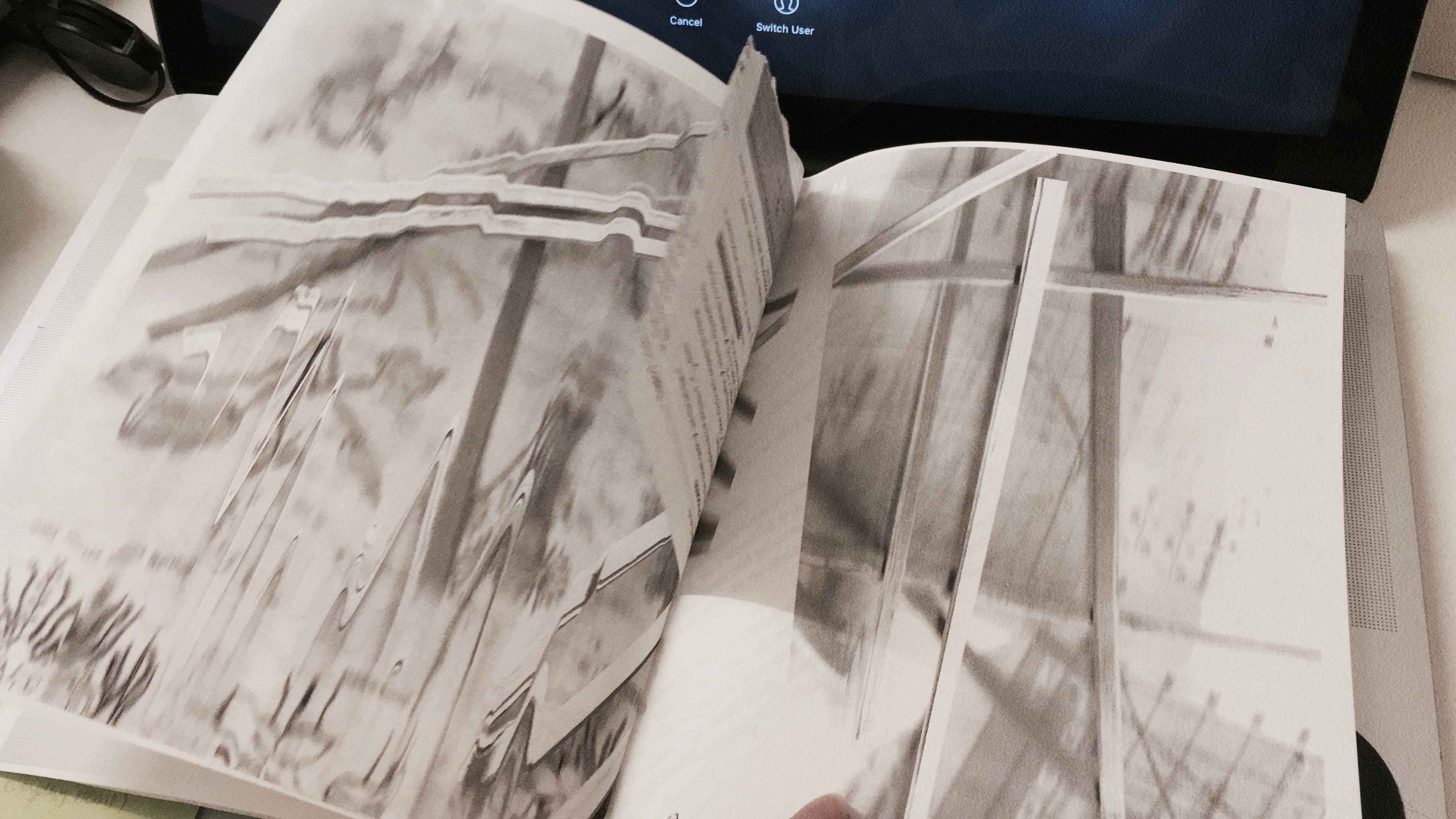
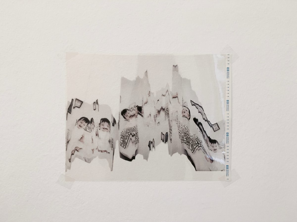
I finally got down to trying out scanography with a home printer! It’s not exactly a very tedious process, but it’s very dependent on moving the photo at the right timing to get the effect at the right position. Here’s an example of how I did it:
The outcomes from experimenting with various movements to distort the photos were quite interesting, although it is difficult to replicate the exact effect again due to the nature of the process. Anyway, here are some of the methods I tried for each photo:
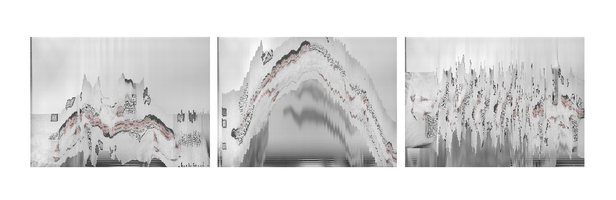
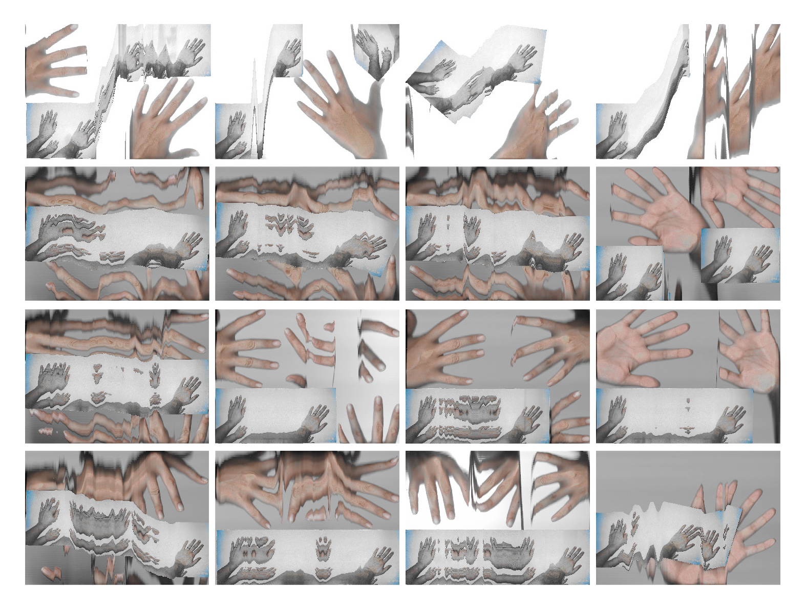
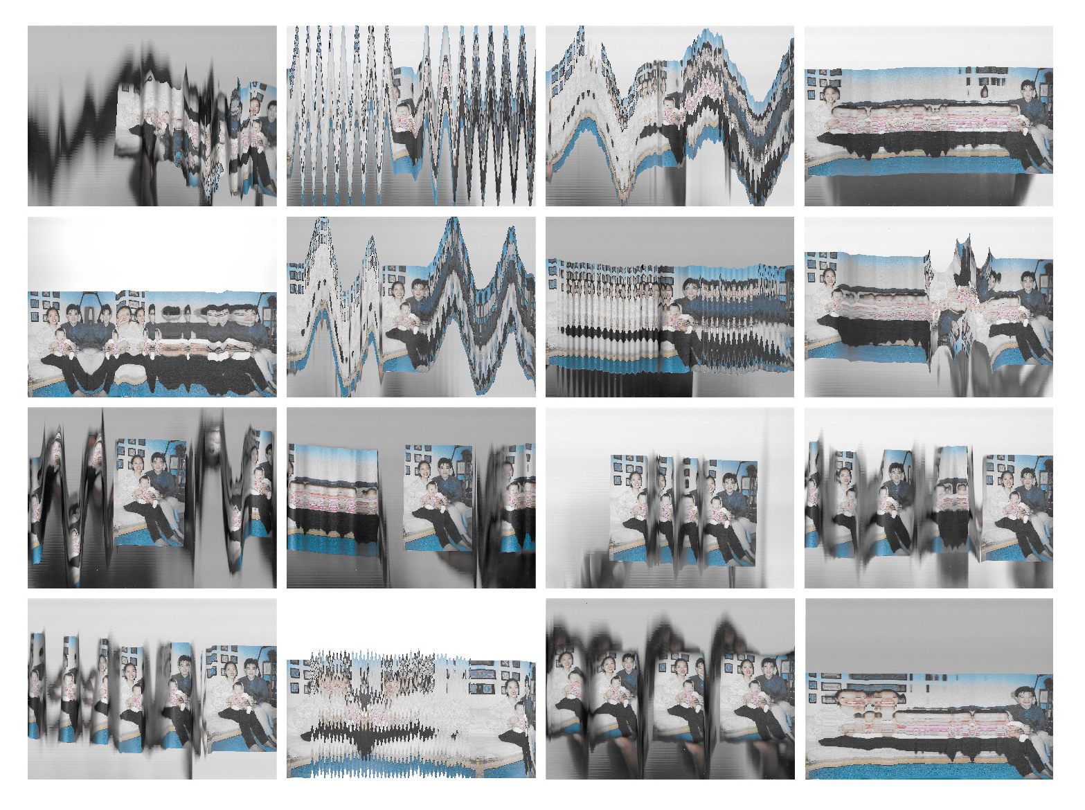
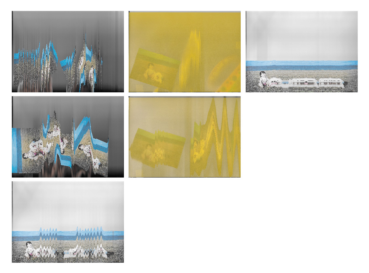
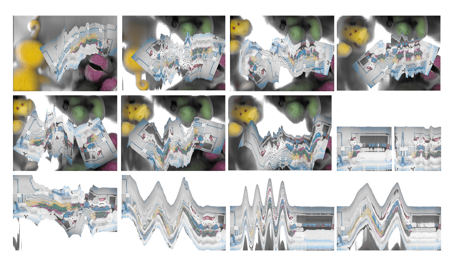
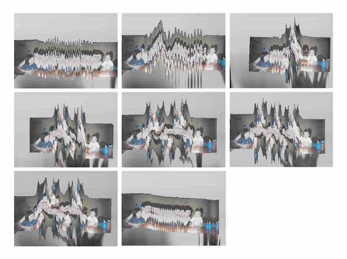
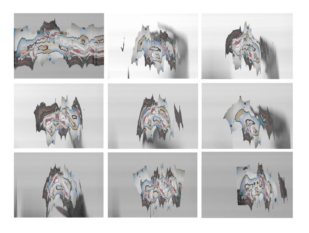
Currently it looks really really trippy and I quite like what has been produced so far. In my experimentations, I tried scanning extra elements in the hopes of enhancing the meaning of the photos. I’m not really sure if it works or how I can further improve this, will wait for the sharing session to hear what Robert & my classmates think about it so far. I thoroughly enjoyed the process of making, though I’m questioning if the photos look too complex and manipulated to make out what I’m trying to express.
Some examples of scanography found in zines:
 Using objects to create patterns
 Using motion & abstraction
I feel that motion & abstraction can be interesting as it does not distract the viewer from the subject matter (image), but brings more attention to certain areas of the photo that the creator might want to emphasise on. In the example shown above, it is also very emotive & expressive although there is a lack of colour. Hope all goes well!
I’ve been thinking a lot about how I could express my emotions through editing my photos with a particular medium. I remembered a process that I came across once, when I attended a Local People SG x M2 Academy market. A particular booth caught my eye – while everyone else was selling products, this booth was selling an experience – a hand at making zines, using scanography.
Scanography is the process of capturing digitized images of objects. It uses atypical objects, often three-dimensional, as well as from photography, due to the nature of the scanner’s operation.
The booth offered a wide range of items for us to play around with, from old textbooks & examination papers to a good morning towel. Using these items, as well as the movement of the creator while the scanner was in the process, created an effect that is impossible to replicate.
Examples of the pages in the zine from that flea market:
I love the distortion of the images and how the effect expresses the creator’s movements and probably their thoughts and emotions when creating the zine. I also like how it makes use of existing objects to make art, giving the old object a new lease of life. I would like to try using this method to manipulate my photos to express how I feel about my childhood photos and the stories behind them.
I’ve been having problems thinking of how to execute my existing topic regarding human behaviour/reaction and expressing that through photos. I think the idea of using a set-up experiment as a form of research is interesting, but the topic I’ve chosen is really really broad and I had a hard time finding a place to start. (#self-kill)
After contemplating about my topic for the past 2 weeks, I have decided to focus on something that is more personal and close to the heart. The title of my project will be “What I Remember”, and it the central theme will be about memories (or lack thereof). I’ve always had this situation whereby I have barely any recollection of my childhood. I thought of expressing what I actually remember about my past through existing images of my childhood, with the use of old photos and pops of colour, to express my thoughts and emotions about that particular photographed memory.
Before I started experimenting, I decided to do some research on the medium of using colours on photos to see if I could get any inspiration.
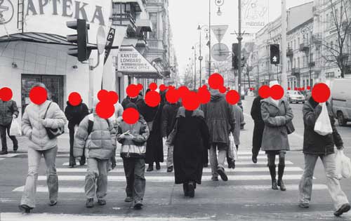
I love how the bright red colour is in stark contrast to the black & white background, immediately bringing attention to their faces (or lack thereof). It also draws my attention to the action of the subjects and their dressing.
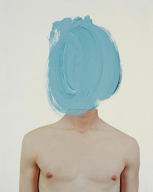
I like how the tone of the blue matches that of the filter of the photo. Giving the photo a very “soft” feeling. I also like how the brush strokes provide some form of depth and direction of an imaginary face although there isn’t one in the photo.
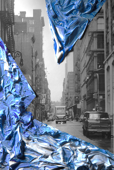
The textures of the paint caught my attention because it gave a very three dimensional effect to a 2D photo. The mix of blues and whites also divides itself from the mundane black and white of the rest of the photo. The sharp angles direct the eye, further emphasising and framing certain parts of the photo.
I will start trying out by adding colour onto the photos and see if I can achieve the desired effect to bring out the emotions I would want to express.


