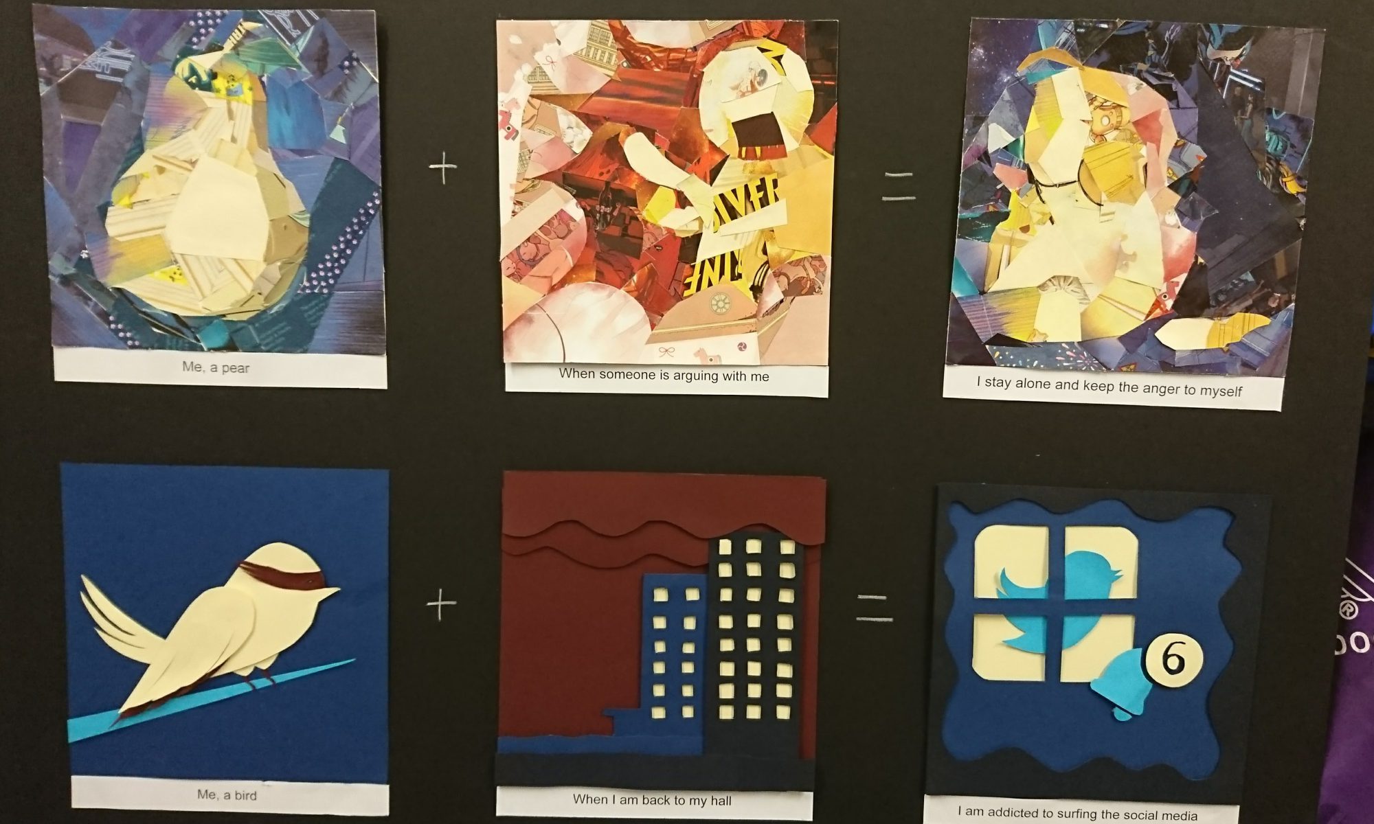
Here are my final designs for this final assignment.
Me, a pear + when someone is shouting at me = I stay alone and keep the anger to myself
The style I used for this row is magazine collage because the designs are quite simple and don’t have many details inside, which suit to the collage style.
For the color theme I choose the primary colors because the contract between each other is high. The main problem for this style is that I need to choose the color carefully so the elements can stand out instead of merge together. Base on that, the brightness of the color between each other is very different as well. For detail like the mouth of the pear I use pen to draw it.
Me, a bird + when I’m back to hall = I’m addicted to social media
The style I’m using for this one is paper craft. This is very close to digital vector illustration because the color is plain and the outline is sharp and clear, but also it has the problem that the image will be too flat. In order to solve this, I use multiple layers and between each layer I add one piece of foam to create the distance and shadow.
For the colors I choose triacial colors so I have different shadow of blue, which can create a gradient effect and a bright yellow as contrast. And the blue fit to the twitter logo color as well, to help deliver the message of this design.
Me, a pair of glasses + when I’m shopping in Daiso = I enjoy it and spend a lot of time inside
The style I’m using for this one is digital painting. Adding texture inside make it more interesting and friendly feeling. It becomes more lively also.
The color I use is complemetary colors, which can create a high contrast to help my main object stands out from the background. Complementary colors are very dramatic and can catch people’s eyes very fast.
Me, a robot + when I’m traveling with my friends = I become multi-function
The style I’m using for this row is vector illustration. This style is very common in industry, it’s clean and simple, and vector illustrations are easy to fit different printing size without getting blur.
The colors I choose to use are monochromatic colors plus the yellow as highlight. All the colors are quite dull so the highlight can stands out, and dull colors fit the impression of robot also.
The difficulty I have during this project is choosing the colors since there are too much choices. And time management also since every module is rushing for the final assignments. But I’m very happy that I can try different type of traditional style to make the designs.


