Artist Statement
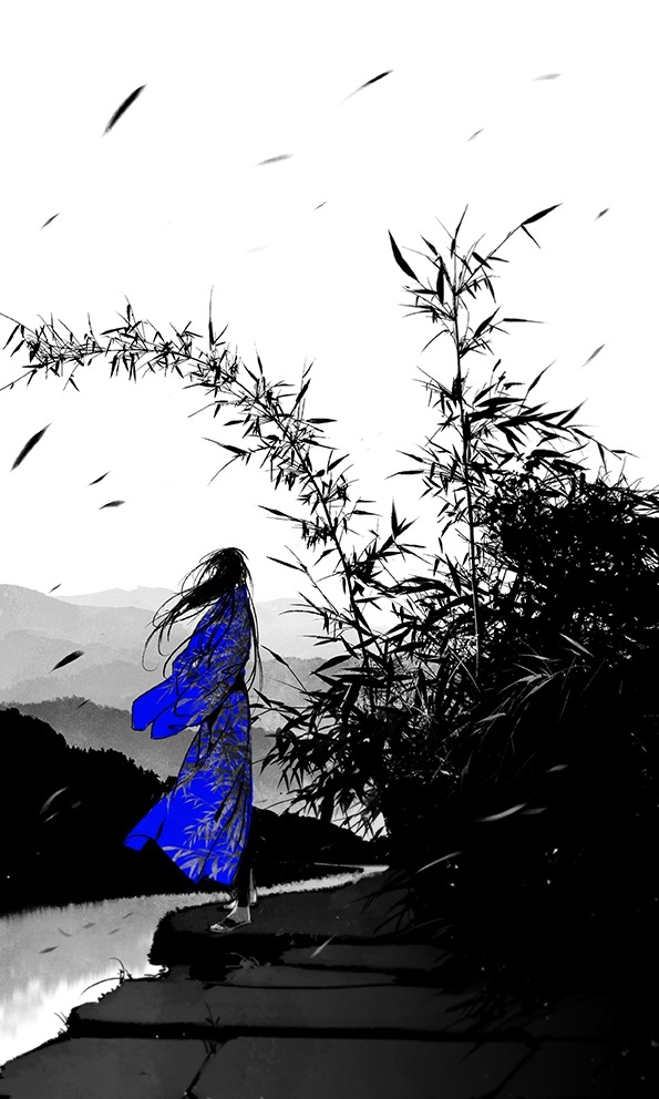
As Chinese New Year is approaching, I realised that this is the 5th CNY that I spend in Singapore. Sometimes I do feel that I’m like a duckweed which doesn’t have a strong root and only can drift with wave. I made important decisions in my life, but I didn’t really know where the path leads to, and those unknown makes me anxious. As time goes by, I learnt to be calm and composed to new environment or situation that I never expect. When things happened, there must a way to get through it, and I know I will get through it, somehow.
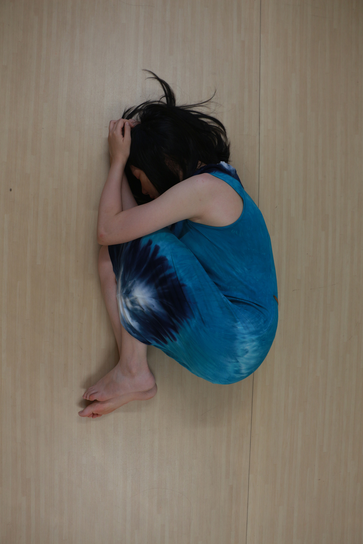
Before Image
Technical Decisions
Camera
Camera: Cannon 650D
Lens: 18 – 135 mm (Has a wide range)
IOS: 200 (It’s a indoor shooting)
Focus Length: 18 (Use wide angle to include the whole figure)
Shutter Speed: 1/40 (Based on my experience, if the speed is slower than 1/30, the picture will mostly become blur because of hand shaking)
F: 4.5 (To get enough exposure)
Digital Process
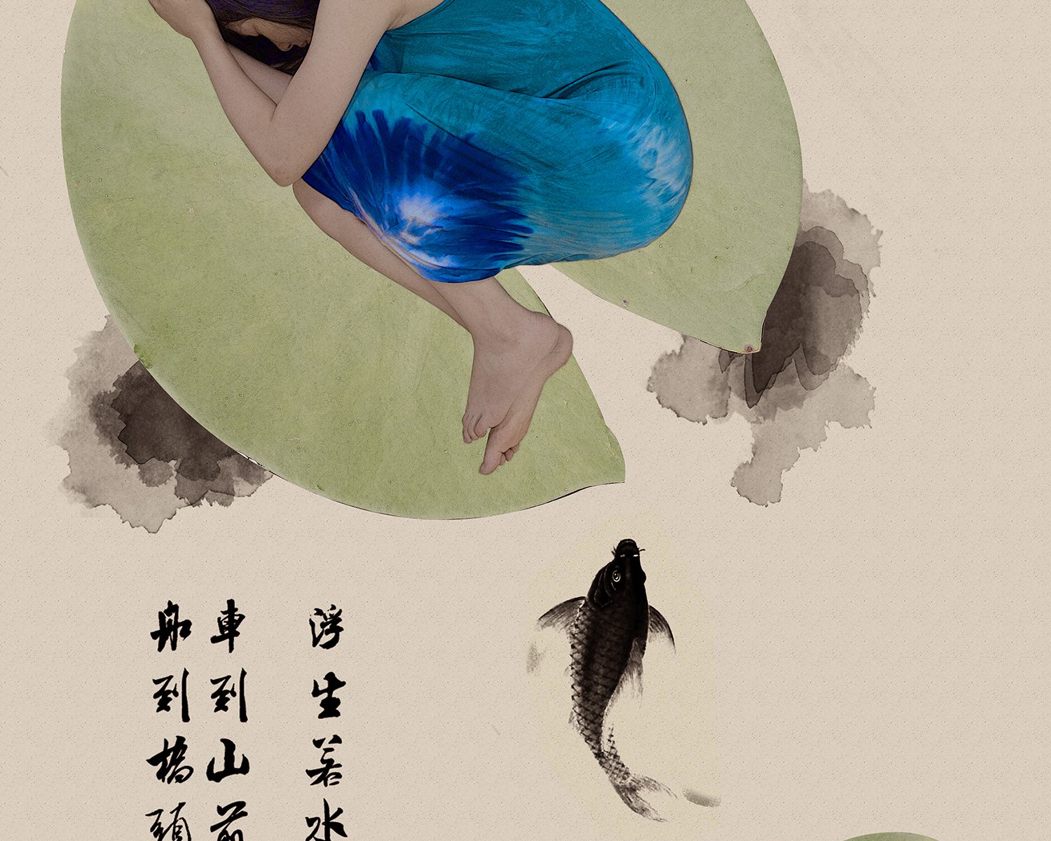
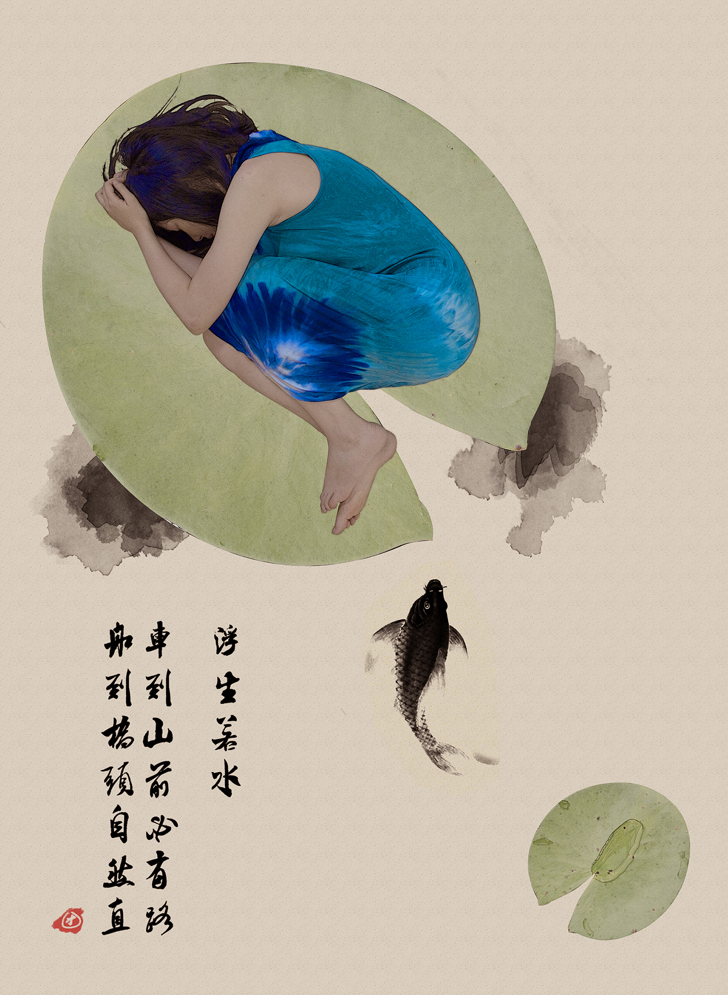
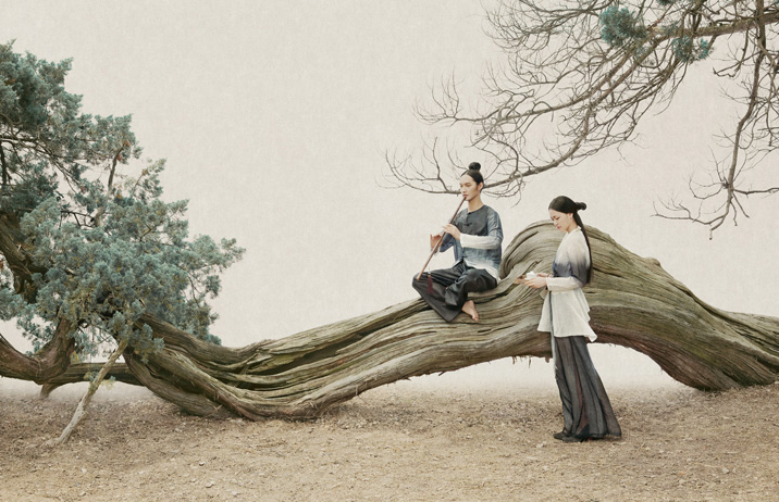
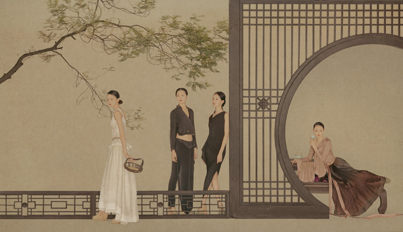
First of all I use masking to crop out the figure and the lotus leaf. Then I arranged all the elements to test the composition.
After the composition is done, I start to convert the real photos to Chinese painting style. I have done some research for tutorial, the basic steps are as below:
1. Duplicate your image and desaturate.
2. Duplicate the desaturate layer and inverse, change the mode to Color Dodge
3. In Filter, choose “minimum” in “other”, change the number according to get the line work of the image.
4. Merge the 2 desaturate layers, then there is the line of the image. Change the layer mode to “soft light”.
5. Now the photos convert to Chinese painting style, you can change the original layer mode to “multiply” then put a paper texture as background.
After those steps I desaturate the leaves a bit because it’s too bright. For the Chinese painting style that I took as my reference, I find out that the color is quite dull and more toward to yellow and brown.
To emphasis on the figure I decide to make the blue color brighter and pop out. In Chinese painting there is a blue color called lazuli blue, which is a very shining blue. So I try to adjust the blue to achieved the shining effect.
In the end I added in the fish and Chinese text to make it more looked like a Chinese painting. And I add in a bit red as well.
Artist References
1. Sun Jun
Sun Jun is a Chinese photographer and famous for his unique Chinese painting style. I was really surprised at his work when I first saw them and always want to try this style.
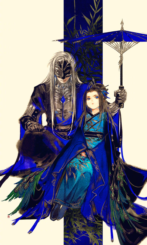
2. Ibuki Satsuki
Ibuki Satsuki is a illustrator, for this assignments I take her painting as reference for colouring, especially the lazuli blue that used in Chinese painting.