Research

Moodboard

Idea

It’s 2020, and despite how the year has been, we can’t deny society’s progression for equal rights although nowhere near perfect. That said, why doesn’t Mother Nature have rights? She’s unable to speak for herself, yet we ignore the fact and take advantage of it. But what if Mother Nature was human?

My idea is to depict Mother Nature twenty first century woman figure in this century, standing up for herself in a nature-filled environment she deserves.

https://kimsalt.com

https://www.thejealouscurator.com/blog/2017/07/21/liana-jegers/

https://www.behance.net/seheechae

https://www.behance.net/gallery/98567977/EDEN-OF-THE-ORIENT?tracking_source=curated_galleries_architecture

https://www.dezeen.com/2019/12/31/superflux-mitigation-of-shock-climate-change-future-imagined/

Idea

Singapore is labelled as a “Garden City” and has always been under control and well maintained However, due to the lockdown, maintenance dialled back and nature went wild. It was an unusual sight to see wildflowers and tall grass beside our urban landscape. 

My idea is to embrace this “wild” side of Singapore, appreciating how wildlife can live in harmony with humans.

https://mothership.sg/2020/05/circuit-breaker-wildflowers/

https://www.weforum.org/agenda/2020/06/jane-goodall-coronavirus-humanity-natural-animals-covid-finished/


Idea

Creationism is the religious belief that nature, and aspect such as the Universe, Earth, life and humans, originated with the supernatural acts of divine creation. And that one act has seemed to mess up with nature pretty badly.

My idea is to take a glimpse of a time where humans and nature lived in harmony and respect by recreating the Garden of Eden with the hint of the modern era.

http://www.jamesjean.com

https://www.instagram.com/cloudy_thurstag/

https://lucilaperini.com

https://www.behance.net/gallery/78229509/OJ


You can view the presentation through the link below:

“Research Presentation”

History Of Design Reflection

Industrial Evolution & Graphic Reactions

In the previous lecture, we focused on typography as an aspect of graphic design and how it was used as an idea of documentation. However, in this lecture, we learn about the influence of the industrial revolution on graphic design. In this period of advancement and commercialisation, more graphical designs were needed as effective and efficient methods of reaching mass audiences.


Art Noveau

Amongst the various graphic design movements we learnt about, the Art Noveau movement caught my attention for both its unique style and story.

Art Nouveau is an international art movement popularised from the 1890s to the 1910s, which could often be seen employed on art, architecture, jewelery, poster design and illustrations. It was characterised by its use of long, sinuous, organic lines and sense of dynamism, often given by whiplash curves.

The art nouveau movement was a deliberate attempt at creating a new style, free of the imitative historicism that dominated much of the past movements. It was also inspired by the Japanese woodblock printing style “Ukiyo-e”. It really amazes me how the arts and design can transcend from region to region despite cultural and behavioural differences. It’s always heartwarming to see how the arts and design solely portray meaning and emotion through aesthetics and graphics that anyone can appreciate and understand despite language or educational barriers.


https://en.wikipedia.org/wiki/Art_Nouveau

https://www.britannica.com/art/Art-Nouveau

History Of Design Reflection

Writing to Typography


In the first lecture, we learned about how type first came about and how they have evolved over the centuries. It was interesting to see how the environment and advancement of each era influenced the evolution of type, from simple carvings on the wall to ink on parchment followed by the great innovation of the printing press on paper.


Letterpress Printing

Through the lecture, letterpress printing was something that really piqued my interest. Letterpress printing is the technique of relief printing using a printing press, it was invented by Johannes Gutenberg in the mid 15th century and remained a widely used technique until the second half of the 20th century. Not only did the invention make printing more efficient, but it also allowed the greater spread of communication materials. I believe this invention truly shaped the way we design type today.


Additionally, it is also really impressive how letterpress printing has been revived in this age as an artisanal form. Even in Singapore, there are multiple printing studios that focus on the craft of letterpress printing such as The Gentlemen’s Press and The Fingersmith Letterpress. It is great to see these traditional form of printing carry on a legacy, continuing to inspire the next generations of designers.


https://en.wikipedia.org/wiki/Letterpress_printing

https://thegentlemenspress.com

Anxiety Toilet Conceptualisation

Anxiety Toilet


Idea

When seeking peace and quiet during a sudden anxiety attack, one would usually consider a toilet as the first place of refuge. With the given privacy of a toilet, one can stay hidden from the public eyes and avoid breaking down.

However, the Anxiety Toilet is not the toilet for such situations. As a dark object, the Anxiety Toilet will amplify the fear of anxiety in an enclosed space. Our interaction uses sound and light to amplify common symptoms of anxiety such as hyperventilation, panic, worry, stress, sweating, trembling, fatigue and increased heart rates.

Calming jazz music plays when there’s no one using the toilet, acting as a false place for “anxious refugees”. Once seated on the toilet bowl, the proximity sensor will be triggered causing the lights to flash and sounds of paranoia to play. The textured wall in our set up creates an optical illusion along the walls as the shadow bounces off the crevices of the walls. The sound effects start off rather gentle at first but soon amplifies with heavy breathing and loud white noises accompanied by flushing sounds.


Process

You can view our process video through the link below:

“Anxiety Toilet Process”


Materials

  • Arduino Board
  • Bread Board
  • IR Sensor (SHARP GP2Y0A41SK0F)
  • RGB LED Strip (2812B)
  • External Power Source
  • Wires
  • Crocodile Clips


Instructions

Step 1

Connect IR sensor in the following sequence to Arduino Board:

Red Wire (VCC) to 5V

Black Wire (Earth) to Ground

Yellow Wire (DATA) to A0


Step 2

Connect 2812B LED Strip into the Board and to the External Power Source:

Red Wire (VCC) to + of Outlet

Yellow/White Wire (Earth) to – of Outlet

Green Wire (DATA) to Pin 3


Step 3

Connect to the Arduino to your Device and link it to Processing for Music to be played via Minim.


Reflection

This project has allowed me to truly understand the connection between tech, design and interaction. 

It has shown me what a key role interaction plays in design. Often we end up design “for ourselves”, in the sense that if something works for us we assume it works for everyone. However, though the various project tests in class I came to realise how different people often had different reactions and actions to the same given object or space. I realised how we can’t simply expect people to interact and do things in a certain way, instead, we had to understand the behaviours of people and readjust our designs to them.

It was also really interesting dabbling into the world of coding. In all honesty, most codes still seem like a foreign language to me. However, they are no longer a complete blur, I can now understand some simple codes and their functions. Although coding was really tough, it was really satisfying to see the code work and I think that made all the work worth it.

This project and module has really broadened my knowledge of the interaction design field and has made me much more curious and appreciative for interaction design. 

Despite all the challenges along the way, I am glad there was Lei to guide us through all the disruptions in our codes and lastly, I am thankful for having a great group mate, En Qi. We were able to split the work evenly and were on the same page throughout the project.


You can view our showreel through the link below:

“Anxiety Toilet”


A group effort with:

En Qi

Form and Visualisation Final Assignment

“In”


“In”, like its name, encourages people to come in and immerse themselves with nature and design.

The two organic shaped buildings in “In”, were created with a minimalist style and approach in order for them to stay subtle, giving the exterior nature elements the main focus of the space.

The larger building in “In” is an Environment Design museum that will exhibit and feature design works of environmental sustainability, while the small building will be a reception space. The exterior area is meant for the people to simply enjoy the natural elements while relaxing.


You can view my Design Report through the link below:

“Design Report”


Graphic Form Project 2B CPJ

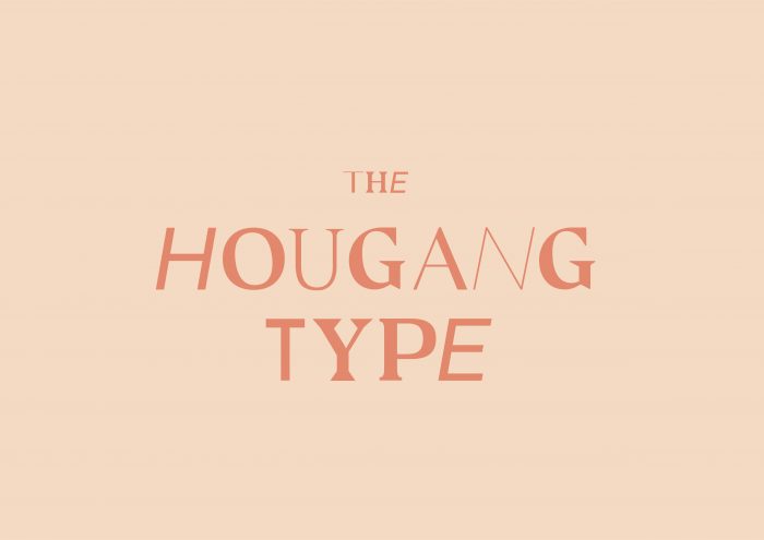
Locale : The Hougang Type


Brief

For this project, we were tasked to create an A5 size 8pp zine that explores the neighbourhoods we lived in. We were to showcase our neighbourhoods from our own perspective. 

I have lived in Hougang all my life and I thought that this would be a great opportunity for me to really display what I knew about Hougang as well as what I loved about the place. Twenty-one years in the same place is a really long time. I lived, breathe, studied and grew up in Hougang. Most of my fondest memories of my friends and family are all within walking distance in the vicinity of my neighbourhood. 

Hougang is my home.


Ideation

Honestly, I actually enjoy taking aimless walks around my neighbourhood with some music on, and I often opt to walk from place to place within my neighbourhood if I wasn’t in a rush for time or when the weather wasn’t too crazy. One thing I often conclude was that Hougang was really a hidden beauty.

I feel that Hougang still retains much of my childhood nostalgic interpretations of Singapore, especially in the type. To be brutally honest, the type in Hougang is nowhere near any graphic designer’s standard, however it authenticity and old “school-ness” is what makes it so simple and beautiful. The handwritten signs and Chinese calligraphed shop branding have their own uniqueness and I felt this was something I wanted people who do not live and live in Hougang to take a second look at and appreciate. In this day and age, we are often so preoccupied in our own worlds, looking at those tiny rectangle screens, we call phones to look around and appreciate the beauty that surrounds us, it was even proven in the survey I conducted for research where 62% of those surveyed admitted to being oblivious to their neighbourhoods.

Therefore, my idea was to create a zine that appreciated the type in Hougang. The zine was titled, The Hougang Type, which connotates two meanings. The typography in Hougang and the type of beauty in Hougang. 


Inspiration

For the design of my zine, I drew inspiration from the concept of brutalism. Brutalism in graphic design is a myriad of systems fonts, irritatingly positioned images with no distinctive hierarchy and a lack of symmetry. It was basically any design that could evoke a headache.

In other words, when you encounter a brutalist design, you certainly won’t miss it. And this was the same view I wanted people to have for the type in Hougang. Despite the visually offensive, raw and retro designs of Hougang’s type, I didn’t want people to miss it. Instead, I wanted these “ugly” type to call out for attention in order to be appreciated for their own beauty.

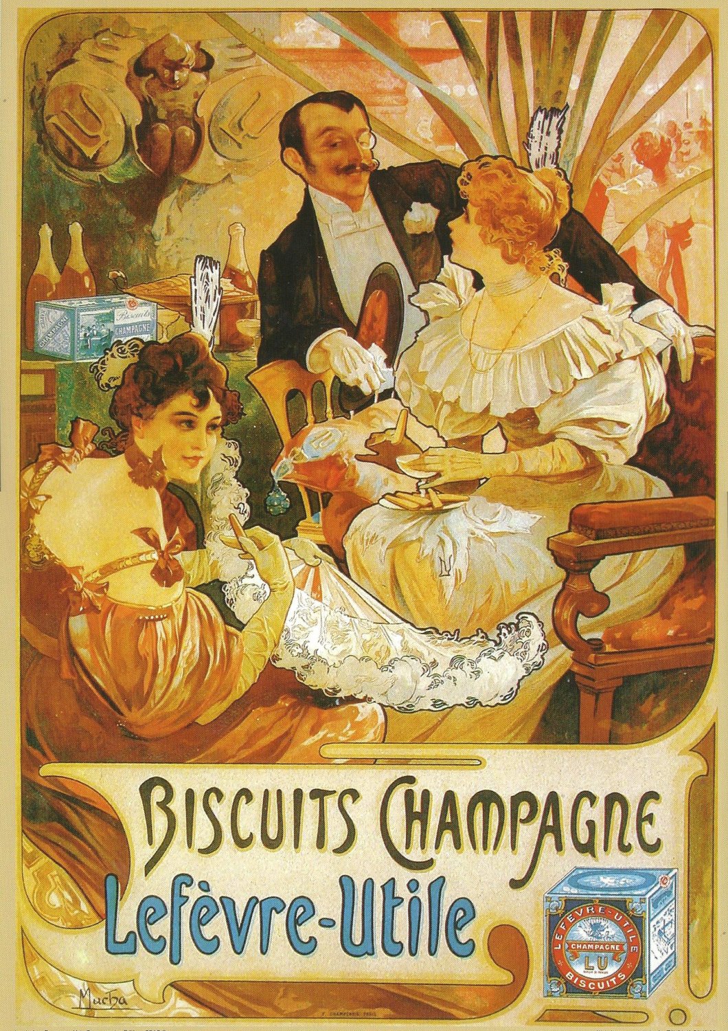
Here are some designs I drew inspiration from…


Developments

Of course, despite knowing what I wanted to do and how I wanted to do it, actually doing it is much more difficult and the results are often unpredictable. 

Below are my developments in design…


Cover

Initially, I wanted a purely type-based cover. However, after consultations with Shirley, she explained how a pure type cover may be a bit unattractive as compared to a vibrant cover with imagery.

First Spread

For the first spread, I wanted it to be an introduction to the zine as well as a guide on how to appreciate type. If one followed the flow chart, it is actually a step by step guide. At first, I planned to simply use contrasting typefaces to create the design however by doing so I was not really using typography from Hougang and that would defeat a zine that main purpose was to showcase the special type in Hougang. Thus, I brought my camera and went all over the neighbourhood looking for the words I needed.

Second & Third Spread

Initially, I was going to split the second and third spread into either two of the categories, type in architecture, type in people and type in things. However, after shooting the images I came to realise that there were a lot of overlaps within these three categories and eventually decided to use both spreads to simply showcase the unusual and beautiful type hidden in signages and communications in Hougang. 

Back Cover

The back cover was pretty straightforward. I wanted a clear key line map that matched the style of my zine to show and guide viewers through Hougang to view the beautiful hidden type. 


Conclusion

All in all, despite the sleepless nights and photoshoots under the scorching sun, this was a really fun project where I got to go around my favourite place in Singapore. My very own neighbourhood, Hougang.

In all honesty, I kinda believe this assignment was designed for us, who may have lost touch with the places we grew up in as we have grown older. This is especially relevant for those who may live on campus, far away from their homes. It definitely gives us a good reason to go back and revisit our homes and surrounding neighbourhoods. the project has also reiterated the importance of paying attention and appreciate our surroundings. I hope this project continues on for the next batches of design students in ADM! 

Form and Visualisation Assignment 3

Form Making


Orthographic Drawings


Process


Final Model


This assignment was a new experience for me. I have never really made a model before, I had always used photoshop to composite fake model instead. It was a really tedious and time-consuming process, however, the results made it all worth it. Being able to hold and feel what I had imagined in my head whilst drawing the sketches was pretty incredible. I also gained a new appreciation for the surfaces of objects. After sanding my model for days and nights, I was impressed by my own efforts on how smooth I could make the finishing hahaha!

Through this assignment, I learnt the difference between scale in two dimensional and three-dimensional objects. When I sketched out my model in for the orthographic drawing the overall size of my model seemed right, but after building the model, with much sanding, the model still seemed rather big for a hairdryer. This made me understand the reason for building a model and the importance of it.

Micro Project 4

Disobedient Objects


The Disobedient Object

Our disobedient object is called the “Aka-Pan”. Aka is Japanese for baby and just like an annoying screaming baby, the “Aka-Pan” screams when it’s hot. This is a contradictory twist on the sole purpose of a cooking pan, to transfer heat and be hot.

The “Aka-Pan” comprises of a temperature sensor and buzzer that is connected through the Arduino. When the temperature is hot, the buzzer rings alerting its user that it does not want to be hot and discourages them from cooking. This can also function as a kind of alarm that reminds forgetful users that they left the pan too hot. The Aka-Pana is both disobedient and thoughtful!

You can view our promotional video through the link below:

“Introducing the Aka-Pan”


The Process

We first started our journey to create the Aka-Pan with a simpler exercise, using the temperature sensor to light up and control a LED bulb. We followed an online setup and code. Without any issues, the LED worked and the brightness was indeed influenced by the temperature read on the sensor!

Next, we had to swap out the LED bulb for the buzzer instead. This was when it all got messy and the confidence we gained from the first exercise completely vanished. It was really hard to find a matching setup and code that actually worked. We searched thoroughly online for some help with the setup and codes, however, the online sources we found had either really bad quality photos of setups or really complicated codes which we could not understand, let alone manipulate. We wanted to get a consultation with Lei but all the timings had been booked… We then decided to try combining what we learnt previously in class on the buzzer setup and joint it with a set up for the heat sensor we found online. After much troubleshooting and failed attempts it “kinda” worked! The only problem was that it was reading a degree of like 200 plus? Hahaha. We ended up burning our only temperature sensor and had to call it a day. Turns out, we mixed up a few of the negative and positive pins for some of the elements. After going down to Sim Lim Tower and getting more temperature sensors, we re-essembled the setup with the pins in the right directions and it finally worked.

I think we learned a pretty valuable lesson from all this trial and errors, it is not about copying the codes and following the setups we learn in class. We believe that it is necessary to actually understand how and why it works in order to be able to manipulate it to work for other various projects. 

You can view our making video through the link below:

“Behind the Aka-Pan”


The Setup

The is our set up for the Arduino board. 

One thing we realised when attaching the pan is that the crocodile clips can’t touch each other, otherwise it messes up the readings. (You learn something new every day.)

Yes, we also made the stove hahaha.


The Code

Well one thing we learnt from using an Aurdino is that open source is really important and can really help dire students like us. Hence, here’s the code we used for our project! Feel free to copy it haha!


float sinVal;
int toneVal;
unsigned long tepTimer ;
void setup() {
pinMode(8, OUTPUT);
Serial.begin(9600);

}

void loop() {
int val;
double data;
val = analogRead(0);
data = (double)val * (5 / 10.24);
if (data > 16) {
for (int x = 0; x < 180; x++) {
sinVal = (sin(x * (3.1412 / 180)));
toneVal = 300 + (int(sinVal * 150));

tone(8, toneVal);
delay(1);
}
} else {
(data < 16);
noTone(8);
}
if (millis() – tepTimer > 50)
tepTimer = millis();
Serial.print(“temperature: “);
Serial.print(data);
Serial.println(“C”);

}


Despite multiple challenges along the way and a few burns from the temperature sensor, this was a really exciting experiment and we can’t wait for the next one!


A group effort with:

En Qi