In this post, I will be sharing the artist and his works which greatly influenced me for my first final project: Image Making Through Type. The artist which I will be introducing is John Ed De Vera, a multidisciplinary designer based in Manila, Philippines. However, his notable strength would definitely be through paper cut as an artistic medium within the projects which he executes.
———————–
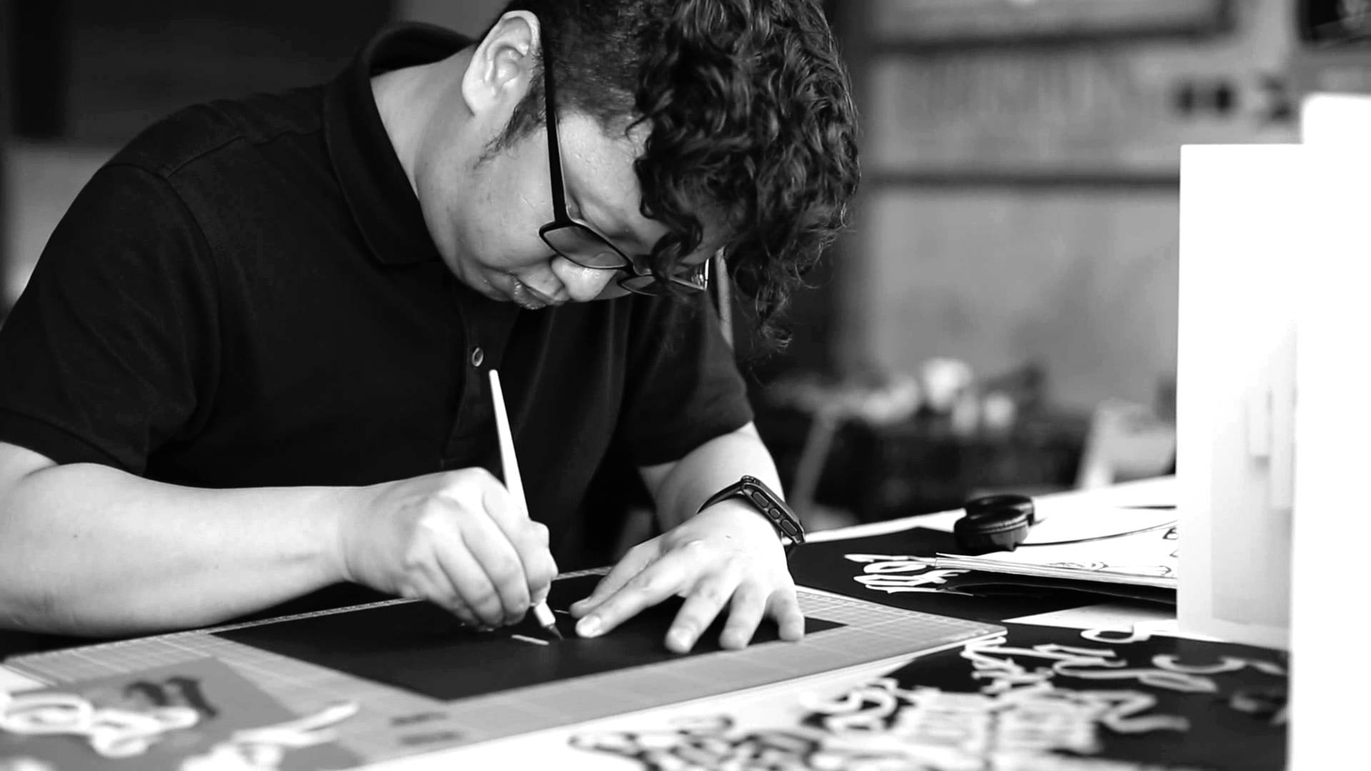
John Ed De Vera
A Short Introduction

Photograph of John Ed De Vera derived from
https://www.creads.fr/blog/book-freelance/john-ed-de-vera-creations-papier
John Ed De Vera has a great love for paper, which he exuberantly shows off within the creative projects he takes on. The artist’s love for typography as well as calligraphy is clearly demonstrated within what he does as well as the commissioned projects that he takes on as challenges.
John is currently a creative director for the design department at TBWA/SMP. In almost majority of his projects, the artist has paired the main medium of paper with other varying and interesting materials that contrast the texture of one another. These consist of: copper wires, sugar and strings (just to name a few). It is, however, his capability to use paper in its whole and natural state to create a variety of perceptions and perspectives with the aid of foam, that really had me impressed. What really influenced me were the clever color choices chosen and the tactful usage of light to create effects such as depth and curvature within something as flat as paper. Loving color, I found paper cut to be a medium that I would enjoy since I would have fun pairing one color with another.
For a while now, I have taken interest in his works of art but never had the guts to work on paper cut and use him as a point of influence within any of my projects. I’ve followed him on the social media platform, Instagram, for about a year or so now. It wasn’t until Image Making Through Type, had I wanted to finally take upon the challenge. Since first semester of 2D was all about using photoshop for me, I wanted to attempt a traditional medium that would prove to become an obstacle yet become a first hand learning experience. After all, if I wasn’t going to attempt something new now, when will be the next time I begin to feel motivated to do so once again?
John Ed De Vera works with paper not only as the flat surface it is typically perceived as. Instead, he allows the paper that he works with to take several various forms depending on the sculpting method used. The medium is common, yet there are many different ways it can be interpreted as.
You can find out more about him with the following hyperlinks I have embedded below:
The Floating Magazine & Inspiration Grid
Influential Works
Photograph of John Ed De Vera derived from
https://i.ytimg.com/vi/r3hGTZppavY/maxresdefault.jpg
An Inspiring Journey
MOLESKINE x TMALL

Image from johned.co
This artwork, titled An Inspiring Journey, is a paper cut artwork for Moleskine, as John Ed De Vera partnered together with TMall’s 11.11 annual shopping festival. It was launched in November 2017. The artwork was is currently being displayed in Shanghai, China at the Moleskine store in K11 Shanghai, one of the malls in Shanghai.
Since I wanted to approach my 4 panels with an actual setting/scene taking place, I decided to use this work of John Ed De Vera’s as my major source of inspiration. Here, the main focal point is clearly the girl; larger in scale, in comparison to the other full-sized figures surrounding her. The contrast between colors are not too jarring and everything is still sensitive to organisation. It seems as though, in some areas, some layers pile up a lot more, in comparison to others. This has been a common technique I have seen, used in a majority of the artist’s works. Going back to the middle girl as the focal point; her hair is made out of multiple layers of the same colored paper, stacked up against one another to create a stronger sense of shadow and depth. This immediately catches the audience’s attention as opposed to everything else drifting in the background; as if giving context to what the middle girl is experiencing or feeling. The background is made out of only 2-3 layers, making it a drastic contrast with the number of layers involved with the girl in the foreground. Even though there is complexity within the entire artwork, there is a sensitivity to lightness/brightness (left) as well as a gradual transition to darkness (right). The color palette is well picked out, with lighter and darker tones of chosen hues to create perspective within the flat medium.

Image from johned.co

Image from johned.co
In the above images, we can see a detailed picture of the background. Note that there is barely the use of foam to heighten multiple layers. Simplicity with layers become key here and colors help to ‘unflatten’ the image at hand. With more colors being used, the less there seems to be of foam. The layers are simply stuck one on top of the other with what seems like just glue.

Image from johned.co
With this image, a greater height between each of the layers become much more prominent to the visible eye. The use of what seems like foam is obvious, emphasising more upon the character’s features. Here, the lack of colors actually help to create a greater sense of depth since the shadows casted between same colors become more apparent in contrast.
The Washington Post Brand Studio
Illustrations for PRUDENTIAL x JOHN ED DE VERA
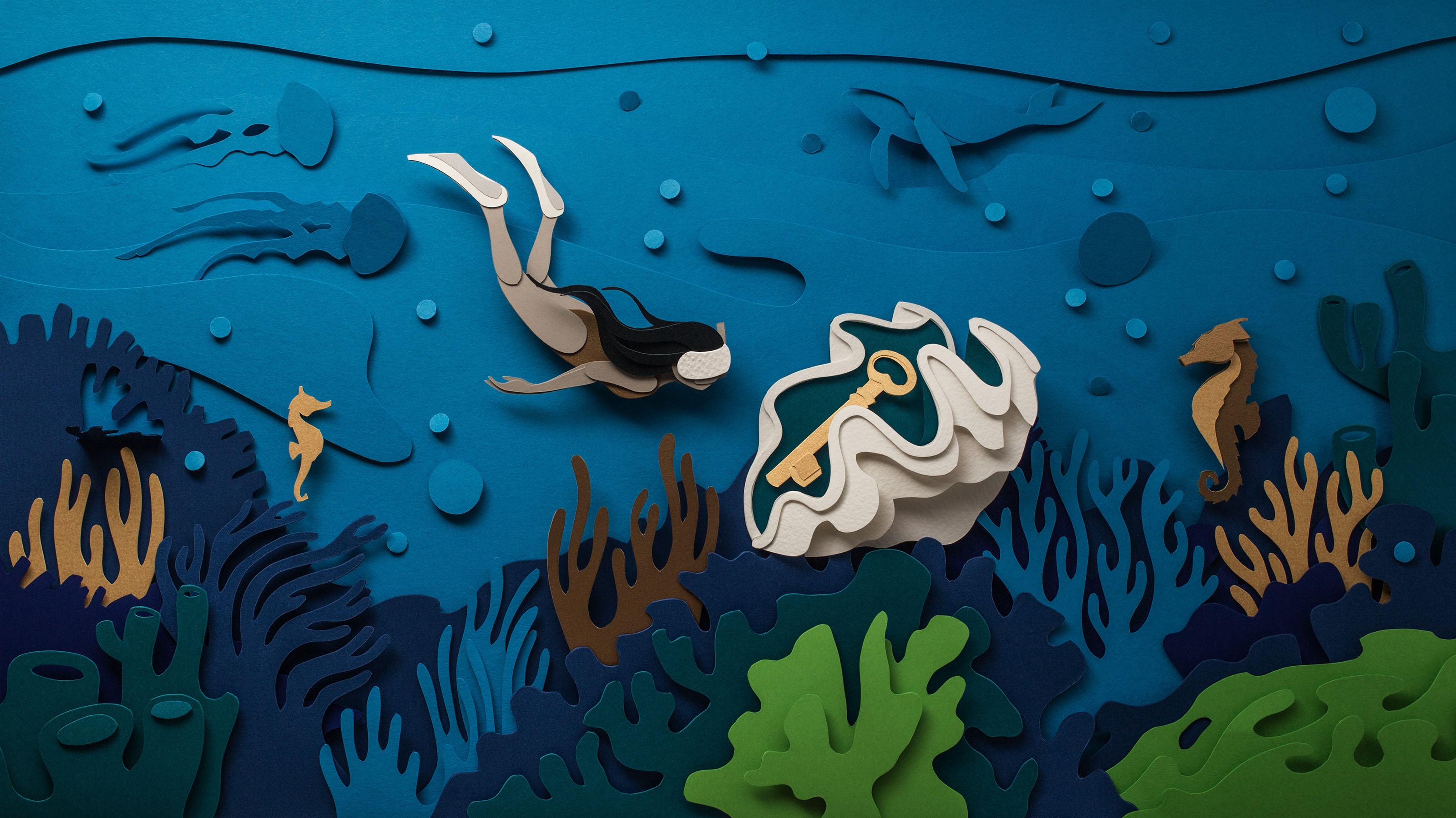
Image from johned.co
This second artwork that I’m using as another example for reference, were illustrations designed for Prudential under The Washington Post BrandStudio content program.
In this, we can see that very little foam is used within the composition itself. Where foam is most apparently used would be the main focal points of the entire spread; the diver and the clam containing the prominent key within. John Ed De Vera cleverly portrays the foreground and the background through his color choices. As focal points, the clam and diver are dressed in brighter colors that range around the same spectrum; white, beige and brown. He contrasts the brown with the white and beige hues to capture the audience’s attention. The coral reefs and background are created with cool, dull, dark and mysterious colors to differentiate it from the main focal points. These colors include dark brown, dark blue, dark green, navy green, turquoise. A common ocean blue is addressed in many parts of the composition to create a stable balance overall.
By observing the artist’s clever usage of colors and depth with a common medium like paper, I have applied these similar theories to my final project of Image Making Through Type, that can be evidently found right here!