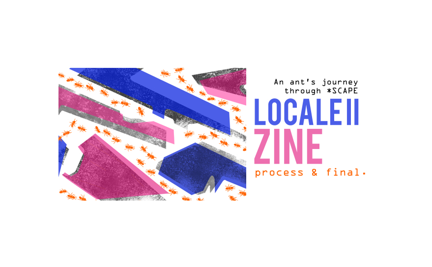
With this second part of the project, Locale, our objective was to completely abstract the knowledge that we already gained while collecting research for the first part.
—————————
FIRST ATTEMPTS
Initially, the thought process which I had for each spread within my zine involved various themes that had no connection with one another. The only thing that connected them together, was that the zine would be a body of my personal interpretations and feelings of my first encounter at SCAPE. Each page within my zine also had too many elements and motifs that needed verbal explanation. After my first group consultation with Joy, she told me to narrow it down to having only one motif or element per spread. She also mentioned that there should also be a stronger connectivity between all pages; something that makes each page belong with one another.
Below are some of the spreads that I eventually had no intentions of using in my zine. After first consultation, 3/4 pages became failed drafts. During that week, I had to rethink my conceptual and art direction as I had misunderstood the point of my zine. It was more about telling the motifs through visuals, rather than during the critique itself. Critique time was meant more for expressing how the method of abstraction within the zine had any correlation to what we observing using our 5 senses as we visited our chosen site.
Some Examples of Unused Drafts

After consultation, I found that my sense of abstraction was more directed to the semiotics of actual imagery rather than trying to mutate and warp them into something else unexpected. Here, I received feedback that there was too much text used, in comparison to the other spreads I had shown during our first consultation. It prompted me to think about whether there was another way to tell others: “This is SCAPE. Welcome.” This page in particular gave me much to think about and reflect on during that one week. Also, I was trying to feed the audience way too much information than what they could take in with a 8 paged zine.
The message I was trying to send revolved around the idea that in SCAPE Underground, the first impression as you walk down the flight of stairs is that, because there are so many stores, you would think that there would be way more unique items being sold as you walk from one store after another. However, I soon realised that this wasn’t the case and it seemed as though the entire concept of SCAPE Underground was a visual lie of the physical space. That is why there is a portrayal of similar imagery yet things aren’t exactly an imitation of one another; it demonstrates how with two different stores, they might sell something like baseball caps as a common, general good but there may only be slight variations within the design itself.
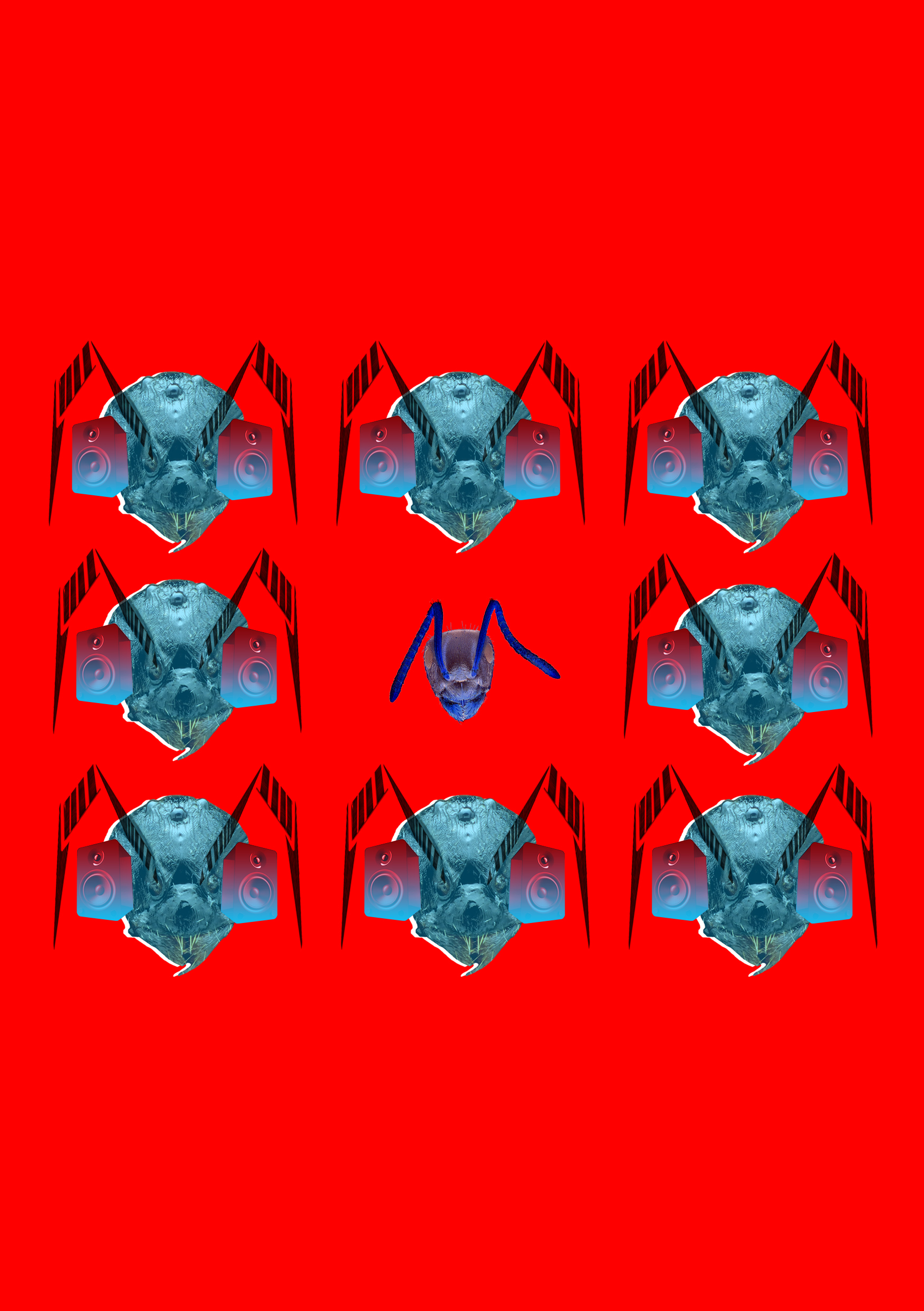
With this spread, it was an option that I could think about expanding throughout my entire zine. The message portrayed here was that the experience on the second floor of SCAPE gave me feelings of anxiousness, which felt like could have been experienced by an ant itself. At this point of time, I was playing with ideas of my spreads building emotional connections to different potential animals. However, my consultation with Joy brought up the issue that I was overthinking my zine and putting in too much of a variety.
Eventually, Joy proposed using an ant as the common and overarching concept to my entire zine. A thought came about that I could explore more upon the different feelings and ways of various ant species. Thus, I began my research on ants, their survival instincts, their mode of communication, etc. All things ant related ended up being the way to go.
THE CONCEPT
After much thought, I decided to split the SCAPE building into 3 different sections, based on the areas which I felt was most impactful based on sensory experiences. These 3 sections involve SCAPE Underground, SCAPE’s second floor as well as the high rise atmospheric balcony at the very top level. I portrayed these three areas exactly in the order mentioned. I will explain these choices with each spread, one by one, with progression of the page scrolled downwards.
Overall, I wanted to portray SCAPE through the eyes of an ant with the context of an unfamiliar setting. This was especially since the execution of my zine was based upon a personal first hand experience of SCAPE and I was unfamiliar with the place itself; it was really all new to me. My zine is an ant’s journey throughout the varying floors as I made my way from the bottom floors of SCAPE towards the very top.
FIRST SPREAD
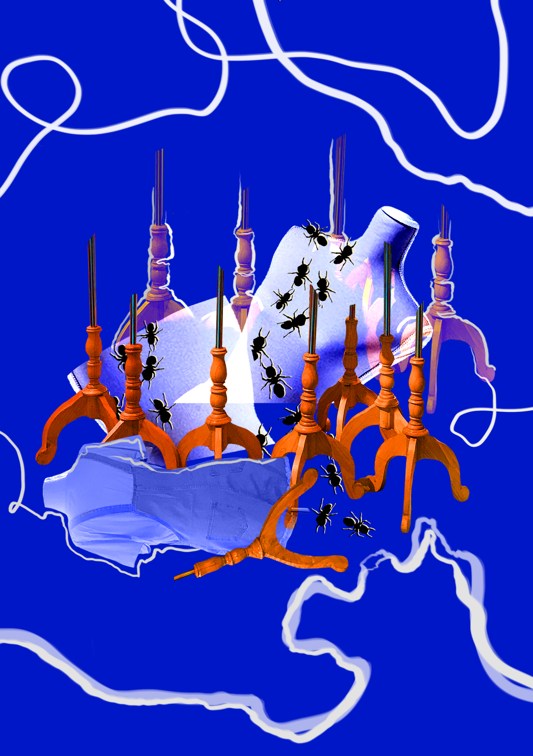
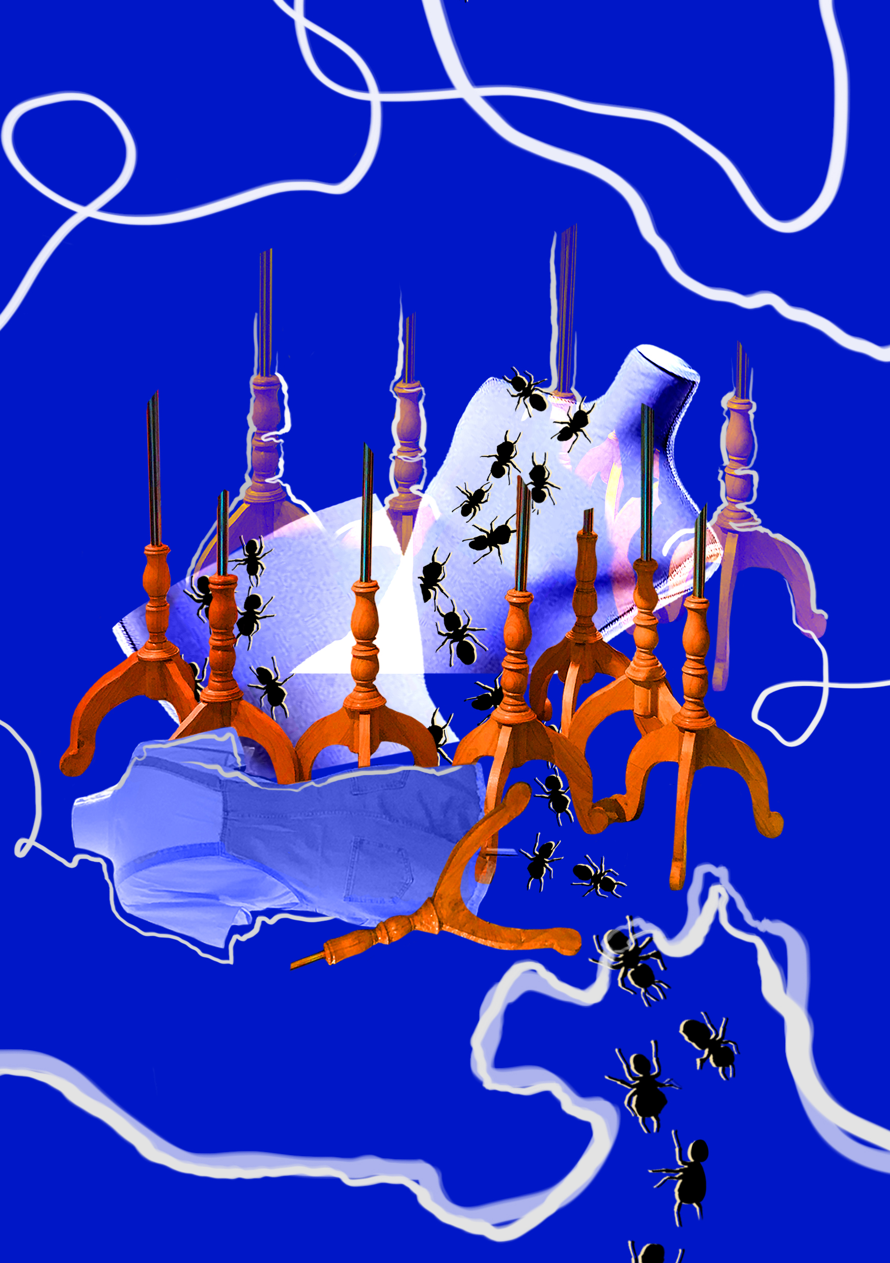
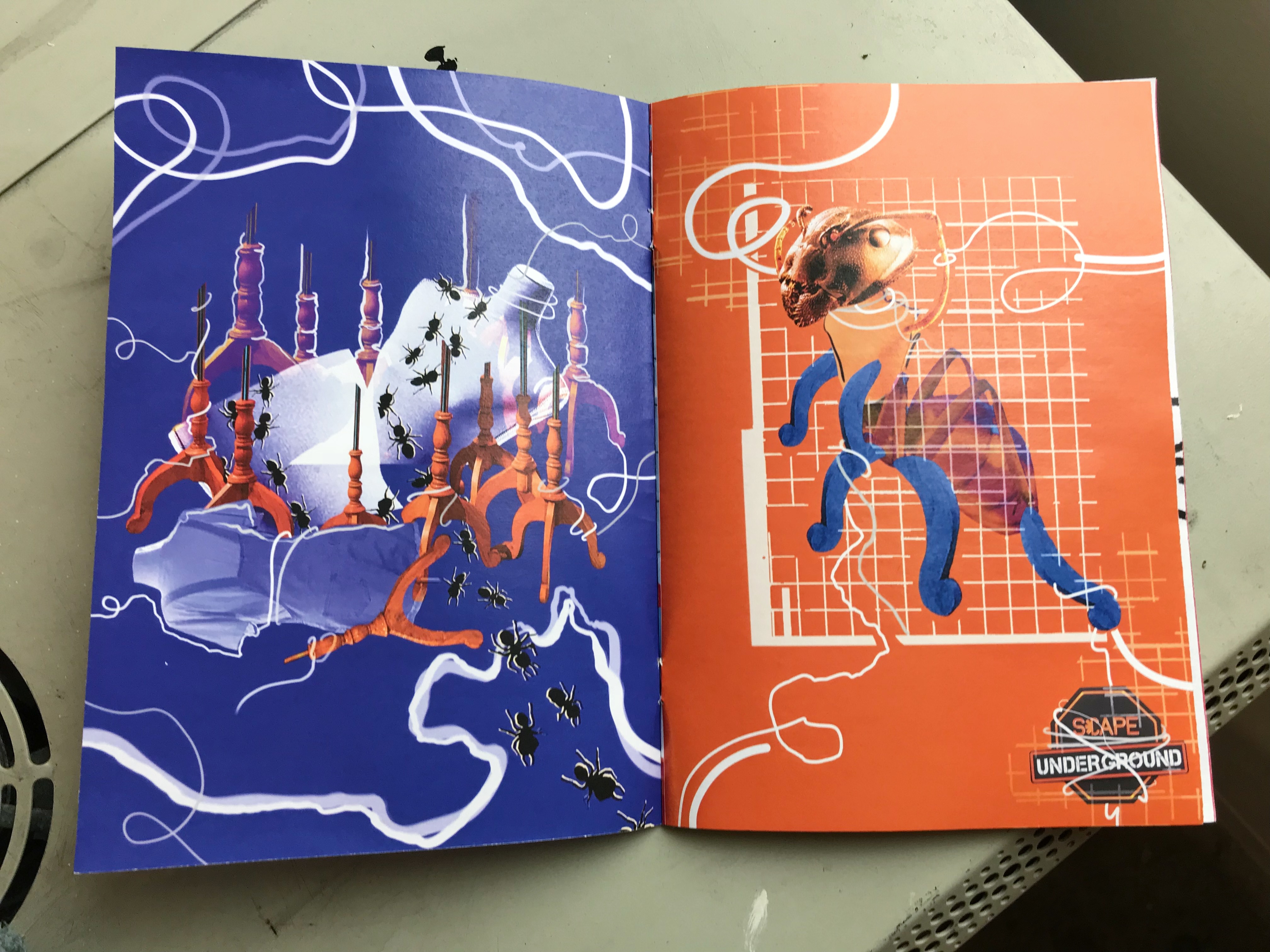
SCAPE Underground
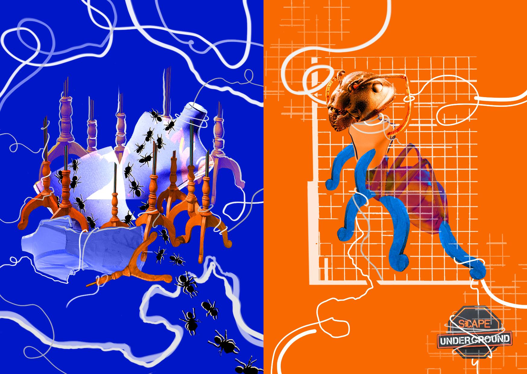
In my first spread, I wanted to portray the feeling of being trapped within a small and congested area. SCAPE Underground definitely felt like a place that had way too many shops in one enclosed space. Shop owners constantly had their eye on you as if your presence there, meant that it was only right that you buy something off of them. Mannequins were a common sight down below that seemed to tower your visual spectrum everywhere you looked.
On the left side, the mannequin, a common sighting in SCAPE Underground is used as a visual representation. It is split in half to demonstrate an unsettling feeling shown in a physical manner. A transparency lo-fi effect is used on the mannequin to show these penetrating feelings. The overwhelming number of mannequin standards represent the numerous different stores portraying congest that promote this feeling of being trapped. The ants try to crawl upwards the mannequin, as if asking for a change of scenery, as a form of escape. Distraught and entangled lines become a common motif on both pages of this spread. They wrap around the visual objects in an attempt to demonstrate being tied back, forms of a strangle and a struggle to break free and escape.
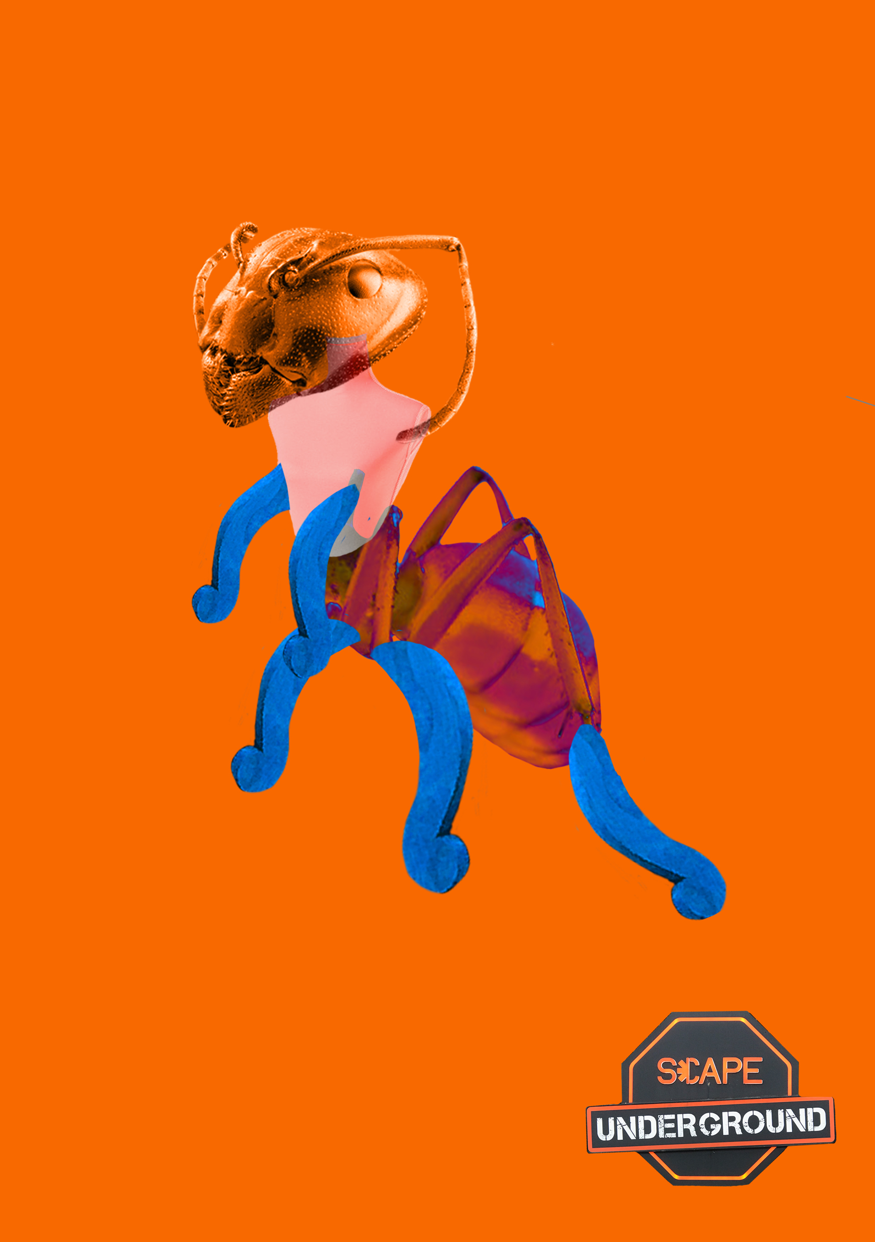
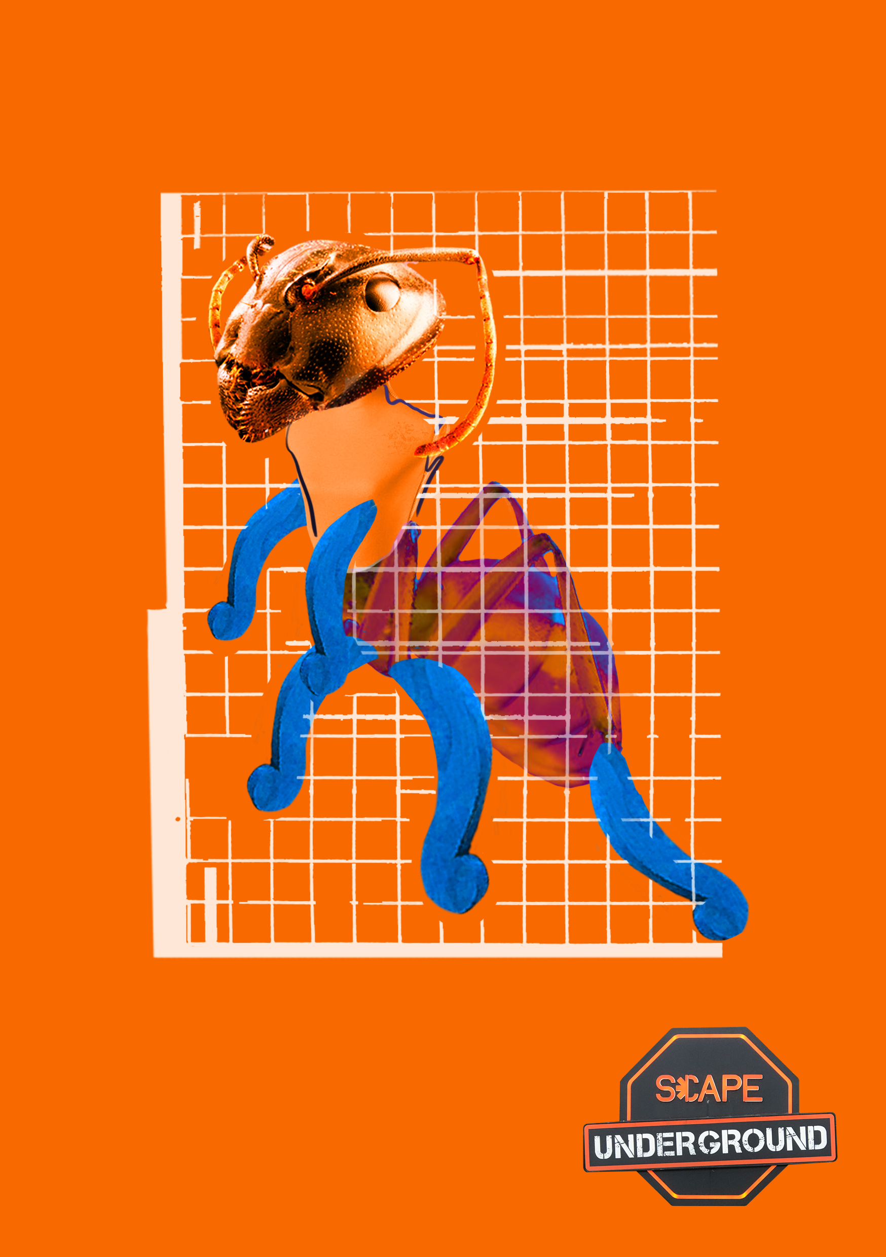
On the right side, a singular ant is portrayed with a central focus. It is mutated with artificial products found around SCAPE, demonstrating how the prolonged effects of being trapped down below in SCAPE Underground can cause harm. I felt that the more time I spent down there, the more I didn’t feel more like myself. The same curvy lines are continued on this side of the spread showing the never ending feeling of becoming trapped within the space itself. Here, lines entangle around the legs and antenna of the ant. The ant’s thorax seems to be some sort of a chameleon color, trying to change and adapt to its environment. The legs are still and mutated, a derivation of legs from the mannequin stand. It represents a constant stiffness and immobility; making it harder to escape the feeling of being trapped. The metal wired fence used for clipping on items such as socks is used to hold the ant in a chokehold; making this trap sensation much more obvious to the viewer. Parts of the ant seem to protrude out of the fencing as if almost being able to escape as it tries and tries again yet it is physically impossible for it to escape as a whole.
At the bottom right, the SCAPE logo is used. During my visit and with the time spent at SCAPE Underground, I gradually noticed that there were many graphic design posters located along the walls below. Most of them were accompanied by SCAPE Underground’s logo on the bottom right hand corner. I wanted to make this page appear just like one of the many posters decorating the walls. Not only are the lines entangling the ant itself, but they are also doing so to the logo. This demonstrates how it is not only taking over the ant, but also the entire space itself.
The colors blue and orange are used to contrast with one another; blue being the situation being placed in while orange represents the reaction to the situation.
DEVELOPMENT
First Draft
Lines were not as exaggerated on the left. Lines were not included on the right. The bottom page was plain and simple and did not have the exaggeration needed for a reaction to the situation.
Second Draft
In the previous draft, the trail of ants would end out of nowhere. Here, they seem to begin from the bottom right of the page where the eyes are eventually directed towards the middle. On the bottom, the first introduction to the metal wiring is included over the ant.
SECOND SPREAD
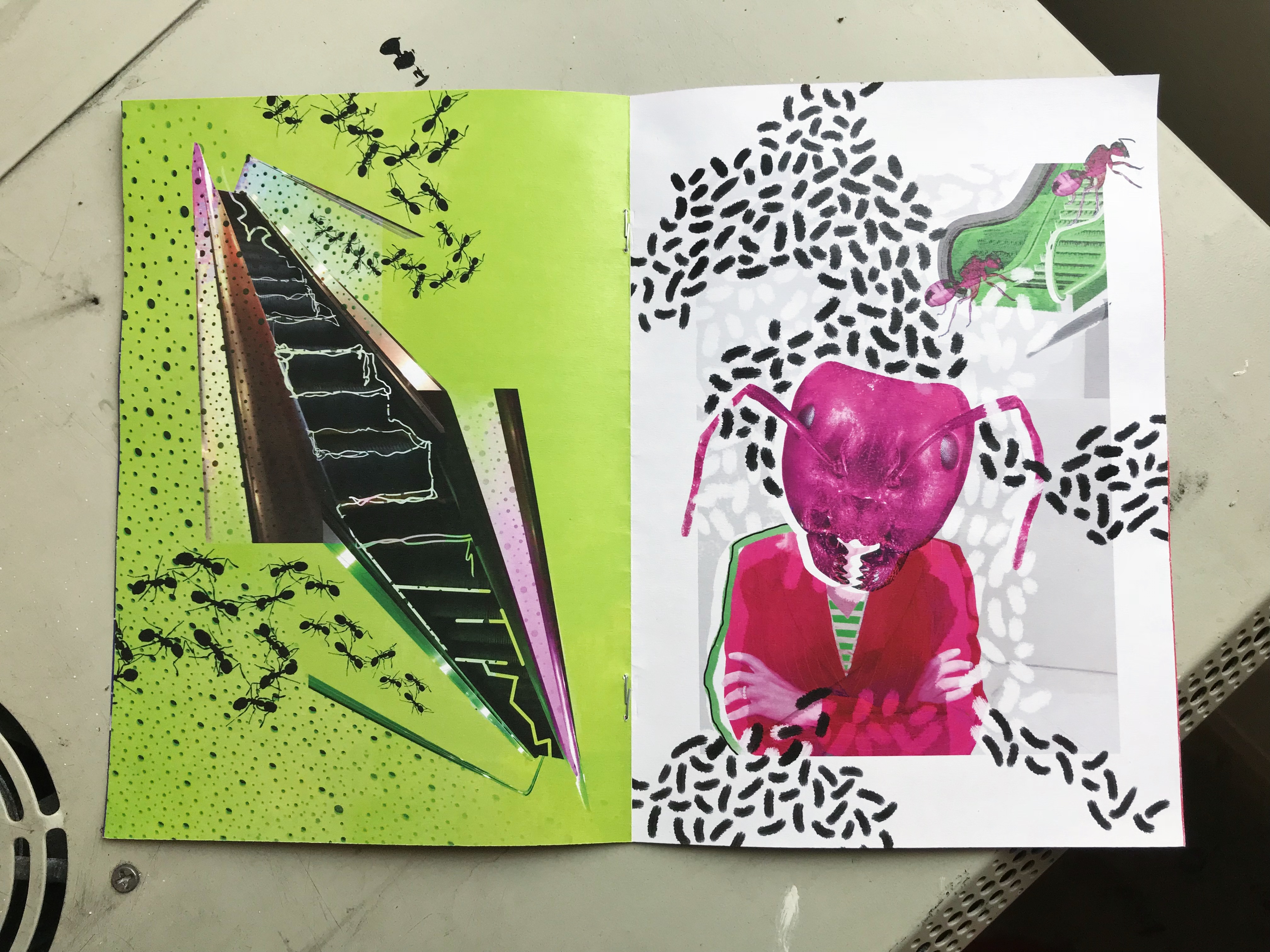
Second Floor
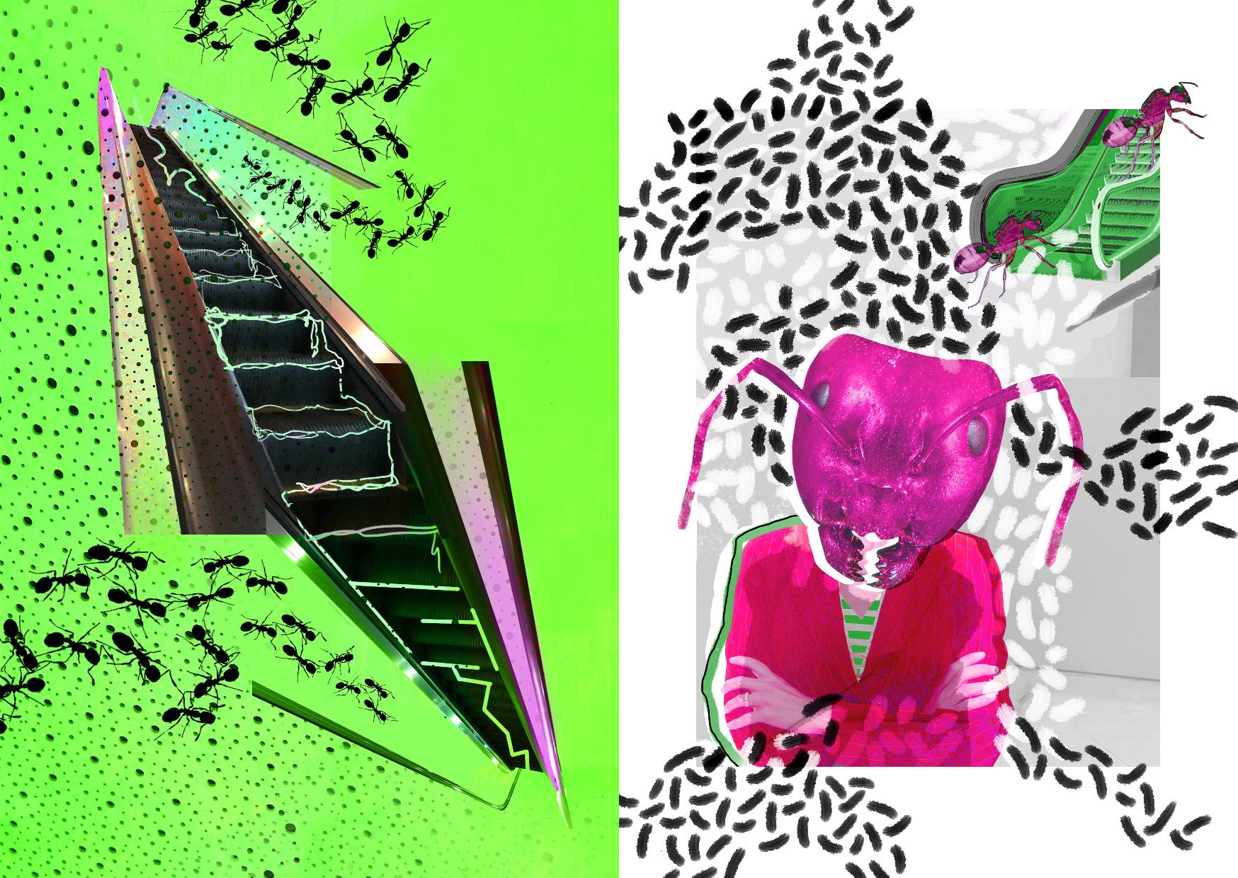
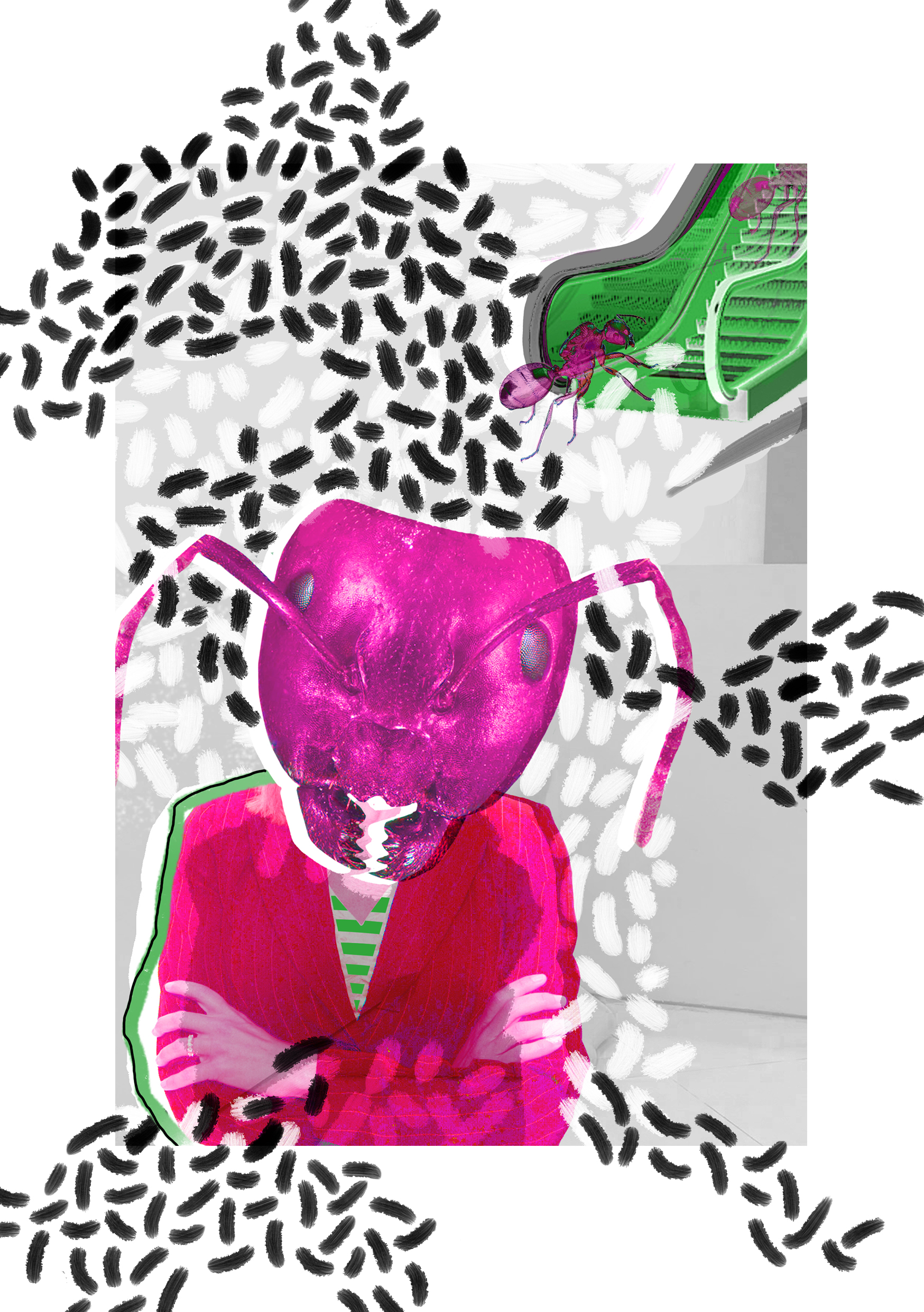
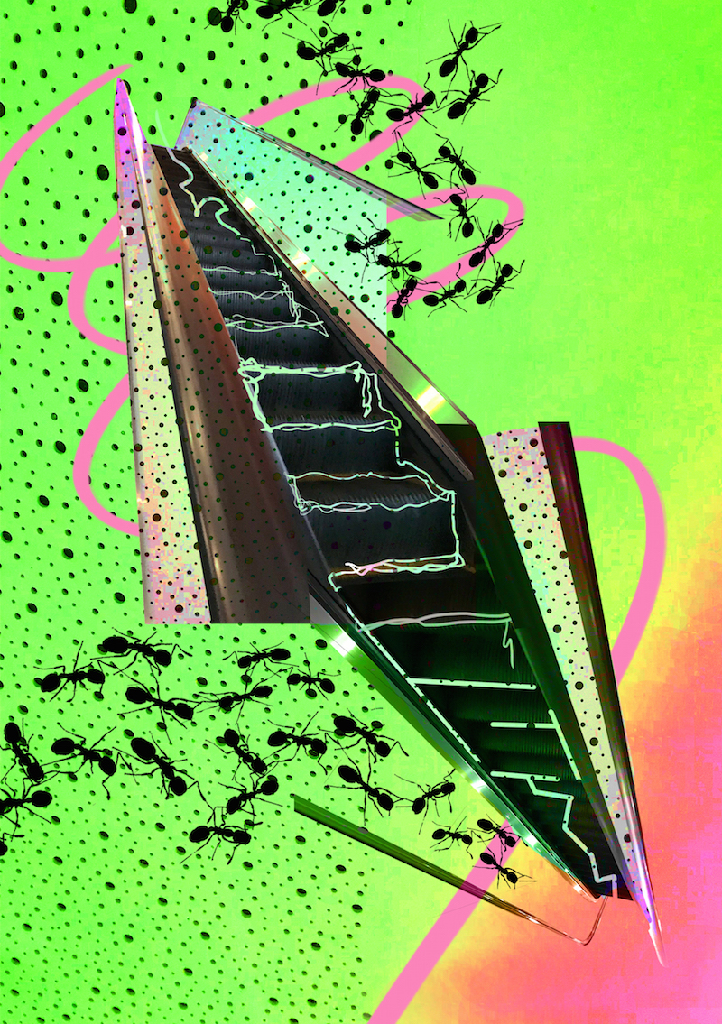
In my second spread, I wanted to portray the sense of being uncomfortable and lost. While I was venturing the second floor, I noticed that it seemed like there was no other way up and down to the top and bottom floors. All I could see were escalators that seem to mislead the direction which I wanted to go towards. Everything else was a blur to me and eventually the portrayal of escalators came to me as a common visual element within my second spread.
On the left side of this spread, a visual paradoxical space is demonstrated. Two escalators, one original while the other flipped, meet in the middle. The lines outlining the steps of the top escalator start off organic, curvy and entangled and end up becoming more straight, rigid and geometric as they make their way towards the bottom escalator. It demonstrates two choices to be chosen from yet we are stuck within the middle; not being able to go up or down since both escalator directions force you into the middle section, allowing the visitor of the place to become ‘lost’ in a sense.
The uneven texture of the second floor ceiling is also used here to further promote the sense of being uncomfortable. There is an uneven amount of negative versus positive space and vice versa. A pink gradient is established along the bottom right railing, as if leading towards the next page within the spread. Instead of crawling all over the escalators in their natural form, the ants crawl into a trap made by these railings.
On the right side, a mutated ant-human can be seen in the foreground. Similar to the first spread, it has mutated to the prolonged effects of the environment. Psychologically, it is found that when arms are crossed, the person is feeling either nervous or uncomfortable. Portrayal of this is therefore, a response to the situation on the left page. On the top right hand corner, the hint of an escalator is shown. The ants seem to crawl into an open space of nothingness, as if unsure where they are going. Just like the uneven ceiling texture on the left hand side, soil effect ant tracks that seem fuzzy, further promote this sense of unevenness, being uncomfortable and itchiness in a way. Similarly, the negative space outweigh the positive space in an odd manner and vice versa in both opaque layers as well as the black layering above.
Pink and green are muted contrasting colors; similar to the previous spread with blue and orange, these colors help to separate the situation from the response.
DEVELOPMENT

First Draft
There was no sense of consistent direction for the viewer as he or she looks at this page. The ceiling texture should be edited to follow along the escalator railing on the left side. For the bottom page, it seemed unnatural for the ant on the top right to be randomly cut off and the antenna of the ant woman to do the same as well. In the final page, the antenna and the ant on the top right hand corner exceed the white border.
Second Draft
The pink curvature line eventually seemed unnecessary and I eventually got rid of it since it seemed distracting and had no purpose. The pink hue was intensified through saturation for the bottom right corner. However, it didn’t really work out so I had it completely removed.
THIRD SPREAD
Atmospheric Balcony on Top Floor

In this last spread, I wanted to portray that as I finally made it to the top floor, a rush of relief runs through me as there seems to be a sense of direction at this destination. However, this eventually disappears after a while as I lose a sense of belonging. Dancers usually crowd around this space and I suddenly feel out of place. The openness of atmosphere is ruined by the reminder that I am unable to dance which leaves me out as opposed to the space’s intended audience.
I decided to use the metal railings that wrap around this area as my common visual subject. On the left hand side, a dynamic flowing pattern is painted to demonstrate the energetic vibe apparent in this top floor. The ants approach a central focus that is white, seemingly to the direction of freedom. On the right hand side, there is a grid like approach to the composition’s organisation. Here, I decided to portray mutated ants with railings glitched to look like antennas and speakers as eyes. These become the dancers of SCAPE as they imitate one another regarding their dance personas. In contrast, I seem to be a normal and basic ant that is insignificant; obvious through the comparison in scale. The ‘dancing’ ants that surround are much bigger in size in comparison to the ant in the middle.
The background is covered in rigid geometric shapes that are obviously duplicated and layered on top of one another. This demonstrates a glitch; just like a glitch in the environment where my first impression of the top floor was that of calmness and quickly switched to a place where it seemed like I just had no belonging in. The railings curve in a snake-like manner approaching the middle ant, as if attacking it in a sense.
DEVELOPMENT
First Draft
The difference in ants were not significant enough to see this contrast between the dancers and myself. It seemed as though I was the one that stood out in specialness as opposed to everybody else who seemed normal which wasn’t the effect I was going for.
Second Draft
The page was too plain in comparison to all the pages and spreads I had in my zine. It seemed out of place. The background should be exaggerated in effect just like the others.
COVER

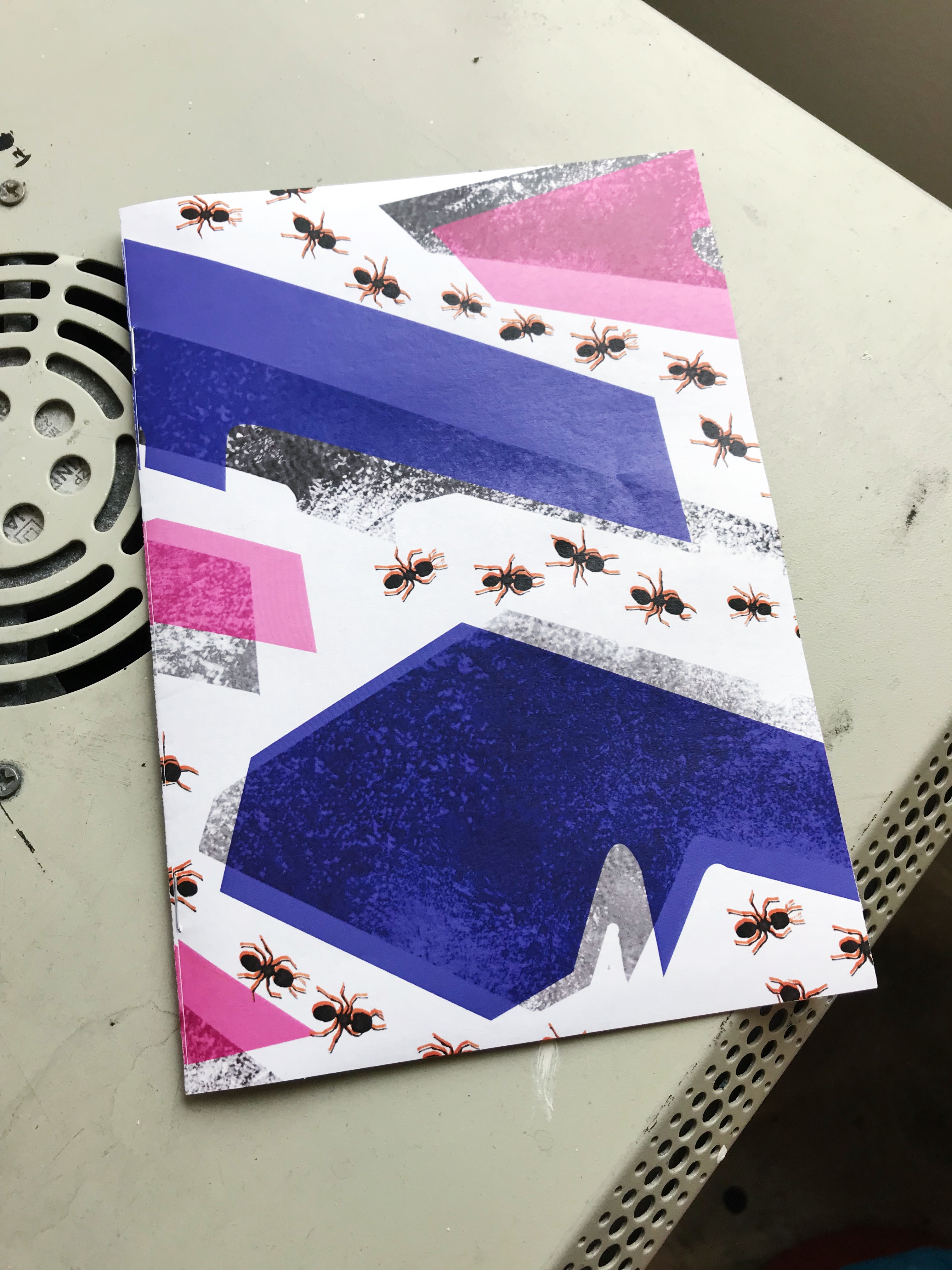
Using the vector image of SCAPE I created in part I of Locale, I split the building into 3 sections accordingly to my interpretation of the underground, middle and open space. With these static categories, I decided to use gray-ish black as my base color. Blues and pinks were popular colors within my zine and I decided to use them to overlap the base color itself. This shows a ‘glitch’, in a sense that SCAPE isn’t necessarily what it seems. The grunge-like effect was intended to give senses of wilderness and soil. Also, I wanted the ant trails (or negative spaces) to mimic ant farms in plastic boxes, which was the main inspiration for my cover.
PICTURES OF ZINE BEFORE SUBMISSION


EXPERIMENTAL ZINE
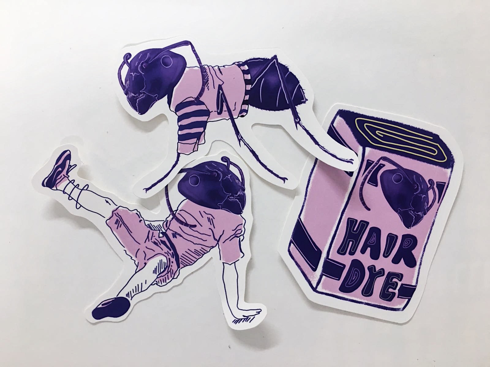
Sticker Pack
I created a fun 3 set sticker pack, with each sticker being a representative of each floor.
I wanted to capture items that I found was either surprising or amusing during my first visit to SCAPE and juxtapose that with the ant figure.
Physical Copy
Image Credit: Brendan Tan
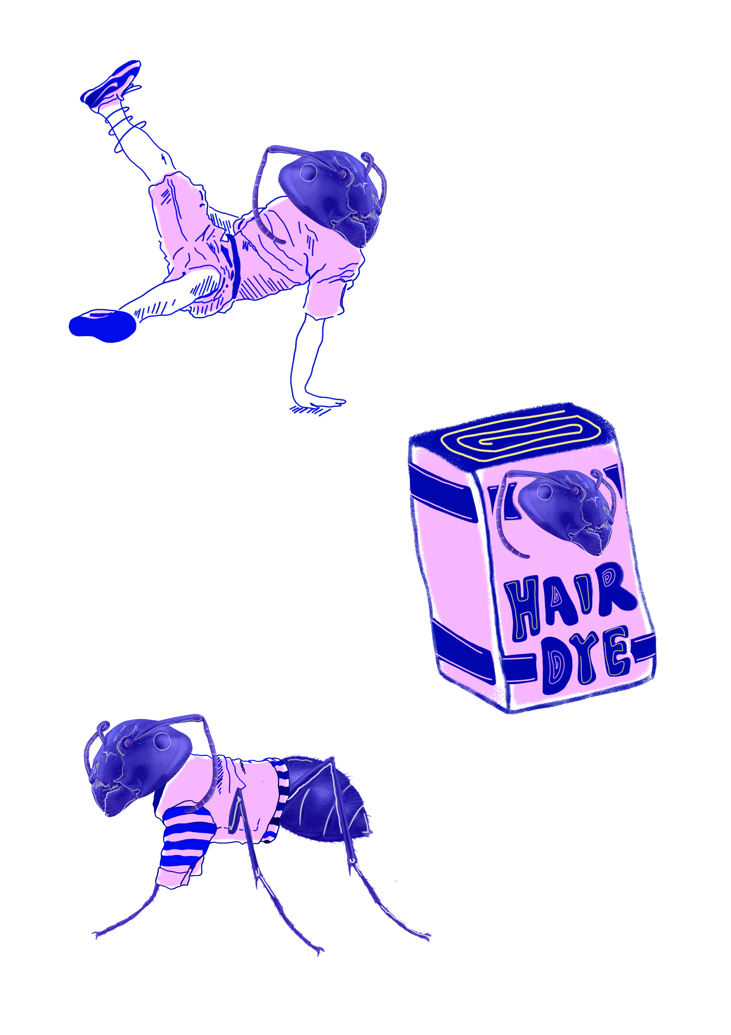
Digital Copy