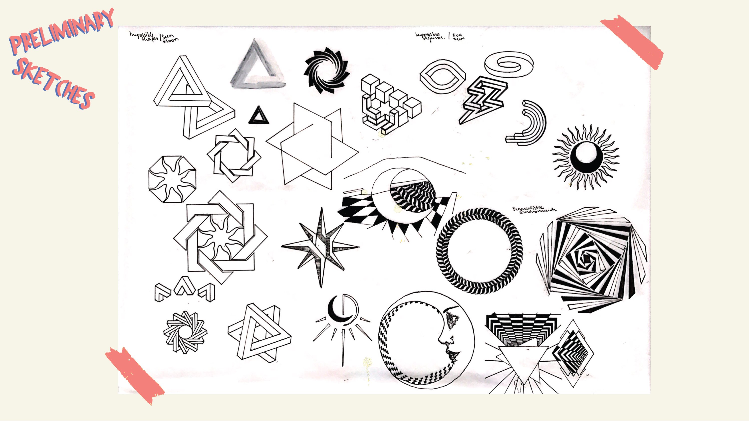
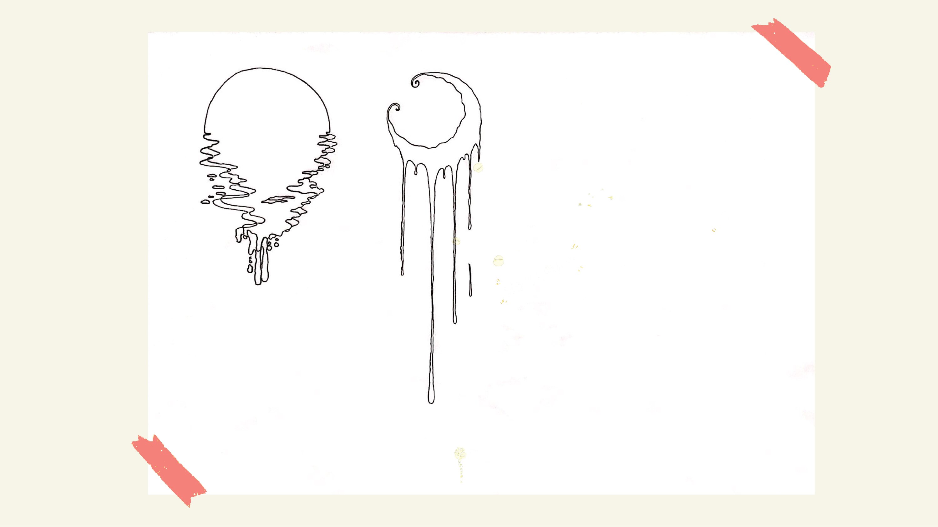
Sketches + Progression
Ina suggested that we stuck to a more simple illustration instead of over-complicating the design with too much; we could leave that for poster design instead. In the coming week, I focused more on expanding my designs, in various forms, styles and colour.
Preliminary Ideation
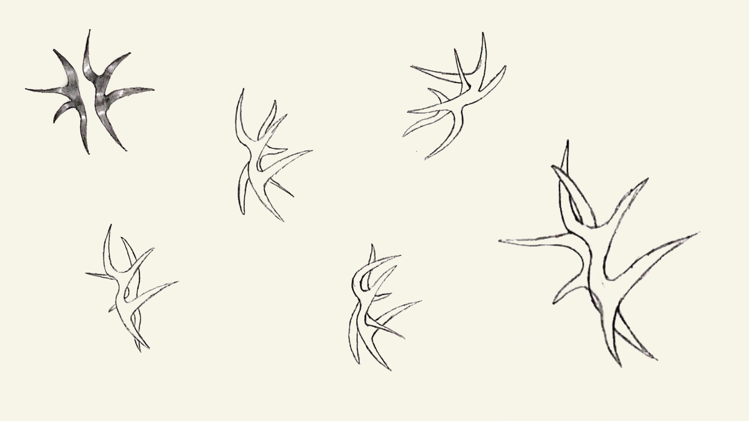
R&D (Refine & Develop)
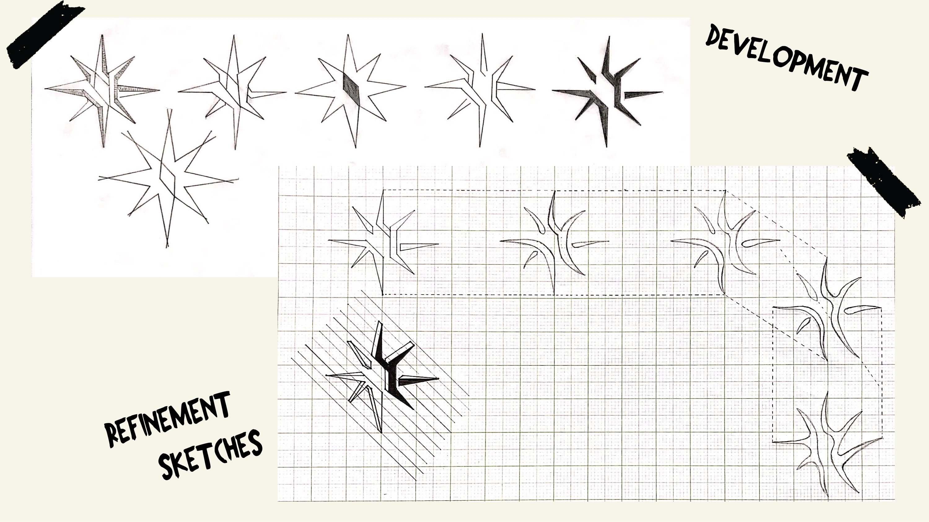
good progress! Please use grids for the final shapes!
I have uploaded videos here:
https://drive.google.com/drive/folders/1vTEPgUsixX0xrX4VbgG3LgUOwbgtBULk?usp=sharing
By adding underline ellipse like grids or circle grids you will get consistency of graphic elements. Also it will add more complexity to your design. The image will remain complex but also unified.
https://www.skillshare.com/classes/Logo-Design-with-Grids-Timeless-Style-from-Simple-Shapes/683637231/projects
https://www.instagram.com/p/BvGw2X4BKjk/
https://www.skillshare.com/classes/Logo-Design-with-Grids-Timeless-Style-from-Simple-Shapes/683637231/projects