What if you were to deconstruct nursery rhymes and depict them in a totally different meaning?
Hey Diddle Diddle
Hey diddle diddle! The cat and the fiddle,
the cow jumped over the moon.
The little dog laughed to see such sport,
and the dish ran away with the spoon.
Since my initial group was assigned to look for images related to this particular rhyme, I started off the project by challenging myself with it. The rhyme itself is quite straightforward. As expected of my first take on the project, the first drafts came out quite literal.
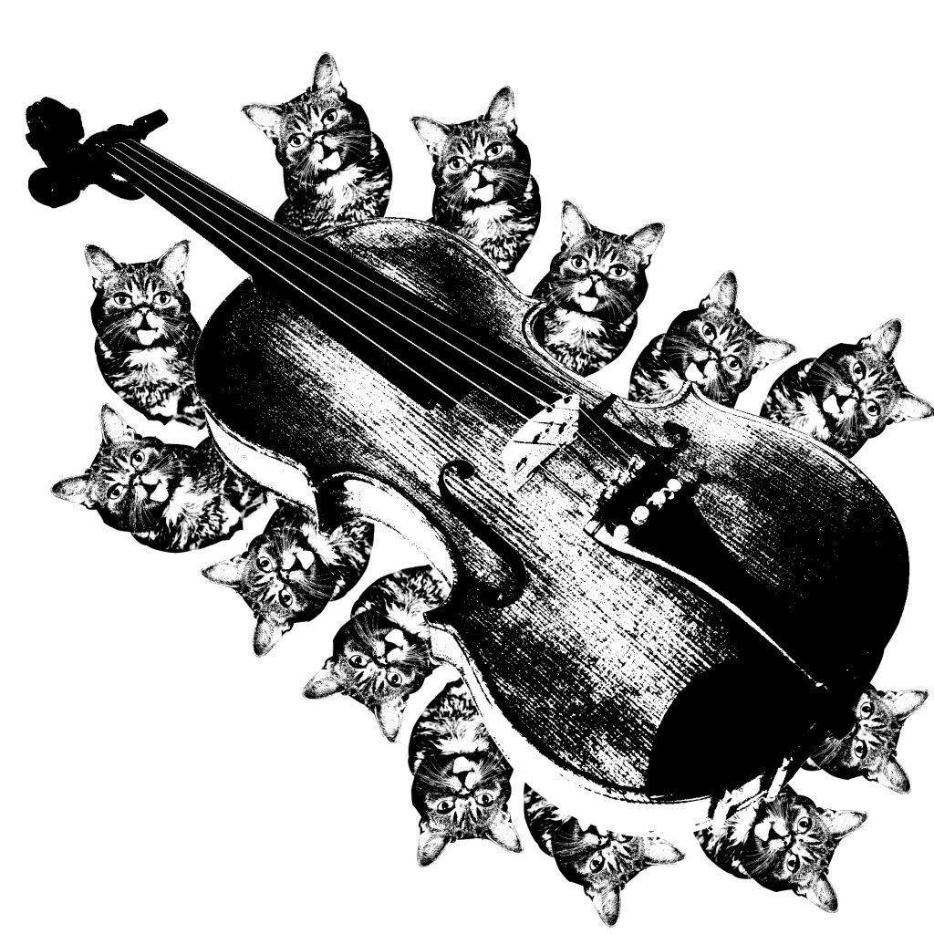
Hey diddle diddle! The cat and the fiddle,
A rather literal depiction of the first line of my first rhyme. I was merely playing with the idea of repetition. By repeating the cat images to surround the fiddle, I was hoping to create a sense of harmony and make the whole picture look visually pleasing to the eyes.

the cow jumped over the moon.
Another literal interpretation. I was trying to display the principle of movement by using repetition on the images of the cows and lining them up using the principle of gradation from the smallest in size and lightest in opacity, to the largest and opaque. That way it would lead the viewers’ eyes in a way that it would look as if the cow was jumping over the moon.

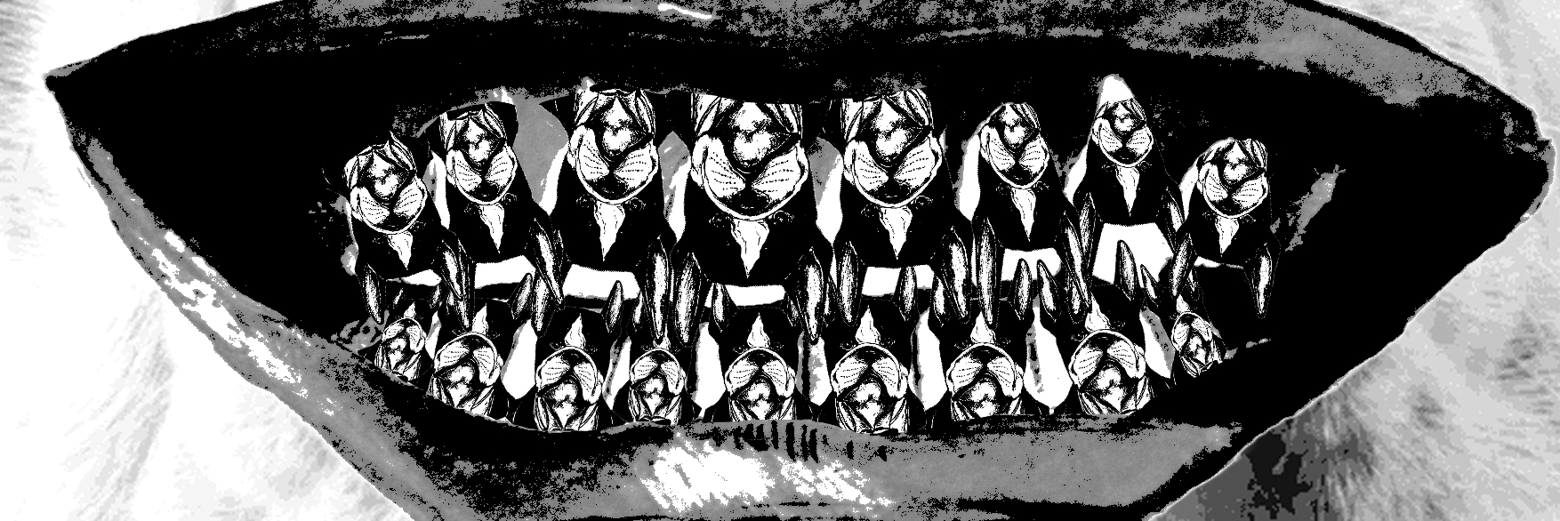
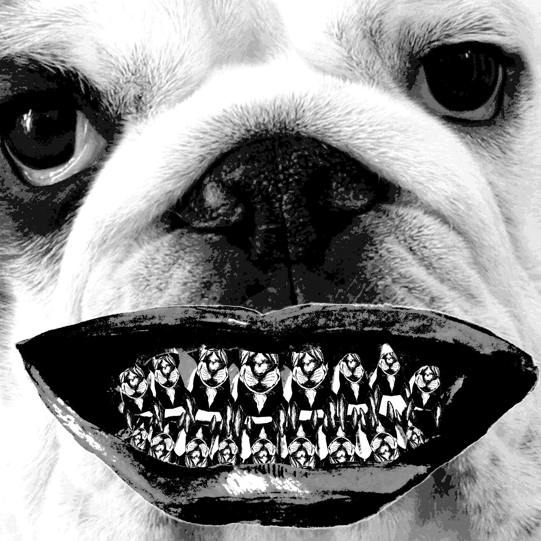
The little dog laughed to see such sport,
This composition still includes images of the literal objects mentioned in the rhyme, but I think the way I arranged them is more interesting than the previous two. By using more repetition of the dog image and making use of the transformation tool in Photoshop to resize and skew the images, the dog images are arranged in where the teeth are supposed to be to create a sense of unity in the whole image. Aside from that, the mouth itself is placed right where the larger dog’s mouth is supposed to be, making the whole image look more unified.
I chose this as one of my final images because I feel that I used the design principles interestingly in this composition. There is also the irony that although the line goes “The little dog laughed to see such sport,” none of the dogs in this picture is laughing at all.

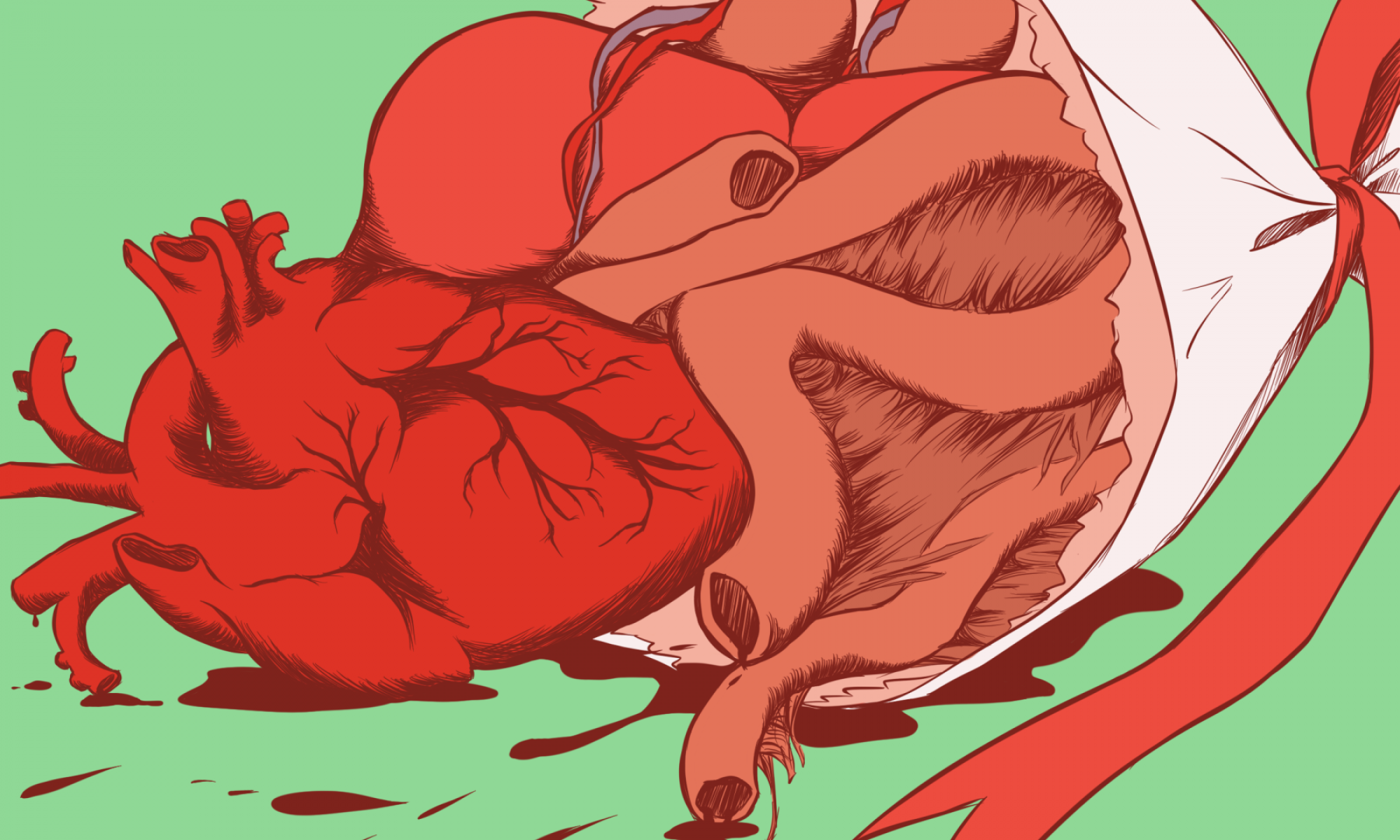
and the dish ran away with the spoon.
(LOL) To be honest I made this composition purely out of impulse and without any prior thinking ahead. I don’t think I had any particular design principle in mind – aside from unity maybe, where the individual elements (plates and spoons) are arranged in a way that it can be seen as a human body running as a whole. Aside from that, I used the stroke effect in Photoshop to give a white border around the ‘human body’, making it stand out more from the dark background.

and the dish ran away with the spoon.
Consider this as a compensation for the previous composition. Through the use of repetition of the footsteps and lining them up, it creates the principle of movement and leads the viewers’ eyes from one end of the footsteps to the other end – where all the dishes and spoons are cluttered together. The footsteps are meant to represent running away. I also tried to create unity in regards to the footsteps leading towards the plates and spoons, but the elements seem too flat that the image as a whole doesn’t seem unified at all.
Humpty Dumpty
Humpty Dumpty had a great fall.
All the king’s horses and all the king’s men
couldn’t put Humpty together again.
The next nursery rhyme I tackled was Humpty Dumpty. Having loosened up quite a bit after the Hey Diddle Diddle, my compositions started to lose their literal meaning from the rhymes given.
Now for Humpty Dumpty, I read the rhyme again and wondered to myself – why is Humpty Dumpty an egg? As children, we were taught that Humpty had always been an egg. But reading the rhyme by itself without the aid of visuals like in children’s books, Humpty could be anything. For all we knew, they might as well be a human. And that is exactly what I did in my compositions. However, since the image of an egg is already automatically ingrained in our minds when we think of Humpty, I replaced the head of the human with an egg so the viewers can still relate to Humpty Dumpty.

Humpty Dumpty sat on a wall,
In case it isn’t clear, the background of this composition is the Great Wall of China, depicting the ‘wall’ on which Humpty is sitting on. This idea was actually inspired by nigahiga’s video (it takes a while to get to the Great Wall part… and yes the video doesn’t make sense but that’s the beauty of it). By using contrast in the tone of the lighter ‘Humpty Dumpty’ and the dark background, I tried to give emphasis to Humpty Dumpty, hence making it the main focus of the whole image.

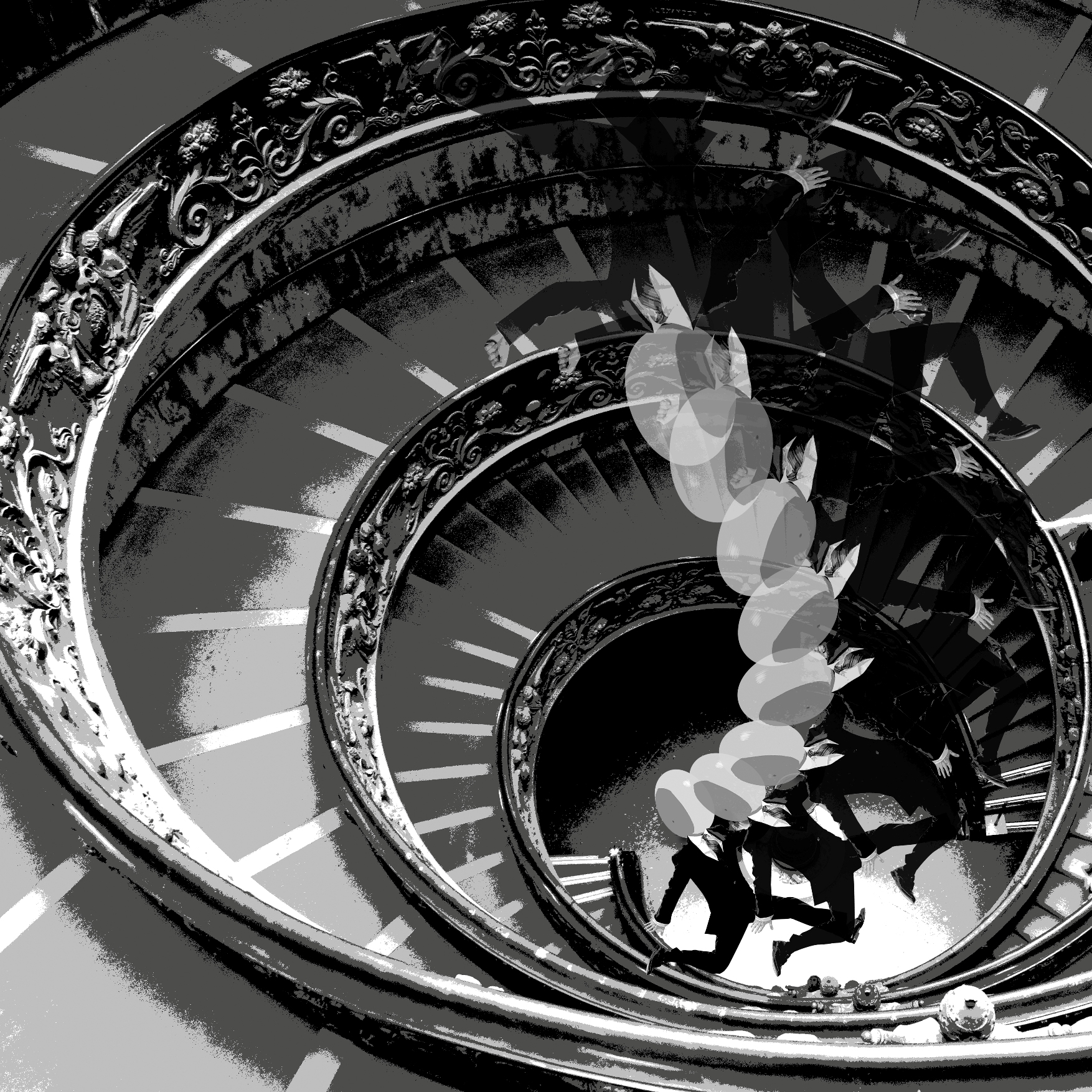
Humpty Dumpty had a great fall.
I chose this particular background for this part of the rhyme as I wanted to incorporate the principle of radial balance, and because the descending spiral motion sucks the viewers’ eyes into the middle – giving emphasis to the ‘falling’ part. As for Humpty Dumpty itself, I used a similar idea as one of the previous compositions (the cow jumped over the moon) by using repetition of Humpty Dumpty and gradation of both size and opacity to create movement of the object in the viewers’ eyes.
I chose this as one of my final images because the design principles are used effectively in this composition and helped in conveying the message that I wanted to – that is the infamous Humpty Dumpty and their great fall.

All the king’s horses and all the king’s men
Chess pieces are used to depict this particular line in the rhyme. By using the principle of repetition, the ‘king’s horses’ and ‘king’s men’ are lined up to form a sense of harmony. The king piece is placed in the middle, right above all his subordinates, and a crown placed on top to give emphasis that the king rules above all. The image as a whole also includes the principle of symmetrical balance.

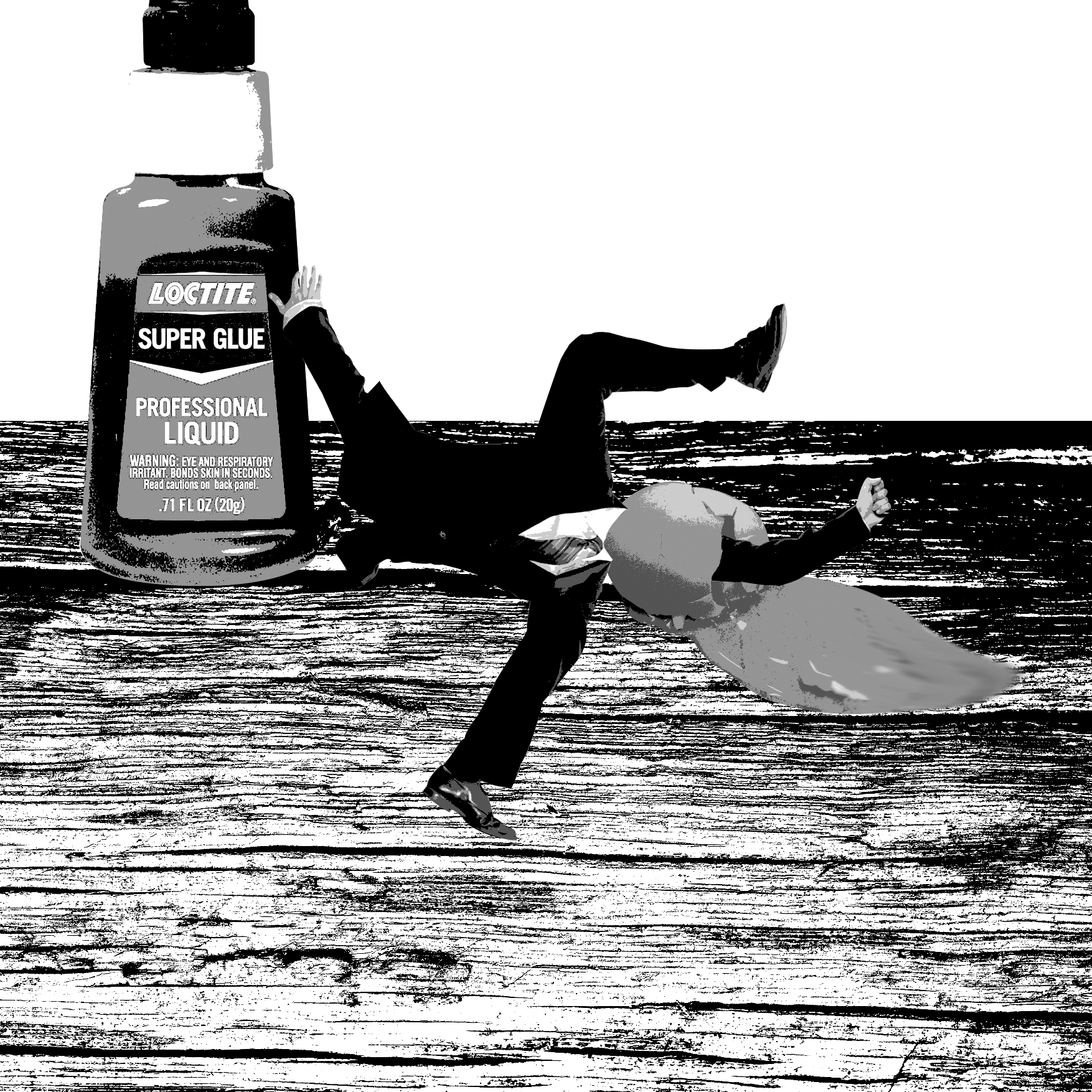
couldn’t put Humpty together again.
I actually find this composition quite interesting – not because of the principles of design used, but because of the objects in the image itself. Looking from up to down, the first thing you would notice is the super glue on the left side – this is the result of dominance of the bottle by having the bottle higher than the rest of the objects and by using contrast of tones between the bottle and the white background. Following the glue will lead your eyes to the hand of ‘Humpty’ and, eventually, the whole picture of Humpty itself. This line of gaze includes the principle of unity between all the elements of the composition.
I chose this as one of my final images because of its simplicity. There is not a lot of components in this particular composition, but I think that it is still effective in relaying the message of the rhyme. I also tried to put this morbid sort of humor by rearranging the limbs of Humpty (and even went as far as putting one hand inside its cracked egg head) and including a super glue bottle in relation to putting Humpty back together.
The Old Woman Who Lived in a Shoe
she had so many children she didn’t know what to do.
She gave them some broth without any bread,
then whipped them all soundly and put them to bed.
I have never heard this nursery rhyme in all my life. And besides, after reading the rhyme, I thought: is this morbid poetry even considered a nursery rhyme? But then again, maybe if I heard it as a child I wouldn’t think twice about its underlying meaning.
For this rhyme, I tried to dissect the parts of the rhyme and looked for its underlying message – especially the last two particularly ambiguous lines – and interpreted them in rather disturbing images that would not be normally seen in children’s books.
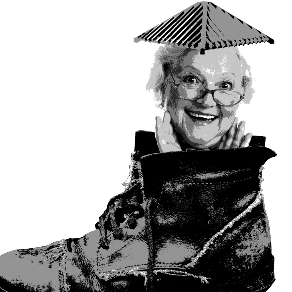
There was an old woman who lived in a shoe,
This is a literal depiction of the first line of the rhyme. I did not aim for much here, except just to get the literal interpretation out of my system.

There was an old woman who lived in a shoe,
This second take on the first line has more thought process than the first. Rather than using an image of an old woman, I used the image of a cat – because of the relation of lonely old women living together with a dozen of their cats. By focusing the images on the right side of the whole composition, I tried to give negative space on the left to create a balance in the tones elements by having two contrasting tonal sides.

There was an old woman who lived in a shoe,
To be honest, I wasn’t satisfied with the first two takes on this line so I did another one (which disappointed me too, actually). I used the principle of repetition on the image of the shoe to create a roof – or at least attempted to make it look like a roof. All in all, I didn’t feel like there is a sense of unity in this composition.

She gave them some broth without any bread,
There is a jarring contrast in tonal values between the line of cans and the rest of the composition, giving the cans more emphasis and hence become the main focus of the whole picture. The use of contrast is used again in differentiating one can from the others – giving it dominance over the rest. I also arranged the images in such a way that it gets wider as it goes down. This is to incorporate the principle of harmony between the three main elements of the composition.
I chose this as one of my final images because I think the design principles are used effectively in this composition, especially in using contrast to make particular components pop out from the rest of the picture. When I first heard the term broth, I could not help but imagine the picture of an evil witch and her pot of nastiness so that is what sparked the idea of this image. Aside from that, bread symbolizes the staple food of life so by saying she didn’t give any bread, I interpreted it as she took away their life – hence the rat poison.

then whipped them all soundly and put them to bed.
This is probably by far the most disturbing line of the whole nursery rhyme. I tried to interpret it into a completely different thing altogether. The use of contrast between the bright light from the door and the dark figure and shadow gives the figure more emphasis, making it the main focus of the picture. I also used repetition in the coffin images so that it would lead the viewers’ eyes from the dark figure to the coffins.
I chose to use coffins because I related the ‘bed’ mentioned to ‘deathbed’ – and what better object that represents that than a coffin? I also chose to use the figure of a grim reaper as it is a symbolic image of life being taken away.
FINAL IMAGES

~*~*~*~*~
I know this was a long read; so if you have stuck til the end, congratulations to you 🙂
Credit: all resources taken from the internet, they belong to their rightful owners