

Month: April 2017
2DII – Zine Process + Final
i had a few inspirations in mind for my zine. i wanted to design my zine learning towards the experimental side, rather than a straight forward photo + interview one.
here are a few inspirations i had in mind –


taking these inspirations into consideration, i came up a few layouts variations –

i consulted mimi and she told me to try out with the real content out because i didnt have anything out yet so it was hard to comment on.
and so i came up with my first layout mock up –
however, mimi wasnt a fan of my layout because she mentioned that my images weren’t deserving the little attention as how they should be as they were well taken. she also didnt like the unnecessary geometric patterns and elements that i was adding into my zine as they have no purpose.
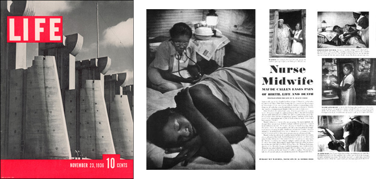
mimi gave me a few helpful and insightful tips that i should work on. she told me to focus on the people, and my zine should be one that people would want to keep looking at the images. my zine should be humanistic, and story orientated. she told me to look at magazines such as TIME.
i researched on those magazines and here are some insightful


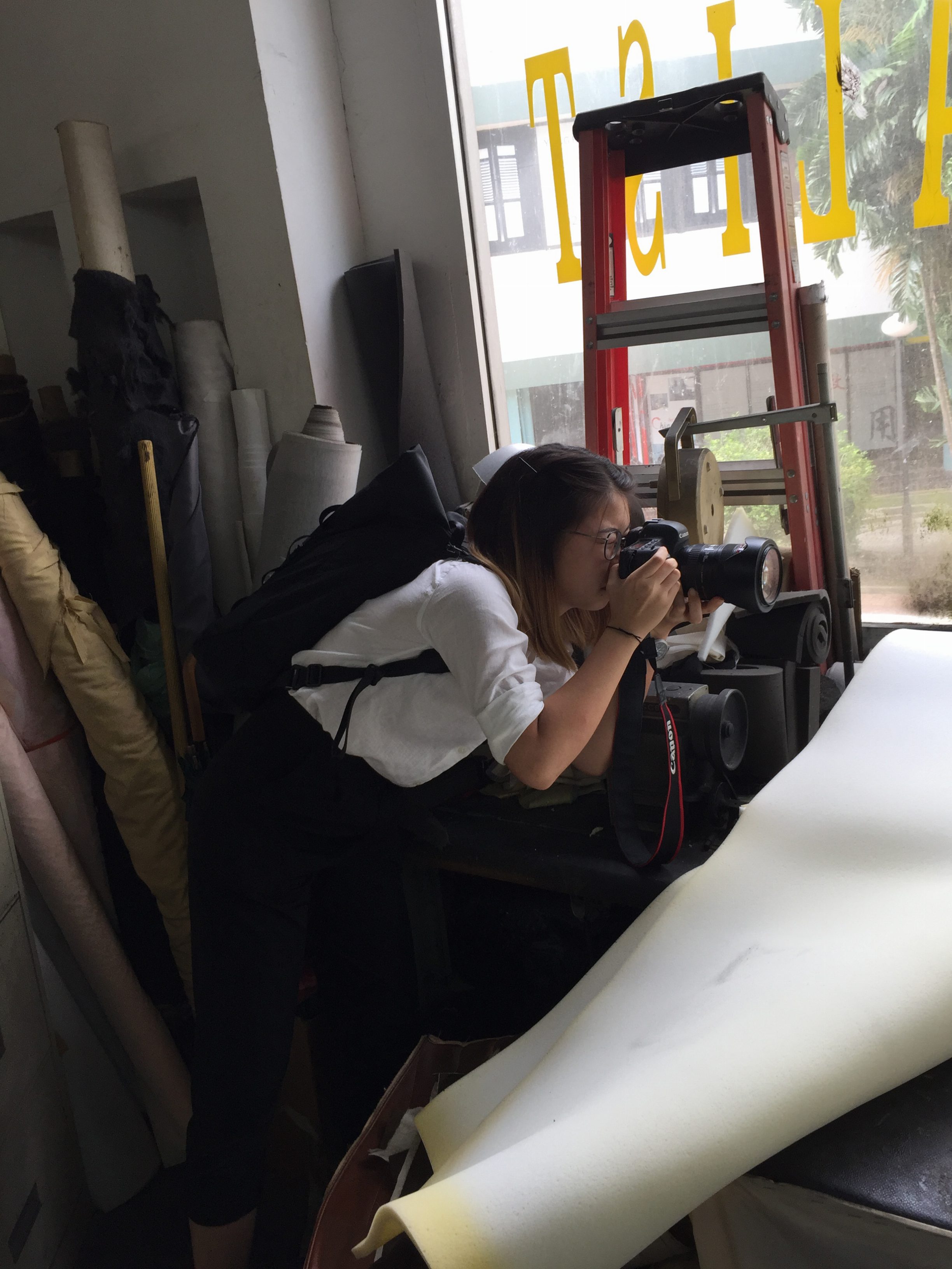
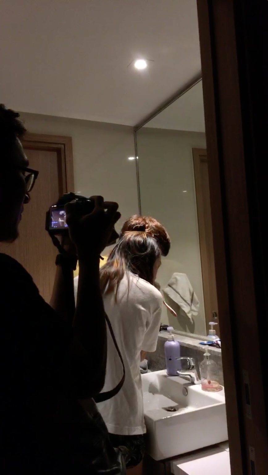
i understood what she was referring to and i realized i was lacking in some portraiture, so i went back to beauty world for another time to take their portraits.
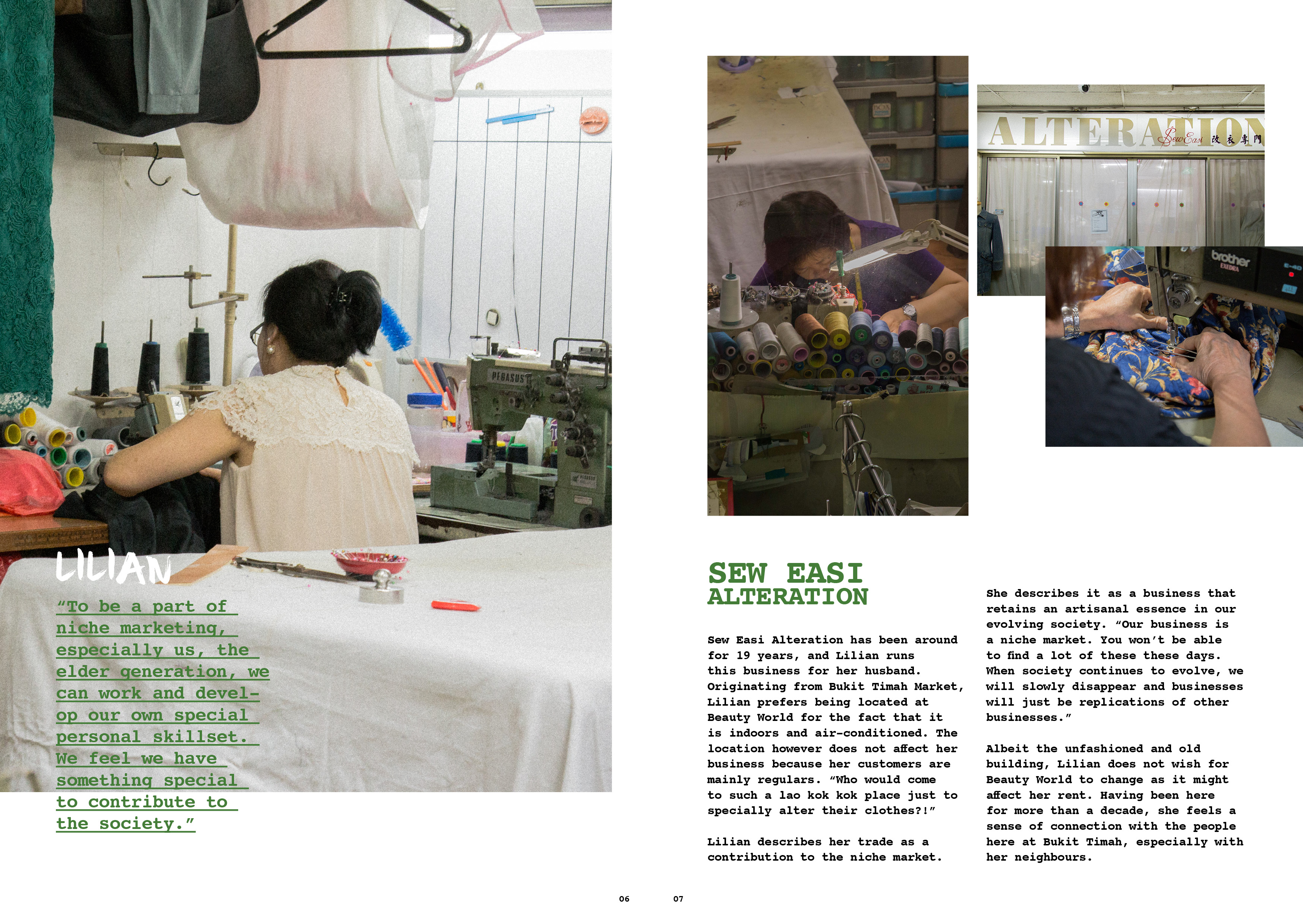
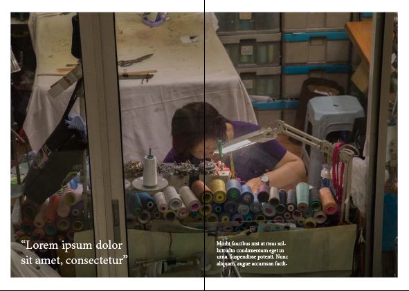
unfortunately Lilian from Sew Easi wasnt comfortable to have her picture taken, so i could only use the previous photo i had of her back to substitute as her portraiture 🙁
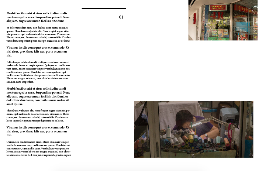
getting a layout was actually quite difficult mainly because of the lack of pages!! as i had 3 craftsmen to showcase, it meant that i only have 1 spread for 1 craftsman. the tough part was squeezing the images into one spread, and have a write up with it too. i had struggles on the arrangement because i didnt want to make my zine as just a photo journal, but more of it being content related.
i wanted to have a full page of their portraiture, however that leaves me just 1 page of images + text. that. was. a. challenge.
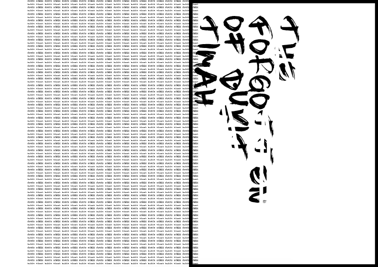
i didnt know where to place my write up because there was just too much going on one one page. i wanted to experiment with the overlaying of write up on my images to make it look “experimental”, but that’s not a way to do graphic design because aesthetics shouldn’t be the main reason to design. design must make sense, then comes aesthetics.
after much painful processes of rearranging in the middle of nights, i finally settled on a layout –
however there are some elements that i felt should be worked on –
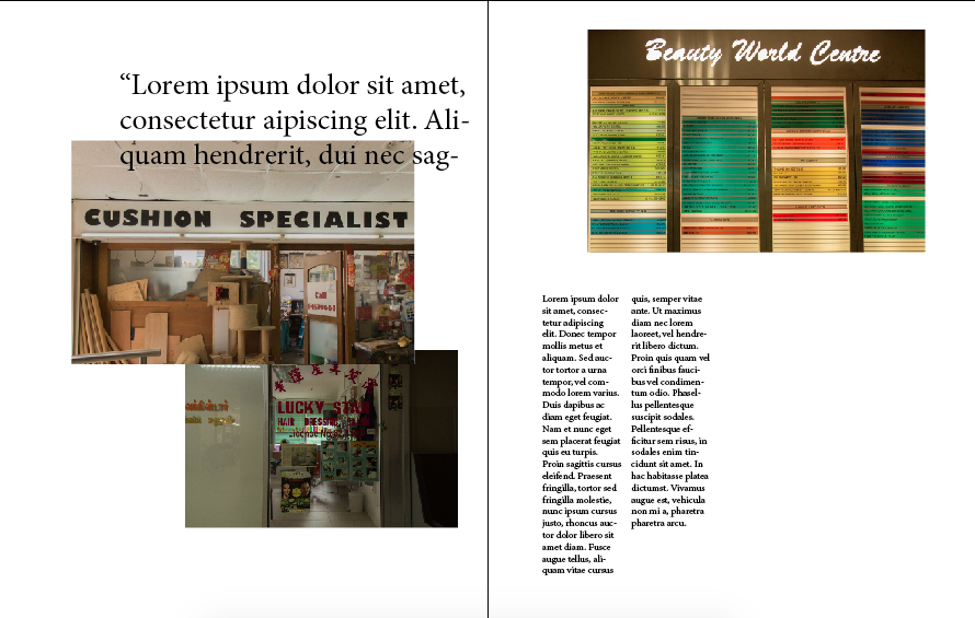
- the placement of the quote on the first page. it was hard to read because of the colour of the text and background, and the arrangement of it was wrong. it didnt make sense. my eye doesnt lead me to the quote.
- the title of the place. “lucky star hair dressing saloon” was at the wrong place because it makes people have the impression that the write up starts from the right column, but it is not.
i tweaked them again and here is my final layout! –

i preferred the way it looks now because the images dont look too stagnant and systematic. they are overlaid and i feel that way they look more organic, but also pleasant to the eyes.
aaaand thats a wrap for 2D! i really had fun the projects for this semester because they were more visual communication related. i really enjoyed the process of doing site research because it opened my eyes and created a whole new perspective of bukit timah as a whole. i am also thankful that because of this project, i managed to find out about these artisans, and their stories be it their life, their business, or their philosophy on things in general. i am also glad i had the opportunity to land myself photography project as well because it has always been my passion to document and photograph artisans and their craft.
designing publications has been my favourite because i find the excitement in the challenge on how placements of elements could affect the readability and the feeling. this project has definitely provided me the experience and trained me well.
and im really glad that mimi brings her professional industry background into class, as telling us how the graphic / advertising industry works in class. i believe that is important and essential for us, especially for budding designers.
thank you mimi for your guidance for this sem! i have definitely learned quite a bit!
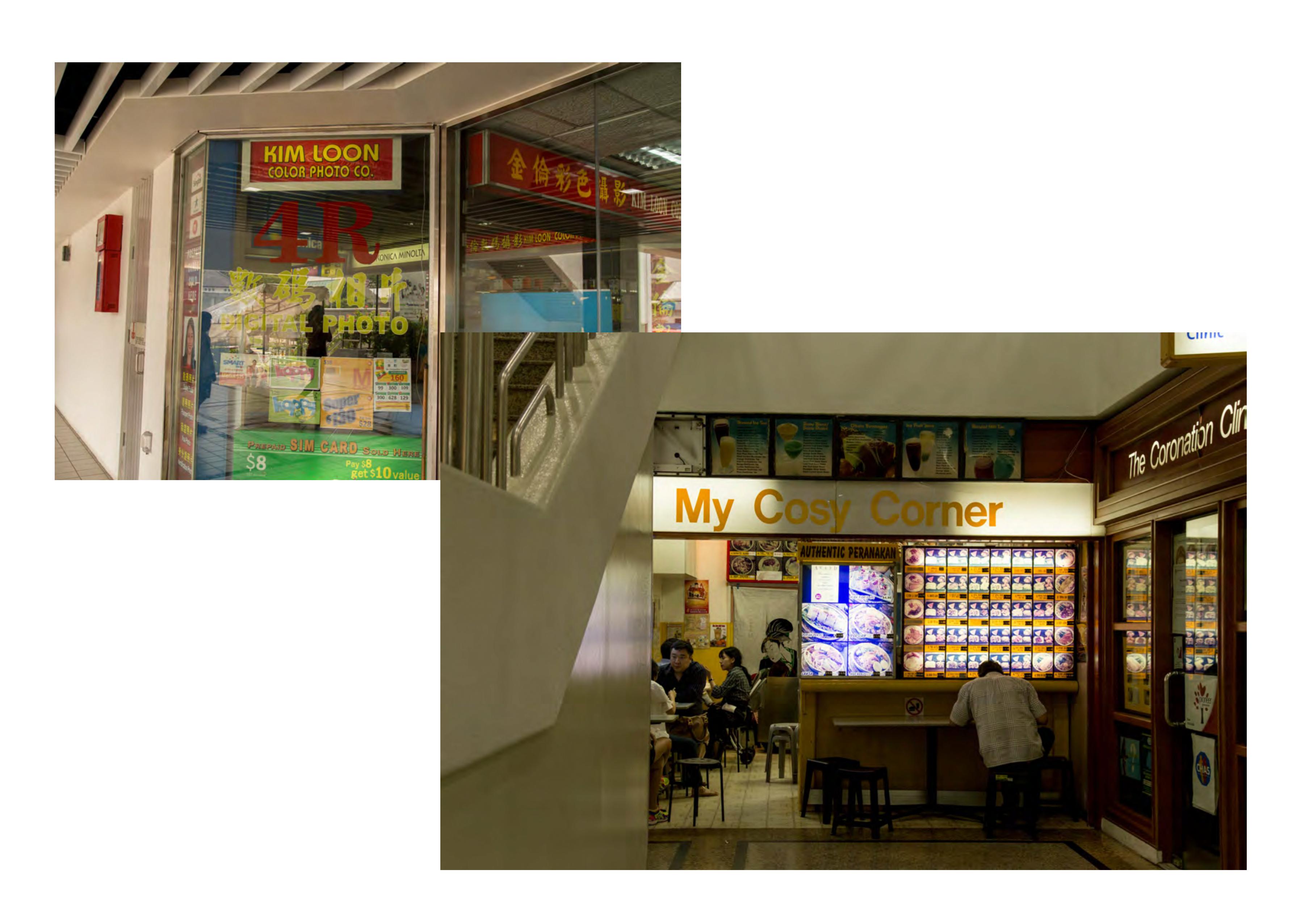
before i end off, here are images that didnt make it into the zine. enjoy!
2DII – Zine Process #1
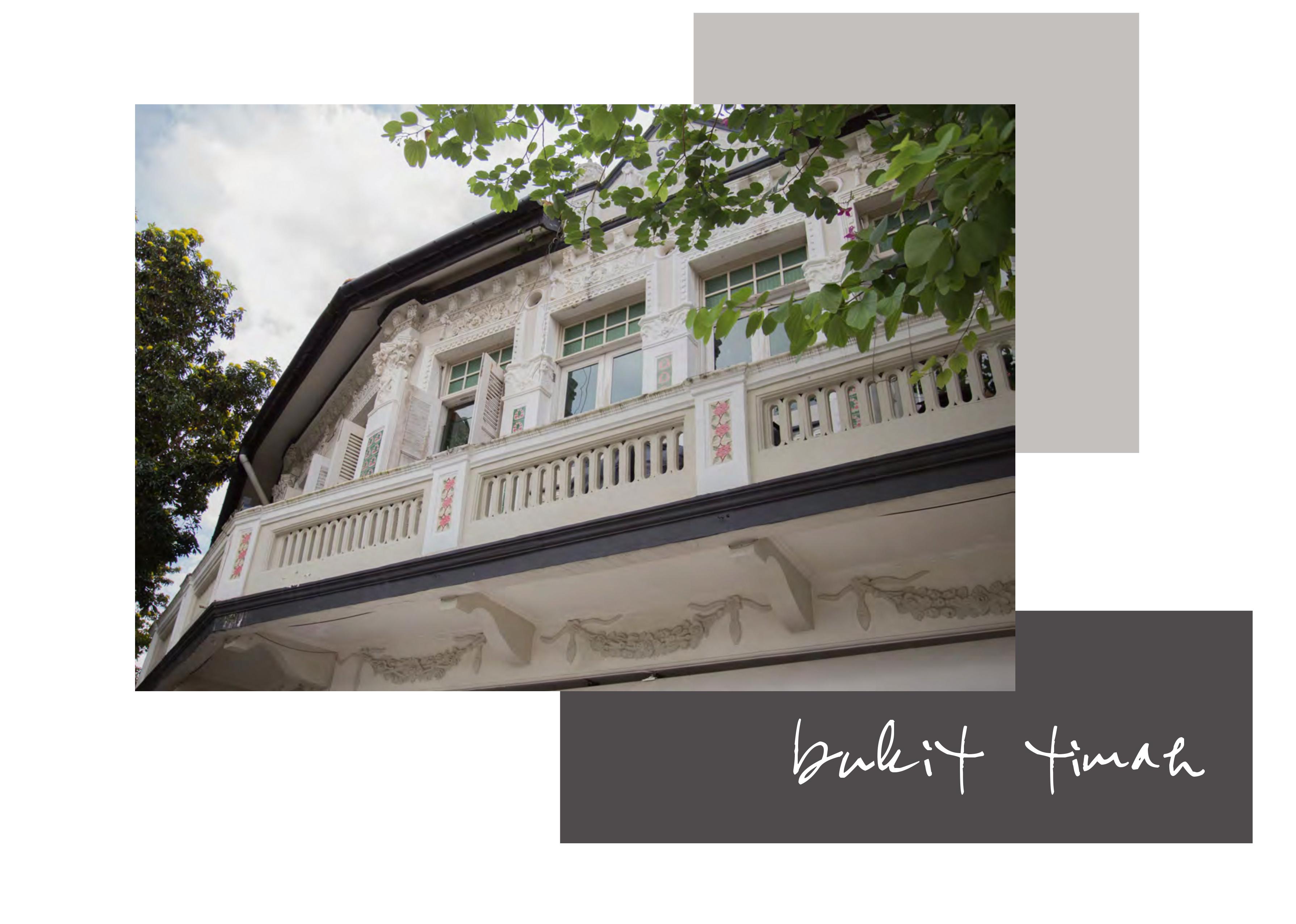
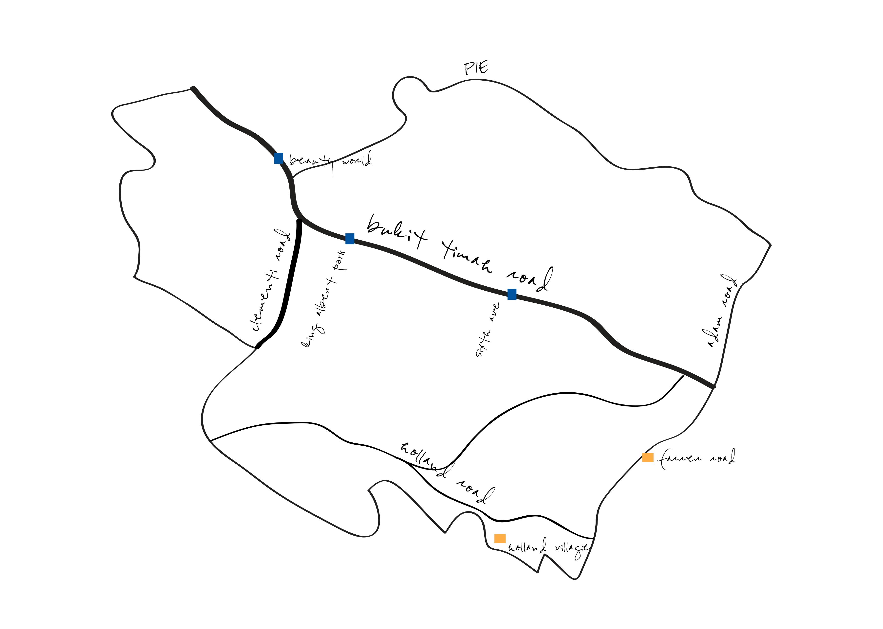
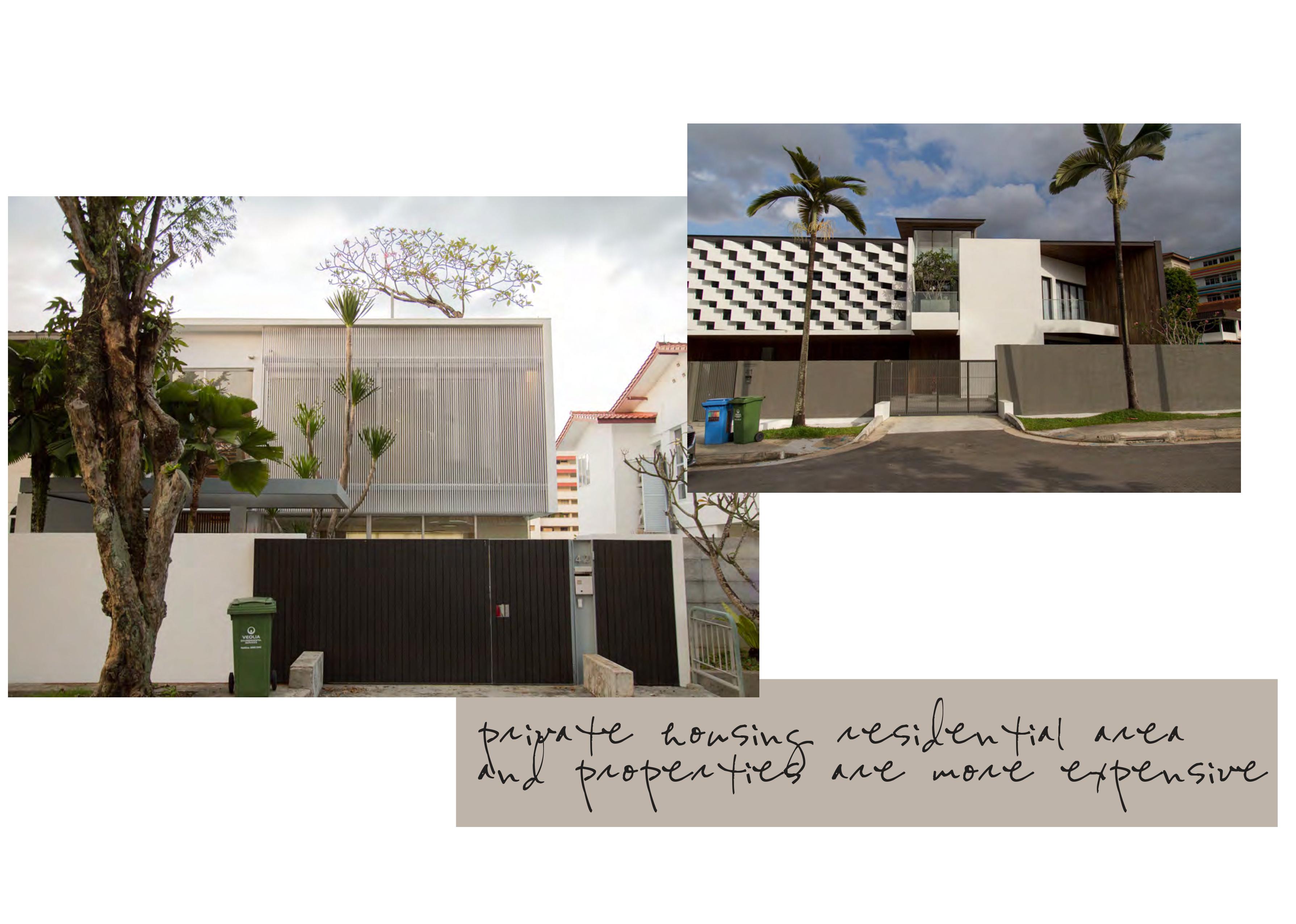
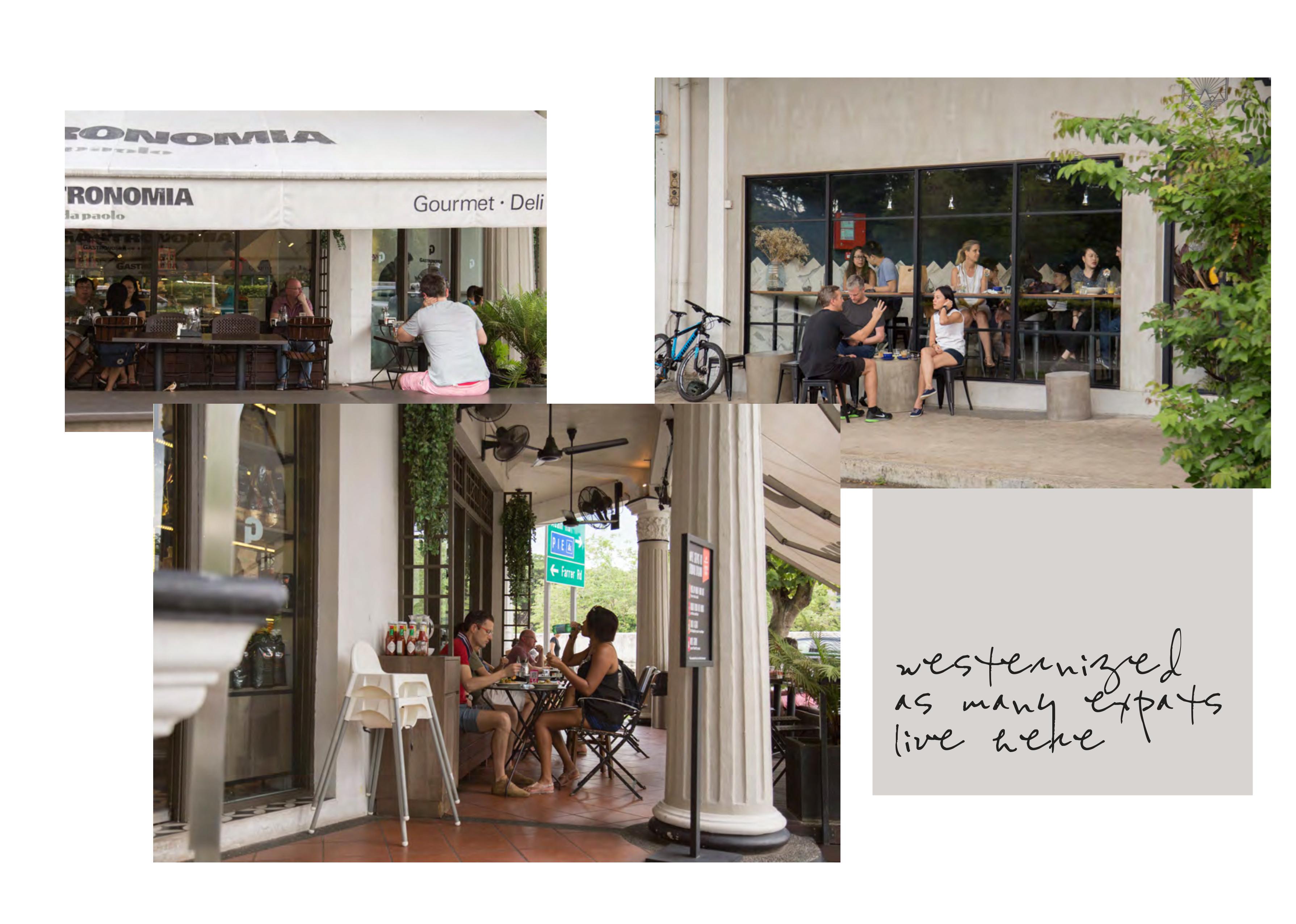
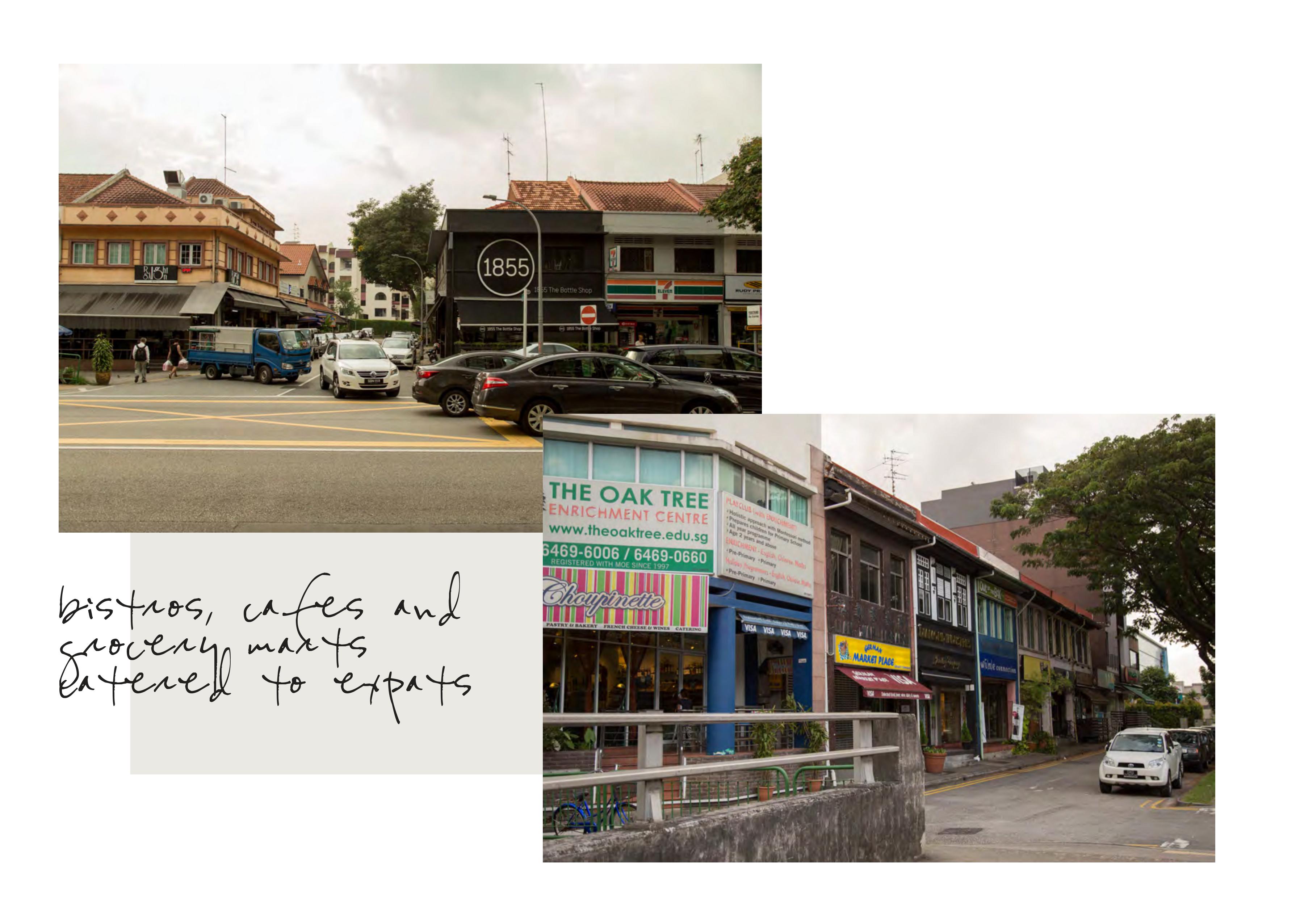
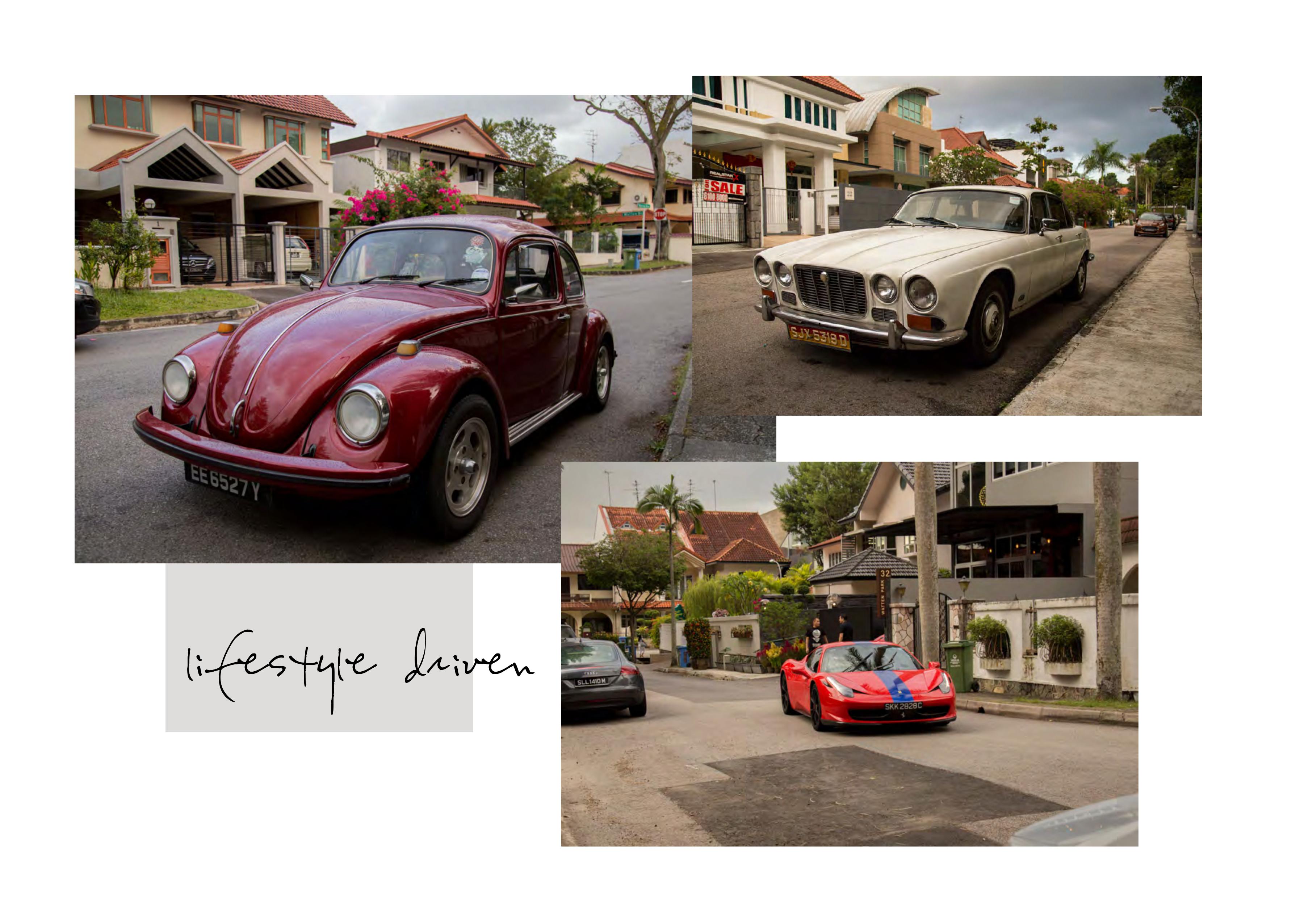
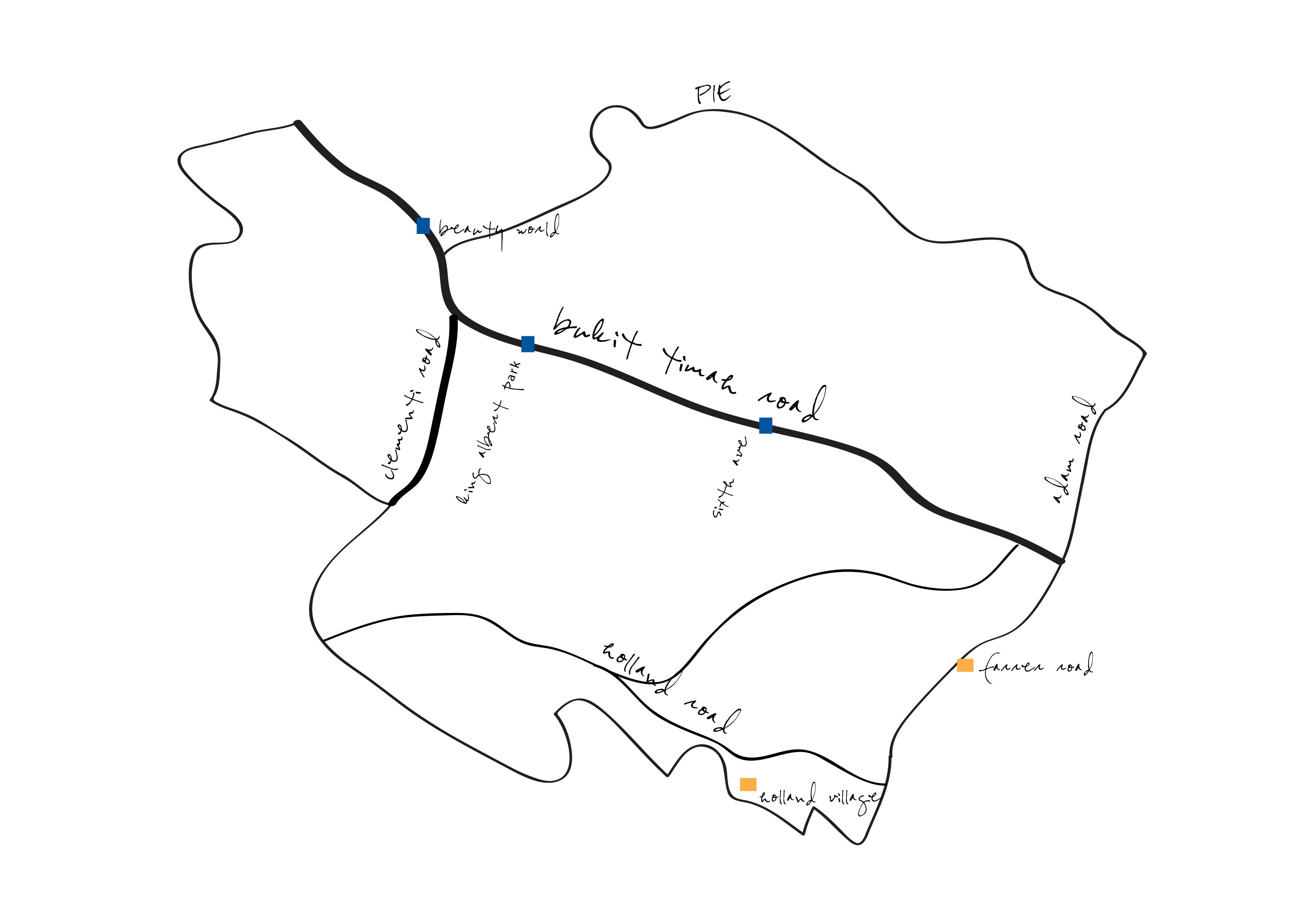
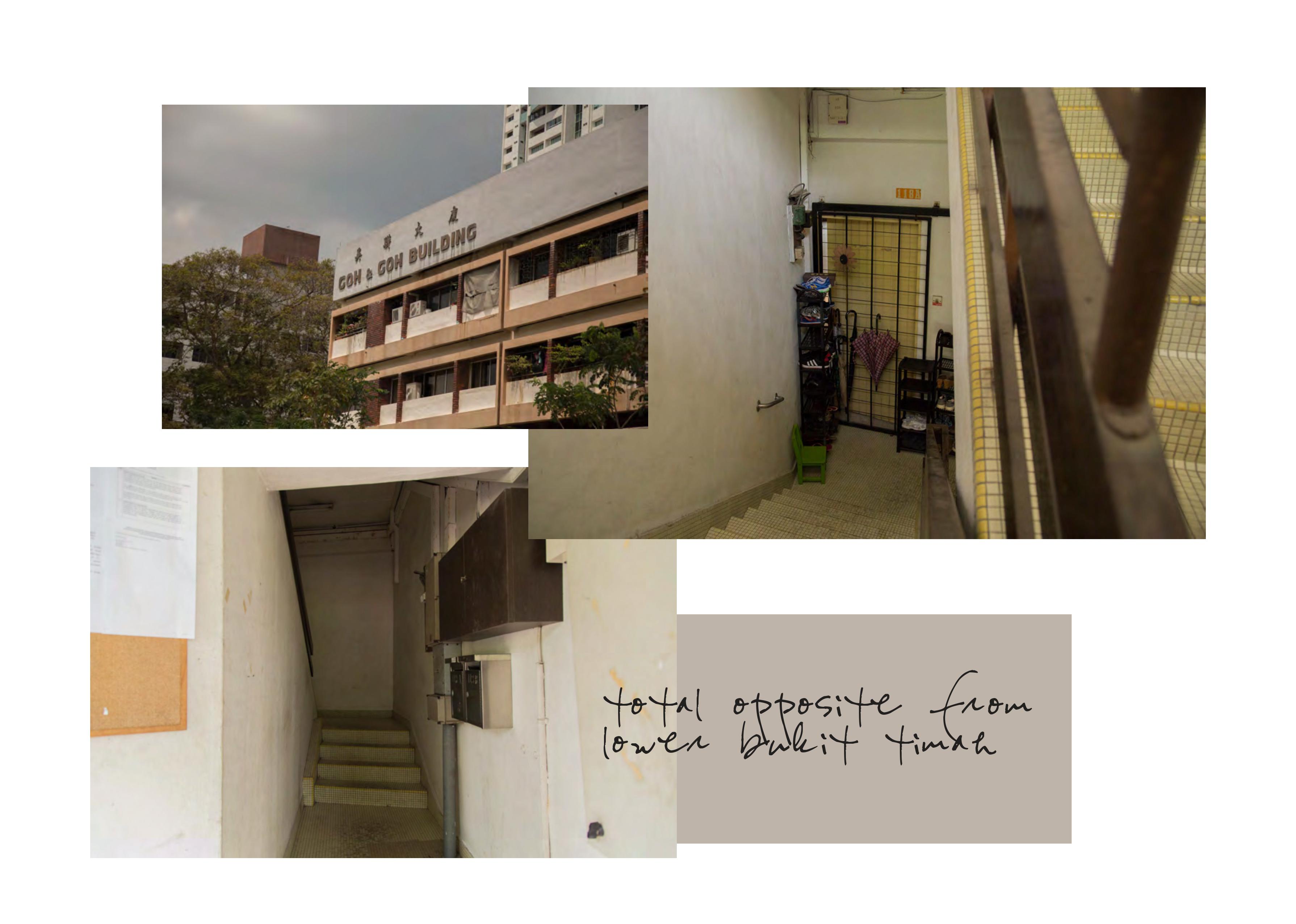
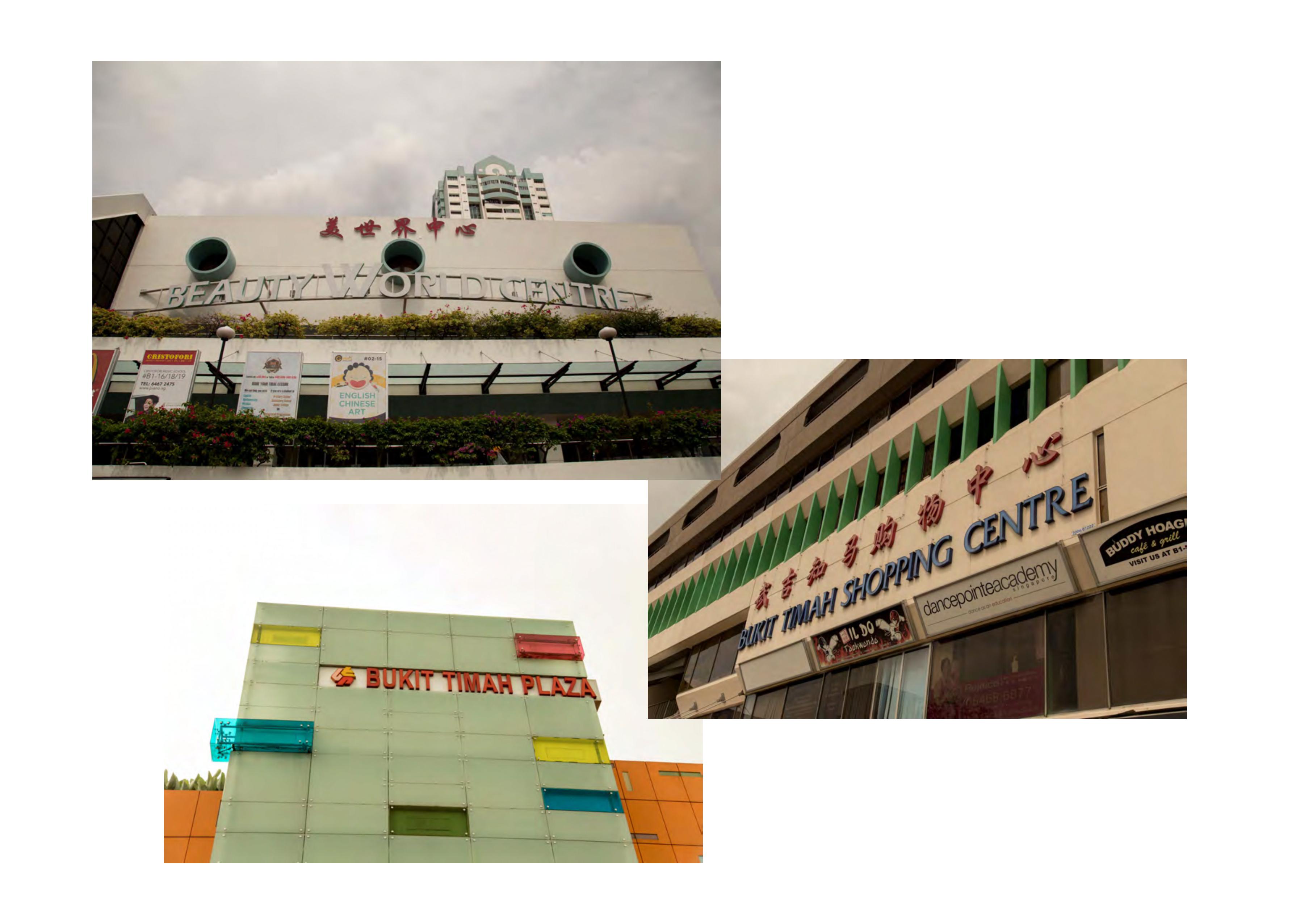
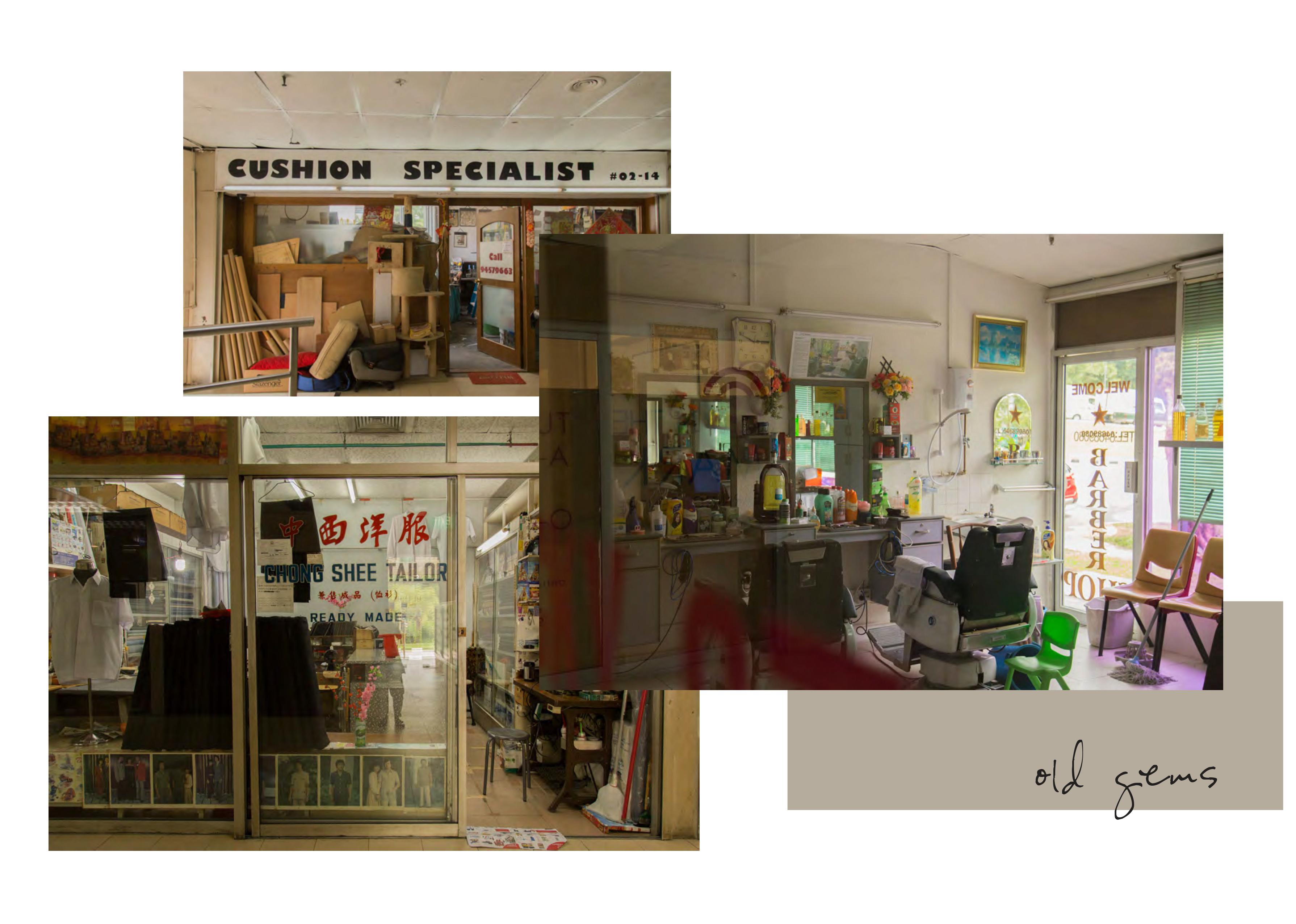
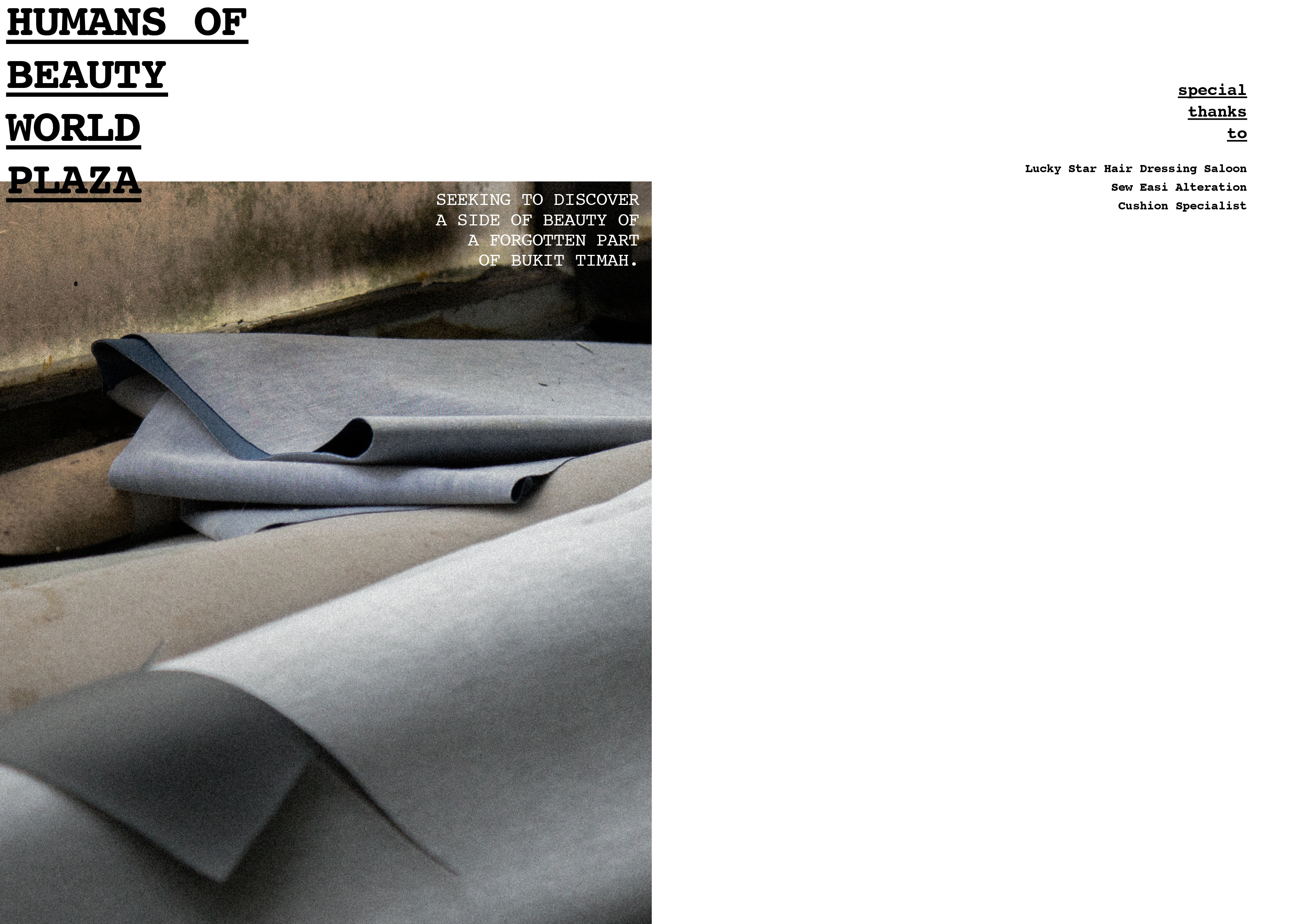
my zine concept is going to be documentating the forgotten of beauty world. i narrowed down to 3 store owners that caught my attention the most during my first recee – Cushion Specialist, Sew Easi Alteration and Lucky Star Hair Dressing Saloon.
prior to the visit i made, i crafted a few initial questions to ask them. they were mainly questions on their thoughts of bukit timah and their thoughts when people associate it as an atas area, but forgetting this part of bukit timah.
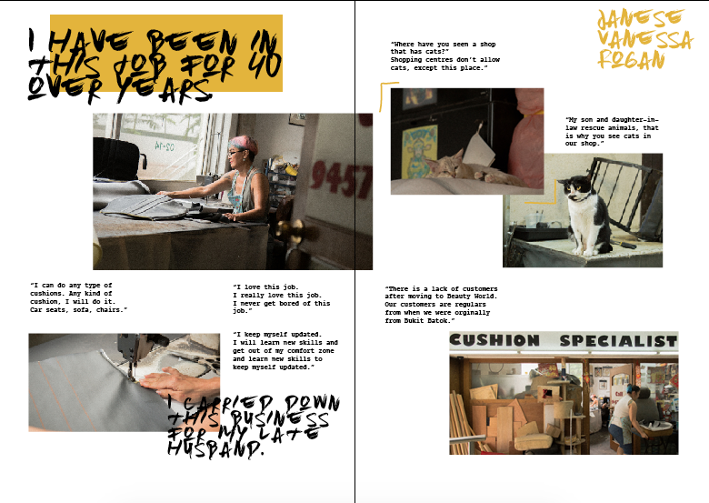
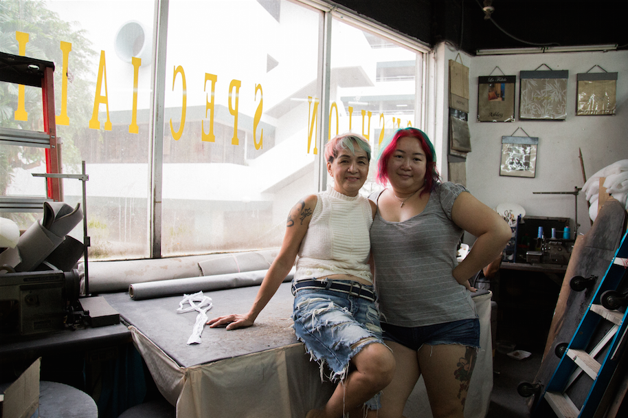
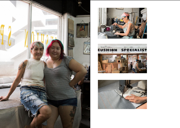
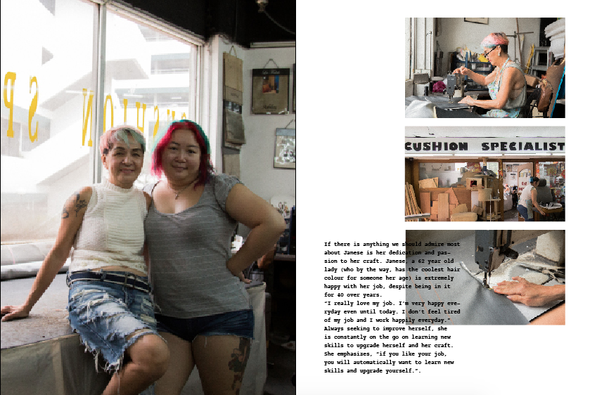
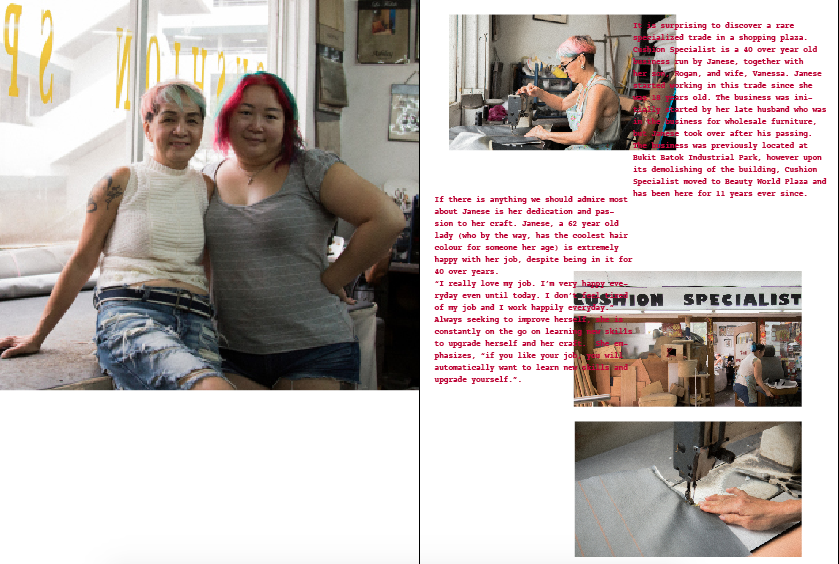
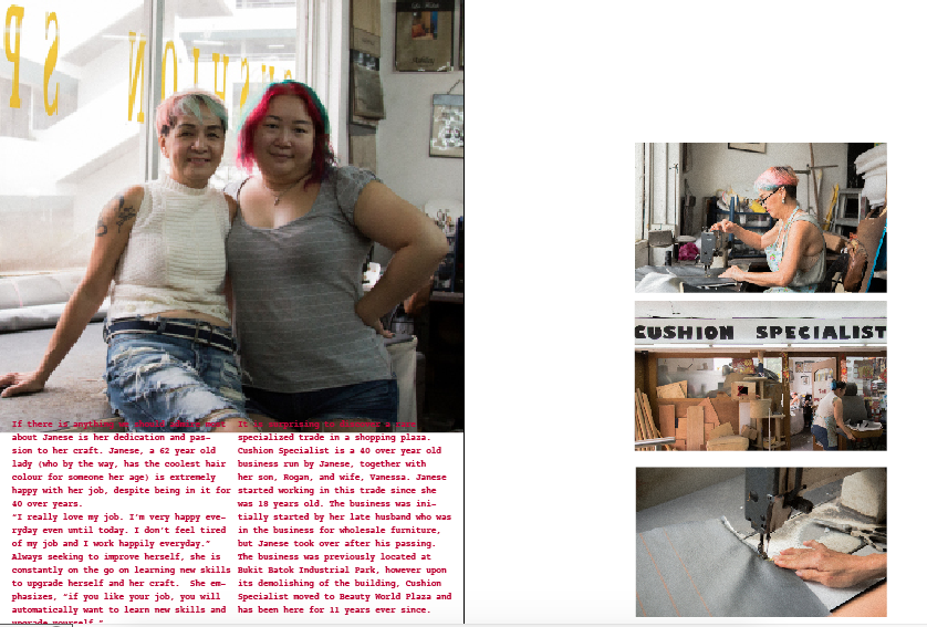
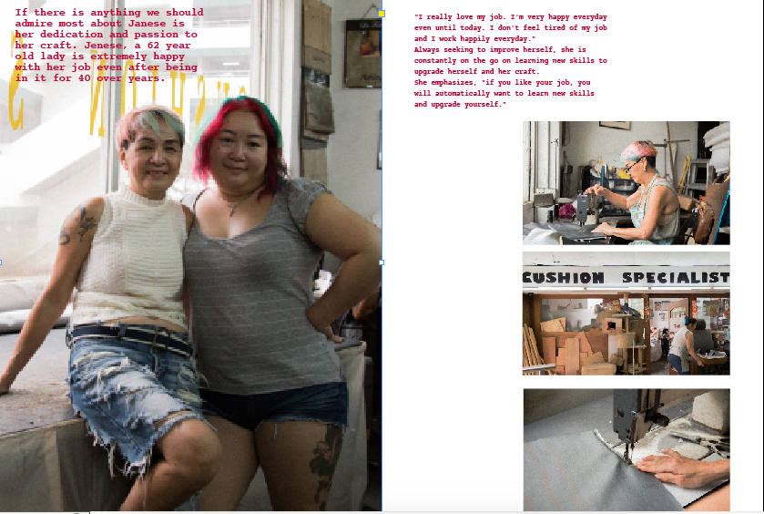
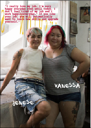
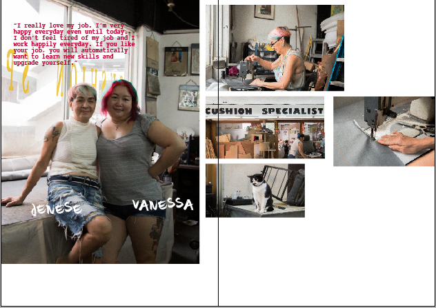
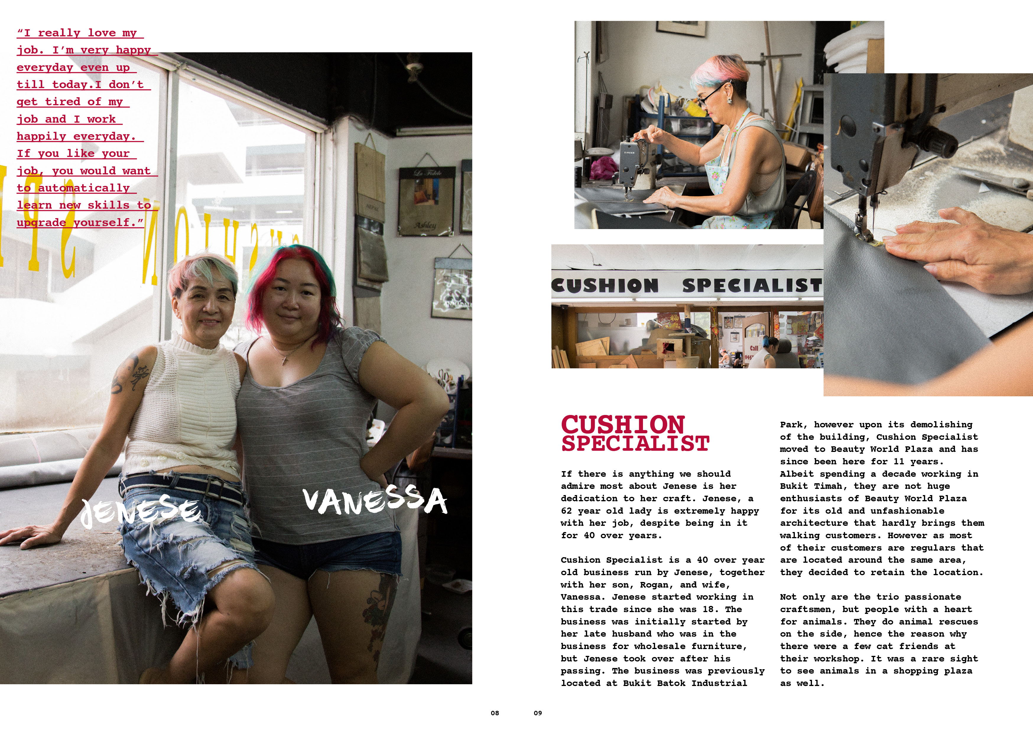
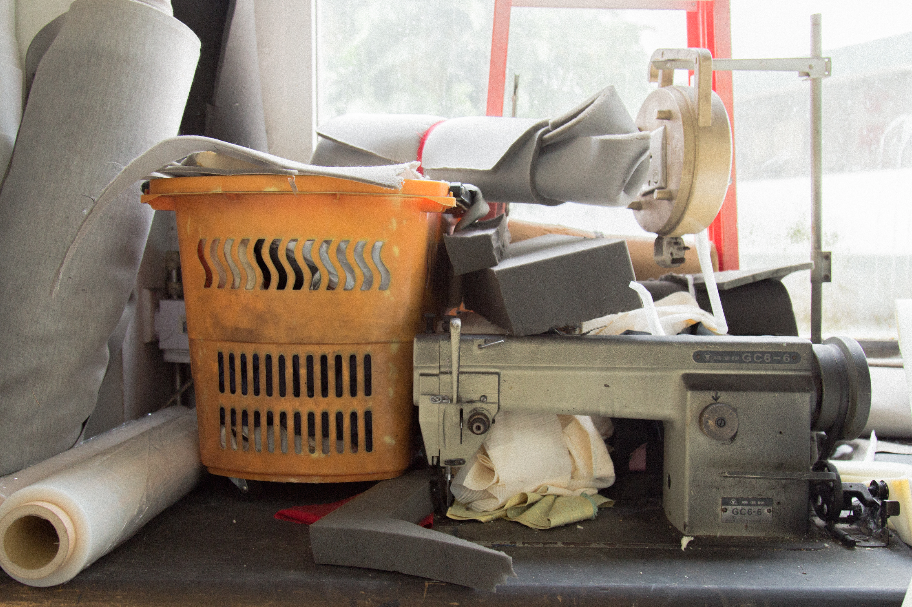
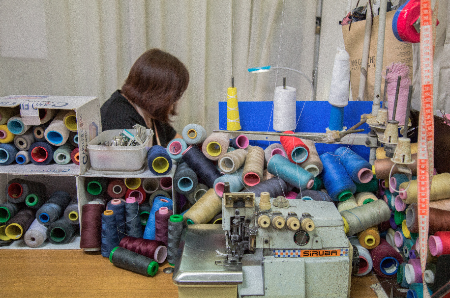
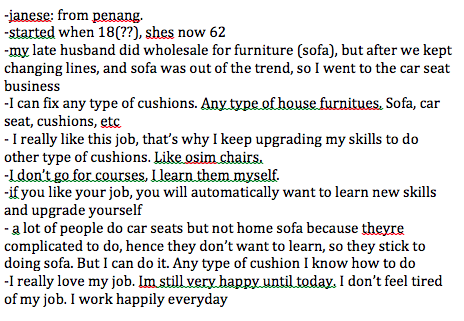
Cushion Specialist
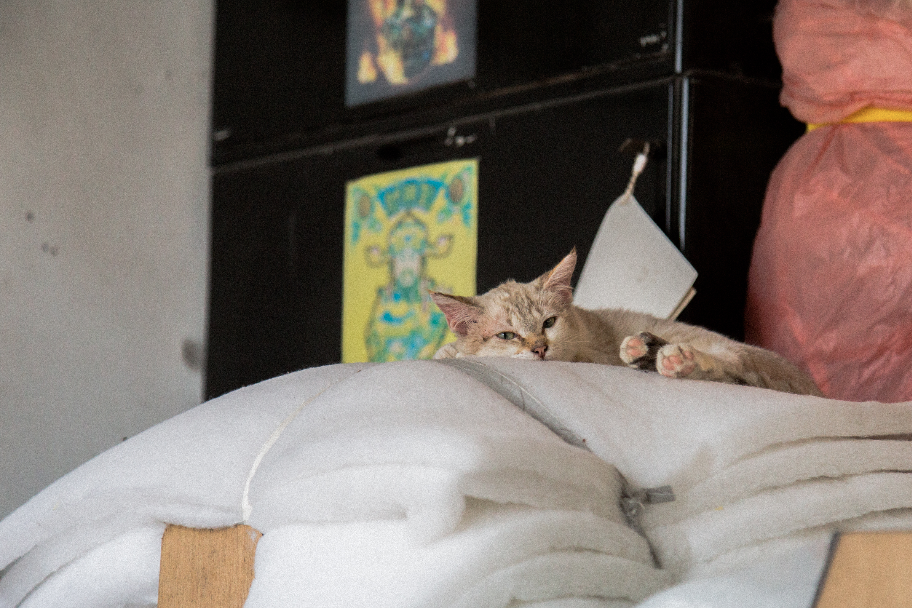
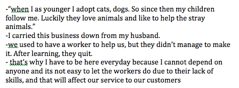
jenese, vanessa and rogan were really friendly people to talk to. jenese is a 60 year old lady who runs the business together with her son and daughter in law. it was a business started by her late husband but took over upon his passing. throughout the whole conversation, it was really heartwarming to hear her speak continuously and so passionately about her job.
vanessa told me that they do animal rescues on the side, and it was the reason why they have 4 cats in their workshop (and 10 more at home). it was really really nice to meet and know there are kind hearted people like them that exist.
images below are insights that i got from the interview.
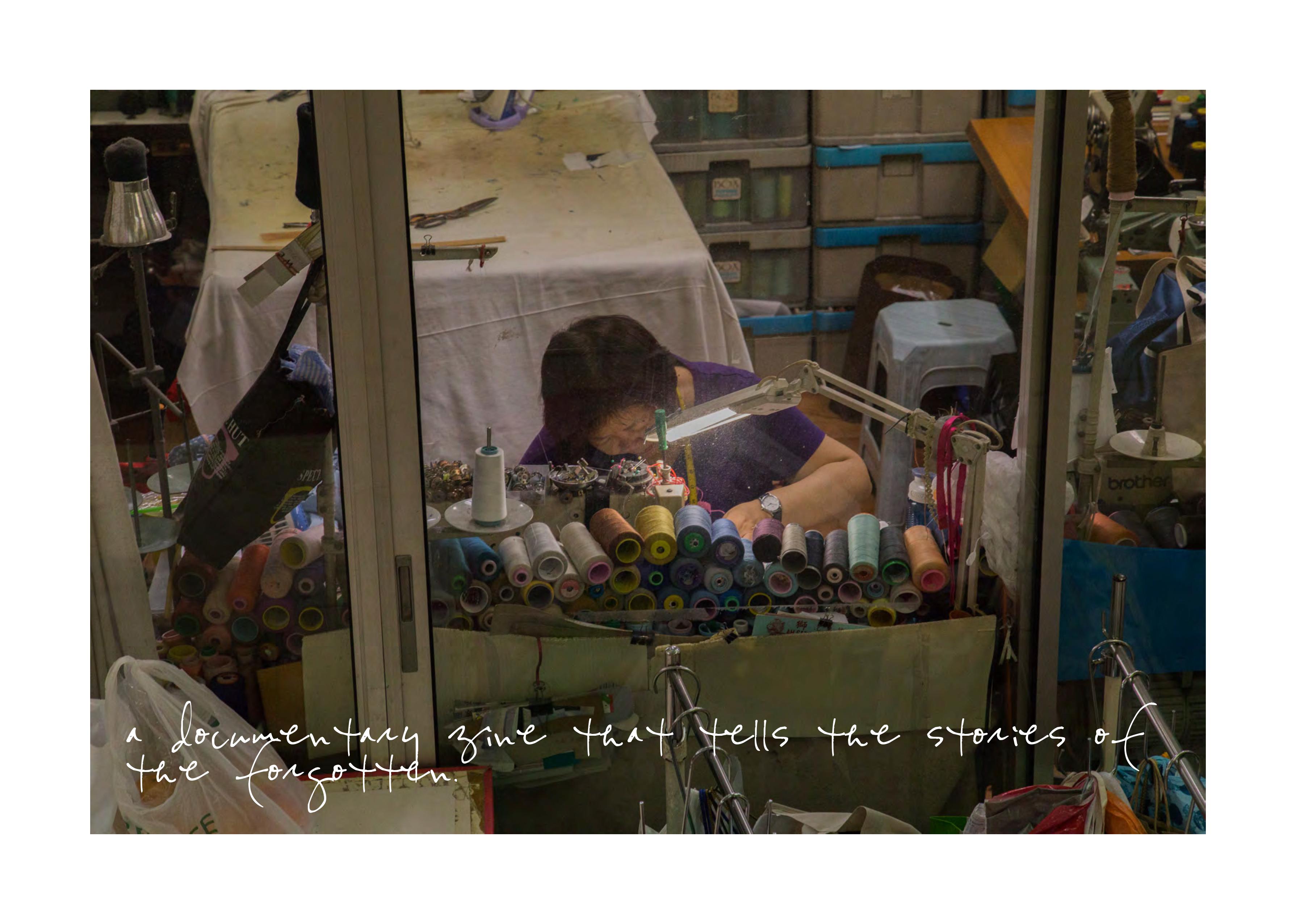
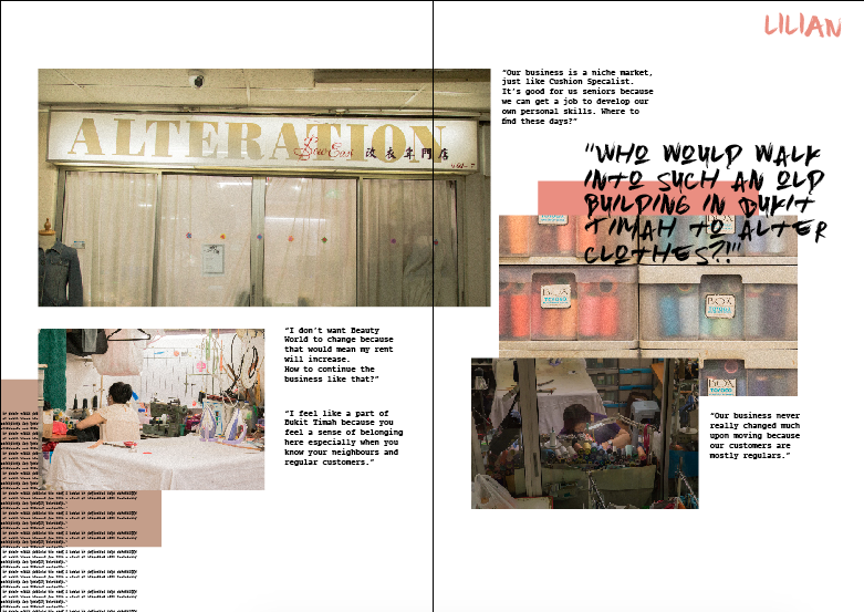
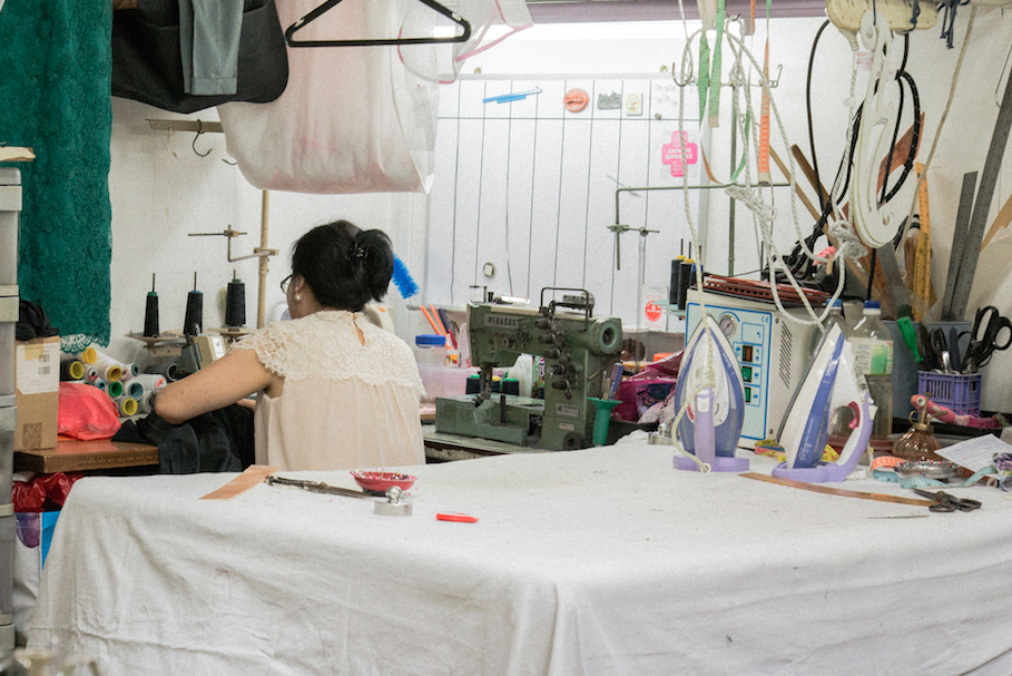
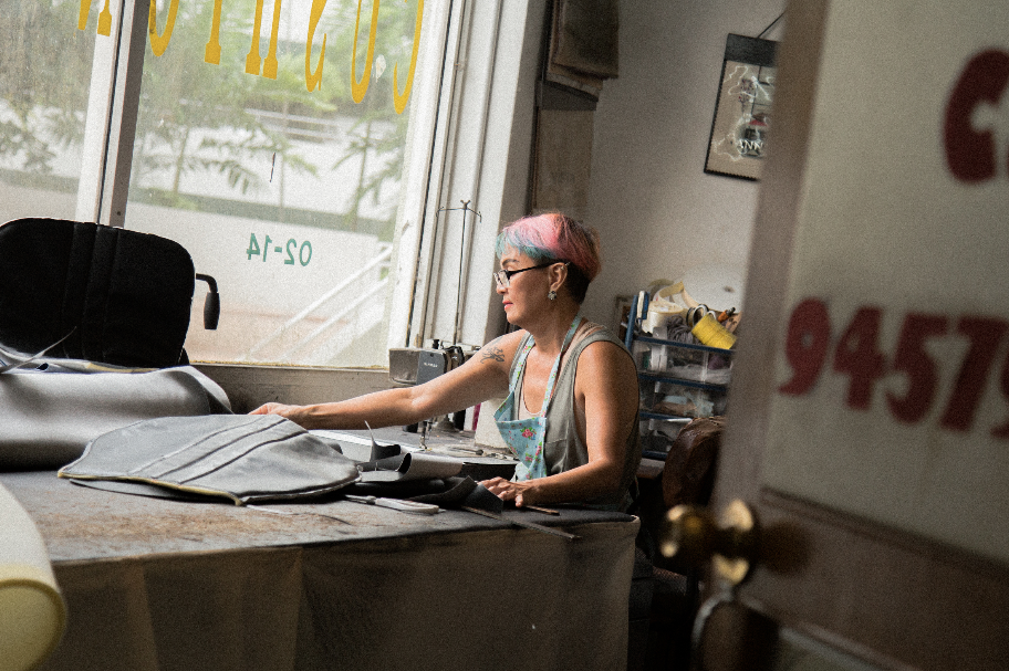
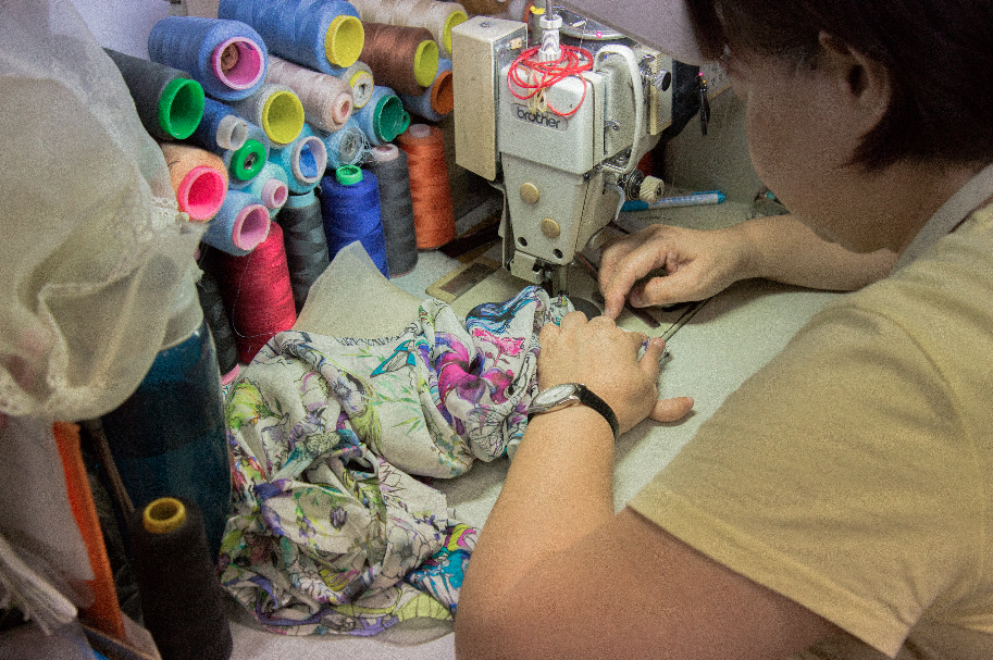
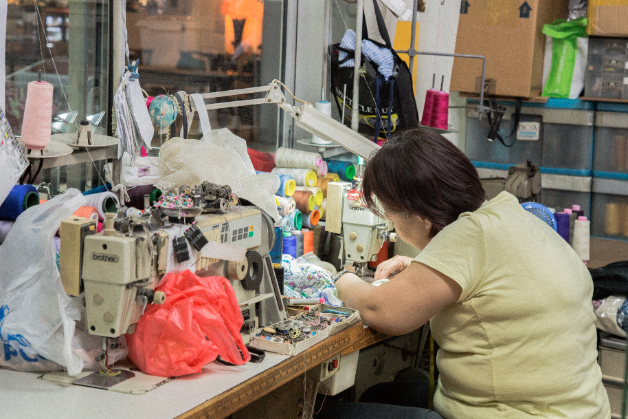
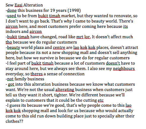
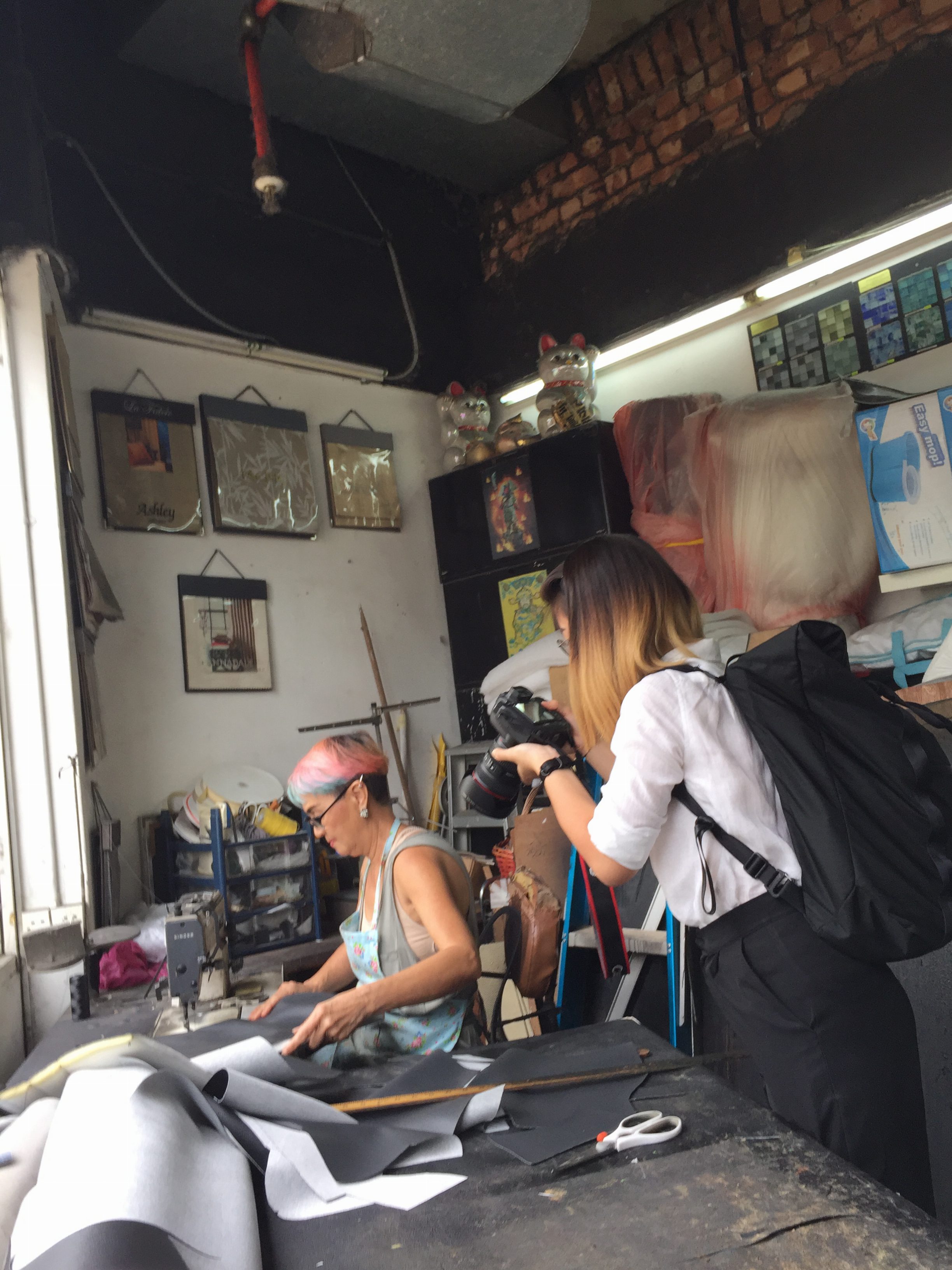
Sew Easi Alteration
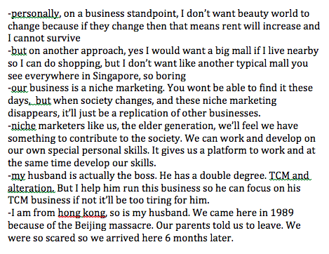
lilian came to singapore from hong kong in 1989 due to the Tiananmen massacre in china. she runs the business for her husband because he holds a double degree – TCM and Alteration (she runs it because her husband cannot cope with 2 jobs). i was glad that i found out she came from hong kong because i was able to communicate with her in cantonese (that made the converastion more comfortable for her and casual). however she was really uncomfortable to be infront of the camera, so i could not get any photos of her face and her colleagues.
images below are insights that i got from the interview.
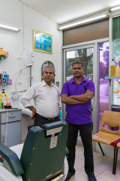
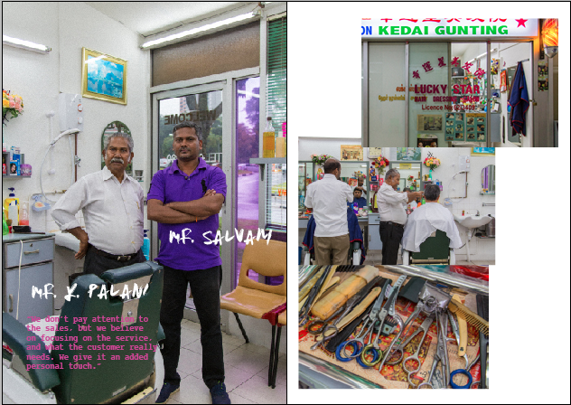
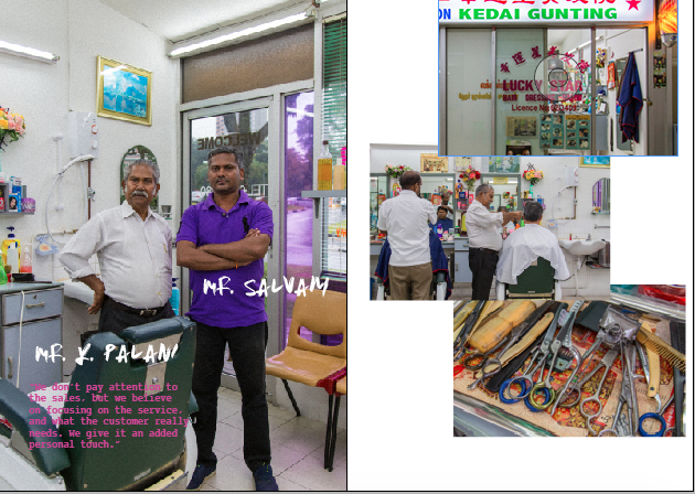
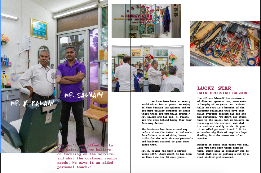
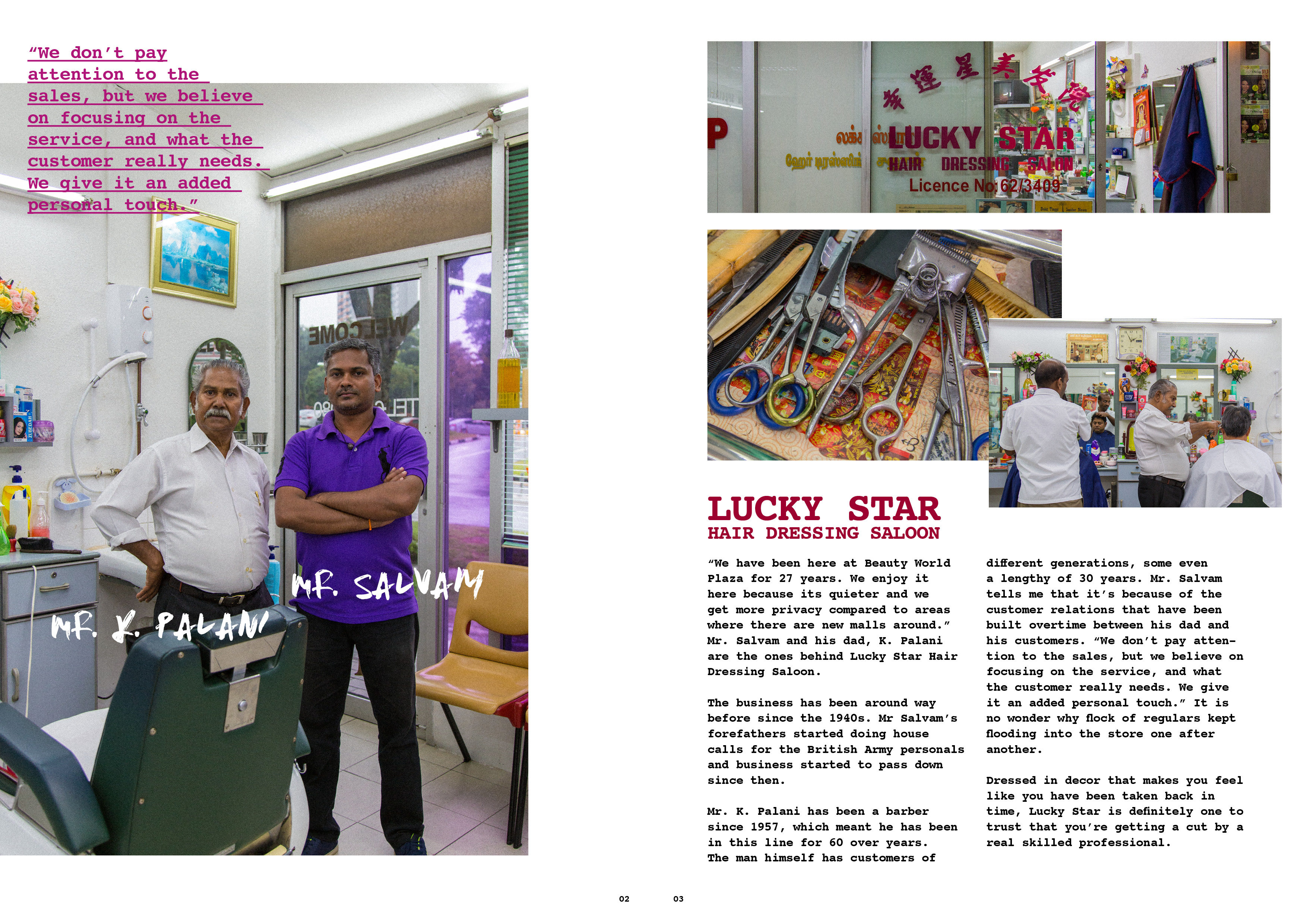
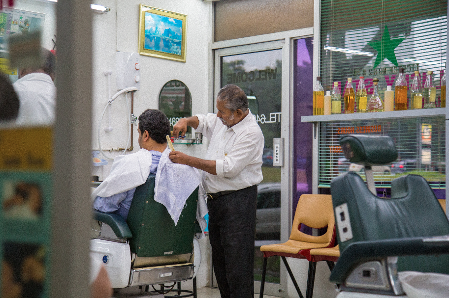
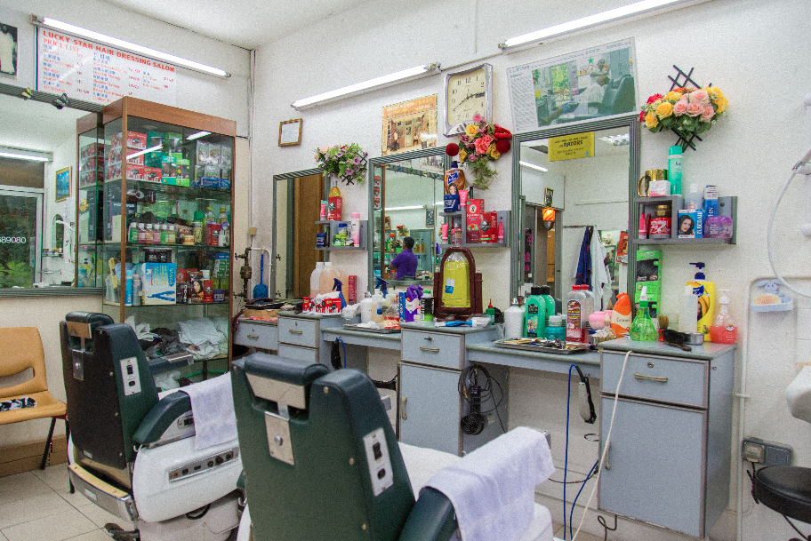
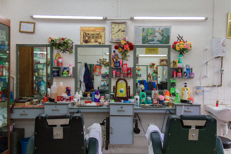
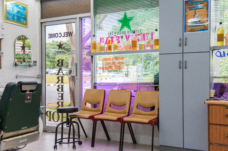
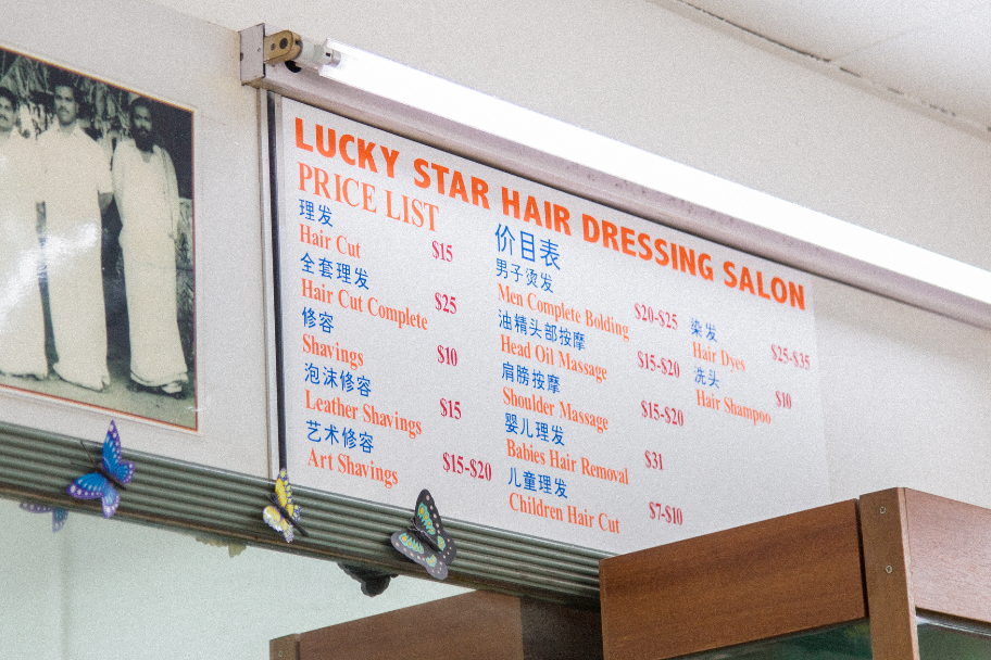
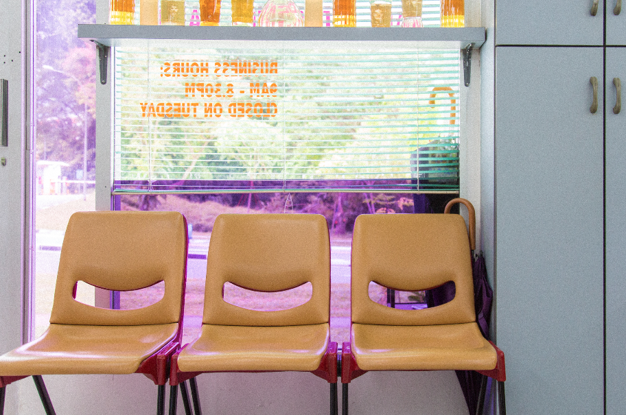
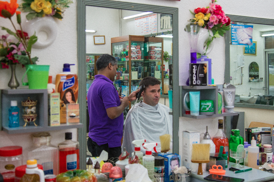
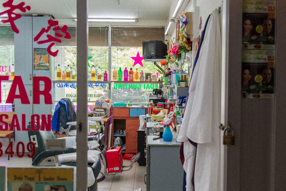
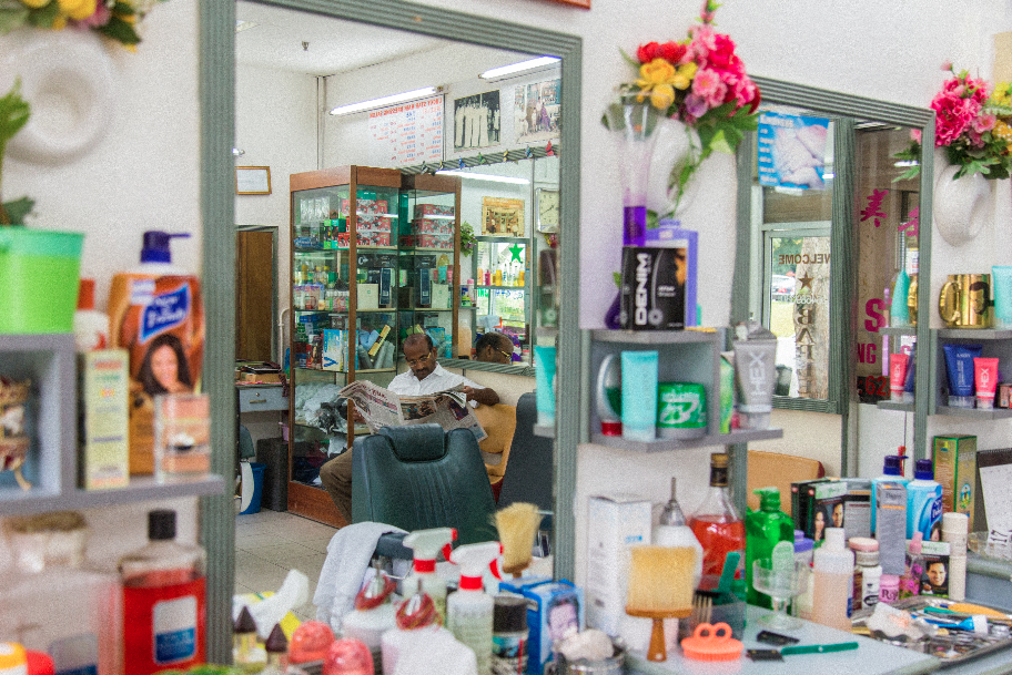
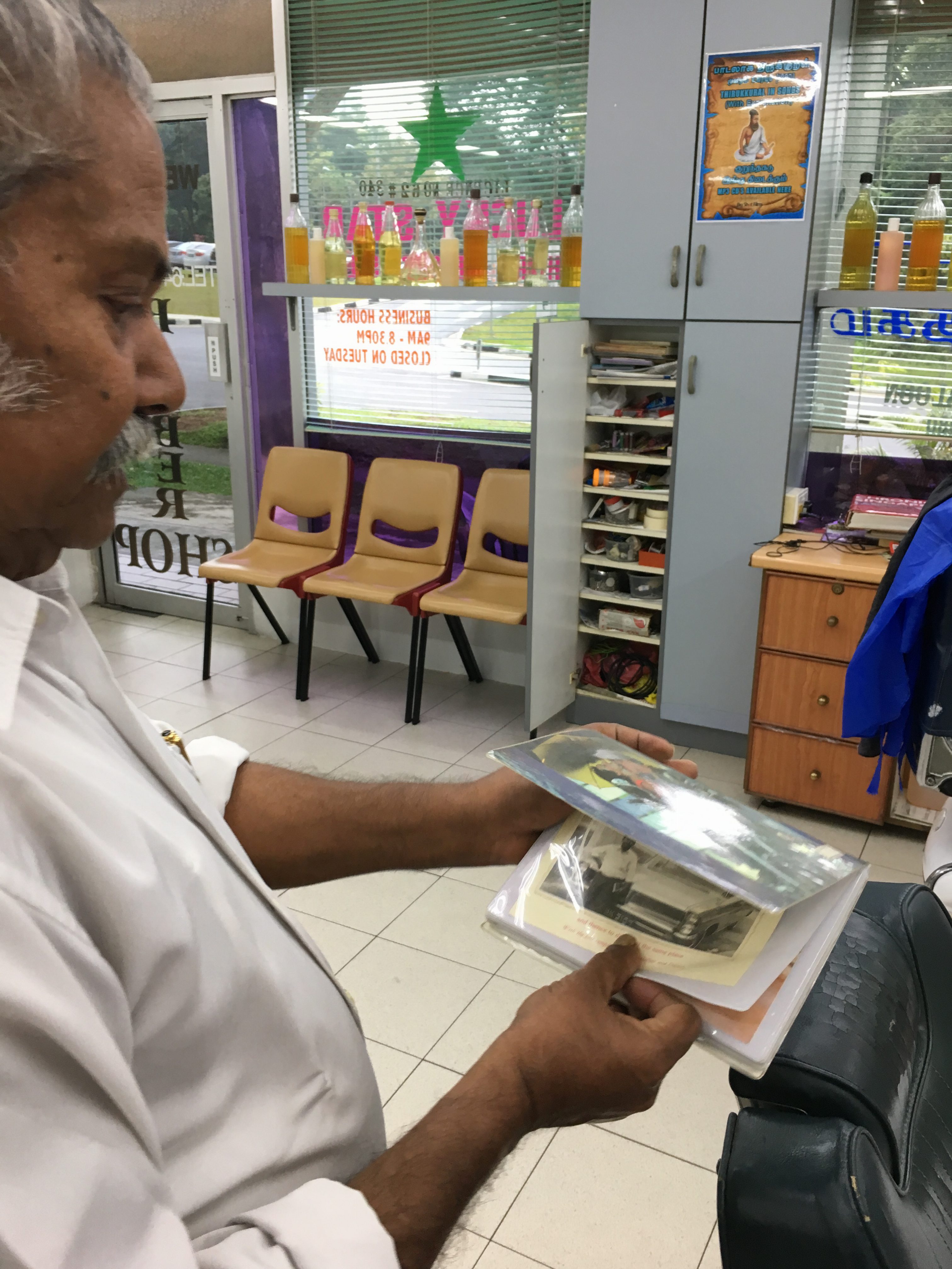
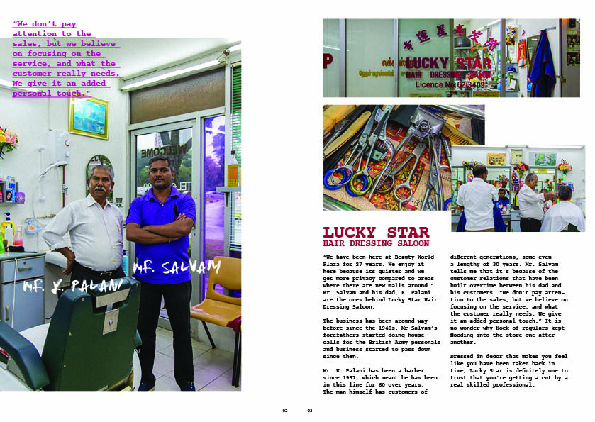
Lucky Star Hair Dressing Saloon
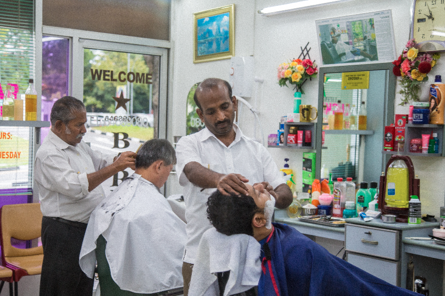
this place was a challenge for me to get an interview with them. they were closed the previous 2 times i went to beauty world plaza for recee. during the 2nd time, i asked vanessa (from cushion specialist) if they’re always closed. turns out they are closed on every tuesday. the third time i went on a thursday to specially interview them, i waited for 2 hours because they were busy. afterwards, the old man (Mr K Palani) told me to come back tomorrow morning (around 10am) because he cant speak english but his son will be there tomorrow to hold the interview. i agreed and came back the next day. on friday, i came in 10am and Mr Palani told me that his son wont be here until 2pm. (i was really discouraged at that point of time because i have been wasting too much time). luckily i came back at 2pm and his son arrived and agreed to do the interview with me.
they were really nice people to talk to, especially Mr Palani (we commuicated through simple english) and i could feel his pride in his craft. i learnt that their business has been around for 60+ years. during the 2 days ive been there, customers kept coming in and they were extremely busy. turns out they’re really famous. Mr Palani was so passionate about telling me how long his customers have been going to him. he told me some of his customers have been with him for 30 years, and now hes starting to cut for theit grandchildren. he also told me how the relationship between him and his customers is more than just a business interaction, but a bond. i could feel his sadness when he told me some of his customers have passed on, and some are sick.
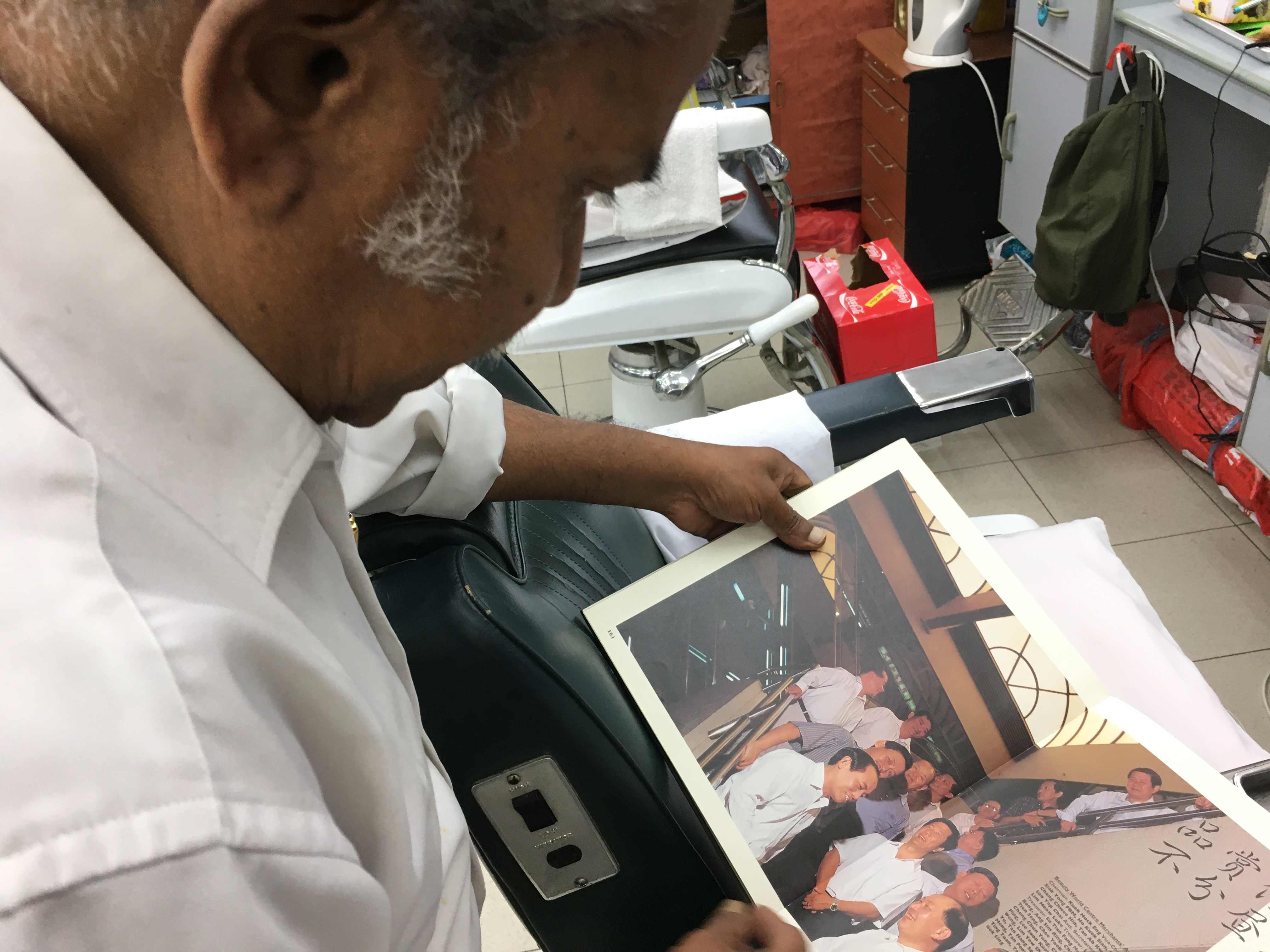
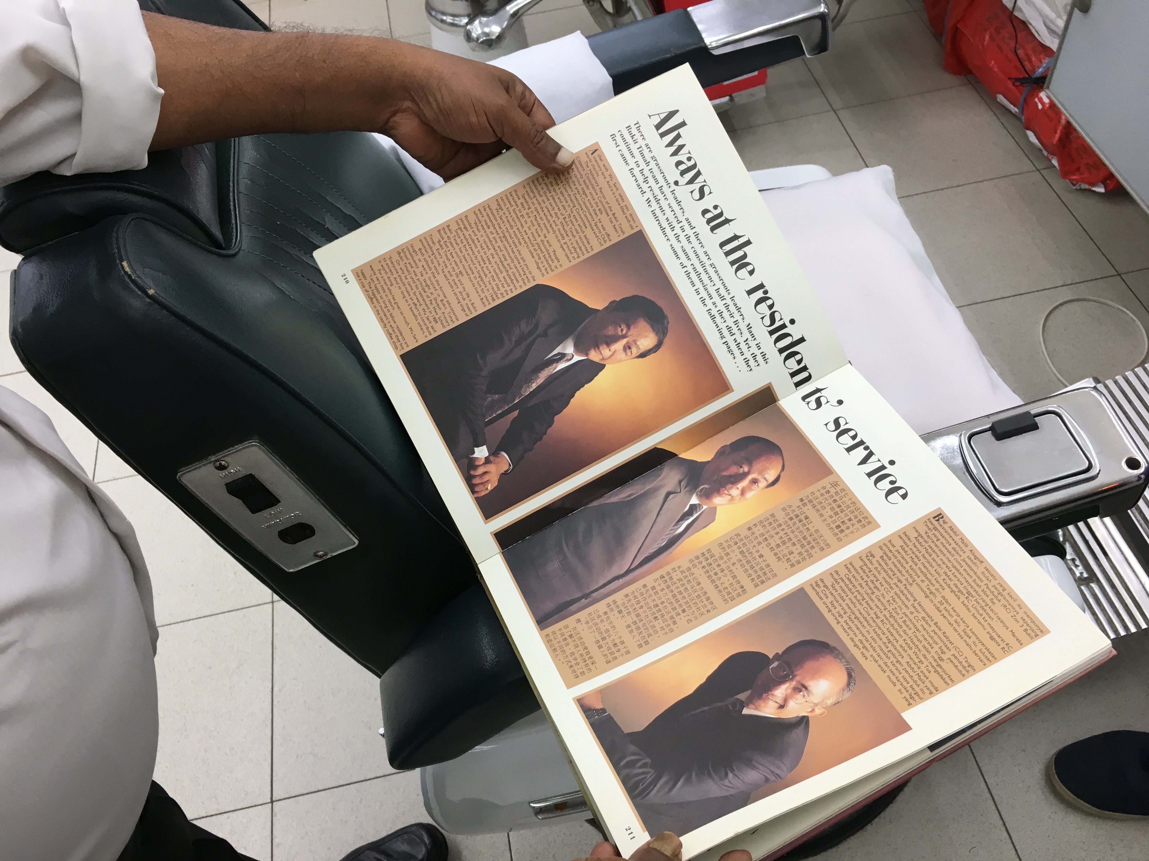
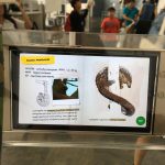
Mr Salvam and Palani showed me a book on the old bukit timah they were given from PAP when i told them my proj. (talk about the real originals of bukit timah!)
here’s a video on them in action! (pay attention to Mr K Palani’s hand movements and the sound of his scissors. definitely an old professional indeed.)
images below are insights that i got from the interview.
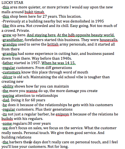
i really enjoyed the interview process. it broadened my perspectives on knowing the stories behind these craftsmen – they’re really passionate in what they do, and they put their customers’ needs more than their attempt on making their money. this is probably because they’ve been doing it for many years, and making money from their regulars is the last thing that they want. their customers also add on to the fact why they are unwilling to move. (reasons include their customers are familiar with their location, or because their customers live around the area and its accessible for them).
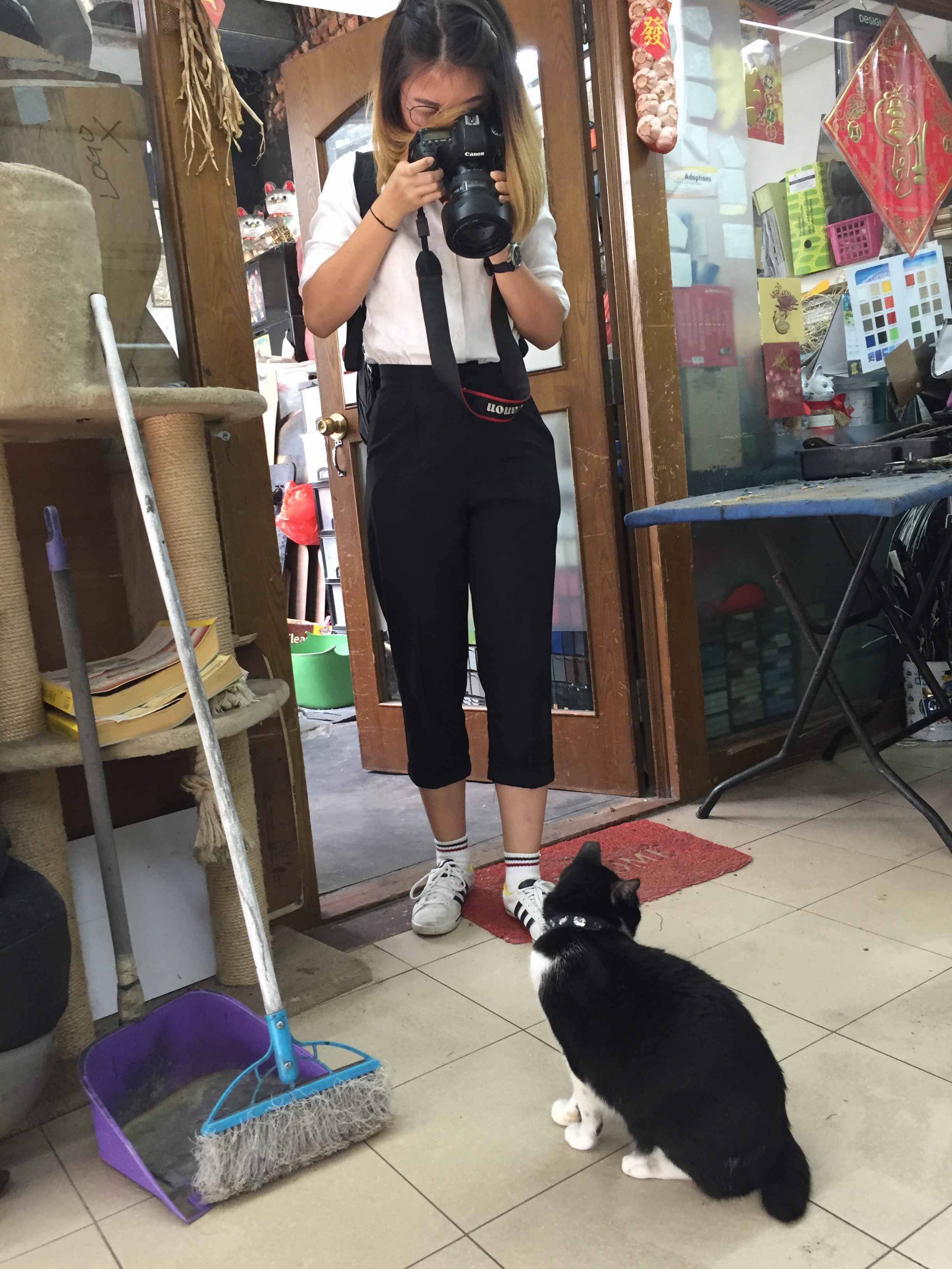
some behind the scenes images
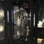
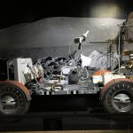
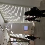
4DII – Exhibition Excursion
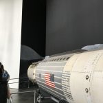
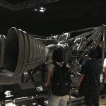
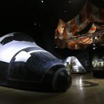
one on of the days of our recess week, we headed down to the art science museum for the NASA and Future World exhibitions. it was a really fun day.
NASA
my dad is a huge NASA fan so i sometimes get excited too about space and universe due to his influence. so this was the exhibition that i was really excited for.
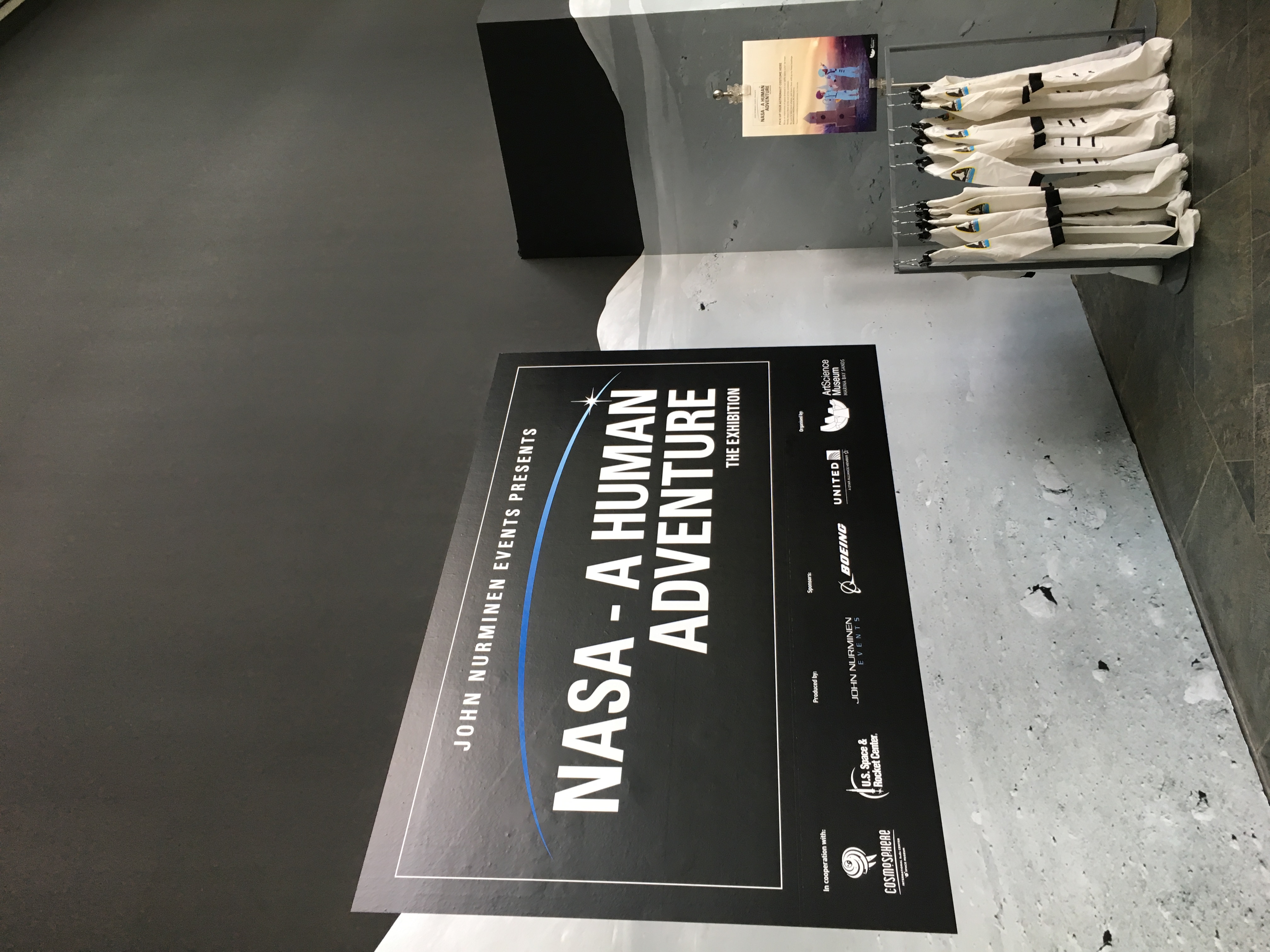
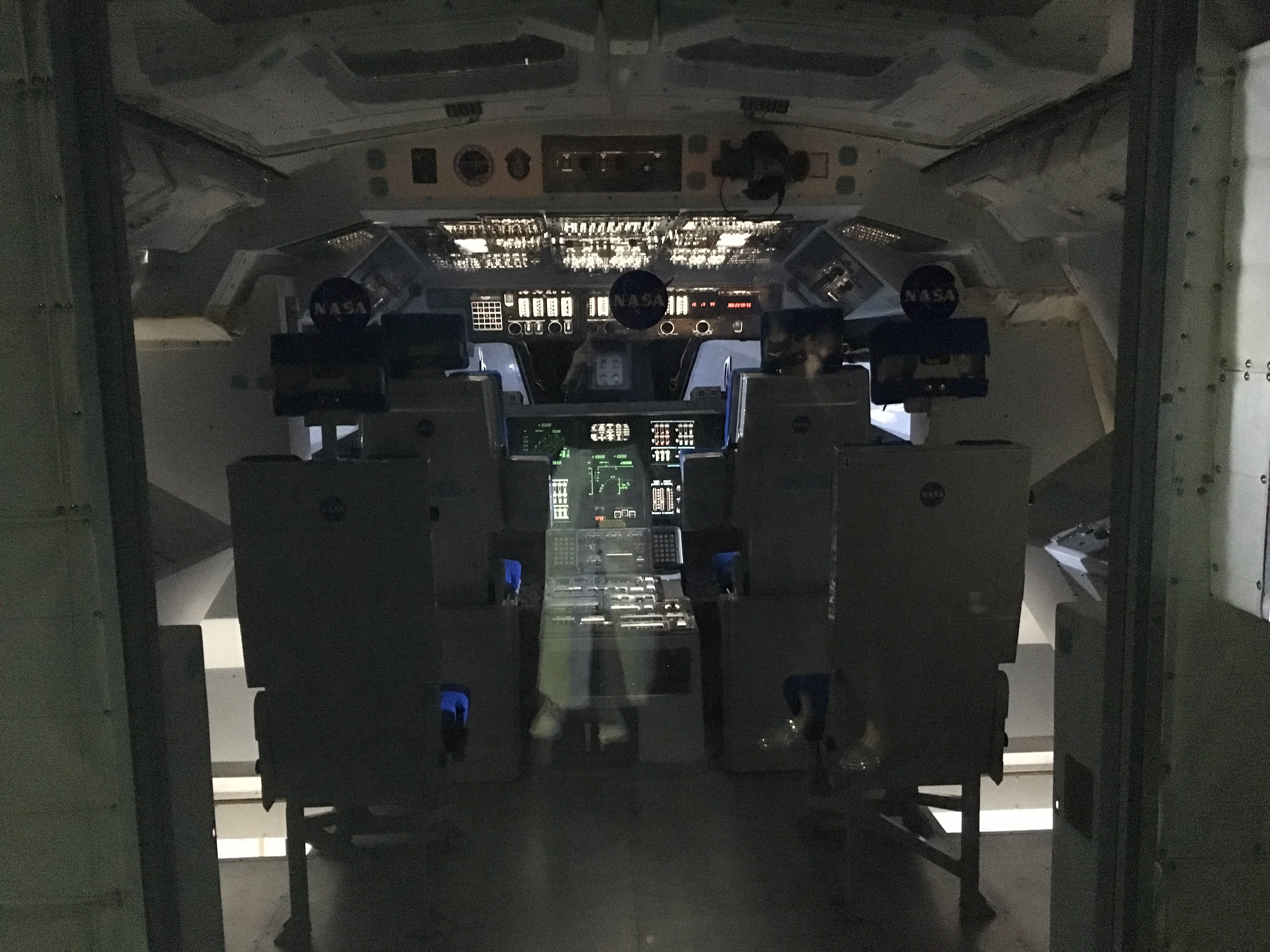
the exhibition was really insightful, albeit a little underwhelming (i had high hopes for it) maybe because there were too many information about the little details that i wassssnt interested in (or maybe because im not that much of a fan yet to appreciate). was looking forward to the “OH WOW” big scale models (there were, but only a few but naaaaah, they didnt catch my attention). but nonetheless, i was really happy to go for the exhibition because ive been meaning to go (plus it was sponsored by the school! who doesnt love free entry to exhibitions hehe)


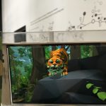
FUTURE WORLD
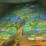
the exhibition was really fun because most of the installations had a lot of interactions between human and technology. the installations were colourful as well so i guess that element of colour also added to the fun experience. (colours are fun!)
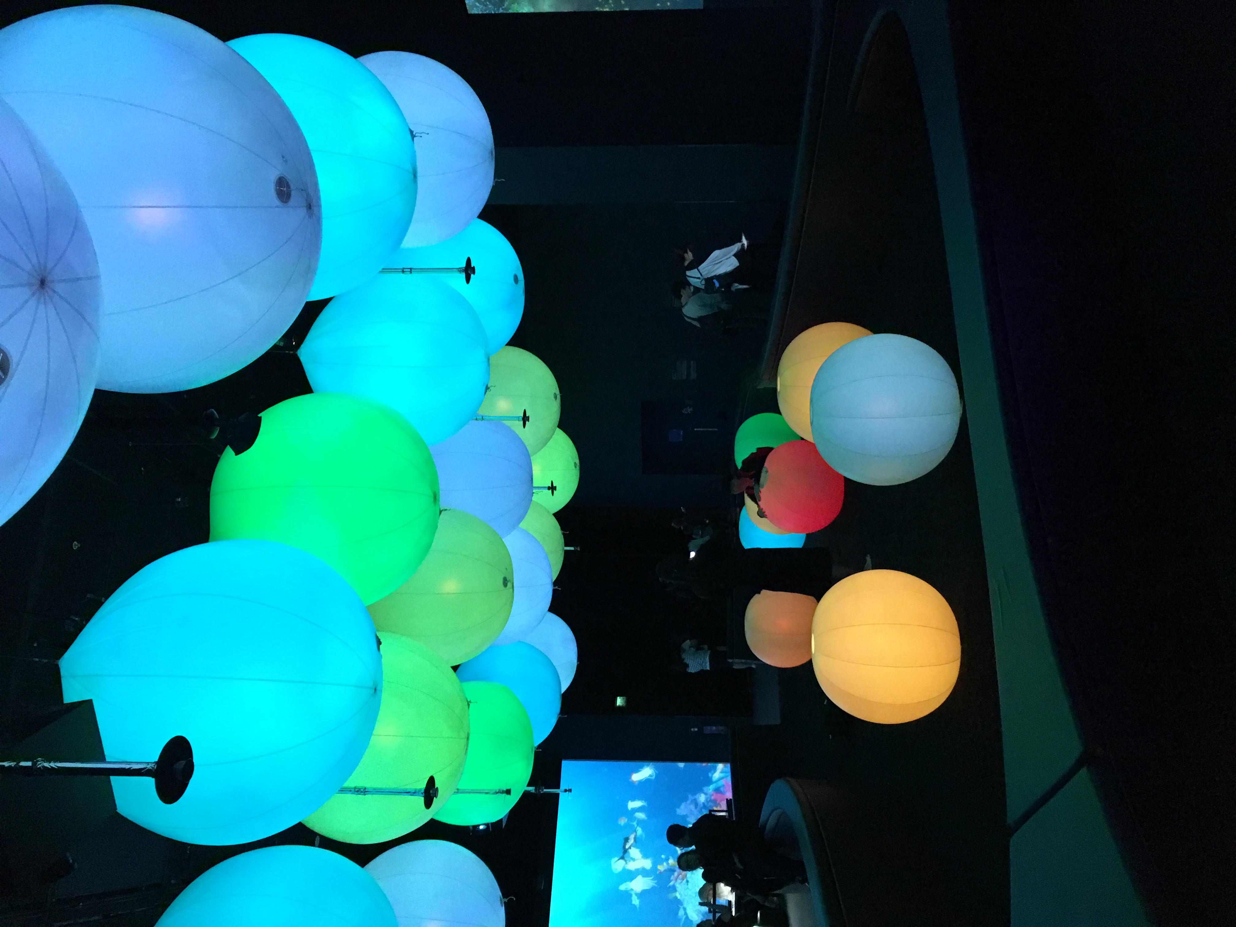
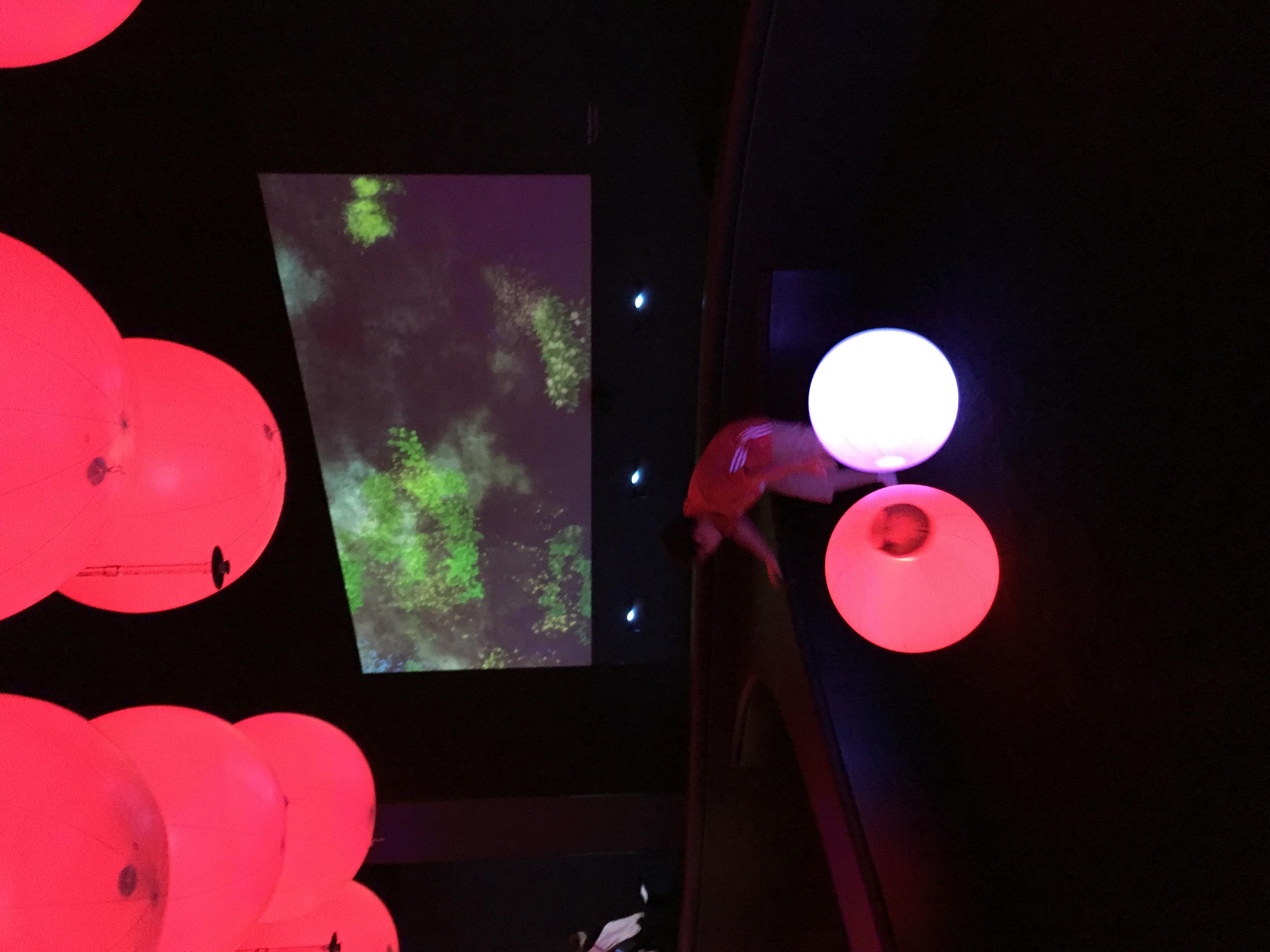
i forgot the name of this installation but this was my favourite. i enjoyed watching the kids have fun with the balls, and how innocent they felt at that moment of time.
i think its a smart idea to compliment an element of fun to an installation to make it engaging, especially if its for the general public, kids will definitely love it. colours is a great way to incoporate that element. i think what made this installation even more fun was the play on sound. the colours change to the beat of the music. the music choice was also a good choice because it was somewhat “cute”, and that made it light-hearted, which catches the attention of people.
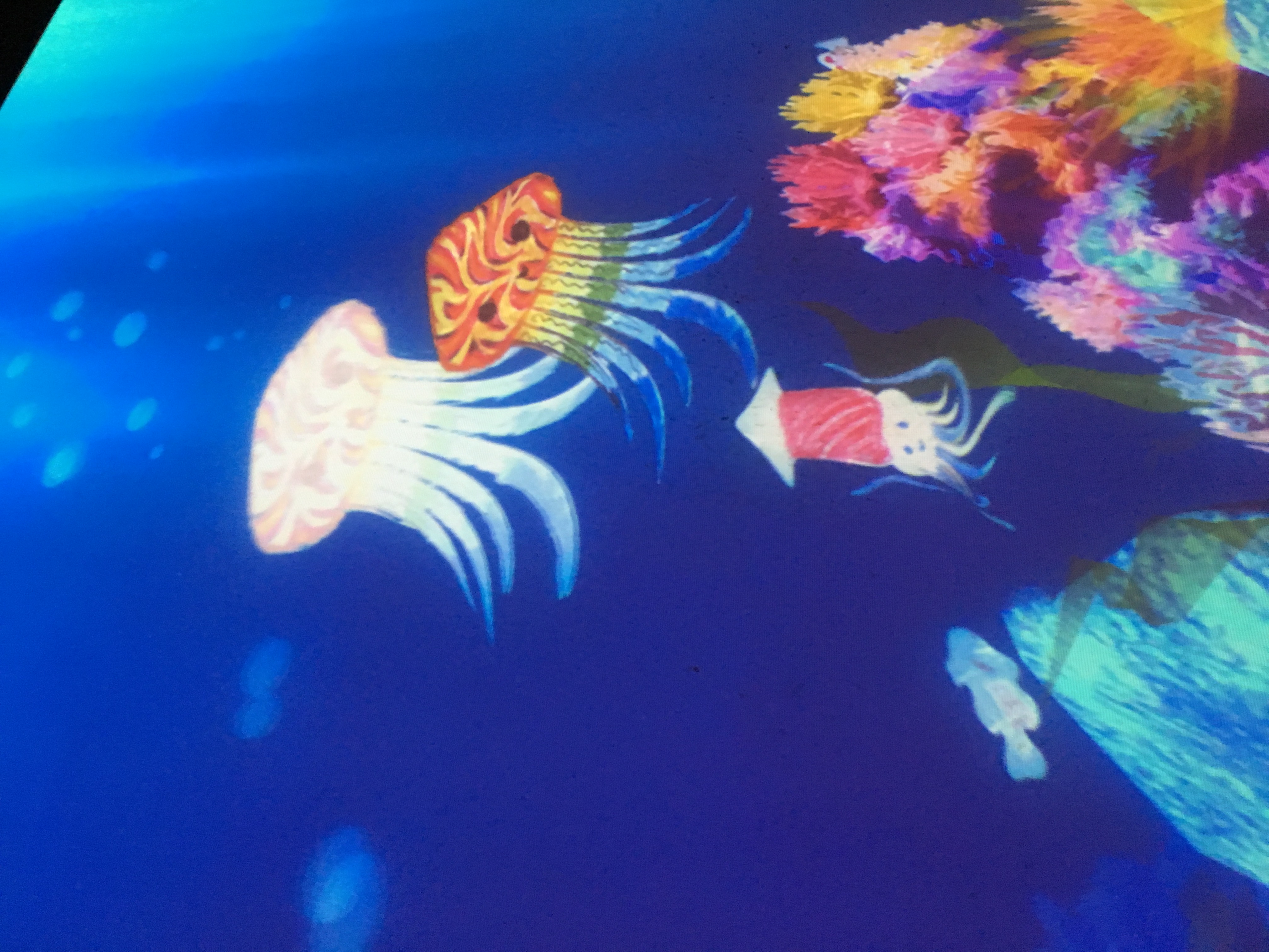
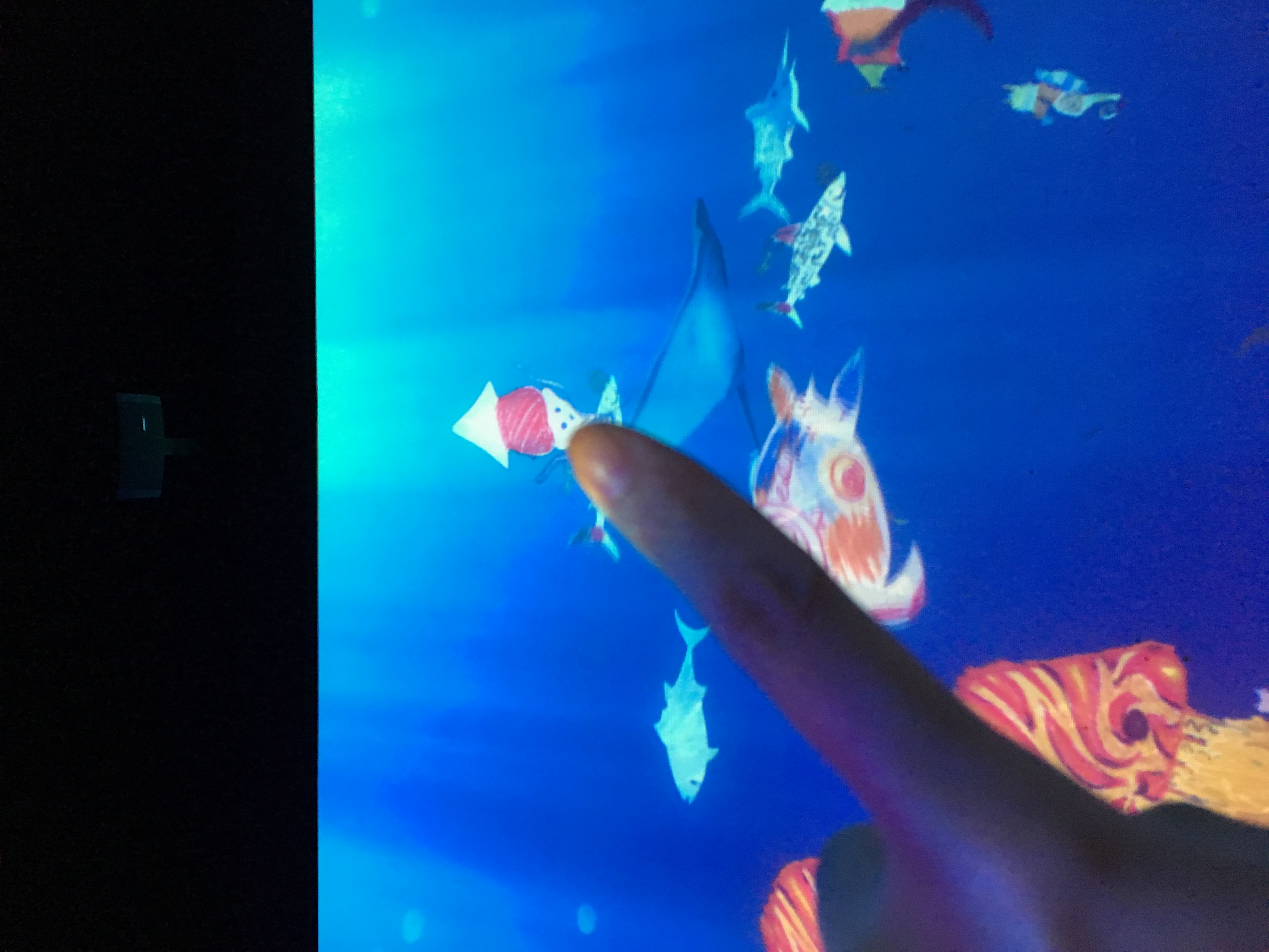
this was a really cute idea of designing your own sea animal!! i really enjoyed the thought behind this.
other engaging exhibits:
the next exhibition was my favourite.
we had a device to navigate ourselves around the museum to at end where we watch a animated video. it was really fun because it was like a digital VR treasure hunt. it catches everyone’s attention because… its digital. but i guess its con is that it gets us too focused on the screen that we dont pay attention to our surroundings (major 21st century social issue). but hey, we cant do everything to please everyone.
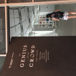
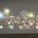
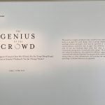
after everything, we headed down to the Jendela Visual Arts Space at Esplanade for the genius of the crowd exhibition.
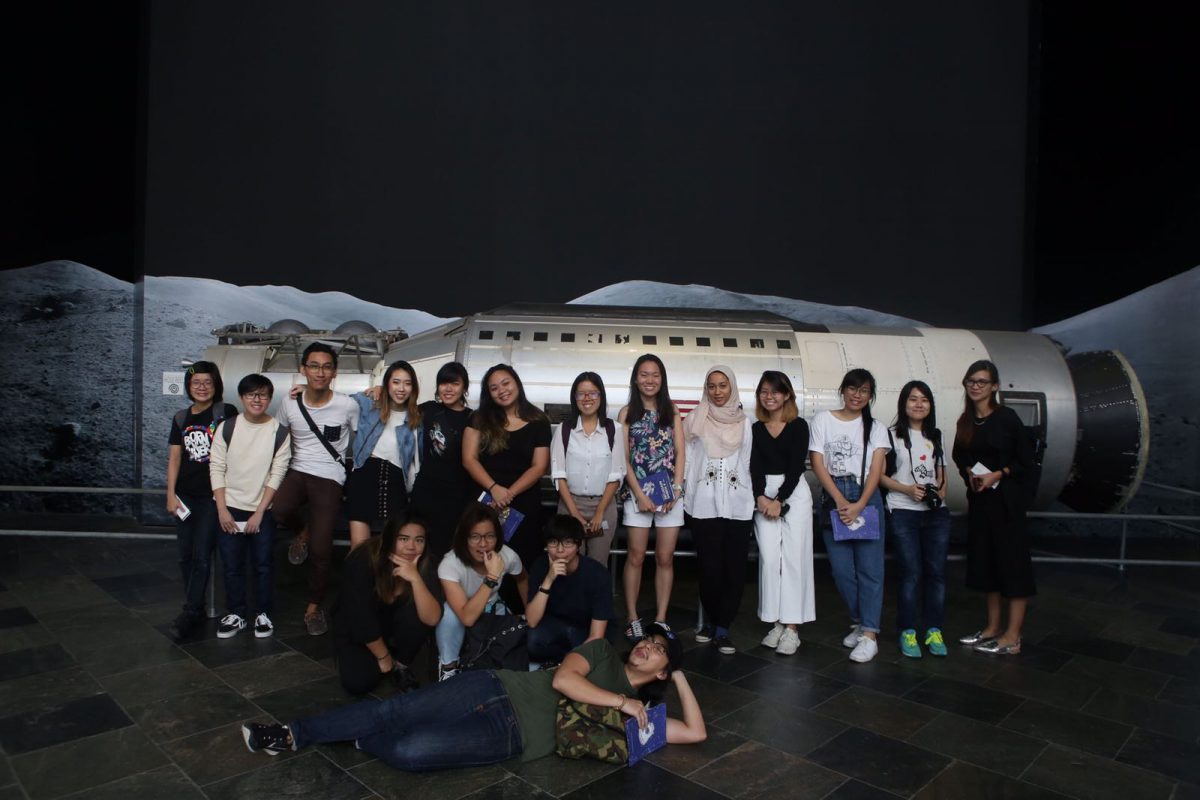
and that was it for the day!
it was a great one.
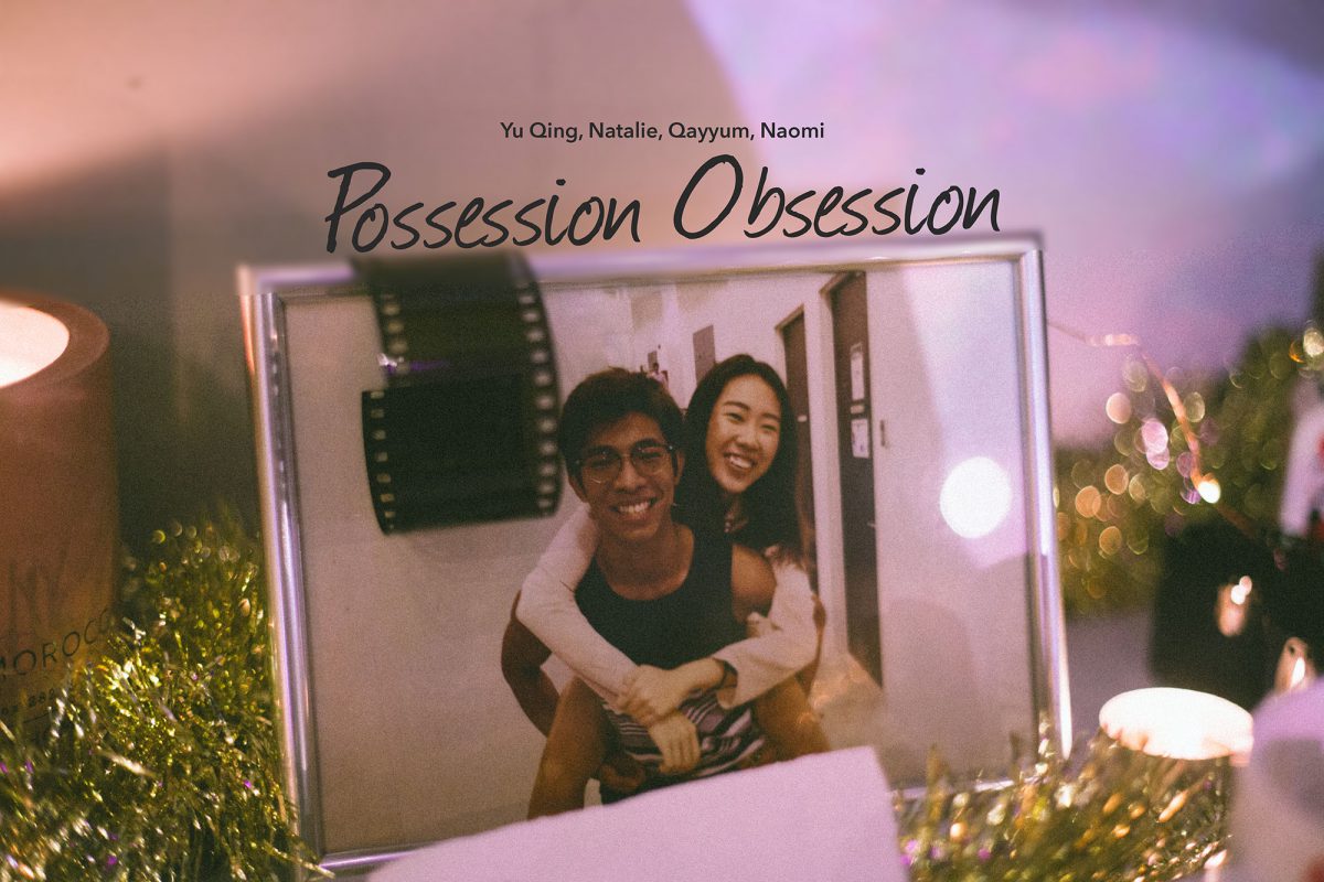
4DII – Possession Obsession Final
This documentation post is written in a chronological manner:
Idea 1
Our group wanted to use utilitarian objects to present a narrative. Through discussion and brainstorming sessions, the overarching concept for our first idea is:
A significant development from Naomi and Kai’s assignment 2 where the male lead, Pierre Tan, left her. Lead actress wants to tell –
- The story of how it happened through the objects she obsessively collected from her ex during the relationship and what these objects mean to her.
- To tell the story of their 1 month relationship through these objects. The short time frame is used to highlight her obsessive behaviour.
Read more about idea 1 here
Consultation 1:
Unfortunately, the feedback we had received was that our story was too convoluted. There were too many ideas brought together — Craziness, sadness, sense of lost, etc. Furthermore, we wanted to present our idea is a non-linear manner. To bring so many ideas together and present it this way, our idea no longer evokes the fuzzy feelin’ we were looking for but instead seem rather haphazard. Our story was also lacking substance. Oh yes, and our request to use the dark room was rejected too.
Major Brainstorm 1:
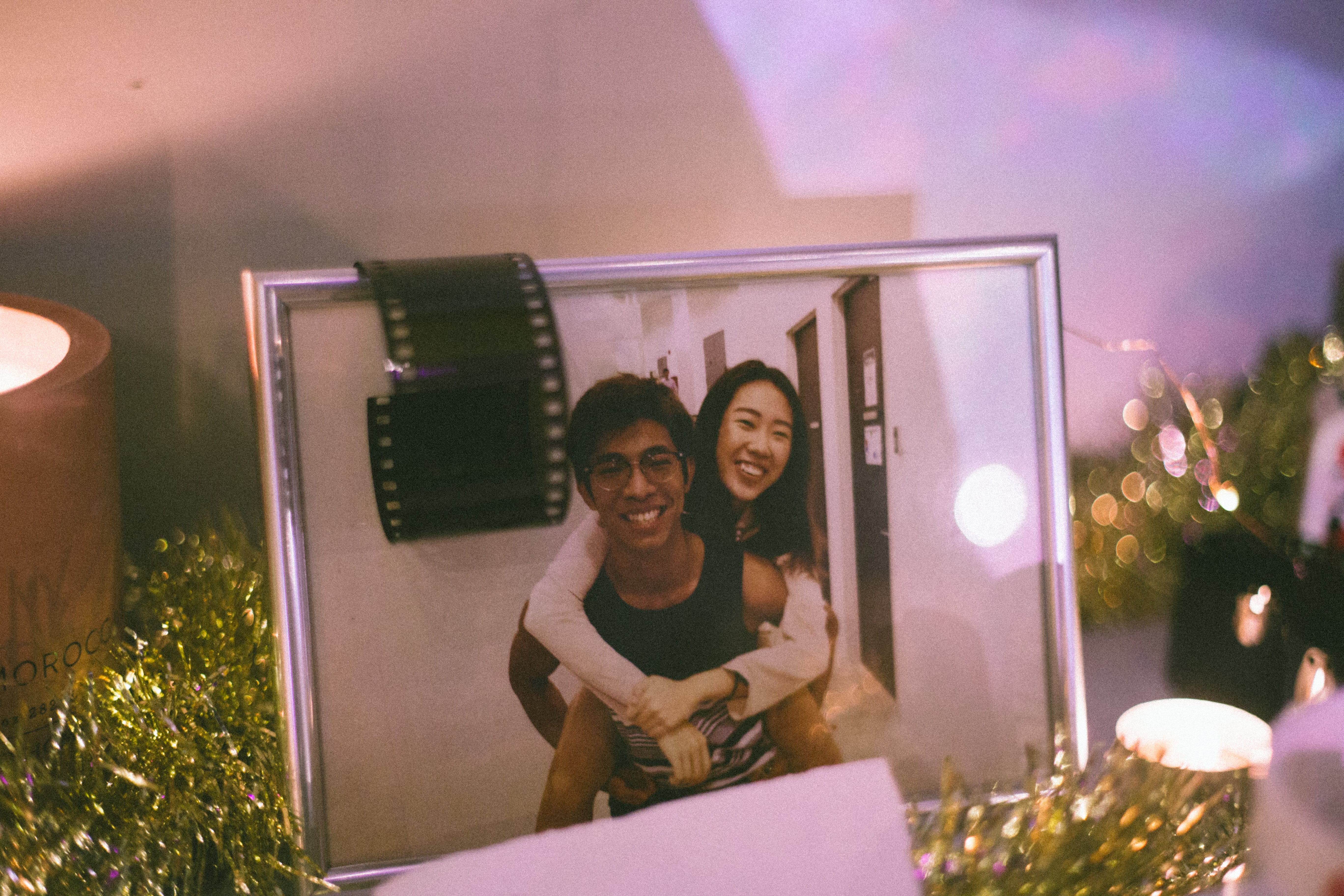
Story/Plot: We had to defined our break-up story and we decided that our main characters remains as a pair of young adults– an enlisted boyfriend and a undergraduate girlfriend– that broke up due to inherent problems of our society. This story is largely based on Naomi’s personal experience where the differences between the duo was pulling them apart. Some inherent problems the characters faced are the clashing schedules they have that resulted in less time together, the different goals they have in life and the income gap between them. While these problems may sound materialistic, they are the reality. As an undergraduate, the girlfriend is all eager to get things right to prepare for the future whereas the boyfriend may learn to see life beyond the paper chase during his enlistment.
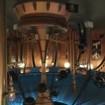
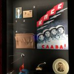
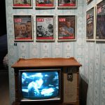
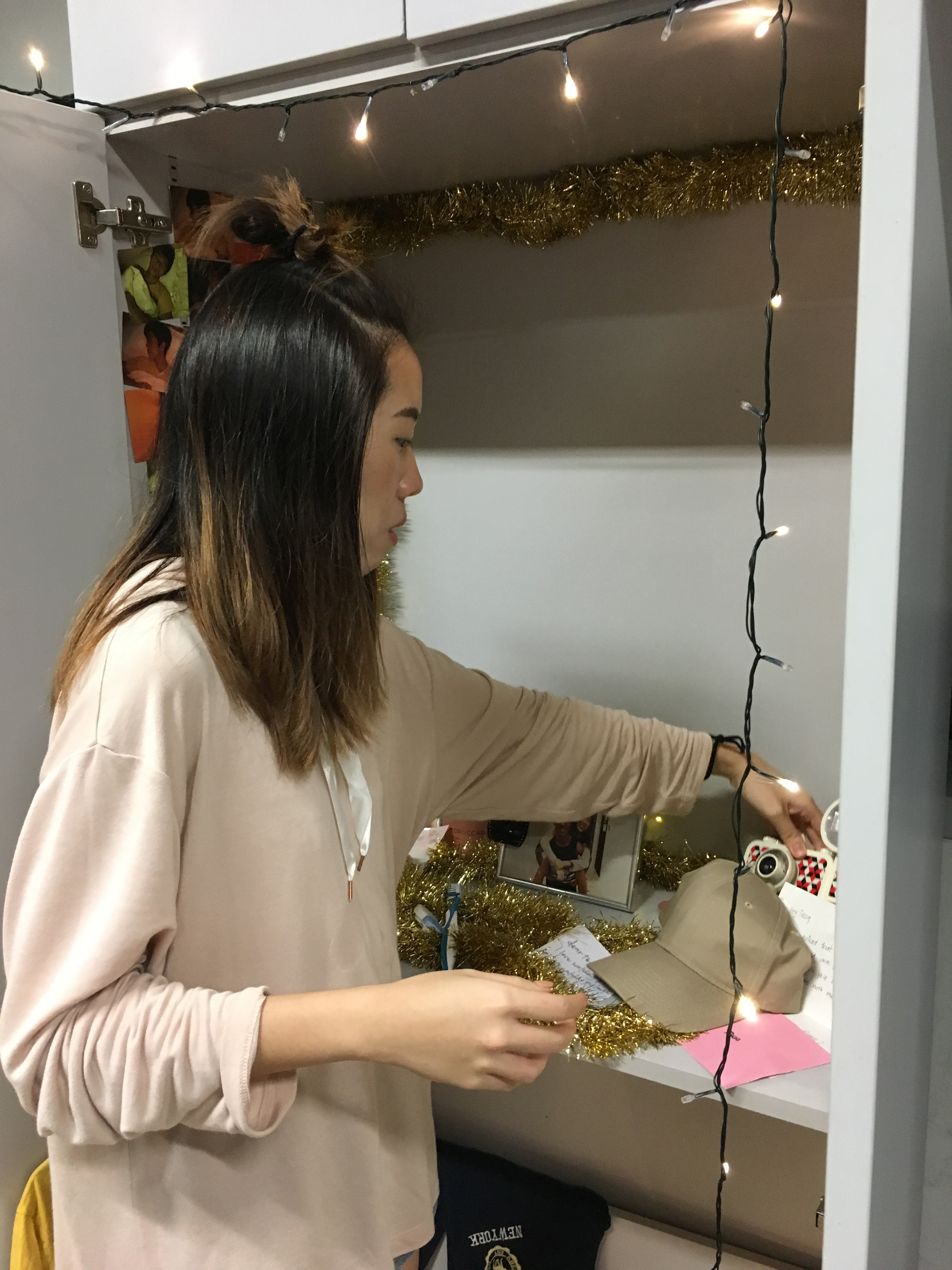
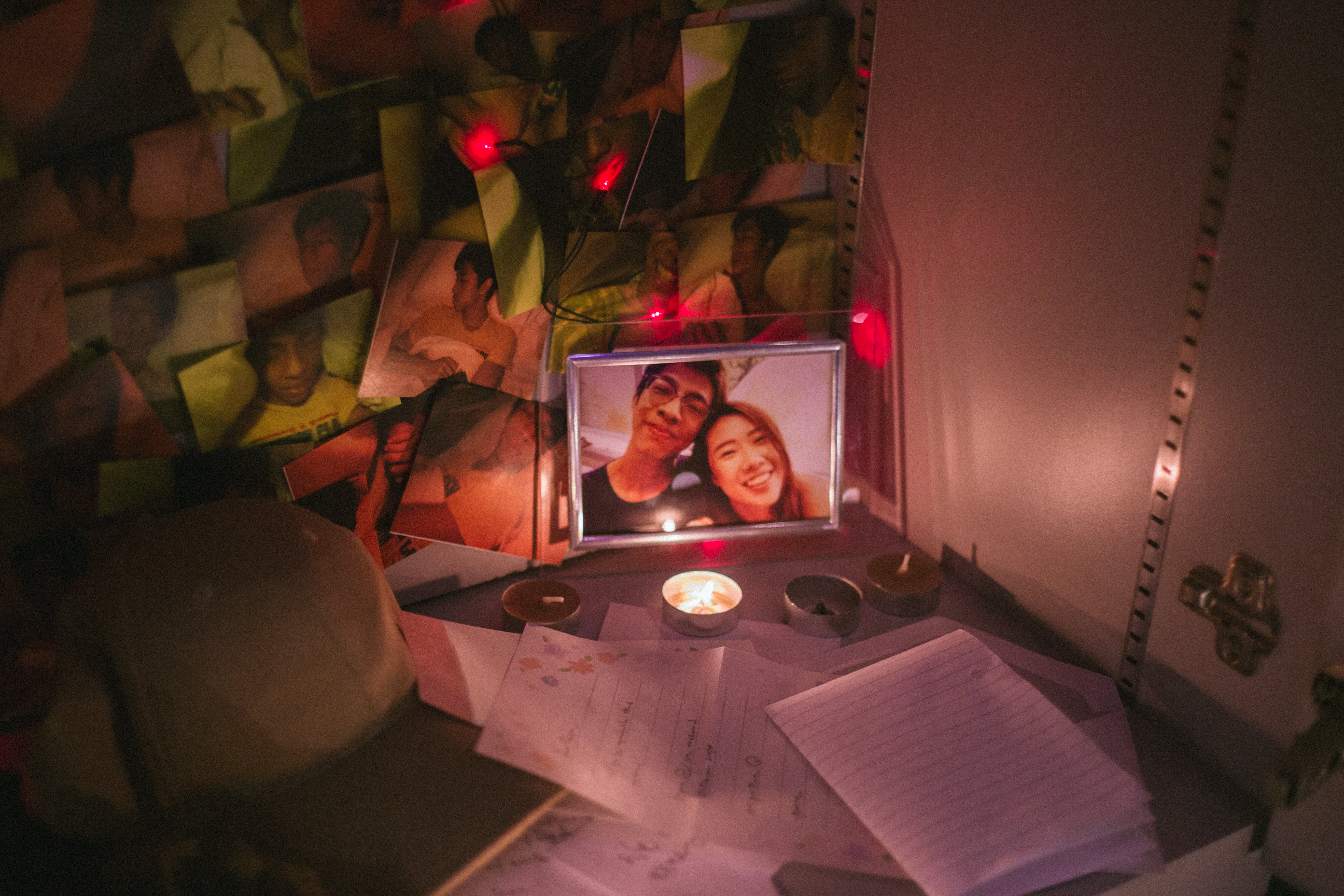
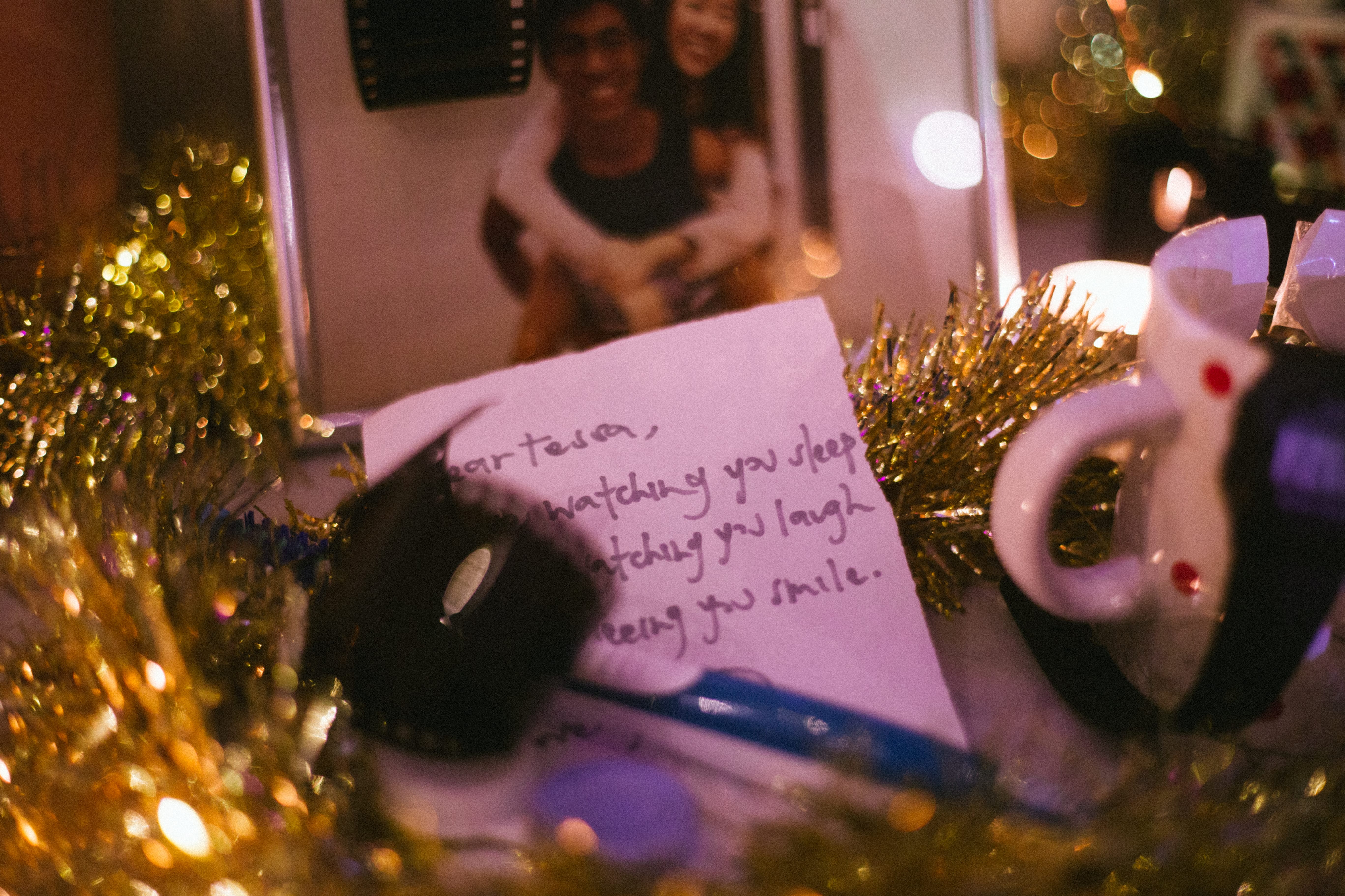
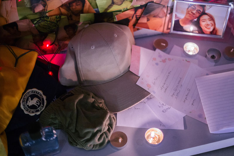
Space: With our request rejected, we were forced to pick a new space. This was a blessing in disguise as we downsized from a room to a cupboard. Firstly, it was easier to fill up a cupboard. Secondly, the limited space creates a greater sense of intimacy which was a big part of our work. Furthermore, we ditched the idea of a shrine in order to better focus on what was necessary. Hence, creepiness was no longer a factor of consideration. Creating an intimate and private space was our main objective.
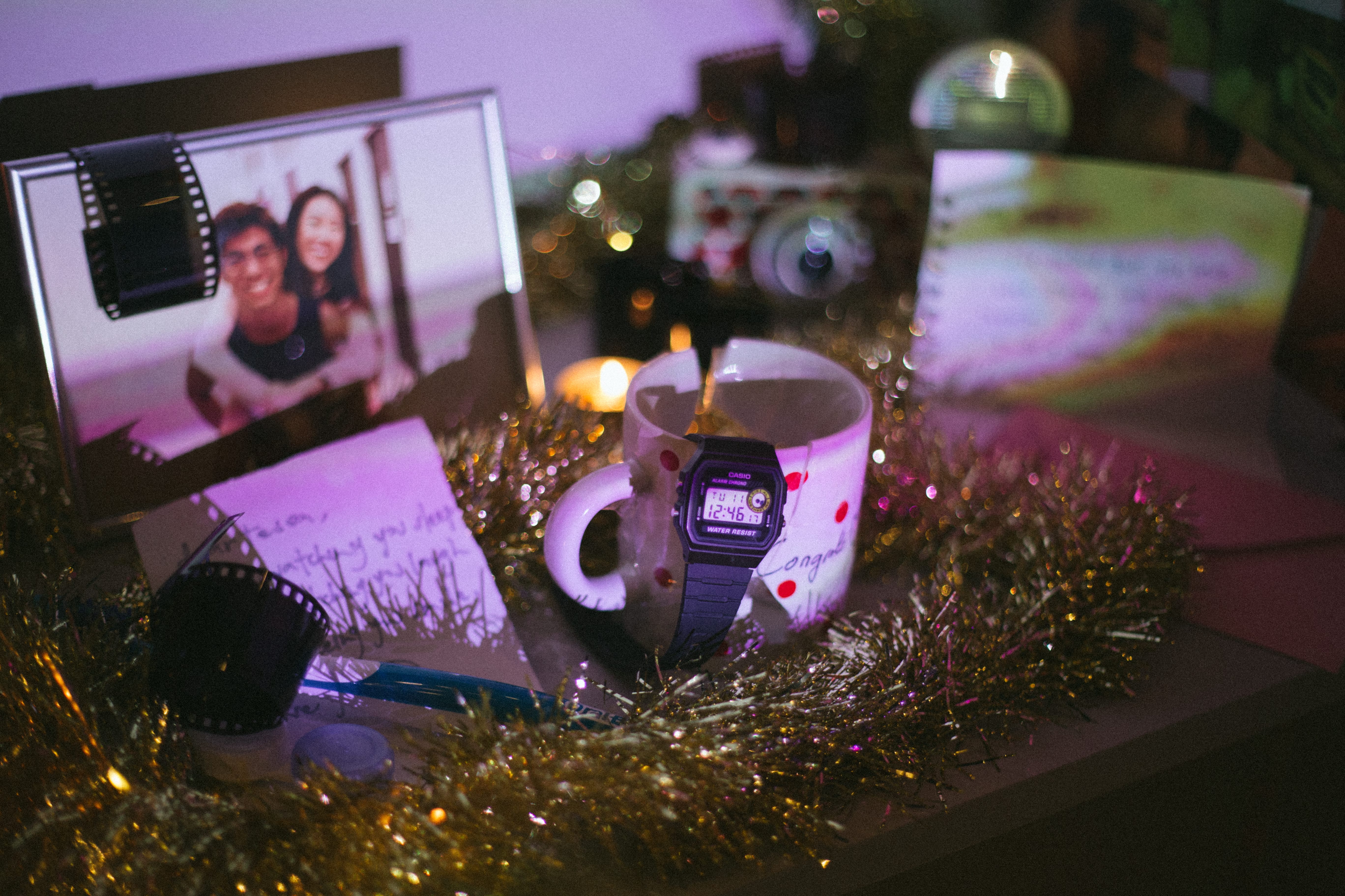
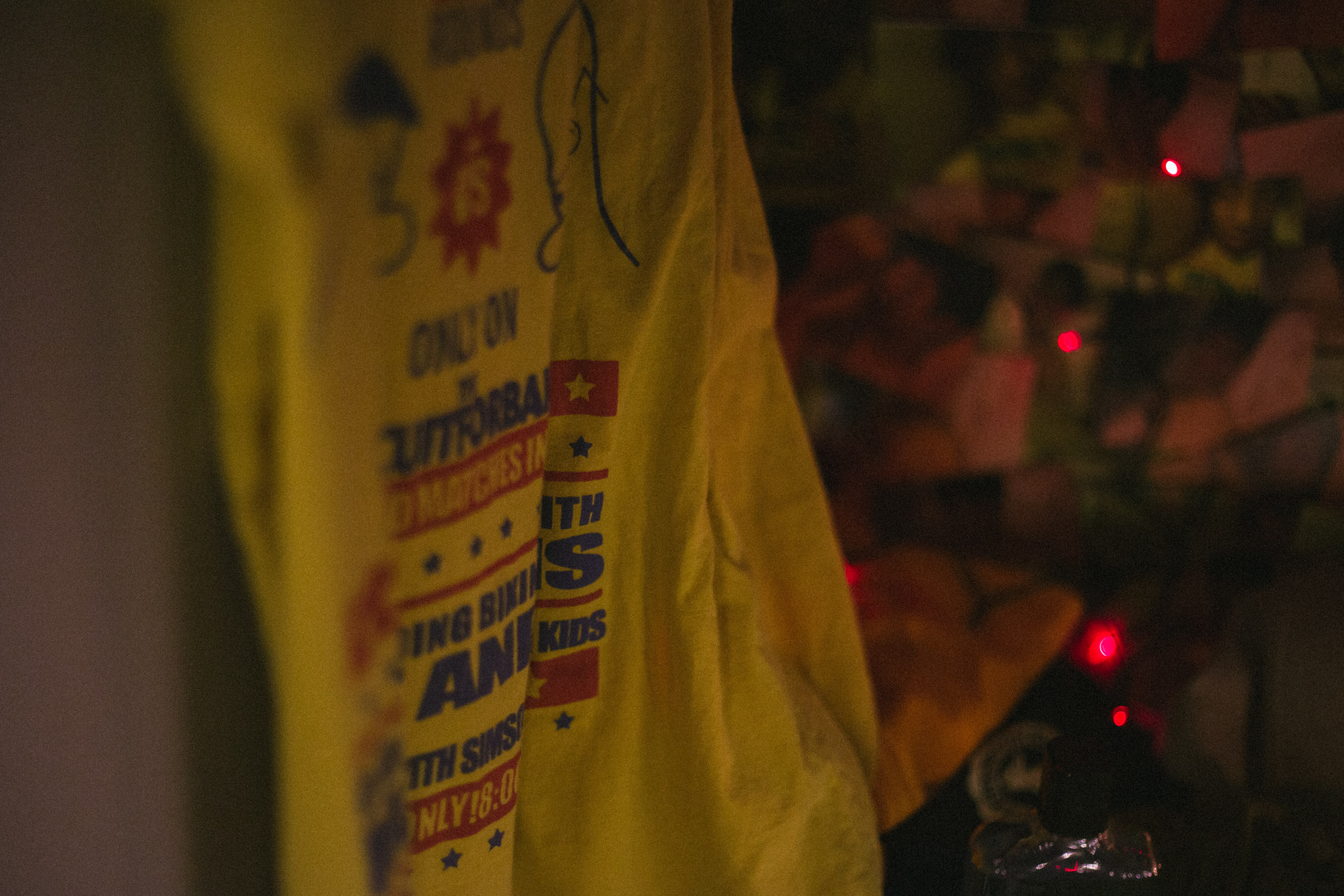
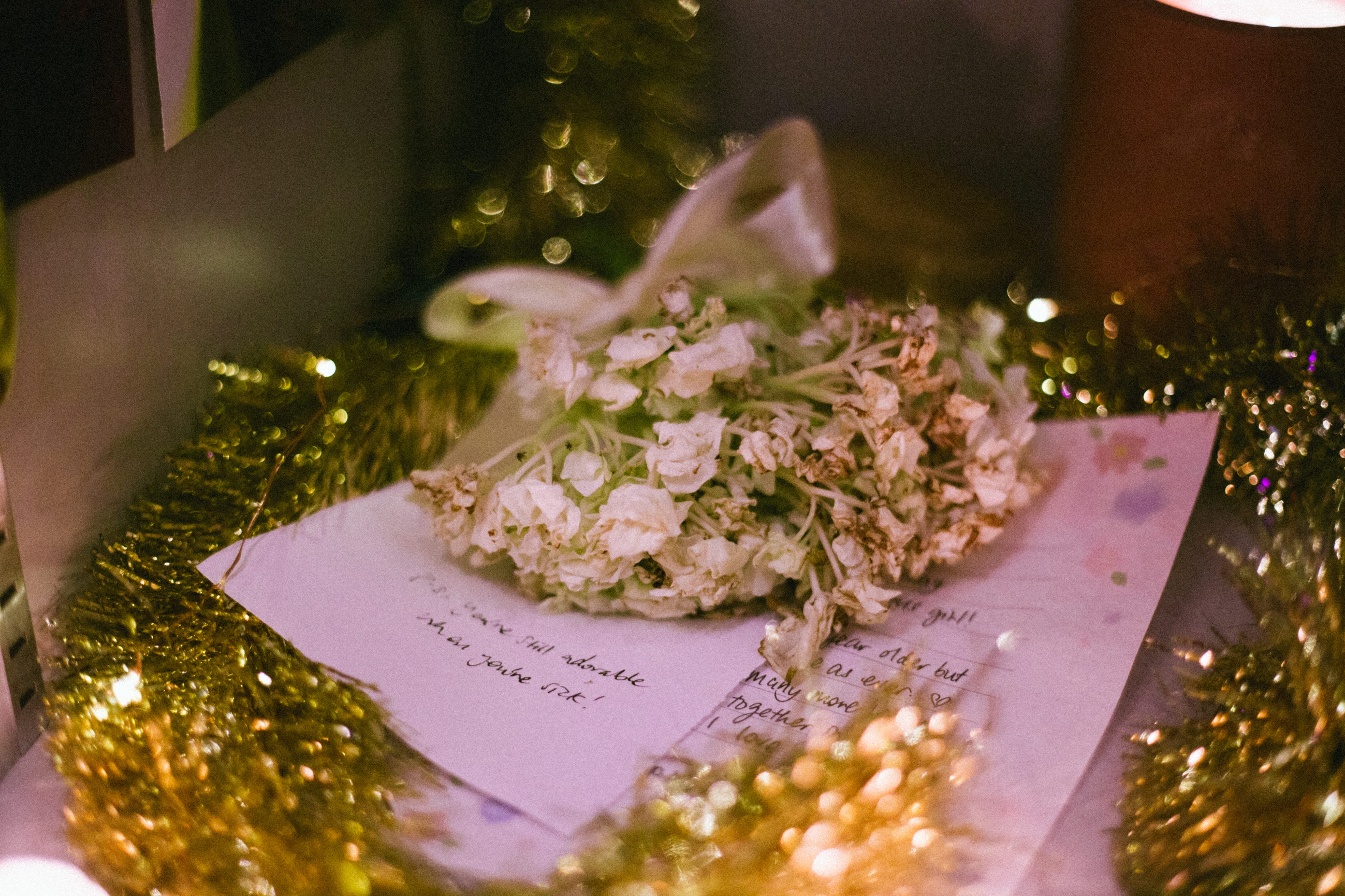
Props: Instead of the original 30 objects, we had also reduced to only the necessary objects because 1) it wasn’t necessary to talk about every single day of their 1-month relationship and 2) a cupboard is smaller than a room. Also, instead of merely displaying the objects, some of the objects are of different state from its original state in the film. Eg: the graduation was painstakingly taped together, the fresh flowers had dried and wilted. These changes in objects was to show that a phase had passed and also reflects the girlfriend’s obsession with keeping these objects despite they are pretty much useless.
Presentation: We had decided to do away with the non-linear film in order to convey our story clearly.Instead, we would add a voice-over in order to show that these whole project was from the girlfriend’s POV.
Okay, so we are not going to bore you with the finer details of our plan. The plans on google doc are up here for read if you’re keen! So now, let’s move on to the next exciting step – filming.

Execution:
Filming:
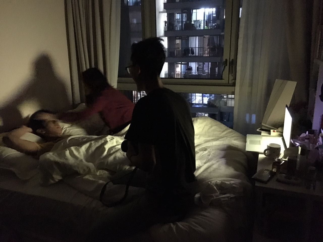
All thanks to Kai steady filming skills and Naomi and Chris amazing acting, we’ve managed to film all that was necessary within a day. The first half of the scenes were filmed in school and the second half at Naomi’s house. The key scenes we filmed were:
*note MC = Main character, GC = Guy character
Scene 1. Object: Letters and graduation cup
Have a few shots at our school first. GC and MC at school, GC made the first move to write a letter to MC, passed the letter secretly to the locker. (this is how they first met and from there, take a shot of them studying and spent time together”, Graduates but then GC has to serve the army. MC went on to uni to continue study.
Scene 2. Object: Cologne and t-shirt
One shot of the guy preparing to go out, to celebrate their anniversary (maybe 1 year anniversary?), wearing his cologne, MC hugs him from behind, smelling the cologne.
Scene 3. Candles
GC just books out from army, MC visited him at his house and changed into his t-shirt), but GC just ignore cause had a long day, MC get pissed cause MC is also tired from a hectic day (?), broke out into a fight. (dramatic transition to when the watch stopped……. To symbolically show that from this point onwards everything goes downhill)
Scene 4. Object: Cup again
Different scenes of them arguing of small things and eventually the end.
Set-up
While setting-up we tried to arrange them randomly but not messily. We wanted some form of order amidst the mess. The key objects had to be touched, letters could be read and photos could be seen. It’s tricky to re-create a mess.
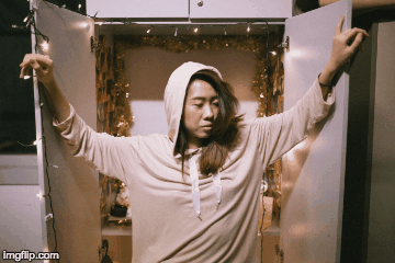
We also added fairy lights to re-create this cozy atmosphere in the cupboard space. We wanted viewers to feel that opening this cupboard is like entering the mind of the protagonist.
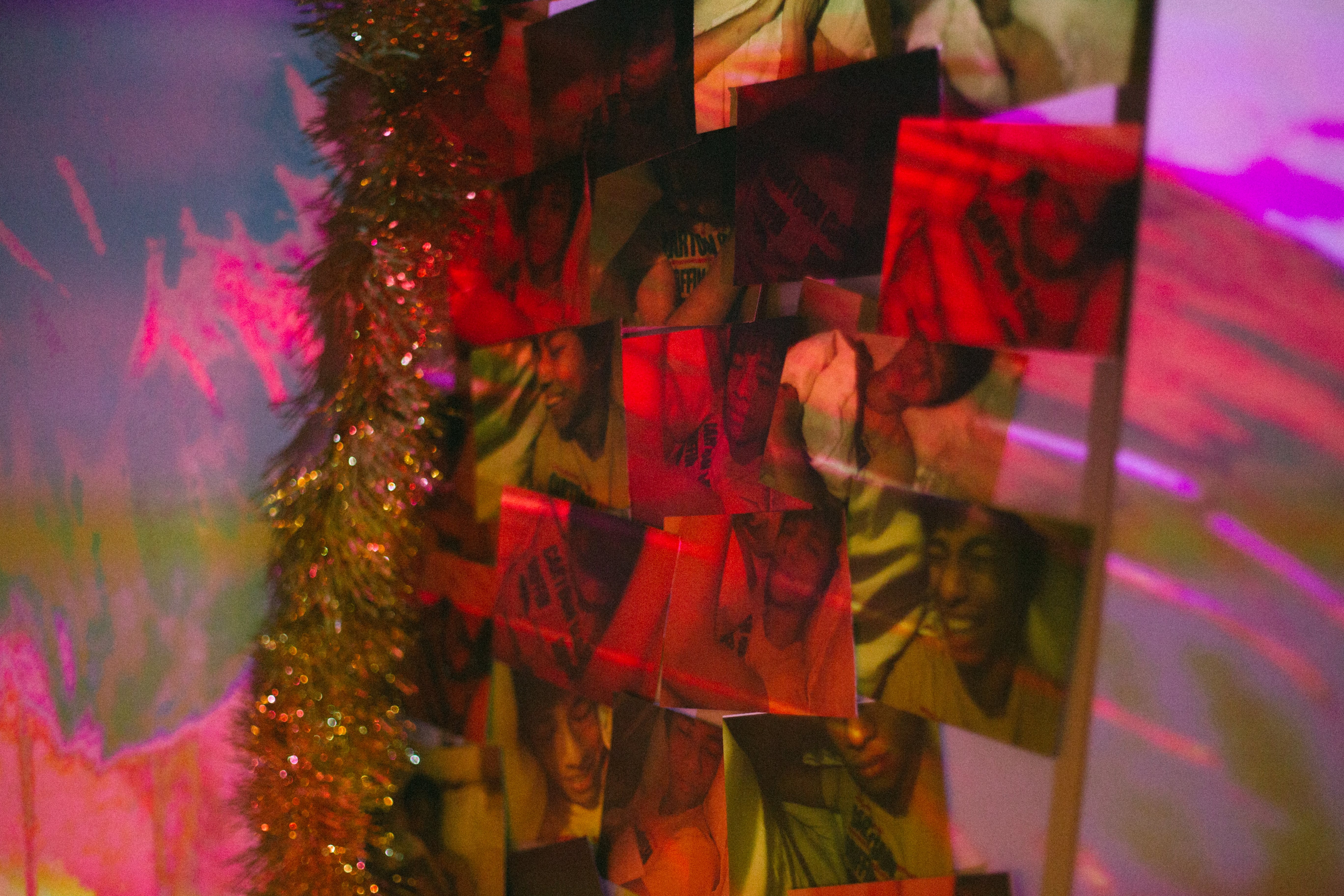

Final Aesthetic:
With the projection on….
Final Video:
…bloopers here…
Audience Response:
…and a final group photo.

THE END.
2DII – Experimental Bookbinding
here’s the link to our presentation! –
Experimental Bookbinding2D Slides
2DII – Zine Recee Presentation Slides