forrest gump – movie quotes

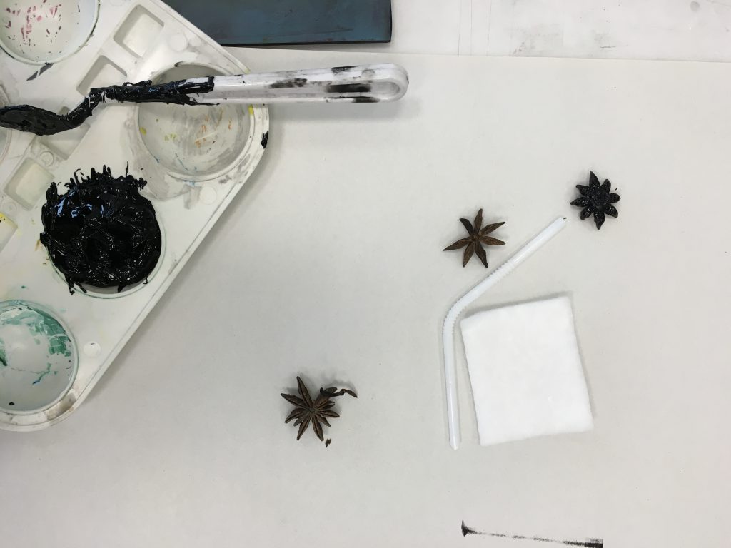
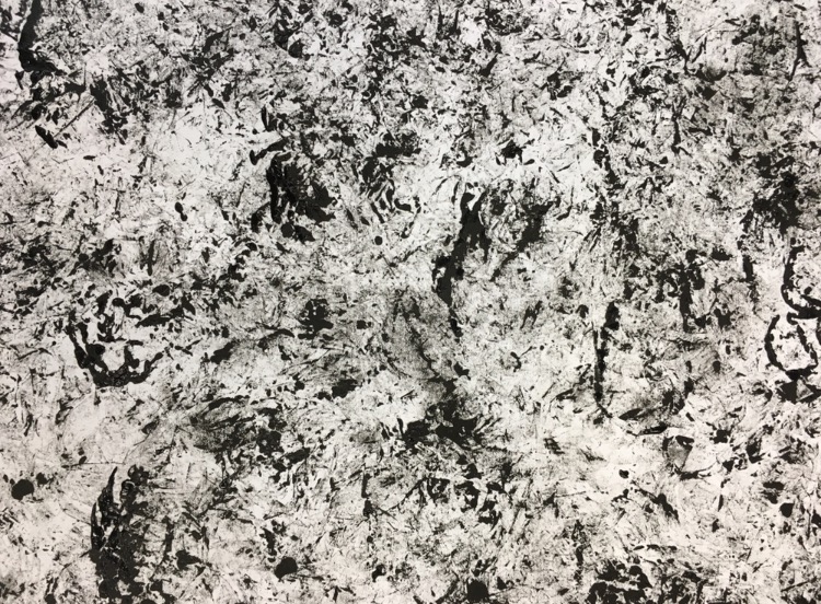
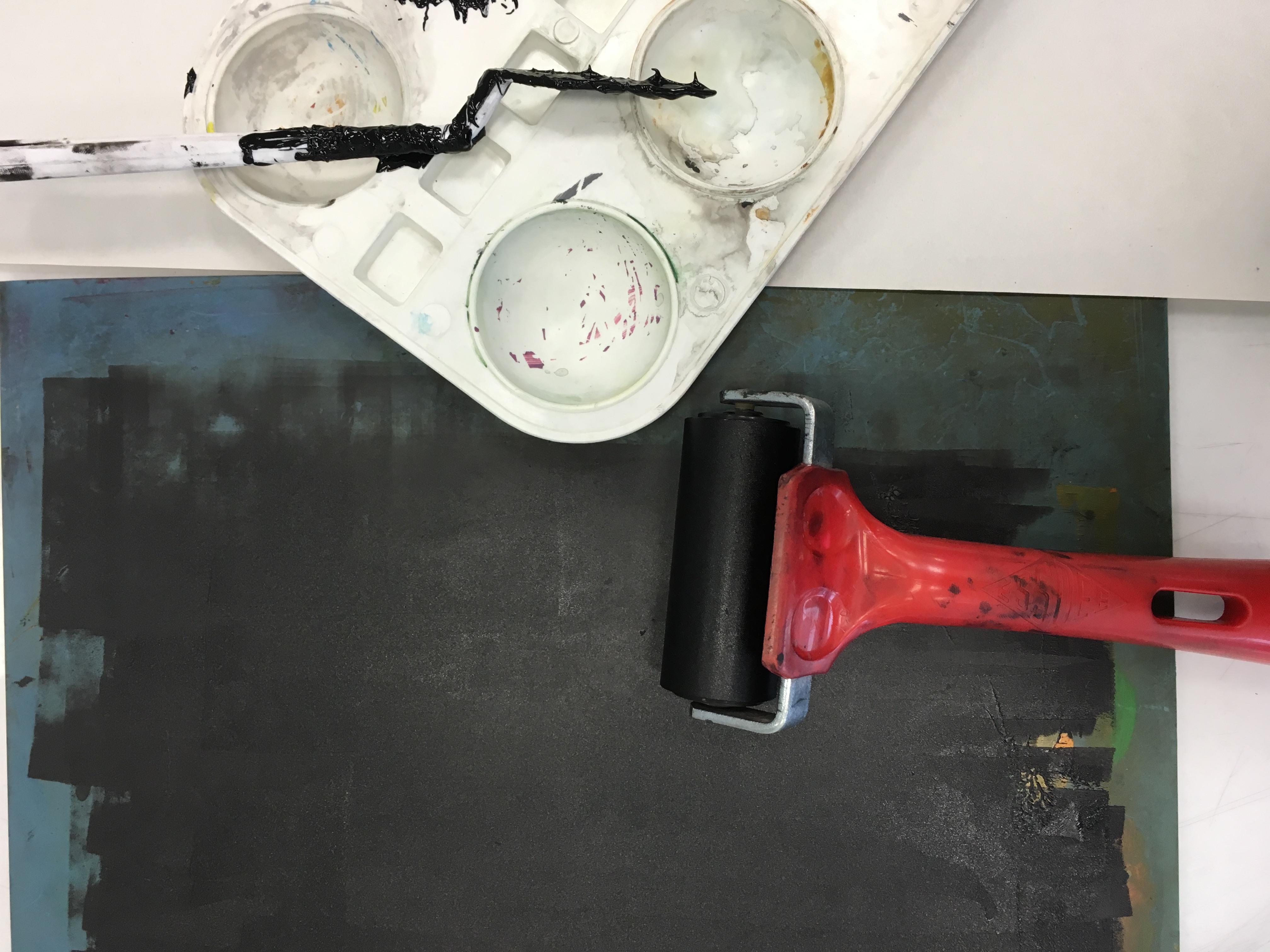
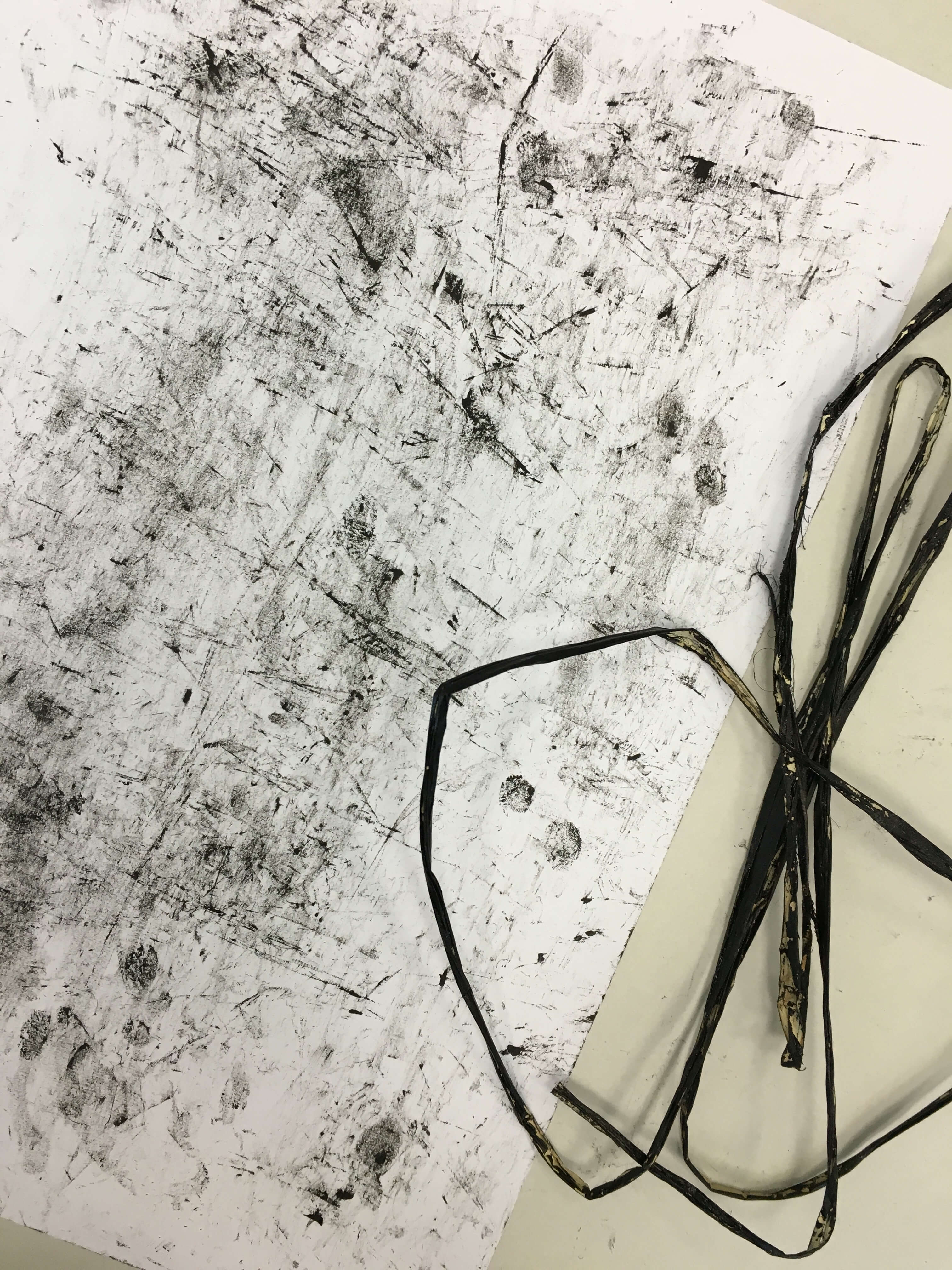
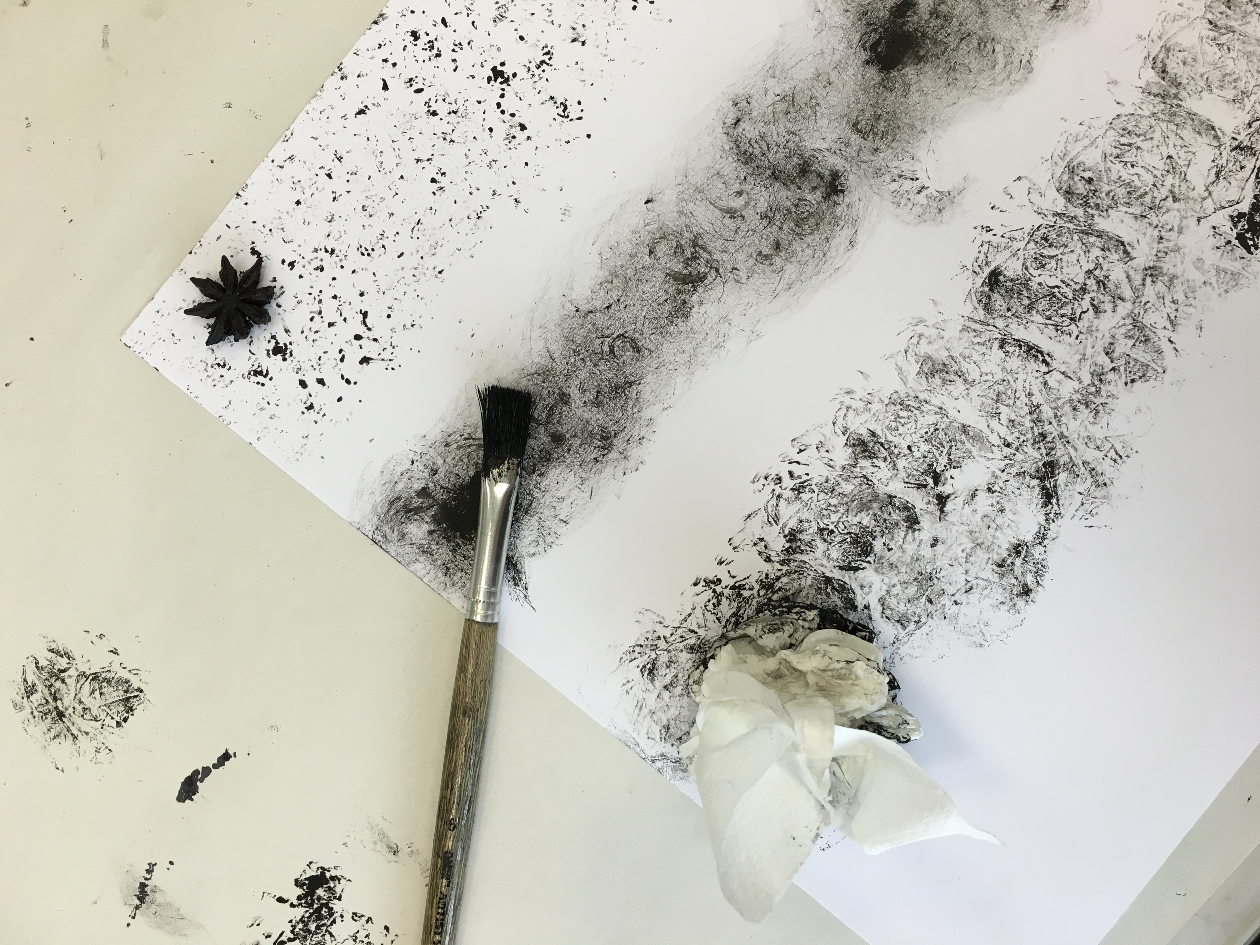
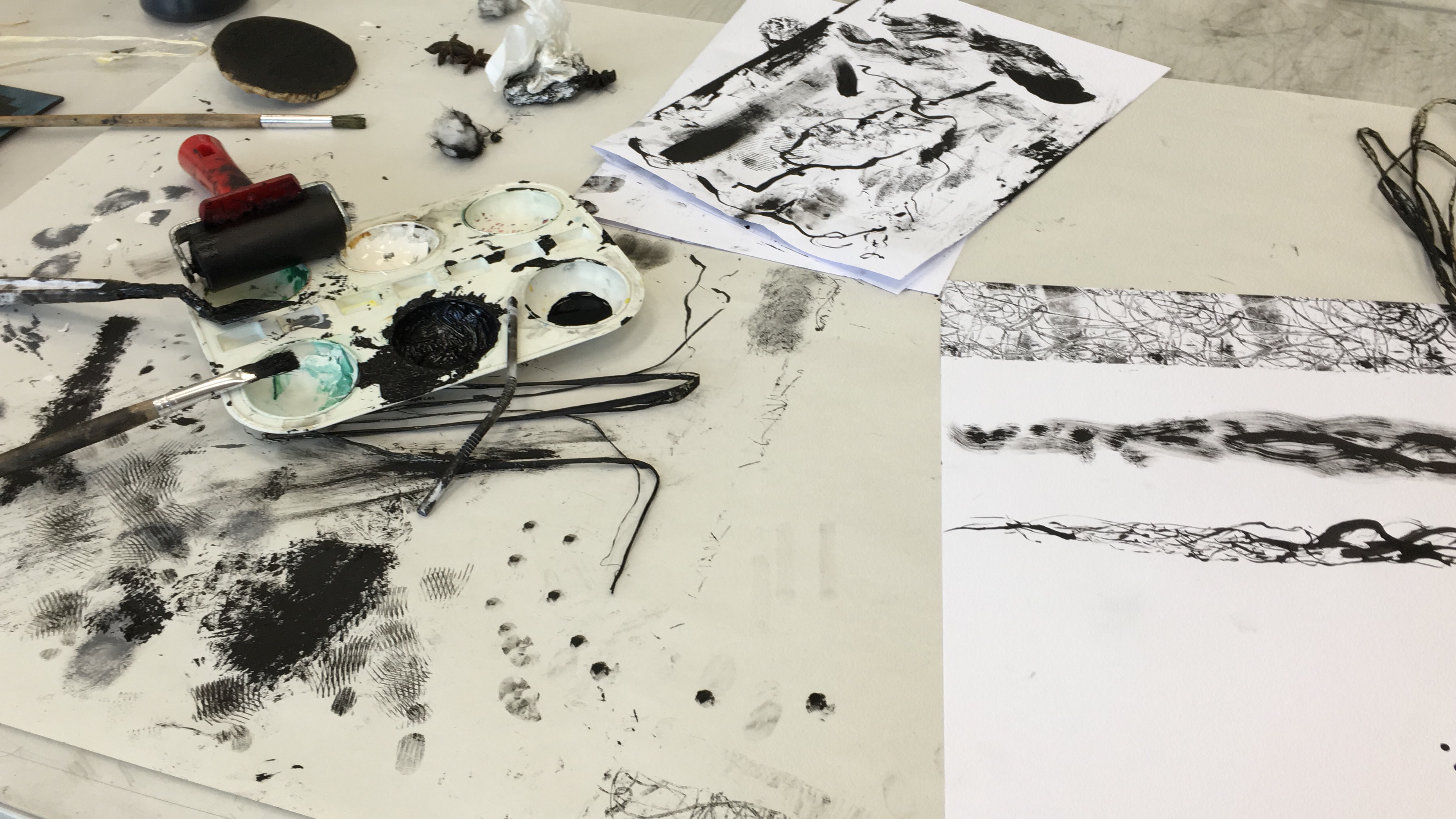
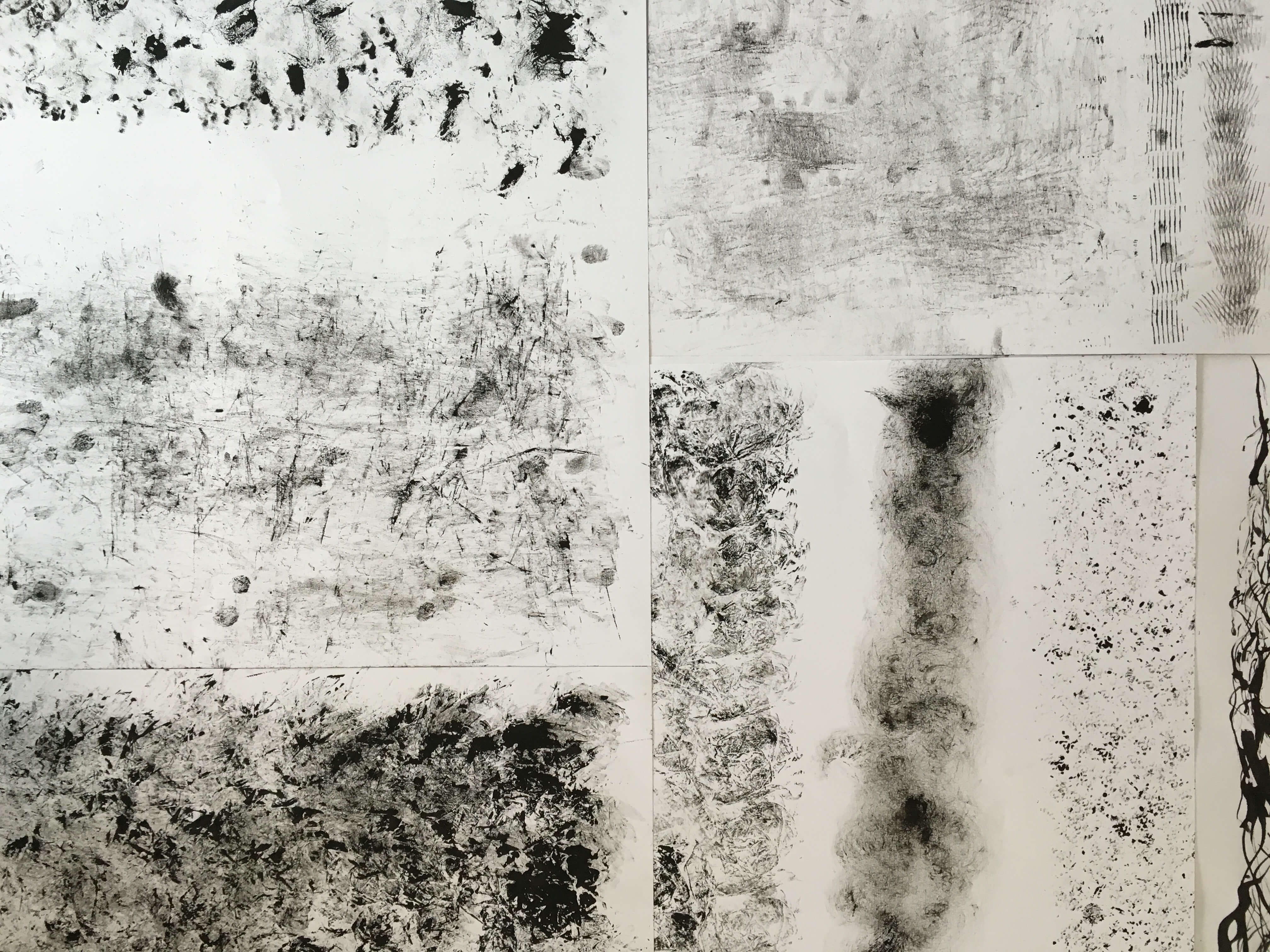
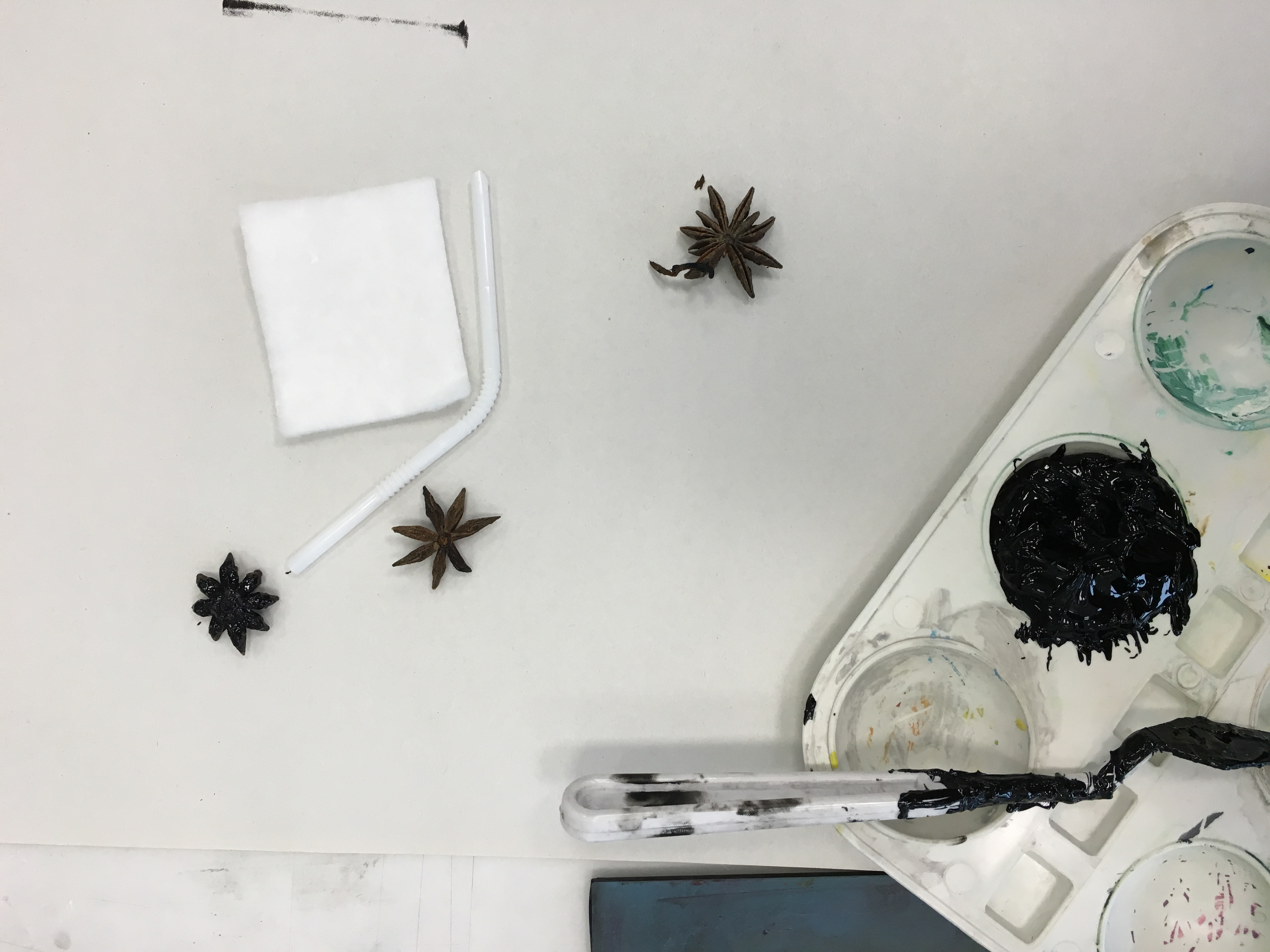
this week we had to prepare 4 movie quotes for our upcoming project 2 on compositional visual studies using digital methods. im actually quite enjoying the process so far because

1. we get to do digital work (which i usually prefer because its more liberating)

2. we get to silkscreen our own totebags!

ok so lets started –

quote #1

“to die by your side is such a heavenly way to die.”

500daysofsummer

this quote is from the movie 500 Days of Summer, but also extracted from the song There Is A Light That Never Goes Out by The Smiths.

apart from picking this quote because i like it (and the movie), i think it is a fun one to play with because of the imagery present. also i think it is interesting because of the oxymoron present that creates a contrast in mood/theme/emotion.

quote #2

“i had a dream my life would be so different from this hell im living”

c13af25d2b68d82d9bafeff050e79387

this quote is extracted from the great Les Misérables. i think it will be create something great out of it although the imagery to this quote aren’t as obvious as the previous one. however i think it will be a fun challenge to look for and create something interesting to suit the adjectives, hence eventually a composition from the quote.

quote #3

“live long and prosper”

live-long-and-prosper

star trek! this is definitely one of its classic quotes known to most of us. i would think this will be a more challenging quote to work with because it will be difficult to ruin a visual (spock and his hand in this case) that is familiar to people. but i guess thats the challenge?

quote #4

“if i like a moment, for me, personally, i don’t like to have the distraction of the camera. i just want to stay in it.”

1dbc637bb85cd5274e0a58679081cf42

i enjoy this quote because i can relate to it and believe in it. this quote is adapted from the secret life of walter mitty (which was really beautifully shot). the imagery to this quote are quite obvious so i think it’ll be fun to work with especially since i believe in the quote too.

emo – ink on brush

another session on monoprint experimentation.

i focused more on creating textures and patterns from brushes unlike last week where props were involved.

acrylic paint and calligraphy ink were both of my mediums used.

with no intention of creating a specific type of line work in mind, i went with the flow with whatever my hand took me with.

the results actually turned out quite well. there were some that i was satisfied with such as for the emotion “hurt” where i created sharp lines by using the edges of the metal palette knife. the patterns were inspired from the cuts and blood we’d usually get from a fall.

i also realized that dry inked brushes tend to give out better results for depressive emotions as it creates a raw, messy, clouded feeling.

File 8-9-16, 15 36 36

File 8-9-16, 15 36 14

next: happy emotions.


emo – monoprint #1

greetings,

for today’s 2D lesson (23rd aug), we had a chance to experiment with mono printing, where we created prints and patterns from the props that we brought, and also things we could get hold of in the silkscreen room &studio. heh.

the props that i brought were star anise and a bendy straw (the neck was the part that i was interested in in creating patterns).

Photo 23-8-16, 09 21 55

01 –

star anise
Photo 23-8-16, 10 26 33

was quite disappointed with the turnout as i thought that i could create interesting patterns from its shape but it turned out otherwise because of its difference in smoothness. the point of base of my star anise ended up being the only point of contact.

File 29-8-16, 17 30 28

02 –

scrunched up cling filmPhoto 23-8-16, 09 55 40File 29-8-16, 17 29 14

there was a roll of cling film available, so i decided to use the opportunity to find a use for it. i decided to scrunch up a piece of it and dab it with ink. the results were quite interesting on its own because every stamp created rather different patterns. i quite like how it looks when they all come together; messy yet rather clutter-ly interesting because of the difference weightage.

03 –

banana leaf-ish string
Photo 23-8-16, 09 45 27

decided to paint the string with black ink and rubbed it against on my paper. there was some kind of textured pattern but i feel that it just looks messy.

04 –

star anise, brush, tissue paperPhoto 23-8-16, 10 39 48

dabbed the brush with ink and swirled it around on my paper.

just like the cling wrap, i scrunched up a piece of tissue and did the same to it. the results were almost similar as the cling wrap.


05 –

banana leaf string on roller, brush, straw endPhoto 23-8-16, 11 41 38

i decided to experiment more with the banana leaf string, so i decided to place some on the roller. it created interesting patterns, especially the visual of the messy lines. maybe i could draw some inspiration from that for my project.

nothing fancy for the second one but just ink on brush. shirley said that my patterns i created so far were lacking in tensions (which were essential, or rather recommended for the brief), so i decided to play around by added some pressure at some areas while brushing over on my paper. it could be explored further though.

the third one was created from my straw end using calligraphy ink (which was more liberating to work with for its loose viscosity i feel). i would say this was the best out of everything because there is definitely a play in tensions through its difference in line weightage. turned out the straw end gave better results than the neck. ha ha


Photo 23-8-16, 11 54 36Photo 23-8-16, 11 56 34


end result of the first monoprint lesson –

Photo 23-8-16, 11 55 38