2DII – Que Sera Sera Process #2

after the last consultation with Mimi, i had lots of comments to take in to rethink about my idea.

this round of trials, i had an idea of incorporating the element of my hand into the images, to show the current action of making.

1. Pasta Chef

natcheng-adm-foundation-2d-typography-090217-2702natcheng-adm-foundation-2d-typography-090217-2686

taking in advice from my classmates on using tomato sauce, and creating my name to standout, i created this.

i felt that using the spaghetti to form my name in the right context (in this case in a pan of spaghetti) would create the ‘ah hah’ moment that Mimi referred to. unfortunately Mimi said it didnt look appealing, and at the same time nothing to shout about.

2. Pastry Chef

natcheng-adm-foundation-2d-typography-090217-2738 natcheng-adm-foundation-2d-typography-090217-2743

okay i have to be honest that this didnt turn out as what i expected. the typography turned out quite ugly, and the execution isnt good. Mimi agreed with me and i had to rethink again.

some process images on how i created my failed outcome.

img_7423 img_7424 img_7425 img_7426 img_7427

3. Executive Chef

natcheng-adm-foundation-2d-typography-090217-2711 natcheng-adm-foundation-2d-typography-090217-2714

the executive chef is the one who garnishes and plate up before allowing the waiters to serve the food. i chopped up some basil leaves and parsely to have my name formed. Mimi said that my name looks a little thin and there isnt a need for the hand.

4. Grill Chef

natcheng-adm-foundation-2d-typography-090217-2757

in the previous consultation, i thought Mimi meant that i should create my name using the burnt char marks left on the grill pan. but no, thats not what she meant. anyway, i tried having the burnt marks on the pan but it didnt turn out obvious enough.

natcheng-adm-foundation-2d-typography-090217-2761 natcheng-adm-foundation-2d-typography-090217-2777

i didnt want to waste the cuts of meat again so i tried to see if putting them on the pan, with the tongs would be better.

at that point i was really lost. i didnt know how to proceed further. Mimi told me that my work has to be believable, they have to look like its done my a proper chef and in the context of a real kitchen in an expensive restaurant. my execution has to be good, and it has to look like it comes from a page of epicure magazine. it could be food styling, or it could be really good DI of food typography. all in all, the art direction has to be thought out, and my photography has to be good. the choice of utensils has to be well thought out as well as they are the details that speak that they’re in a context of a restaurant.


2DII – Que Sera Sera Process

prior to this, i had a few different ideas on my job scope. some examples such as florist, photographer, barista, etc.

i did some research on some examples i could find on the internet and had some ideas.

florist –

2d8e3098765b2e419bfa8bccb39fb8d1 2df07841d6ee48d0b3335b40742a9453 2115cf2f32e47b5eb61e5e087a9ea93b f245e3b692e2c9fa03ecd6e668448da7

photographer –

8520b9950acd4b2770dc4a2d6c5c6cfb

2c67312694e1df06a5c9e40978c17b5d

i had an idea of using the edges of signboards to form my name using photos i recently shot of during my trip to Hong Kong during the Chinese New Year.

screen-shot-2017-02-16-at-3-26-22-pm

i wasnt really clear on how to proceed, but it was just an idea. i asked my friends about it and they mentioned that its gonna be tough because of the angles of my signboards, and also it doesnt really protray me as a photographer, but more of a neon light artist.

after a few days of conceptual thinking, i had an idea to focus on one type of job then branch it out. finally, i decided to focus on a being a chef, but branching it out to 4 other different types.

i did some visual research on pinterest –

7b91f1e14b6753945d8004a6294acf46 9d6baa97cc0ff3e639cab6c02a140d5b a35a81acb4451a229583f78bf97ea281 d473d883367b31d717ea34fc4bc7733c

there were a few chefs i had in mind:

sushi chef, steak chef, sous chef, pastry chef, executive chef (the one who plates the food), pasta chef, vegetable chef.

i settled on pastry, pasta, executive chef, grill chef.

i felt that my knowledge on the types of chef werent strong, so i decided to do a research on the different types of chef. these are some examples of what i found.
screen-shot-2017-02-07-at-4-23-09-pm

from this, i decided to focus on Grill Chef, Pasta Chef, Pastry Chef, and Executive Chef.

i did some studies on pinterest hopefully to get some inspiration from existing works.

5a74d75f5847712ebd8f13d6a2b29131 6e4b3661a7eafa88dbd7fe2323915e07 9fcf38e3e13f829650ceb2c93ea70f2c 71c947482e3302d581e92a04bfff399a 130170a0703dbb9a8ce1333bd830331d 678634937685ad9ddf8405348ee15070 b0ddcca1e85d2f5a8b2d76f327079f98

i appreciate the cleverness in the play of words with the visuals. unfortunately this project is based on our names, so creating a clever play on the words is out of scope.

i did some initial tryouts –

1. Pasta Chef

natcheng-adm-foundation-2d-typography-020217-2586
pasta chef

this is an initial idea of a pasta chef. i had an idea of having pasta in a pot of boiling water as the concept, but Mimi advised me to have it more complex and not too direct. she also advised to use different types of pasta because spaghetti is a difficult medium to control.

my classmates gave me some advice that i could experiment with other types of noodles like ramen or penne. they also said that i could use tomato sauce as a background to make the image pop (yellow on red).

i had an idea on playing with the alphabets found in alphabet soup. is-google-drowning maxresdefault

i could try and elevate this simple concept into something more visually appealing.

2. Pastry Chef

natcheng-adm-foundation-2d-typography-020217-2636
pastry chef
natcheng-adm-foundation-2d-typography-020217-2626
general visual

this is my initial version of a pastry chef. i really liked how it came out but Mimi said that it only looks pretty; there is no deeper concept behind it. she also pointed out that tearing up a croissant to form my name doesnt prove my role as a pastry chef because (which pastry chef tears up their work?), which i agreed with her.

3. Grill Chef

natcheng-adm-foundation-2d-typography-020217-2591
after cutting
natcheng-adm-foundation-2d-typography-020217-2601
frying process

natcheng-adm-foundation-2d-typography-020217-2593natcheng-adm-foundation-2d-typography-020217-2602natcheng-adm-foundation-2d-typography-020217-2611natcheng-adm-foundation-2d-typography-020217-2612natcheng-adm-foundation-2d-typography-020217-2620

similar to the previous 3, Mimi said that my outcomes didnt really have any conceptual depth to them. she suggested that i use the grill marks to create my name because all im doing now is approaching the execution too directly, and thats too simple.

generally, Mimi told me to think of my concept in a depeer context, and create that ‘ah-hah’ moment.

forrest gump – the real deal: silkscreen


today was quite an exciting yet nerve wrecking day for us. exciting because we finally had a chance at silkscreen, nerve wrecking because we only have one totebag so we cant mess it up.

being the kiasu me, i took about 20+ tries silkscreening my print on paper before doing it on the real deal- THE totebag.

it was quite a stressful process for me because the results were literally based on your luck. my print has lots of fine details, so screening it with lots of ink will ruin the outcome and details. and when i tried with with lesser ink, some part will not be screened and thats another fail.

img_8697

img_8700

img_8706

img_8707

img_8708

the kiasu me with 20+ pieces of prints.

throughout the whole process i was really afraid the details wont show because they are really fine, but to my surprise, it turned out really well on fabric! i conclude that you need more ink when printing on fabric because of its material.

img_8704

yay! glad they turned out well and the process went smoothly. so happy to see clear details!


forrest gump – silkscreen pt.#1

silkscreen!!

it was an enjoyable lesson today because we finally started to get our hands on silkscreen.

we had our transparencies printed out and had to stick it on our screen coated with the dried blue emulsion.

img_8575

then we had to put it in this UV machine to expose our prints.

img_8578

img_8579

lastly we had to use a jet spray to wash off the parts that were exposed so our prints can be seen.

img_8607

silkscreen isn’t new to me, but the pre process was because i learnt the printing technique back in polytechnic instead of photo emulsion, which is easier and more efficient. yay, cool stuff.

emo – how did they come about?

Infatuation

photo-19-9-16-23-19-553

“an intense but short-lived passion or admiration for someone or something”,

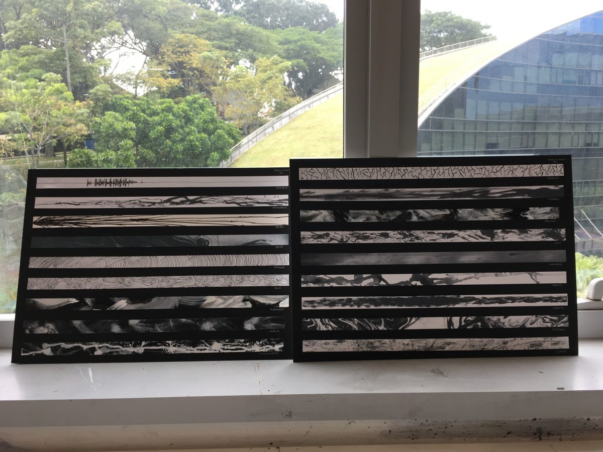
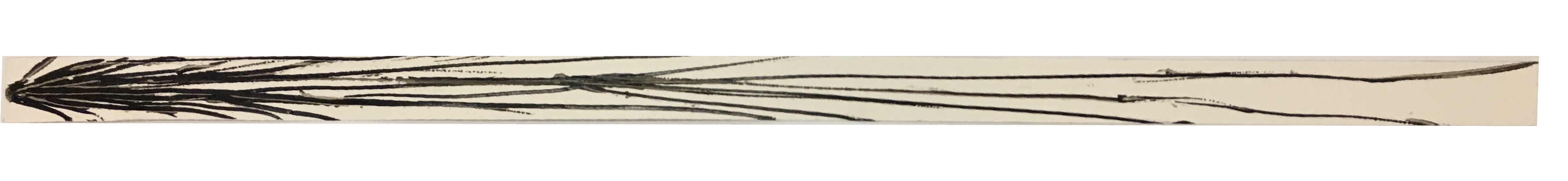
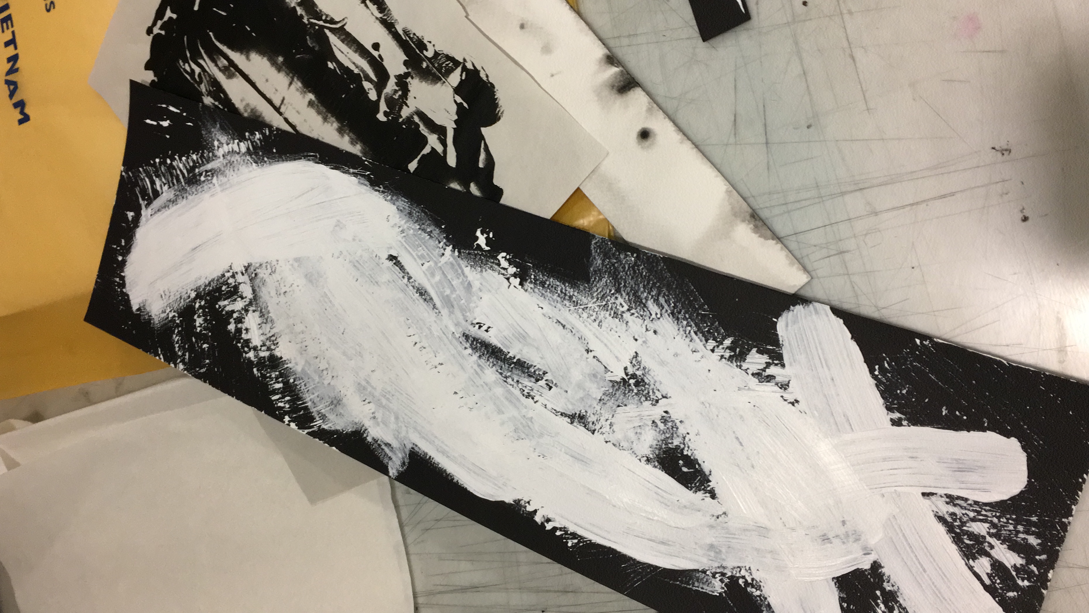
in my emotions post, i talked about how infatuation was linked to the heartbeat. in my final print, i took the visual image of the line that represents the heartbeat into context. since the meaning of infatuation is “…intense but short-lived passion…”, the intensity of the line breaks halfway, to represent the short-lived element to it. the intensity is represented through the messy, dense lines.

Sentimentality

untitled-2-02

“of or prompted by feelings of tenderness, sadness, or nostalgia”.

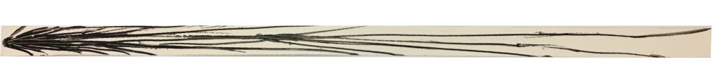
 my emotions are raw and they flow like the ocean waves. hence i took this feeling and created a visual image of wavy, messy lines because they’re unpredictable; uncalled for. thick wavy lines are started off first to represent the wave of energy of sadness. the energy dies down hence the thiner and faint lines towards the end as they represent the sense of nostalgia that i do enjoy feeling. 

example: you find an album of old images of your childhood. *gasp* (wave of energy), old photos that i dont remember!” then you start flipping through the album.. *aww* (tenderness, nostalgia) those were the old days that i miss…” 

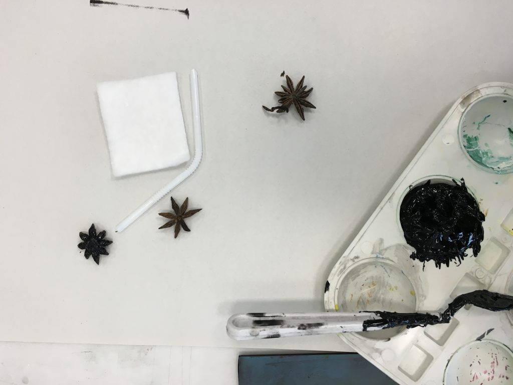
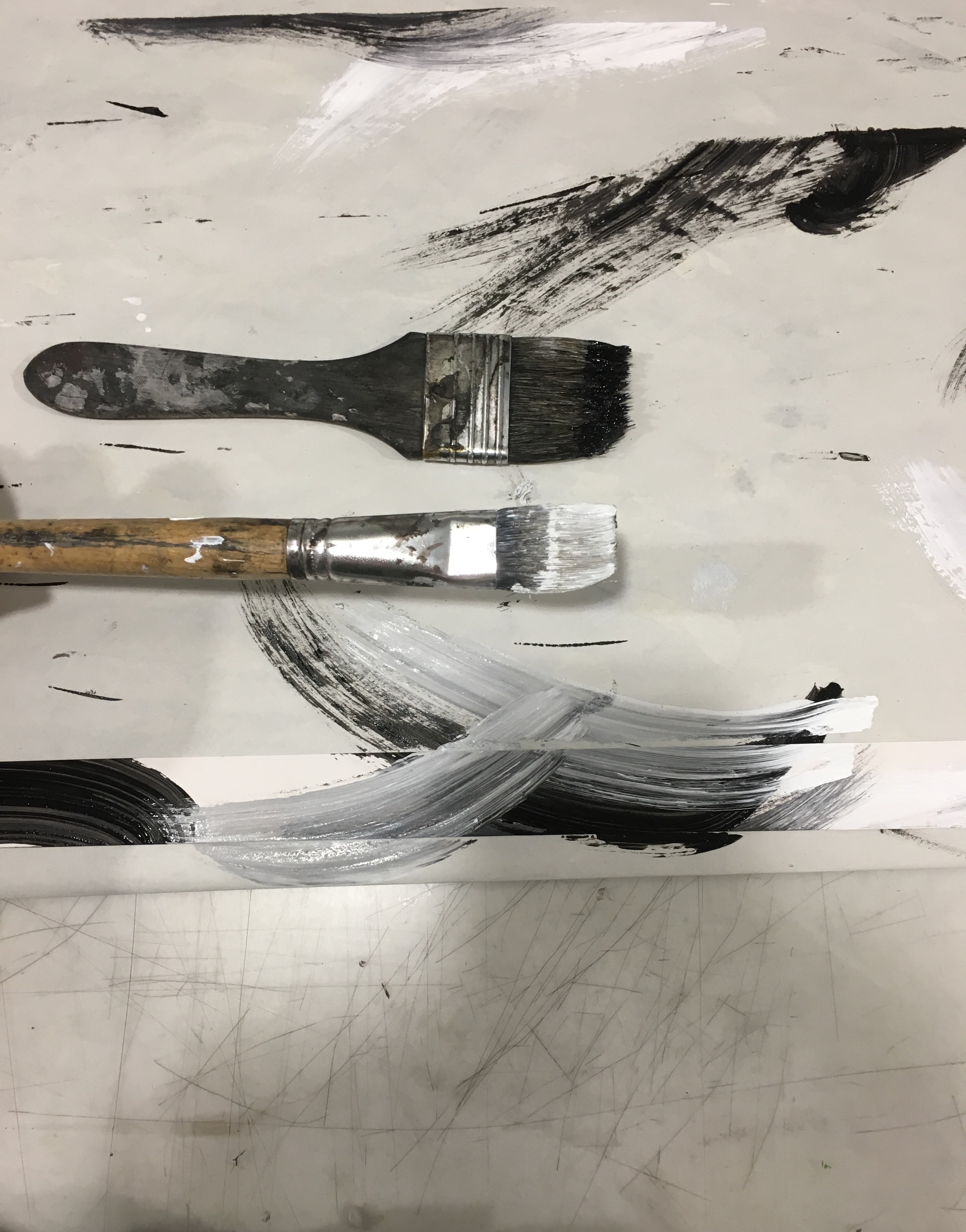
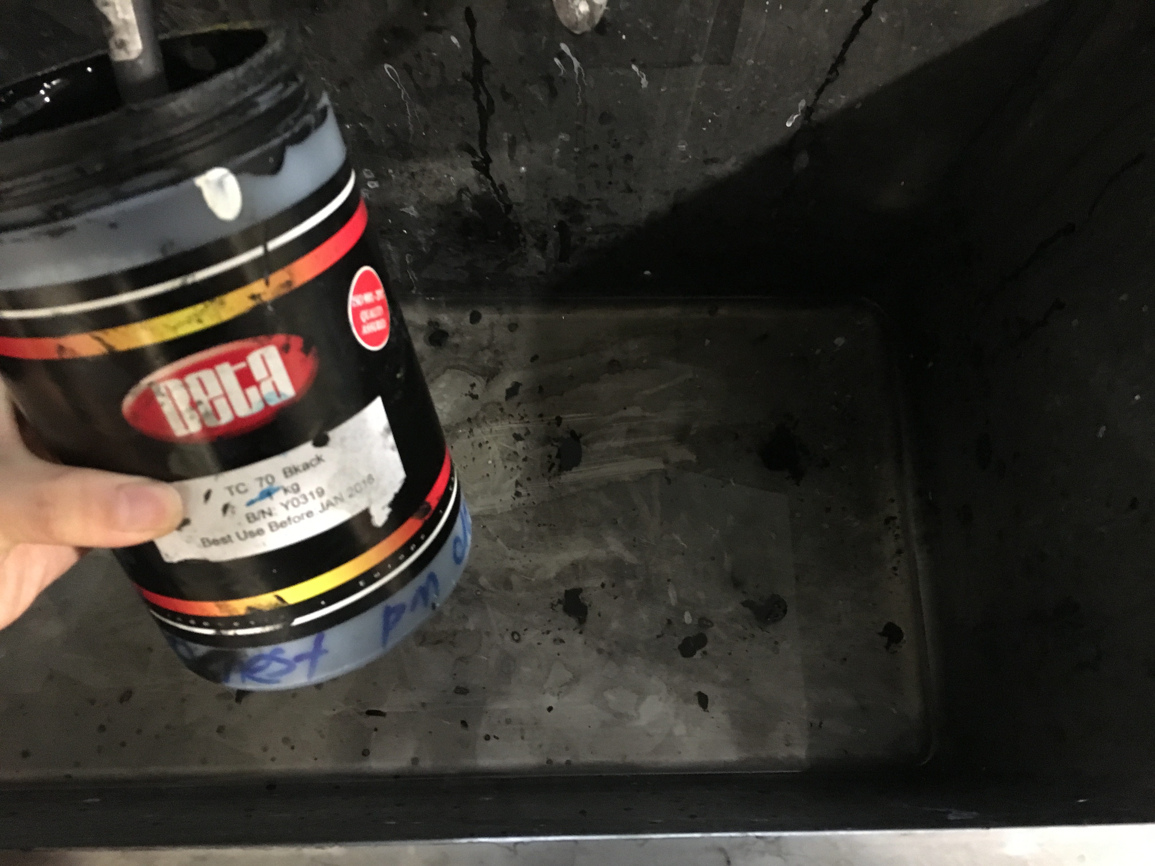
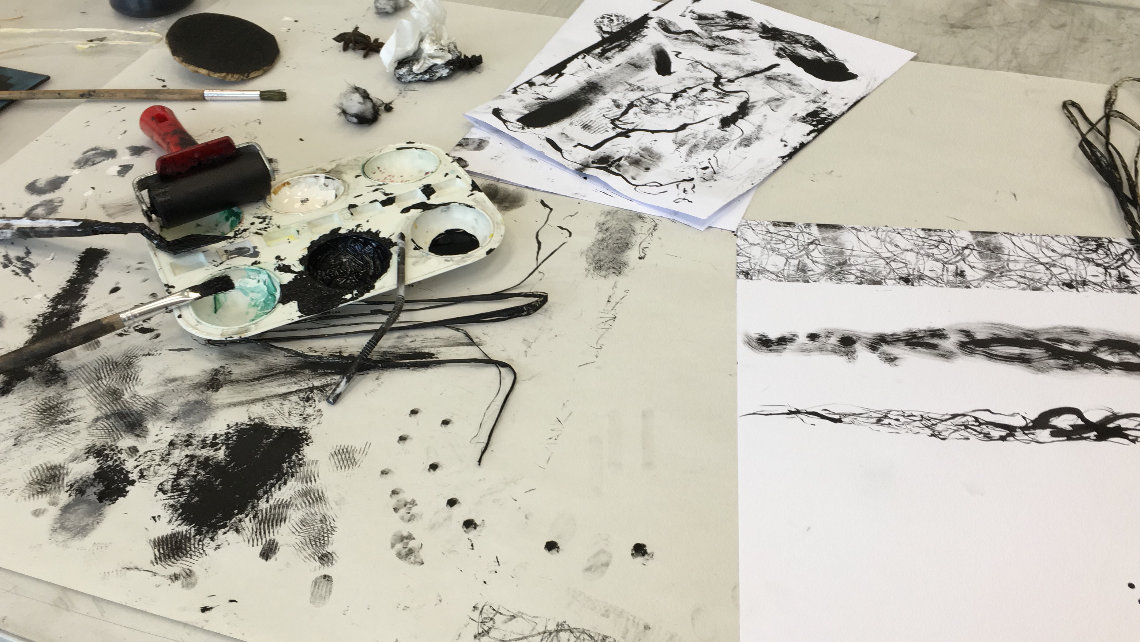
the lines were created using the end of the straw that i brought on the 2nd 2D class. the sharp end of the straw was dipped into calligraphy ink and was dragged onto the piece of newsprint paper to create my print.
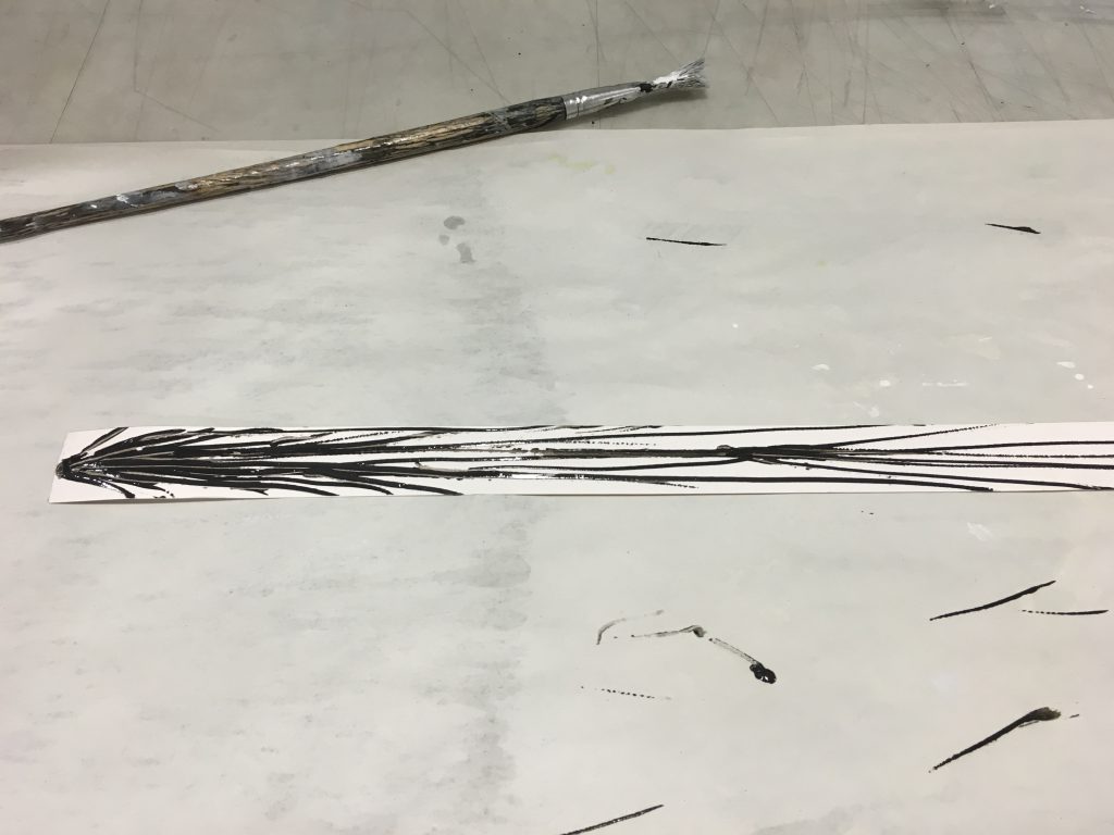
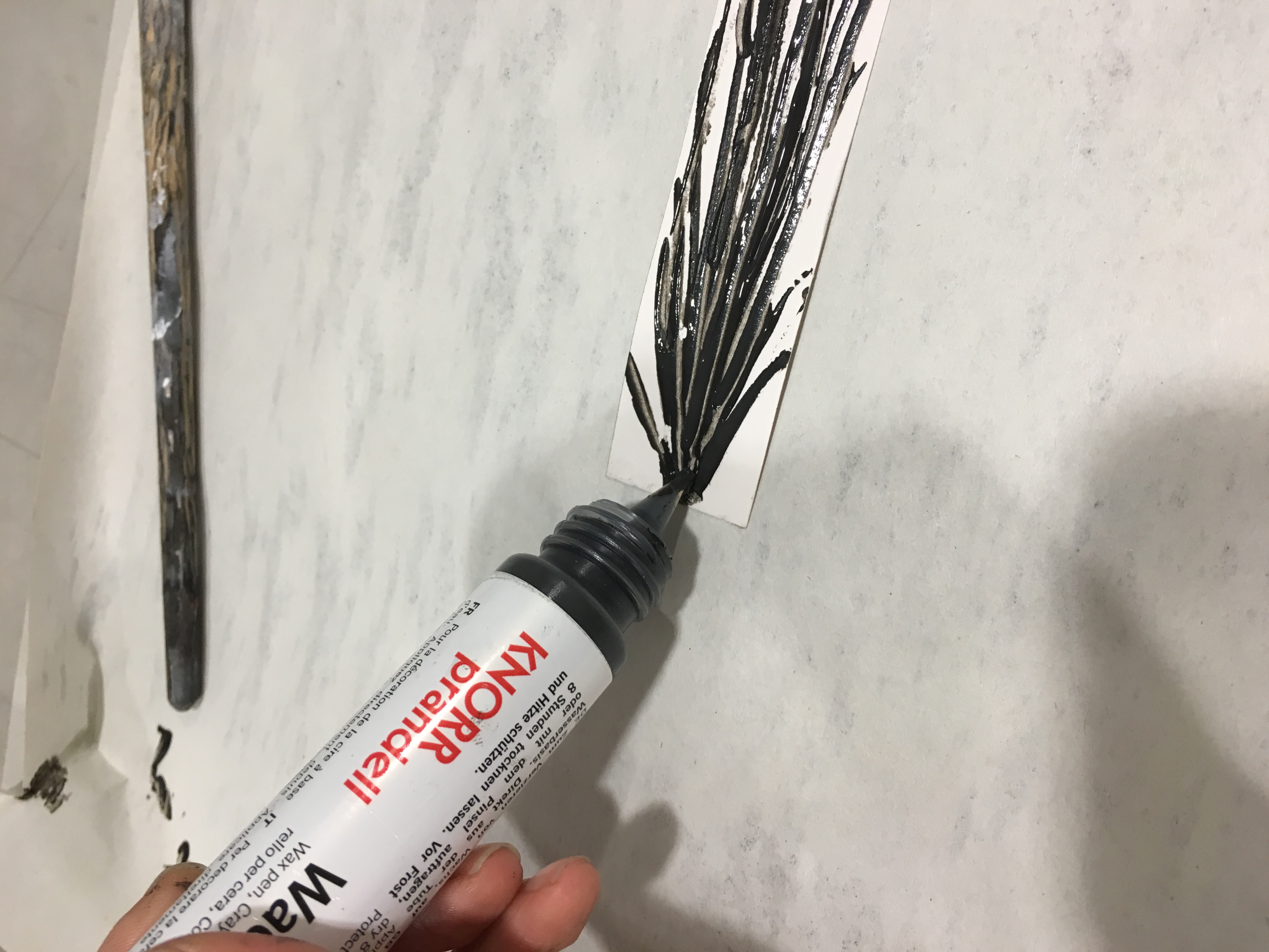
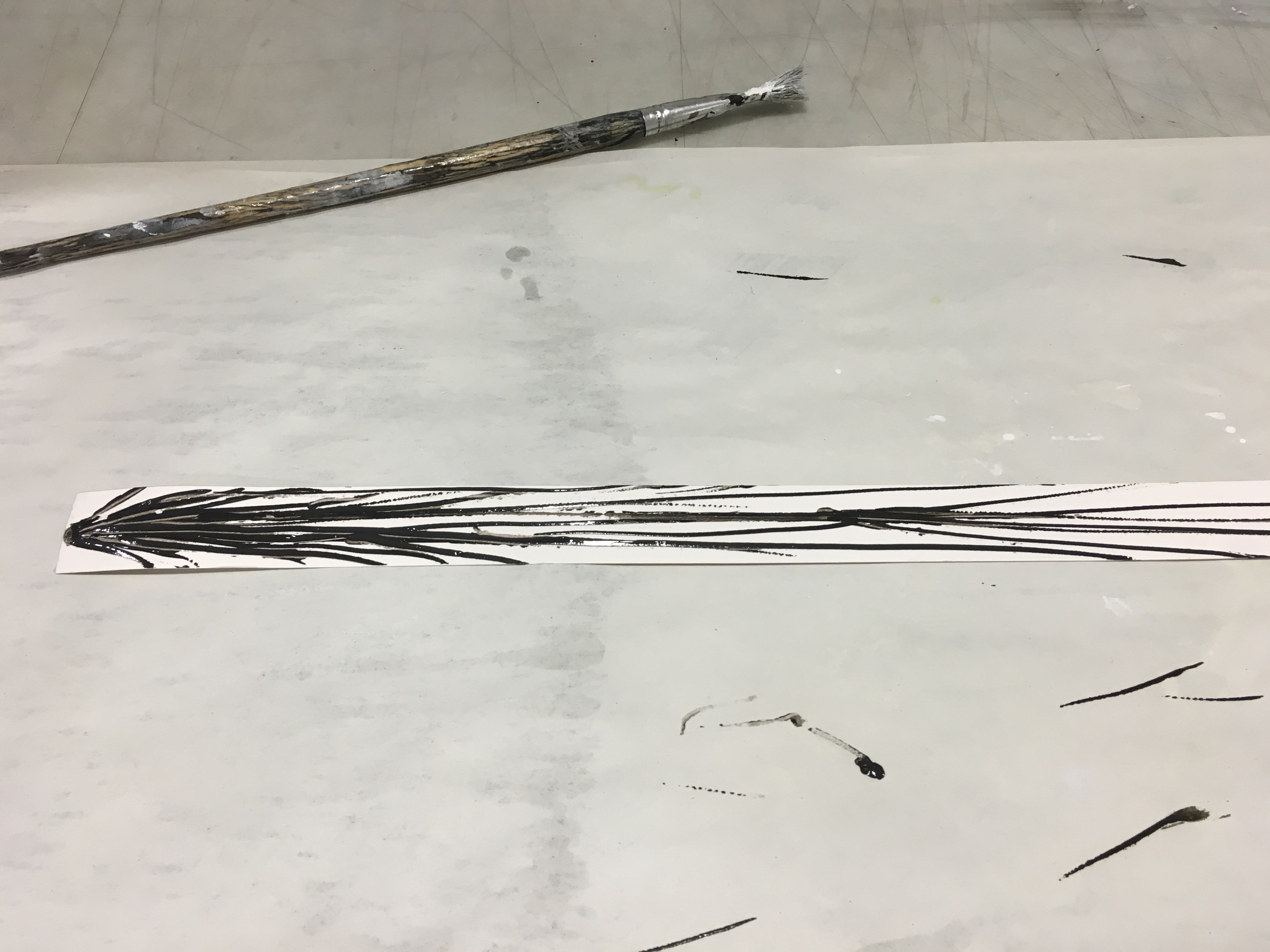
photo-23-8-16-09-21-55

Desire

photo-19-9-16-23-19-06

“a strong feeling of wanting to have something or wishing for something to happen.”

desire to me means to want something so badly that you’d go reach for it and grab it. 

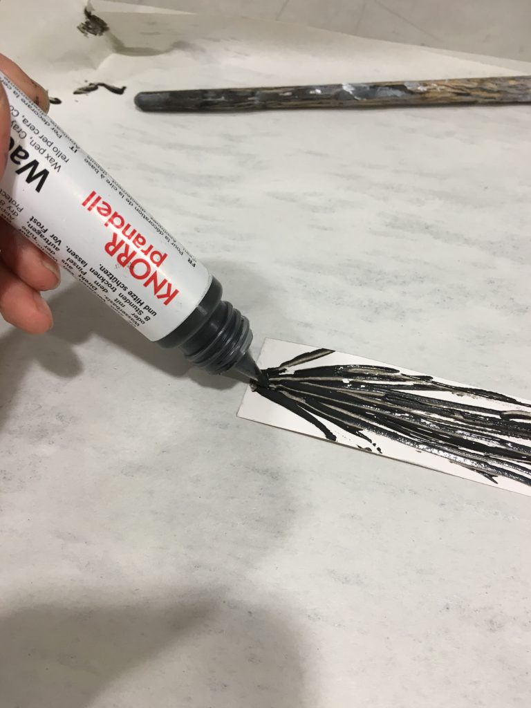
the act of reaching out and getting out could be used literally in my print. this wax pen was perfect for it.photo-16-9-16-02-46-03

since desire means reaching out, there has to be a starting point. hence, i created my print by bridging out more lines from the starting dot, to represent the determination to want to get out and go grab for it.
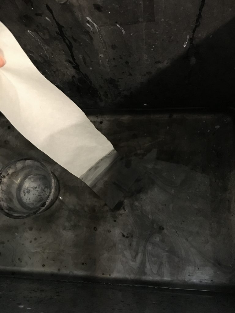
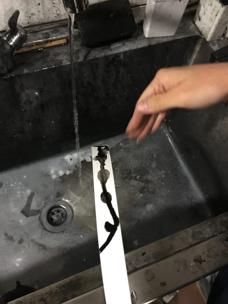
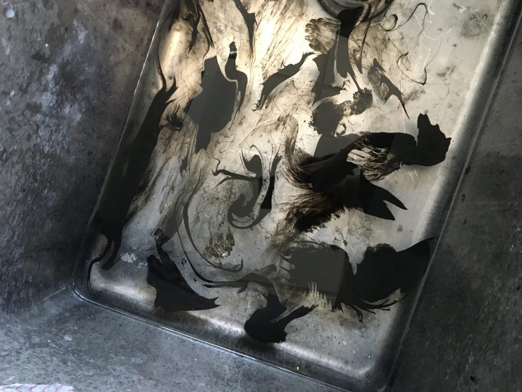
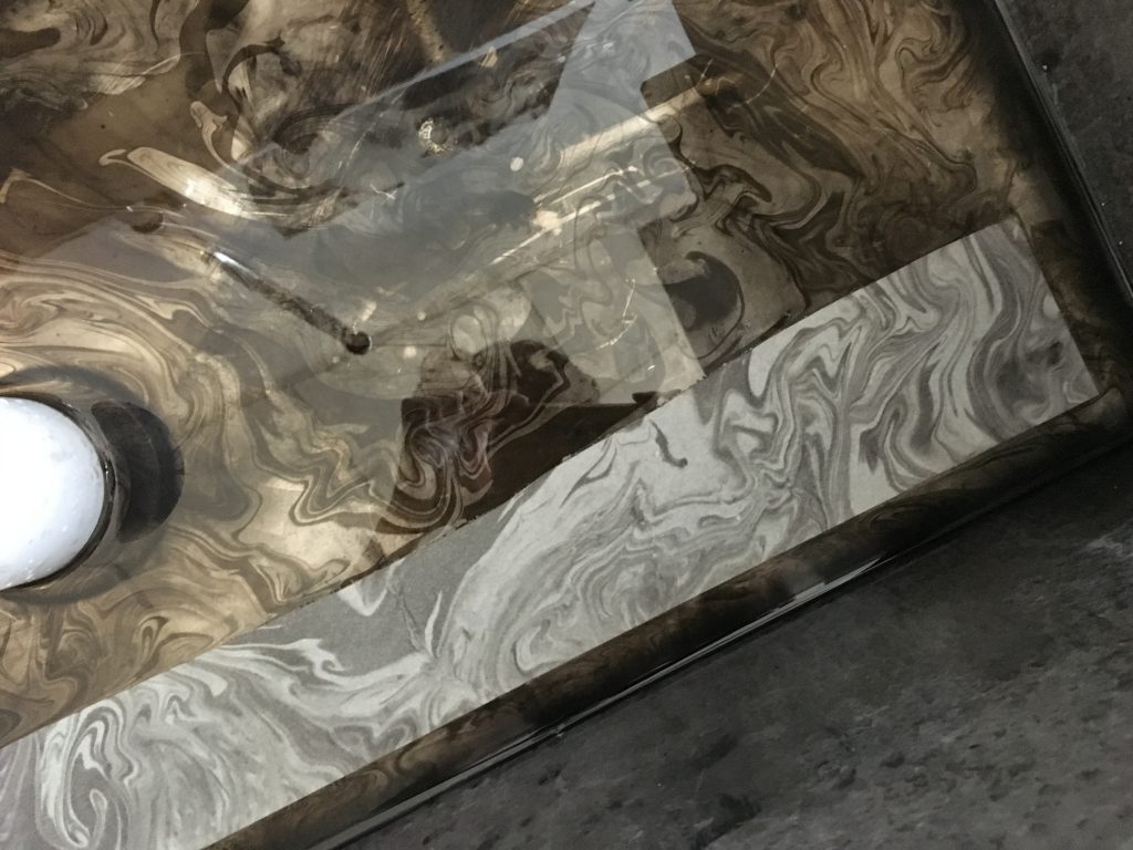
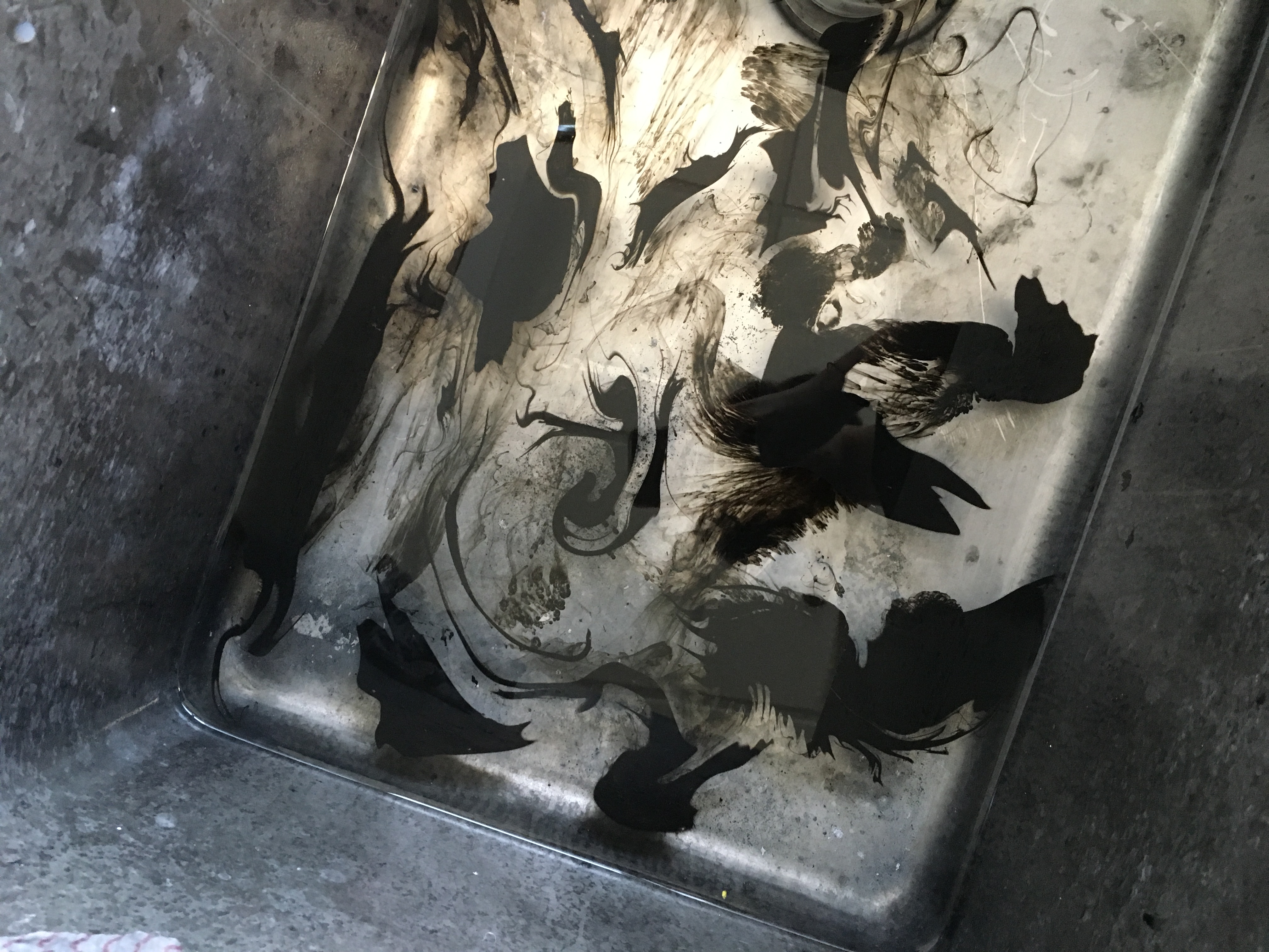
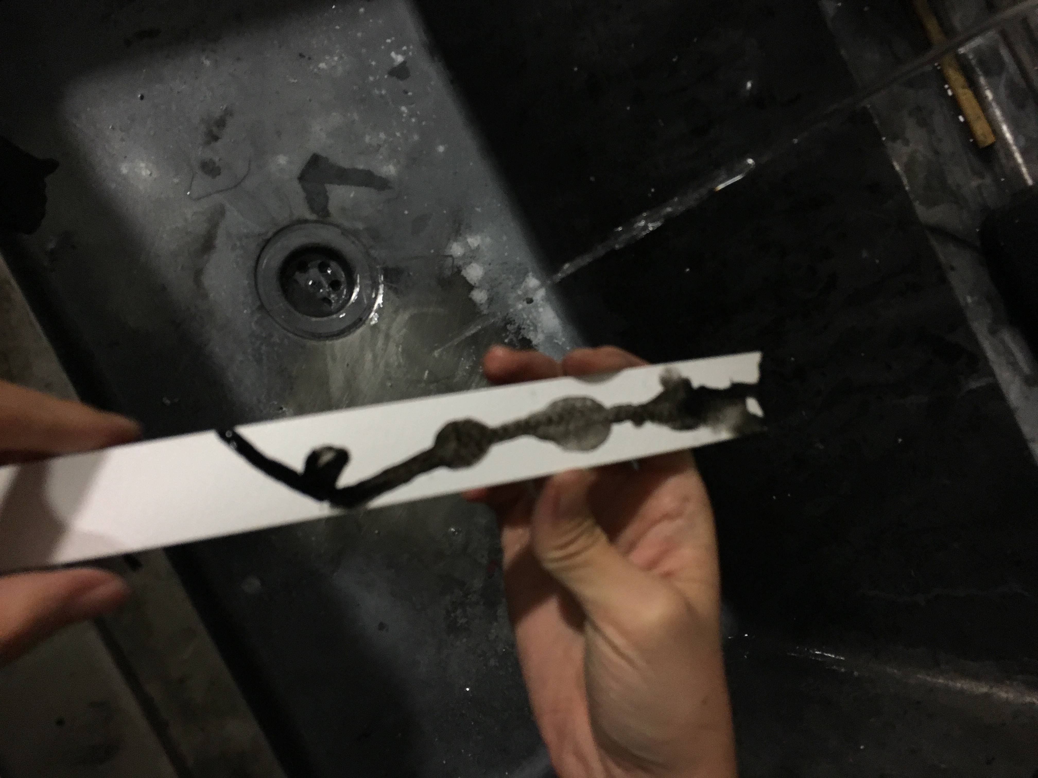
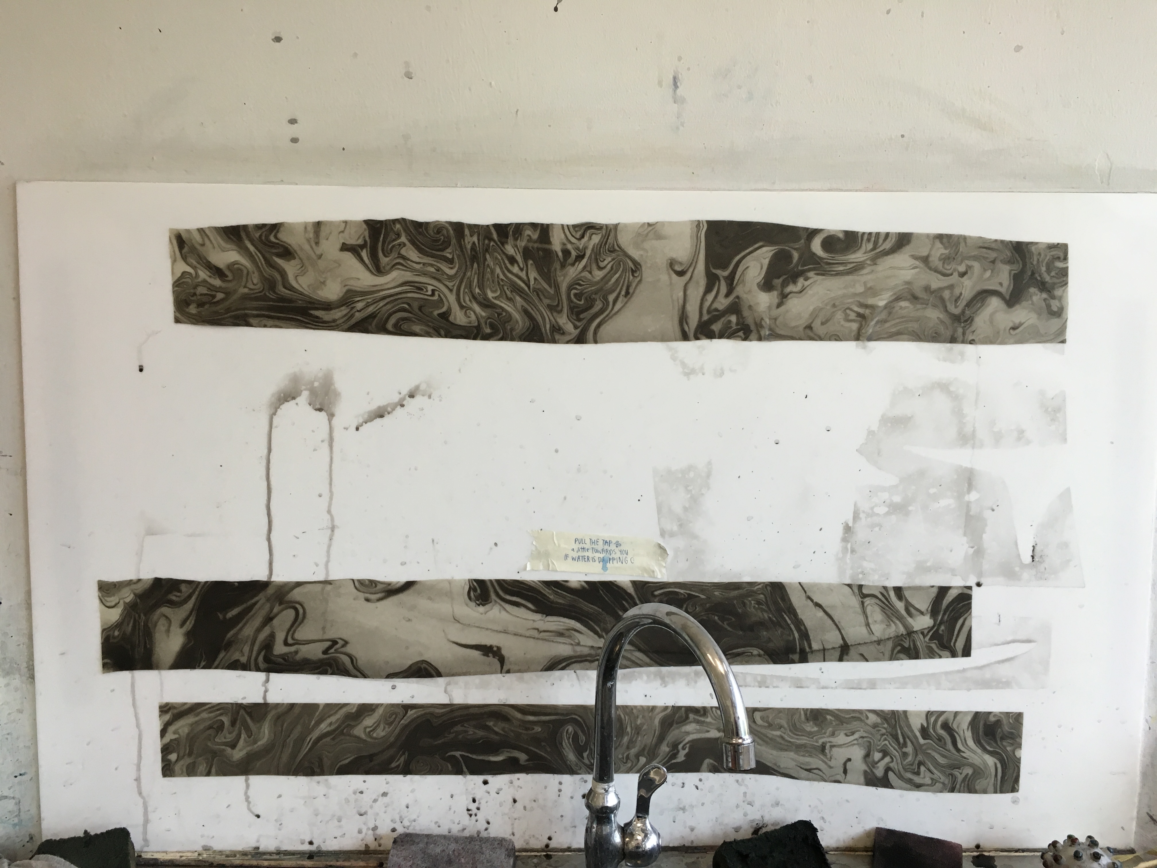
photo-16-9-16-02-46-12 photo-16-9-16-02-46-17

Relief

untitled-2-06

“a feeling of reassurance and relaxation following release from anxiety or distress” 

this was created using the marble technique (which was really fun to do). the black area represents the anxiety and distress, whereas the empty part area represents the sense of relief and relaxation.

(the marble technique was uploaded in the previous post but we shall refresh our minds again)

file-8-9-16-16-45-50 file-8-9-16-16-47-05

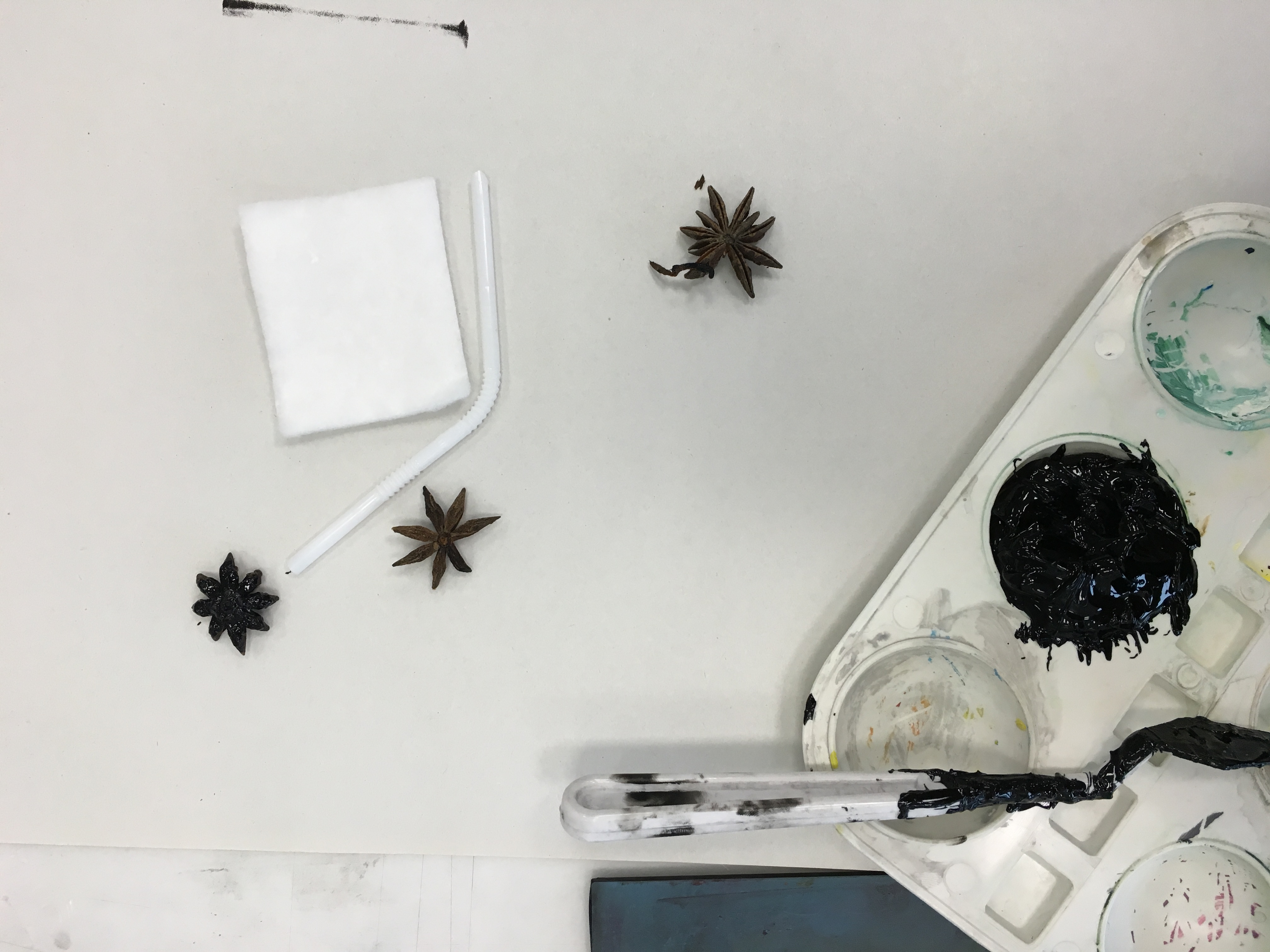
  1. drops of calligraphy ink are added into the sink of water
  2. swirls are created by moving the drops with a stick
  3. newsprint paper is used to absorb the patterns

Optimism

photo-19-9-16-23-19-552

“hopefulness and confidence about the future or the success of something”

as circles are not structured shapes and are free in the form, i feel that circles are a good positive representation for this emotion.

the lines that start off anticlockwise represent the negativity that looms the mind; that prevents you from feeling positive. the lines are dense and thick to show its strong power. slowly, with determination, the circular lines (clockwise) start to break free, and slowly it becomes sparse, to show the immense energy of feeling hopeful.

Bliss

photo-19-9-16-23-19-554

“perfect happiness; great joy.”

bliss to me reminds me of a person whom is calm and at peace. wavy lines and circles are a good positive shape for this emotion because they are free form and provides an image of tenderness and positivity. hence my visual representation of bliss is represented through a mixture of them. the patterns depict ocean waves which are often described as calming elements, and that is an image im trying to achieve.

Amazement

photo-19-9-16-23-18-52

“a feeling of great surprise or wonder.”

to me, swirls give me the sense of wonder. an example would be the glitter we usually see in disney films

kids0039_color-2 magic-dust-background

so i took this idea of swirls for my print. i also did a mixture of black and white for an effect and play on colours, to give the sense of different and get people wondering how the grey came about. it also adds a softer image compared to pure black and white.

photo-16-9-16-03-35-30

Surprise

photo-19-9-16-23-18-28

“an unexpected or astonishing event, fact, etc.”

the term surprise automatically reminds me of things that we use to create the feeling, eg confetti, fireworks, balloons etc.

i do like the element of fireworks thus i managed to create the sparkly, fireworks effect with the use of paint on a dry brush. the reason why i chose to do it on black paper is because it works better with the sparkly effect i’m trying to create.
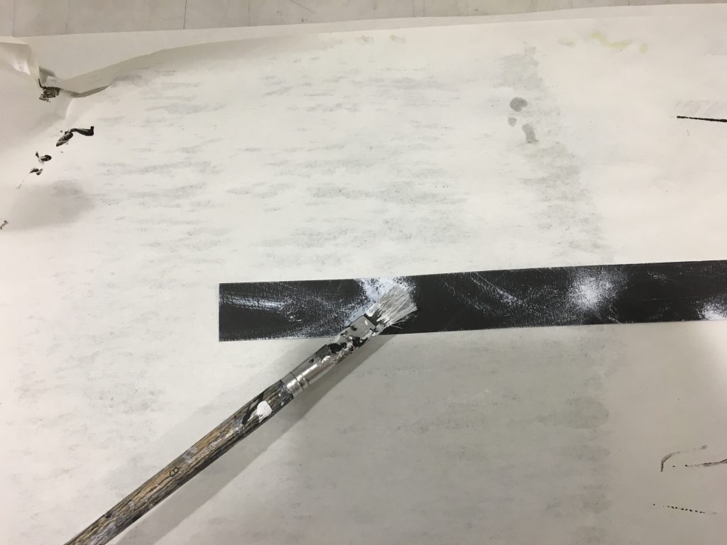
 photo-16-9-16-02-48-03 photo-16-9-16-02-48-12

Astonishment

photo-19-9-16-23-52-12

“great surprise”

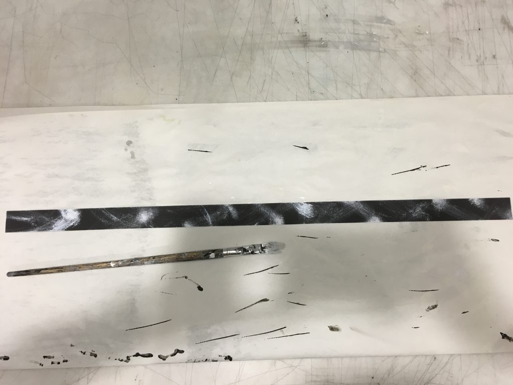
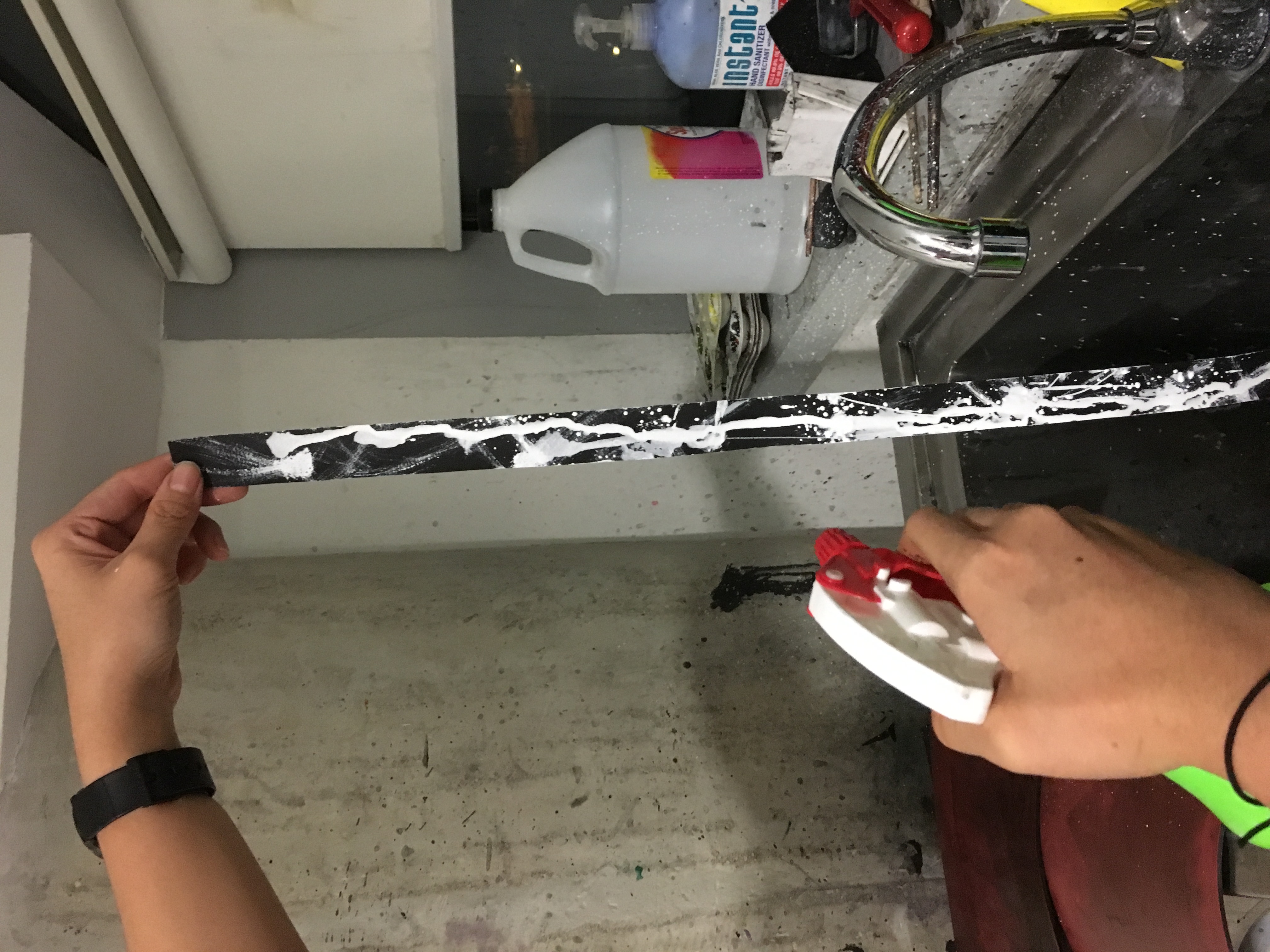
the emotions astonishment and surprise are almost similar, but there is a greater intensity for astonishment. hence i took the similar idea of using white on black paper. photo-16-9-16-02-01-24 
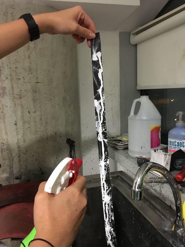
acrylic paint is mixed with water and sprayed from a bottle.

compared to “surprise” where a dry brush was used to create the glittery effect, wet liquid acrylic paint is used here to create a higher intensity and thicker medium. also i decided to use the spray bottle because i do enjoy the messiness it can create through the splashes. those messy splashes represent the uncalled for great surprise element.

Ferocious

photo-19-9-16-23-19-551

“savagely fierce, cruel, or violent.”

with ferocious, there has to have a visual image of something fierce. i felt that the visual image of lightning is a good representation of something fierce, and violent. just like how we get intimidated by thunderstorms and lightning, the emotion ferocious can be used to represent that.
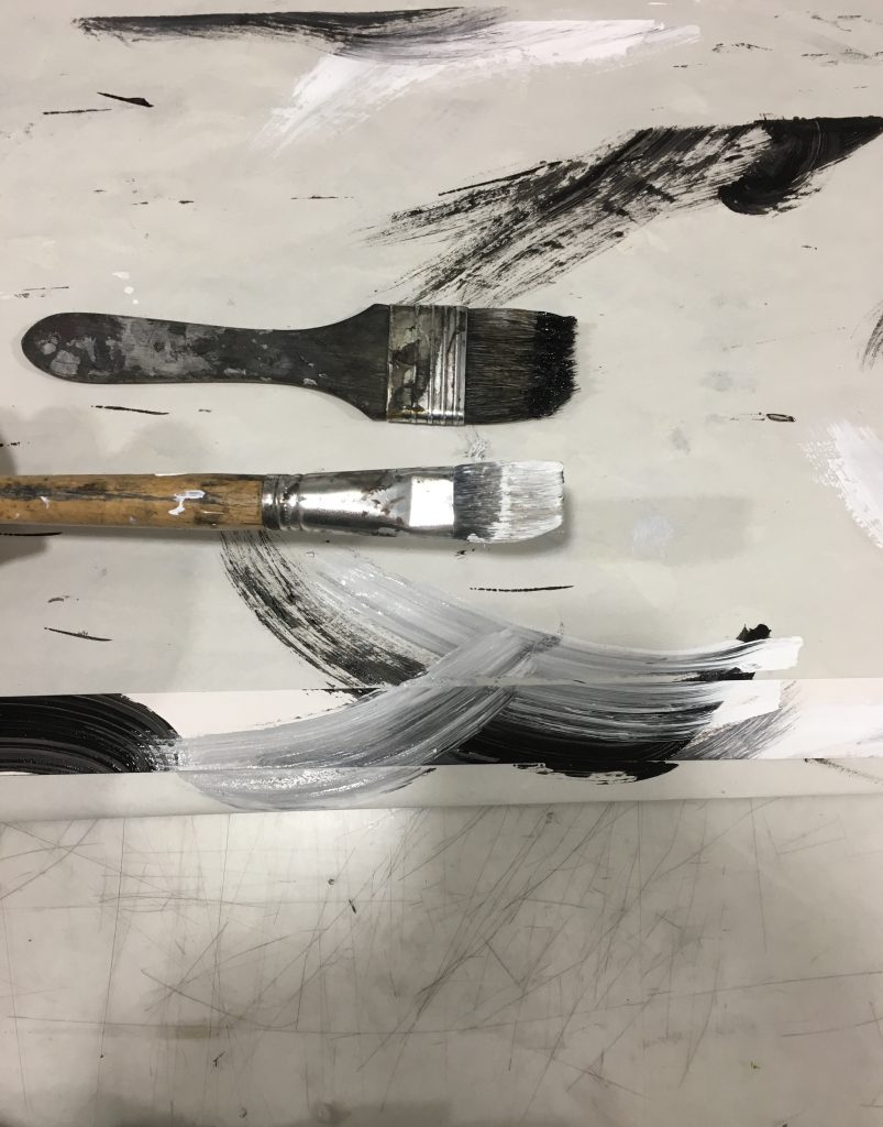
Outrage

untitled-2-05

“an extremely strong reaction of anger, shock, or indignation.”

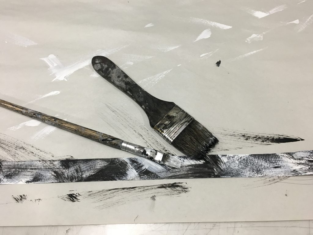
when you need to release your anger, you result to doing things that aid with that. in this case , outrage means to me venting my anger through something. hence using the brush to create a rapid movement is the most successful way to do so.

Jealousy

photo-19-9-16-23-17-53

“feeling or showing an envious resentment of someone or their achievements, possessions, or perceived advantages.”

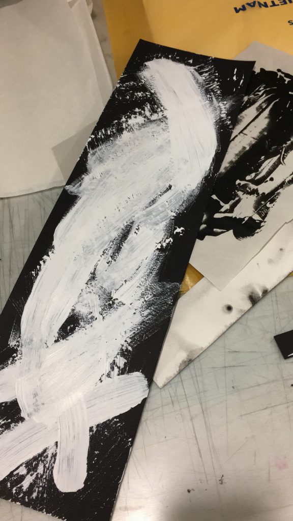
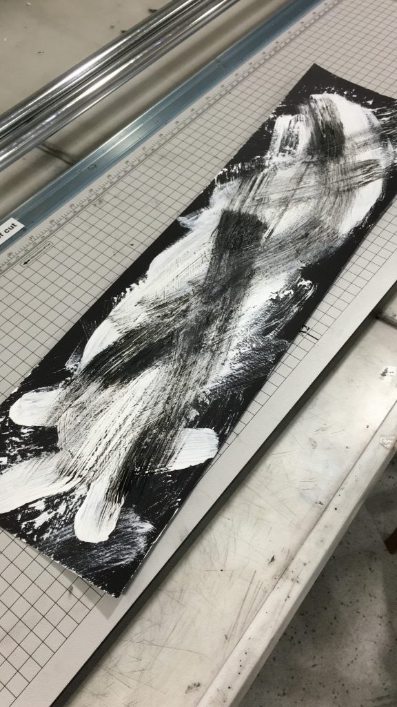
the act of jealousy can be done through lots of harming negative ways such as destroying / sabotaging someone else’s work. in this case, to recreate the act of destroy, clean brush strokes of white paint is used to paint over black paper. white to represent purity; in this case an innocent person’s work. then, black paint is brushed over in thick dry strokes to represent an act of sabotage; feeling jealous over his enemy’s clean, well-done work.
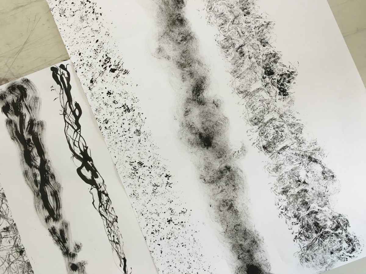
photo-15-9-16-21-57-44 photo-15-9-16-22-09-19 photo-15-9-16-22-57-06

Hurt

“to cause pain or injury to (yourself, someone else, or a part of your body)”

untitled-2-04

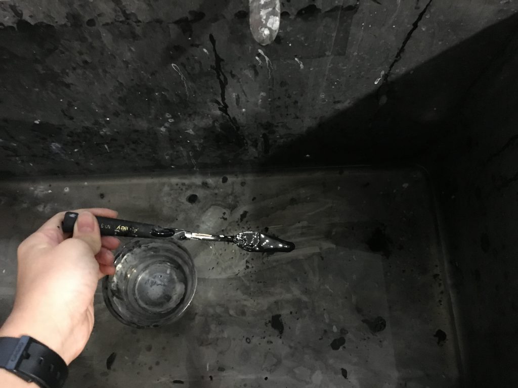
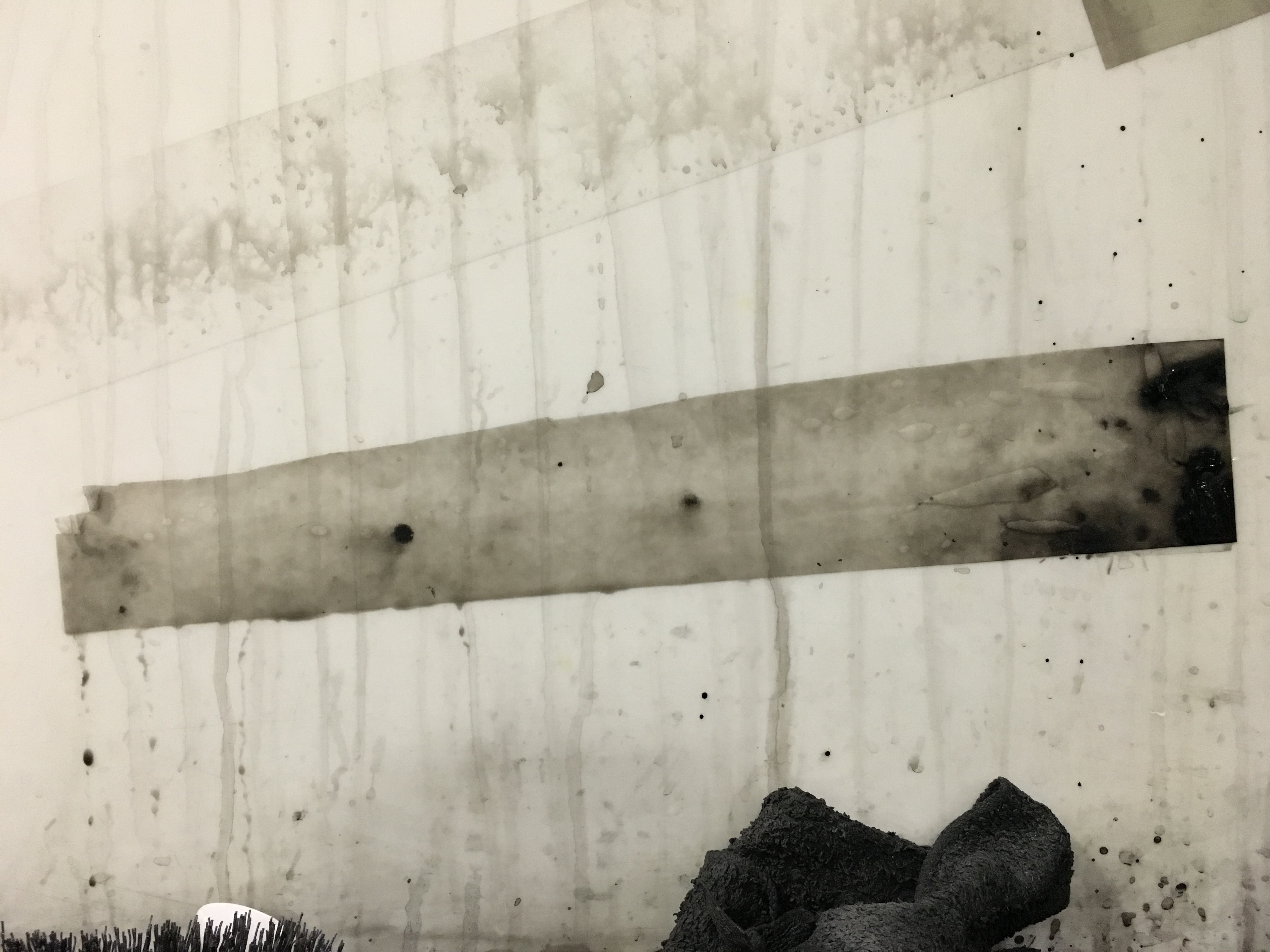
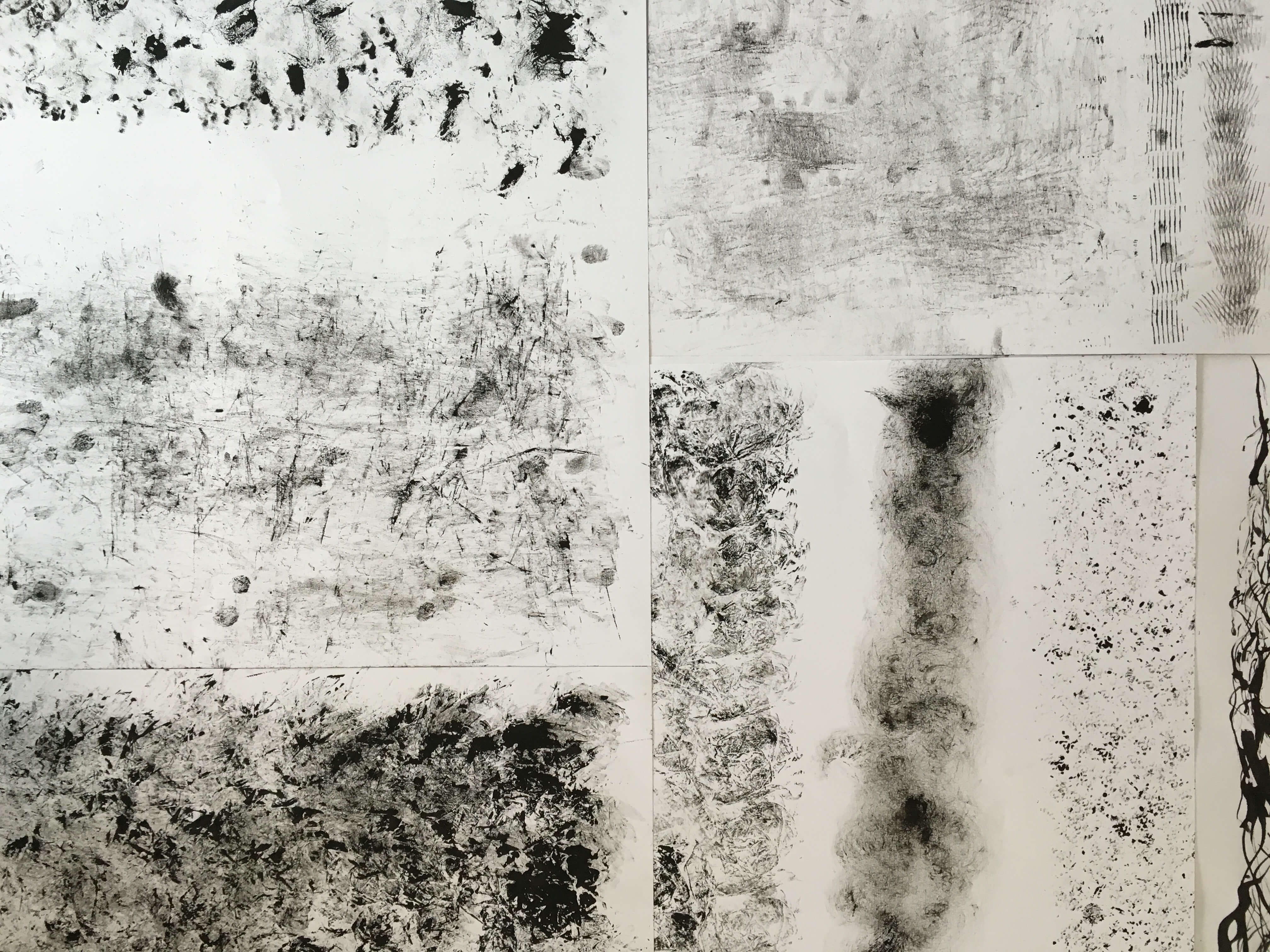
Cuts and blood splats are some visual representations of being physically hurt. The sharp lines represent the cuts while the blobs of ink represent the blood. The sharp lines are created by dipping the palette knife with ink and hitting the edges of the palette knife on the paper, while the blobs are by using the flat surface of the knife and smearing it on paper.

Lonliness

“sadness because one has no friends or company.”

untitled-2-03

lonliness…. such a sad feeling to feel ain’t it?

in this emotion, i experimented with the marbling technique again but this time round with a different type of ink – acrylic paint! (can it work??)

it definitely didn’t give me with the marbling effect as the paint was too dense, so it sunk to the bottom of the sink.

i do like the grey background of my piece as it represents the dark, gloominess of one’s mind when they’re feeling lonely.

photo-15-9-16-19-11-25

by using rice paper, i felt it would be a better paper medium to use as it absorbs ink quicker than normal paper.

photo-15-9-16-19-05-51

photo-15-9-16-19-06-01

adding acrylic ink into a sink of water

photo-15-9-16-18-57-41

to my surprise, there wasnt alot of ink caught due to the high density and solubility of the paint.

photo-15-9-16-19-08-29

however i was really happy with the results for this emotion because the little the better, right? i really like how the there’s just one lone dot in the middle, but an accumulation of ink blobs at the sides of the piece. this is a well visual representation of lonliness due to their contrast.
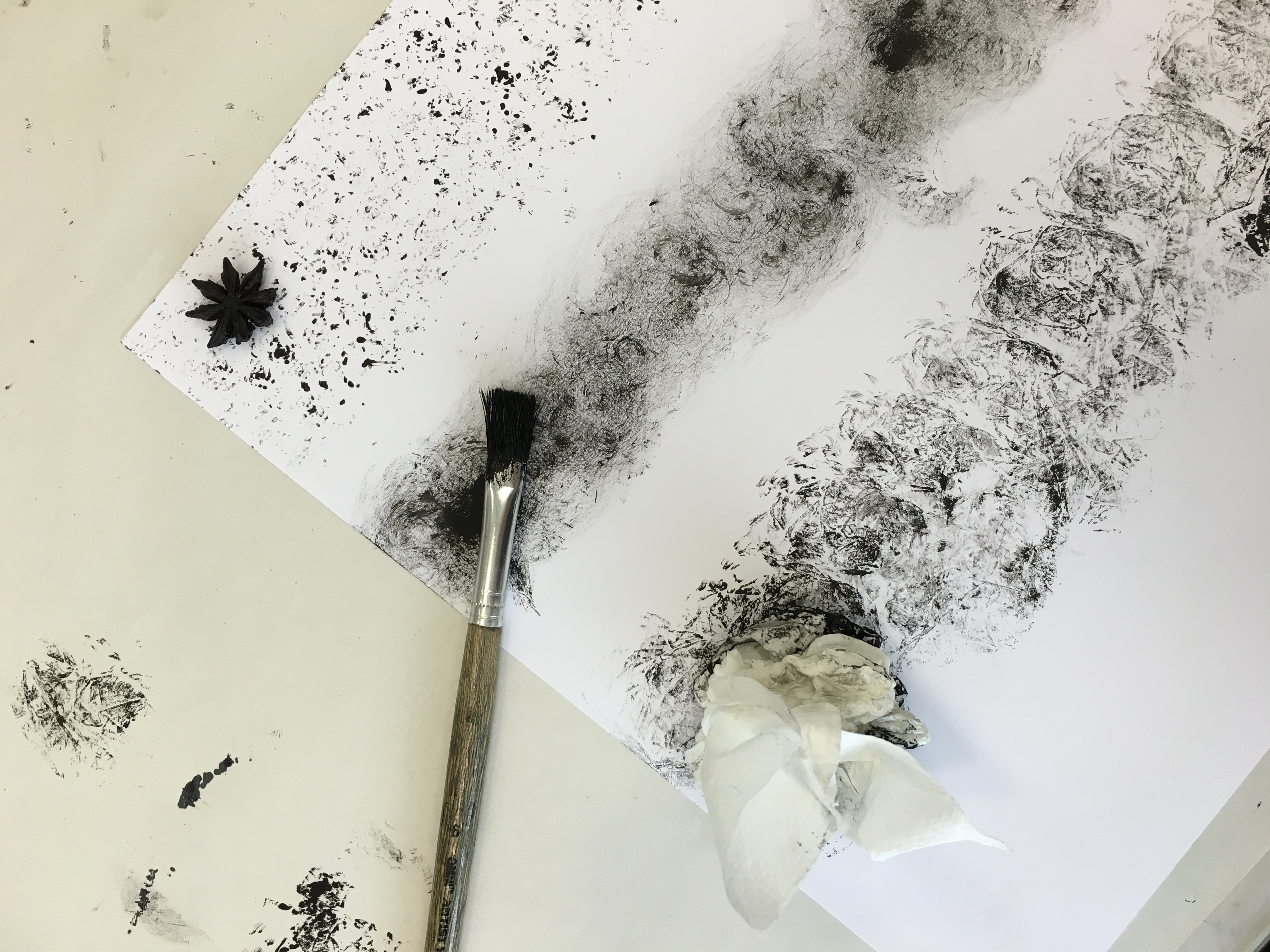
Agony

“extreme physical or mental suffering.”

untitled-2-09

i experimented with water colour for this medium. A few drops of black water colour ink is dripped on water colour paper (for better results), followed by dripping drops of water over it and swirling them to create a messy yet beautiful pattern.

photo-15-9-16-18-56-39

photo-16-9-16-00-14-28 photo-16-9-16-00-14-30

the reason i used water colour for this emotion is to depict the teary / crying like effect when someone is dealing with agony. i quite like how it turned out in the end as it shows different black tones, just like how it represents the different types of pain when one is agonised. the lines are stretched out to represent the extremity of pain.

Anxiety

“a feeling of worry, nervousness, or unease about something with an uncertain outcome.”

untitled-2-01

this emotion is recreated just by a dry brush. as anxiety means nervousness, the middle portion represents how one would feel when anxiety reaches the maximum. the dry brush creates a feeling of tension, speed (heart beat racing).
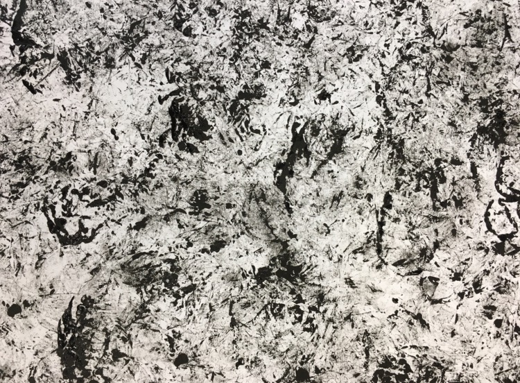
Hysteria

“exaggerated or uncontrollable emotion or excitement.”

untitled-2-07

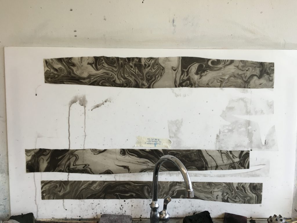
as shown in a few posts back where i posted on my marble technique process, this piece was created using it. i really like how this turned out as we can see how uncontrollable the movement is, just like how hysteria feels like. the emptiness in the centre represents how one cant control his emotions – from feeling hysteric to being fine and back to its original state.
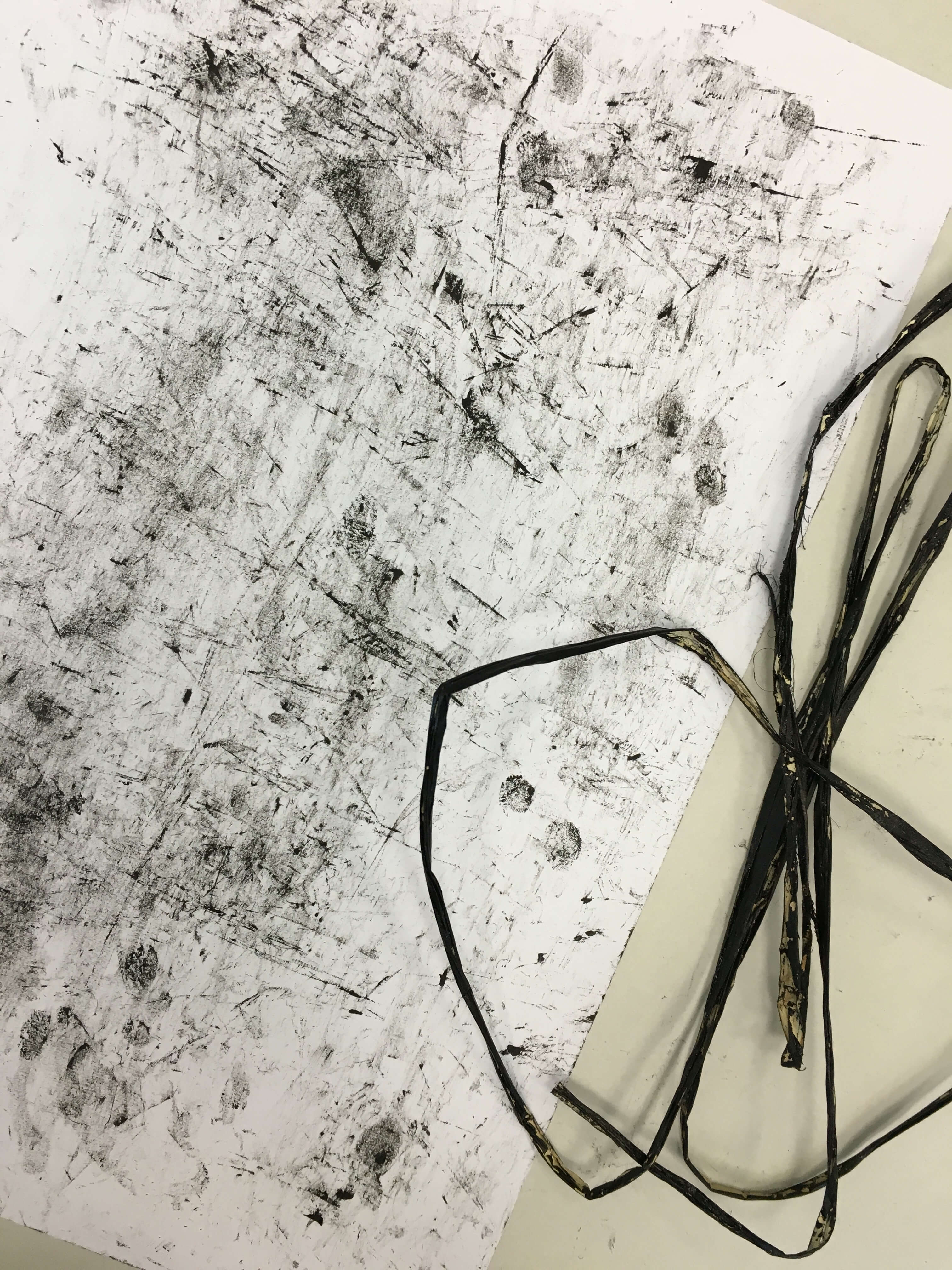
file-8-9-16-16-45-50

file-8-9-16-16-47-05

file-8-9-16-16-47-47

Distress

“extreme anxiety, sorrow, or pain.”

untitled-2-08

this emotion was created using by rubbing the paper-like string with ink onto paper. photo-23-8-16-09-45-27

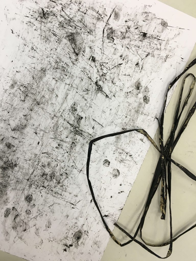
sharp linea and black textures were created with this experiment. i like how it turned our because the way i intepret distress is that everything is in a mess, painful and unexplanable. the sharp lines created from the edges of the string represents the pain in distress; something sharp. the black messiness represents the extremity, messiness of pain.

emo – monoprint #1

greetings,

for today’s 2D lesson (23rd aug), we had a chance to experiment with mono printing, where we created prints and patterns from the props that we brought, and also things we could get hold of in the silkscreen room &studio. heh.

the props that i brought were star anise and a bendy straw (the neck was the part that i was interested in in creating patterns).

Photo 23-8-16, 09 21 55

01 –

star anise
Photo 23-8-16, 10 26 33

was quite disappointed with the turnout as i thought that i could create interesting patterns from its shape but it turned out otherwise because of its difference in smoothness. the point of base of my star anise ended up being the only point of contact.

File 29-8-16, 17 30 28

02 –

scrunched up cling filmPhoto 23-8-16, 09 55 40File 29-8-16, 17 29 14

there was a roll of cling film available, so i decided to use the opportunity to find a use for it. i decided to scrunch up a piece of it and dab it with ink. the results were quite interesting on its own because every stamp created rather different patterns. i quite like how it looks when they all come together; messy yet rather clutter-ly interesting because of the difference weightage.

03 –

banana leaf-ish string
Photo 23-8-16, 09 45 27

decided to paint the string with black ink and rubbed it against on my paper. there was some kind of textured pattern but i feel that it just looks messy.

04 –

star anise, brush, tissue paperPhoto 23-8-16, 10 39 48

dabbed the brush with ink and swirled it around on my paper.

just like the cling wrap, i scrunched up a piece of tissue and did the same to it. the results were almost similar as the cling wrap.


05 –

banana leaf string on roller, brush, straw endPhoto 23-8-16, 11 41 38

i decided to experiment more with the banana leaf string, so i decided to place some on the roller. it created interesting patterns, especially the visual of the messy lines. maybe i could draw some inspiration from that for my project.

nothing fancy for the second one but just ink on brush. shirley said that my patterns i created so far were lacking in tensions (which were essential, or rather recommended for the brief), so i decided to play around by added some pressure at some areas while brushing over on my paper. it could be explored further though.

the third one was created from my straw end using calligraphy ink (which was more liberating to work with for its loose viscosity i feel). i would say this was the best out of everything because there is definitely a play in tensions through its difference in line weightage. turned out the straw end gave better results than the neck. ha ha


Photo 23-8-16, 11 54 36Photo 23-8-16, 11 56 34


end result of the first monoprint lesson –

Photo 23-8-16, 11 55 38