after the last consultation with Mimi, i had lots of comments to take in to rethink about my idea.
this round of trials, i had an idea of incorporating the element of my hand into the images, to show the current action of making.
1. Pasta Chef
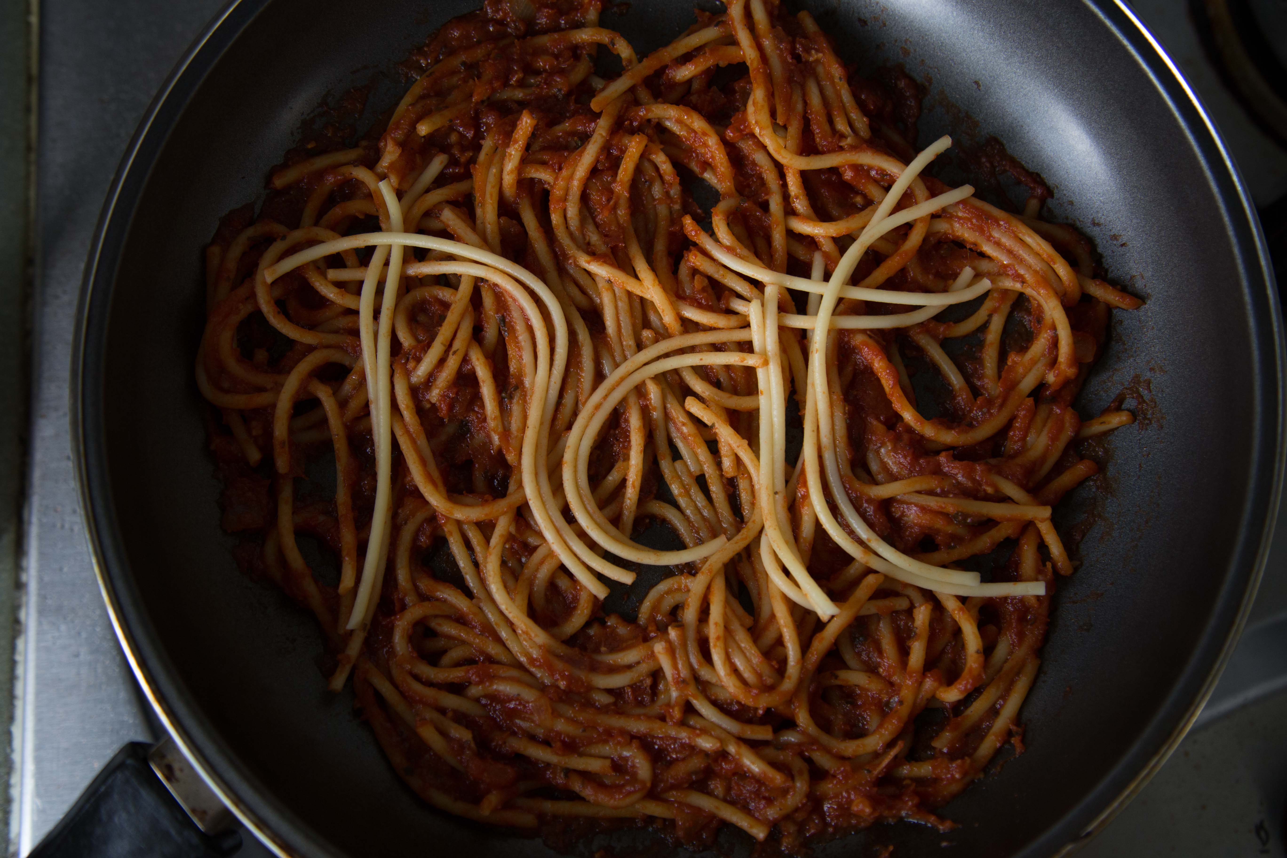
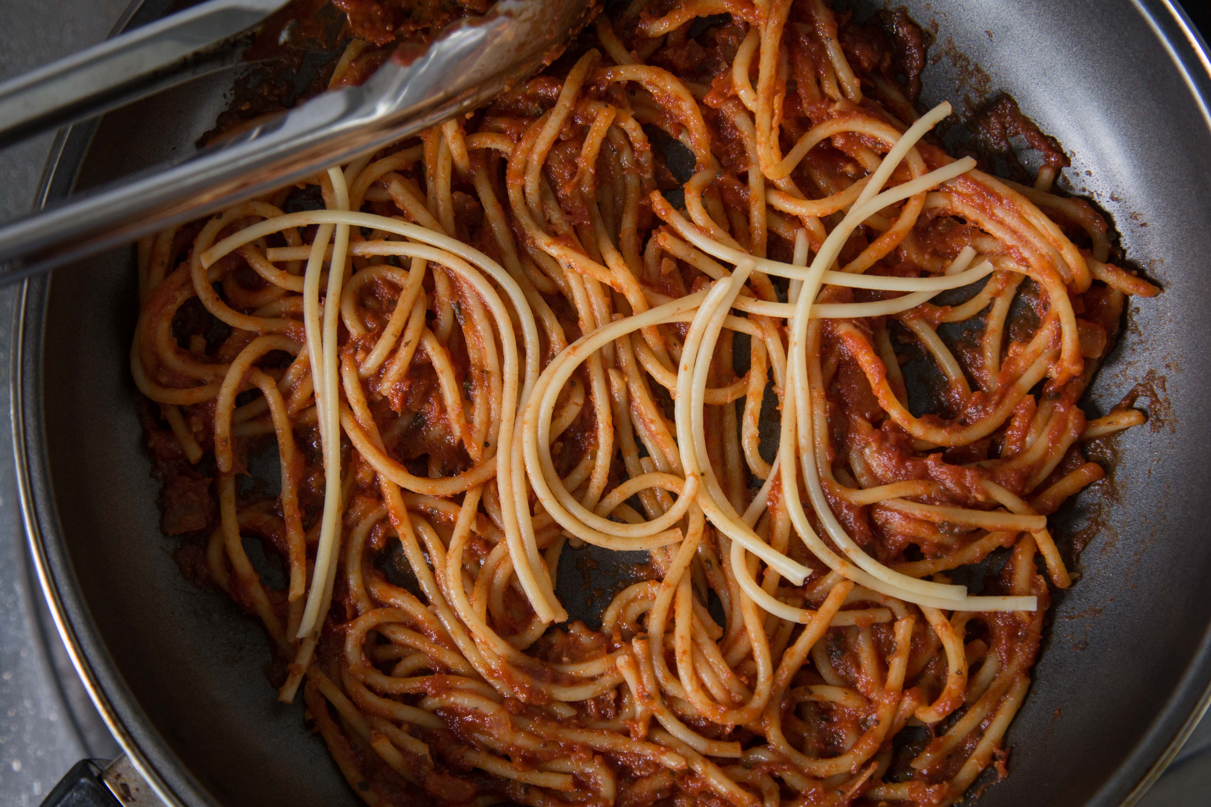
taking in advice from my classmates on using tomato sauce, and creating my name to standout, i created this.
i felt that using the spaghetti to form my name in the right context (in this case in a pan of spaghetti) would create the ‘ah hah’ moment that Mimi referred to. unfortunately Mimi said it didnt look appealing, and at the same time nothing to shout about.
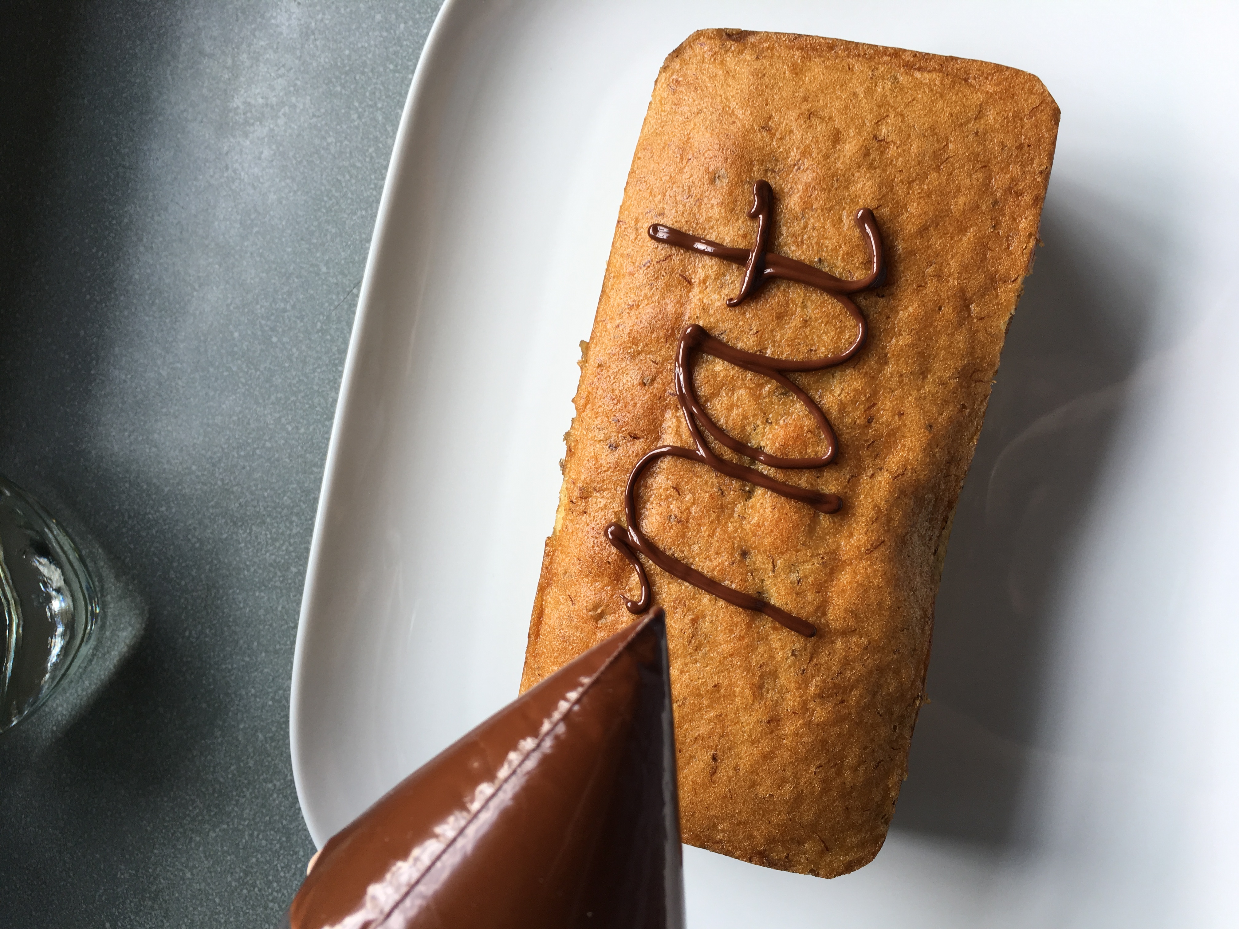
2. Pastry Chef
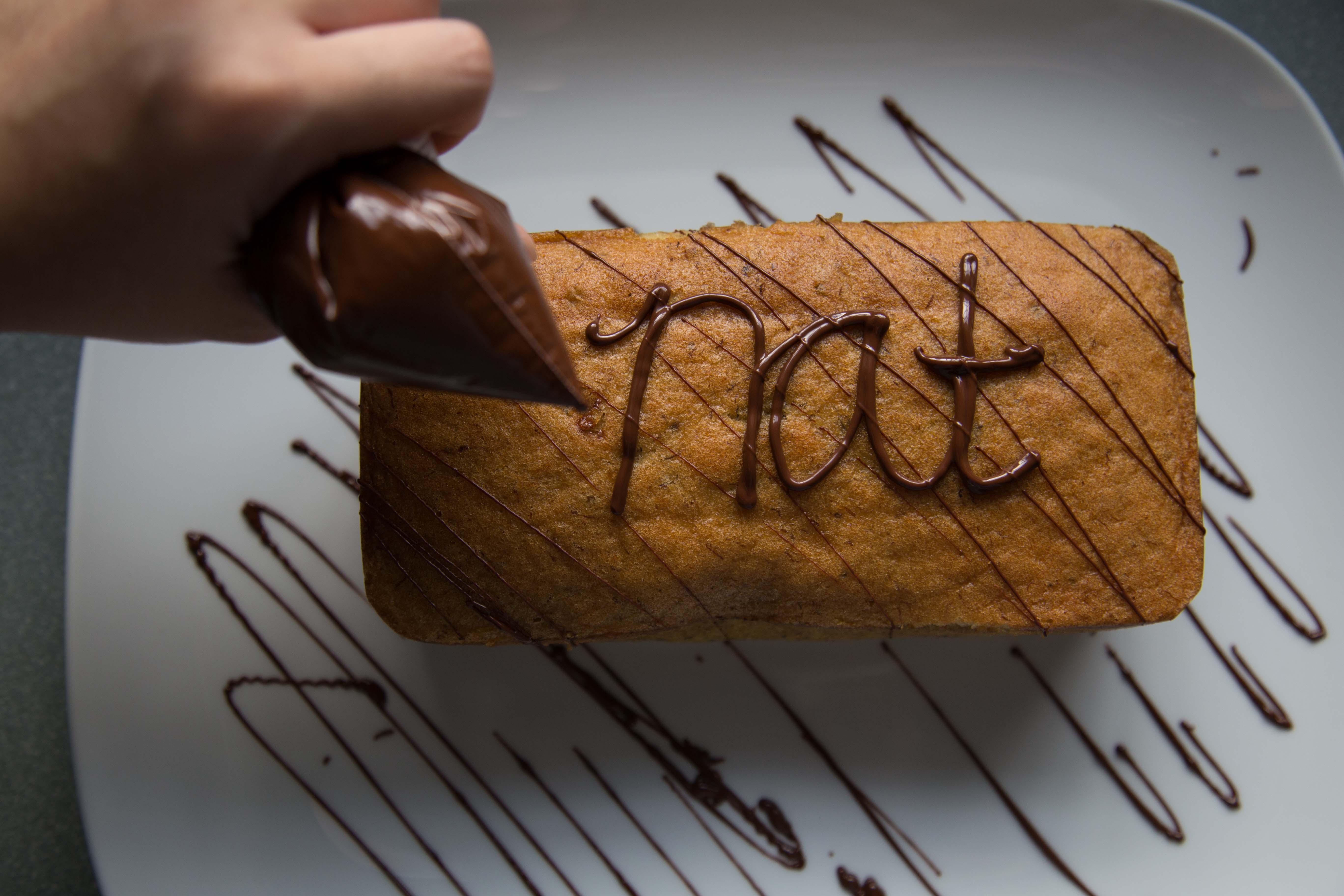
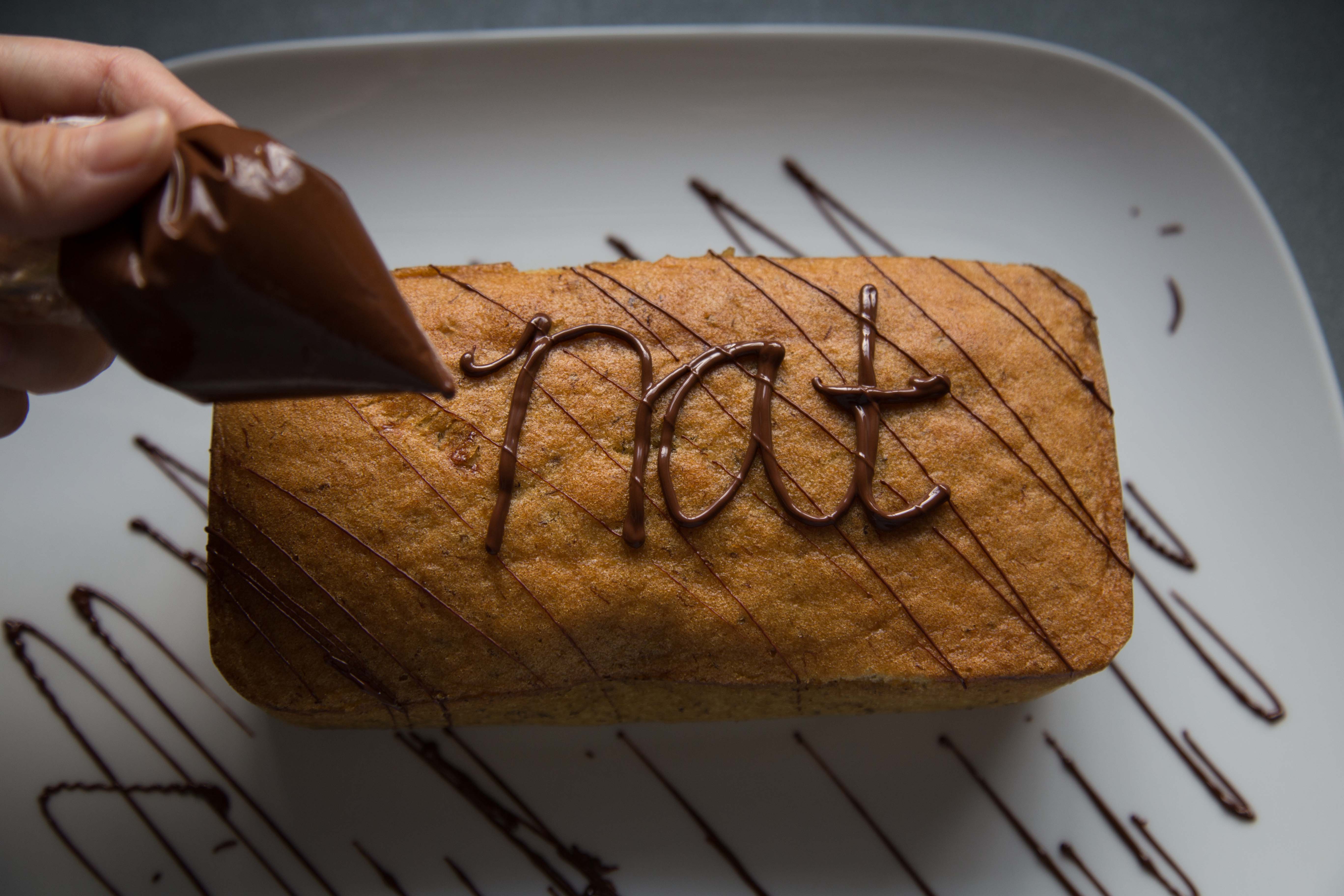
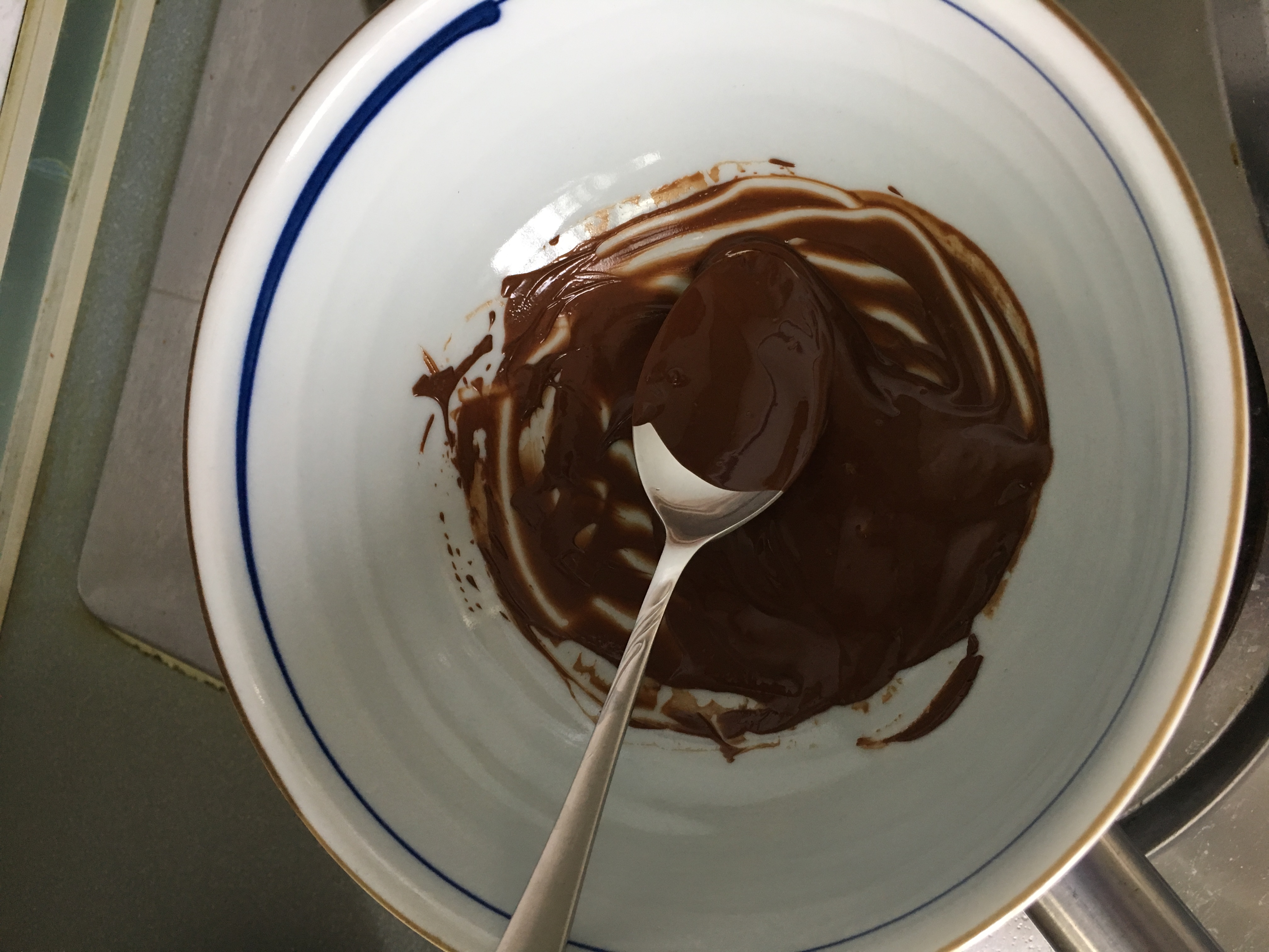
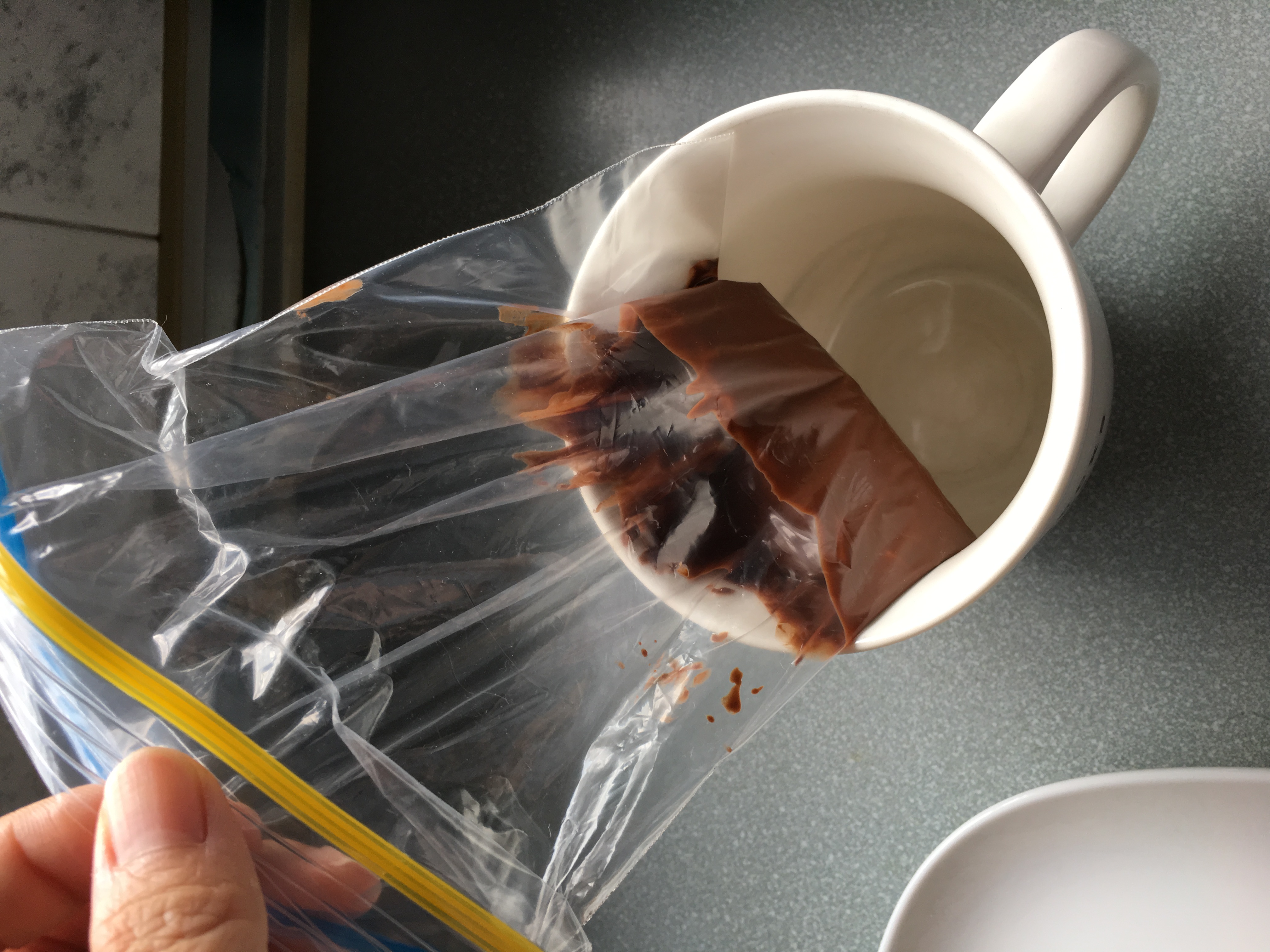
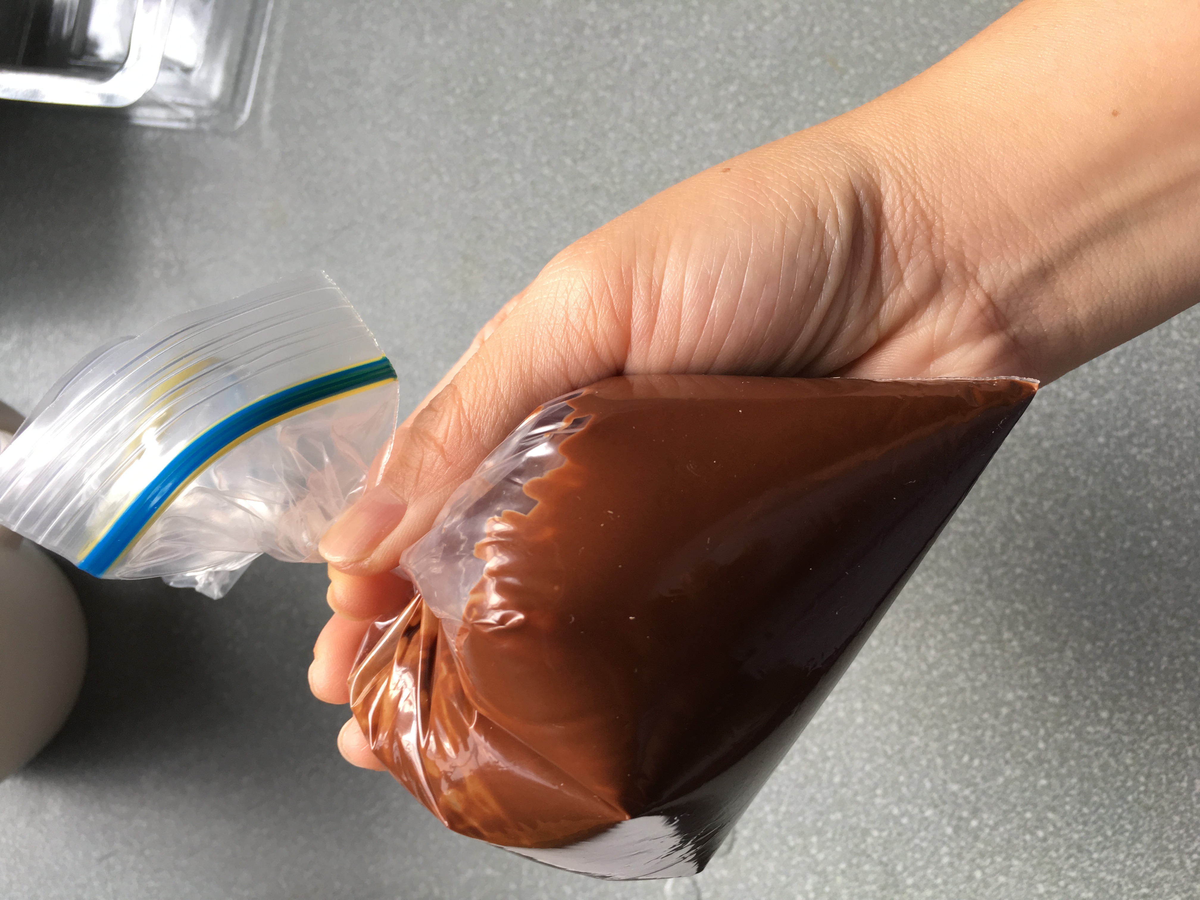
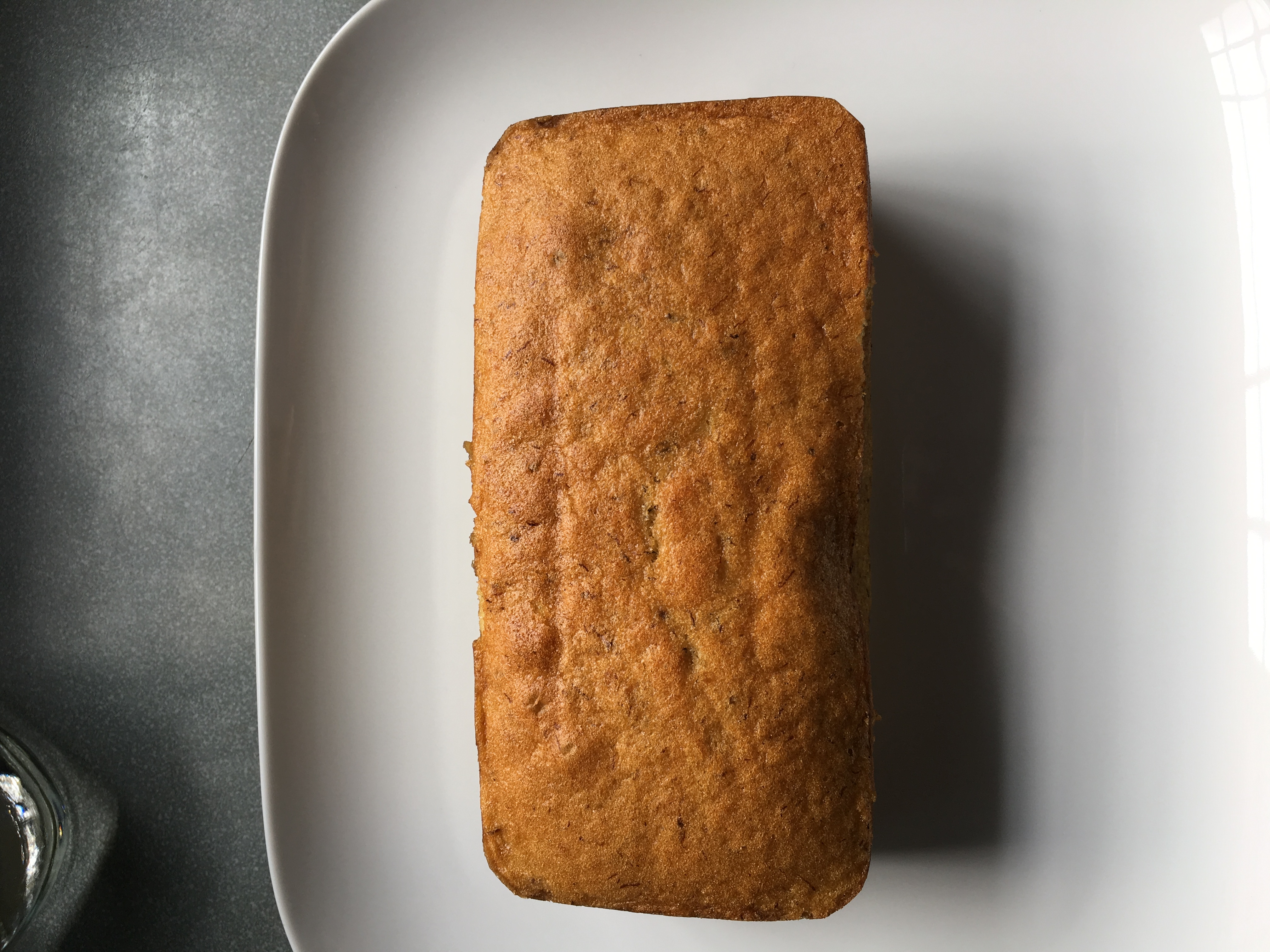
okay i have to be honest that this didnt turn out as what i expected. the typography turned out quite ugly, and the execution isnt good. Mimi agreed with me and i had to rethink again.
some process images on how i created my failed outcome.
3. Executive Chef
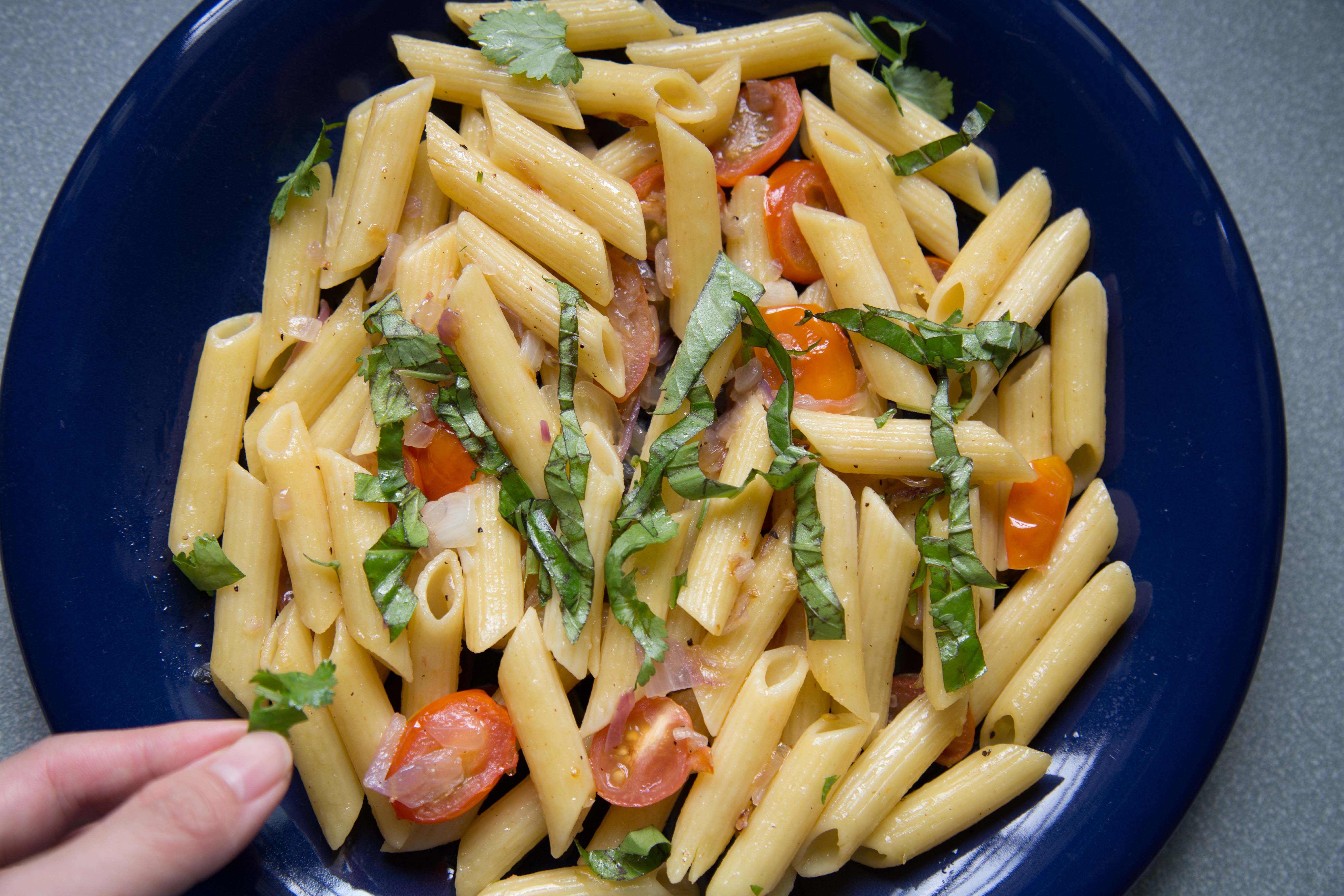
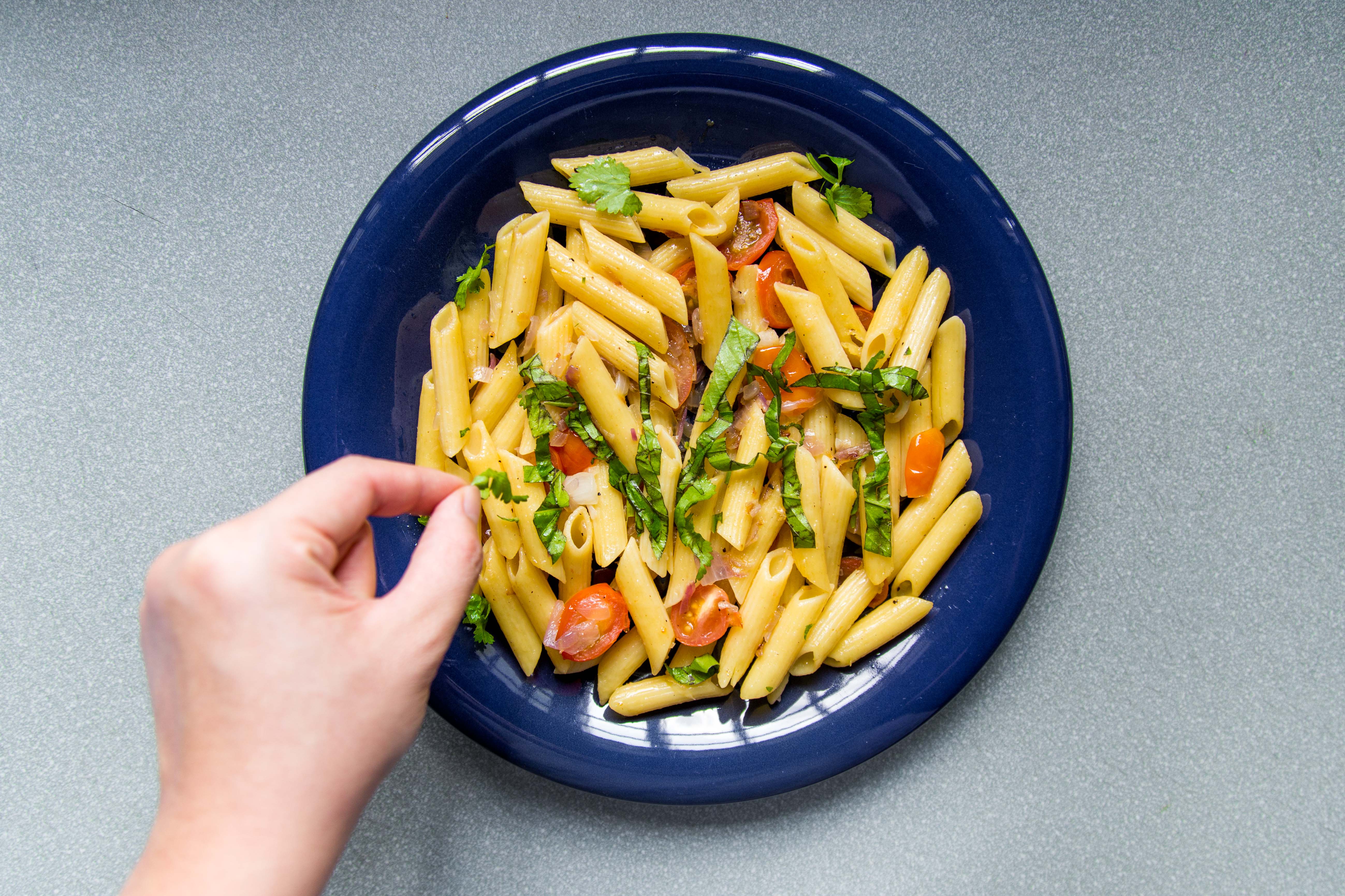
the executive chef is the one who garnishes and plate up before allowing the waiters to serve the food. i chopped up some basil leaves and parsely to have my name formed. Mimi said that my name looks a little thin and there isnt a need for the hand.
4. Grill Chef
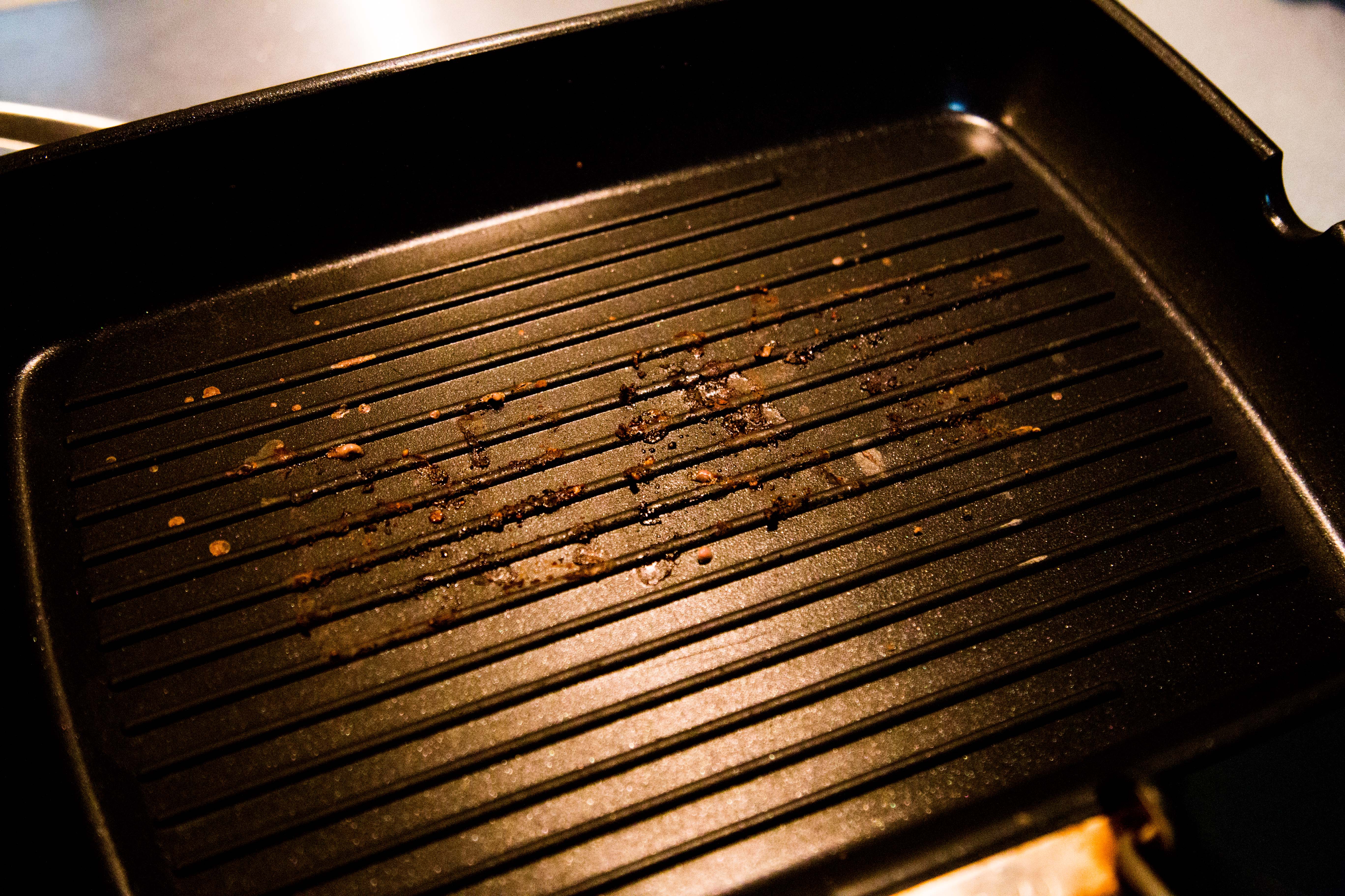
in the previous consultation, i thought Mimi meant that i should create my name using the burnt char marks left on the grill pan. but no, thats not what she meant. anyway, i tried having the burnt marks on the pan but it didnt turn out obvious enough.
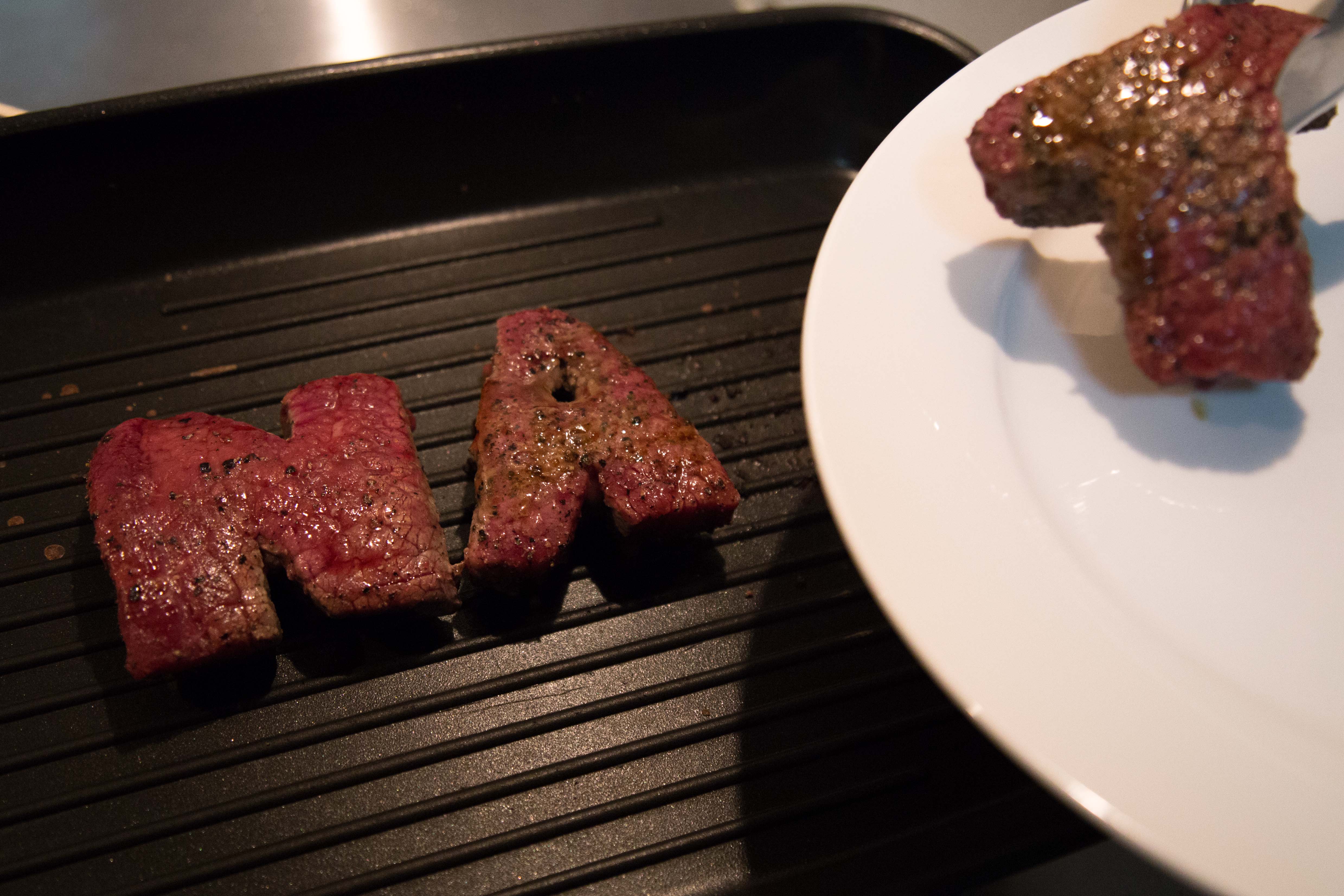
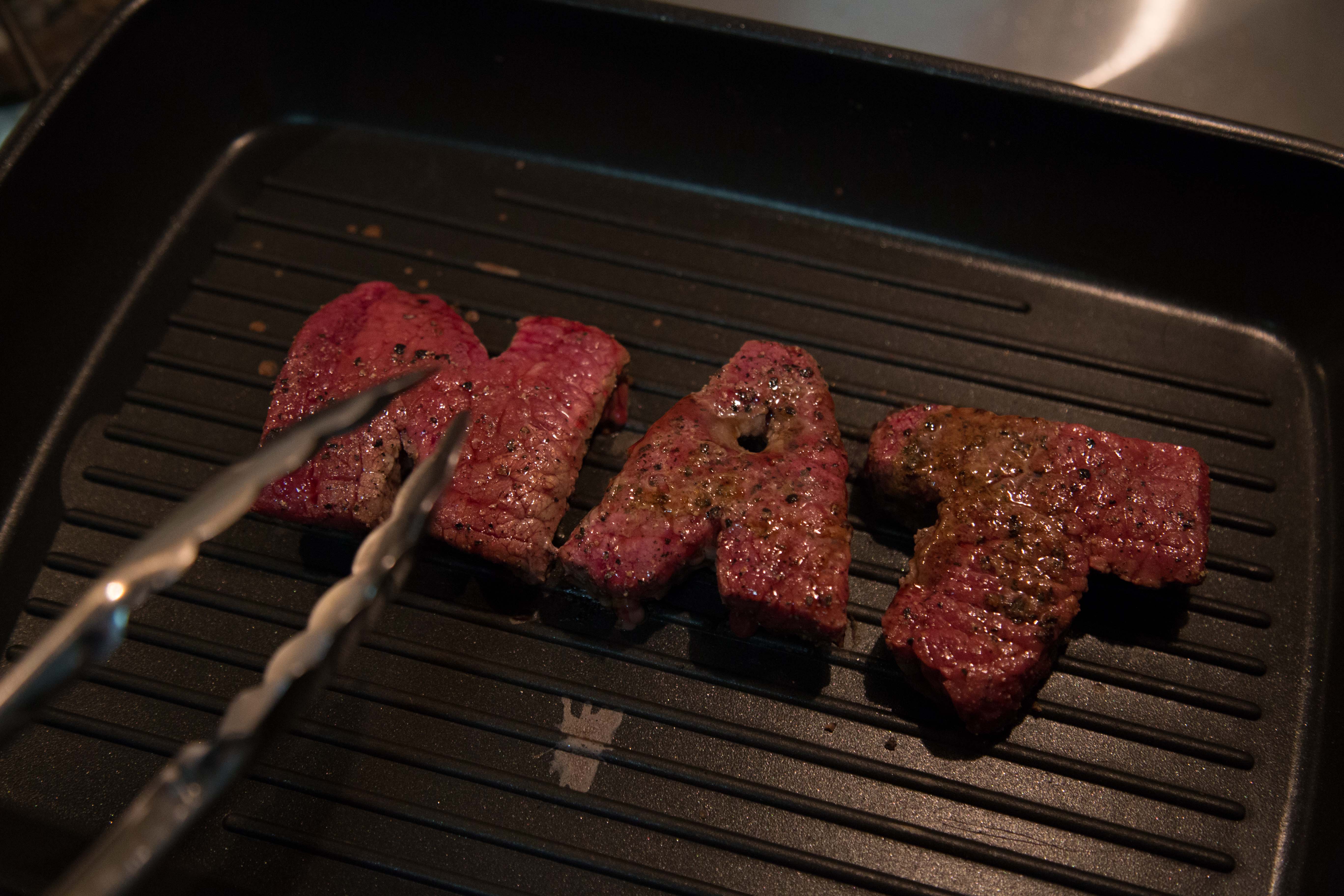
i didnt want to waste the cuts of meat again so i tried to see if putting them on the pan, with the tongs would be better.
at that point i was really lost. i didnt know how to proceed further. Mimi told me that my work has to be believable, they have to look like its done my a proper chef and in the context of a real kitchen in an expensive restaurant. my execution has to be good, and it has to look like it comes from a page of epicure magazine. it could be food styling, or it could be really good DI of food typography. all in all, the art direction has to be thought out, and my photography has to be good. the choice of utensils has to be well thought out as well as they are the details that speak that they’re in a context of a restaurant.