my concept is time based on the 4 seasons. its a series of development of myself through situations in the idea of time passing.
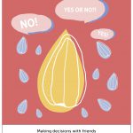
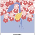
in spring, i start off as a seed. as spring is a season of personal growth, i put myself as a person that grows through making decisions. as im an indecisive person, i require friends to make decisions for me. from that, i can fully breathe and have a clear mind.
spring –
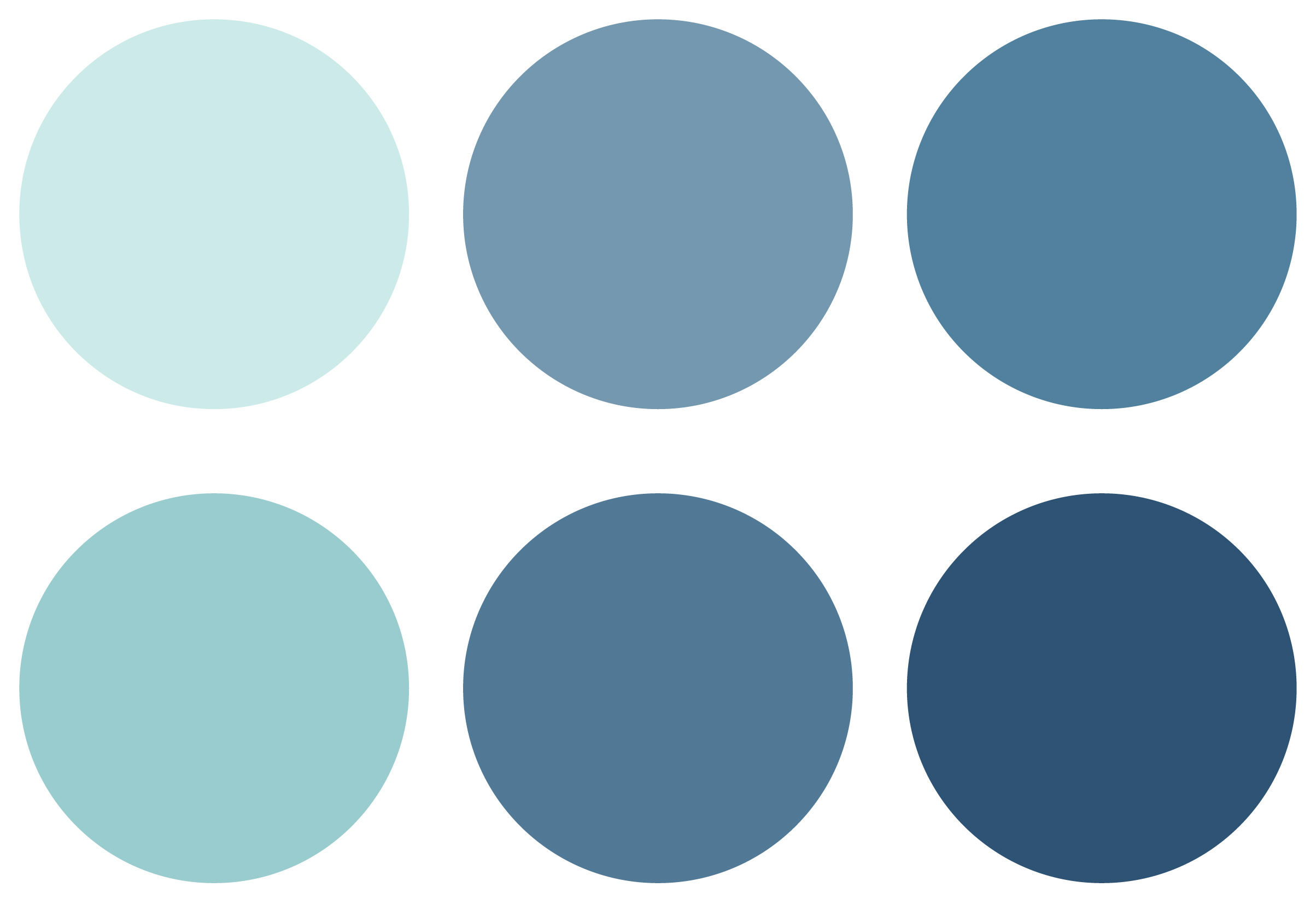
triadic harmony, monochromatic harmony
the colours for spring is quite pastel like, pretty and colourful. because my colour scheme is triadic, i had to keep it low tone so it won’t be too jarring.
i took this opportunity to apply some knowledge on colour emotions, previously studied from my study on colour emotions for my presentation.
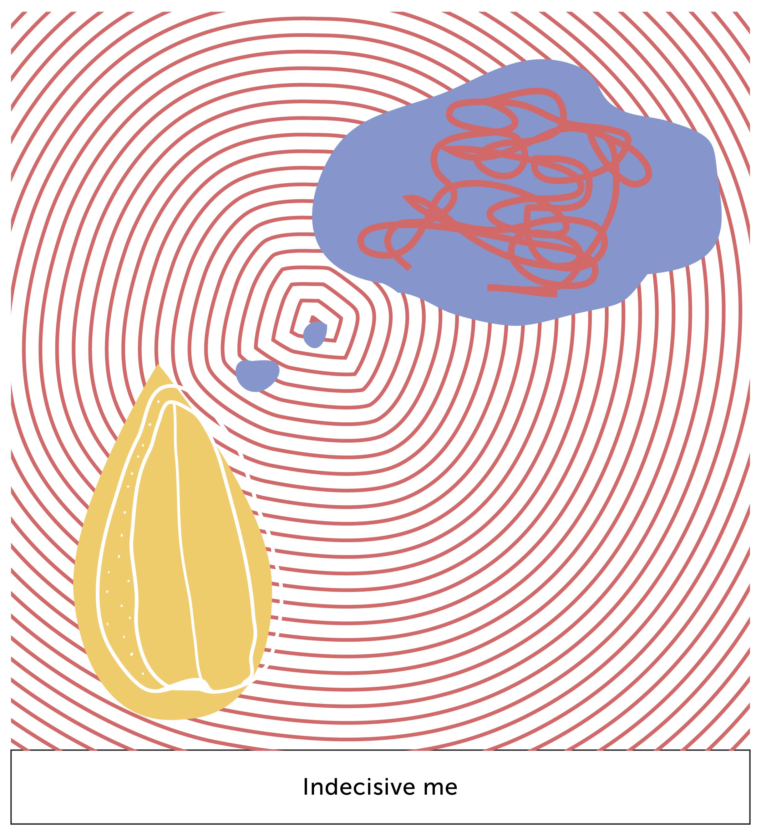
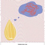
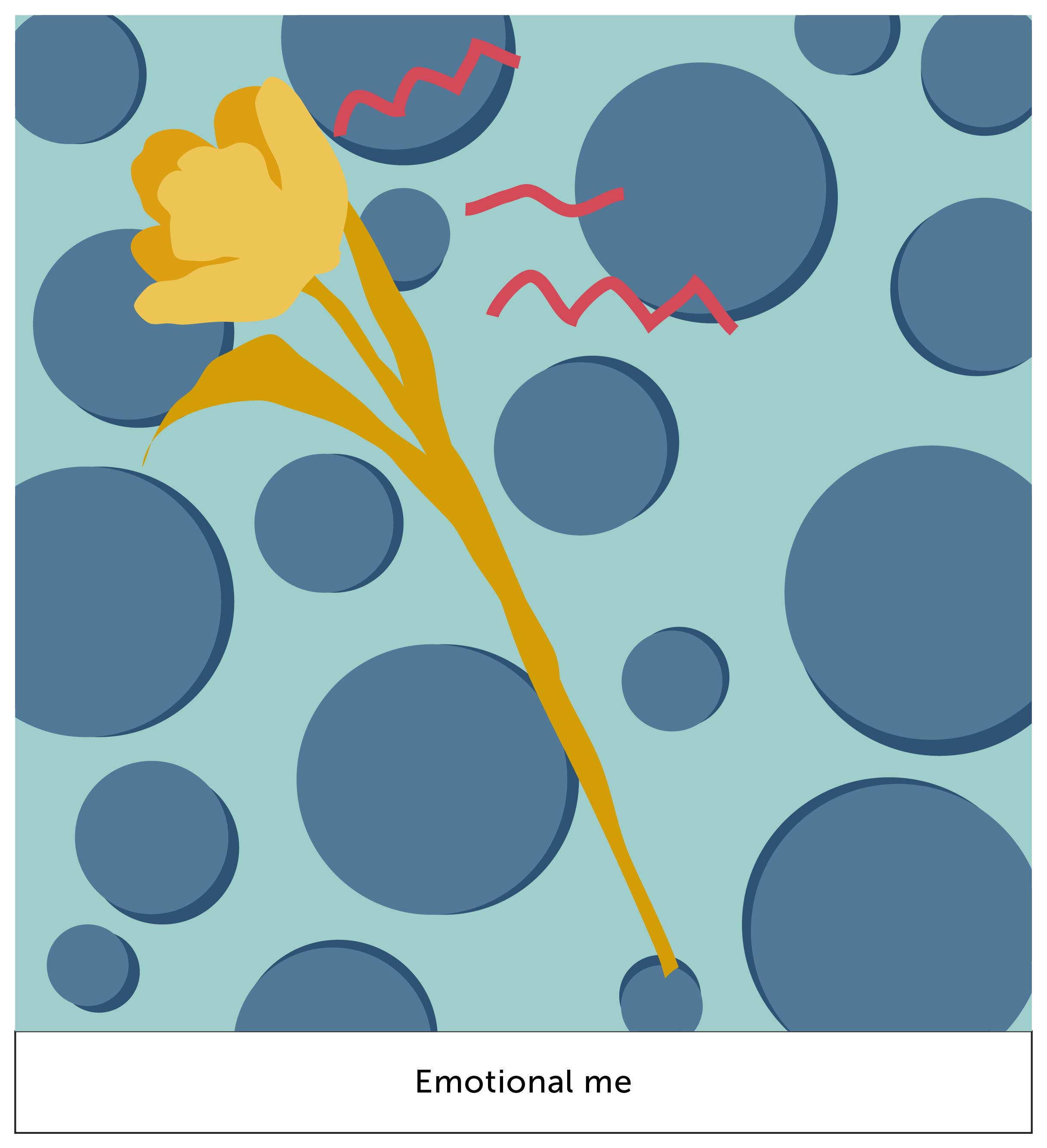
this box depict me as a decision maker. the pattern of circles represent my choices; often overwhelming i cant make up my mind. the scribbles in the dream bubble represent me overcomplicating my options although they are as simple as ABC.
+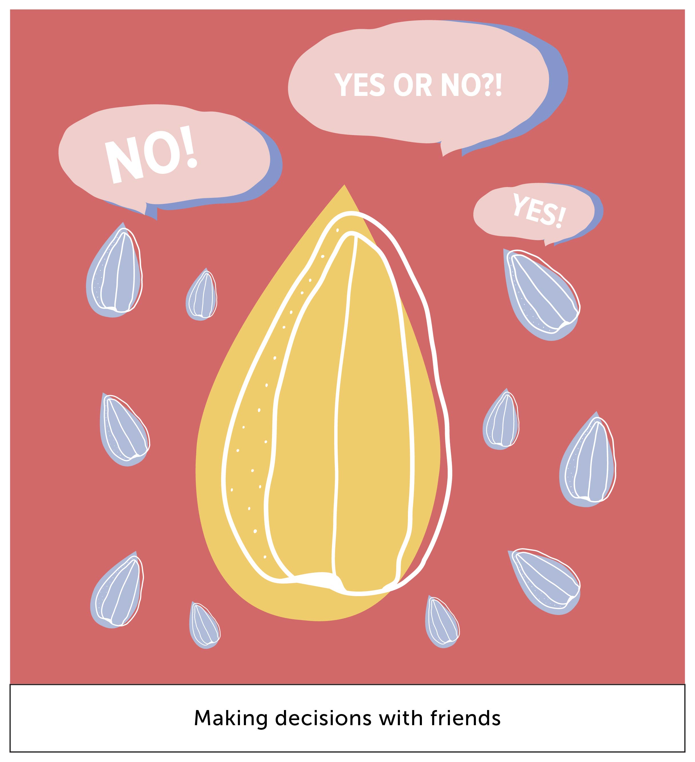
the little blue seeds represent my friends. often, i require people to make decisions for me. hence, we see here the little seeds answering my question.
the colour red represents anger. red is also a colour for something to stand out. hence i used red mostly in this situation because it’s a heated situation of debating, thus i feel its a great colour out of the other 2 to represent what im trying to communicate.
i used blue instead of using a darker shade of red as the shadow for the speech bubble in my 2nd box because it gives it a subtle pop of visual interest.
=
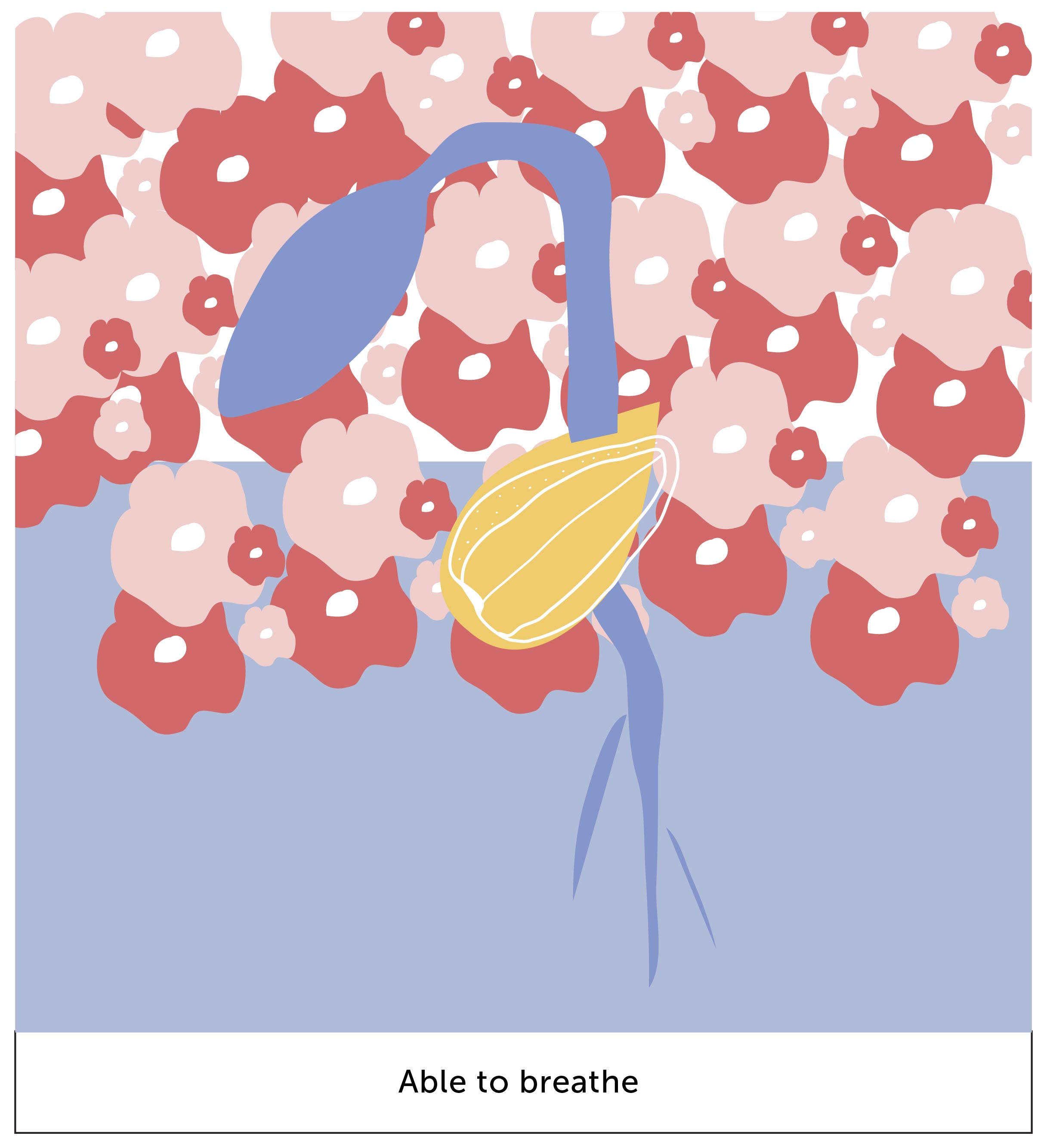
in this box, we see a germinating seed. the background is half applied to represent that i can finally breathe. the flowers represent the beautiful aspect of spring; in this context they symbolize a depiction of a clear mind through the flowers.
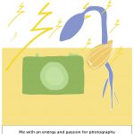
in summer, its a season of energy and vitality. i feel energized whenever i have my camera with me. the colour scheme rotates around mainly with yellow because it being the recognized colour for summer. also yellow is a symbol for happiness, which is what summer is about.
summer –
analogous harmony, monochromatic harmony
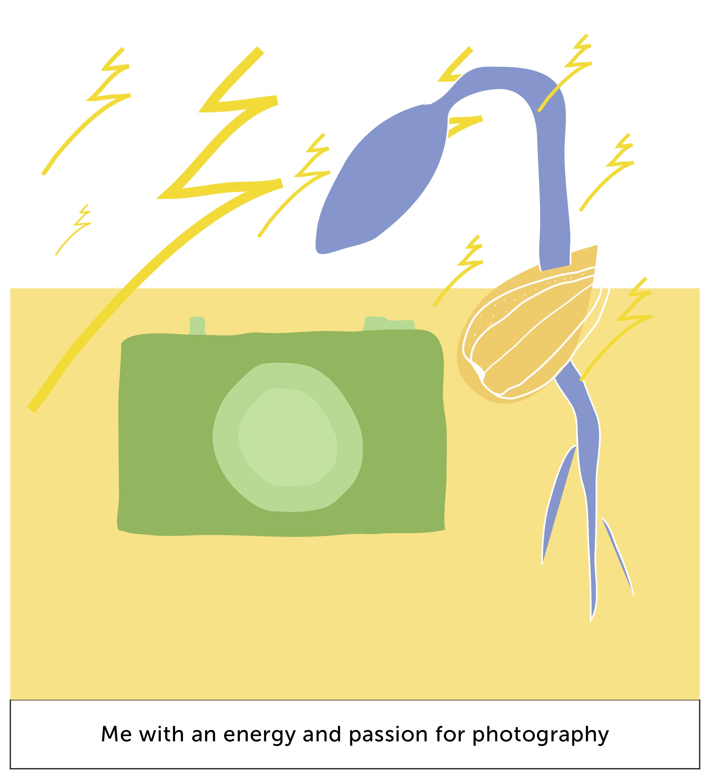
the symbols of lightning represent the energy whenever i have my camera with me. also, building up with the last box from spring, the germinating seed gives it a pop of emphasis with a yellow background because they’re complementary colours.
+
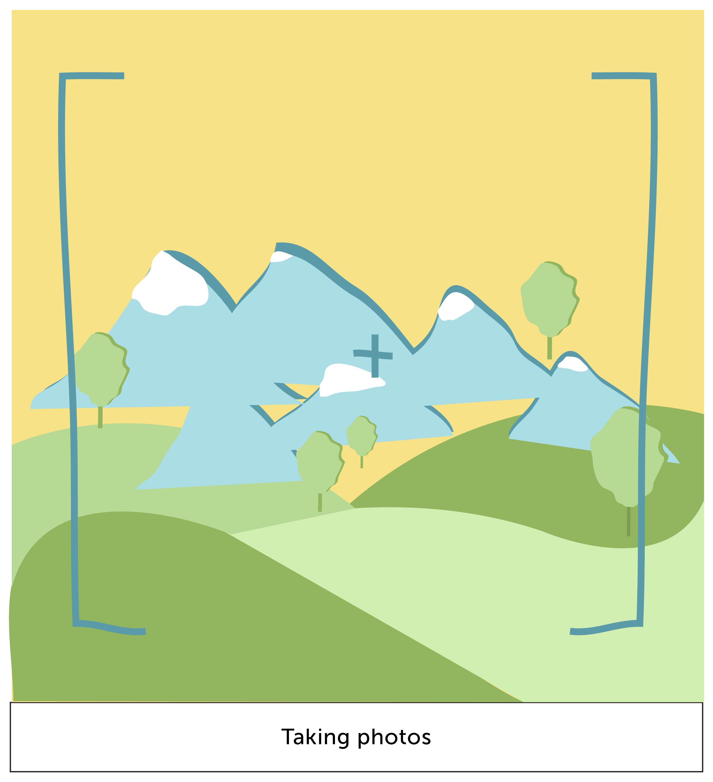
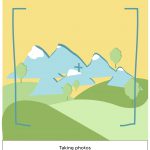
this box represent the act of photography-ing. the mountains and trees represent scenic views, which is what i enjoy taking most. the colours used here are kept to their original natural colours.
=
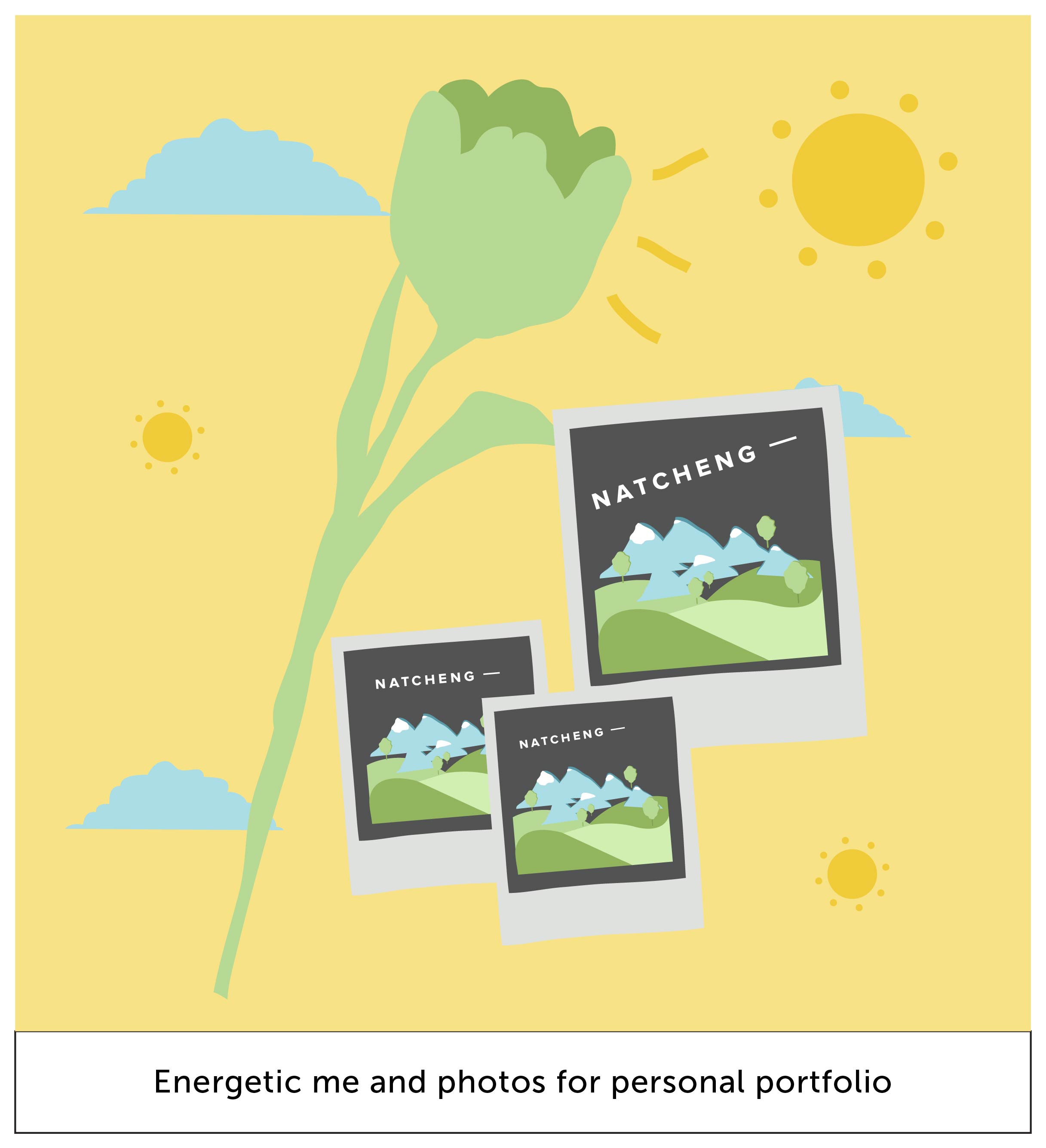
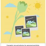
a flower has bloomed here! it represents me as a person who has grown, full of energy, because of the amount of new photos taken that i can use for my portfolio.
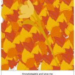
autumn represents middle age, knowledge and wisdom. hence i feel that a good way to represent this is when i travel. i gain knowledge from learning about the city’s culture, talking to people, eating local food, etc.
autumn –
analogous harmony warm, monochromatic harmony
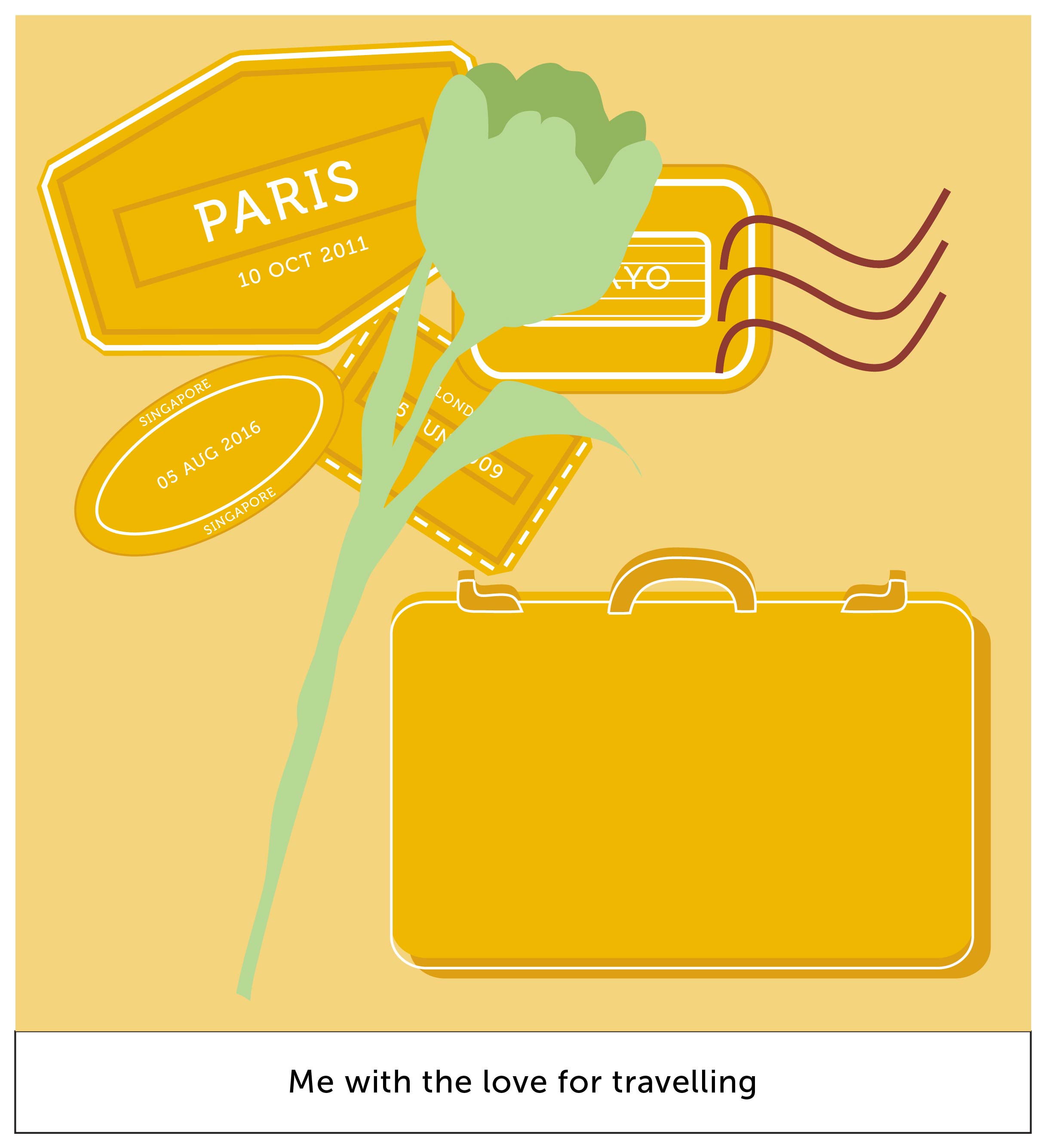
as described, i do love to travel. the stamps at the background represent the collection of stamps. as orange is a colour that symbolizes “energy” and “excitement”, i feel that this colour scheme is appropriate for my context of travelling.
+
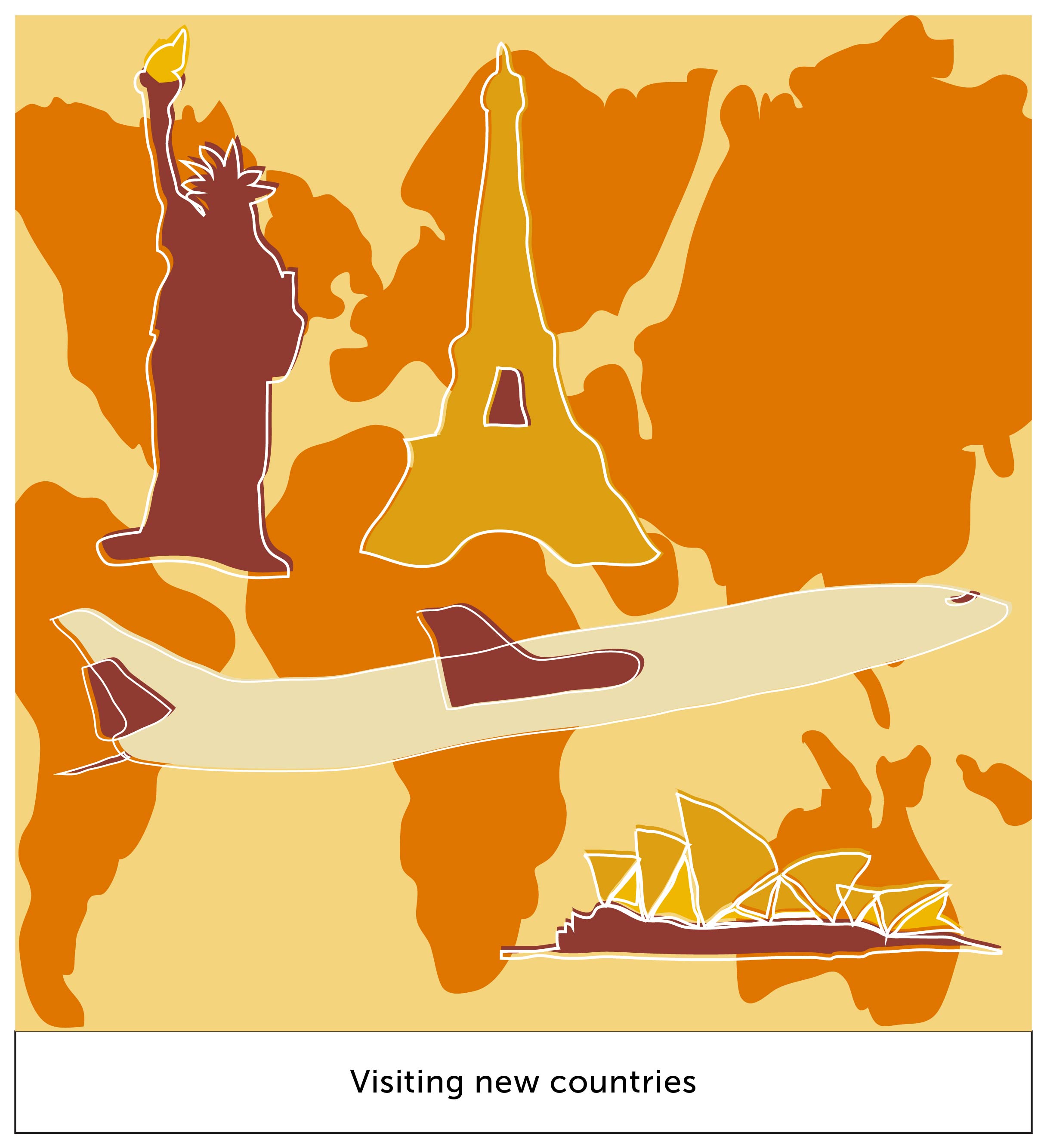
this box represents my setting of travelling. different world icons are illustrated and are set on their appropriate continents.
the darker shade of orange as used for the continents gives it a level of depth to the composition. it brings out the monument icons.
=
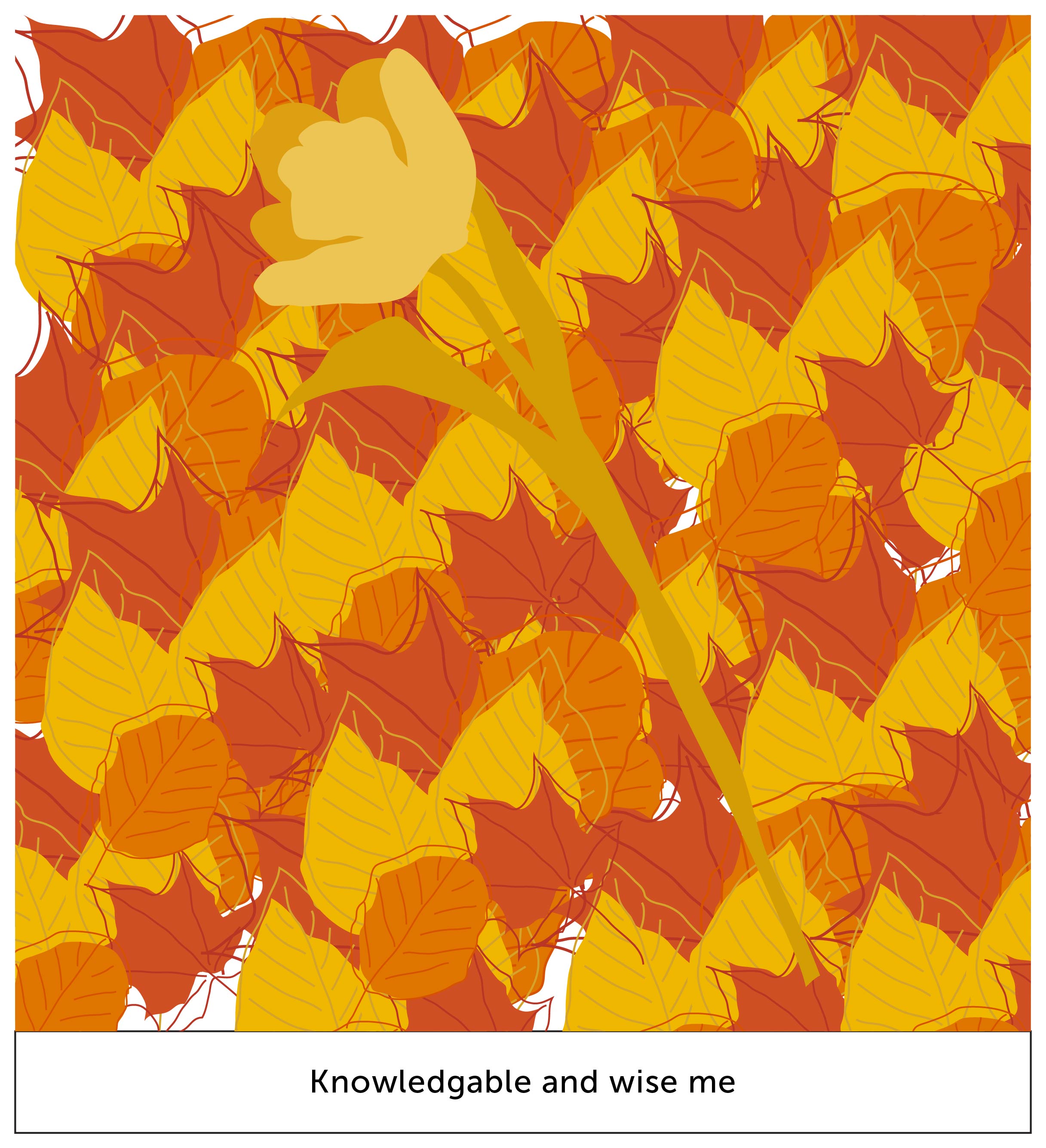
me, the flower, has bloomed even larger! it depicts the amount of knowledge i absorbed, causing it to grow larger as a person.
the foliage represents my amount of knowledge collected. the colour of the leaves harmonizes one another, giving it a pleasant visual interest.
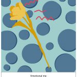
winter represents death; the end of a cycle. in literature, it can also symbolize sadness, which is what i did in this last equation. the colour scheme for winter is the most perfect for my context as well. the colour blue represents sadness, calmness, stillness.
winter –
analogous harmony cool, monochromes harmony
since orange and blue are split complementary colours, my flower definitely stood out.
the red strands represent my emotions (hur hur, project 1); frustrated, emotional; emotional pain. the circles being blue, they complement my emotions too, and also since circles are organic shapes.
+
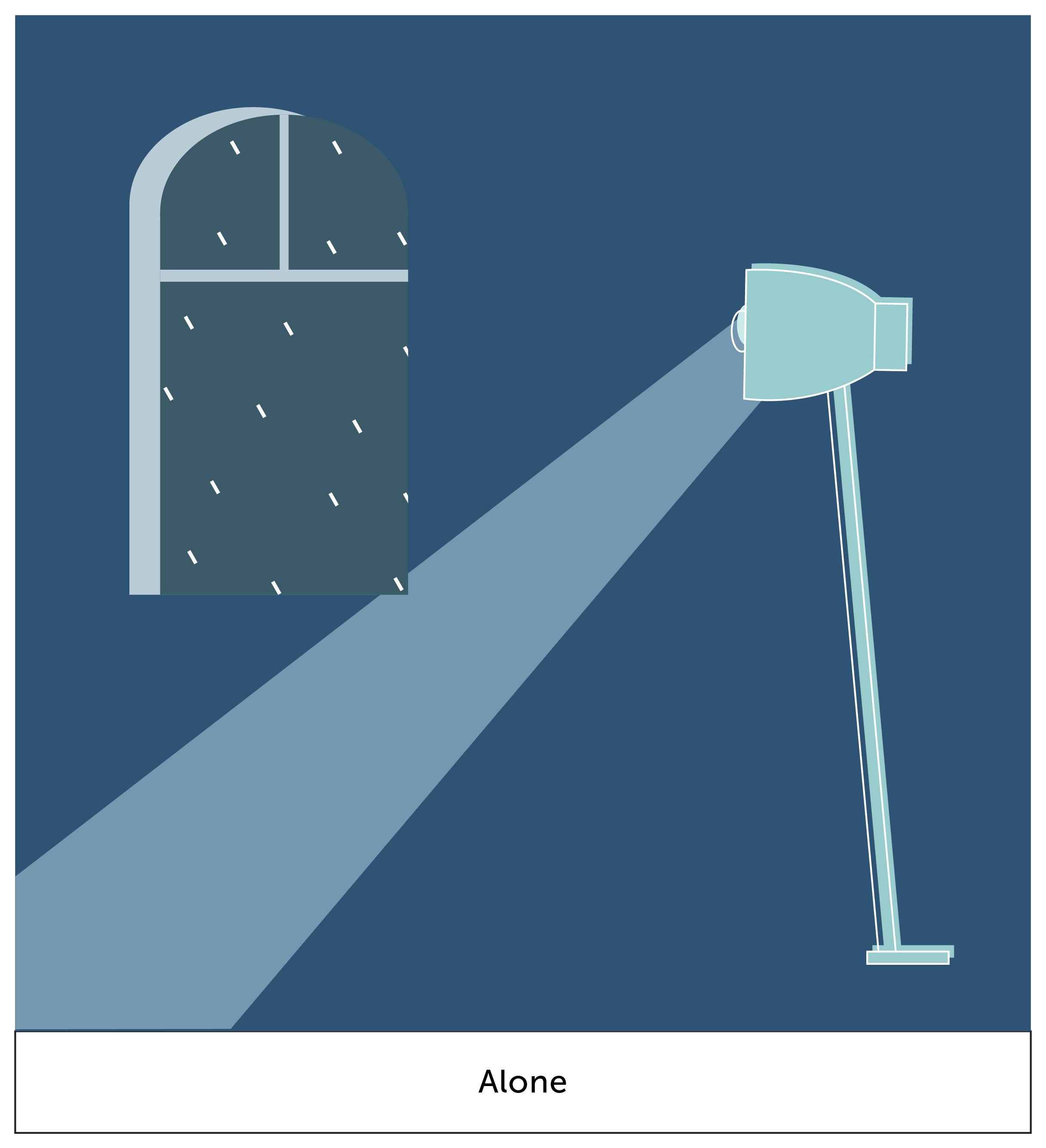
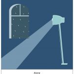
i wanted to create a setting of quiet and stillness. from the window at the back, you can see raindrops. this creates a mood to the setting. the lighted ray shines at a corner of nothing-ness, which is what i create to depict a scene of emptiness. i do like how the dark blue is able to create a mood of stillness.
=
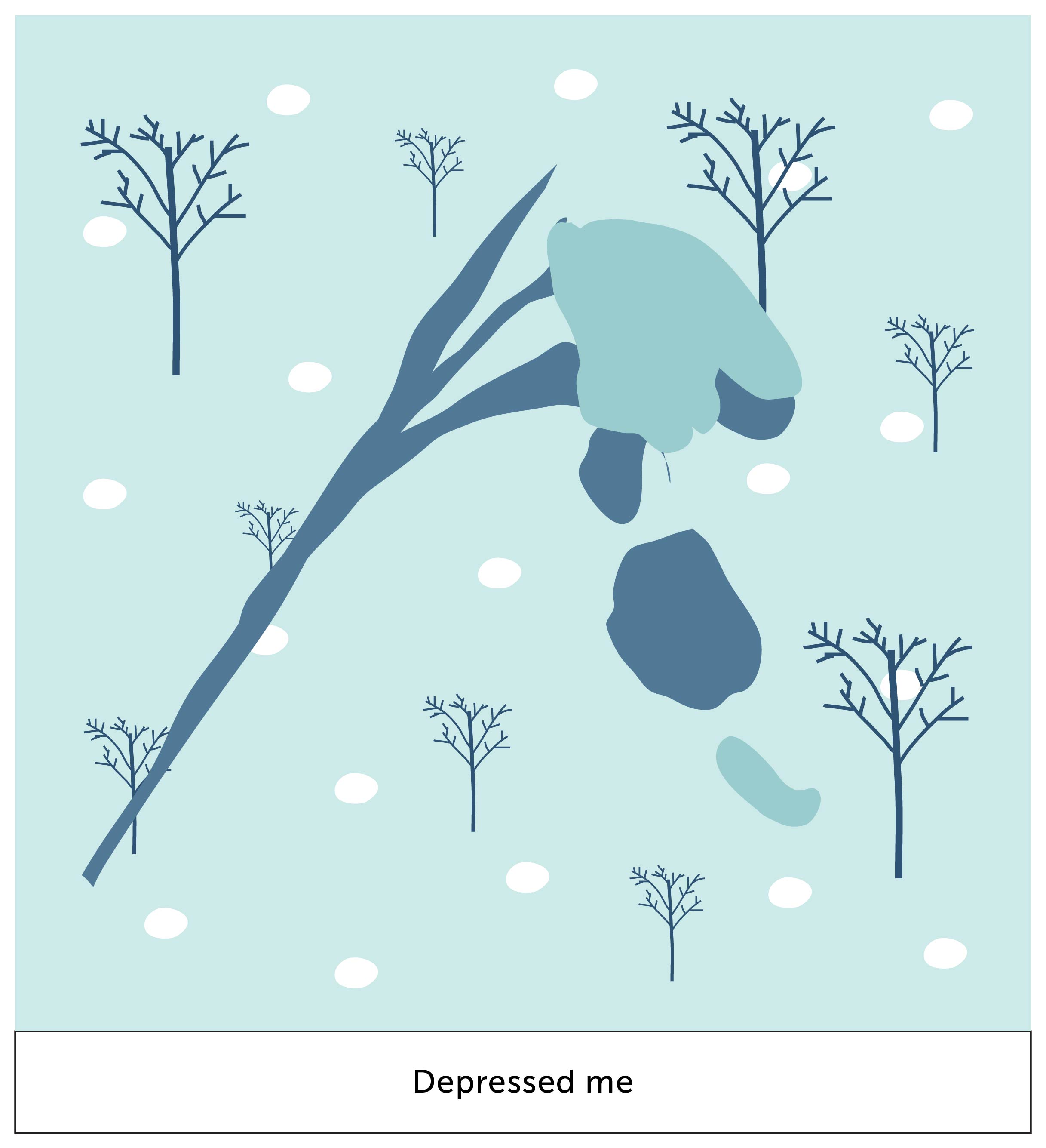
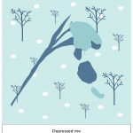
in my final box, i finally caved in to nature’s work. the “depressed me” is withered, and this is shown by petals falling. the blues definitely create a somber aesthetic look to it. also the emphasis is still kept despite the contrast of white (snow) in the background.
aaaand thats it for this project! it started off difficult for me but i enjoyed the execution part. i enjoy illustrating and im glad i managed to do it for this project. i’m looking forward to improving my skills and to create great work just like from my artist research.
time to get a wacom because i cannot tell you how painful and limiting it was to illustrate with a mouse and touchpad.