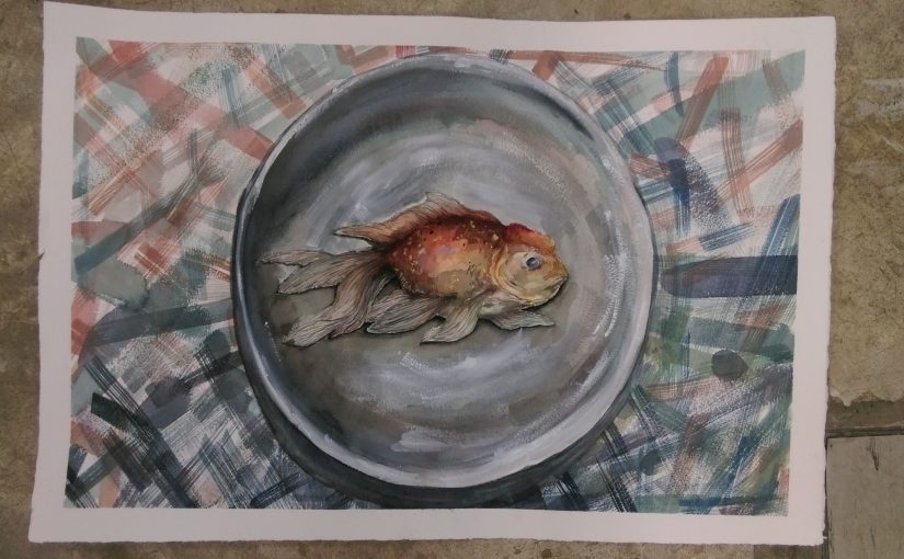
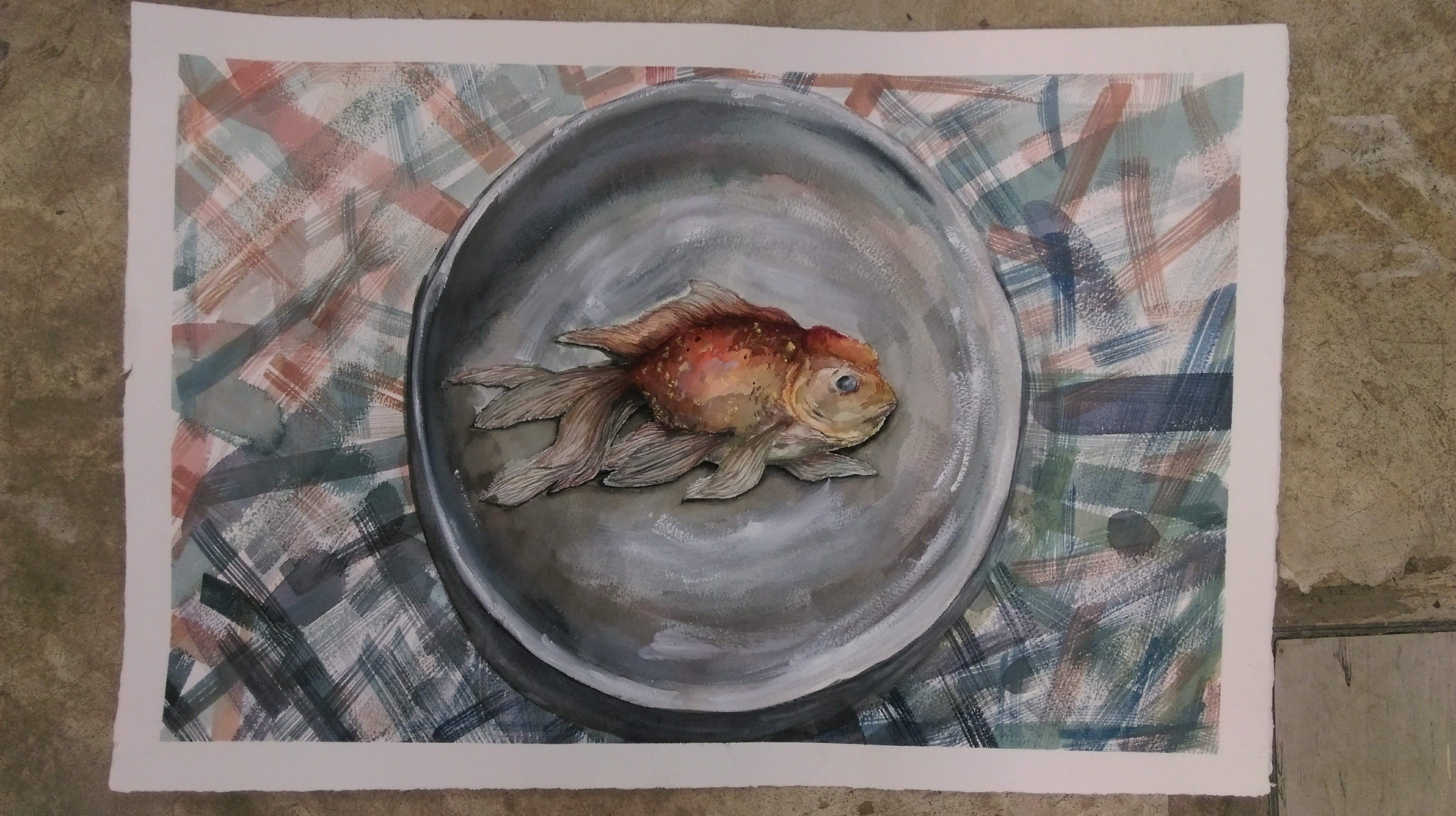
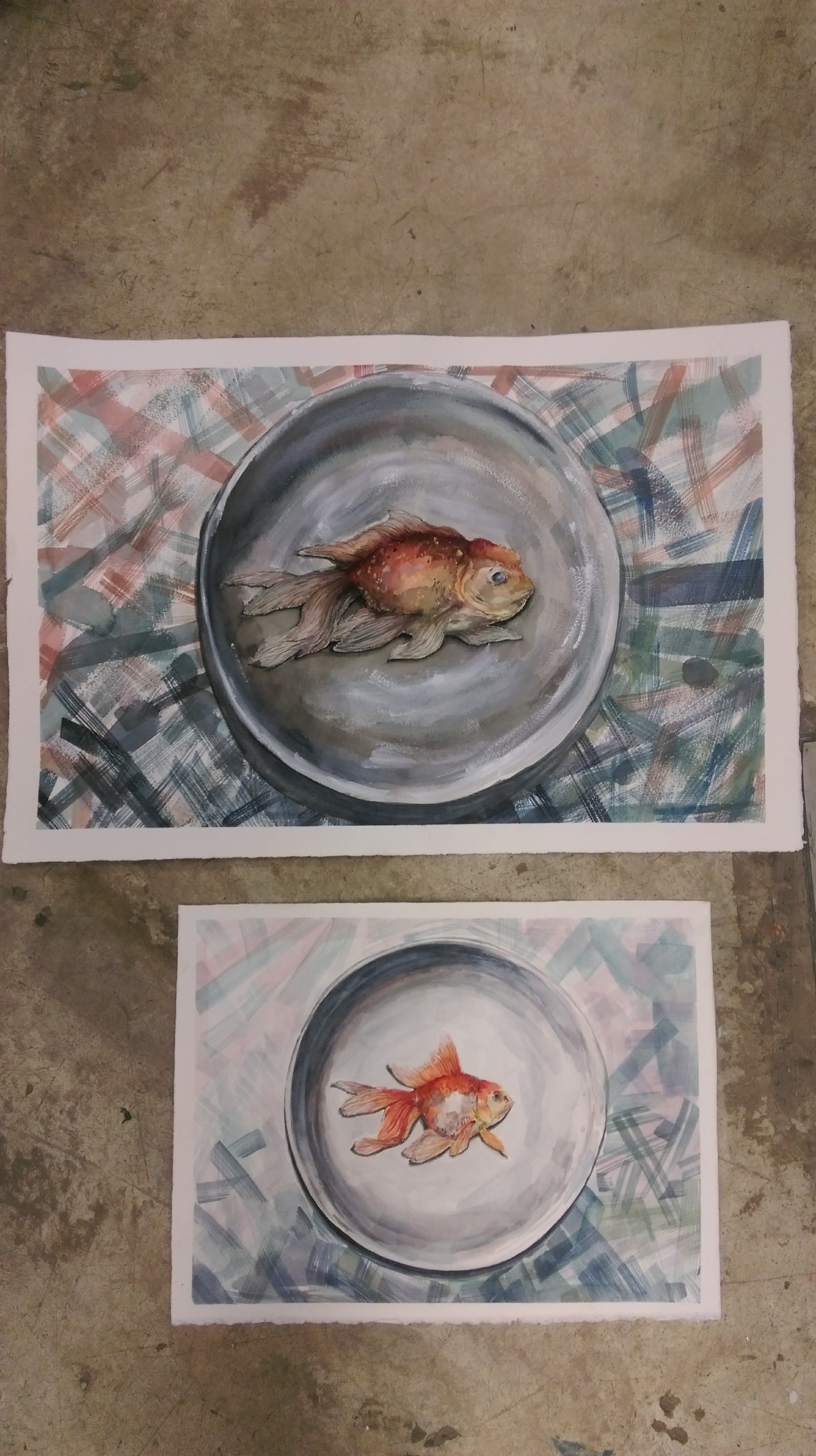
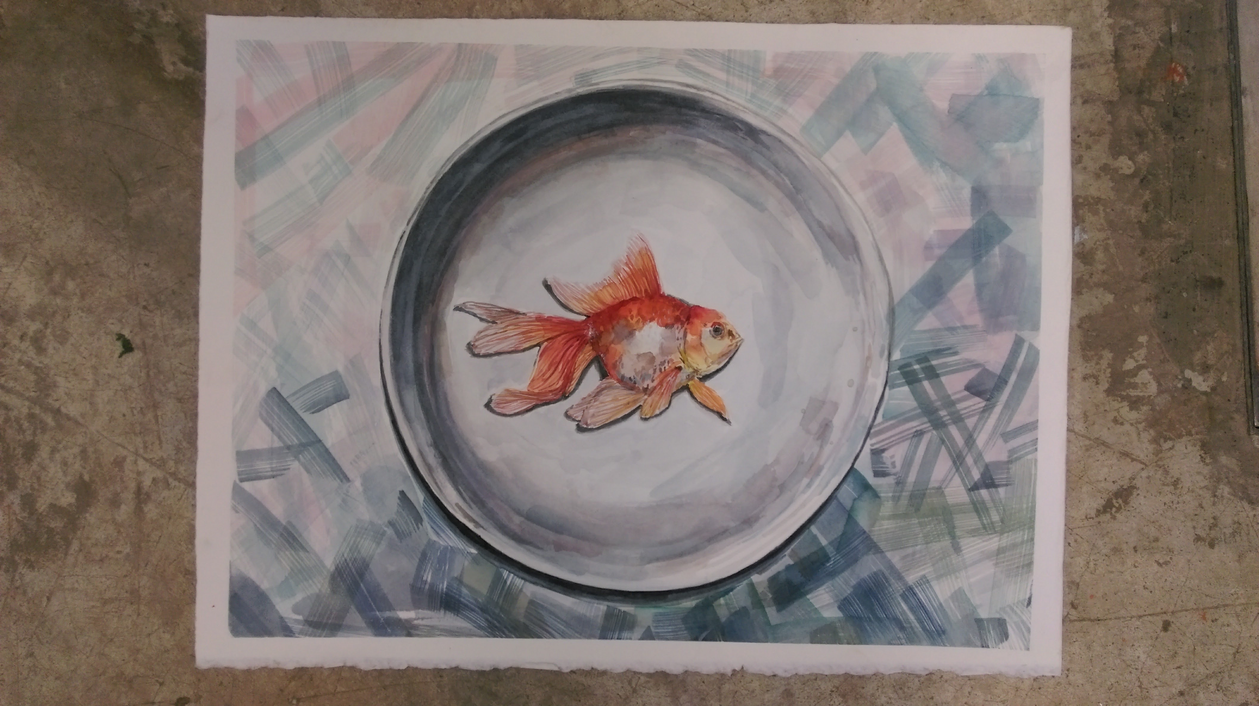
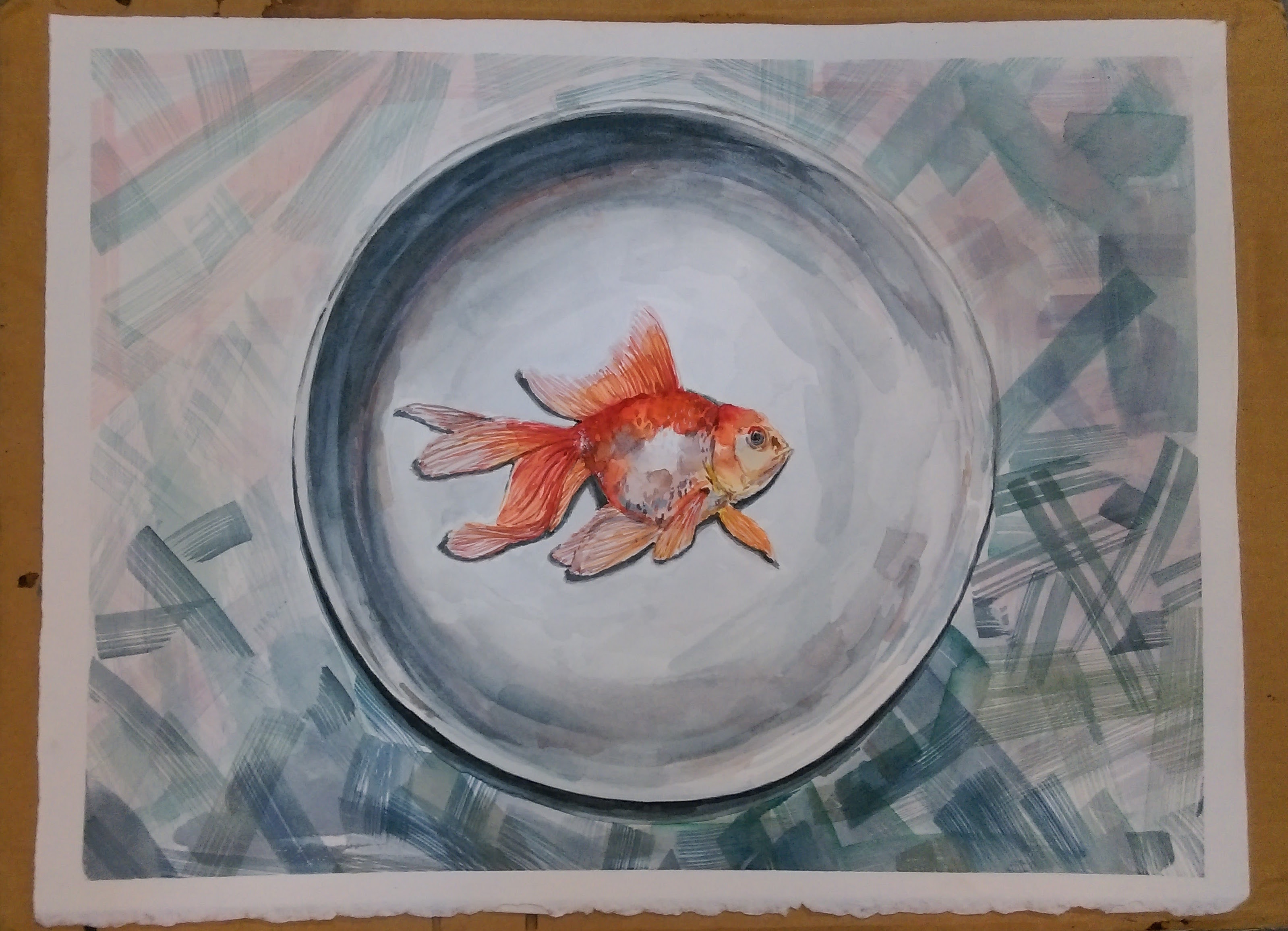
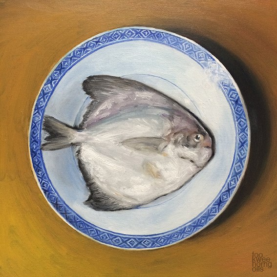
After the critique, I worked on a couple of areas:
-Improving the shadow
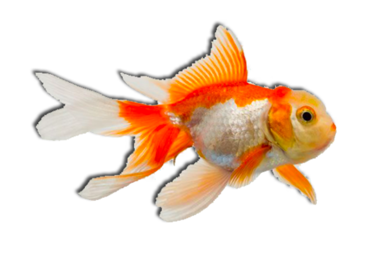
-Changing the form of the fish to portray a more dead look
In addition to changing the form and the orientation of the fish, I also used a cooler color palette using greys, greens and blues to give the fish a deathly pallor.
Helen Shideler
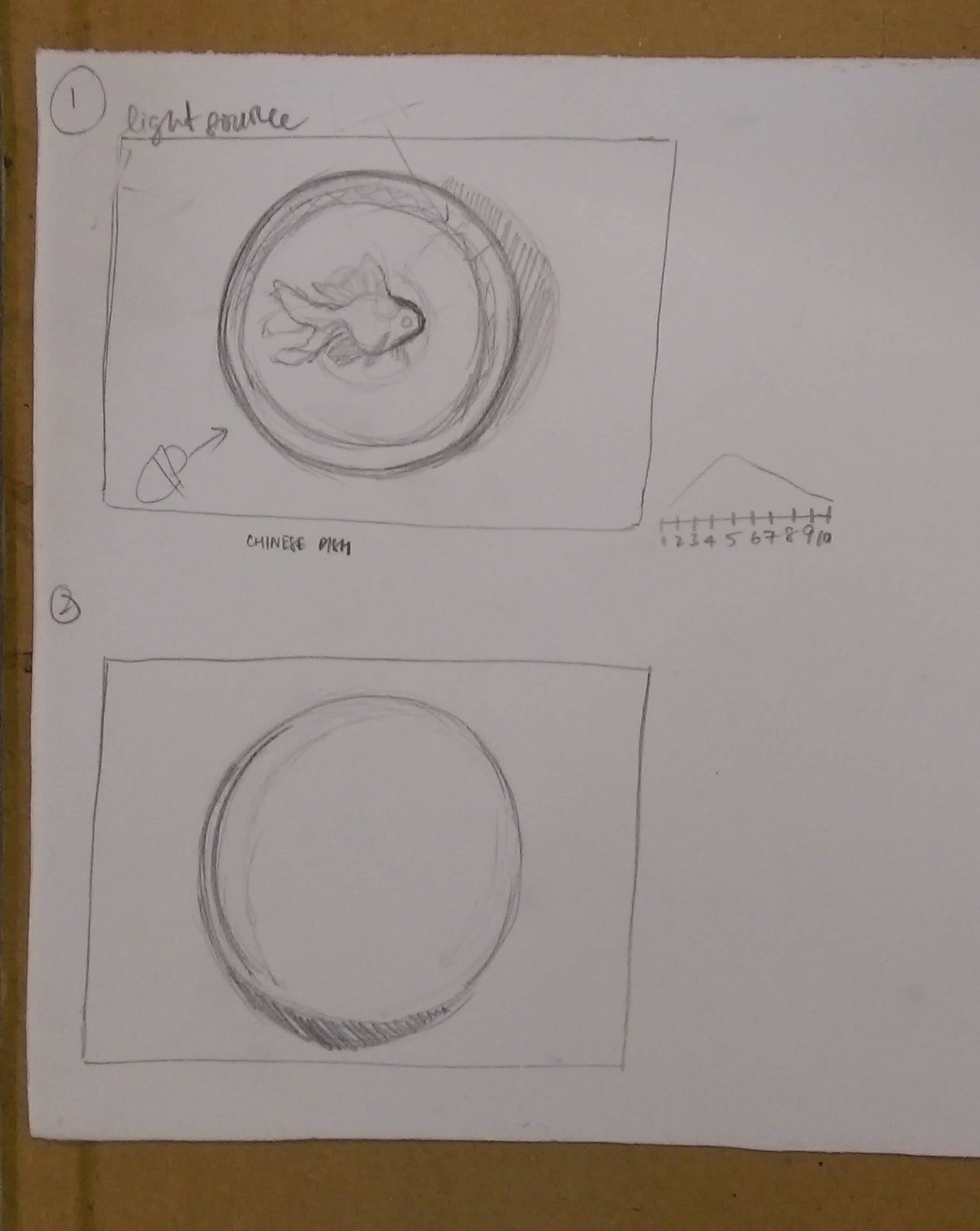
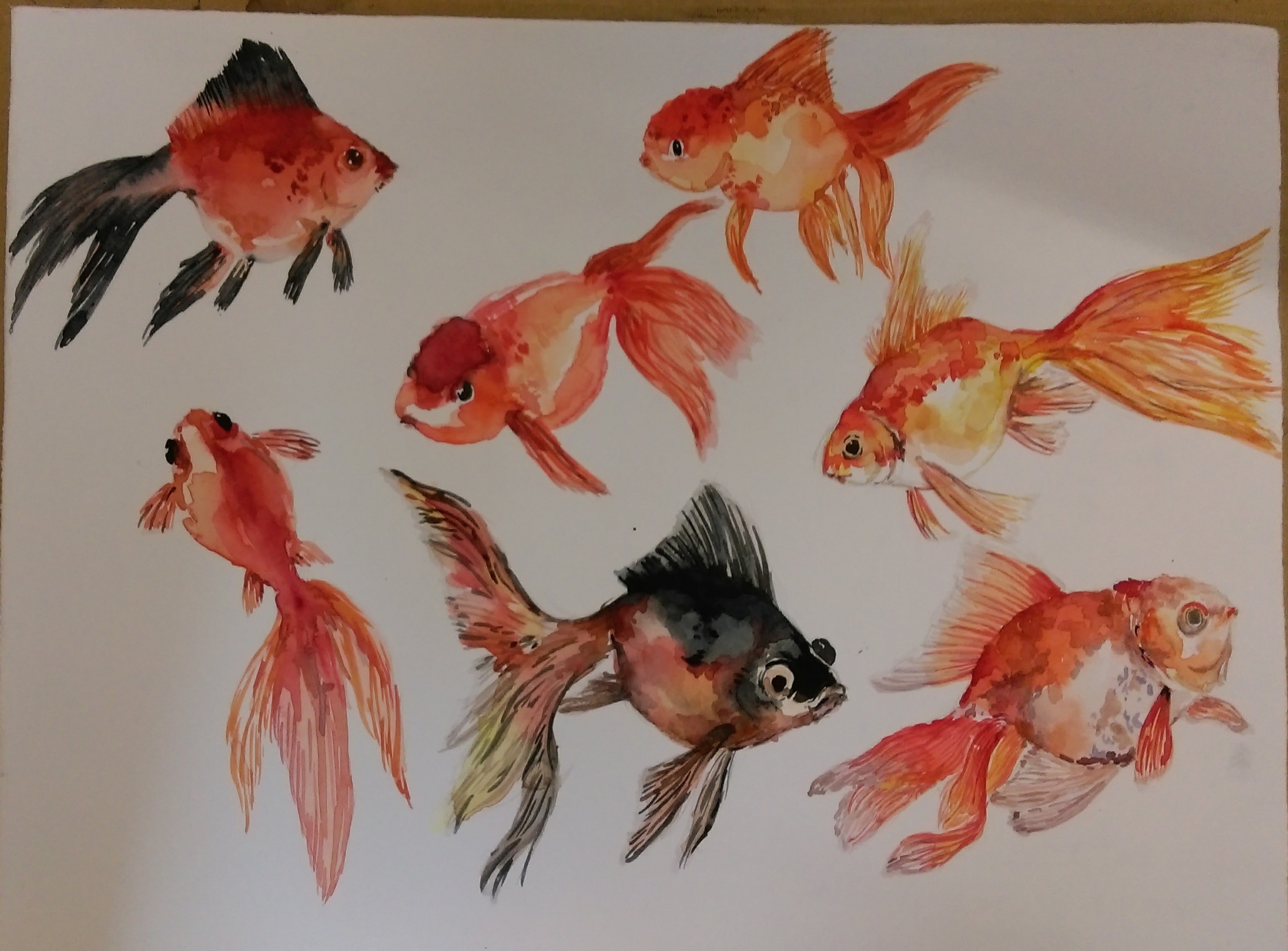
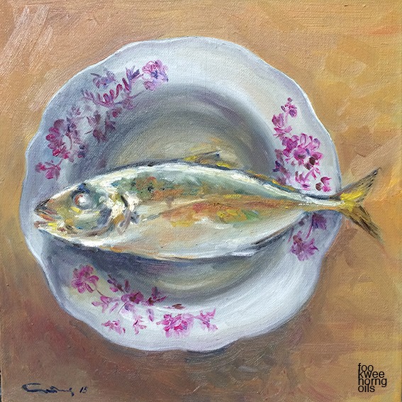
Foo Kwee Horng- Reference for fish on a plate
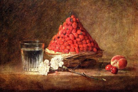
Jean Simon Chardin
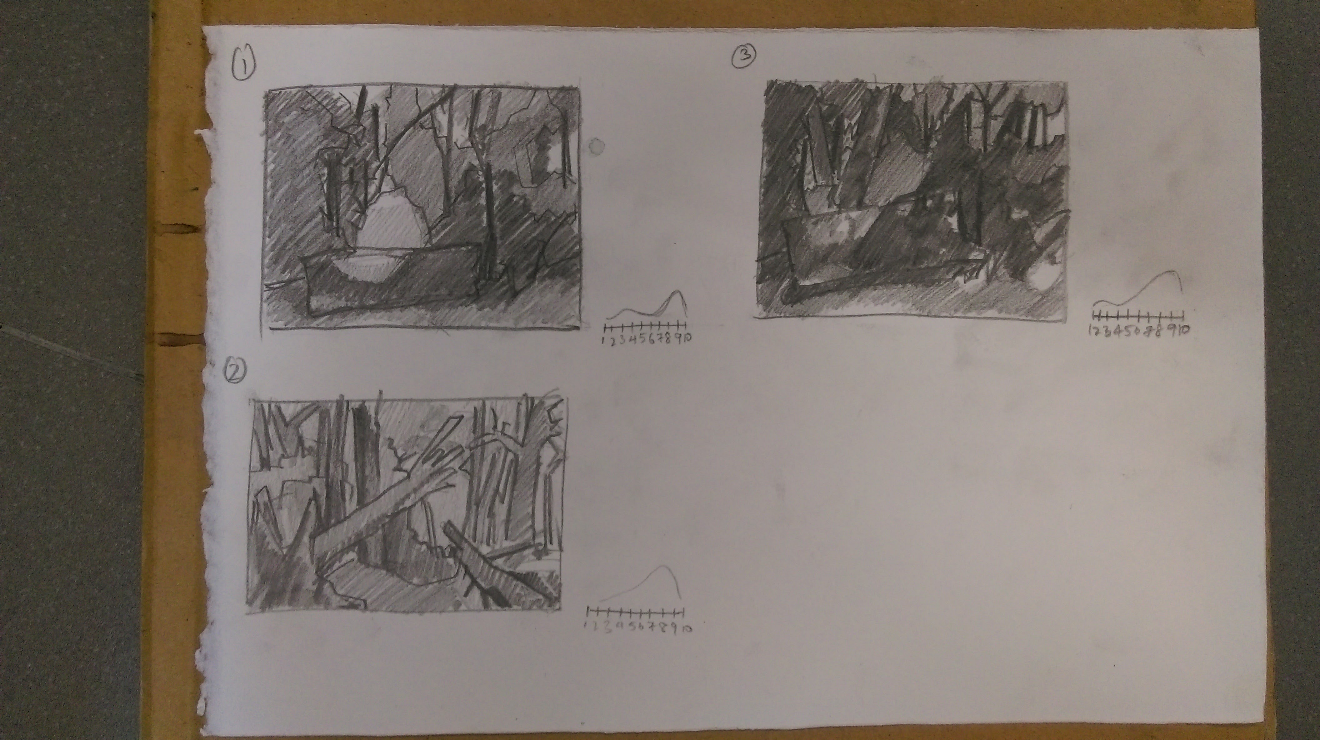
Study of reflections
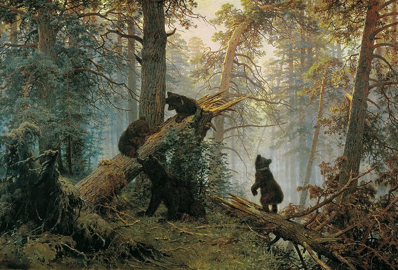
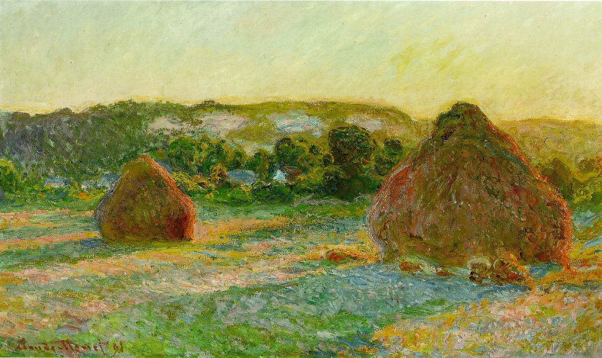
Monet Stacks of Wheat
Study of shadows
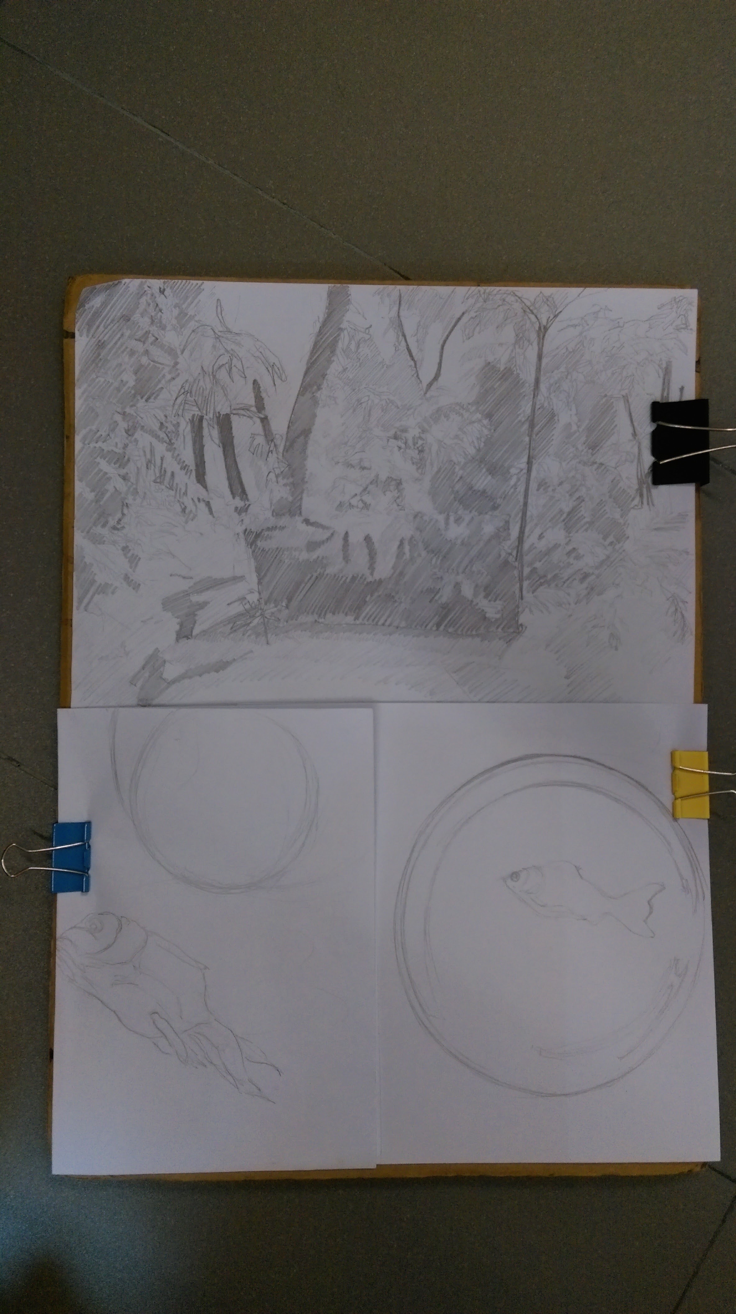
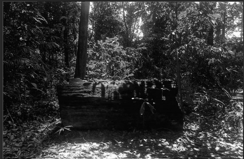
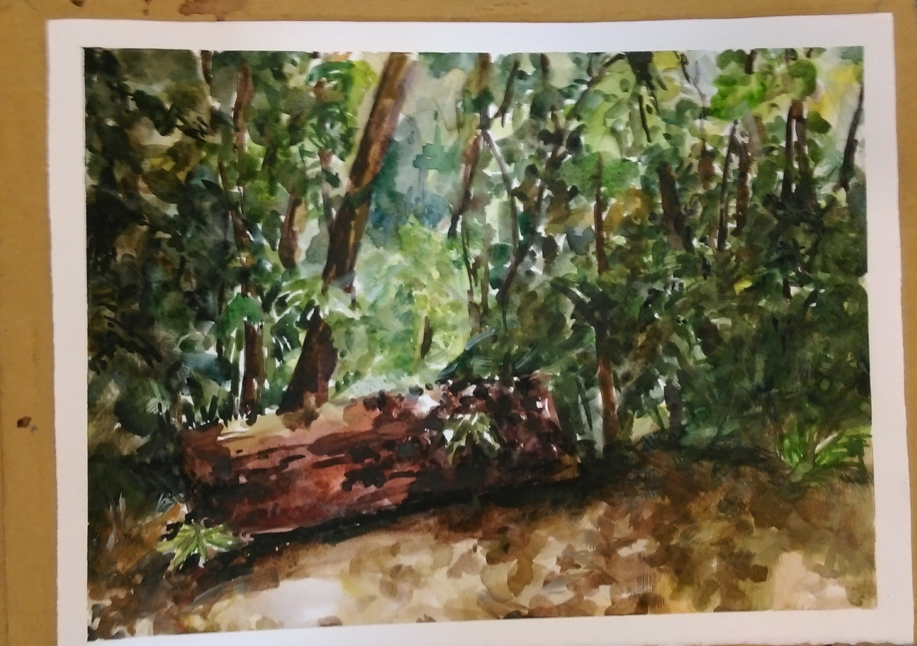
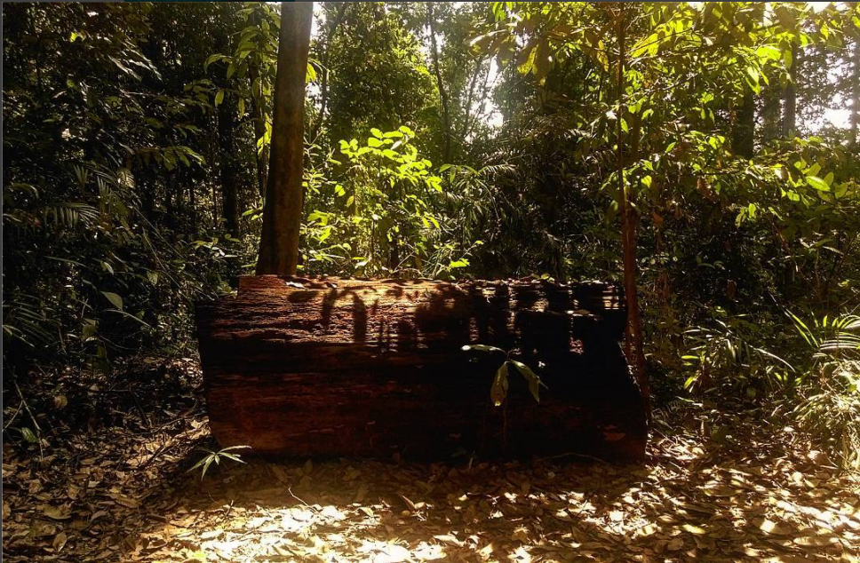
For the final submission I had two ideas- to paint an image of a forest as it was one of the very first things we learnt in class, I wanted to see if I had grasped the knowledge of painting trees. Secondly an image of a dead goldfish on a plate, with a symmetrical composition almost like those religious paintings as a representation of what second year in product design has been for me. Reflecting on the past year, I identified very much with a fish out of water, floundering and struggling to pick up an entirely new set of skills. Gasping for air as I try to figure my place here, struggling to breathe under self imposed expectations as well as the lies of comparison.