It has been so much fun!!! I’ve learnt to be so much more on how to create illustrations digitally, admittedly so much more to experiment and learn but it has been a 13 weeks picking up new adobe skills. It has been a joy to be able to learn from some of the most talented people, seriously my mind is blown every critique session. Also, a big thank you to you Lisa for making this experience so wonderful! I have never once felt dread coming to school on a Monday for class and it has truly been so enjoyable listening to you teach animatedly:-) Every assignment has been equal parts challenging and satisfying. Other than the technical aspects, I’ve learnt to appreciate the function and beauty of mood boards, especially when I’m so easily swayed! Also the importance of knowing the target audience you’re designing for. Hopefully I’ll be able to go beyond designing for audiences I’m comfortable with and expand my body of illustrative works in time to come.
Category: My Work
Wk12:Sound&Spaces
As we discussed last week during consultation, we have combined the candy furniture with the patterned rubber mulch flooring to create a fun and vibrant space for public gatherings. Additionally, this space and furniture is thoughtfully and deliberately designed according to the proxemics matrics to enhance the comfort level of the users who gather here, alone or in groups.
We felt like the space still needed another element to enhance the mood and tried adding fairy lights.
We also thought about how we can redesign some of the furniture. Here are the variations we came up with
Also after consulting, we changed the rubber mulch flooring to colored concrete to create a more sophisticated, laid back atmosphere.
Doughnut chair
Indicative of intimate space. By entering through the narrow opening, the user creates a personal space within this shared area.
Squiggle bench
An s-shaped bench that features a divider in the middle creating some degree of privacy for users who share the bench.
Macaroni Seats
These chairs are rotable on an axis to allow users to create private spaces for themselves or in pairs for conversations.
Party bench
Long benches for social gatherings/groups to convene and hang out together. These benches move along an rail to create longer benches accommodating larger groups.
Jellybean bench
Similarly this bench moves along a rail to accommodate larger groups in the space.
Week 11: Sound & Spaces
Considerations & developments for this week:
Track 1: Are the concentric circles are really necessary?
Explore a mediation between the organic shape and the candies
Smaller organic items that are colorful and re-arrangeable?
Track2: Looking at how we can reimagine and repurpose the queue poles
Research
Track 1
After consulting with KS & feedback from Fabrizio we decided to see how we could make this set of public furniture more fun and delightful for users while still retaining the proxemics matric.
Our exploration lead us to the Memphis design movement.
The Memphis movement was initiated by Italian architect and designer Ettore Sottsass in the early 1980s, who gathered a group of fellow designers with a vision to start a revolution against the sober and functional era of modernist design.
Characteristics of Memphis designs often include geometric shapes, bright colors and loud patterns.
The Dune Bench
We were inspired by how the negative space informs the user how to attach the modular pieces together.
Sketches & Renders
Exploring different candy forms
Initial renders of a fun and vibrant public space oozing happy vibes.
The tubular seats are designed to be rearranged and reconnected into different permutations so that groups could also create their own private spaces.
On the idea of making the furniture movable yet retaining its ideal distance. We also thought of using a rail and ball bearing to limit and direct movements.
Track 2
Research
We found this project, Playne which aimed to create a playful form of public seating which greatly resembled our queue pole idea. Having the stretchy fabric would also mean that this set of furniture would be unobtrusive in public spaces.
Sketches & Renders
Furthering our discussion with KS, we worked on reworking the queue poles into something familiar for Singaporeans. This could look like incorporating the retractable dividers into a frame of a chair to indicate that these structures can be used for seating.
Week 10 : Sounds And Spaces
To follow up from last week’s progress, we asked ourselves these questions to further our explorations in the new frontier of proxemics.
What materials are we considering ?
How can it be fabricated?
Does it require electricity? And if so, how can we generate it sustainably?
Foam mockups of the installation?
Which locations are we considering? Does it accomodate the scale?
Geometric or organic?
We also wanted to justify and showcase the use of proxemics so how we communicated the distance without text was important.
Story/ dimensions / places
SO FIRST OFF!
After consulting with KS, he left us to continue developing both our ideas:
1.. A shared working space/table
2. The queue pole divisions
We started working on foam models of our clay mockup just to have a better feel of the scale and form.
After trying really really hard to model this out in Rhino, we felt our hearts getting less satisfied with how this looked AND less convinced this could work.
SO we decided to re-think on how we could express proxemics with sculptural furnitures and this was our first iteration.
So this sitting area was informed by Intimate Space, Personal Space and Social Space deliberately leaving out the Public Space as thats the location where the installation would be placed. The distance from each area is measured according to the matrics.
The innermost platform was designed to be elevated thus separating the person (or persons) who would be using that space from other users. It can be used leaning, perched or seated (High enough for swinging legs, score!!!).
The second ring is personal space, also good for a person for the ~alone~time, or for two people who prefer to have private conversations. Each mini bench is situated an appropriate distance apart that conversations can be had comfortably. Most notably, the back rest was designed so that whatever is happening in the surrounding environment would not be too much of a distraction.
Lastly the outermost ring- the decreasing height of these pieces were intentional to demarcate the varying levels of privacy. These low benches were designed for pairs or groups of people to share or use seated or straddled (or even on the floor cross legged using it as a backrest).
Possible material considerations: Fibreglass plastic + fun vinyl prints!
SECOND TRACK-Queue poles!!!
Expansion of the queue pole idea to do a pyramidal representation of the space.
Spaces marked out by color to give a feeling of the space, different blinds to also give function to the space (i.e: they can be extended to provide seating) . Cross blinds that acts as both seats and backrests.
Possible material considerations: Rope or nylon (for the bands), plastic poles.
Looking forward to see how we can further refine these ideas.
Week9: Sound & Spaces
Working thesis: Rethinking existing study spaces in South Spine, and how the re-division of that space could facilitate different activities better for various groups of people. (Eg: mugging alone vs group meetings alongside people having lunch and taking a nap.)
From last week:
Q1: How do you contextualize such structure?
Q2: What kind of qualities are you looking for in your place selection?
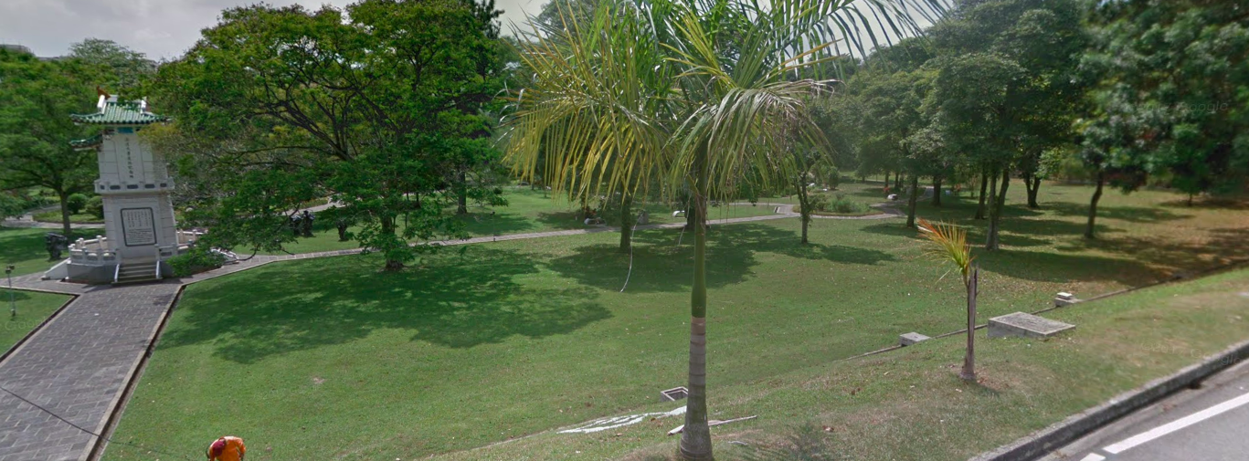
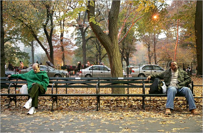
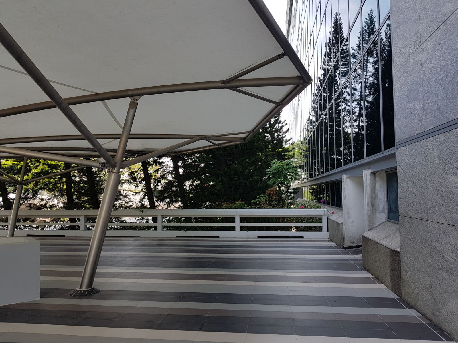
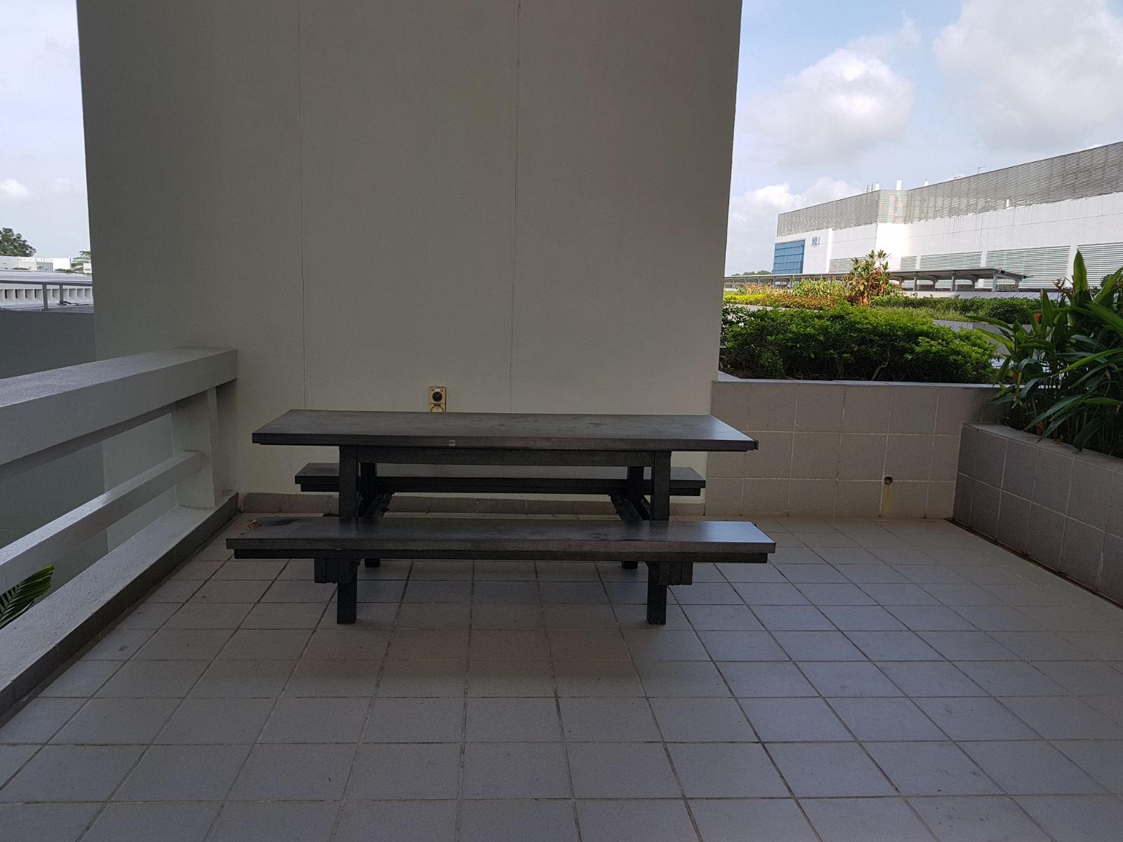
A: We are looking at shared spaces in school that are frequently congested which limits usership.
(Eg: study benches outside the lecture theaters in North Spine. )
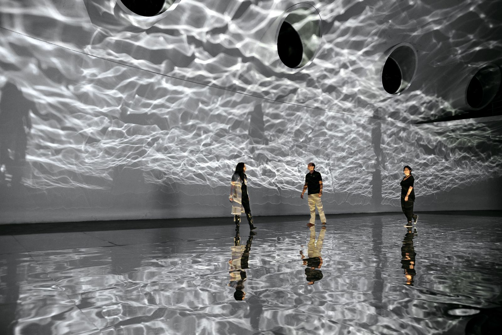
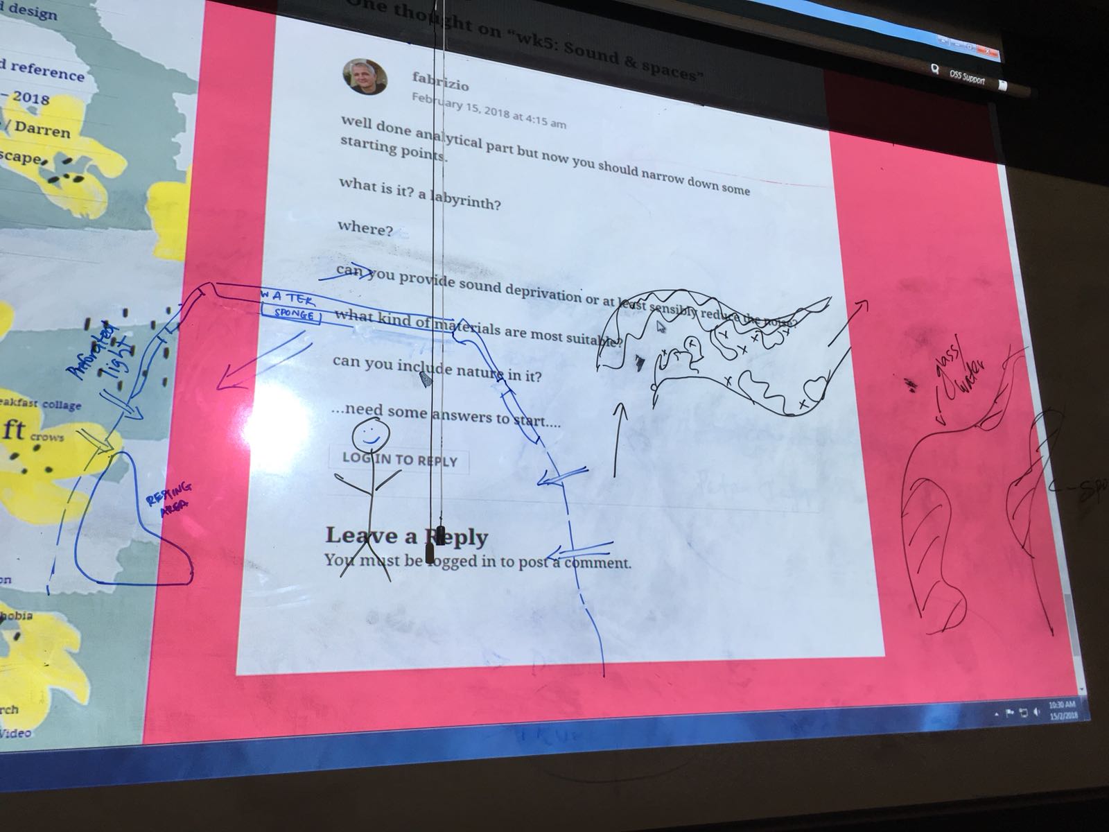
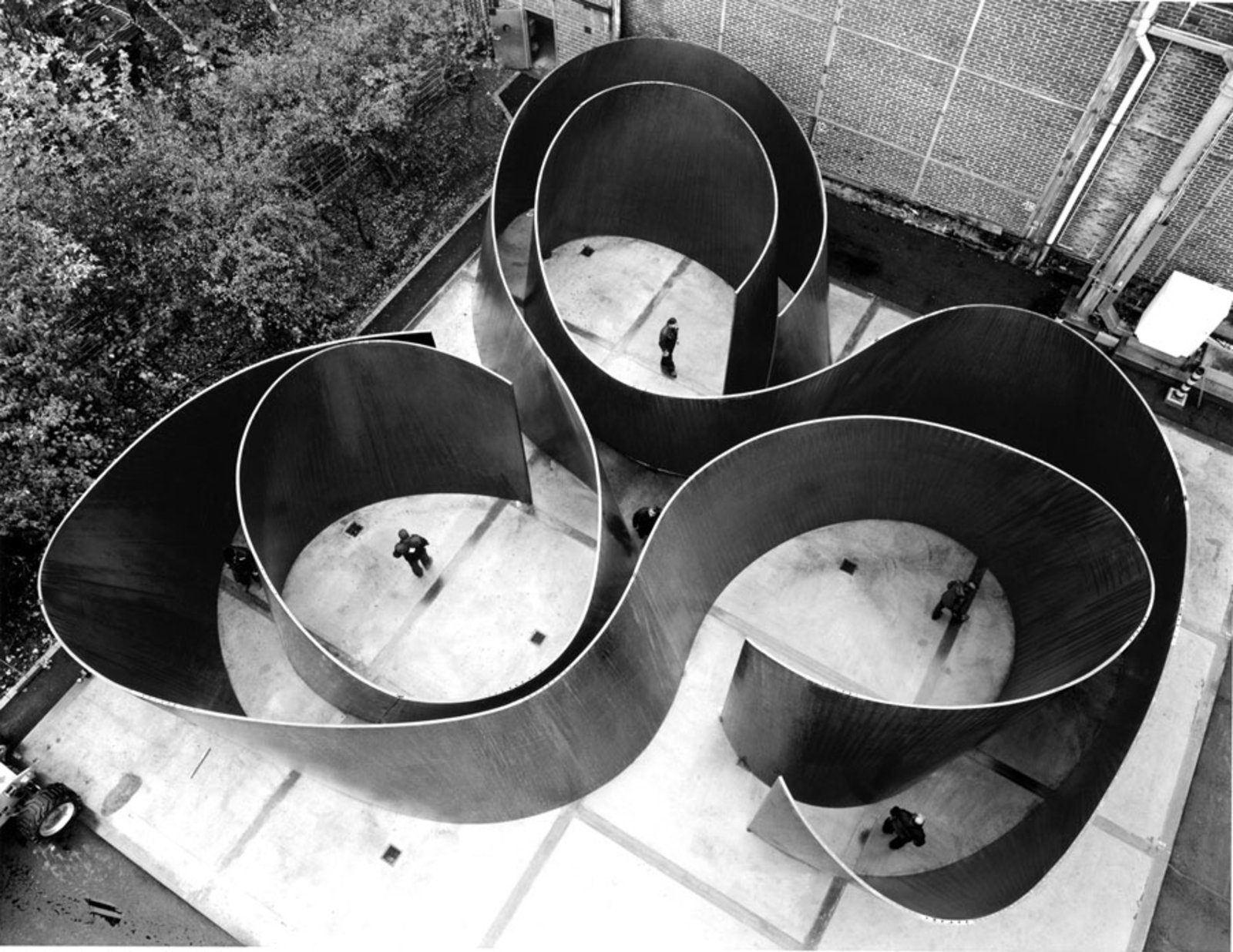
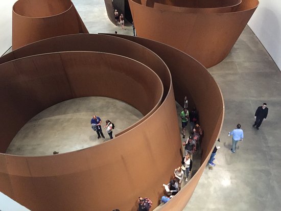
Q3: what do you expect the people to behave? Sitting and relaxing like the “superfurniture” or forcing into a path like in Serra installation?
A: A “Superfurniture” with divisions that maximizes limited space ie: allow more people to use it, and at the same time ensure that these shared spaces would not result in an uncomfortable experience for everyone.
This week we are going to focus on testing the mechanics of our installation before the form.
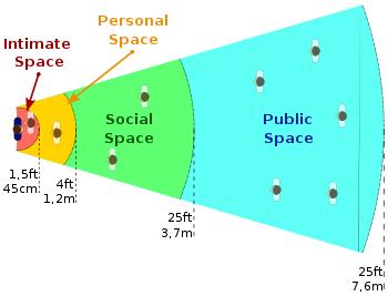
Following the proxemics matrix:
Intimate Space: 45 cm
Private Space: 120cm
Social Space: 370cm
Public Space: 760 cm
If we let the Intimate Space =x, the approximate ratio of the distance between these spaces would be about
Intimate space=x
Private space=3x
Social Space= 9x
Public Space=18x
(This ratio is a radial comparison, because very rarely do people congregate linearly spontaneously. Linear congregations are usually intentional & directive (eg: queueing up for food, seating on a train))
How this could look like:
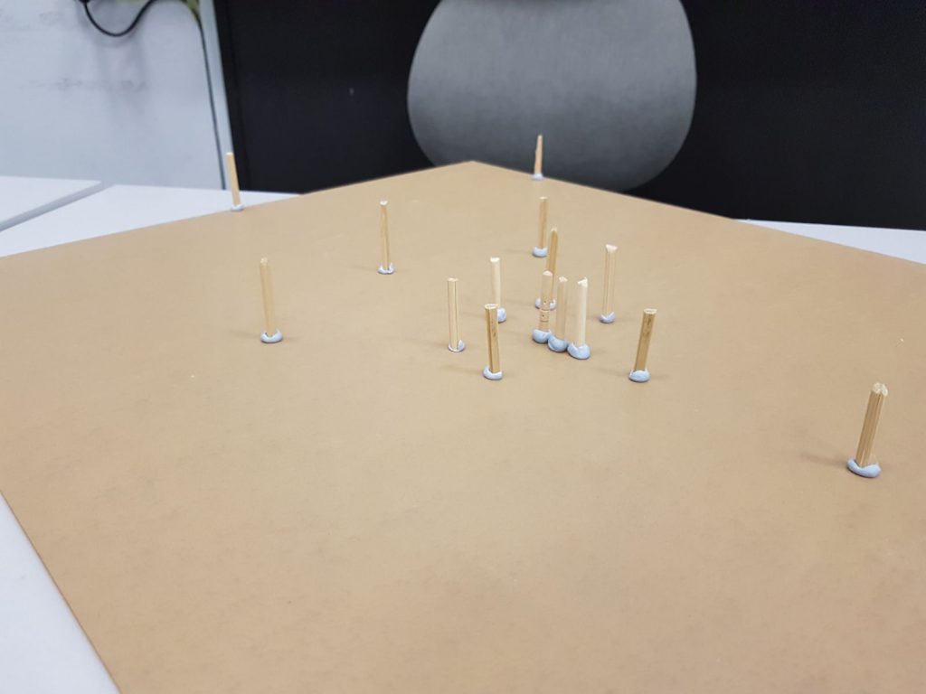
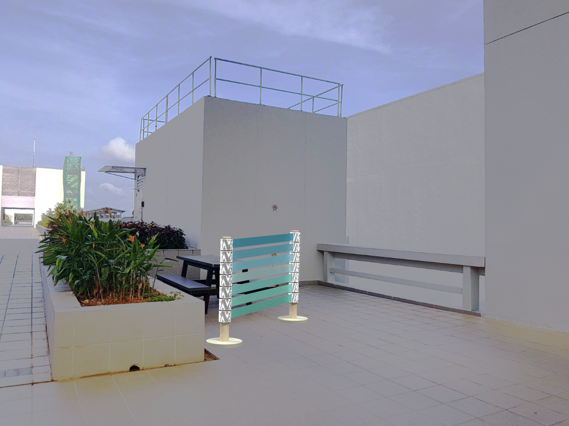
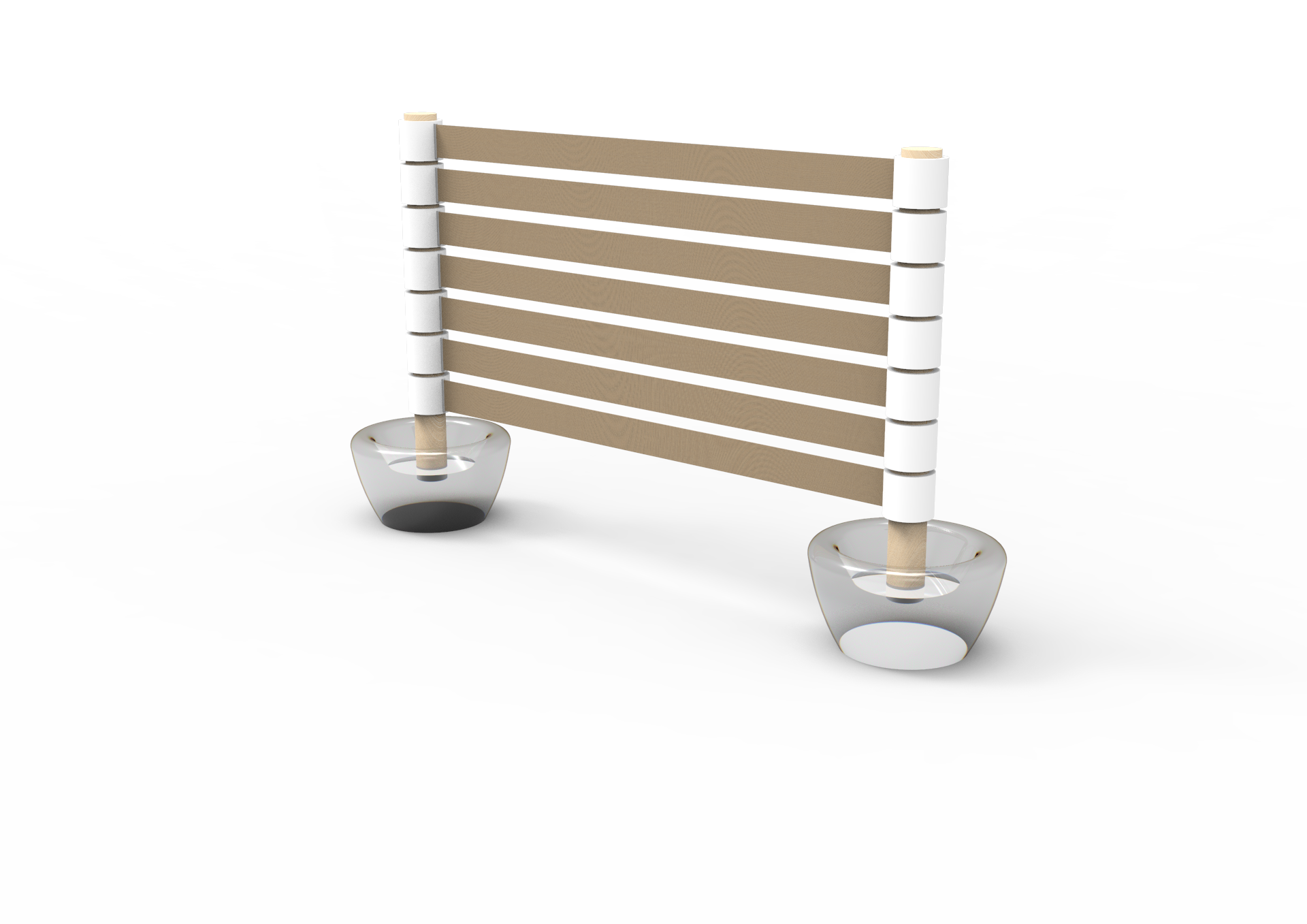
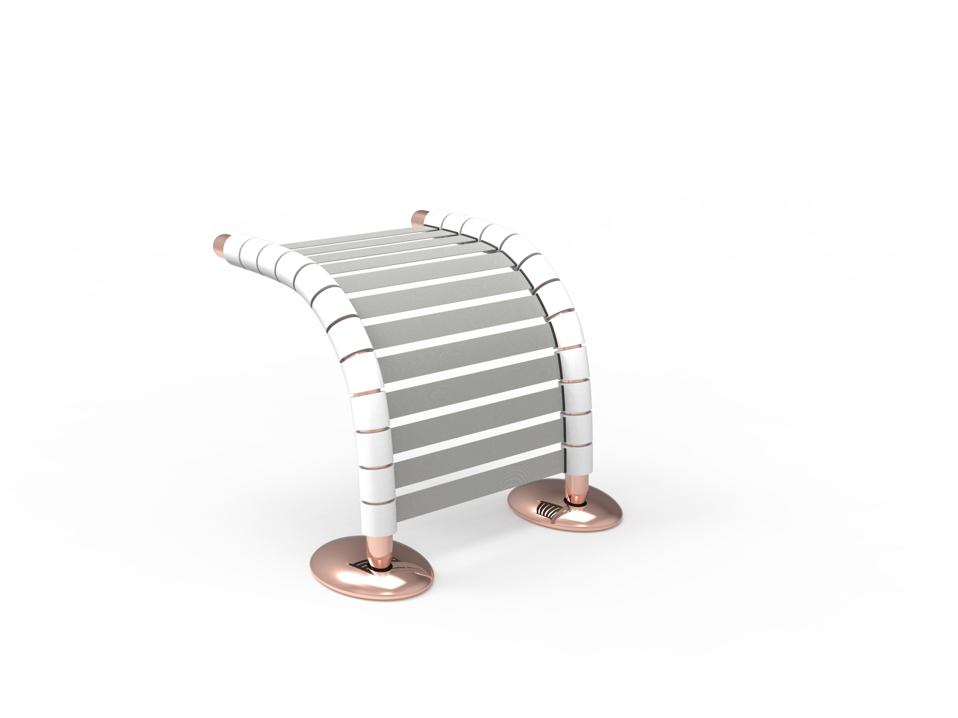
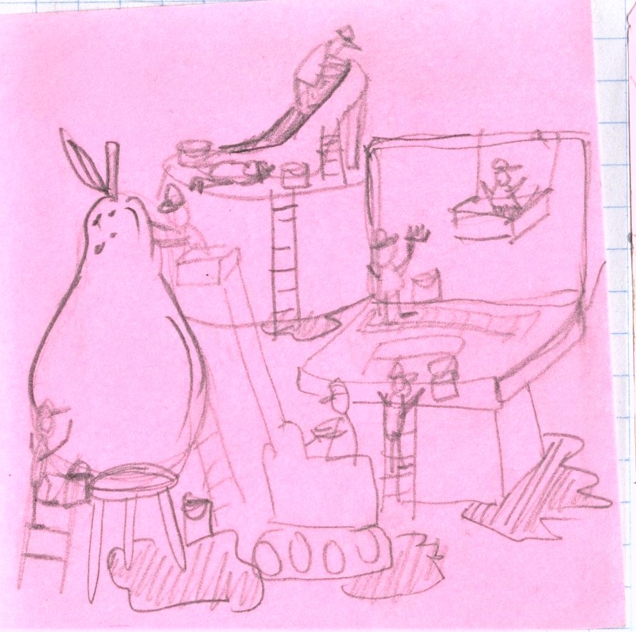
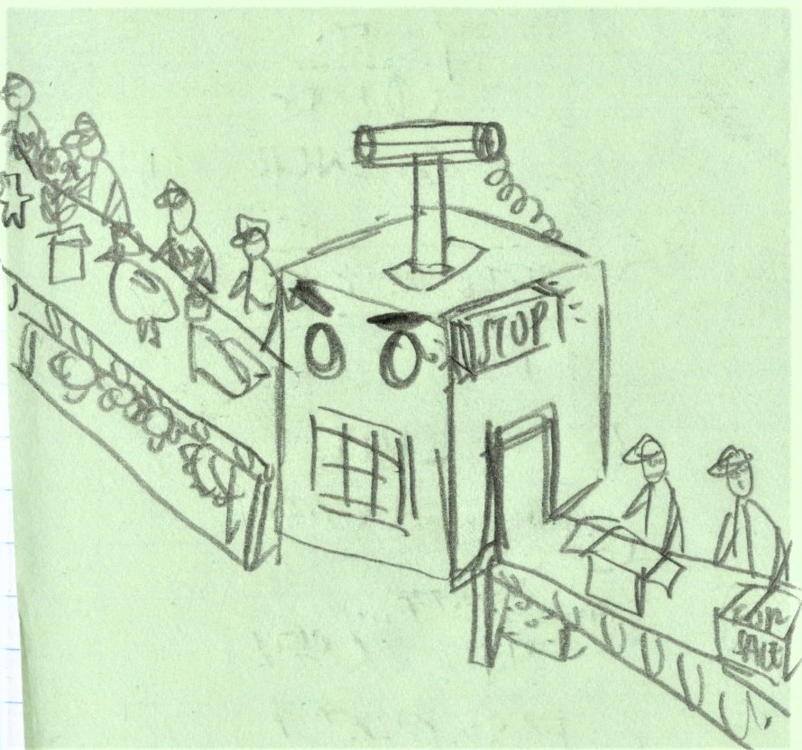
Test 1: Having modular, customizable “queue poles” as divisions
We tried modelling some prototypes of how we envisioned it to be. Poles that could be erected in spaces allowing users to customize the space for their own needs.
Observations: We felt that although it gave us the freedom to place it in any location, it looked rather awkward and counter intuitive. more like a foreign object than an installation.
We tried imagining the same mechanism within a context and it felt rather unnatural and linear. Almost look like a human parking lot. Also we couldn’t imagine how the sharing of furniture could take place unless we redesigned all the furniture as well.
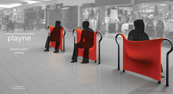
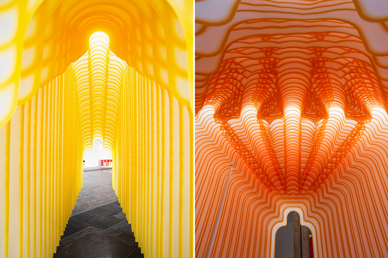
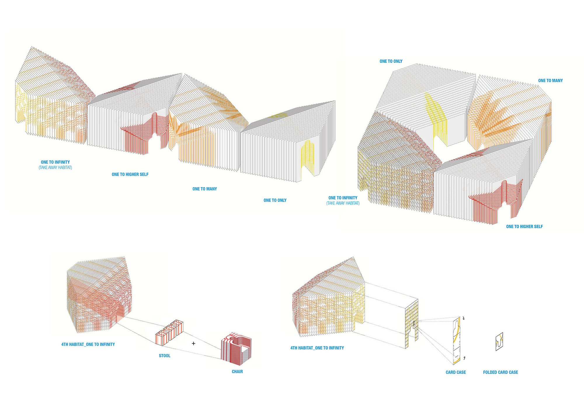
Briefly inspired by: 4Habitats @ Seoul, South Korea
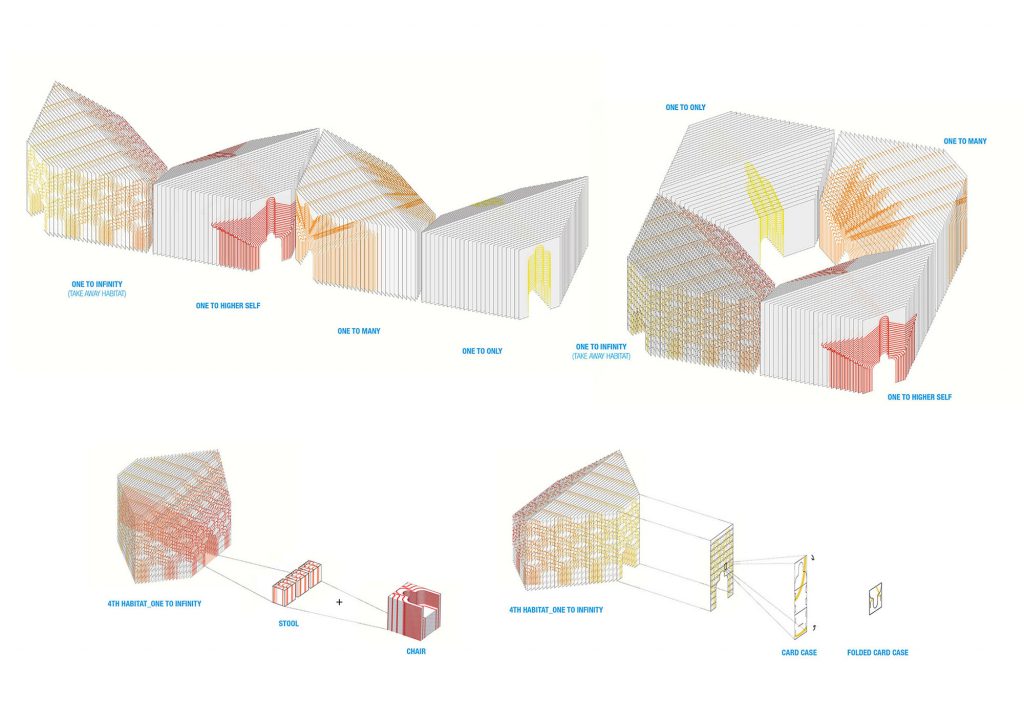
” After two years of research, we decided to tell one story at a time. Spunbond was our material of choice. Printed off the roll and hung, 160 layers of Spunbond create 4 ‘habitats’ of repeated human profiles that evolve and transform, one person at a time. Each explores the range of selves we inhabit as solitary and social beings. These habitats are transportable and reconfigurable, designed to adapt to its host venue”
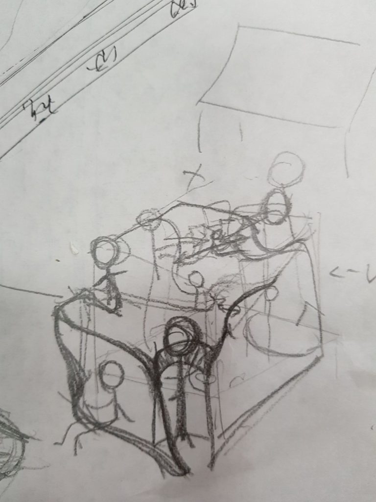
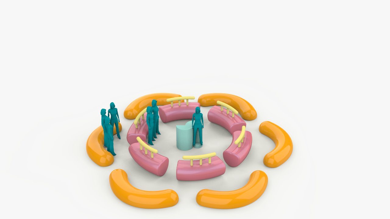
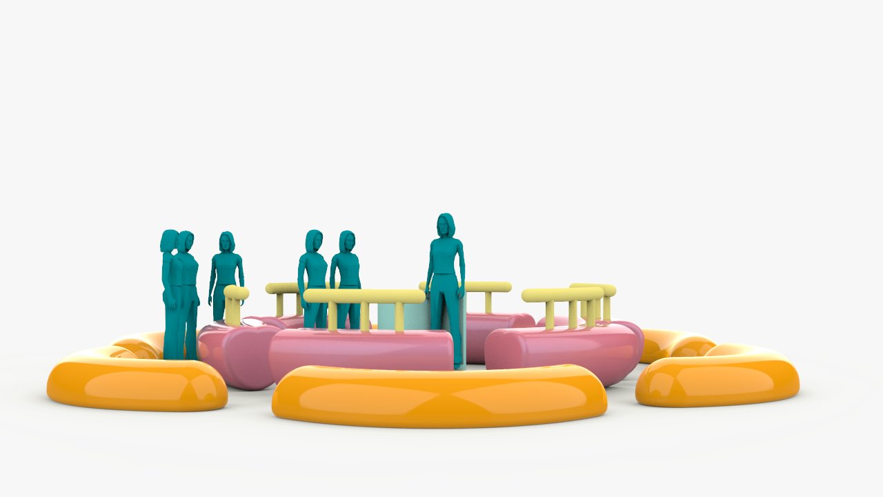
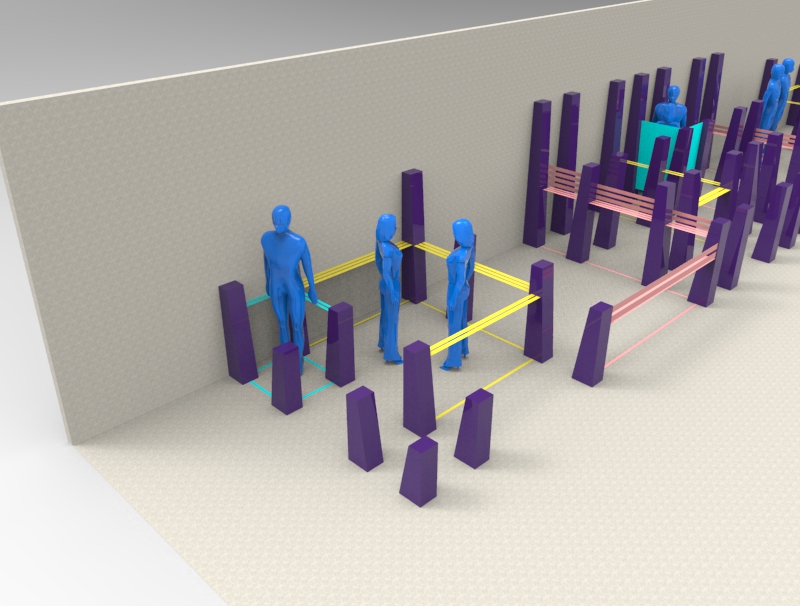
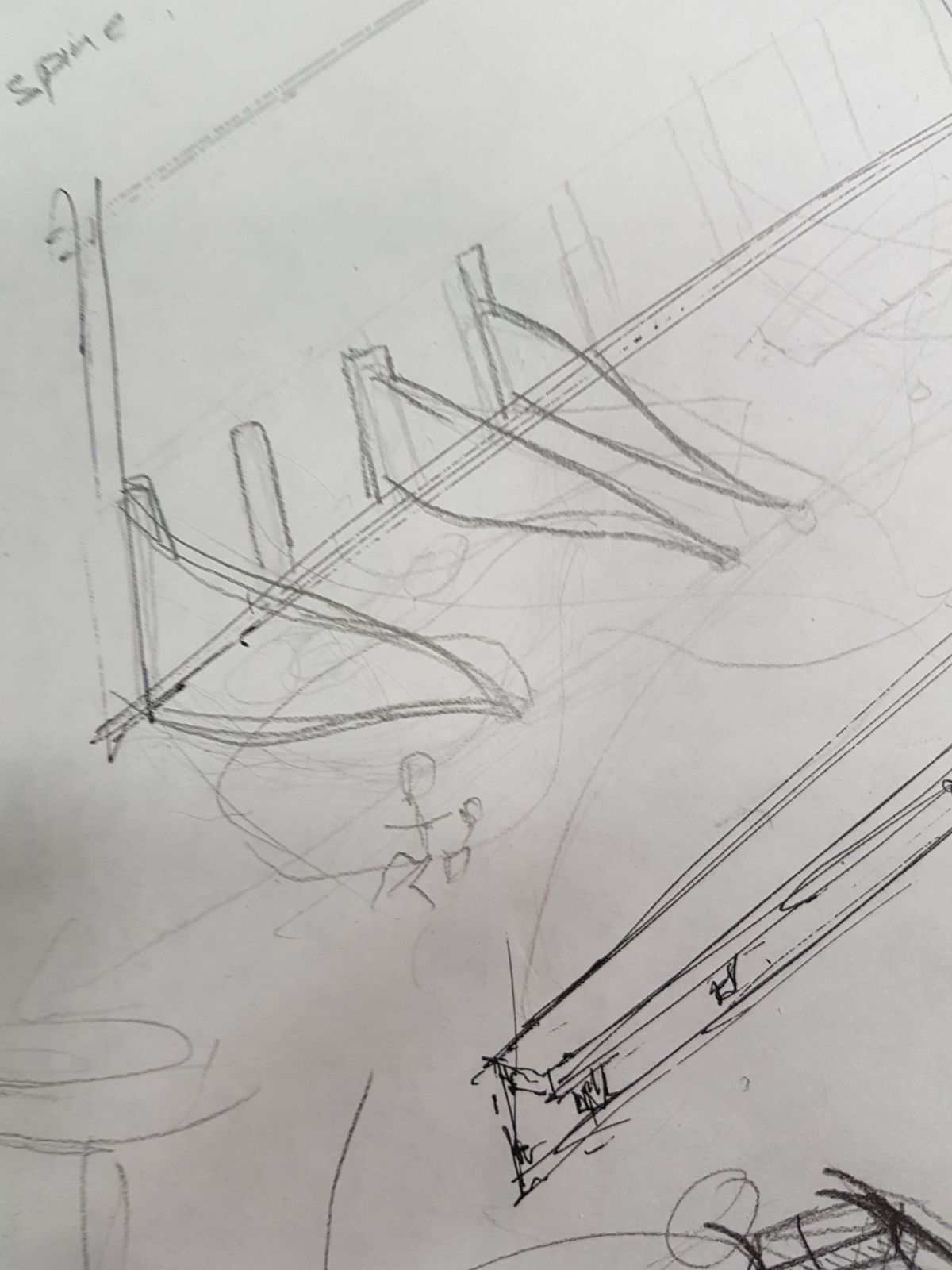
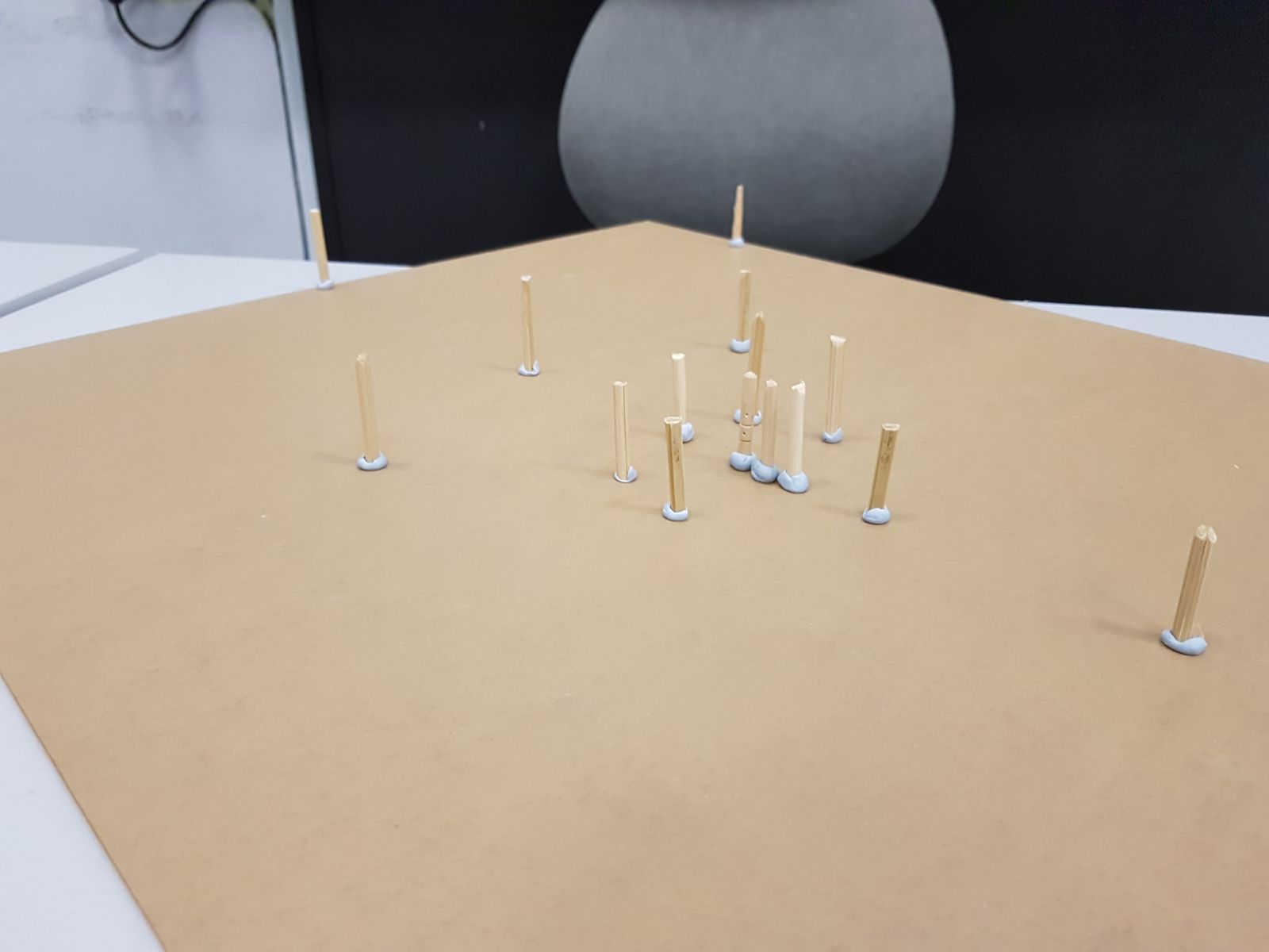
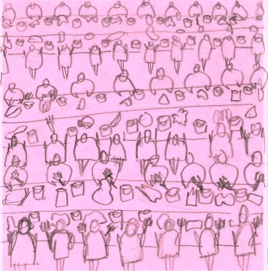
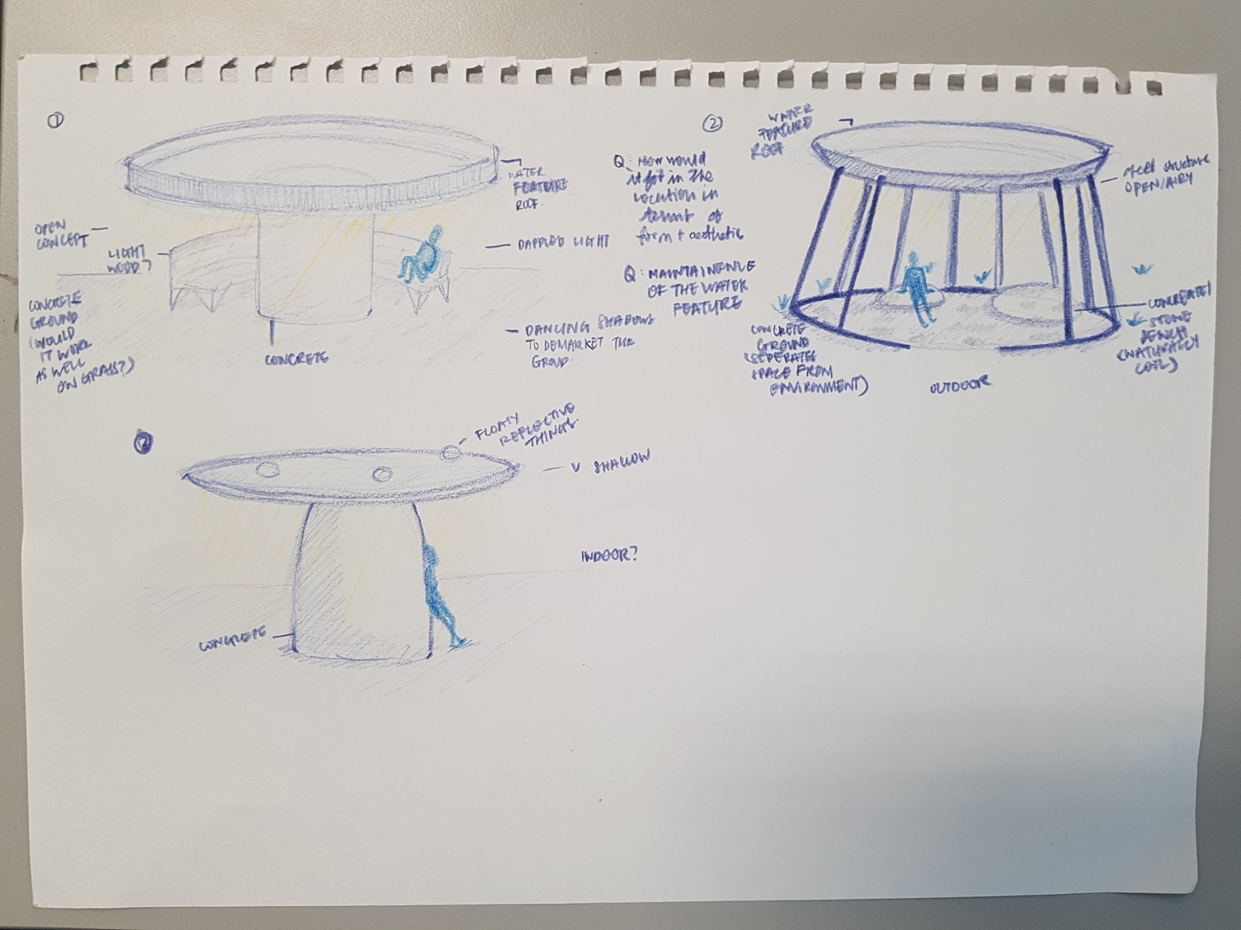
Test 2: We tried thinking of doing a commentary on the proxemics matrix by testing the scale of the ratio to see how much space this would take.
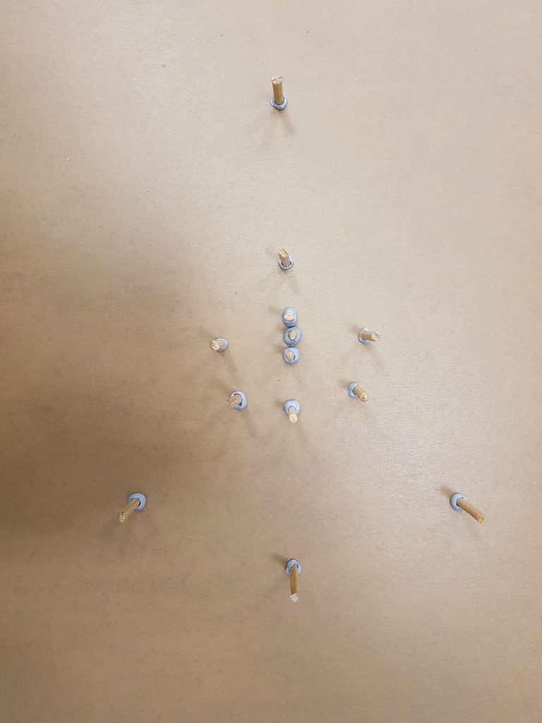
The placement of sticks represents the number of people within each category and how they affected each group.
Conclusion: Though it works in theory, the scale proved to be too big. For example, the Public Space would take up the size of 2 rooms and we couldn’t see how this could pan out in NTU. Also since proxemics is an observation of a (somewhat) unseen phenomenon, it has to be made very, very obvious for the audience to get it and the large scale might come in the way of communicating that.
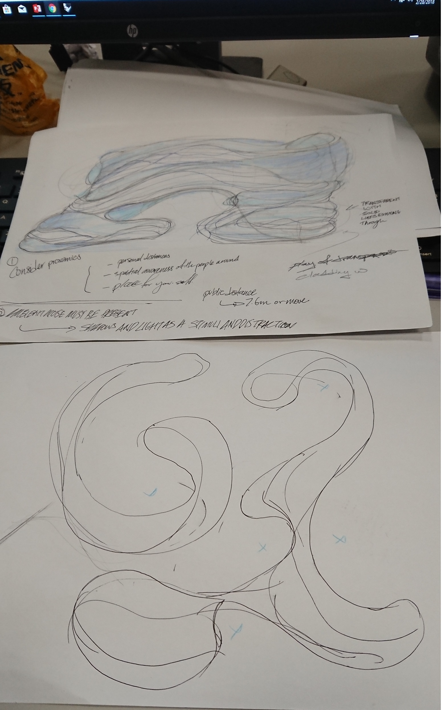
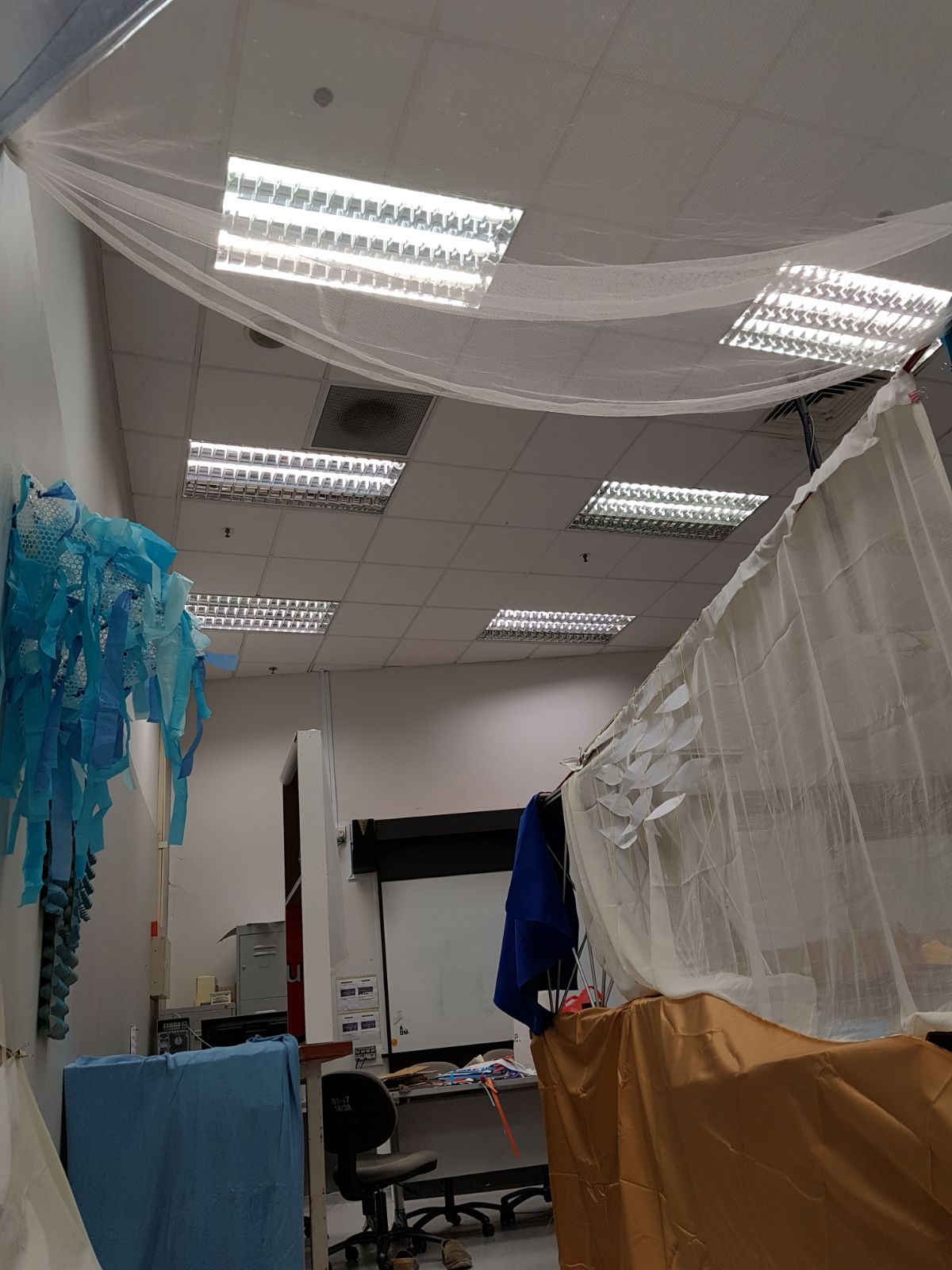
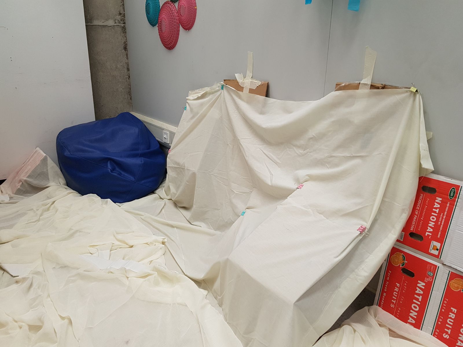
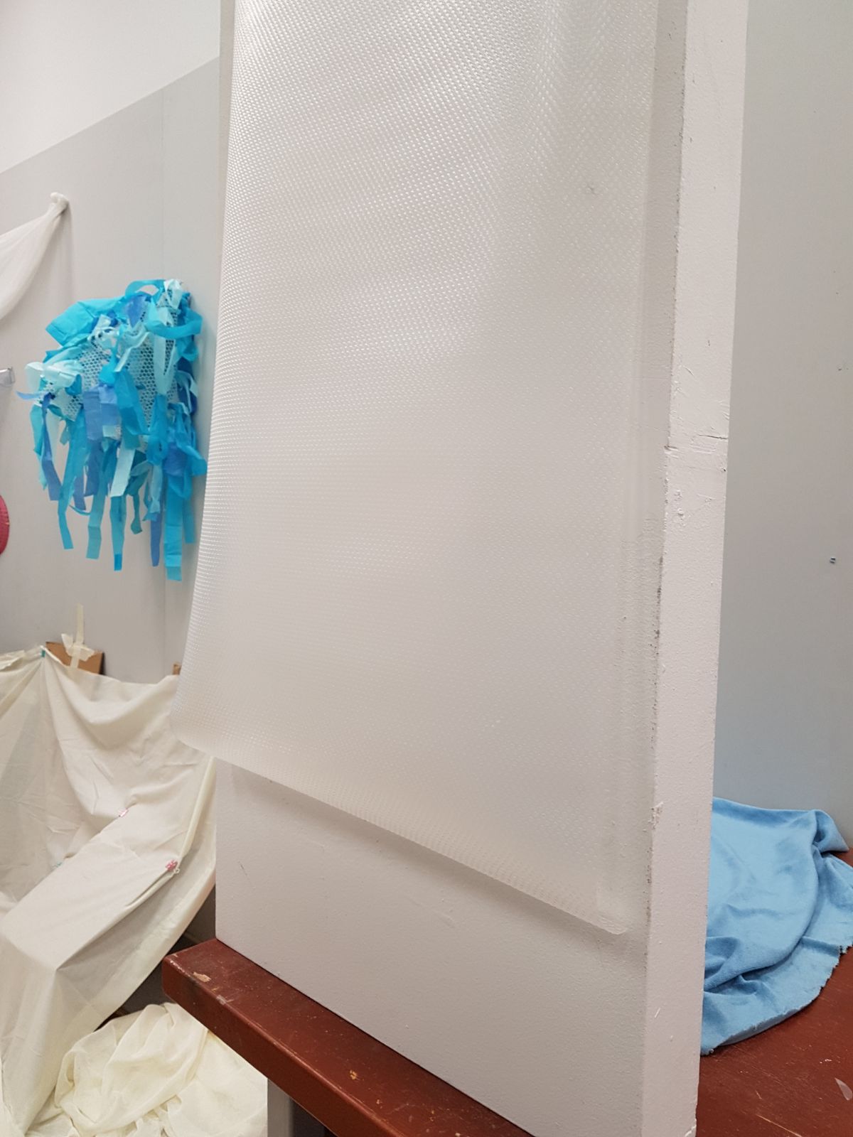
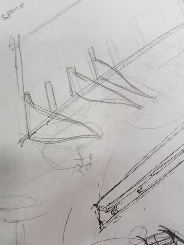
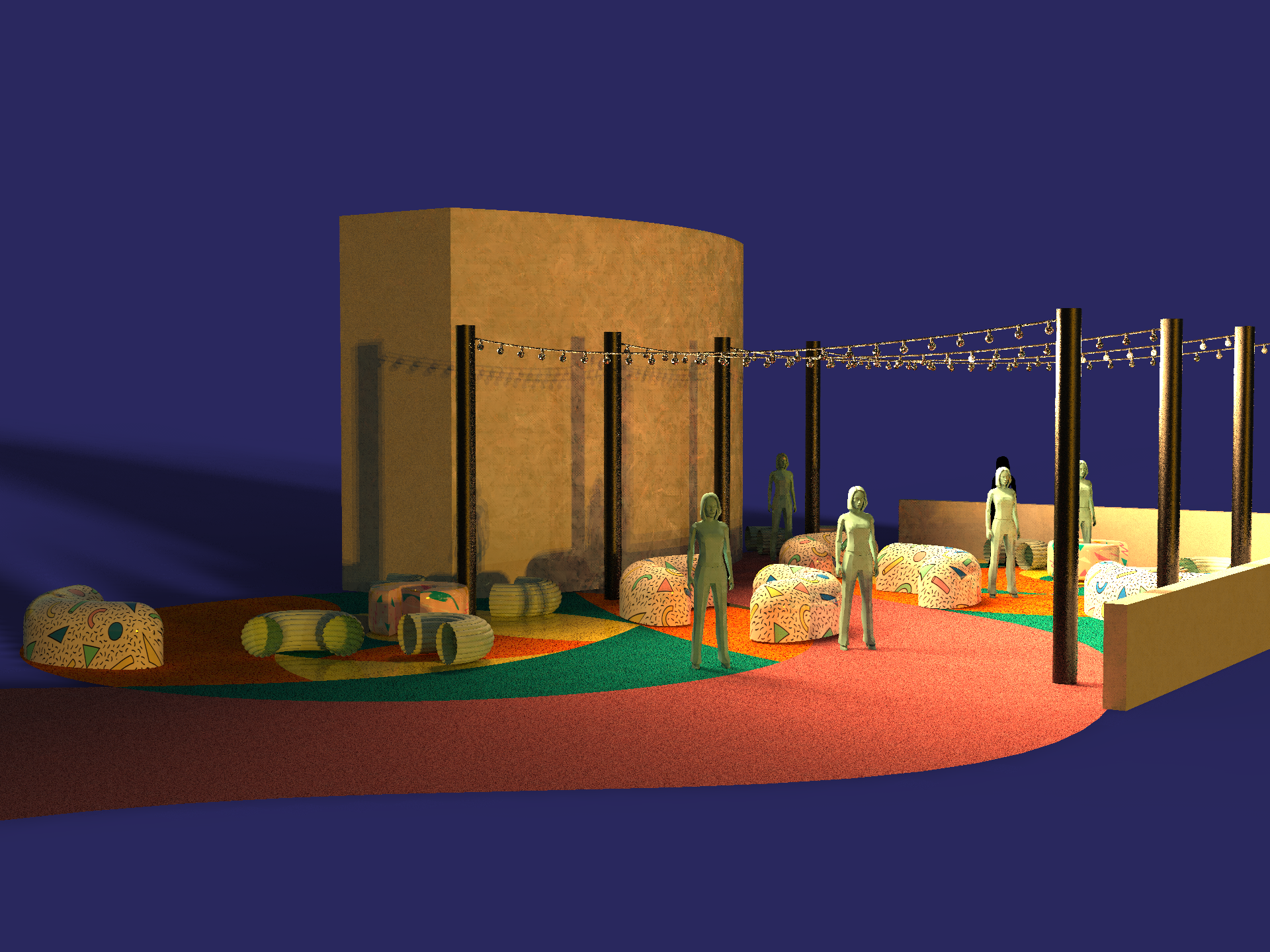
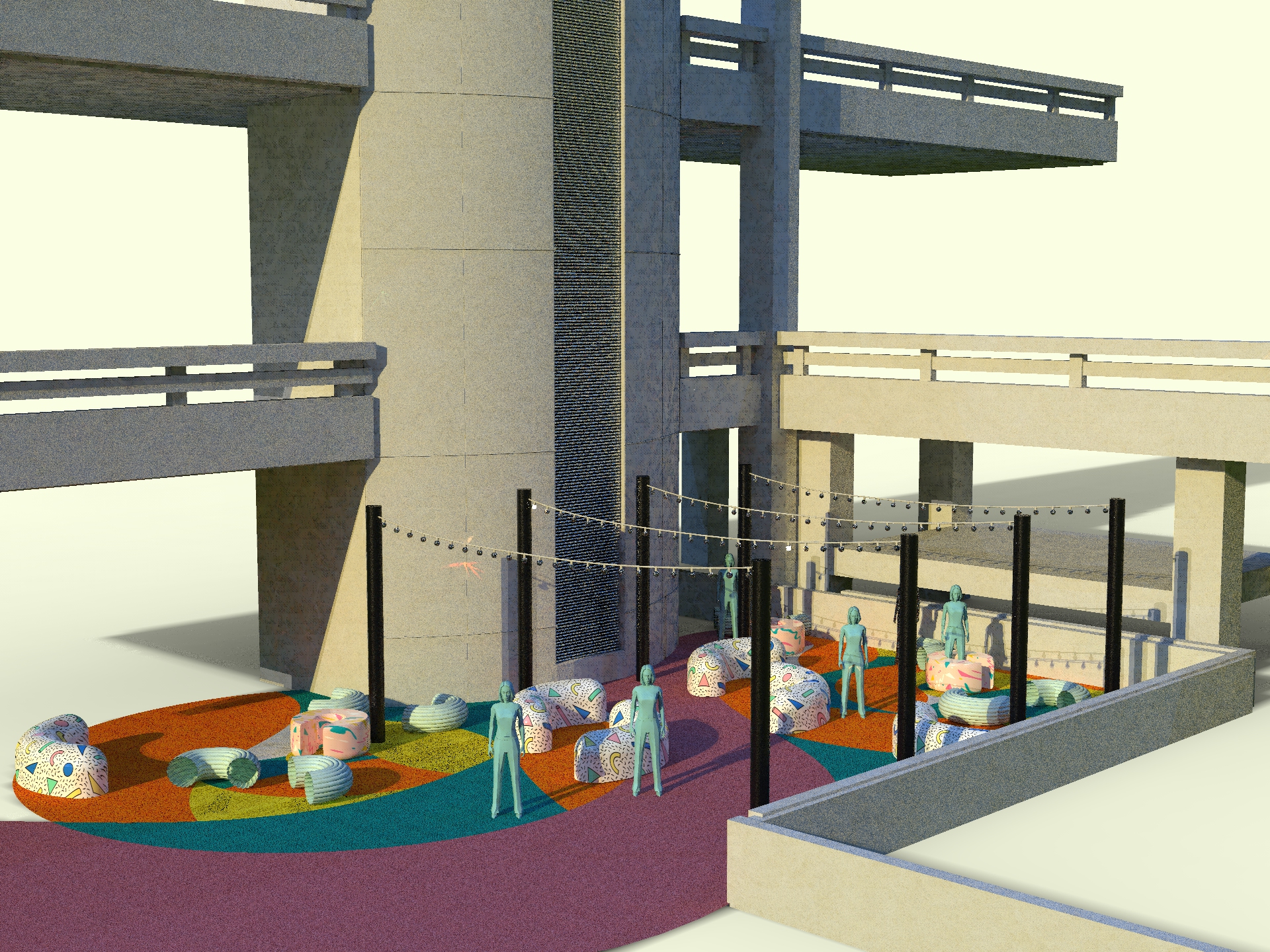
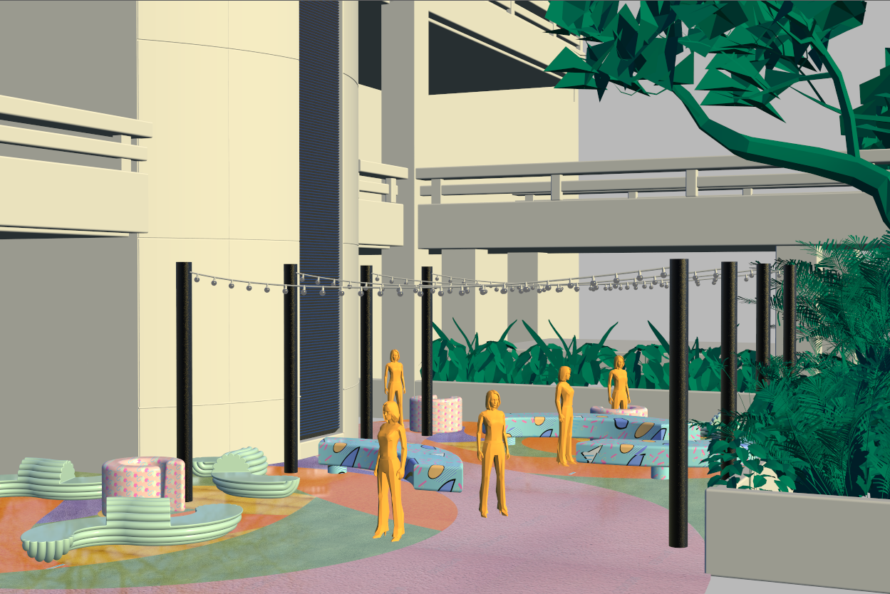
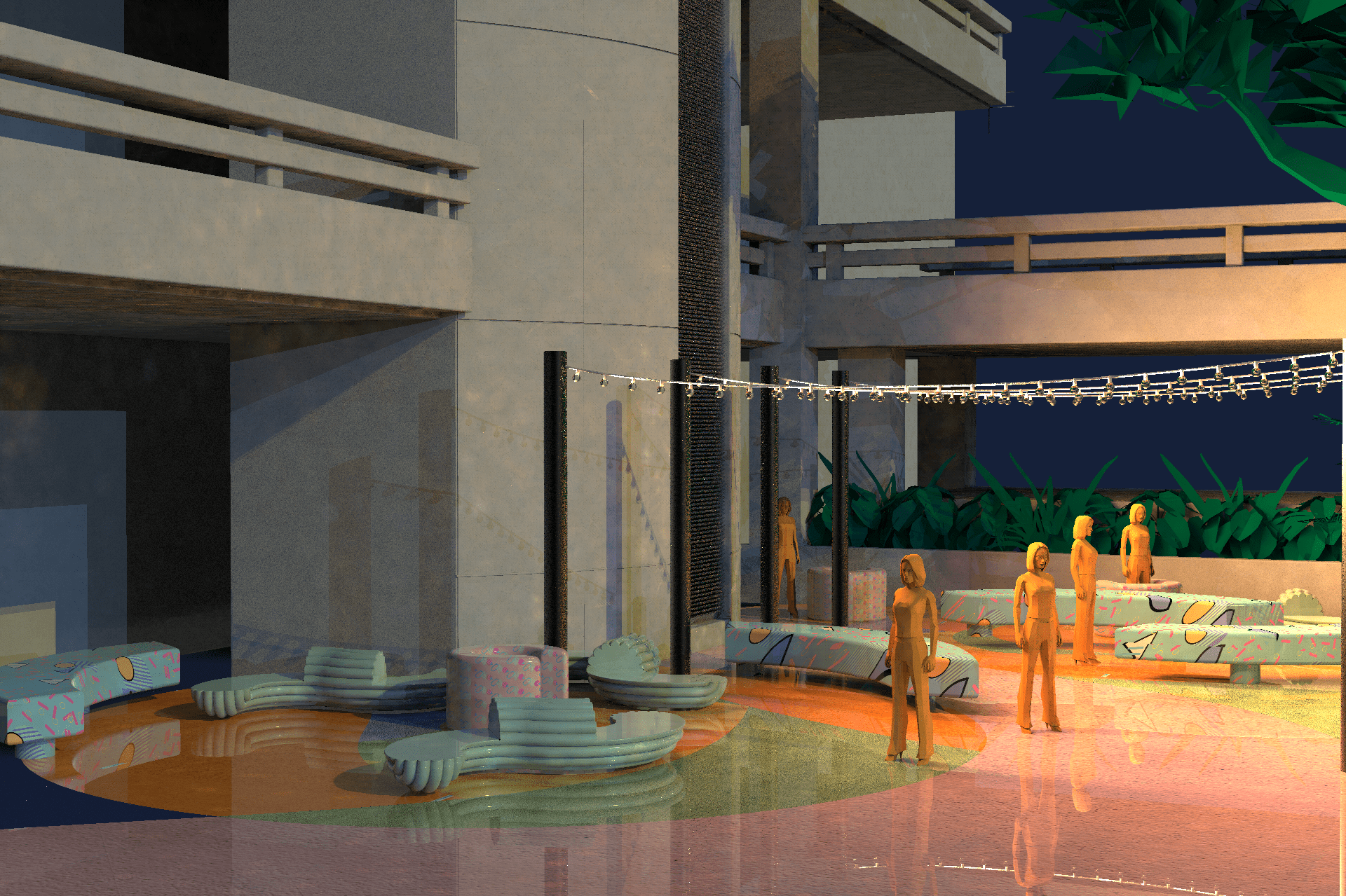
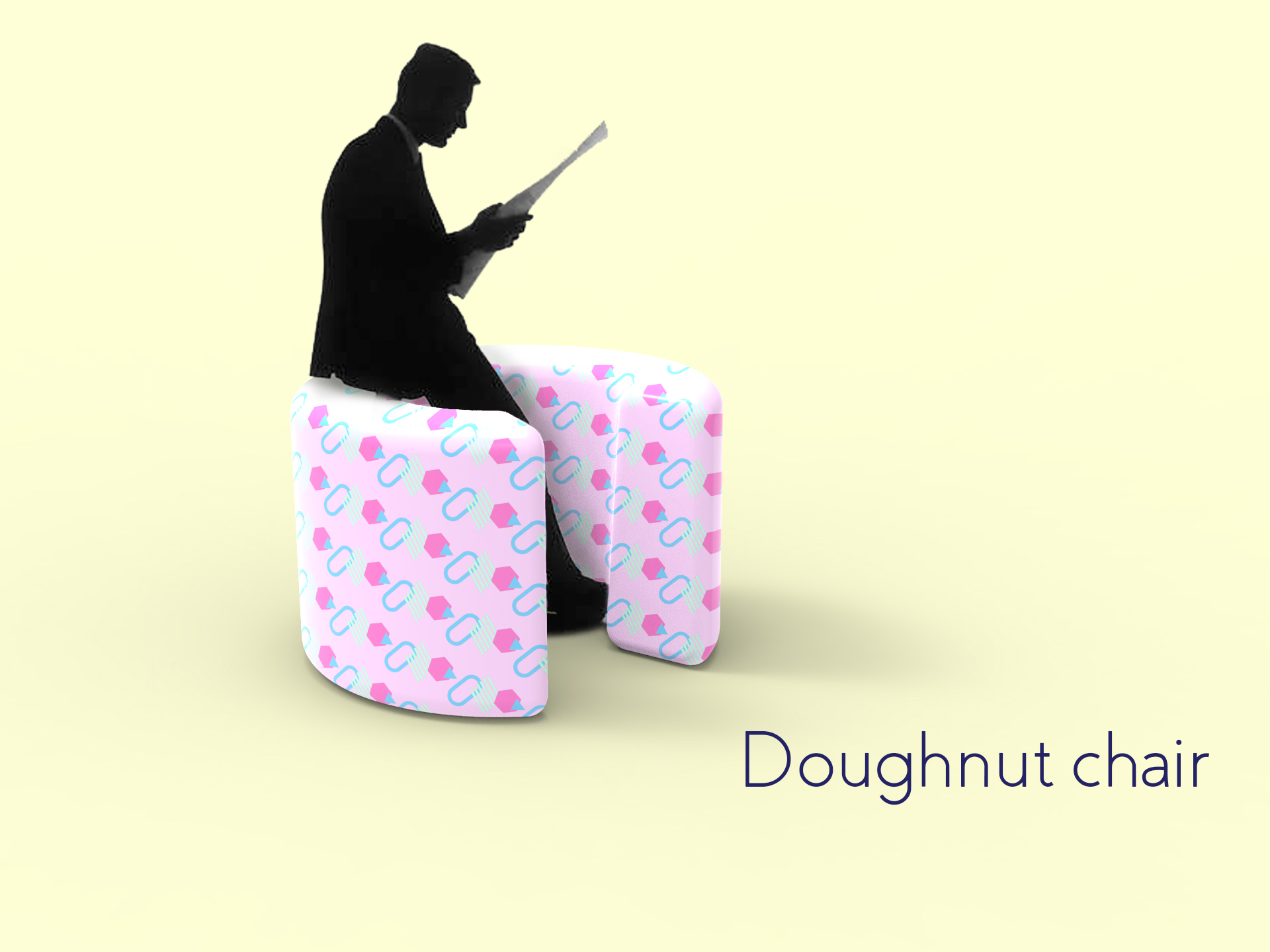
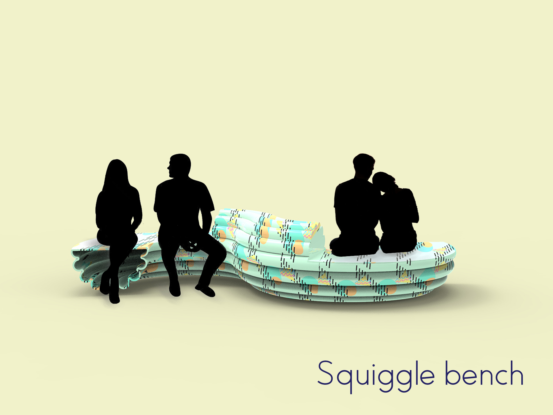
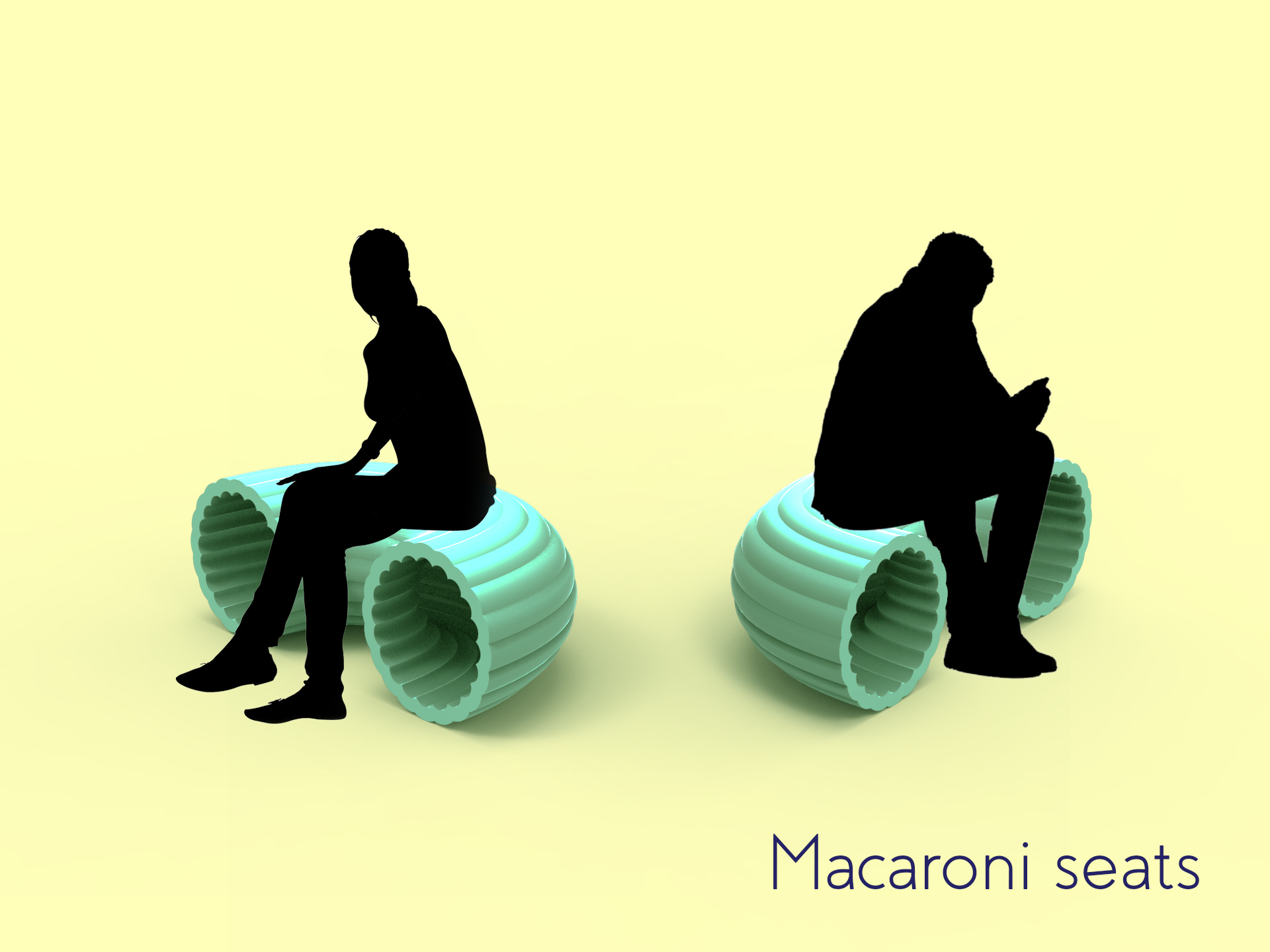
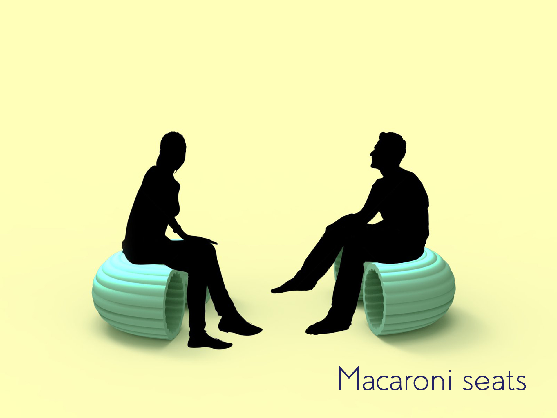
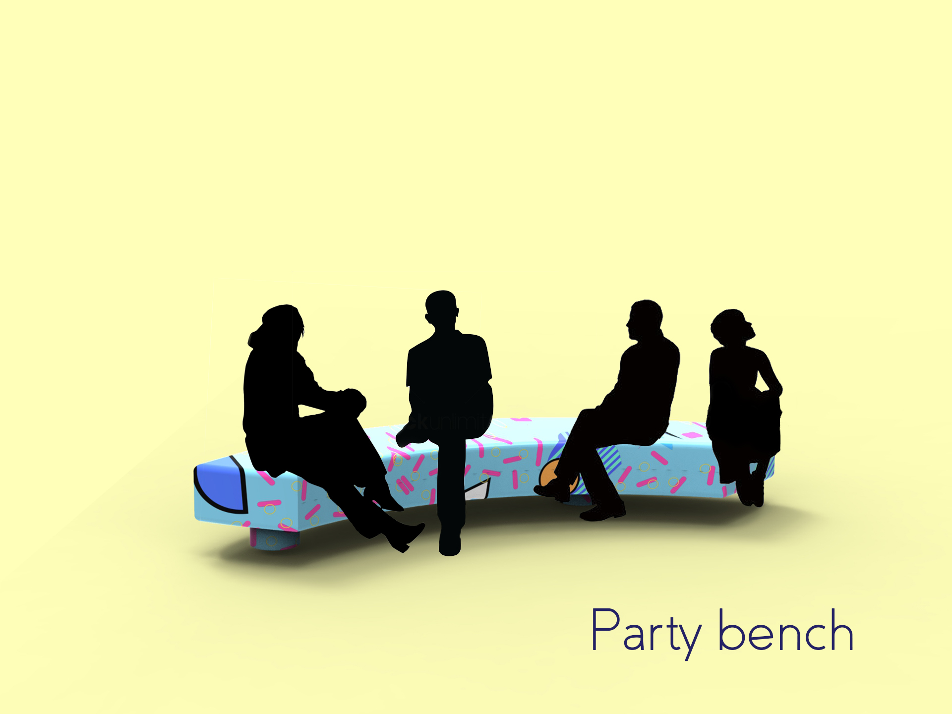
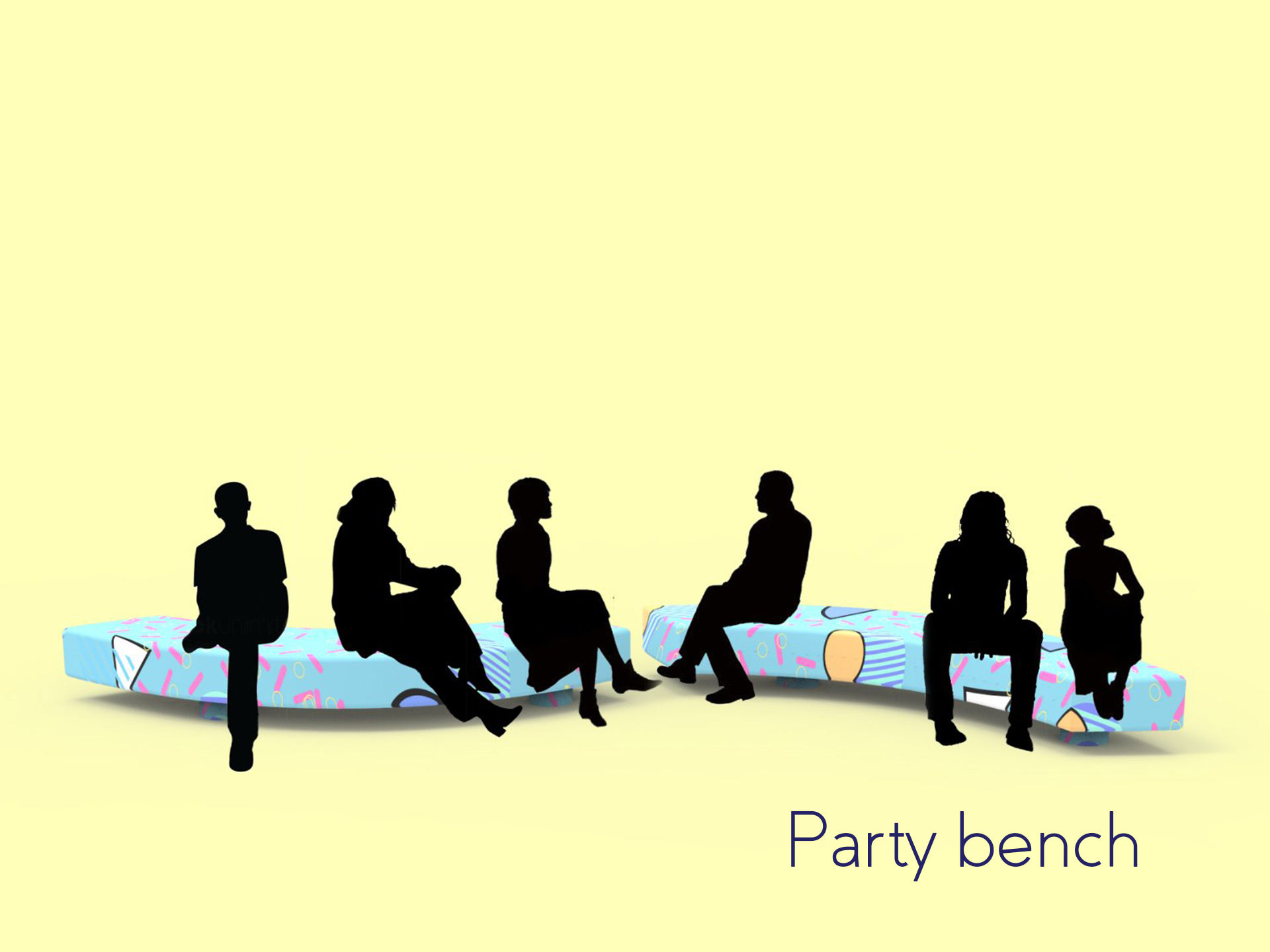
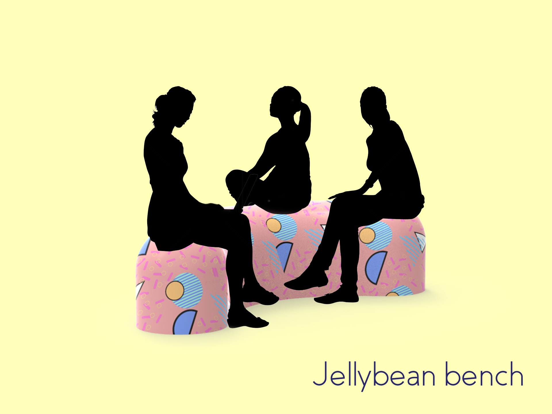
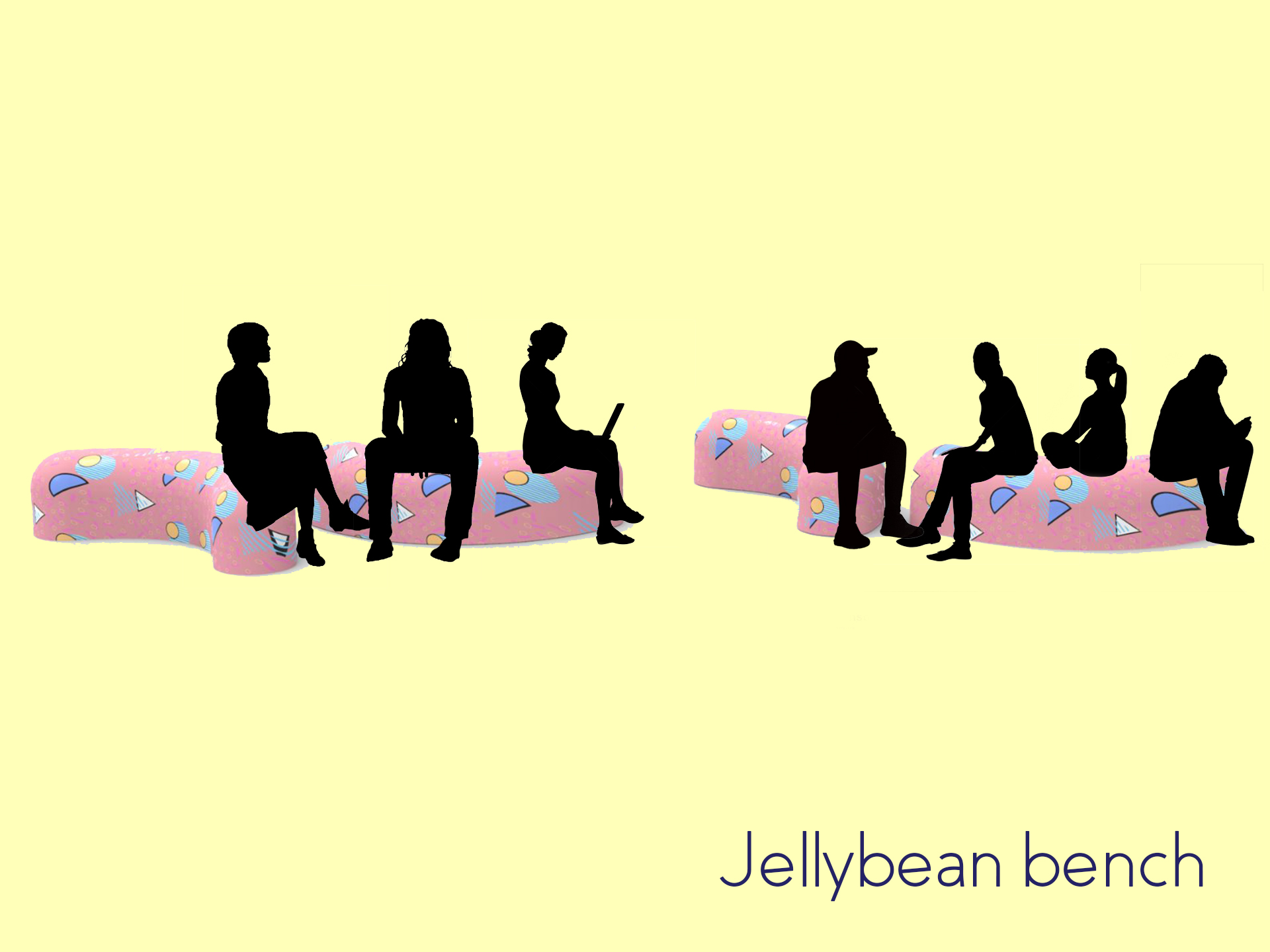
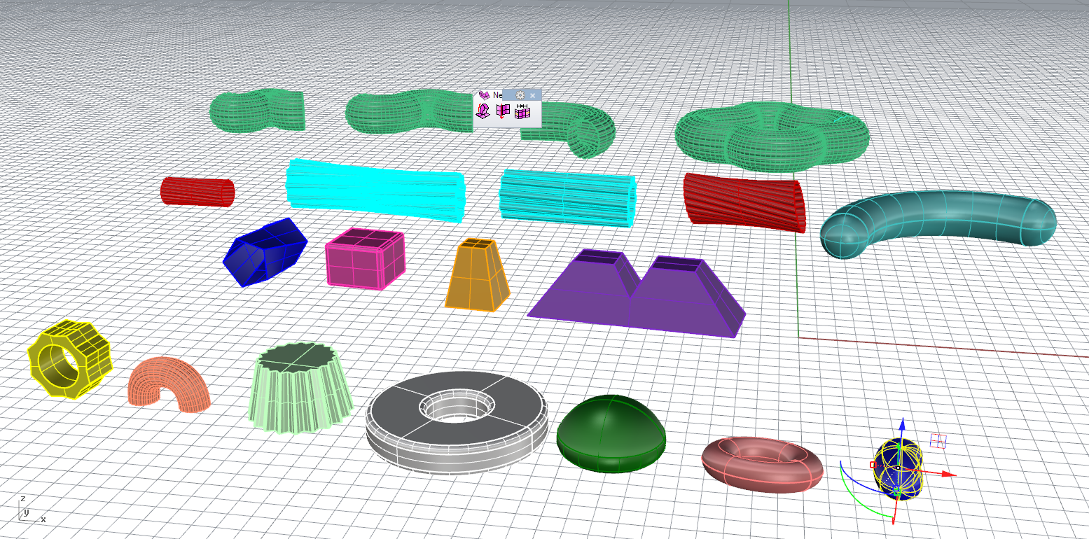
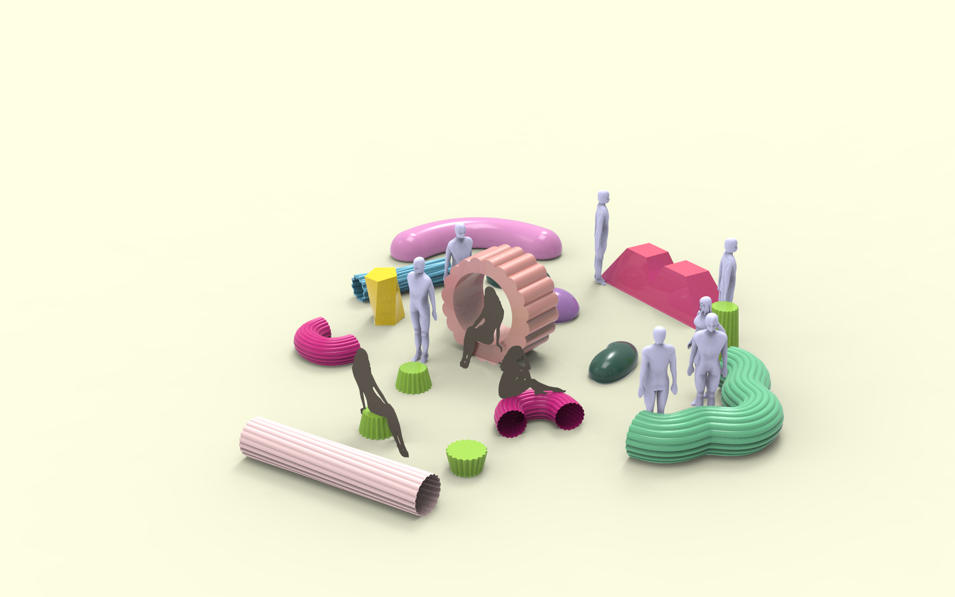
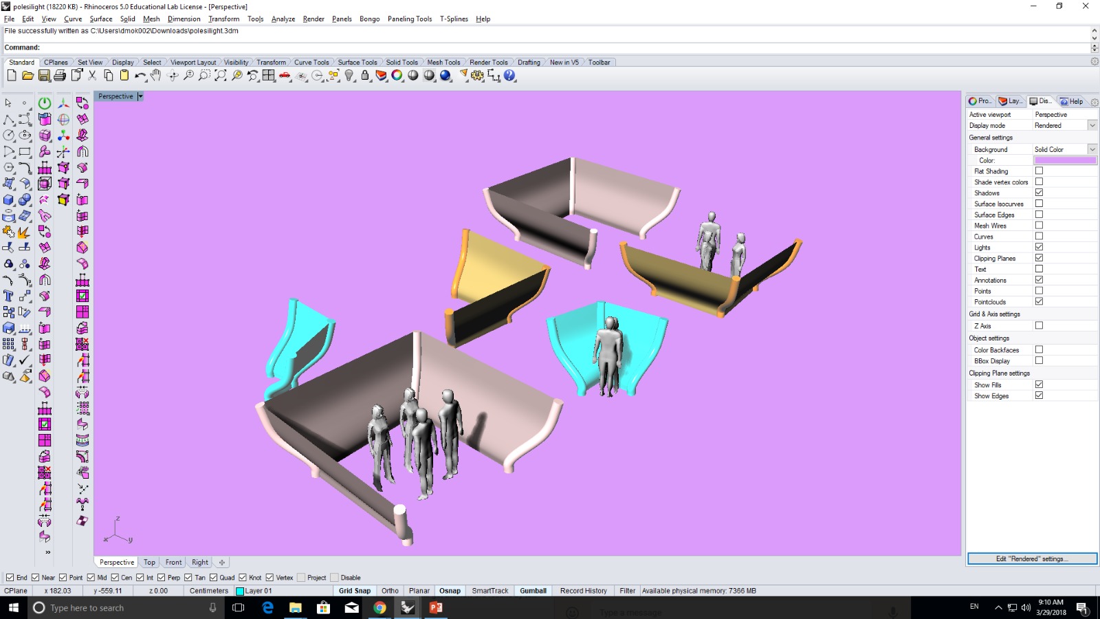
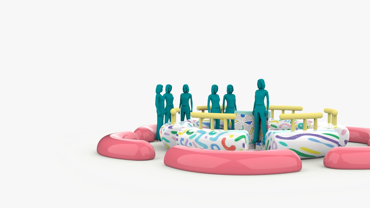
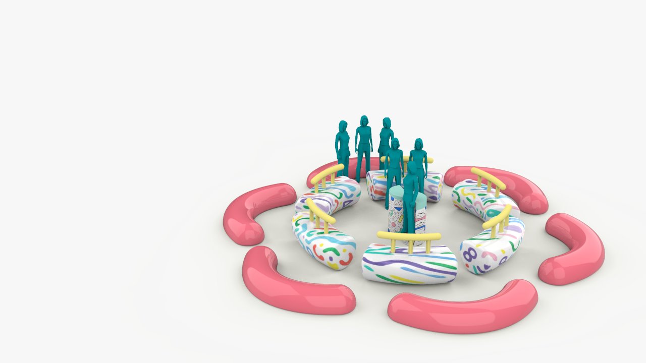
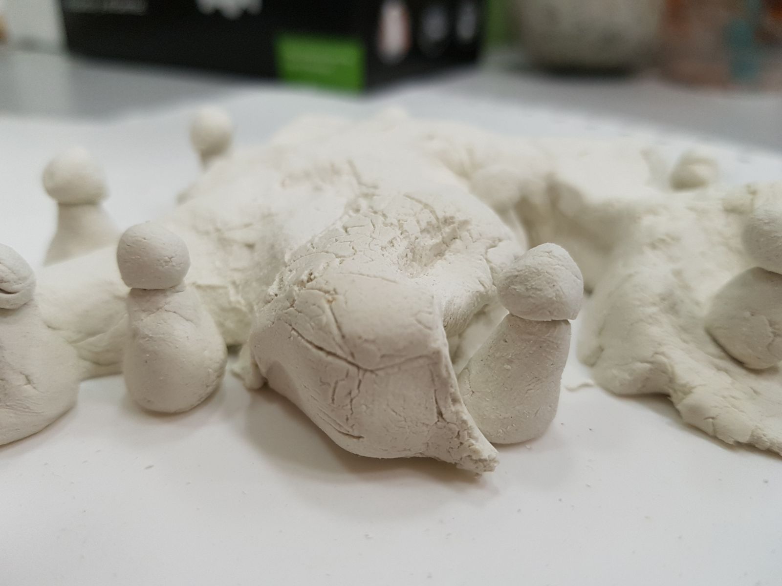
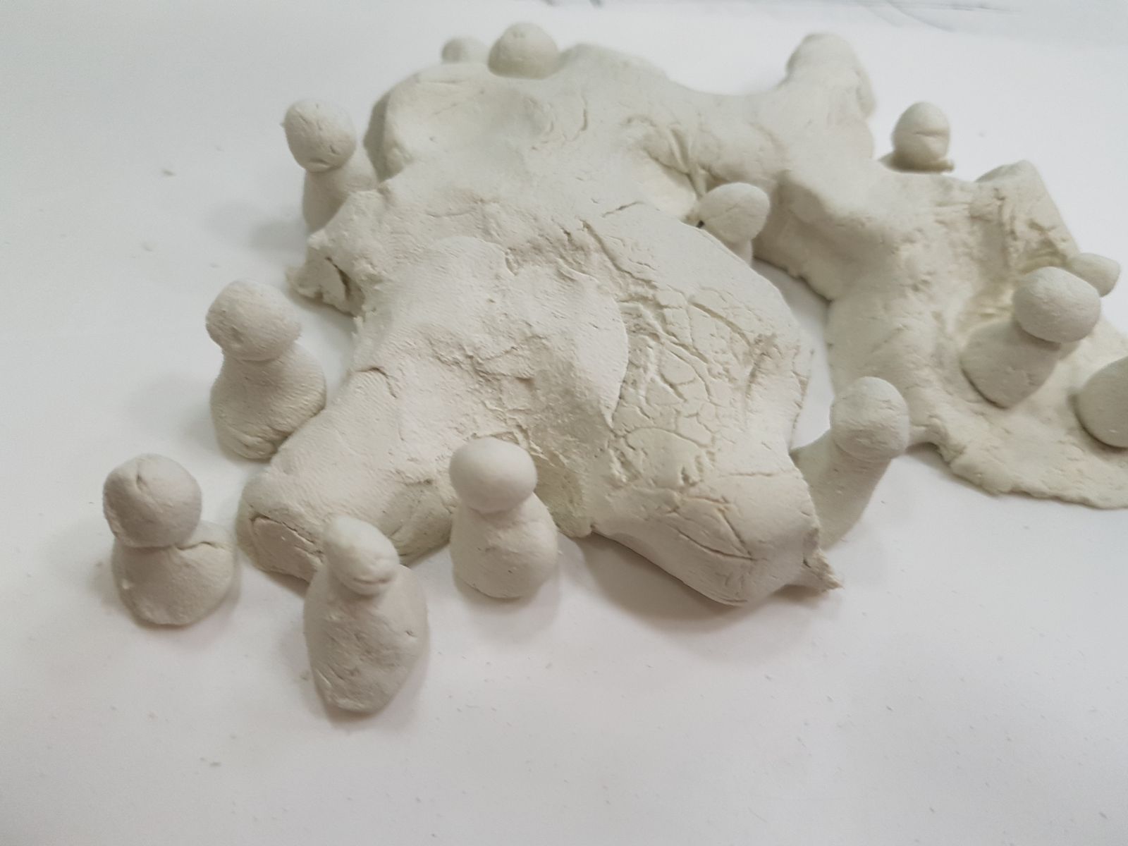
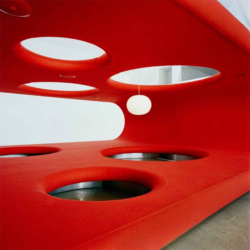
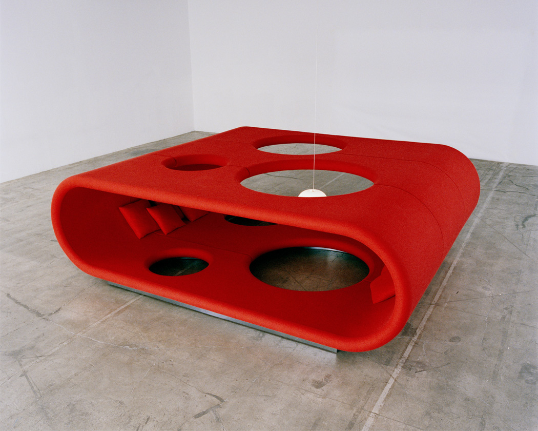
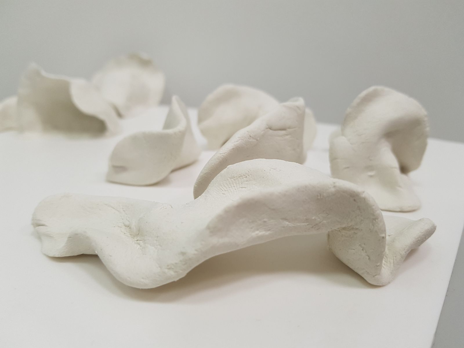
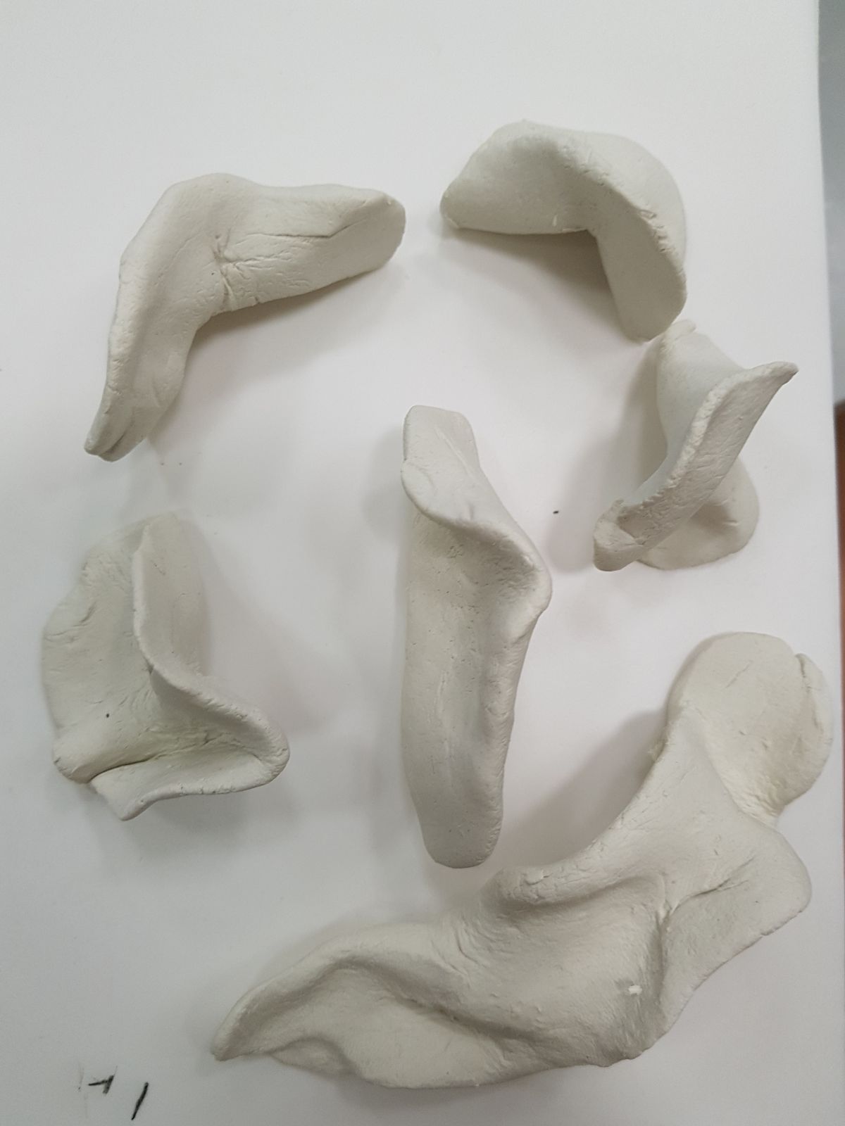
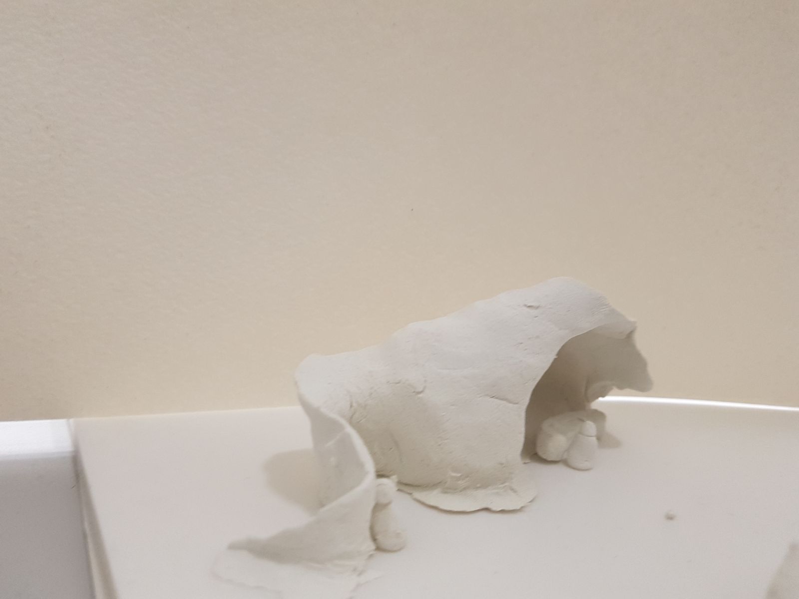
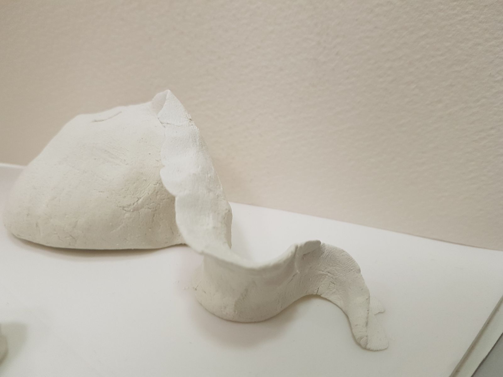
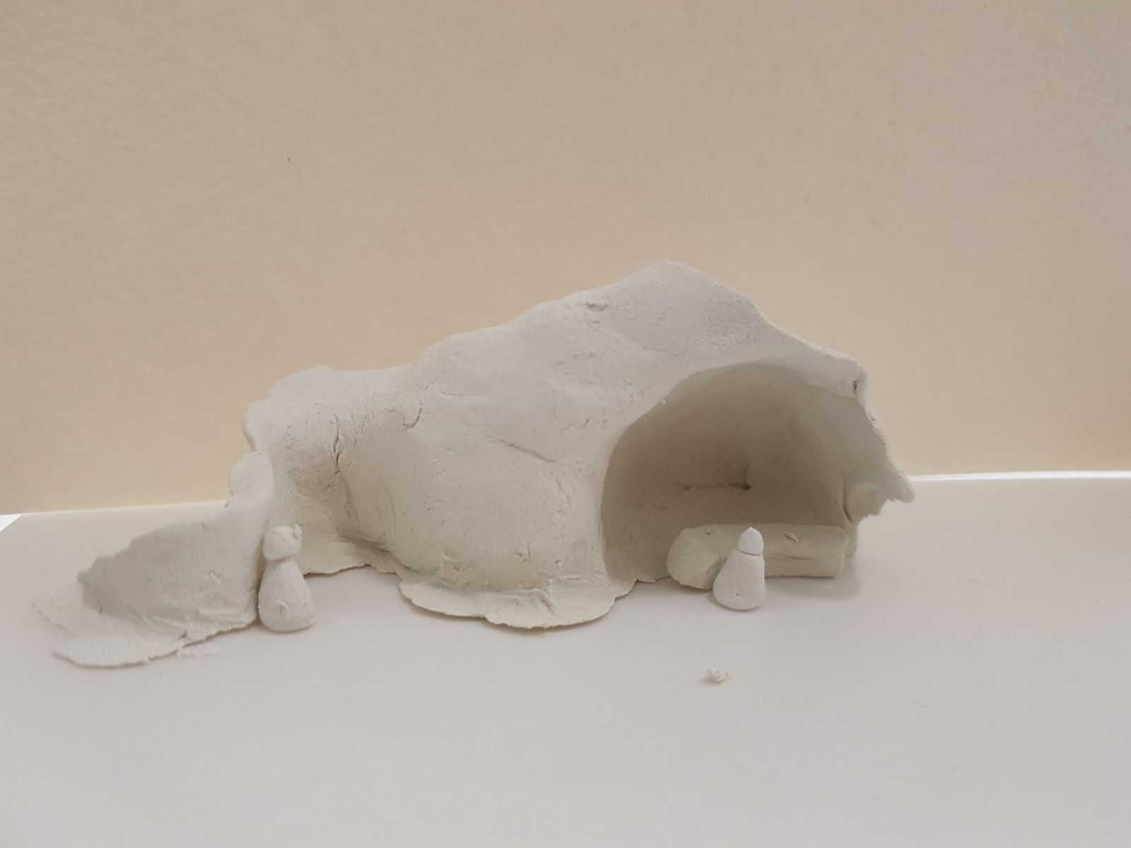
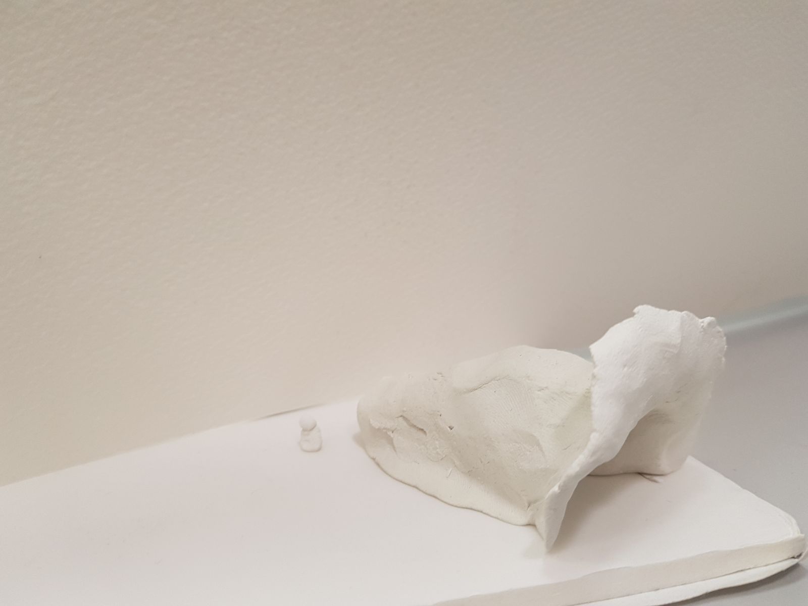
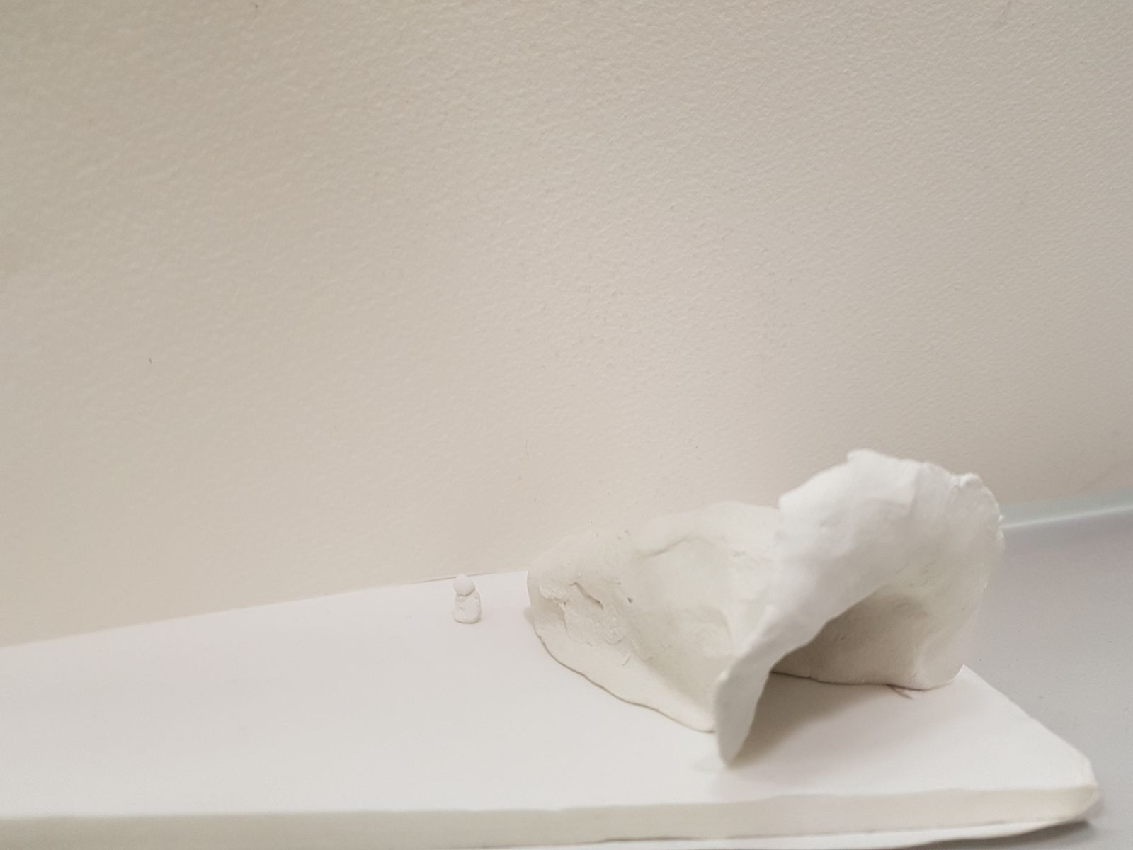
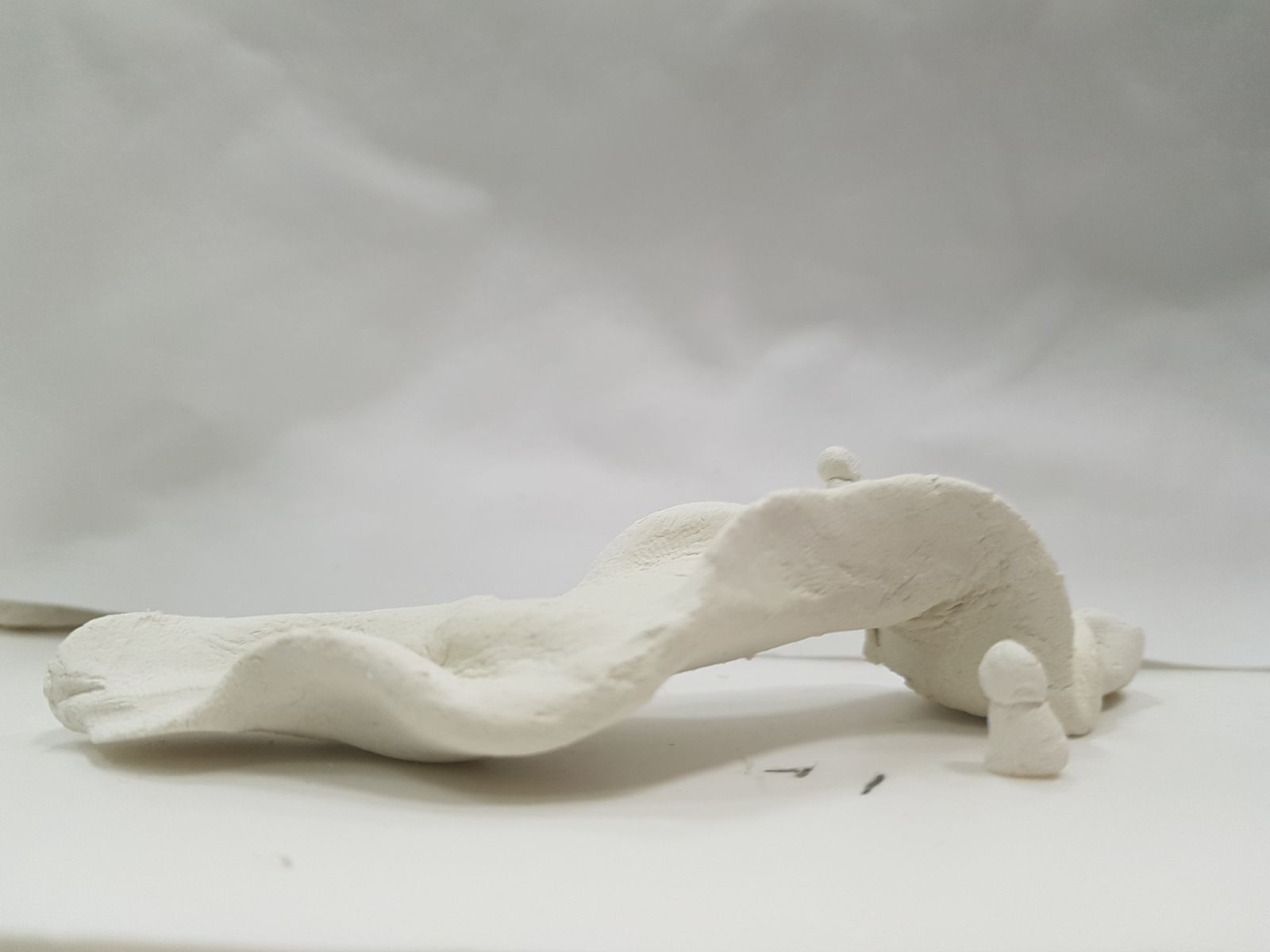
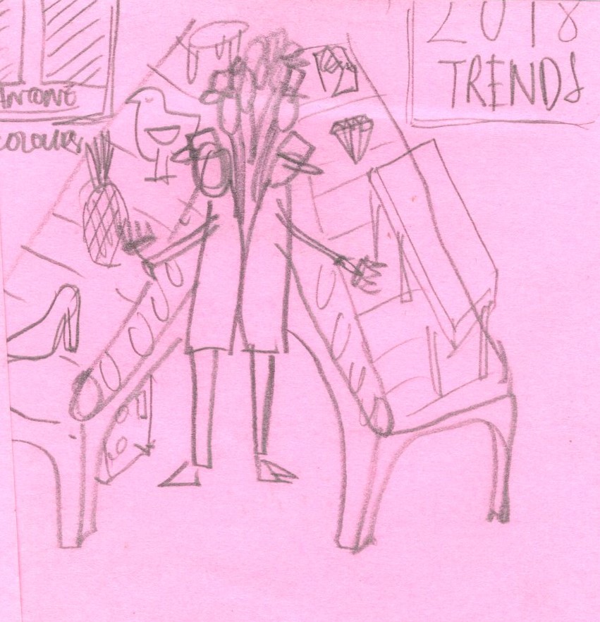
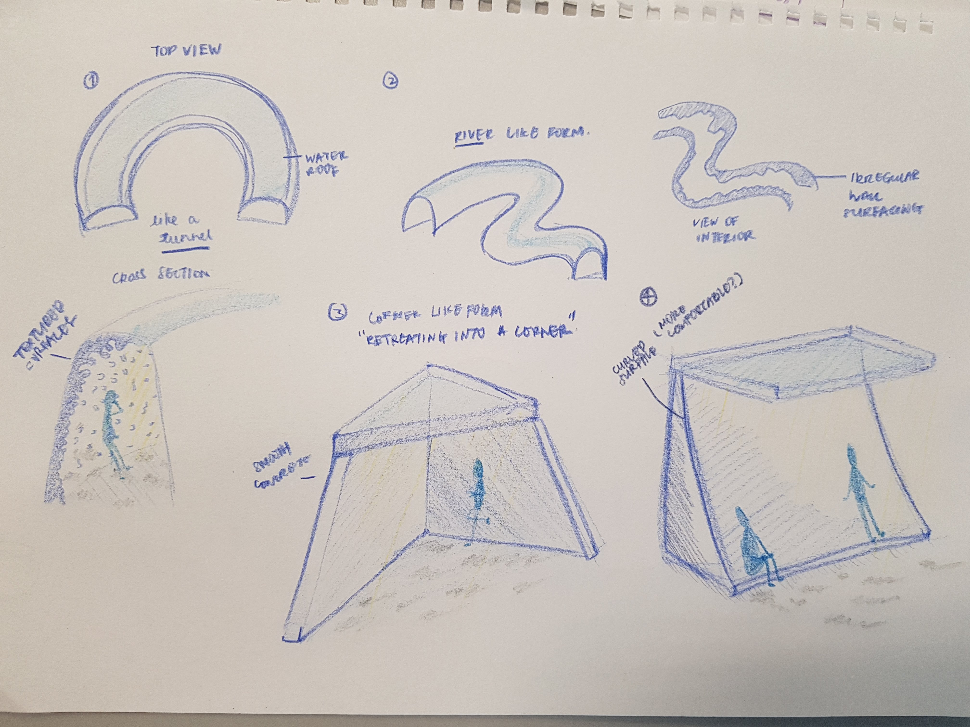
3. Trying to make an interpret the idea of shared spaces in our version of a “Superfurniture”
(V rough test!!!)
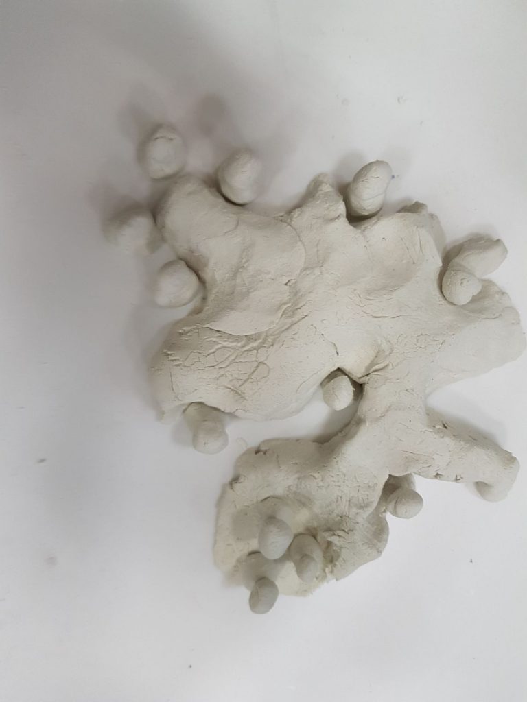
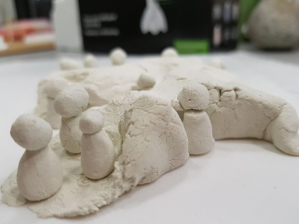
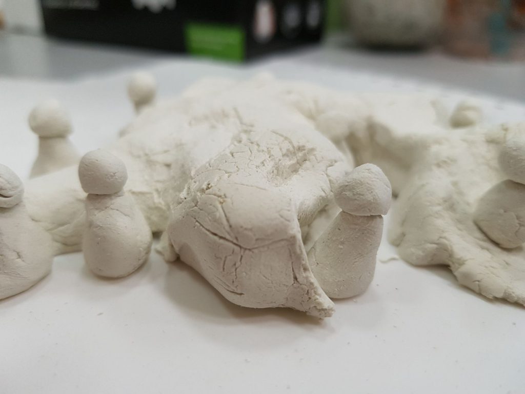
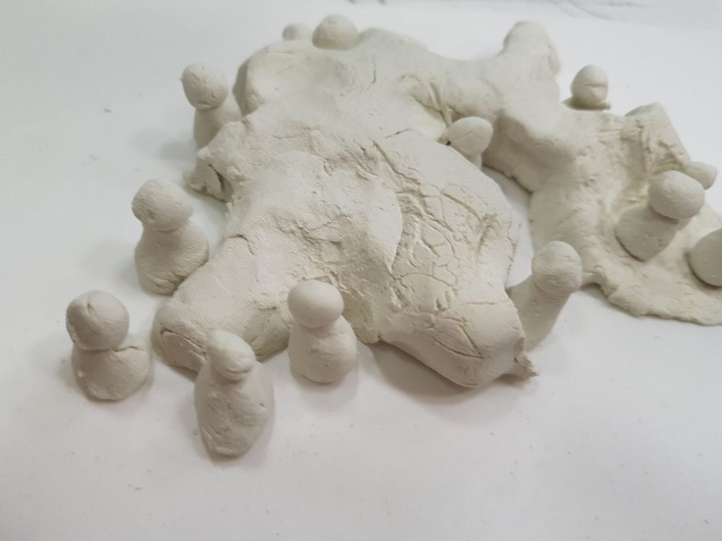
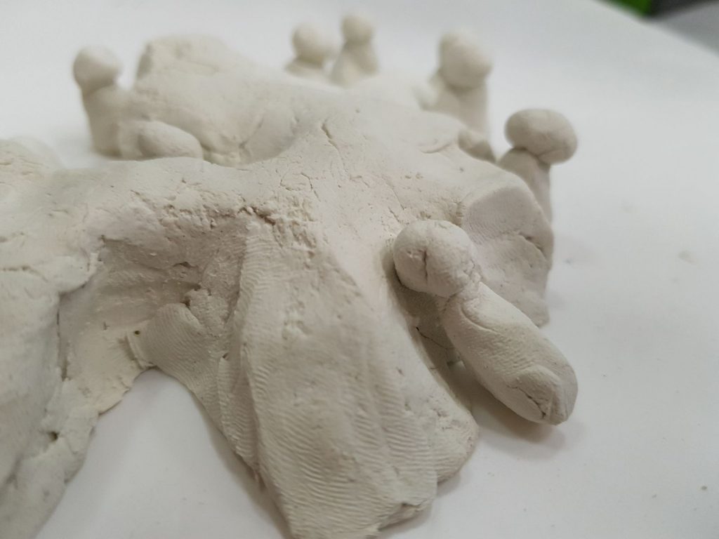
Trying to use the form of the furniture to inform users of how they can best share this space. The idea was to make a huge piece of furniture that can accommodate multiple users creating a vibrant hub, reducing awkwardness of sharing tight spaces.
Observation: We realized that it didn’t achieve our goal of maximizing space and realistically, this scale might not work out. Also taking into consideration the way Asians use shared spaces, this might not work out so well.
Conclusion
We felt that although it was good to be testing all these different outputs and strains of thoughts, we really need to recalibrate and looked through all the developments we’ve gone through and see which ones have the most potential with the given limitations.
Perhaps we have drifted a bit too far from our initial idea of creating spaces of serenity as we explored how we could include the proxemics matrix.
Week 8: Sound & Spaces
Direction: Using proxemics to create quiet enclaves within public spaces
What is proxemics?
Proxemics—”the study of the spatial requirements of humans and the effects of population density on behavior, communication, and social interaction” (Proxemics 2016)
It could be a linear division, just like the matrix above or it could be a carefully designed installation to provide multiple areas to experience the full spectrum of intimate space to public space (of course this would depend on the location).
It also can also be seen in public furniture eg: armrest on benches, a cup holder in cinemas, chairs with desk arms, indents on the mrt seats etc.
on personal spaces: http://www.nytimes.com/2006/11/16/fashion/16space.html
A study of how proxemics can be applied to public transport systems to improve the quality of how people commute.
Reference & Inspiration
1. Richard Serra
His sculptural pieces have a way of dominating places and separating spaces.
Particularly the last installation at Guggenheim Museum Bilbao, the way the form directs how people experience the space is something we hope to achieve with our installation as well.
2. Luna, Superfurniture by Claesson Koivisto Rune/
a.South Spine
b. Above Nanyang Auditorium
c. North Spine
Form exploration
Creating nooks and a pathway
Exploring a division of space, sheltered + unsheltered, for groups and individuals.
Sizes of entrances to direct crowds. Also a fully enclosed spaces would have louder acoustics or may be too claustrophobic?
A bridge like structure to divide space vertically
Thumbnail sketches + artist reference
Continuing from my previous post on my idea of an almost obsessive emphasis on keeping in trends, I’m using the metaphor of production lines and disproportionately sized arbitrary objects to bring my point across. The uniformly dressed workers are totally emotionless as they paint all these objects the same shade of paint to keep them on trend yet rendering them similar and ultimately giving consumers boring products that are one and the same. These are my thumbnail sketches:
1&2
L: Vertical lines, orderly, top view.
R: Horizontal lines, frontal view.
3&4
L: Deeper perspective, with an organic leading line. Extra bit of information from the trend board
R: Symmetrical side view with a pantone color board
5&6
L: Close up on facial expressions with a triangle composition. A little bit more chaotic
R: Faceless workers. almost pattern like. The repetition and distant view makes the image really cold, almost portraying an image of unethical employment.
7&8
L: Giant objects and tiny workers. Need to work on different compositions as well as being selective with the products featured.
R: Inspired by communist propaganda posters where the use of diagonal lines create dynamic movement. Not sure if this would work with my existing color palette/mood board.
9&10
L: A more central image with breathing space on each side. Also giving faces to these objects to attribute an almost human character to them?
R:Include stop button as well as shipping boxes to suggest that this obsession can be stopped as well as drawing a link to consumers
11&12
L: Giant objects being pumped out by machines; workers painting with both hands
R: U shaped production line, focused on the faces of the workers
13&14
L: A background of boxes
R: Machines to resemble a ticking time bomb? With newly minted objects all dumped at the end of the production line
15
A cleaner look with a plunger dynamite box like machine
Artist reference/ style reference:
1.Rami Niemi
Clean, bold outlines to keep the patterns and colors contained. I like how simple it is yet how a depth is created through the layering of objects.
2.Isometric illustration
Nuria Madrid
This 3d style is the opposite of the first artist reference. Not sure which direction would be more suitable but I am keen to explore either for this project.
Week 7: Sound and spaces
Sketches from last week’s presentation.
Moving forward, we decided that we will drop the water feature as it wouldn’t be something feasible in terms of maintainence.
This week we focused on:
- Looking for suitable materials that can absorb sound to some degree and would create the feeling of meditative silence we hope to achieve.
- Exploring a different method of recreating the shadows produced by sunlight reflected on water.
- Creating new forms that creates an abode/alcove/nook
Material exploration
- Bamboo rattan
Good sound absorption qualities
(Adjusting the thickness and density of the weave we can control the sound that gets through)
Cooling properties
‘Zen’ feel
Allows light and air through
Sustainable building material - Coconut husks
Thermal insulation properties
Sustainable material
Natural fibers have been considered valid raw materials for producing sound absorbing panels at a reduced cost - Wool
- Sound absorption foam
- Kavrat soft cells
Sound absorbing textile
Special technology used to strengthen and increase longevity
Shadow experiments
1. First we tried video projections of water into the space
This was done to see how light would be reflected and how the shadows would be cast in space.
Form Explorations
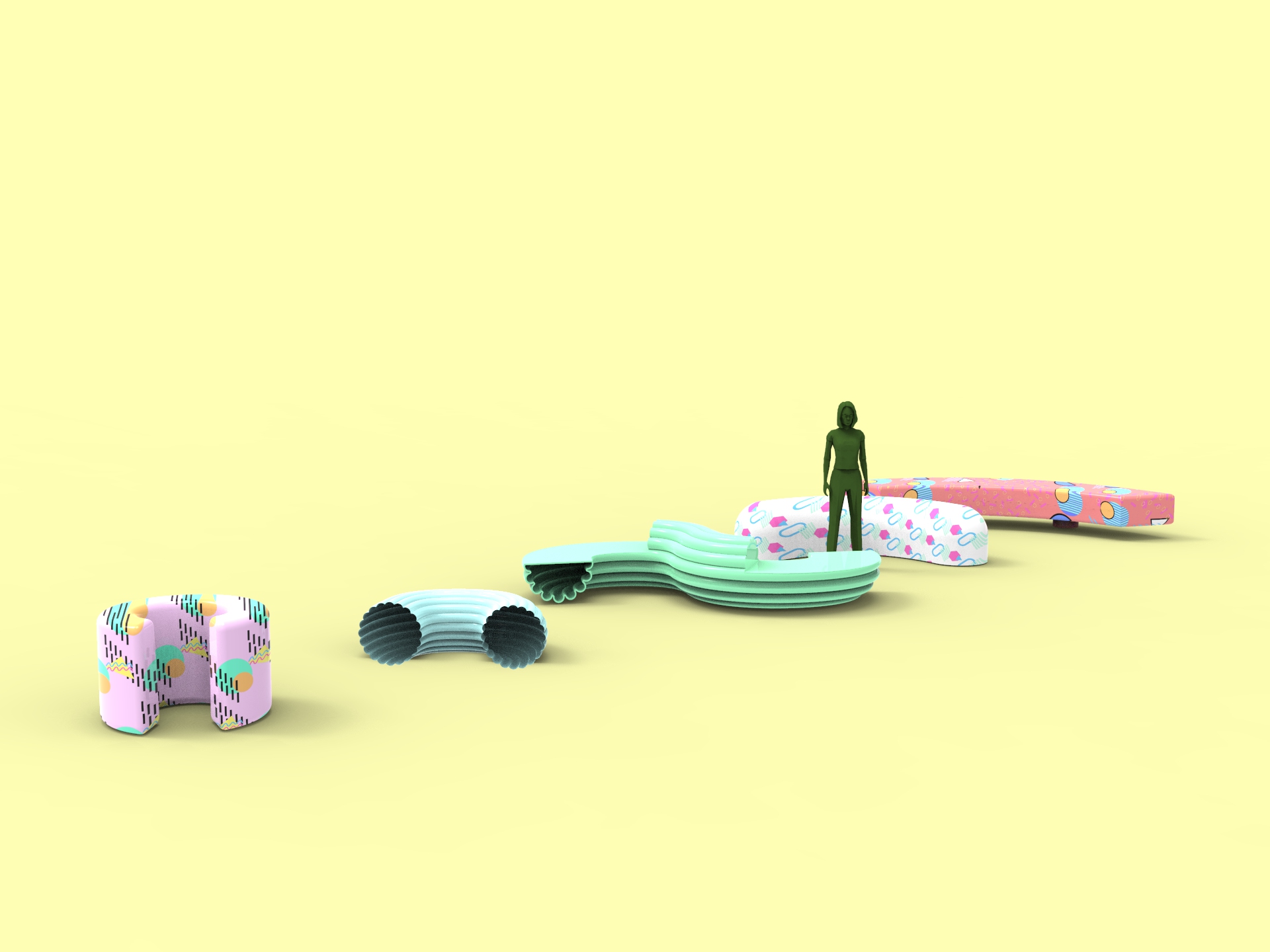
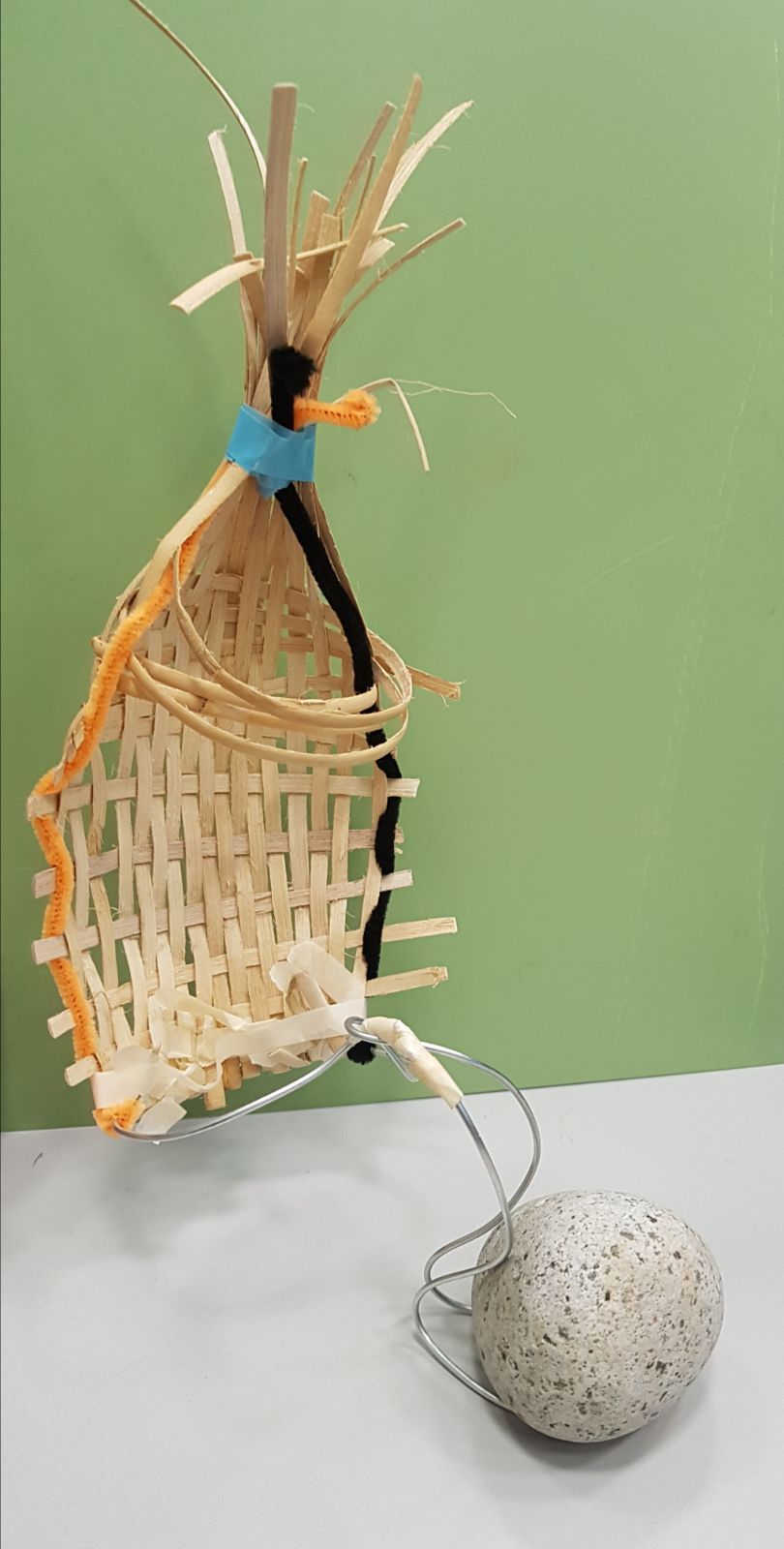
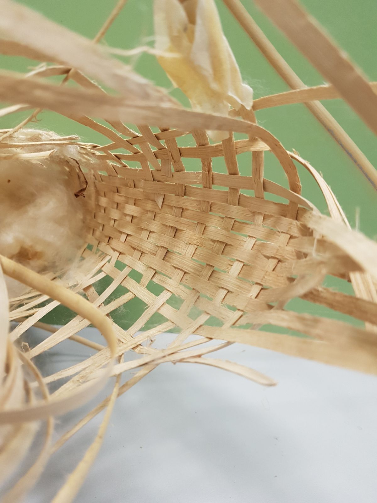
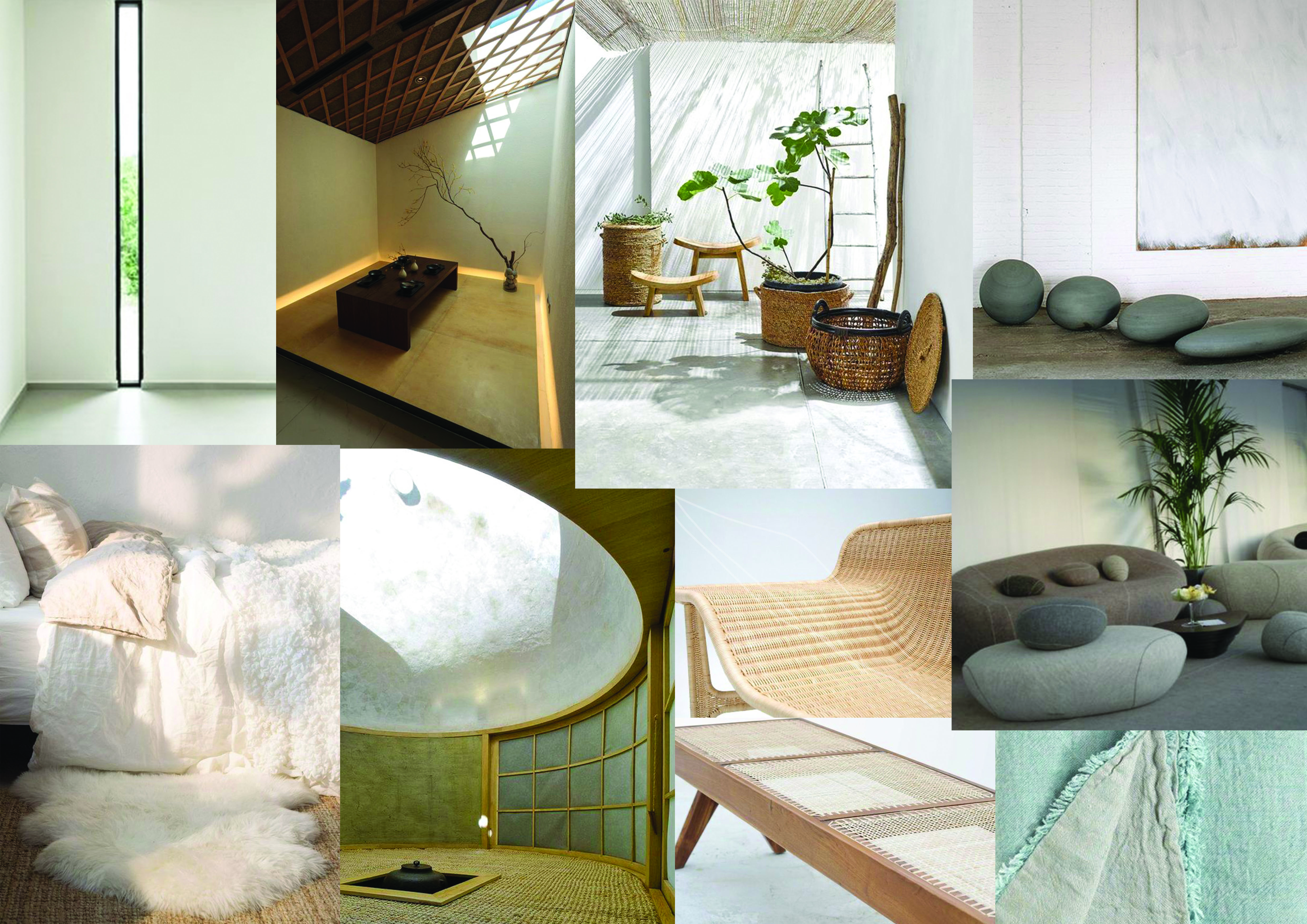
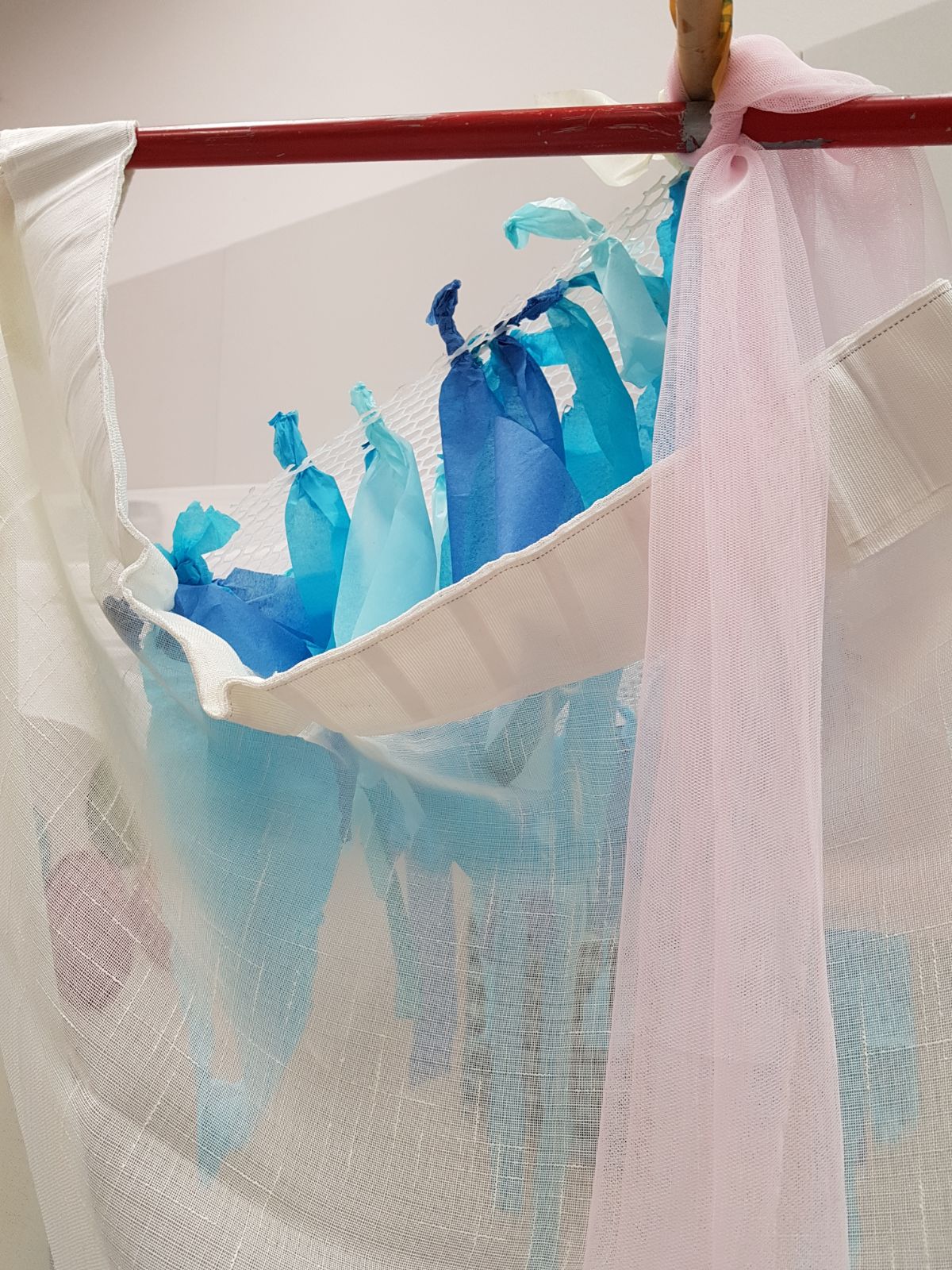
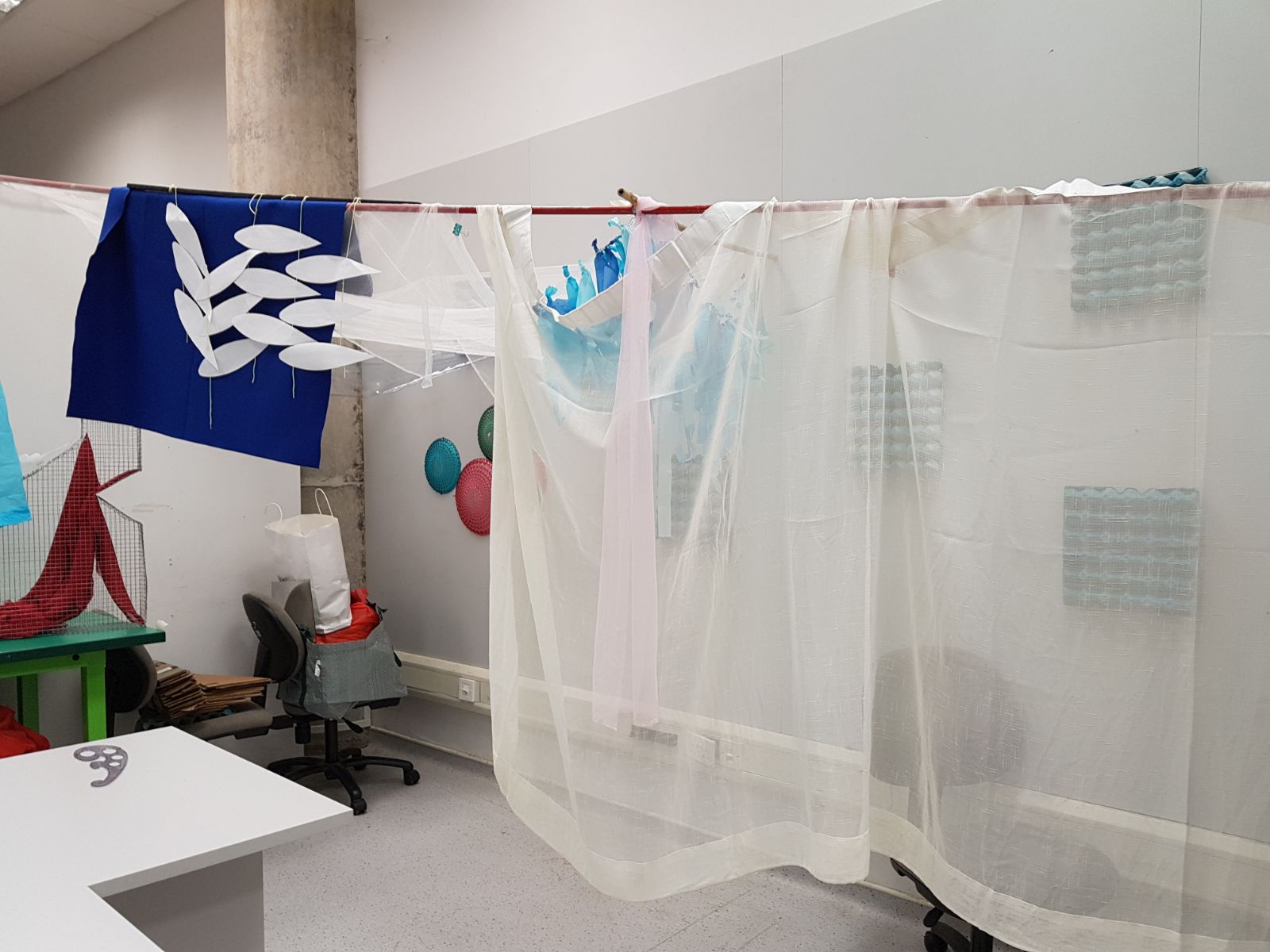
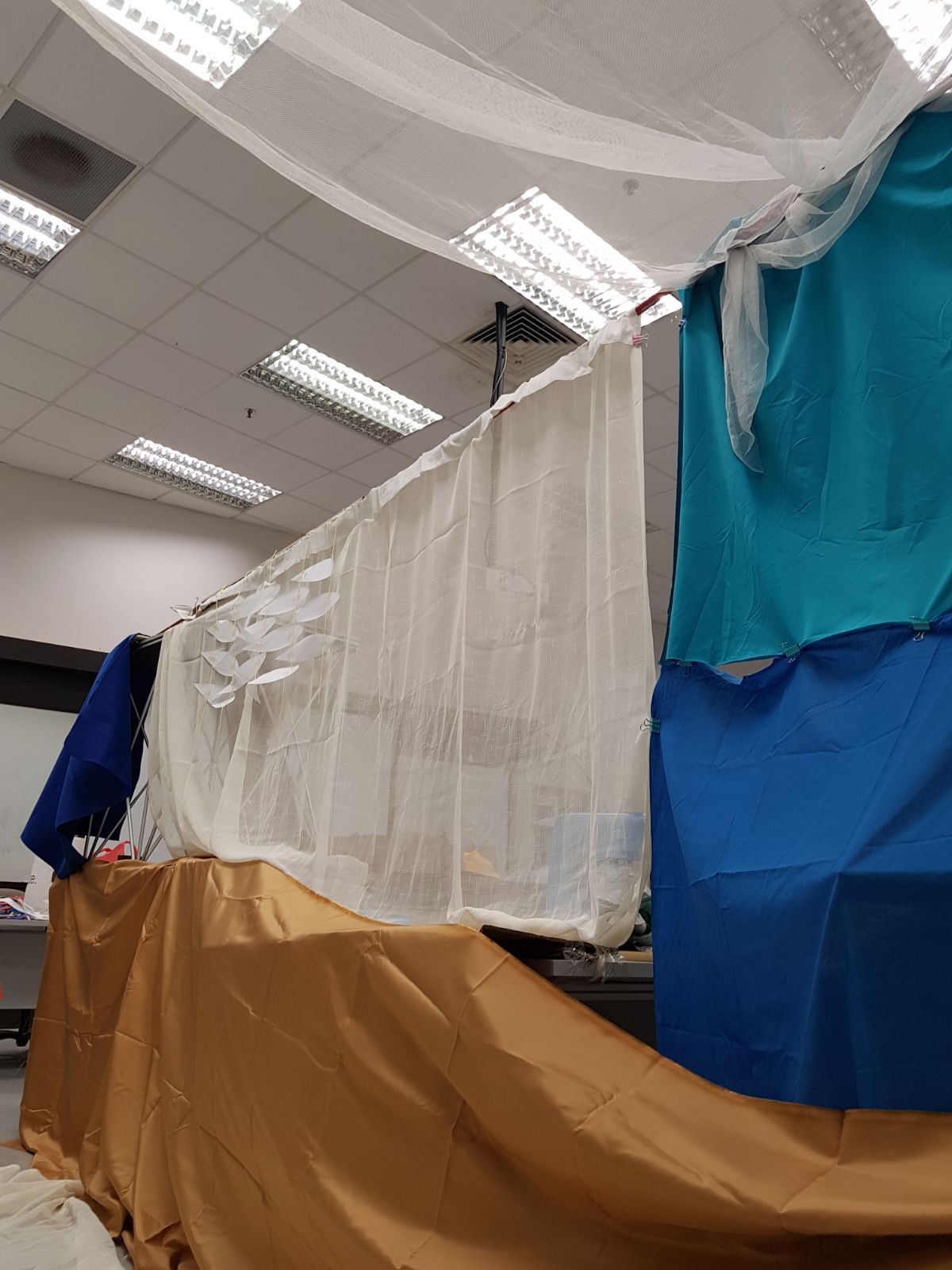
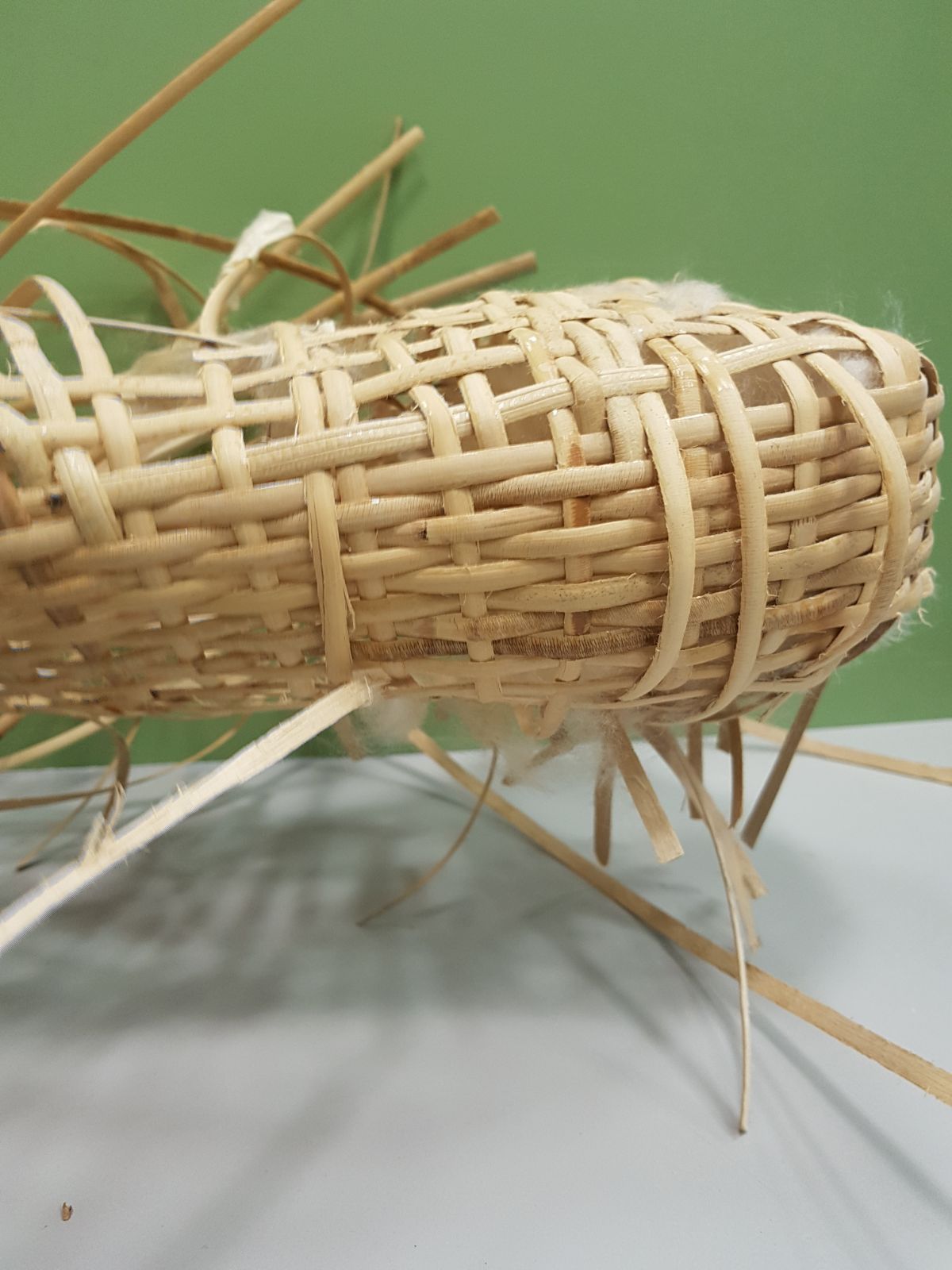
softness of cotton with rattan
Currently we are exploring three options to replace the water feature
-To build it around an existing water body
-To use projections
-To use shadows from the exterior facade
Q: How to make it look unobtrusive in the environment
^ our current consideration for form and material selection
Wk 6: Sound & Spaces
From last week
Questions
What is it?
It is a space for quite respite. The form is a cave-like structure with a water feature ceiling allowing dappled shadows to dance within the interior surface.
Where?
a. Opposite School of Physical and Mathematical Sciences
Can you include nature in it?
Yes! With the use of the water feature it would bring about the sense of serenity that comes from a gentle breeze
Comments:
-Research on materials that reduces noise
-Forms that encourage resting positions
-How can we maintain the water feature?
-How do we create a meditative pathway
-Solidify form
Concept: The internal noise we hear in our heads are relentless, especially in a buzzing environment such as NTU. We wanted to create a place of quiet reflection that can be a place to withdraw to for a moment of silence.
Elements to build the environment
Water-shadow feature
- Mood/color
3 moods revolving around the water/shadow featurea. Whimsical oceanscapeMaterial consideration:
-Foamb. Japanese zen
-Mirrors
-Rattan, linen, concrete, light wood (Pine?)
-Raw - Surfaces/furniture that encourages rest/meditation
Nua Stools by Ng Siang Joo
Nest by Keith Soh
eg: furnitures that incite certain posturesSketches & mockups
Mockup (I)
Thinking with our hands
Exploring spaces, forms and textures from our first moodboard (A)
Reflection: After looking at our first mock-up, we made a few observations. Mainly the elements were too disparate and were not in harmony with one another, we then decided to move forward by grouping them in different areas to create areas of attractions.
Mockup (II)
We wanted to group the different elements into specific focus groups and then to see how did it actually make us feel.
1.Translucent linen cloths with decorations hung around it.
We tested different shades of blues and different colors to see which is the most inviting and what seemed jarring.
The dark deep shade of navy blue felt too overwhelming as
The presence of light blues also should not be the main focus, but only as a secondary element to the main white colour.
2. Plastic plates to represent a tactile surface that mimics corals,
The tactile surfaces seemed interesting as well as the transparent quality of the surfaces. Light as well as touch would be and interesting blend to the form, combining both mood lighting as well as a soft tactile array of such forms.
3. Using the draping of the mesh fabric, we tried to recreate a dappling light adding softness to the space, this is combined with plastics sheets to see if the effect it might bring.
4. Plastic mesh and paper strips to create interactive flowing surfaces and object. This felt more like an anchor to the space as it stood out more as compared to the rest of the zones.
More “main attraction” like as compared to the other features.
5.
6. Egg cartons to represent sound foam boards that can be arranged to form the inner cladding on the walls. Playing with the gradation of the color that was used also to provide a certain amount of visual effect.
7. Protruding surfaces and uneven surfaces on the sides of the wall and ground for interaction, at different heights to sit as well.
8. Different tactile surfaces as you enter the tunnel area
Editorial illustration research
Varoom Magazine
I believe this magazine is suitable for illustrators, designers or just people who are interested in design/illustration. The articles cover quite a wide range of topics and issues and are personal and interesting.
Mitch Blunt
http://www.mitchblunt.com/
This digital illustration was done for an article on corruption in the church for Spectator Life. I found the illustrator’s use of symbols and semiotics very effective in expressing the message, as well as the use of simple geometric shapes and even outlines. It lends a certain seriousness and austerity to the image. The colors also helped to provide a stark contrast on what is going on inside the church.
The puppetry strings implies a certain manipulation of the cross which is often used to represent Christ. The stained glass background also sets the location where the situation unfolds. I found it a good method to frame the message as well.
Tommy Parker
This set of digital illustrations were done for an article on how to switch off on a vacation for Mr Porter. I really like the limited color scheme that ties the series of images together very nicely. I also liked the use of shadows to add depth, dimension and light into the images. However this were done for a digital article rather than for print. I’ll be interesting to see how these images would be used in a printed magazine.
Geraldine Sy
http://www.goodillustration.com/portfolio/Geraldine-Sy-196/
These two illustrations were done for very separate articles on love and solo travelling respectively. I liked how the illustrations spilled over across the spread, connecting the text. I also appreciate the simple geometric shapes that creates the landscape and characters for the storytelling to take place. The textured finish also gives its a nice rustic charm.