
Research
Art Movements:
- Dada/Dadaism – Questions the society, role of an artist, and the purpose of art
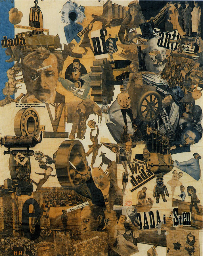
Hannah Höch (1889-1978)
- A German photomontage artist active during the Dada movement.
- Combined unrelated images to form startling or insightful connections.
- Challenged the status of women in the social world of her times.
Famous works:


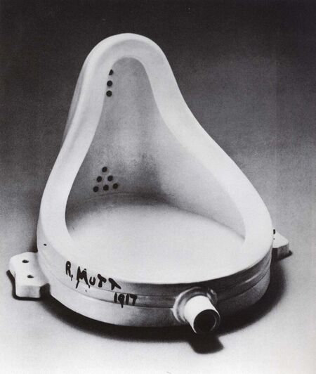
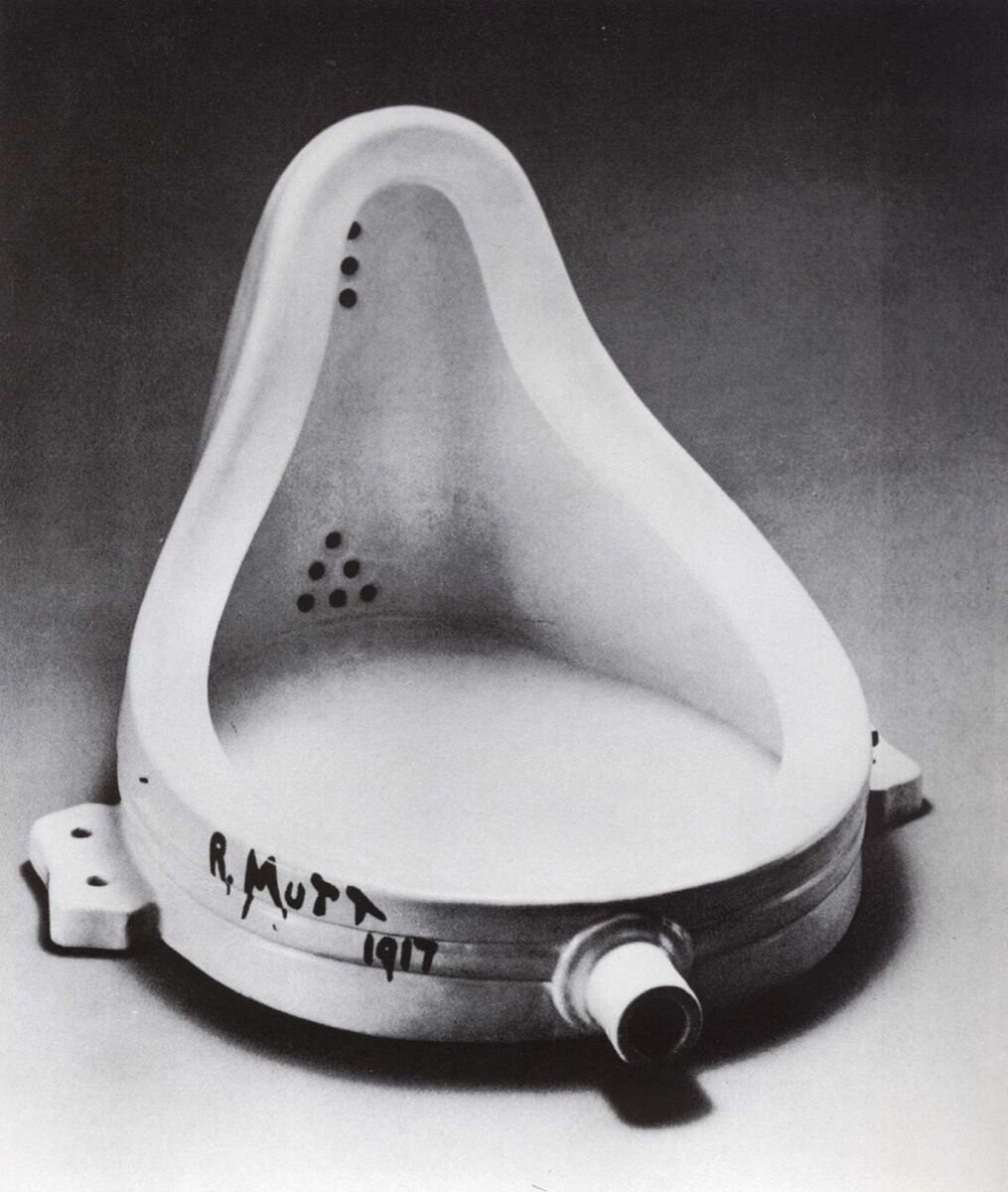
- A French painter and sculptor who refused to follow a conventional artistic path
- “readymades” – turning everyday objects into art
- Also associated with Cubism, Surrealism and Conceptual Art
Famous Works:


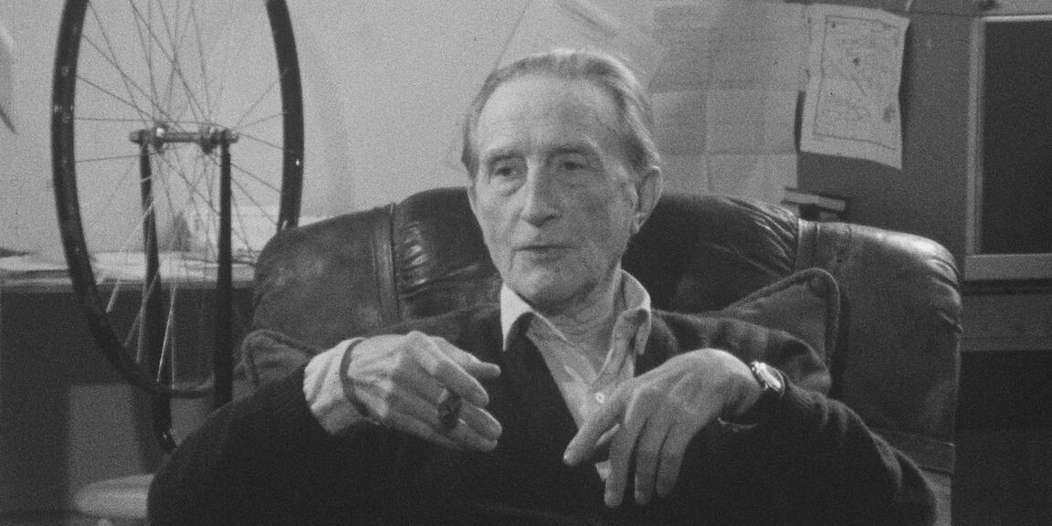
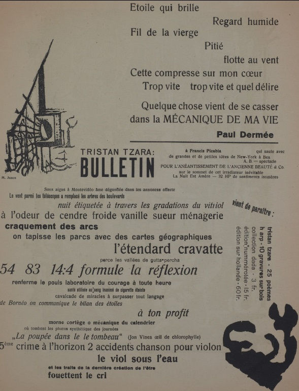
Tristan Tzara (1896-1963)

- Considered the founder of Dada
- Organised performances to shock audiences as a way to spread anti-art
- “cut-ups” – recomposing images and text that were cut, forming an artwork of chance and juxtaposition
Famous Works:

2. Russian Constructivism – Abstract, modern and minimal. Geometric, experimental and rarely emotional. Focuses more on the material and form.
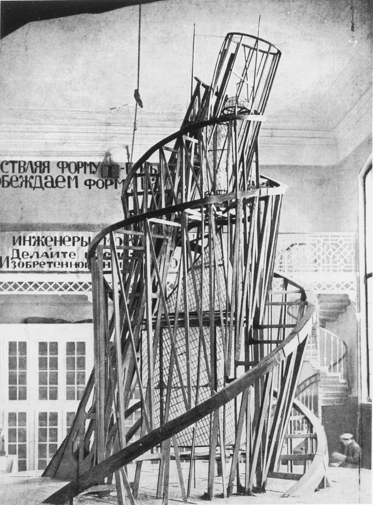
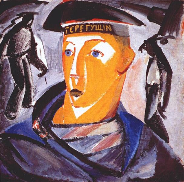
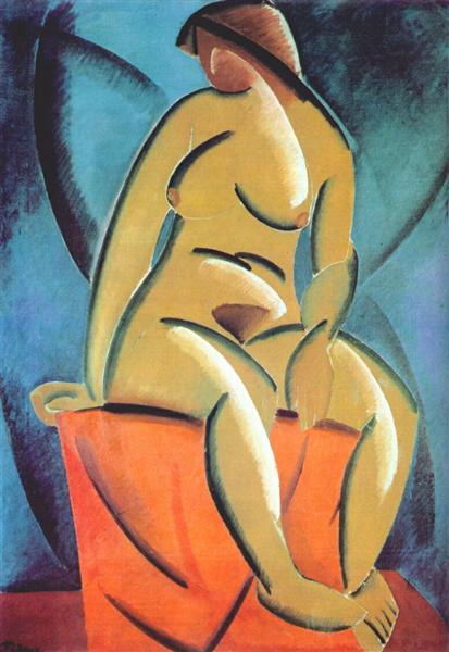
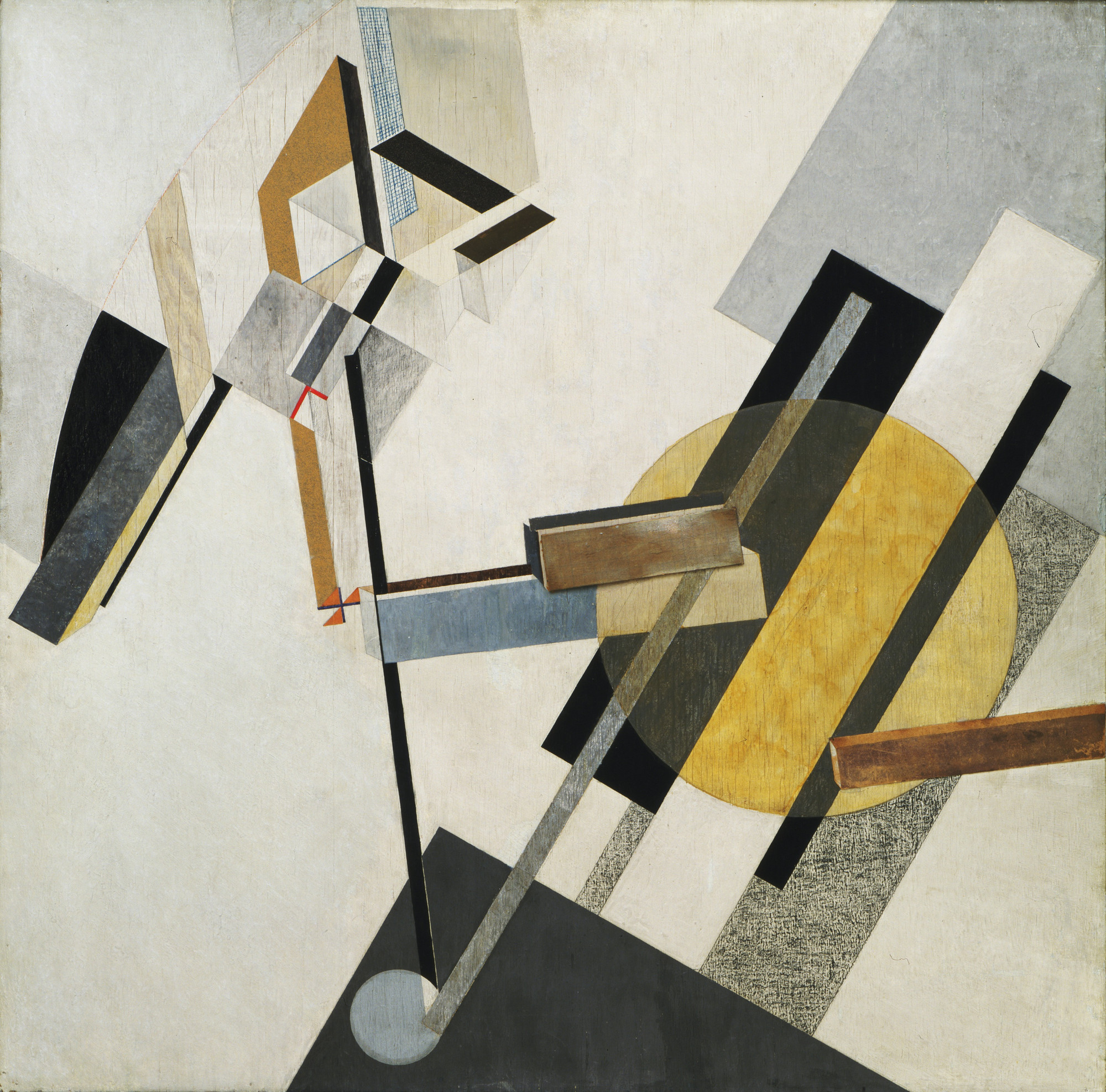
Vladimir Tatlin (1885-1953)

- Wanted to bend art into one that had practical uses
- Focused on technology and the machine
- Likes to include curves in his works.
Famous Works:
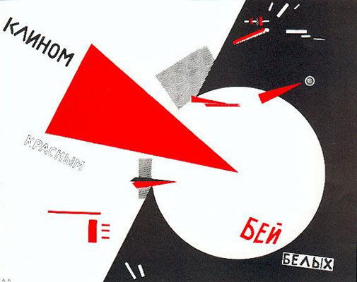
El Lissitzky (1890-1941)

- Made works with strong political statements
- Used basic colours and shapes
- Influenced the De Stijl and Bauhaus movements
Famous Works:
References:
https://www.theartstory.org/movement-dada.htm
https://www.theartstory.org/artist-hoch-hannah.htm
https://www.theartstory.org/artist-duchamp-marcel.htm
https://www.widewalls.ch/dada-collage-readymade/
https://www.theartstory.org/artist-tzara-tristan.htm
https://www.dadart.com/dadaism/dada/037-Tzara.html
http://www.arthistoryarchive.com/arthistory/constructivism/
https://www.theartstory.org/movement-constructivism.htm
https://www.theartstory.org/artist-tatlin-vladimir.htm
https://www.theartstory.org/artist-lissitzky-el.htm
Images:
https://www.stmuhistorymedia.org/wp-content/uploads/2017/05/Hannah-Hoch-Self-portrait-in-Mirrors-1931-Image-via-artblastcom-770×466.jpg
https://www.ft.com/__origami/service/image/v2/images/raw/http%3A%2F%2Fcom.ft.imagepublish.prod.s3.amazonaws.com%2F4a57d4e4-81de-11e3-87d5-00144feab7de?source=next&fit=scale-down&width=700
https://www.berlinischegalerie.de/fileadmin/_processed_/csm_hoechst_f24c48aa5e.jpg
https://upload.wikimedia.org/wikipedia/en/6/6b/Hoch-Cut_With_the_Kitchen_Knife.jpg
https://d3i6li5p17fo2k.cloudfront.net/en/rimage/pivot_half_1152/image/4414/f6a3171449b93d7524d3a110a43c031a
https://d7hftxdivxxvm.cloudfront.net/?resize_to=width&src=https%3A%2F%2Fartsy-media-uploads.s3.amazonaws.com%2Fi-8Le397-h2ZTgLM1iMegw%252FMarcel_Duchamp.jpg&width=1200&quality=80
https://upload.wikimedia.org/wikipedia/en/thumb/7/74/Marcel_Duchamp%2C_1919%2C_L.H.O.O.Q.jpg/620px-Marcel_Duchamp%2C_1919%2C_L.H.O.O.Q.jpg
https://cdn.mdr.de/kultur/tristan-tzara-102-resimage_v-variantBig24x9_w-1024.jpg?version=13828
https://www.theartstory.org/images20/works/tzara_tristan_2.jpg?1
https://www.dadart.com/dada-media/Dada-no-7.jpg
https://bestarts.org/ba/wp-content/uploads/2015/01/Vladimir-Tatlin-top.jpg
https://www.moma.org/interactives/exhibitions/2012/inventingabstraction/?work=226
https://uploads7.wikiart.org/images/vladimir-tatlin/the-sailor-self-portrait-1912.jpg!Large.jpg
https://uploads6.wikiart.org/images/vladimir-tatlin/model-1913.jpg!Large.jpg
https://bestarts.org/ba/wp-content/uploads/2015/01/El-Lissitzky-top.jpg
https://www.theartstory.org/images20/works/lissitzky_el_2.jpg?2
http://www.moma.org/media/W1siZiIsIjE1MTA3NSJdLFsicCIsImNvbnZlcnQiLCItcmVzaXplIDIwMDB4MjAwMFx1MDAzZSJdXQ.jpg?sha=3e9f0871a4490ad4
http://deliver.odai.yale.edu/content/id/cd31e5b7-c029-41ef-adb5-1c4f7ca50666/format/2
Process
When I first started thinking of ideas/jobs for this project, my four jobs were quite normal and all circus themed (juggler, bubble artist, clown and popcorn seller). I was told to make the jobs more interesting by adding random words/elements to it so it became: egg juggler, bubble artist in a cactus farm and funeral clown (I hadn’t thought of the 4th one yet). I first tried making the elements and objects of each job look like the letters and sketched them out on paper.
Egg juggler: egg, juggling
Bubble artist in a cactus farm: bubble wand, bubble, cactus
Clown: colourful/red afro, red nose, balloons
Popcorn seller: uniform, red and white stripes, popcorn
Juggler: balls, juggling
Bubble artist: bubble, bubble wand
Clown: balloons
Juggler: Juggling

I was told that that wasn’t what I was supposed to do and I should incorporate the elements into the letter itself with bending them. I thought the bubble artist in a cactus farm would be the easiest so I tried it out first.
1 Bubble artist in a cactus farm -> Bubble in a cactus farm
Elements: Bubble + green, spikes
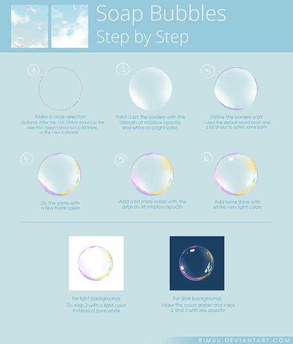
Using the elements of a bubble and cactus, I came up with 2 designs using the font called rns baruta as the font is fat and round, which is similar to that of a bubble. I realised that I couldn’t show the bubble artist part so I ended up changing the job to a bubble in a cactus farm.


I didn’t know which design was better so I tried both again digitally to compare (just the letter ‘o’). I followed a tutorial on pinterest to draw the bubble.


I liked the look of the bubble on the left more but it looks more like a cactus in a bubble farm instead. I was also told that the one on the right looks more interesting so I decided to go with that design.
To do the final design, I first brought the image of the font to illustrator to image trace it. Then I opened the vector in krita and drew the green bubbles within the font area by selecting it. I added the spikes after I was done with all the bubbles.

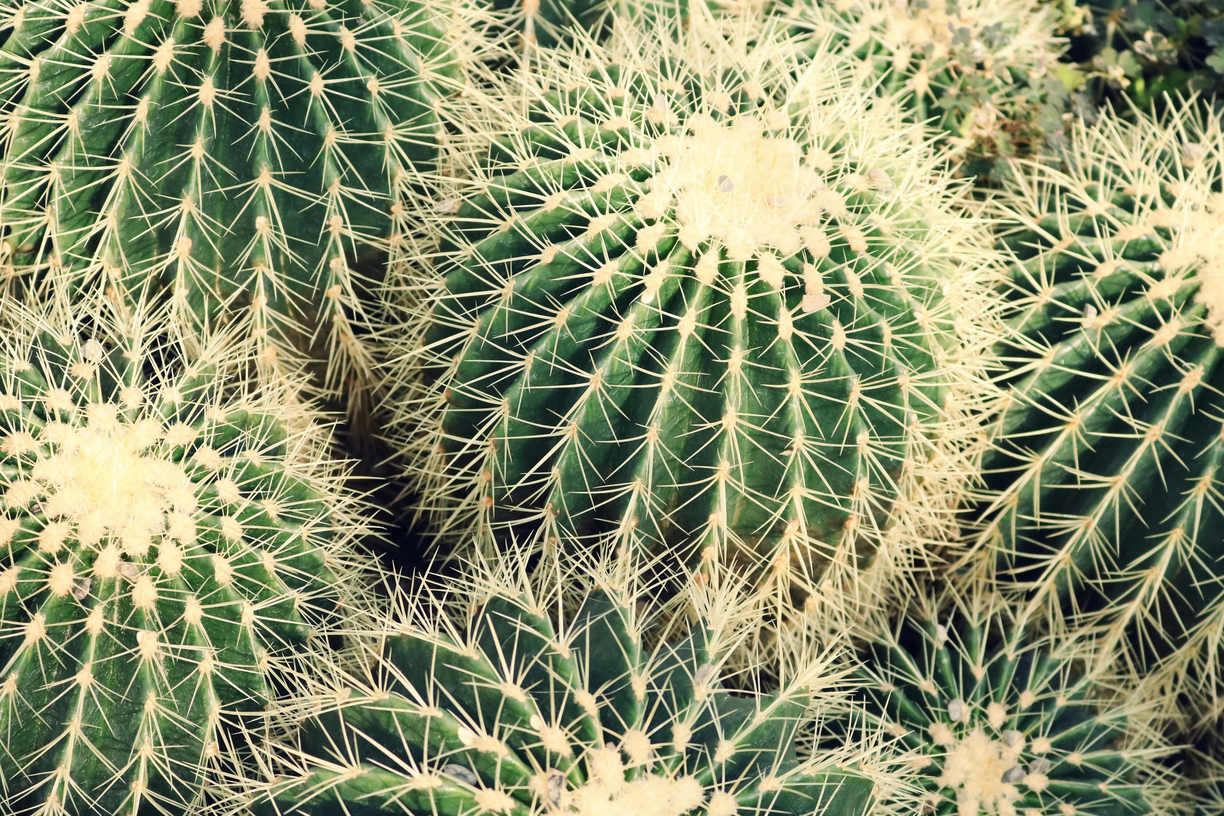
As cacti are usually found in the desert, I decided to use a picture of the desert for the background. I also tried to vary the positions of the letters as bubbles don’t usually stay in a straight line. After looking at pictures of cacti, I realised that the spikes weren’t dark green so I changed them to a lighter colour that is similar to those of the actual cactus spikes.


2 Funeral Clown
Elements: Casket/coffin + colourful afro & polka dots
For the design of the funeral clown, I used the fat face font as it looks more formal and rigid, which is a font suitable for funerals.


I didn’t really like the colours in my sketch so I did it digitally and experimented with the colours. I referenced the colours of an actual coffin for my design. I also made the borders of the letters slightly darker to give the coffin a bit of depth.


I felt like the one with red polka dots looks quite plain and the polka dots don’t seem to pop out like the colourful ones so I ended up picking the colourful ones instead. For the background, I wanted to use a white cloth/curtain to make it look like a wake but I couldn’t find a good picture of it and I also couldn’t draw it so I ended up using a photo of candles which could also represent the solemn occasion.

3 Bankrupt Gambler
Elements: Poker cards + torn money(?)
Since this was supposed to be a gambler, I decided to use a poker card character font for it. I started off with adding different gambling elements to my design and using empty pockets to represent bankruptcy but it didn’t seem to express bankrupt gambler well and it was also very messy.


I was told to choose only one element to represent gambler so I decided on the poker cards. I drew the outline of each poker card and pasted images of poker cards on the outlines one by one and trimmed away the parts that were overlapping. I added stitches to the money attached to the poker cards to represent money being torn and also like the patched up clothes of poor/homeless people. I added a reddish/pinkish background as I felt that it represents someone in the red (bankruptcy).


In the end, I felt that the bankruptcy part wasn’t very obvious, so I included a broken piggy bank in the background.

4 Misfortune Cookie
Elements: Skull + Slip of paper, cookie
For this design, I used a font called djb hunky chunky. It is fat and has a slightly irregular shape so I felt like it looks like a cookie. I wanted to use another font at first so the font used for the sketch is different. I wanted to write bad fortunes on the slips of paper but I was told it would be better to use symbols.


I referenced a illustration of a fortune cookie for my design. I used the colours of the fortune cookie for my drawing and tried to make it look hollow. Then, I added the textures, cracks and the slip of paper for each of the letter. I also added skulls on the papers to represent the misfortune.


Fortune cookies usually come in packets but I wanted to show them placed on a plate, in a random order. The picture I chose was of a broken plate as I thought the broken plate is also a sign of misfortune.

Fonts + Images:
https://fonts2u.com/rns-baruta-black.font?ptext=HOW&size=4https://www.deviantart.com/rimuu/art/Soap-Bubbles-Steps-674625970
https://images.pexels.com/photos/1054016/pexels-photo-1054016.jpeg?cs=srgb&dl=botanical-cacti-cactus-1054016.jpg&fm=jpg
https://images.pexels.com/photos/90407/pexels-photo-90407.jpeg?cs=srgb&dl=africa-camels-desert-90407.jpg&fm=jpg
https://www.fonts.com/font/typetogether/abril-fatface/fatface-regular
http://www.fanagans.ie/download/1/Coffins%202017%20Resized/Elm%20.JPG
https://png2.kisspng.com/sh/c794b96cb0bb42b40ca63c47d32db42e/L0KzQYm3U8MxN6JBiZH0aYP2gLBuTfl1NZZ7gd42Y3zyh7A0kPhwfJDsitN5aImwcbf5j702aZNqfKIAMnXmRIHtWL41PWI2TKo5OEG4QoO7VcQ3OWEATqkCLoDxd1==/kisspng-it-evil-clown-photography-afro-5abed052ec40f8.4511480815224546109677.png
https://www.urbanfonts.com/fonts/Card_Characters.fonthttp://pngimg.com/uploads/money/money_PNG3529.png
http://pngimg.com/uploads/scar/scar_PNG15769.pnghttps://www.publicdomainpictures.net/download-picture.php?id=188256&check=c976544b7a2d76d851f9ac7547685c4a
https://upload.wikimedia.org/wikipedia/commons/thumb/1/14/English_pattern_king_of_hearts.svg/2000px-English_pattern_king_of_hearts.svg.png
https://upload.wikimedia.org/wikipedia/commons/thumb/5/5a/Ace_of_spades.svg/2000px-Ace_of_spades.svg.png
https://upload.wikimedia.org/wikipedia/commons/thumb/1/16/English_pattern_jack_of_diamonds.svg/2000px-English_pattern_jack_of_diamonds.svg.png
https://upload.wikimedia.org/wikipedia/commons/thumb/b/b3/English_pattern_queen_of_clubs.svg/2000px-English_pattern_queen_of_clubs.svg.png
https://upload.wikimedia.org/wikipedia/commons/thumb/0/07/Ace_of_hearts.svg/2000px-Ace_of_hearts.svg.png
https://upload.wikimedia.org/wikipedia/commons/thumb/f/f1/English_pattern_king_of_spades.svg/2000px-English_pattern_king_of_spades.svg.png
https://upload.wikimedia.org/wikipedia/commons/thumb/e/e6/Ace_of_diamonds.svg/2000px-Ace_of_diamonds.svg.png
https://www.dafont.com/djb-hunky-chunk.font?text=HOW&psize=l
https://www.astrology.com/images-US/games/game-fortune-cookie-1.png
https://pxhere.com/en/photo/1164088
https://upload.wikimedia.org/wikipedia/commons/thumb/5/53/Skull_and_crossbones.svg/1066px-Skull_and_crossbones.svg.png
Final Outcome

Reflections
This project was very challenging for me as I have not attempted digital painting before and I don’t really know how to use photoshop and illustrator. I ended up spending more time on the drawing than I expected. For the colours of the design, I chose them based on the reference images without thinking too much about the colour palette. I could have spent a bit more time on it to make the design better.
Problems with each design:
– bubble in a cactus farm: The bubbles didn’t really look that round after adding the spikes, I could have added the spikes to follow the form more closely instead of putting it in random spots and directions.
– funeral clown: It still ended up looking quite flat even though I tried adding a darker border to show depth, it might have worked better if I tried using a 3D font for my design instead.
– bankrupt gambler: I think I chose the wrong font as the font is too thin so I couldn’t add much to it and it is also quite hard to see the details. I could have also tried to make the tear more obvious. Without the background, it might be quite difficult for people to figure out the job.
– misfortune cookie: I realised that the fortune cookies appear to be floating and not on the plate as I didn’t add shadows. The slips of paper also look flat due to the lack of shadows. Also, I could have taken a photo of actual fortune cookie crumbs on a plate for the background.
Although there were many problems with my designs, I learnt a lot about digital art while doing this project. I think it was quite challenging, having to incorporate the elements of the jobs into the letters instead of just bending the objects/elements into the letters. It forced me to focus on the details of the jobs and think about how to communicate it to the viewers.