Part 1: Prelude – Site & Ergonomic Studies (Pair Work done with Wei Lin)
Link to slides:
https://docs.google.com/presentation/d/1iumuLpGXtiEtbmYVOMgAn5PMQjV1AbCsrxG9DGw_9Ow/edit?usp=sharing
Part 2: Installation Design (Individual)
Part 1: Prelude – Site & Ergonomic Studies (Pair Work done with Wei Lin)
Link to slides:
https://docs.google.com/presentation/d/1iumuLpGXtiEtbmYVOMgAn5PMQjV1AbCsrxG9DGw_9Ow/edit?usp=sharing
Part 2: Installation Design (Individual)
When I first started on this project, I was quite worried as I had no idea what I should do and I am also quite bad at visual communication. I started out with a sketch of the layout of the zine.
I really like this photo that I took so I wanted it to be on the cover page.


I received feedback that it fitted the brief but didn’t really show my own interpretation of my neighbourhood. I tried looking on pinterest to see what else I could attempt and also to get inspiration for they layout.


I liked those with simple/minimalistic layouts so I decided to try them and also changed my cover to fit the theme. I also liked the engraved words on the nanyang community club rock so I used that as well.


I didn’t really like the layout after I tried so I didn’t continue with the 3rd spread. Instead, I went back to the original cover page and redrew it in illustrator. I liked the vector drawing so I did it for another photo of a HDB that I took.


After the second consultation, I learnt that the layout should contain images of different sizes — dominant, subdominant, subordinate. Shirley also helped me with the layout by showing me how to do it. The text and images should follow the grid lines. As there was a bird on the cover page, I thought I could make it into a story of the bird/the perspective of the bird.


I felt like the cover was still quite plain so I added textures to it and changed the title. I also change my layout of the spreads so that they follow the grid lines. I was still unsure about my 3rd spread at this point.


After receiving feedback that I should add the nanyang rock to the back page, I decided to make it such that the map and artist contact are “engraved” in the rock. I also added ‘Jurong West’ in the title on the front page


In the end, I was unsatisfied with the layout of my spread and it didn’t really fit the mood of the cover page so I decided to redo all of them. I wanted the spreads to fit the “chinese” them like the front and back cover so I tried to do some research on chinese paintings. I found some artworks that were really interesting and I felt that I could use that idea for my spreads.


I tried the idea using the HDB vector illustration that I did. I used the font from the front cover but It looked weird so I changed the font to something that looked like calligraphy writing. I tried the change the colours of the drop shadows of the buildings to make it more vibrant but it didn’t fit the mood so I changed it back.


I also added a tree, a bird (the idea of making this the perspective of the bird) and a stamp to make it resemble a chinese painting. The tree was painted in illustrator an the bird was done using image trace. The stamp was also made using illustrator.


For the 2nd and 3rd spread, I tried to replicate the same style but I didn’t want all of them to be HDB buildings since it could be quite boring. For the second spread, I tried mimicking other simpler chinese paintings.


Using the textures in my neighbourhood as the background, I added the the bird, tree and stamp again to follow the theme. I added leaves on the branch to make it less plain and a fruit so it ties in with the title. The layout of the textures follow the grid lines (what I learnt from the previous consultations).


For the last spread, I decided to use patterns to form the mountains and the leaves of the tree. Like the first spread, I varied the sizes and opacity of the pattern to show depth and replicated the look of mountains in a chinese painting. I added a feather instead of a bird to give off a playful feeling, which fits the title.


For the back cover, the background colour was to similar to the rock so I changed it into the pattern used on the third spread. I also changed the colour out the words and made it look more like it was engraved on the rock.

Through this project, I really learnt a lot about design and also how to use photoshop, illustrator and indesign. (It was the first time I used illustrator for all my illustrations.) I also experimented a lot and was really satisfied with my final work. I was very stressed about the project at first but I enjoyed it in the end when I started playing with my layout instead of following everything strictly. I think the cover page is very important as it sets the tone for the zine and I only came up with my final idea because of the cover page.
Progress in pictures
Cover Page:

1st spread:
2nd spread:
3rd spread:


Back cover:

Part 1 – Designing through details
I was quite worried when I heard we had to weave again for this assignment as I had trouble weaving for assignment 2A. For part 1, we had to choose a minimum of 2 verbs and try to express them using the weave and another material with a larger surface area in 4 study models. I thought that ‘cradle’ was the easiest so I thought of two ideas using that — a phone cover and bottle holder.

As I was trying to think of ideas for another verb, I thought of including ‘grab’ and ‘slide’ in the phone cover.

After working on the phone cover using rattan, I realised it didn’t work the way I wanted as the rattan was too thick. The ‘slide’ didn’t work and the ends didn’t close up well. In the end, I had the cover to ends with cardboard and the grabbing part was permanent.


As I spent too much time to make the phone cover, I decided not to do the bottle holder but something simpler next. I tried making ‘bind’ using ice cream sticks and string in a way that it can flip continuously.
 IMG_1539
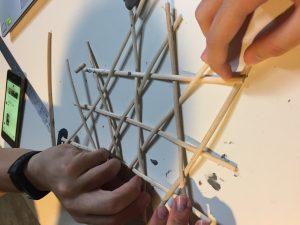
As I was thinking of what the do for the 3rd study model, Wei Lin suggested that I could replace the sliding lid of a box that I made with a weaved pattern to make ‘slide’. I tried it out and it was quite nice so I replicated it and made a larger box to fit the 10cm requirement. The box was made out of ice cream sticks and satay sticks + weaved cardboard strips.


After consultation, I was told to try out ‘puncture’. My idea of ‘puncture’ would be something sharp emerging from the weave pattern so I made a “sharp” structure using cardboard.

Drawings for study object:

Part 2 – Vessel to be Held, Worn or Carried
For this project, I wanted to make something that I can actually use so I decided on making a bag. My original idea was a squarish 3 in 1 bag that can be used as a bagpack, sling bag and hand-carried bag. The verbs I wanted to include were bind (for the lid) and slide (for the handle).

However, I thought that a 25cm x 22.5cm x 6cm bag couldn’t hold a lot of things so I changed it to 32cm x 24cm x 10cm so that it could hold A4 sized things. I also realised that it would be difficult to make the handle slide and the handle should not be attached to the lid as the lid come off if the bag is too heavy (the lid is only binded on one side so the bind is not very strong) I also wanted to add a buckle-like thing in front to make sure the lid is bounded more tightly when it’s closed.

I first made a tiny prototype of the bag using cardboard strips and foam to see how it would look like. I was satisfied with the dimensions so I decided to go with it.

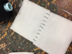
Due to the way I’m weaving, I had to start with the bind part first. I used leather cord and metal wire since it is stronger and keeps it’s shape better. I used the same pattern as my ‘bind’ study model and replicated it on the other side as well. I spent a lot of time trying to bind it as the space for the cord is quite small.


I continued with the frame using rattan and started weaving.


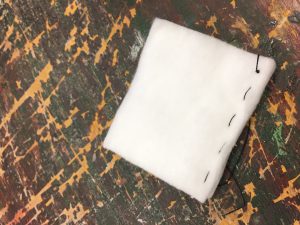
For the lid, I used a rattan frame with cardboard and covered it with 2 pieces of foam. I tried stitching the foam together but I failed so I ended up using uhu glue to stick them together. I added a nother layer of foam on the underside to make it stronger and it ended up forming a catch for the lid so it doesn’t open easily (so I didn’t need a buckle anymore).

As the dimensions for this bag fits a bagpack more, that was what I had in mind when I made it. But since there were holes (lack of materials + too tight to weave) on the bag, I realised I could hook the handles there and still make it a 3 in 1 bag.


More photos of final product:


Orthographic drawing:


Isometric drawing:


2 point perspective drawing:


Research
Art Movements:
Hannah Höch (1889-1978)
Famous works:


Famous Works:


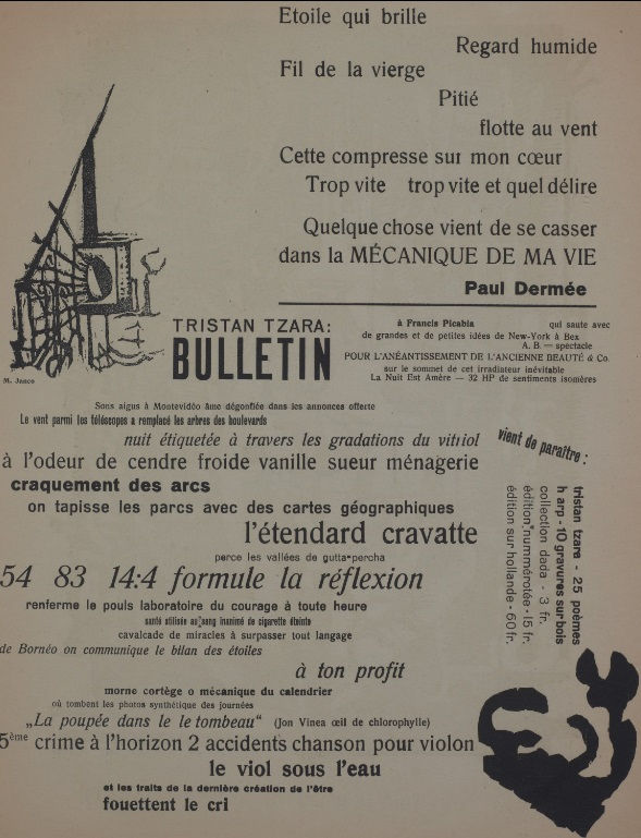
Tristan Tzara (1896-1963)

Famous Works:

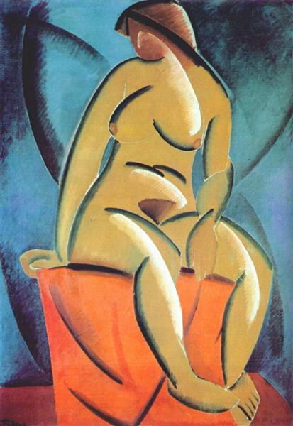
2. Russian Constructivism – Abstract, modern and minimal. Geometric, experimental and rarely emotional. Focuses more on the material and form.
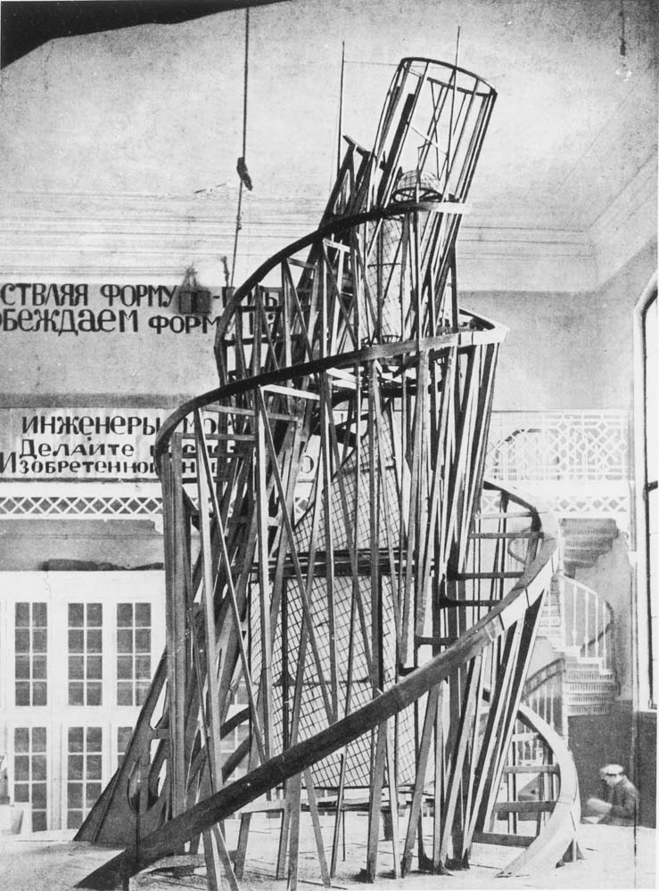
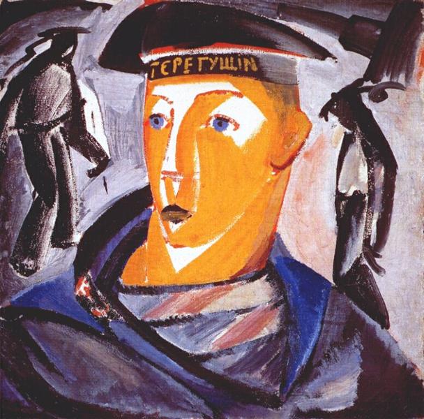
Vladimir Tatlin (1885-1953)

Famous Works:
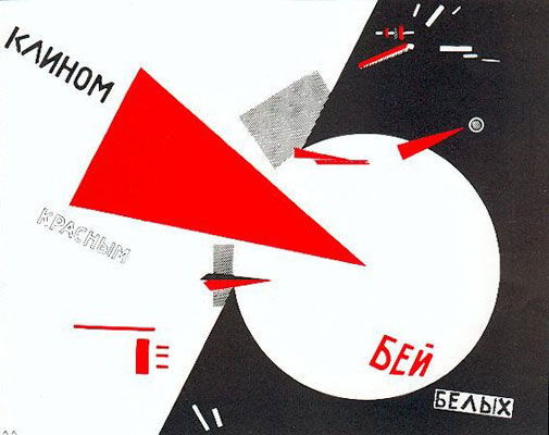
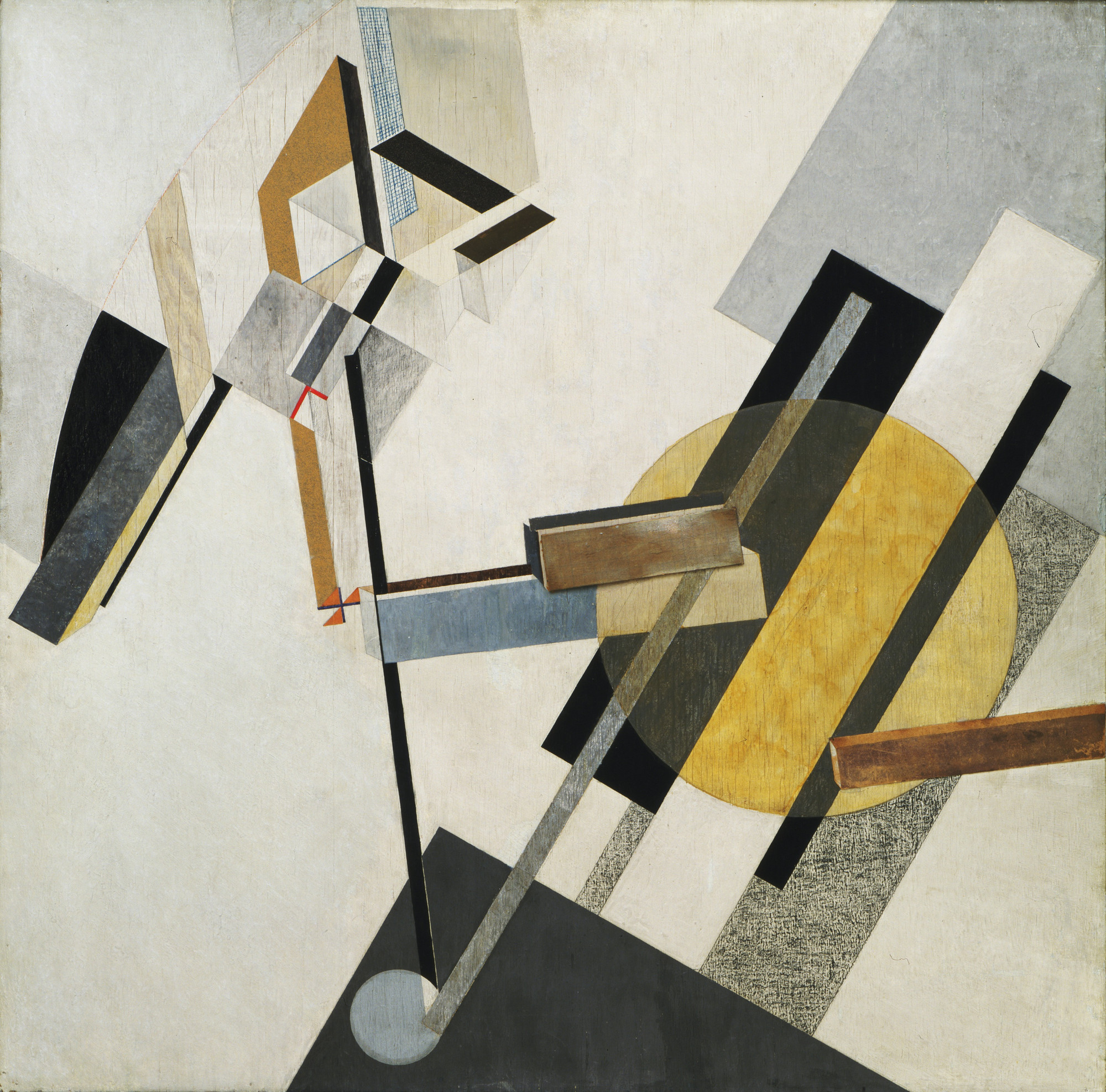
El Lissitzky (1890-1941)

Famous Works:
References:
https://www.theartstory.org/movement-dada.htm
https://www.theartstory.org/artist-hoch-hannah.htm
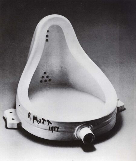
https://www.theartstory.org/artist-duchamp-marcel.htm
https://www.widewalls.ch/dada-collage-readymade/
https://www.theartstory.org/artist-tzara-tristan.htm
https://www.dadart.com/dadaism/dada/037-Tzara.html
http://www.arthistoryarchive.com/arthistory/constructivism/
https://www.theartstory.org/movement-constructivism.htm
https://www.theartstory.org/artist-tatlin-vladimir.htm
https://www.theartstory.org/artist-lissitzky-el.htm
Images:
https://www.stmuhistorymedia.org/wp-content/uploads/2017/05/Hannah-Hoch-Self-portrait-in-Mirrors-1931-Image-via-artblastcom-770×466.jpg
https://www.ft.com/__origami/service/image/v2/images/raw/http%3A%2F%2Fcom.ft.imagepublish.prod.s3.amazonaws.com%2F4a57d4e4-81de-11e3-87d5-00144feab7de?source=next&fit=scale-down&width=700
https://www.berlinischegalerie.de/fileadmin/_processed_/csm_hoechst_f24c48aa5e.jpg
https://upload.wikimedia.org/wikipedia/en/6/6b/Hoch-Cut_With_the_Kitchen_Knife.jpg
https://d3i6li5p17fo2k.cloudfront.net/en/rimage/pivot_half_1152/image/4414/f6a3171449b93d7524d3a110a43c031a
https://d7hftxdivxxvm.cloudfront.net/?resize_to=width&src=https%3A%2F%2Fartsy-media-uploads.s3.amazonaws.com%2Fi-8Le397-h2ZTgLM1iMegw%252FMarcel_Duchamp.jpg&width=1200&quality=80
https://upload.wikimedia.org/wikipedia/en/thumb/7/74/Marcel_Duchamp%2C_1919%2C_L.H.O.O.Q.jpg/620px-Marcel_Duchamp%2C_1919%2C_L.H.O.O.Q.jpg
https://cdn.mdr.de/kultur/tristan-tzara-102-resimage_v-variantBig24x9_w-1024.jpg?version=13828
https://www.theartstory.org/images20/works/tzara_tristan_2.jpg?1
https://www.dadart.com/dada-media/Dada-no-7.jpg
https://bestarts.org/ba/wp-content/uploads/2015/01/Vladimir-Tatlin-top.jpg
https://www.moma.org/interactives/exhibitions/2012/inventingabstraction/?work=226
https://uploads7.wikiart.org/images/vladimir-tatlin/the-sailor-self-portrait-1912.jpg!Large.jpg
https://uploads6.wikiart.org/images/vladimir-tatlin/model-1913.jpg!Large.jpg
https://bestarts.org/ba/wp-content/uploads/2015/01/El-Lissitzky-top.jpg
https://www.theartstory.org/images20/works/lissitzky_el_2.jpg?2
http://www.moma.org/media/W1siZiIsIjE1MTA3NSJdLFsicCIsImNvbnZlcnQiLCItcmVzaXplIDIwMDB4MjAwMFx1MDAzZSJdXQ.jpg?sha=3e9f0871a4490ad4
http://deliver.odai.yale.edu/content/id/cd31e5b7-c029-41ef-adb5-1c4f7ca50666/format/2
Process
When I first started thinking of ideas/jobs for this project, my four jobs were quite normal and all circus themed (juggler, bubble artist, clown and popcorn seller). I was told to make the jobs more interesting by adding random words/elements to it so it became: egg juggler, bubble artist in a cactus farm and funeral clown (I hadn’t thought of the 4th one yet). I first tried making the elements and objects of each job look like the letters and sketched them out on paper.
Egg juggler: egg, juggling
Bubble artist in a cactus farm: bubble wand, bubble, cactus
Clown: colourful/red afro, red nose, balloons
Popcorn seller: uniform, red and white stripes, popcorn
Juggler: balls, juggling
Bubble artist: bubble, bubble wand
Clown: balloons
Juggler: Juggling

I was told that that wasn’t what I was supposed to do and I should incorporate the elements into the letter itself with bending them. I thought the bubble artist in a cactus farm would be the easiest so I tried it out first.
1 Bubble artist in a cactus farm -> Bubble in a cactus farm
Elements: Bubble + green, spikes
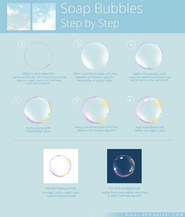
Using the elements of a bubble and cactus, I came up with 2 designs using the font called rns baruta as the font is fat and round, which is similar to that of a bubble. I realised that I couldn’t show the bubble artist part so I ended up changing the job to a bubble in a cactus farm.


I didn’t know which design was better so I tried both again digitally to compare (just the letter ‘o’). I followed a tutorial on pinterest to draw the bubble.


I liked the look of the bubble on the left more but it looks more like a cactus in a bubble farm instead. I was also told that the one on the right looks more interesting so I decided to go with that design.
To do the final design, I first brought the image of the font to illustrator to image trace it. Then I opened the vector in krita and drew the green bubbles within the font area by selecting it. I added the spikes after I was done with all the bubbles.

As cacti are usually found in the desert, I decided to use a picture of the desert for the background. I also tried to vary the positions of the letters as bubbles don’t usually stay in a straight line. After looking at pictures of cacti, I realised that the spikes weren’t dark green so I changed them to a lighter colour that is similar to those of the actual cactus spikes.


2 Funeral Clown
Elements: Casket/coffin + colourful afro & polka dots
For the design of the funeral clown, I used the fat face font as it looks more formal and rigid, which is a font suitable for funerals.


I didn’t really like the colours in my sketch so I did it digitally and experimented with the colours. I referenced the colours of an actual coffin for my design. I also made the borders of the letters slightly darker to give the coffin a bit of depth.


I felt like the one with red polka dots looks quite plain and the polka dots don’t seem to pop out like the colourful ones so I ended up picking the colourful ones instead. For the background, I wanted to use a white cloth/curtain to make it look like a wake but I couldn’t find a good picture of it and I also couldn’t draw it so I ended up using a photo of candles which could also represent the solemn occasion.

3 Bankrupt Gambler
Elements: Poker cards + torn money(?)
Since this was supposed to be a gambler, I decided to use a poker card character font for it. I started off with adding different gambling elements to my design and using empty pockets to represent bankruptcy but it didn’t seem to express bankrupt gambler well and it was also very messy.


I was told to choose only one element to represent gambler so I decided on the poker cards. I drew the outline of each poker card and pasted images of poker cards on the outlines one by one and trimmed away the parts that were overlapping. I added stitches to the money attached to the poker cards to represent money being torn and also like the patched up clothes of poor/homeless people. I added a reddish/pinkish background as I felt that it represents someone in the red (bankruptcy).


In the end, I felt that the bankruptcy part wasn’t very obvious, so I included a broken piggy bank in the background.

4 Misfortune Cookie
Elements: Skull + Slip of paper, cookie
For this design, I used a font called djb hunky chunky. It is fat and has a slightly irregular shape so I felt like it looks like a cookie. I wanted to use another font at first so the font used for the sketch is different. I wanted to write bad fortunes on the slips of paper but I was told it would be better to use symbols.


I referenced a illustration of a fortune cookie for my design. I used the colours of the fortune cookie for my drawing and tried to make it look hollow. Then, I added the textures, cracks and the slip of paper for each of the letter. I also added skulls on the papers to represent the misfortune.


Fortune cookies usually come in packets but I wanted to show them placed on a plate, in a random order. The picture I chose was of a broken plate as I thought the broken plate is also a sign of misfortune.

Fonts + Images:
https://fonts2u.com/rns-baruta-black.font?ptext=HOW&size=4https://www.deviantart.com/rimuu/art/Soap-Bubbles-Steps-674625970
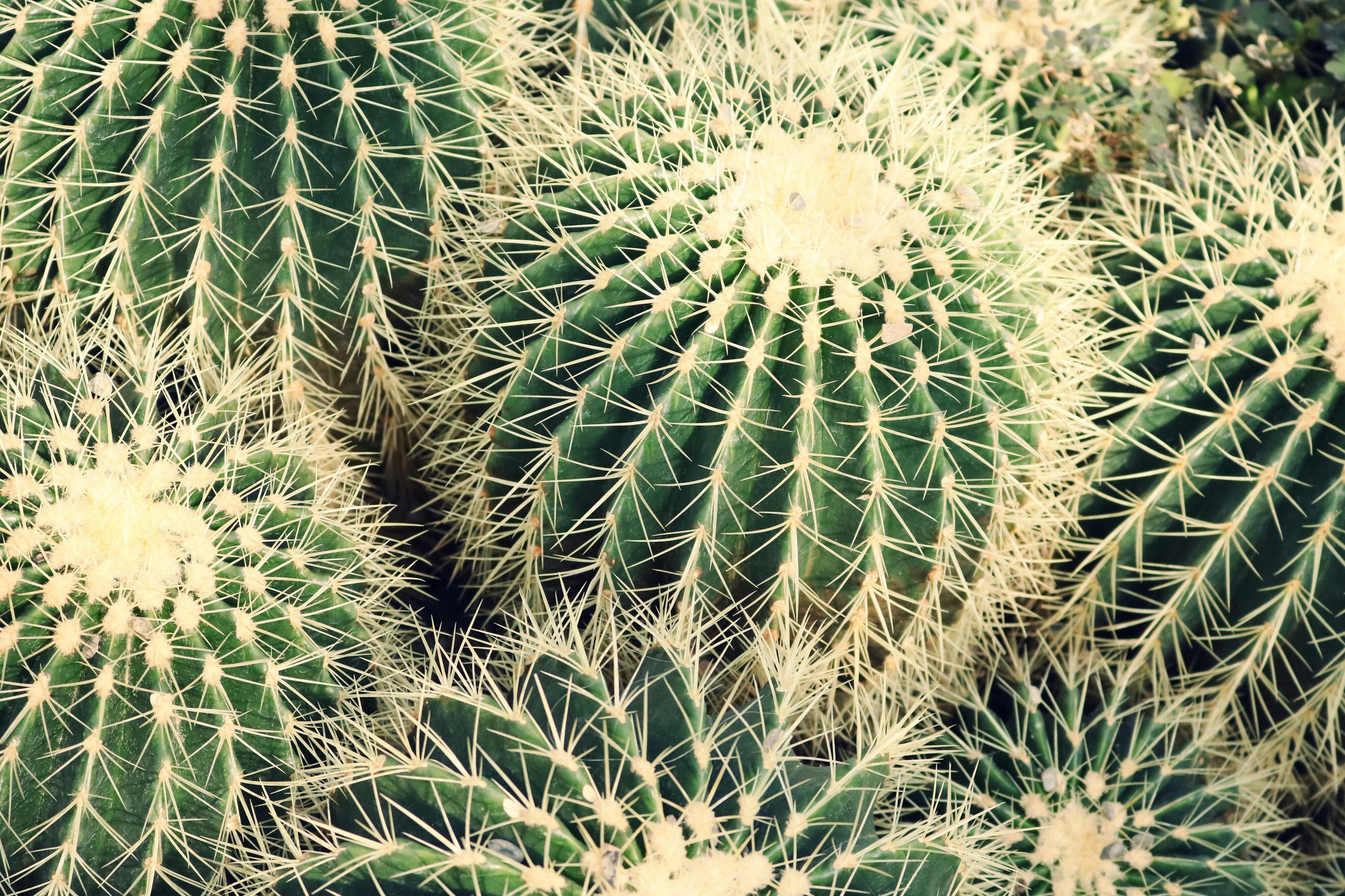
https://images.pexels.com/photos/1054016/pexels-photo-1054016.jpeg?cs=srgb&dl=botanical-cacti-cactus-1054016.jpg&fm=jpg
https://images.pexels.com/photos/90407/pexels-photo-90407.jpeg?cs=srgb&dl=africa-camels-desert-90407.jpg&fm=jpg
https://www.fonts.com/font/typetogether/abril-fatface/fatface-regular
http://www.fanagans.ie/download/1/Coffins%202017%20Resized/Elm%20.JPG
https://png2.kisspng.com/sh/c794b96cb0bb42b40ca63c47d32db42e/L0KzQYm3U8MxN6JBiZH0aYP2gLBuTfl1NZZ7gd42Y3zyh7A0kPhwfJDsitN5aImwcbf5j702aZNqfKIAMnXmRIHtWL41PWI2TKo5OEG4QoO7VcQ3OWEATqkCLoDxd1==/kisspng-it-evil-clown-photography-afro-5abed052ec40f8.4511480815224546109677.png
https://www.urbanfonts.com/fonts/Card_Characters.fonthttp://pngimg.com/uploads/money/money_PNG3529.png
http://pngimg.com/uploads/scar/scar_PNG15769.pnghttps://www.publicdomainpictures.net/download-picture.php?id=188256&check=c976544b7a2d76d851f9ac7547685c4a
https://upload.wikimedia.org/wikipedia/commons/thumb/1/14/English_pattern_king_of_hearts.svg/2000px-English_pattern_king_of_hearts.svg.png
https://upload.wikimedia.org/wikipedia/commons/thumb/5/5a/Ace_of_spades.svg/2000px-Ace_of_spades.svg.png
https://upload.wikimedia.org/wikipedia/commons/thumb/1/16/English_pattern_jack_of_diamonds.svg/2000px-English_pattern_jack_of_diamonds.svg.png
https://upload.wikimedia.org/wikipedia/commons/thumb/b/b3/English_pattern_queen_of_clubs.svg/2000px-English_pattern_queen_of_clubs.svg.png
https://upload.wikimedia.org/wikipedia/commons/thumb/0/07/Ace_of_hearts.svg/2000px-Ace_of_hearts.svg.png
https://upload.wikimedia.org/wikipedia/commons/thumb/f/f1/English_pattern_king_of_spades.svg/2000px-English_pattern_king_of_spades.svg.png
https://upload.wikimedia.org/wikipedia/commons/thumb/e/e6/Ace_of_diamonds.svg/2000px-Ace_of_diamonds.svg.png
https://www.dafont.com/djb-hunky-chunk.font?text=HOW&psize=l
https://www.astrology.com/images-US/games/game-fortune-cookie-1.png
https://pxhere.com/en/photo/1164088
https://upload.wikimedia.org/wikipedia/commons/thumb/5/53/Skull_and_crossbones.svg/1066px-Skull_and_crossbones.svg.png
Final Outcome

Reflections
This project was very challenging for me as I have not attempted digital painting before and I don’t really know how to use photoshop and illustrator. I ended up spending more time on the drawing than I expected. For the colours of the design, I chose them based on the reference images without thinking too much about the colour palette. I could have spent a bit more time on it to make the design better.
Problems with each design:
– bubble in a cactus farm: The bubbles didn’t really look that round after adding the spikes, I could have added the spikes to follow the form more closely instead of putting it in random spots and directions.
– funeral clown: It still ended up looking quite flat even though I tried adding a darker border to show depth, it might have worked better if I tried using a 3D font for my design instead.
– bankrupt gambler: I think I chose the wrong font as the font is too thin so I couldn’t add much to it and it is also quite hard to see the details. I could have also tried to make the tear more obvious. Without the background, it might be quite difficult for people to figure out the job.
– misfortune cookie: I realised that the fortune cookies appear to be floating and not on the plate as I didn’t add shadows. The slips of paper also look flat due to the lack of shadows. Also, I could have taken a photo of actual fortune cookie crumbs on a plate for the background.
Although there were many problems with my designs, I learnt a lot about digital art while doing this project. I think it was quite challenging, having to incorporate the elements of the jobs into the letters instead of just bending the objects/elements into the letters. It forced me to focus on the details of the jobs and think about how to communicate it to the viewers.
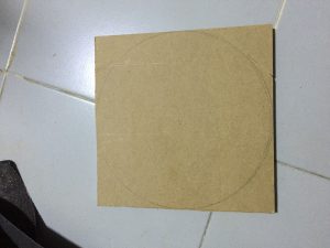
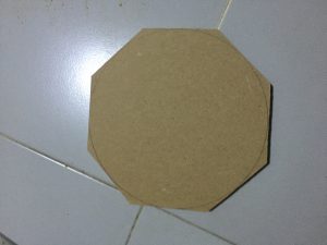
Task 1 – Object Studies
For this task, we had to bring a personal item that is held, worn or carried to be studied.
I ended up bringing a wireless mouse.


We had to draw the top, front and side view of the object so I did a sketch before drawing on the graph paper. I also added the measurements on the sketches.

![]()
The drawing I did in pencil wasn’t very clear so I went over it with a pen.

Then, we had to draw the 2 point perspective of the object. I also did some sketches of it (shown above) before I did the actual drawing. Once again, I went over the drawing with a pen.


Task 2 – Weave Technique Studies
For task 2, we had to weave a 2D and a 3D pattern as a pair work. Chien Ping and I decided to work on the 2D component together. We didn’t have any tape or water so it was really hard to weave the pattern we chose — hexagonal pattern. We tried the method from this video: https://www.youtube.com/watch?v=psHmWNielcw but there was too much tension between the rattan strips so we experimented with different methods and ended up just weaving by looking at the picture of a hexagonal pattern.


I decided to try the pattern again at home using tape and the method from the video. I also did it using 5mm cardboard strips. It works better with cardboard as it is thinner and there’s less tension.


For the 3D component, we decided to split it into half, each of us doing 20x20x10 then combine them together. Chien Ping suggested making it look like a pig since it’s Chinese New Year, so I did the top while he did the bottom of the pig.
Before I started making the actual structure, I experimented with a few patterns.


I think the hexagonal pattern looks better but it would be difficult to replicate it with the rattan strips so I used the mat pattern instead. I liked how the sepak takraw ball turned out but I couldn’t put in in my 3D structure.


In order to make it look like a pig, I also added the ears and nose. I tried different materials and sizes on the chrysanthemum bottom pattern for the nose. I also made sure the structure could stand.


Afterwards, we just combined our parts together. For the details of the bottom of the structure, please refer to Chien Ping’s post.


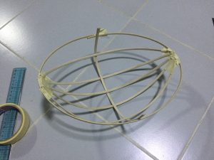
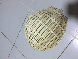
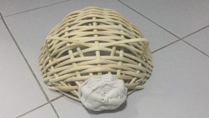
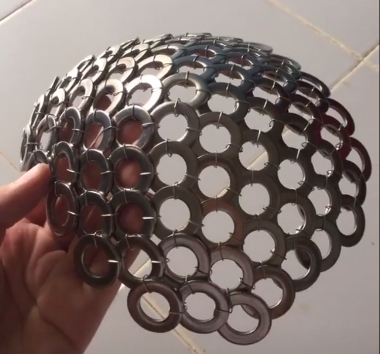
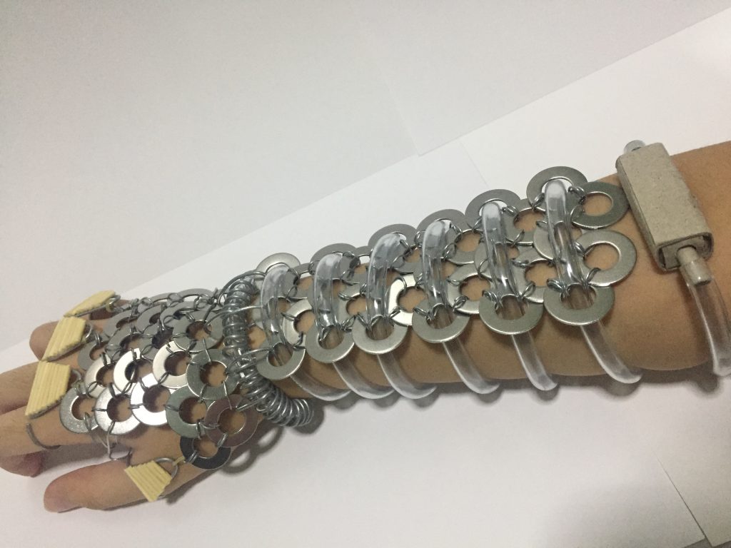
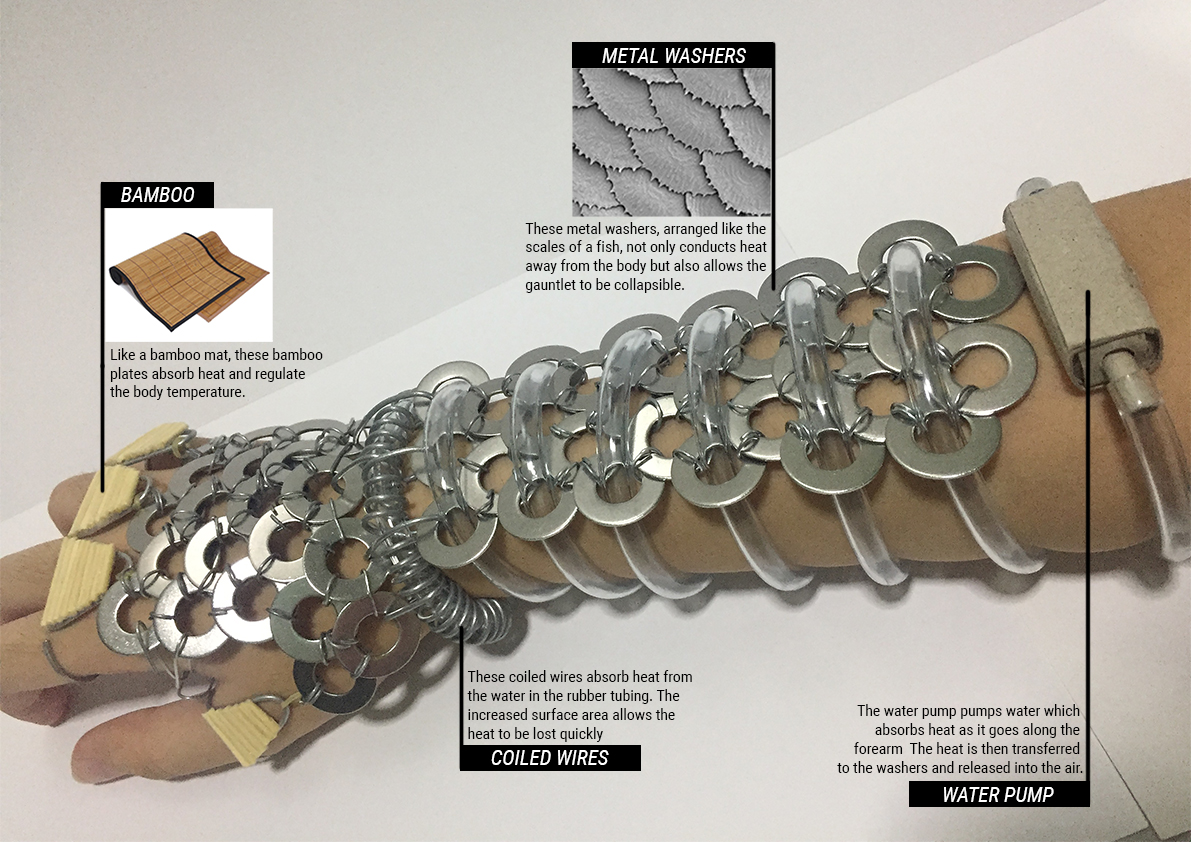
A Bio-radiator for Emiko’s Kind
After working on part one, I was thinking of what I could make with the material.
Because of the way it can curve, I wanted to make a cap or head gear but I felt like it would look like a torture device. I also thought of making it an arm piece.
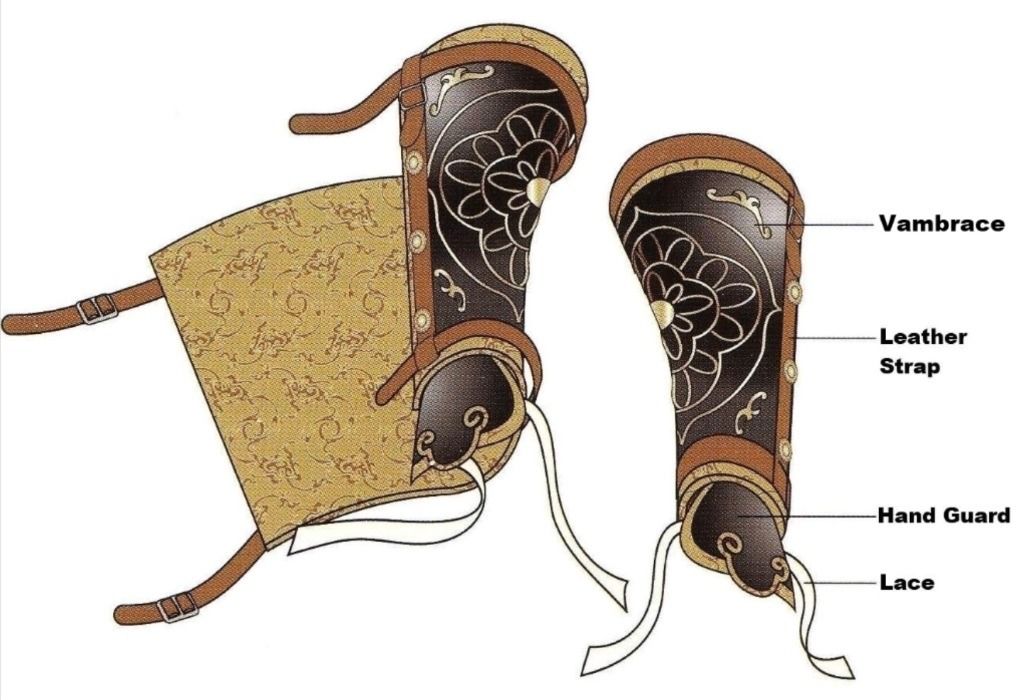
I ended up choosing to make a vambrace (arm guard).
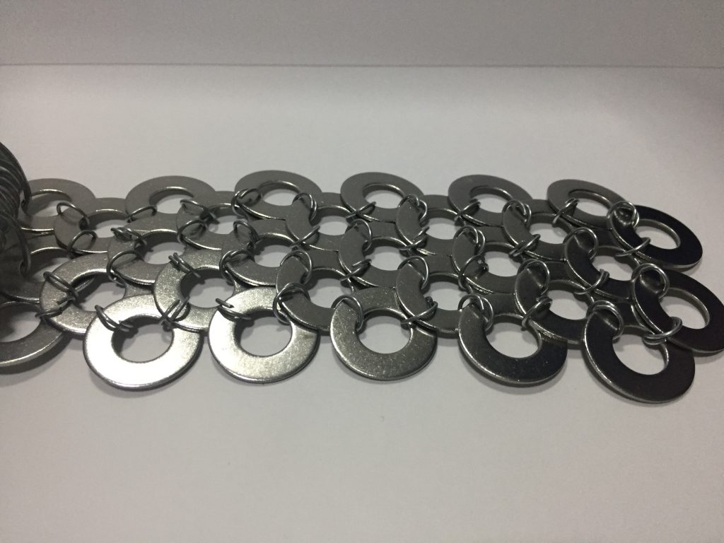
I struggled with the organic material so I tried changing the material of the washers to cardboard and making rings out of paper to connect it to the metal washers but they look weird and out of place.
I also wanted to use cotton, but I realised they trap heat instead of cooling down the body.
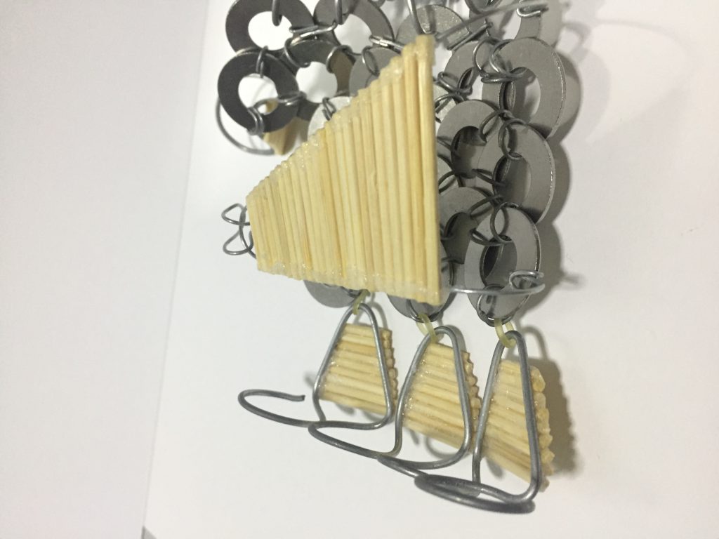
In the end, I decided to use bamboo tooth picks to mimic bamboo mats that absorb heat and regulate the body temperature.
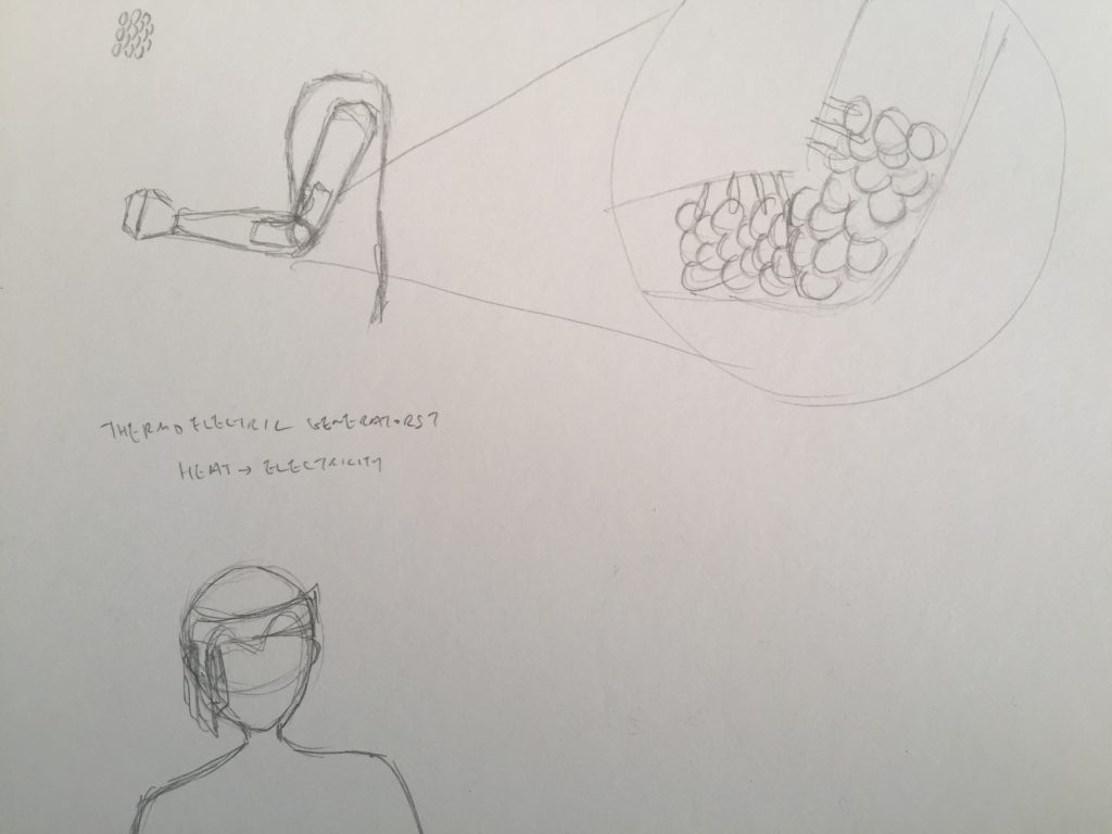
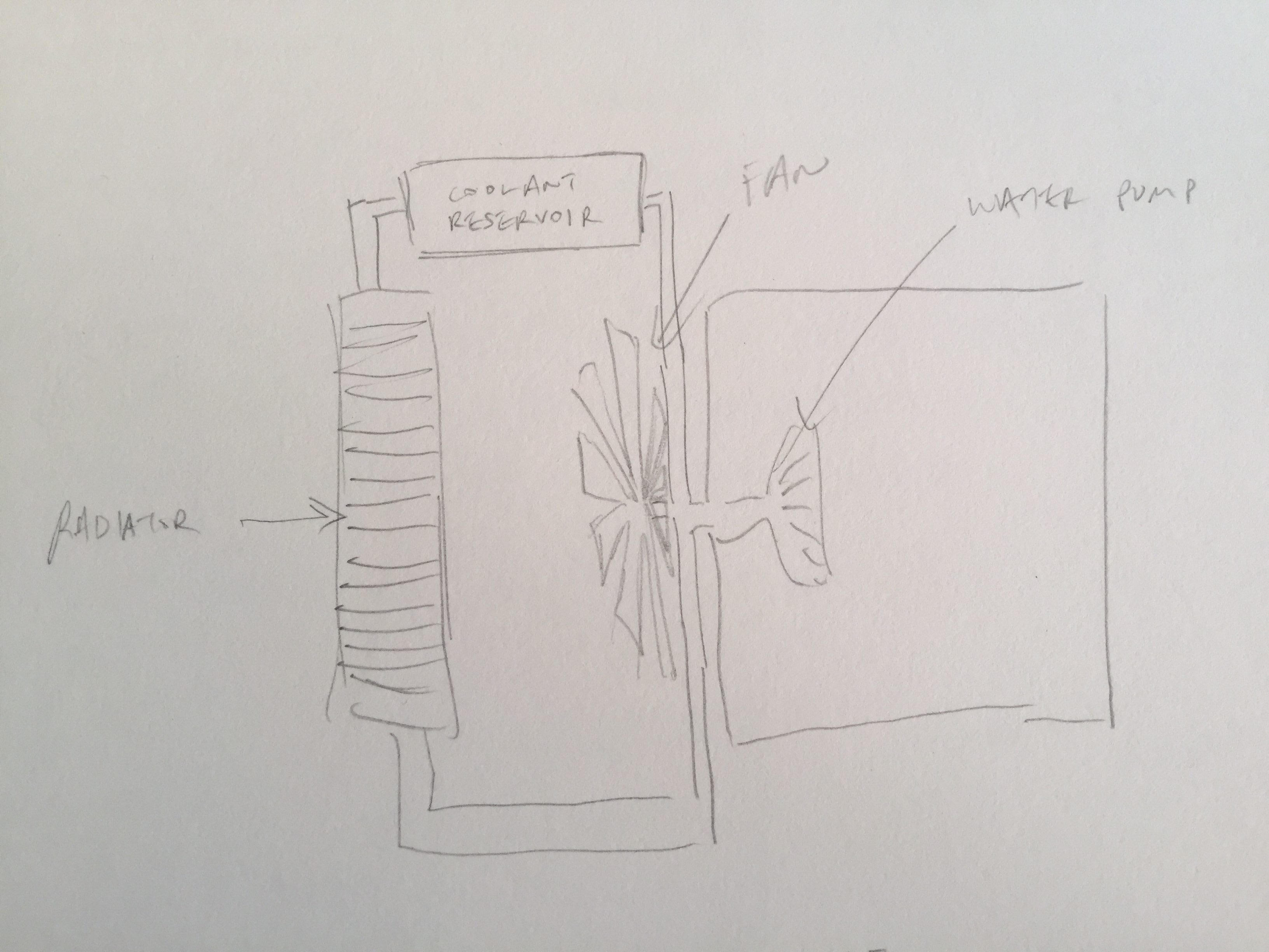
We also had to do research on bio radiators and I sketched out the main components of a bio radiator
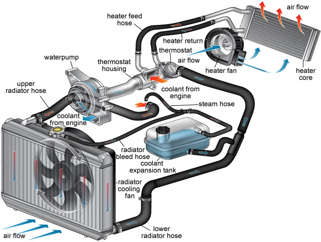
I decided to use the water pump system and mimic the large surface area of the radiator by coiling wires and rubber tubing
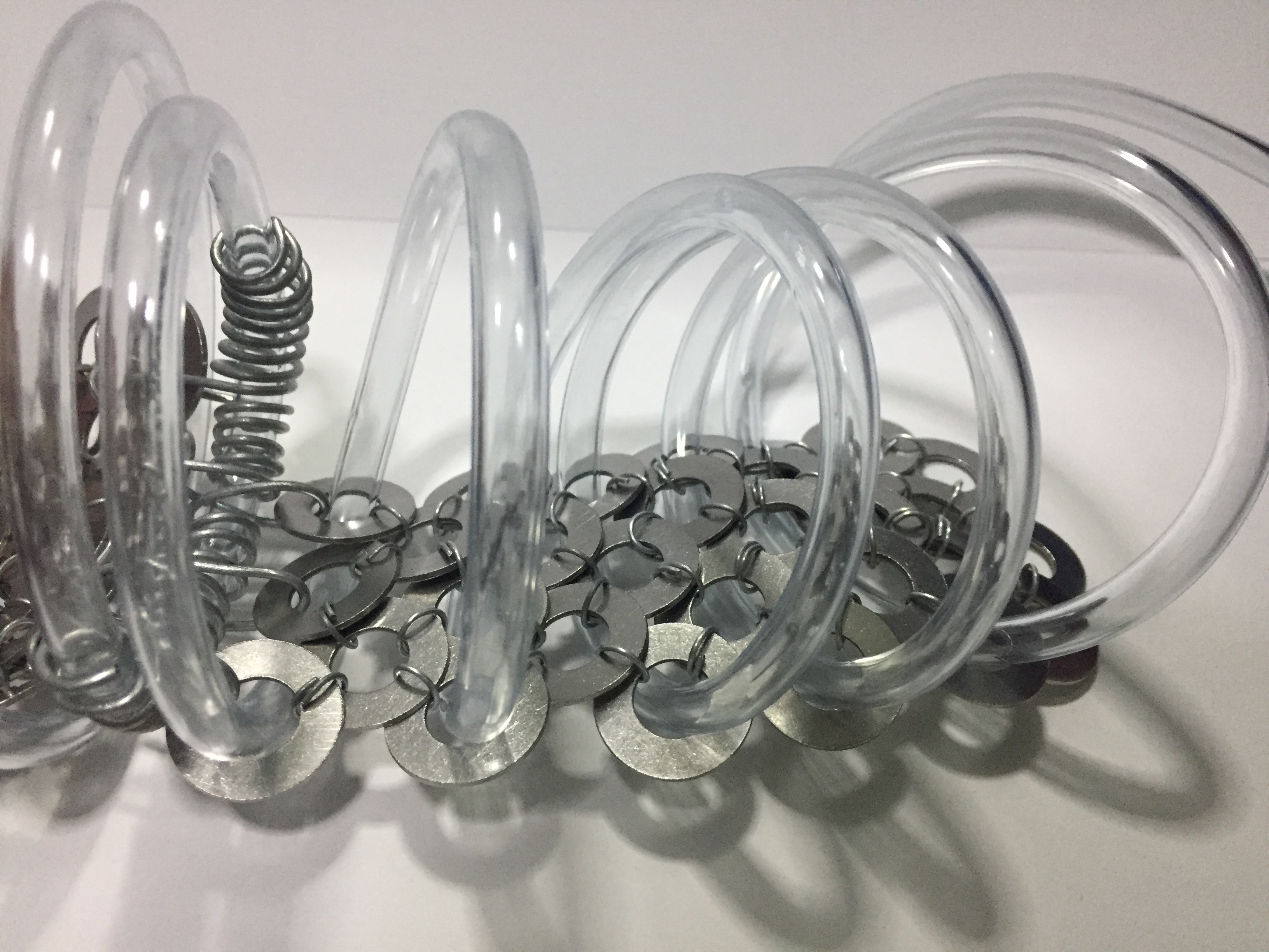
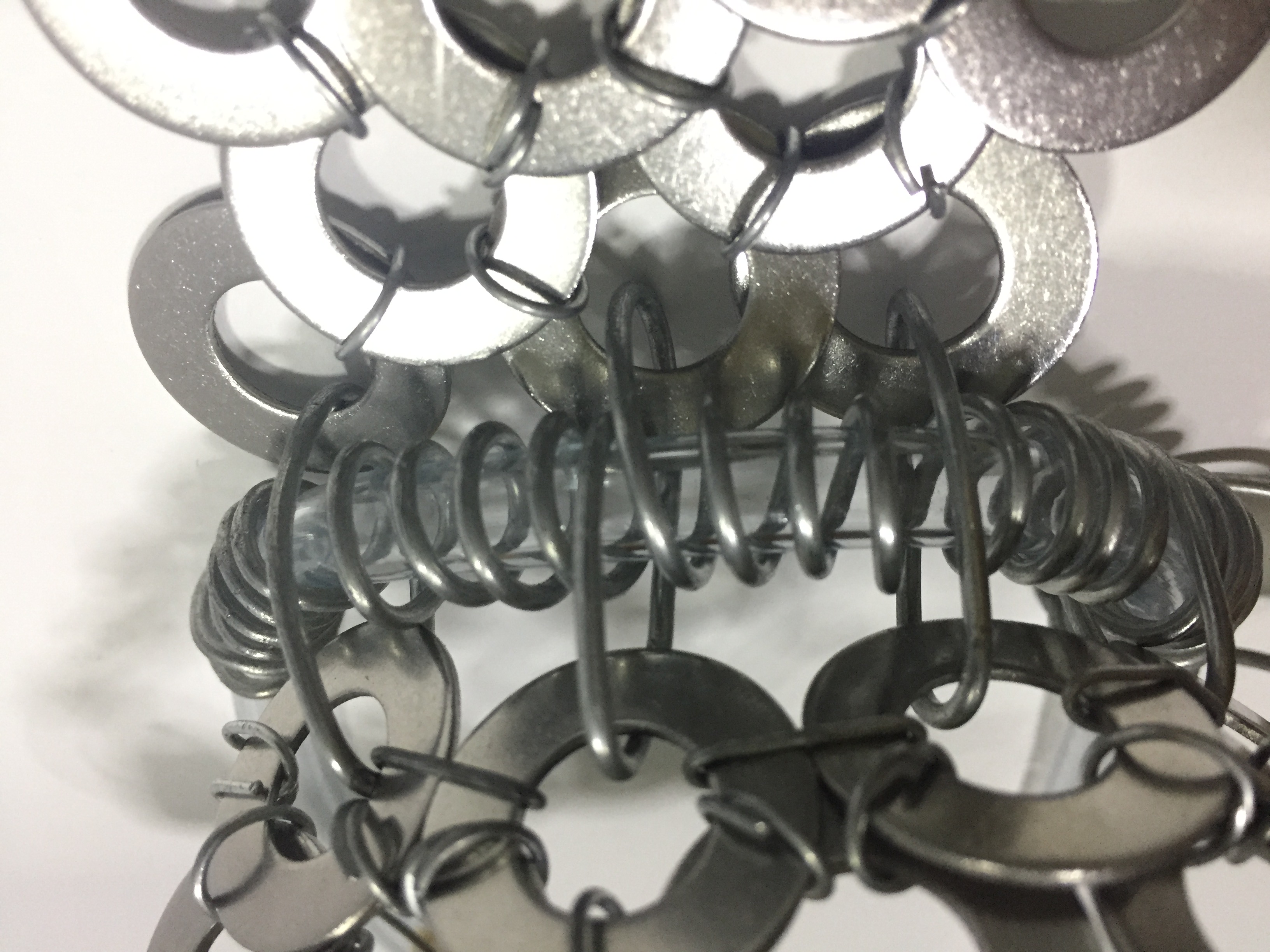
Because of the properties of the washers, the vambrace is also collapsible.
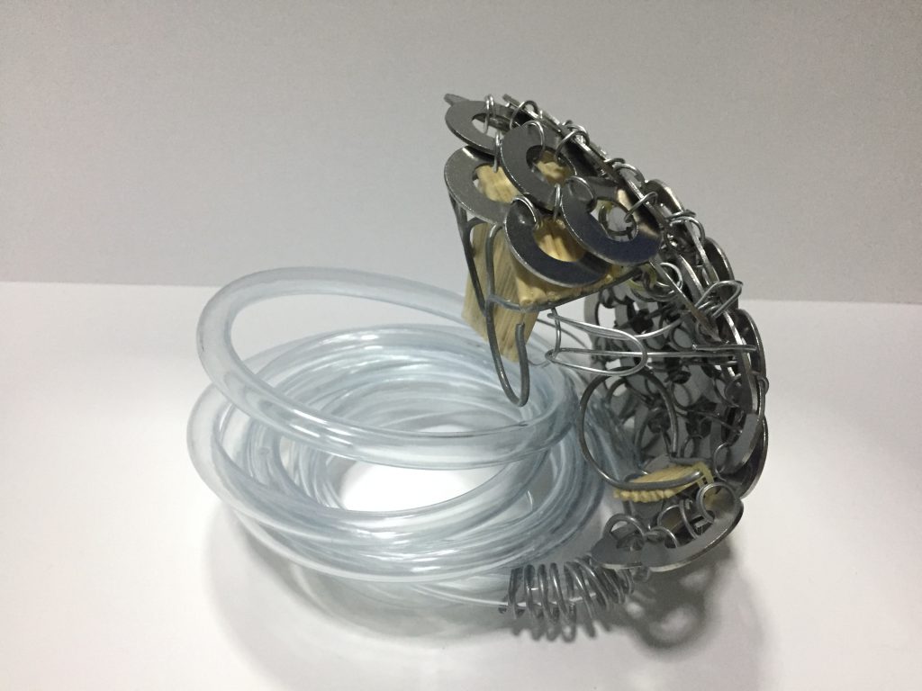
The Final Work
References:
“Song Dynasty Commander Armor.” Digital image. Accessed November 21, 2018. https://i.pinimg.com/originals/f4/8c/b7/f48cb7937bf98dfea3bcf021b38892ae.jpg.
Digital image. Accessed November 21, 2018. https://www.setadirect.com/images/images_big/ mats/cm713.jpg.
“How a Radiator Works in Automobile.” Digital image. Accessed November 21, 2018. http://www.mechanicalbooster.com/ wp-content/uploads/2017/12/how-radiator-works.jpg.
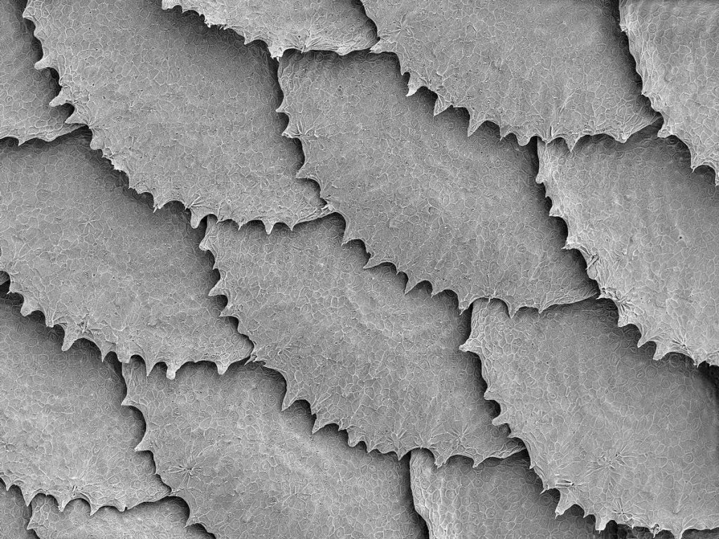
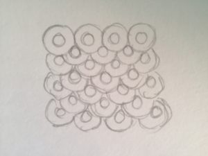
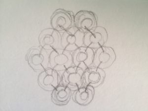
Morphogenic Studies
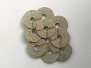
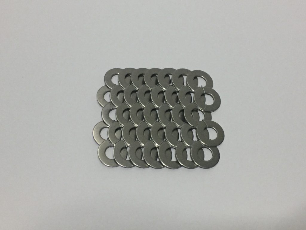
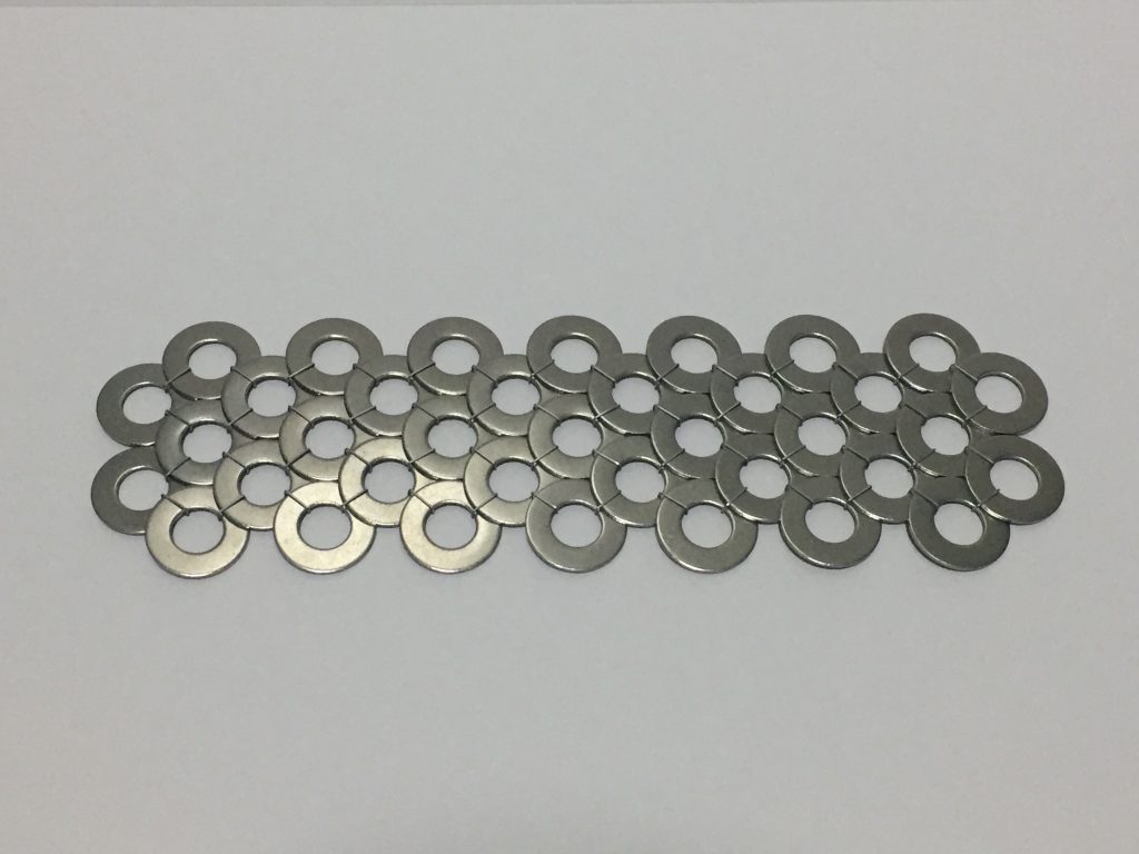
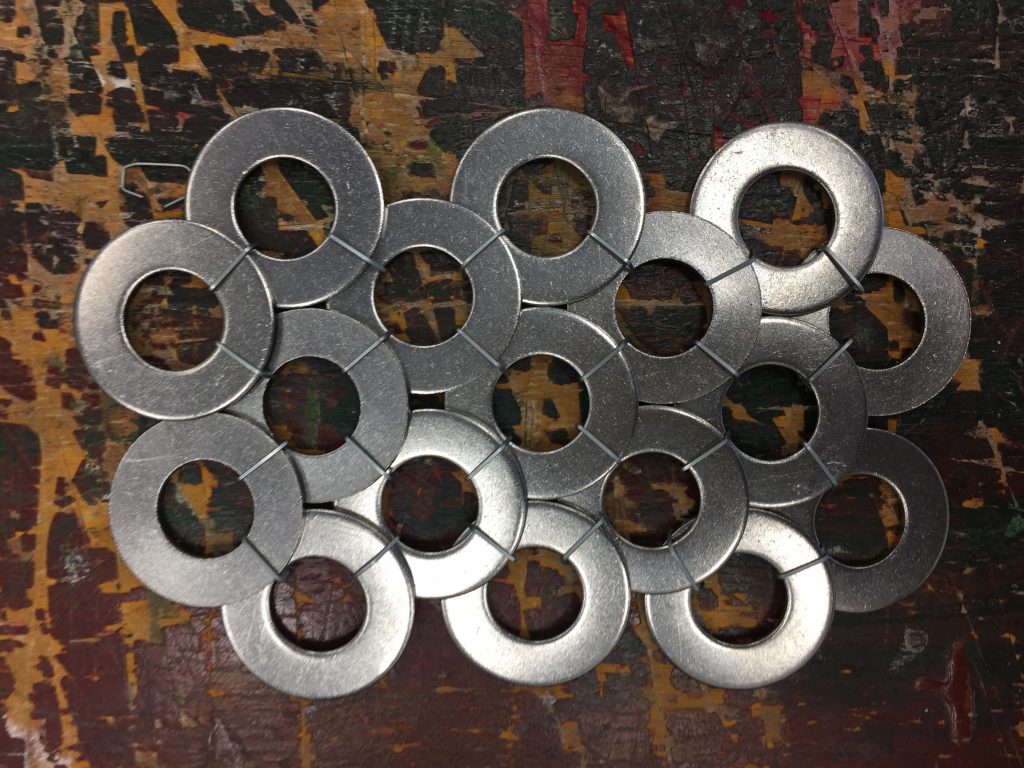
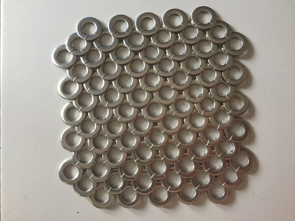
When I first heard of this project, I knew I wanted to use washers so I had to look for SEM photos with circular modules. I found a SEM of fish scales and I thought it was perfect because I could use washers to recreate it.
I did some sketches of the arrangement of the washers before actually working on them.
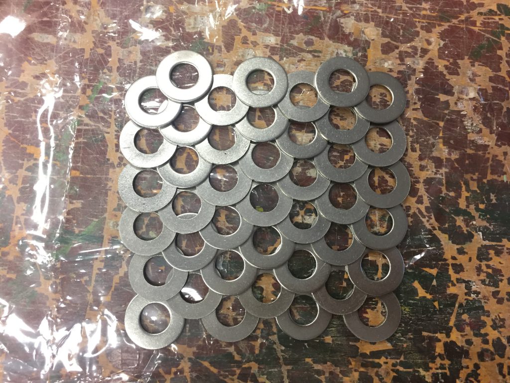
I wanted to tie the washers with string but the string is fragile and snaps easily due to the weight of the washers so I ended up using staples.
I didn’t have enough of the thinner washers so I bought another type of washers and did my part 1 with it
References:
“Convict Cichlid Fish Scales, SEM.” Digital image. Accessed November 21, 2018. https://www.sciencesource.com/Doc/SCS/Media/TR1_WATERMARKED/b/0/3/6/ SS21052219.jpg?d63657842614.
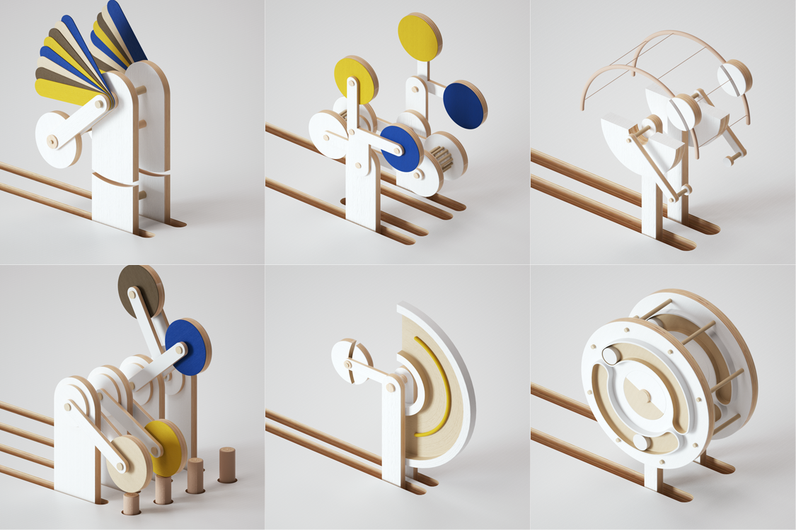
Act I (Yellow) of Triadisches Ballett (Triadic Ballet)
After watching the video and doing some research on the dance piece, I derived 2 words from the dance and tried to think of ways to express the words
While researching for kinetic sculptures I found a reference that reminded me of the double pendulum and I was thinking that I could make use of physics toys (Drinking bird, Helicone, Perpetual motion machine) in my sculpture.
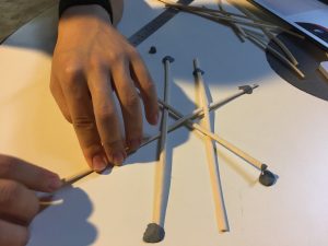
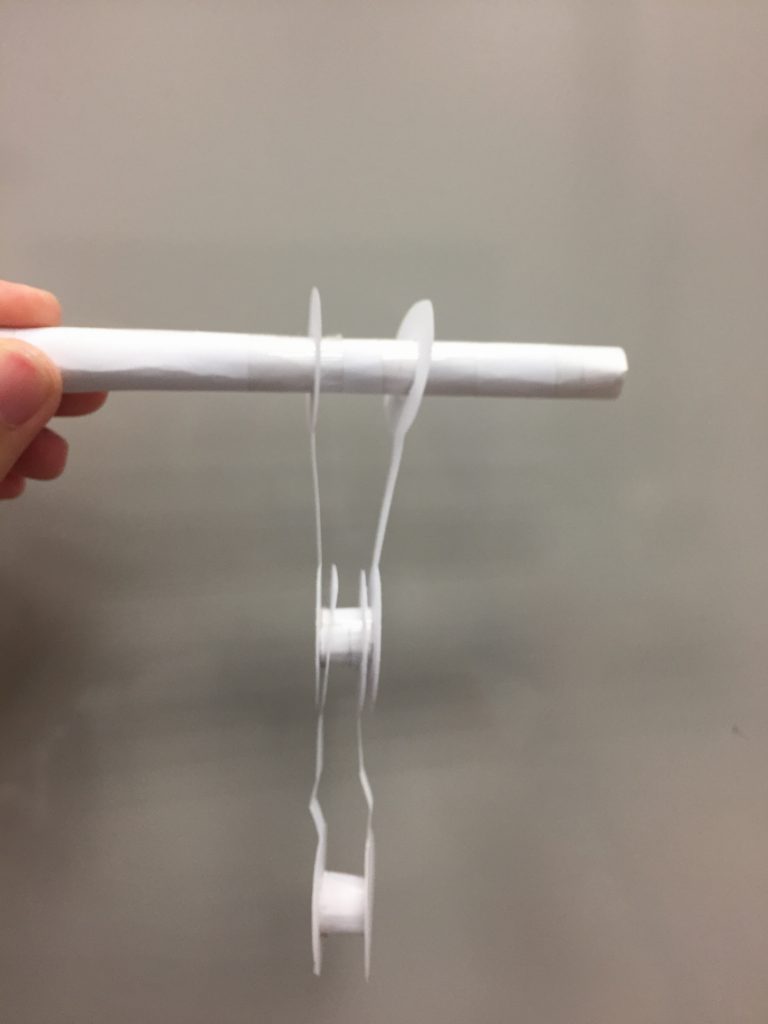
I first tried making a double pendulum with paper and inserted clay in some areas to make it heavier. I realised it was quite difficult to make it work so I didn’t use it.
I also thought of making a puppet or robot since the dance was rigid and it reminded me of this exhibition I saw in Taiwan.
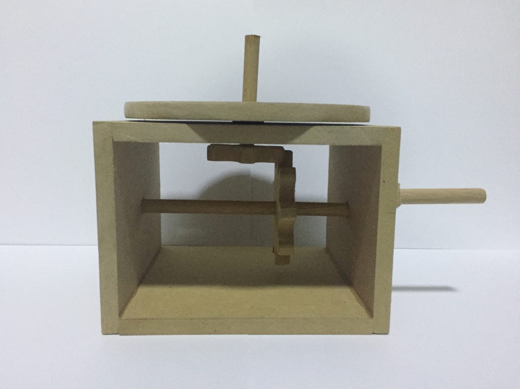
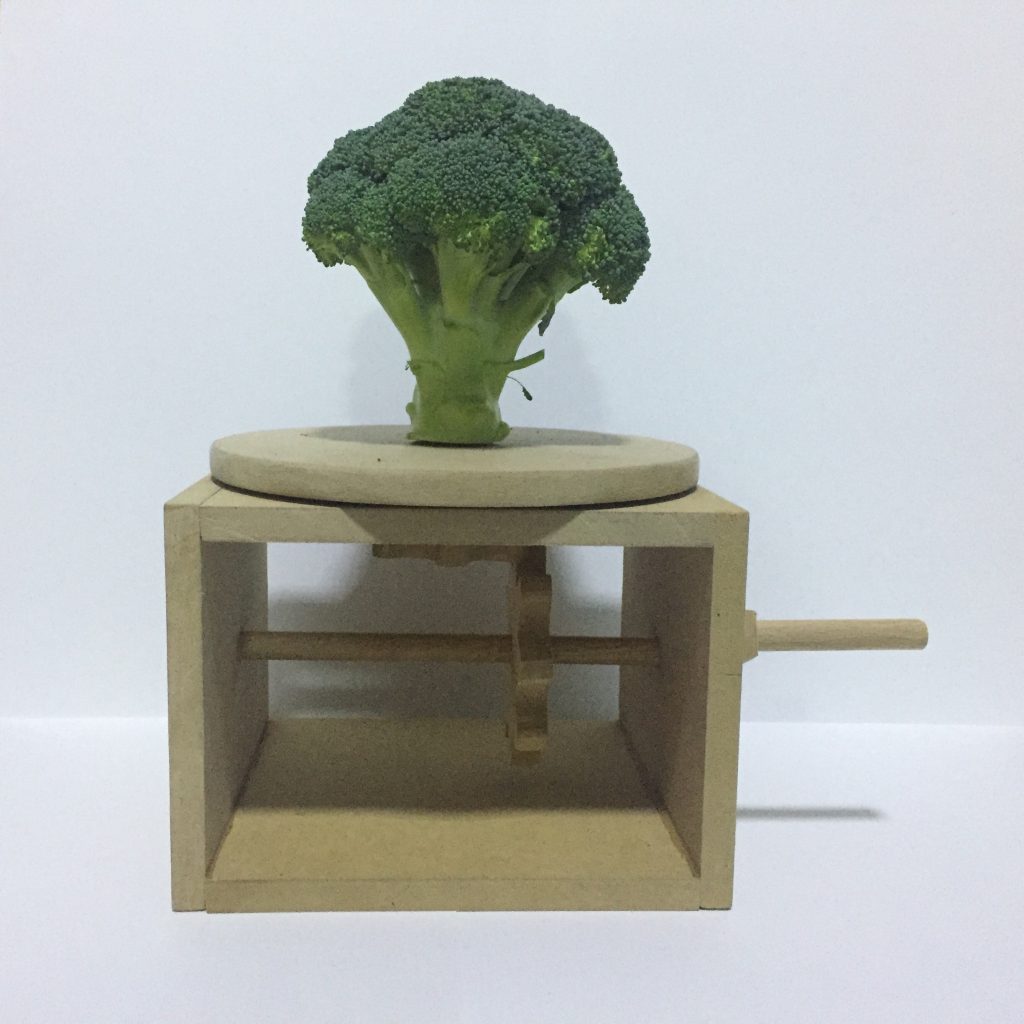
After the group consultation, I got to know that the video is supposed to show Flow vs Rigid/Natural vs Mechanical. I went back to watch the video and I thought it looked like a kids show, so I was thinking I could make a mechanical toy with natural materials.

While researching on mechanical toys, I found a website that teaches people to concepts behind the toys and how to make it (http://www.mechanical-toys.com). The website shows that the mechanical toy works by turning the rotational motion into an up/down one but I wondered if it was possible to change the axis of rotation instead.
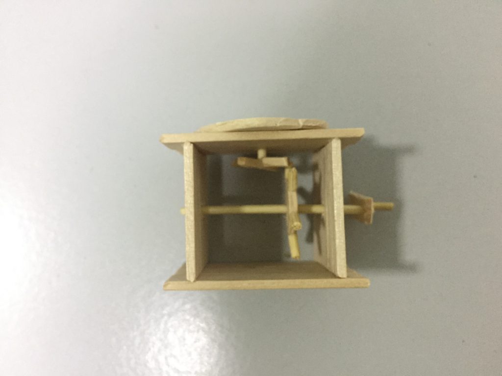
I tried to research on that but only found bevel gears which I can’t really make without a machine or 3D printer so I decided to just go ahead and make a small model to see it the normal gears could work.
Since the small model worked, I decided to stick with the idea and make the large one. For the large one, the measurements of the gears needed to be more accurate so I used a template to help me get the measurements (http://woodgears.ca/gear_cutting/template.html).
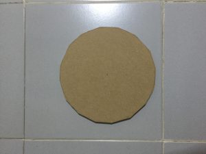
To make the gear, I first cut the wood to the size I want the gear to be. Then, I cut the corners to form an octagon and then into a hexadecagon. Afterwards, I sanded the edges to form a circle. Finally, holes were drilled into the circle so I could cut out the teeth of the gear.
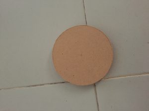
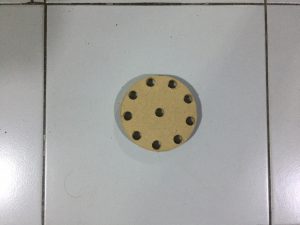
After assembling the model, I realised that the gears weren’t smooth enough so I took them out and sand the teeth of the gears to make them slightly rounder.
I was told that I could put a natural object on top of mechanical base to show the contrast between the natural and mechanical elements. I did some research and found an artist (Myeongbeom Kim) that uses a mix of natural and man-made materials in his sculptures.

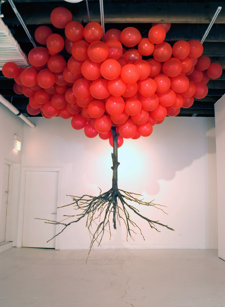
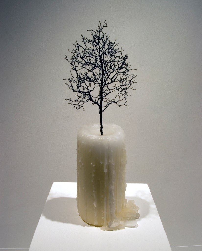
I wanted to add tree branches at the top to make it look like a carousel. I couldn’t find a lot of tree branches so I took it from a plant instead.


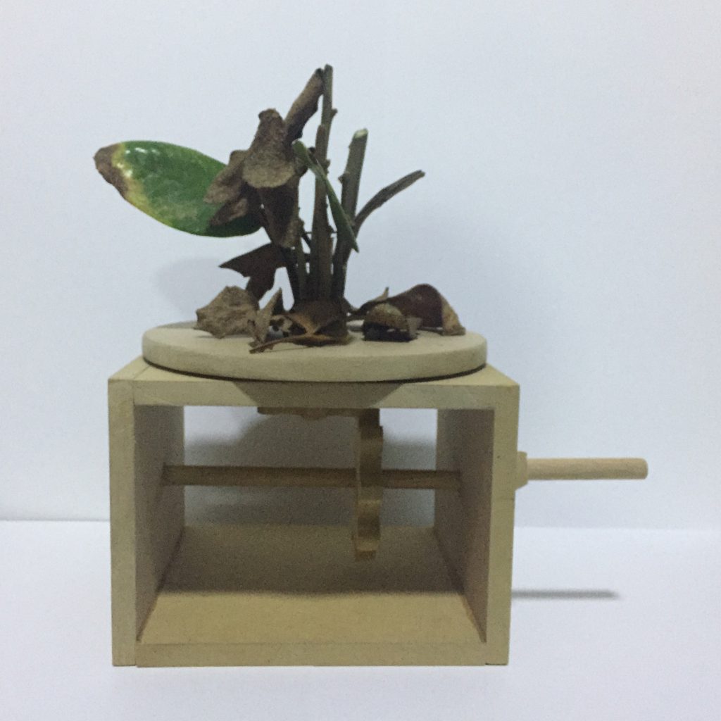
It ended up looking quite interesting but it did not have the impact of the dance so I tried to think of other natural objects that would have the shape of a carousel:
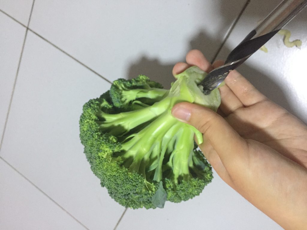
In the end, I decided on a broccoli. I drilled a hole in the broccoli and attached it the the mechanical base.
RESEARCH
Planes
After knowing we had to use basic geometrical planes for the model, I tried searching for planar sculptures and found this interesting sliceform planar sculpture.
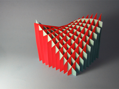
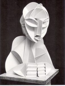
In class, we learnt that the planes don’t have to be flat. The sculptures made by Naum Gabo and Antoine Pevsner are some examples that consist of curved planes.
Lines + Planes
I thought that the idea of using straight lines to form a curve was interesting. There was a picture of a sculpture similar to this being shown in class but I couldn’t find a picture of that sculpture.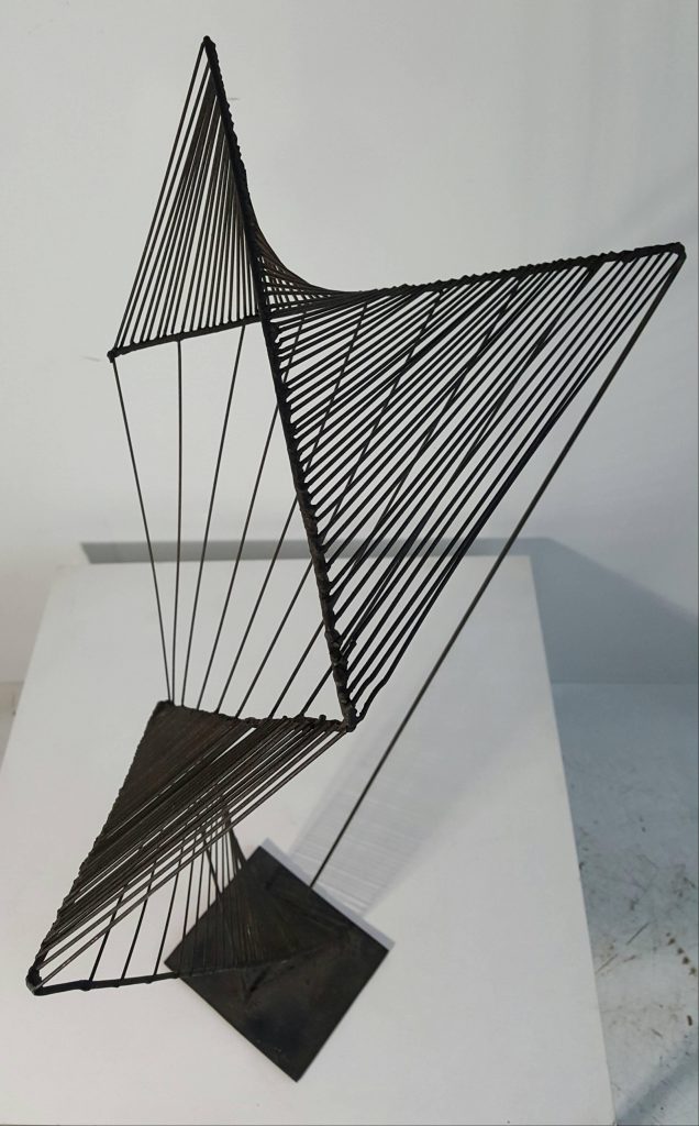
References:
https://sculpturecourse.files.wordpress.com/2011/11/v-sliceform-color1.jpg
https://i.pinimg.com/originals/15/97/95/159795ec2662ada1d8ad38e5ce9745e2.jpg
https://dg19s6hp6ufoh.cloudfront.net/pictures/613064517/large/The_Black_Lily_%28Spiral_Construction%29__1943_Bronze_by_Antoine_Pevsner.jpeg?1470823148
https://a.1stdibscdn.com/archivesE/upload/f_10624/f_59992931479599137307/20161119_124320_master.jpg
PROCESS
Planes
At first, I wanted to use the letters from my name to form the model.
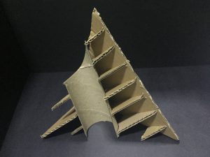
I made a small model using paper to see if it works, then I did a larger model with cardboard.
After I realised that we were suppose to use basic geometric shapes for the planes, I tried experimenting with the different shapes and arrangement using paper.
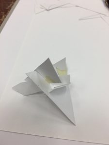
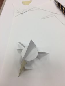
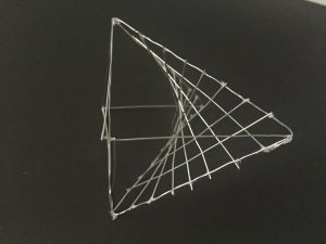
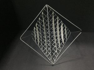
I wasn’t satisfied with what I made and since it wasn’t done with proper measurements, it would be difficult to replicate it with cardboard. After researching, I decide to make a sliceform model so I tried it using paper again.
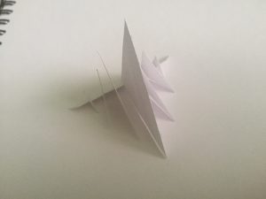
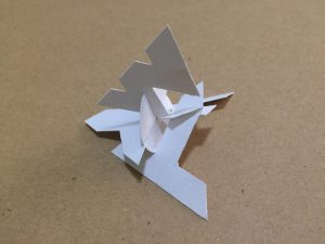
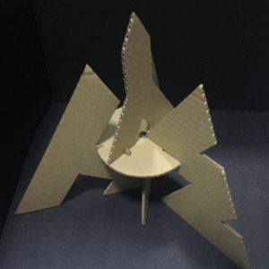
The model ended up looking symmetrical and boring so I thought of making it look different from every side. I wanted it to show a square, circle and triangle on each side. It was difficult to do this with the small model so I made a larger one with cardboard.
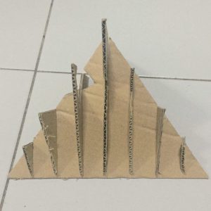
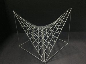
As I had to make sure the model only took up the volume of the tetrahedron, I couldn’t really vary the shape of the model so I decided to cut up the shapes instead. I also tried to include a curved plane into my model.

Lines + Planes
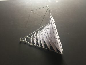
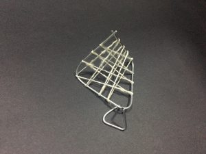
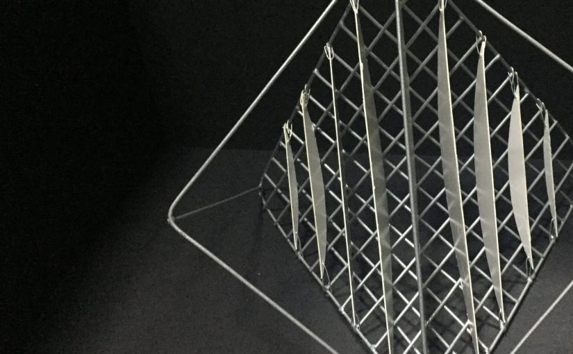
I tried to use blutack on a small wire model to figure out how to make the curve using straight lines as blutack can stick on to the wire without glue. When it worked, I did it with wires on a slightly larger wire model.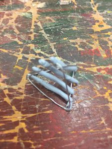
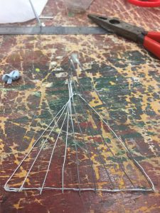
I wanted to use the idea of making the model look like a square, circle and triangle on each side since I could break free from the tetrahedron structure for this model. I found out that a tetrahedron can fit into a cube and decided to work on that idea and extend the tetrahedron.
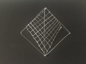
I liked how it looked so I decided to make a larger wire model and soldered to wires together. Then, I realised that there weren’t any planes so I added so planes that were similar to that of my sliceform model but tried it on the smaller model first. I found that it kind of puts emphasis on the curve made by the straight lines. I tried putting the planes on the outside and inside of the model but it didn’t look as interesting when the planes were outside.
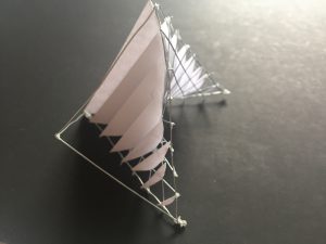
As I felt that there wasn’t a disintegration, I tried making smaller models to add on to the larger models but they didn’t seem to fit and looked like there was too much going on.
In the end, I just left it as it was and didn’t add the smaller models.
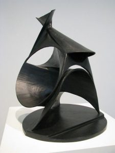
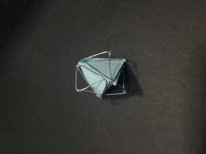
FINAL
Planes
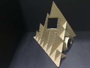
The final model is a sliceform model of a tetrahedron with cutouts that form a square and a circle. It also includes a curved plane.
Lines + Planes
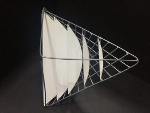
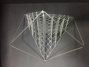
The final model looks different from every angle and still uses the idea of the sliceform from the planar model. It is breaking away from the tetrahedron structure.


