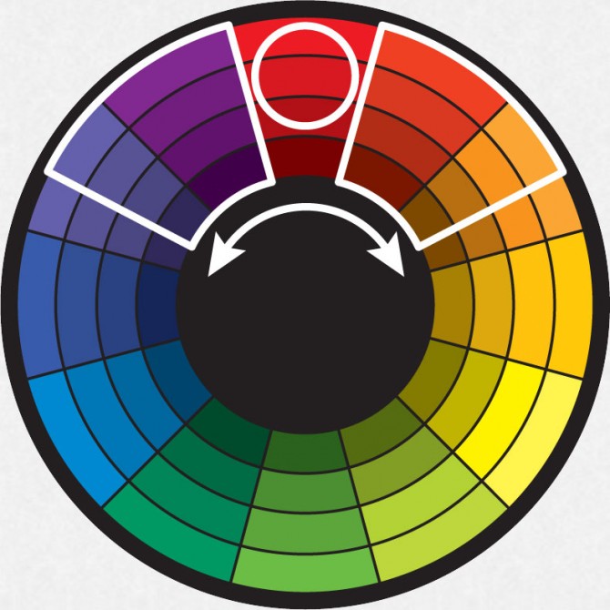
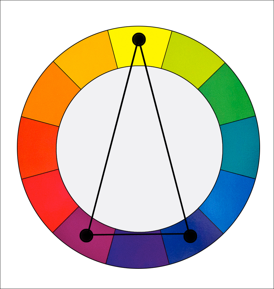
Colours are powerful. They stimulate and provoke human emotions, manipulating the way we feel. According to Colour Affects, here are the emotions represented by the 11 basic colours –
Primary colours include red, blue and yellow.
Red
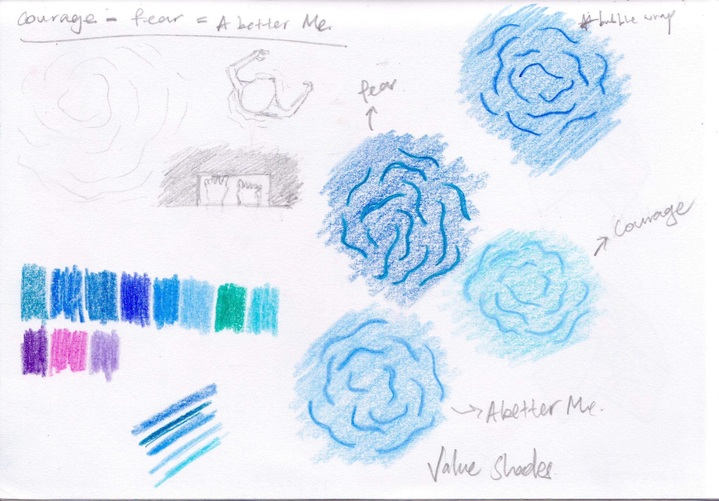
Positive – Physical courage, strength, warmth, energy, basic survival, stimulation, masculinity, excitement
Negative – Defiance, aggression, visual impact, strain
(NeochaEDGE,Flickr)
Lighter tint of the red will produce pink.
Pink
Positive – Physical tranquillity, nurture, warmth, femininity, love, sexuality, survival of the species
Negative – Inhibition, emotional claustrophobia, emasculation, physical weakness
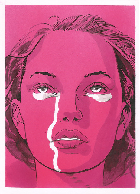
(Señor Salme, Flickr)
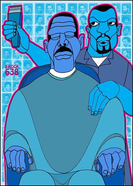
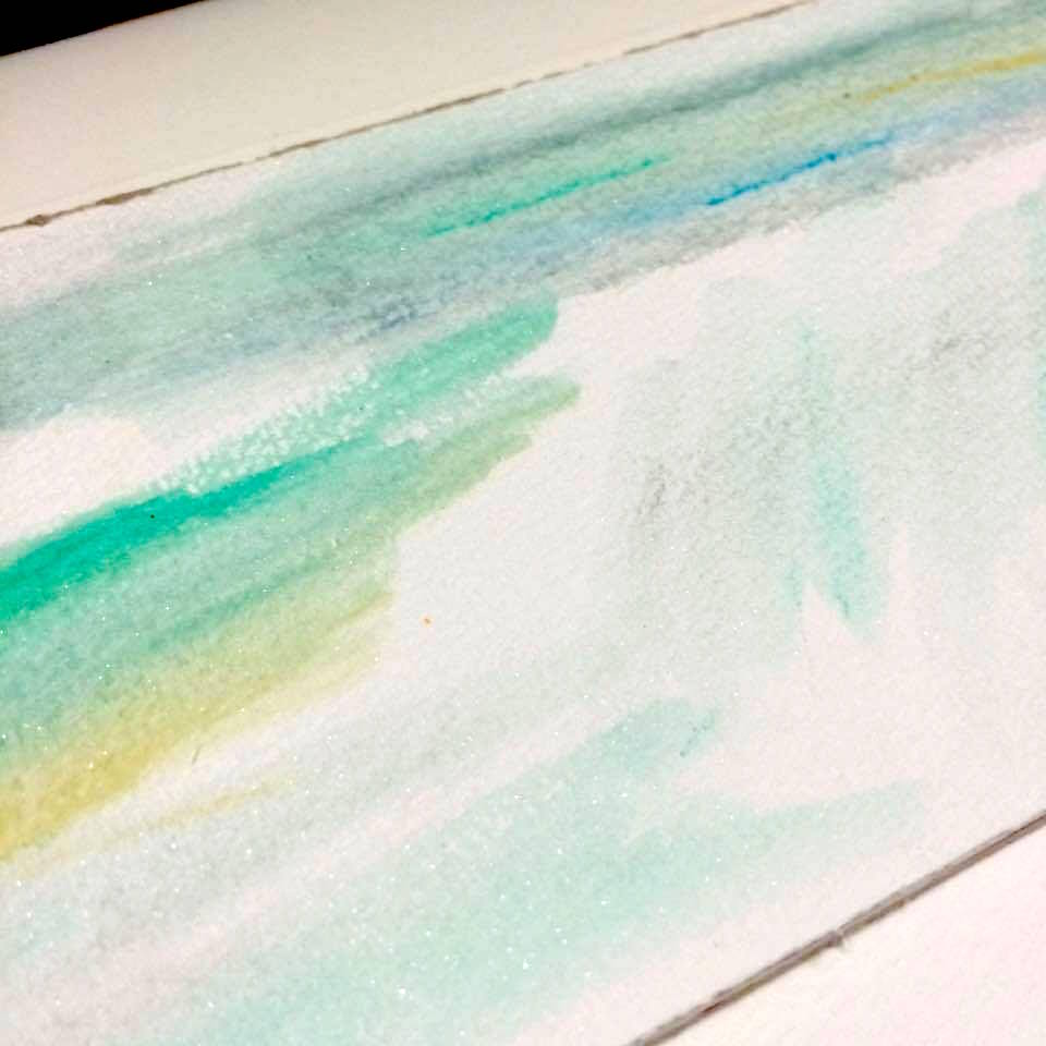
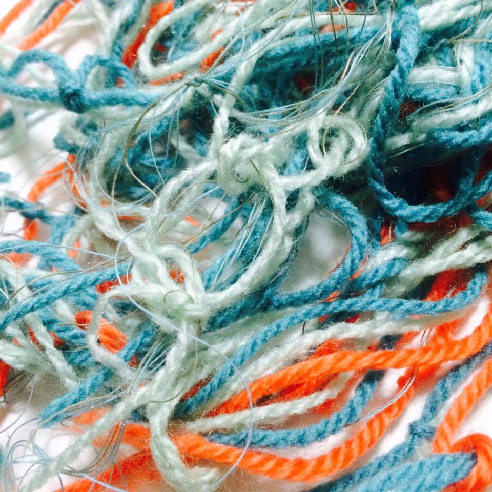
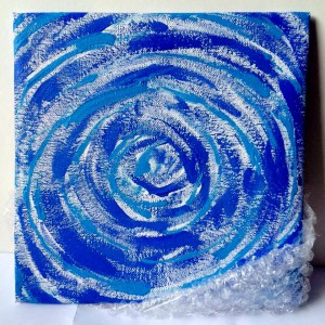
Blue
Positive: Intelligence, communication, trust, efficiency, serenity, duty, logic, coolness, reflection, calm
Negative: Coldness, aloofness, lack of emotion, unfriendliness

(Jozelle Dyer,Flickr)
Yellow
Positive: Optimism, confidence, self-esteem, extraversion, emotional strength, friendliness, creativity
Negative: Irrationality, fear, emotional fragility, depression, anxiety, suicide
(davidad64, Flickr)
Mixing all the 3 primary colours (red, blue, yellow) together results in brown.
Brown
Positive: Seriousness, warmth, Nature, earthiness, reliability, support
Negative: Lack of humour, heaviness, lack of sophistication
(Hiroyuki Izutsu, Flickr)
Secondary colours are green, violet and orange.
Green
Positive: Harmony, balance, refreshment, universal love, rest, restoration, reassurance, environmental awareness, equilibrium, peace
Negative: Boredom, stagnation, blandness, enervation
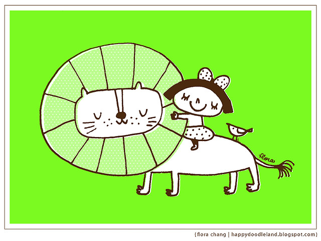
(Flora Chang, Flickr)
Violet
Positive: Spiritual awareness, containment, vision, luxury, authenticity, truth, quality
Negative: Introversion, decadence, suppression, inferiority
(Karen, Flickr)
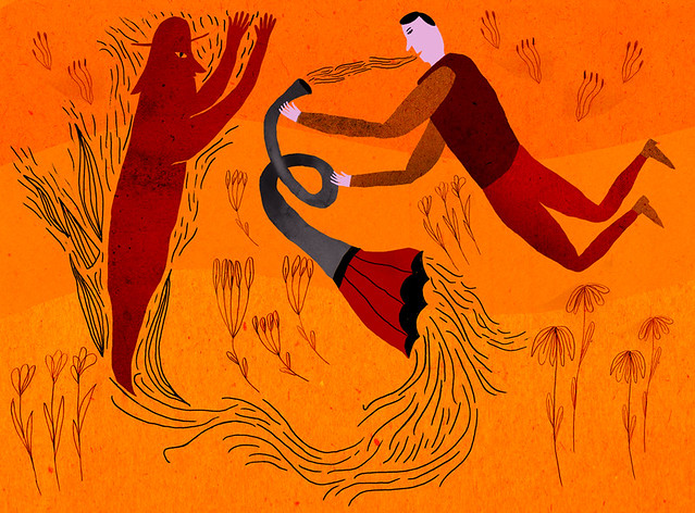
Orange
Positive: Physical comfort, food, warmth, security, sensuality, passion, abundance, fun
Negative: Deprivation, frustration, frivolity, immaturity
(Pashandy Ep, Flickr)
Shading colours are black, grey and white.
Black
Positive: Sophistication, glamour, security, emotional safety, efficiency, substance
Negative: Oppression, coldness, menace, heaviness
(Denis St. John, Flickr)
Grey
Positive: Psychological neutrality
Negative: Lack of confidence, dampness, depression, hibernation, lack of energy

(Serdar Saygi, Flickr)
White
Positive: Hygiene, sterility, clarity, purity, cleanness, simplicity, sophistication, efficiency
Negative: Sterility, coldness, barriers, unfriendliness, elitism
(alloparis.allotokyo, Flickr)


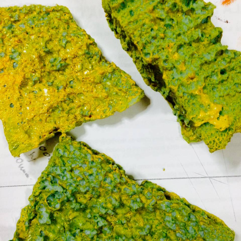
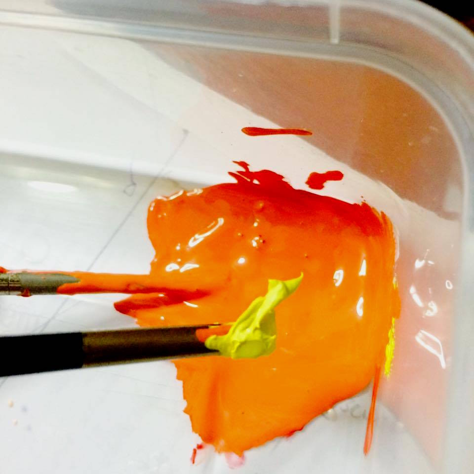
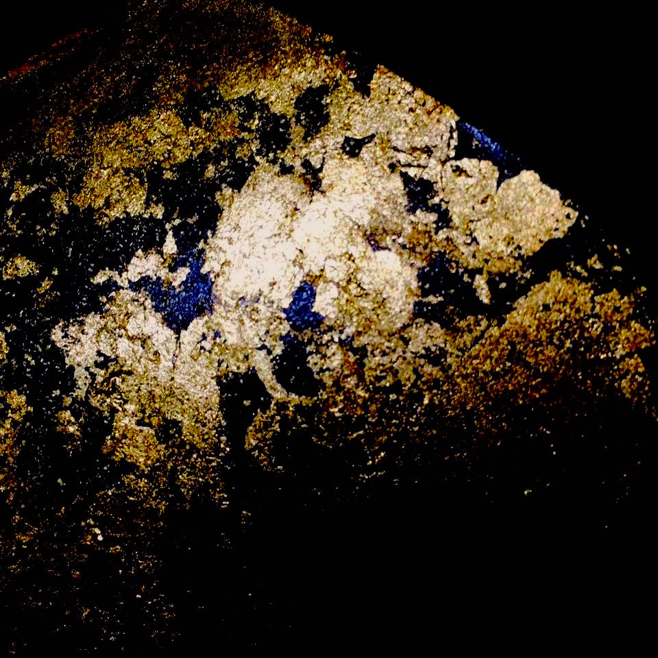
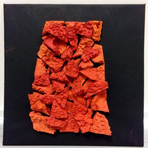
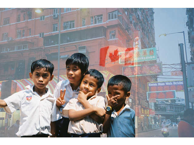
 (Toronto, Canada, 2014)
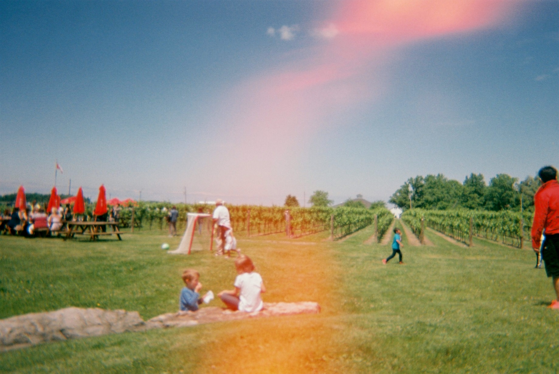
 (Toronto, Canada, 2014)
 (Toronto, Canada, 2014)
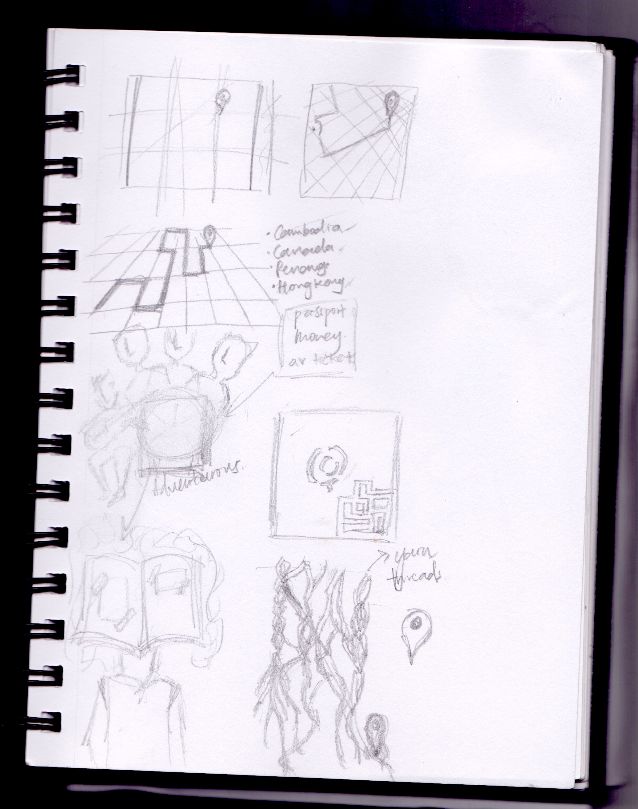


 An ordinary cowbell