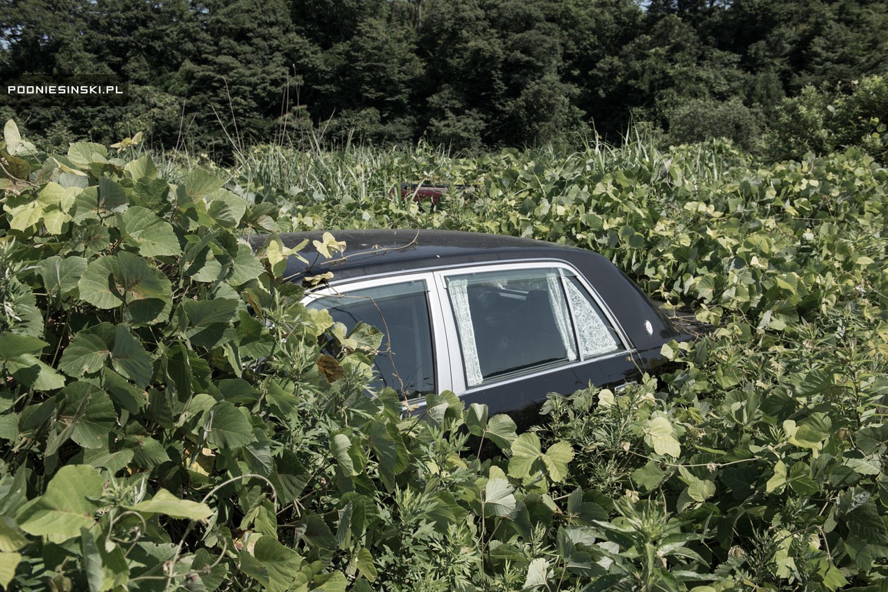
The artists picture the space installation as their responses to the aftermath of Fukushima nuclear disaster in 2010. Residents were forced to evacuate from their homes when nuclear radiation spread across the town, abandoning every possession they had. This room captures the moment of emergency, anxiety and fear of the evacuees. Marking its fifth year as an exclusion zone, the time capsule flourishes with nature. Inspired by an installation located right in the prohibited area, Don’t Follow the Wind (2015) will only open to public in years when radiation is completely cleaned up. This artwork aims to resurface the forgotten disaster and provoke discussion between humanity and authority rights.
Reflection
Creating an installation has expanded my horizons in discovering the possible ways to craft a narration within an art piece. Unlike short films, we had to really dive deep into the essence of our focused story. Why do we want to expand on this topic? How do we tell story in a non-linear way? How can audience relate to your story? It was a nerve wracking start, for just deciding on medium and location. Many ideas were infeasible due to resource constraints. Soon we realized that we were clouded with so many considerations, and it was not going anywhere.
Our installation, Traces, derived from our fundamental interest to revisit someone’s memory/ dream/ experiences (from our first ideation process). Fear was an emotion we would like to explore, and an idea struck when we chanced upon a documentary video called “Don’t Follow the Wind”. It is the juxtaposition between human and nature, a contrast between life (overgrown plants) and death (abandonment home).
I am too amazed by the other groups’ installations, inclusion of performance and interactive art. It was interesting to understand their thought process and execution, that would definitely help me to better plan and express my works in the future installations (hopefully?).
The 2011 Fukushima earthquake led to the world’s biggest nuclear disaster since Chernobyl. It’s been five years, and citizens are still unable to return to their contaminated homes. The radiation levels remain dangerously high, and will probably stay this way for a long time. We were intrigued by the state of homes in the Fukushima prefecture left by citizens who were forced to evacuate. The untouched homes within Fukushima now serve as a time capsule, capturing the moment of anxiety when disaster struck. This is inspired by an installation called “Don’t Follow The Wind” (2015), where a group of artists entered the exclusion zone and placed their works in abandoned homes.
In our installation, the audience steps into a room belonging to a former Fukushima resident, and gets an intimate look into her daily life before she knew what was coming. We invite viewers to think about the power of inanimate objects and the stories they can hold. At the same time, there is a slight nod towards the relationship between man and nature — when man leaves, nature flourishes. Finally, we hope to generate discussion about the nuclear meltdown and its ongoing repercussions.
CONCEPT
The idea for TRACES came about when we chanced upon a documentary about an art installation held within the exclusion zone of the Fukushima prefecture, called “Don’t Follow The Wind”. In 2015, a group of 12 artists including Ai Weiwei and Trevor Paglen created works that were placed within three buildings in the exclusion zone (Muñoz-Alonso). The thing is, the works will not be open to the public until the area is free from contamination, possibly in a couple of decades. “In this way it will serve as a monument to the disaster, and its ongoing consequences,” says one of the participating artists, Franco Mattes.
Although the Fukushima Daicii nuclear disaster happened in 2011, citizens are still coping with the effects five years on. Many of the 300,000 people who were displaced are still seeking answers as to when they can return to their homes. Because they weren’t allowed to bring their belongings with them for fear of contamination, their homes are filled with memories, sentimental treasures and daily essentials, a time capsule of their lives before they knew about the tragedy that was to come.
Immersive space
We decided to create an installation space that explored the use of inanimate objects in a room, and how the combination/placement of items could tell a narrative, or paint a picture of emotions when disaster struck. Making use of what we learned in class about characterisation, the idea was to suggest a presence instead of physically having one in the room.
Video
We also implemented the appropriation of videos, piecing together news clips, citizen captured videos, documentaries and interviews as a timeline for the audience to get a sense of how the past five years have been in Fukushima. Appropriation is a useful tool for shedding light on social issues. By extracting the original imagery and rearranging them using pattern, repetition and juxtaposition, artists create new meanings in the work (“A New Order: Appropriation Art In The Digital Age”). The video not only serves as a concise recap and informative source for audience, it also brings about more discussion and awareness of what is going on. For example, the interviews in the video revealed a lot more insightful details, such as how a family of six is squeezing in a child’s room, likely to be even smaller than our installation room size. Another interview then pointed at the government not being truthful towards the locals, not telling them accurate details about the radiation levels as well as being unable to give them an answer as to when they can go back to their homes.
Our appropriated video compresses the five years into a single clip saturated with sadness and fear, further highlighting the severity of the Fukushima nuclear disaster. In the installation, it plays on loop on an old television.
EXPERIMENTATION
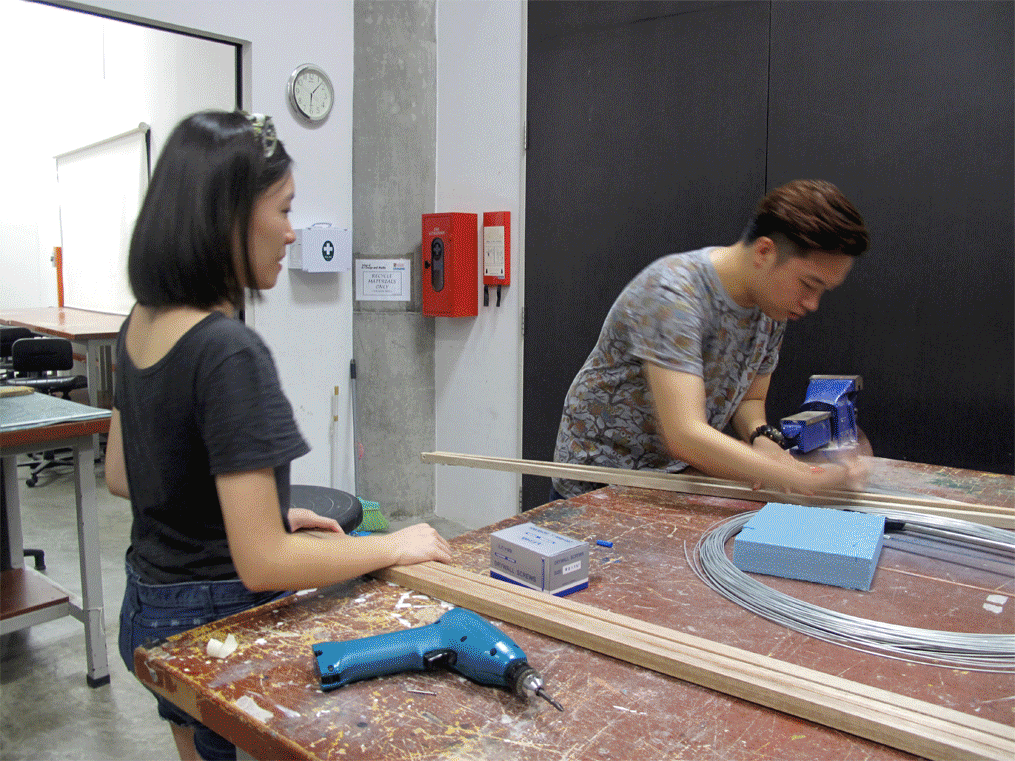
Throughout our execution of the installation, there were countless times our ideas did not turn out as well as we had expected, and were thus improved on or scraped, changing along the way to our finalised installation.
Video
The initial appropriated video was more than 7 minutes long and we felt would be too draggy for audience to view if it was on loop. If they missed the start, they would have to wait for a long time for it to restart, causing it to be a bit boring. We had also intended to add in more thought provoking ideas by localising it, asking what would the audience feel if the nuclear disaster hits Singapore, or even turn into a global disaster.
In the end, we decided to do away with these and cutting it down to 5 minutes, just to bring across the key points of recapping as well as some important details. The clips were clustered based on the similarity of events, just as how we were showed an appropriation artist once clustered clips of gunshots and made this his own installation.
Space and Objects
Our initial set up of the room was also different. While facing the main projection, the bed was initially on the right, the table on the left, which could be seen in our video documentation of the setting up. We later felt that this layout could not bring out the “room” kind of feeling we wanted, together with some concerns on the placement of projectors and projections, we decided to swap it around, ending up with a table against the wall, and the bed along the glass windows on the left. This way, we could also use the projection of a window above the table to provide a light source.
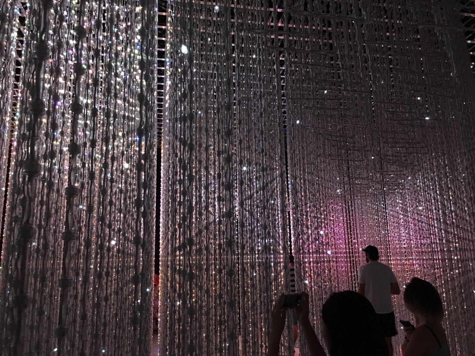
For lighting wise, we felt that the entire setup was nice in very very low light conditions when we tried out our initial setup on Sunday night, where we worked through the entire day to see what problems we might encounter (which turned out we had a lot). This was initially inspired by how The Future World exhibition has everything in darkness such that the main objects are in focus, drawing the full attention of audience.
Nonetheless, there has to be sufficient lighting for everything to be seen, to make sure the objects add value to our installation instead of just being there. We switched the lights on and off multiple times in a dilemma to whether the lights should be on or off, before coming up with the idea of making use of the projections as a source of light, as well as getting fairy lights to highlight certain important areas. This way, the room would be slightly dark to give a haunting feeling or being deserted, yet the lights could help out the original warmth of the room as well.
FINAL PRESENTATION
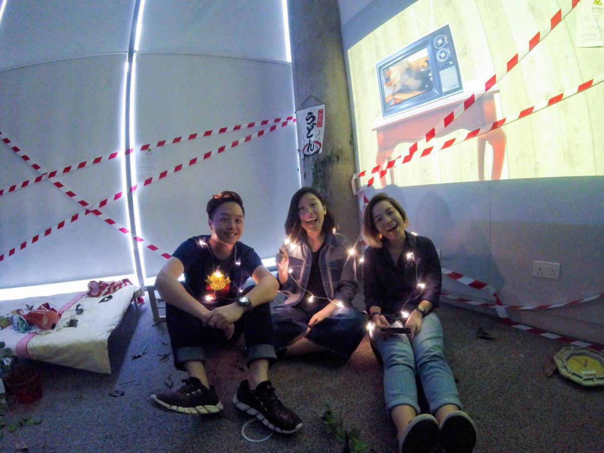
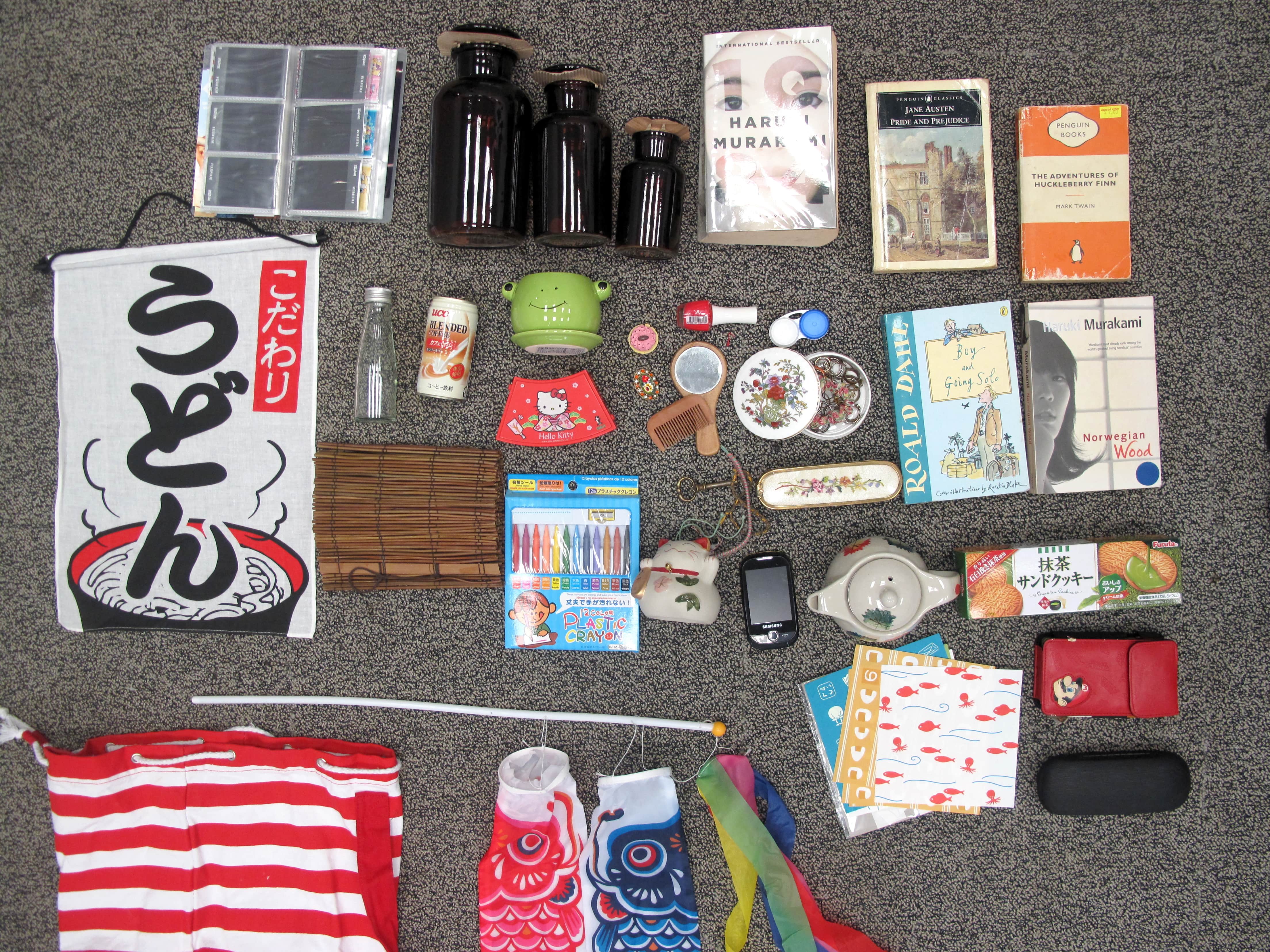
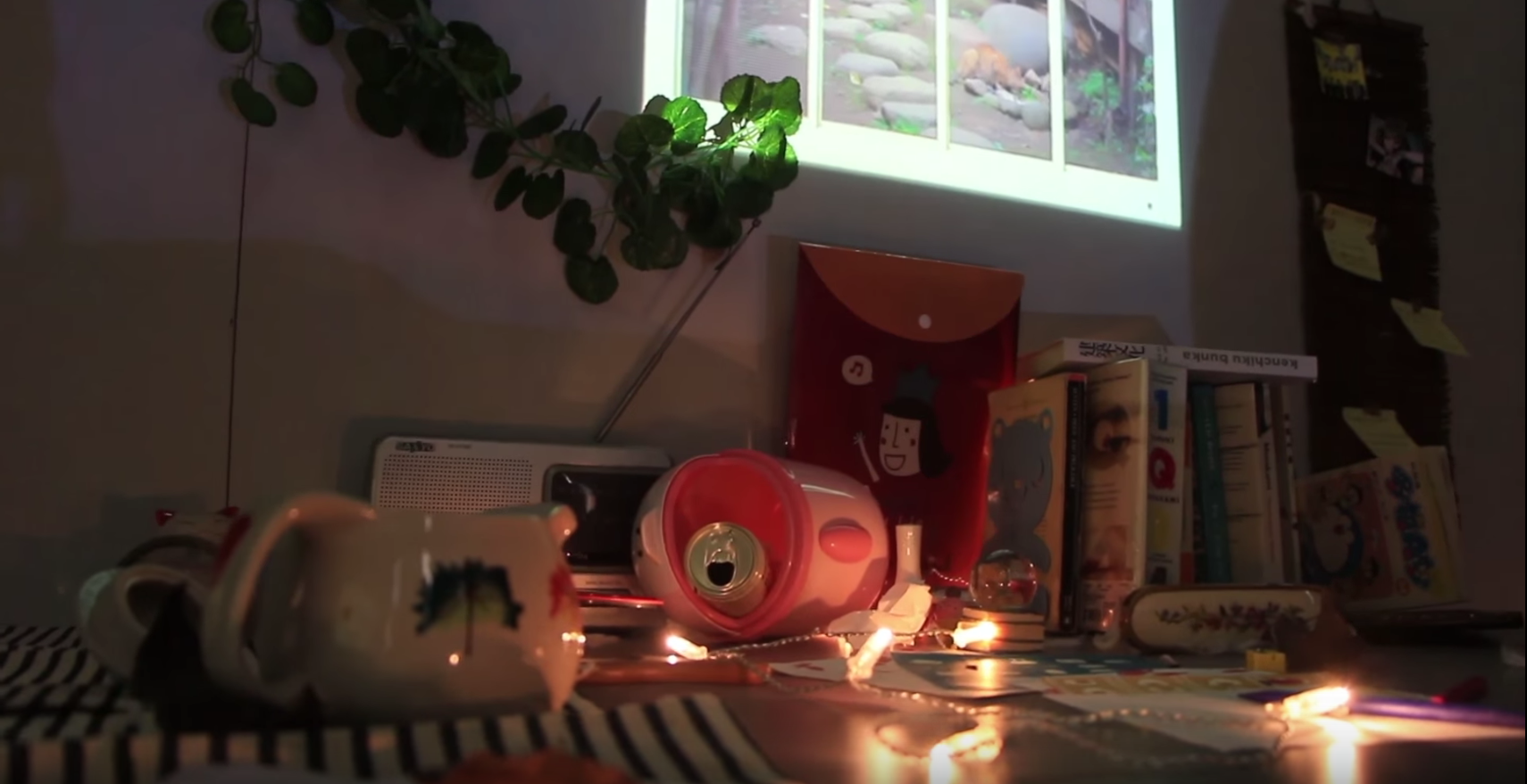
We invited our audience to enter the room without giving away any details. They were allowed to touch and feel the objects, crafting a story in their own interpretations. Here are the key elements to guide audience in enveloping an intimate understanding of an unidentified persona in her abandoned room.
Entrance
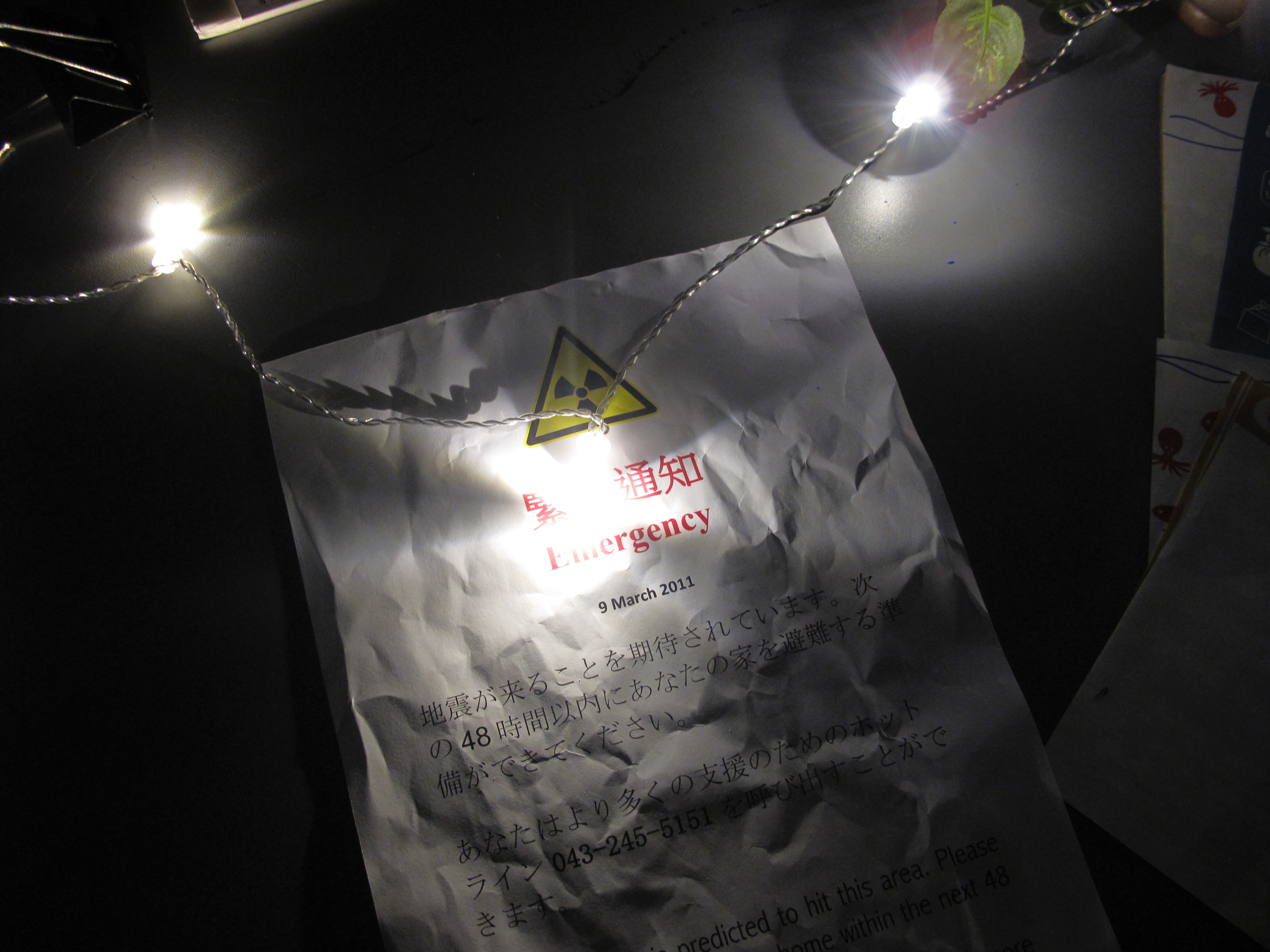
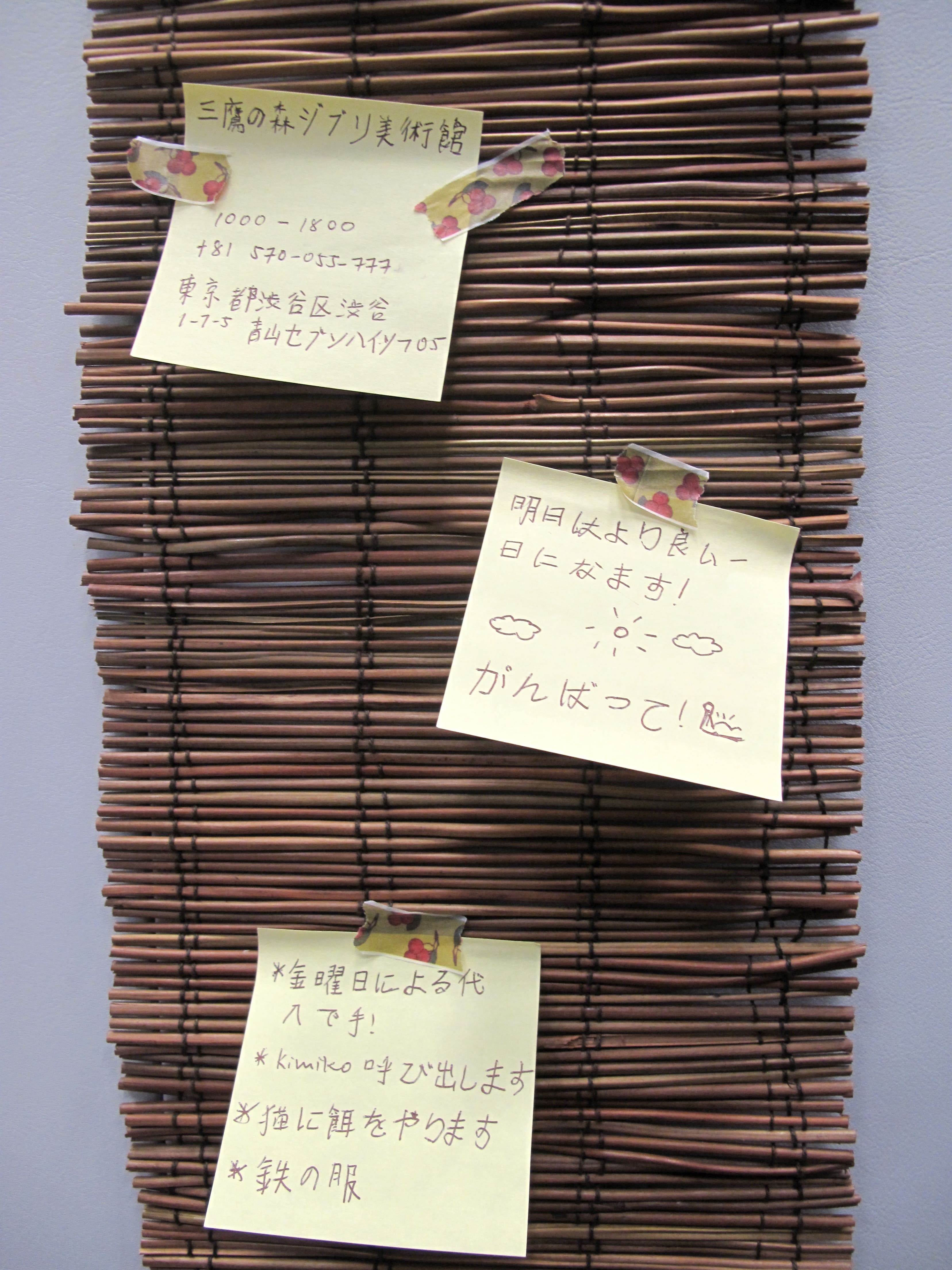
The door of the room was decorated with caution tapes stuck across the door, together with an emergency notice of the evacuation to give a context and ambience even before the audience steps into the installation. A smaller piece of notice was also partially exposed from beneath the door to seem as if the notice came from inside the room.
Study Area
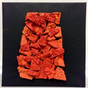
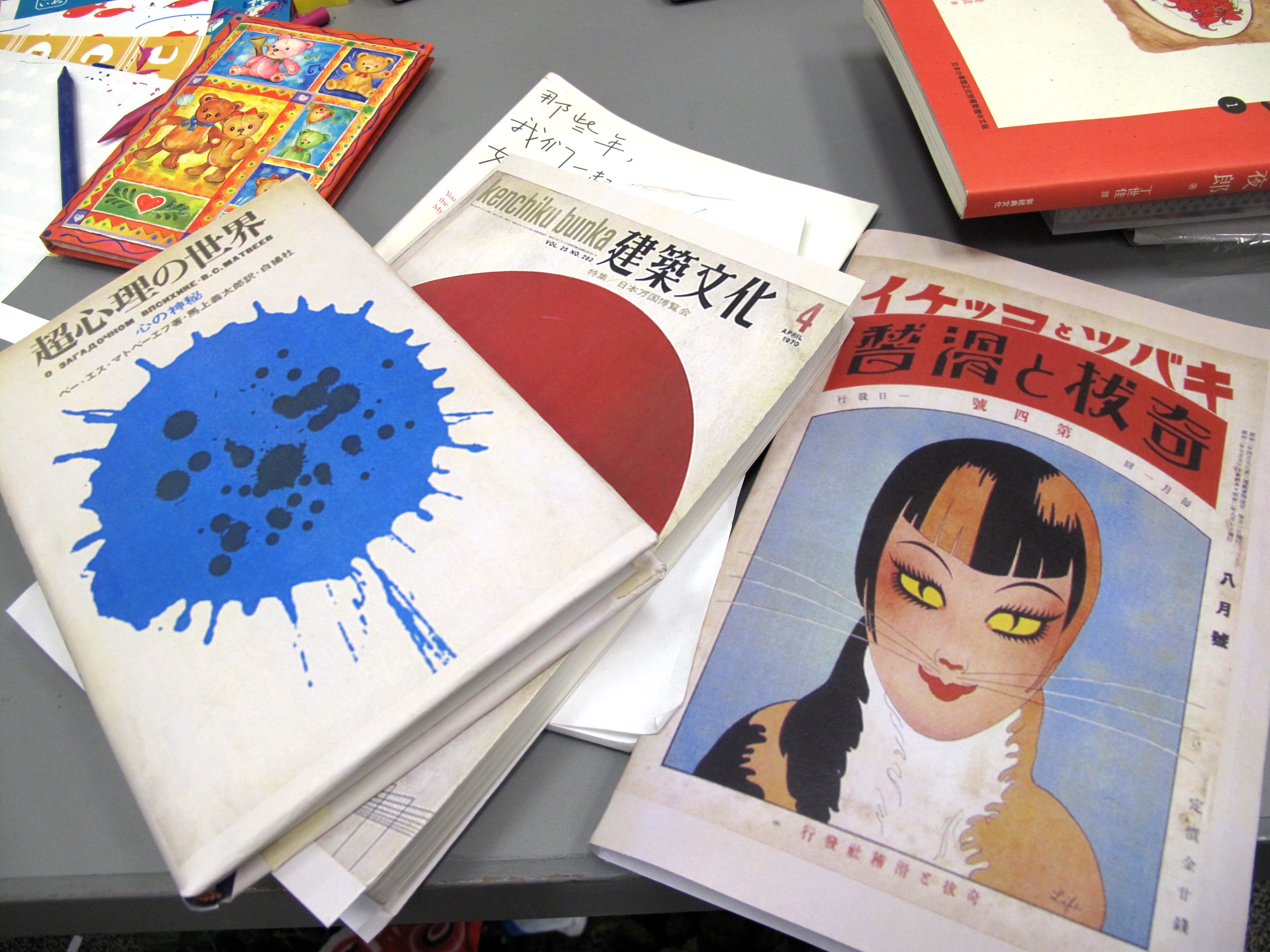
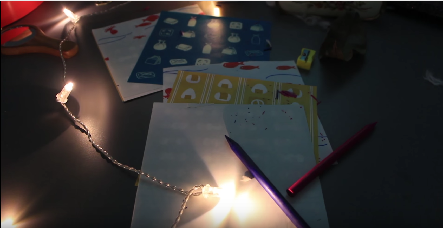
Personal items were scattered across the table to reflect the aftermath of Fukushima earthquake. Books relating to life, death and psychology tells us how emotionally affected she was for living within the nuclear zone where natural disaster could easily struck. Also, you could see photos of her with friends hanging right under the window. This portrayed her to be someone who is warm and cherishes her loved ones very much. A childhood photo album laid beside the table, leaving trails of her memories living in this room since young.
Window Projection
We casted a window above the study table, showing a Japanese street view outside. This helped to emphasize on the context, as well as adding more realism to the room. It also provided an alternative light source to bring attention towards the study table.
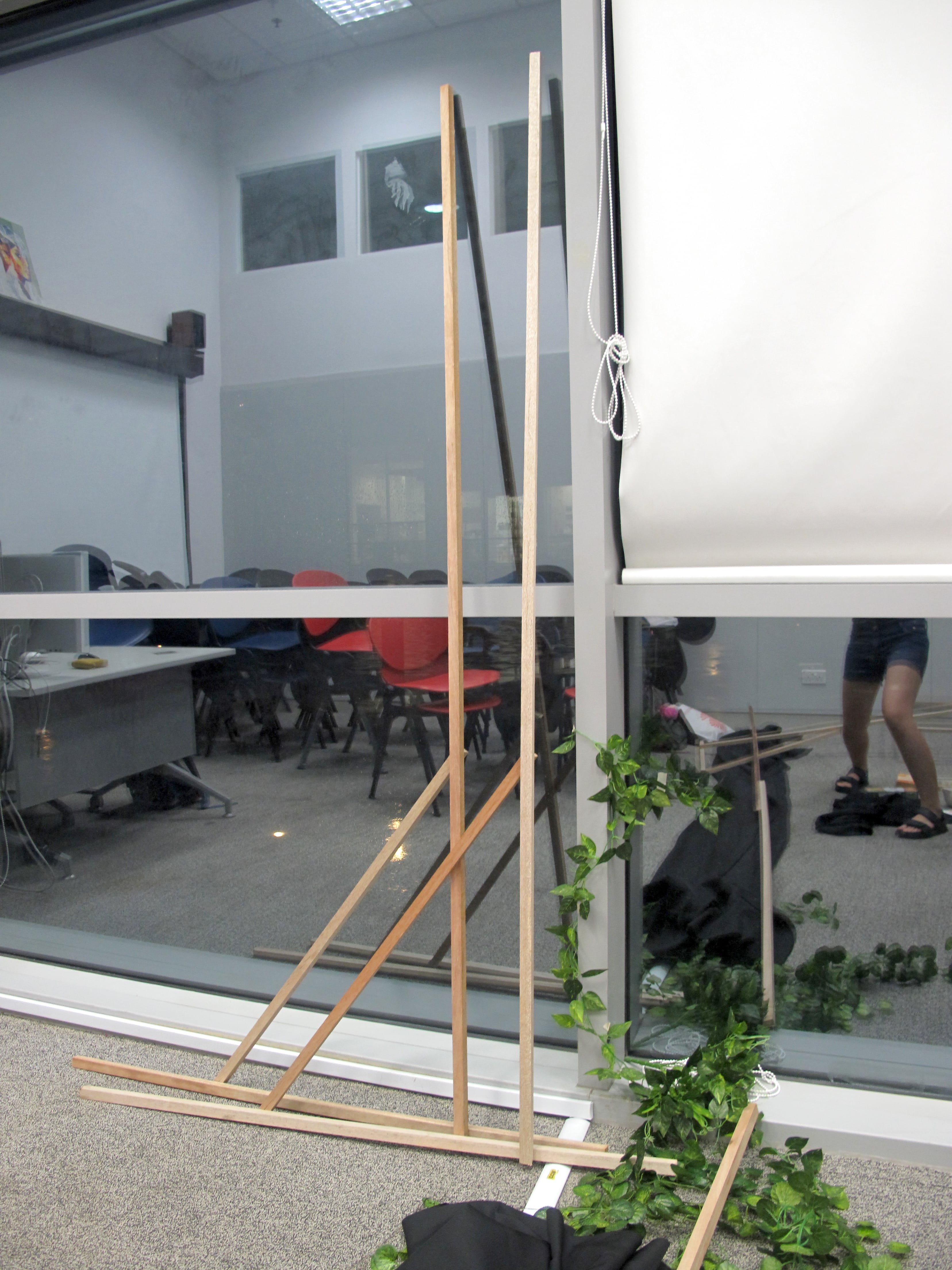
Partition
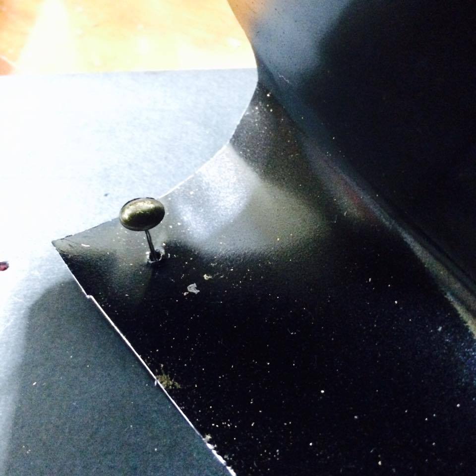
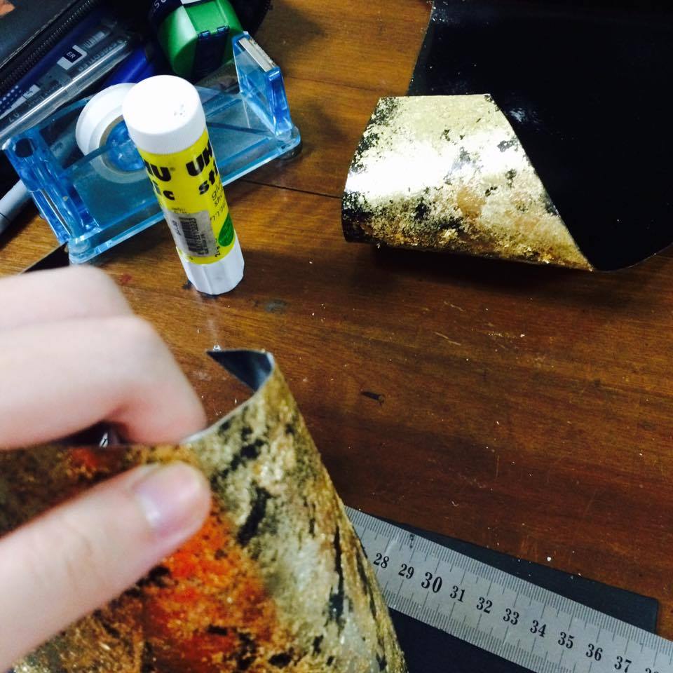
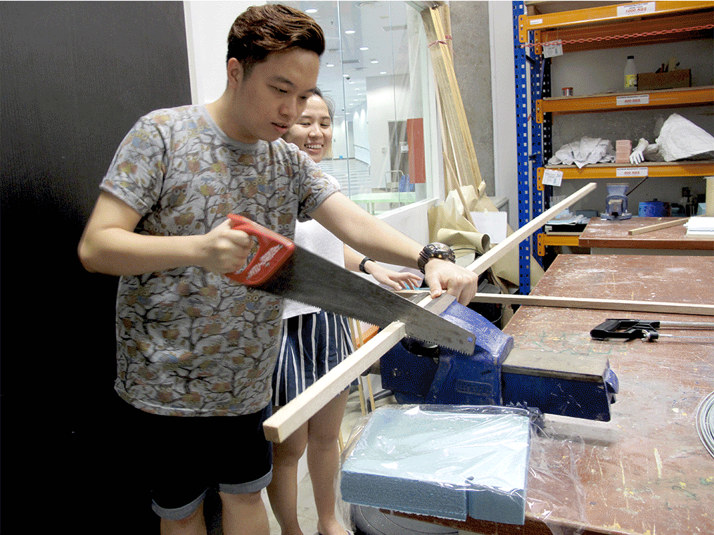
We decided to scale down the classroom by half, to how a regular bedroom would look like. The use of black cloth darken the room, provoking a sense of mysterious. Due to the limited budget and resources, we dug out wooden planks from the 3D studio and black cloth from the student club storeroom to construct the partition.
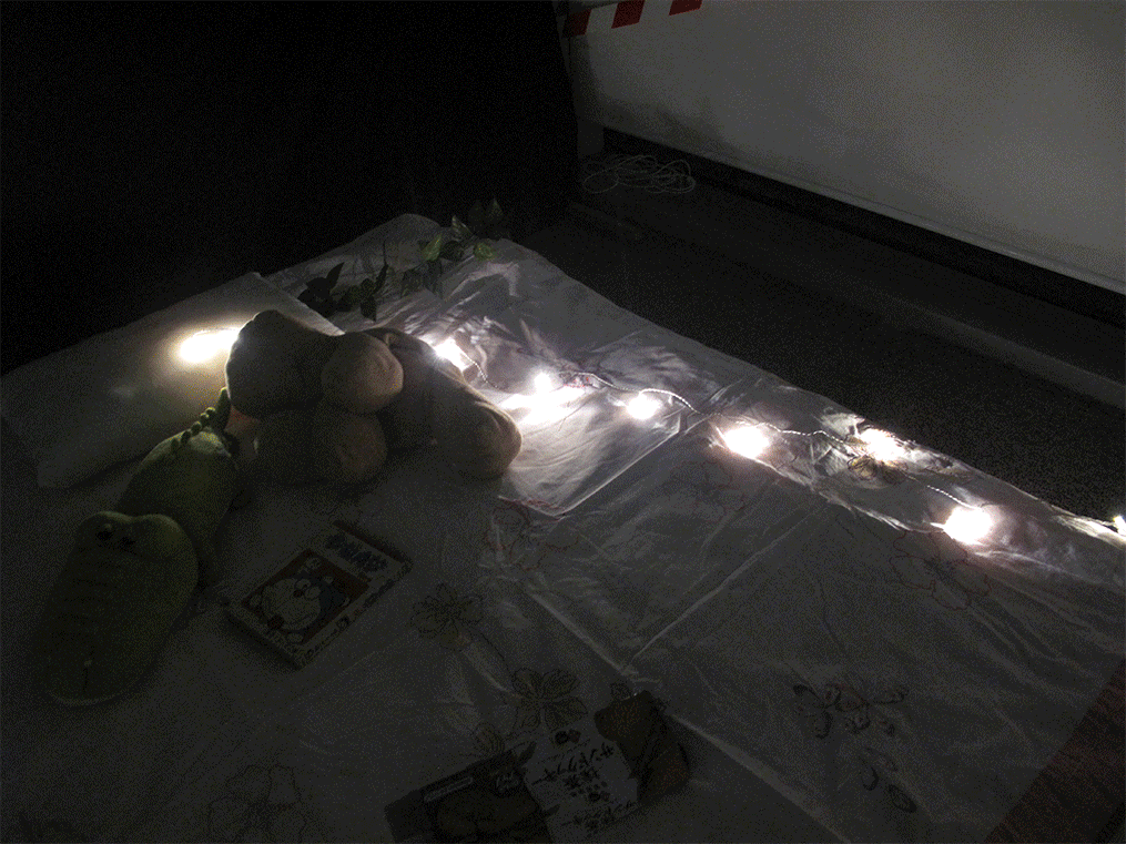
Fairy lights
Using the fairy lights, we aim to draw attention to the specific areas (mainly the study table and bed) amidst the chaotic room.
Bed
To enhance the ambience of a bedroom, we all decided that a bed was necessary. However, we could not find a bed frame and bed that we could easily bring into the room, thus we had to make one by ourselves. Same thing, we gathered wooden planks from the 3D studio and constructed a simple frame that was sturdy enough to hold a quilt as a thin mattress, but definitely not for use. We used a quilt to lay it over, supported by a huge wooden board used as a backing for Foundation Drawing classes.
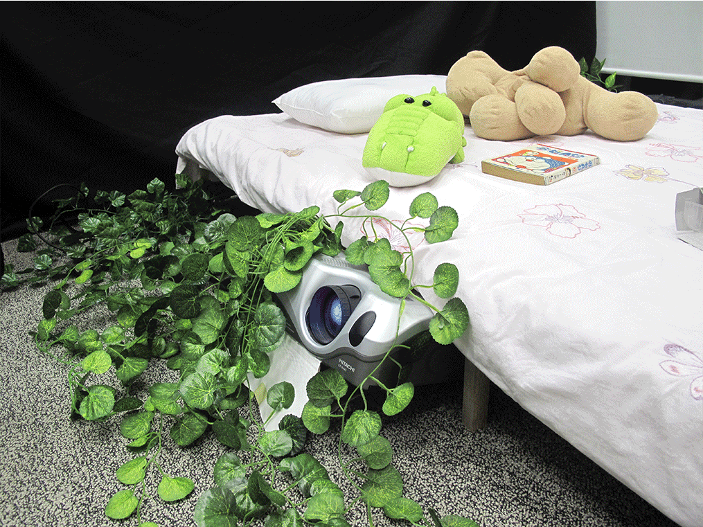
Pillow and soft toys were added to make it more real and personal, further enhancing the persona of the girl who used to live there together with food wrapping and a book. This also ties in well with the slight messiness of the room. There was also a small broken wooden chair toppled over next to the bed to add on to this.
Wall Projection (television that never stops playing)
The main projection showed a wooden background with a table and a television, where the television displayed our appropriated video on loop. Projection is used to create a homely feel, where the video in the television would seem more realistic as compared to projecting the video on the entire wall. This was also the closest we could achieve to displaying the video on a real television in a room. At the same time, it provided the room with most of its lighting.
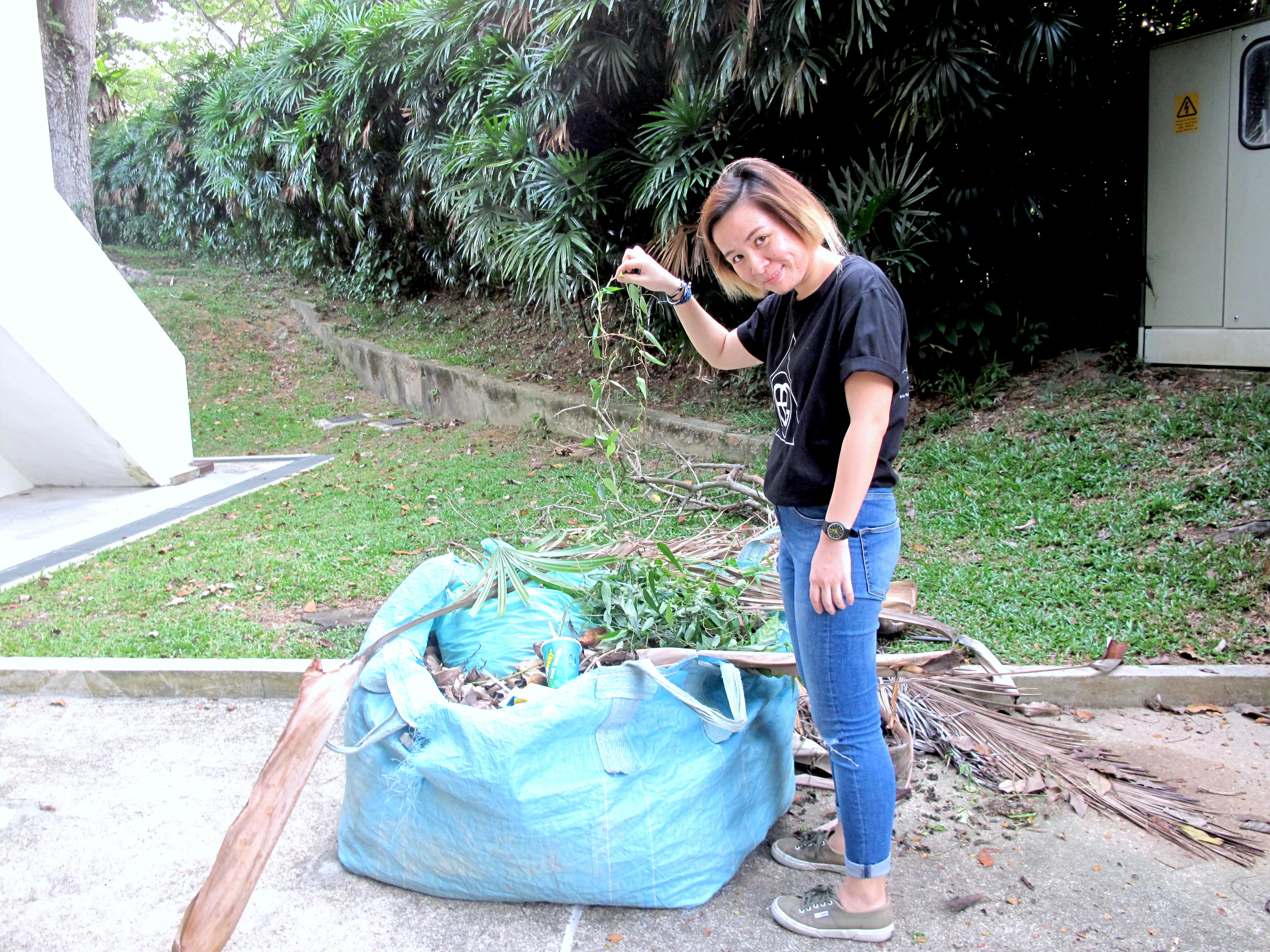
Overgrown Plants
We used vines that seem to grown from the entrance and under the bed to show how nature has taken over and flourished with the absence of human. They suggest the overgrowth of nature from outside into the house. Dried leaves are also littered around the floor as a signifier that time has passed and also add to the deserted and disaster theme.
Here is the video documentation to bring you through our process and final installation:
WORKS CITED
Muñoz-Alonso, Lorena. “Artists Install Works In Fukushima – Artnet News”. artnet News. N.p., 2015. Web. 22 Apr. 2016.
“A New Order: Appropriation Art In The Digital Age”. Montserrat College of Art. N.p., 2004. Web. 22 Apr. 2016.
Ego, a sense of self-importance, is something that is not for open discussion. Many fear the public judgement for acknowledging personal strengths and weaknesses. It is important to exercise self-judgement, where we could learn and grow as an individual.
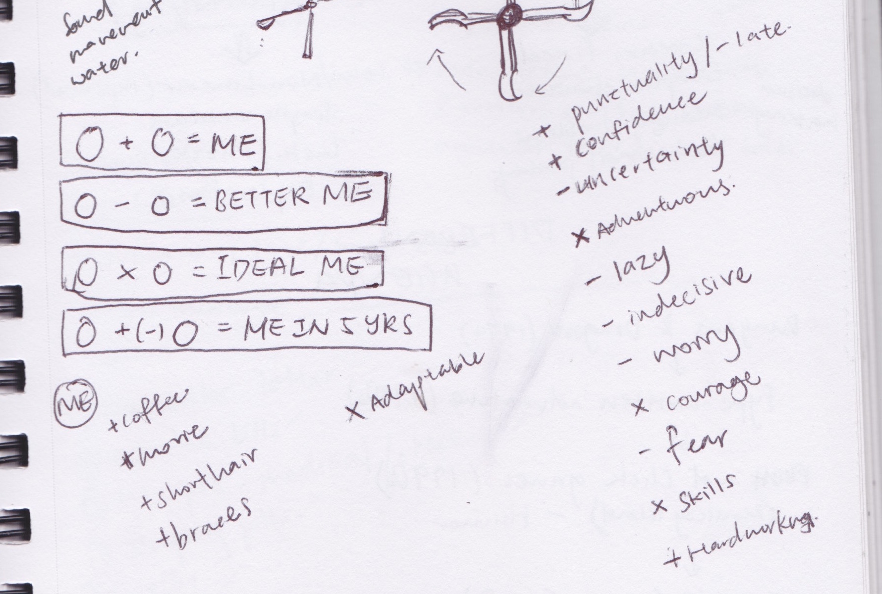
Here are the 4 equations to self-exploration:
____ + ____ = Me
____ - ____ = Better Me
____ x ____ = Ideal Me
____ +/- ____ = Me In 5 Years
To start off, I listed out possible adjectives or features that reflect my personality.
I filtered down to the following adjectives, in which the best representation of me:
ADVENTUROUS + BAD SENSE OF DIRECTION = ME
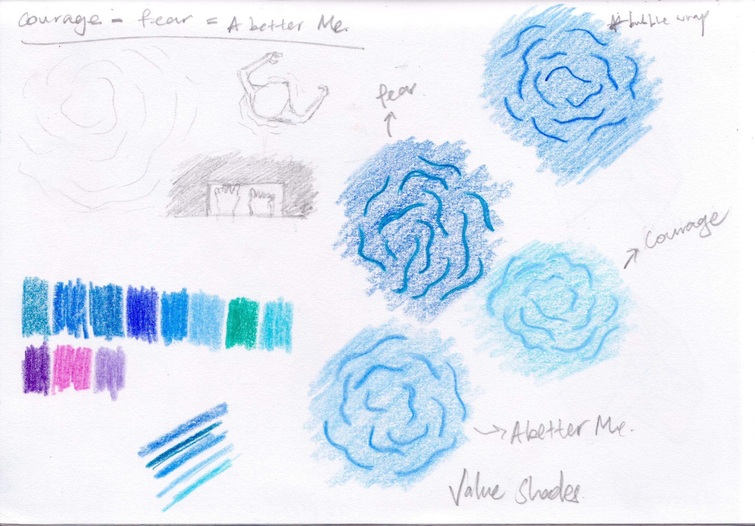
COURAGE - FEAR = BETTER ME
CURIOSITY X ADAPTABLE = IDEAL ME
PERFORMING ARTS + PRODUCT DESIGN = ME IN 5 YEARS
ADVENTUROUS + BAD SENSE OF DIRECTION = ME
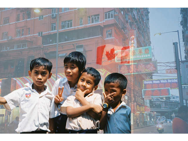
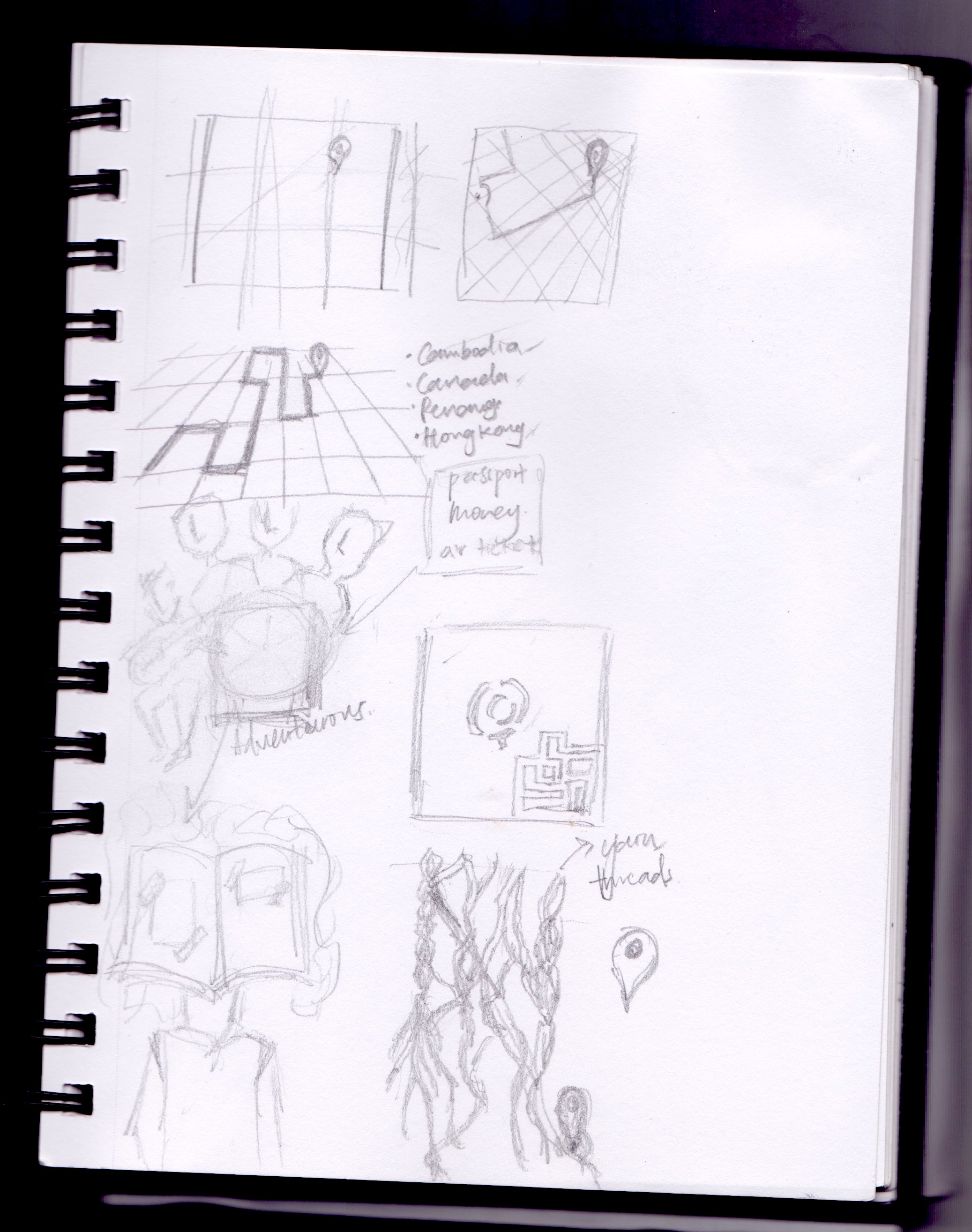
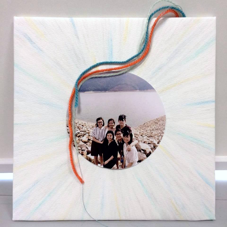
I love travelling overseas, immersing into the local culture and meeting people with alternative perspectives in life. Also, I am pretty bad in navigation. I need, the Google Map while travelling or to rely on my travel mates. When both fails, I find myself in unexpected situation, good and bad.
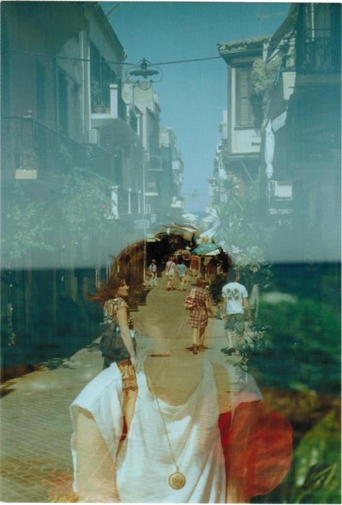
One of my spontaneous overseas trip happened recently in Penang. With a map on the hands, we had the best cuisines and met the friendliest shop owners. Company is definitely what makes travelling meaningful. I solve the equation with a group photo of me with my friends, whom I have been learning from to be a better person, a better me. Hence, I decided to compose this set at a very personal level by including my own photos.
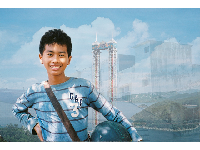
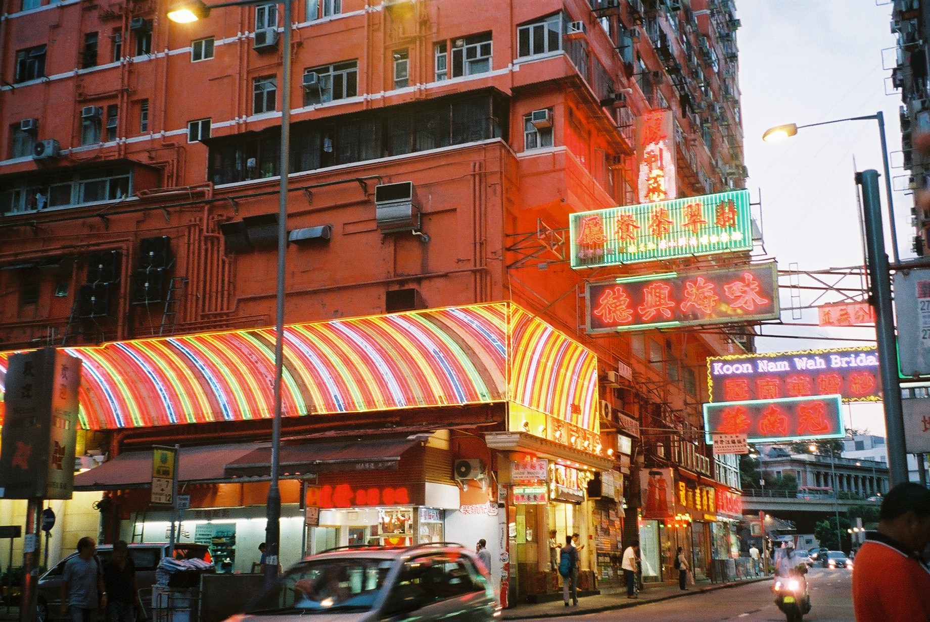
Triad harmony of blue, orange and green is used. Photos of the same hues are put together to create multiple exposure effects, juxtaposed with landmarks/places from different countries.
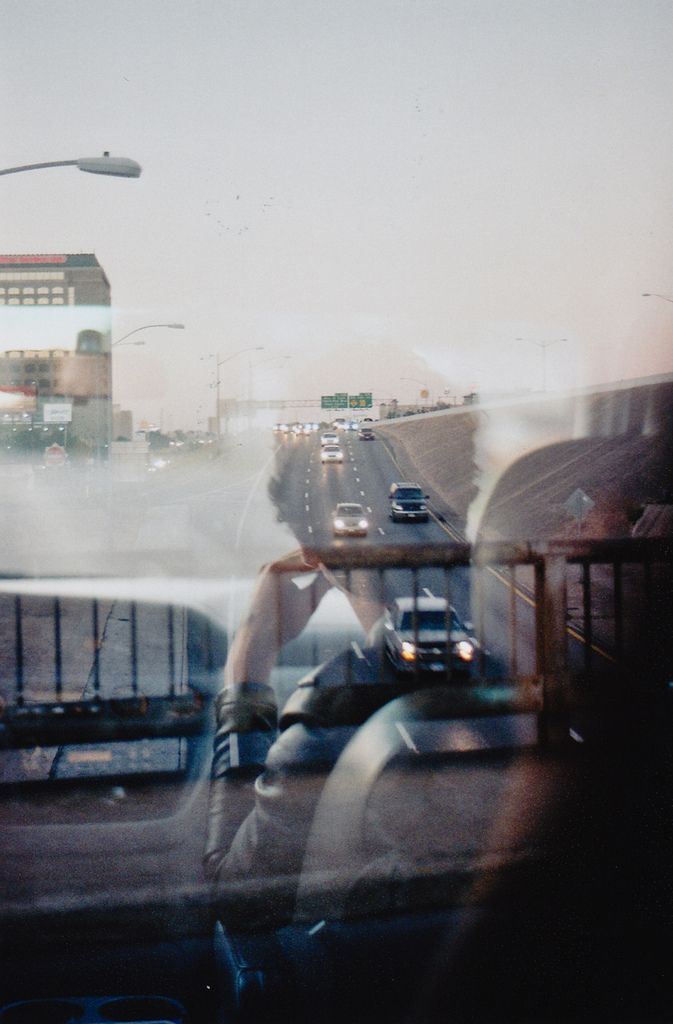
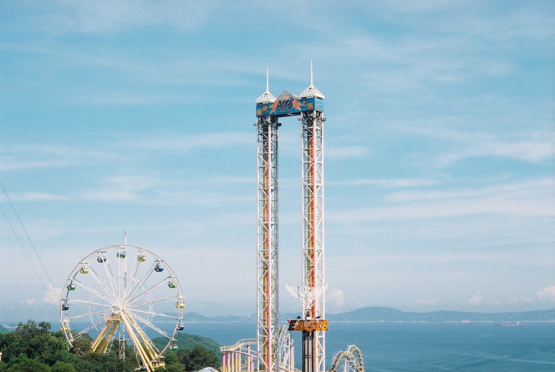
Blue hued photos –
(Hong Kong Ocean Park, 2015) (Terengganu, Malaysia, 2014) (Siem Reap, Cambodia, 2015)
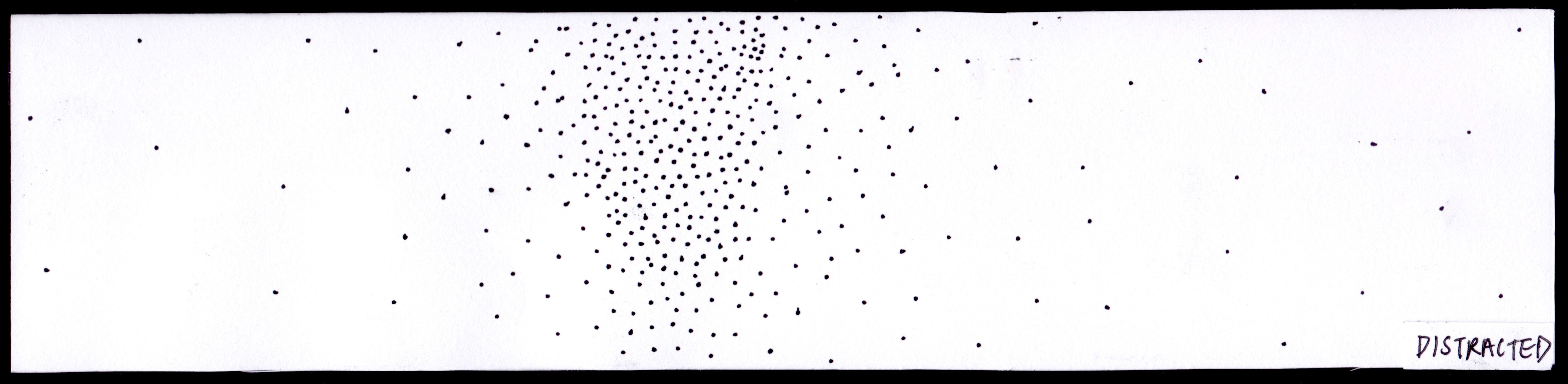
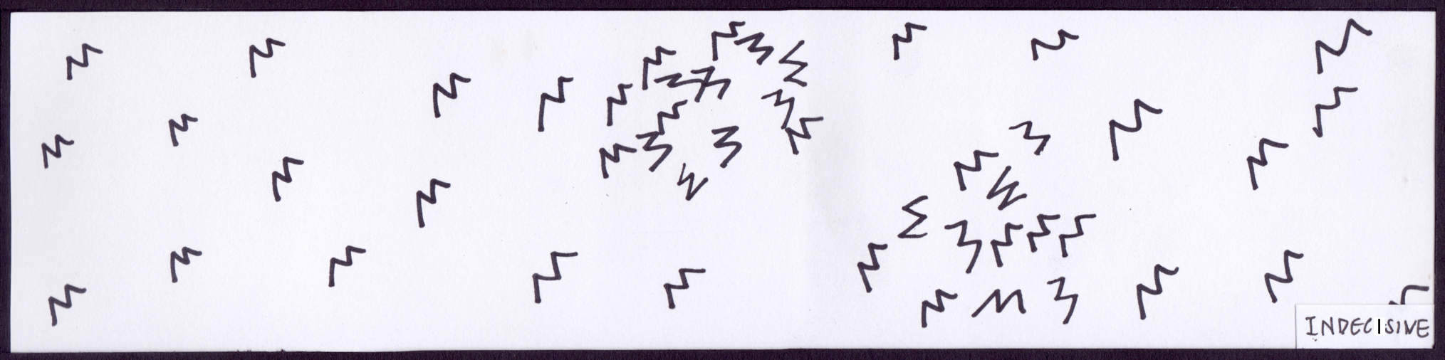
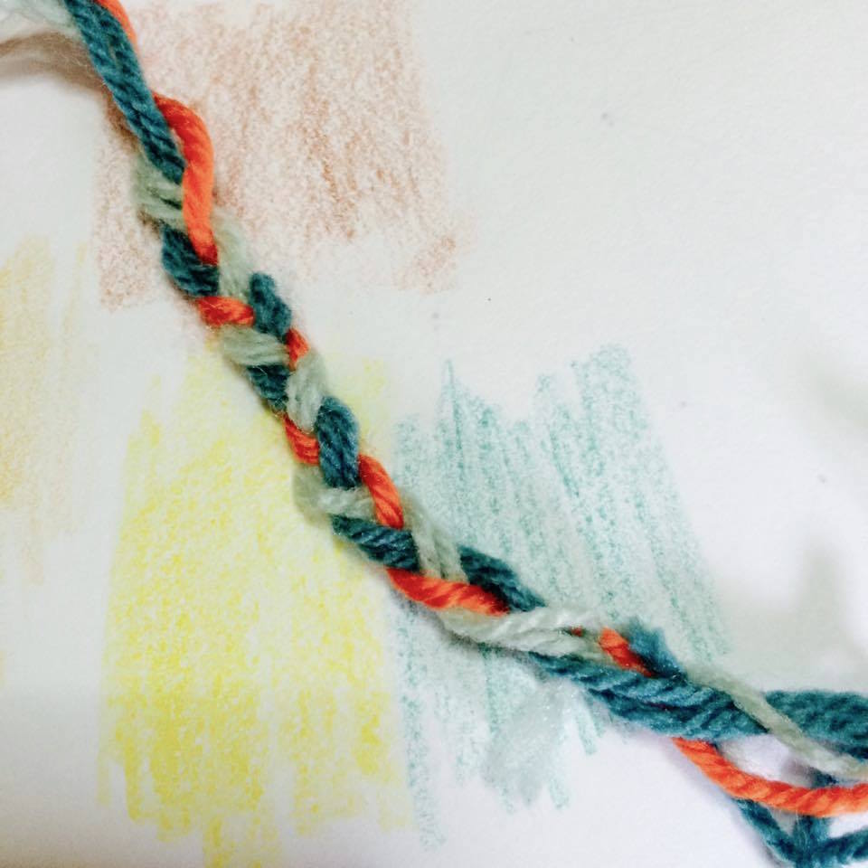
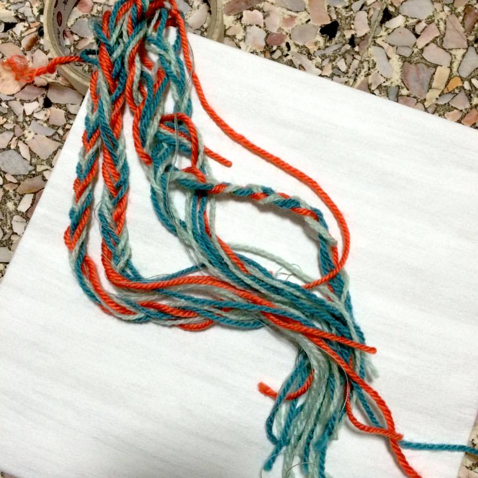
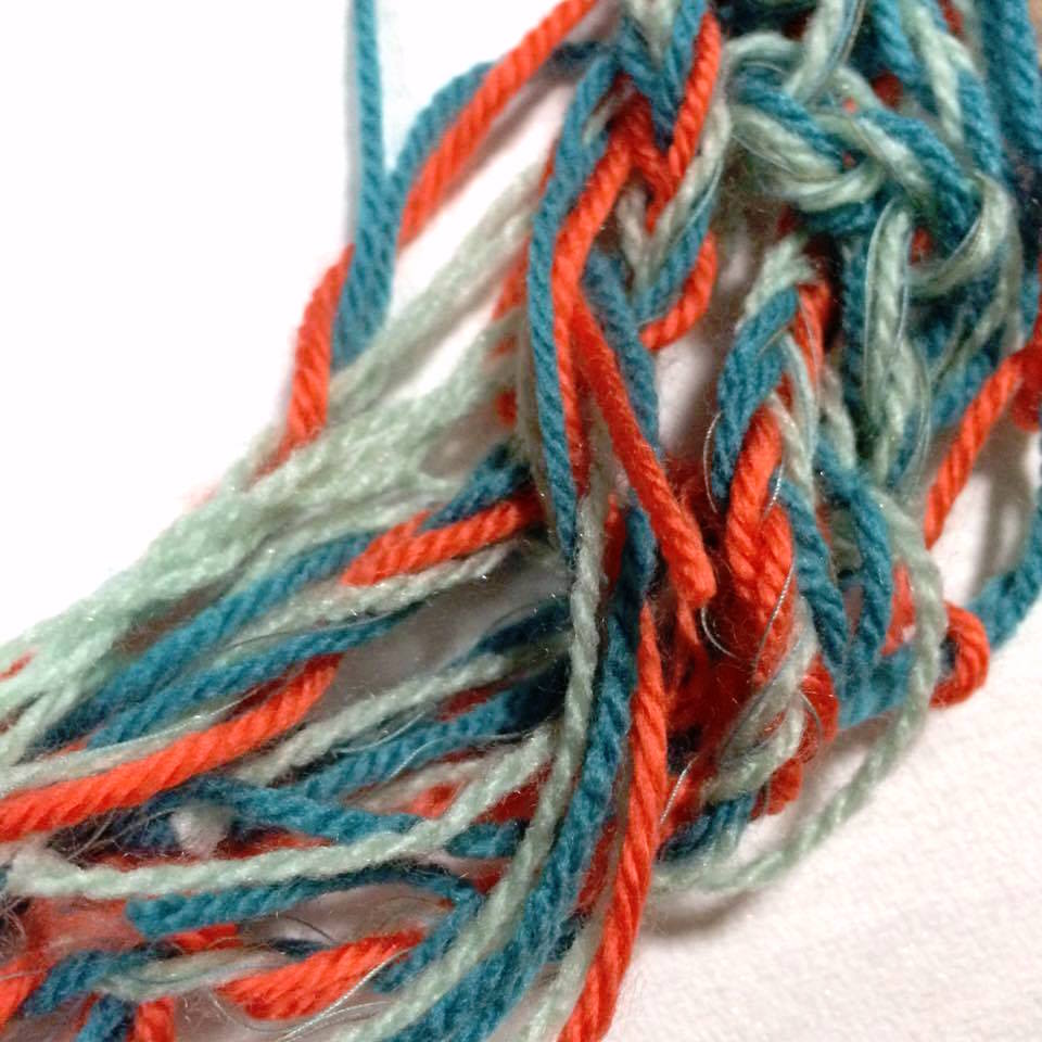
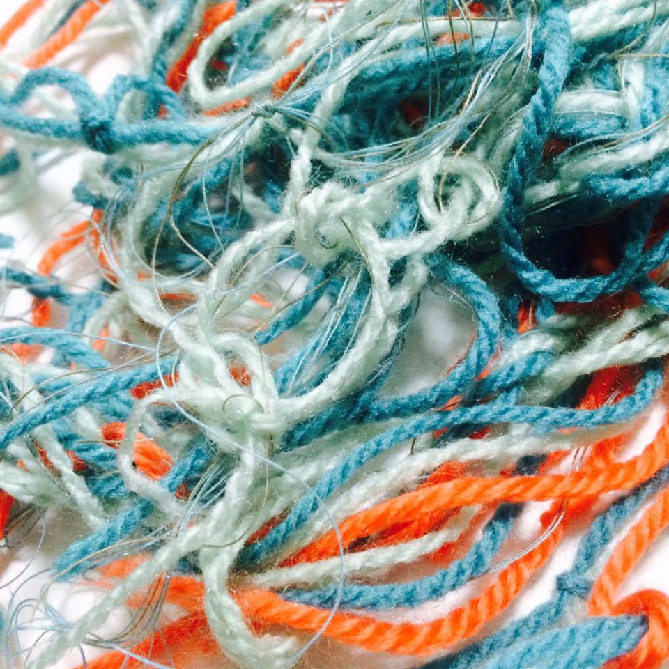
Our first assignment working with lines came to my mind, particularly with distracted and indecisive. Compact lines were cluttered in one area to create an irregular form. It is the same when one gets lost while navigating, walking in circles with uncertainty.
I decided to intertwine yarn threads with structure before losing into separate ways. Colours of the yarns and background are selected from the same triad harmony.
Final Compositions
adventure
+ Bad sense of direction
= ME
COURAGE – FEAR = BETTER ME
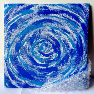
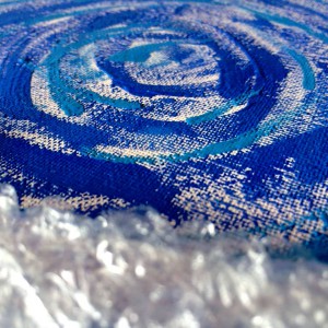
Fear can take over and hold you back in making decisions. It is a psychological obstacle when you feel insecure and bare. Relating to my acrophobia, I imagine myself about to dive into the deep swirling ocean. A better me means to be more courageous in life, to take a leap forward without caring too much. Fear should not entirely be eliminated in life, however, for its ability to motivate and push my limits further.
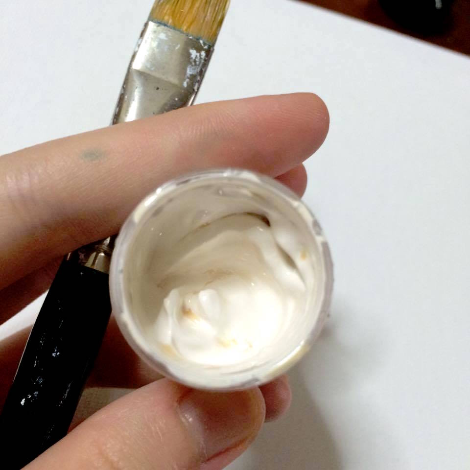
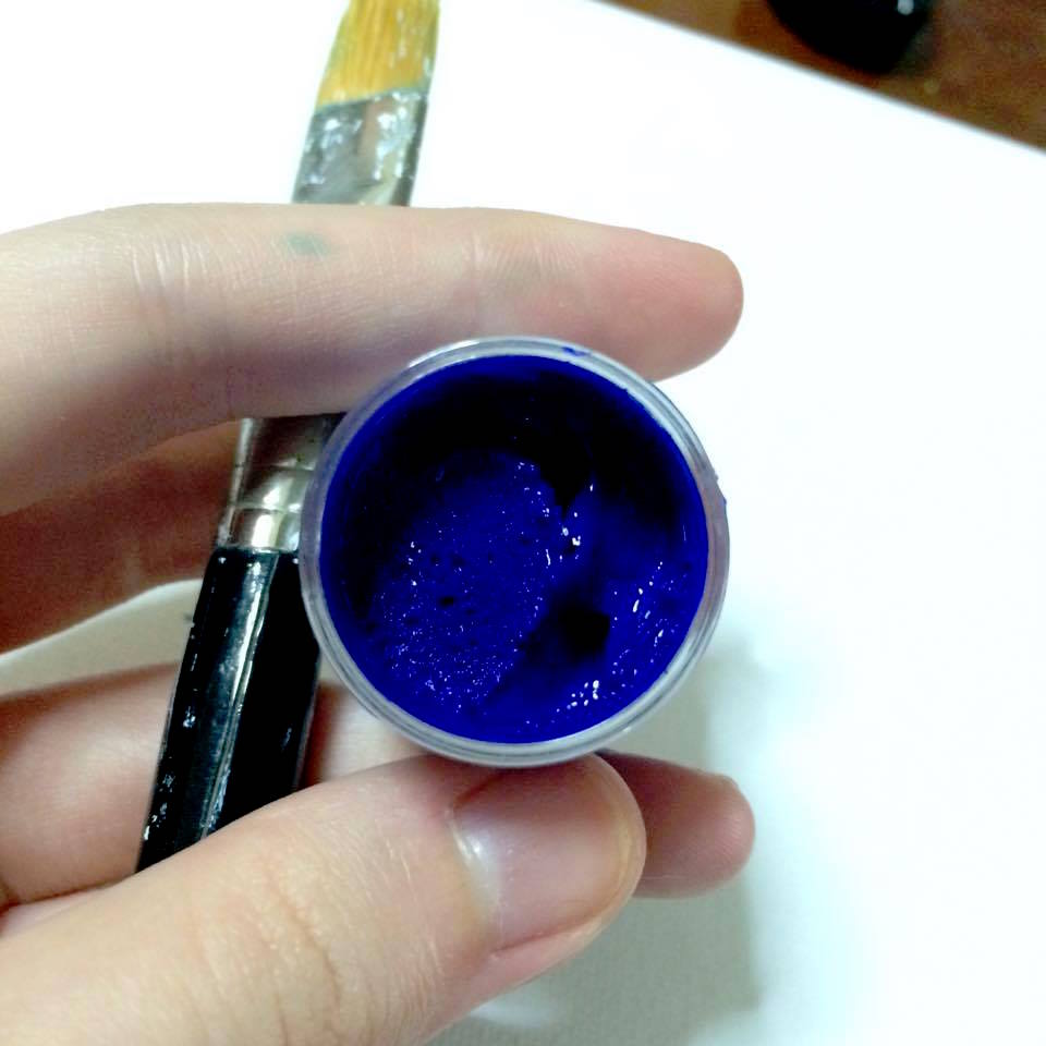
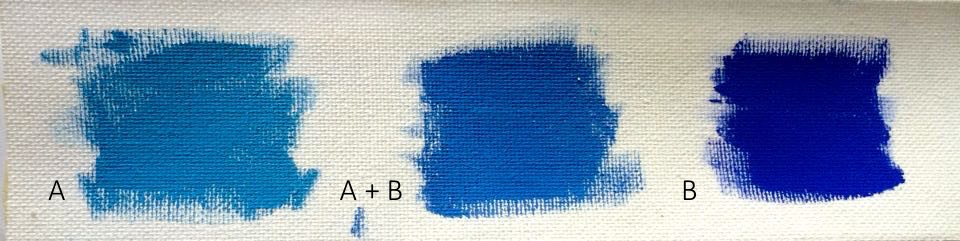
Initial attempts were to blend shades of blue to create different tones, but they did not turn out to be as vibrant in poster paints. Optical blending technique is used instead to contrast atmospheric moods. Bubble wraps build a sensual mood of feeling nervous, in need to hide for protection.
Final Compositions
Courage
– fear
= better me
CURIOSITY x ADAPTABLE = IDEAL ME
Curiosity allows me to open the doors of knowledge. However, I can take very long to get comfortable in a new environment, often missing the opportunity to interact with new people. An ideal me is to remain passionate in learning not just in books but through experiences. Becoming a more expressive and adaptive individual would help me to reach out to people of different backgrounds.
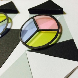
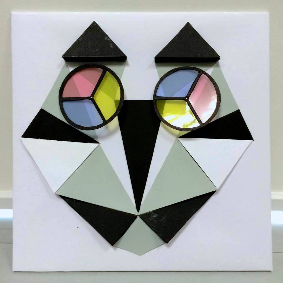
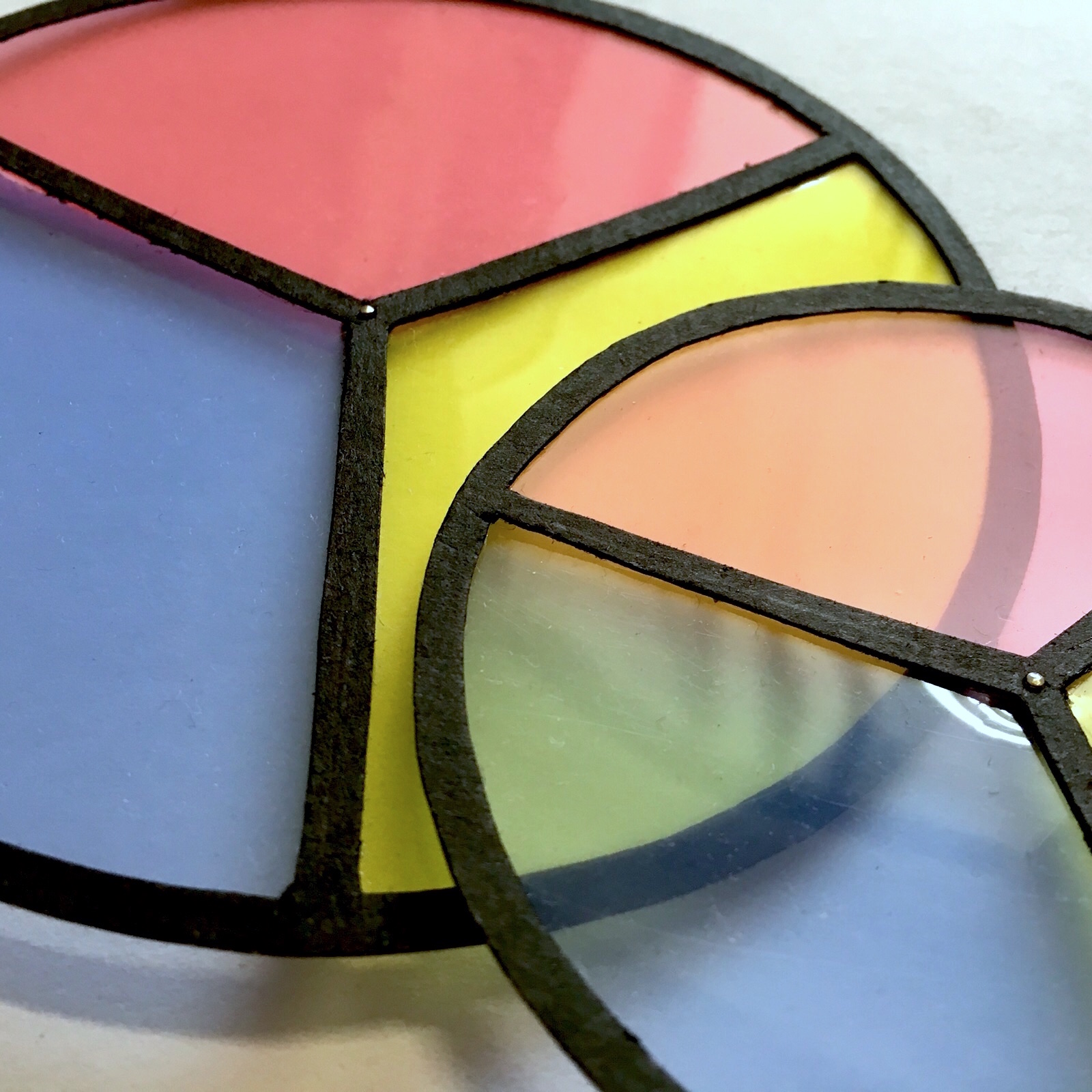
Curiosity is represented with cat for its nature behaviour. Triad harmony of blue, green and orange are used. Overlaying primary colour wheels create secondary colours (violet, green) to illustrate adaptability. By adjusting the lens of different colours (embracing new perspectives), we gain wisdom in new ways. Monochrome harmony from the Ideal Me composition is used to allow the colour wheels to pop.
I love how production set design could elevate stage atmosphere, providing performers with an illuminated world to tell a story. In 5 years, I would see myself working towards to become a spatial/scenic designer.
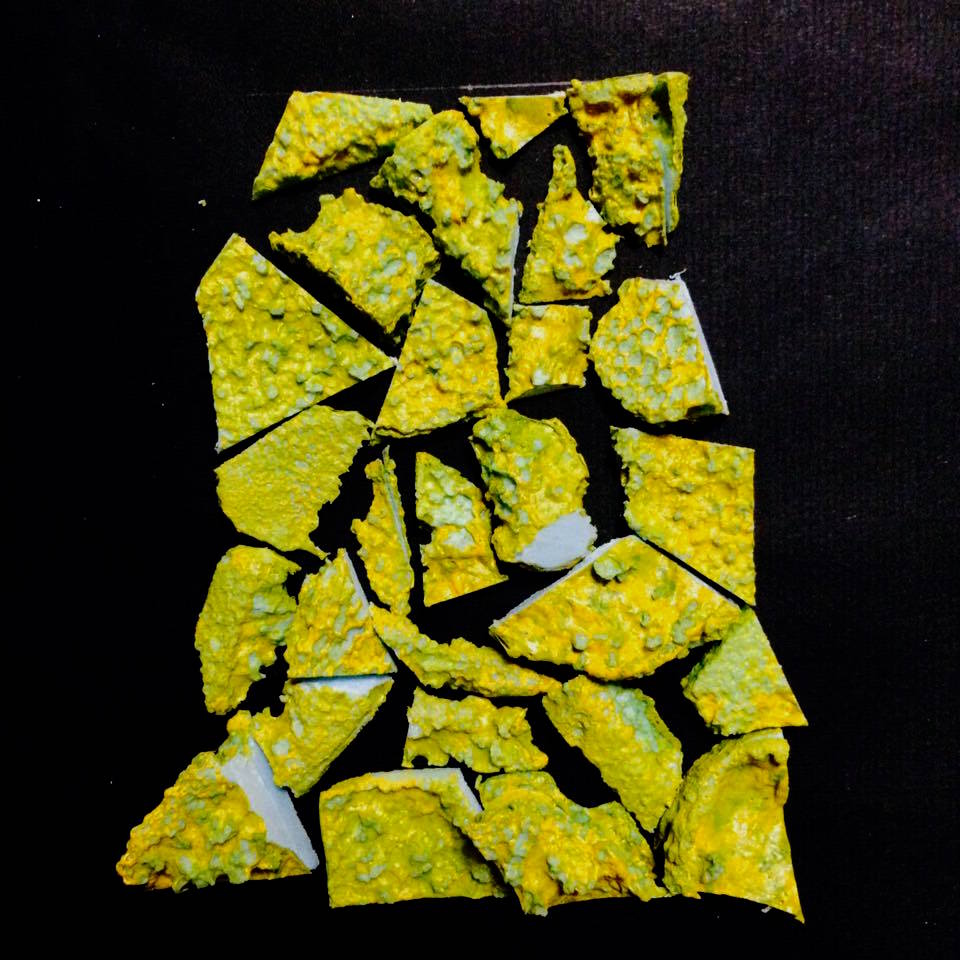
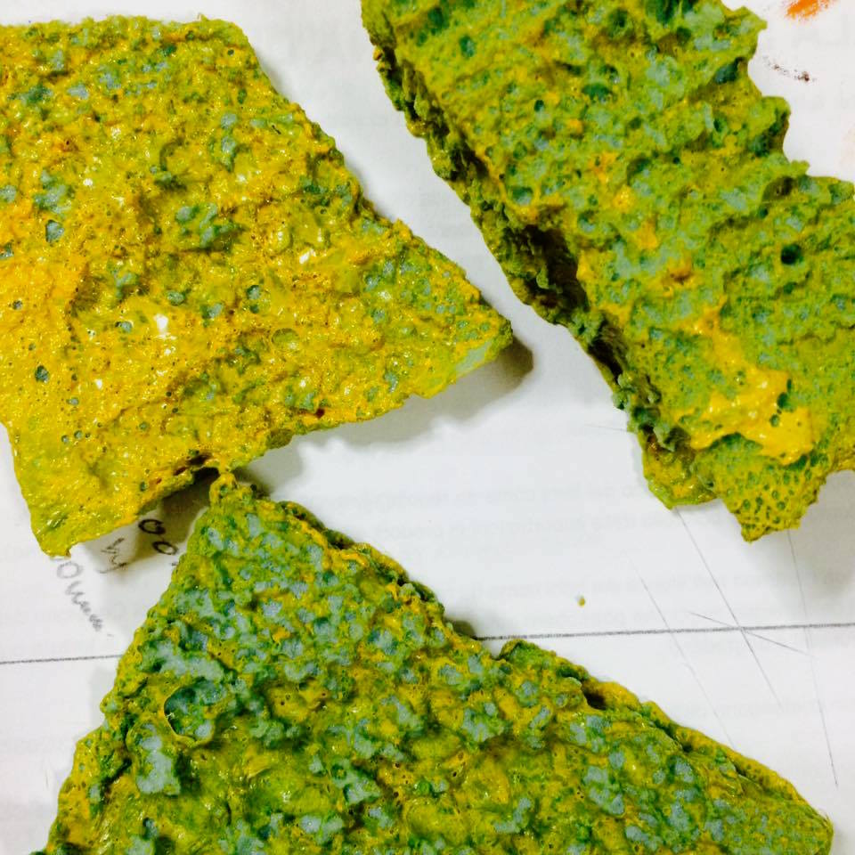
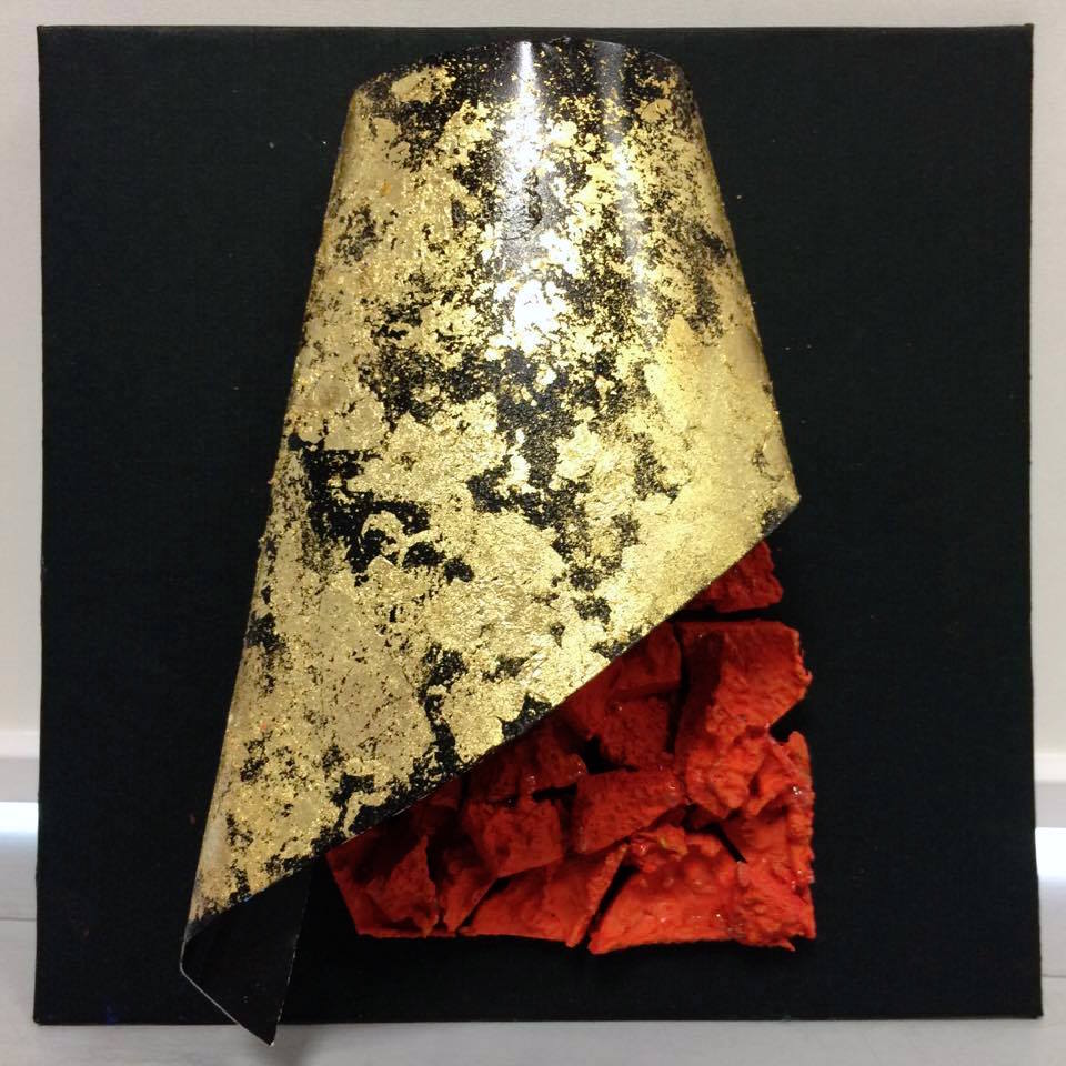
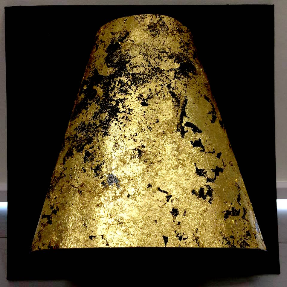
Analogous harmony of yellow and orange is used. Aluminium sheet is bent to shape like a cowbell instrument to represent performing art. To strike a contrast from the smooth and shiny surface of the sheet, I decided to use corroded foams for its porous texture. A combination of both would present a decorative instrument that gives pleasure to the eyes and ears.
Final Compositions
performing arts
x product design
= me in 5 years
So there you have it, a 2015 Yi Wen. And I am already excited to meet the future me 🙂
“Who in the world am I? Ah, that’s the great puzzle.”
To get a taste of how children books are illustrated, I flipped through a few of them and noticed a particular style among them.
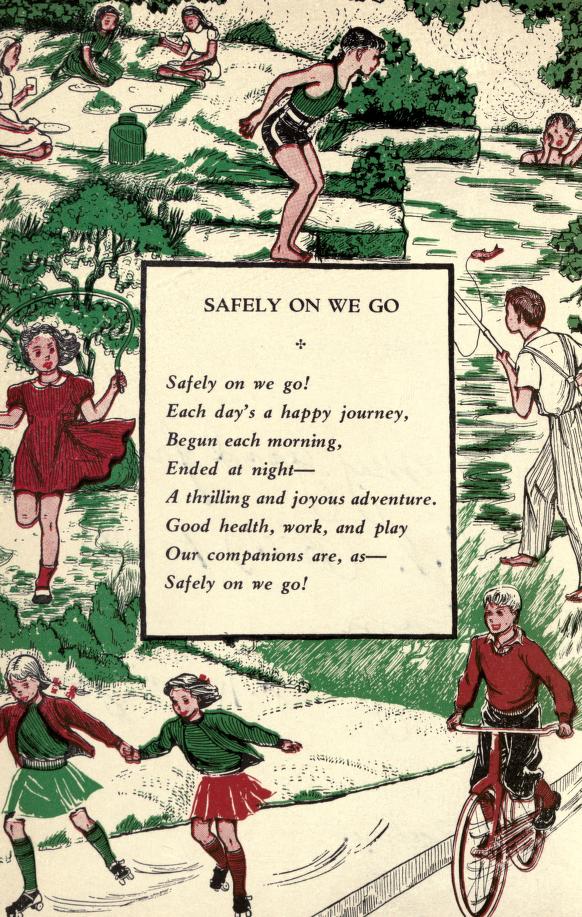
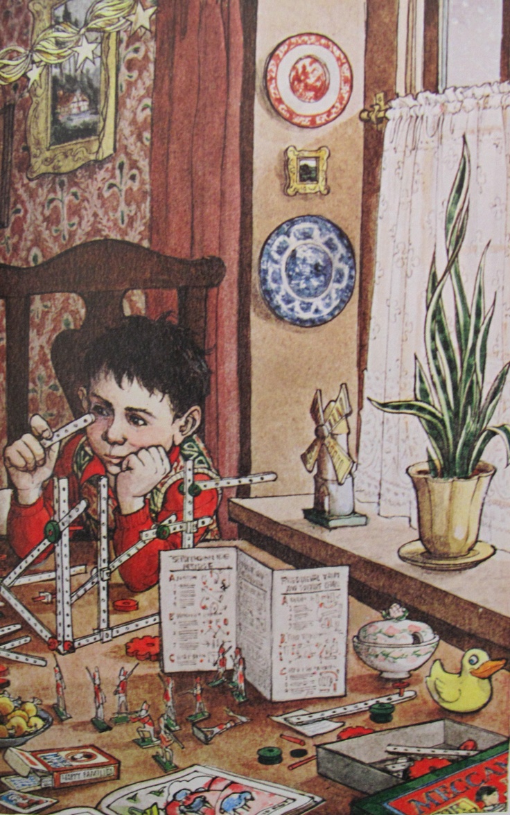
For instance, the illustration from the book Safety On We Go is drawn with fine and grainy lines which is a certain type of texture style oftenly used. Characters tend to have staged poses. They can sometimes fill the entire page with small intrigued objects around the main character (refer to Trina Schart Hyman’s artwork). Despite being assigned to reinterpret rhymes in a different manner, I somehow would like to keep few of these elements in my compositions for these are what makes children rhymes magical.
from A Child’s Christmas in Wales, Trina Schart Hyman
Research – Surreal Artists
Surrealism is a breakthrough for conventional art, as it plays with viewer’s perspective and sense of proportion. Here are the artists I have gotten inspiration from –
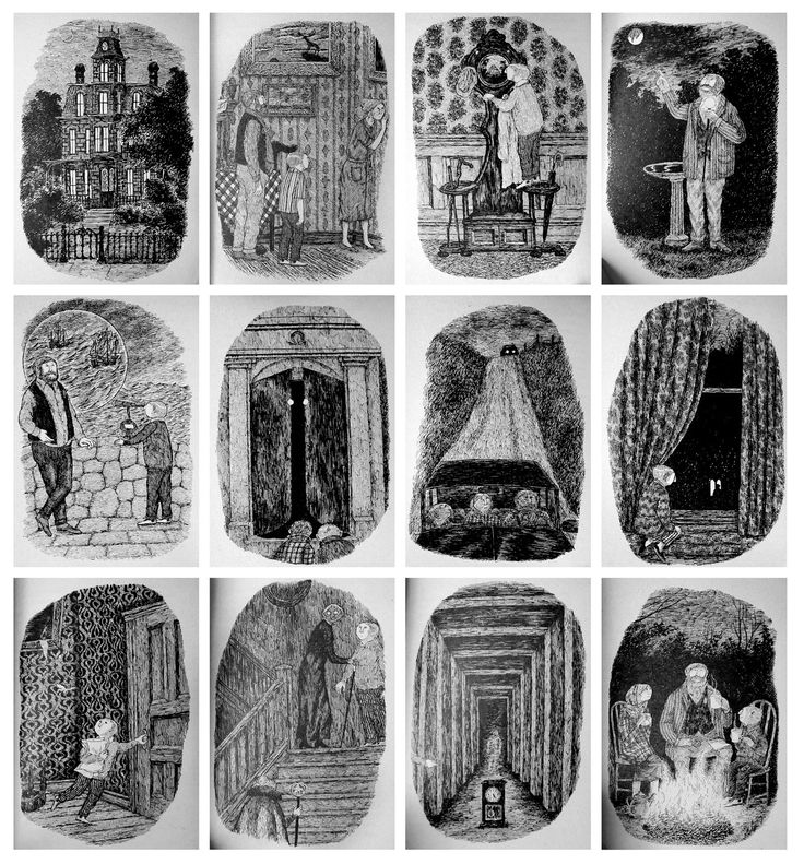
Edward Gorey uses pen and ink to illustrate daunting scenes. His artworks are heavily filled with short and fine lines, leaving a very compact and eerie impression.
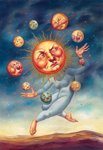
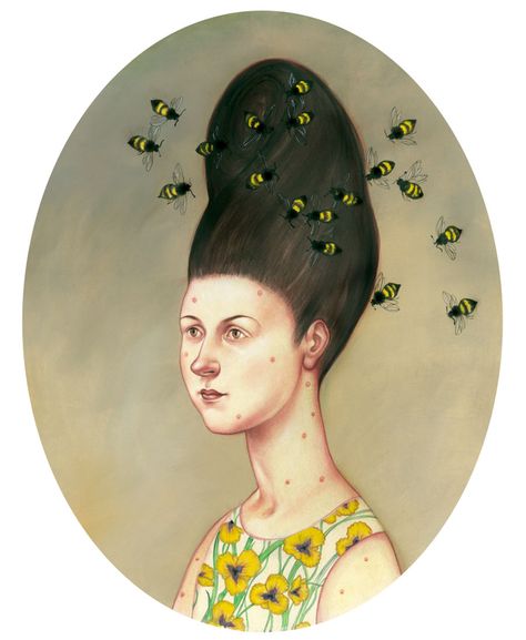
Anita Kunz adds in humour to her illustrations, which can better provoke emotions and grow viewers’ interests in knowing the message behind these artworks.
Wolfgang Paalen plays with simple shapes on these art pieces while working on the negative spaces in between.
I used Hey Diddle Diddle as my practicing subjects on Photoshop to understand how filters like threshold and transformation tools work.
THE CAT AND THE FIDDLE
Using just two subjects, the cat and fiddle, they created a systematic and repetitive layout. I tried playing with Threshold filter on the cats, which gave me an insightful collage of shadow variables. They can bring across different moods, less shadow intensified cat looks innocent whereas those with darker shading look scary and mysterious. Fiddles are aligned neatly to fill up the background and slightly tilted diagonally to create a singular movement in synced to the cats. Arrangement is overall clean and neat, but lack of creativity.
Repetition of the same image and variation of shading values will be seen in my final composition 3: She had so many children she didn’t know what to do.
THE COW JUMPED OVER THE MOON
As the original photo of the moon already has densely filled lines and pattern, I decided to keep its essence and dramatise with Threshold filter. Also, I can achieve the kind of compressed fine lines drawing style found in traditional children books. Cows are filtered with Path Blur to show jumping motion. It is one of my discoveries in pushing subjects to look more 3-dimensional.
Highly textured subjects will be seen in final composition 4: Couldn’t put Humpty together again; blur filter in composition 1: And the dish ran away with the spoon.
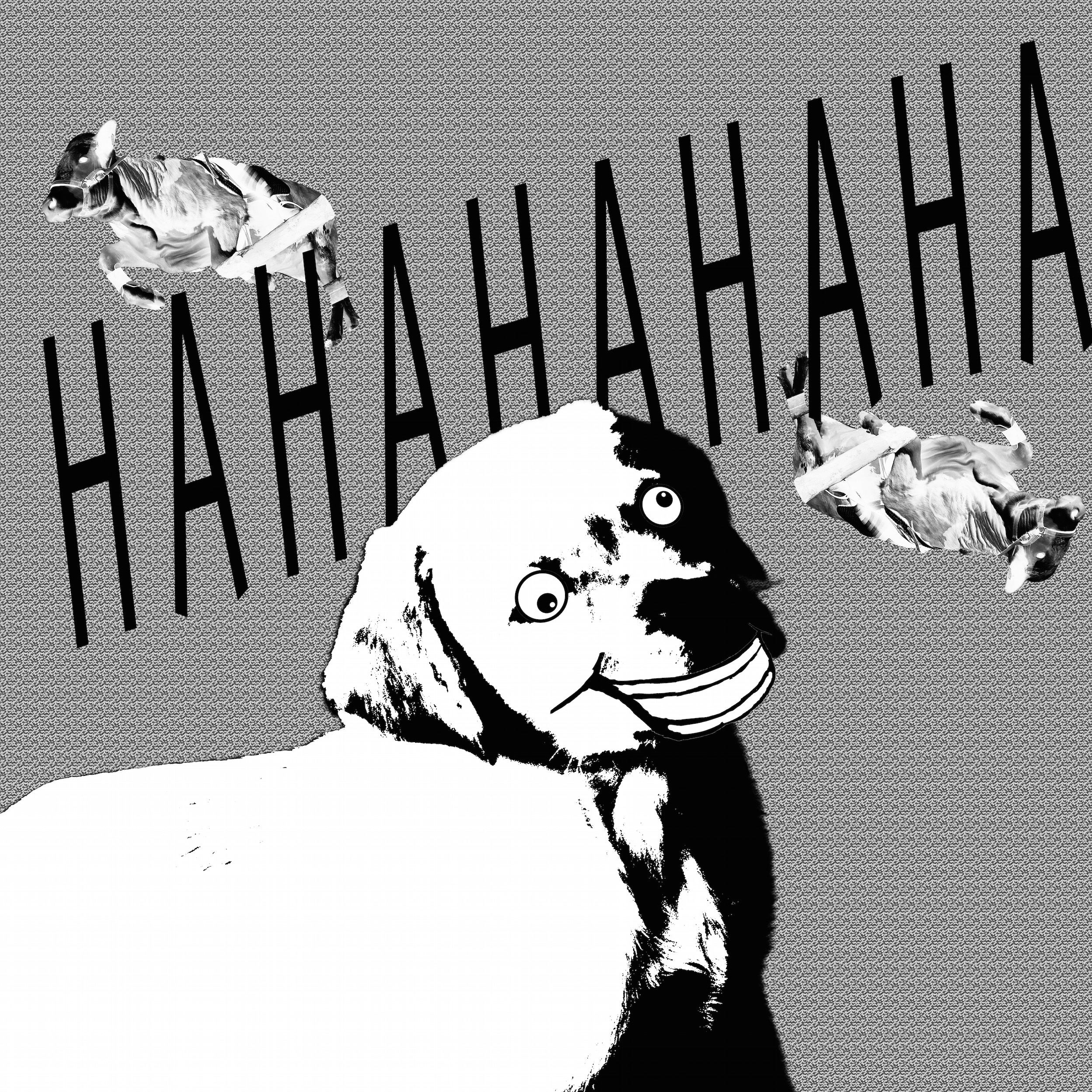
THE LITTLE DOG LAUGHED TO SEE SUCH SPORT
Images are inversely contrasted for further experimentation. Highly exposed subjects pop out with its large white spaces, complemented by a darker shade in the background. Despite the intentional juxtapose, it still looks boring for its literal context interpretation.
As such, I tried adding images that require audiences to decipher its underlying meanings. It will be seen in final composition 2: The little dog laughed to see such sport and 3: She had so many children she didn’t know what to do.
Final Compositions
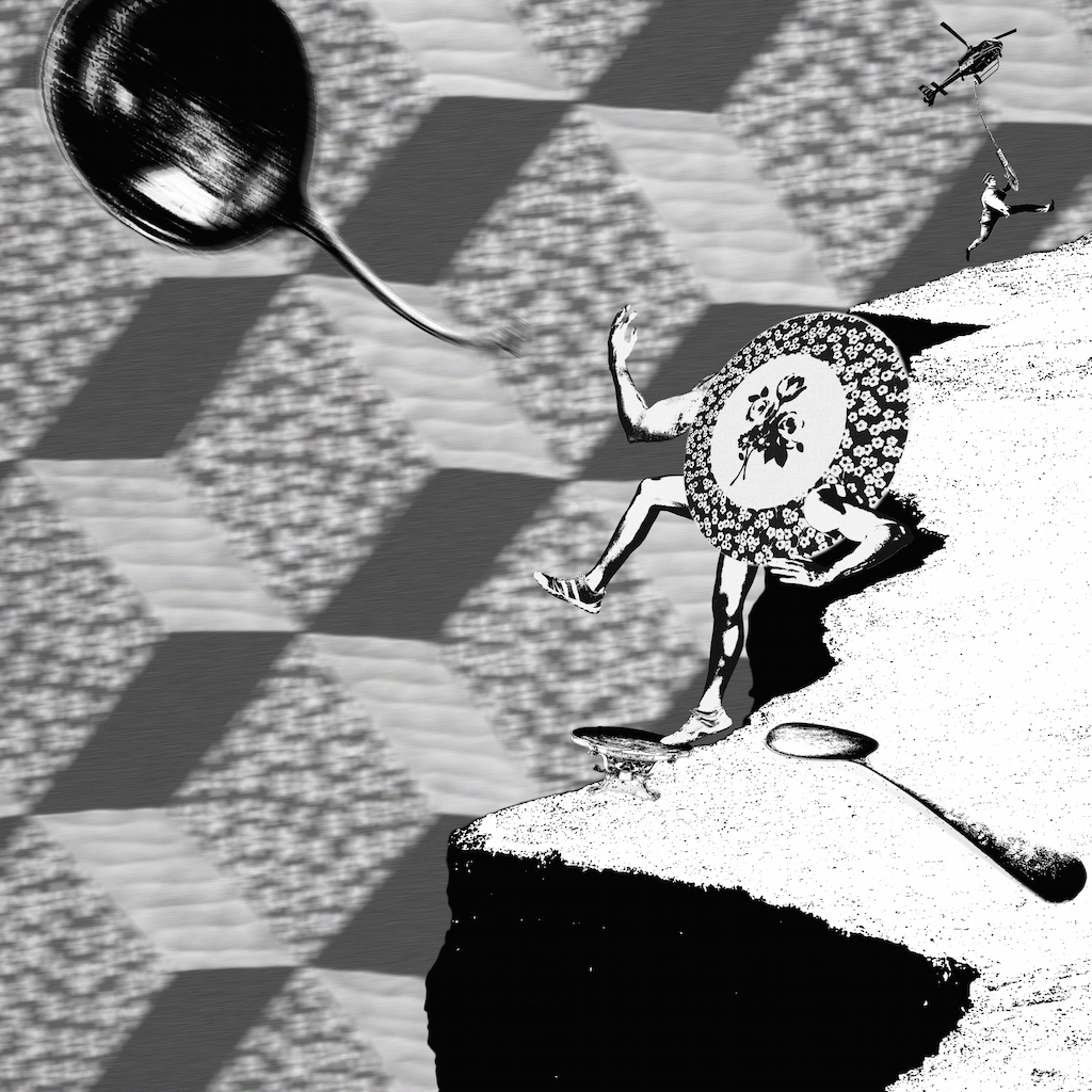
1) And the dish ran away with the spoon
Story description
Jumping onto the table, a deliberately dressed dish leaps forward to reach for the flying spoon. Her old partner, who is laying on the floor lifelessly, seems to have given up in the relationship. She has decided to leave for good. If you would look closely at the top right corner of the composition, a policeman arrives to arrest the adultery couple. However, his clumsiness has landed him way too far from his target.
design principles used
Emphasis – Background is blurred to ‘pop’ out foreground elements
Movement – Arrangement of the laying spoon, dish and flying spoon creates a diagonal visual continuity across the composition
Proportion – Stark contrast in sizes between the policeman and culinary to prioritise attention to the main characters – dish and spoons
2) The little dog laughed to see such sport
story description
“What is taking him so long?” the pack of dogs wonders. They are dying to play catching with their new found friend. Hopping onto each other’s back, they elevate themselves to look for their friend. As the last dog peers over the little boy’s back to see what is he up to. He is so engrossed into the gameboy, he did not hear the mocking laughters coming from his back.
design principles used
Rhythm – Dogs face in alternate directions
Gradation – Size of dogs slowly decreases
Balance – The platform that little boy is sitting on occupies half of the composition, leaving the other half of the space for the dogs
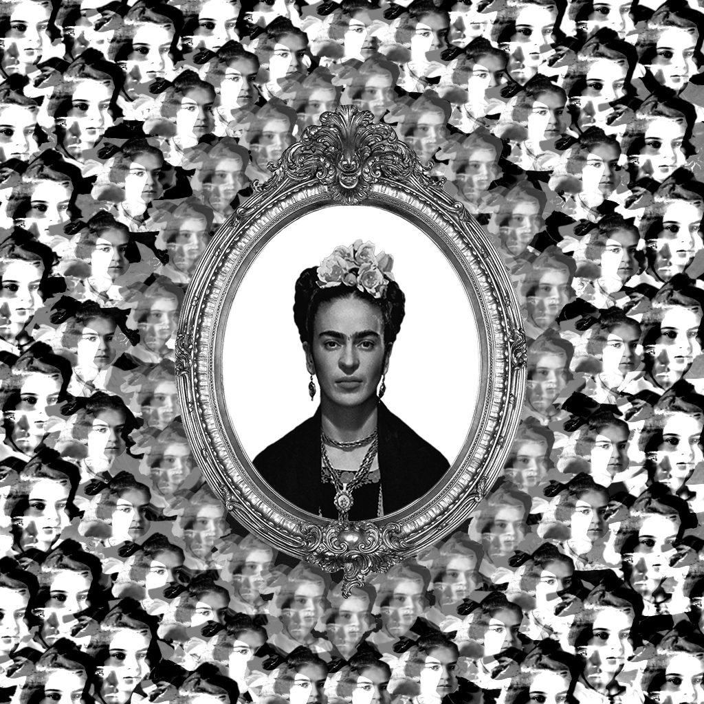
3) She had so many children she didn’t know what to do
story description
Looking into the mirror, Frida Kahlo imagines how her child would look like. How she wish to embrace her own child in her arms. The faces of the illusional child get blurrier as they float nearer to her, as she knows it is impossible to realise this dream.
design principles used
Rhythm – Faces of child form ring of circles around the mirror
Balance – Symmetrical composition
Gradation – Value shade of the faces fades off into the center
Movement – Overlapped faces around the mirror are arranged in a manner that directs optical focal point to Frida Kahlo at the center
Harmony – Despite an overwhelming repetition of faces filling the composition, they exist harmoniously by gradual shading and similar movements
4) couldn’t put humpty together again
story description
Humpty is broken and cannot be mended. It is thrown into the infinite galaxy hole to be disposed permanently. Even in the last few seconds, four formulated hearts are still trying their best to save Humpty. Pumping and pumping, with their veins popping out and muscles about to tear. The mission is not over until Humpty has its last breath.
design principles used
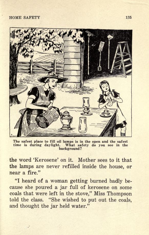
Diversity – Variety of heart illustrations
Balance – Symmetrical composition
Movement – Visual continuity from the hearts of four corners to Humpty
Contrast – Blurred background suggests the long distance between the subjects and galaxy


 (Toronto, Canada, 2014)
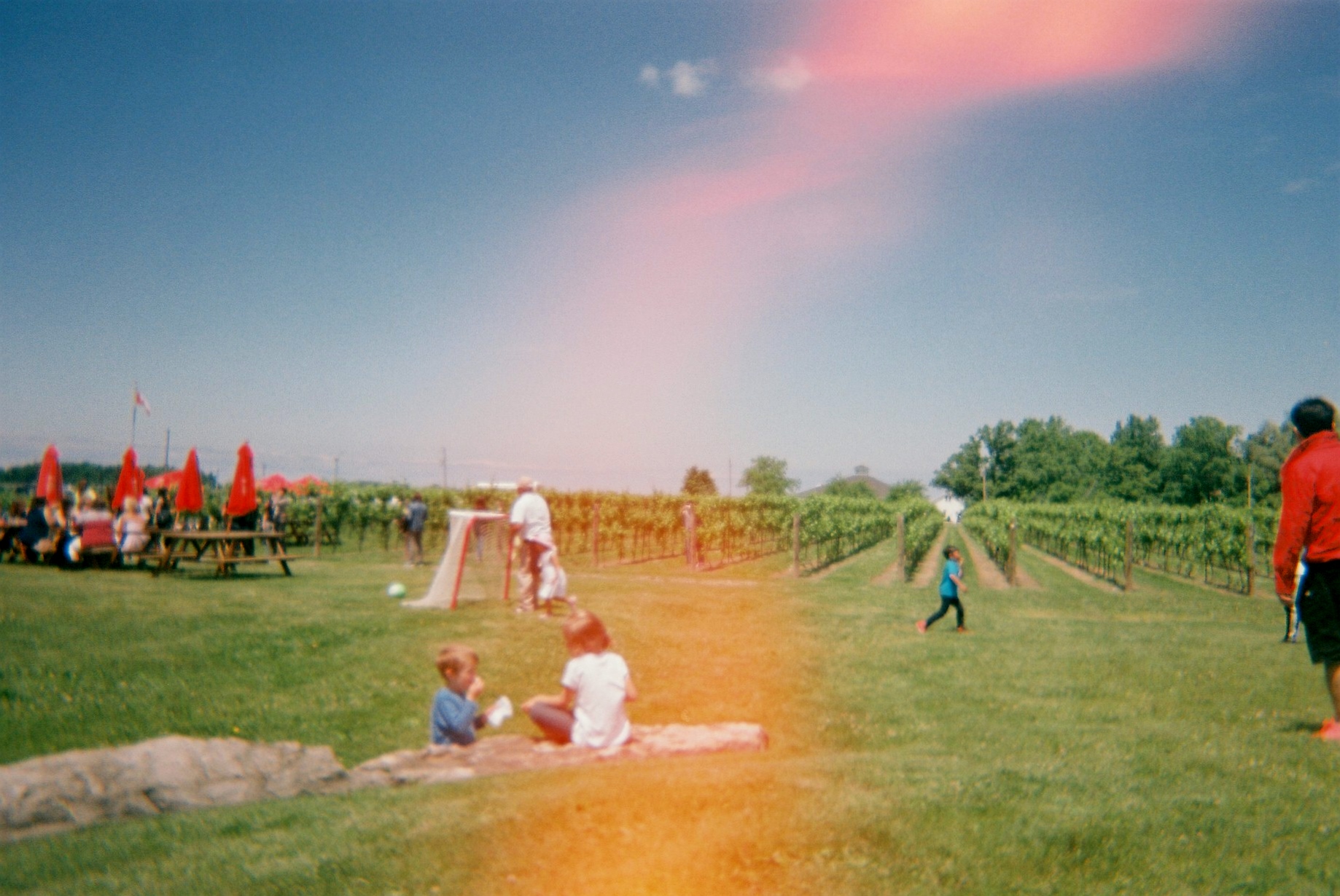
 (Toronto, Canada, 2014)
 (Toronto, Canada, 2014)


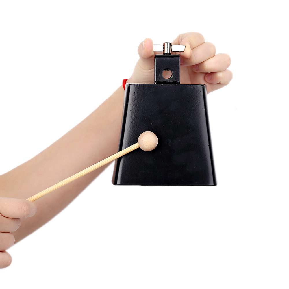 An ordinary cowbell