Hi, first of all, thanks Professor Joy for the refreshments provided for the class during each lessons, much appreciated! 🙂 Now, back to update on RIII – Second consultation!
After reading up on Henry Hargreaves’s inspiring projects, new ideas crossed my mind that night after asking myself several questions such as (1) What choice of medium can I use in better representation of my overall concept? (2) How can it tell a story? (3) Why?
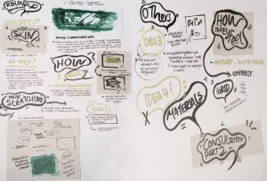
Here’s a basic walk through of my ideas for my concept,

IDEA (1) & (2) – Playing with the idea of ‘Skin’
Why skin? Reason being, sometimes we tend to examine things/situations around us just through examining the surface. For instance, when buying fruits, we tend to avoid fruits with scratches/bruises and go for those that looks almost flawless. However, is it really the best? Maybe visually it is, but taste wise, it is definitely uncertain. Similarity, we tend to categorize professions subconsciously based on things we perceive it to be.
For idealization (1), I will be playing with the idea of ‘skin’, in this case – scratch cards/ instant lottery scratchcards. (Details will be further explain.)

For this test out composition, can you roughly guess what profession I am trying to show? – I used complex lines as the composition background in representation of scaffolding which is often found at construction sites. Playing with alphabets from my name, I ‘constructed’ a ‘house’ with a ‘tree’ at the side. I believe you know what it is now!
For idealization (2), similarity, playing with the idea of ‘skin’, however, this time I will be playing be with ‘peel’ of a fruit/vegetable. Why fruit peel? I chose fruit peel as I find that they are often being neglected in a way, such as sometimes we tend to peel them off whenever we consume a fruit. In fact, this peels contains a lot of vitamins and health benefits or even other useful purposes that we didn’t know about. Hence I thought it will be good by trying to create something meaningful with these peels.

In this case, this piece above showcases the temporal aesthetics of ‘skin’. The condition of the banana skin oxides over a period of time, when being exposed to the air. Thus, showing that aesthetics is never forever, it shifts/changes over time.
IDEA (3) & (4) – Playing with the idea of ‘Contrast’
Why contrast? Depicting how often the ‘blue collar’ workers felt. – outcast and out of place at times.
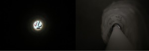
For idealization (3), playing with the idea of ‘Contrast’, I experimented some compositions and photographed them.

For this experimental work, can you roughly guess what profession I am trying to show? – I start by jotting down a few obvious keywords that is associated with this particular profession. (Keywords like: darkness, limited, trapped, dangerous.) before laying out the compositions and photographing them. On the left, is what it seems like a microscopic view. Whereas, the photo on the right is what it seems like a narrow long pathway inside a tunnel with words scattered all over the tunnel.
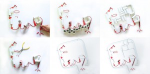
For idealization (4), similarity, playing with the idea of ‘Contrast’, I experimented some compositions using materials that is often found associated with the chosen profession and compose them so that it roughly describes their profession. Then, I carefully documented it by photographing the composition test-outs!


For the above composition test-outs, can you roughly guess what profession I am trying to show? – I start by jotting down a few obvious keywords that is associated with this particular profession. (Keywords like: mending wires, complexity and dangerous.) before laying out the compositions (Thought that the complexity can be further exaggerated). I tried playing with the orientation of the PVC pipes as well. In conclusion, the orientation of the pipes does change the mood of the composition and the message being portrayed.
Lastly, here are suggestions professor Joy suggested that I could also look at,
(1) Look at what lottery scratchcards means in different countries (For instance, in Taiwan, it serves as a kind of entertainment/chance).
(2) Look into the action ‘Scratch’, the objects that were used to scratch and the marks being left behind after scratching (can try with different types of papers).
(3) Behind content? – How do your audience know that it’s for scratching? Is there any form of instruction? At the back maybe? (Like shopping vouchers, they usually comes with terms & conditions located at the bottom or at the back of the voucher). How you would like to present it?
(4) Look into the difference between ‘overlook’ and ‘not wanting to’. (For instance, you may want to consider peeling off the fruit skin as an act of not wanting to?)
Till next update, WIP! 🙂

