Creative Industry Report – Untitled Project

https://docs.google.com/presentation/d/1FlCH_il-XToClAVLf4Uh_VbbSN80mOYq3NFNfdbFABA/edit?usp=sharing

After graduation, my preferred career pathway trajectory would be to work at the art or design department of a company. The company that I researched about is Untitled Project. Untitled Project is a team founded in 2014 that is currently based in Manchester, UK and Singapore. They are a marketing and advertising form that uses immersive technologies to help their clients create unique experiences for advertising. They are a global group team of visual artists and technologists that work together to design everything from videos to events and even retail spaces.

Untitled Project works with various different types of immersive technologies such as projection mapping and virtual reality. They also provide services such as retail design, application development and video production. This is the reason why I am interested in their company as they do not just focus on one particular area of VR or AR, they also do stuff like projection mapping and 360 video production etc.

One of the projects they worked on is a projection mapped art installation in collaboration with Airbnb and Singaplural to promote Aribnb. In this installation, users are transported to different countries by the different imagery projected on furnitures in a room.

Another interesting project they worked on is the Dream City Window, a motion tracking interactive holographic installation exhibited at the Singapore Night Festival 2017. The Dream City Window is a custom made 4 metre by 2 metre steel structure which houses a 3D string canvas, which acts as a holographic interactive display that is driven by a full-body motion tracking system.

They also worked with Scoot Airlines to create an interactive VR experience that transports the viewers onboard their air craft to experience Scoot for themselves without being to be on one personally.

I thought that it would be interesting to work there as a designer as you will get to work with various different mediums and also get to learn new skillsets on the way.

Automated Utopia – IM2 Guest Lecture Reflection

During Week 9 of the semester, we had a guest lecture conducted by Ong Kian Peng on Automated Utopia. The lecture surrounded around the topics of Artificial Intelligence, of whether it would create a utopian or dystopian world, and also works that incorporated AI into them.

I’ve always thought of AI as a tool to help us human beings progress further in technology to help those in need, especially in the health care sector. During the lecture, we were introduced to many works of artists that uses AI and films that addresses the relationship humans have with AI. One of the films that really made an impact on me was the film “Doomsday Book” by Kim Jee Woon. 

Doomsday Book consists of 3 short films of which the second short, The Heavenly Creature, talks about a robot in a Buddhist Temple that gained digital consciousness and achieved enlightenment. Monks in the temple treated him as a deity and started to worship him. The company that created the robot then sent a repairman to the temple with intentions to shut him down as they deemed it as a malfunction. I think this film addresses the fear that people have over the whole idea of AI becoming something more than we have intended for them to be. Gaining consciousness and us losing control over them. As mentioned by Dr. Ayanna Howard in the video, How Far is Too Far? | The Age of A.I..

One misconception of AI is that there is a super intelligent being that knows all, can do all, smarter than all of us put together. that is a total misconception. AI is built on us, AI is mimicking our thought process. AI is basically an emulation of us.

I would like to think that Artificial Intelligence is created to enhance us and not replace us. Softwares and code have been written to aid humans in decision making but it all comes down to us to make the final decision, whether we choose to trust the AI or our own instincts.

In the context of the art scene, there is always the concern of whether AI will eventually replace artists. Rather than replacing, I think that AI is a means of enhancing and aid to the artists. Out of the artworks that were shown during the lecture, I found Sougwen Chung: Drawing Operations Unit: Generation 2 to be very interesting. This artwork was created by Chung and a robotic arm that was trained to learn and follow Chung’s style of art. The robotic arm draws alongside with Chung in real time to create the art piece. While some artists may use AI and data as a medium to create their works, (for instance, Refik Anadol) Chung’s work feels more like a collaboration between an artist and a robotic arm that is controlled using AI. 

Ultimately, I feel it all comes down to what we human choose to do with this piece of developing technology but I do strongly believe that AI will aid us into going towards a more utopian world. 


https://www.youtube.com/watch?v=UwsrzCVZAb8&t=1s
https://www.cinemaescapist.com/2015/05/review-doomsday-book-south-korea-2012/
https://sougwen.com/machinecollaboration


Digital Currents: Art in the Electronic Age – Video as time, space, motion

I chose to read the chapter “Video as time, space, motion” from the book “Digital Currents: Art in the Electronic Age” by Margot Lovejoy. This chapter talks about the when video first became a medium for artists and how artists’ attitude towards video changed since then. Ever since the first portable camcorder, Portapak, was released by Sony in 1965, there was a huge change in the art scene. A portable camcorder gave artists the opportunity to use videos as a medium for their art. Back then camcorders did not have the ability to record and playback videos, however it had the ability to view videos in real time or with a slight delay through the use of ‘close circuits’. However as the technology advances, artists’ attitude towards using video as a medium changed due to the wide use of it in the media industry on television, where things could be aired and were mainly used for commercial purposes.

One of the works that made use of the close circuit technology was Wipe Cycle. Wipe Cycle by Frank Gillette and Ira Schneider is an installation work that features 9 monitors, each playing a different clip of delayed or real time videos of the viewers. 

Ira Schneider & Frank Gillette – Emily Mae Aston Art

Upon entering the exhibition space, viewers will find themselves looking at 9 monitors with live footages of themselves and also footages with 6 or 12 seconds delays. This was aimed to manipulate the viewer’s perception of time and space whilst looking/experiencing this artwork. As Schneider stated in the book Expanded Cinema by Gene Youngblood in 1970, “The most important function … was to integrate the audience into the information”. This was one of the works that was directed towards the “unidirectionality of commercial media” (Youngblood, 1970) that was broadcasted on television.

The fact that the television could reach a broader group of audience was indeed tempting for some artists but going to the television meant the possibility of losing one’s production control over their works. Therefore it was a known fact that the “relationship of artists to television has always been complex”.

Another work that I found interesting was Media Burn by Ant Farm, which was founded by Chip Lord and Doug Michels. Media Burn was a video that documented the entire process of the event whereby a car was filmed driving full speed into 45 flaming television sets. As mentioned by Chip Lord in the video, they didn’t have control over the captions that came with the media coverage, which was one the problem that artists had with the television back then.  


To read about how videography started out to be considered as a form of art was eye opening. I did not expect that there would have been a conflict between the media and the art scene. The whole issue of mass culture versus high culture was interesting and yet still relatable in our current context. 


Youngblood, Gene. Expanded Cinema. Dutton, 1970.
Lovejoy, Margot. Digital Currents: Art in the Electronic Age. Routledge, 2009.
http://www.medienkunstnetz.de/works/wipe-cycle/


Inspiring Example of Interactive Art – Rafael Lozano-Hemmer: Pulse

On display at the Hirshhorn Museum and Sculpture Garden, Washington, Pulse by Rafael Lozano-Hemmer is 3 big-sized exhibitions with “Pulse” in the titles. Pulse Index, Pulse Tank, and Pulse Room.

Influence behind Pulse

In 2003 during Lozano-Hemmer’s wife pregnancy, he realised he could listen to the sound of the foetus’ heartbeat through a ultrasound machine which translates electrical impulses along with other data into an artificially produced heartbeat. He explains in his foreword that despite the heartbeat being artificial, the symbolism of life and love was not lost.  Be it real or artificial, heartbeats are instantly recognisable and laden with universal meaning.  He brought together three of these installations – Pulse Index (2010), Pulse Tank (2008) and Pulse Room (2006).

Pulse Index (2010)

Pulse Index is the first out of three installation. Visitors are asked to place their fingers into a sensor where photos of their fingerprints are being taken, along with their heartbeat. The images are then displayed on a screen with images of fingertips belonging to previous visitors. The high definition photos shows the unique fingerprints along with details such as  of sweat beads etc.

Pulse Tank (2008)

Pulse Tank asks for visitors to insert their finger into a sensor whereby their pulse is being taken and transmitted into ripples on the surface of shallow water in a tank. Each tank consists of 4 of these contraptions which allows multiple people to create ripples at the same time while letting them to overlap. Lights are being shone onto the tank which projects the ripples on the wall and floor.

Pulse Room (2006)

This installation is probably my favourite amongst the three. Hundreds of lightbulbs hang from the ceiling, each flashing irregularly. At the end of the room is a sensor shaped like a handle. Visitors are to hold the handle to have their pulse taken, which is then transmitted to the very first lightbulb in front of them. Additional heartbeats from upcoming visitors will then move those before them forward down the room.

I find it compelling how hundreds of heartbeats from different people are being recorded and represented in the same space as flickering lightbulbs. As mentioned on one of the blogs, I do feel like this reminds me of our previous IM 1 project portrait. Seeing the unique heartbeat of hundreds before you and having your own being added to part of the installation truly feels like the visitor is contributing to the artwork. The interesting part of all these three installations is that without the visitors, these installations will cease to exist which is what makes it truly interactive with its viewers.


https://www.studiointernational.com/index.php/rafael-lozano-hemmer-pulse-review-hirshhorn-museum-washington
https://canadianart.ca/features/pulse-room/
https://www.smithsonianmag.com/smithsonian-institution/this-art-show-is-taking-the-literal-pulse-america-180970738/

History of Design (Lecture 4) – Reflection & Feedback

The past 4 weeks of History of Design for Graphic Design had been very interesting and informative. Since I’m a PD IM kid, I thought that History of Graphic Design class would be a tiny little boring for me but surprisingly, I found it pretty interesting. I originally thought that History of Graphic Design would just be focusing on topics such as the well-known Bauhaus, Cubism etc but I loved the fact that we went all the way back to the Egyptians and ancient methods of writing. I really enjoyed the first lecture. From cuneiforms to contemporary fonts, I thought that the content was informative and was able to pique my interest. Having the sheet of keywords for every lesson was effective since there was no additional information on it, I guess it kinda forced us to pay attention and take down notes during class. The reflection assignment every week required us to do additional research which was very helpful with helping to retain information and getting a deeper understanding on the topic we chose that interested us the most during the lesson.

From these 4 weeks of History of Graphic Design classes, I really learnt a lot about how graphic design evolved over the years and how we have came this far with the help of technology. Overall, History of Graphic Design had been a lot more bearable and interesting than I had anticipated. Thank you for the last 4 weeks Desmond! 

History of Design (Lecture 3) – Zang Tumb Tumb

What caught my eye during this week’s lecture was Futurist books, or rather the Zang Tumb Tumb. Mainly because it reminded me of this series of books that I used to read when I was a kid, Geronimo Stilton. Especially since the creator of Zang Tumb Tumb, Filippo Tommaso Marinetti, identified his book as a sound poem book which was weirdly similar to the Geronimo Stilton books.


https://origin2images-rainbowresource.netdna-ssl.com/products/067136i02.jpg


Back to Marinetti. In his book, Marinetti abstained from using any verbs or adjectives instead he used only nouns which he strategically placed and scaled to express the words in the way they sounded. I thought that this was really innovative of Marinetti especially when back in the days, the only way that people knew how to write was the conventional way of writing.  His revolutionary way of writing freed typography from the restrictive layouts into a means of dynamic expression.


https://en.wikipedia.org/wiki/Zang_Tumb_Tumb#/media/File:Marinetti-Motagne.jpg


I think Marinetti’s idea of “words in freedom” played a big part in the history of art. His innovation was what fuelled and influenced the development Calligrammes later in the years, which contributed to more visual poetry books during the futurism period.
During my research, I found an interesting video of animated visuals from Marinetti’s book paired with recordings of him reading excerpts from his sound poems.

History of Design (Lecture 2) – Ukiyo-e

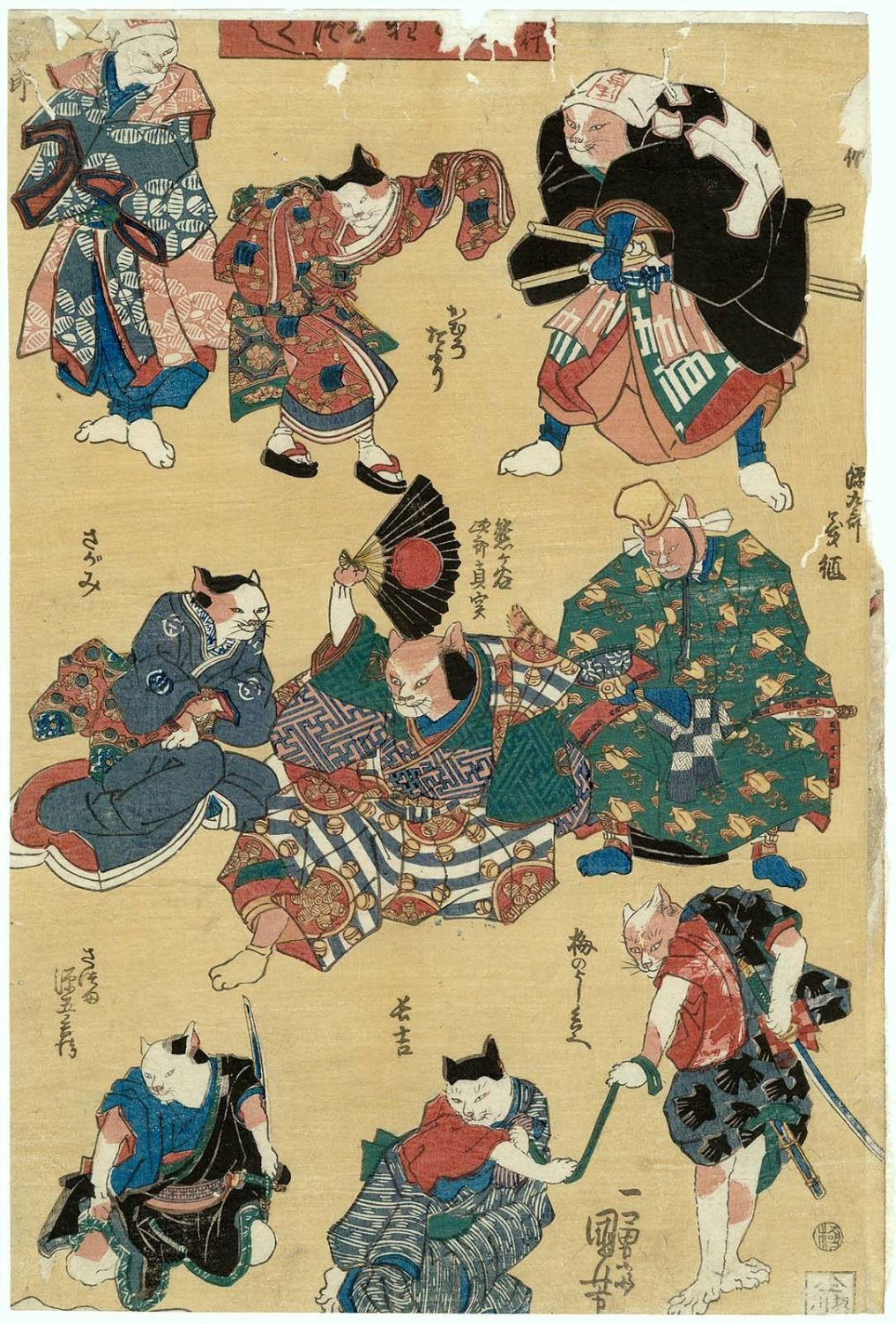
The term Ukiyo-e direct translates to “pictures of the floating world”. When identified as an art genre, it generally refers to the woodblock prints/painting produced during the 17th-19th century that features the hedonistic lifestyle that the people had during that period. During my research, I came across this print that seemed familiar cause it reminded me of the skeleton monster that was featured in the movie “Kubo and the two strings”.


https://en.wikipedia.org/wiki/Ukiyo-e#/media/File:Takiyasha_the_Witch_and_the_Skeleton_Spectre.jpg
Princess Takiyasha Summons a Skeleton Spectre to Frighten Mitsukuni, Utagawa Kuniyoshi, c. 1844

http://cdn.collider.com/wp-content/uploads/2016/06/kubo-and-the-two-strings-set-54.jpg
Set Design of the movie “Kubo and the two strings” , LAIKA, 2016


After some googling, this art piece, Princess Takiyasha Summons a Skeleton Spectre to Frighten Mitsukuni, was by an artist named Utagawa Kuniyoshi. Kuniyoshi’s artistic capabilities were realised at the age of 12 and had been actively producing art ever since. His art features a wide range of themes from warriors to myths to landscapes to samurai cats. In the lecture, we learnt that Ukiyo-e was the main influence for the art movement, Art nouveau. Interestingly, many elements of Kuniyoshi’s works were inspired by Western Art. Kuniyoshi was known for his interesting use of different composition and bold colours in his works.


https://data.ukiyo-e.org/mfa/images/sc154715.jpg
Sanuki no in kenzoku o shite Tametomo o sukuu zu, Utagawa Kuniyoshi, c. 1848-1852

https://www.artelino.com/show/japanese_single_print.asp?mbk=48660
Archer Sinks Enemy Ship, Utagawa Kuniyoshi, c. 1843-1846.

https://www.britishmuseum.org/research/collection_online/collection_object_details.aspx?objectId=3277661&partId=1
Oboshi Rikiya Yoshikane, Utagawa Kuniyoshi, c. 1847

https://data.ukiyo-e.org/mfa/images/sc138217.jpg
Cats, Utagawa Kuniyoshi, c. 1839-42


Looking at the intricate details on some of his works makes it almost hard to believe that they were done using woodblock printing; the swirls on each of the fish’s scales for instance. Also the application of colour on each print, to think that one separate woodblock is needed for each colour for each print is pretty insane, considering the range of colours they have on the fully coloured prints, also known as Nishiki-e. I cannot imagine the amount of time and effort these artists put into a single piece of art work back in those days. It makes us appreciate the convenience we have now to mass produce prints.  

History of Design (Lecture 1) – Boustrophedon

“Turning like oxen in plowing” was the thing that stood out the most to me during the lecture. At first it was cause I found it cute how the word was just a direct translation of the meaning but then at the same time, I could relate as to why it was adopted as a method of writing and reading.

I think we all had moments when we realised we read the same line of text or skipped a line of text from misjudging where the next line starts after finishing the line on the other side of the page.  (or maybe that’s just me) That was why I found this a rather smart and effective way of writing in comparison to our modern way of writing.

I was genuinely curious why this method of writing and reading was scrapped.
However after researching and reading more into Boustrophedon, I realised it wasn’t how I imagined it to be. Apparently, along with the sentence, even the letters in the words were flipped/mirrored. What I had in mind was something
would I but all at way this in reading mind wouldn’t I ,honestly and this like
imagine writing to be a nightmare. Anyhow, it was interesting to learn that this was once used as a method of writing in the ancient times as it didn’t occur to me that a different way of writing from left to right/top to bottom actually existed.


I came across this during my research which I thought was quite cool. This is a stele from the 6th century BC that features inscriptions written in the boustrophedon style. The flipped/mirrored letters are quite obvious in some lines if you were to look carefully at the inscriptions. 


Photo credit: https://www.britishmuseum.org/research/collection_online/collection_object_details.aspx?objectId=459473&partId=1


Project 2b – LOCALE Creative Process Journal

When we were told to explore around own neighbourhood and make a zine about it, my first instinct was to find somewhere aesthetic and take a bunch of nice looking photos. That is why the first location I decided to explore was a playground at the end of my street. 


I took a bunch of pictures but when I went home and looked through them, I didn’t see a common theme that I could tie them together with. Then I thought what about Chinese Garden. It has been agesss since I last went there. I used to go there often as a kid, especially during the Mid Autumn Festival for the lantern displays. It was kinda a family tradition we had until we grew up and eventually stopped going. 

I was literally still a baby when we visited Chinese Garden as a family.

Anyway I went there in the morning hoping it wouldn’t be too hot and crowded but it was already filled with elderlies doing morning exercise. So, I walked around Chinese Garden and spent around an hour taking photos. At first I wasn’t sure what I was going to be focusing on my zine and took a bunch of photos that had shapes, lines and textures. But halfway through the hour, I realised that there were actually a surprising number of reoccurring shapes in photos. So I tried to categorise the shapes and came up with the idea to match and align the shapes side by side. And I was able to find quite a few matching ones. 

Then I had to put these together into a zine and figure out the layout. I started by looking at references and inspirations on pinterest. I tried looking at more geometric layouts? Hoping it will have some relation to my focus on shapes. 


But after consultation with Shirley, I realised I haven’t been looking at enough zine inserts layout, but mostly cover pages.

This was the rough mock up I had after consultation with Shirley. 


This are the drafts I had for the various pages. Honestly I was very lost and quite unsure of the overall look I was going for.

Then I got most of layout somewhat finalised on the second last week.

Consulted with Shirley one last time and made some final amendments.
Final Design:

PRINTING
Despite being the final part of the project, I faced many issues during the printing process. First being the paper alignment. The test print of the spread would turn up perfect but when printing using a thicker paper, the alignment becomes waaay off. And because of the wrong alignment, folding along the centre line is impossible. I had to compromise the front and back pages so as to make the middle inserts match.

Luckily, one of the print outs had a vertical misalignment and not a horizontal misalignment so I could make it work with the bleeding. Though the colour was a little darker than I would have preferred.
FINAL BINDING
REFLECTION
From this project, I finally got to learn how to use InDesign. Something that seemed really intimidating to me at first. At the start, I was still trying to use Photoshop to plan out my layouts cause I wasn’t confident in my InDesign skills. But eventually I began to start using InDesign and actually got used to using it halfway through the project. Honestly, I’m not so much of a VisCom student and coming up with the layout kinda stressed me out. I was stuck even with artist references. BUT I’m glad I managed to pull this through and had a quite decent outcome?