
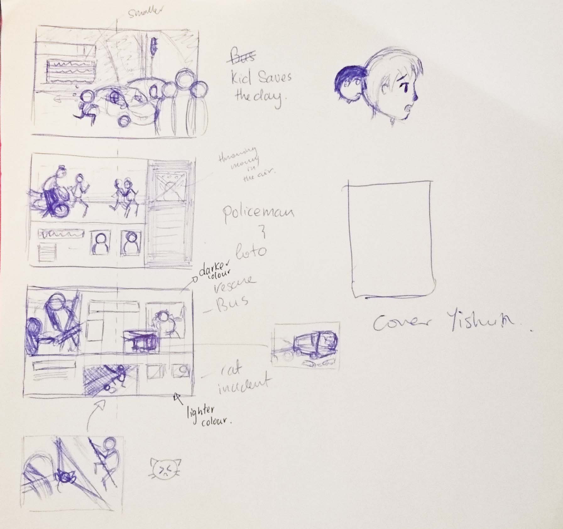
Layout sketches
I did some planning for the stories that I had chosen just to see how I could arrange them.
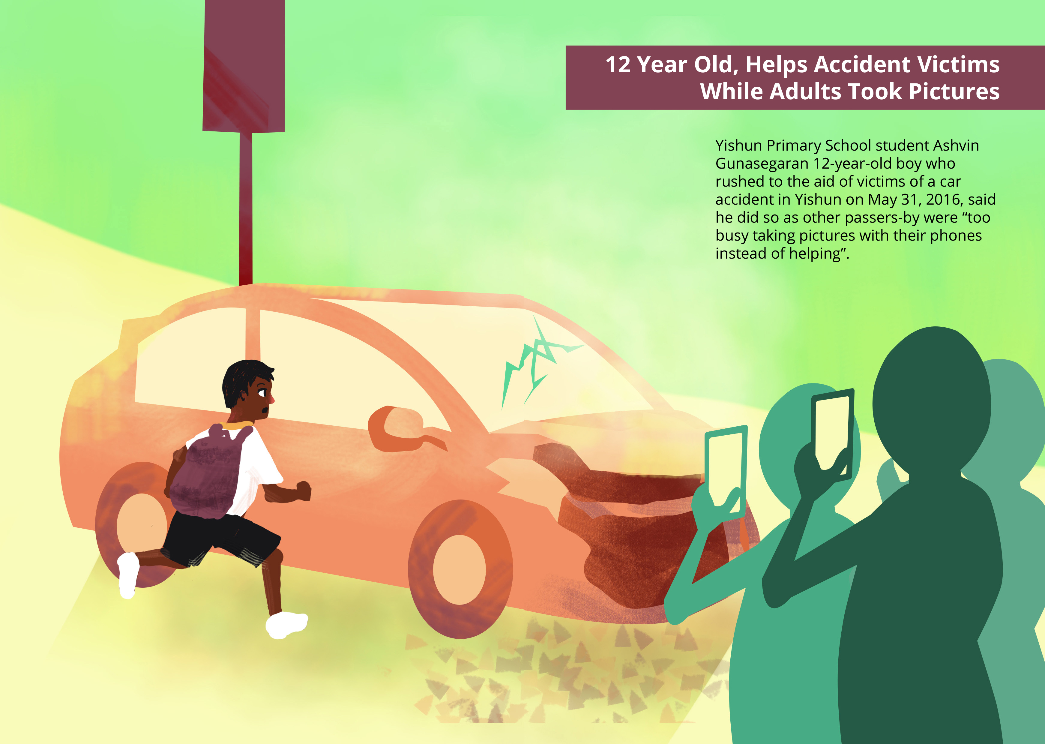
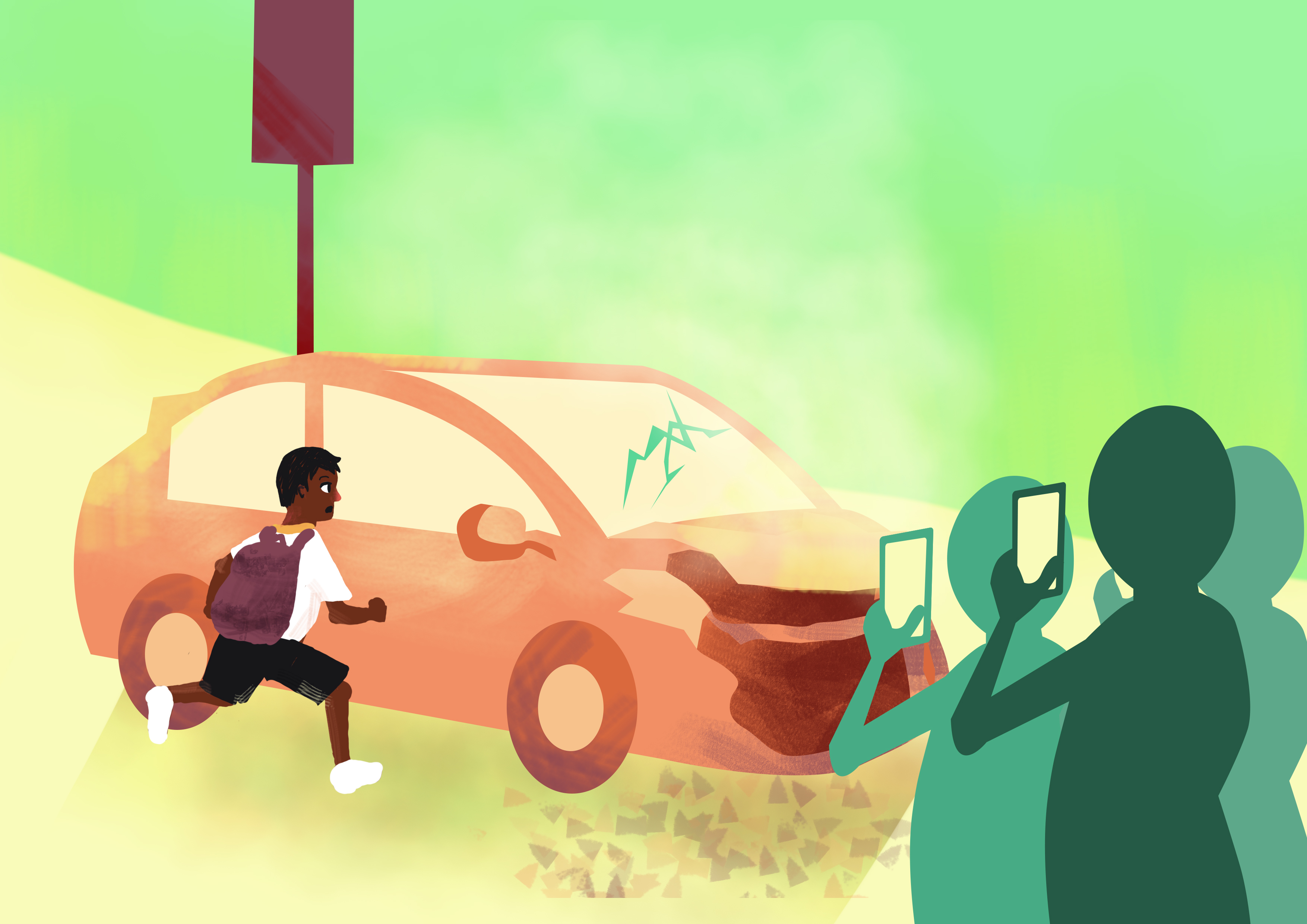
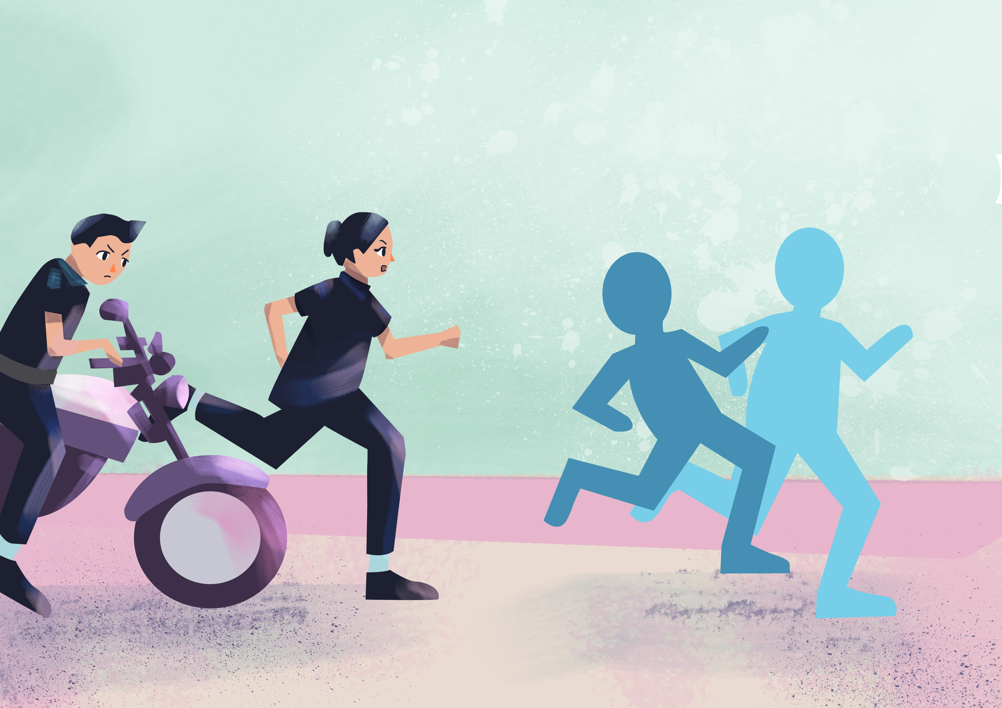
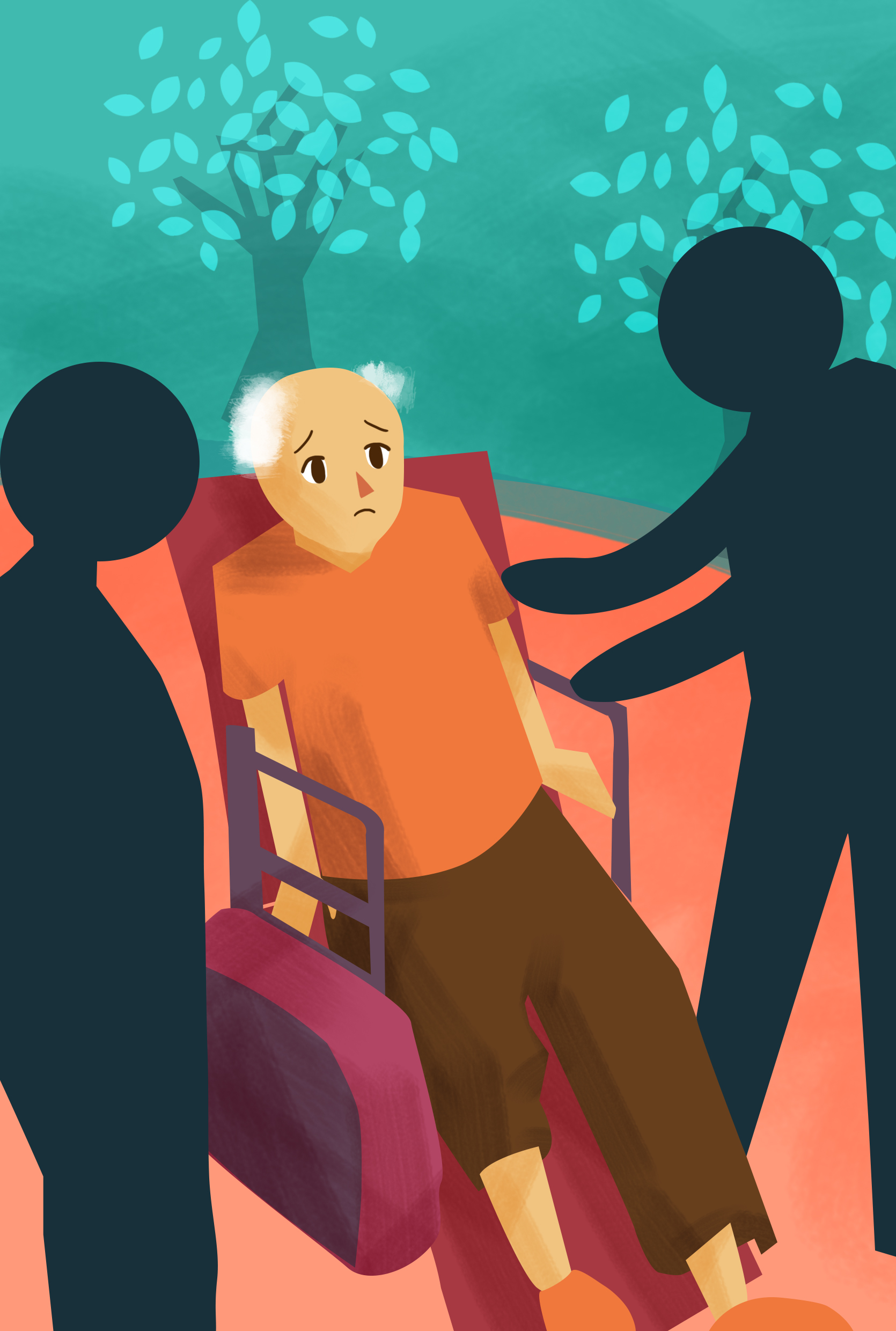
I decided to have the 12 year old Boy aiding the victims as the first spread as it is the most valuable positive news out of them 5 stories.
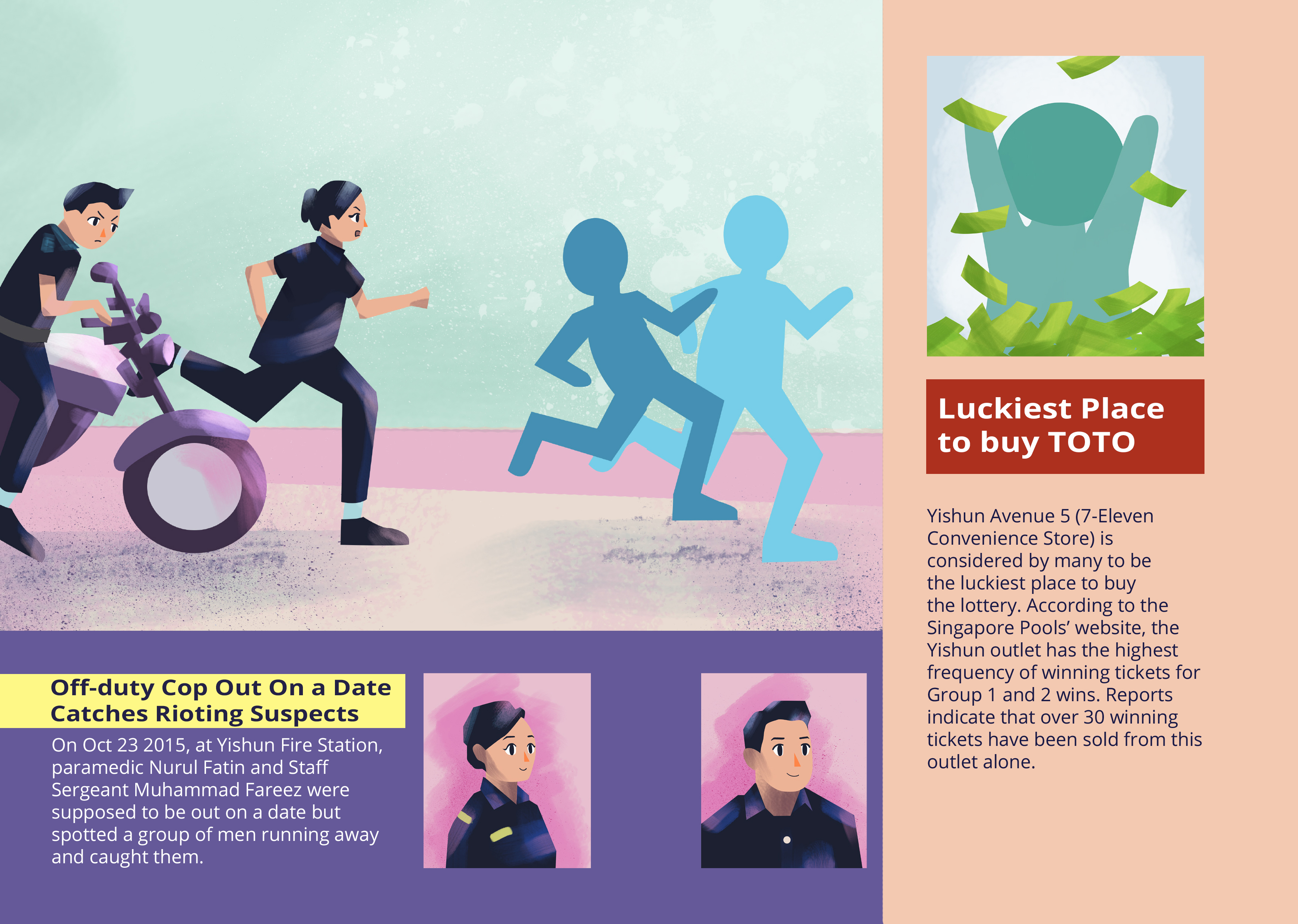
For the 2nd spread, I decided to divide it into 2 sections where the smaller column is for the less important news which I decided was the TOTO article, while the other is about the Cops.
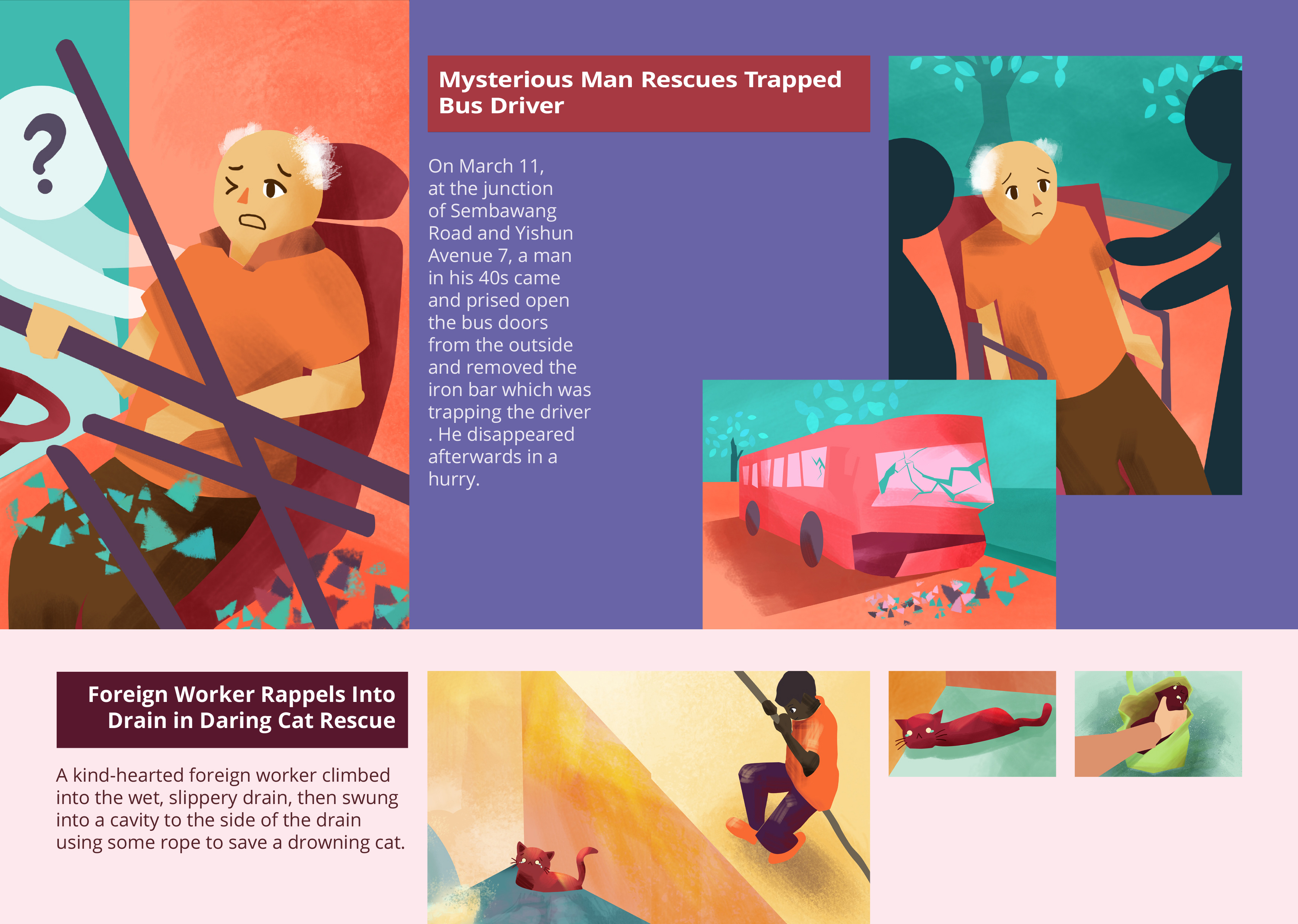
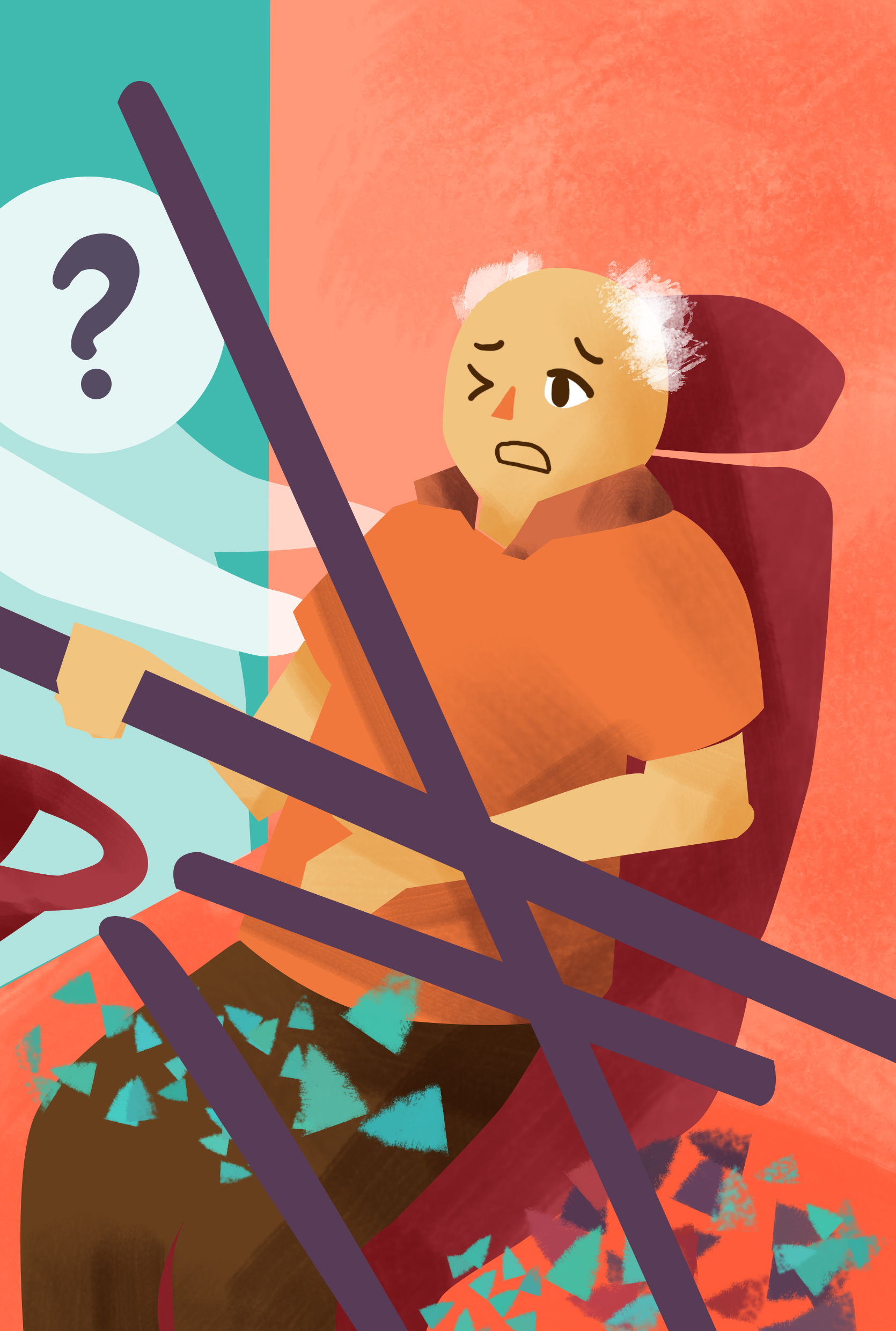
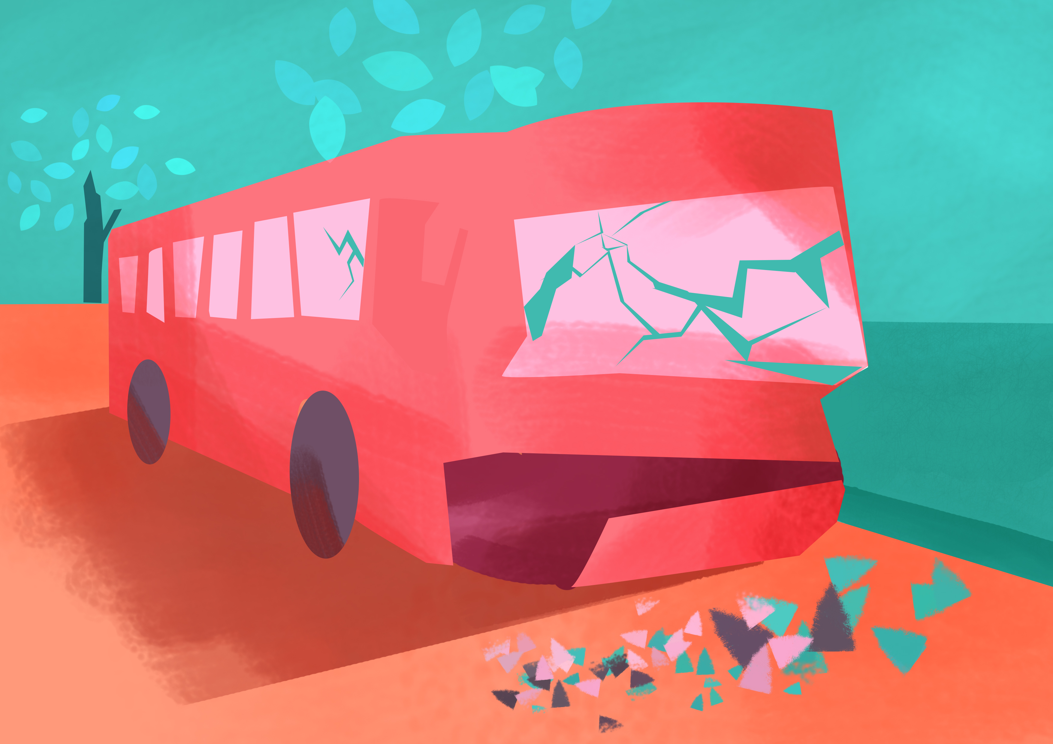
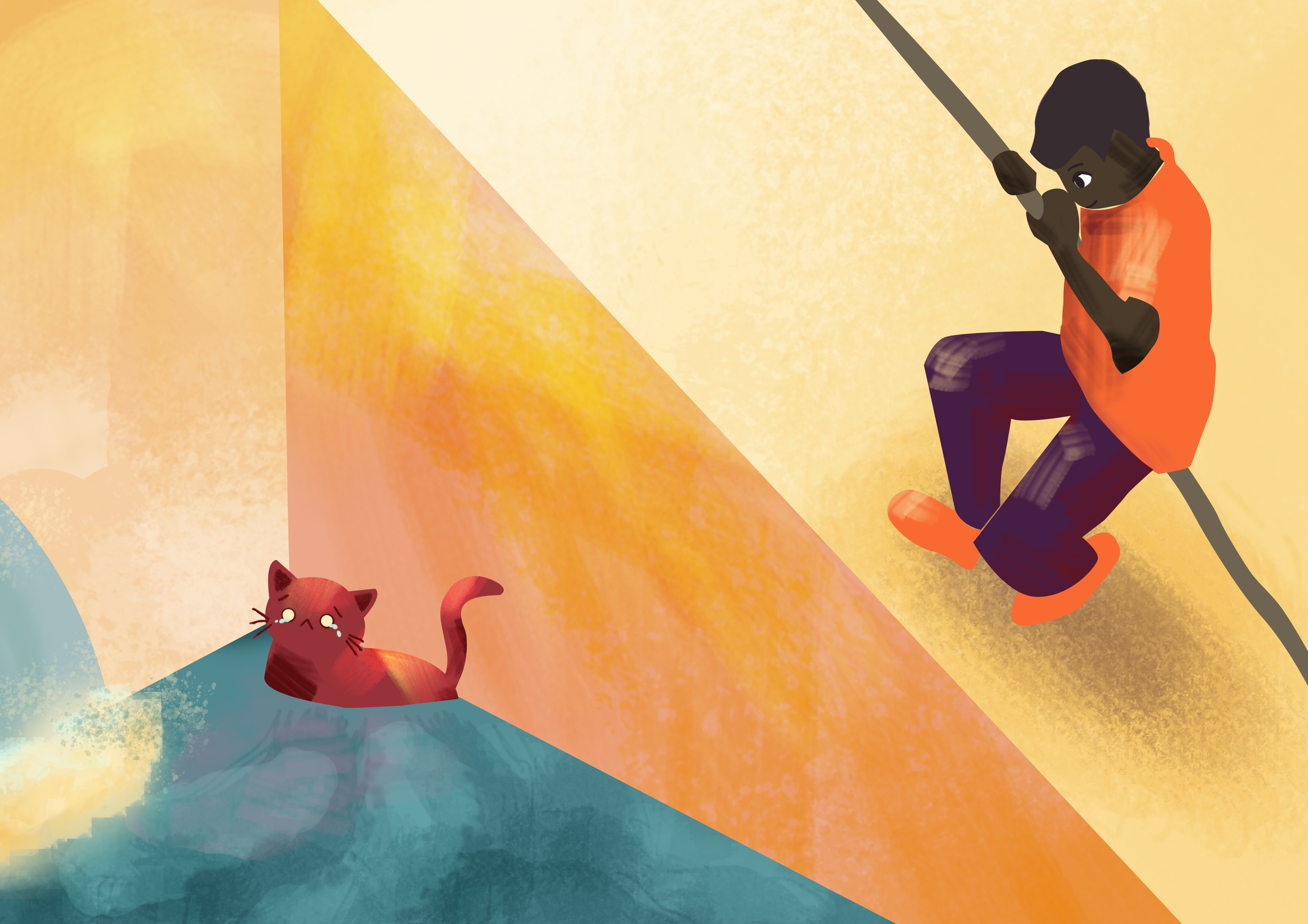
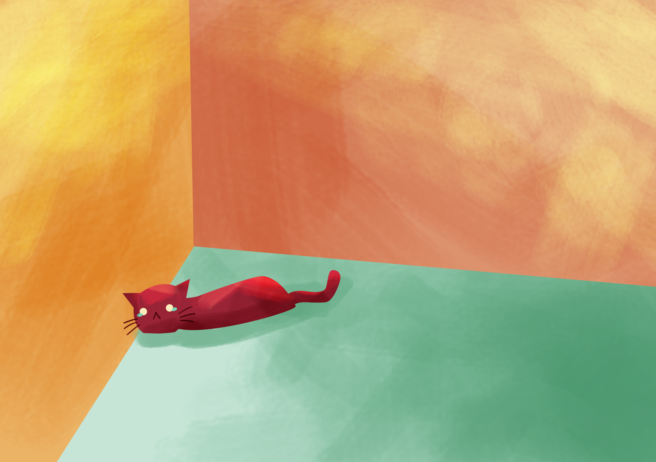
As for the last spread, I decided to place the bus article on top while the Indiana Jones foreign worker helping the cat at the bottom.
Artist References/ Inspirations
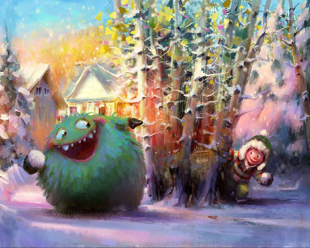
I was just looking through Facebook and DeviantArt’s Facebook page shared these 2 artworks which made me want to try out this kind of style 😀
JillLenaD
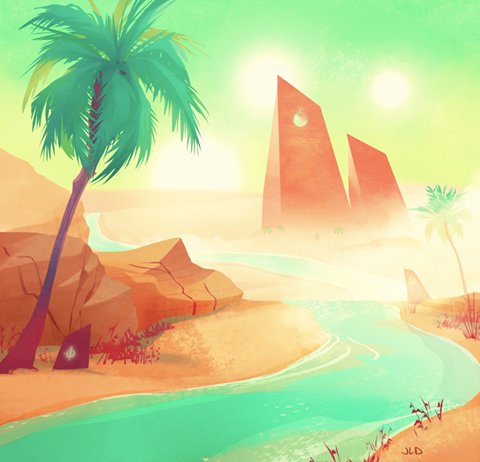
http://jilllenad.deviantart.com/art/105-desert-523596410
MelDraws
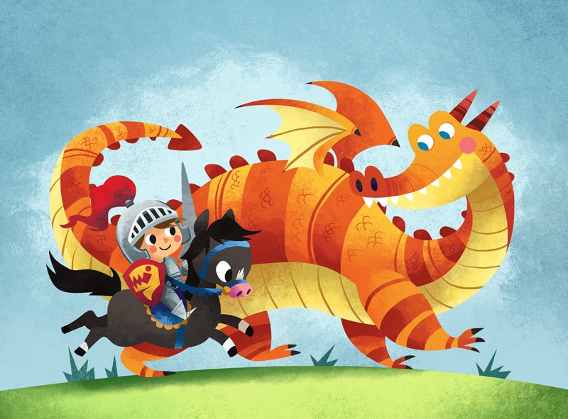
http://meldraws.deviantart.com/art/Dragon-Knight-160860604
MarcoBucci
http://marcobucci.deviantart.com/
Brushes that I used: https://digitalpaintingtools.blogspot.sg/2009/11/marcos-brushes.html
Development for Illustrations
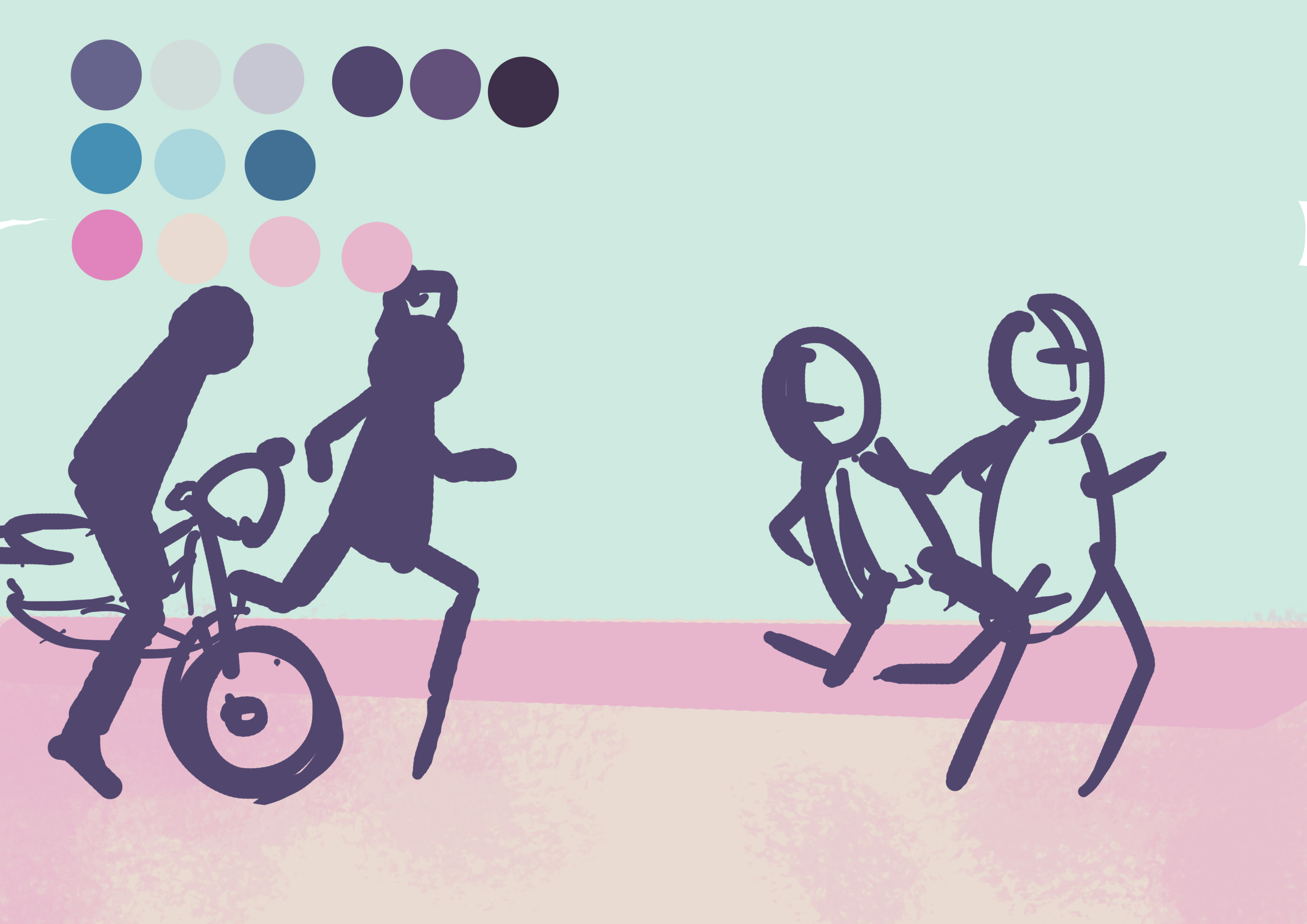
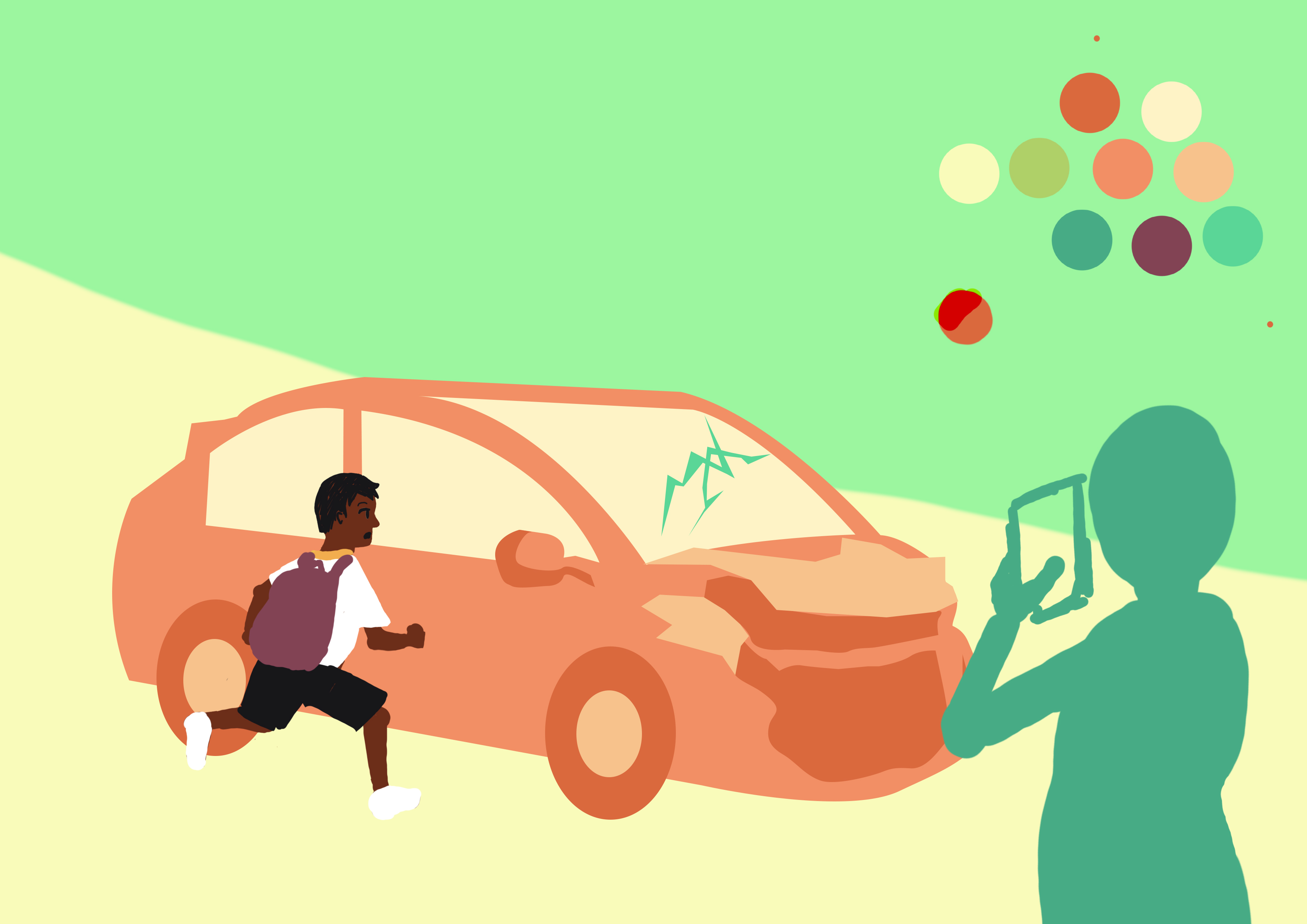
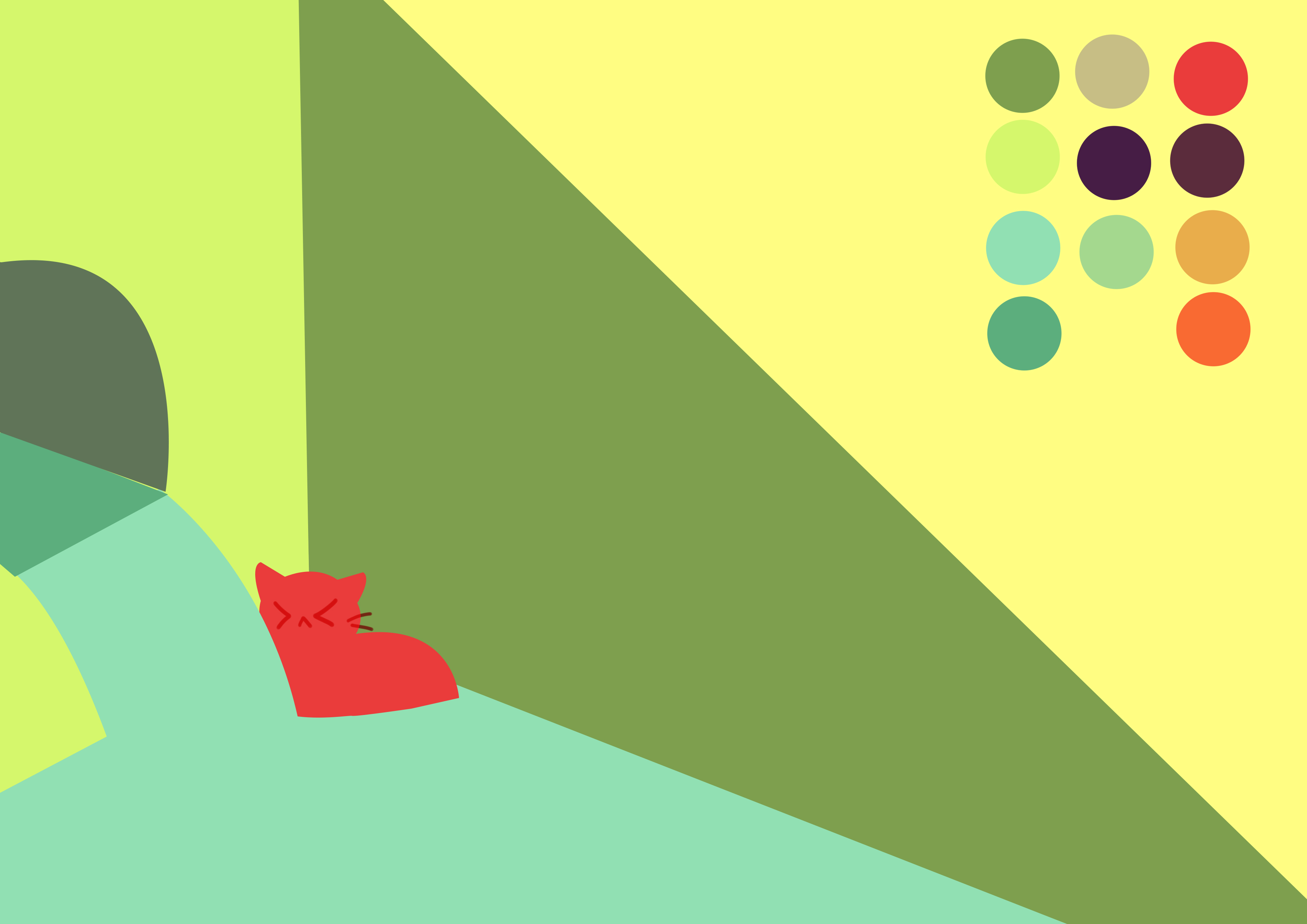
Choosing the colour schemes and Initial sketches
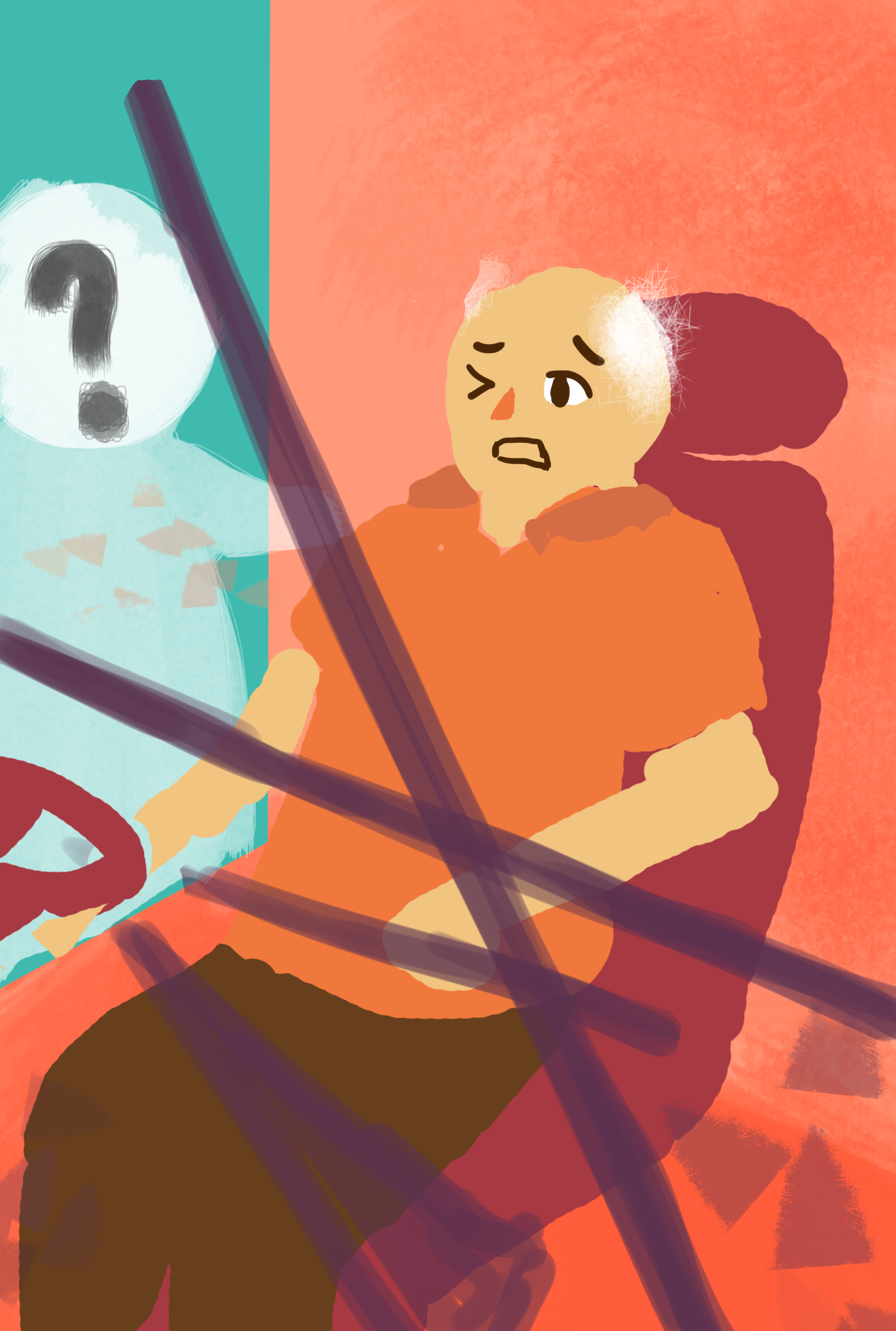
Before using the pen tool to create/ trace out the vectors, I created some sketches using the brush tool first to make life easier 🙂
I wanted to use rich and vibrant colours which helps set a positive tone to the entire zine. In addition the colours, especially on the front cover would be able to attract people’s attention from afar due to it’s saturation and also the usage of more reds which is striking to the viewer’s eyes.
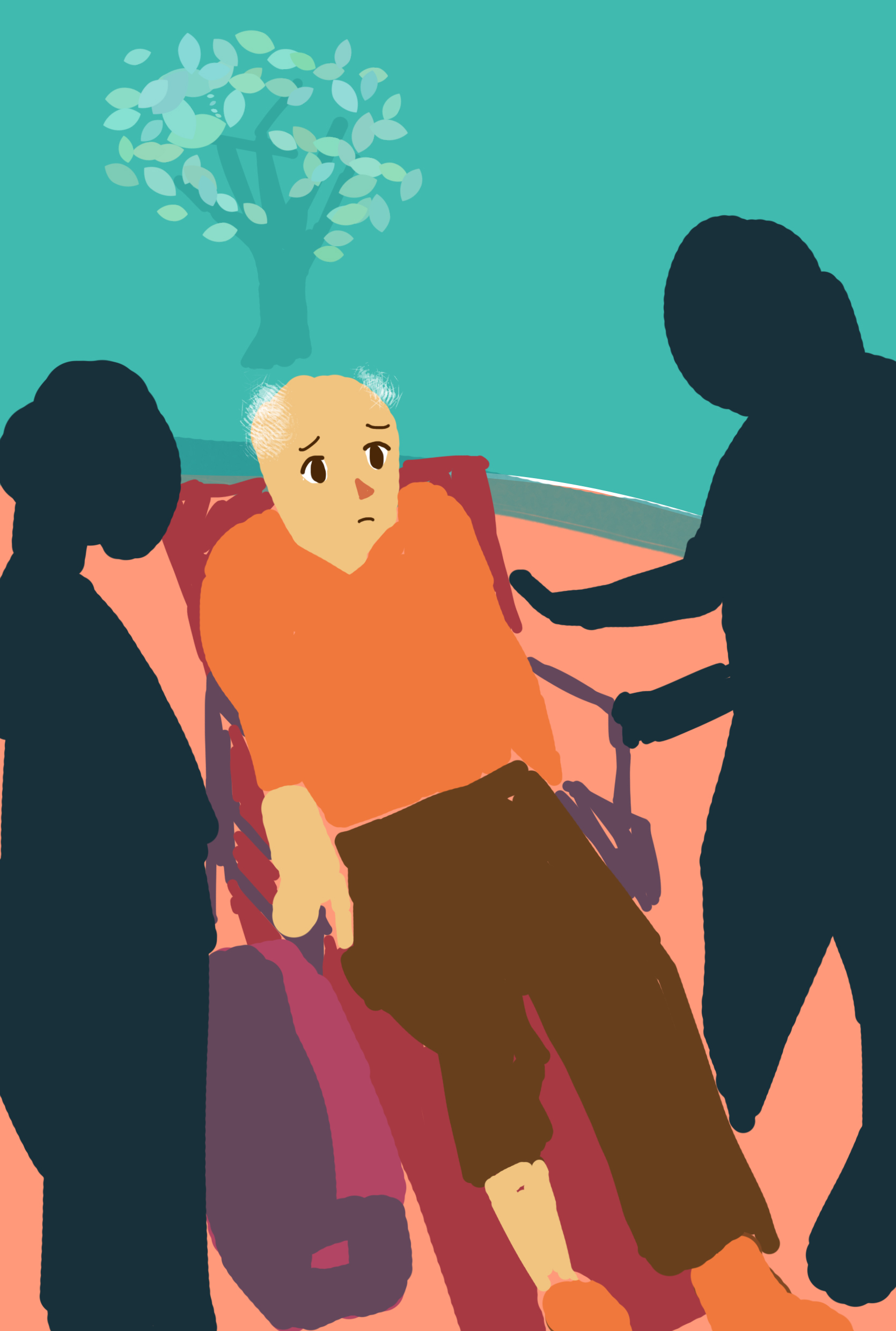
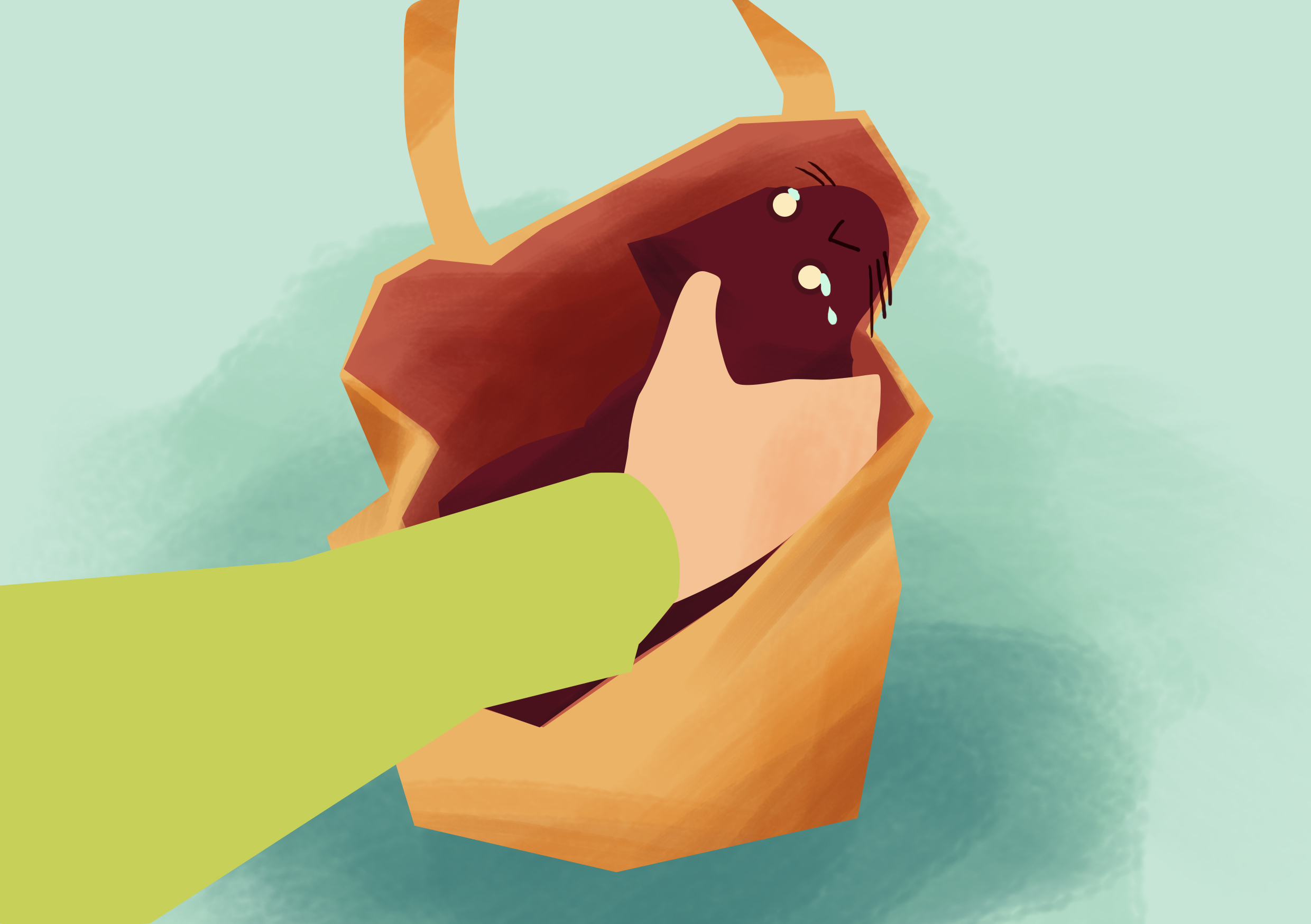
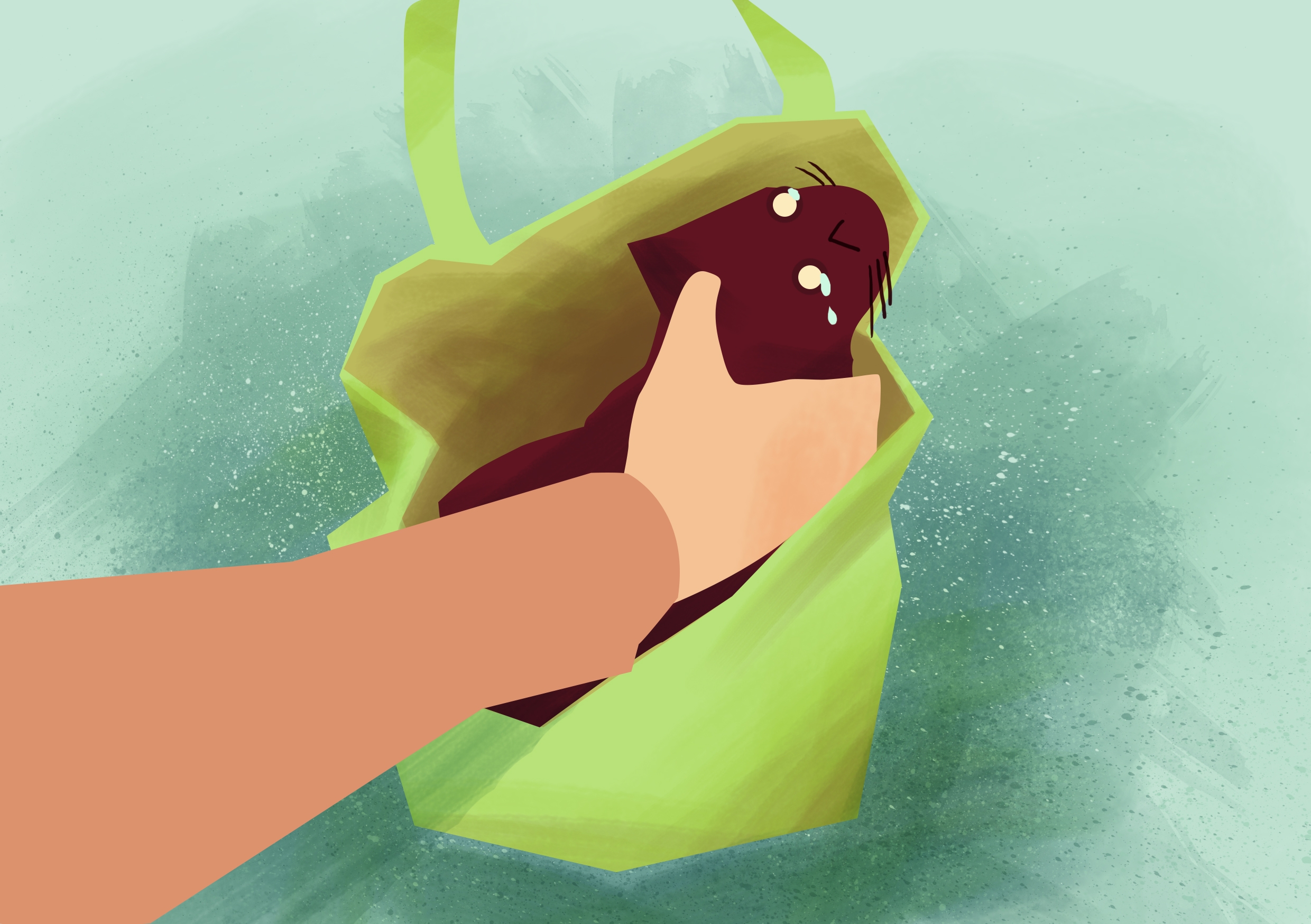
Adding brush strokes to a flat vector
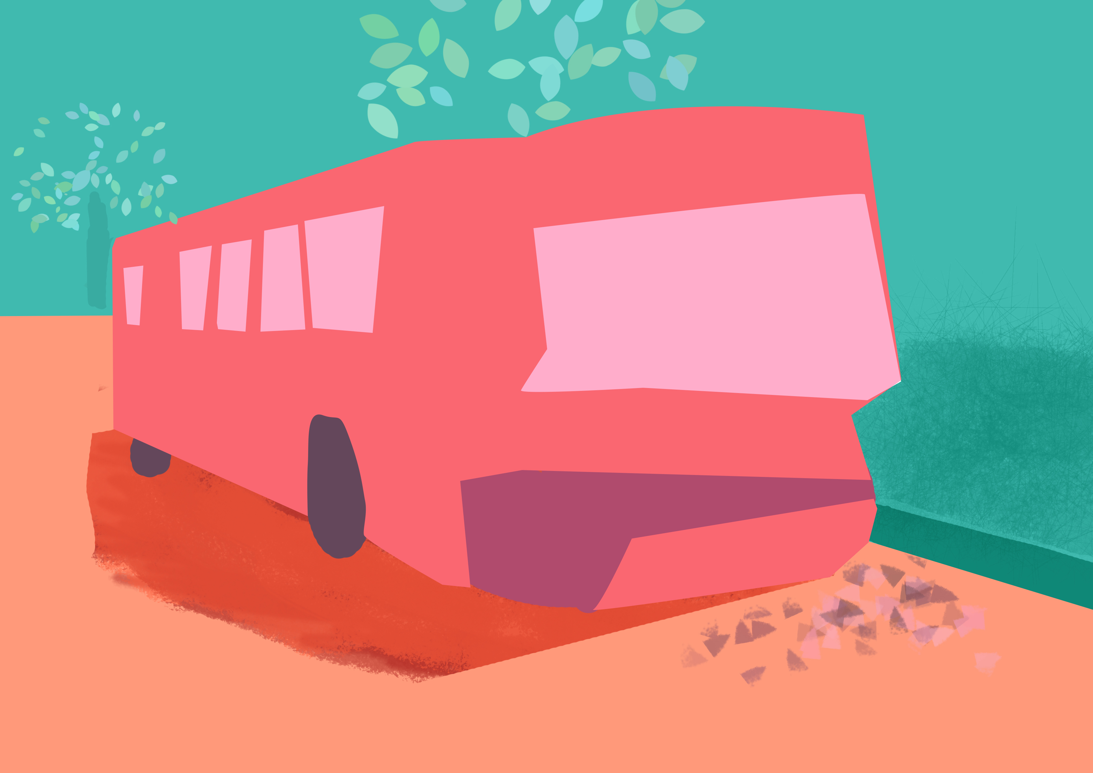

The textures can really make a vast difference 😀
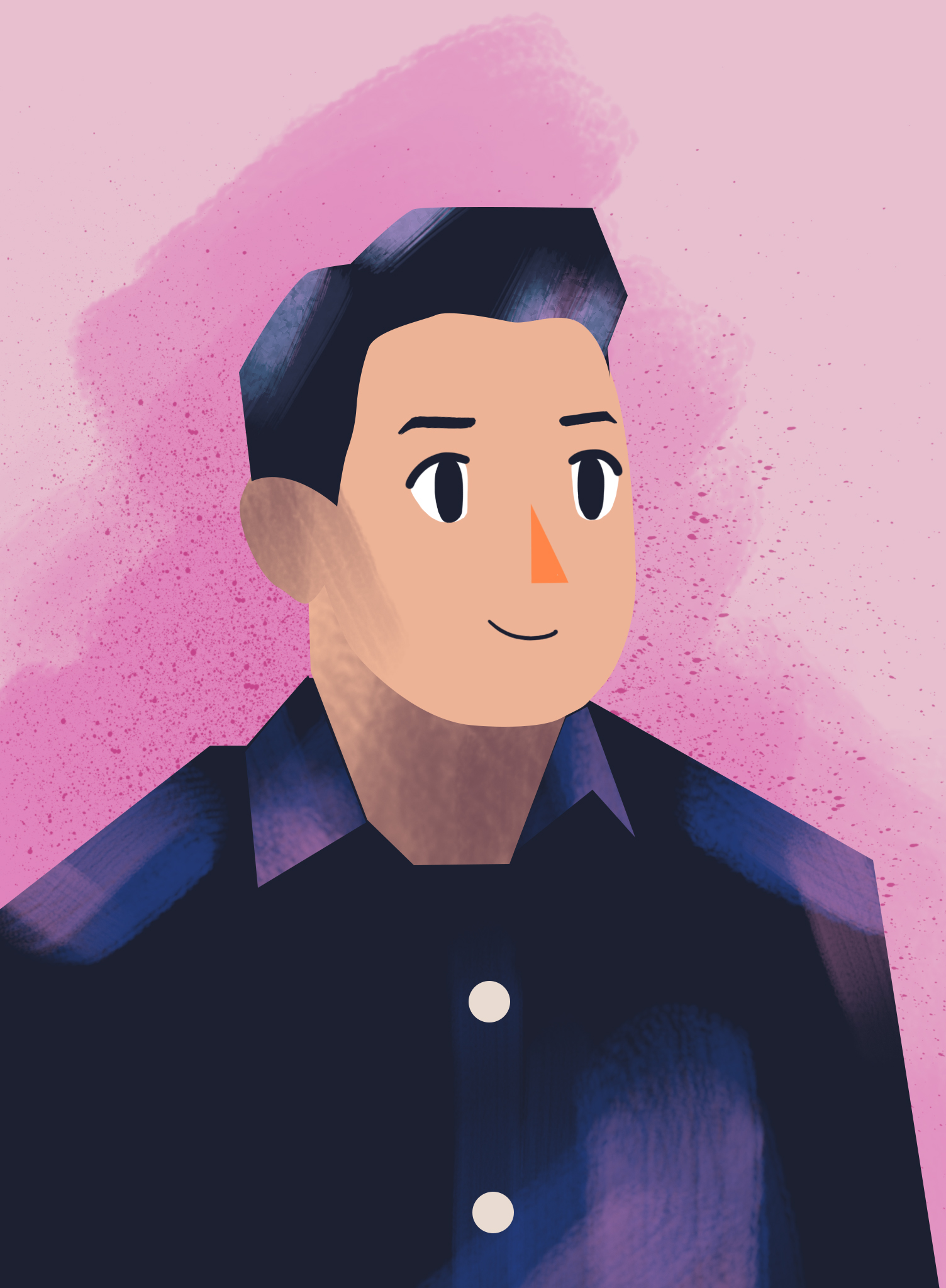
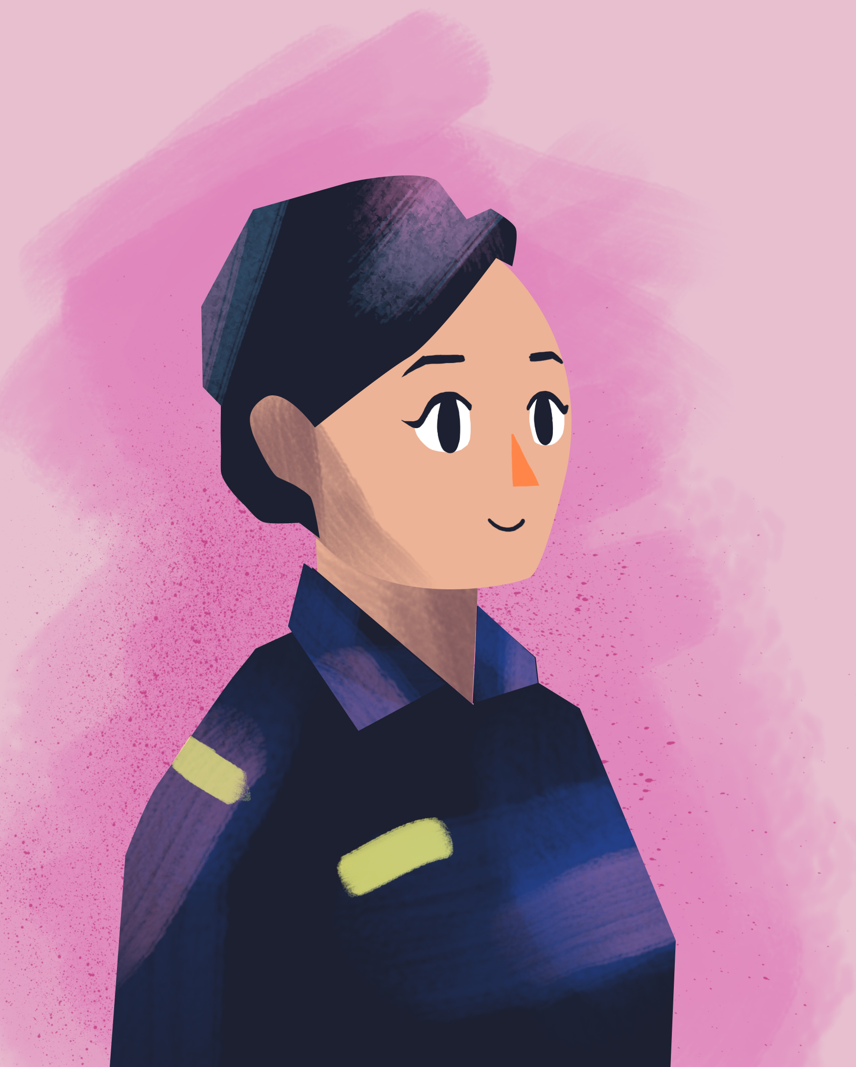
Final Illustrations
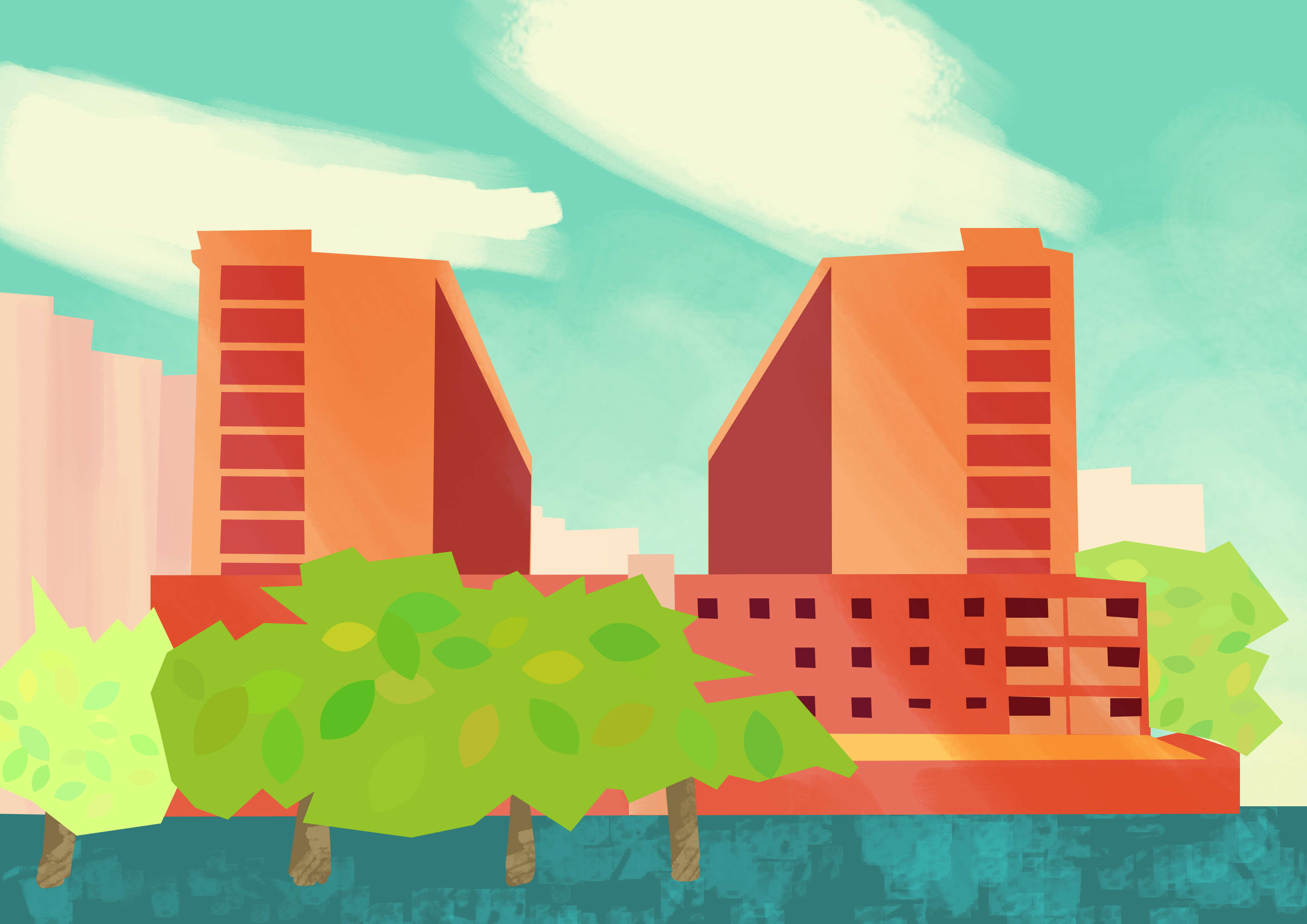
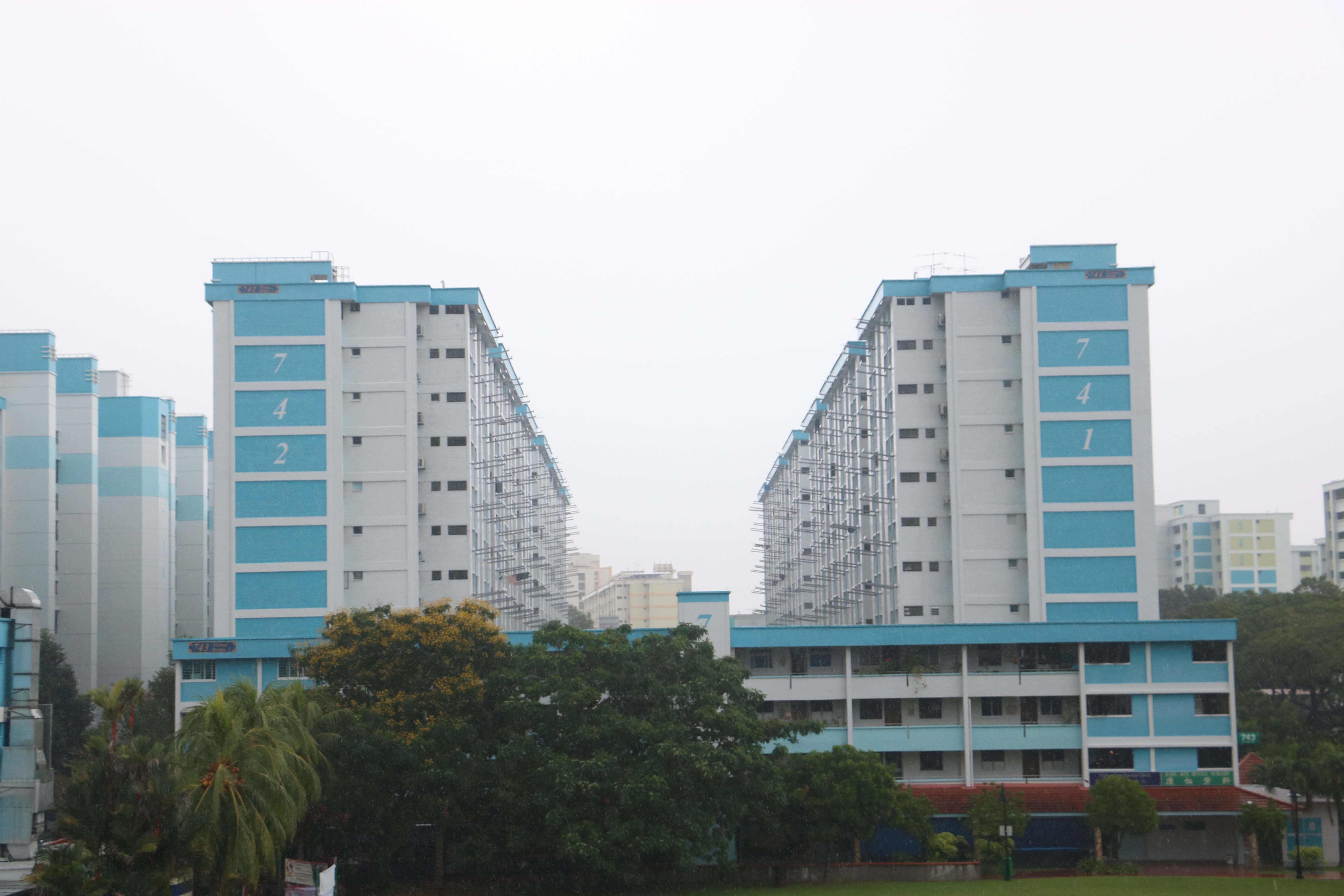
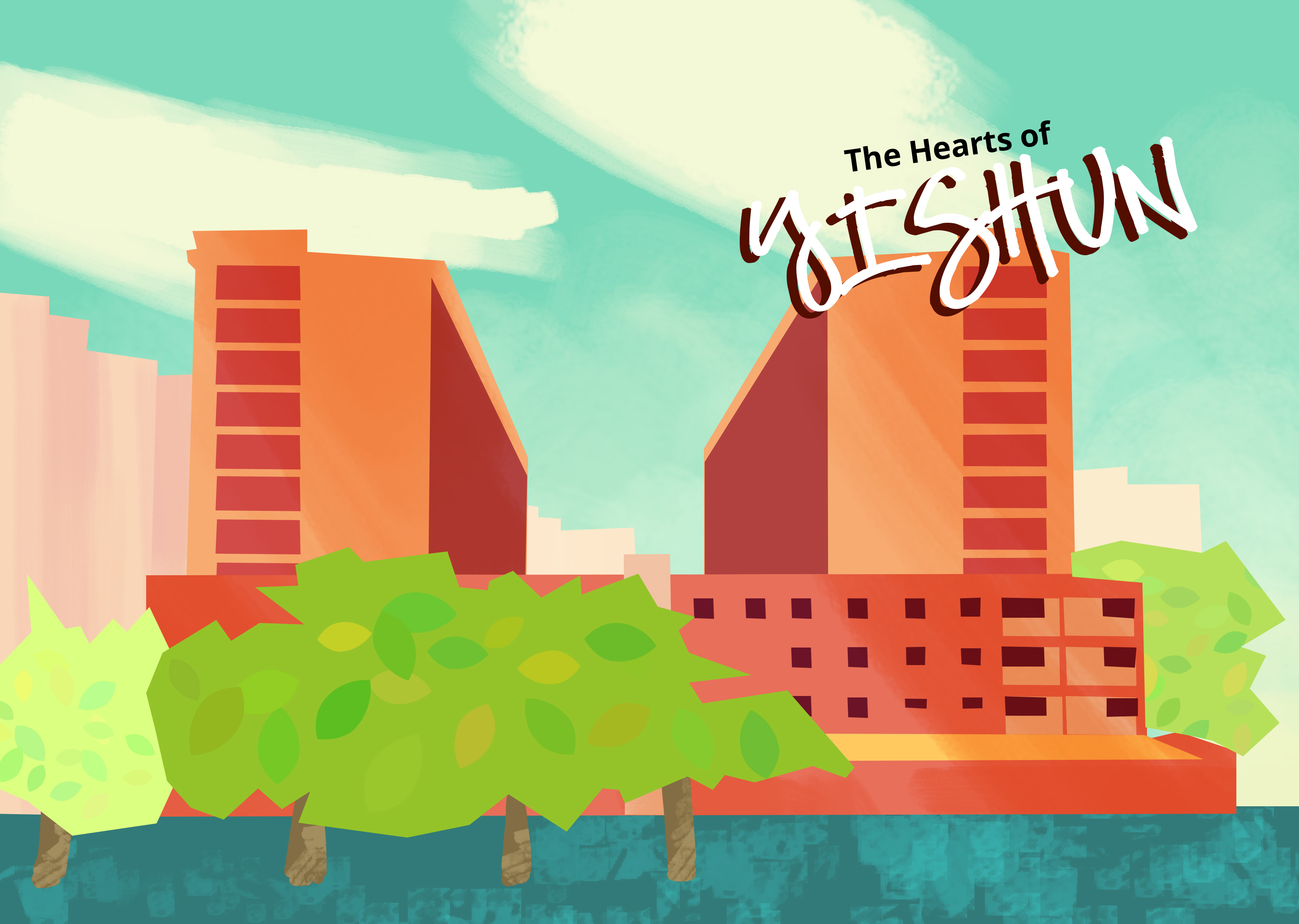
The cover page is a view of Yishun that I took from the MRT station.


Final Booklet