Ego in Different Settings: Colour Harmony Research
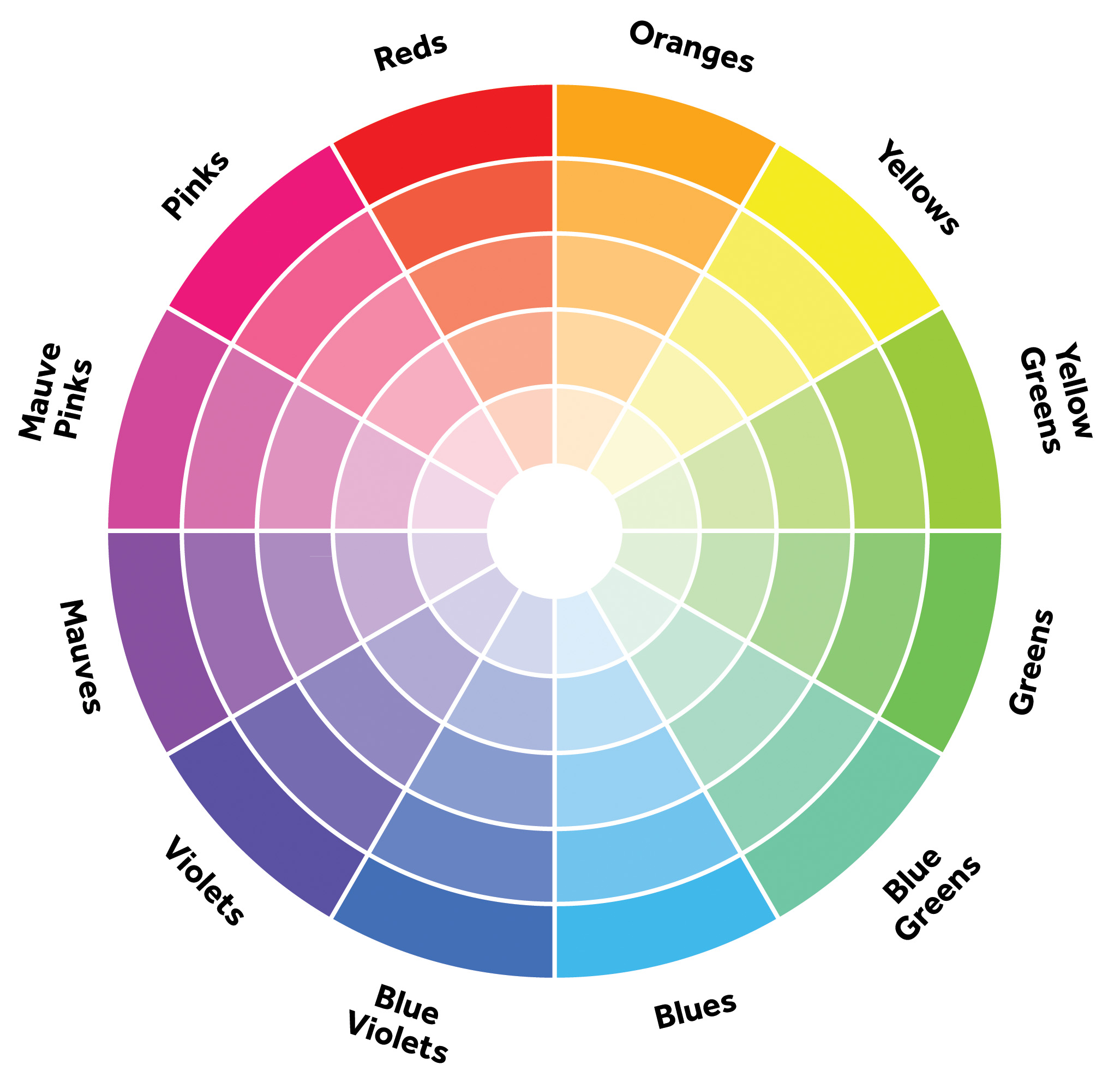
henlo friends here is Big Wheel of Colours:
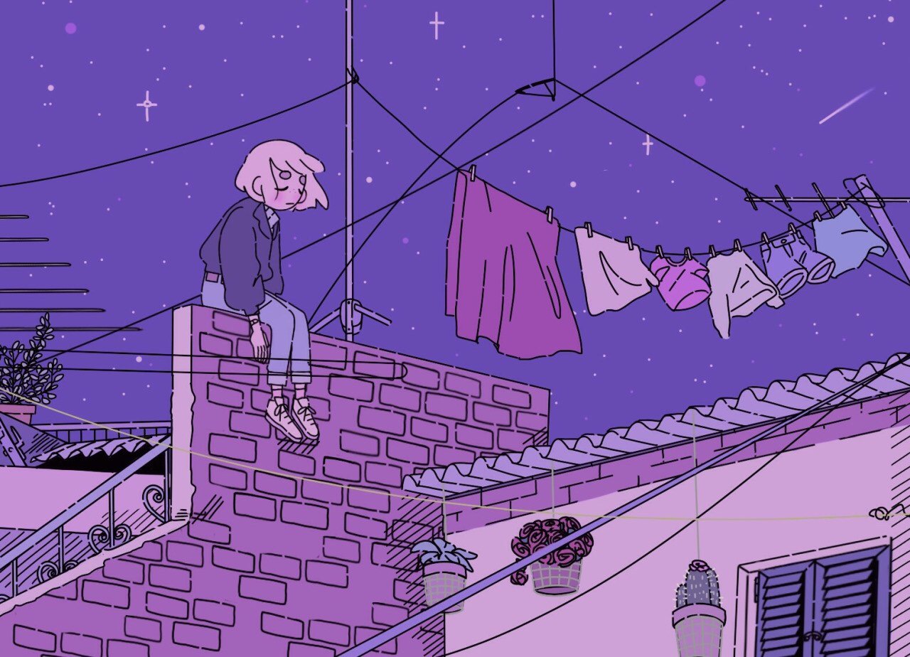
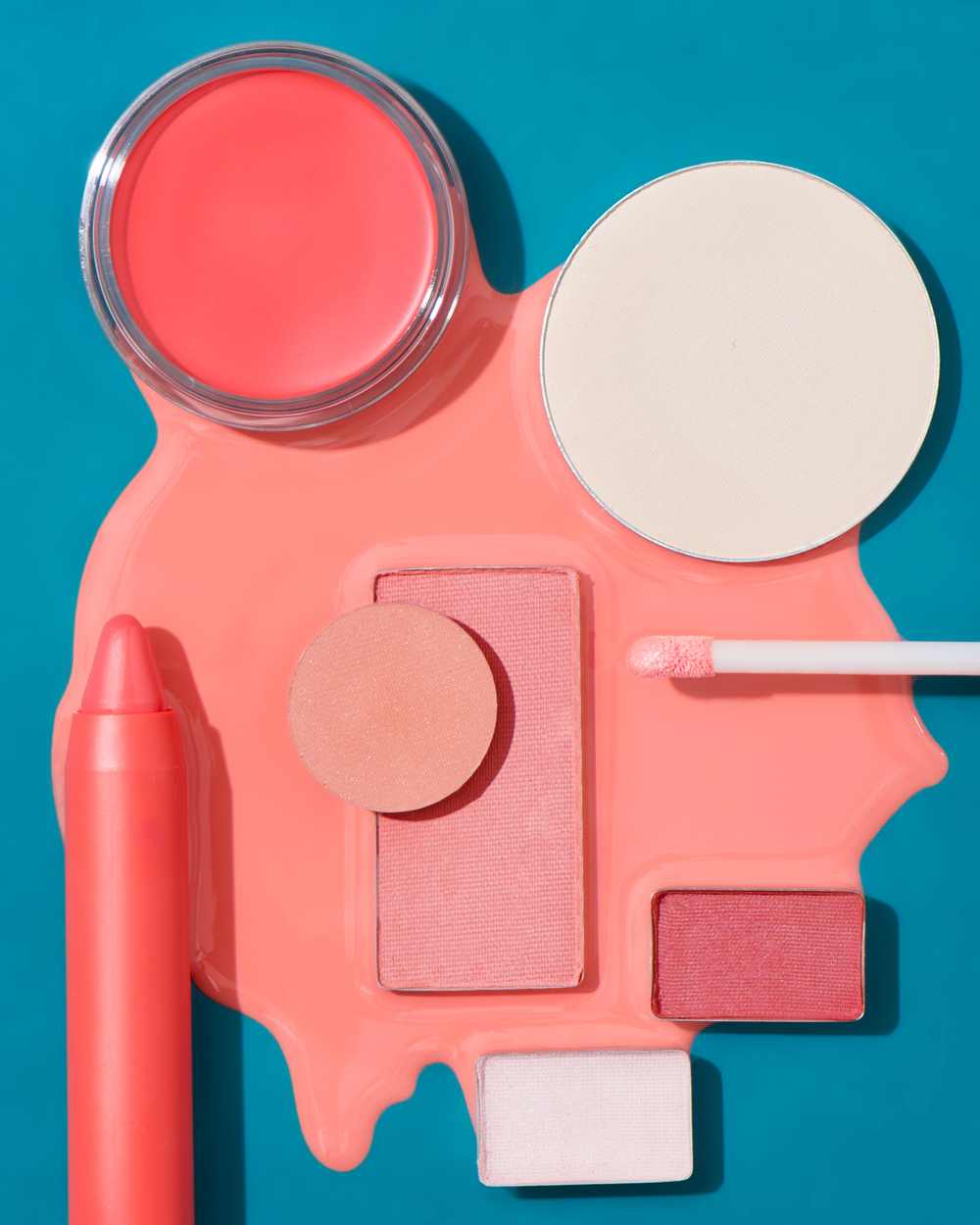
MONOCHROMES HARMONY
Occurs when the colours of a monochromatic palette all share a single hue, but vary in brightness and saturation.
Image taken from www.xboxhut.comthis is so pretty but there were no credits to the artist!! 🙁 make sure to credit artists pls Image taken from https://www.pinterest.com/pin/506021708124150955/By Jenny Wichman. Image taken from www.jennywichman.com
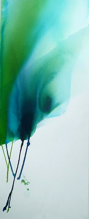
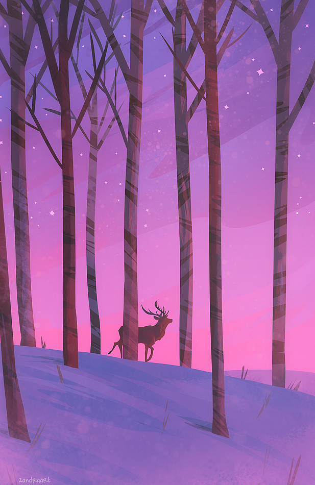
ANALOGOUS HARMONY
Analogous colour palettes consist of different, but neighbouring hues.
The constant property can be either the saturation or the brightness level or both. Usually one of the three colours predominates.
Jo Lewis, ebb tide 1, 2012. Image taken from www.londonart.co.ukBy ZandraArt. Image taken from www.zandraart.tumblr.com
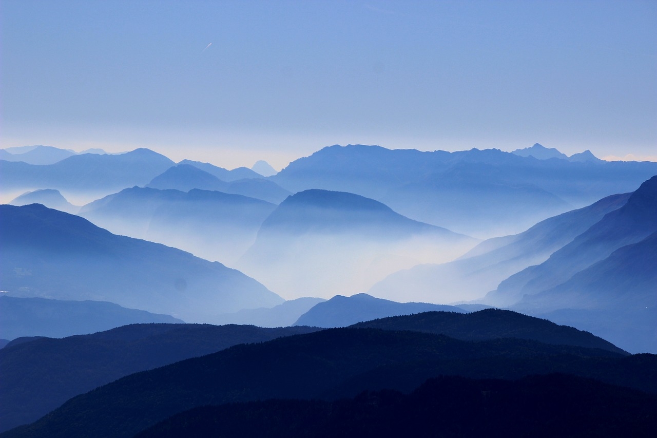
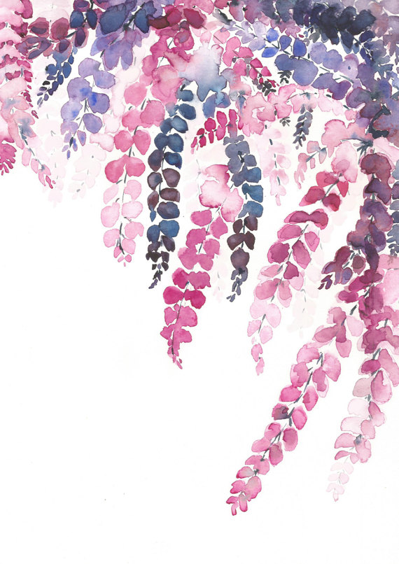
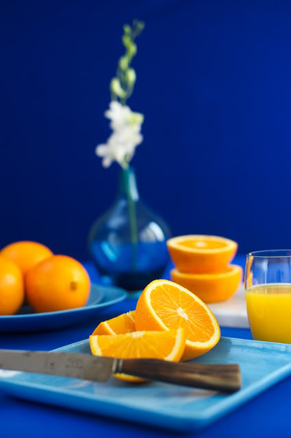
ANALOGOUS HARMONY – WARM & COOL
WARM COLOURS: Vivid and energetic, and tend to advance in space.
By Alea Toussaint. Image taken from www.aleatoussaint.instagram.comBy shopannshen on Etsy.
COOL COLOURS: Give an impression of calm, and create a soothing impression
By thebloomingorchids on Etsy. Taken from https://www.etsy.com/sg-en/listing/512829069/wisteria-original-watercolor-painting?ref=related-1By coolcolorl. Taken from www.coolcolorl.tumblr.com
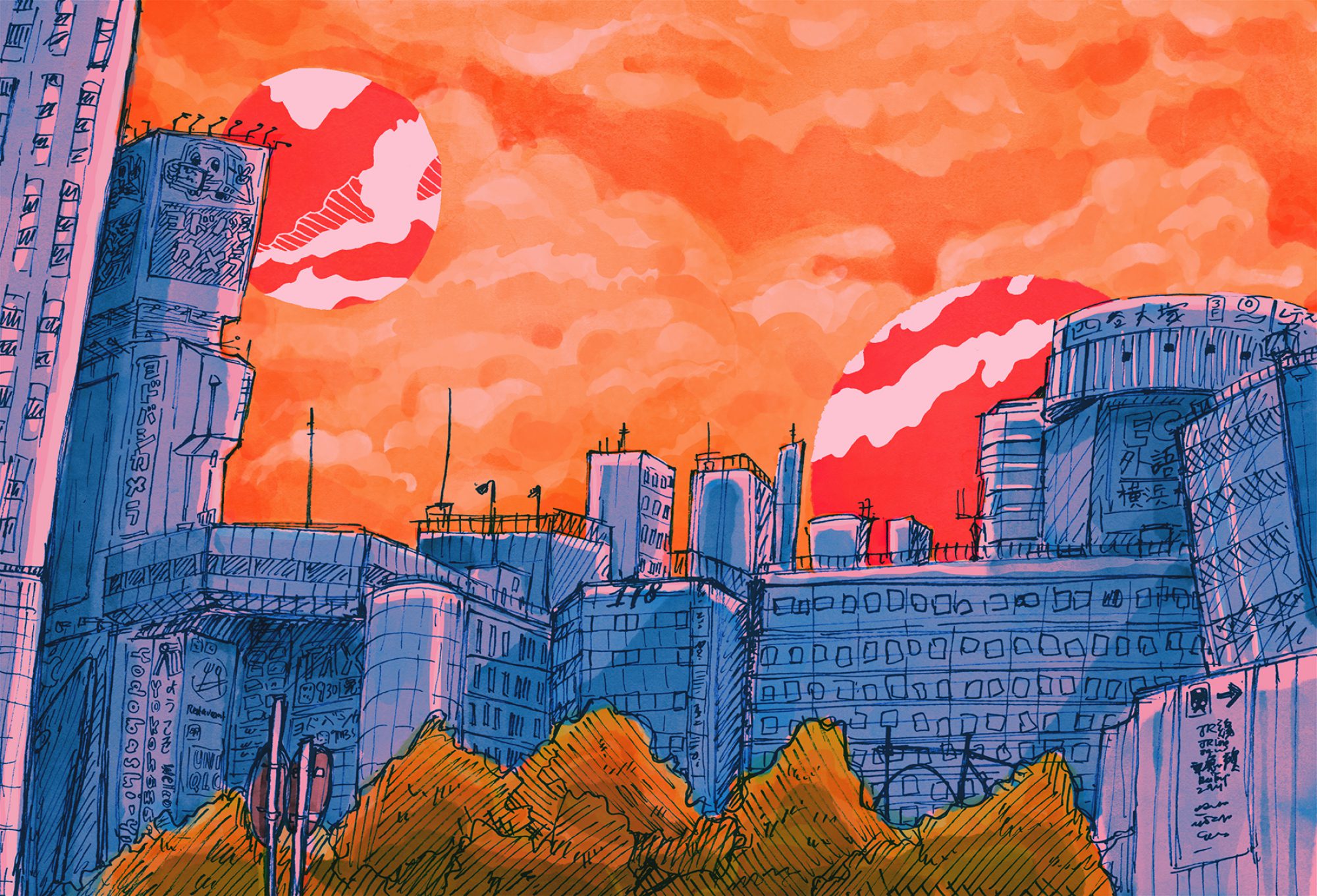
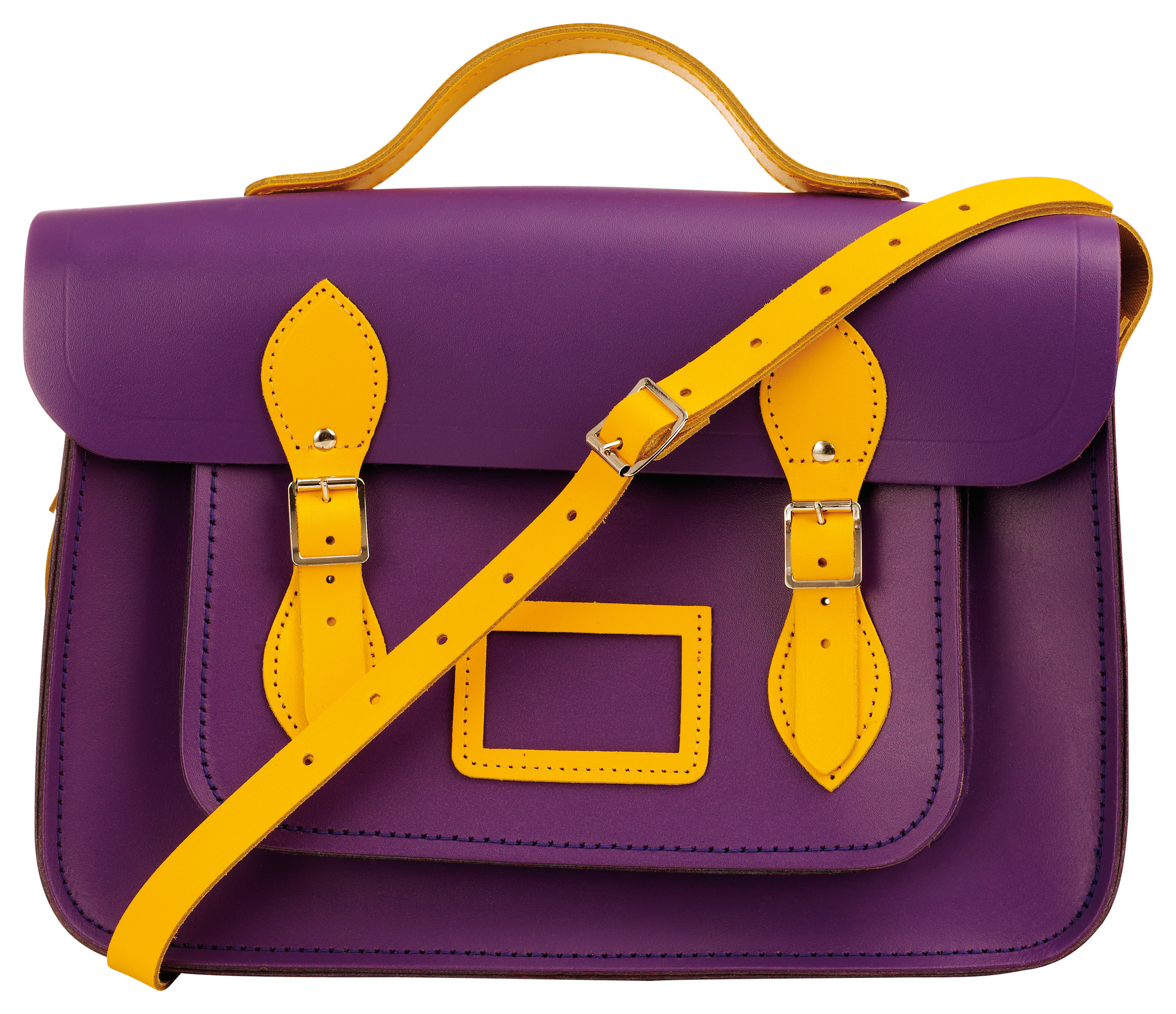
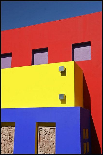
COMPLEMENTARY COLOURS
Complementary colours are any two colours which are directly opposite each other. These opposing colours create maximum contrast and maximum stability.
By Arkakoira on Photobucket. Taken from http://photobucket.com/gallery/user/Arkakoira/media/bWVkaWFJZDo4NTI5MTUxMQ==/?ref=By Amanda Figliola. Image taken from http://www.amandafigliola.com/7qqe6o66uqvfkl5vmefk8ywggi173dImage taken from www.thefashionnomad.com
SPLIT COMPLEMENTARY COLOURS
The split-complementary colour scheme is a variation of the complementary colour scheme. In addition to the base colour, it uses the two colours adjacent to its complement.
Image taken from https://www.pinterest.com/pin/376613587568427350/Image taken from www.stylendesigns.com
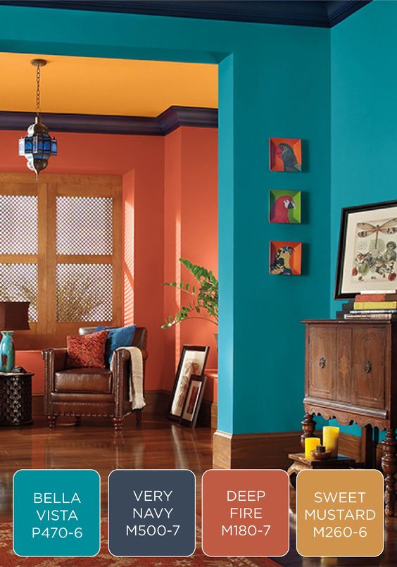
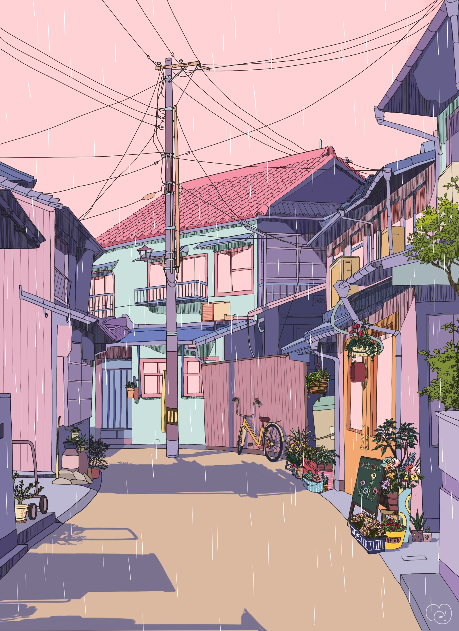
TRIADIC COLOURS
Uses colours that are evenly spaced around the colour wheel.
Centre des Congrès, El Salvador. Taken from https://www.flickr.com/photos/indiashow/3200635678/in/gallery-sa_steve-72157622406479736/Rainy Village by mochipanko. Taken from http://mochipanko.tictail.com/ (Isn’t this the prettiest omg)
Blue, purple and orange are used in this illustration, with the hues slightly desaturated.
2 Replies to “Ego in Different Settings: Colour Harmony Research”
hey niki, the comment function is really underused here so i thought i’d leave a boop here!! great examples, man; they’re quite contemporary and very inspiring indeed!! really showed how important colour harmony is in communicating emotions
HEY esther HAHAHA you made my day manz and thanks!!! like I made sure to stay away from classical examples in painting and things like that cos I wanted to make it more relatable I guess ᕦ(ò_óˇ)ᕤ