Foundation 2D II – Ideas & Execution
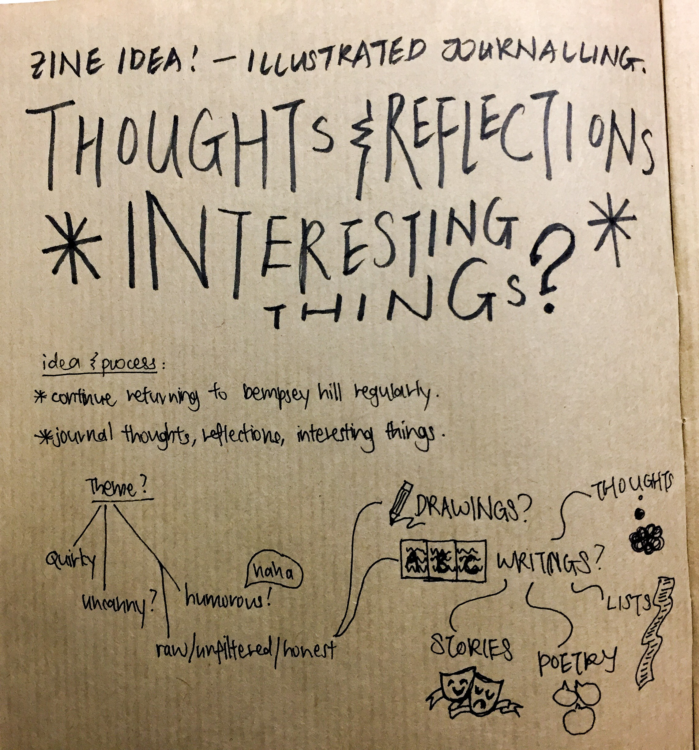
Idea 1: Thoughts & Reflections about Dempsey Hill
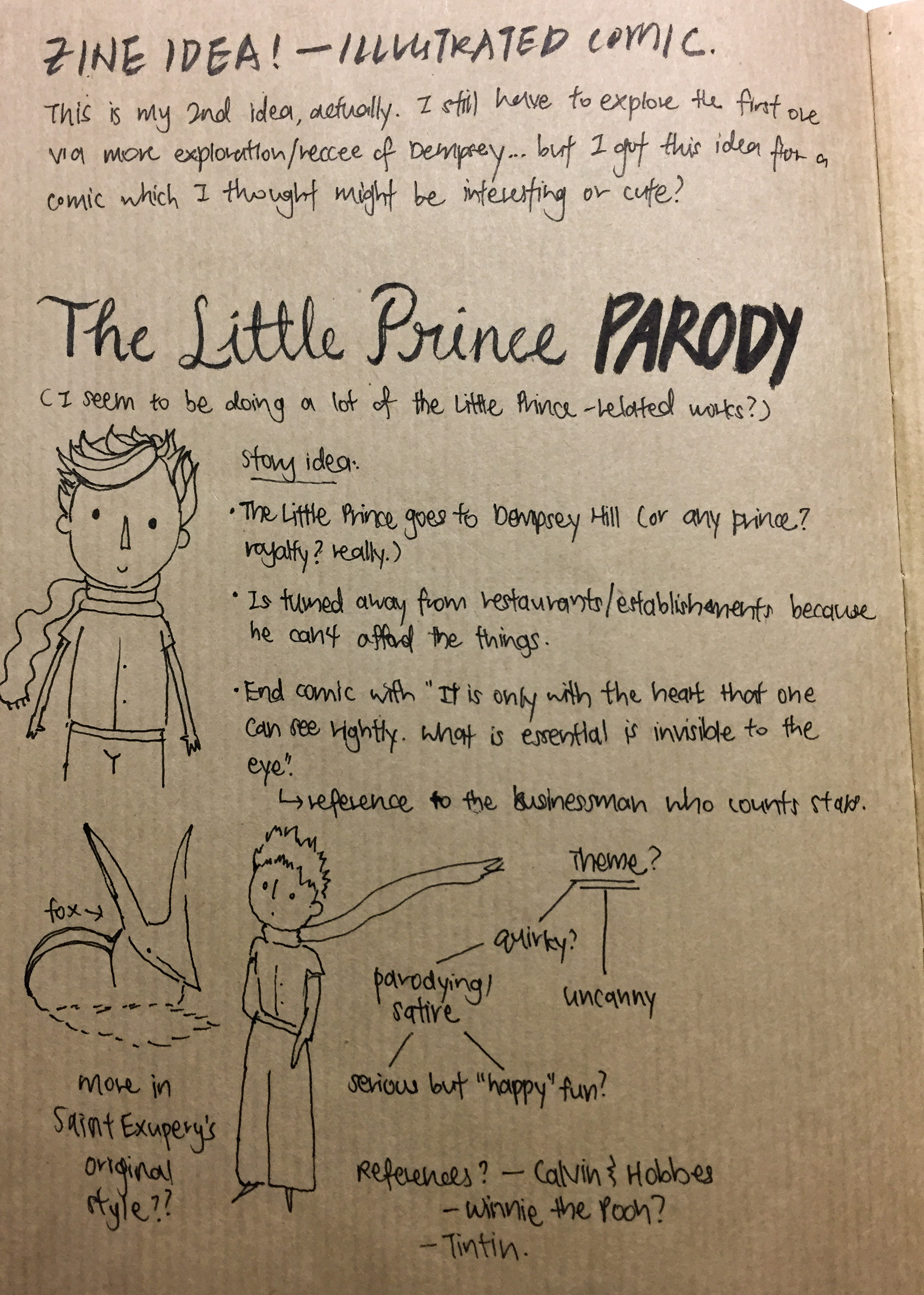
Idea 2: The Little Prince (and his Fox) visits Dempsey Hill
Amongst the two ideas, I very much favoured Idea 2. This was for several reasons:
Firstly, I was more attracted to the idea of creating a narrative. Stories are my passion, and telling stories is something that I want to continue to grow in.
Plot & Character


Inspiration & References
Pinterest board: [link]
First and foremost: “The Little Prince” by Antoine de Saint-Exupéry


Quite obviously! Haha.
I really love this book; it’s the perfect book for all ages, really – less a children’s book and more of a book for an older generation. The general mood, a cross between whimsical and realistic, with callbacks to the truths of life, was something I want to work towards.
“Seconds” by Bryan Lee O’Malley


Summary: Katie is the founding owner of a popular restaurant named Seconds. Katie inhabits a room in Seconds and is woken up one night by a mysterious, white-haired girl named Lis, who gives Katie a notepad, a single mushroom, and instructions for her to follow to cast a “do-over” spell in order to fix her past mistakes. Katie finds more mushrooms under the floorboard in the restaurant and uses them to fix problems arising with the construction of a brand new restaurant, her relationship with her ex-boyfriend, and to prevent the injury of a waitress named Hazel. Despite Lis’ rule of one mushroom per person, Katie ignores Lis’ concerns and seeks to use the mushrooms to make her life perfect, but unintentionally creates more problems as a result and disrupts the balance of time and space. — Wikipedia
While looking at these comic books – alternatively called sequential art – I was on the lookout for inspiration on paneling and flow. While “Seconds” is a 100 page plus book and I doubt that I could use a similar pacing to the book for the zine assignment, I felt that the book was more like my style of artwork and how I would structure my comic if I had more pages. As it was, I was very taken in by the quirky and flawed characters (as well as the plot) of the story, and challenged me to use a ‘show not tell’ method in my own work.
“Ordinary Victories” by Manu Larcenet


Summary: This is the story of Marc, a photographer who’s tired, of a very patient chick he meets, of banal horrors and of his pain-in-the-neck cat. It’s the story of his art thrown against heavy anxiety attacks; of a really cute woman in his small town who seems to take to him against all odds; of the old neighbour, a peaceful likeable fellah until you get to know his disturbing role in the war… Movingly real and deeply perceptive, this graphic novel was the recipient of the top award in Angouleme, France’s largest comics event. — Google Books
I took a closer reference to “Ordinary Victories” in terms of style and pacing. The thin lines I used in this assignment is new to me – a style that I’m experimenting, actually, as I had only just acquired a nib pen. I took a risk in using this new tool as I was unfamiliar to it and was unsure how my art would look like with a different treatment in medium – but it turned out well!
I was quite inspired by the pacing and the deadpan delivery of this book – even in conversation, the paneling changes, providing visual richness and dynamism, which I hope to learn from.
Other References
Here are the key visuals that guided me throughout the process! Most of them are part of zines, so I took my cues in mood and pacing from them.


There are more in the pinterest board… but what I kept referencing was basically:
- A raw, organic mood
- Something personal
- Something candid
This is what I took, and merged together with my personal style…
Draft & Execution
I actually struggled a lot in the conception process! As I mentioned in my earlier post, I did not have a very good impression of Dempsey… However, I don’t want to present a bad front for the place and poison the experience of someone else who might one day go to the same place! To each his own. Anyway, badmouthing the place would just leaves a bad taste in my mouth.
COVER
When at a loss, find references!
I was inspired by this image that I found:

Process:


I was quite satisfied with it – it was not my best work, but it was certainly what I did best. I showed it to Mimi during class.

I do agree!
This led me to eventually change my medium and tone in the entire zine, as well as the title and style. Given the limitation in page spaces, though, I continued on my idea that the cover would be part of the story.

Drafting the pages
The final process was quick, with me banging out ideas, scrapping and re-doing, until I had what I wanted. Most of the work was done in some form of scribbles or another.
At one page (especially for pages 3 – 7), I was quite stuck on the layout, and briefly considered typing out the story instead. Here’s what I wrote:
TheGeographer, while lacking in credibility, seemed confident that Jones the Grocer was the place to be. So off they went.
At the door, there was a man.
“Hi,” he said.
“Hi,” said the Little Prince. “Are you Jones the Grocer?”
“No, I am not Jones,” not-Jones replied. “Neither am I a Grocer. But people call me the Businessman. Is that a crown?”
“Yes, it is in fact a crown,” said the Little Prince.
“My Prince,” interrupted the Fox. “This is a bad idea—“
The Businessman perked up. “You are a Prince?” He asked eagerly. “Come, come in.”
The Little Prince looked the his Fox, who shrugged.
“You must be tired!” The Business man said cheerfully. “Here, here. Come in, come in.”
“But soon I must return to the counter,” the Businessman said. “For I am a busy man! There is coin to be counted.”
“Coin?”
“I administer them,” replied the Businessman. “I count them and recount them. It is difficult. But I am a man who is naturally interested in matters of consequence.”
“I see.”
“But first, a tour for the Prince!”
But in the end, I decided against it; the zine was essentially about the illustrations and the story would definitely ‘break the flow’ of the story, ruining the consistency. The limitation of 8 pages came into play here – if the story was longer, I could certainly include more elements, more storytelling methods, more details.
So, I stuck to illustrating.
PG 8
The last page stayed quite the same even after weeks of hashing and rehashing, somehow. It had essentially the mood & atmosphere that I wanted, so I didn’t change much from it.
Final
Here is the .pdf file of the final! [Natasha’s Final]
Conclusion & Reflections
I felt quite pleased with the final product. I gave it my best shot! I feel that I had managed to work through my reservations of the area, and somewhat showcase Dempsey Hill in a positive light. In a way, I empathise with the Little Prince and the Fox, who were admittedly quite lost in an alien environment.
Greatest Challenge?
For this assignment, my greatest challenge was coming up with a comprehensive narrative/concept for the 8 pages. I feel that I spent a lot of time struggling with the page limit – this is probably because I’m not accustomed to illustrating a full story within the limits of 8 pages (which includes the cover and back page). A zine is very different from an illustrated storybook, though. Furthermore, I didn’t really have much reference to work off due to the unorthodox choice in presentation that a chose. I feel that zines are usually more journalistic? And candid, and personal – I struggled a bit because I couldn’t compensate whimsicality and randomness with repetition to present a more collected view of my location (a style which I noted a lot of zine creators tend to use – random and weird images to create some kinda of visual narrative).
Perhaps I let the 8 page limit get to me too much?
In the end, I managed to make it work, though! And I’m quite pleased with the end result. Between you and me, though, I felt a little cheated because taking photos and formatting the zine seemed easier – my process included creating the illustrations on top of that, and it was quite rough on my timeline. BUT I have no right to complain HAHAHA I understand that photographing and formatting and typography has its own challenges as well, and probably would not have been able to produce as successful and distinctive (to my style) a work if I had gone with the flow.
What is one thing I feel I should have done differently?
One thing I regret the most is not being able to visit other parts of Tanglin. Although focusing on Dempsey Hill worked out for me in the end, I feel that I still have much to see and explore in that place, touristy vibe aside. Perhaps there was more to see…
However, I think it’s more remorse than regret because honestly, I don’t think I could have done it differently. The workload of this semester felt heavier and more demanding despite having dropped a core module from the last semester, although I had expected otherwise.
Regardless, maybe I’ll visit Tanglin again…
What can I do to improve?
I feel that I can work faster, be more tighter with my schedule – always room to improve! I tried my best, but felt that I dragged my feet at certain points. Feeling overwhelmed and drained is normal, but I shouldn’t let it get in the way of my work – that would be unprofessional.
On a more candid note, it’s probably my work-life balance. I’ve been letting school and other commitments eat into my time and life, and have been neglecting things like fitness and meals and sleep. Neglecting those have a negative effect on us, in a long run… I’ll fix it during the holidays, haha. Summer is going to be amazing!
All in all, I’ve learnt quite a lot in this assignment! Foundation 2D II was tough but it was still a blast anyway.
Thank you!