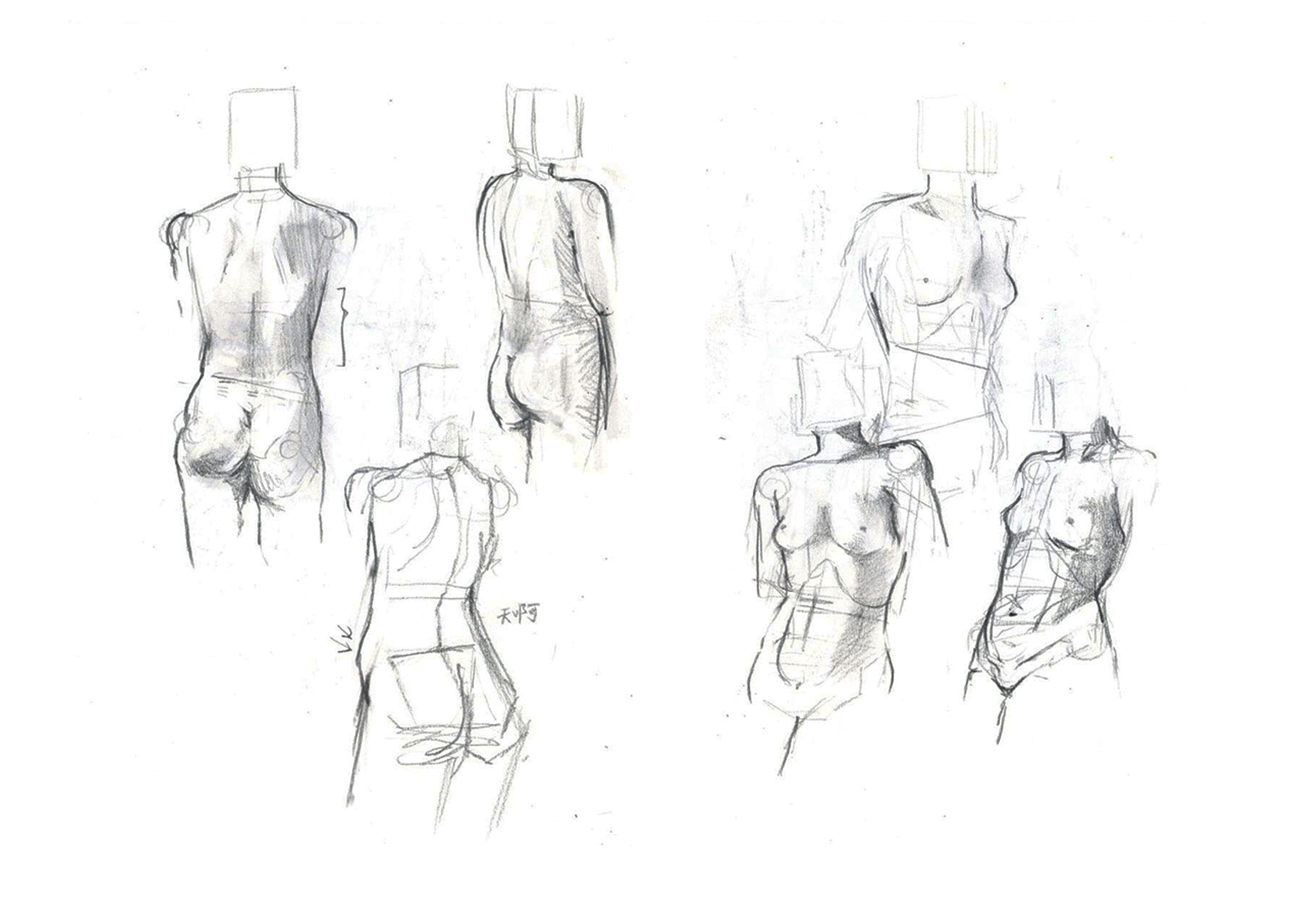
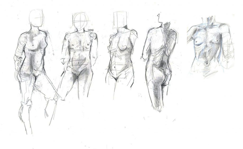
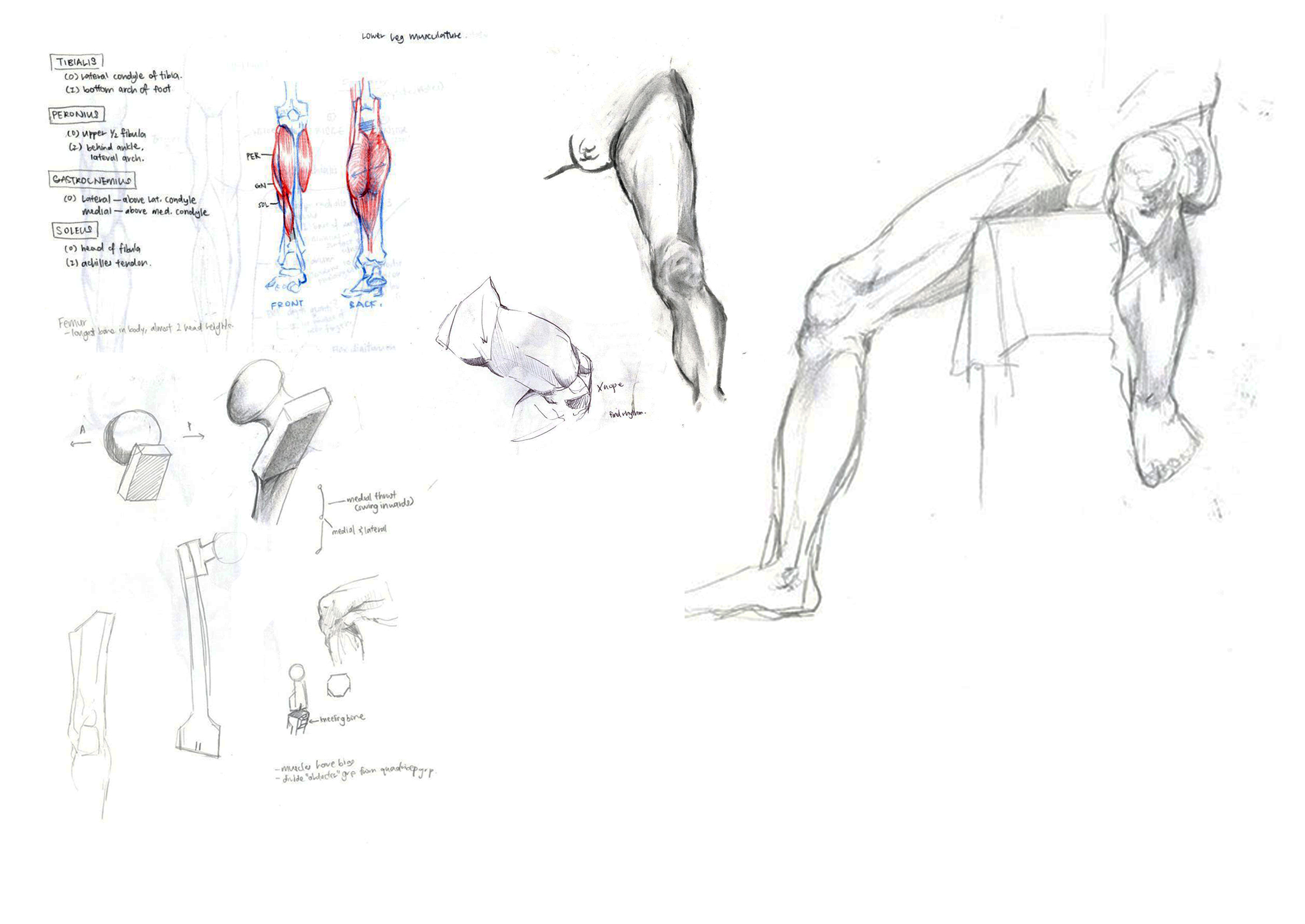
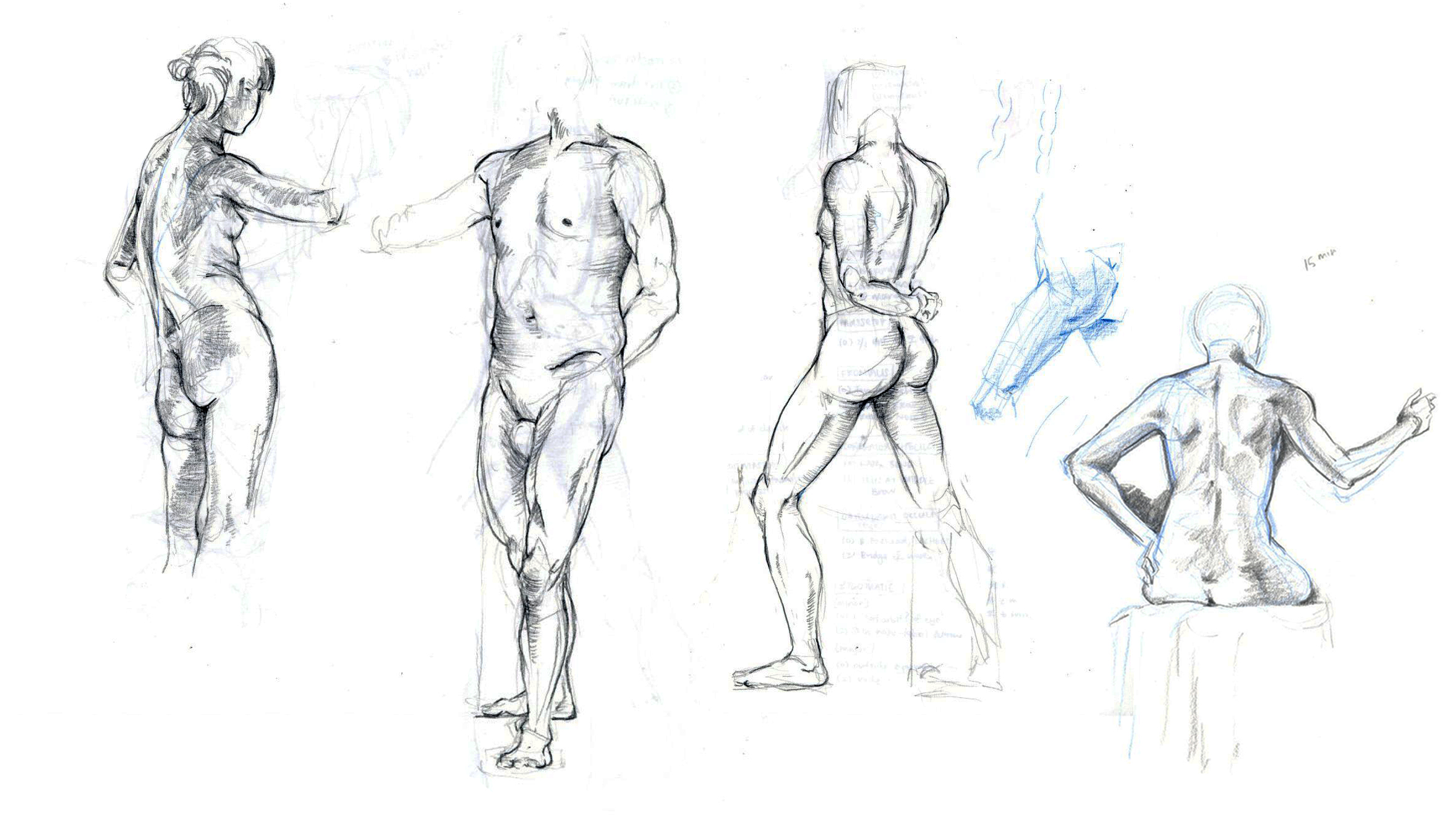
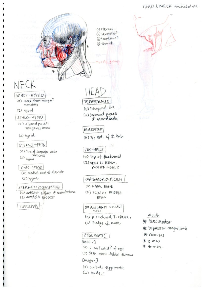
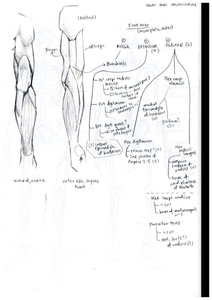
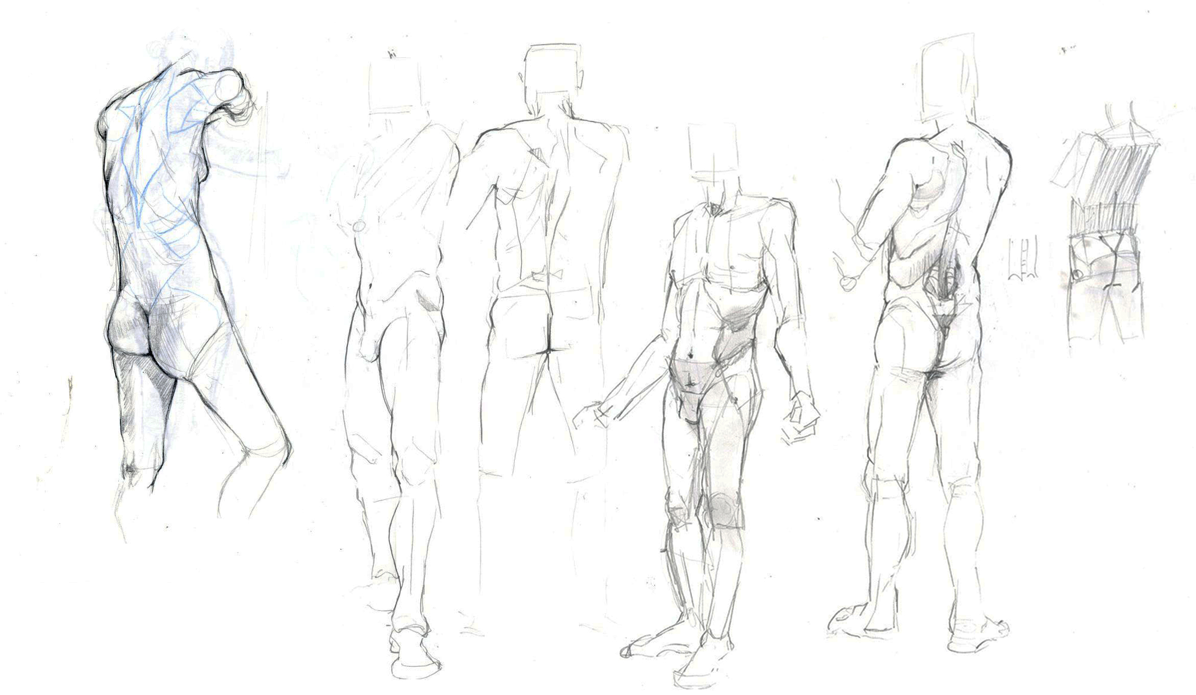
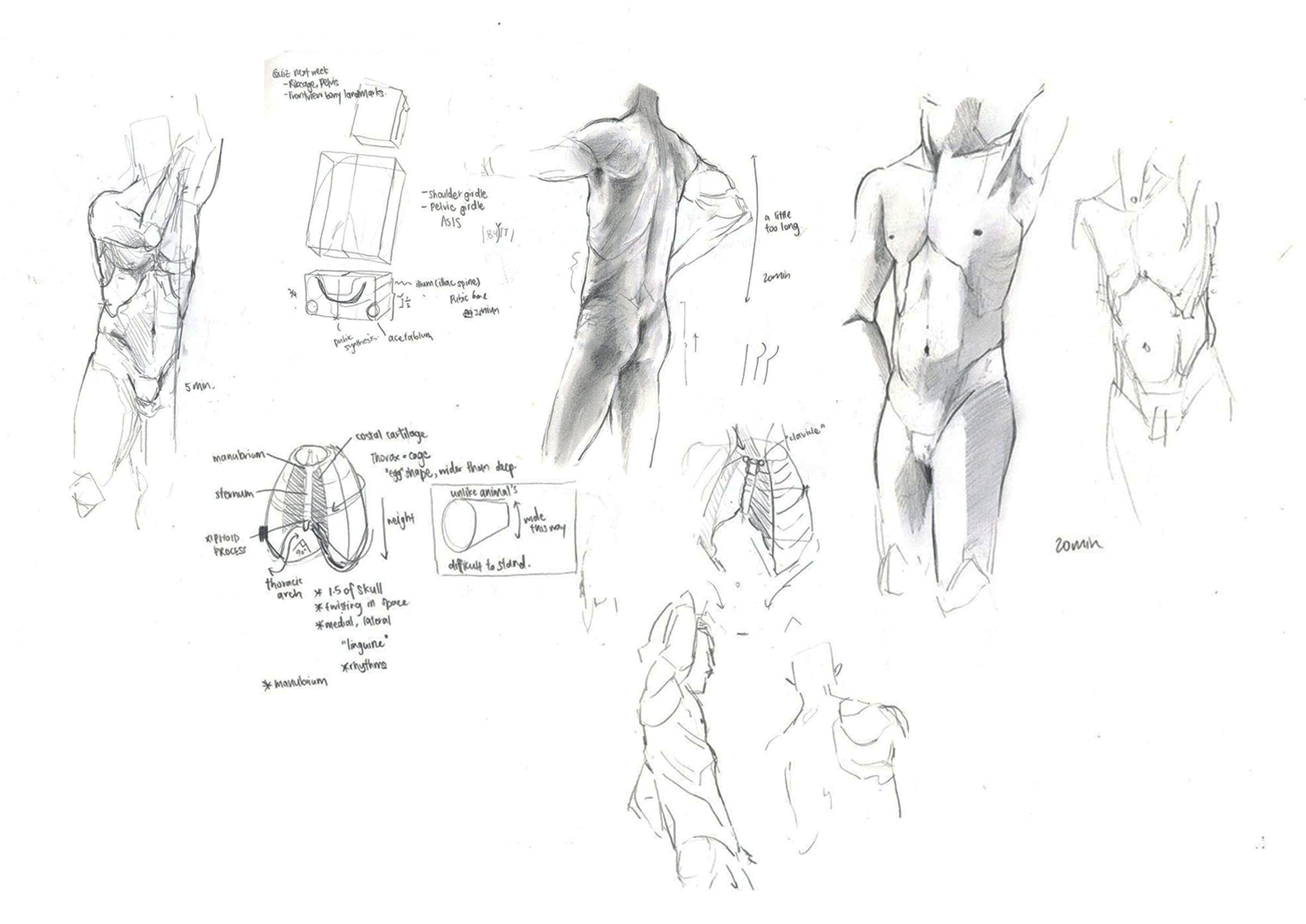
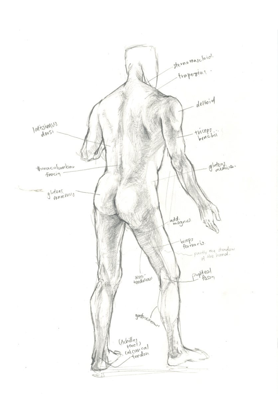
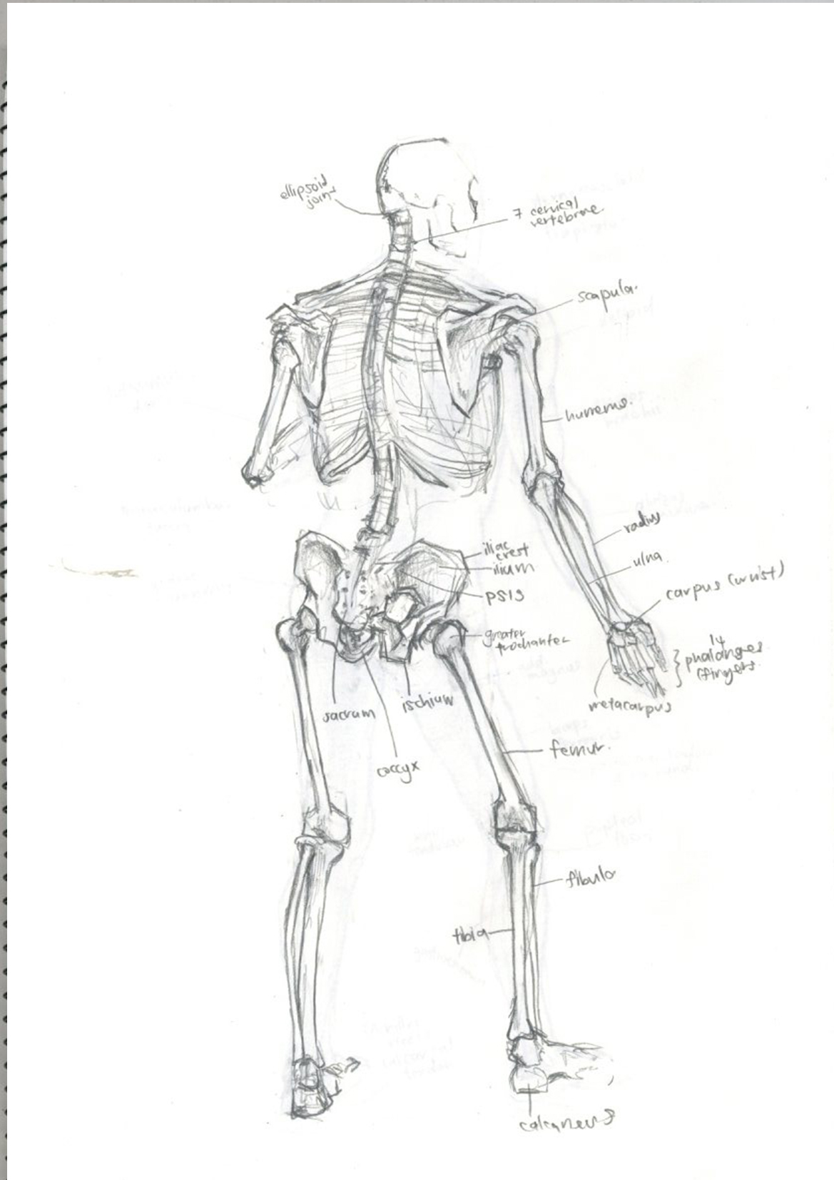
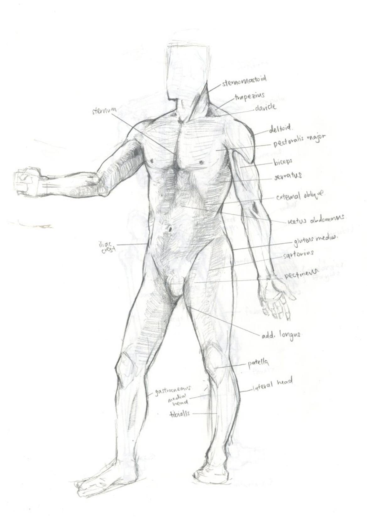
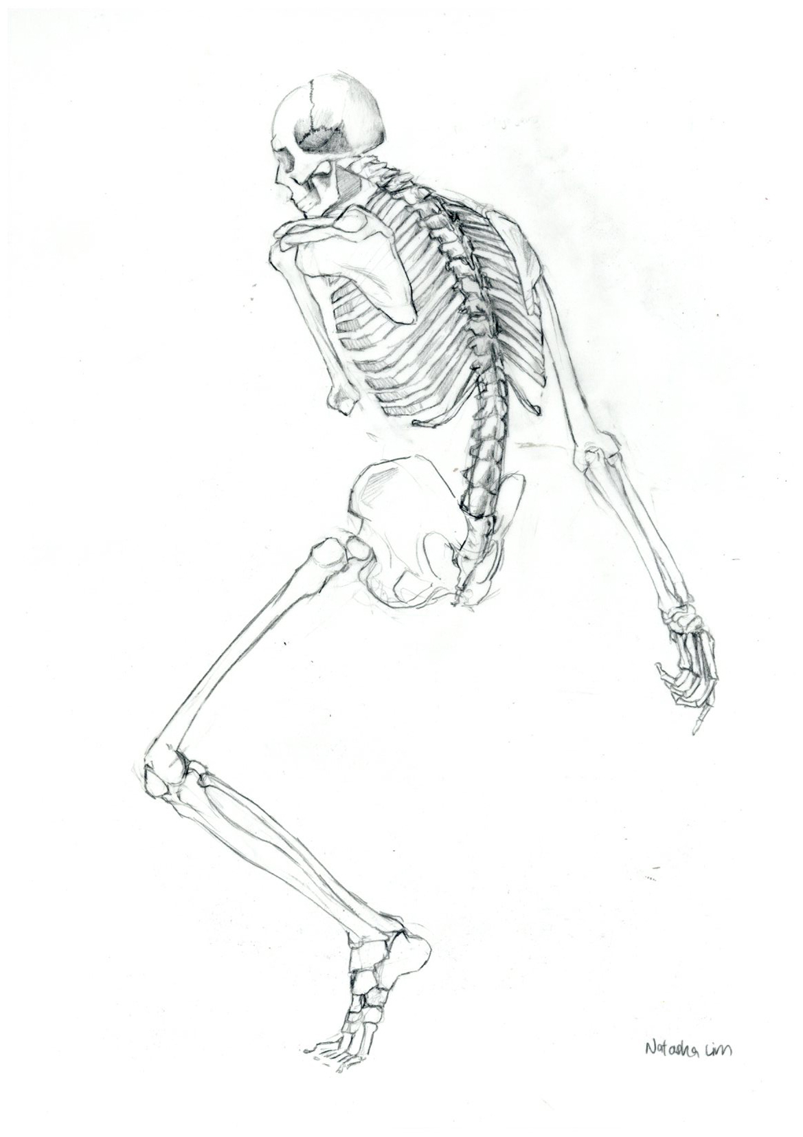
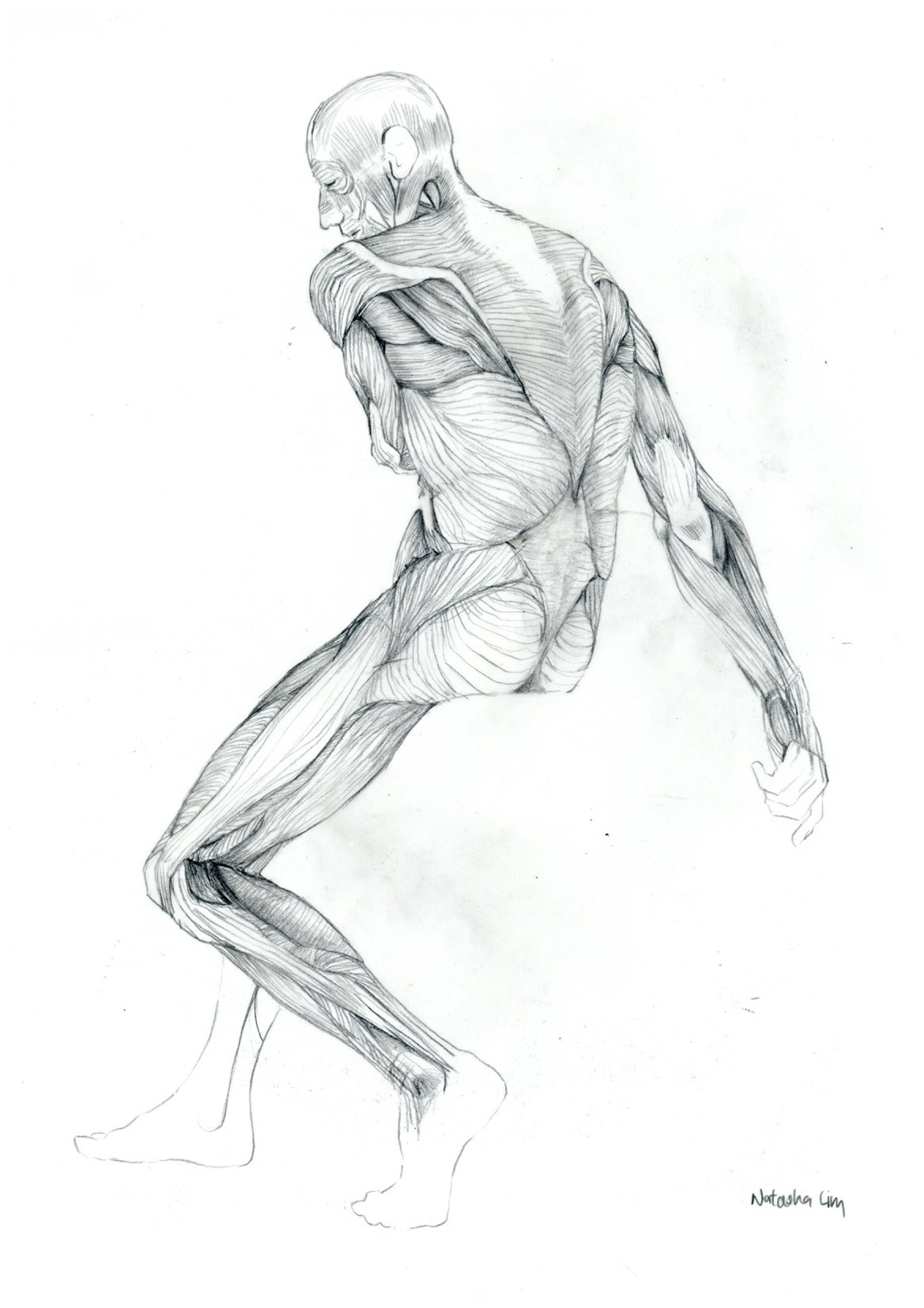
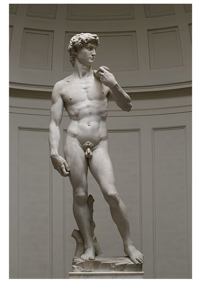
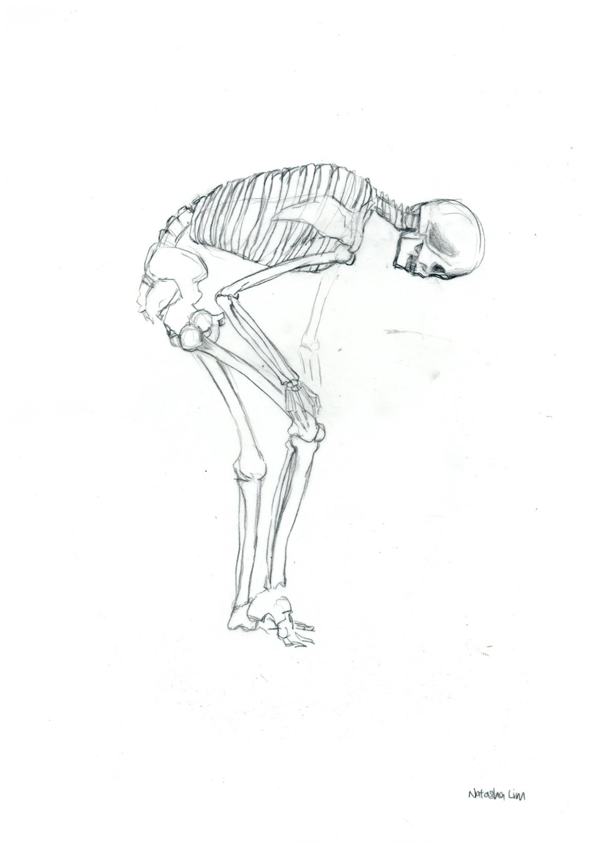
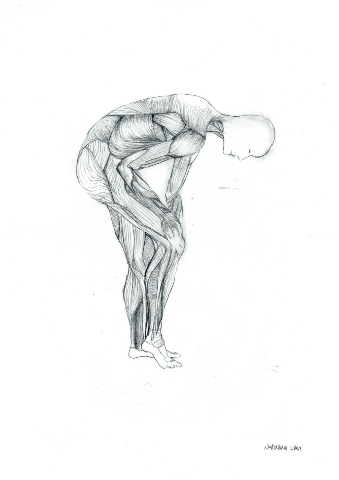
Studies
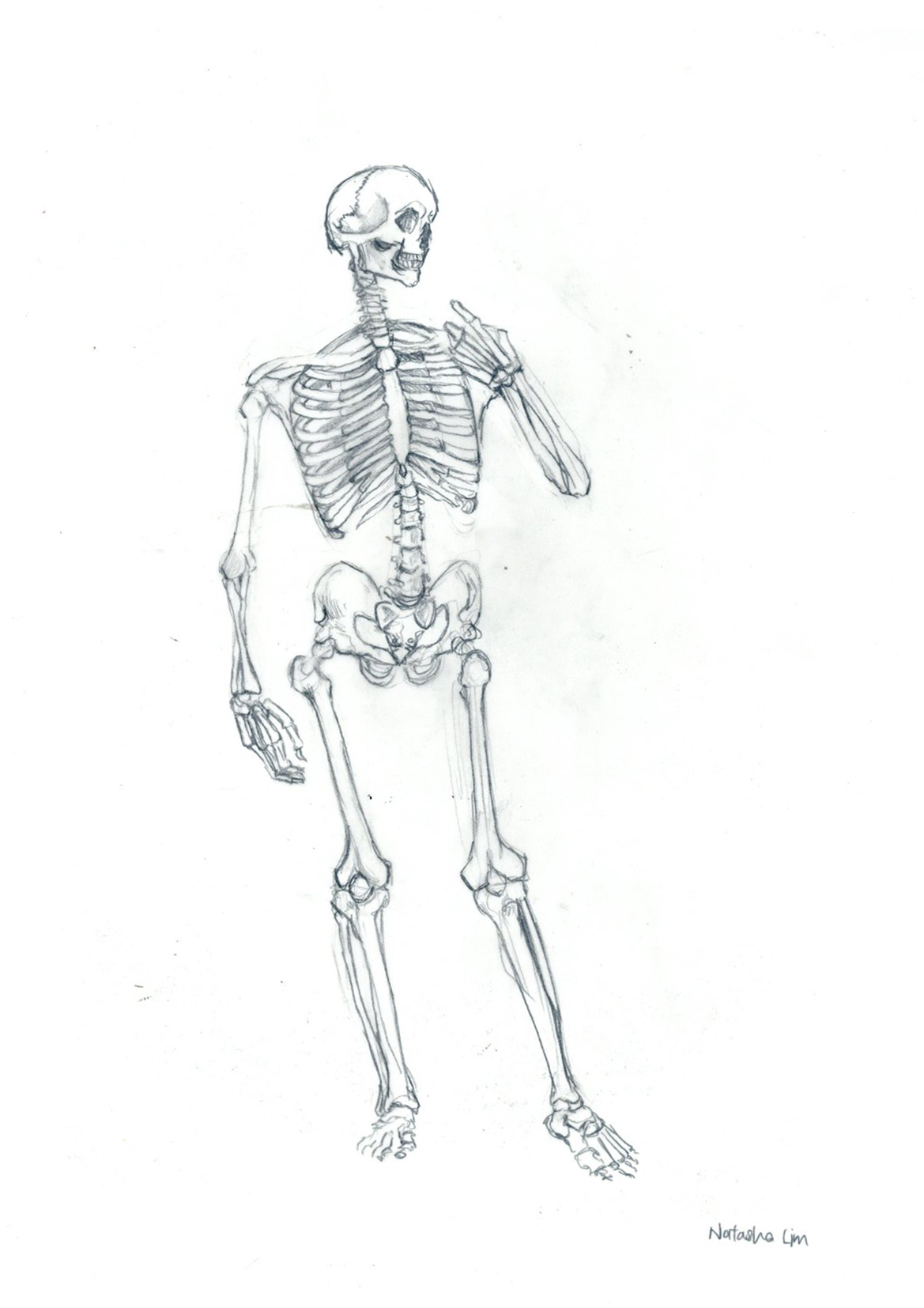
SKETches

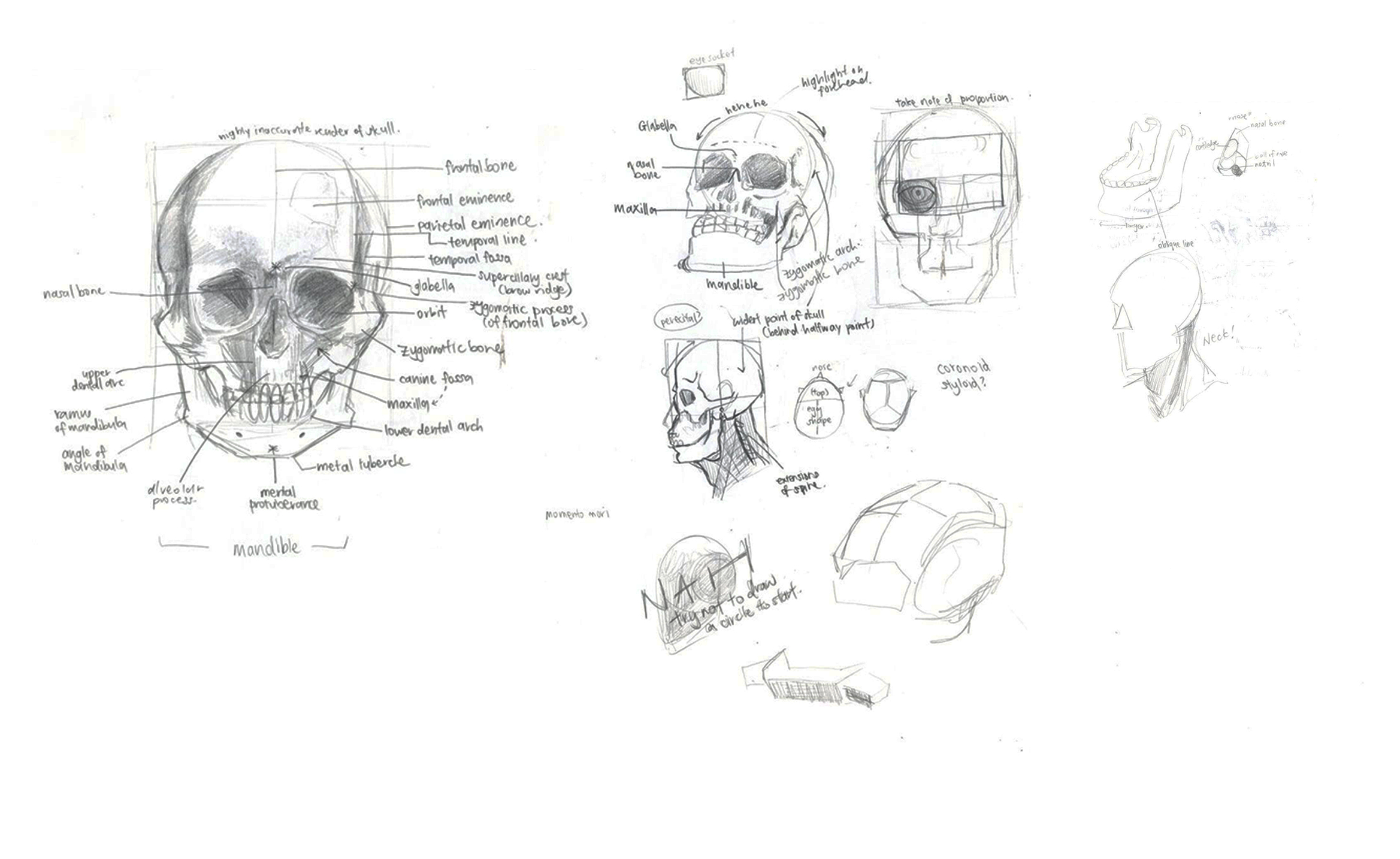
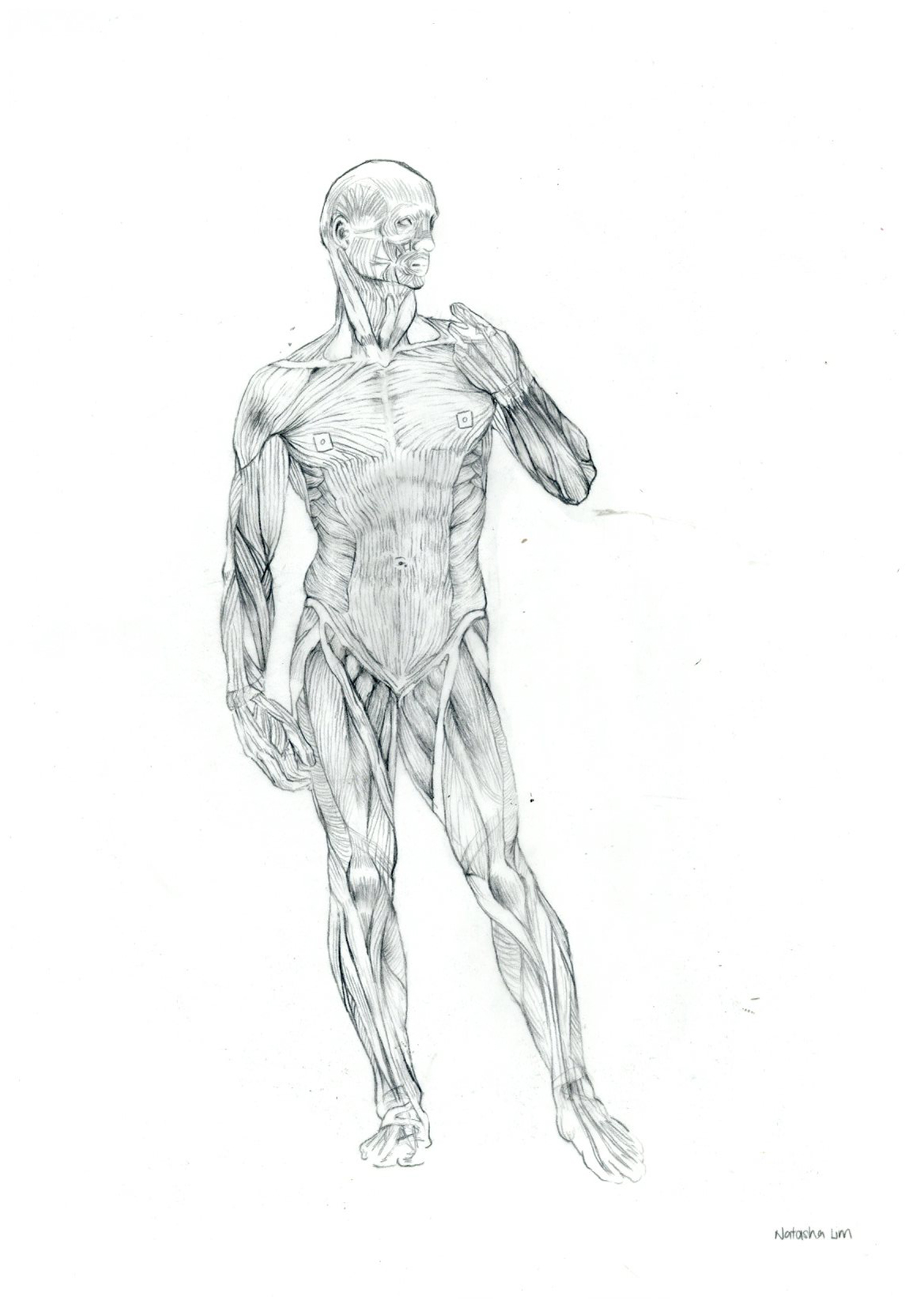
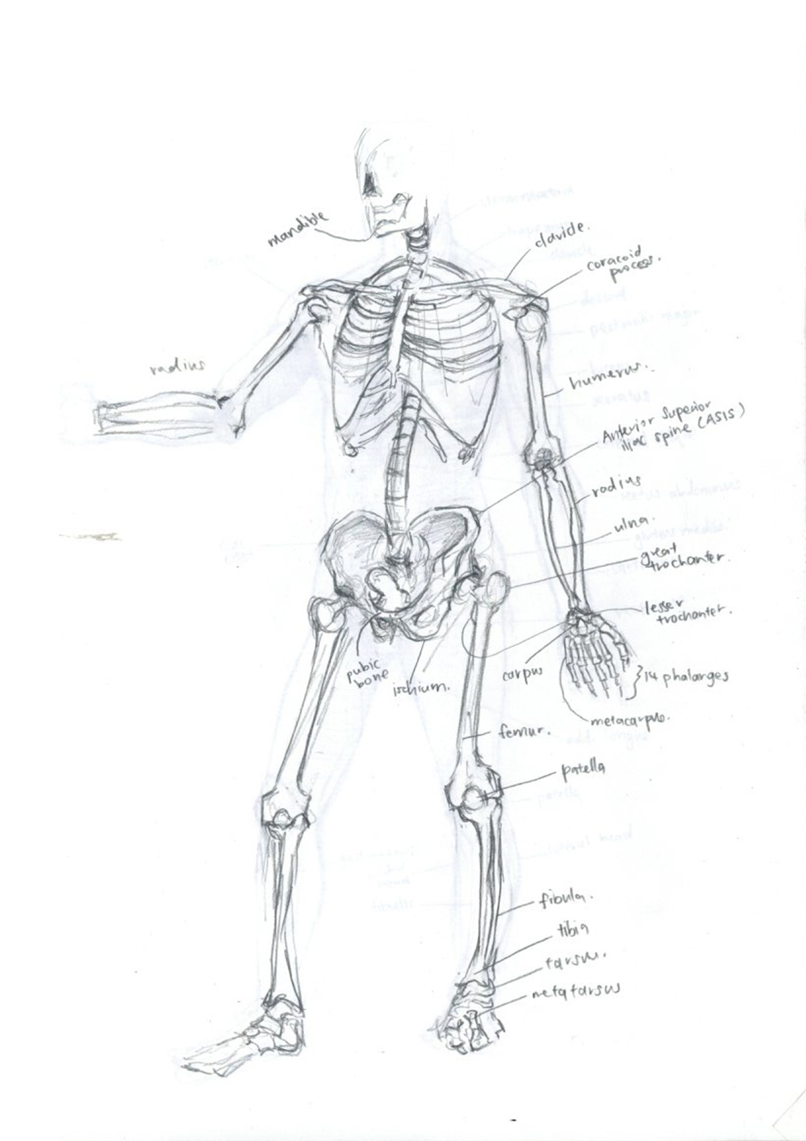 Final Tracings
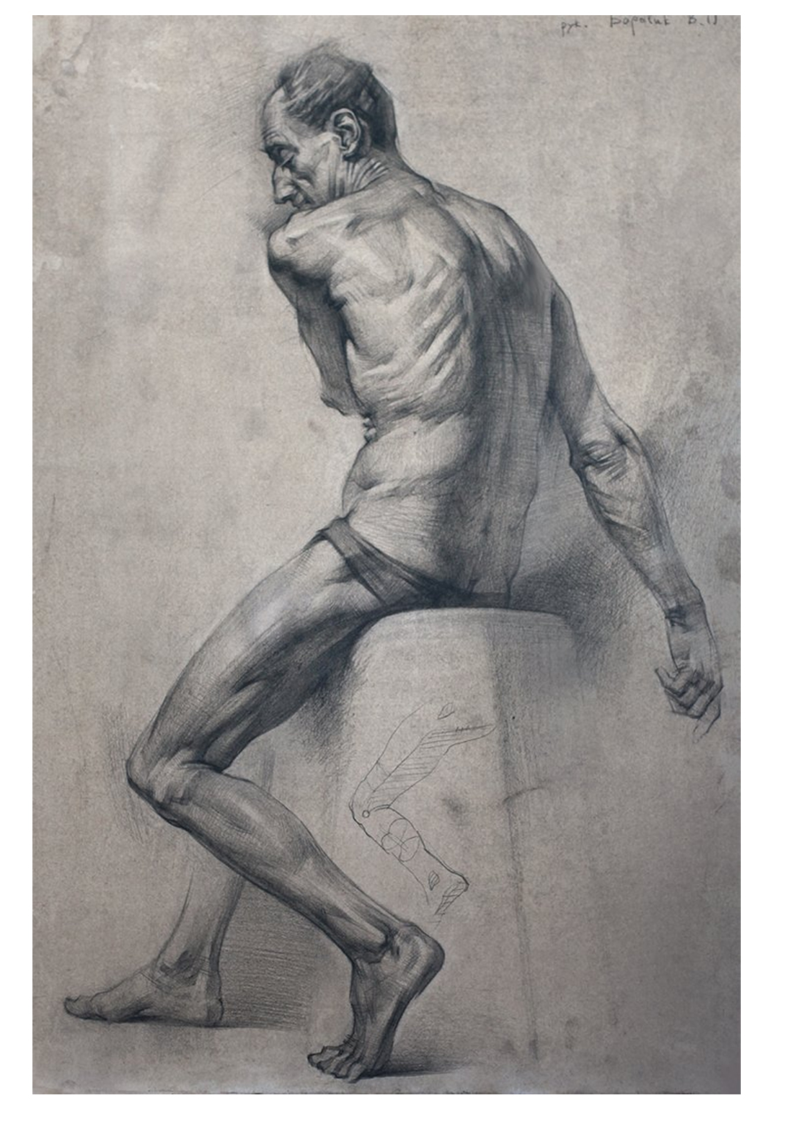
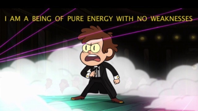
The Grand Budapest Hotel
Director: Wes Anderson
The Grand Budapest Hotel is a work by Wes Anderson, who is known for his distinctive style in cinematography, colourful casting and sets.
In the Grand Budapest Hotel, most of the shots are very centralised – the focus of the shots are very clear cut. Most shots are also closely cropped, giving a sense of intimacy. The entire film gives off a sense of surreality and does not try to be realistic and immersive in its shots – instead it feels and looks more like a well-staged theatre play, toeing the border between kitschy and classy. Each still shot is functional on its own as a visual image, which makes the entire movie a feast for the eyes.
Foreground, mid-ground and background often very clear and segregated, like theatre stills or animated sequences. Compositionally, the graphic separation is also very clear. The main characters, M. Gustave and his lobby boy (and eventual brother-in-arms), Zero, are usually deck out in the darkest colours of the scene, especially in comparison to the setting of the Grand Budapest Hotel itself. The hotel’s set is often lighter in tone, with light pinks and creamy warm hues like light brown, while M. Gustave, Zero and the other hotel staff are clad in striking dark purple. The main characters are also very clearly delineated from the rest of the characters, often separated, emphasising on the one dimensionality of the supporting cast, which are often portrayed as the comedic element or the confused, amused watching audience. This aspect is emphasised from their sense of aloofness, as if they are completely removed from the situation and are merely just watching observers.

Seven Samurai
Director: Akira Kurosawa
In Seven Samurai, I noticed that Kurosawa’s shots held visual interest and a strong sense of movement.
One stylistic trait I read about (and also noticed) was Kurosawa’s tendency to cut scenes while characters are in motion e.g. in the scene I selected, the three rowdy villagers are shown exiting the frame – before they finish exiting the frame, however, the scene jumps to a cut of the three of them settling down at a table. This gives the entire scene a strong sense of continuity, and this cinematic decision was employed quite liberally throughout the film.
Kurosawa’s camera movements are also dynamic and purposeful – when he begins a shot, it is often composed such there is an ‘end point’. This technique has been referred to as the “axial cut”, in which the camera would move closer to or further away from an object without interrupting the shot – much like the one-take technique, although the camera does not shift much, only panning around and zooming in and out. Kurosawa would start on a frame, which would pan away to show another happening, such as the reactions of a crowd or a dramatic action/reaction. I found it quite refreshing as it added a lot of visual interest to the movie, something I find isn’t that common in contemporary cinematography, which employs quite ‘basic’ shots (shots that are functional enough to carry the plot/characters/dialogue through).
Compositionally, with the aforementioned camera techniques in mind, Kurosawa’s compositions often did a lot of “stacking”. Each scene usually had many characters, whether it be main characters or the crowd. Often, this ‘stacking’ allowed Kurosawa to display and amplify the reactions of the various characters. For example, in this scene, as the three rowdy villagers speak, the expressions of the samurai in the background are evident (helped along by the fact that the samurai were well lit by the ambient light through the window) – Kurosawa was able to bring this moment out, demonstrating the relationship of the actors and the various reactions without employing any cuts. The choice in stylistic composition is evident throughout the movie as well.
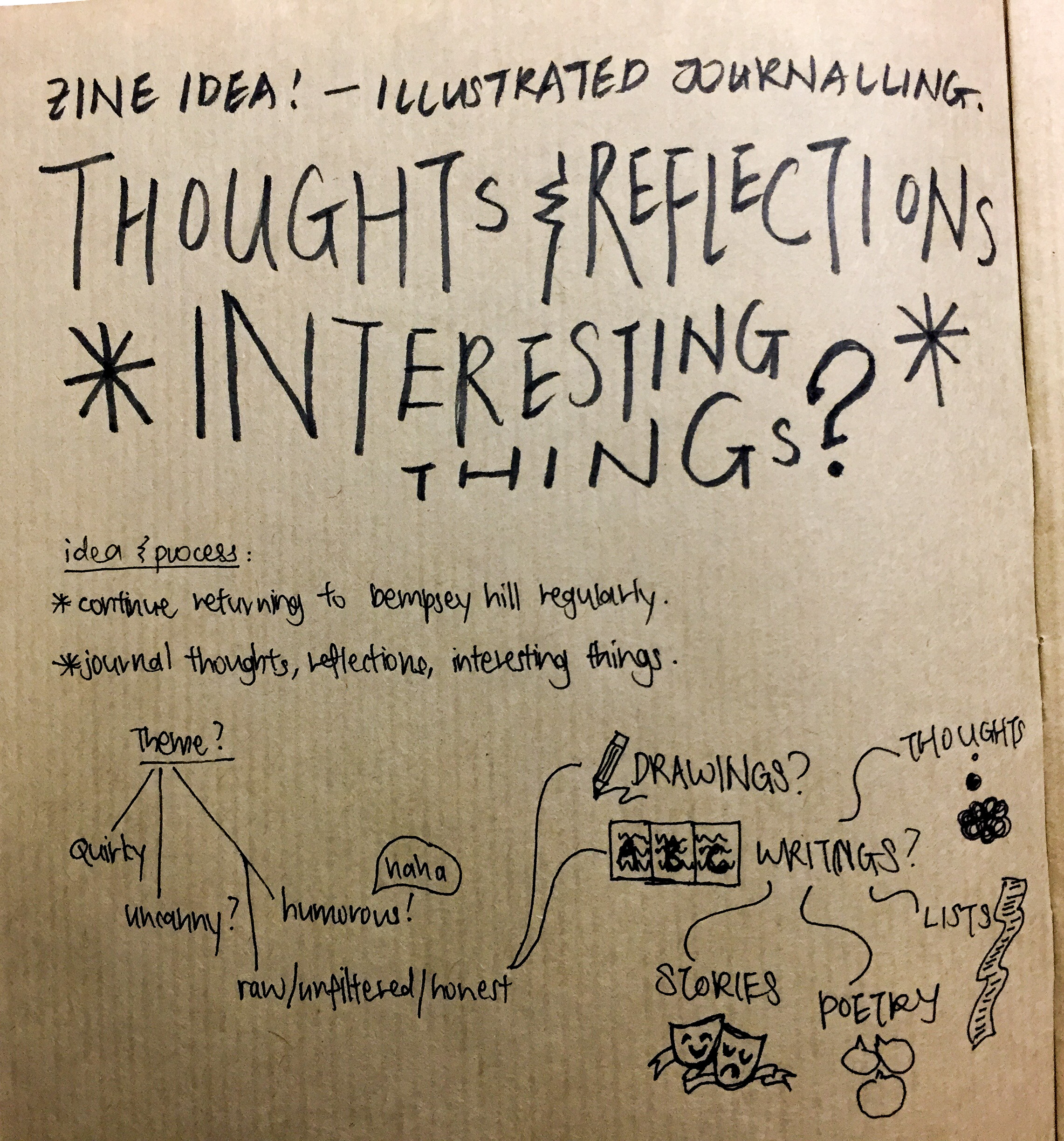
Foundation 2D II – Ideas & Execution
Idea 1: Thoughts & Reflections about Dempsey Hill
Idea 2: The Little Prince (and his Fox) visits Dempsey Hill
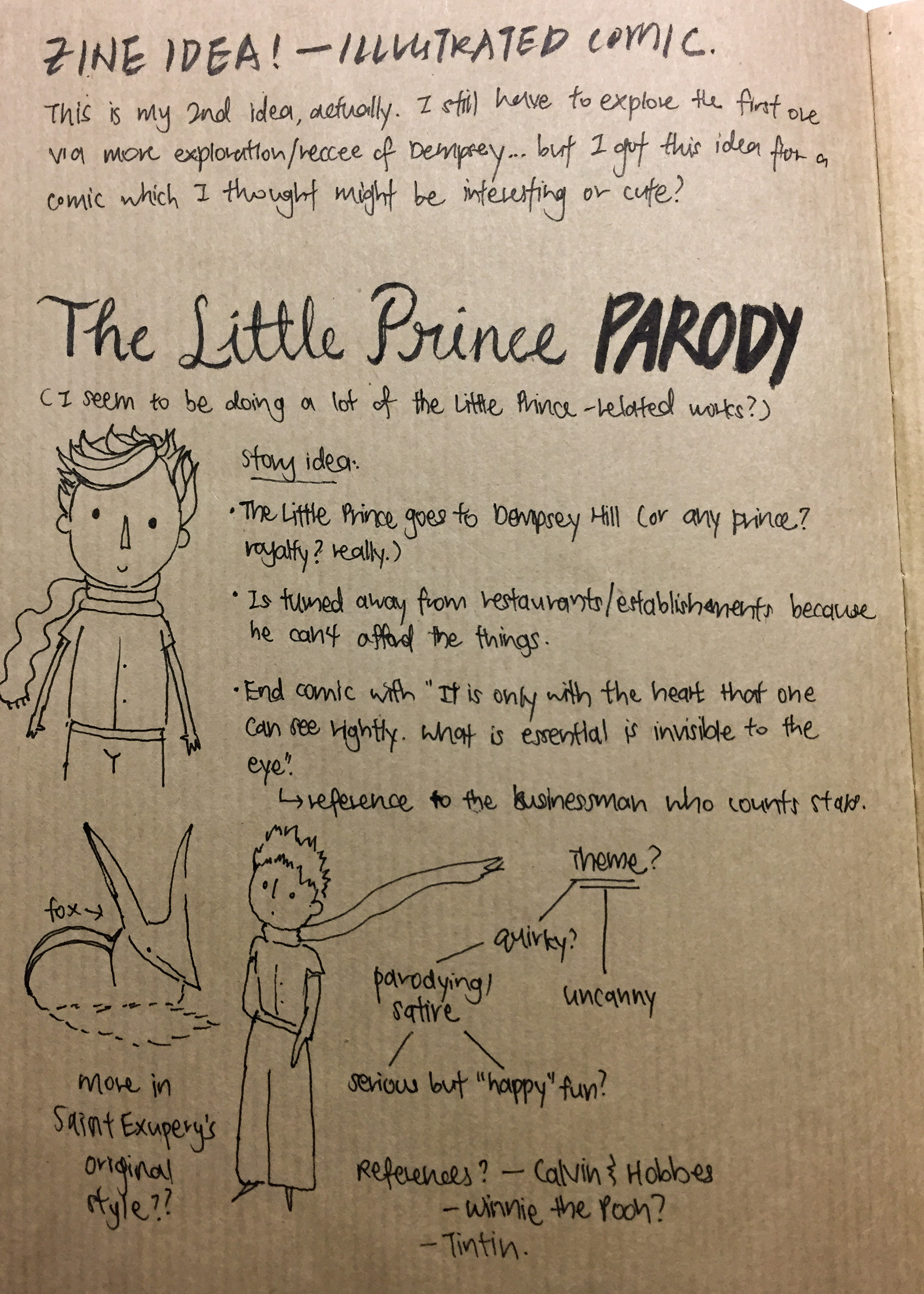
Amongst the two ideas, I very much favoured Idea 2. This was for several reasons:
Firstly, I was more attracted to the idea of creating a narrative. Stories are my passion, and telling stories is something that I want to continue to grow in.
This post details the Home, Authority, Fashion, Architecture, Law, Celebrations of Travellers.
(This post is under construction. More to come in time!)
Eden & Abel
Initially, at the brainstorming stage of the universe, I wanted to do something related to deafness.
Although I eventually scrapped that idea, Eden’s character design had its beginnings here. I was interested in drawing and possibly animating a deaf character who would need to rely mainly on expressions and hand gestures to communicate.

As I was sure that I wanted to include a supporting character as well, I thought of a younger boy as a complement to the older, more mature yet otherwise still optimistic Eden. The plot was meant to be a simple one with the same universe as ours, but with these two kids up to shenanigans – the genre was something more along the lines of ‘daily life’.
It was then I referred back to XM’s prompt – I was also influenced by my classmates, who all very boldly built fantasy worlds from scratch. Furthermore, I wasn’t sure what I could do with so little and I also very much wanted to create something. I began thinking about alternate universes, with developments inspired mostly by “Trollhunters” and “Voltron” by Dreamworks, as well as the famous children’s book author, Enid Blyton. At this point, I was thinking more about the genre Magic Realism.
That’s how I ended up with Travellers, instead! I’ll be posting more about inspirations in a separate post, as I mainly want to showcase my character design process here.

Eden & Abel’s dynamic didn’t change much from the initial idea. I am very against the idea of romance between them as they’re still really young – and not quite ready for romance, honestly. Also not very compatible. But generally, they have a very sibling/familial dynamic.


It was only after this random doodle (and cover design concepts) that I finally managed to come up with something satisfactory. Presenting: Abel & Eden.


Eden retained her sunny disposition, but Abel became a bit of a darker character. Their names have some kind of plot significance as well! I’ll probably have a part 2 to this with cleaner art and a character profile, because I am WAY TOO INVESTED.
See y’all soon!
Foundation 2D – After a long journey, here is my final! I’m also going to talk about my equations and reflections along with it. Cross-posted on my art instagram @ddoughnat.

My Equations
1. Me, Lone Knight Fighting + Around My Friends = I Let My Guard Down 
Sometimes I fancy myself some kind of character – I tend to be very animated in my gestures even when I talk and especially when I get excited, and I think the metaphorical knight has managed to bring out my dramatic tendencies quite well! I wanted to talk about how I’m more relaxed around my friends – it had been the play on the phrase, ‘let my guard down’ that led me to the idea of representing myself as the knight!
Briefly to explain: I had earlier decided to represent the strangers in my life as vegetable and fruit heads – so, what should I represent my friends with? One hilarious conversation with my roommate and several bouts of laughter with my classmates later, I had my idea down: confectionary. If the audience so happened to interpret that sweets helped make me feel better, they wouldn’t be wrong either! Confectionary is something we consume around friends, when we’re relaxed. Furthermore, at the risk of sounding completely mushy, my friends are also really sweet and understanding! Thus the character design.
Colours, alongside the reasons (psychological colour properties) why I chose them:
2. Me + In the Great Outdoors = Freedom

One of my loves is hiking and the outdoors, which I’ve done a lot less since I started university. This quote was especially based on my Junior College time, when I would often run off frustration from school and studying on a near daily basis. When I could afford the time, I would head over to the reservoir close to my home to run through the forest trails! It’s been some time since I’ve done that and I look forward to reestablishing some kind of harmony and balance in my holidays before the next semester.
I’m like a plant, needing sunlight to survive. But with my future in set in Animation, it looks like I’m becoming more of a succulent than a tree… haha.
Colours, alongside the reasons (psychological colour properties) why I chose them:
3. Me, In My Comfort Zone + At Orientation Camp = Nervous… How Does One Make Friends Again?

I may look extroverted, but I get exhausted in new, unfamiliar settings very easily and often fret over making and losing friendships. In continuation to the explanation of my characters, strangers are represented as vegetables and fruits so as to draw out a sense of isolation, to show how they are different from my avatar. It was an idea that I got from a show that I like, called “Mob Psycho 100”, where the main character’s love interest was differentiated from the surrounding supporting characters of various vegetable heads. I found that idea very quirky and decided to adapt it into my work as well… the end result was well-received, with the same playful touch I was going for!
Initially, the final panel was going to be much more complicated. However, I doodled this during my brainstorming… and it surprisingly turned out really well! Not only has it ascended to my all-time favourite panel, it has also been the favourite of my of my friends – possibly due to the humorous tone that the expression of my mini-me took on, as well as the situation mini-me is described to be in.
Colours, alongside the reasons (psychological colour properties) why I chose them:
4. Me + In School = Overwhelmed

…and do I hear an “amen” to that! Honestly though, keeping busy is a bad habit of mine. I’m constantly filling my timetable up and giving away time to all sorts of things… my passions and my obligations. Furthermore, I have a terrible tendency of not being able to say no – the second column shows this, from the way I can’t say no to my Cupcake Friend, to Homework obligations (the desire to do well is overwhelming!) and to my Tomato Professor.
While this has improved over the last few years, I do still need to learn to “chill”, as my classmates always remind me. (Really, I’m so blessed to have friends who look out for me and remind me to slow down in life! I would not have survived this semester without them.) The leftmost composition intends to create a sense of balance with the horizontal lines and color, while the two on the right are tending towards the chaotic and the overwhelmed. In the final panel, mini-me’s expression is resigned, towards my inability to be… not busy.
Colours, alongside the reasons (psychological colour properties) why I chose them:
Reflections
All in all, I’m really glad that I went all out for this last project. Actually, my final was much more ambitious that what I ended up doing, and I had to cut down (for example, installed lighting and more layers in each diorama) but overall, the effect delivered, and I was quite satisfied with it. A lot of people liked it!
I really enjoyed doing the project because I could really draw upon my own personal art style, and I got to do what I love: illustration! Using colour really got me to challenge myself, I usually stick to ink and markers in my illustrations; colour never really factored in. Furthermore, although it seemed simple to decide on ‘analogous colours’, there were a few reasons why this ended up challenging me:
What are some of the challenges that I’ve faced, besides colour?
That’s all folks! Hope that you enjoy my work as much as I enjoyed creating it. See you again soon!
*Postscript: thank goodness I had the sense to copy out my reflections before OSS crashed haha. It’s finally up!
Foundation 2D – In this post, we’ll be talking more about the next part of the suggestions in the project brief – colour. Most of it was research I did but did not include in my sketchbook.
While this project excited me, I have to admit that colour is not my forte. I tend to do a lot of sketches and ink drawings, but I’ve never really focused on colour. This assignment will be a good chance for me to expand on it!
The ones mentioned in the brief weren’t really covered in class, so I did my own additional research too. Scroll down further for my research and some helpful links!
***
Brief recap: I found these two images which I feel best summarised what was taught in class.


Next, let’s look into the different colour harmonies. What are they?
Monochromes Harmony

Analogous Harmony


While it utilizes all cool colors, the lighter green accent offers interest without distracting from the softer blues. Most three-color analogous palettes use the same chroma, but this one shows how adding tints and shades can create a wider and more gradual variation. (source)
Complementary Hues


Split Complementary

I also found other colour combinations:
Triad Complementary/Triadic Color Scheme

The contrasting colors here are softened with tints, and additional shades of the same hues look as though other colors have been added. This is a good way to add neutral tones to offset the brighter colors.
Eventually I decided on the analogous colour scheme, so as to keep it simple. More in the next post!
Helpful links:
http://paletton.com/#uid=75B0u0kgDFt6uWdbTOHkJv+oQsz
100 Brilliant Color Combinations and How to Apply Them to Your Designs
http://www.dtelepathy.com/blog/inspiration/beautiful-color-palettes-for-your-next-web-project
http://www.dtelepathy.com/blog/design/color-theory
Sources:
http://www.worqx.com/color/combinations.htm
Foundation 2D – (True story, though. Your friends really do bring insight into your life.)
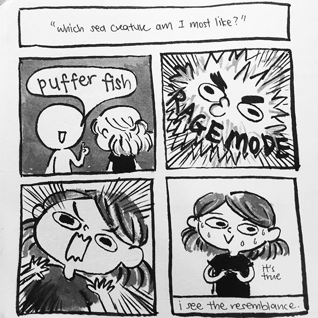
Hello friends! After much deliberation, I’ve decided on my first two equations, as well as my intended medium. This post is going to be a bit short (skipping the brainstorming) because it’s mainly to get some feedback about my ideas – if anyone is reading this, please do drop a comment! or comment with your spirit sea animal I’d love to hear your thoughts.
When I was working on my project, after the many reflections and brainstorming, I realised that there was one thing I needed to clarify.
What am I trying to say?
Chapter 1: Ego, Intention
This project is intended as an insight to me.
Through this project, I want to convey certain character traits that I recognise myself to have.
The list might grow as I discover more of myself in this project, but so far, these are the ones I have thought of. Life isn’t a bed of roses for anyone and that includes me – but I’ll need to reflect more about this.
Beyond just finishing an assignment, I want to learn more about myself too.
Chapter 2: Ego, Situations
1. Me + Emotions = Bottle Them Up
I have a tendency to bottle up my emotions; I tend to skim over them as well, or dismiss them. I feel very intensely but I don’t show it often. One reason is because I’m always, always striving to be a better person, and I feel like my emotions are very selfish things to have. For example, to be angry/annoyed at someone would make the person feel bad if I expressed it towards them – so if it were a small wrong done against me, I shrug the emotion off. When I’m stressed, I also tend to pretend that everything is alright and try my best to keep myself together.
The side effect is, of course, the bottling up of my feelings. The frustration of not being able to express myself usually builds and overflows.
A random tidbit: this is actually how I made one of my best friends? She noticed that I was bottling up my emotions and wrote it down in one of the class camp activity sheets. Maybe the reason why we became such great friends was because I felt comforted by the fact that someone saw.
2. Me + Setbacks in Life = Gets Stronger
One thing I pride myself on is my ability to grow and overcome situations. Aside from the bad habit of trying to appear unshakeable, my ability to bounce back from whatever situation in my life (and my knowing that I have that ability) strengthens me and gives me confidence. It’s something personal to me, something positive. It is also why I tend to move on from things very quickly, especially things that I feel are a failure.
https://www.youtube.com/watch?v=6JARVfb-FBg
Of course, this opens a whole new (negative) can of worms – the independent streak can sometimes overshadow relationships in my life. However, the feeling that I want to bring across in this assignment (through my style and execution) is something fun and a child-like innocence, so the final work is not going to be about that, but about optimism and an almost naive hopefulness.
With that I conclude my first OSS post for Ego. More to come soon.
Foundation 2D – Natasha’s Journal
Forgot that I had these in my OSS drafts, oops! Here is the final (whole) journal. See you guys… in the next post? Haha!
Foundation 2D – I decided focus on the quote from Little Prince for the first print – mostly because I realised I was overwhelming myself by trying to juggle ideas for the four different movies. After some deliberation, here are my compositions and the one I intend for printing!
The Little Prince
“It is only with the heart that one can see rightly; what is essential is invisible to the eye.” – quote from The Little Prince, said by the fox before the Little Prince parted ways with him.


For Compositions 1 & 2, I was trying to work with the motifs and themes that were presented in the movie, but ultimately, it didn’t really represent the quote very well.
In Composition 1, there were three things represented: the planets, the fox and the scarf. I put the scarf around the fox as a representation of how he was ‘tamed’ in the movie/book; the planets were more for composition’s sake, to make it look more balanced (excuse the terrible quality though, the photo was quite low resolution… it’s a good thing I’m not very enthusiastic about this particular composition). I confess that, it being my first composition, I was still warming up and was quite lost about how to go about portraying the idea.
As for Composition 2, I represented the rose and the fox, two things that were important to the Little Prince; using scale, I wanted to make the rose seem as if it were the asteroid that the Little Prince lived on (the rose being of great value to him, being his whole world, hmmm…) and the fox, jumping. It sounded great in my head, but right here in black and white, it’s whimsical nonsense. It’s nice, I guess, but it’s not working. Time to move on, but before that, let me stick in a nice dingbat to quieten the complaining voices (“it’s too empty! too asymmetrical! too unbalanced!! at least add something before moving on!”) in my head.
It’s still not a good composition, though, but at least I’ve got into the groove of things. So let’s move on…

So far, the most satisfactory of the bunch I had done. I felt like this was the most in keeping with the theme. It was also abstract, something more representational than the first few processes I had done for consultation in the first lesson. However, I feel that this composition is really cluttered – the flowers wouldn’t look very good on print as well. So, swiftly moving on…

For Composition 4, I wanted to bring out the same “unnerving” effect, and got the idea from butterflies which mimicked eyes to fool their predators. I felt that the quote reminds us to look closely to see the deeper meaning… but ultimately, Composition 4 is a bust as (1) the eye is too obvious; sure, it’s kinda creepy, but (2) it isn’t even in keeping with the themes and motifs of The Little Prince. So after quickly slapping the eye on the butterfly, I moved on.

The silhouette of the boy reminded me of the Little Prince, standing tall; the horse also felt as if it hinted at the idea of a prince. I did a quick masking using composition 3, which I favoured best so far, and this is the end result. The heart might be difficult to recognise, however, and I feel that overall, this composition was not as clear in communication.
Narrowing it down, I eventually decided to further expand on composition 3. I felt that Composition 3 was the closest in expressing the quote that I chose. Furthermore, it also elicited a feeling of dissonance – it was unnerving to look at, but visually interesting. Thus, from then, I made a few more versions of it:

Compared to composition 3, which was rather distracting and cluttered, I replaced the border with something more focused and symbolic: the rose, which the Little Prince loved. I felt that this one is rather cluttered, though, thus, I decided to cut down on the flowers.

The next two are also quite similar, but for the 2nd one, I liked the asymmetrical positioning of the flowers as a frame around the heart. I’m not too sure how it will look like on the final, however. For the 3rd attempt (below), the idea of masking the flowers so that it looked like part of it was in the heart came from my friend, but while I found this interesting, I’m concerned as I’m not sure if the details will come out nicely on the print. Composition-wise, I find that the 3rd one has a very balanced composition, and would work well as a standalone in the middle of a blank sheet of transparency or floating at the center of the tote bag.

To Professor Mimi: this is the design that I would like to print! I am undecided on which between the last two to choose from, though. Critique will be appreciated! Thank you for your time 🙂