

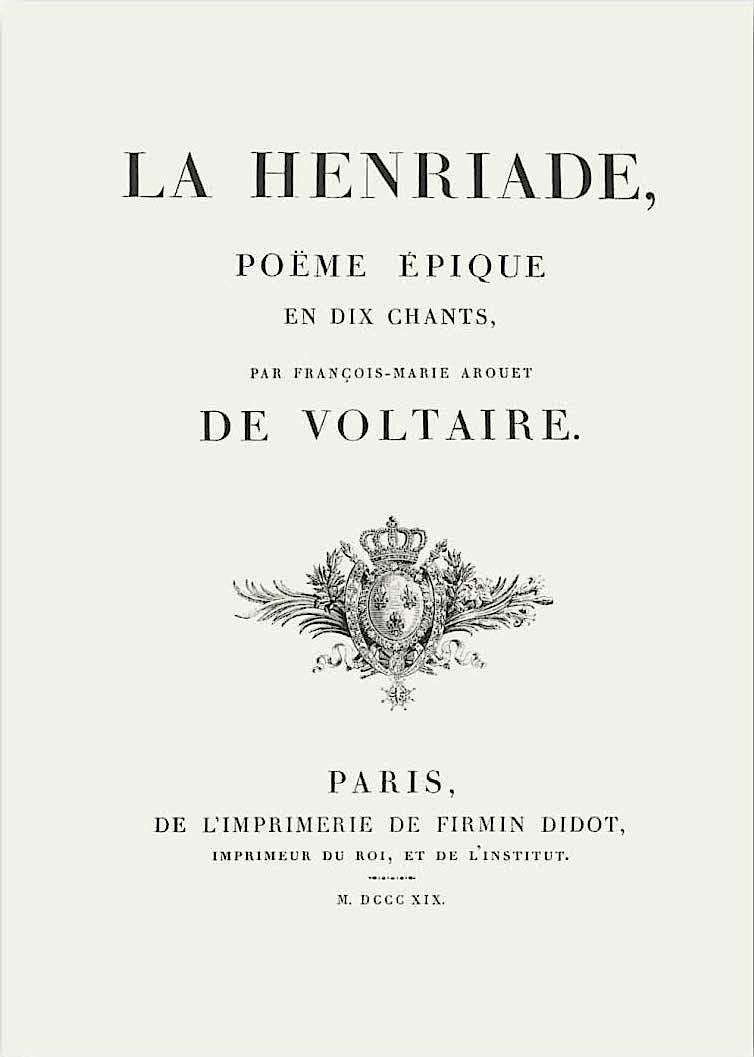
The Didot Typeface was created around the late 1780s to the early 1800s by Firmin Didot who hailed from the famous French Didot family. The Didot family were renowned in the French printing industry and his brother Pierre Didot first printed the typeface and eventually printed the famous poem ‘La Henriade’ by Voltaire in Didot.
The Didot typeface is known as a ‘modern’, ‘neoclassical’ or ‘Didone’ typeface. These typefaces can be recognised by high contrast between its thick and thin strokes and thin and straight horizontal serifs. They are known as ‘neoclassical’ as they reflect the neoclassicism of that time. Neoclassicism is an art movement from the mid 1700s to the mid 1800s, during the ‘Age of Enlightenment’. It stands for the simplicity and geometry reflected in Greek and Roman art and rejected the gaudiness and excessive ornamentation that characterised the Rococo period before. The Didot typeface reflects neoclassicist values as it is not overly ornamented and is geometrically precise.
These typefaces are known to be elegant but can be quite hard to read due to the drastically varying thick and thin strokes. They are usually used for large prints and titles but not for body texts.
The Didot typeface is similar to the Bodoni typeface by Giambattista Bodoni.
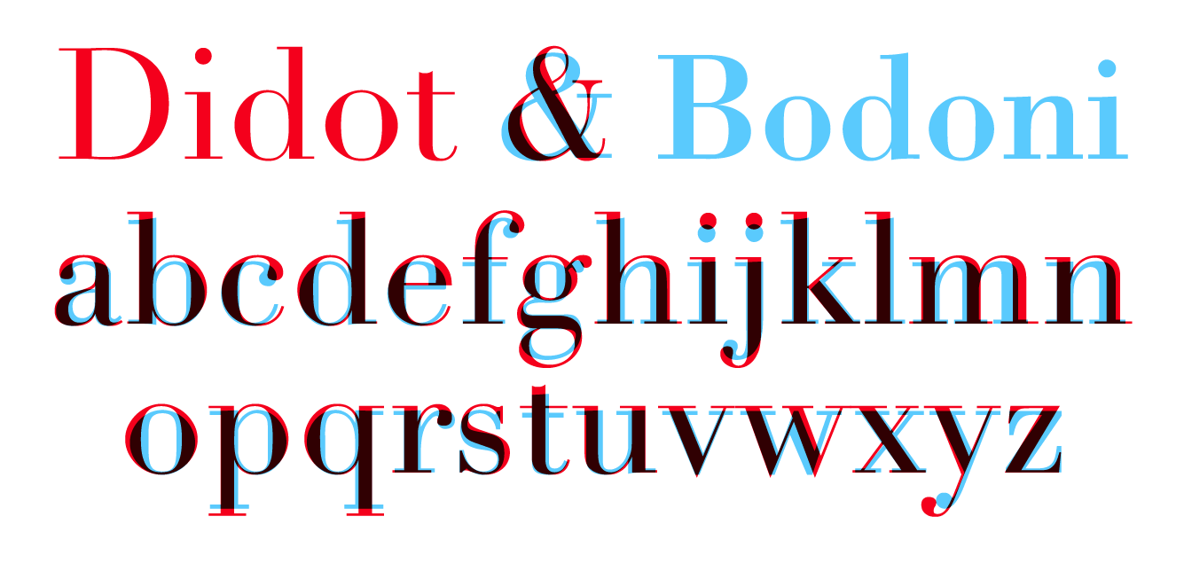
As can be seen, Bodoni’s serifs are thicker and it has a lower X height. Both typefaces faced a problem called ‘Dazzling’ when they were first printed where the thin strokes are so thin that they do not appear in print.
I decided to choose the Didot typeface as I liked how elegant it looked when I did my typography assignments. After researching on it and understanding the ideals and history behind its strokes and serifs, I’ve come to appreciate it even more and will definitely pay closer attention to modern typefaces in the future!
References:
https://www.theartstory.org/movement/neoclassicism/
https://www.typography.com/fonts/didot/design-notes
https://www.fonts.com/font/linotype/linotype-didot/story
https://medium.com/@redheadedmandy/didot-typeface-d38ee7c02c4c
Featured image: https://fontsempire.com/font/didot-font-family-download/